RU
Разработка логотипа и макетов упаковки для линейки молочных продуктов «Läptic».
Задача: Создать отличительную концепцию для этого продукта. Решение должно было быть минималистичным, но одновременно ярким, выделяющимся и узнаваемым.
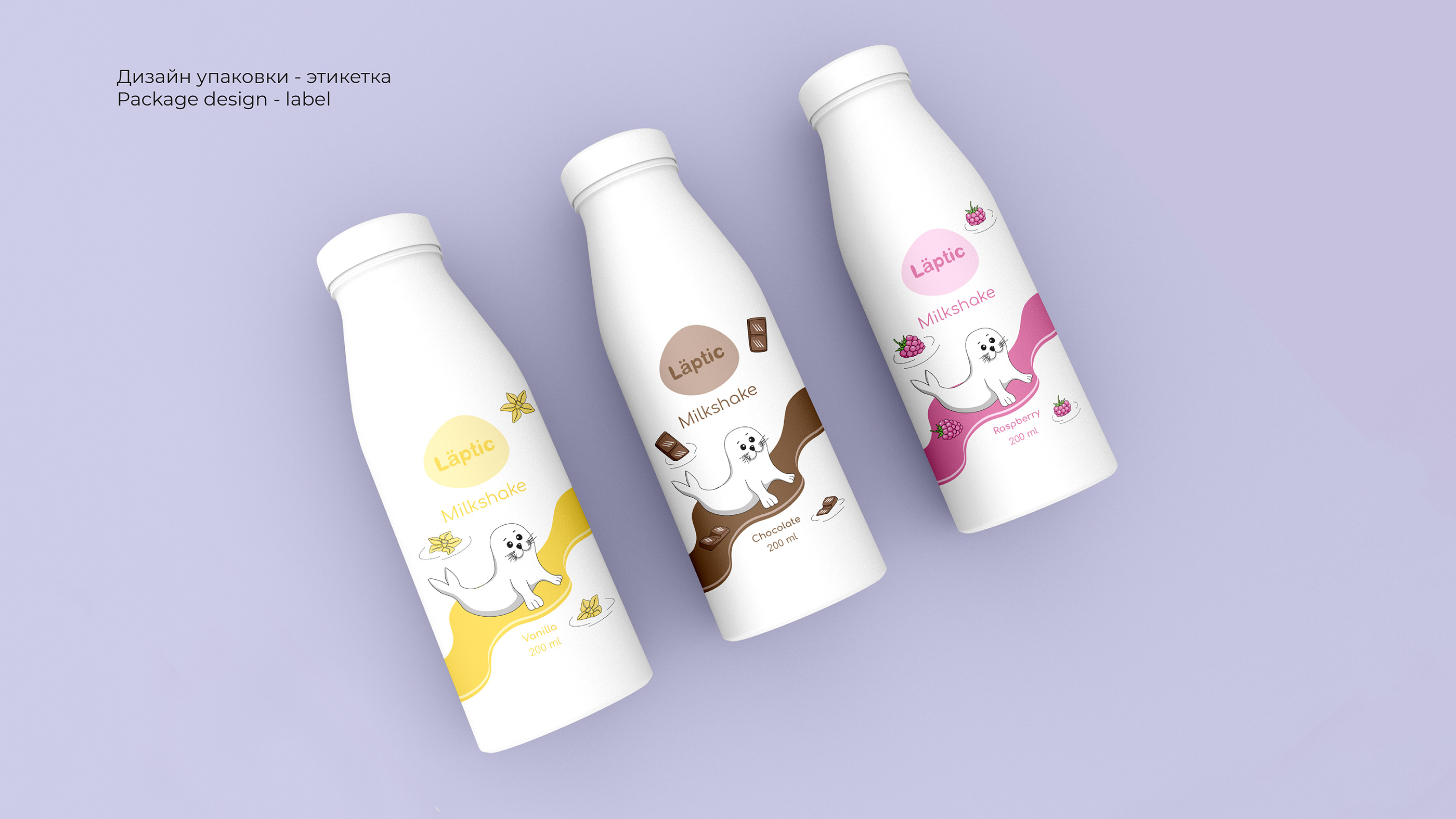
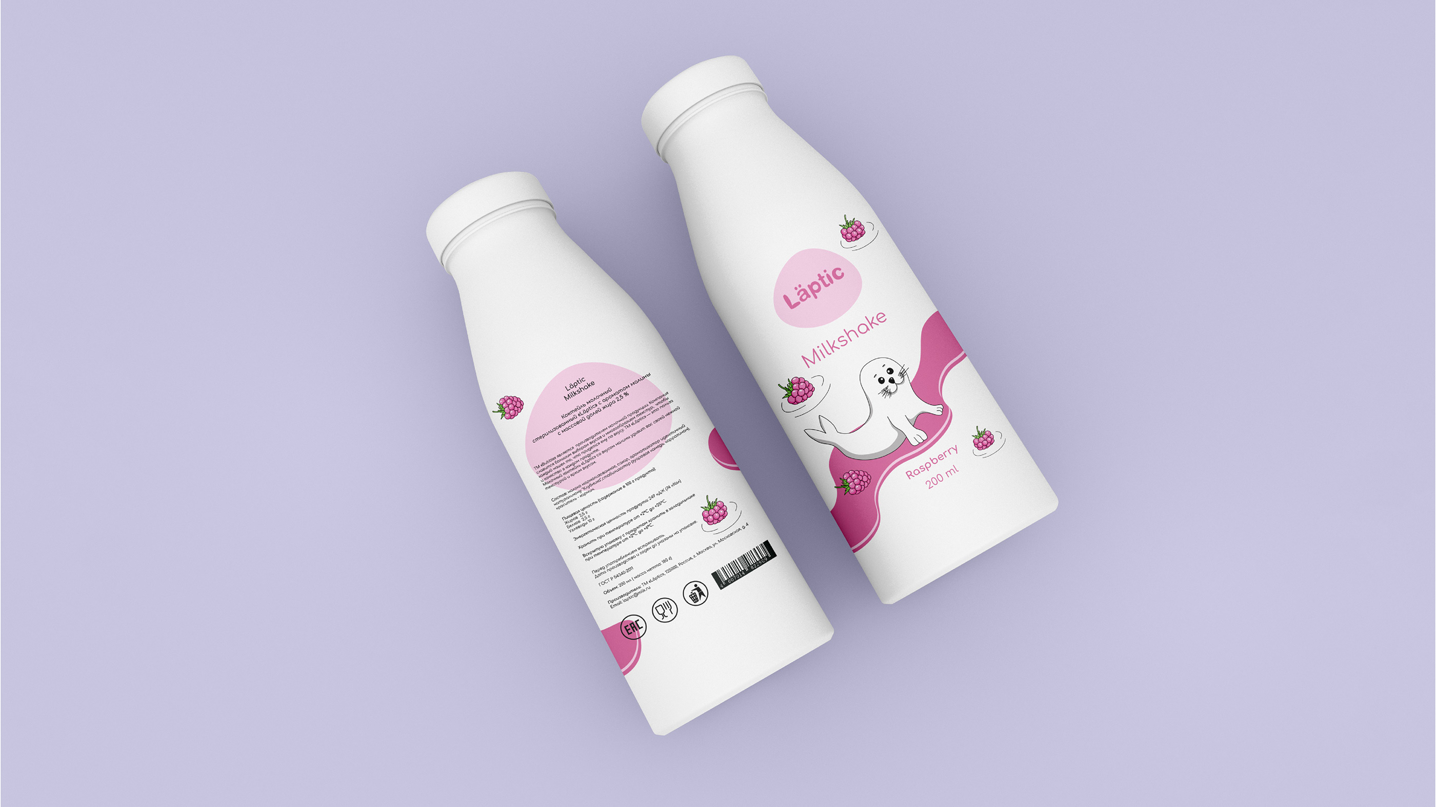
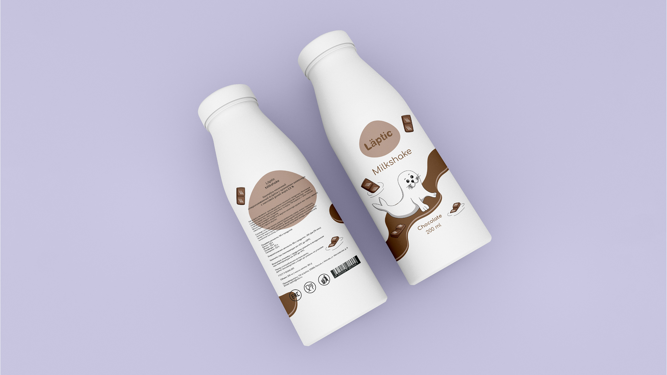
Решение: Создать упаковку, которая была бы разделена на цвета в зависимости от типа и вкуса продукции.
EN
Läptic is a new brand, of course a big challenge to be able to attract the attention of potential consumers to glance and try Läptic products
Development of a logo and packing for a brand of dairy products «Läptic».
In the project, the need to create a distinctive concept for this product and solution can be supposed to be minimalistic, but at the same time bright, eye-catching, and recognizable.
Solution. Create a package that would be pided into colors depending on the type and taste of the products.
What we made:
Naming
Identity
Illustration
Packaging Design
RU
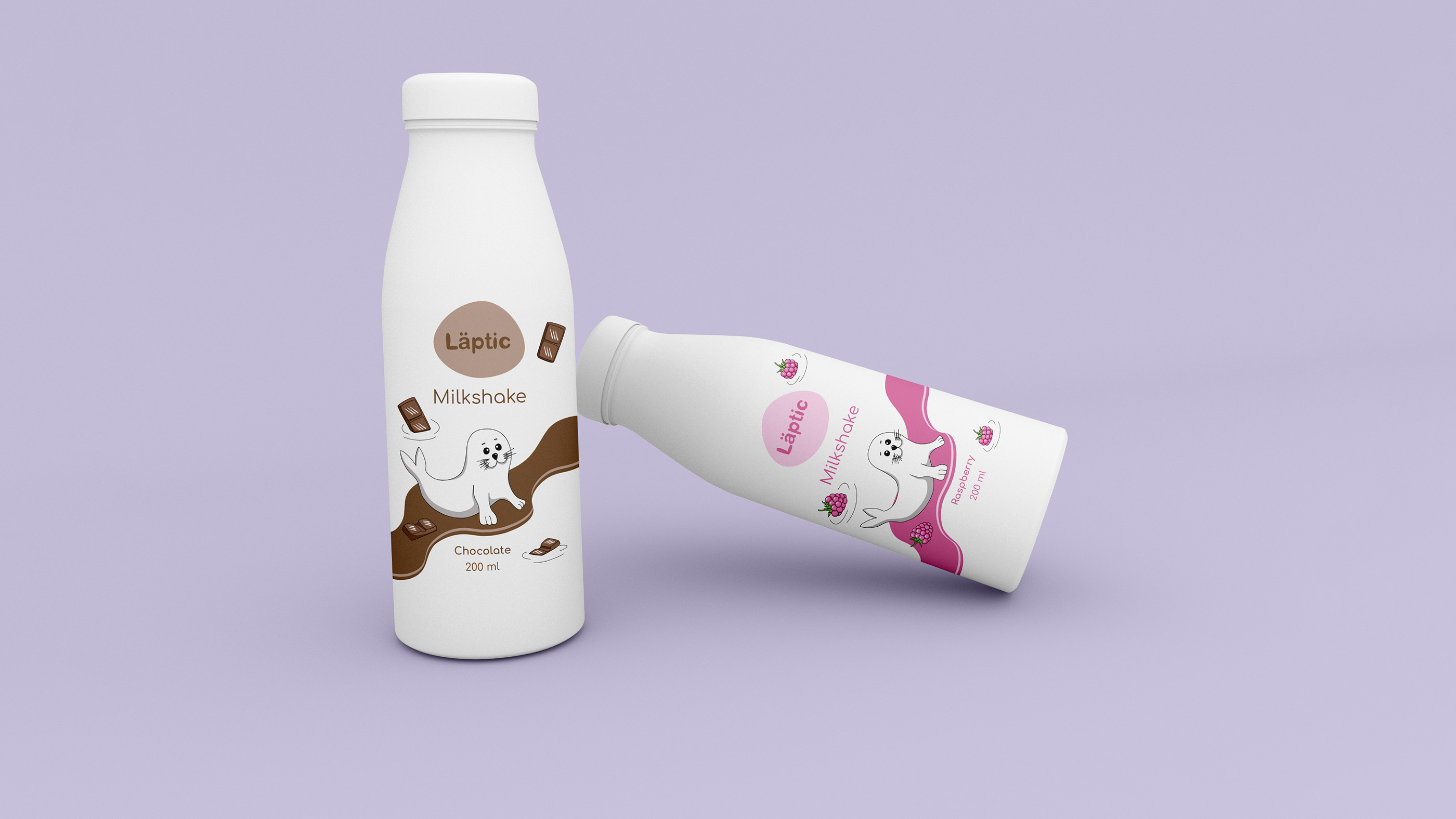
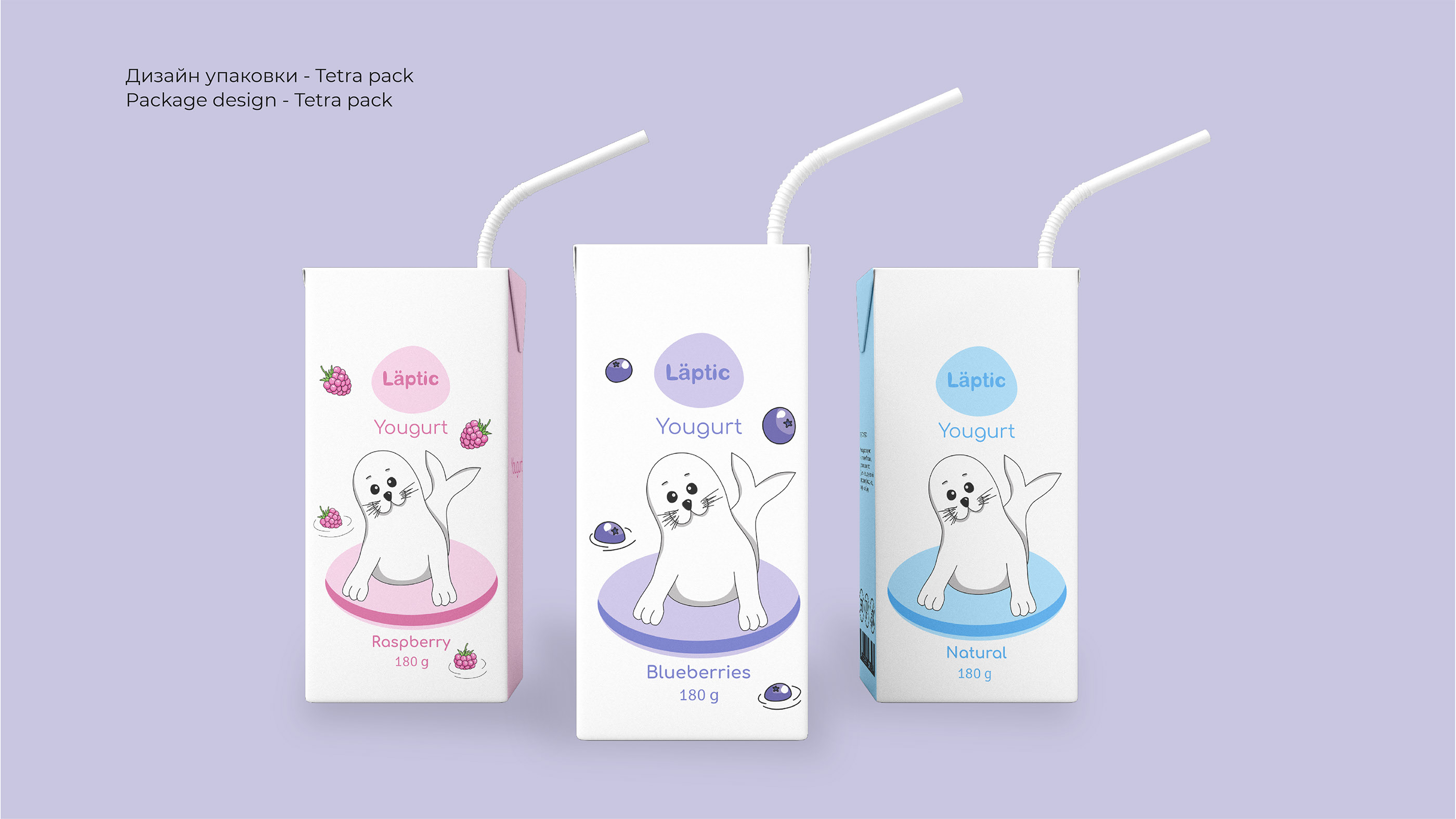
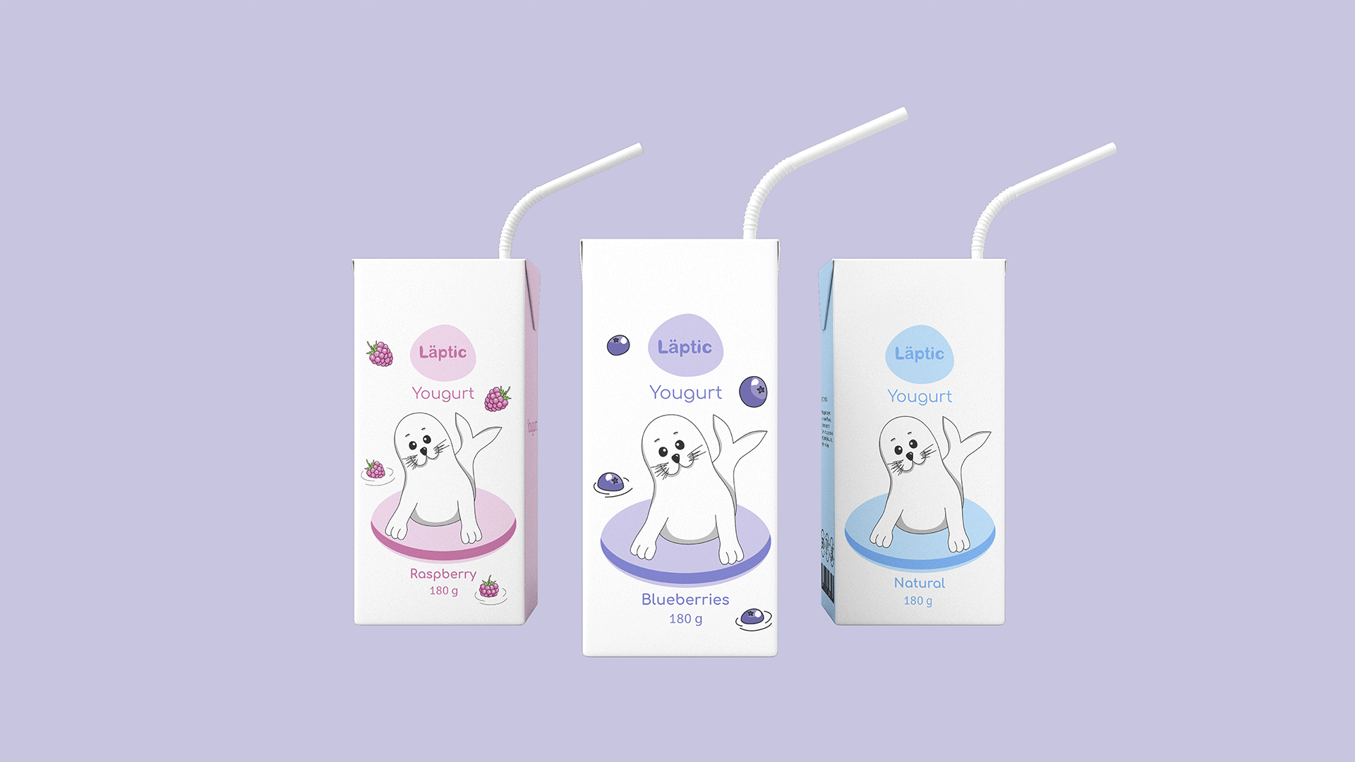
Разные вкусы молочных продуктов легко узнаются потребителем на полке в магазине благодаря уникальной дифференциации продуктовых линеек по цвету и вкусовой зоне.
EN
Different tastes of dairy products are easily recognized by the consumer on a shelf in the store due to the unique differentiation of product lines by color and their taste zone.
RU
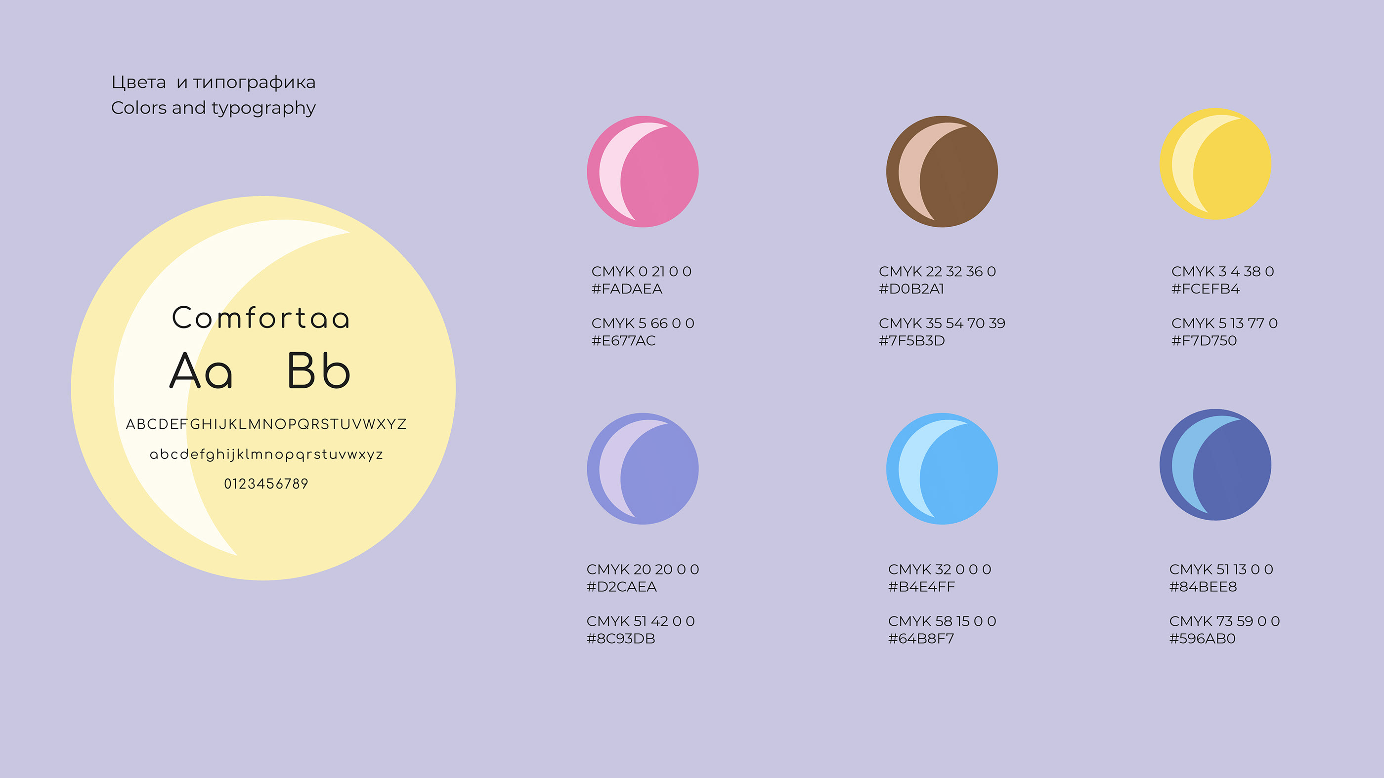
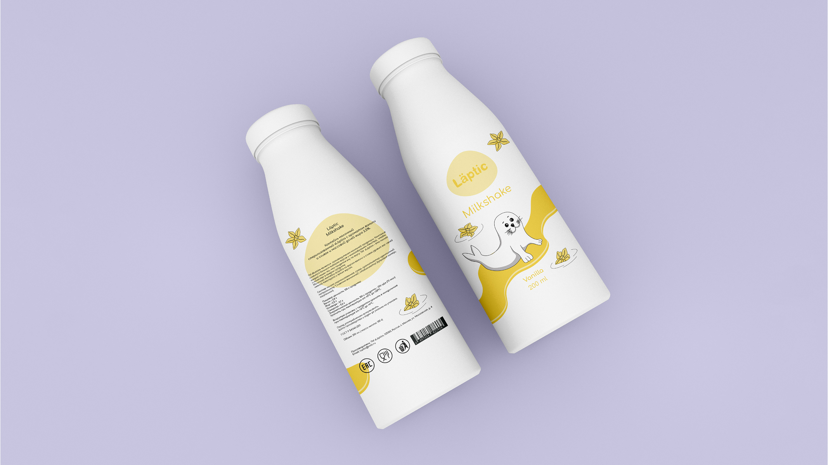
«Läptic» - это натуральный молочный продукт, подходящий как для взрослых, так и для детей.
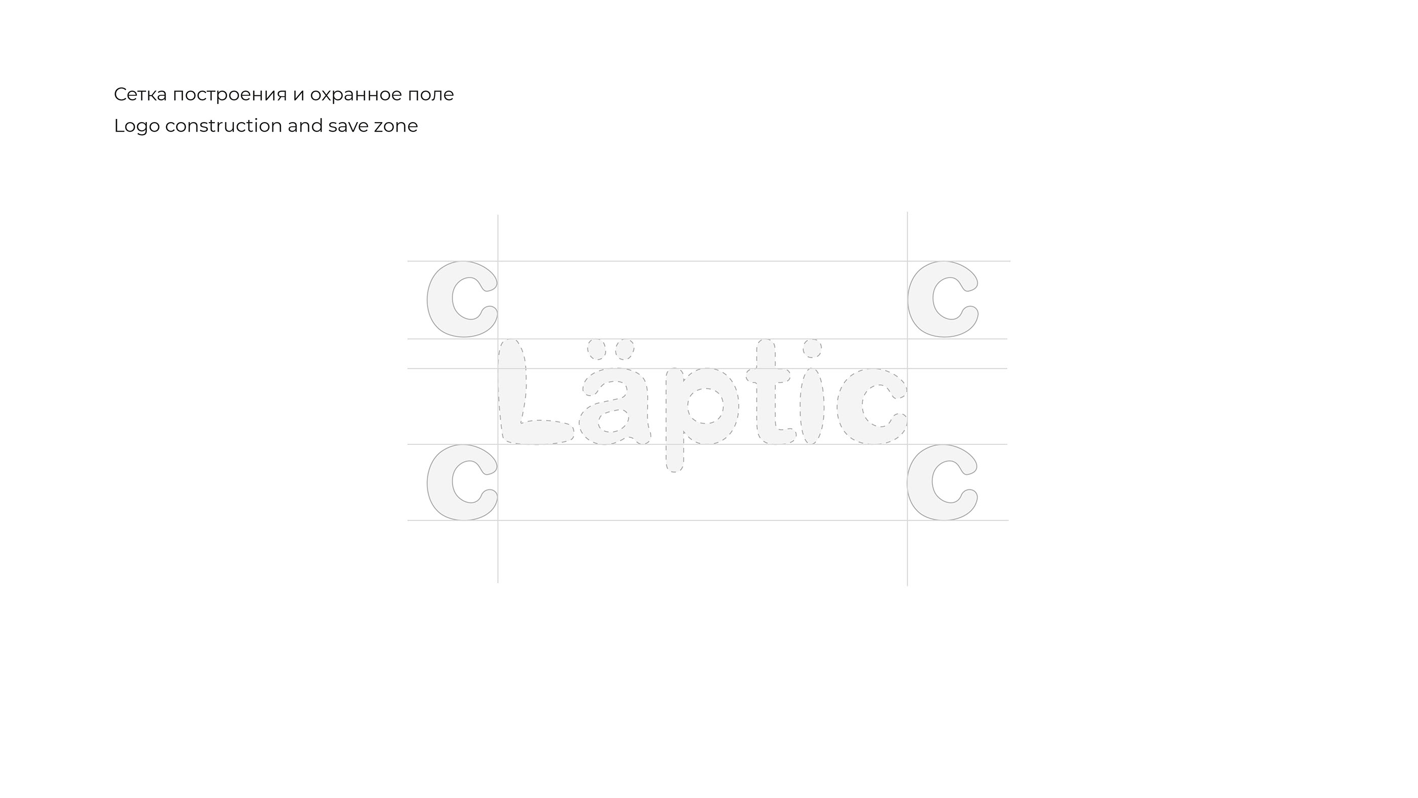
Что касается логотипа, то Läptic разработан шрифтом без засечек, чтобы представлять классические и современные бренды.
Изменив шрифт и добавив к букве а элементы глаз, чтобы придать каждому штриху свою уникальность, а также представить что-то естественное, свежее с фермы из детства.
EN
«Läptic» is a natural dairy product, suitable for both adults and children.
For the logo, Laptic is designed with Serif Sans typeface to represent classic and modern.
Changer font and added to the letter a elements of eyes - to giving each stroke its own uniqueness and also represents something natural, fresh from the farm of childhood.
RU
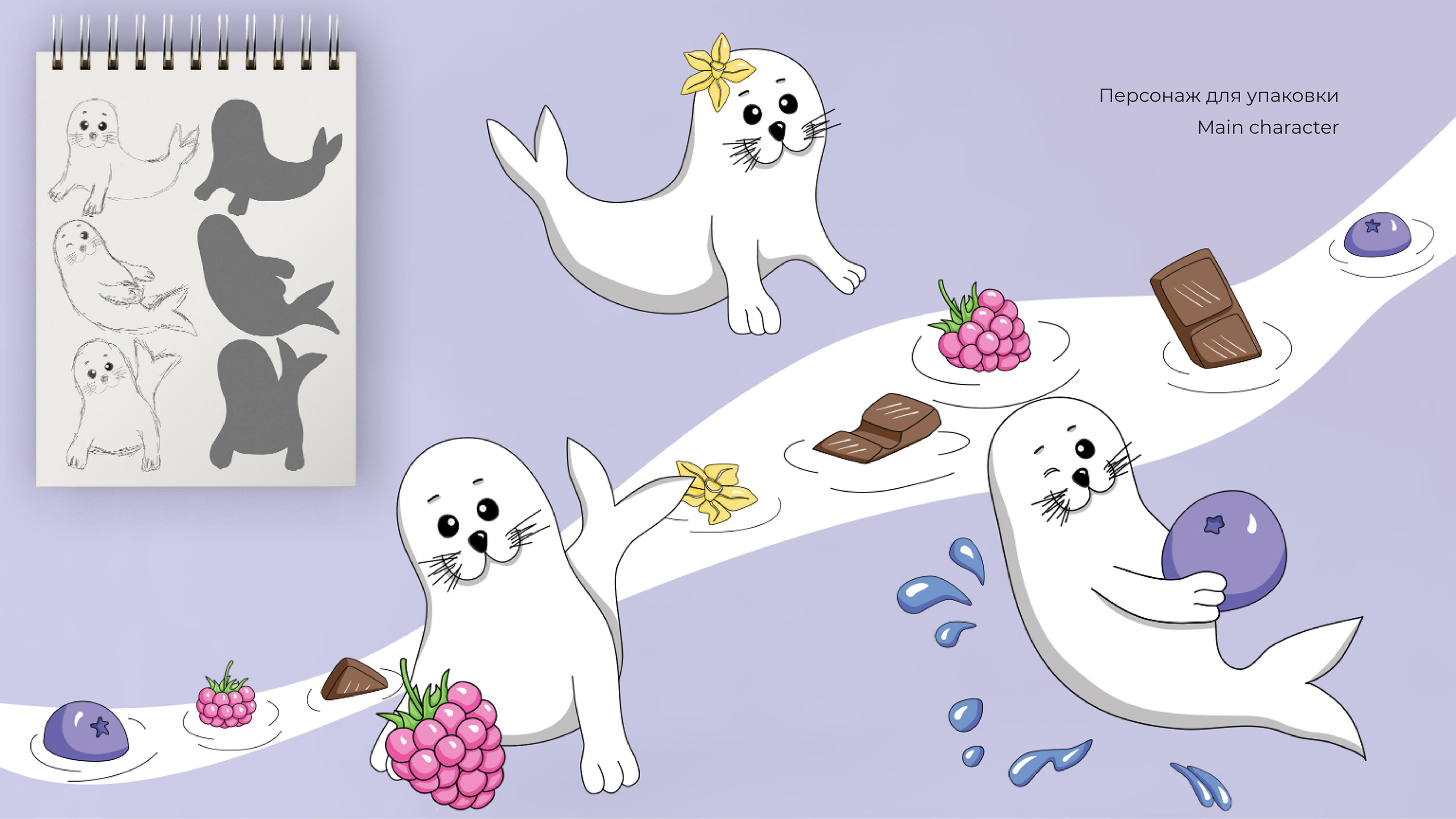
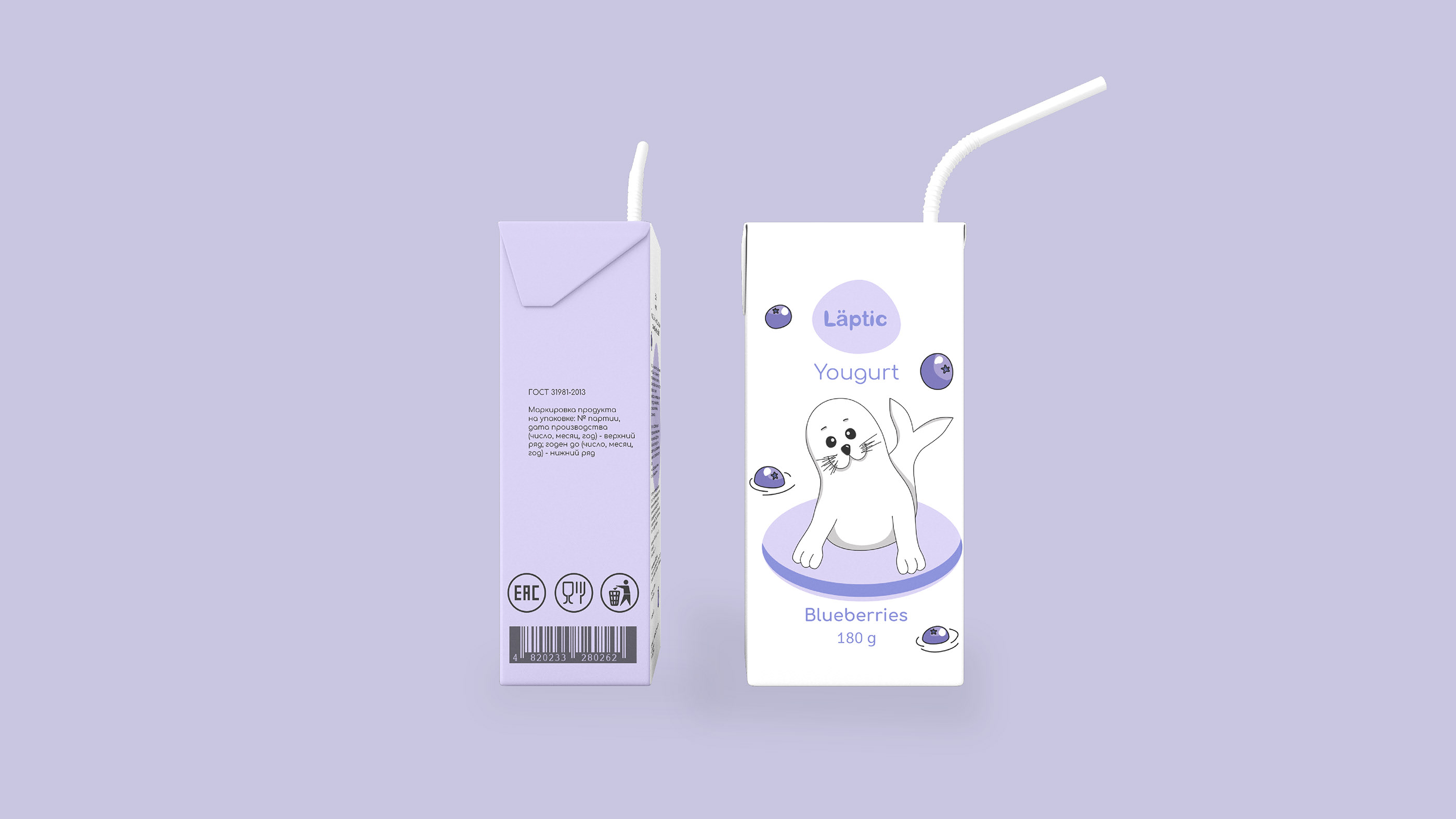
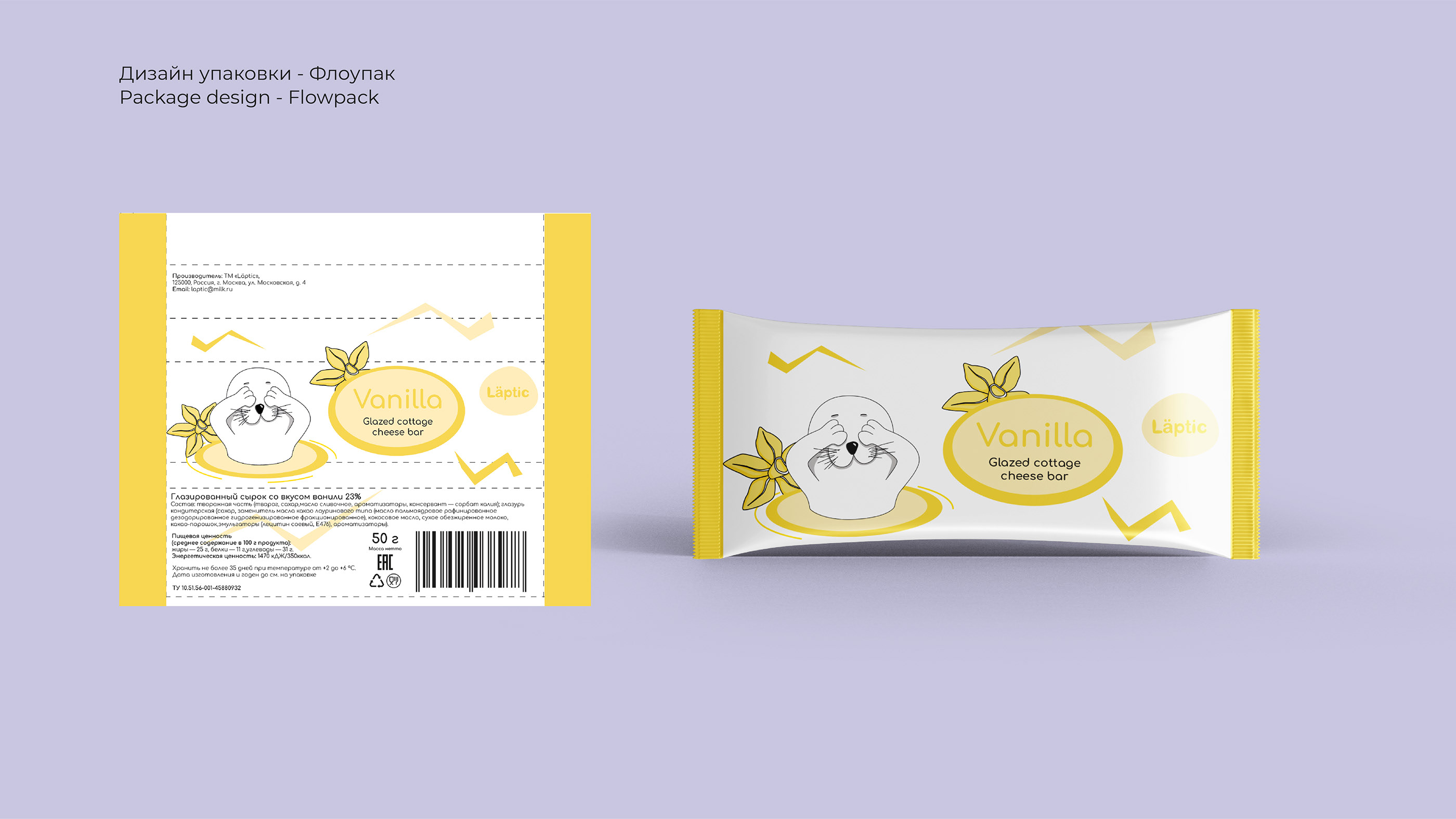
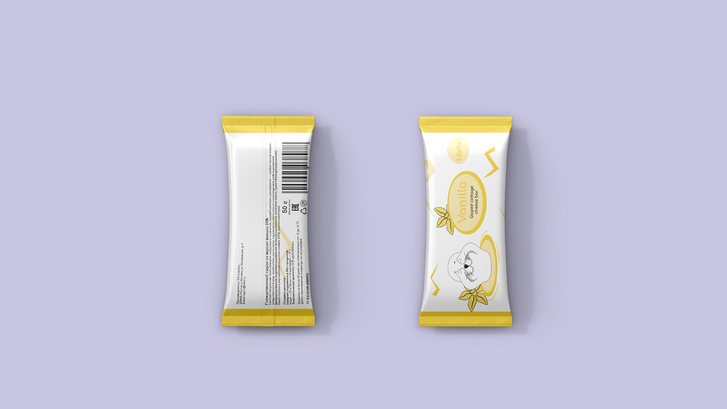
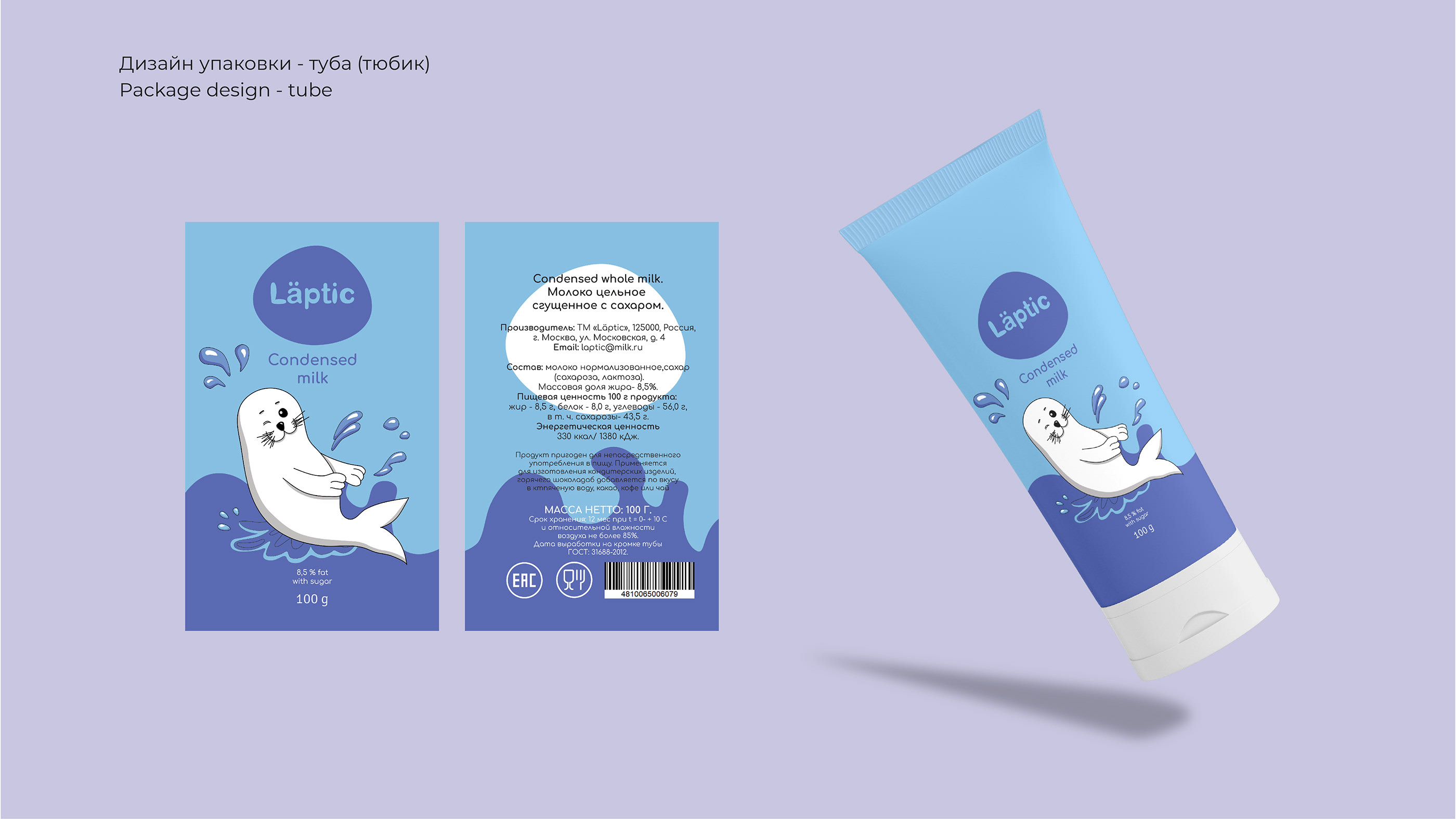
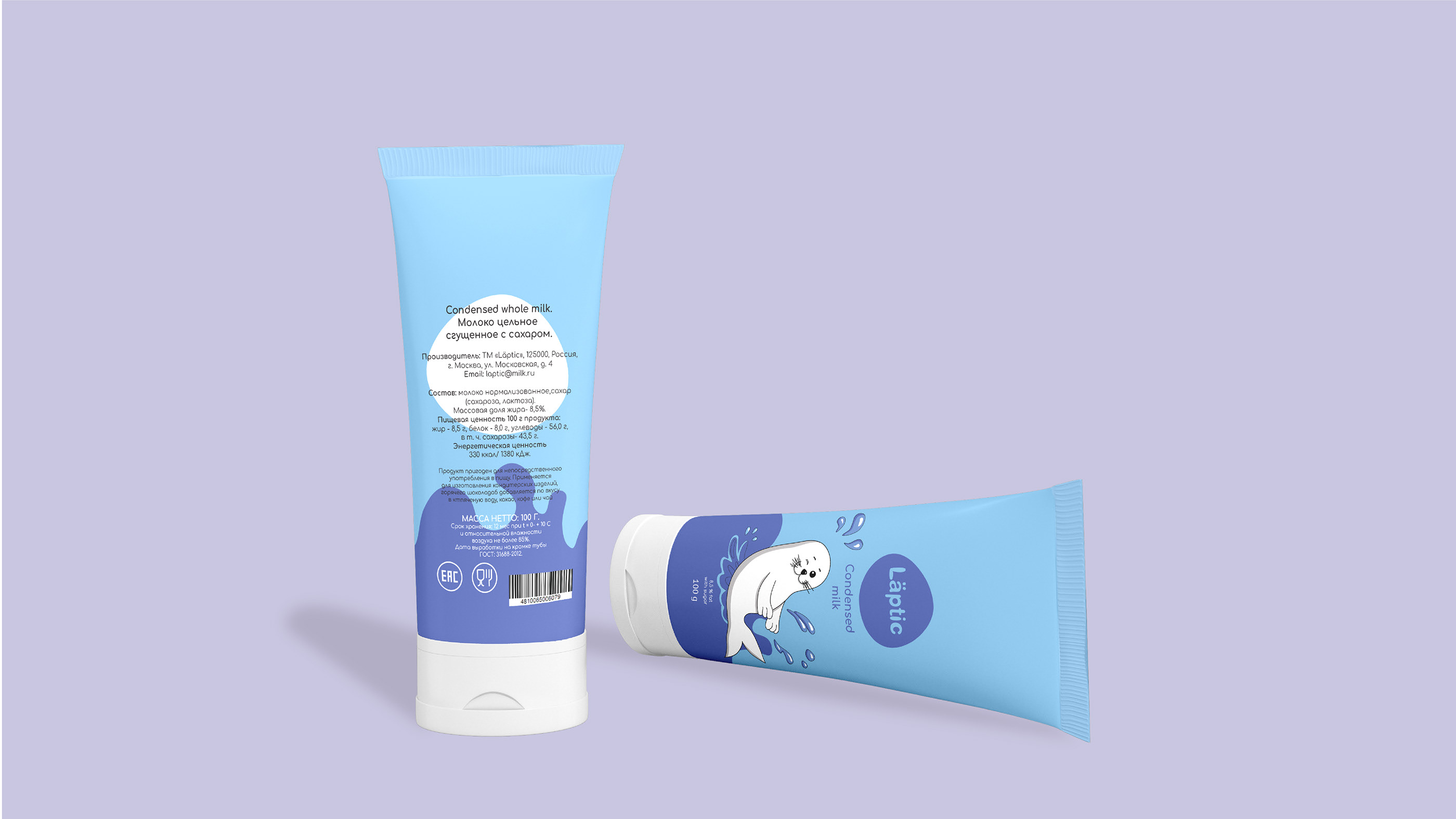
Бренд-персонажем стал малыш-нерпа.
Персонаж был изображён в четырёх позах для четырёх видов молочных продуктов: для молочного коктейля, йогурта, глазированного сырка и сгущенного молока.
Также были созданы вспомогательные иллюстрации для создания дизайна молочных продуктов разных вкусов.
EN
The baby seal became the brand character.
The character was depicted in four poses for four types of dairy products: for milkshake, yogurt, glazed cheese and condensed milk.
Auxiliary illustrations were also created to create the design of dairy products of different tastes.
RU
В сочетании с логотипом дизайн упаковки выглядит более классическим, но все же современным и минималистичным. В целом дизайн упаковки демонстрирует свое собственное ощущение, так что он имеет конкурентную дифференцирующую ценность при сопоставлении на полке с другими дизайнами упаковки конкурентов.
EN
Combined with the logo, the packaging design looks more classic, but still modern and minimalistic. Overall the packaging design displays its own sensation so that it has a competitive differentiating value when juxtaposed on the shelf with other milk competitor packaging designs.
СПАСИБО ЗА ПРОСМОТР!
Пишите, чтобы обсудить условия сотрудничества!
__________
THANKS FOR WATCHING!
I'm open for work write to:
Ala Kovacs-Avtushenko
Graphic designer
Telegram
Email: alla1987@mail.ru
Instagram @alakovacs_designer
Vkontakte
Yuliya Volkova
Illustrator
Telegram
Email : volkovayuv@bk.ru
Instagram @yuliyavolchok
Vkontakte