About the company
The company is engaged in the implementation of automation systems. It becomes clear to the client what works in the business, what does not, what brings money, what does not, who brings money, who does not. Really important indicators become "digitized", and therefore manageable. Working with data itself becomes easier, since Tigratika automates routine actions that take a lot of manual work, and we save employees ' time.
Why a tiger?
The image of the tiger, embedded in the name, perfectly formed the character of the agency: frisky, full of energy, bold, proactive, etc. Tigratika does even large projects quickly, because everyone in this team is a tiger.
About the logo
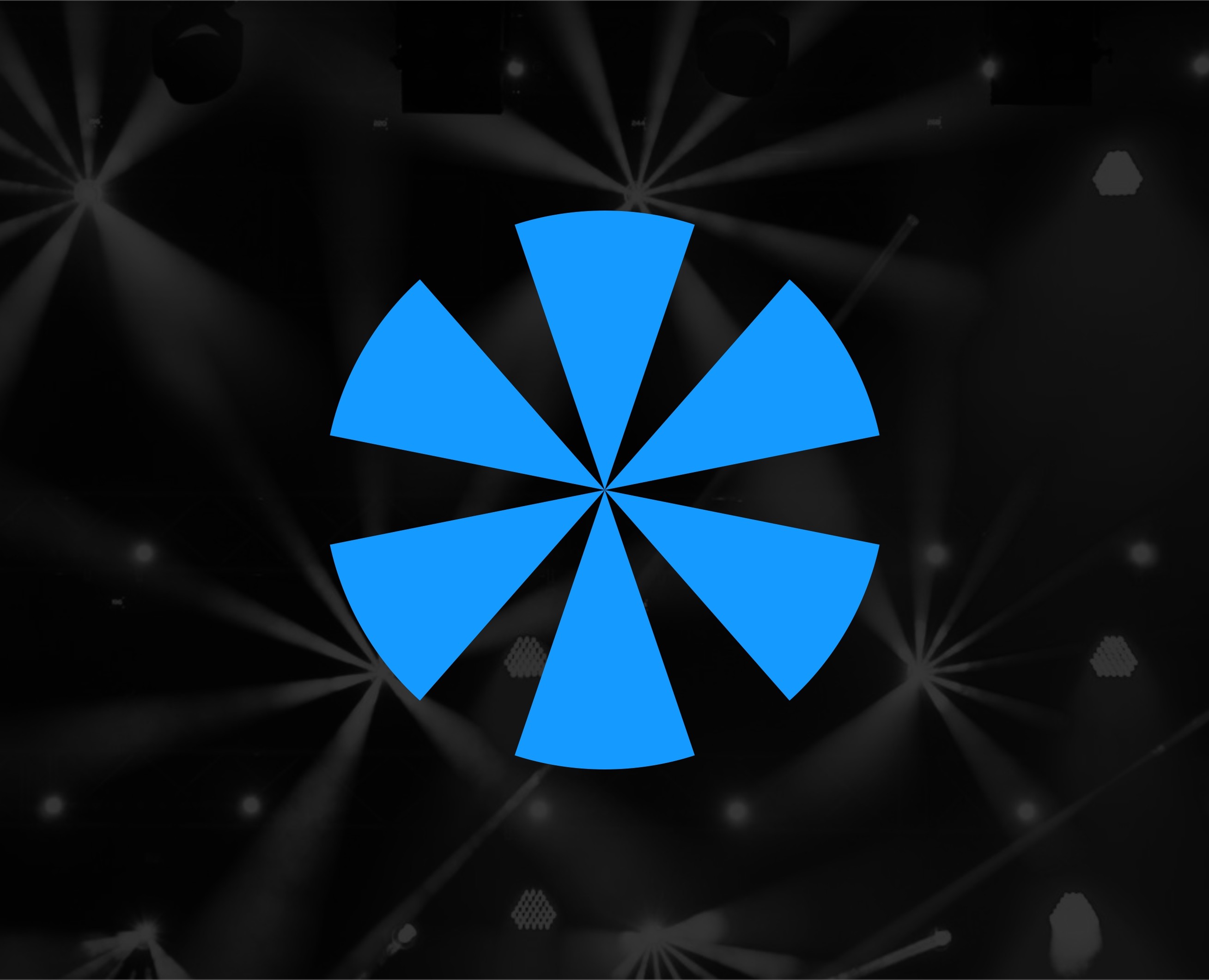
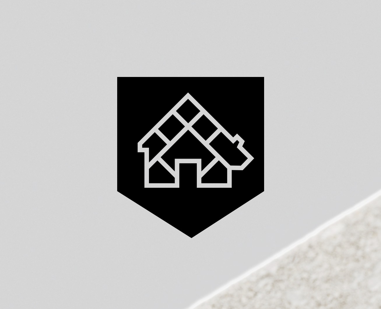
The logo is based on a combination of arrows, each of which symbolizes one of the company's activities: E-commerce, Analytics, Estate. The arrows converge at one point and form a strong, reliable shape of the letter " T " from the name Tigrarika. The arrow combinations resemble the striped color of a tiger, on the prototype of which the entire branding is built. The arrows symbolize movement, dynamics and a constant process of change for the better. They are co-directed and directed to one point — to achieve a meaningful result. The" result " in the architecture of the logomark is symbolized by such a stable figure as a square. The square is inverted at 45 degrees, which means the company's ability to flexibly fit into any circumstances.