VEB.RF | Visual Identity
[ Проект выполнен в рамках задач в агенстве бренд-медиа «Палиндром» ]
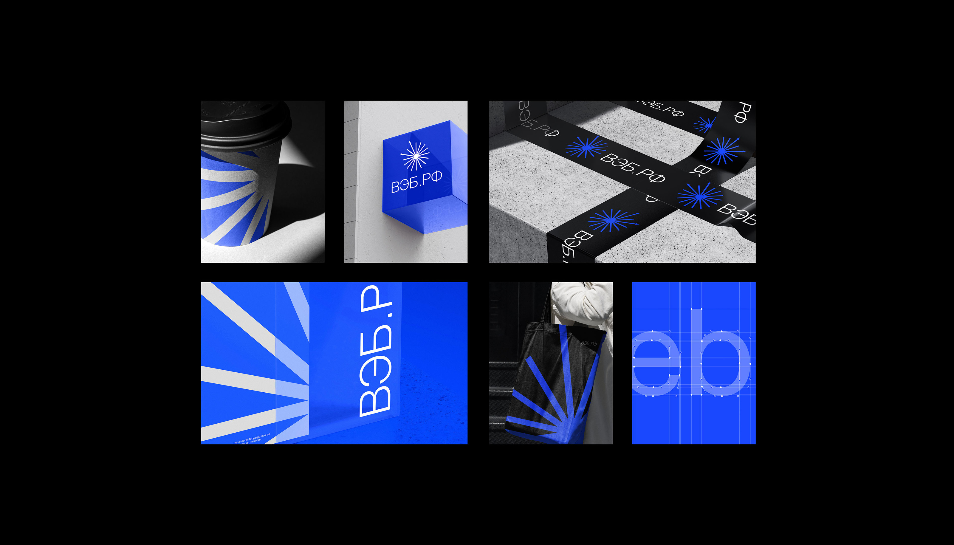
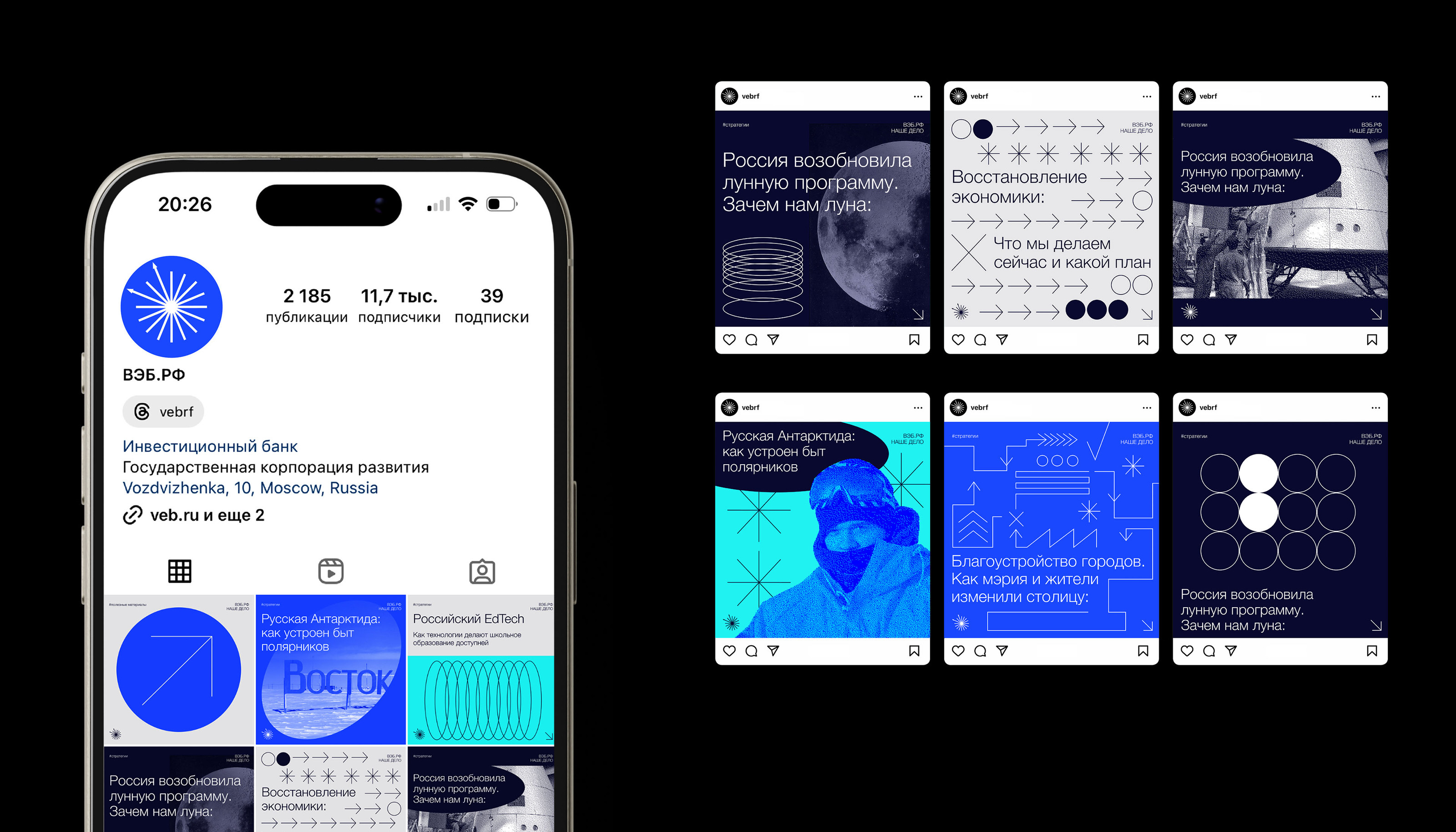
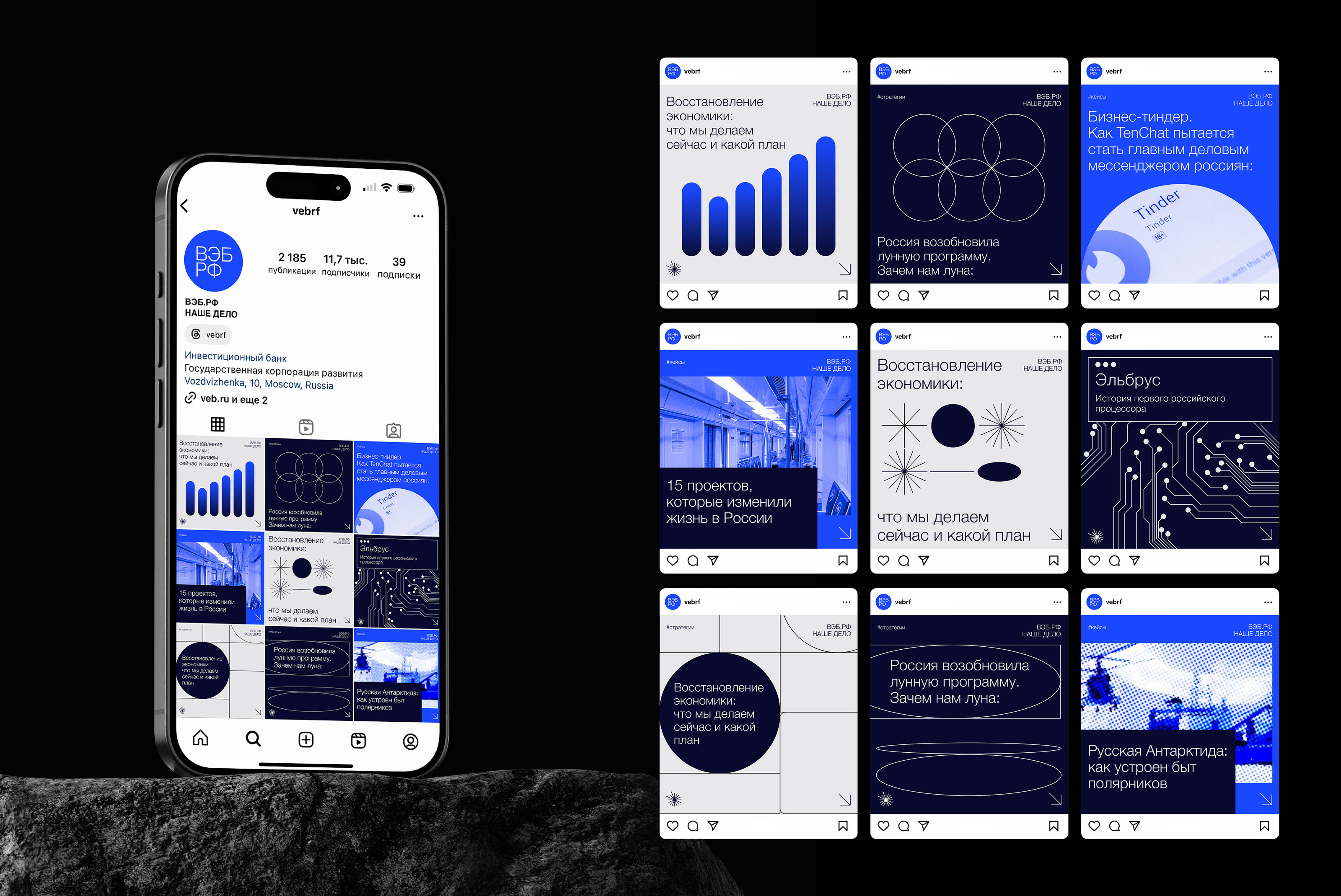
ВЭБ.PФ — госкорпорация и главный институт развития страны, который объединяет все институты развития: Сколково, Роснано, РЭЦ, Корпорацию МСП и другие. ВЭБ.PФ инвестирует в большие проекты по развитию инфраструктуры, промышленности, ЖКХ, экспорта и предпринимательства. Наше дело — это часть ВЭБ.PФ, медиа всей группы развития, объединяющей организации развития страны
Задача:
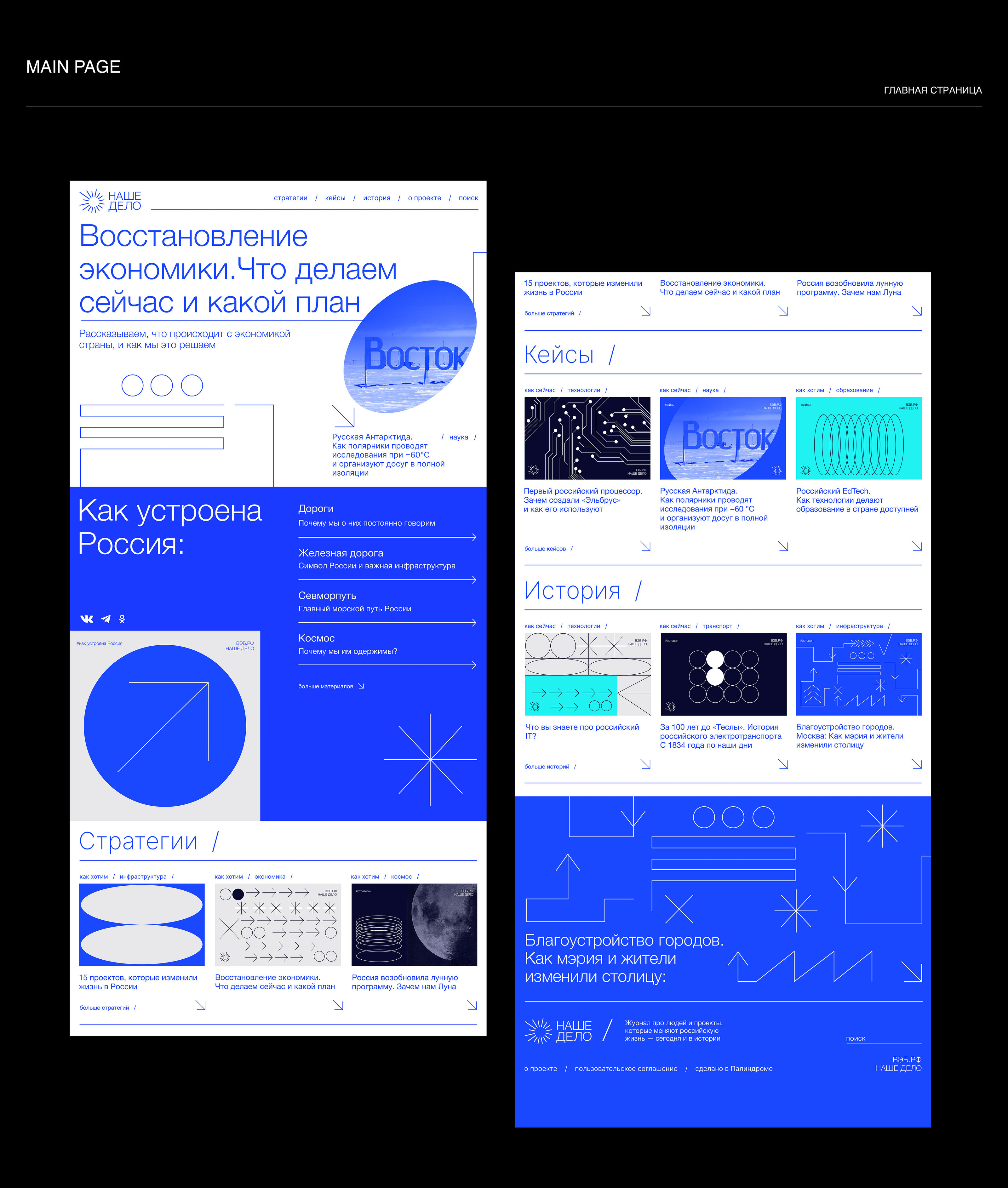
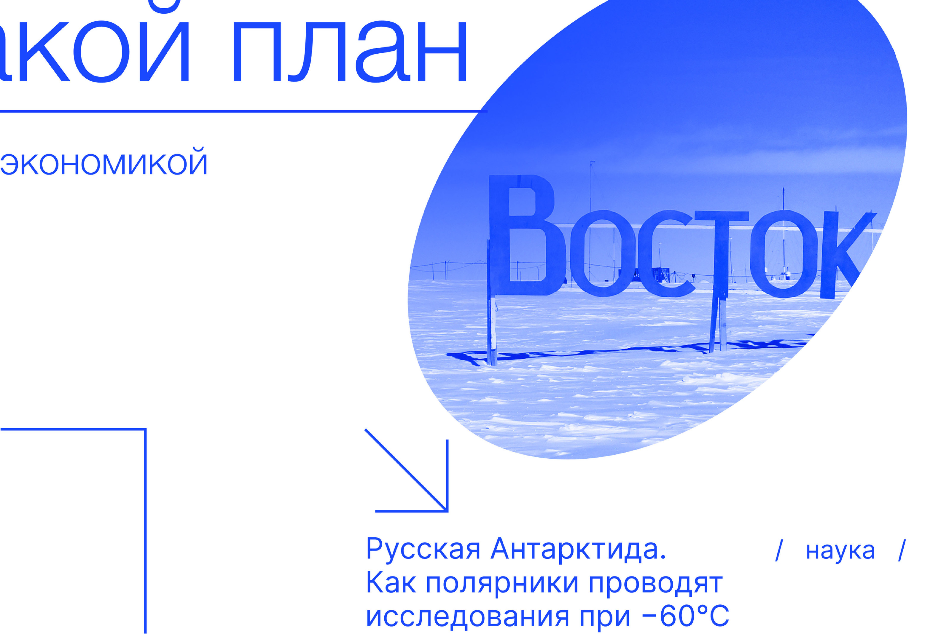
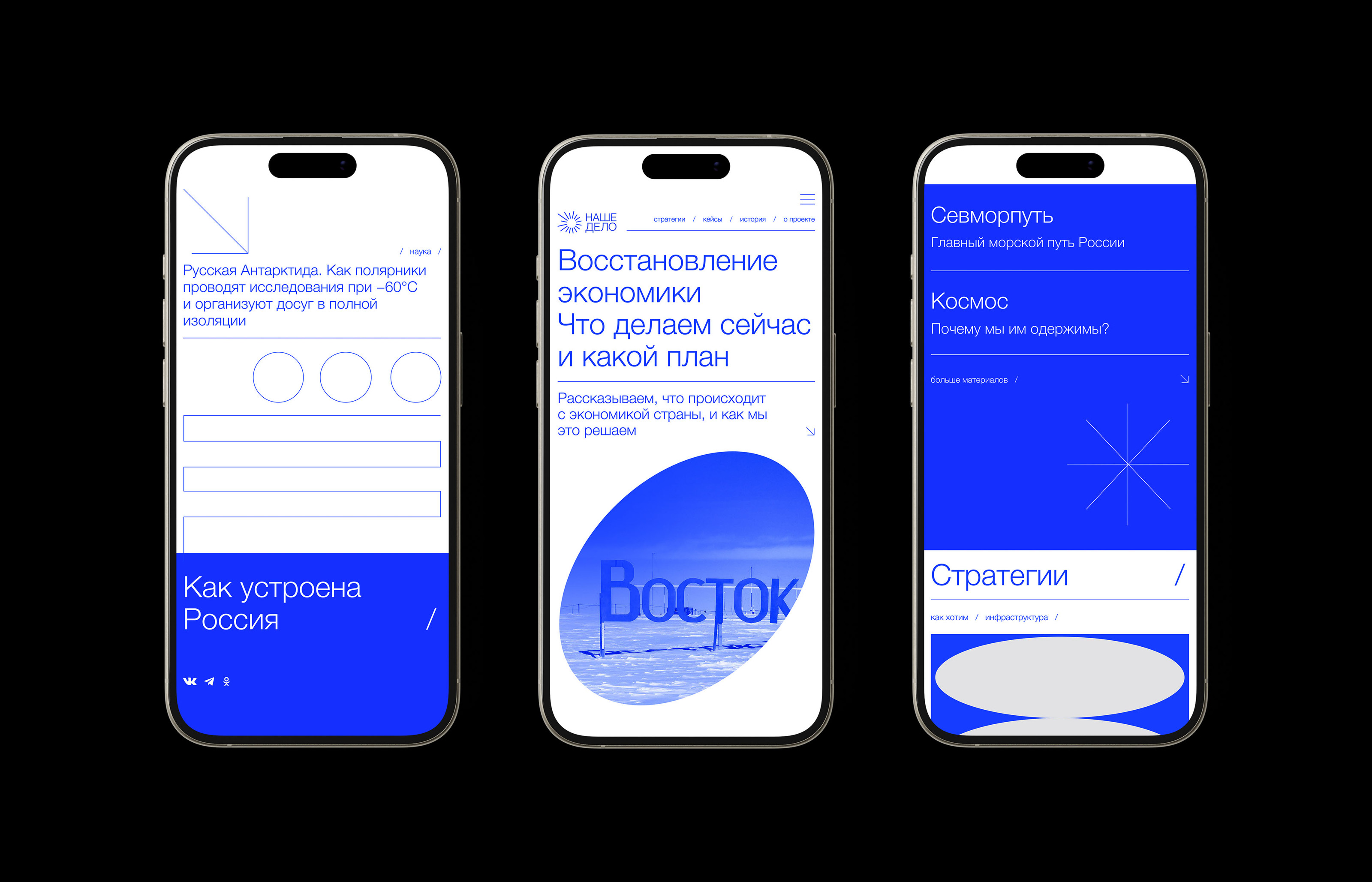
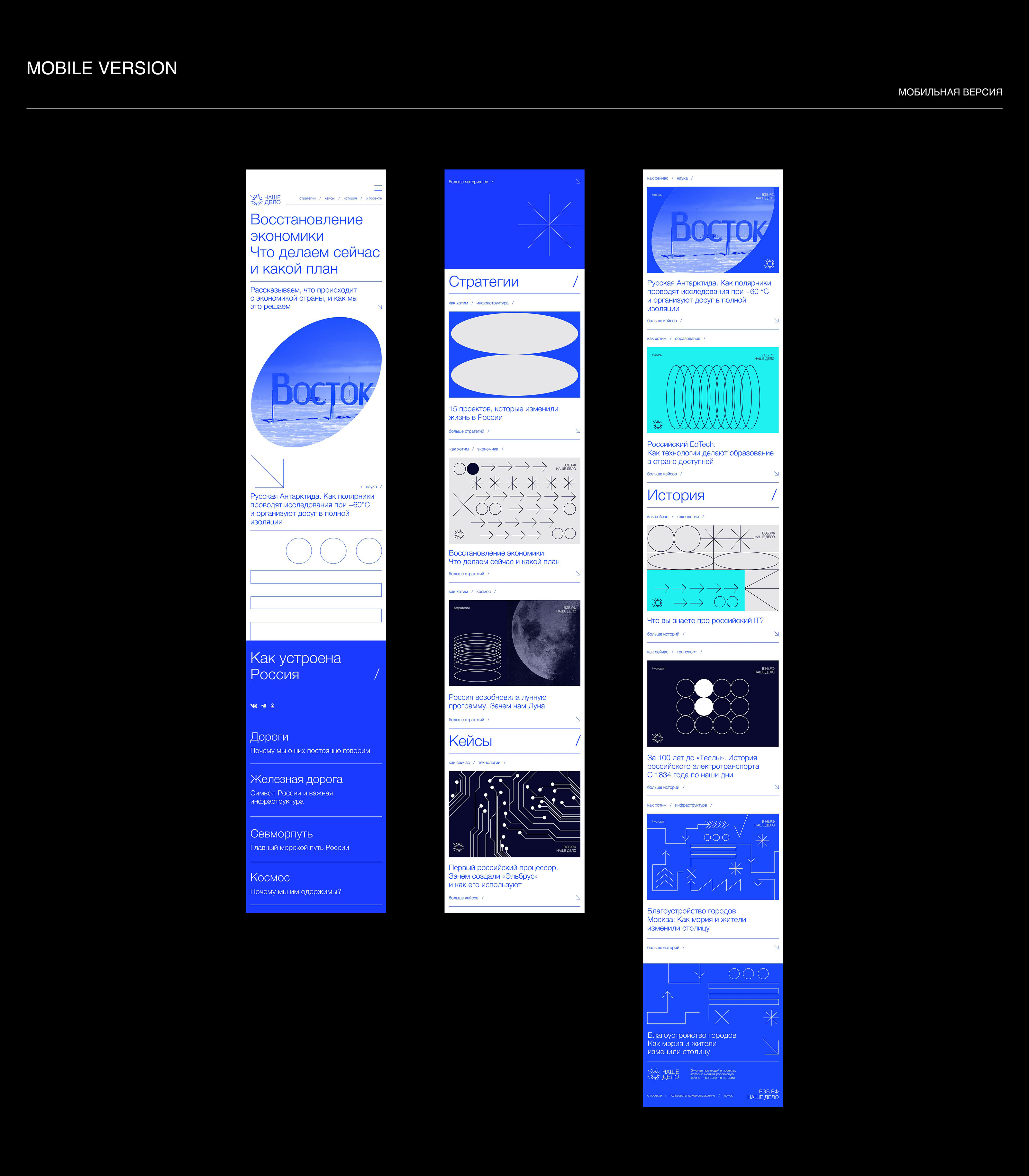
Создать бренд-медиа компании ВЭБ.PФ: разработать фирменный стиль, логотип, сайт и соцсети. Визуал бренд-медиа должен отличаться от строгой и официальной айдентики. Чтобы «приземлить» государственные проекты на реальную жизнь и человеческий язык — сделать коммуникацию понятной и дружелюбной
Решение:
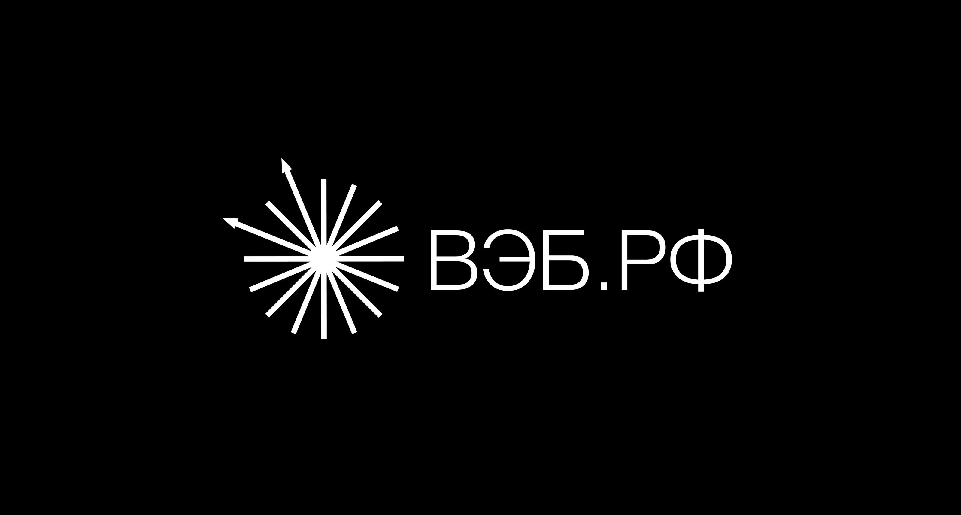
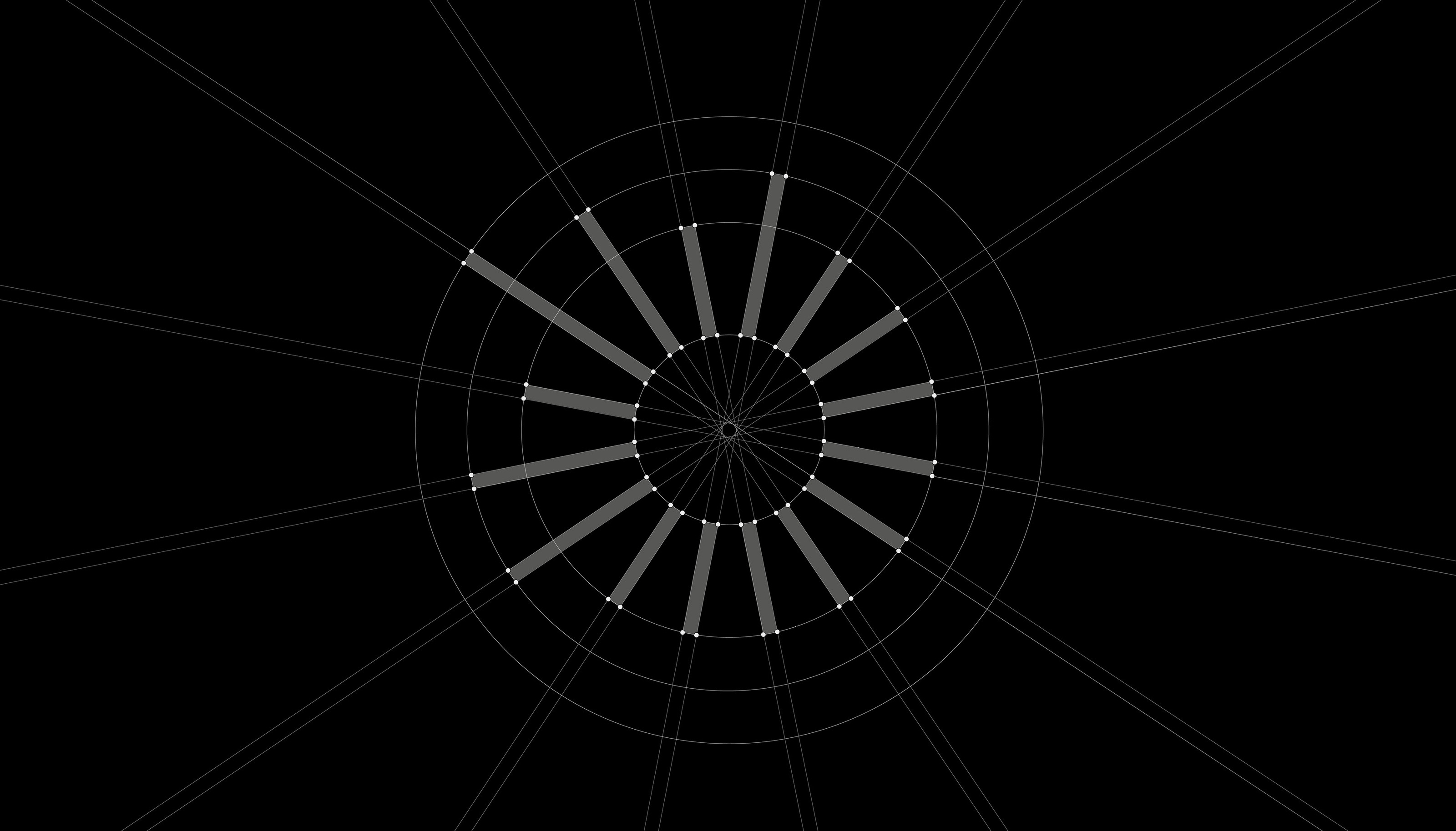
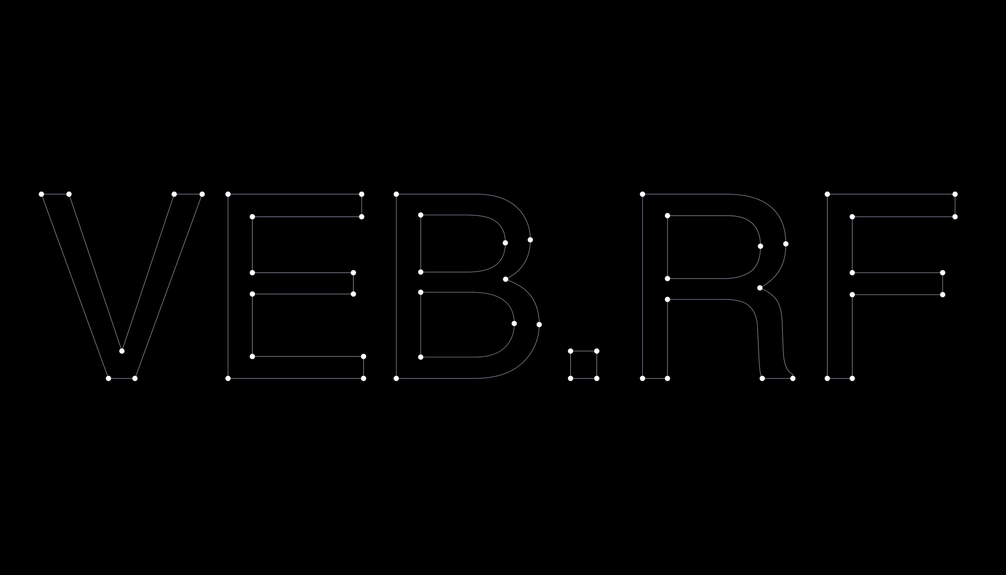
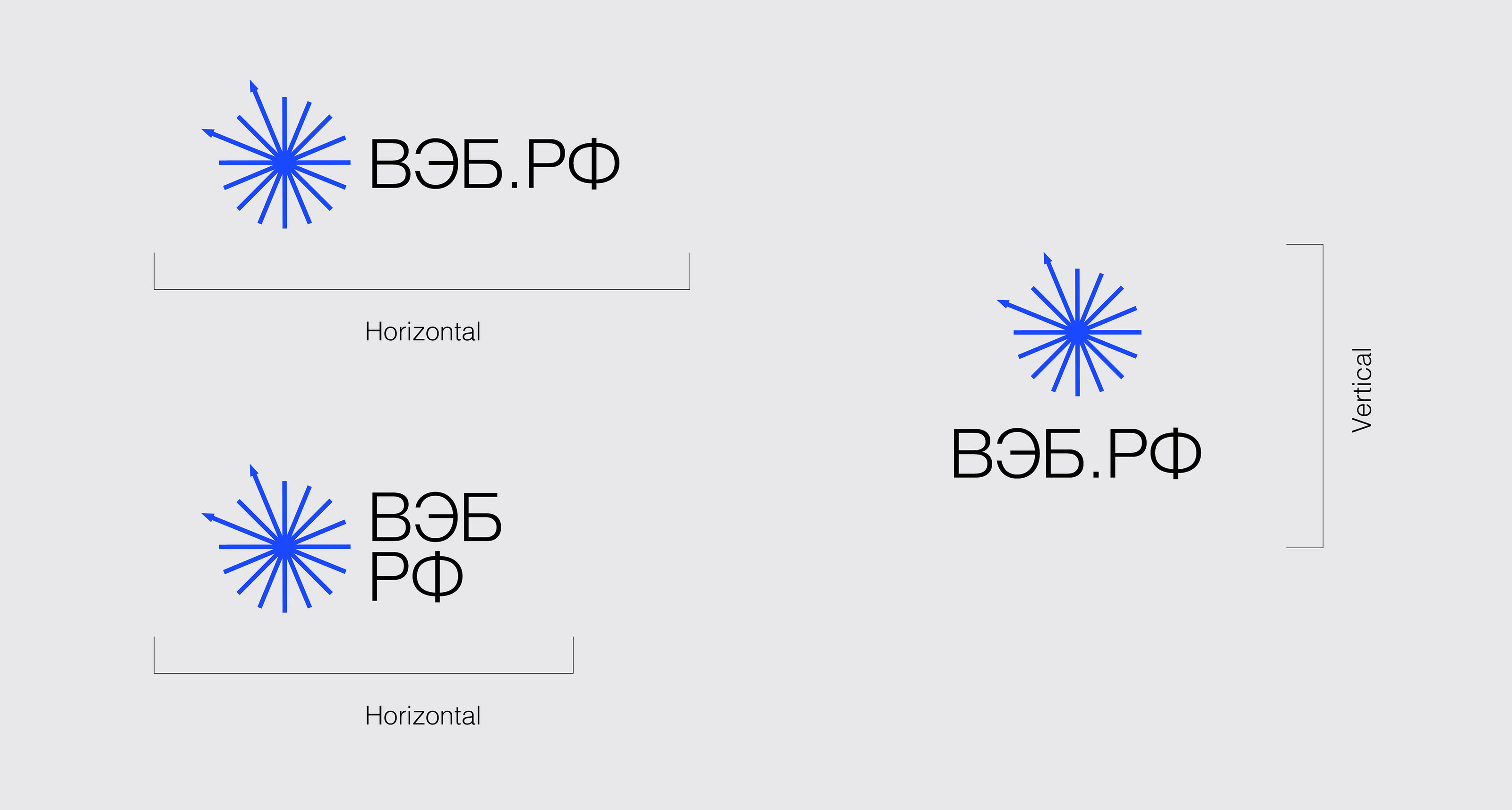
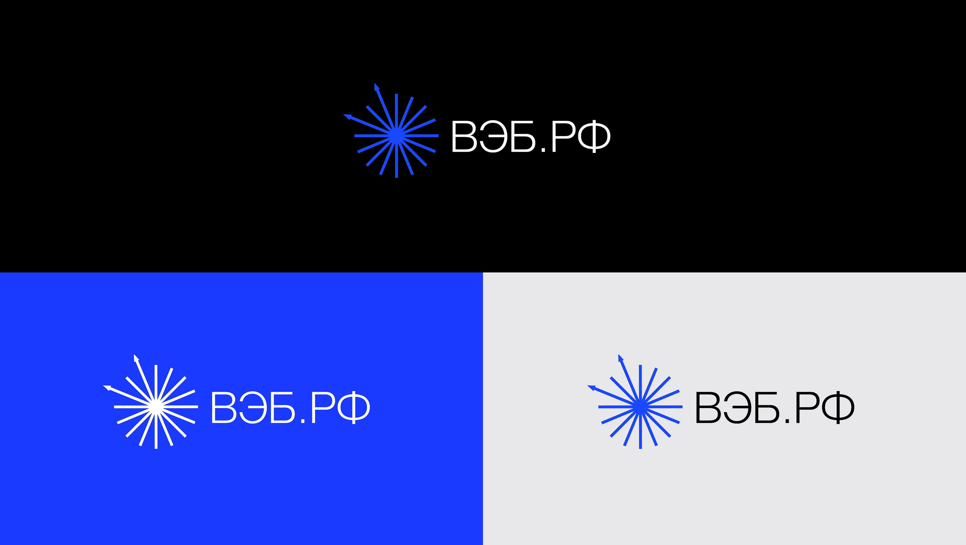
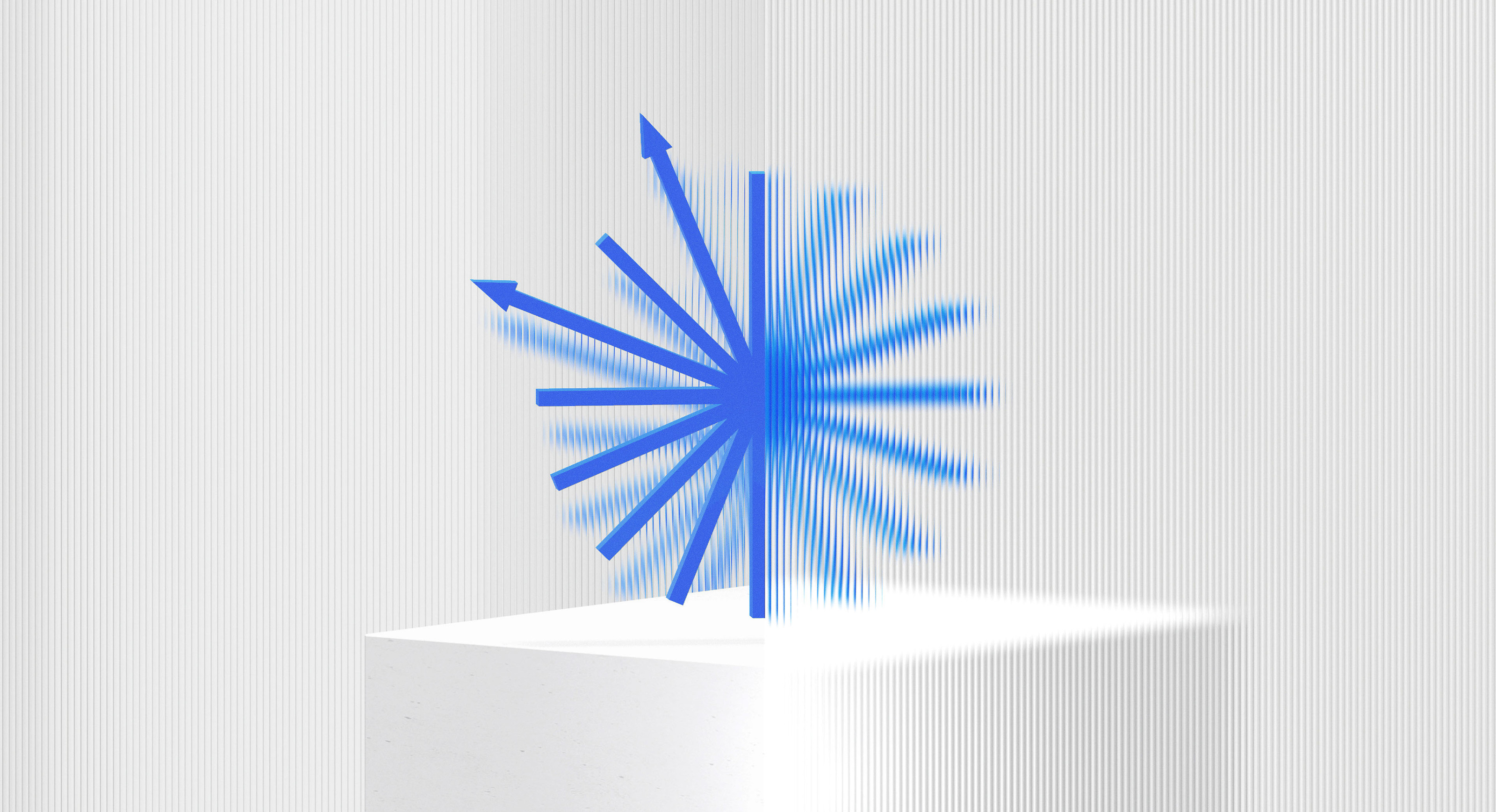
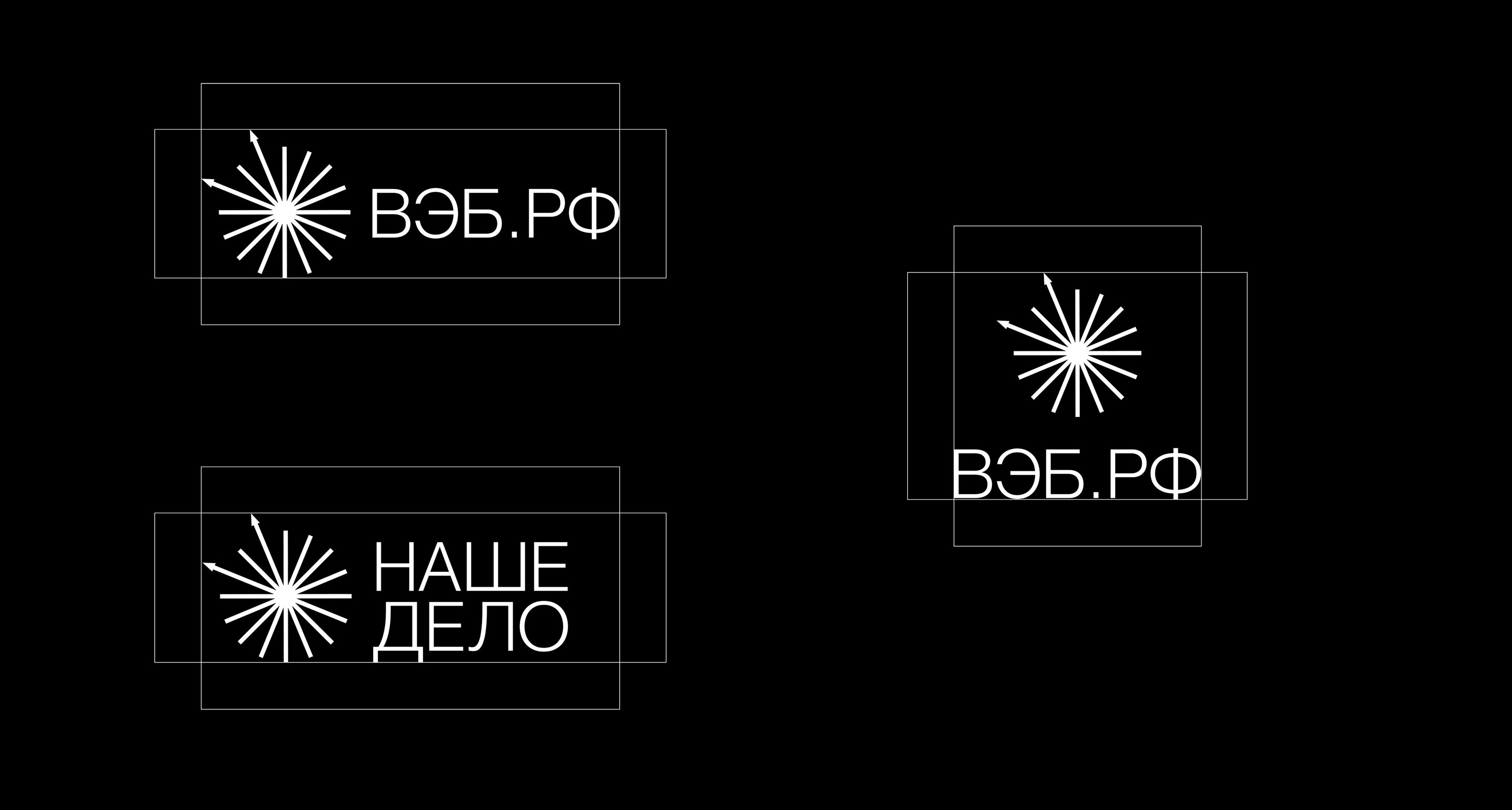
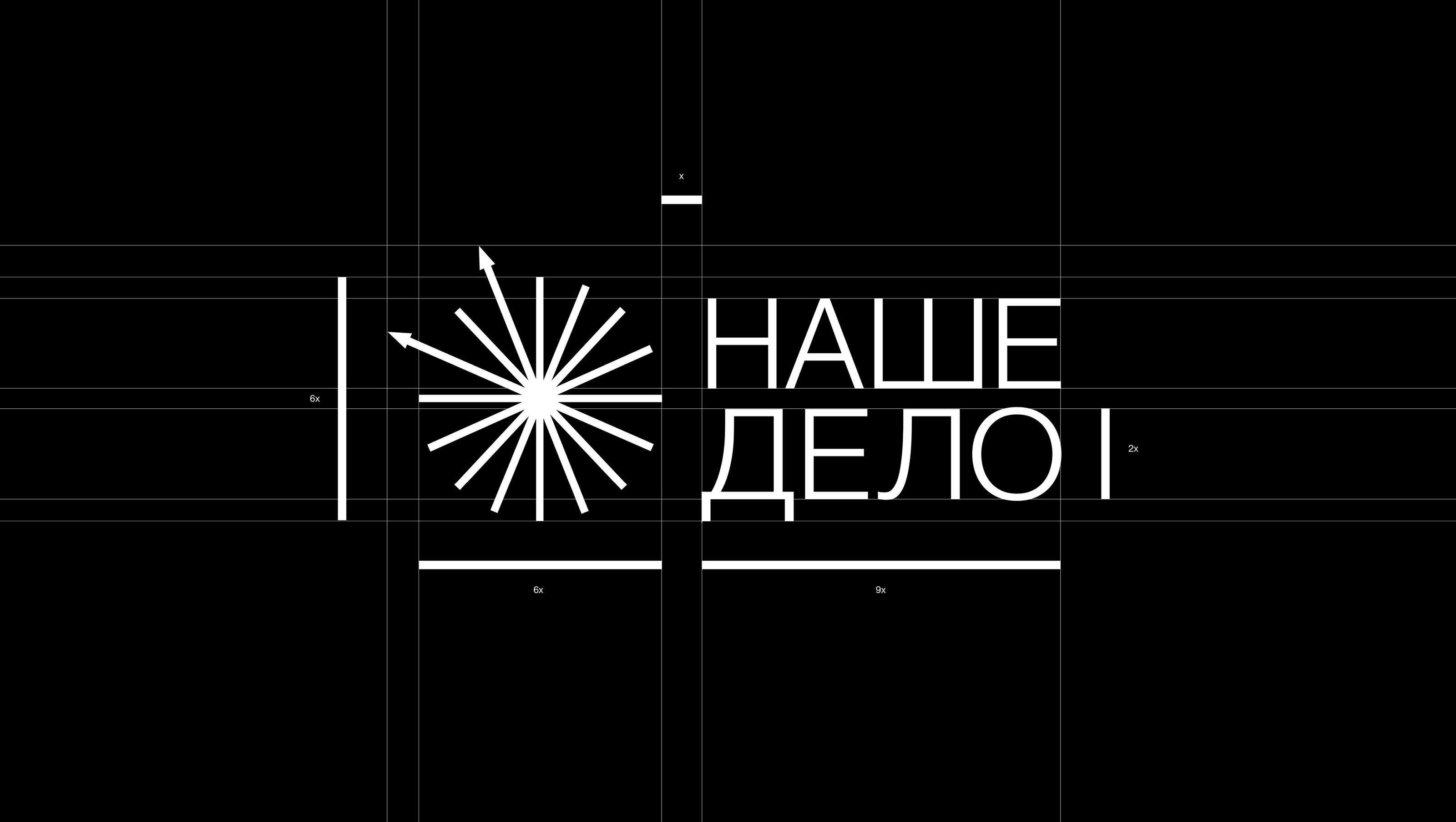
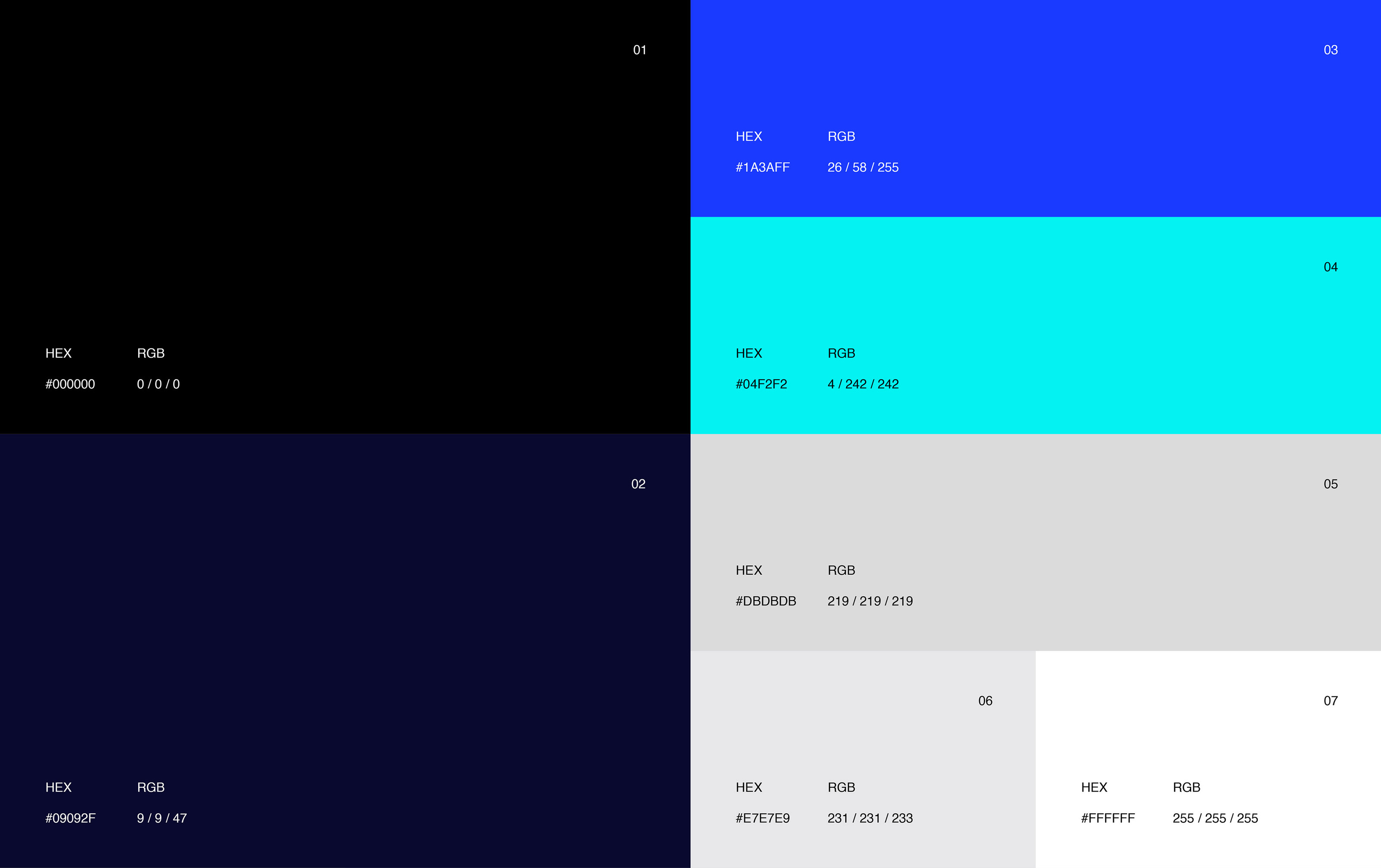
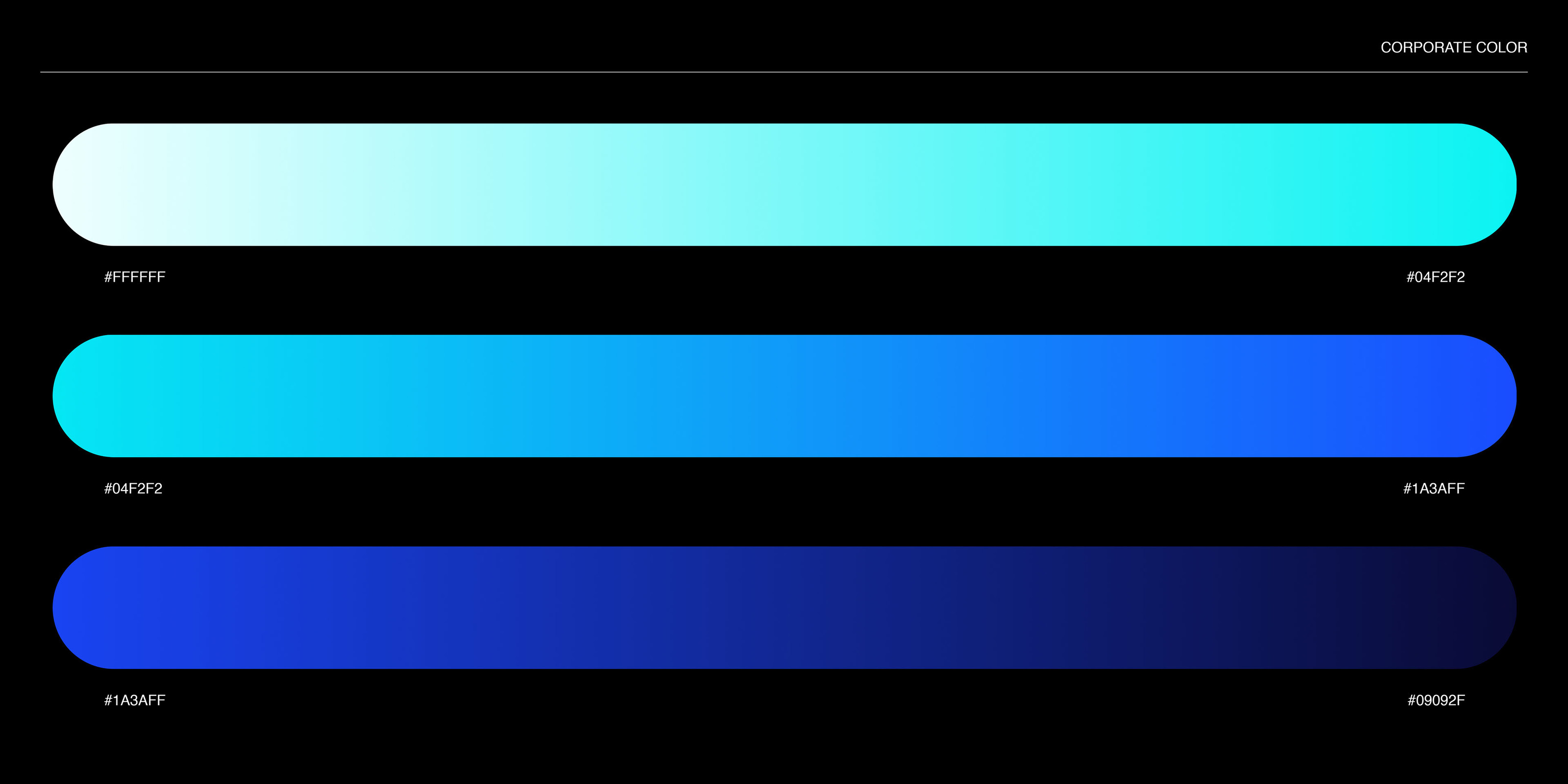
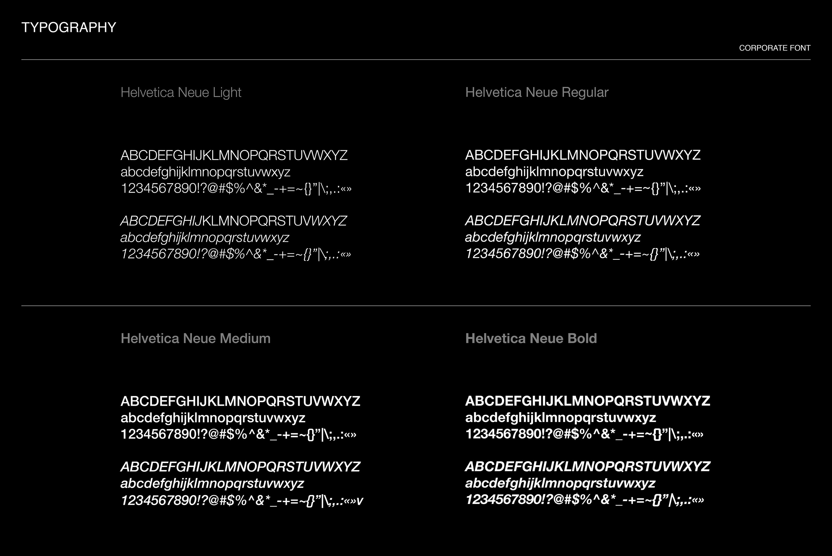
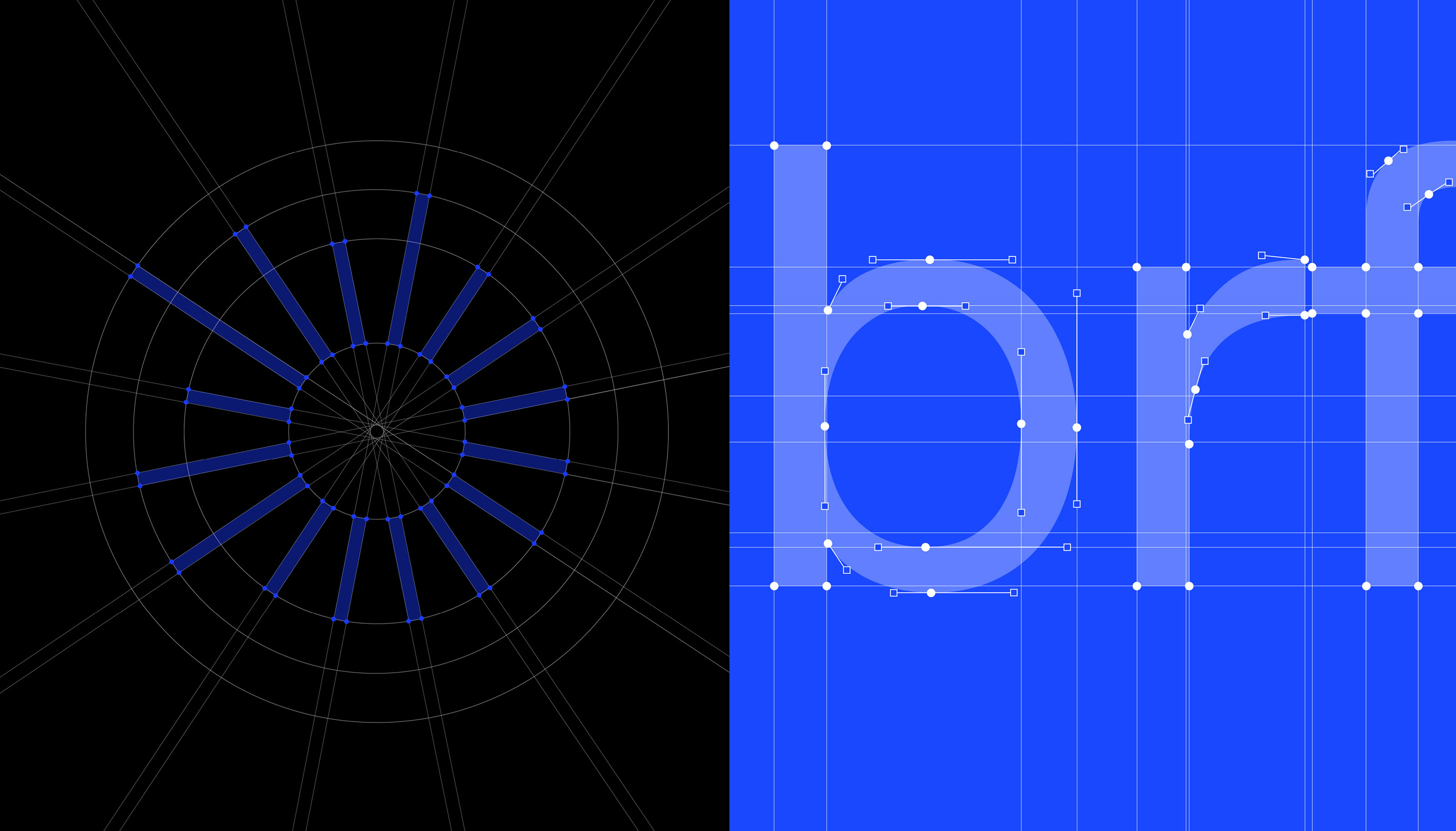
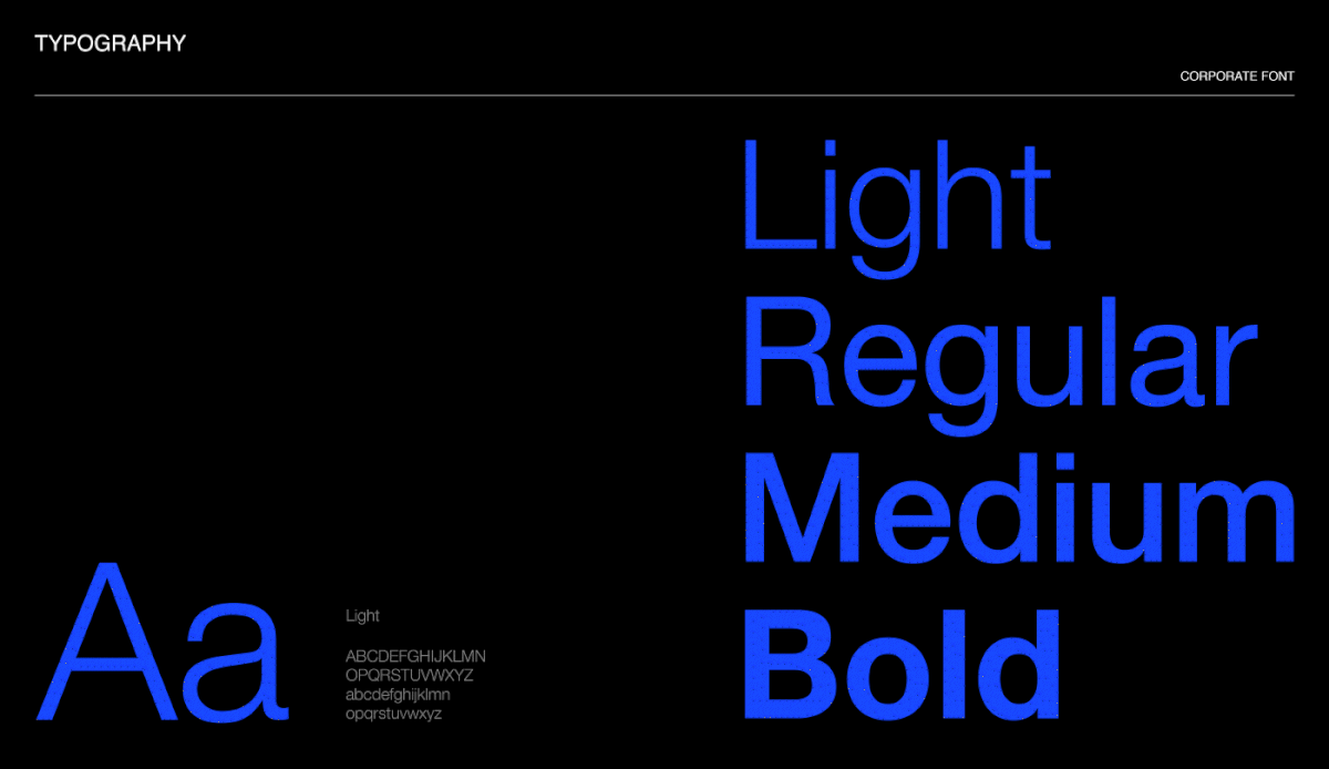
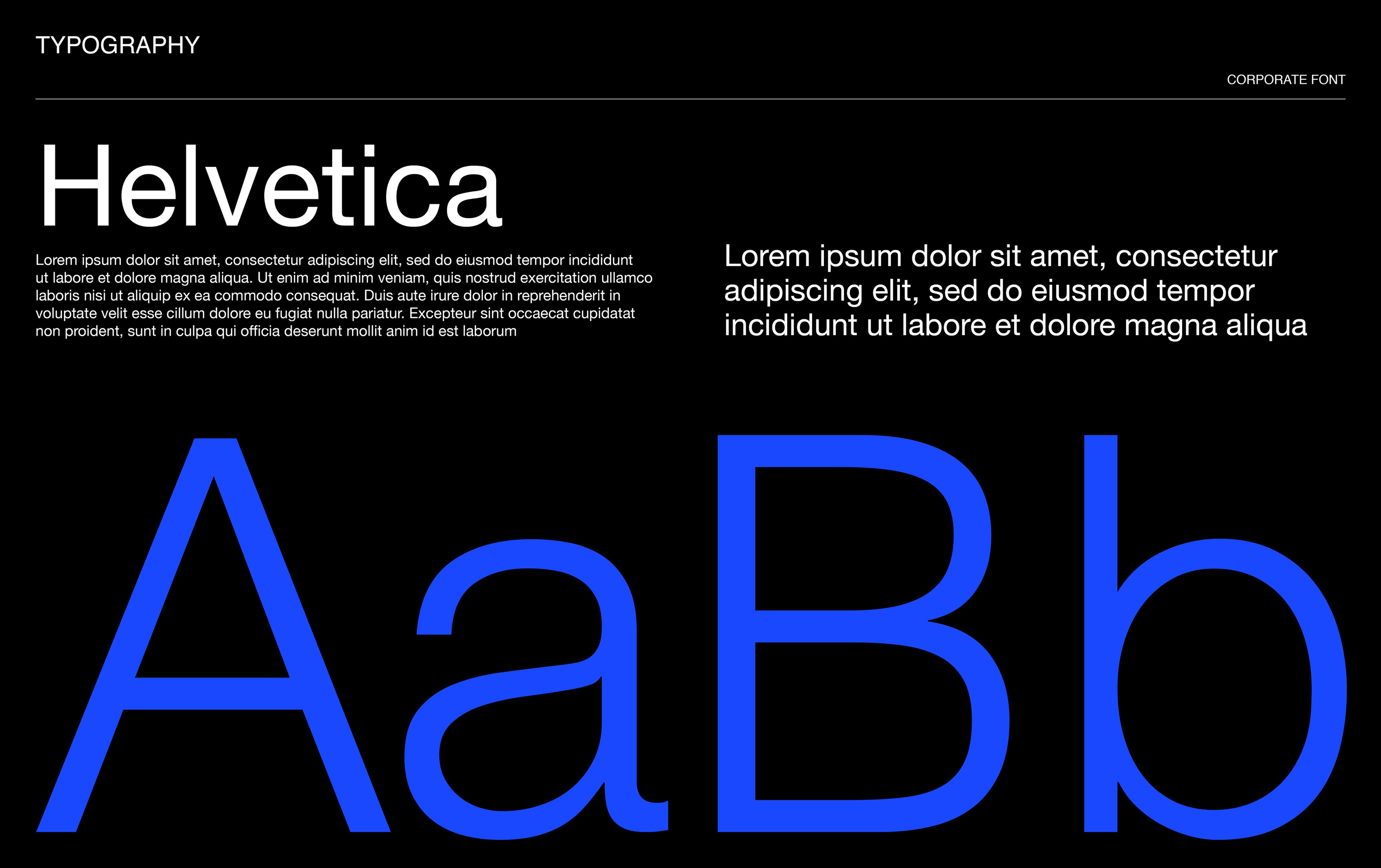
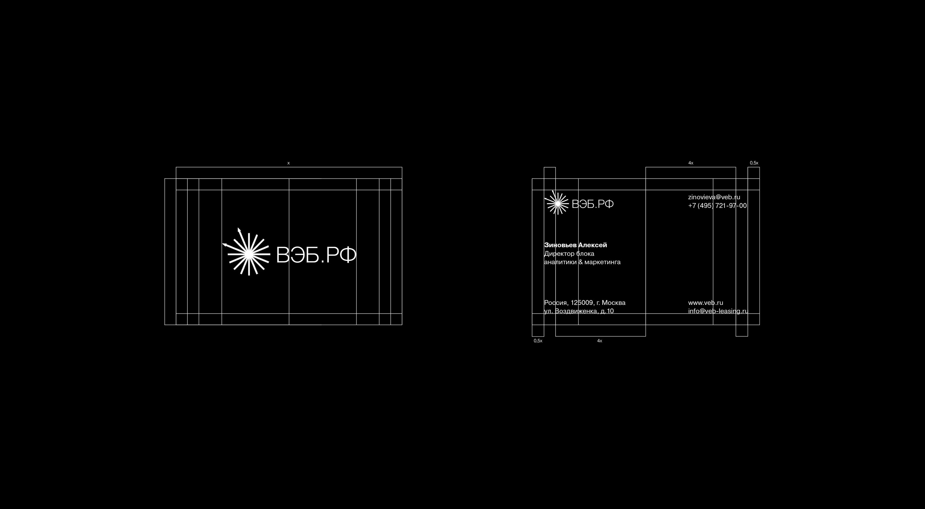
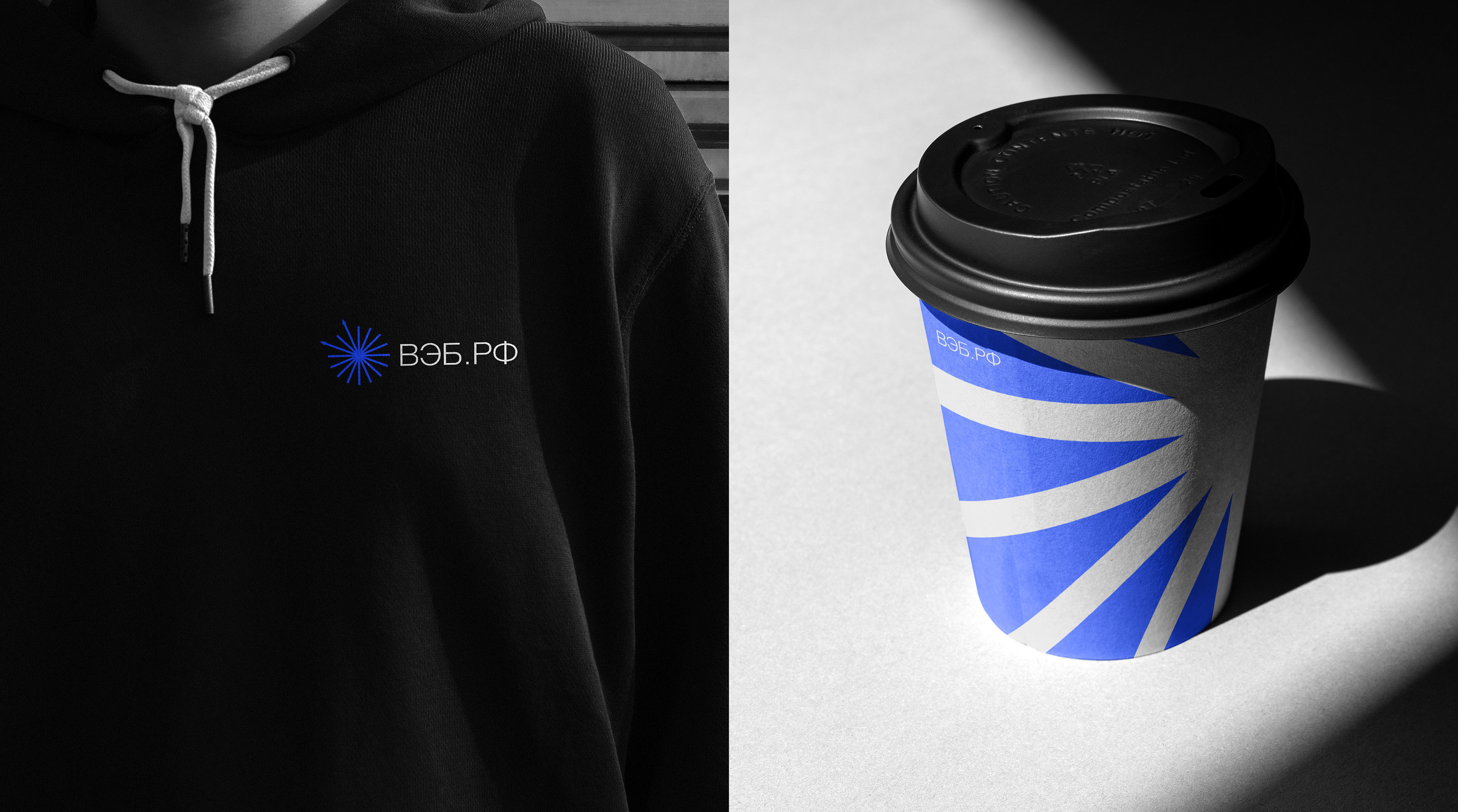
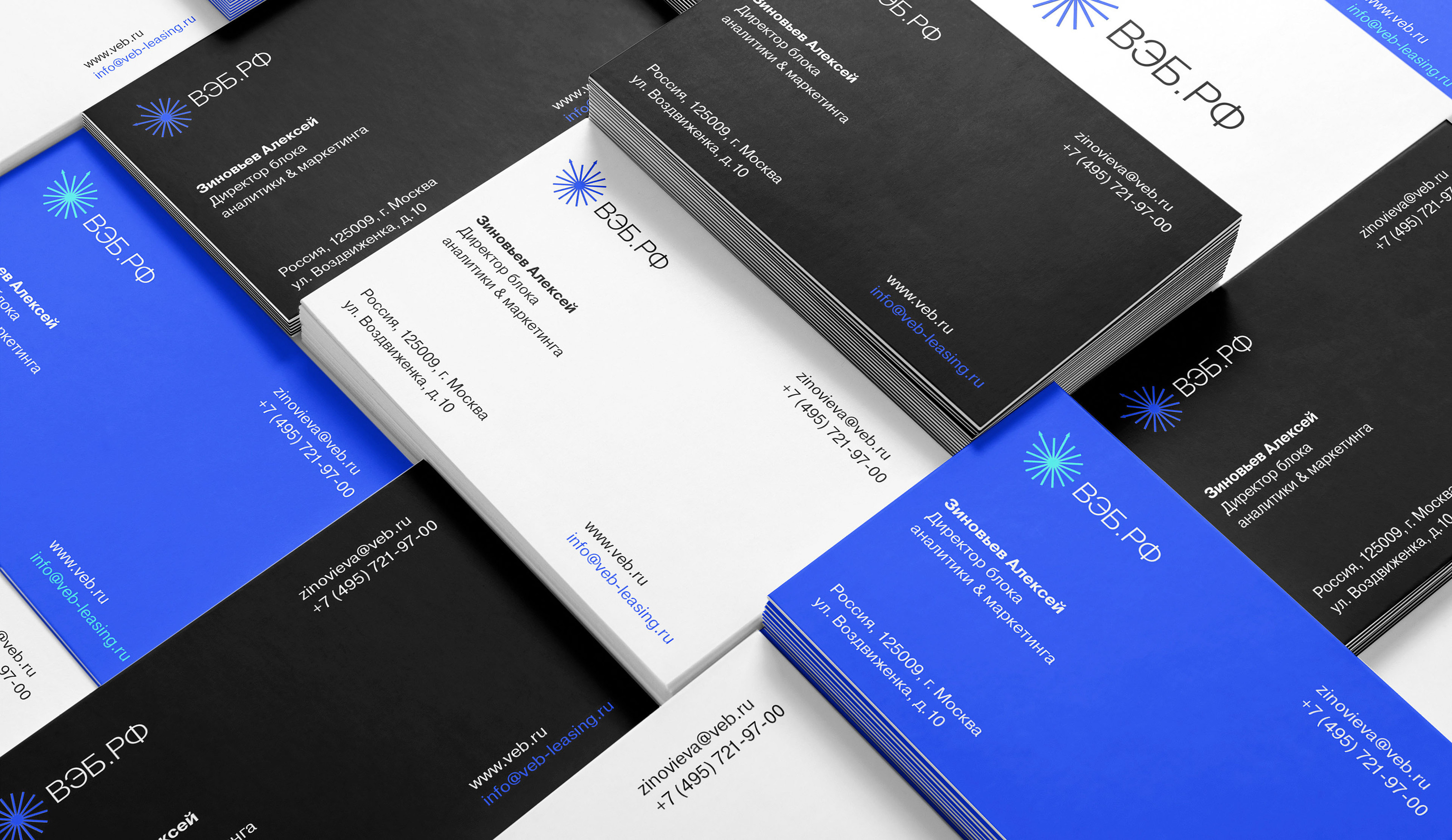
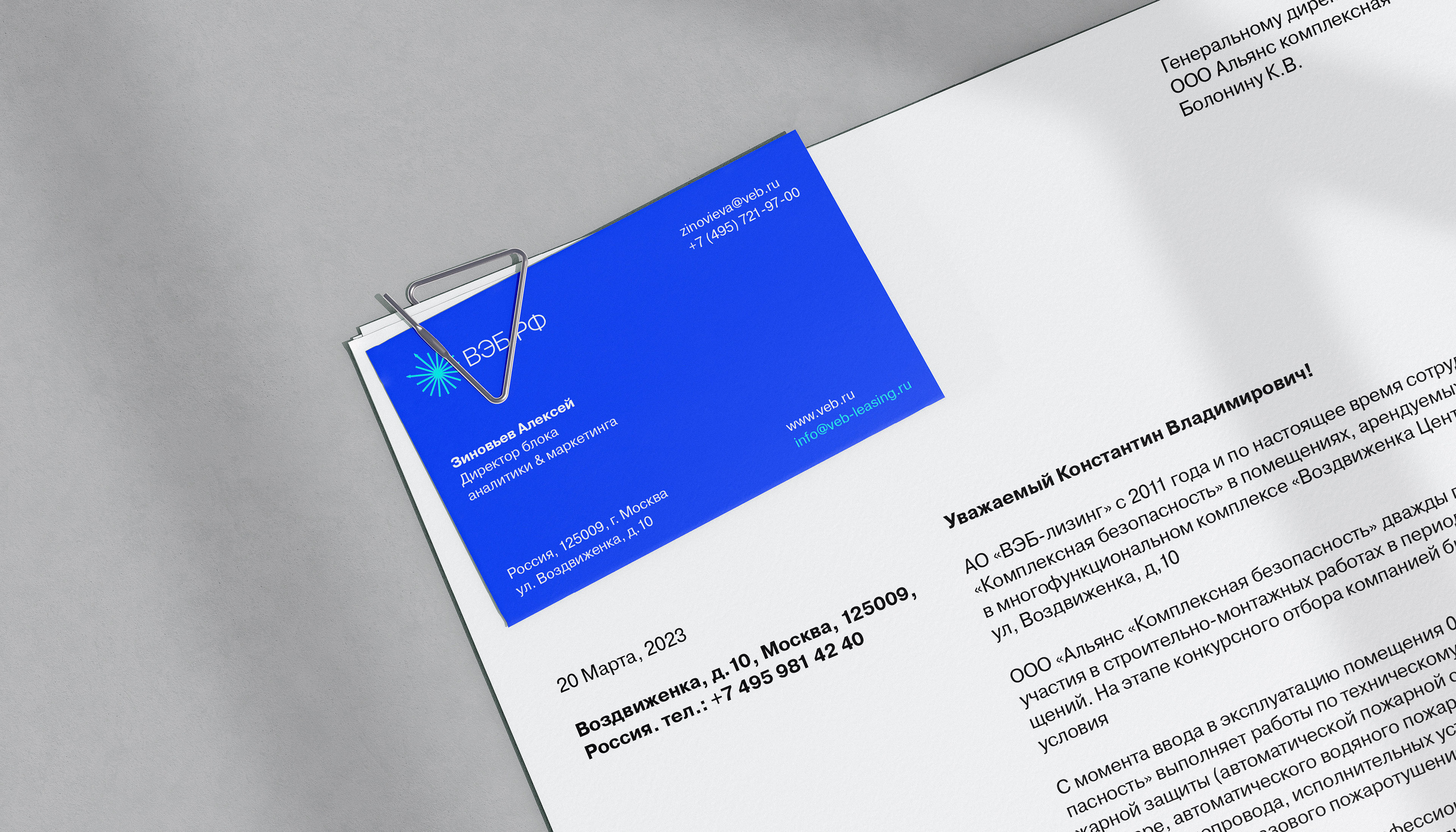
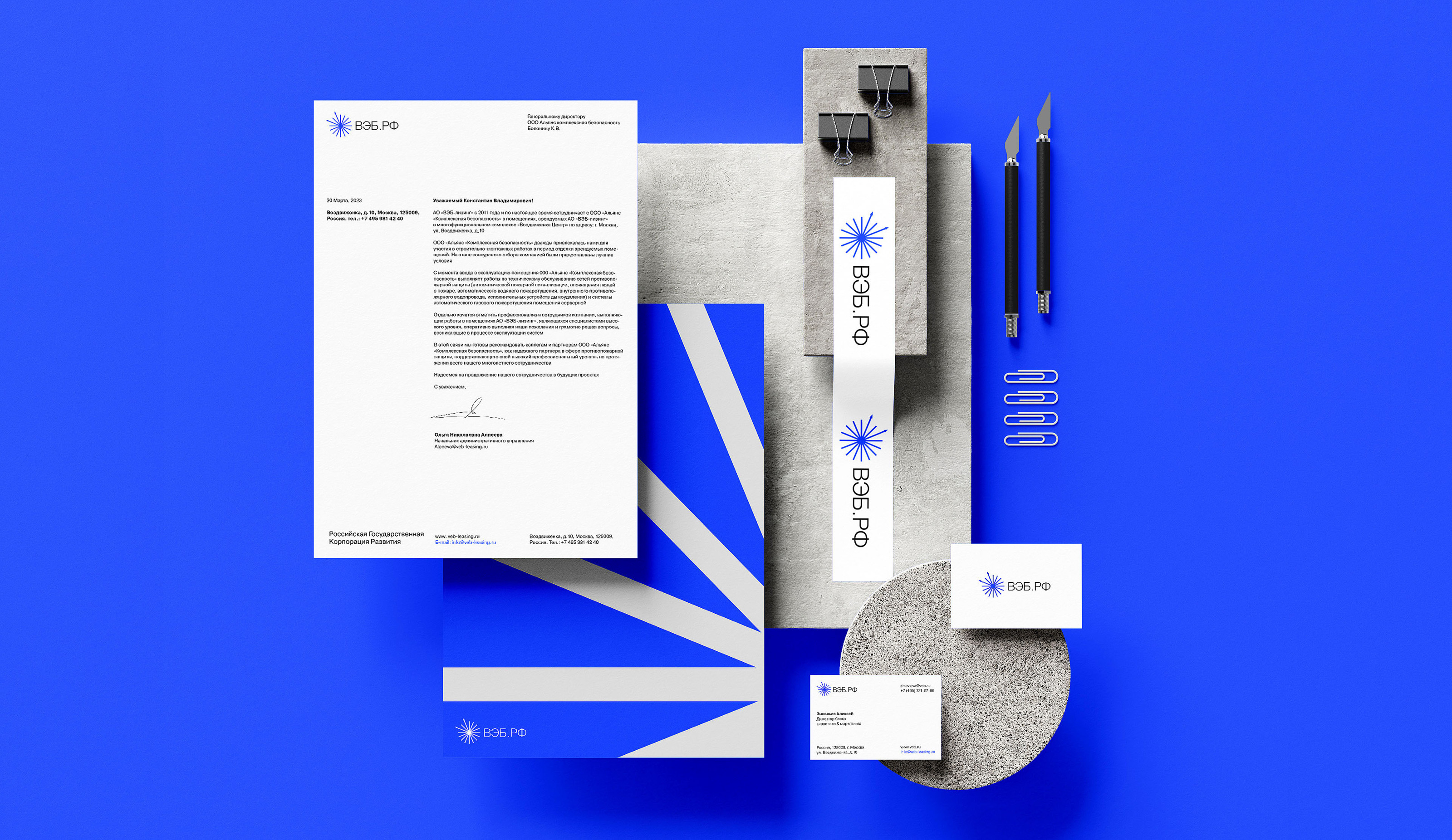
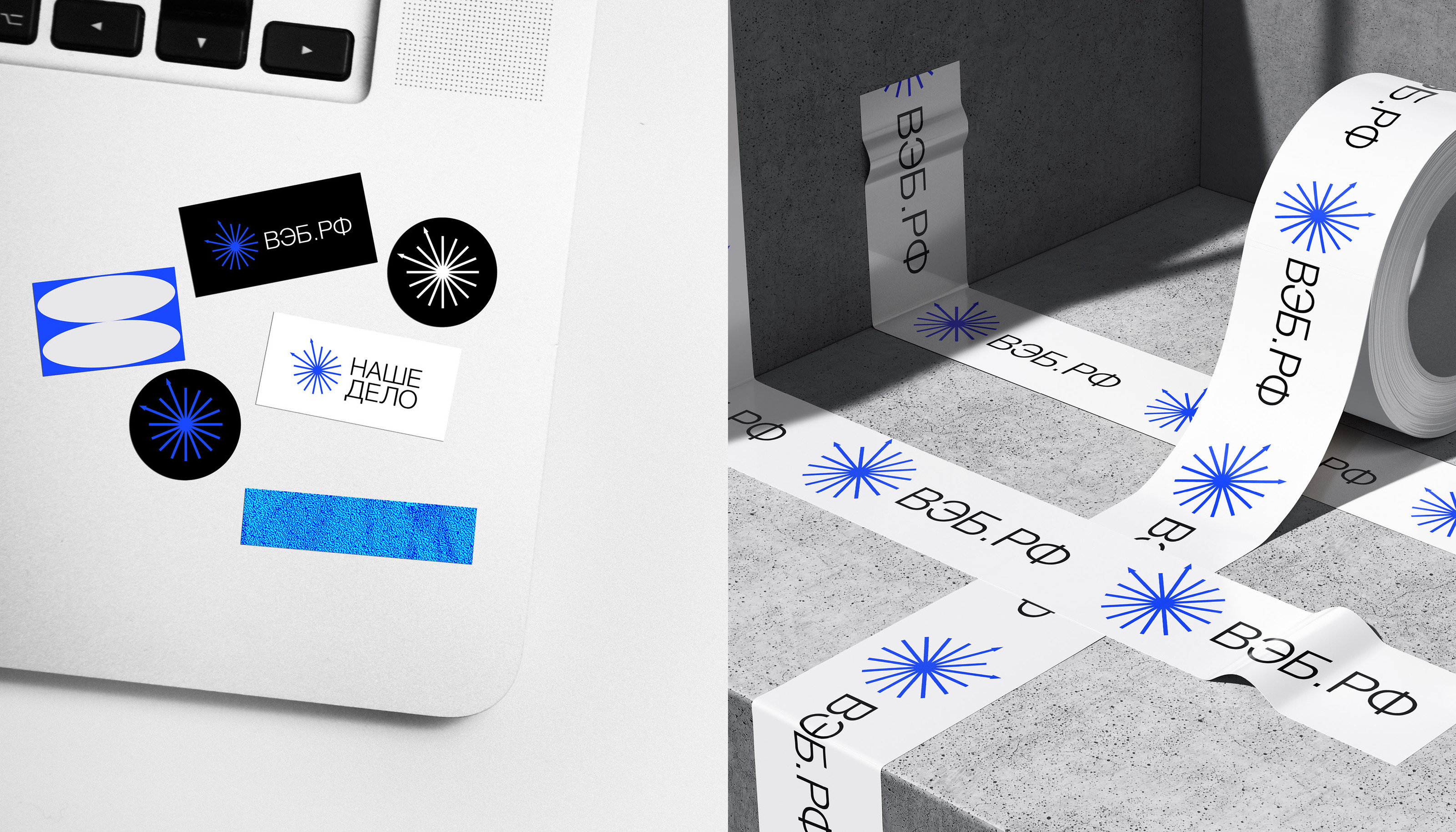
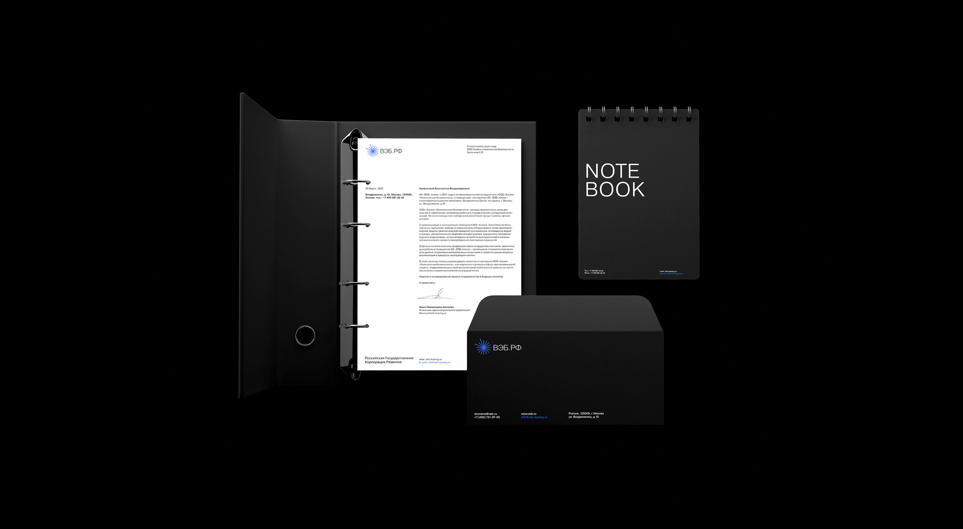
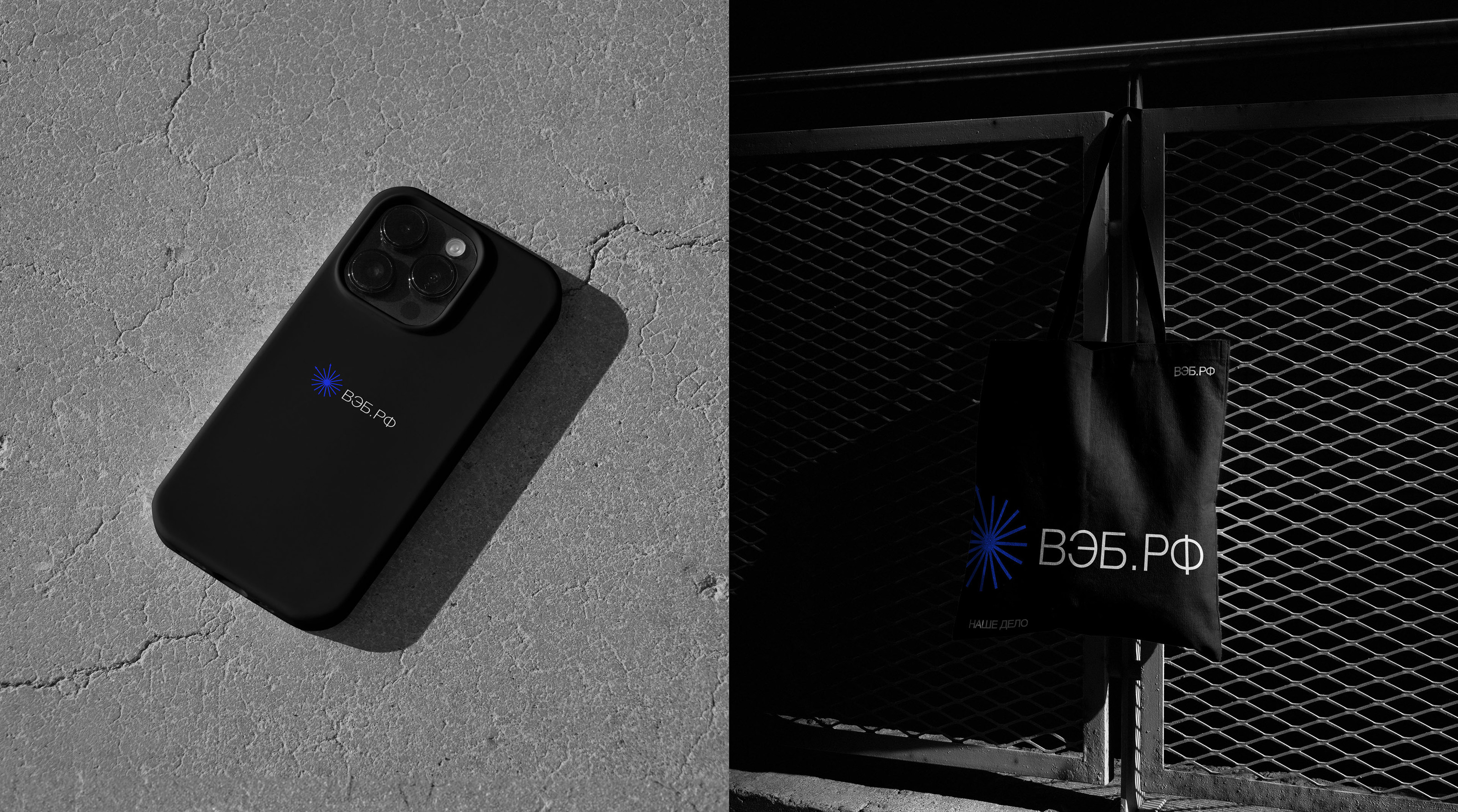
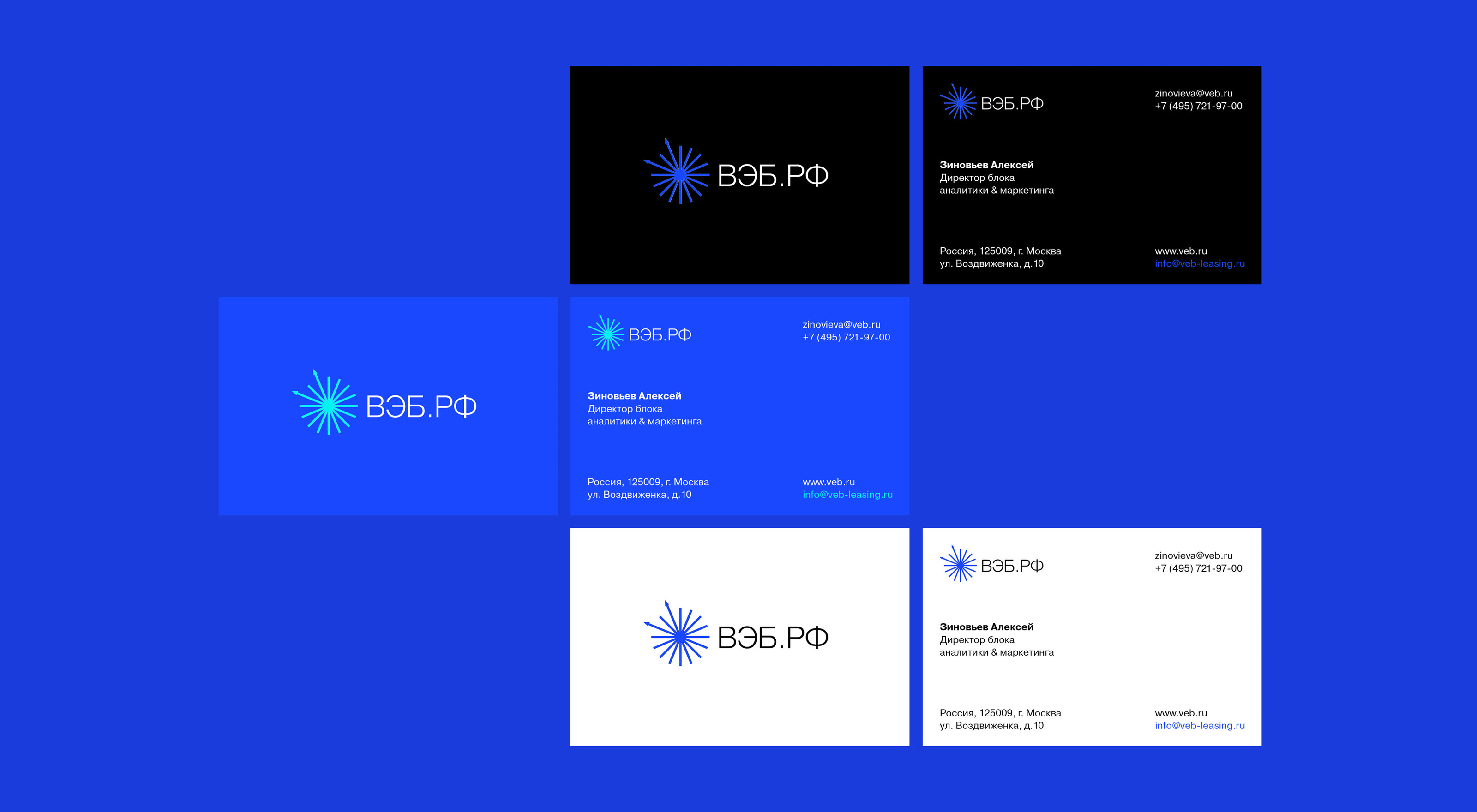
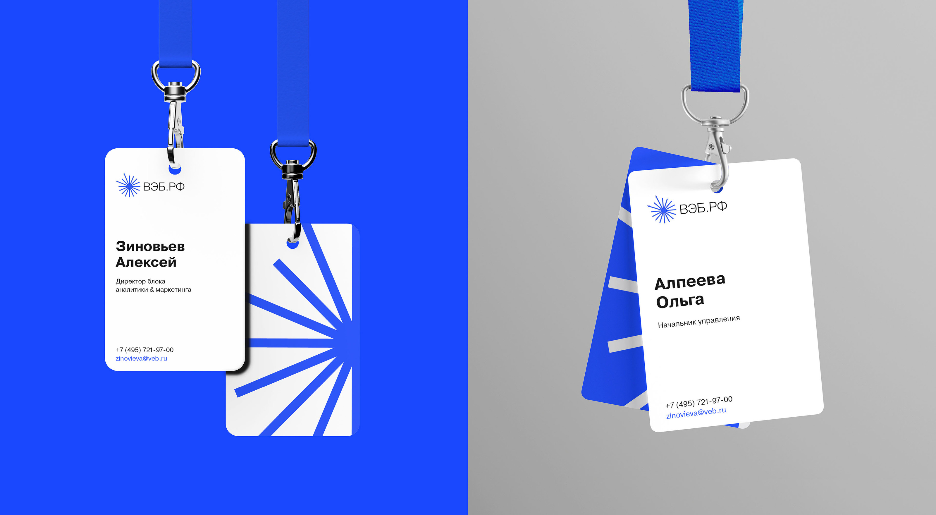
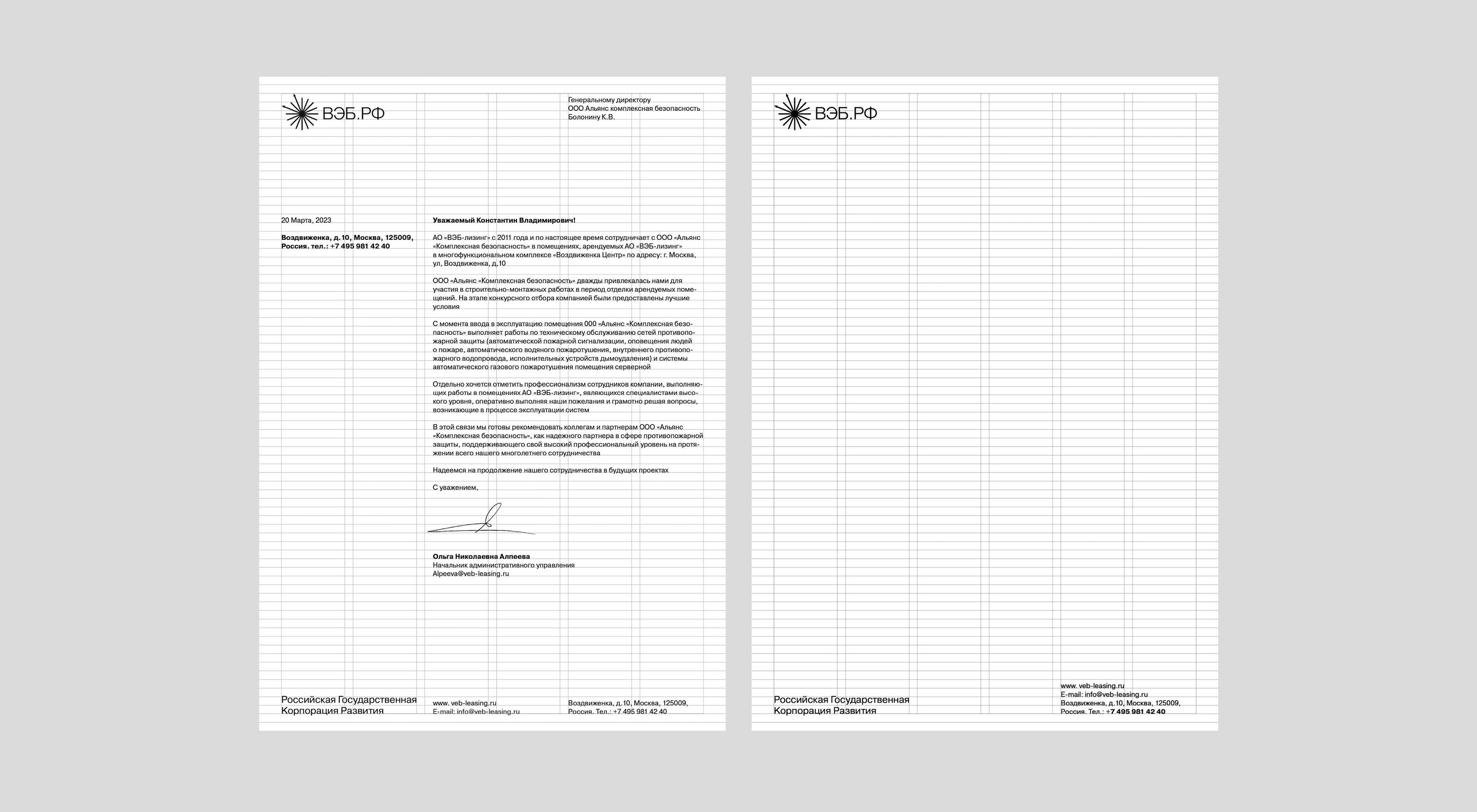
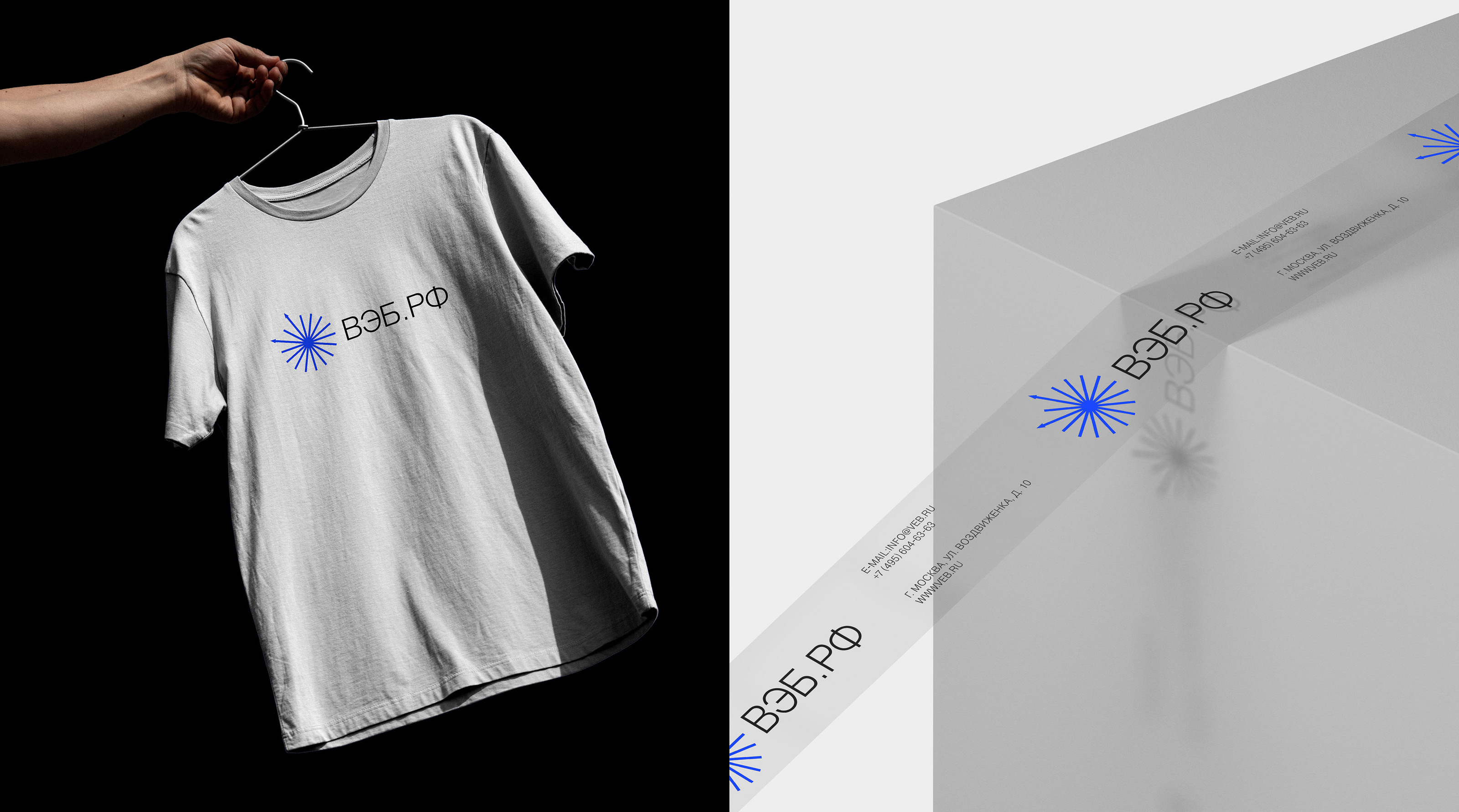
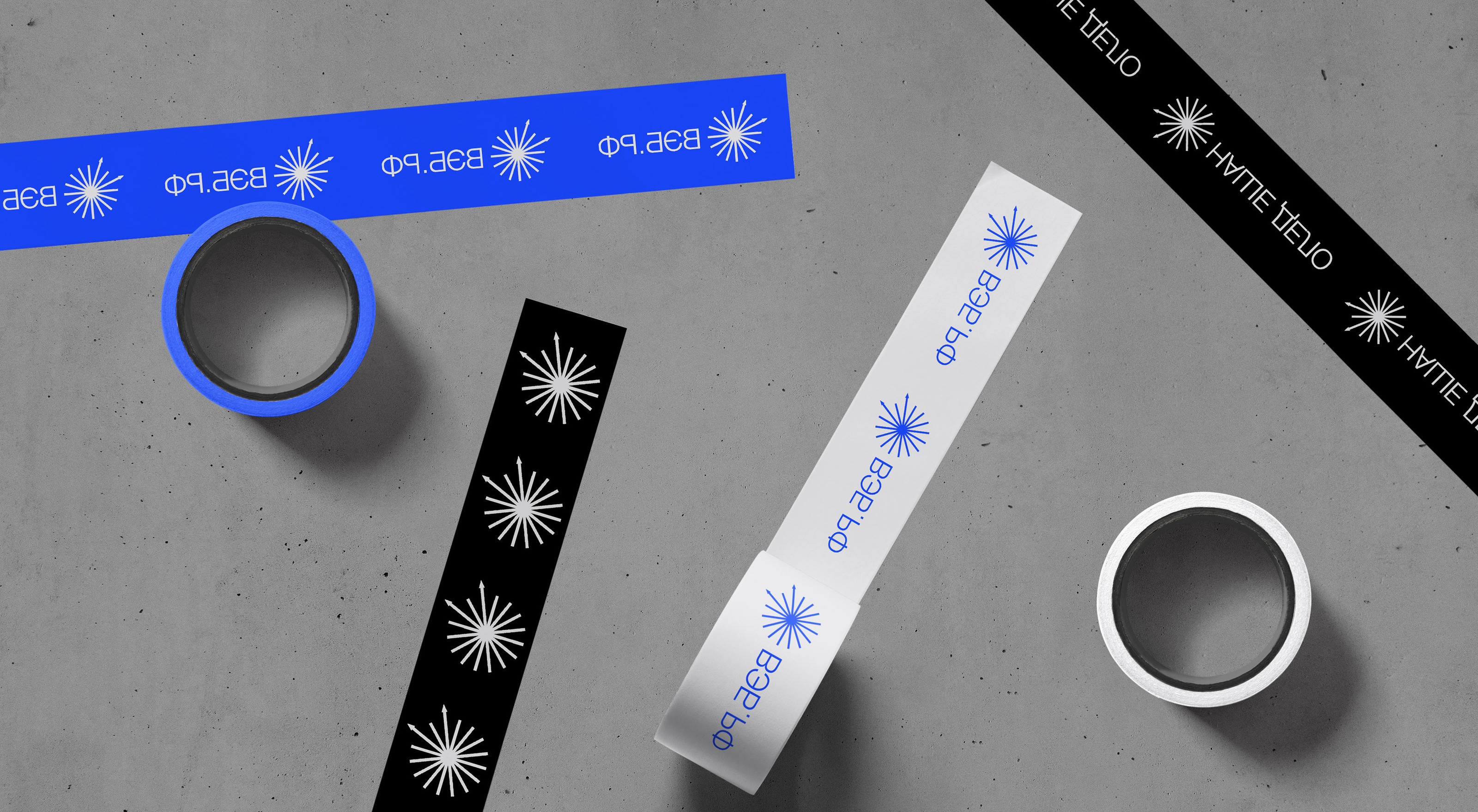
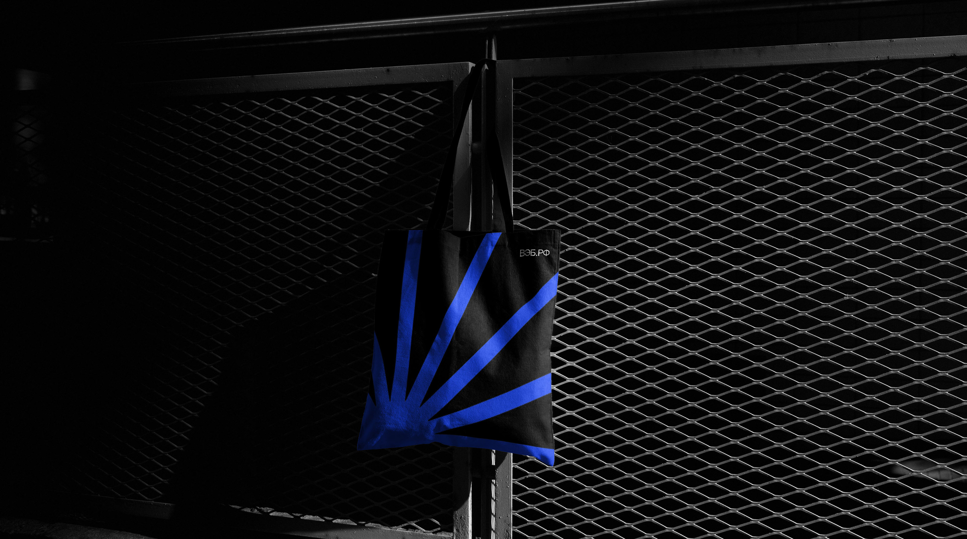
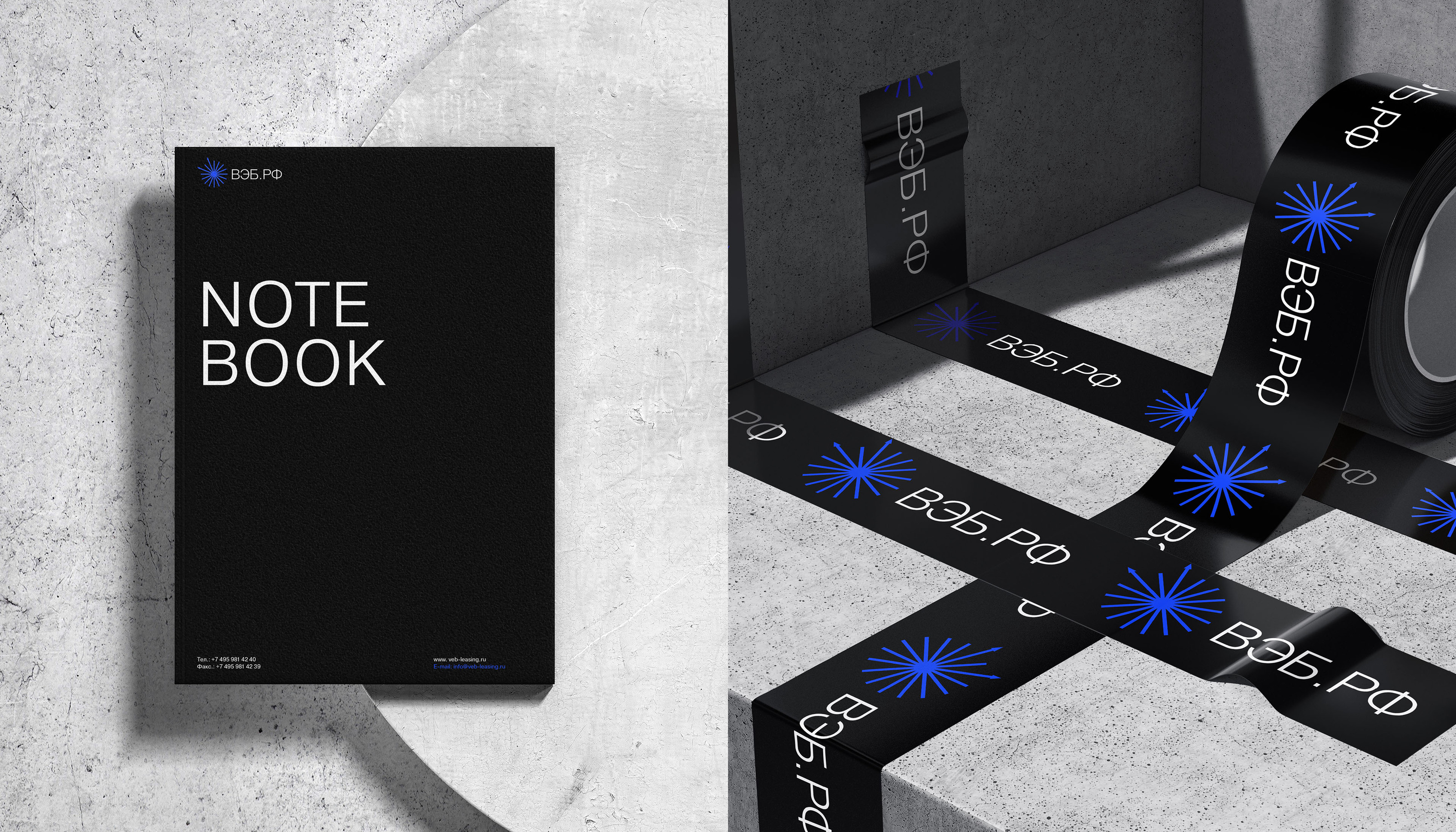
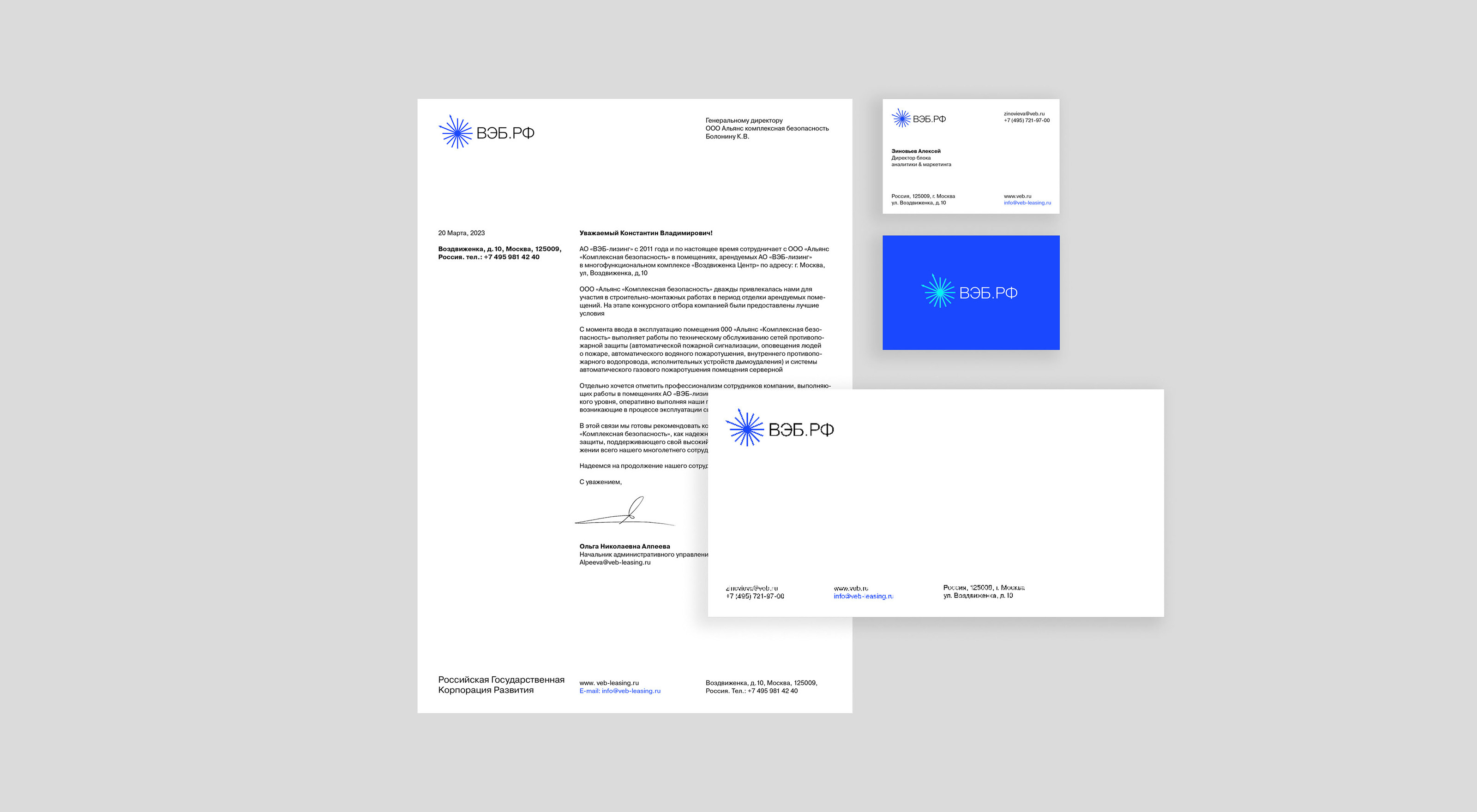
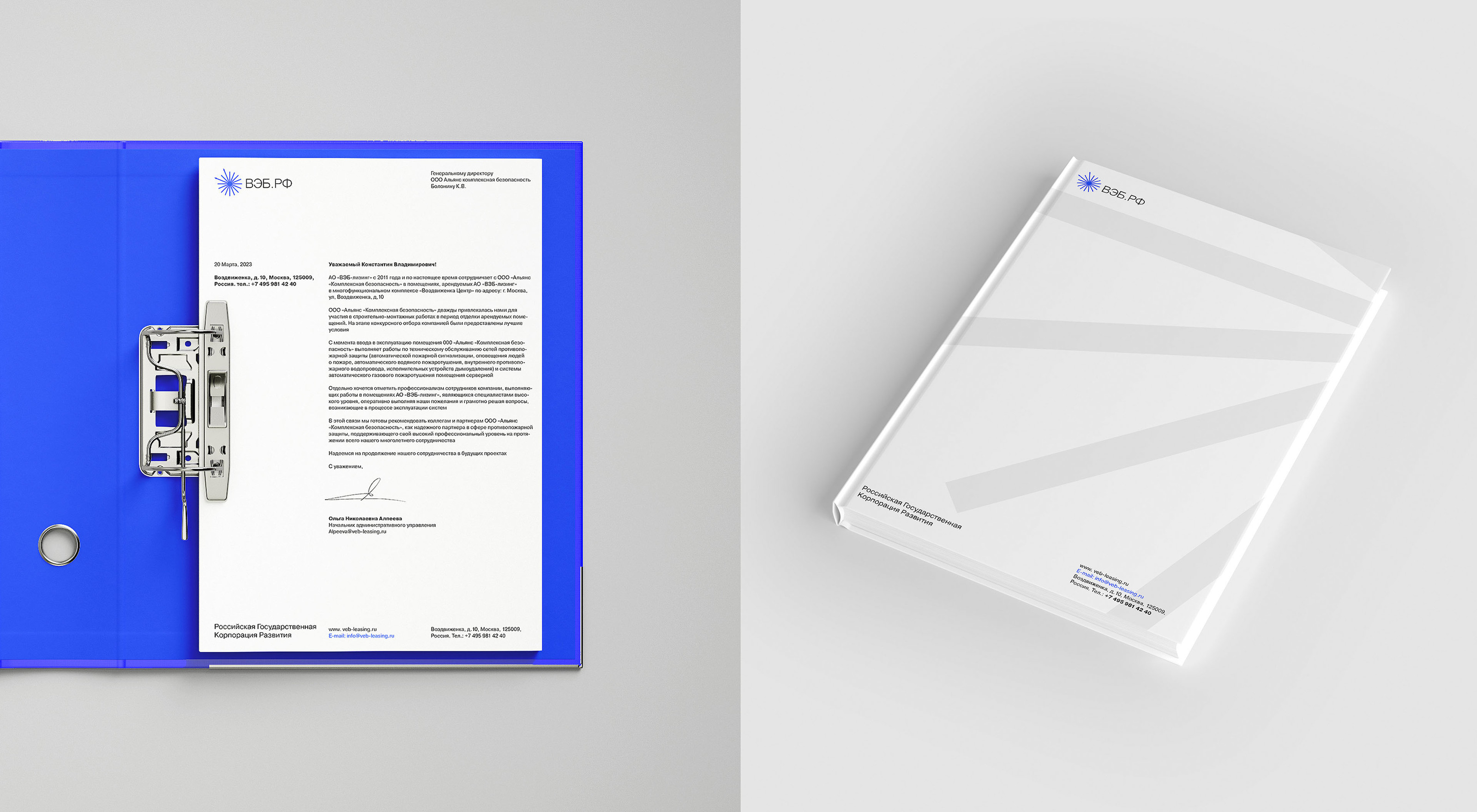
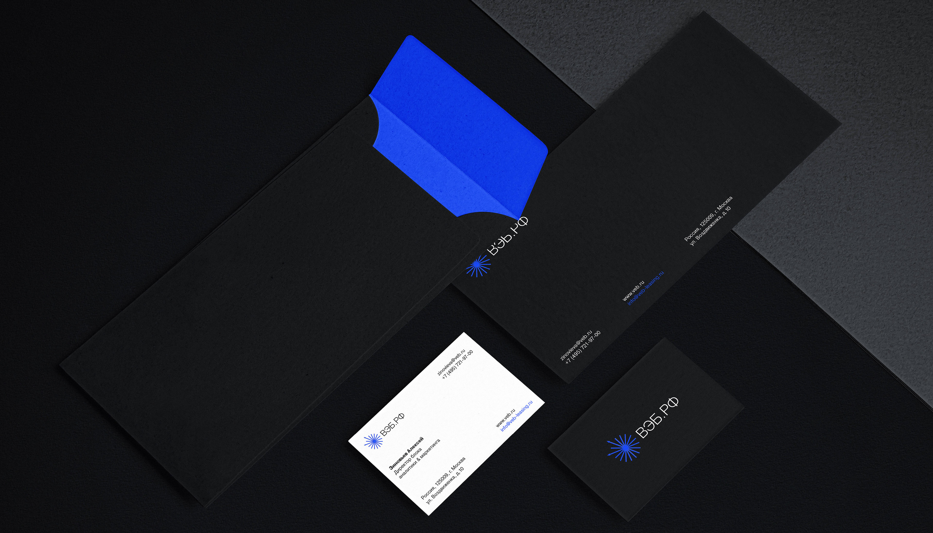
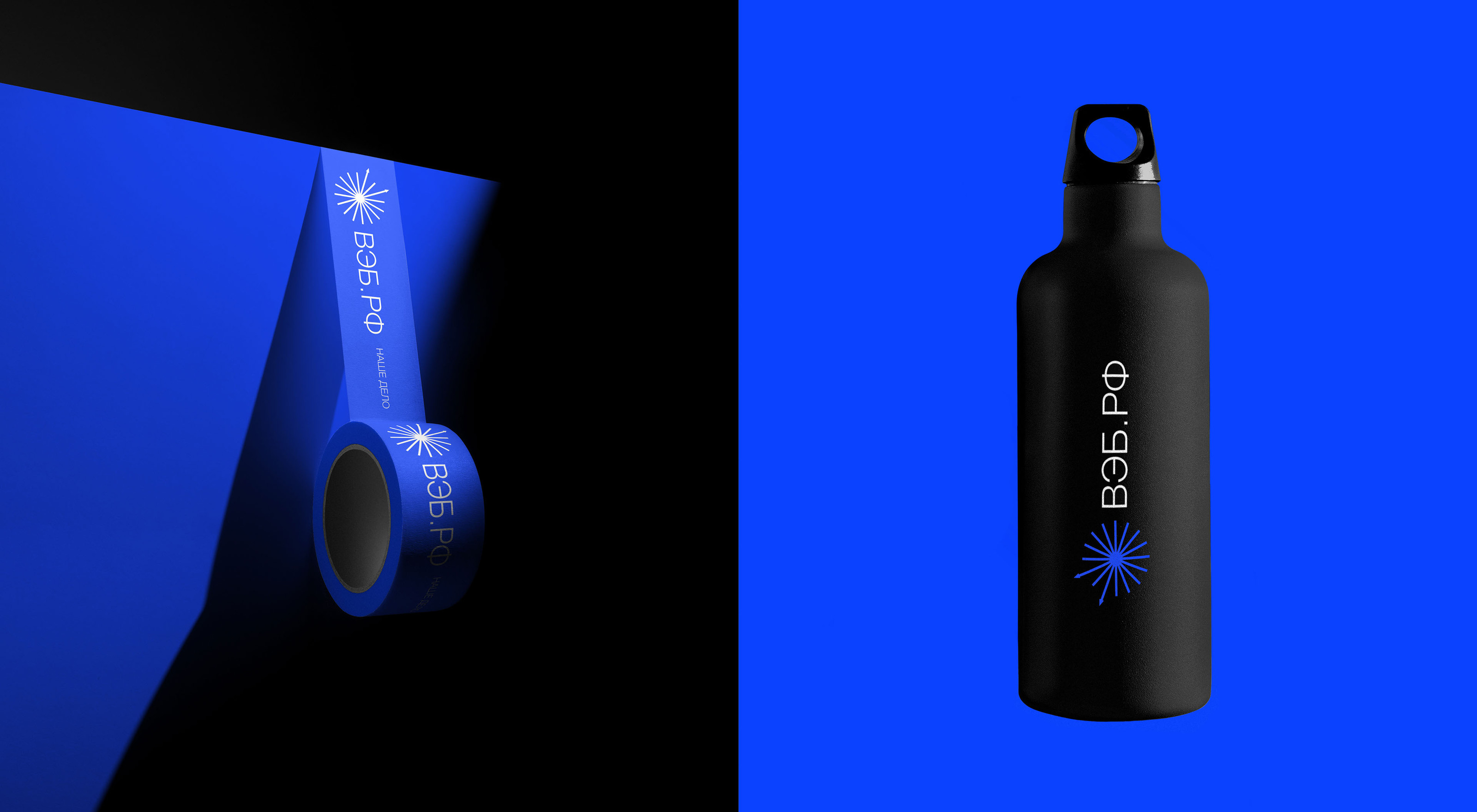
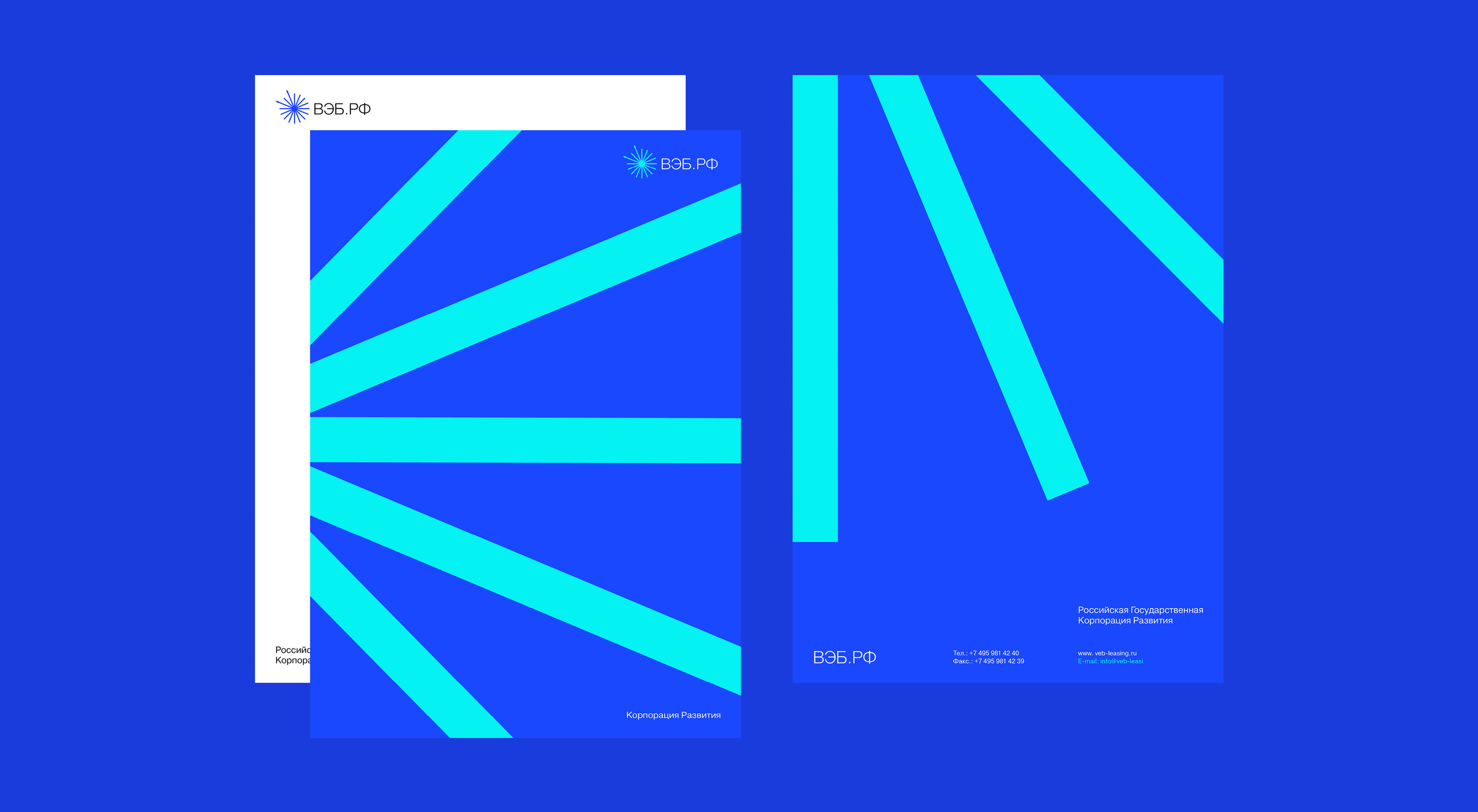
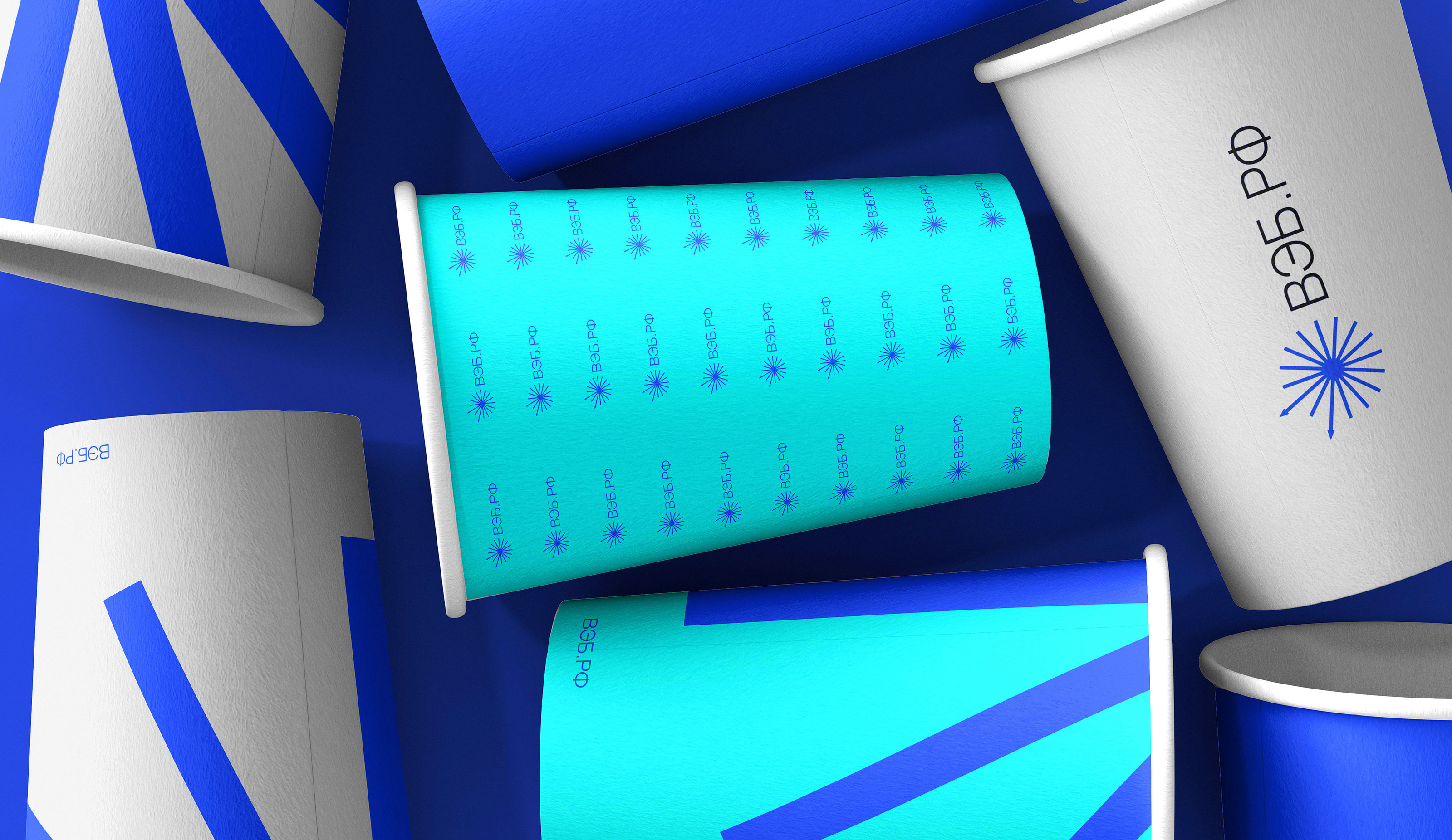
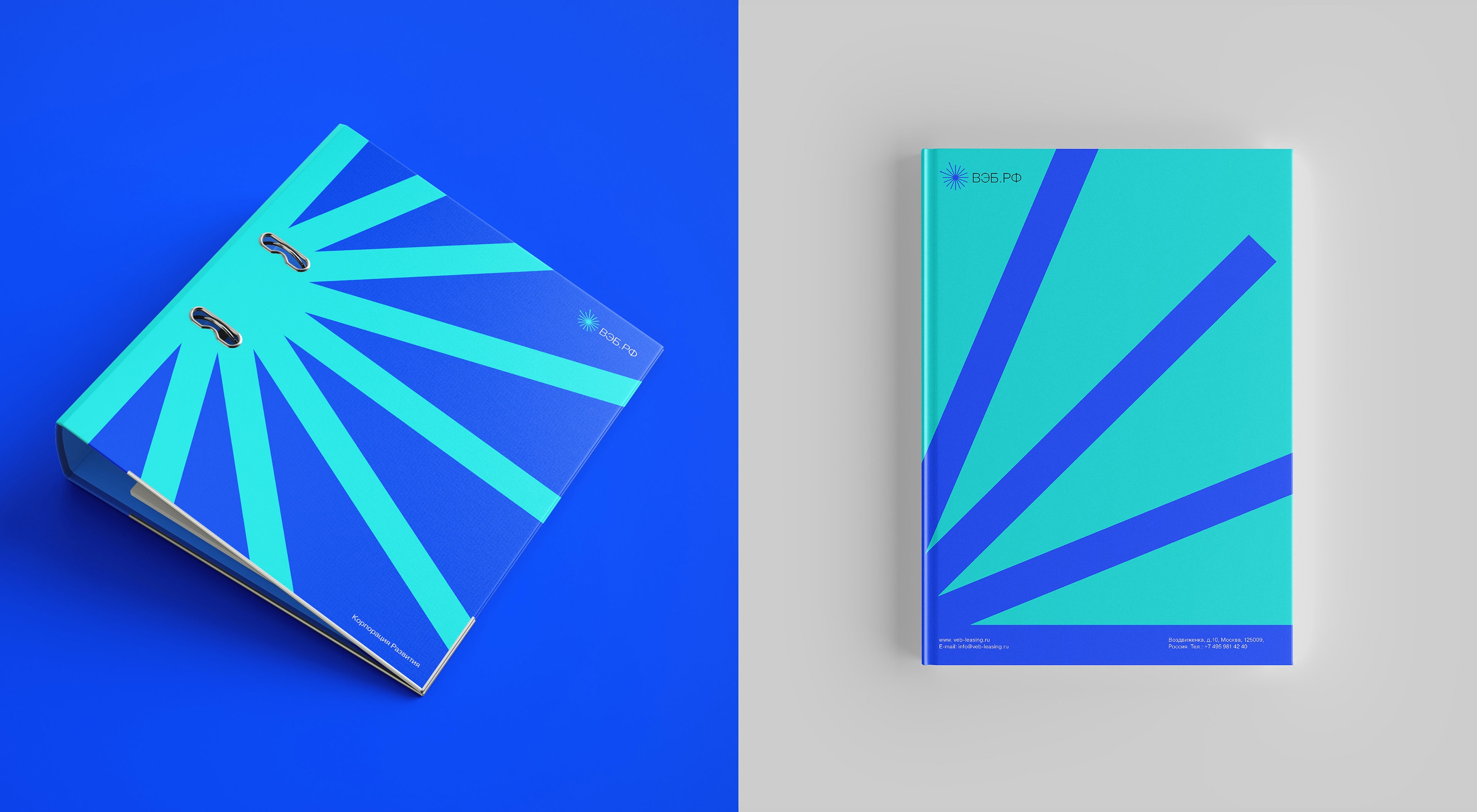
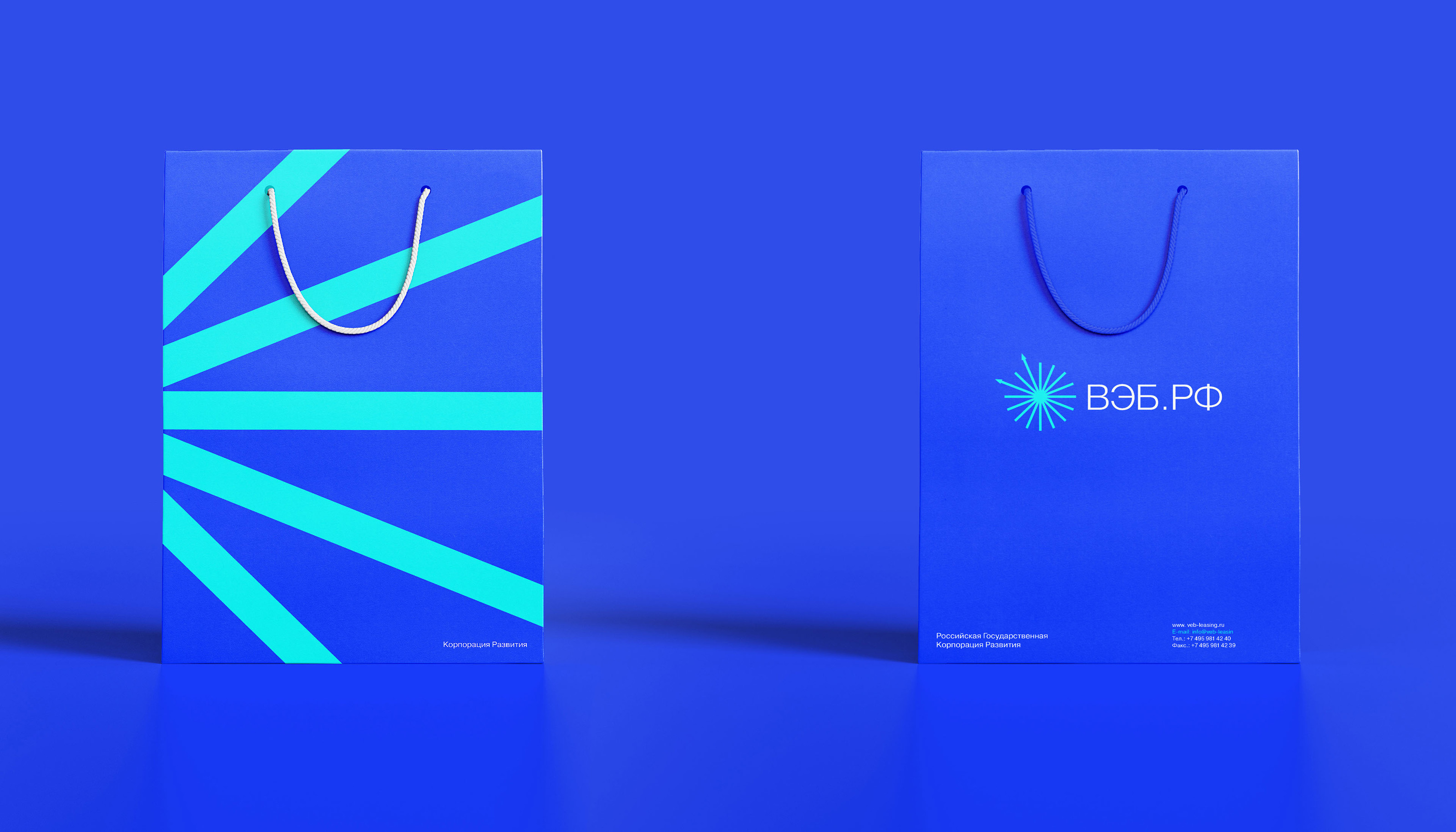
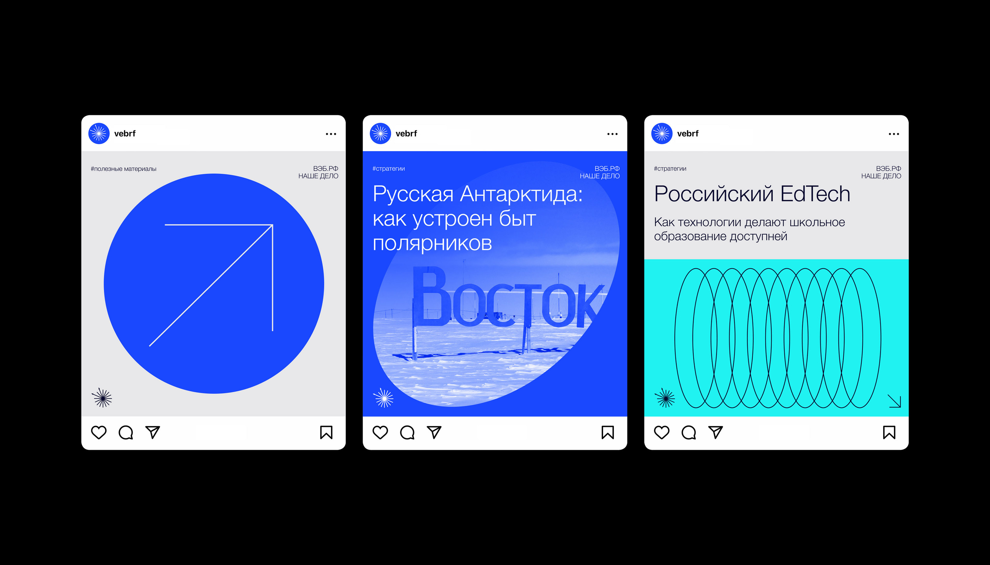
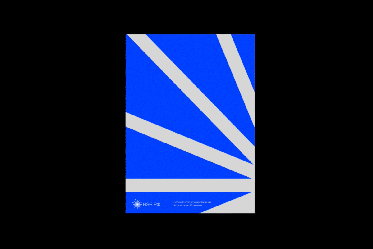
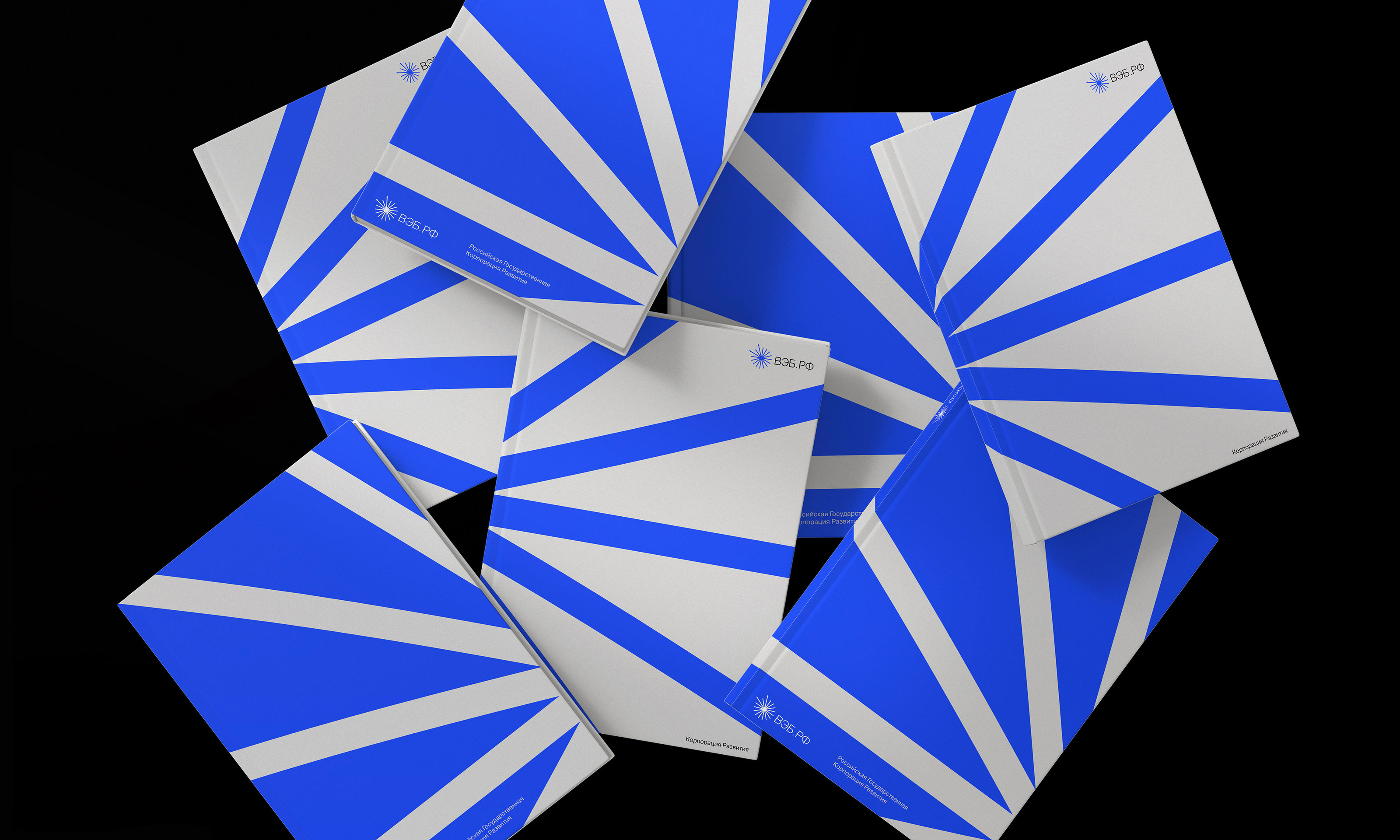
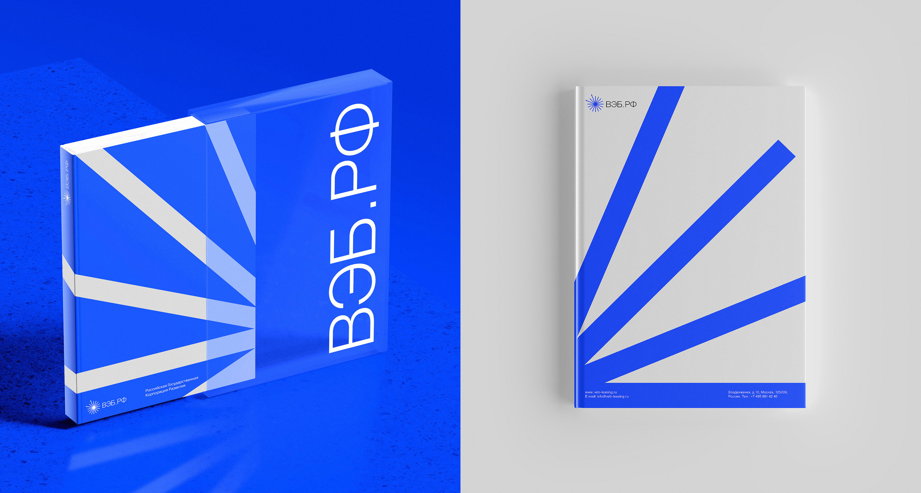
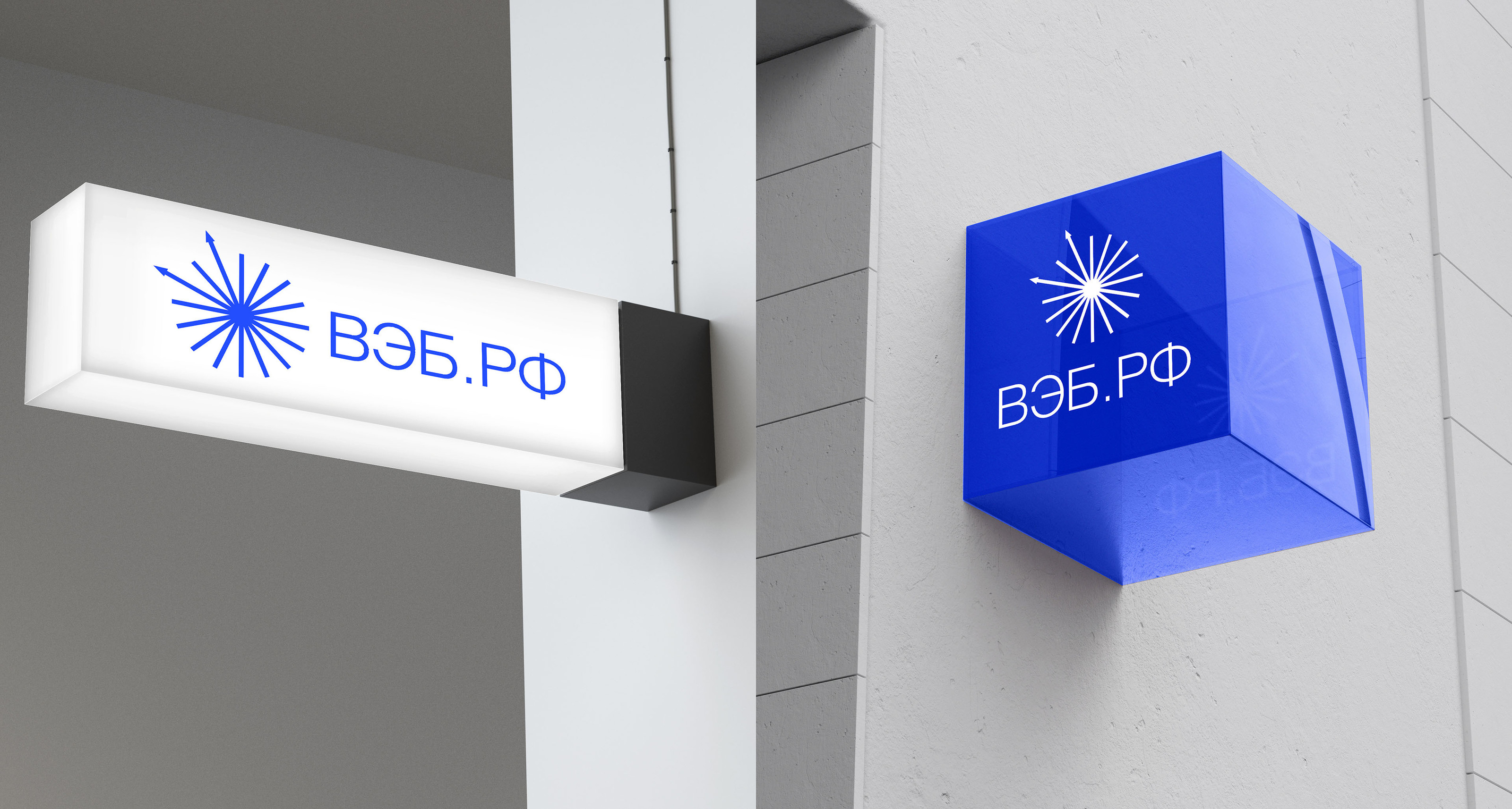
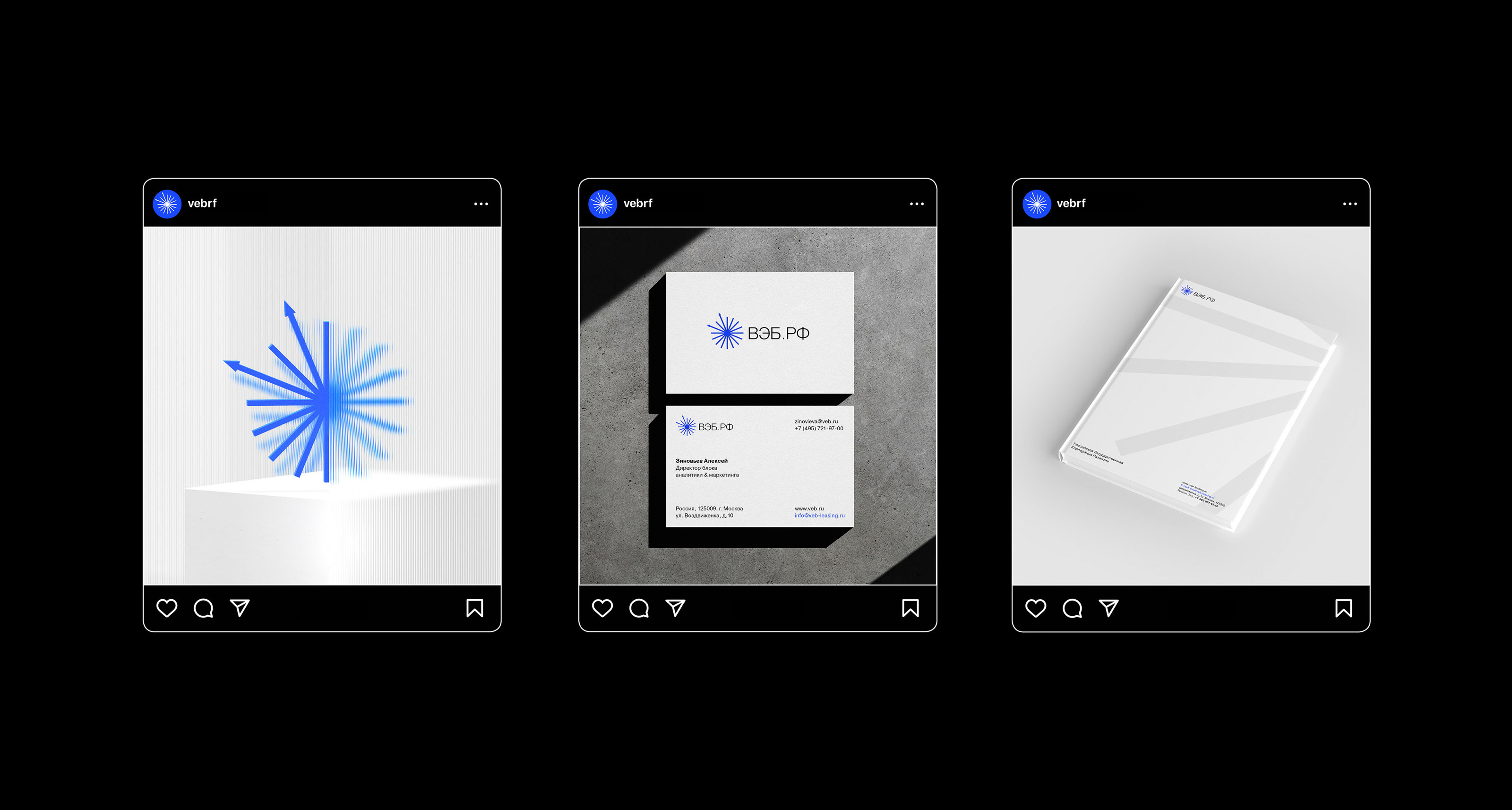
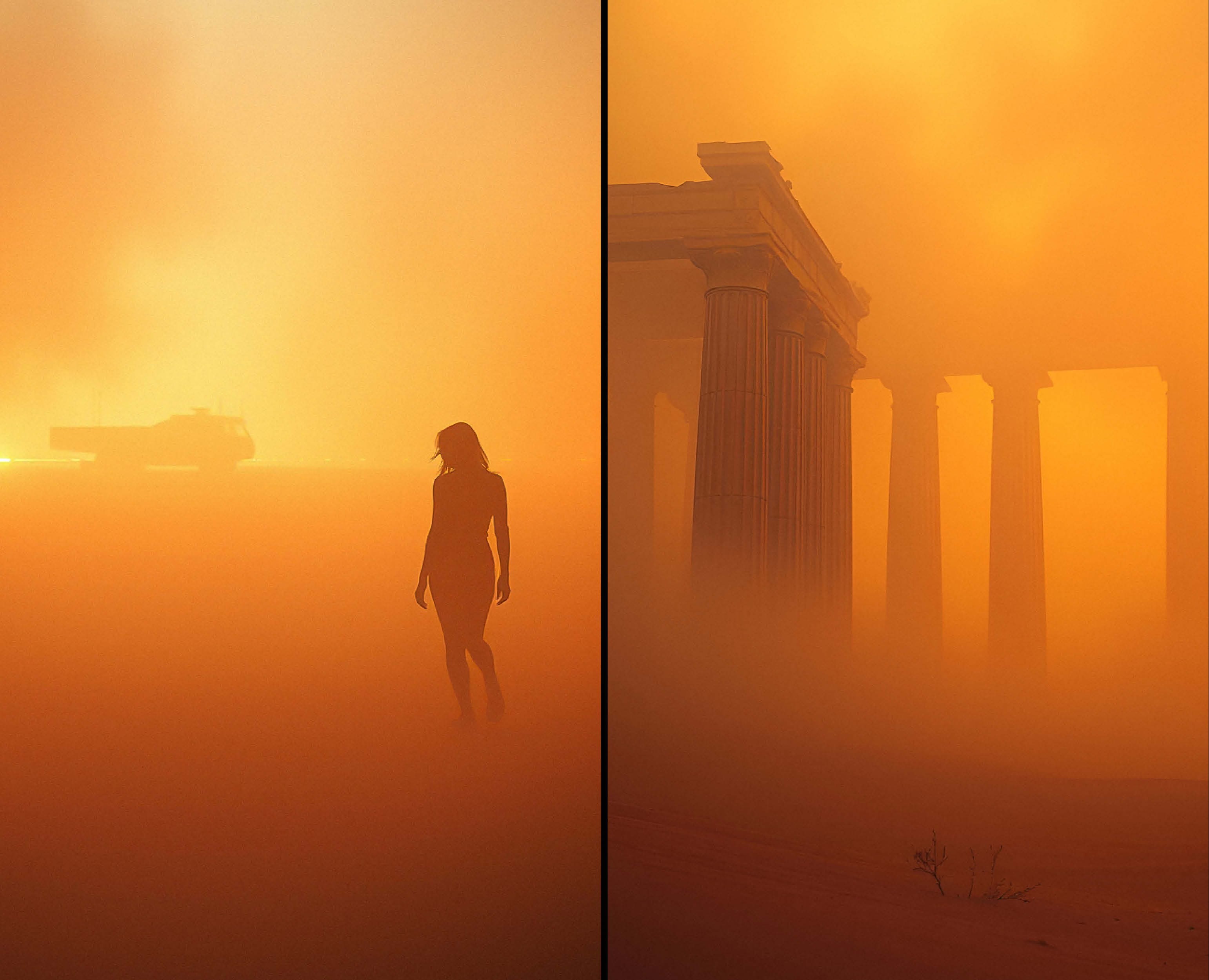
Так как компания серьезная и инвестирует в большие проекты по развитию, я решила, что визуальная идентичность должна строиться на доверии и серьезности. Фокус на чистоту и cовременность. Логотип отражает суть в работе ВЭБ.PФ. Визуальной метафорой служат лучи: лучи хаоса в круге держатся лучами порядка. В центре сходятся стрелки внутрь — это порядок, стрелки выходят из центра к пространству — это хаос. (Бренд-медиа о борьбе с хаосом в Российской жизни сегодня и в истории). При выборе шрифта, опиралась на четкую коммуникацию и читаемость. Шрифт без засечек, который поддерживает простоту и минимализм. Также была выбрана фирменная палитра, где основные цвета чистые, ясные, располагающие к бренду
VEB.RF is a state corporation and the main development institution of the country, which unites all development institutions: Skolkovo, Rusnano, REC, SME Corporation and others. VEB.RF invests in large projects for the development of infrastructure, industry, housing and communal services, exports and entrepreneurship. Our business is part of the VEB.RF, the media of the entire development group, uniting the country's development organizations
Task:
Create a brand media company for VEB.RF: to develop a corporate identity, logo, website and social networks. The visual of brand media should differ from the strict and official identity. To "land" government projects on real life and human language — to make communication understandable and friendly
Solution:
Since the company is serious and invests in large development projects, I decided that visual identity should be based on trust and seriousness. Focus on cleanliness and modernity. The logo reflects the essence of the work of VEB.RF. The rays serve as a visual metaphor: the rays of chaos in the circle are held by the rays of order. In the center, the arrows converge inward — this is order, the arrows go out from the center to space — this is chaos. (Brand media is about the fight against chaos in Russian life today and in history). When choosing a font, I relied on clear communication and readability. A sans-serif font that supports simplicity and minimalism. A corporate palette was also chosen, where the main colors are clean, clear, and endearing to the brand
Follow me: @alenak.design
Client: VEB.RF | Service: Visual Identity | Graphic design: Alena Klimova