RU.
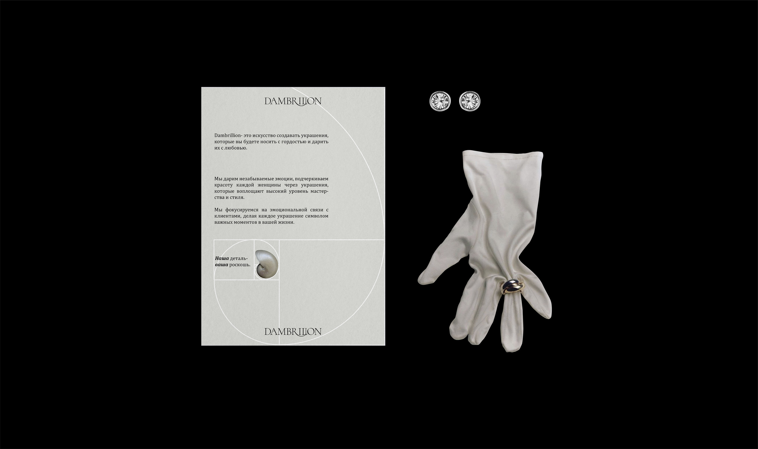
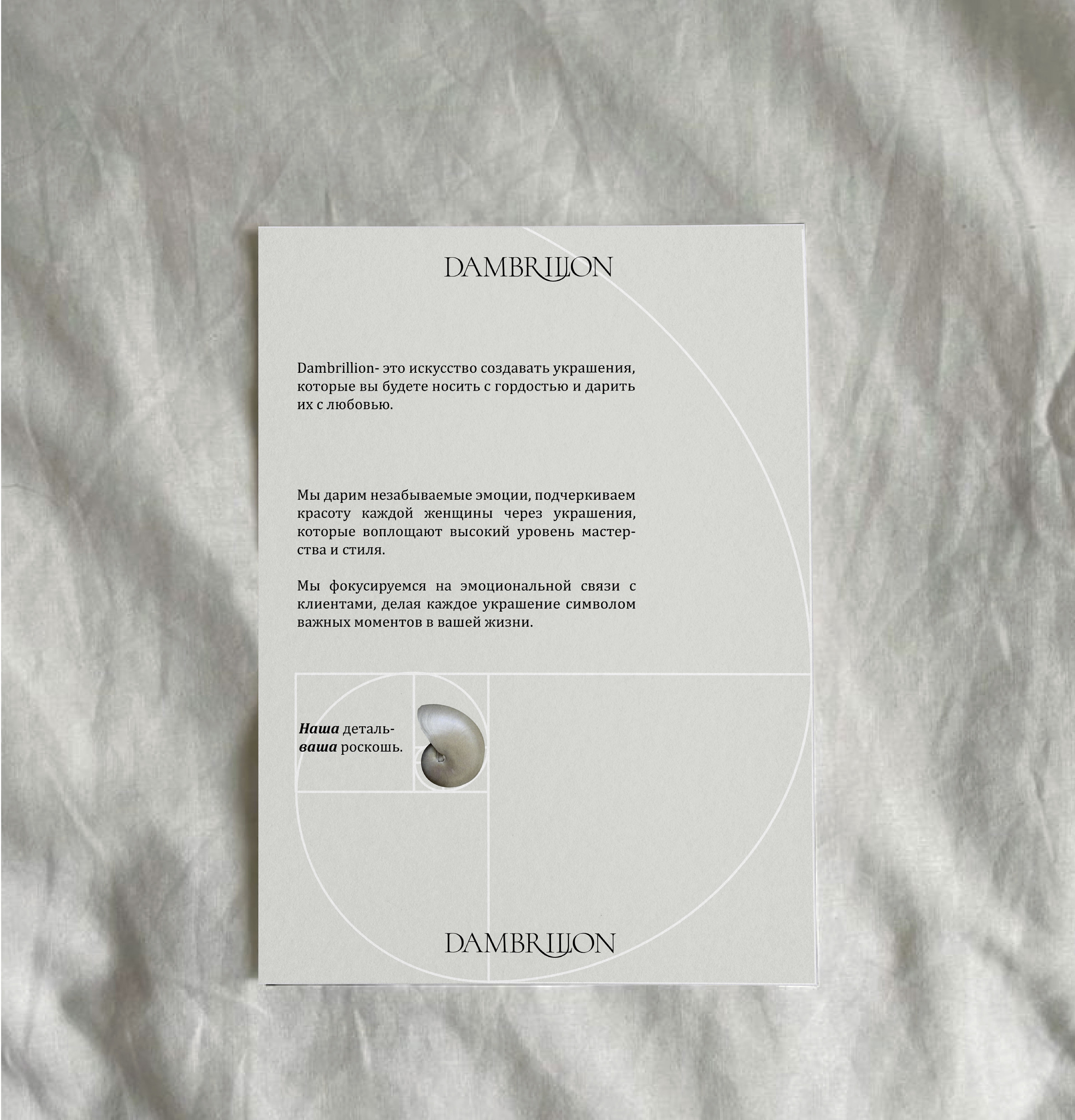
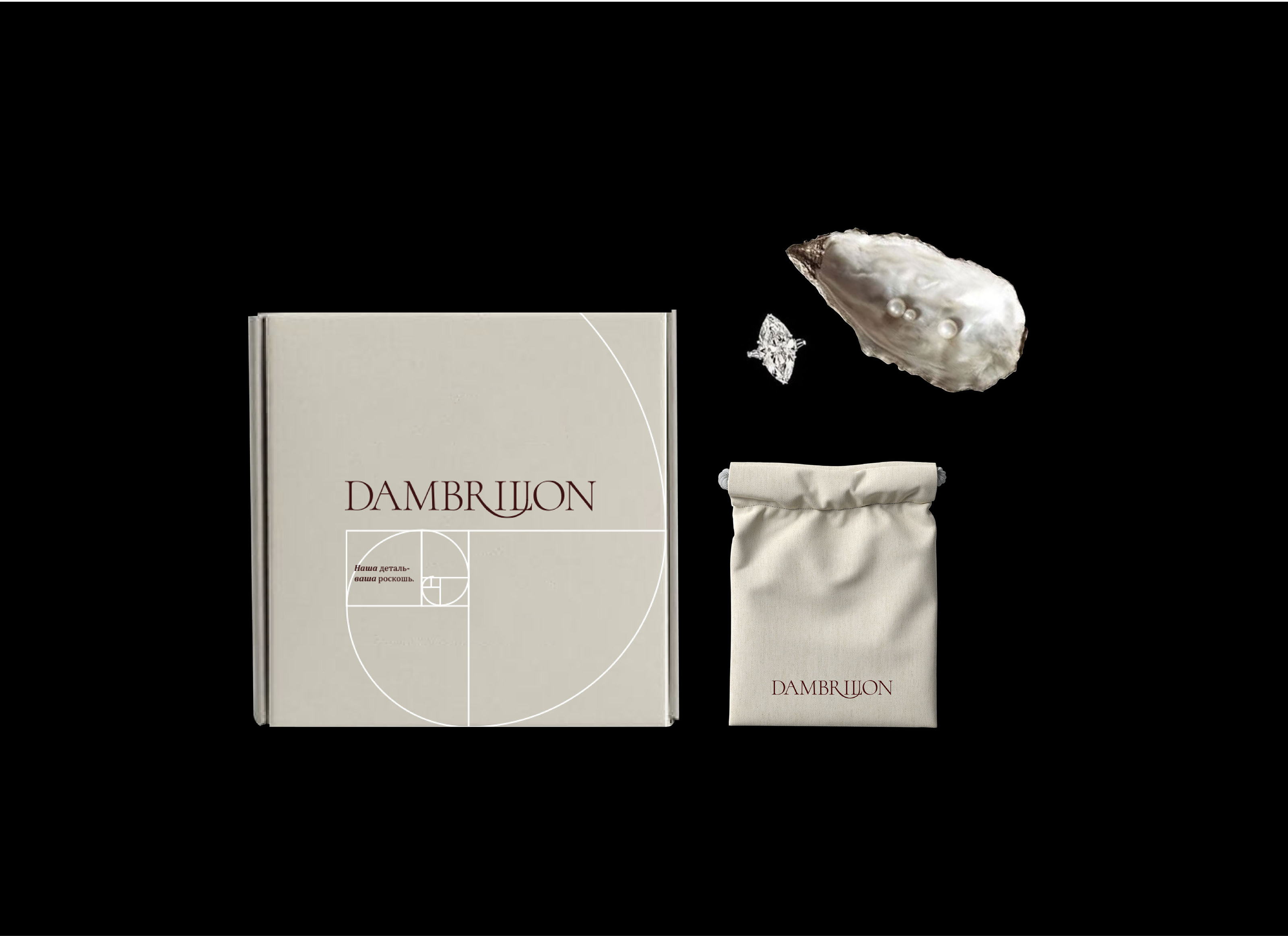
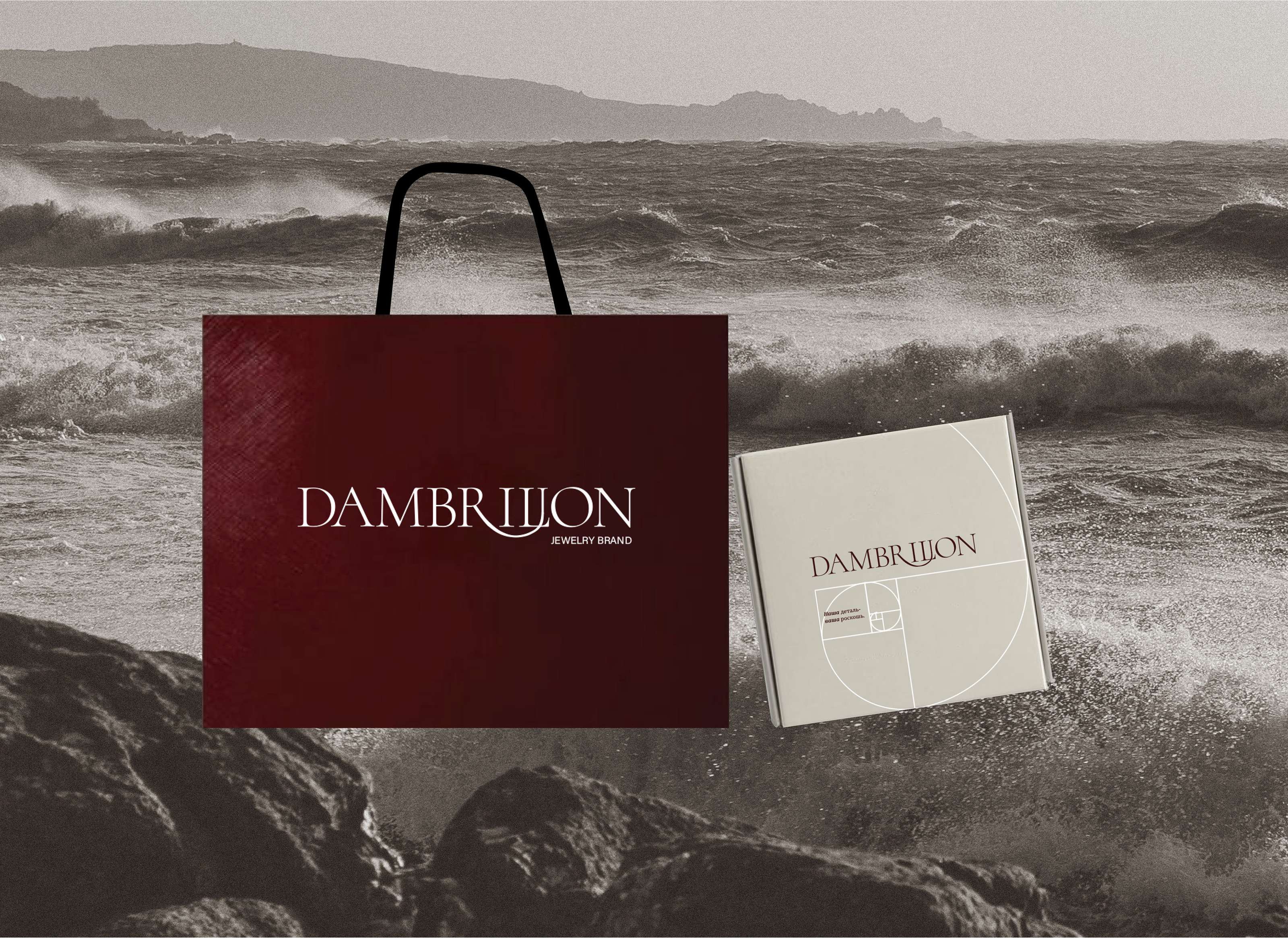
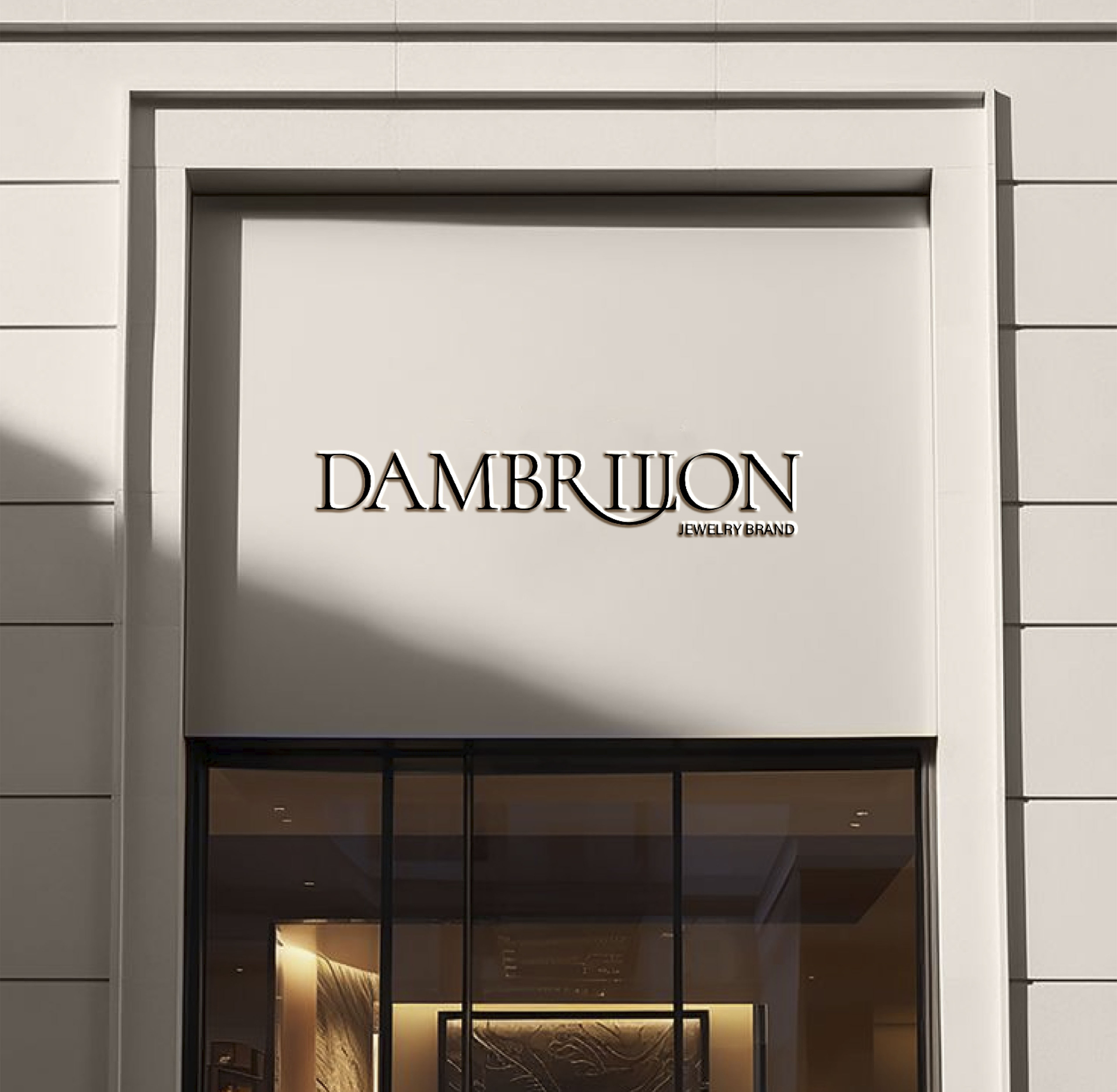
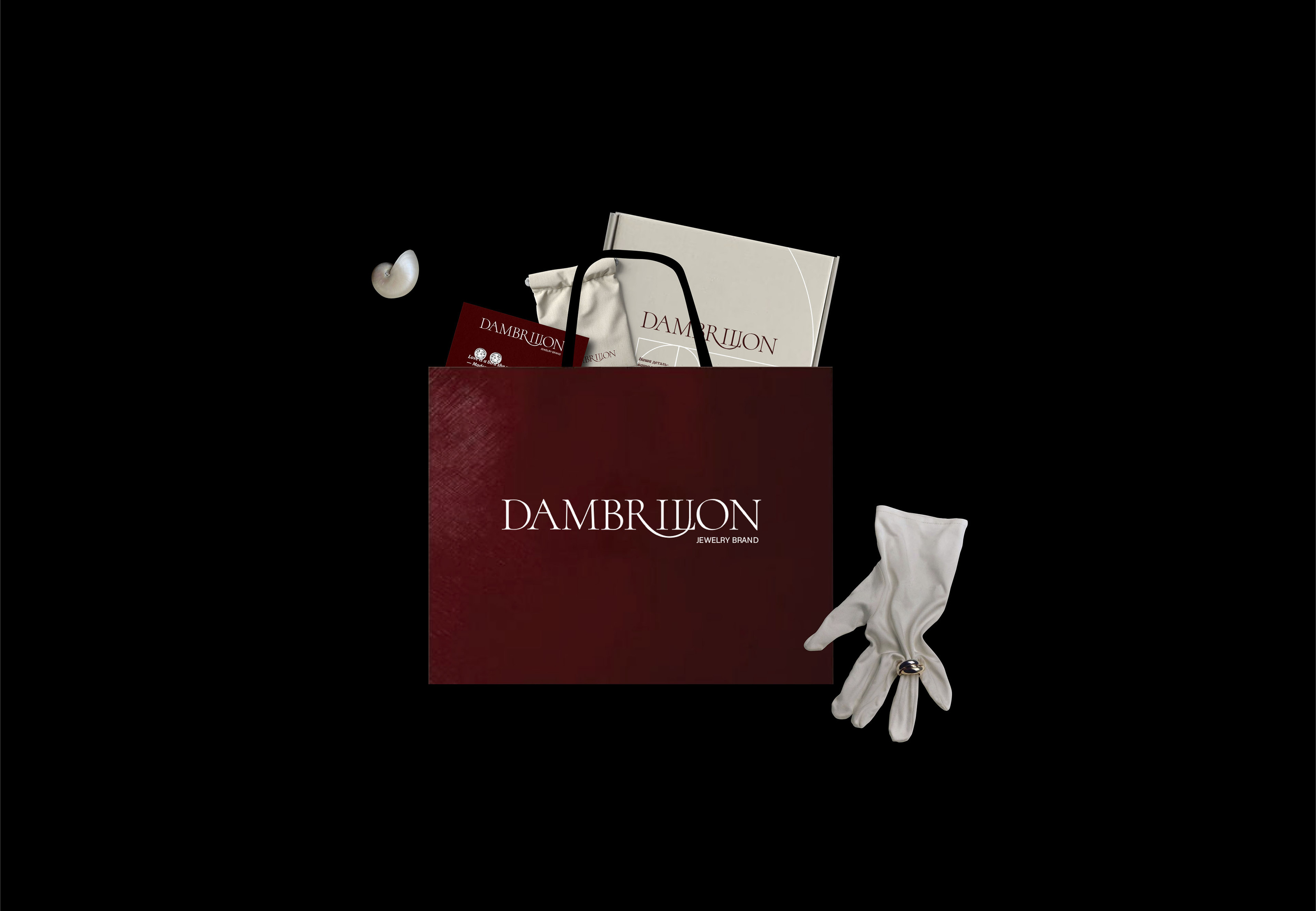
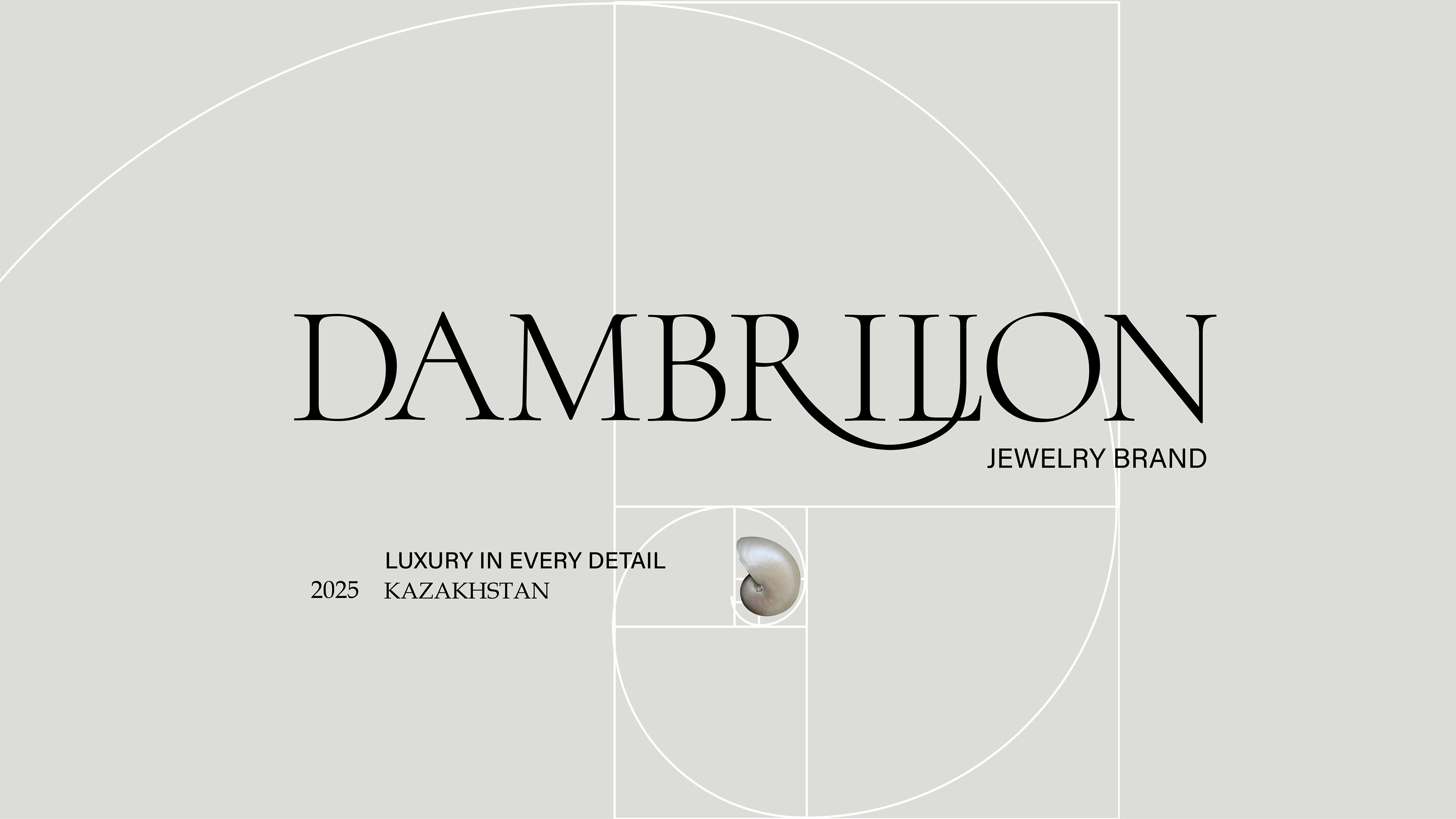
Логотип для бренда Dambrilion выполнен в буквенном написании элегантным антиквенным шрифтом, что подчеркивает изысканность и минимализм бренда, особенность данного логотипа в том, что в нем есть нетипичная буква “R” выполненная удлиненным краем, переходящим в букву “i”, что отсылает нас на тесную связь между деталями, удлинение буквы “R” плавное и изогнутое, напоминающее идеальную дугу «золотого сечения», и это тоже не случайно, ведь отсылка фирменного стиля бренда идет именно на золотое сечение, это олицетворяет бренд как индивидуальный и особенный, со своей главной изюминкой.
ENG.
The logo for the Dambrilion brand is lettered in an elegant antique font, which emphasizes the sophistication and minimalism of the brand, the peculiarity of this logo is that it has an atypical letter “R” made with an elongated edge turning into the letter “I”, which refers us to the close connection between the details, the elongation of the letter “R” is smooth and it is curved, resembling the perfect arc of the "golden ratio", and this is also not accidental, because the reference of the brand's corporate identity goes precisely to the golden ratio, it embodies the brand as individual and special, with its main highlight.