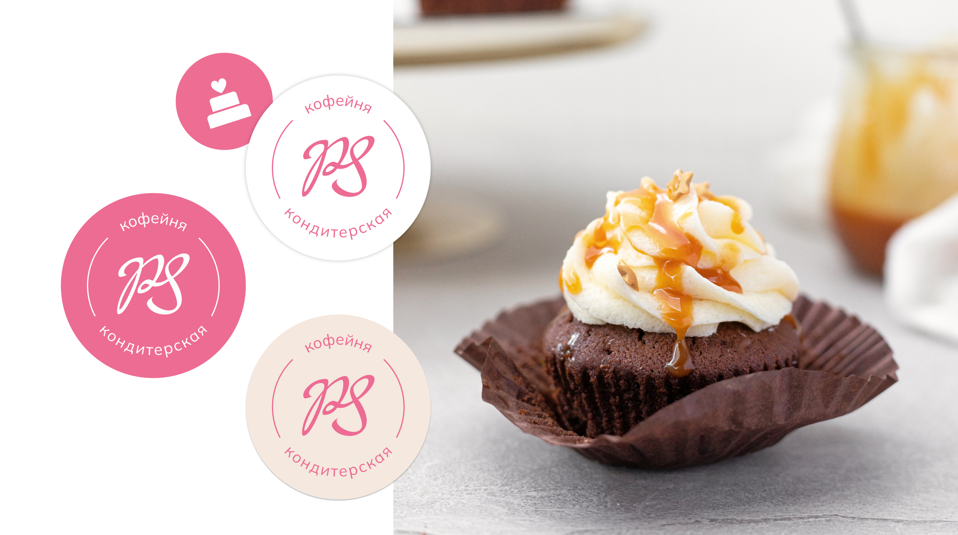
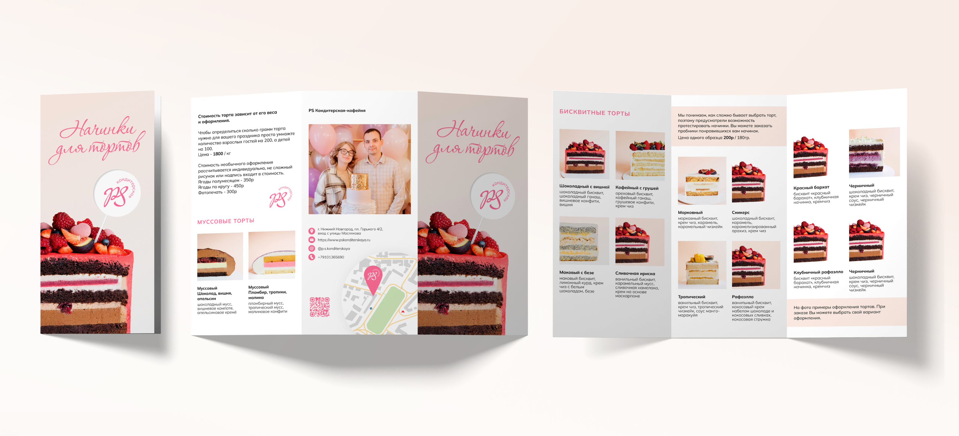
PS Кондитерская - семейный бренд. Основатели - муж и жена. Полина с детства мечтала о собственном кафе, а Сергей работал шеф поваром и был очень увлечен этим делом. Название - это первые буквы имен основателей и дескриптор.
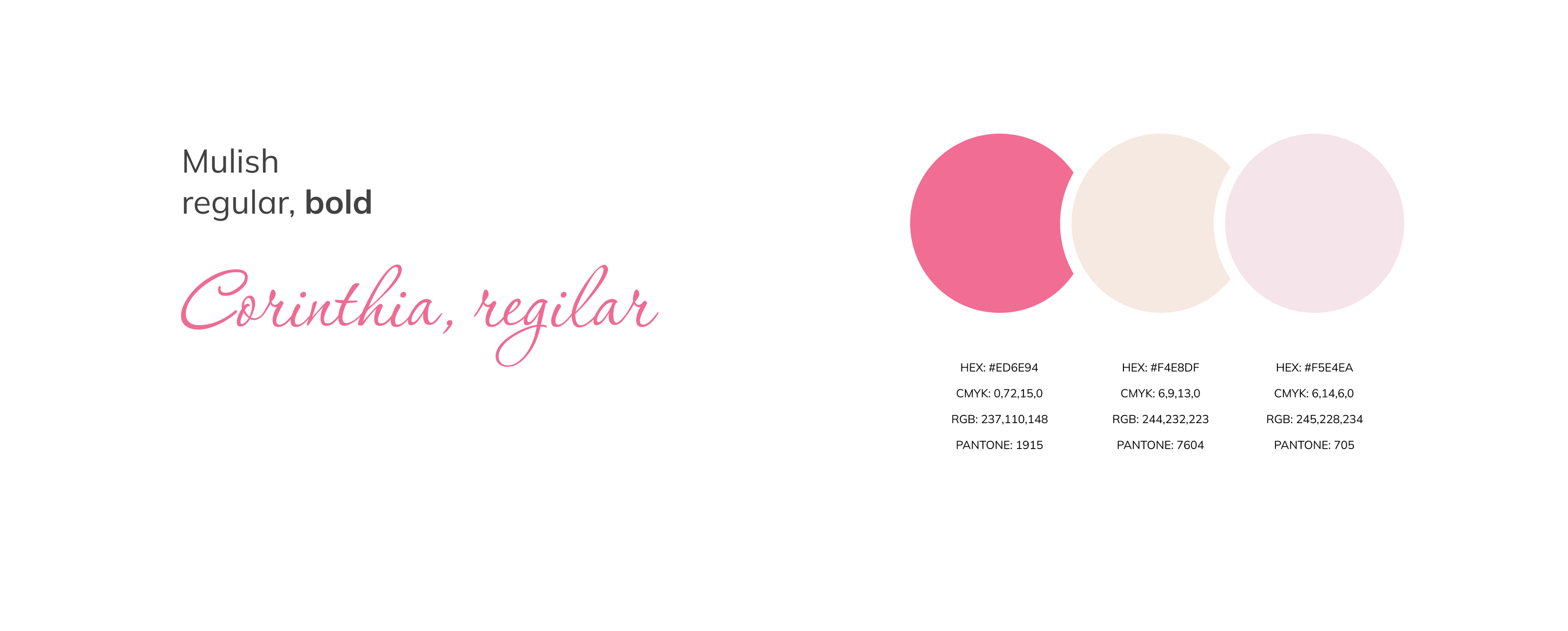
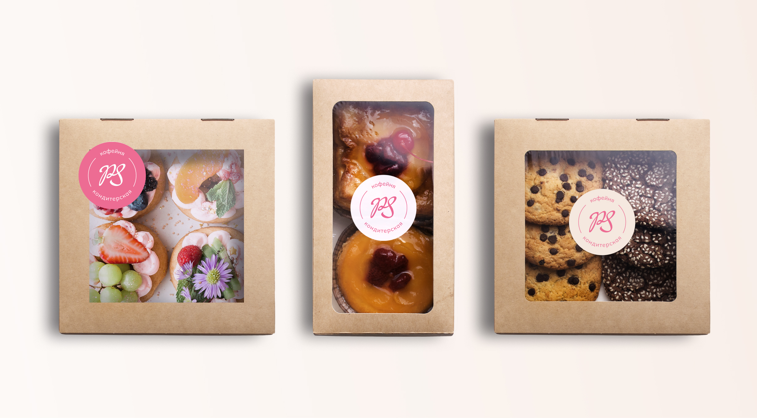
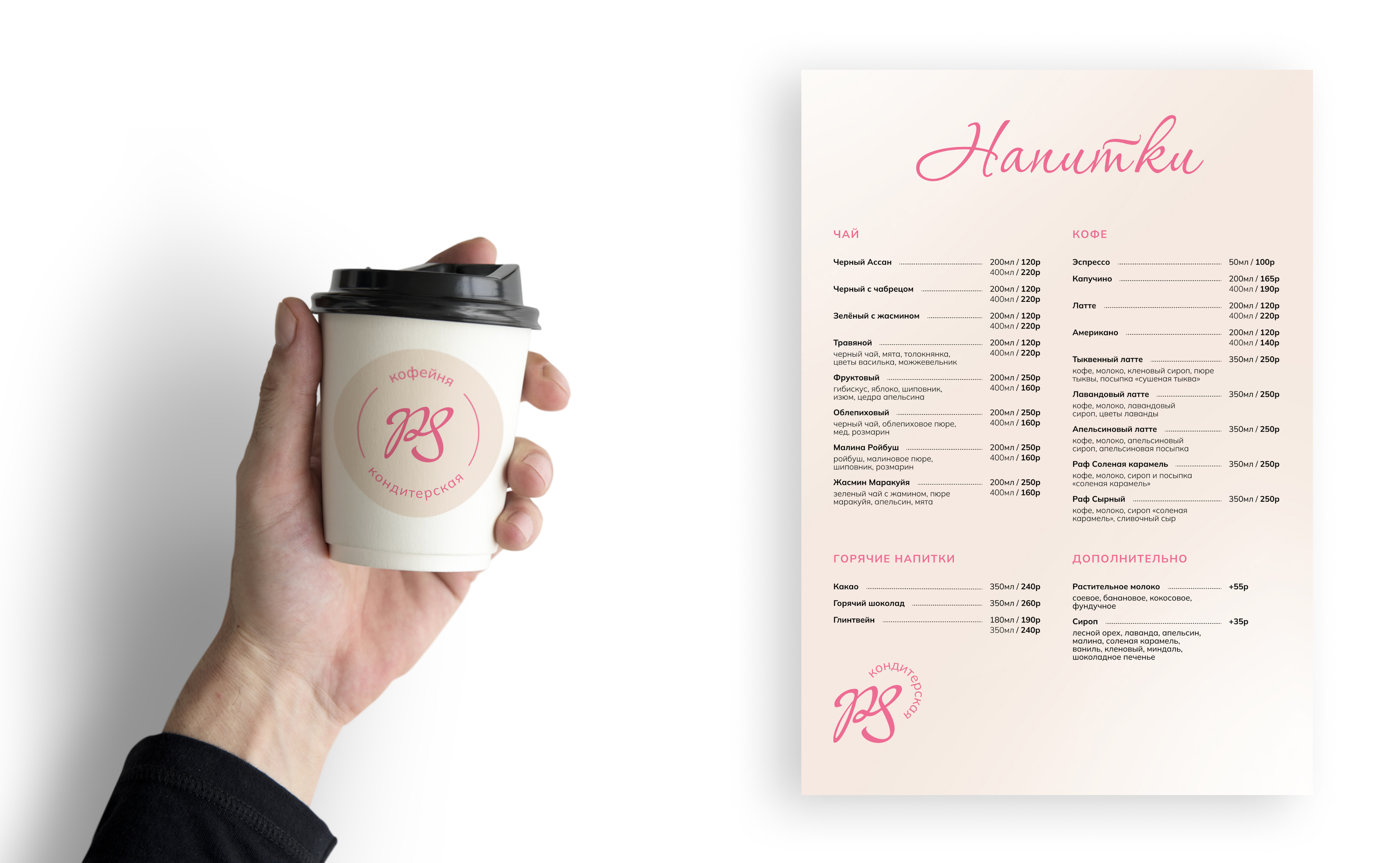
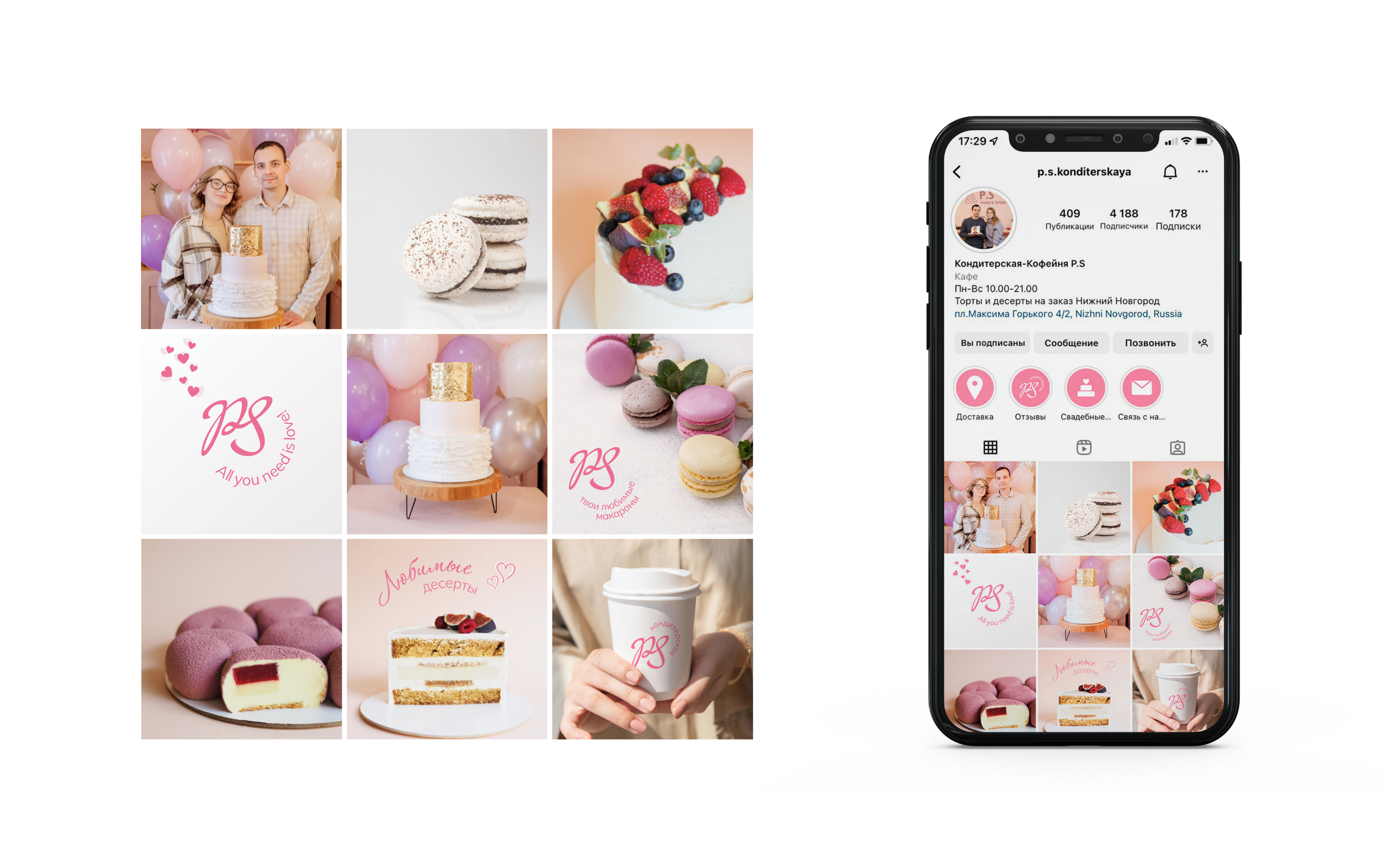
Бренд должен ассоциироваться с праздниной атмосферой, сладостями, радостью. Поэтому для логотипа и акцентного шрифта выбрано начертание, которое похоже на ленту на коробке с тортиком, и подобран насыщенный розовый цвет.
PS Confectionery is a family brand founded by a husband and wife. Polina always dreamed of having her own cafe, while Sergey was very passionate about working as a chef. The name - PS Confectionery - comes from the first letters of the founders' names and includes a descriptor.
The brand should be associated with a festive atmosphere, sweets, and joy. That's why a script font, similar to the ribbon on a cake box, was chosen for the logo and accent font, and a rich pink color was selected.


Brand / Web designer - Shevtsova Olga
shevts.o.va@yandex.ru