
ENG
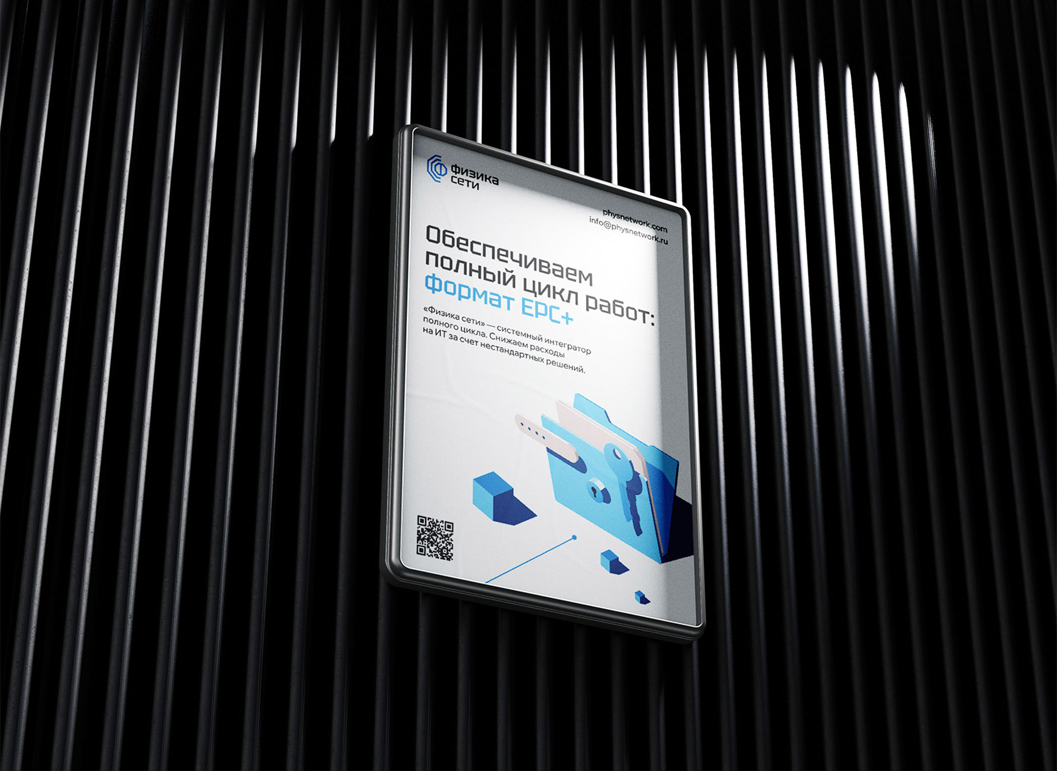
Physics of the Network is a company in the field of cybersecurity, a full cycle system integrator.
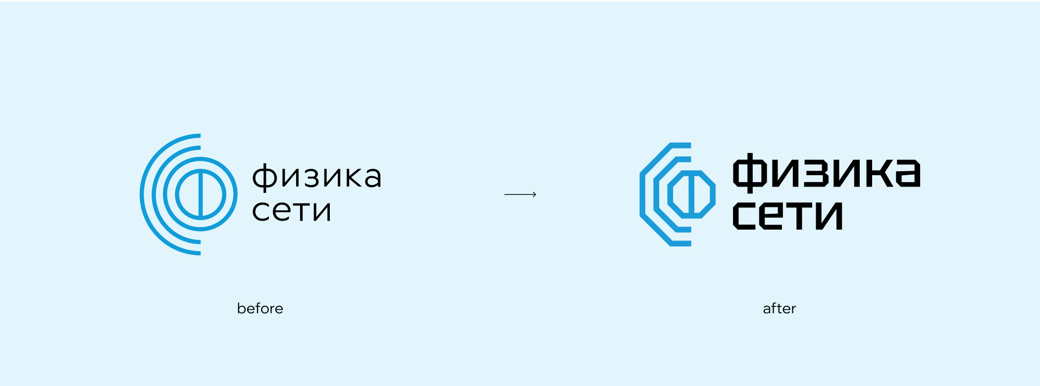
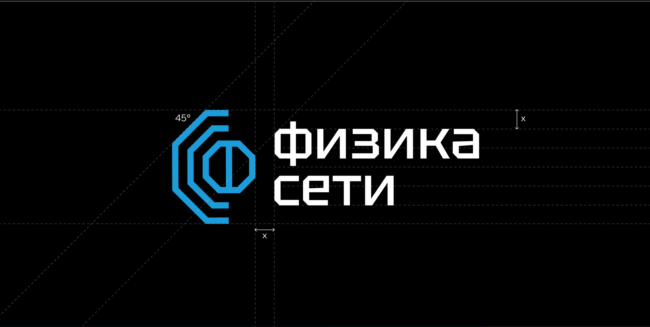
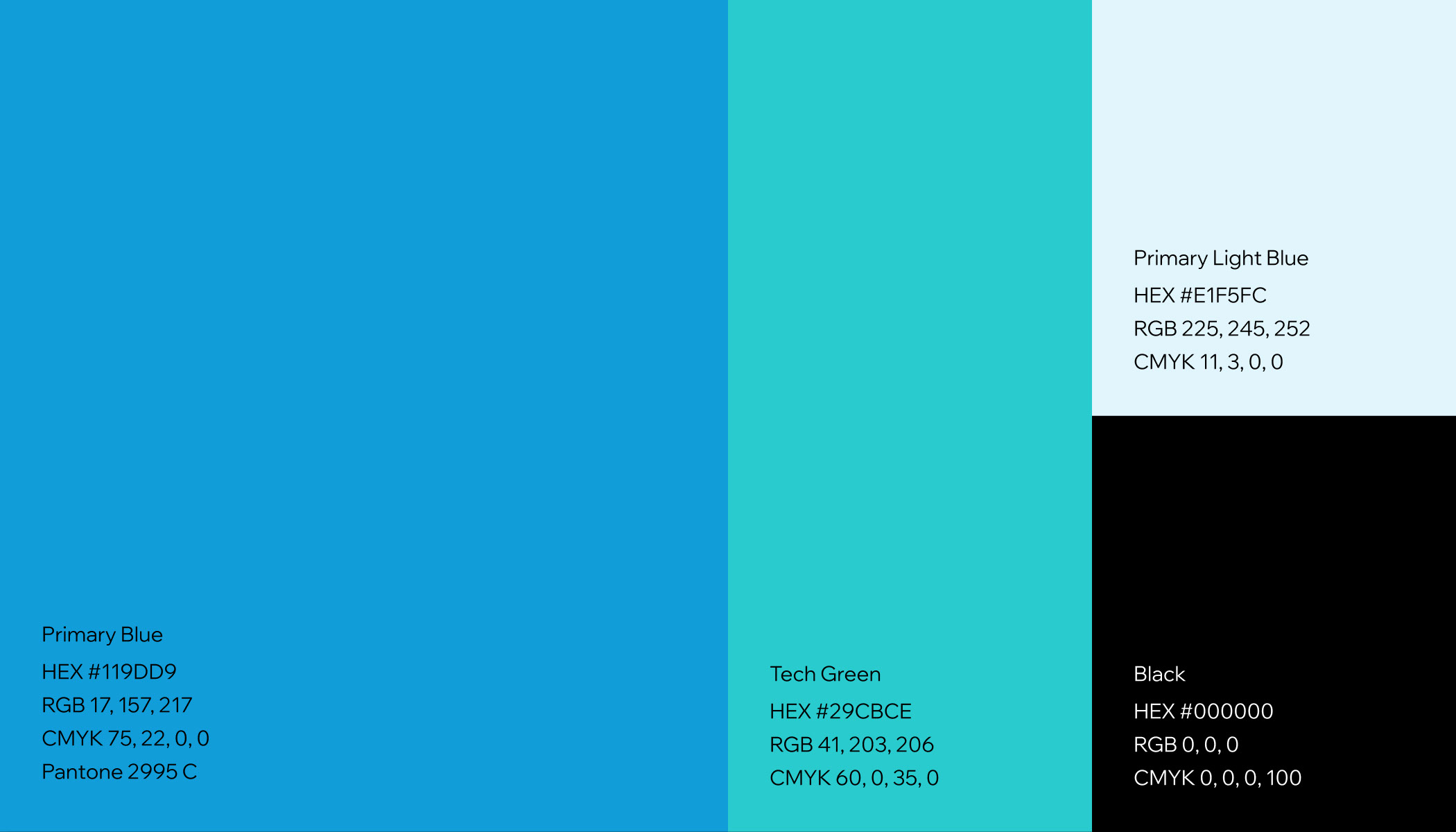
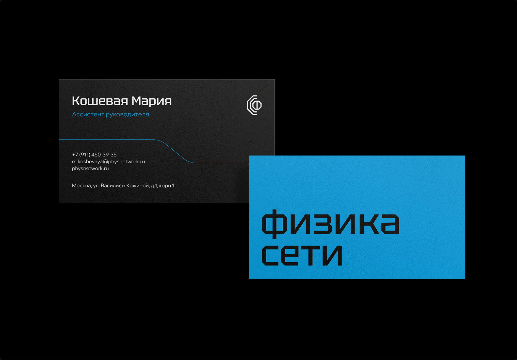
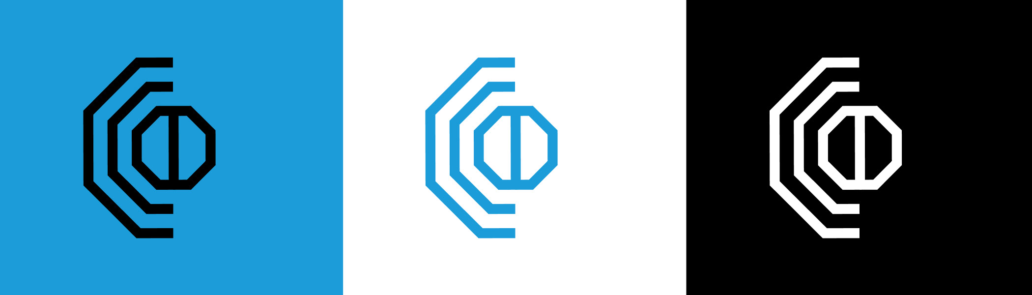
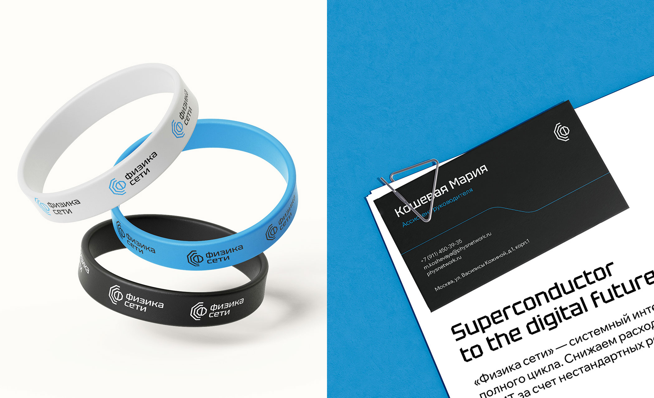
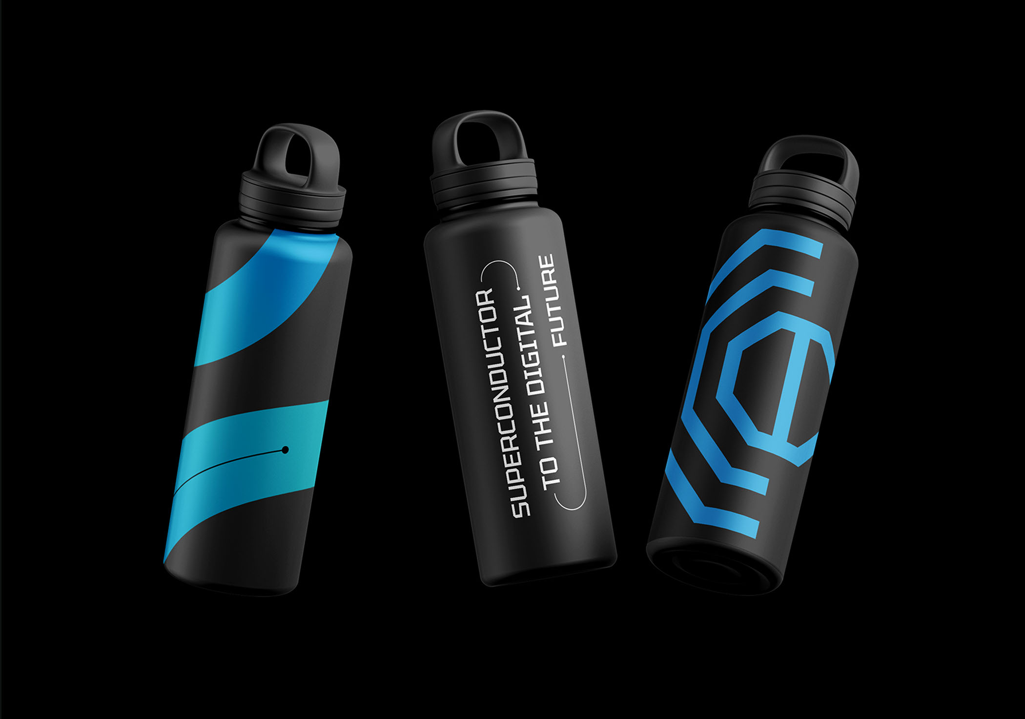
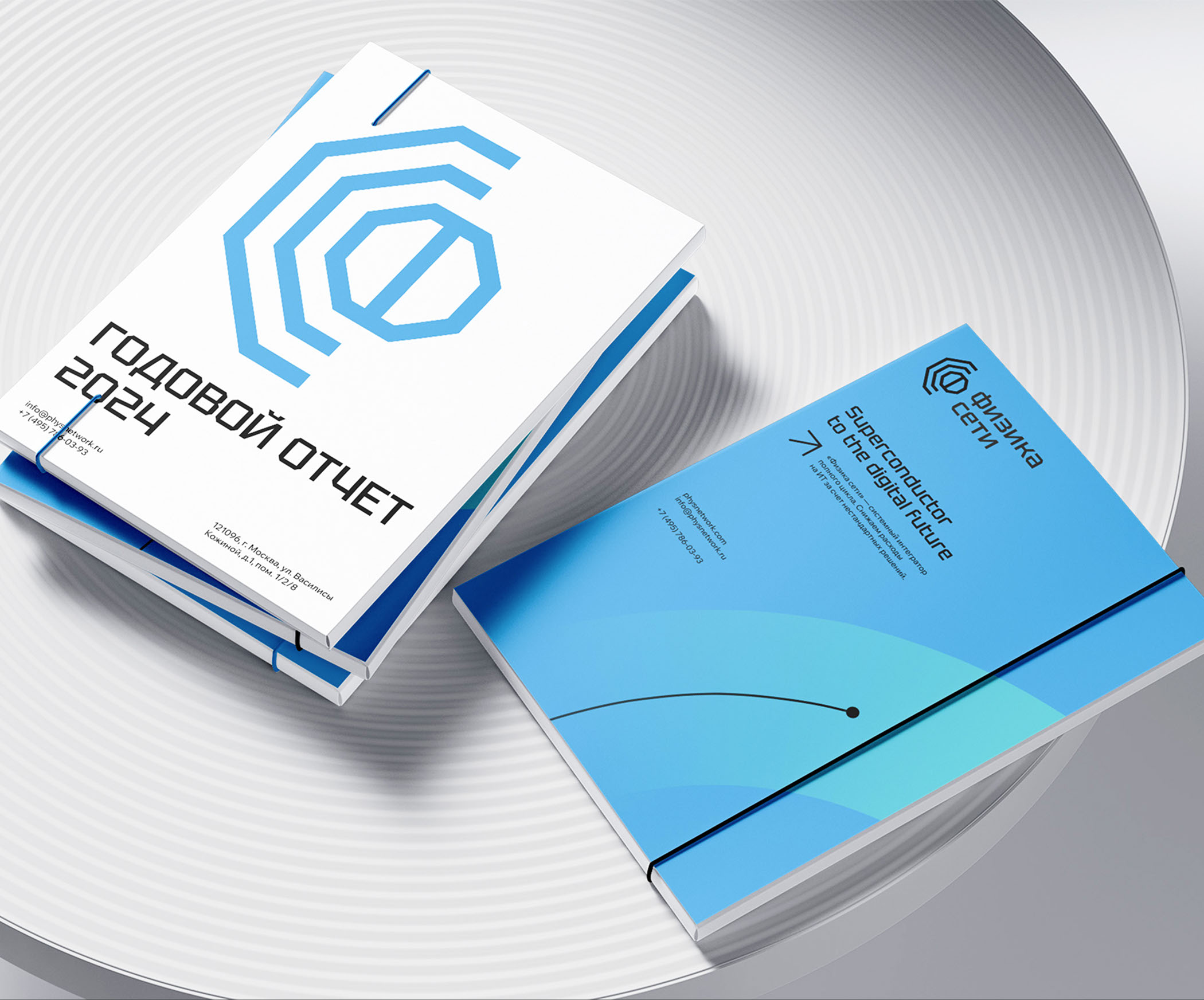
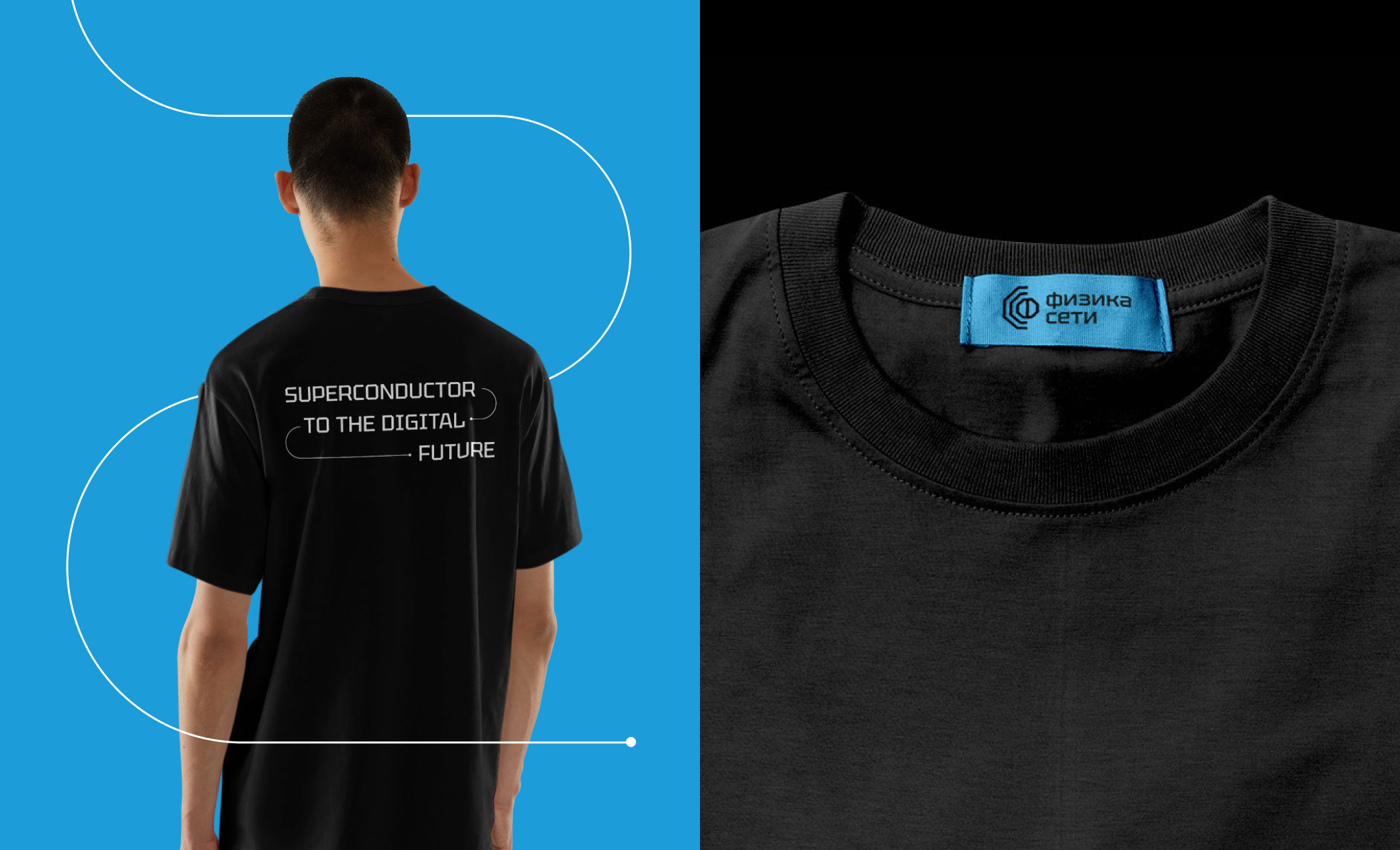
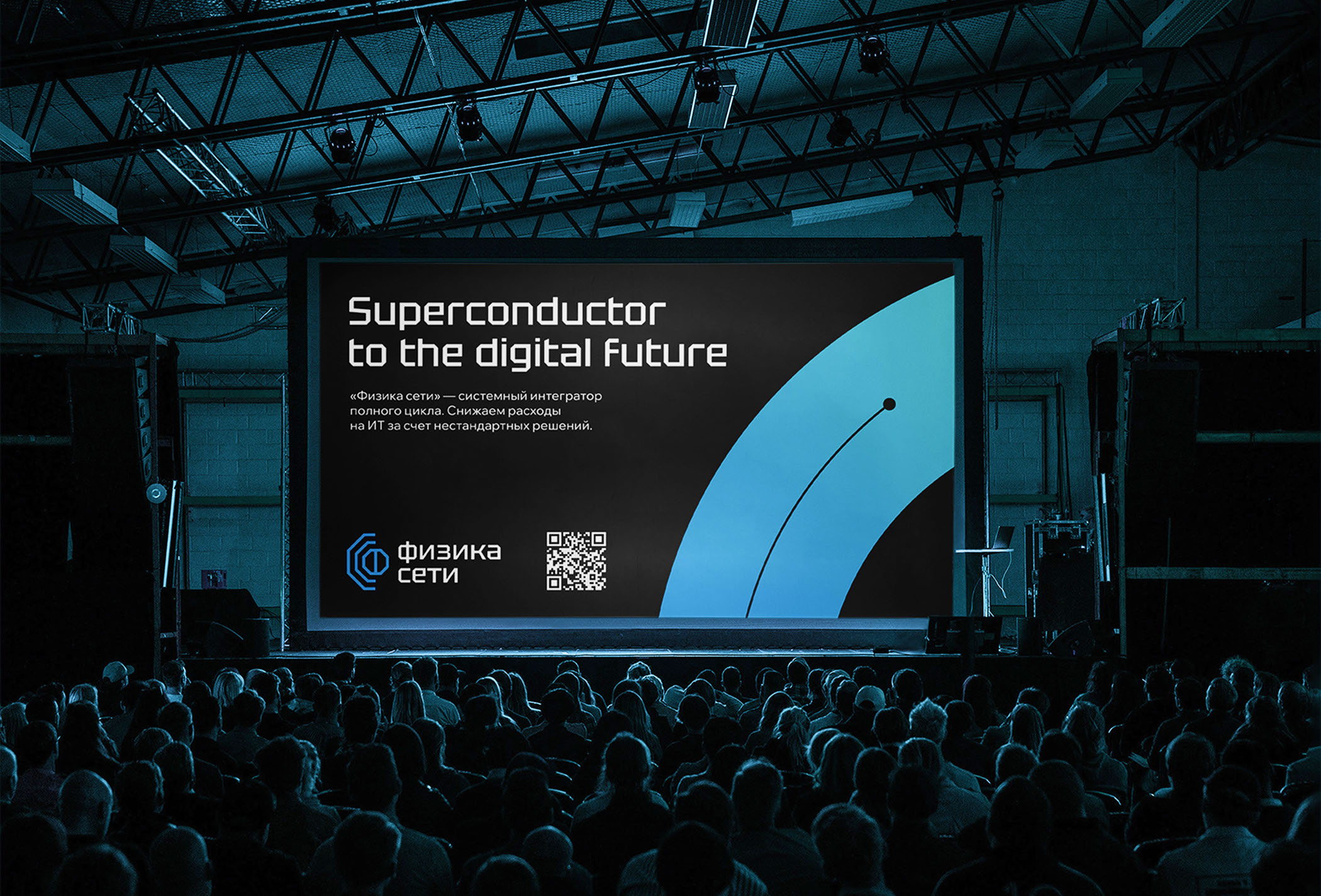
As part of the rebranding, we used the metaphor of a superconductor, representing it as a thin line moving forward. The superconductor symbolizes the desire for innovation and progress in the digital future. The limited palette with two accent colors reflects the company's technology and professionalism. An accidental font attracts attention and allows the company to stand out from its competitors.
The rebranding is not just a renewal of visual identity, it is a statement of the company's willingness to lead customers into a future where safety and efficiency go hand in hand.
RUS
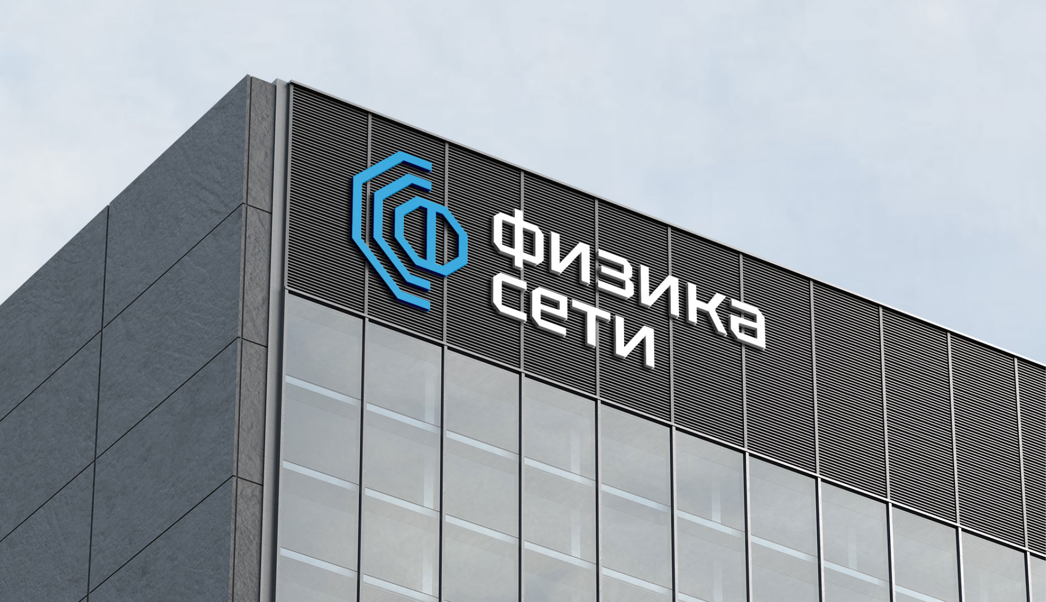
Физика сети — компания в сфере кибербезопасности, системный интегратор полного цикла.
В рамках ребрендинга мы использовали метафору сверхпроводника, представляя его как тонкую линию, движущуюся вперед. Сверхпроводник символизирует стремление к инновациям и прогрессу в цифровом будущем. Ограниченная палитра с двумя акцентными цветами отражает технологичность и профессионализм компании. Акцидентный шрифт привлекает внимание и позволяет выделиться среди конкурентов.
Ребрендинг не просто обновление визуальной идентичности, это заявление о готовности компании ввести клиентов в будущее, где безопасность и эффективность идут рука об руку.