ПРО ПРОЕКТ [RUS]
ABRAMOVICH - это студия красоты, в которой вы полюбите себя заново. Миссия бренда заключается в том, чтобы с помощью красок и кистей раскрыть и подчеркнуть естественную красоту каждой девушки.
ABOUT THE PROJECT [ENG]
ABRAMOVICH is a beauty studio where you will love yourself anew. The brand's mission is to use paints and brushes to reveal and emphasize the natural beauty of every girl.
[RUS]
Студия ABRAMOVICH - это место, где можно расслабиться в уютной приятной атмосфере и отдохнуть от повседневности. Ценностями бренда являются доверие, надежность и теплота.
[ENG]
ABRAMOVICH Studio is a place where you can relax in a cozy pleasant atmosphere and take a break from everyday life. The brand values are trust, reliability and warmth.
КОНЦЕПЦИЯ
В разработку данного логотипа была вложена идея - подчеркнуть утонченность, и в тоже время ответственность работы. Благодаря заглавной букве «A» в середине слова, логотипу придается ритм, который можно символизировать, как рост любви и заботе к себе. Также буква «A» означает инициал фамилии создательницы студии, что еще больше выделяет среди конкурентов. Перетекание из буквы «R» в «A» является знаком доверия, и опоры, которые получает клиенты в студии ABRAMOVICH.
Таким образом, утонченность, строгость шрифта в сочетании с плавностью и изгибами буквы «A» придают логотипу оригинальность, узнаваемость и женственность, что важно для студии красоты.
THE CONCEPT
The idea was put into the development of this logo - to emphasize the sophistication, and at the same time the responsibility of the work. Thanks to the capital letter "A" in the middle of the word, the logo is given a rhythm that can be symbolized as the growth of love and self-care. Also, the letter "A" means the initial of the surname of the creator of the studio, which further distinguishes it from competitors. The flow from the letter "R" to "A" is a sign of trust and support that clients receive in the ABRAMOVICH studio.
Thus, the sophistication, rigor of the font combined with the smoothness and curves of the letter "A" give the logo originality, recognition and femininity, which is important for the beauty studio.
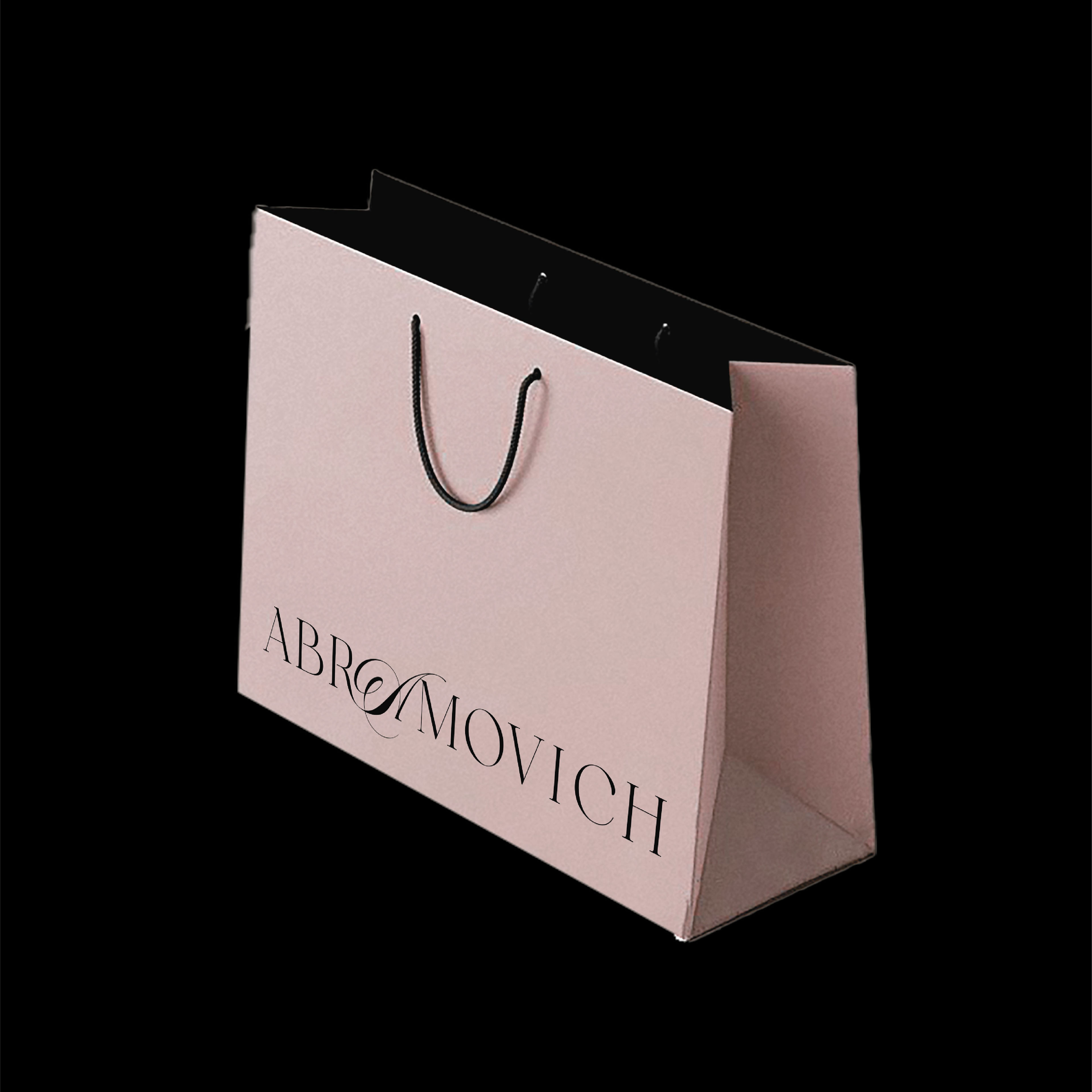
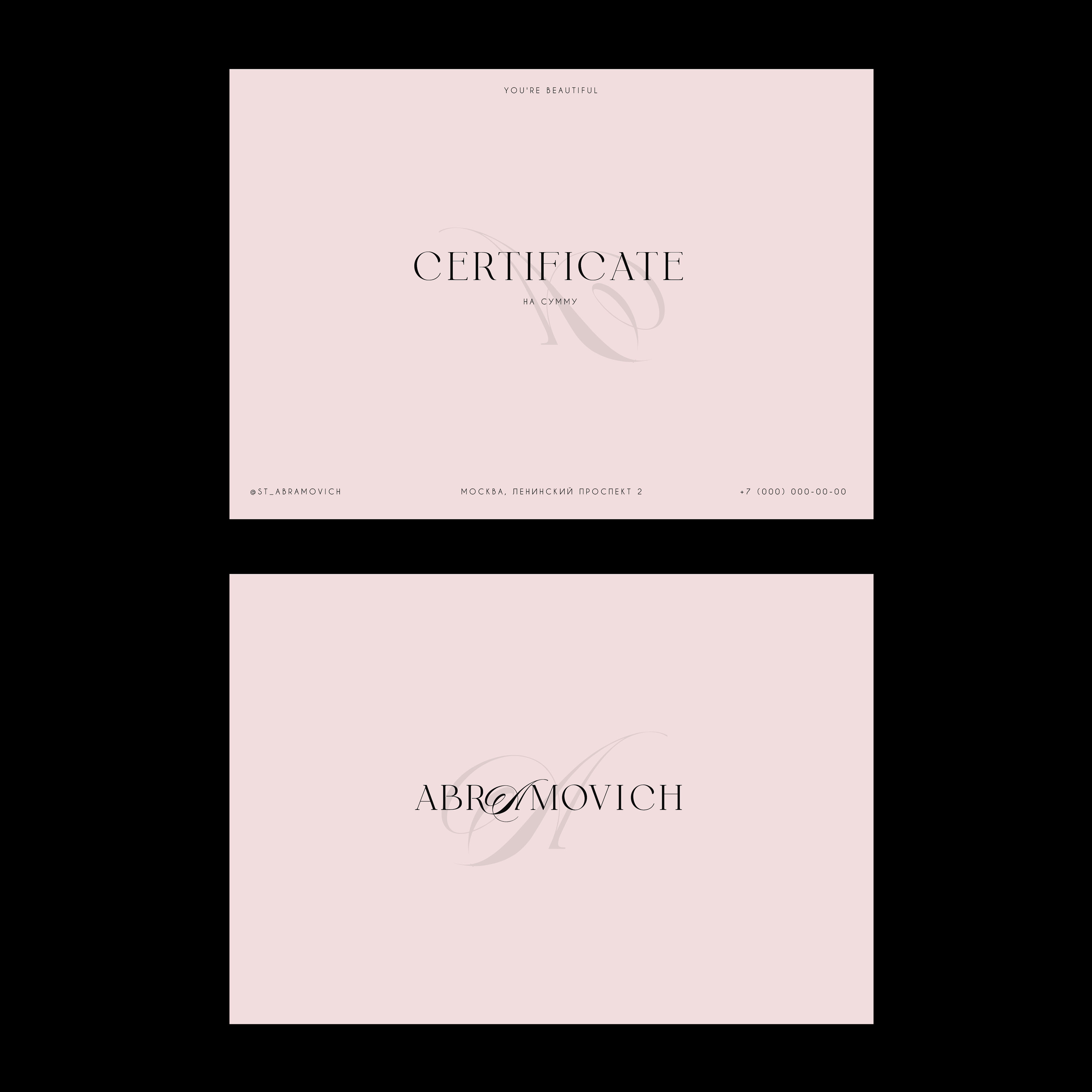
ABRAMOVICH / beauty studio
Thanks for watching!
Designer: Elizabeth Sovetova
inst: es.issabel
july 2024
*все фотографии в кейсе взяты исключительно для вдохновения