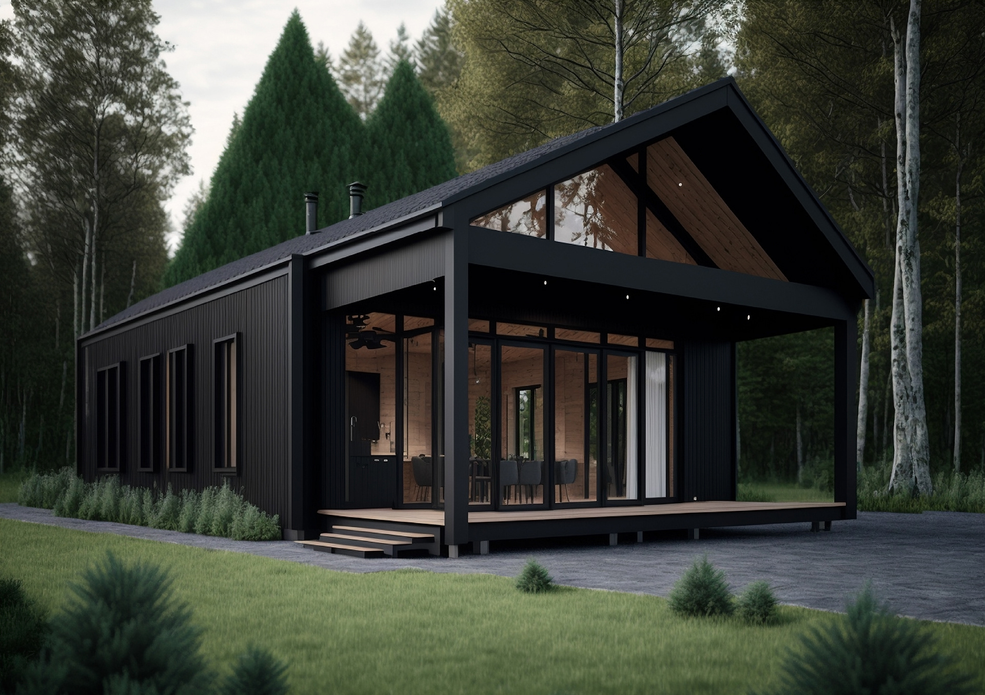
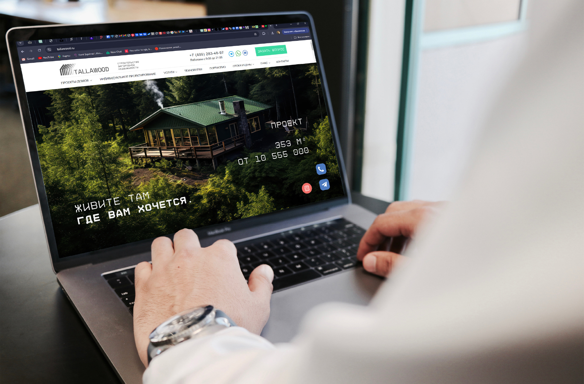
Tallawood is a company based in Karelia that specializes in the construction of countryside properties, particularly timber frame houses.
With over seven years of experience in the market, Tallawood has established itself as a reliable partner, creating cozy and functional living spaces.
The company takes pride in its high quality and excellent craftsmanship, offering clients modern homes that combine aesthetics with comfort.
Tallawood places a strong emphasis on environmental sustainability, using eco-friendly materials and energy-efficient technologies.
Thanks to this approach, Tallawood homes are not only beautiful but also environmentally responsible.
Clients greatly appreciate the personalized service and attention to detail that the company brings to every project.
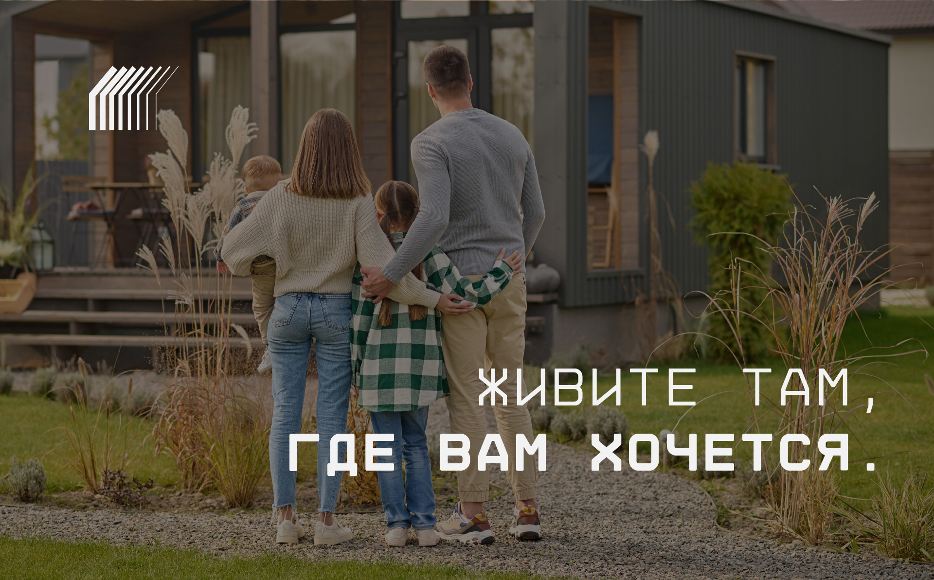
Tallawood creates places that people are proud to call home — where one can enjoy the tranquility of country living without sacrificing
modern comforts. Tallawood is where your countryside dream becomes reality.
Task: To develop a visual identity for the company that effectively communicates its core values
and highlights its competitive advantages in the countryside real estate market.
Goal: To create a cohesive visual image that reflects the company’s experience and reliability,
as well as its specialization in building timber frame houses in Karelia.
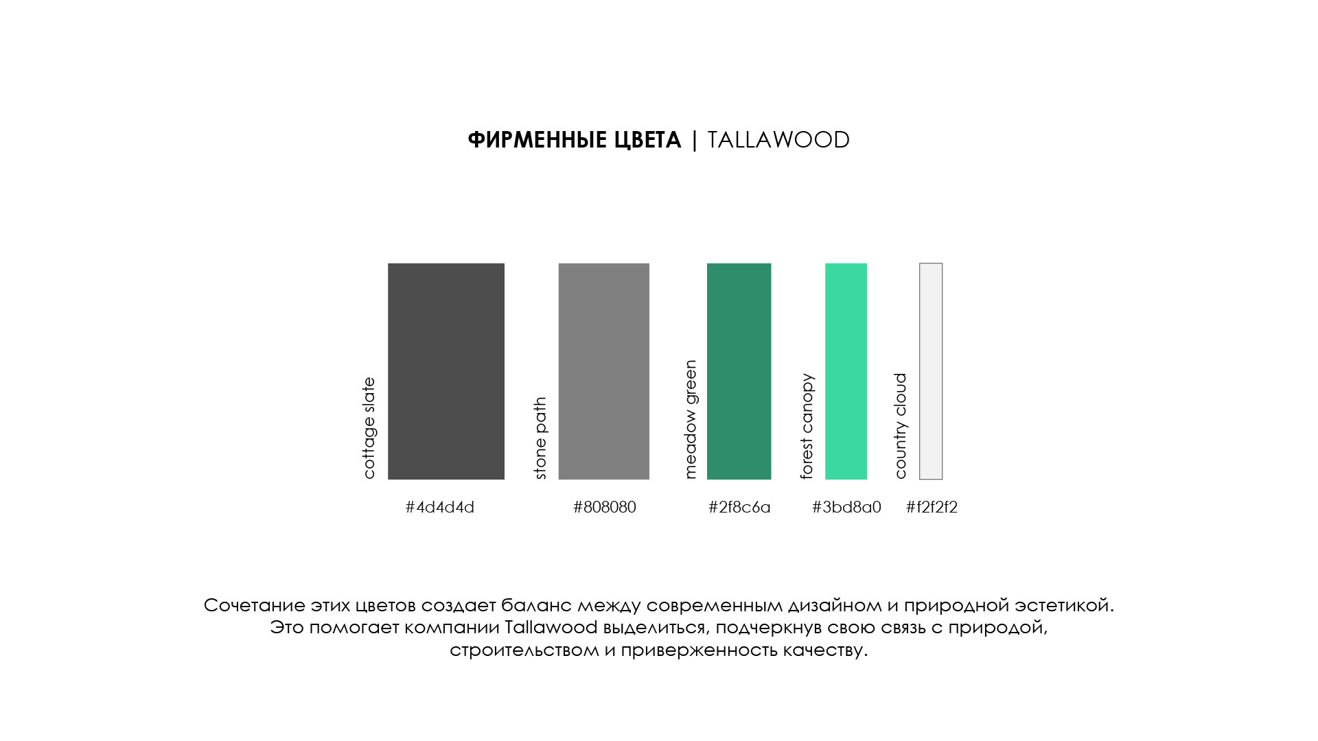
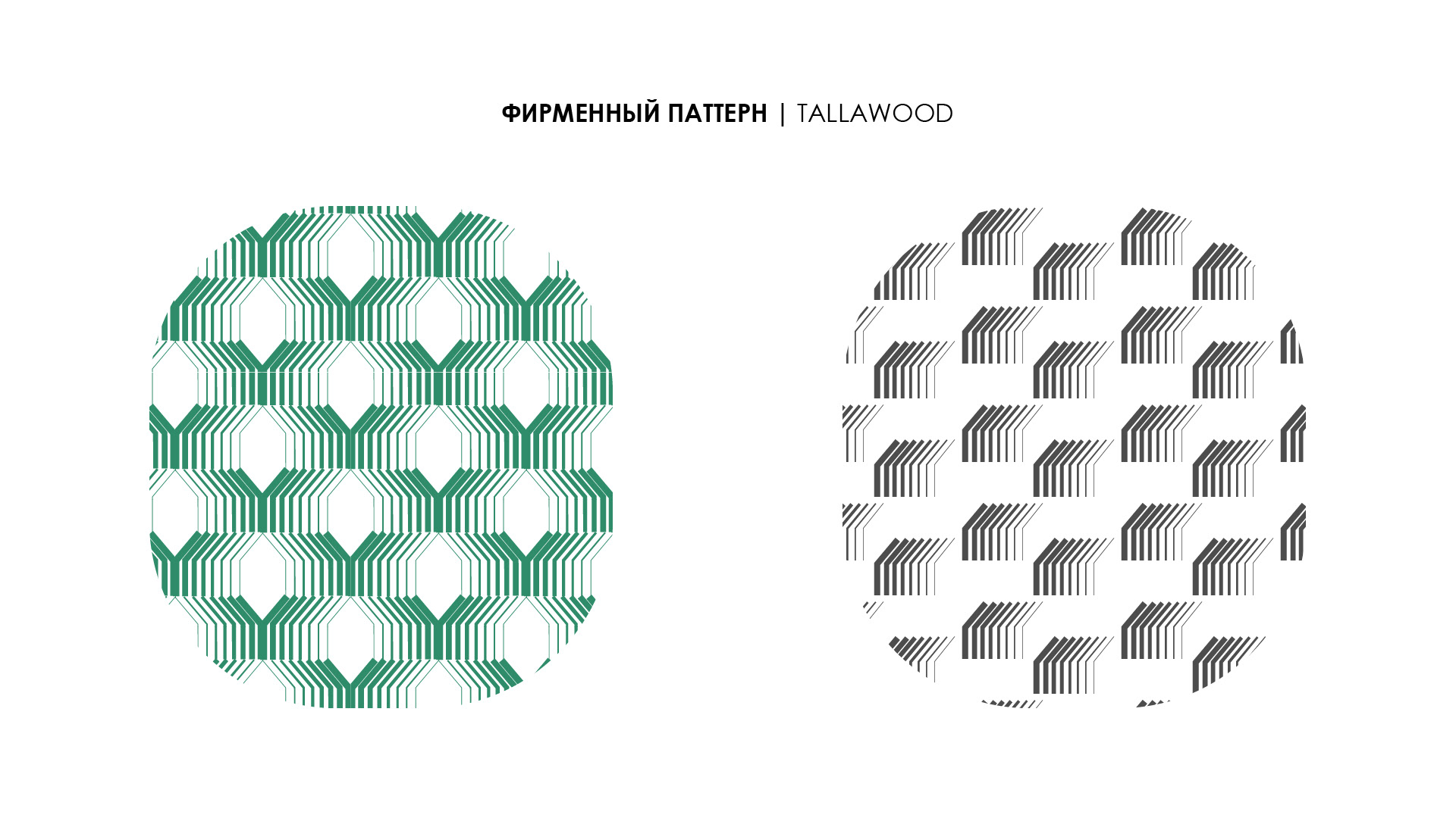
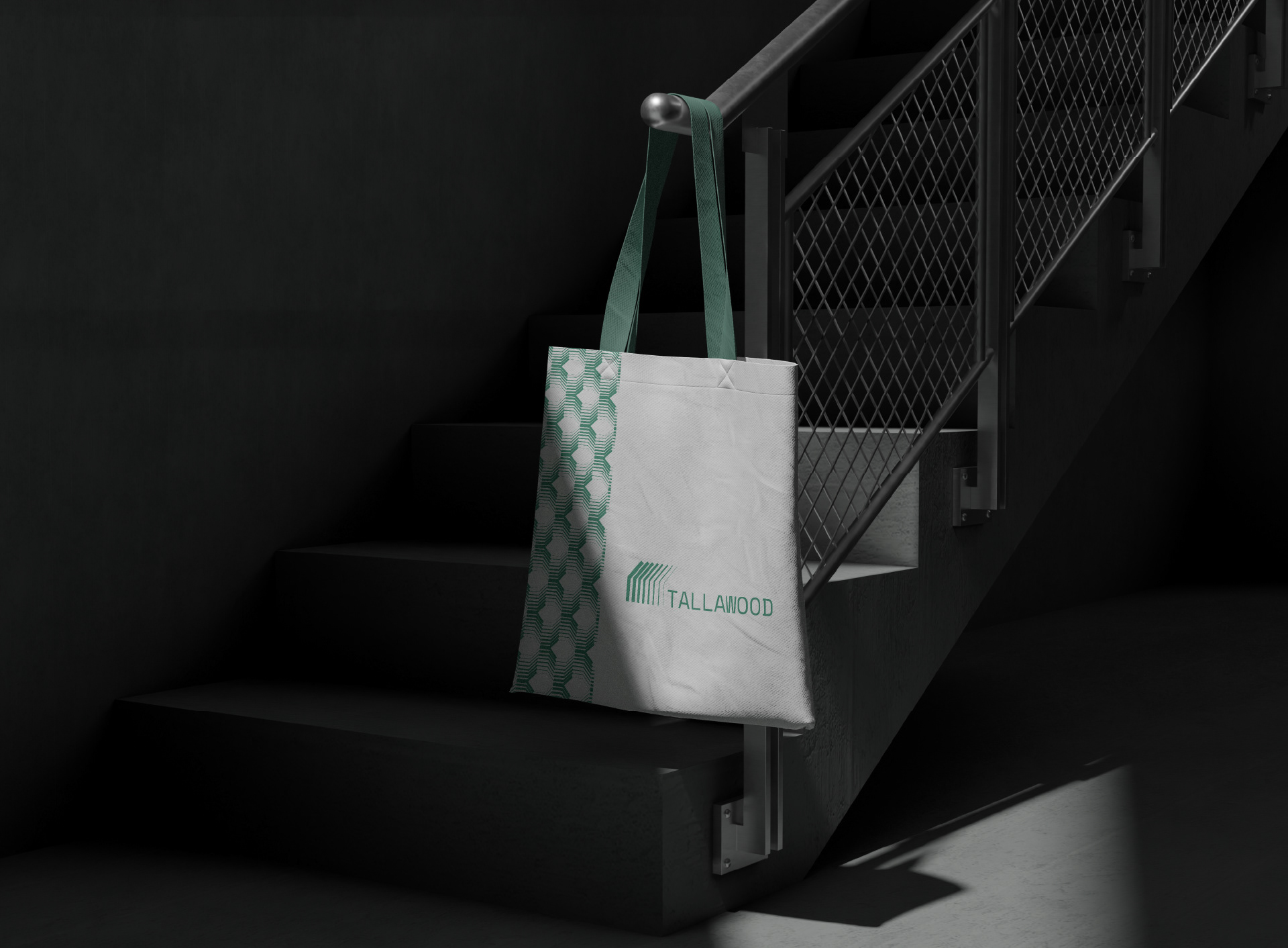
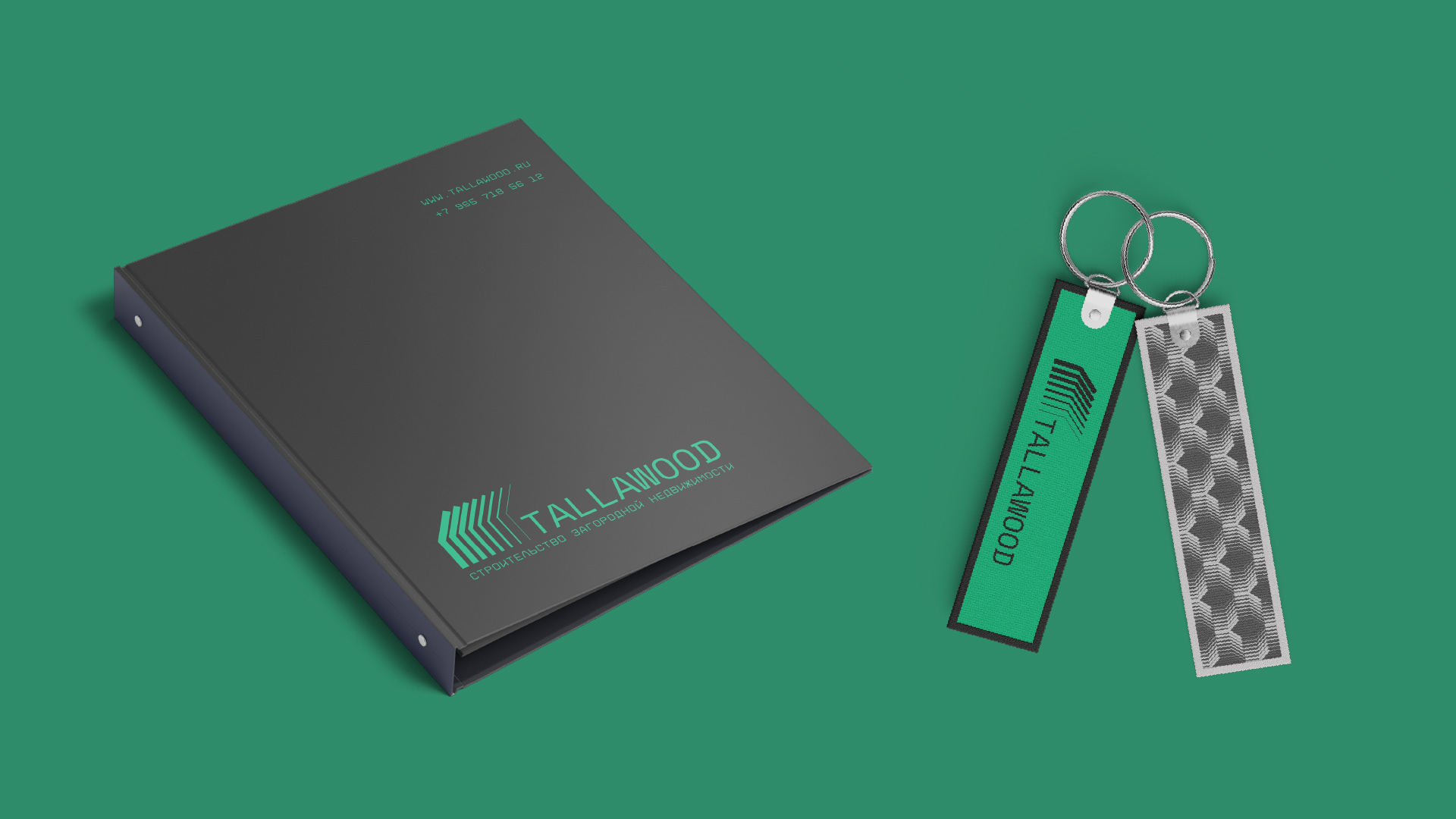
The brand identity should include an appealing logo, a harmonious color palette,
and unique graphic elements that evoke associations with construction, comfort, and quality.
A well-designed visual identity will help Tallawood stand out in the market, strengthen its reputation,
and attract its target audience — people looking to build a countryside home.
The style should immediately convey that Tallawood is a trustworthy partner, ready to turn the dream of a home into reality.
Solution:
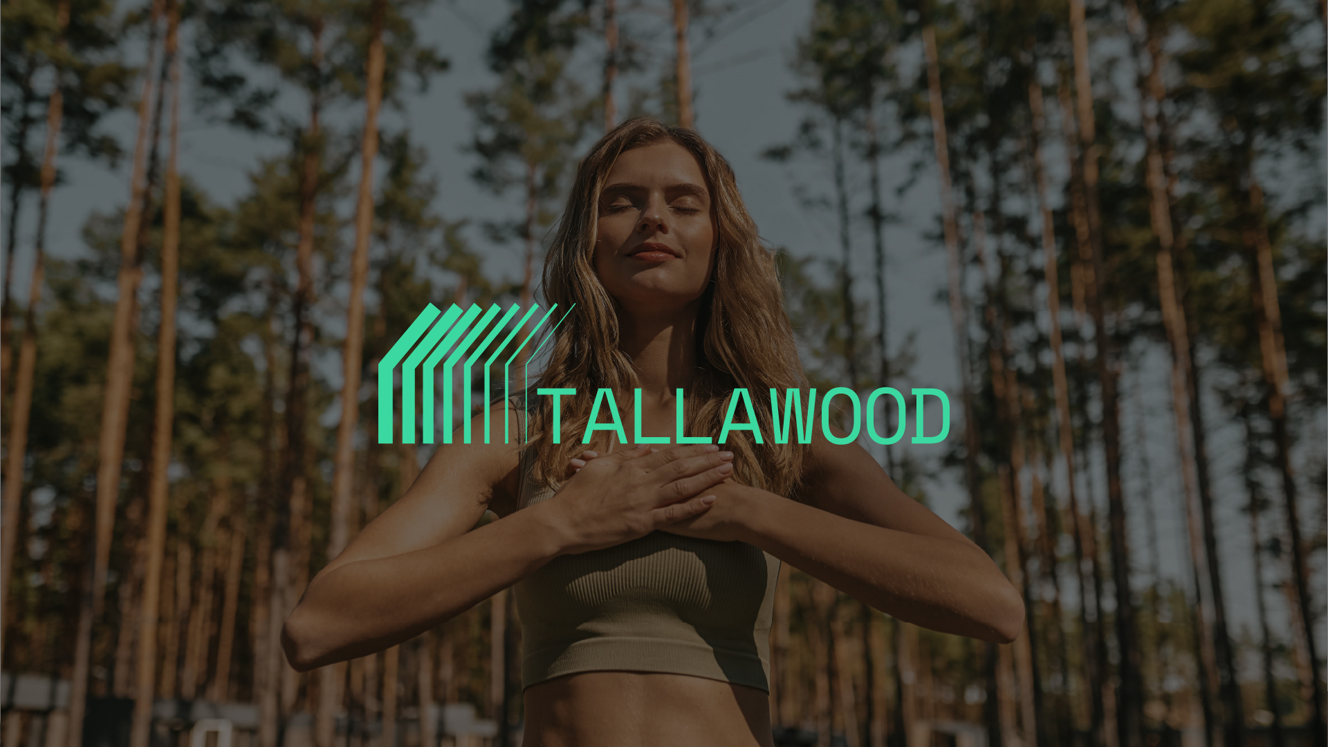
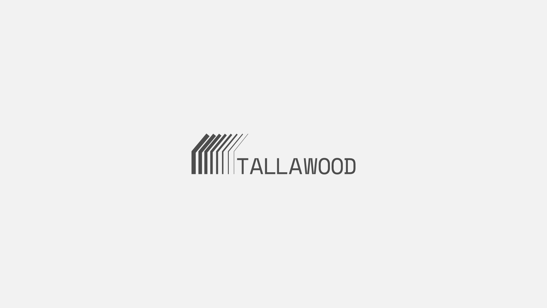
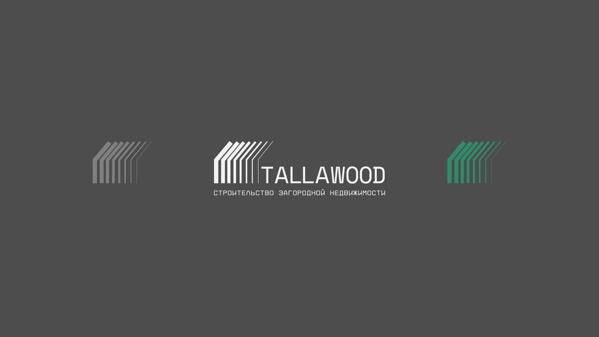
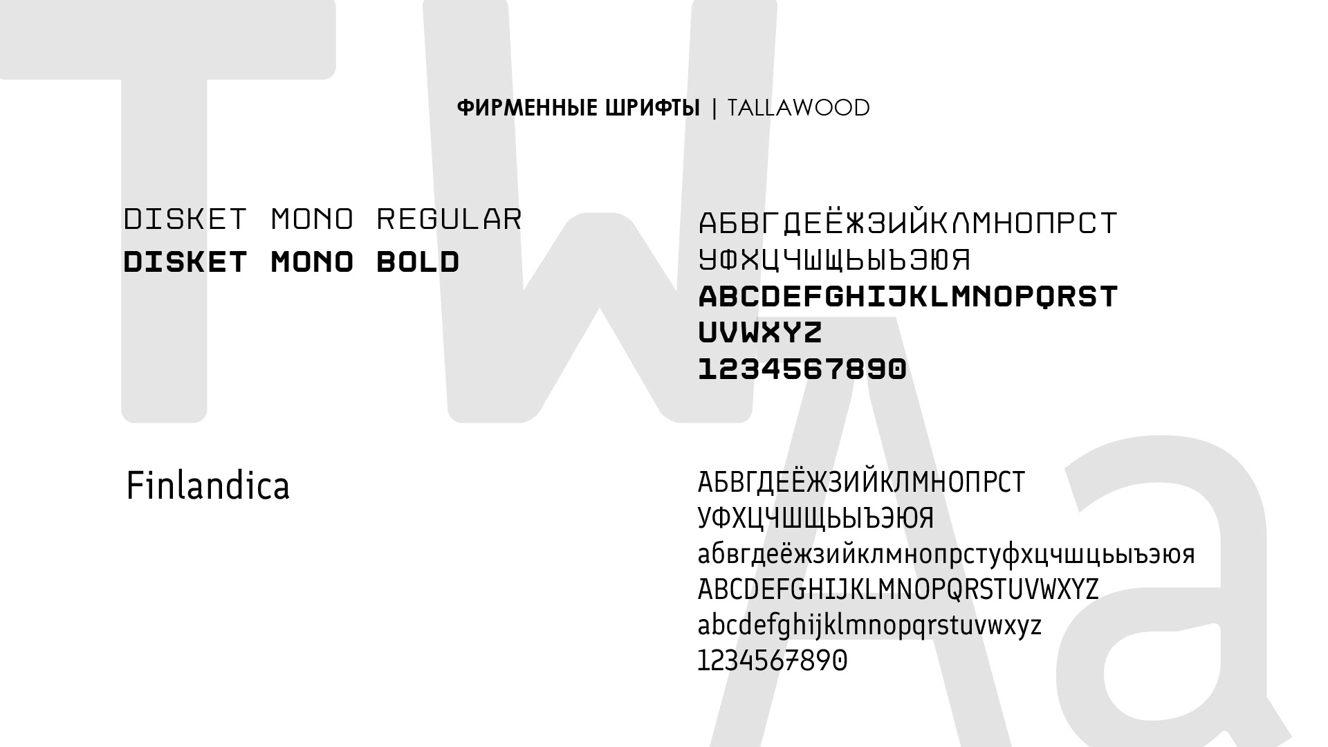
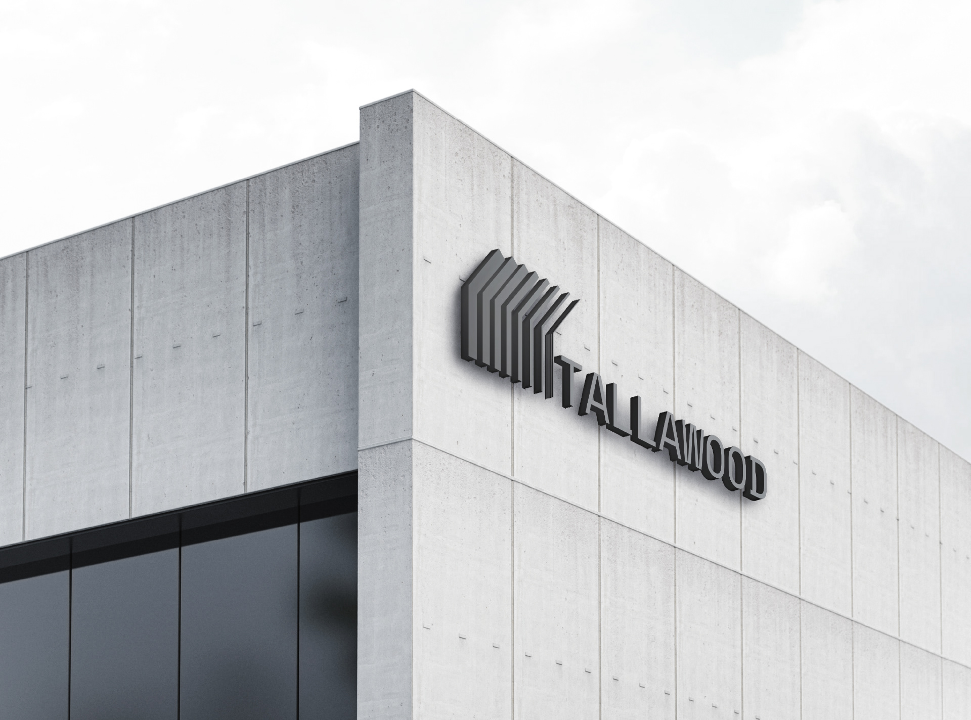
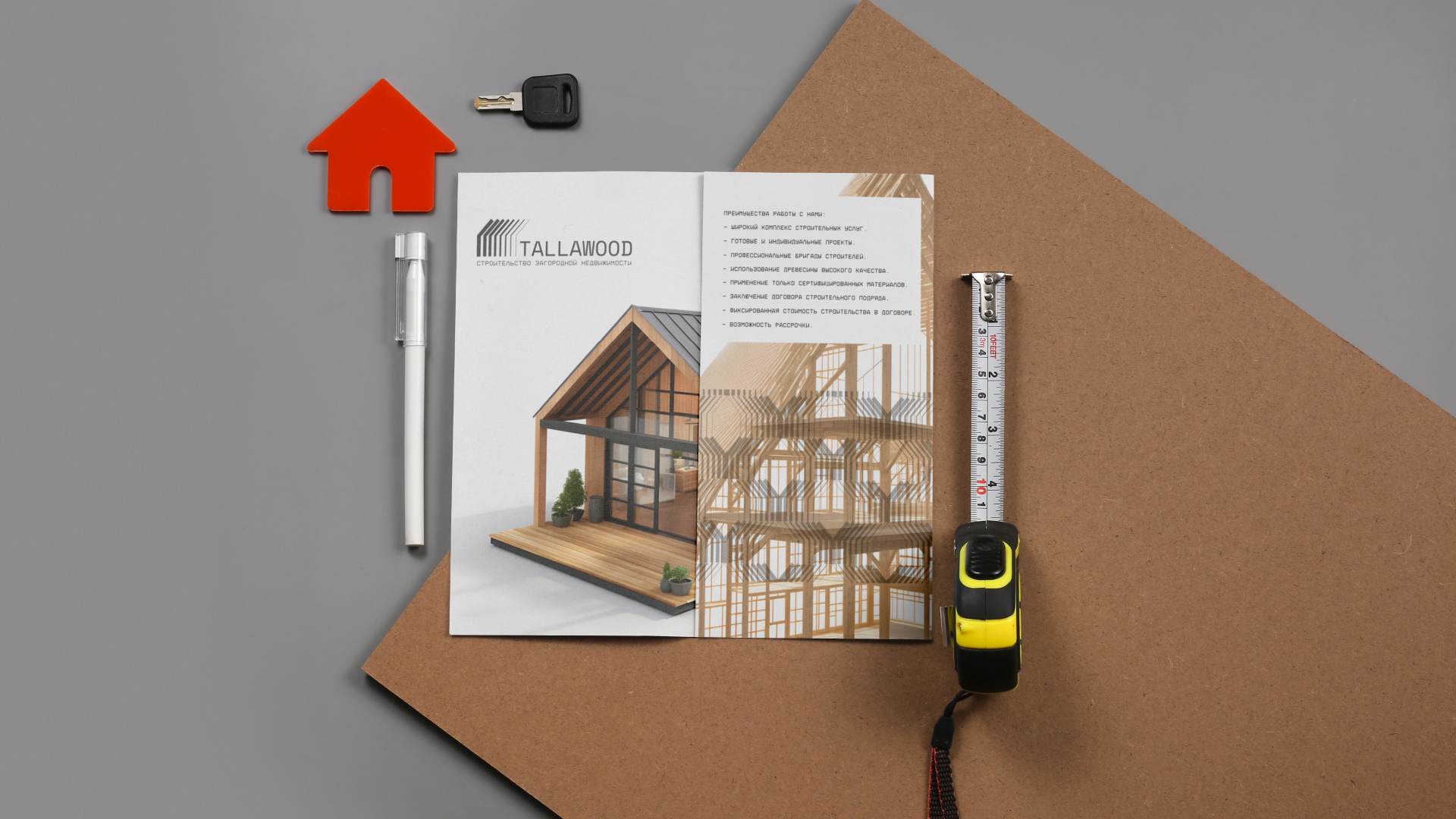
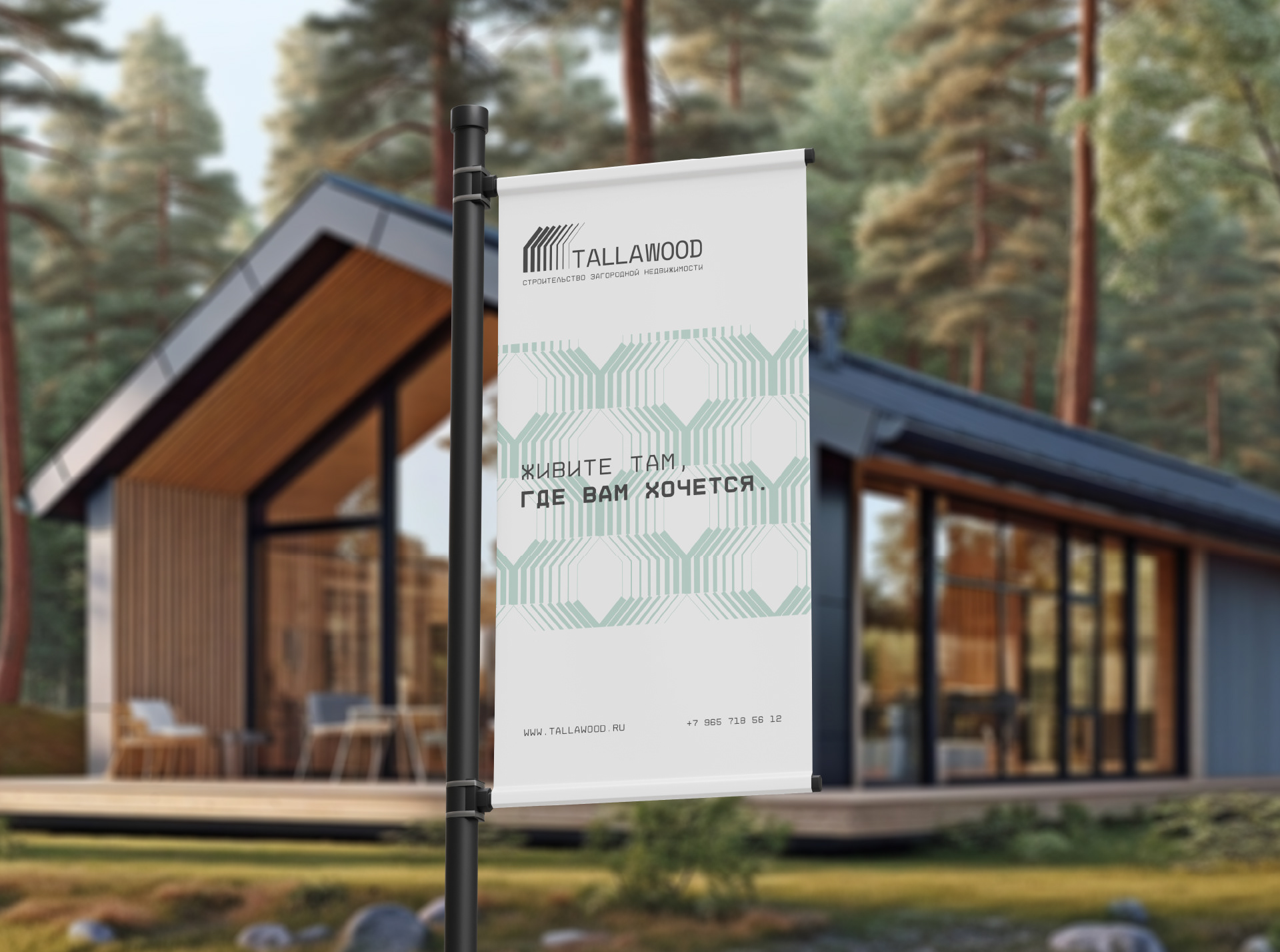
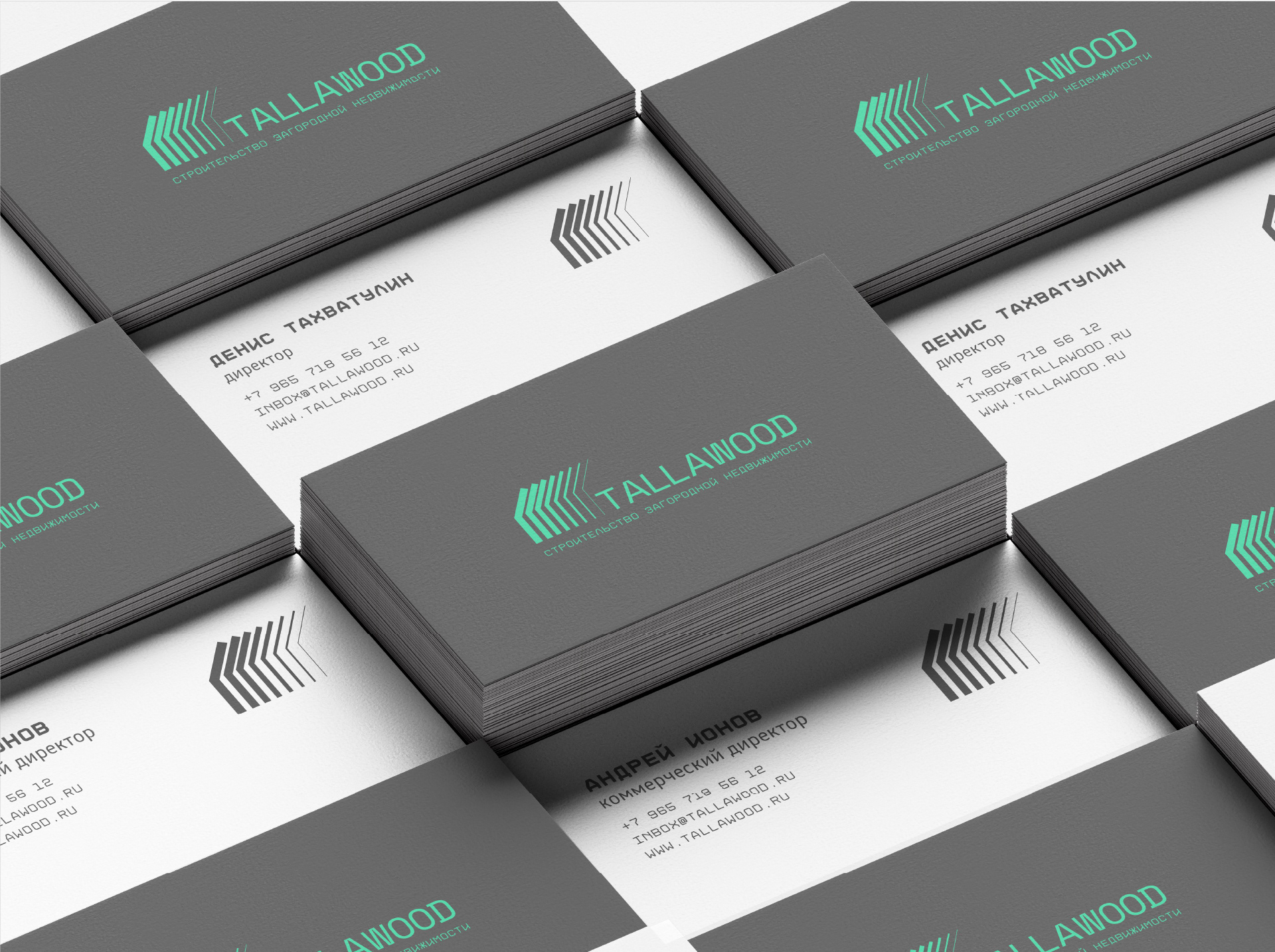
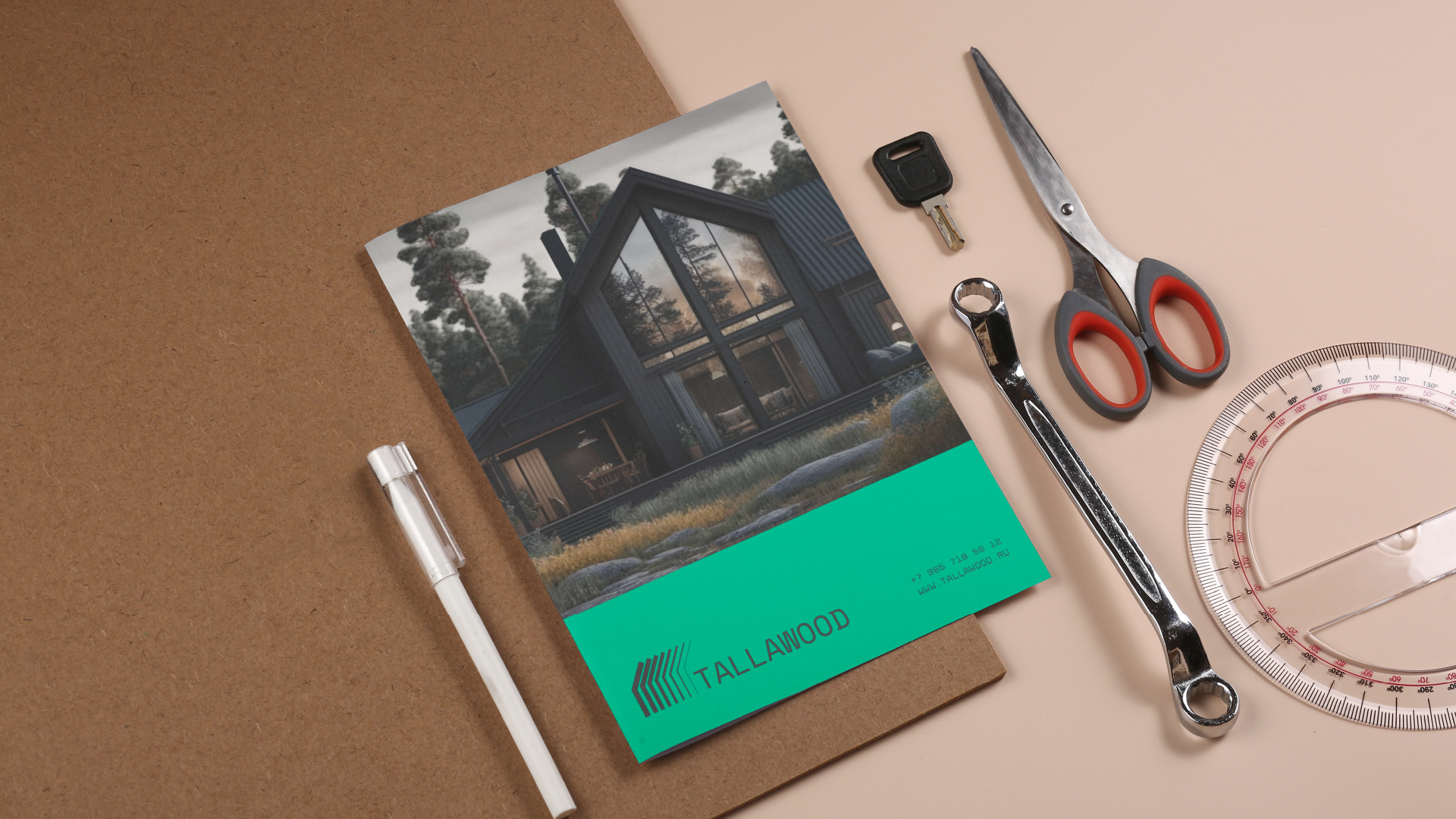
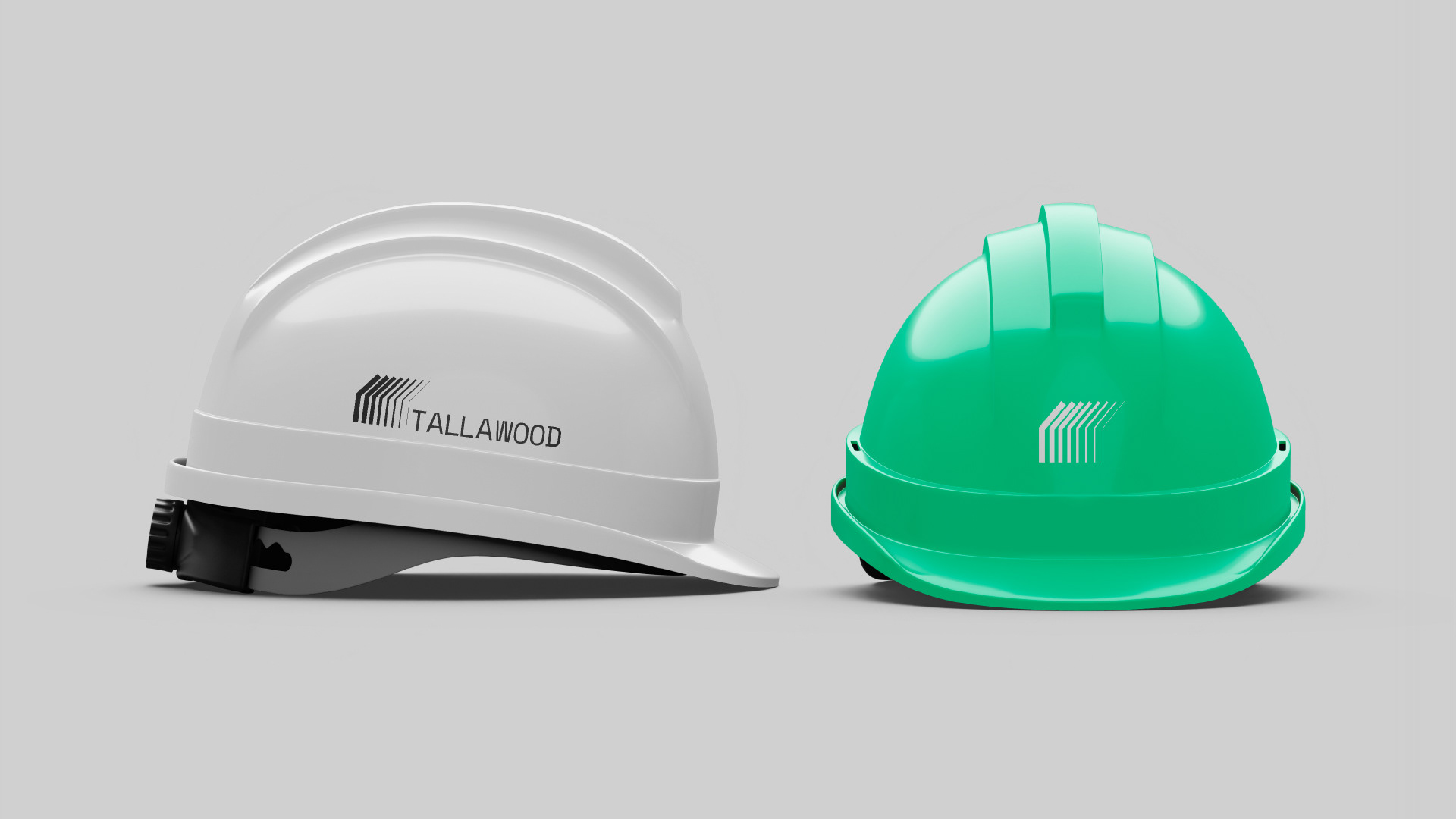
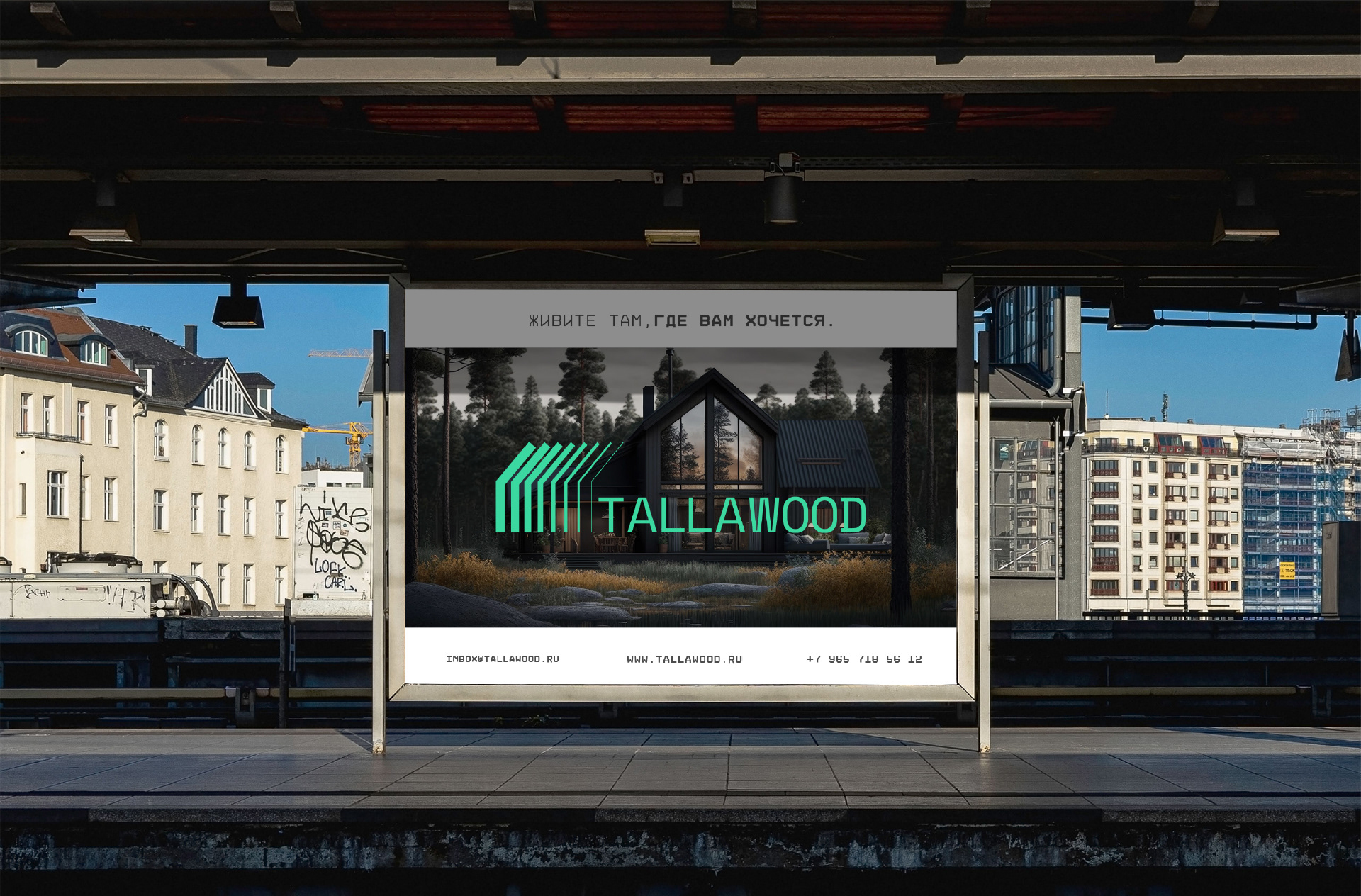
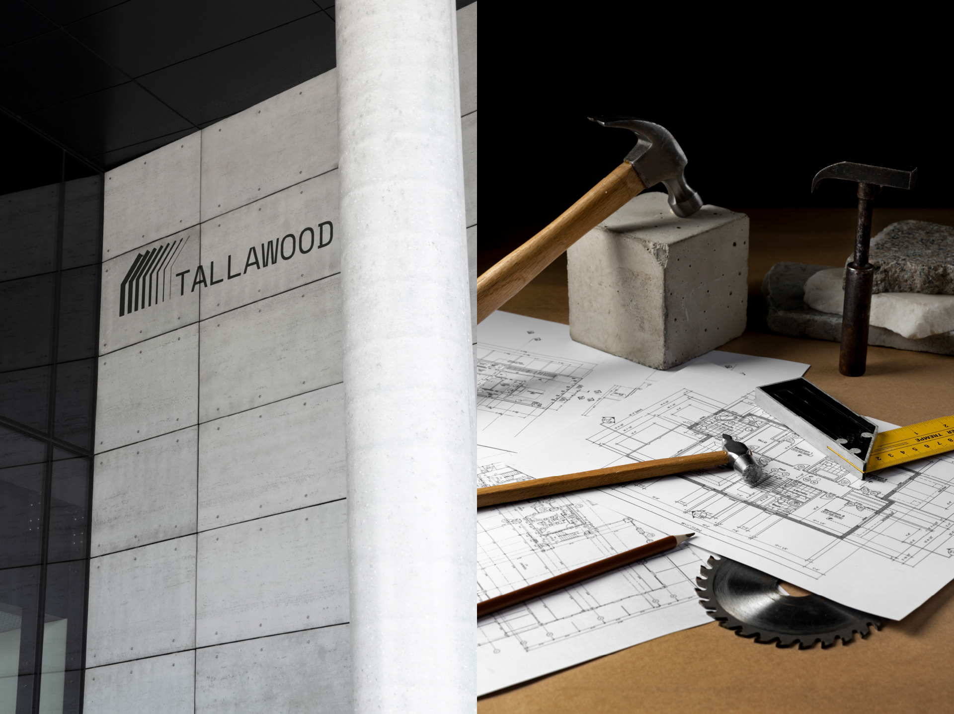
The logo for Tallawood was created with a focus on contemporary design and a minimalist approach.
The main wordmark is set in a sans-serif typeface, giving it a modern appearance. A subtle design twist was
applied by “cutting” the tops and bottoms of some letters, adding a futuristic touch and making the font distinctive.
This bold design choice gives the brand a memorable and fresh look.
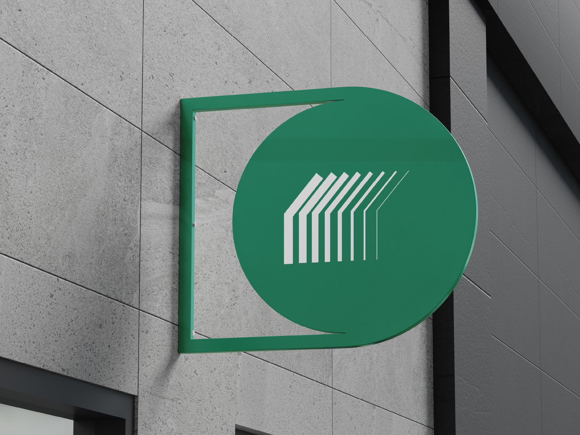
To the left of the name, there is a symbol composed of simple lines forming a silhouette that resembles a timber frame house.
These lines transition smoothly from thick to thin, creating a visual sense of movement and progress. This element strengthens
the visual association with architecture and construction, particularly timber frame homes.
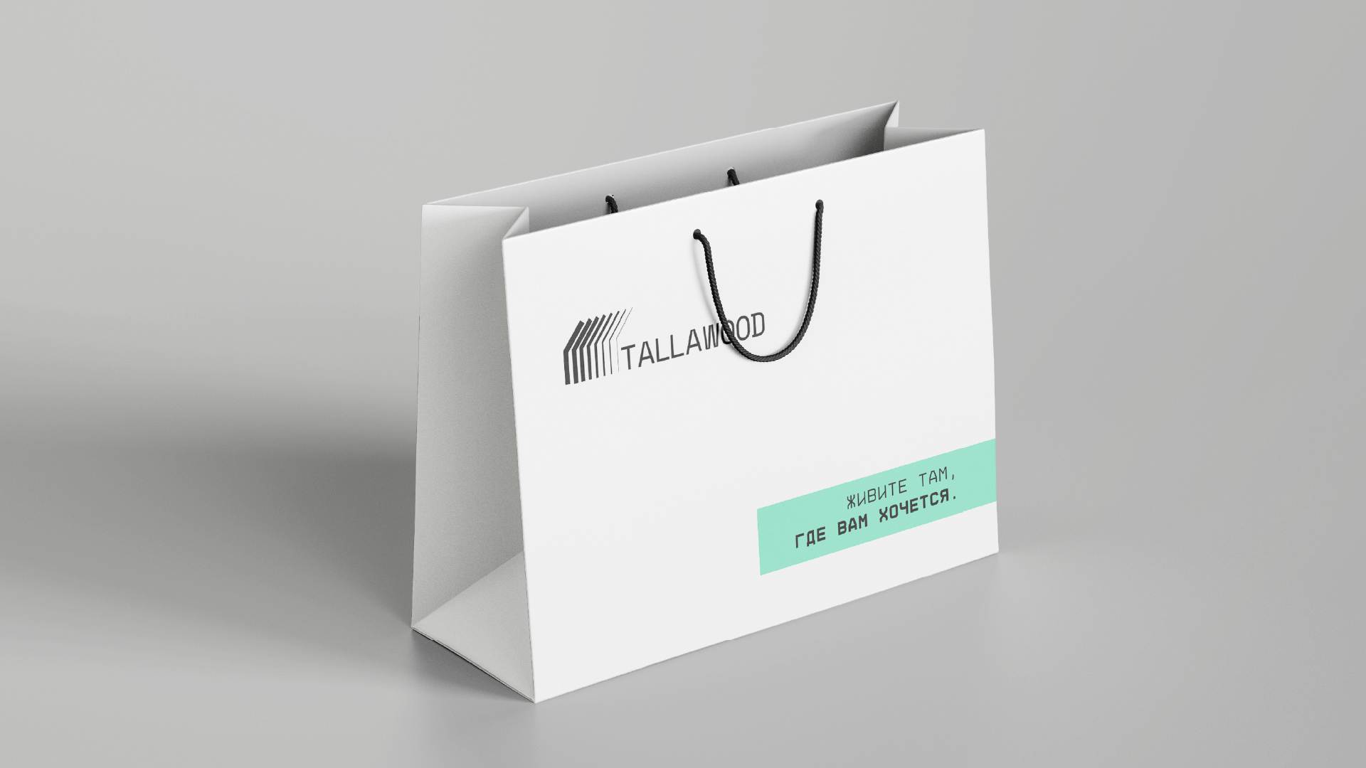
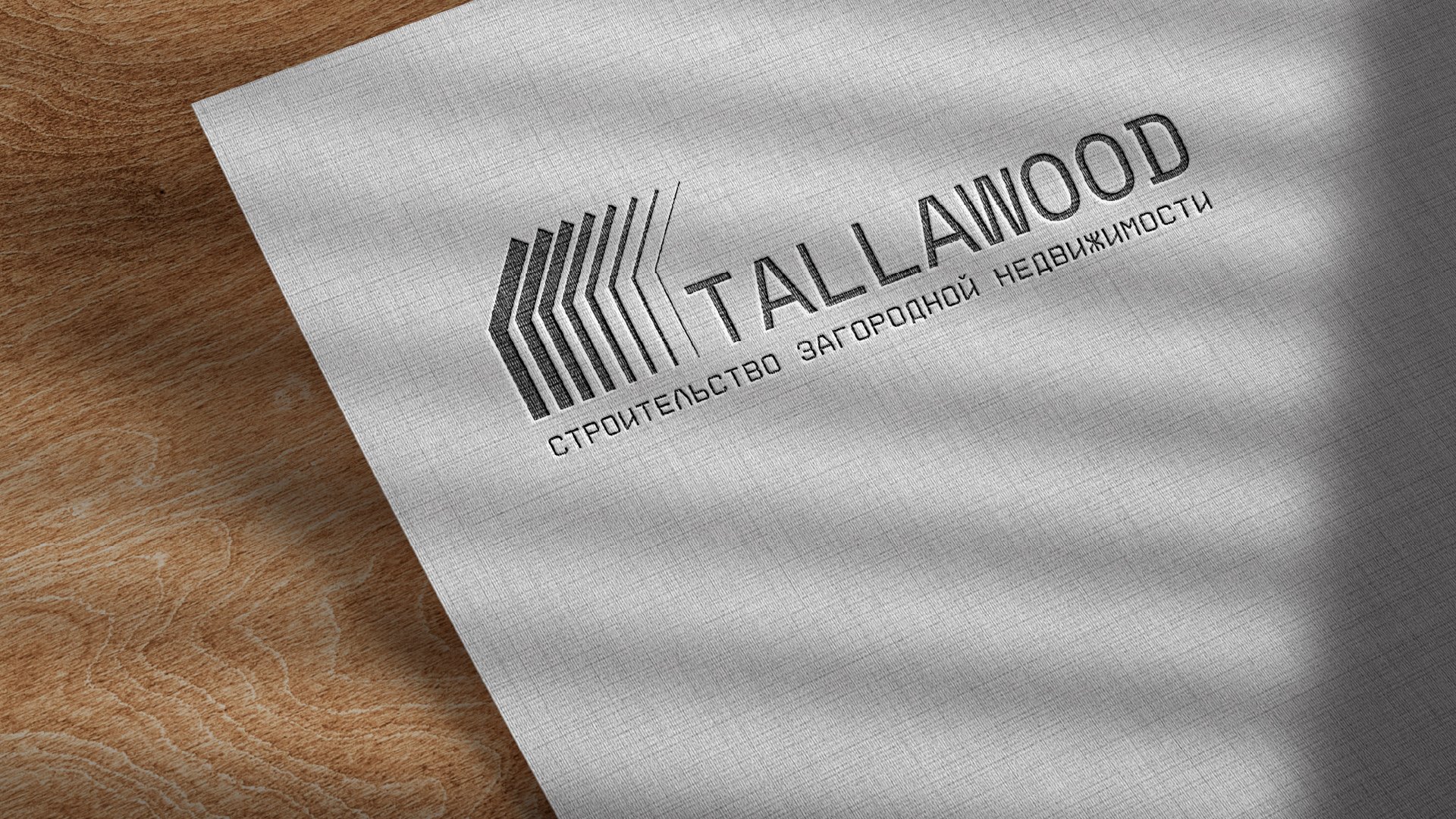
In addition to the primary logo, a supporting descriptor is included to clearly communicate the company’s area of expertise.
This textual element enhances the overall design, adding clarity and allowing the target audience to immediately recognize
Tallawood’s core business.
As a whole, the logo combines modern aesthetics with a strong visual connection to the company’s field,
effectively conveying Tallawood’s values and creating a distinctive, recognizable brand image.
СПАСИБО ЗА ВАШЕ ВНИМАНИЕ!
Мы — брендинговое агентство Александры Вороны (Vorona branding agency).
Мы учитываем все ваши пожелания и особенности бренда, чтобы создать логотип,
который будет работать на вас с первого дня.
Вы можете посмотреть предложения нашего агентства у нас на сайте
или написать нам и мы обсудим все детали работы!
THANK YOU FOR YOUR ATTENTION!
We are Alexandra Vorona branding agency.
We take into account all your wishes and brand features to create a logo,
that will work for you from day one.
You can view our agency's offers on our website
or write to us and we will discuss all the details of the work!
КОНТАКТЫ | CONTACTS
Vorona branding agency (voronastudio.ru), instagram, telegram