ABOUT:
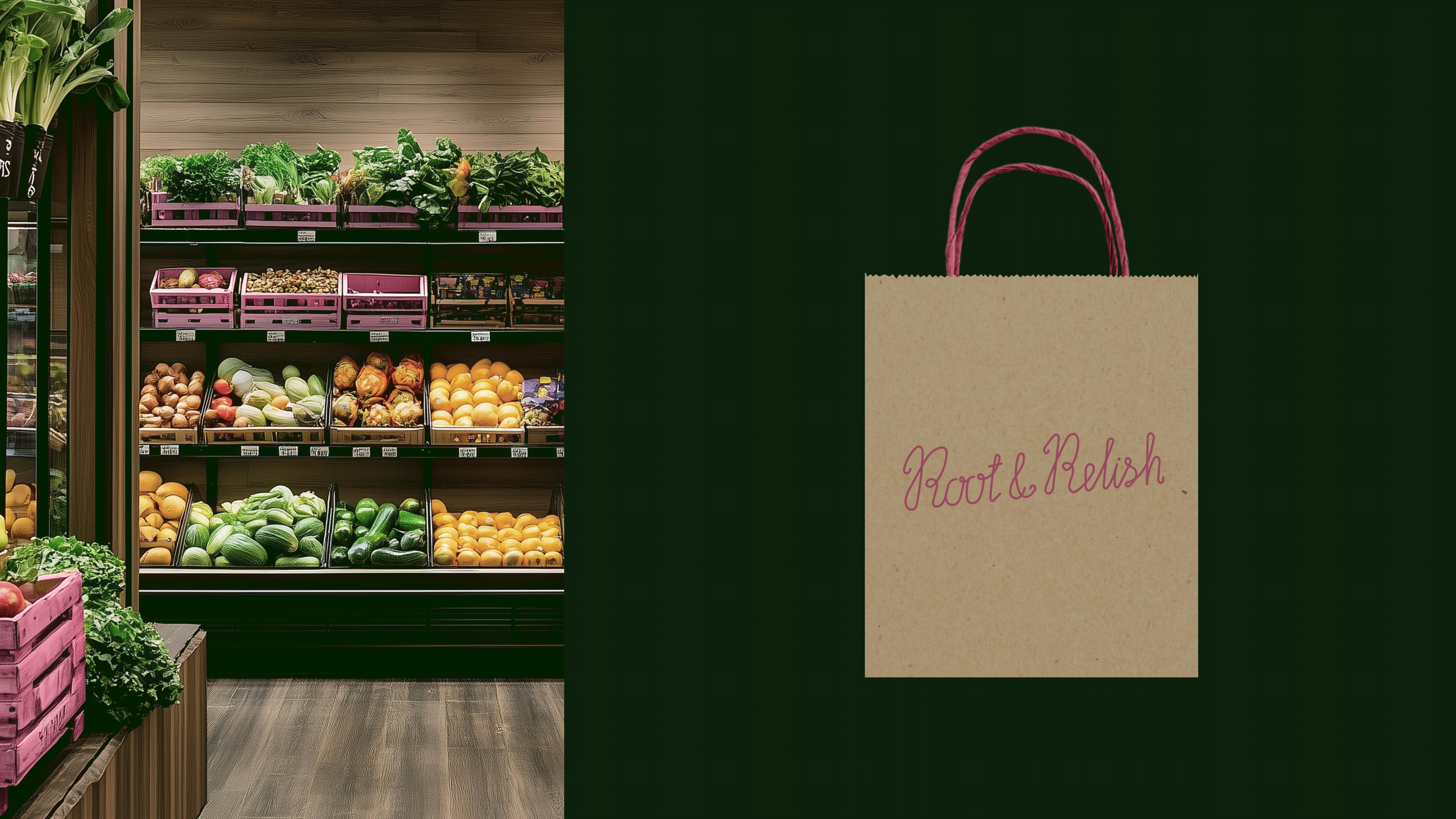
Root & Relish is a grocery market that brings together local farmers, artisans, and lovers of high-quality food. Here, every product is more than just an item — it's part of a larger story told through flavor, tradition, individuality, and culinary inspiration.
We have created a brand identity that conveys an atmosphere of warmth, craftsmanship, and gastronomic adventure, helping the market become a destination for those who appreciate natural and rare ingredients.
Root & Relish is more than just a market; it’s a community of people who see food as an art form and a way to explore the world.
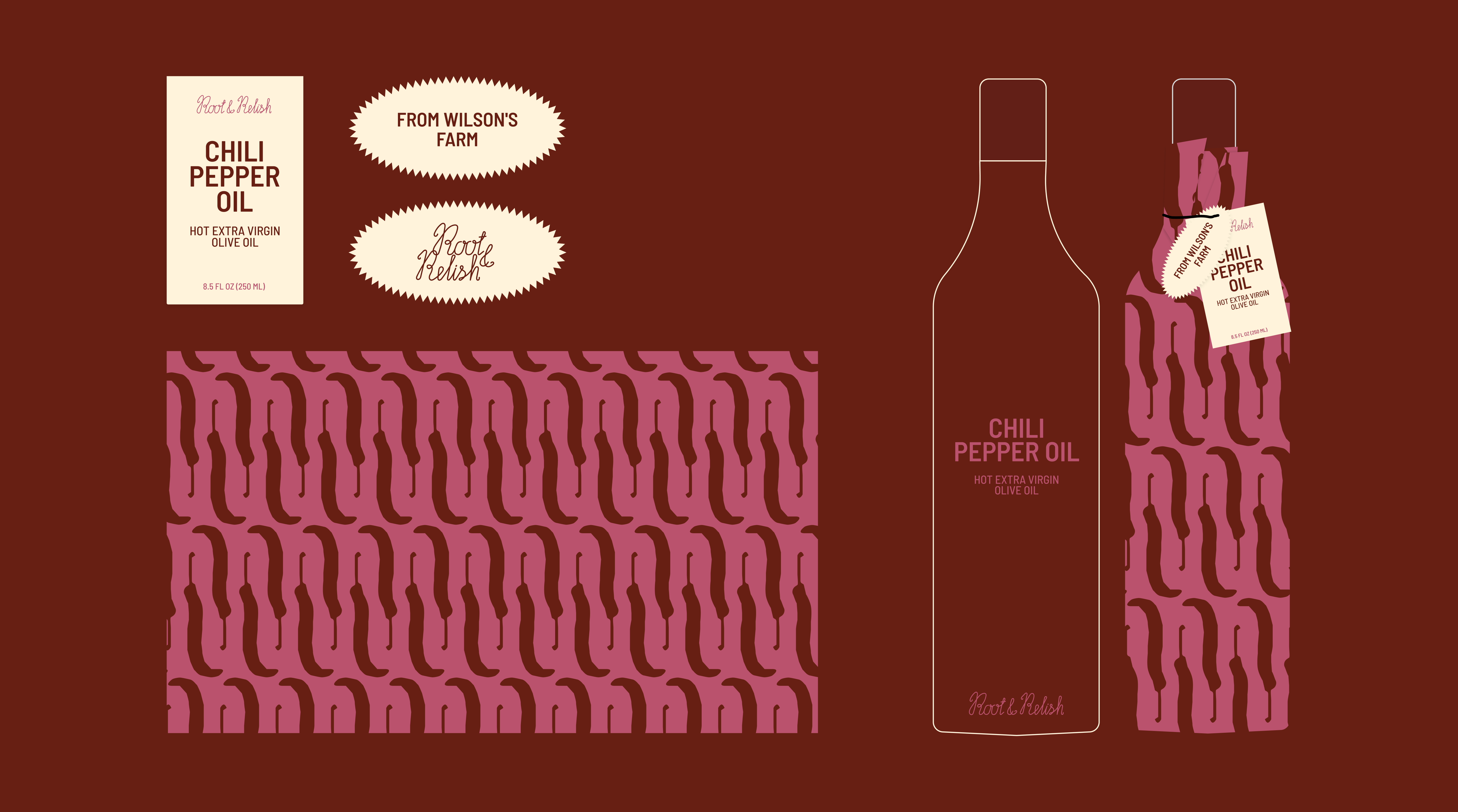
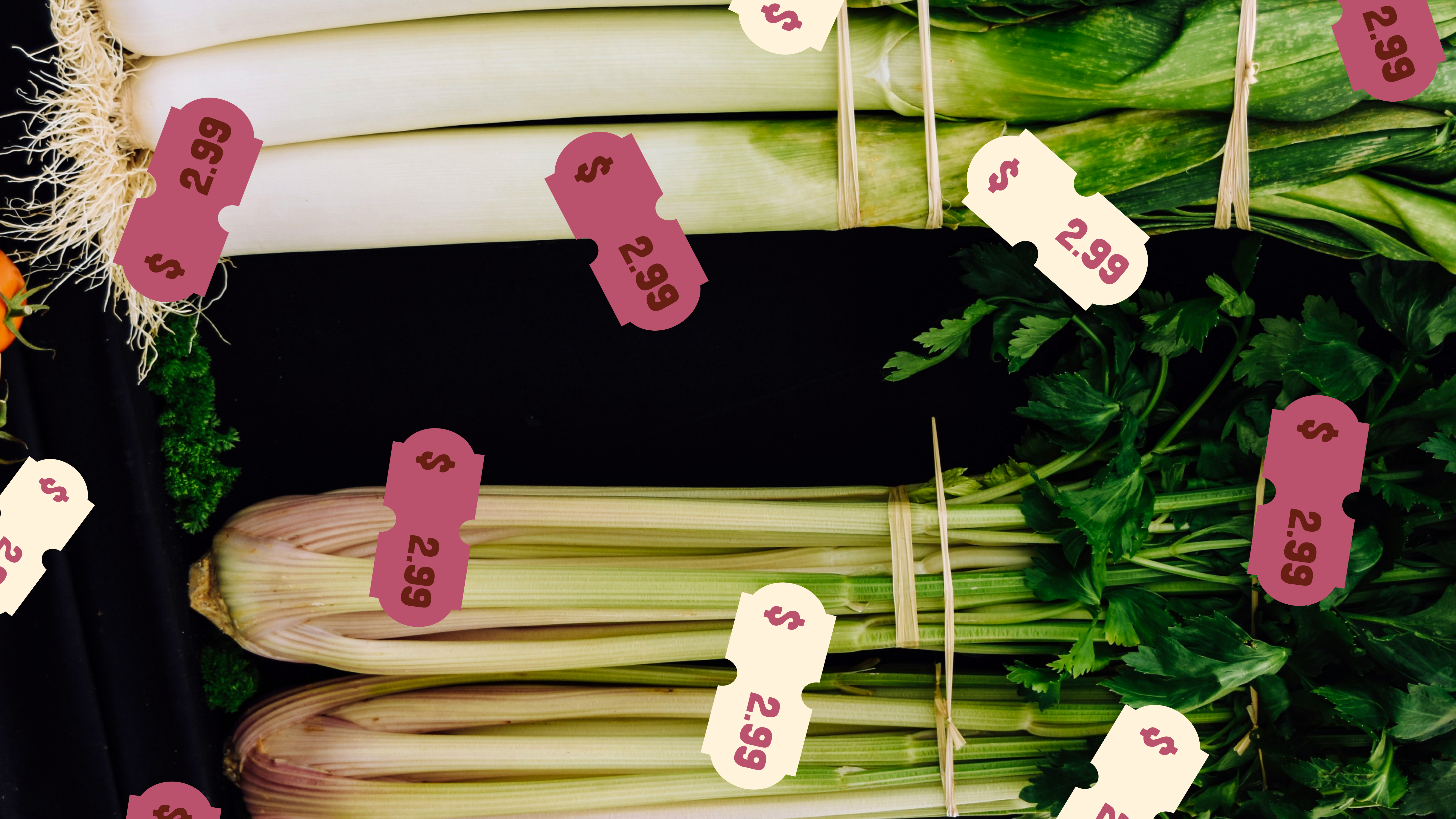
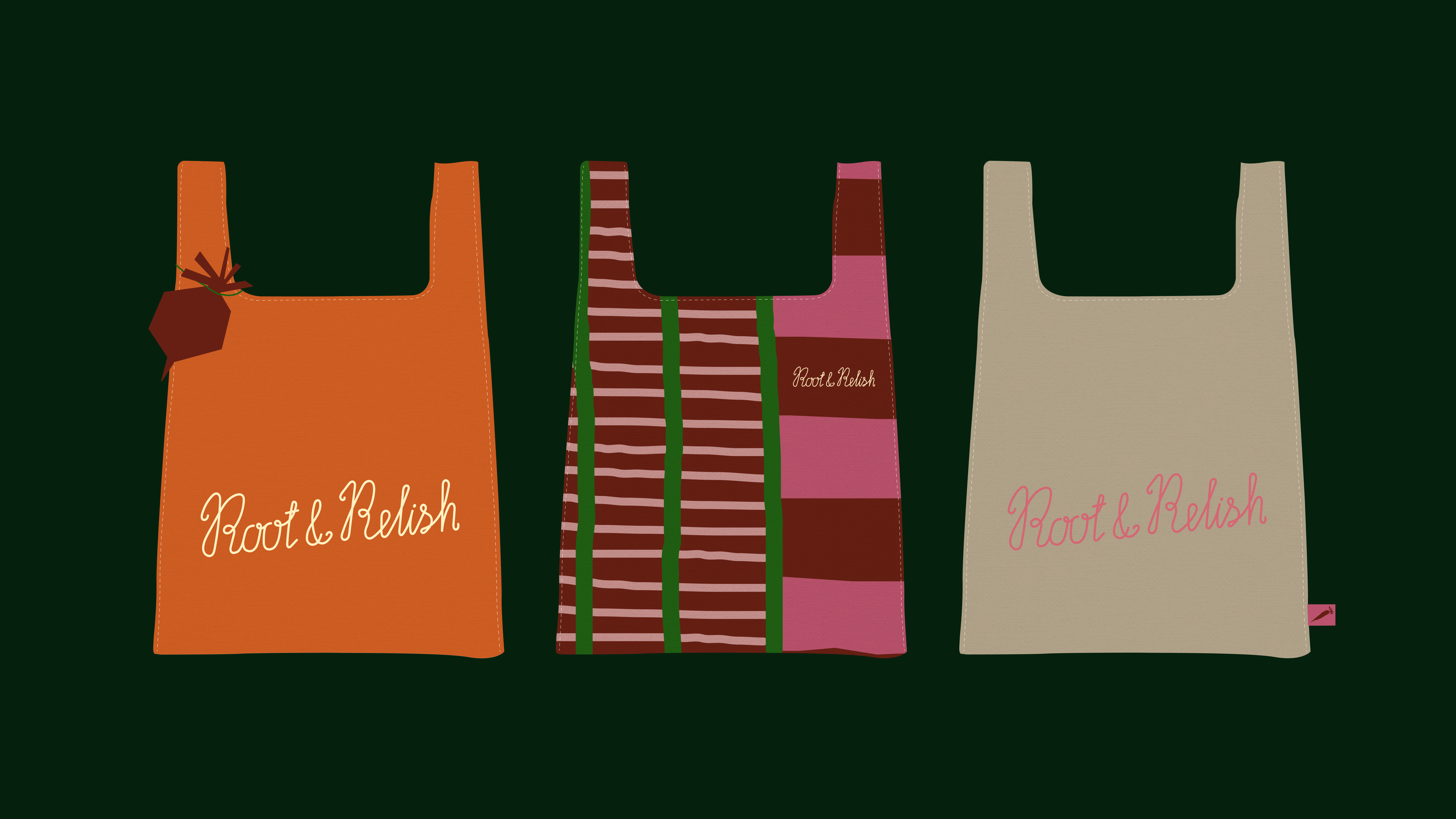
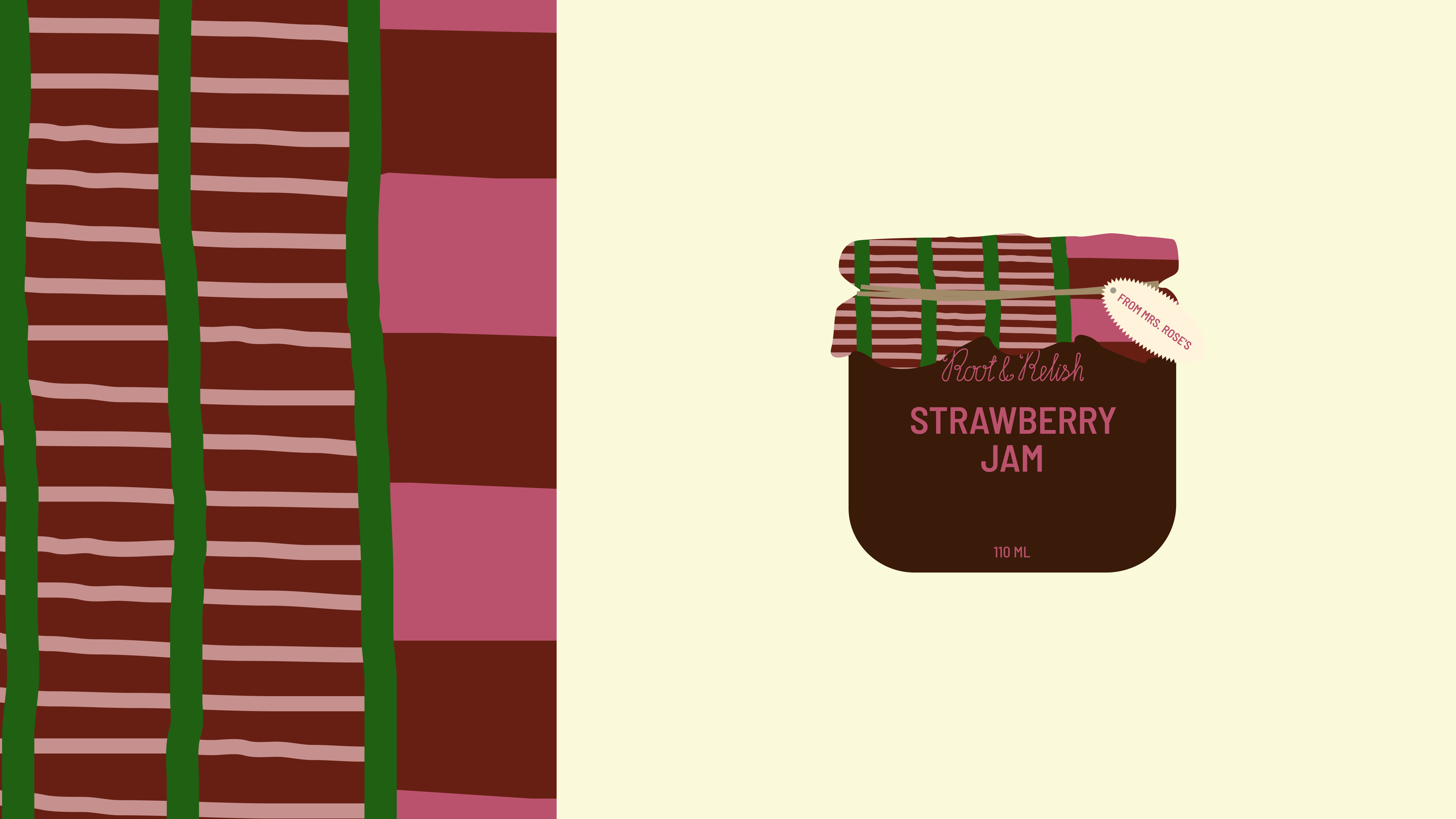
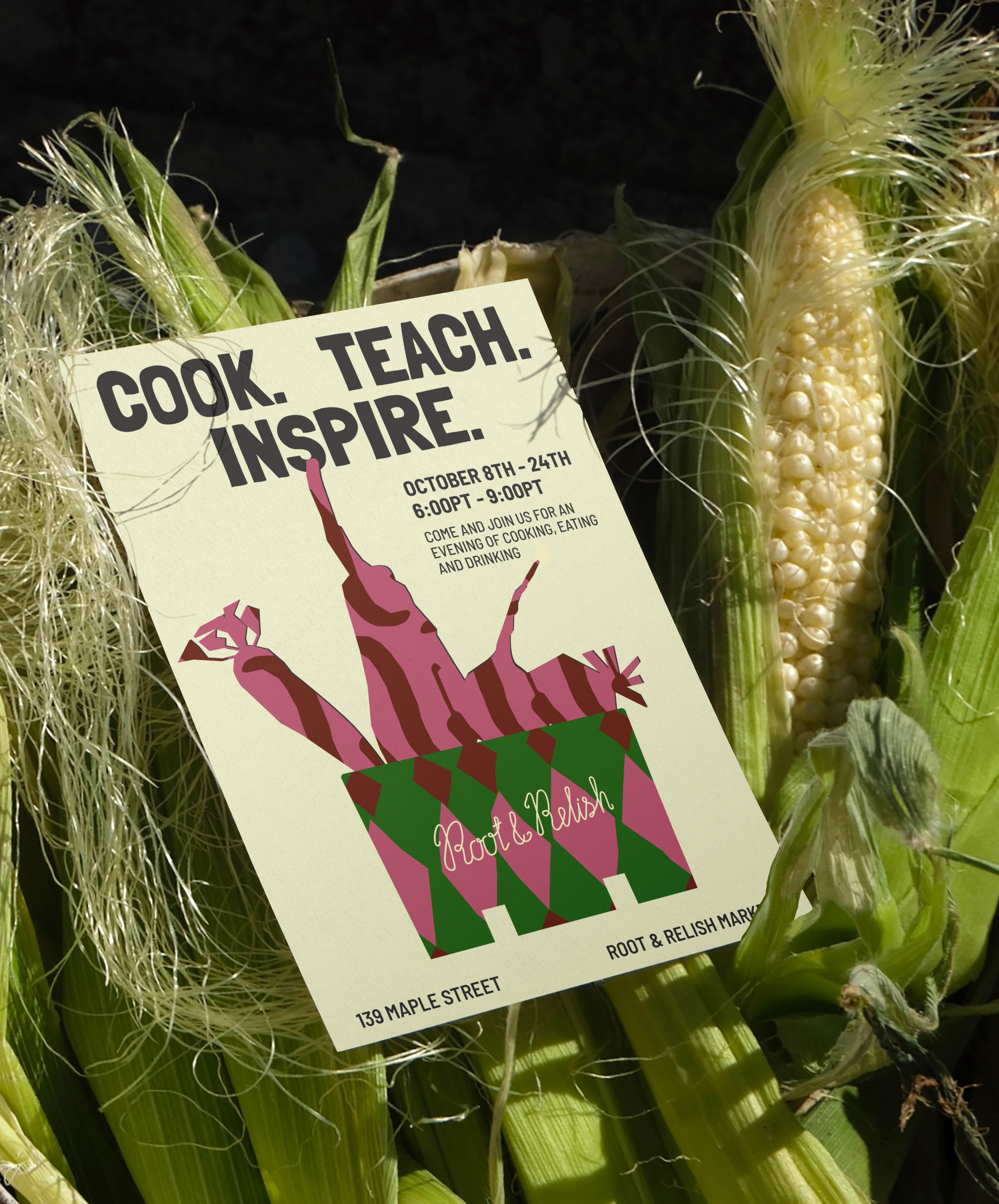
BRAND STRATEGY, VISUAL IDENTITY, PACKAGING DESIGN, ILLUSTRATION
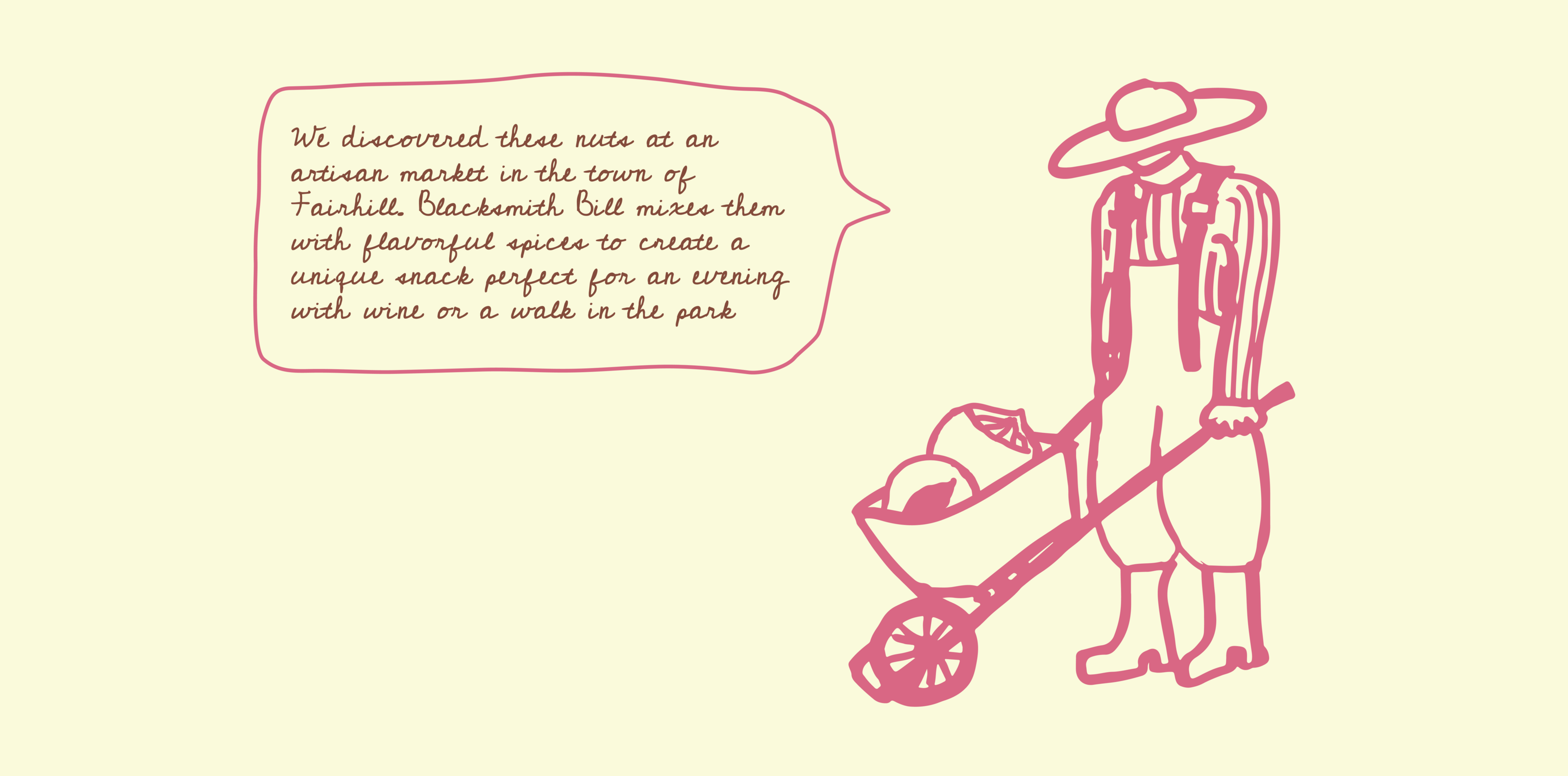
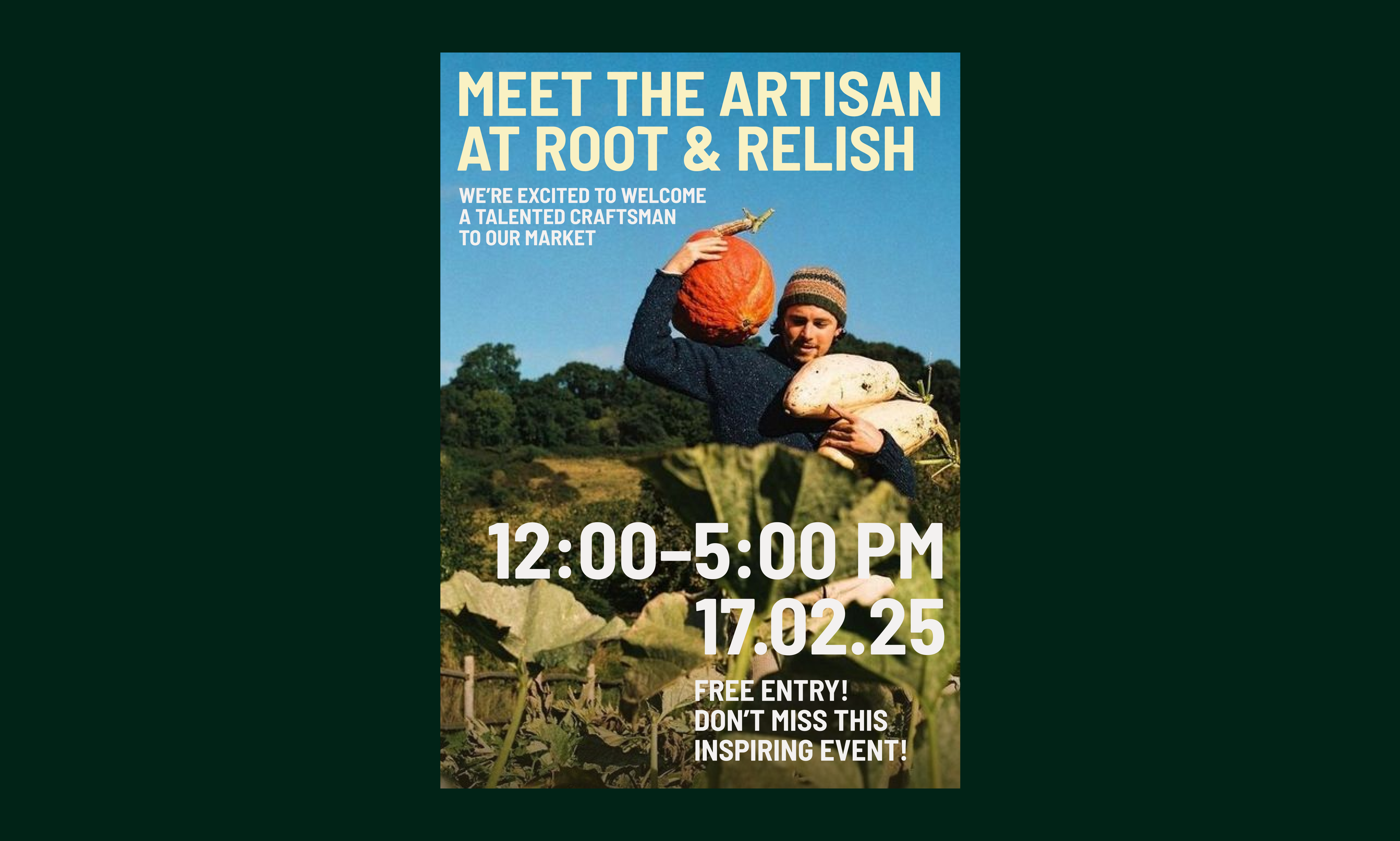
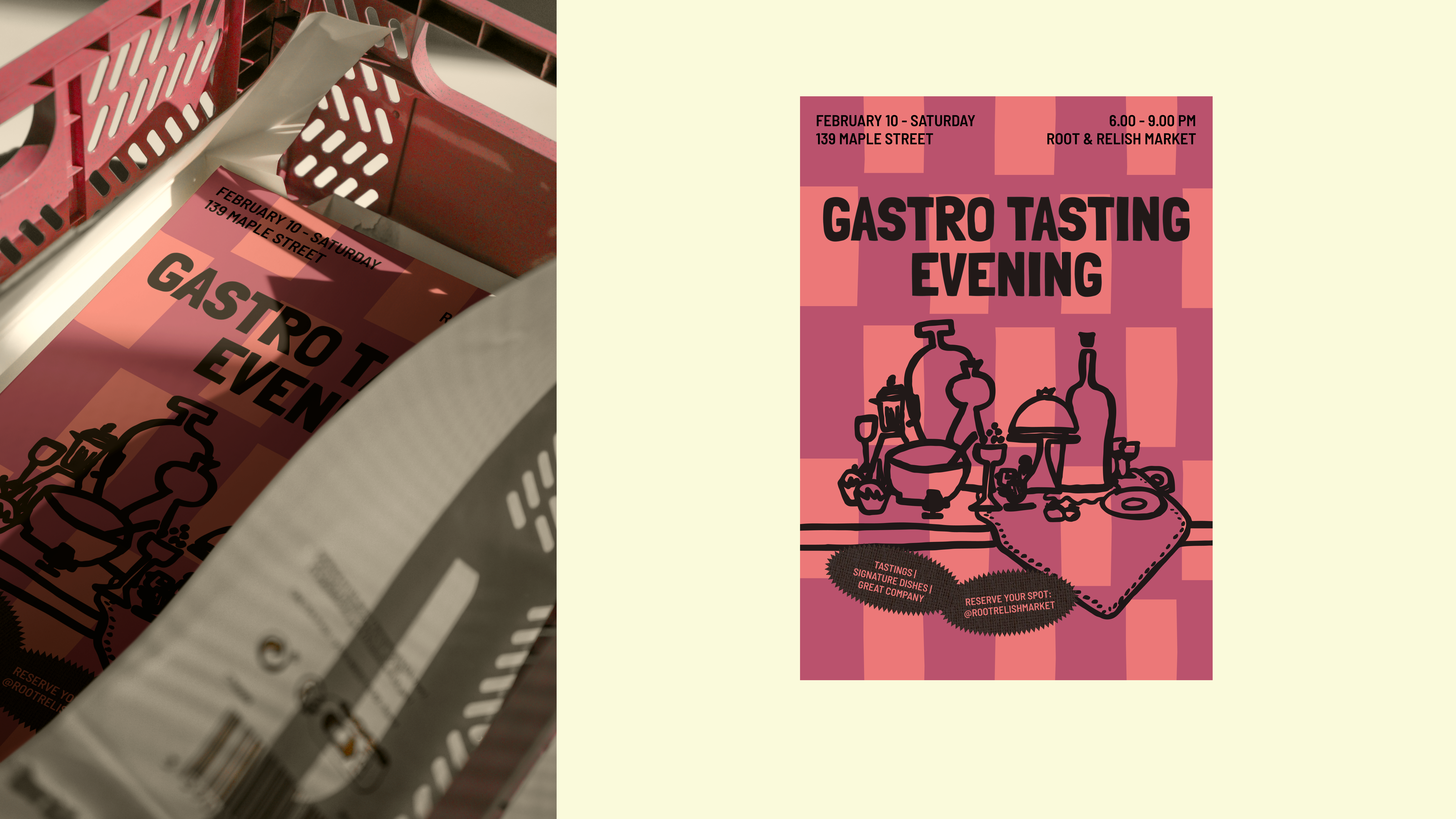
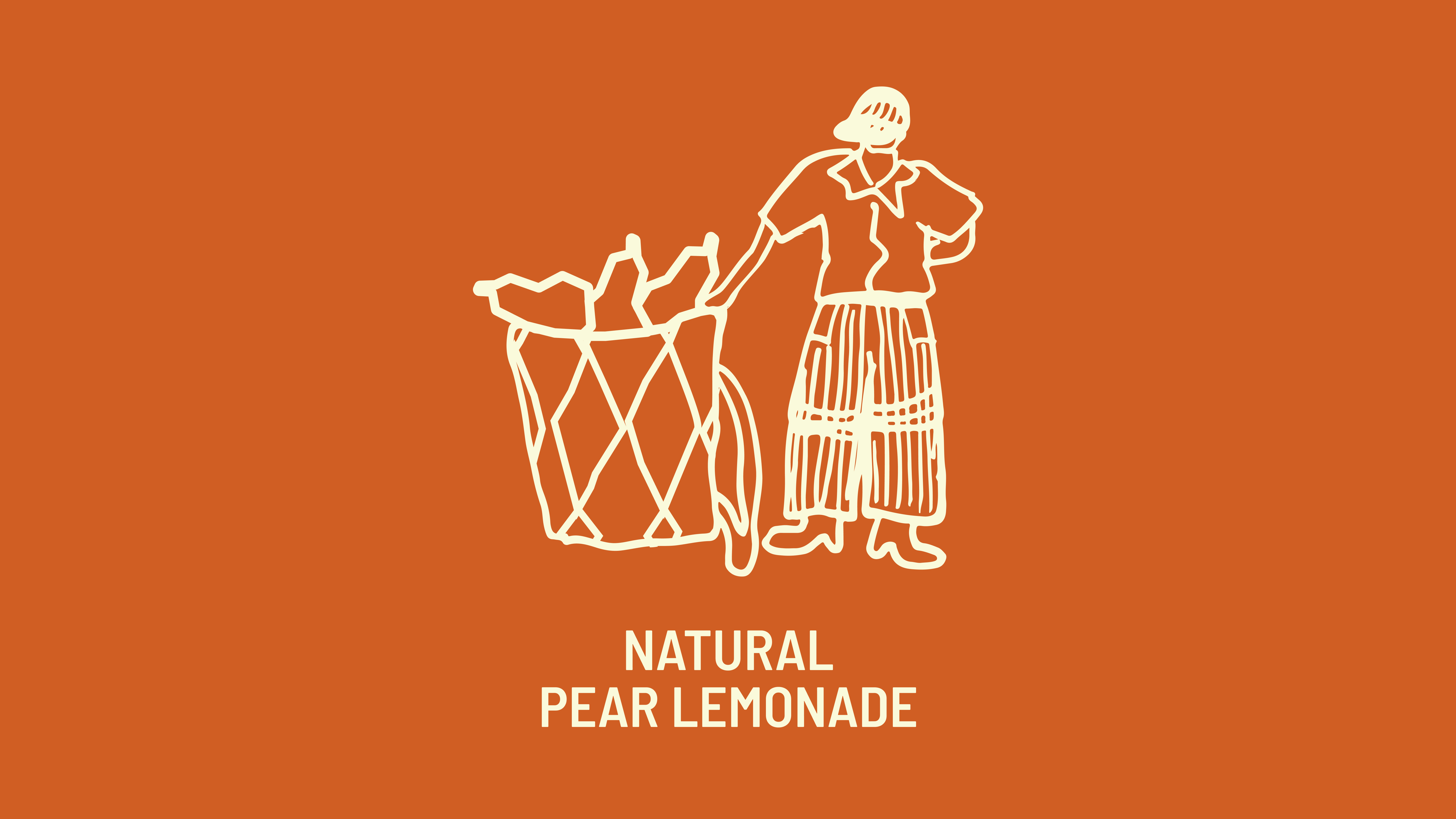
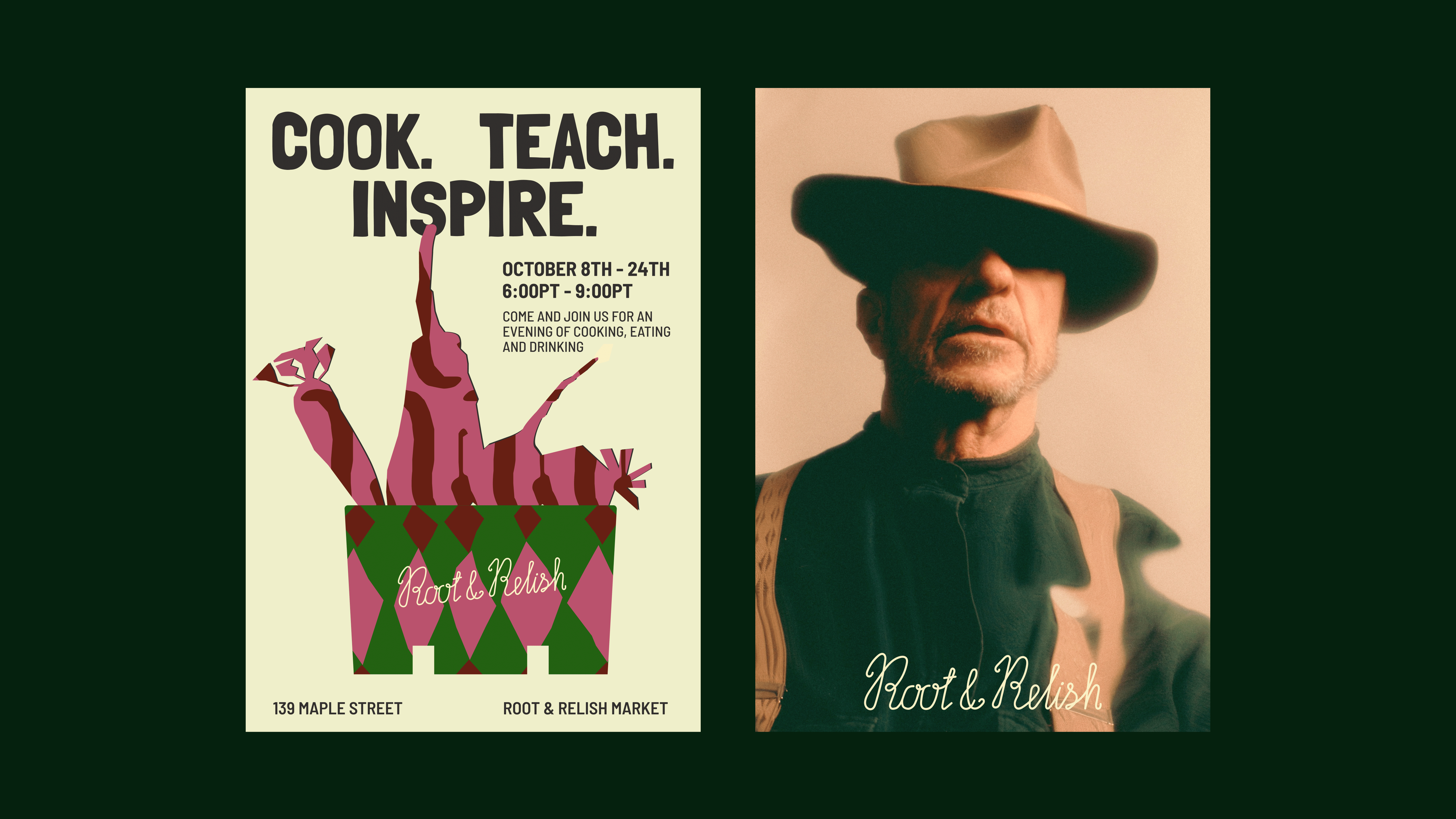
The hand-drawn illustrations convey a sense of authorial, real, non-ideal, but vivid imagery — as if we were quickly sketching a portrait right on the farm, sitting with a cup of tea and listening to their stories.
The markers add warmth and softness to the lines, creating illustrations that feel genuine rather than 'commercial'.
This style harkens back to traditional travelers' sketches, when artists recorded what they saw in their sketchbooks. Root & Relish, after all, was also invented while traveling.
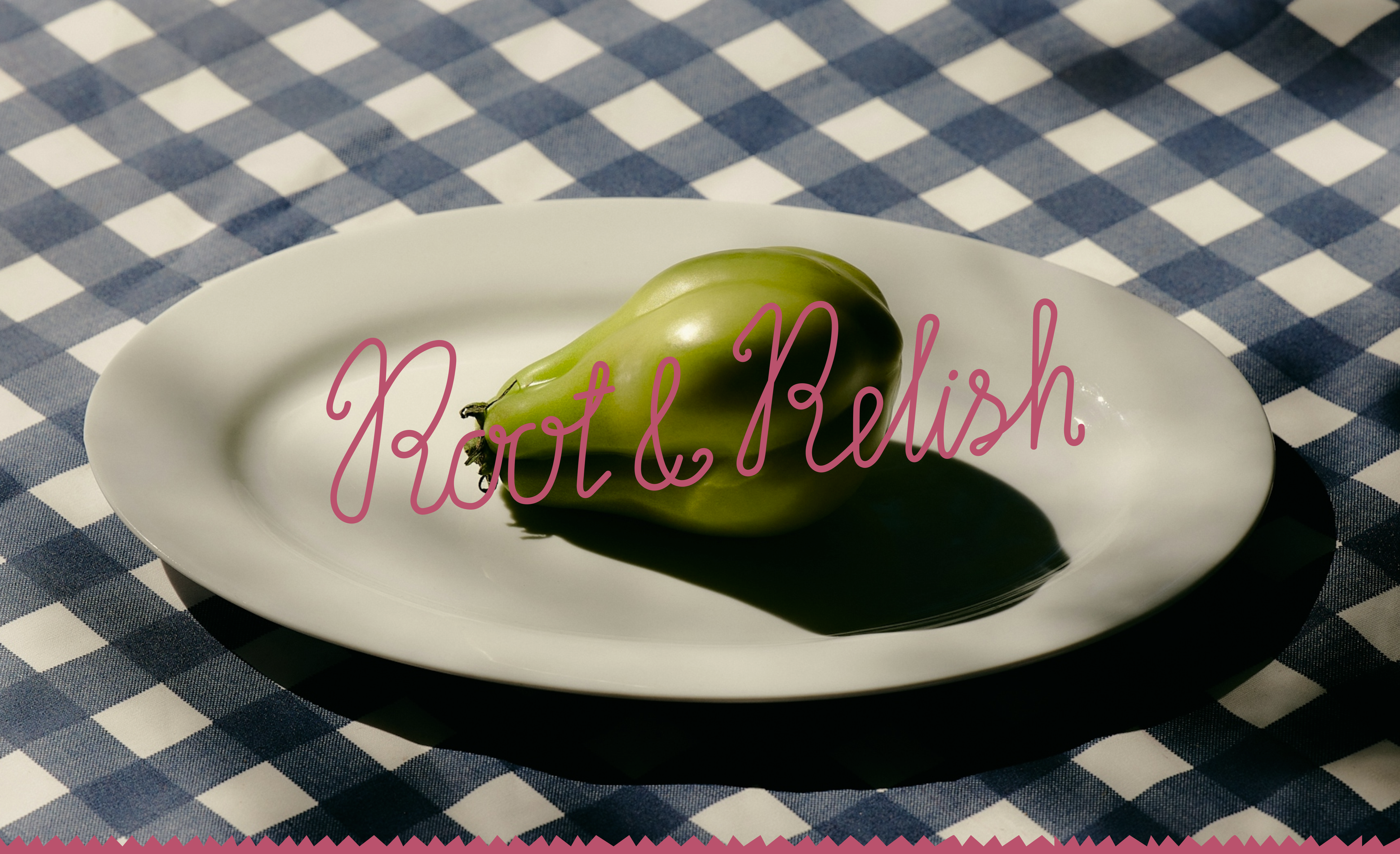
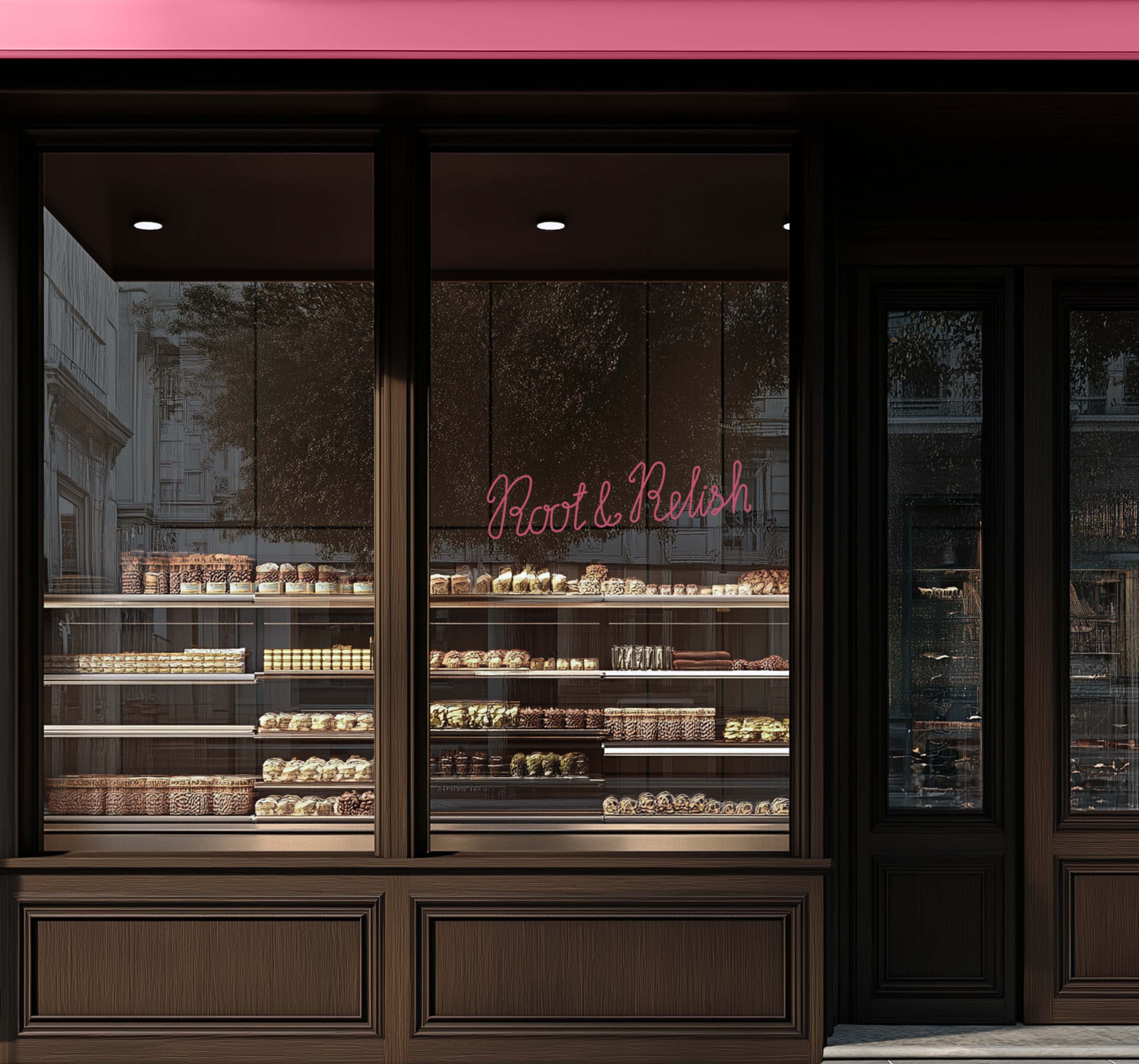
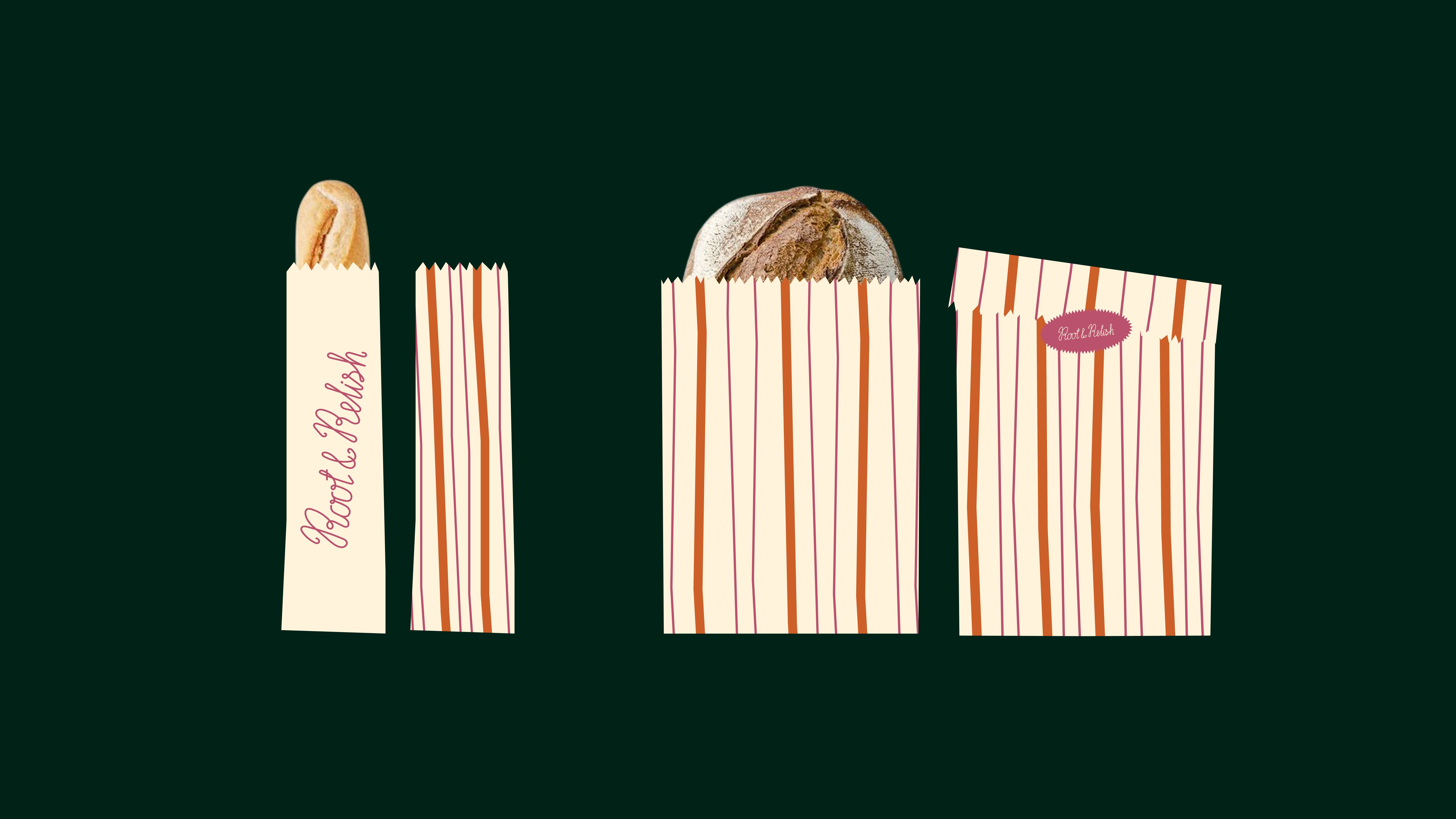
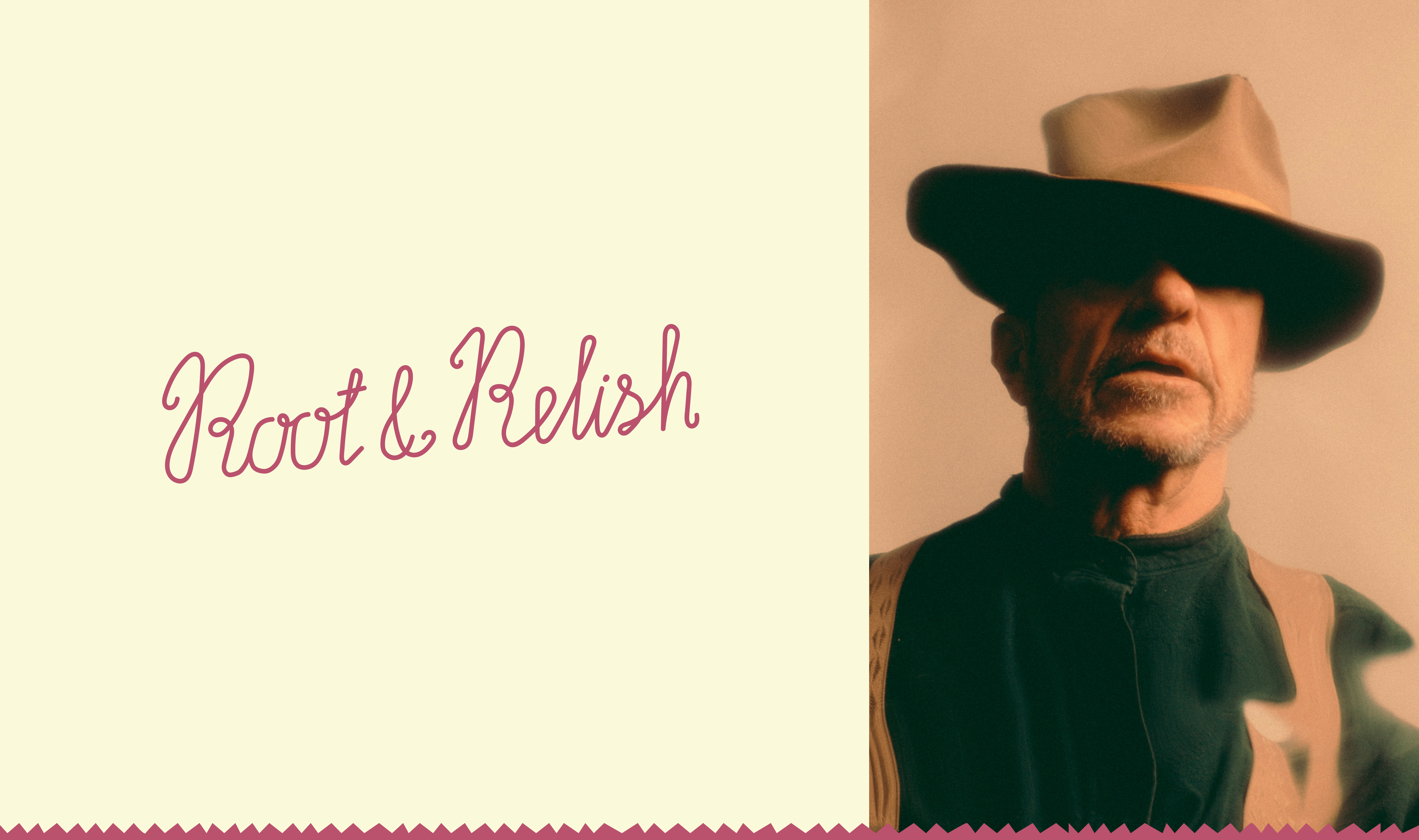
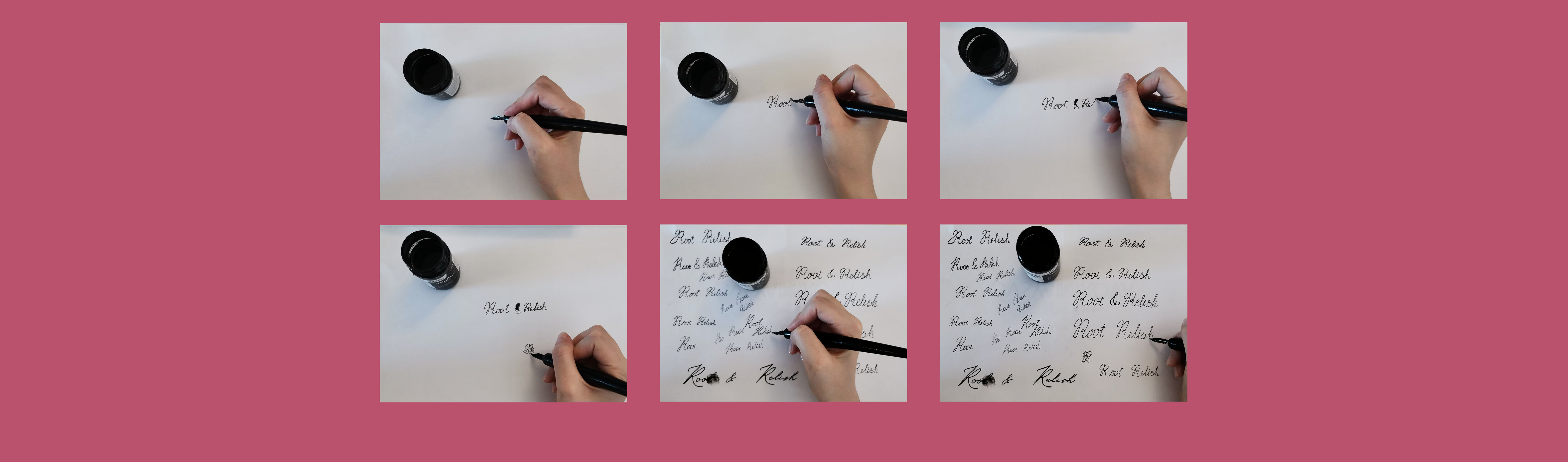
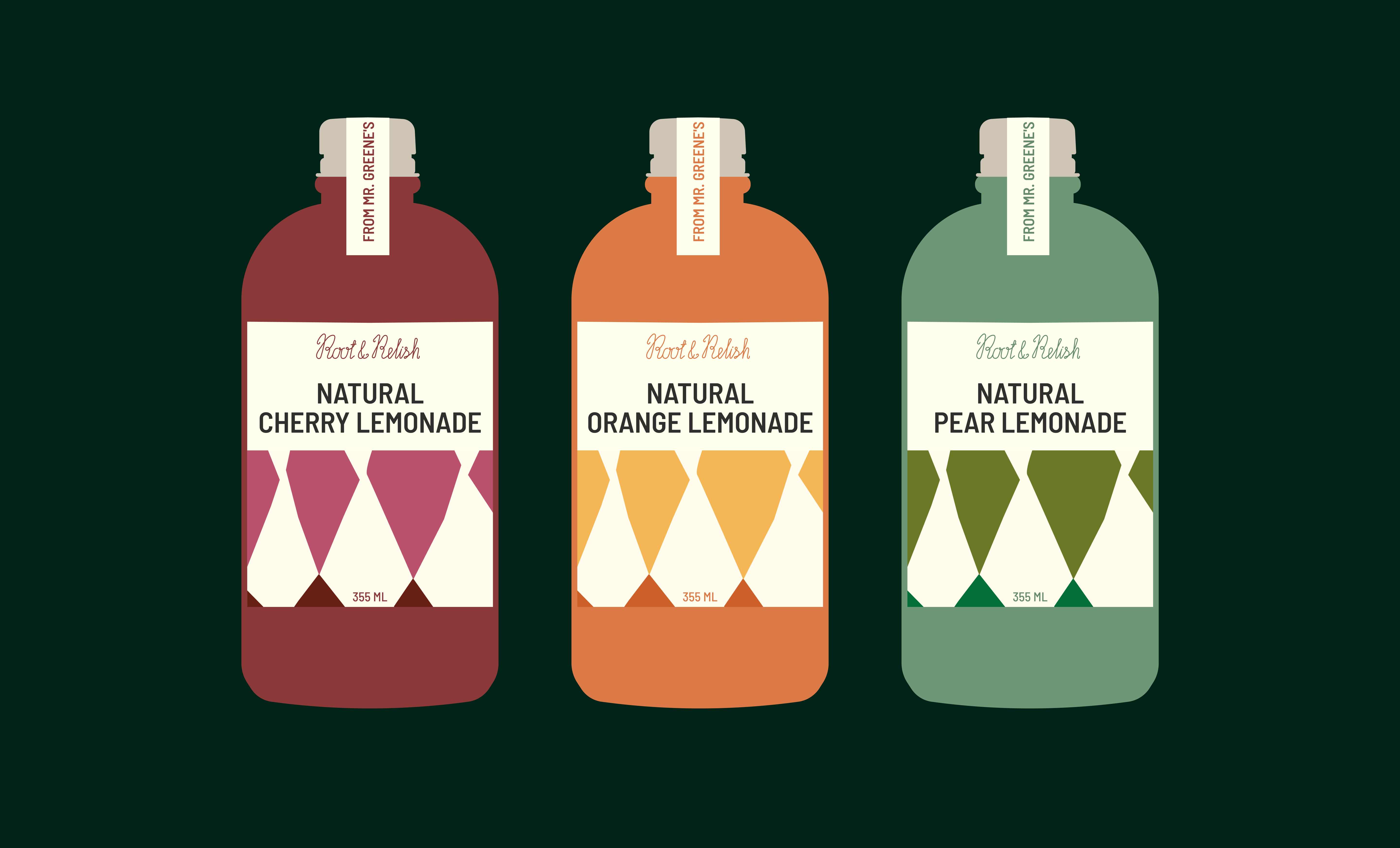
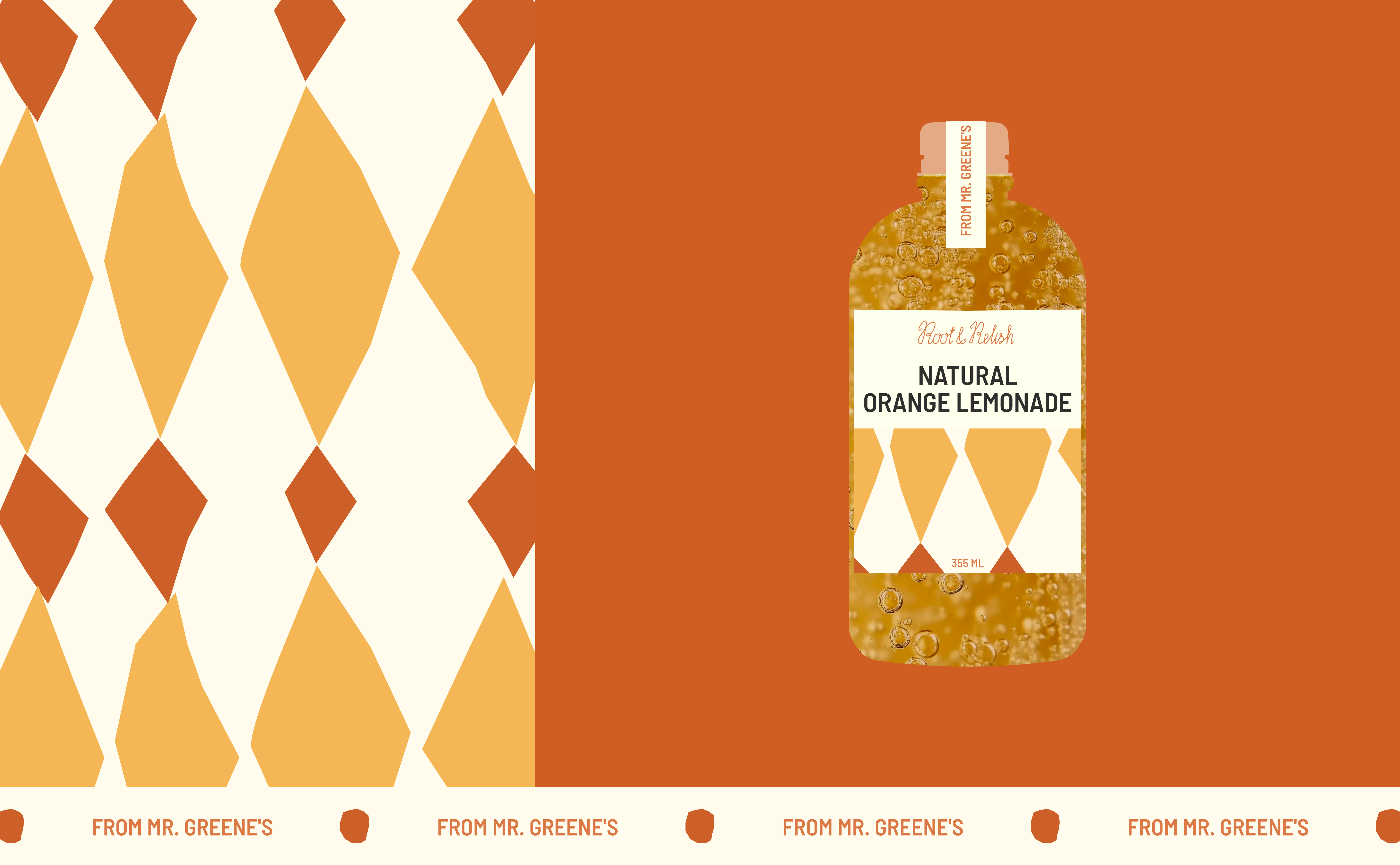
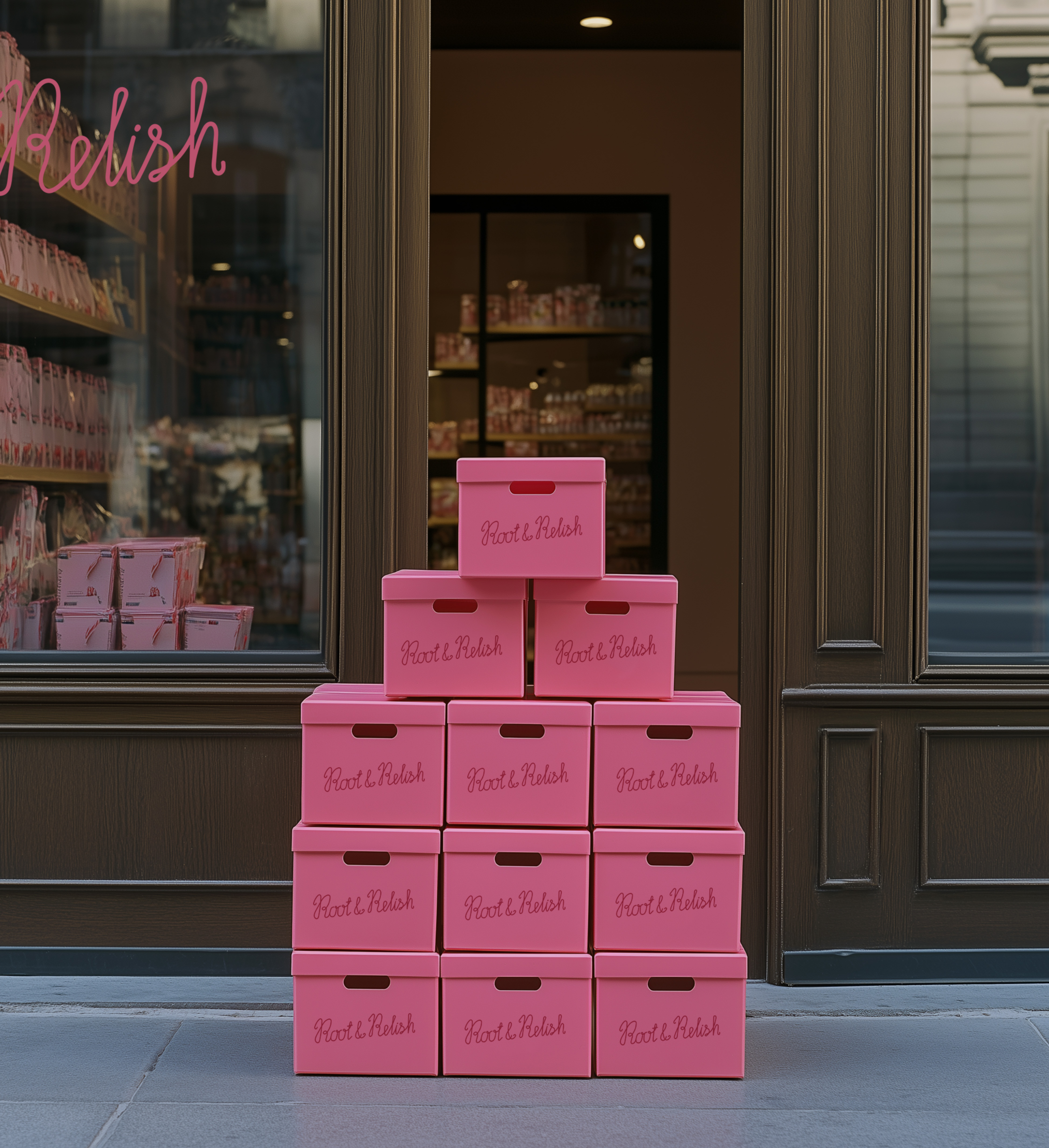
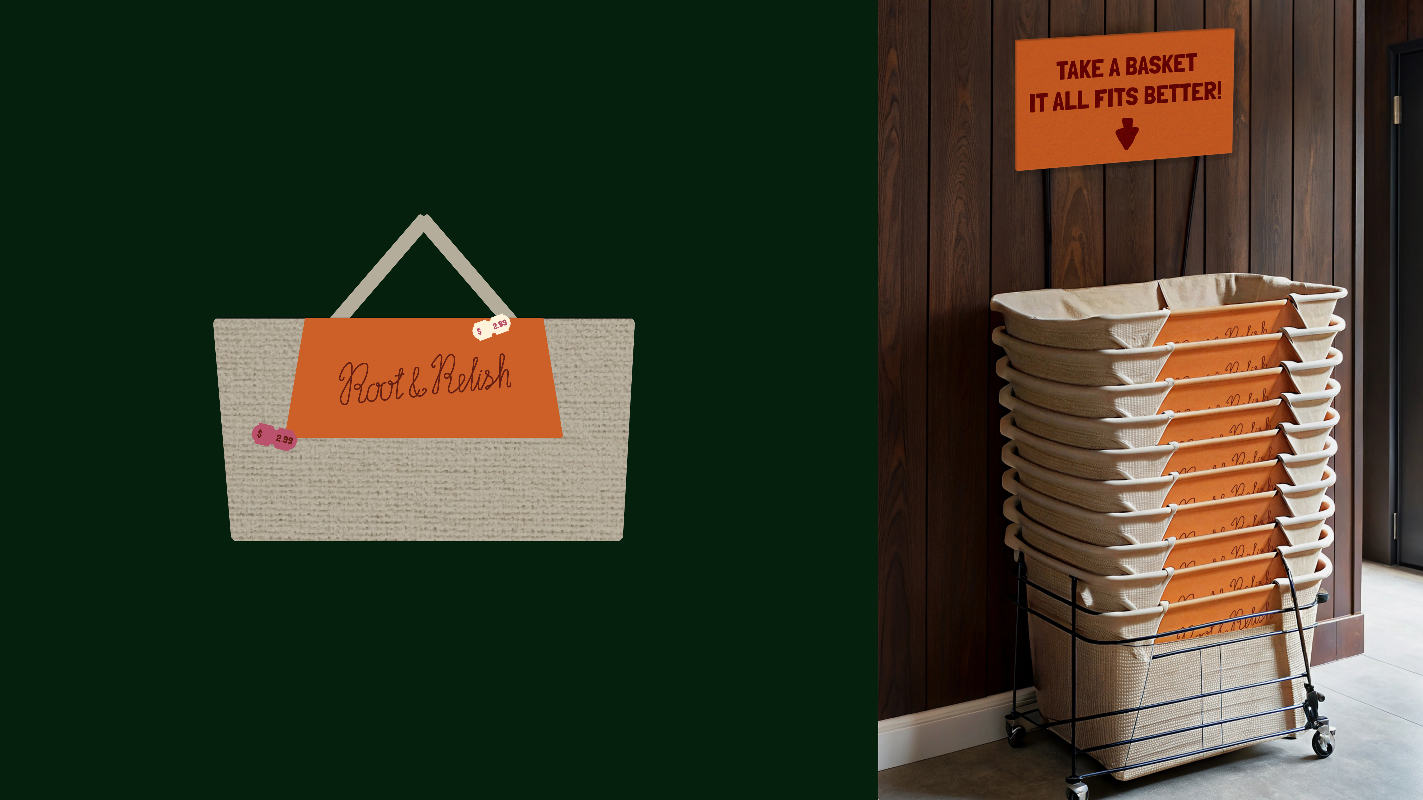
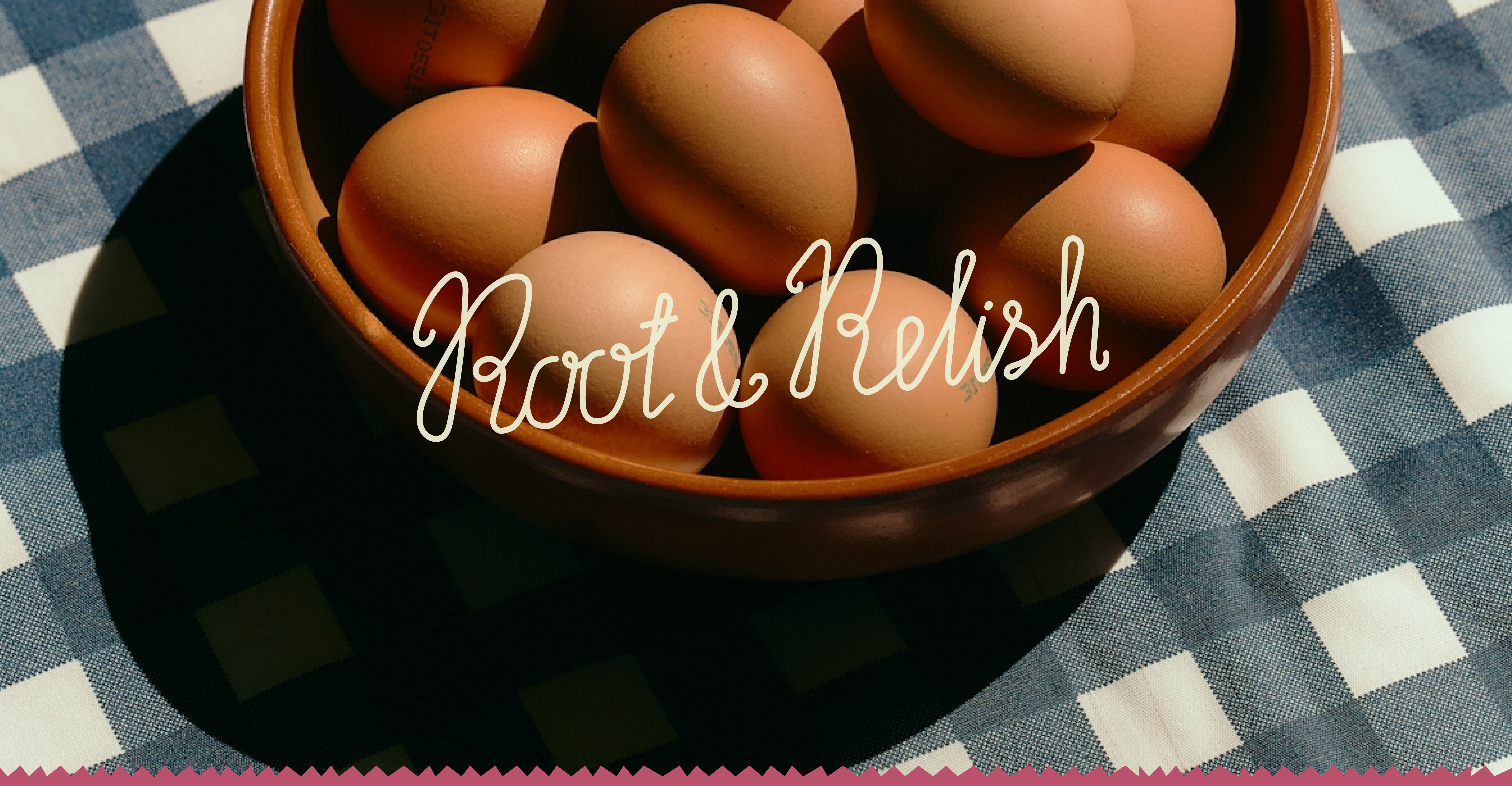
The Root & Relish logo is a reflection of the brand's unique character. we made it hand-drawn, subtle and casual, reminiscent of inscriptions on old labels or family cookbooks.
This style conveys the humanity, craftsmanship and sincerity that are at the core of our marque.
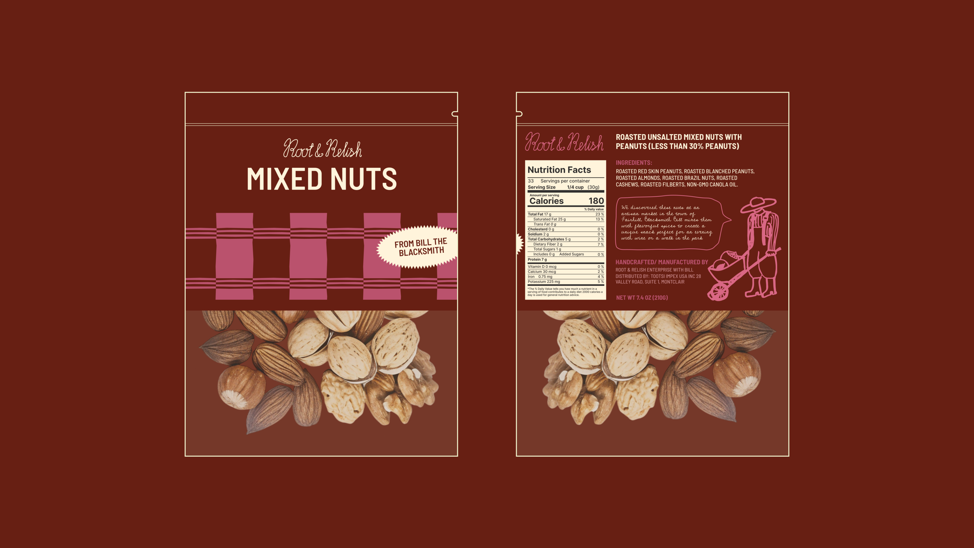
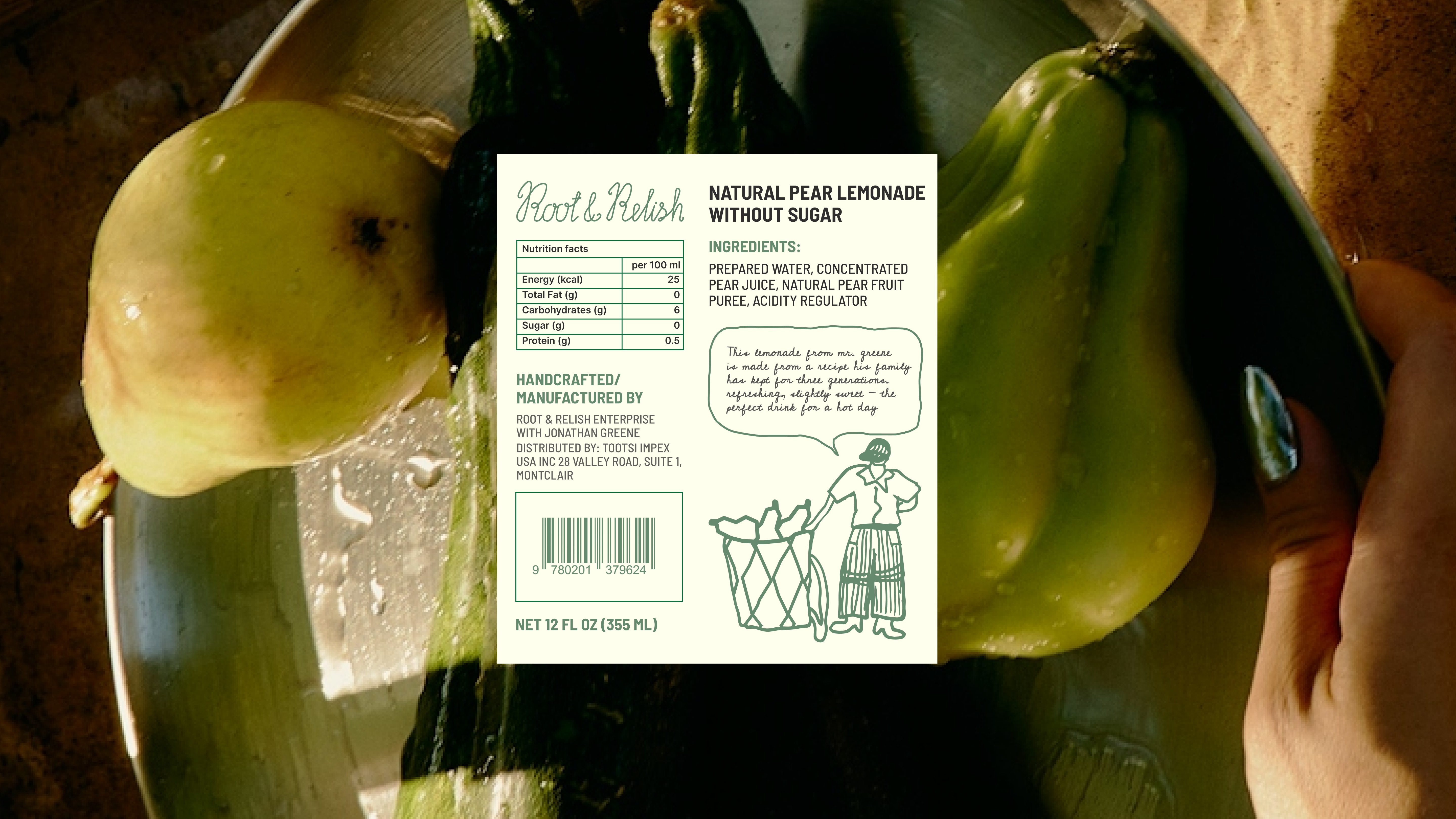
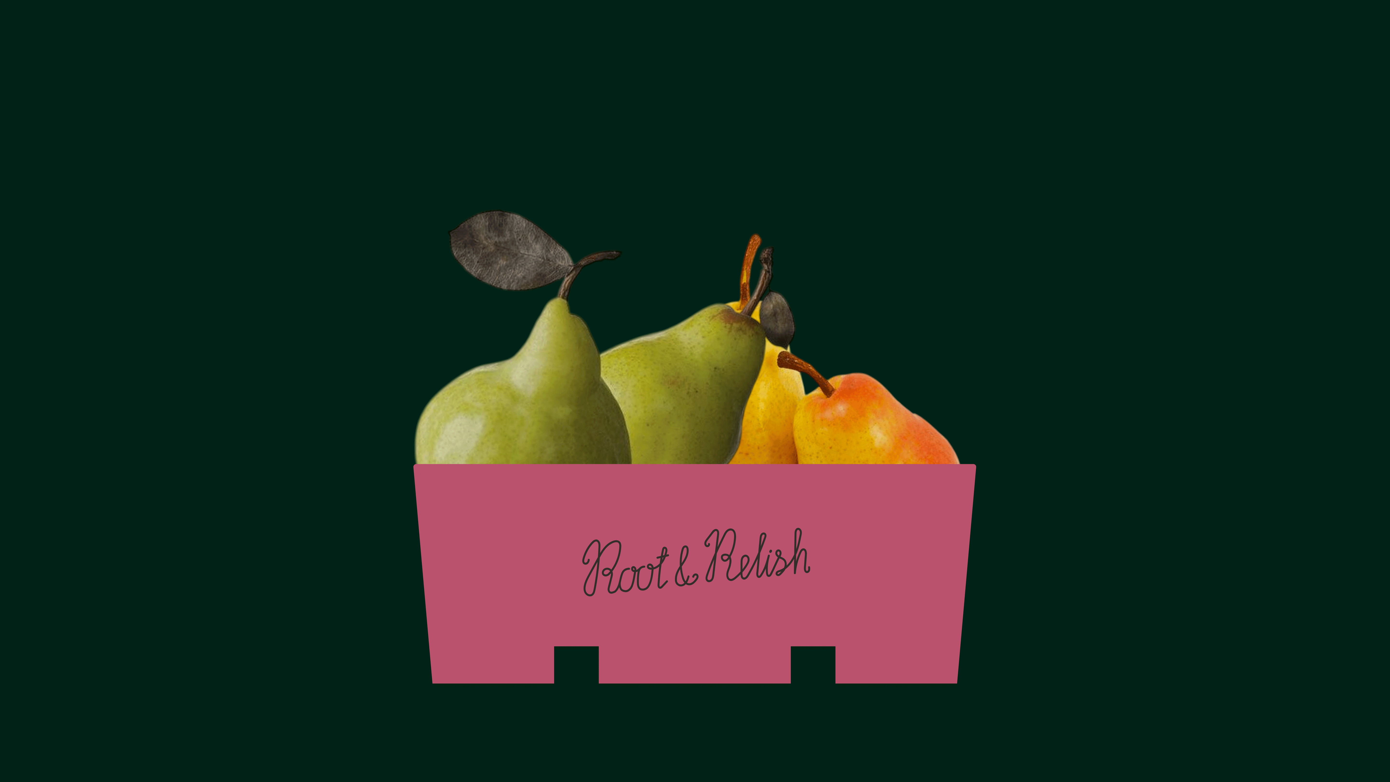
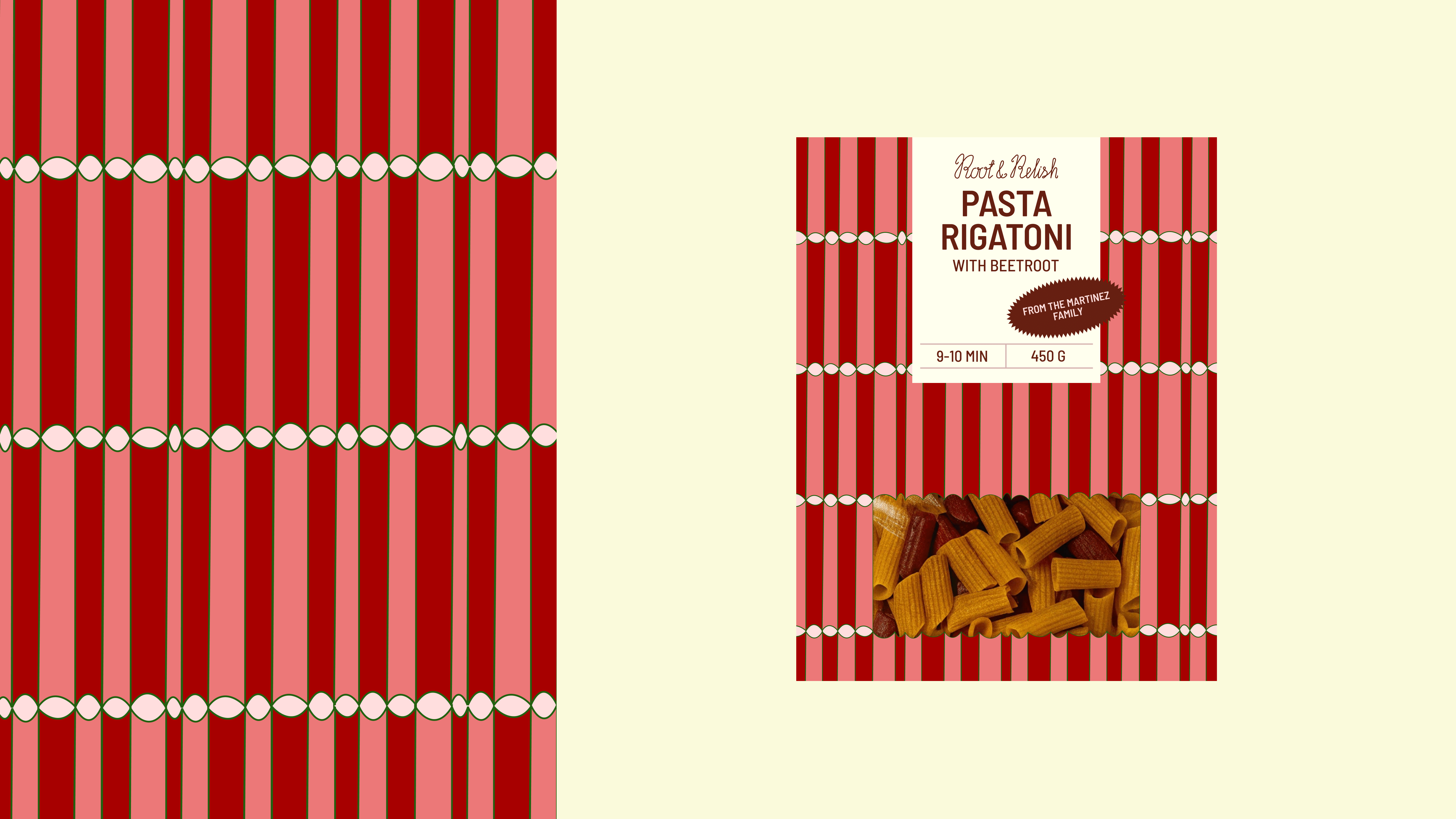
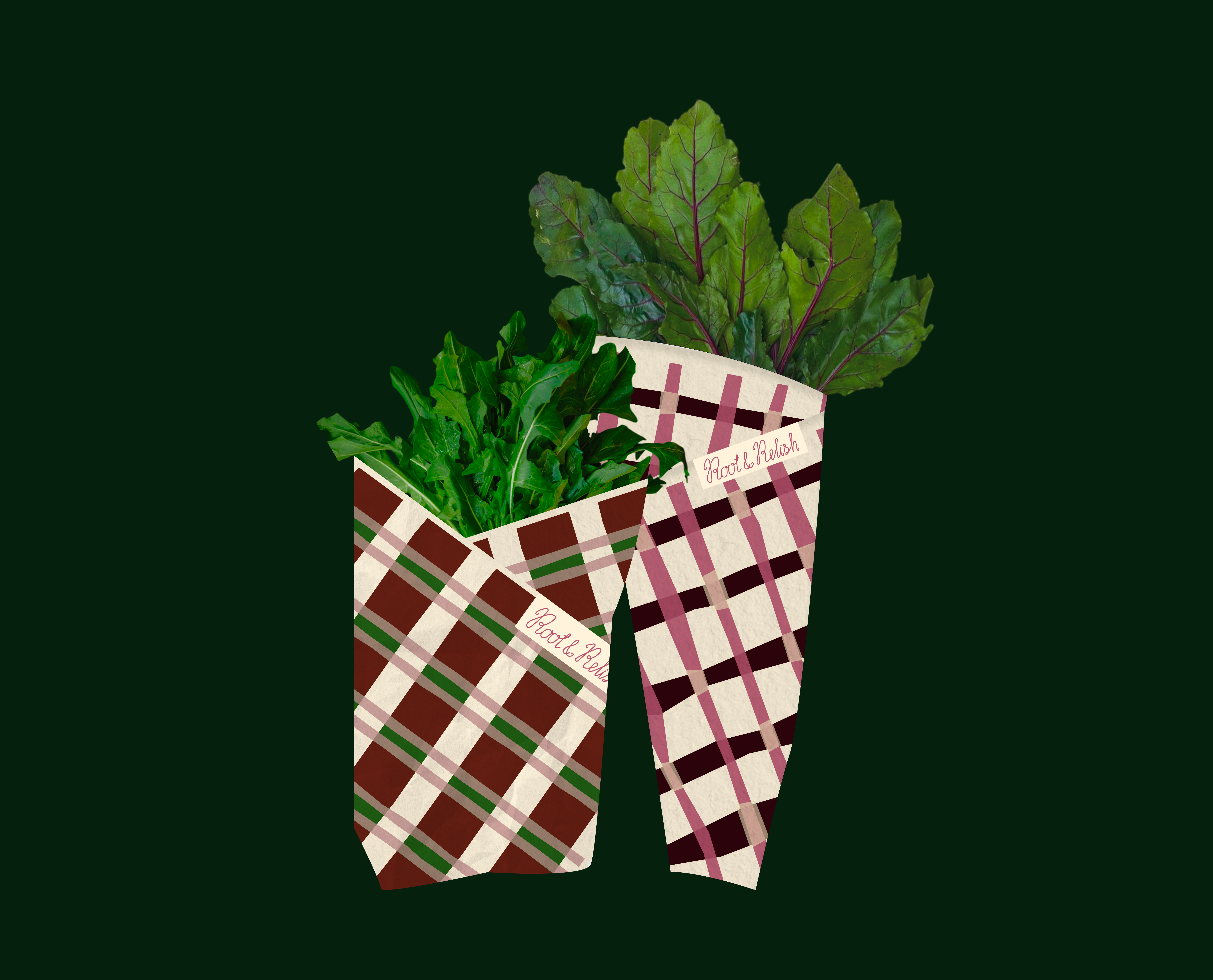
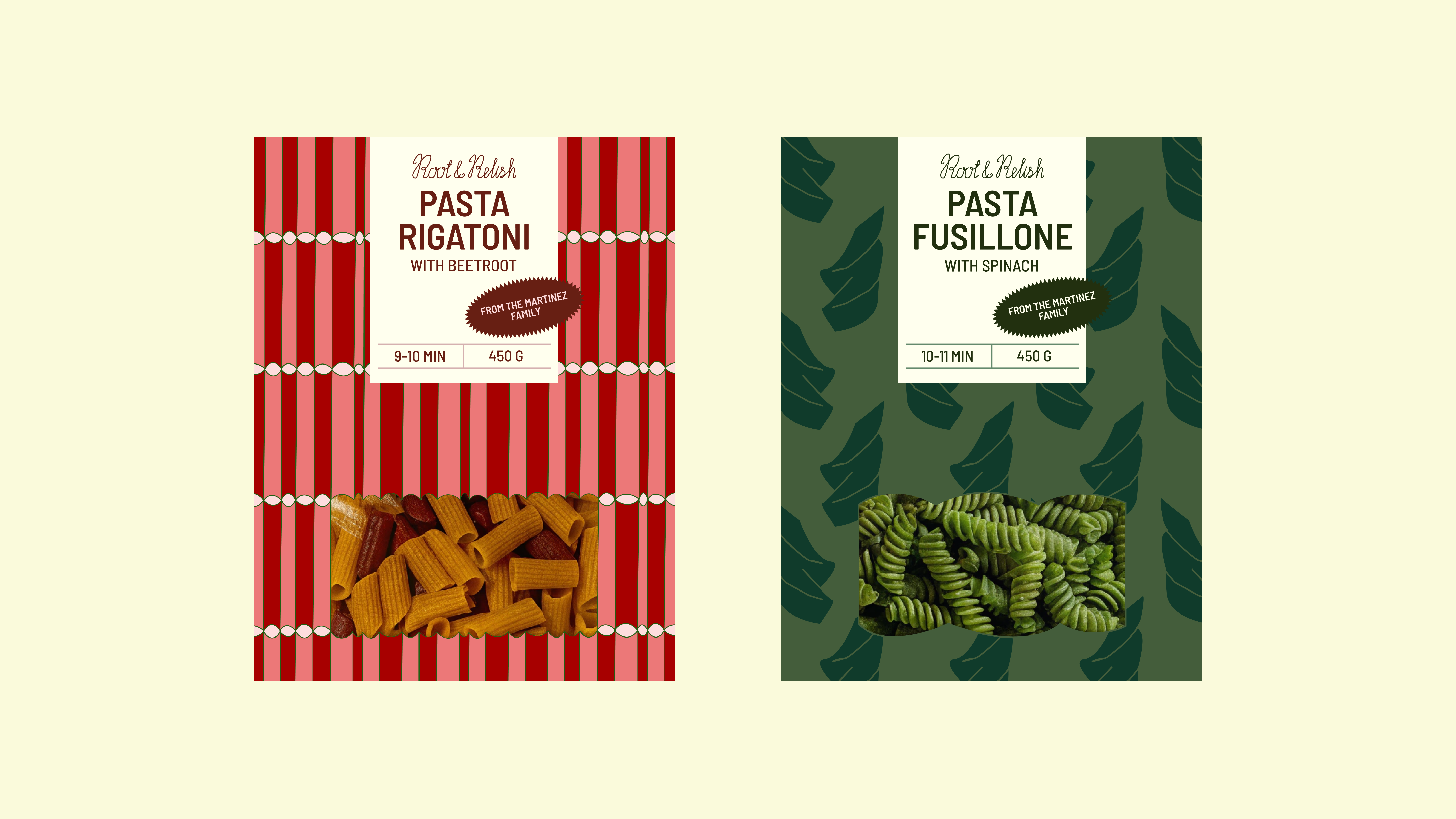
At Root & Relish, every product is not just a commodity, but a piece of someone's story.
We put the names of farmers and artisans on the packaging because we want customers to know who is behind their food.
This helps create a deep connection between producer and consumer, bringing back respect for the hard work of the people who grow and create unique products.
I’M OPEN TO NEW COLLABORATIONS!
THIS IS A DESIGN CONCEPT, IF YOU WANT TO USE IT IN YOUR BRAND, CONTACT ME!
EMAIL: JULIIA.NIKOLAEVA@MAIL.RU
INSTAGRAM TELEGRAM
PROJECT MENTOR: Alina Matveeva