RU:
Айдентика для бренда wellness-напитков
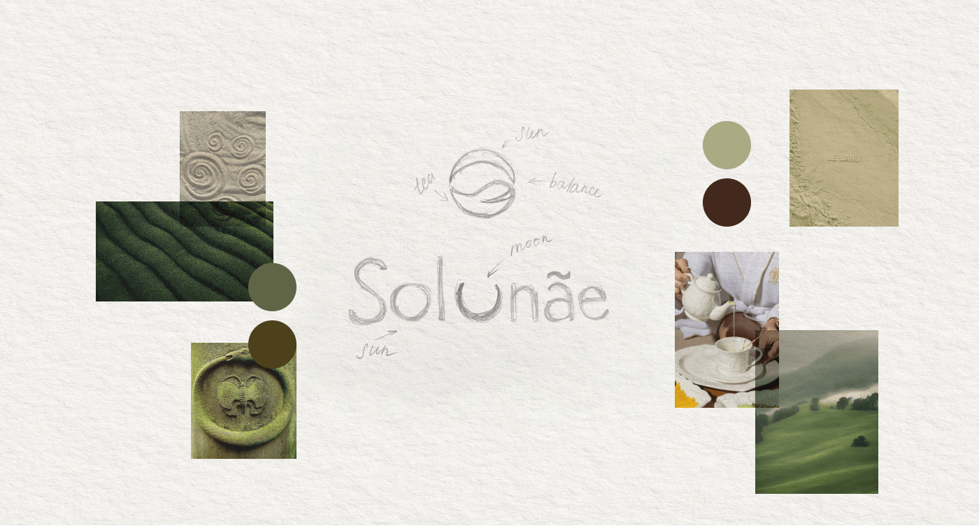
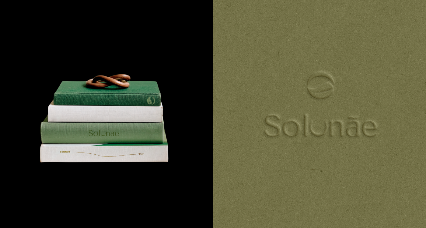
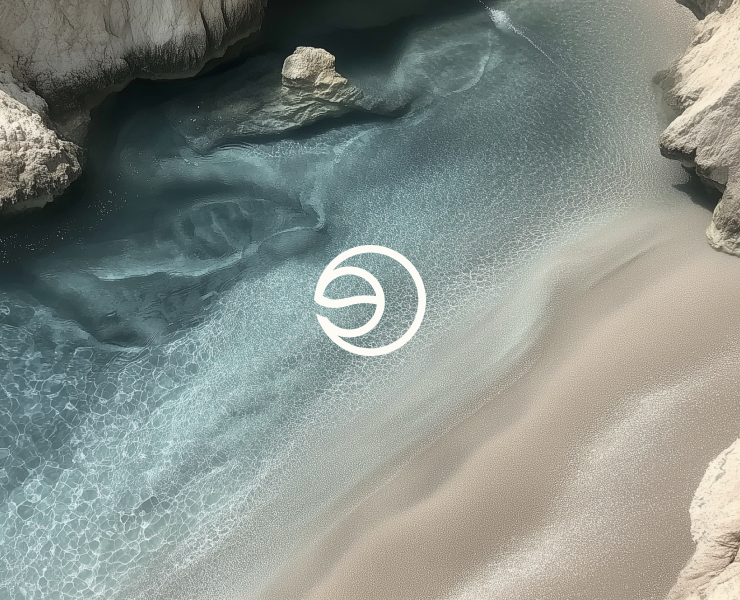
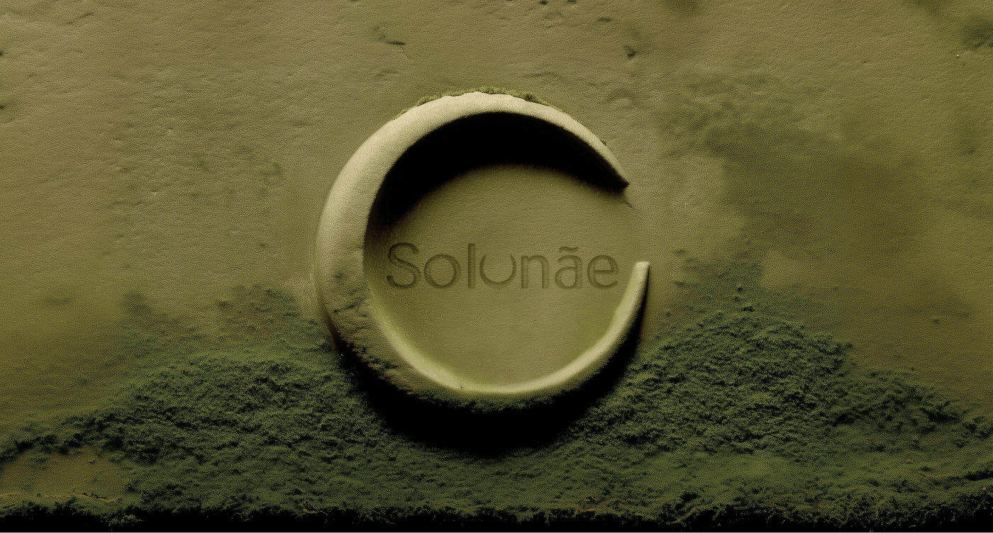
При разработке логотипа Solunae мы стремились передать баланс между динамикой городской жизни и внутренним спокойствием, соединением с природой и собой.
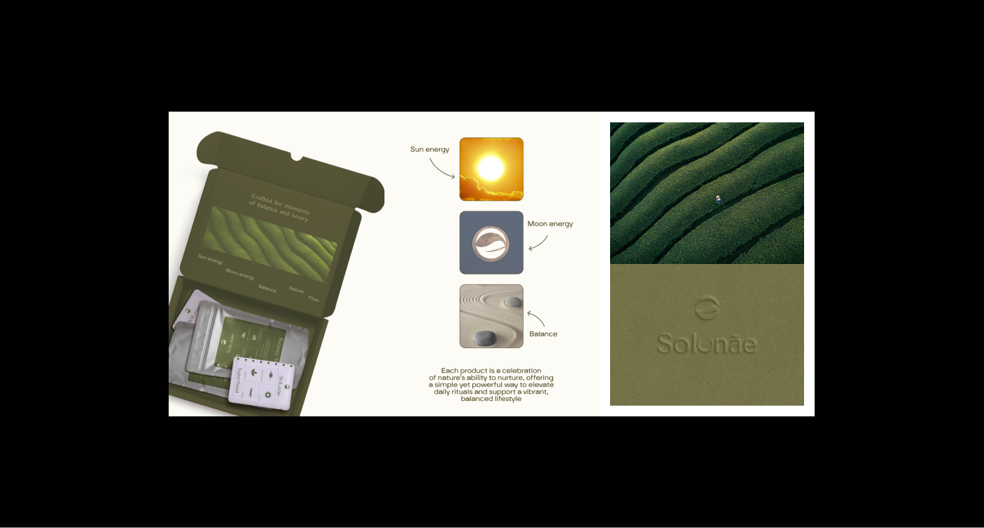
В основе знака лежит образ Инь и Ян, Луны и Солнца — символов противоположностей, находящих гармонию. Это отсылка к истории основательницы бренда, которая родилась на стыке двух знаков зодиака и сочетает в себе энергетику Солнца и силу Луны.
Концепция упаковки
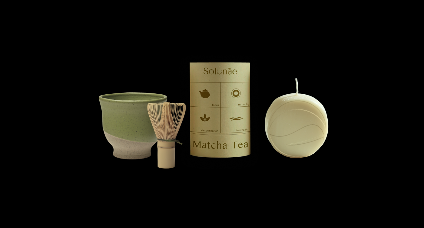
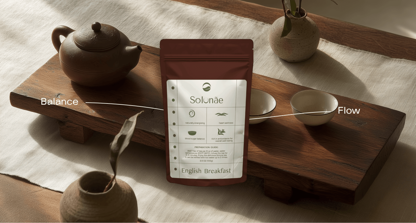
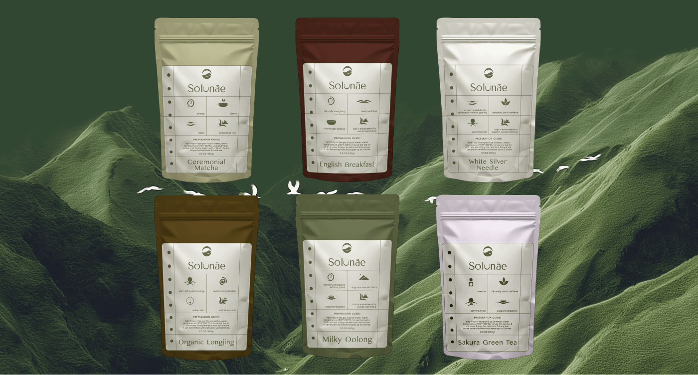
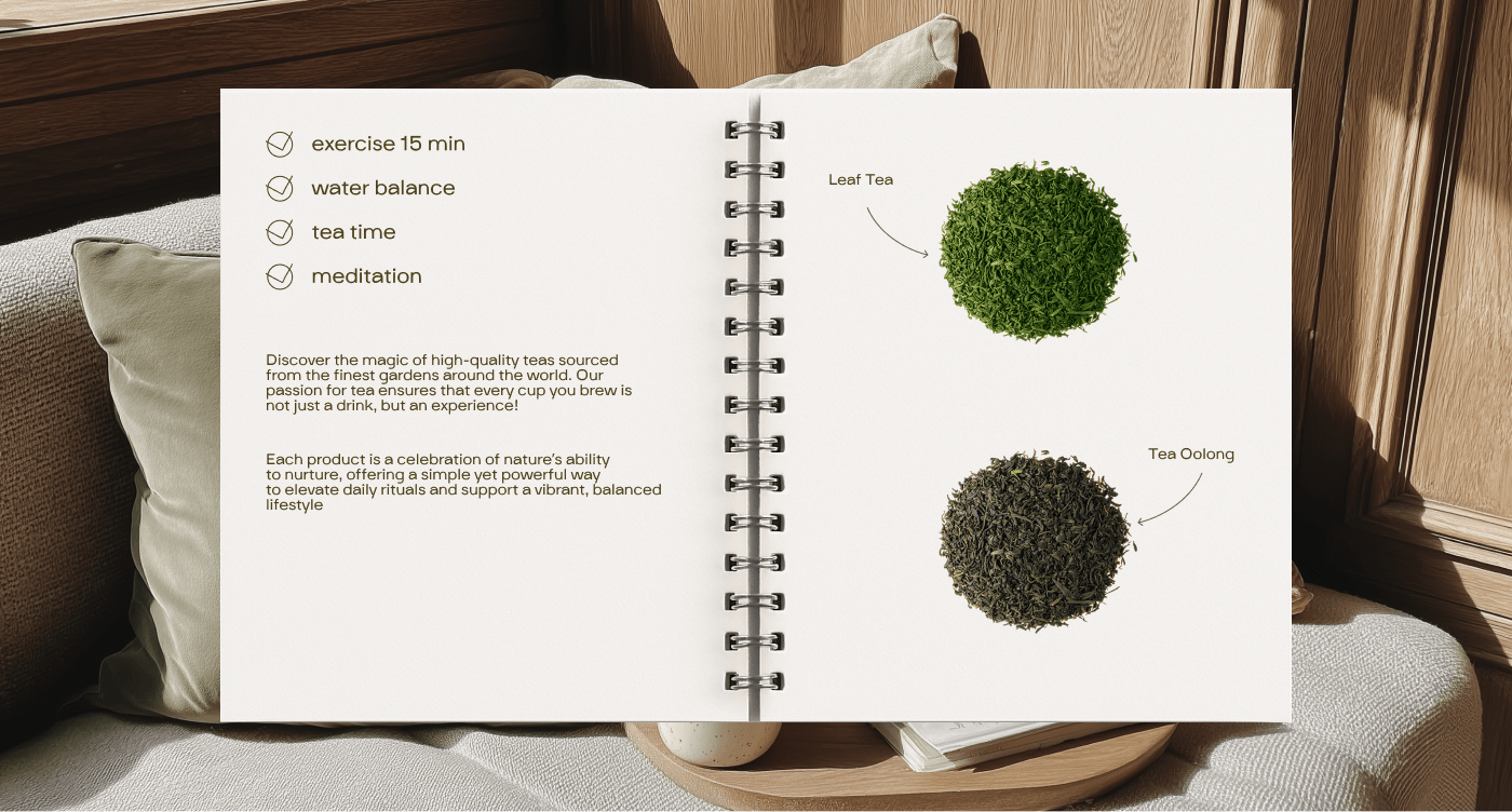
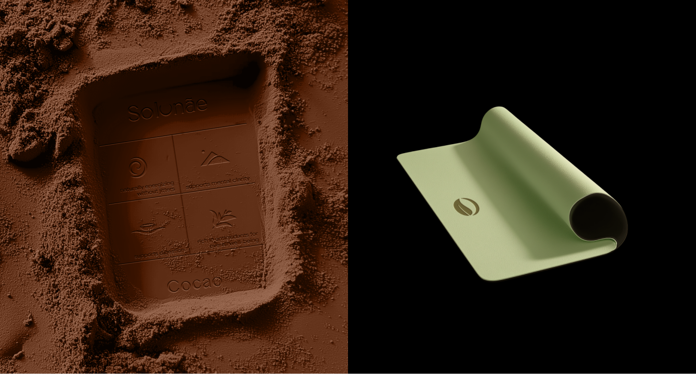
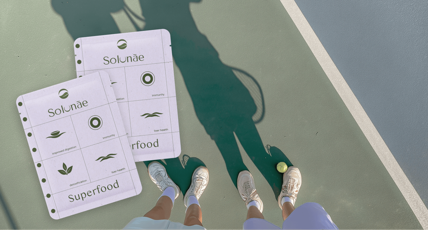
Основным элементом упаковки стала метафора ежедневника. В условиях интенсивного городского ритма ежедневник — наш главный помощник, куда мы записываем важные дела. Мы предлагаем, добавить в этот список и время для заботы о себе.
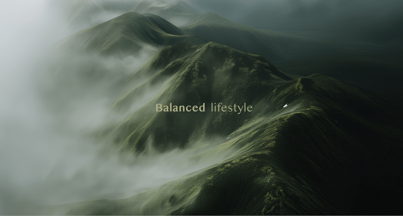
Миссия бренда — помогать поддерживать сбалансированный образ жизни, где есть время и ярким эмоциям, и спокойным минуткам наедине с собой.
ENG:
Identity for a wellness beverage brand
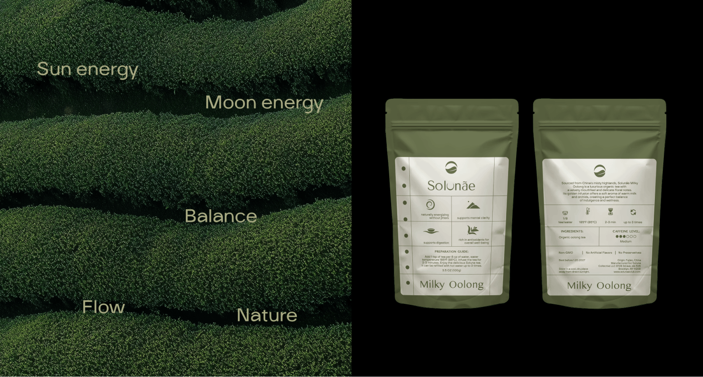
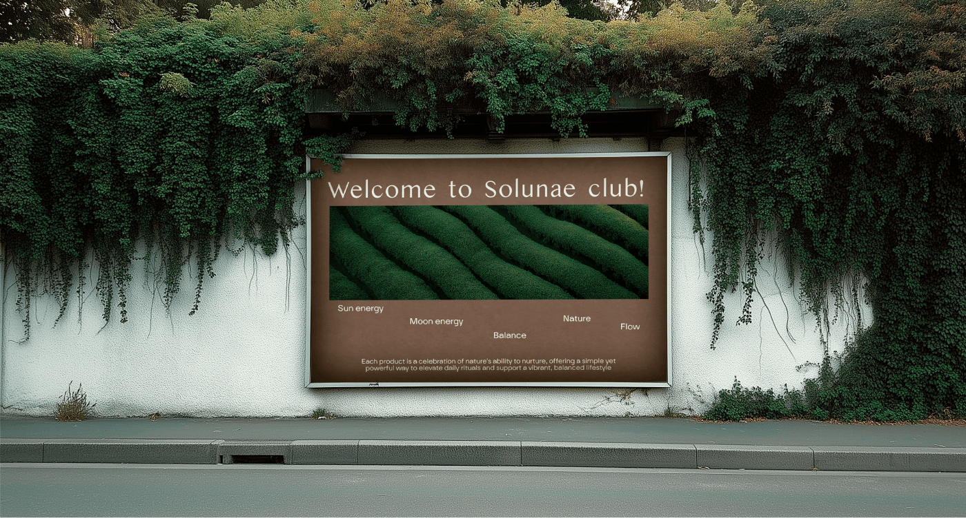
When creating the Solunæ logo, we aimed to convey the balance between the dynamics of urban life and inner tranquility, the connection with nature and with oneself.
The symbol is based on the imagery of Yin and Yang, the Moon and the Sun — symbols of opposing forces finding harmony. This concept references the story of the brand’s founder, who was born at the intersection of two zodiac signs and embodies both the vibrant energy of the Sun and the mysterious strength of the Moon.
Packaging concept
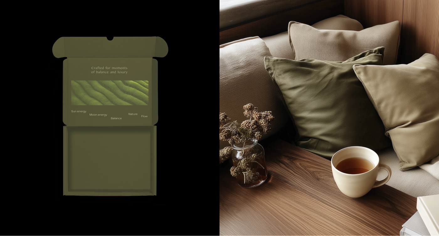
The main element of the packaging design became the metaphor of a daily planner. In the fast pace of city life, a planner is our essential assistant, where we record important tasks. We propose adding one more item to this list — time to care for oneself.
Brand mission
To help maintain a balanced lifestyle, where there is space both for vivid emotions and for quiet, peaceful moments of solitude.