Story & Task
One day, I was approached by a company called “Spintronika”, which specializes in microchip manufacturing. The main request was to incorporate either the company’s name or the visual concept of a microchip into the logo design.
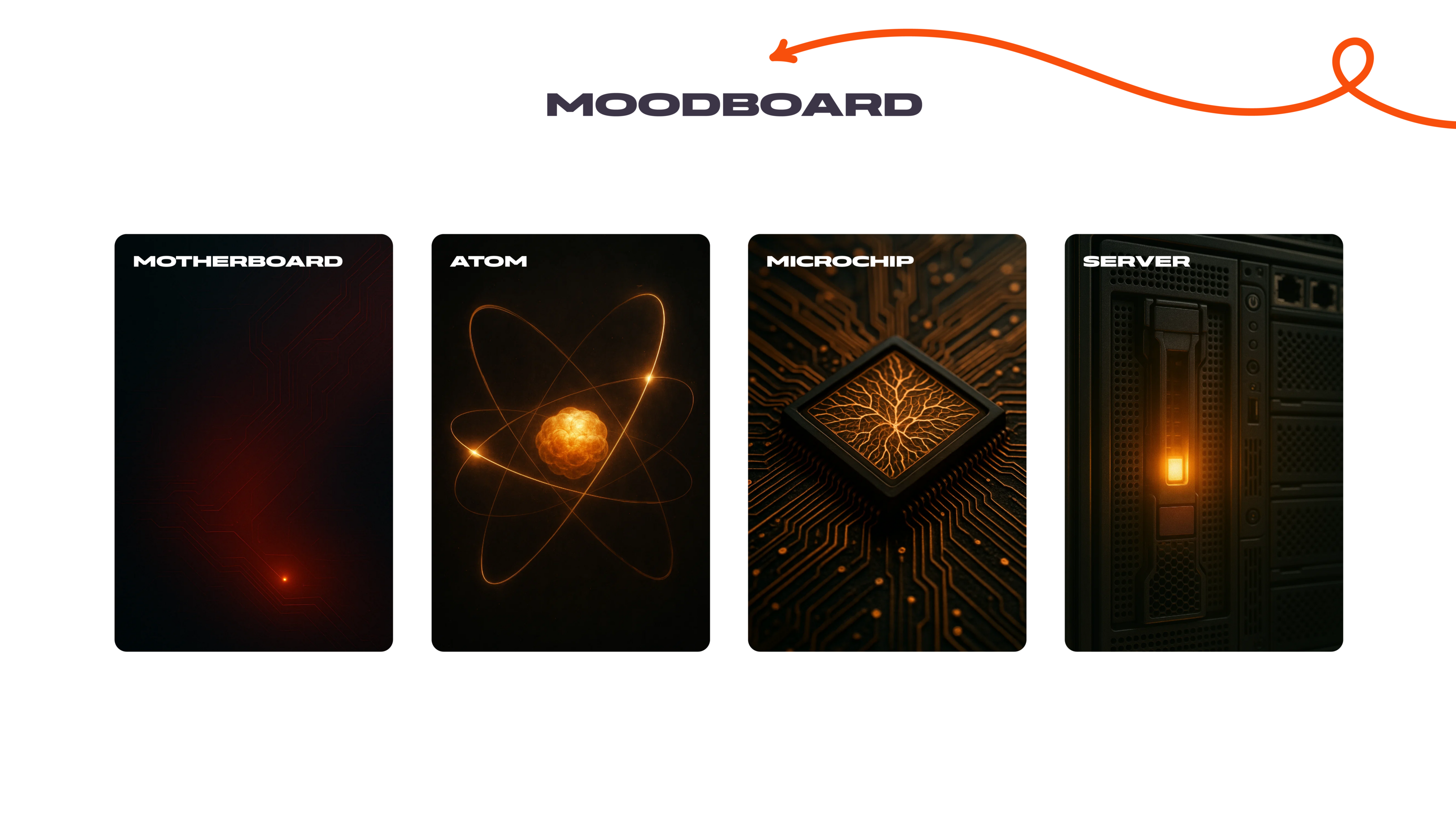
I started by creating a moodboard to explore key concepts and visual directions. The most promising and inspiring ideas at this stage were: a motherboard, an atom with orbiting electrons, and a microchip.
Solution
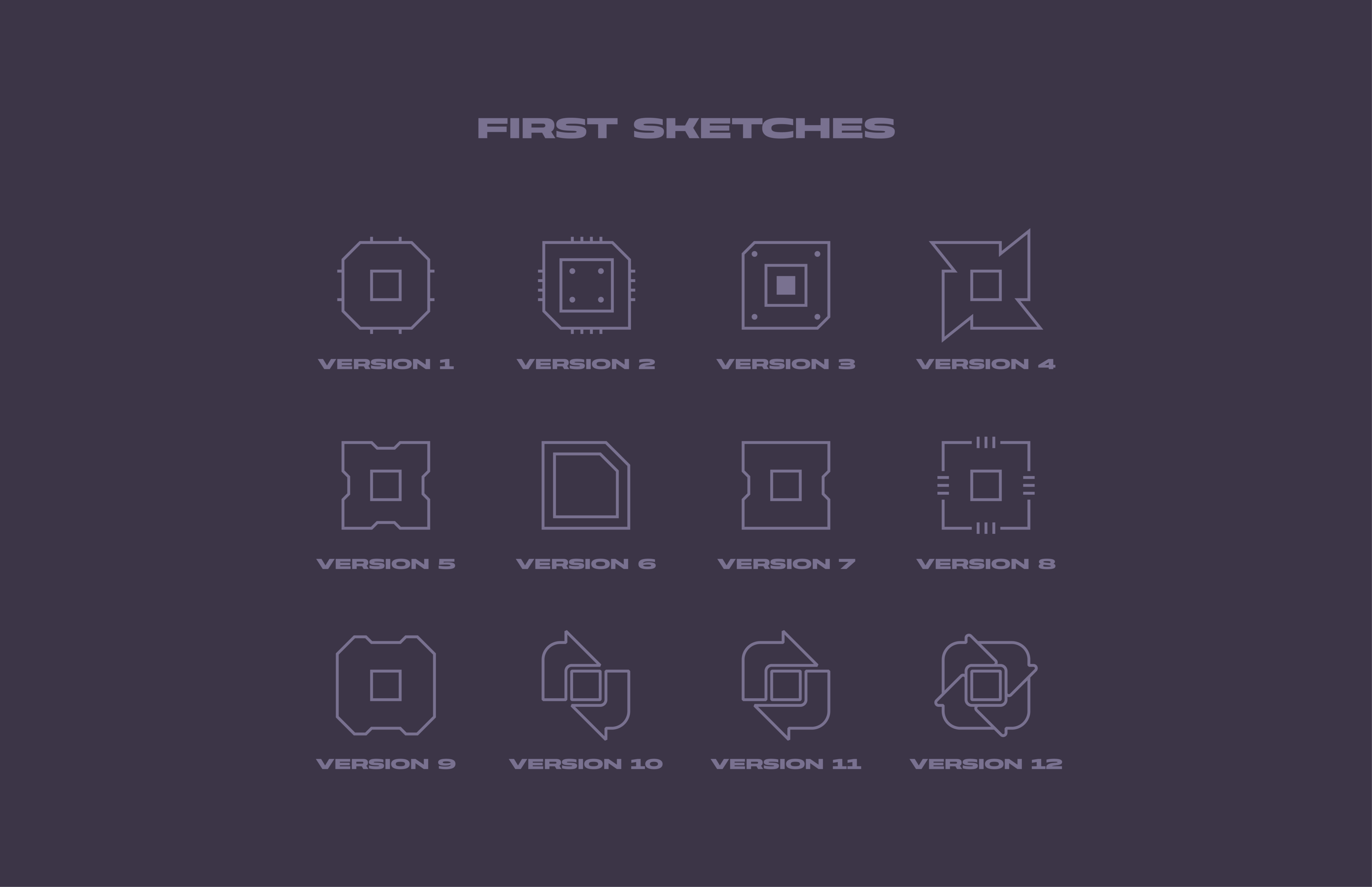
However, after sketching out the first logo concepts, I realized they felt too plain and conventional. I wanted to breathe life into the design and make it less overtly technological and more emotionally expressive. I asked myself: what could truly set a young tech company apart from the industry giants?
Eureka! A bold style, rule-breaking attitude, and rebellious spirit!
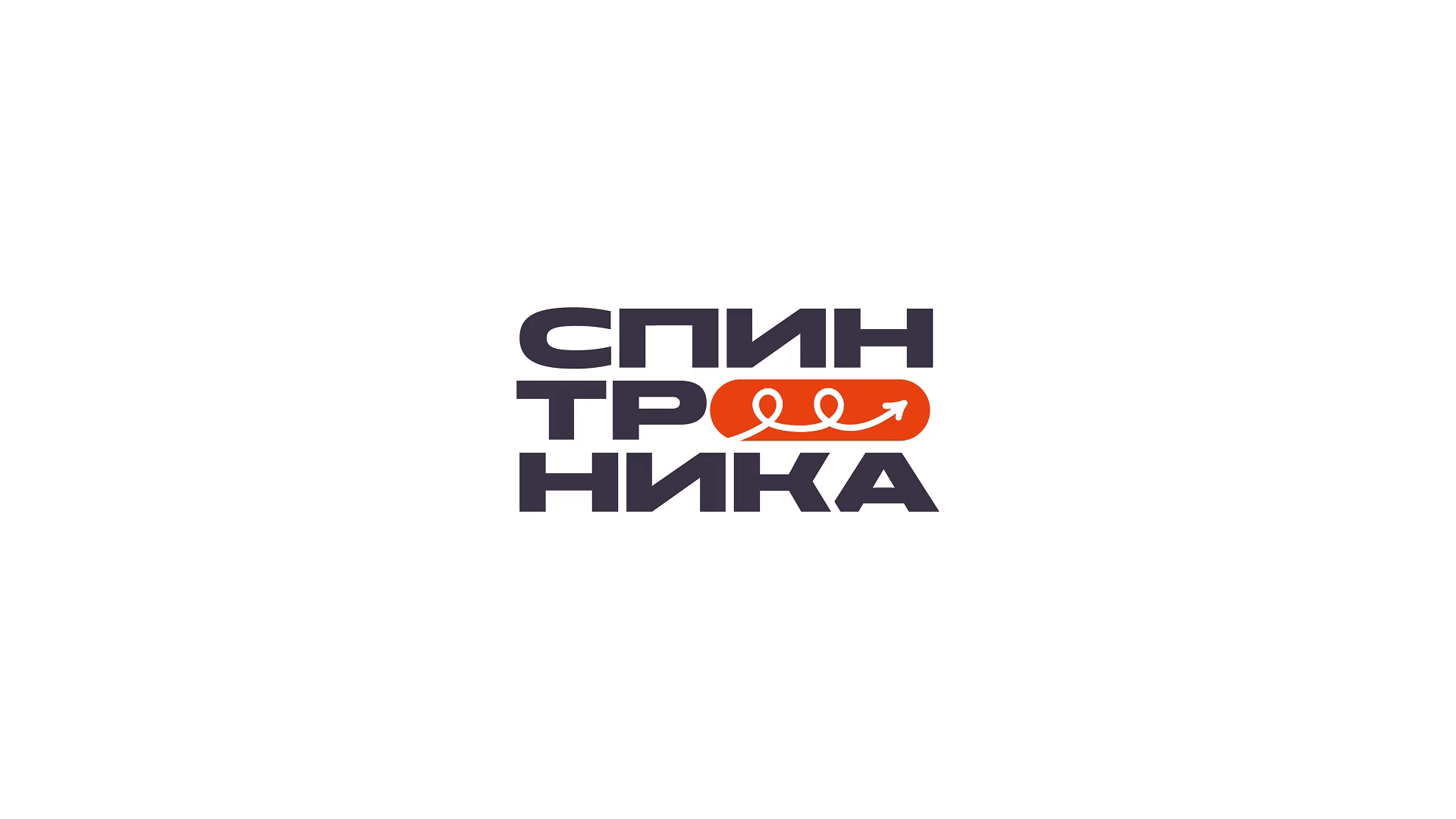
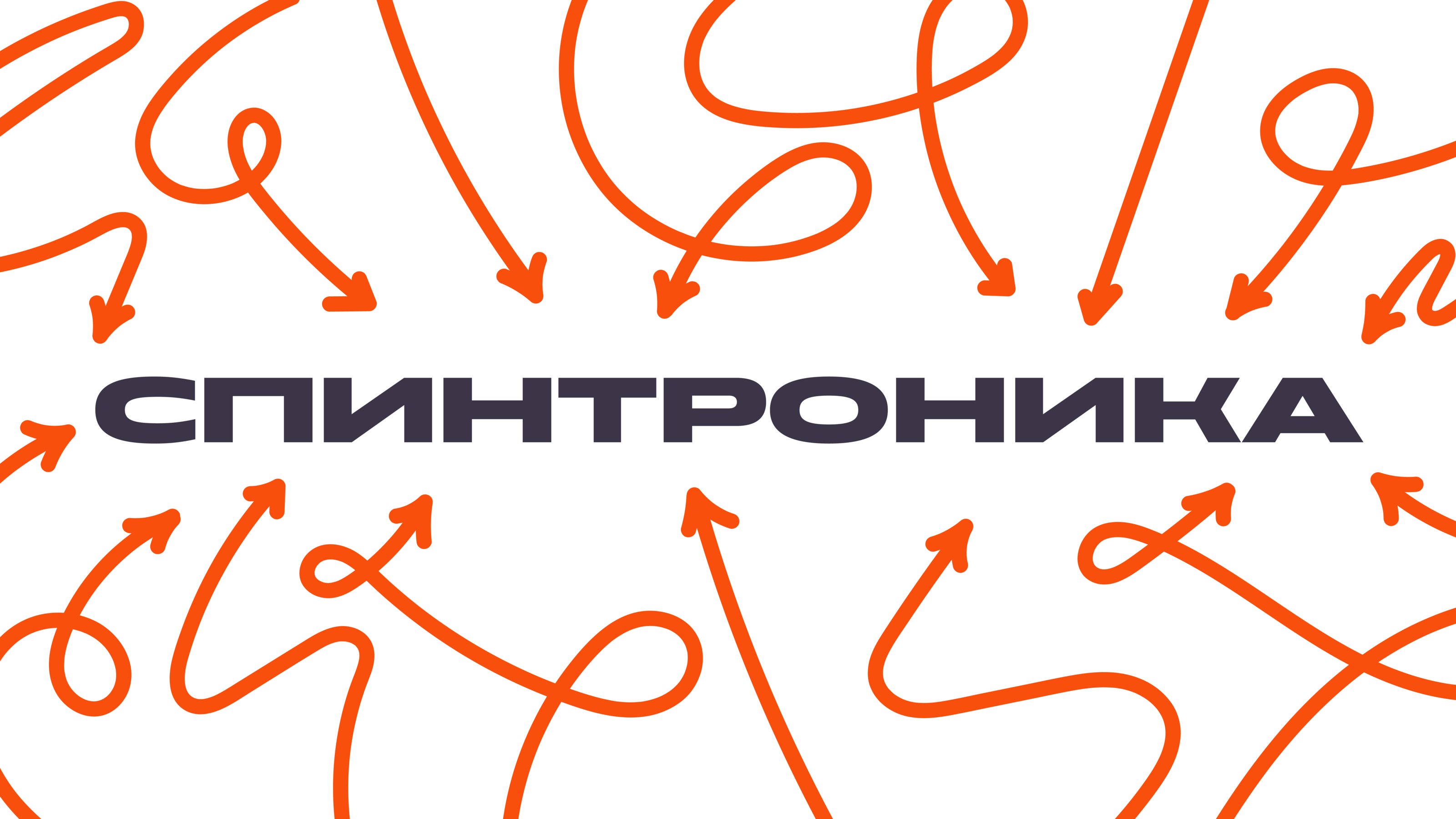
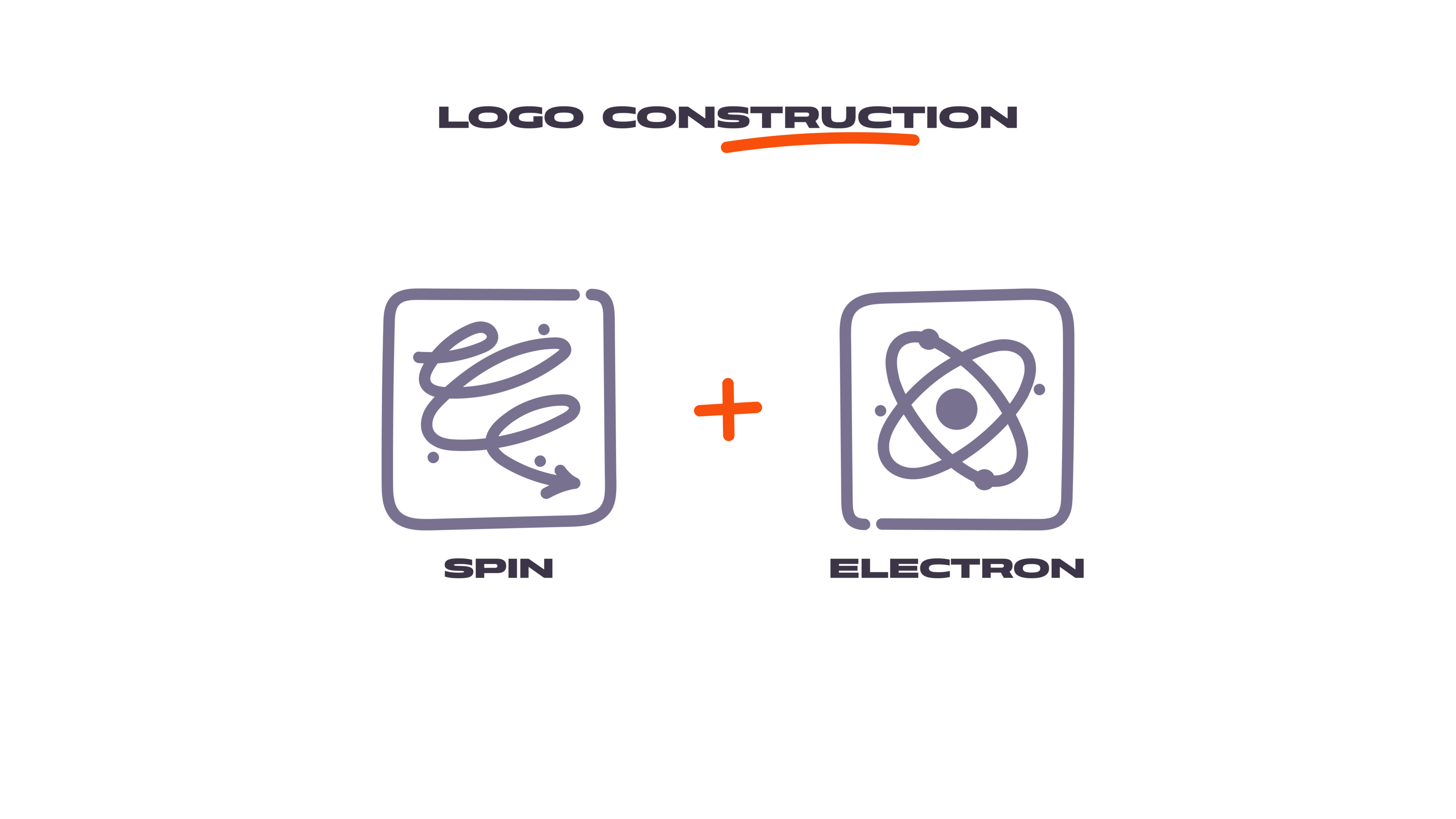
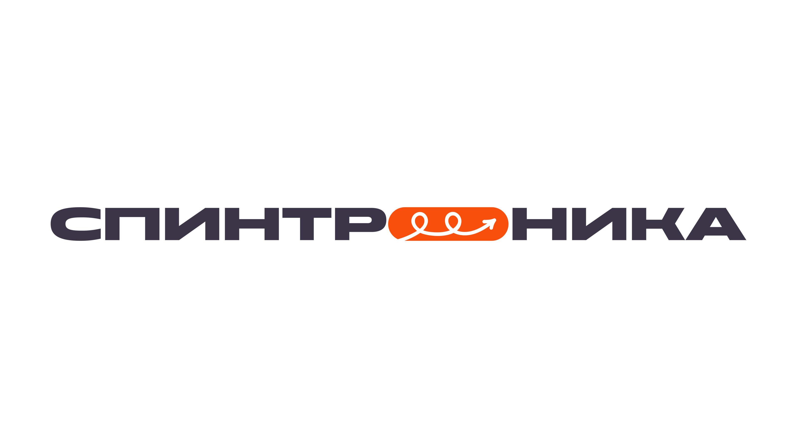
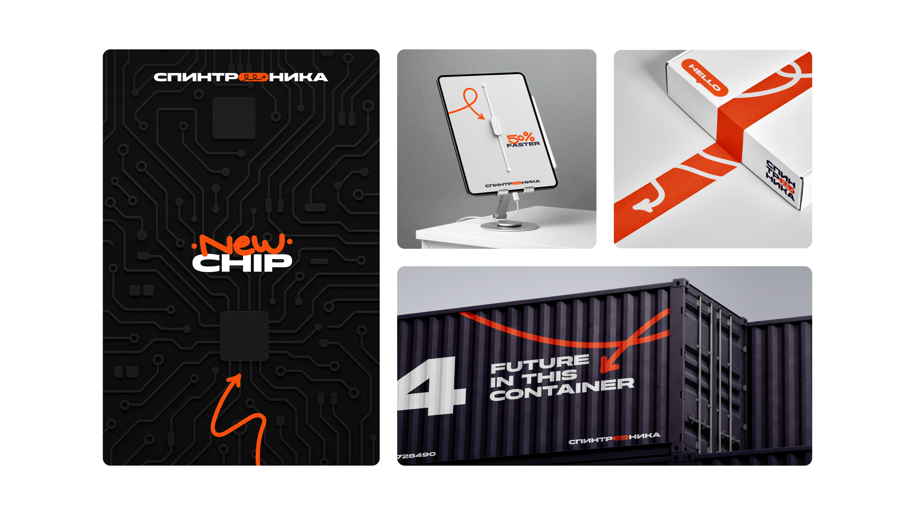
That’s how the brand’s DNA took shape in the form of a spinning arrow — a visual metaphor for the electron’s spin, directly tied to the brand’s name.
Visual Identity
The accent color of the brand became a bold and energetic shade known as Orioles Orange.
This choice was intentional and based on two key reasons:
First, the company actually manufactures orange-colored microchips.
Second, this vivid hue is often used as a power indicator light in switches, symbolizing energy, ignition, and action — a perfect metaphor for how the company plans to ignite the tech market with boldness and impact.

The core elements of the brand’s identity are built around three key components:
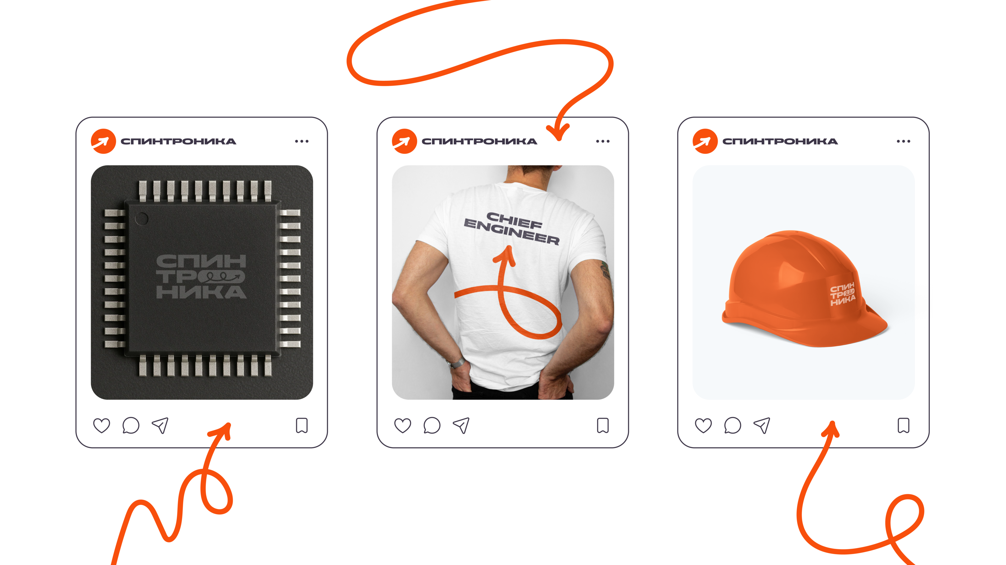
1. A spinning arrow — symbolizing dynamism and movement.
2. A letter "O" shaped like a button — evoking associations with modern technology and user interfaces.
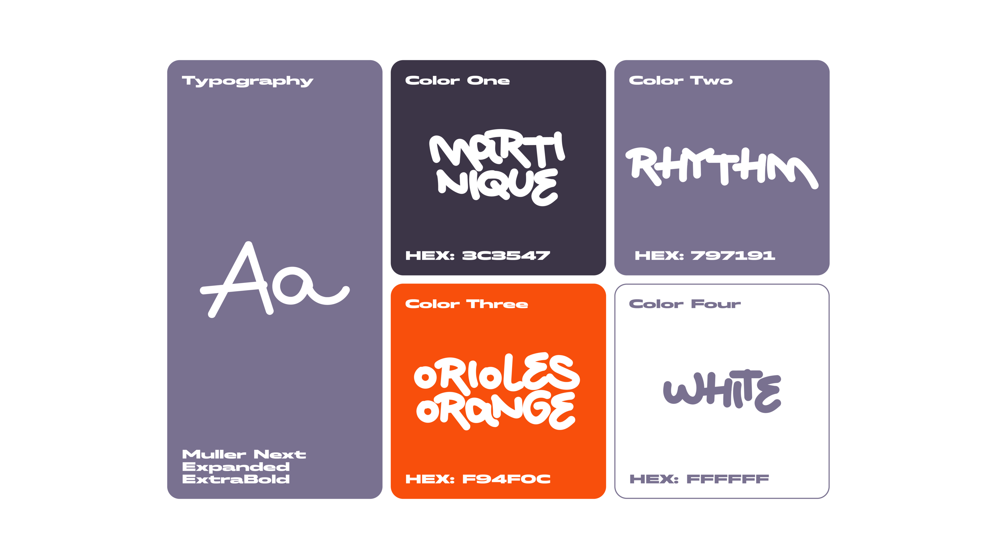
3. A mix of print and handwritten typography — balancing precision and uniqueness.
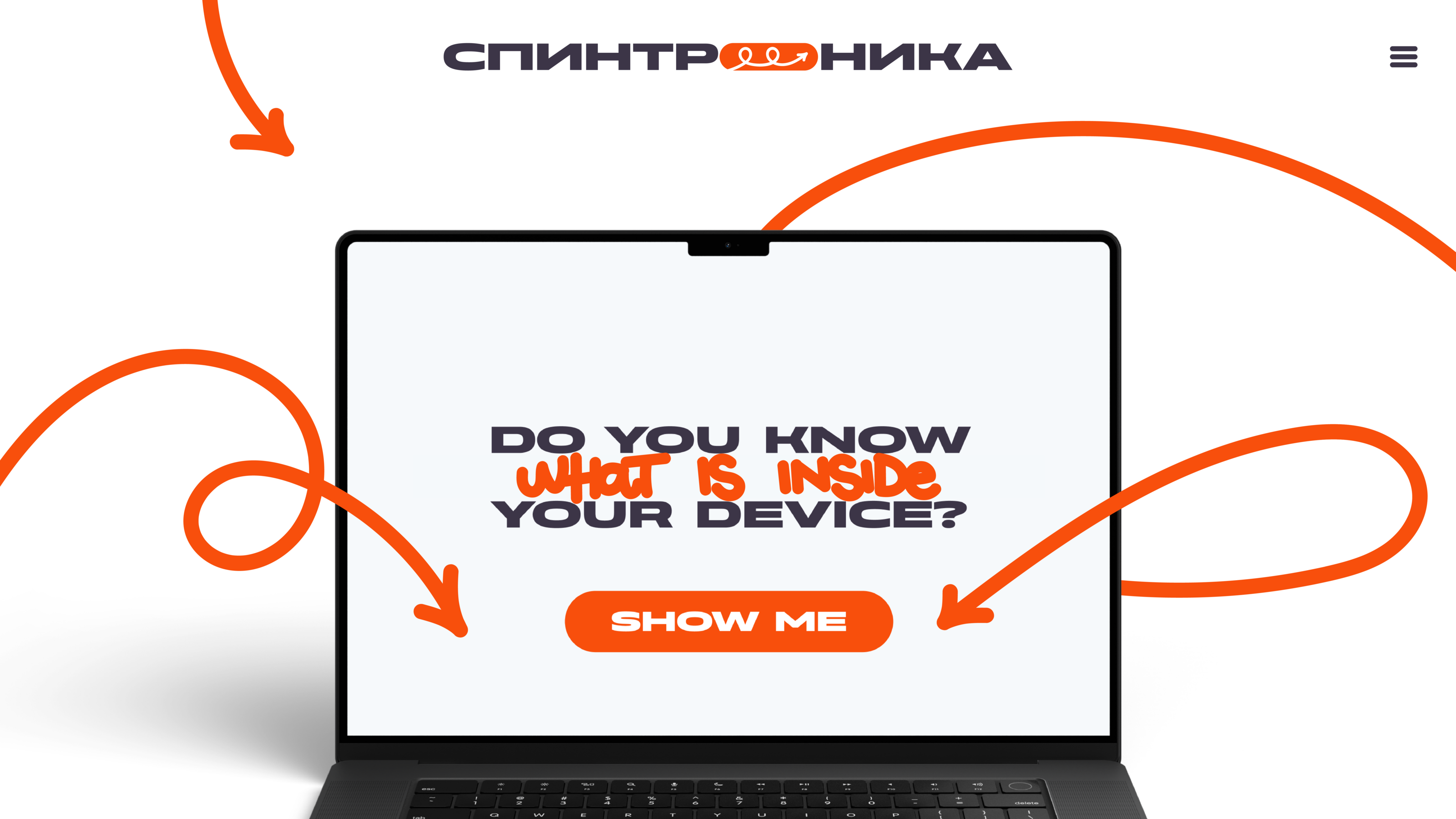
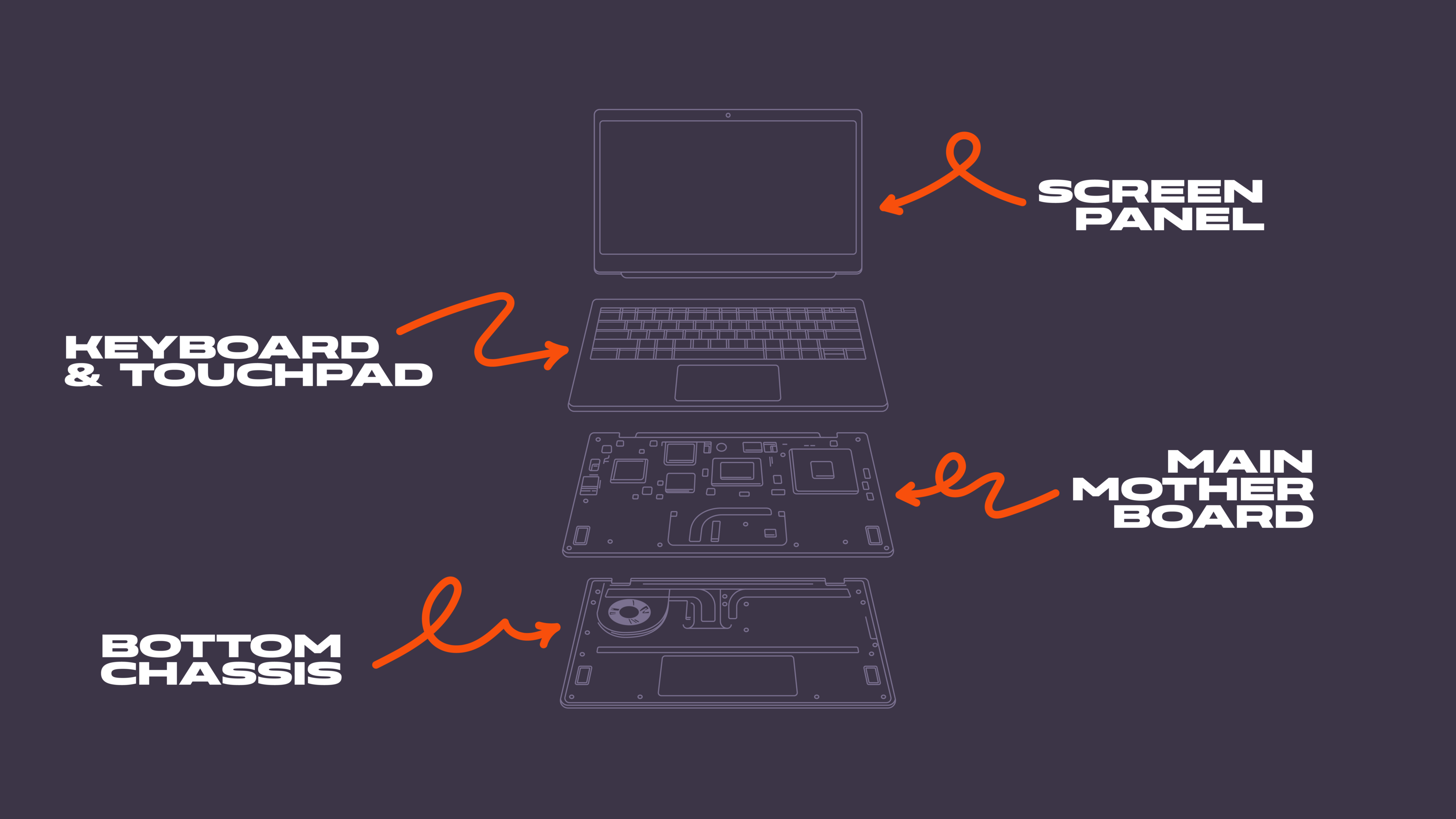
The spinning arrow inspired the idea of using it as a supporting element overlaying images. It reminded me of the emanata — a graphic element originating from Japanese manga, symbolizing movement, energy, and process.
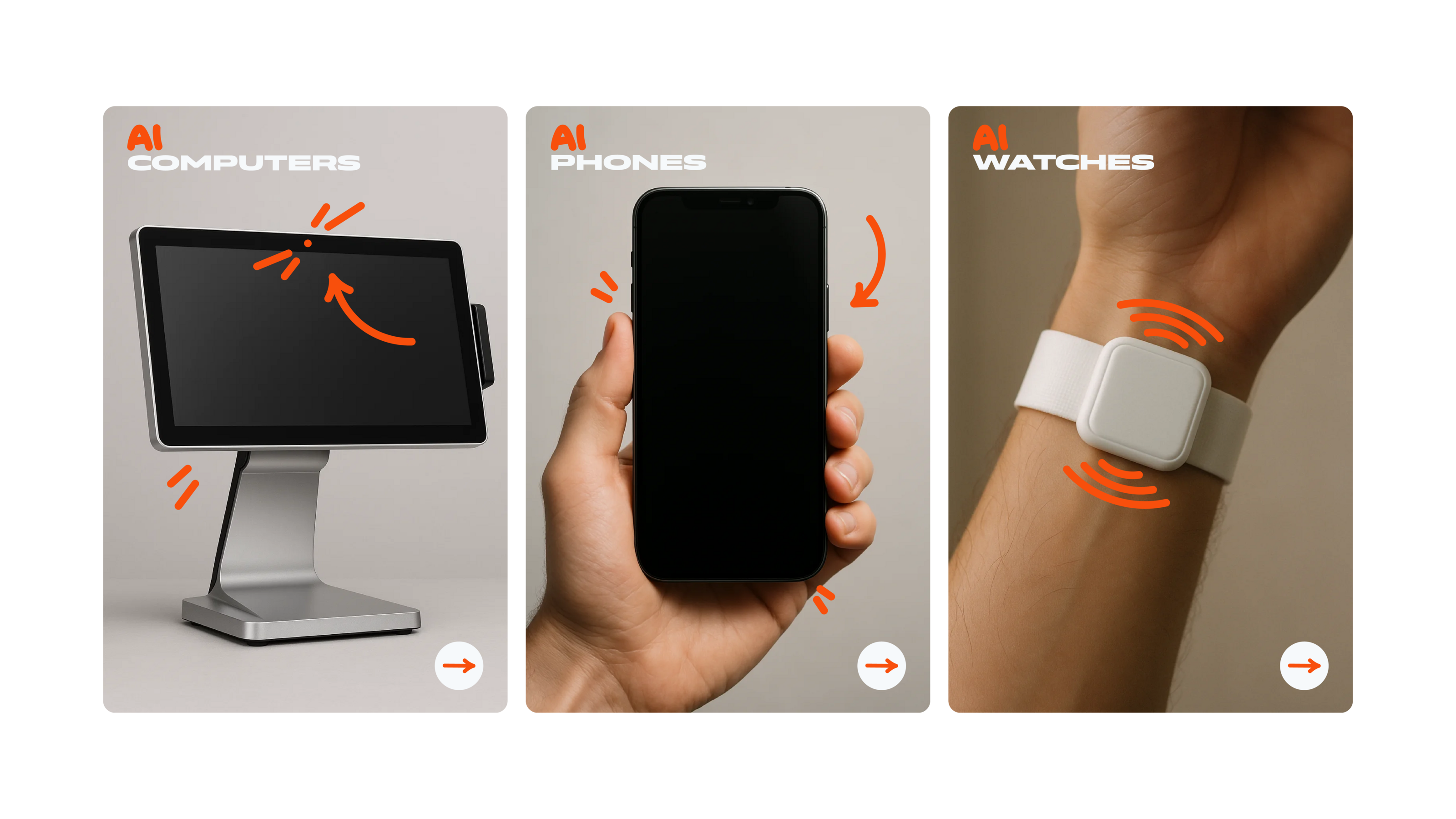
The combination of the three core elements of the brand’s identity offers unlimited possibilities for creating various design combinations, both for external and internal communications.
This logo has become more than just a visual symbol — it embodies the company’s innovative approach and unique philosophy. Through the combination of bold ideas and unconventional solutions, we were able to create a memorable, dynamic, and multi-layered brand.
Thank you for your attention! I’m open to feedback and suggestions.