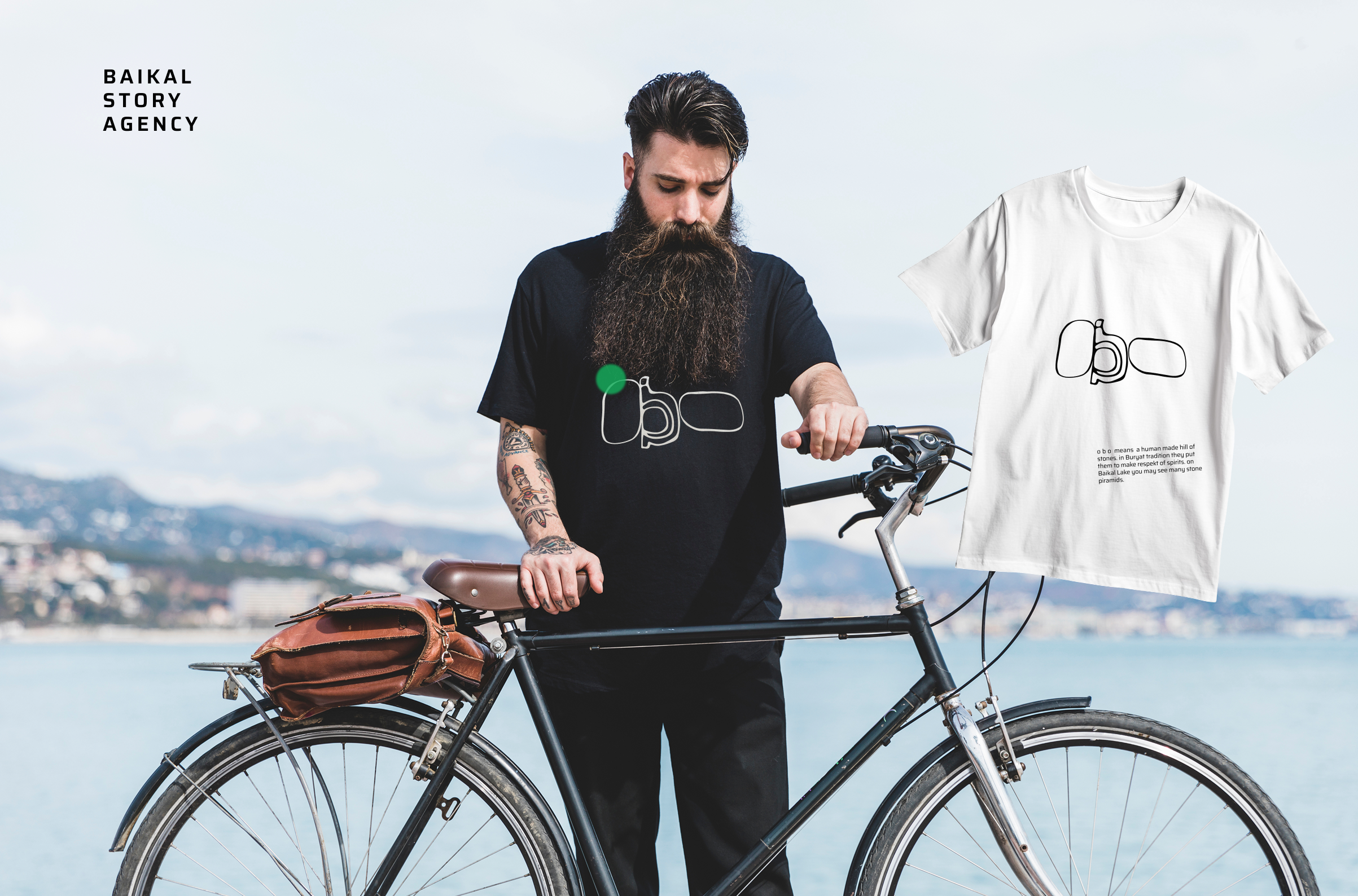
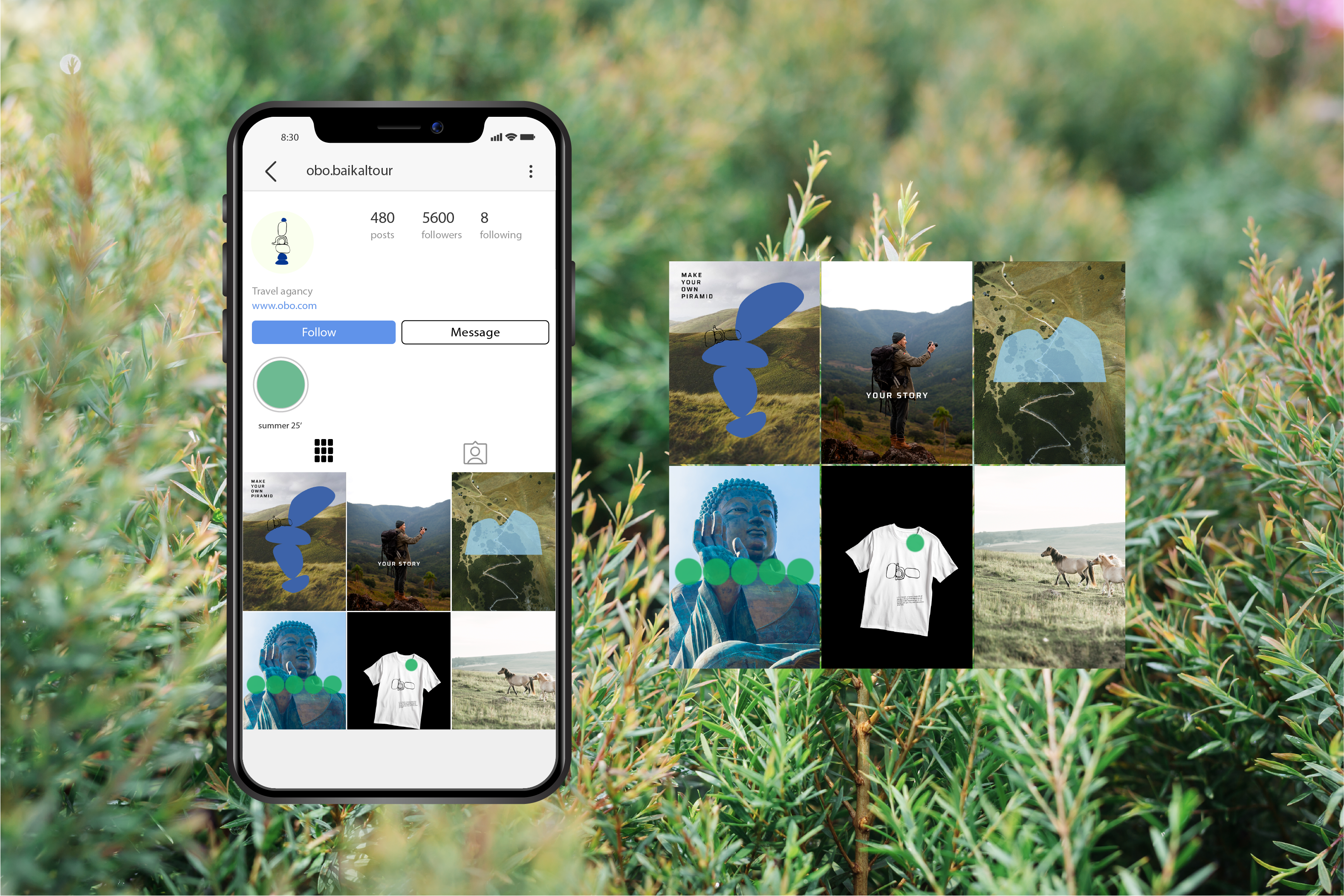
To create an identity for an agency that makes tours on Baikal Lake. I noticed that websites about Baikal traveling might be more unique. I thought i would make something commited.
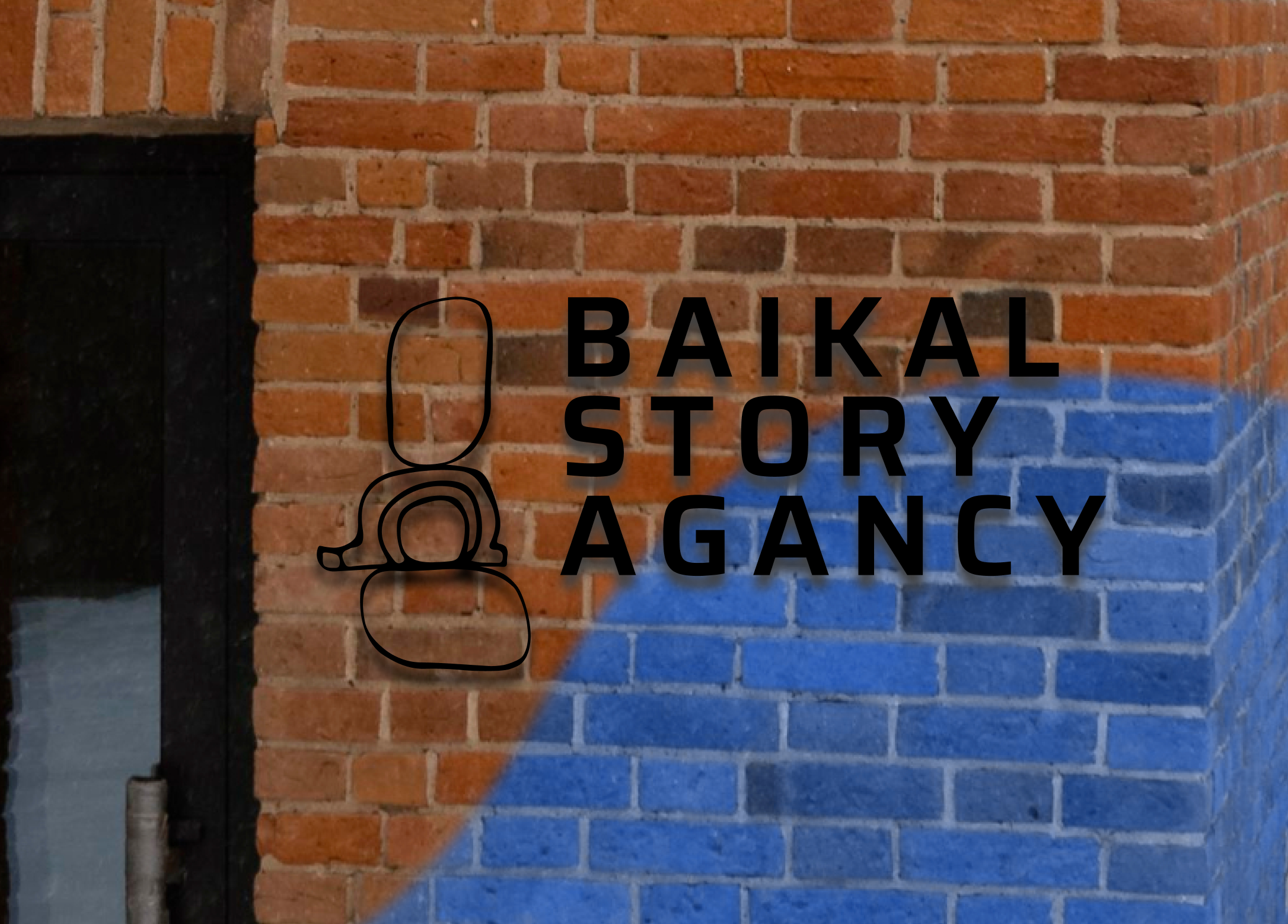
For logo I wanted font that will remind something of nature. Rock 3D was perfect.
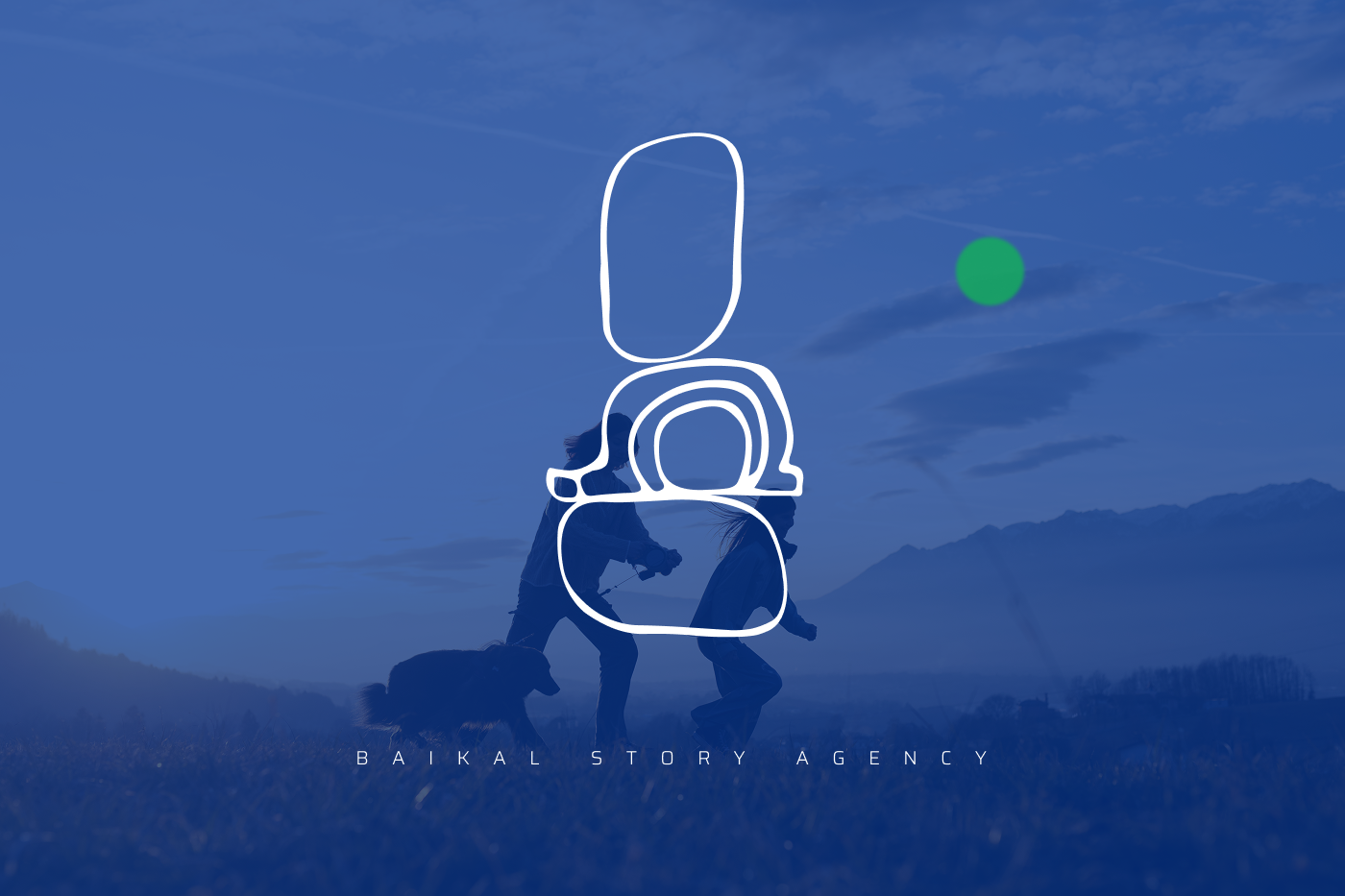
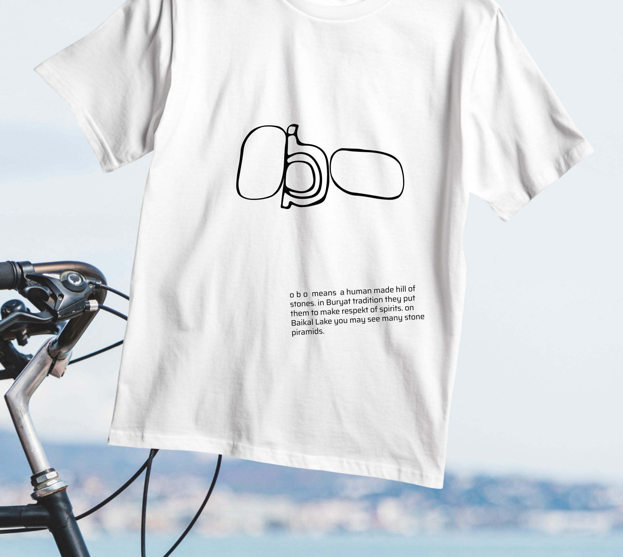
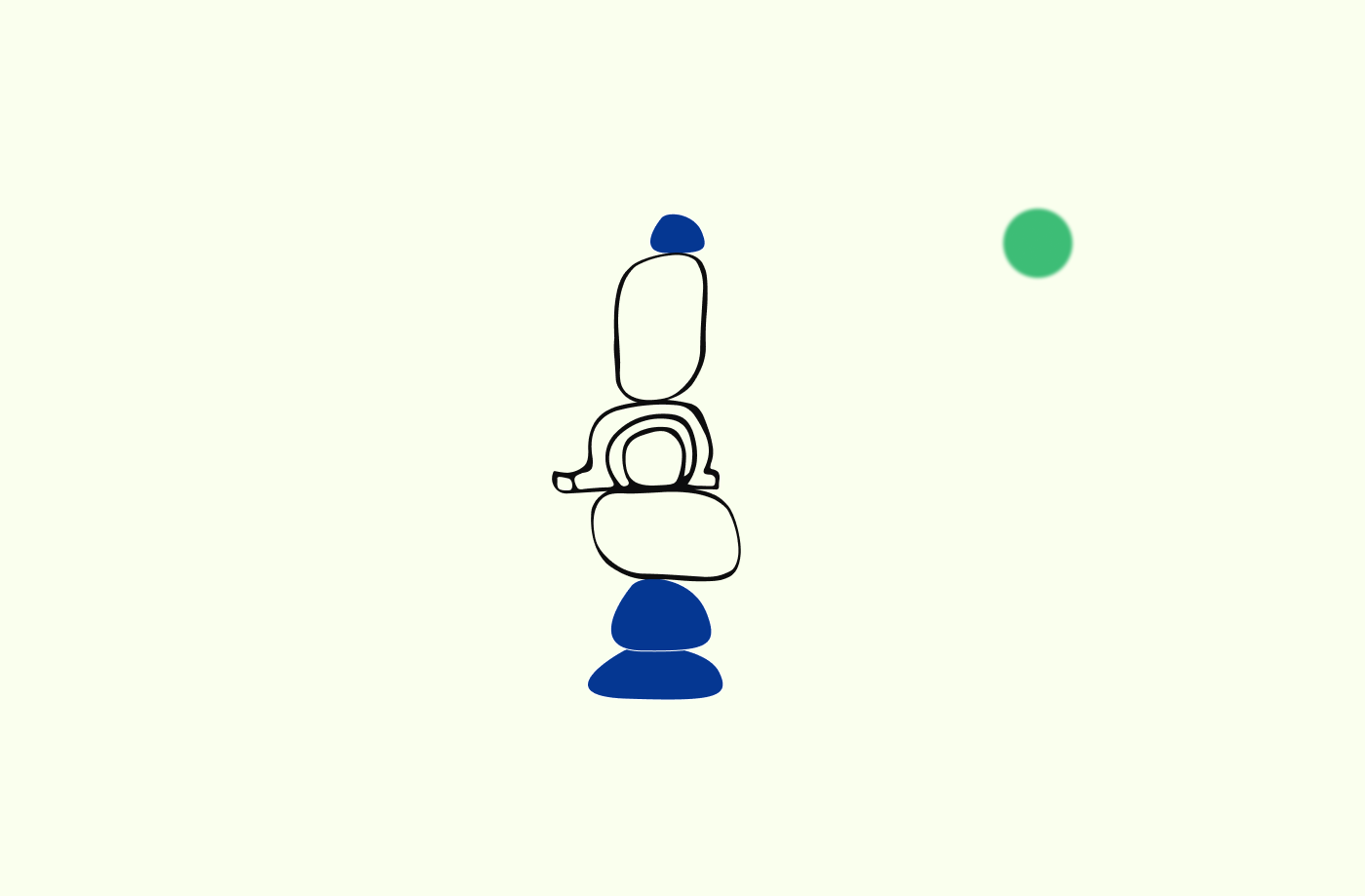
the idea came from the Buryat beginnings.
the word ‘obo’ means stones that go one on top of another like a piramid.

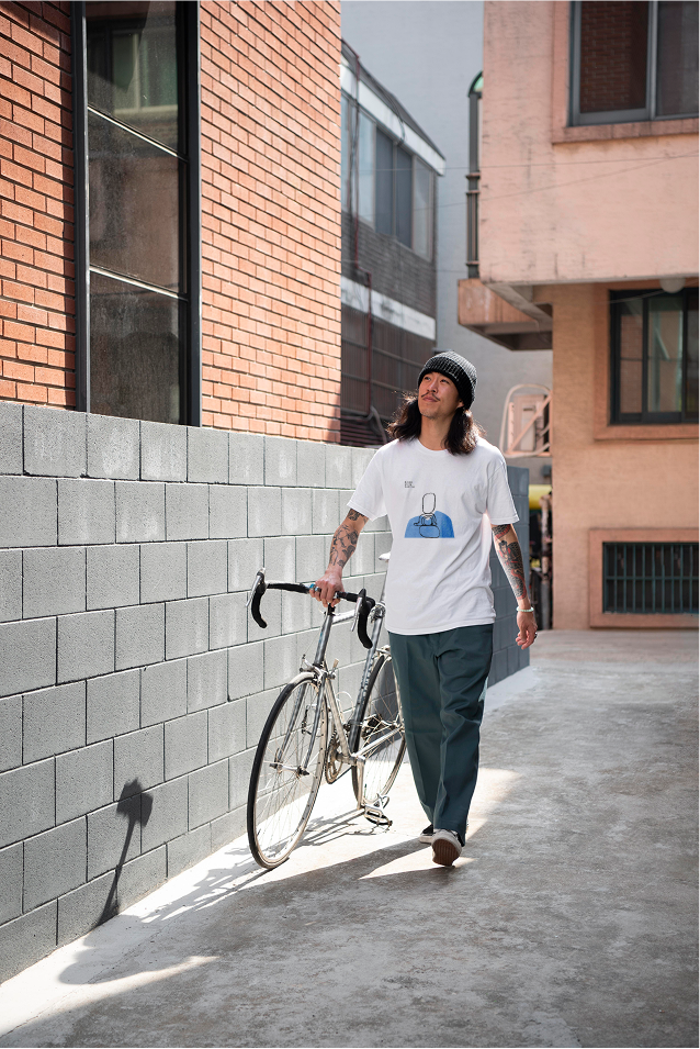
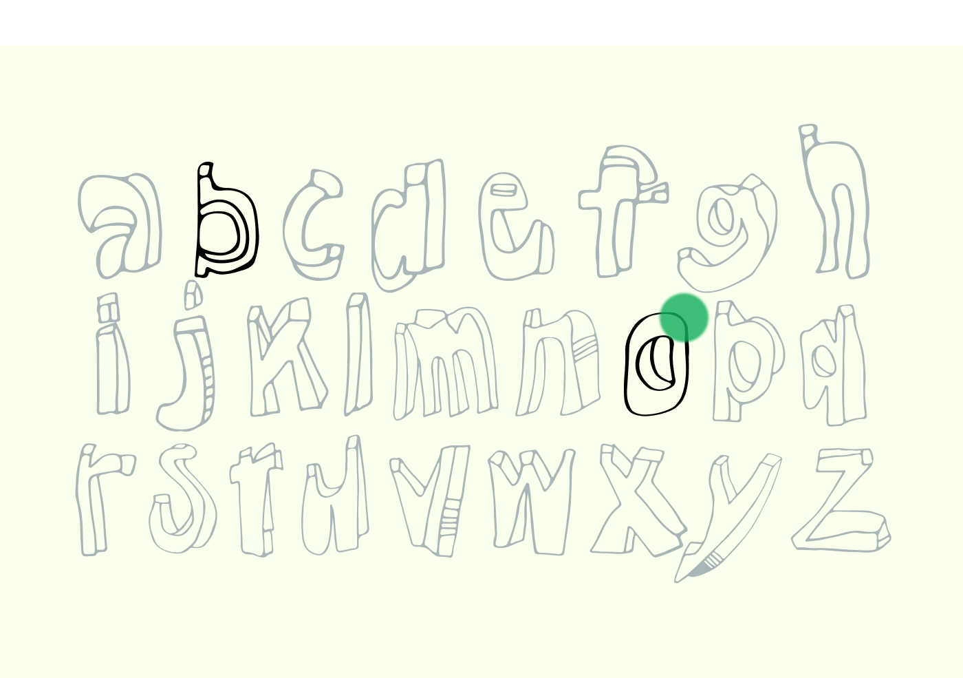
Some merched tings will have text-explanation about traditions to aware people of things they ‘touch’ everywhere but know noting about it.