From idea to implementation
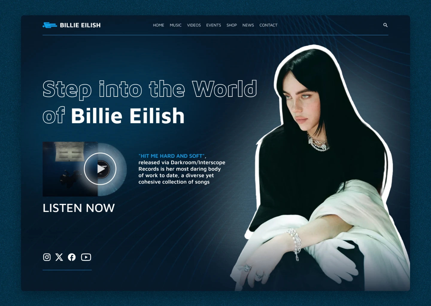
The project uses signature colors, depth effects, minimalism and a pop star vibe. Minimalistic UX/UI, deep background, lines reminiscent of the flow of water and music, are laconically combined with a heavy font that emphasizes the image of the singer.
The smooth transitions of color in the background create a sense of depth and layering, reflecting the complexity and diversity of her songs. Gradients add visual dynamics, symbolizing evolution and movement. The simplicity and laconicism of the design allows you to focus on the main elements – the music and Billy’s image. The minimalist approach prevents visual overload and ensures a comfortable perception of the content. The heavy font emphasizes the strength and influence of Billie Eilish's image, contrasting with the softness of other design elements. With further development of the site, animations will add interactivity and even more movement.
Thank you for watching!


