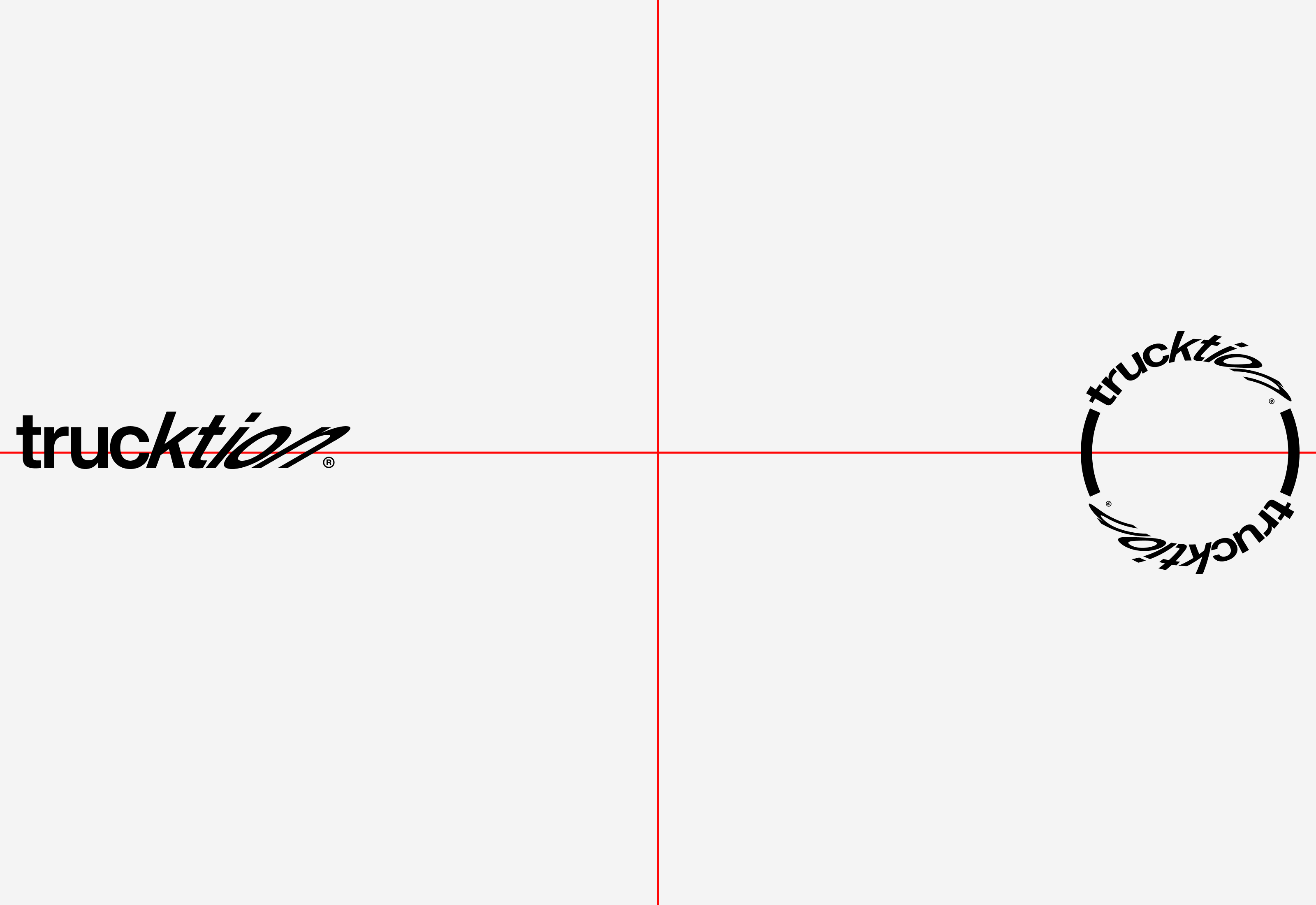
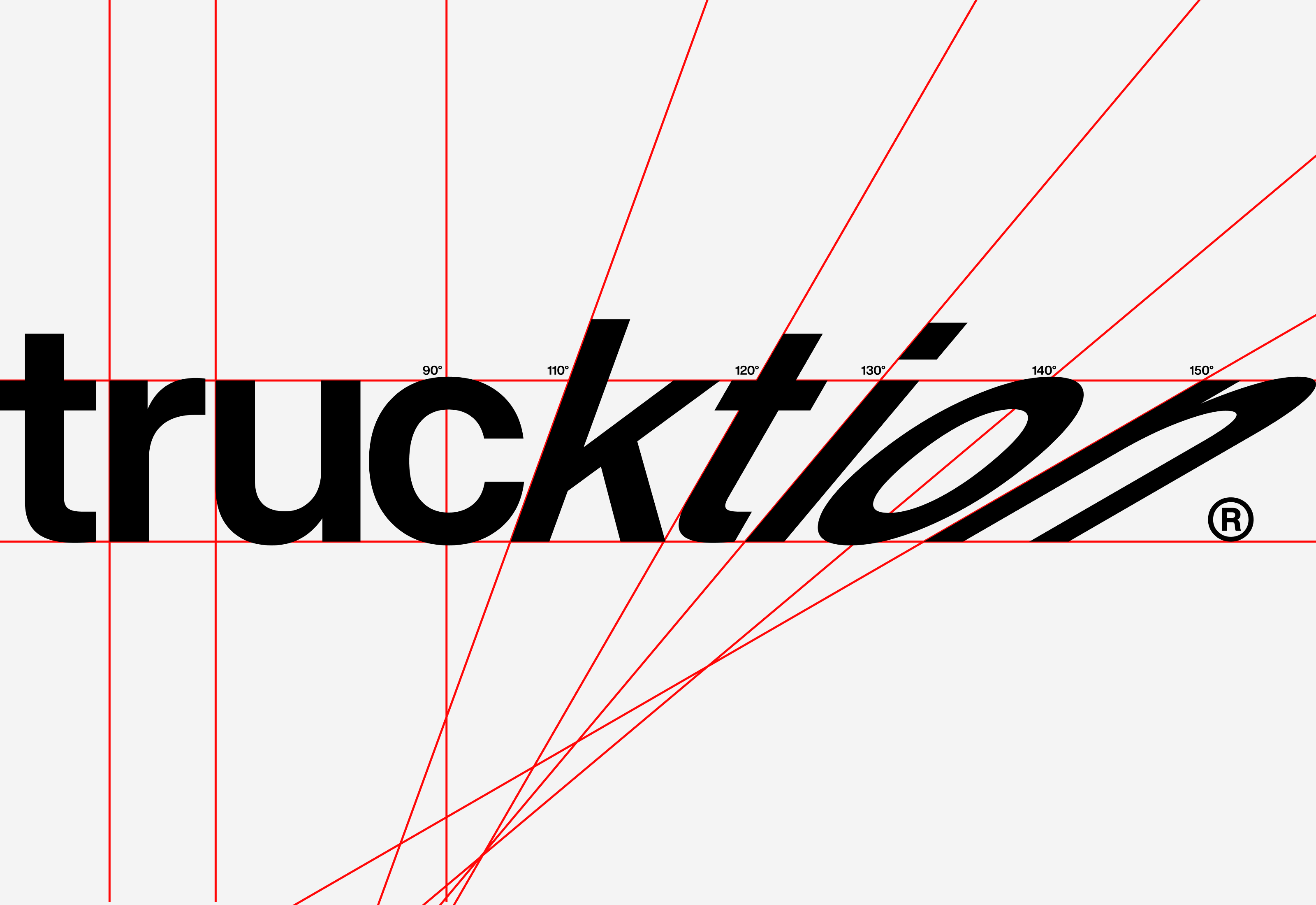
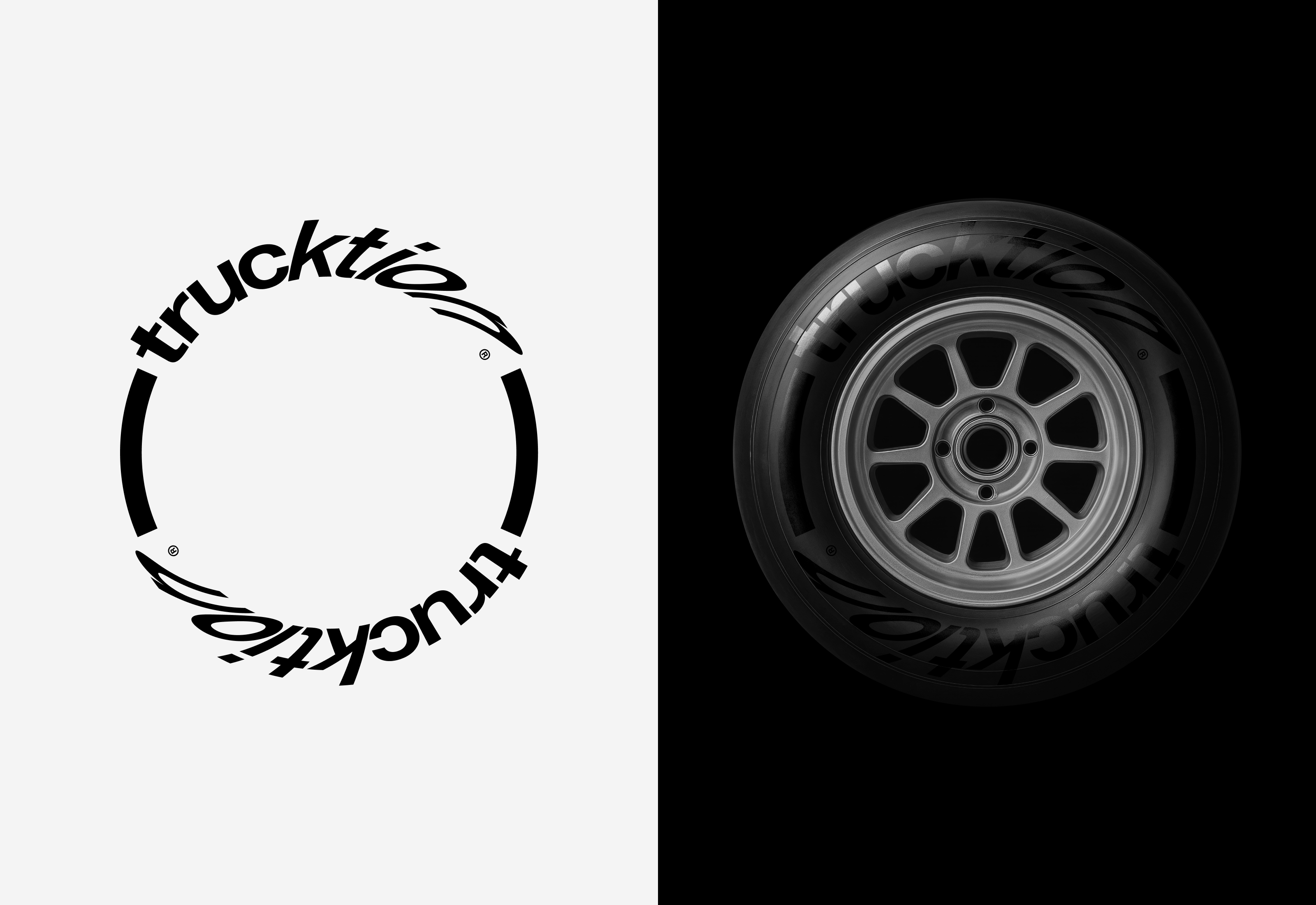
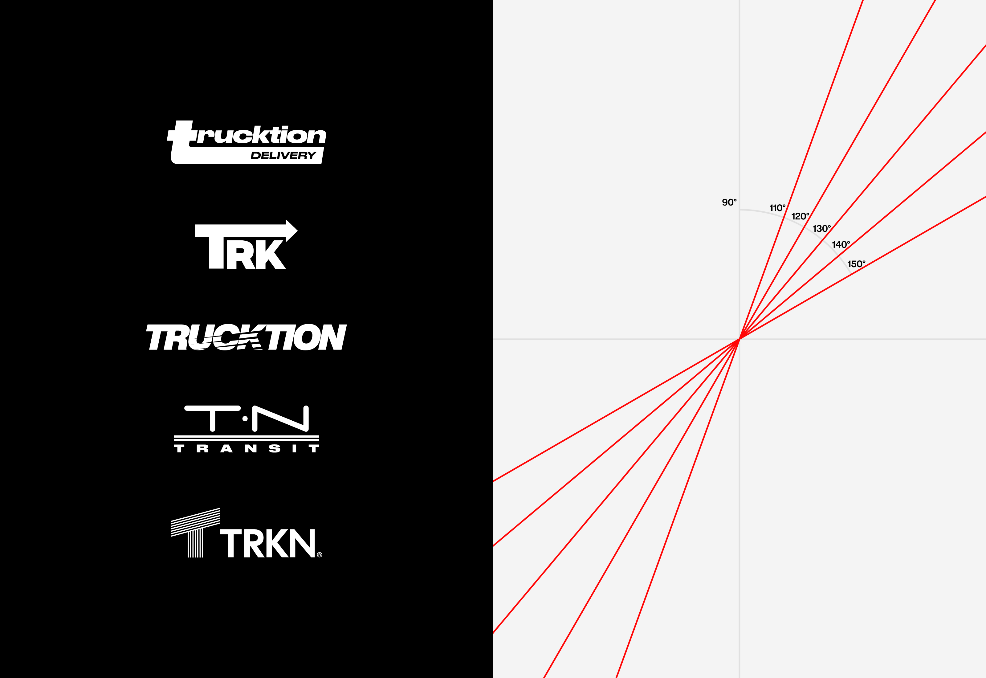
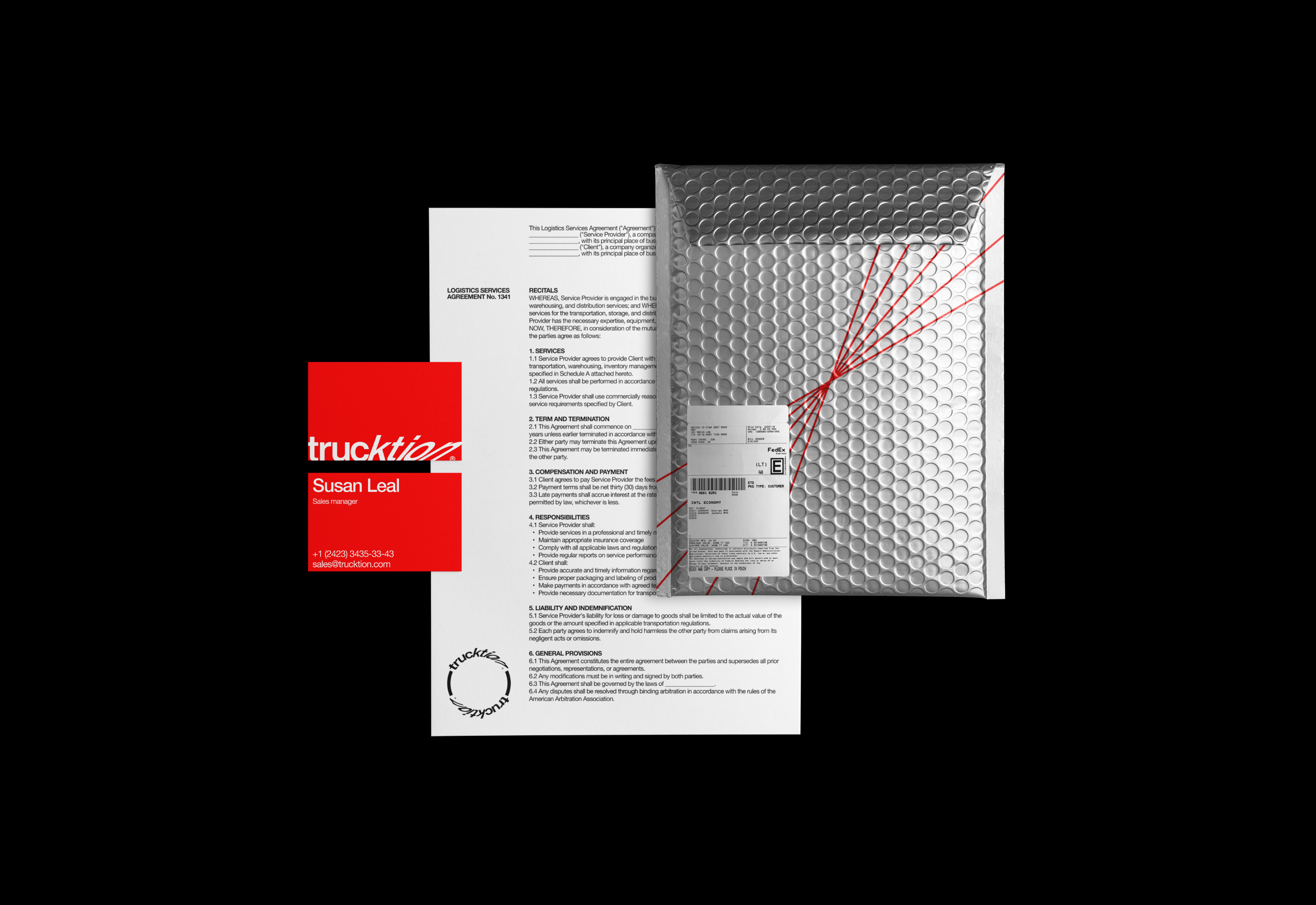
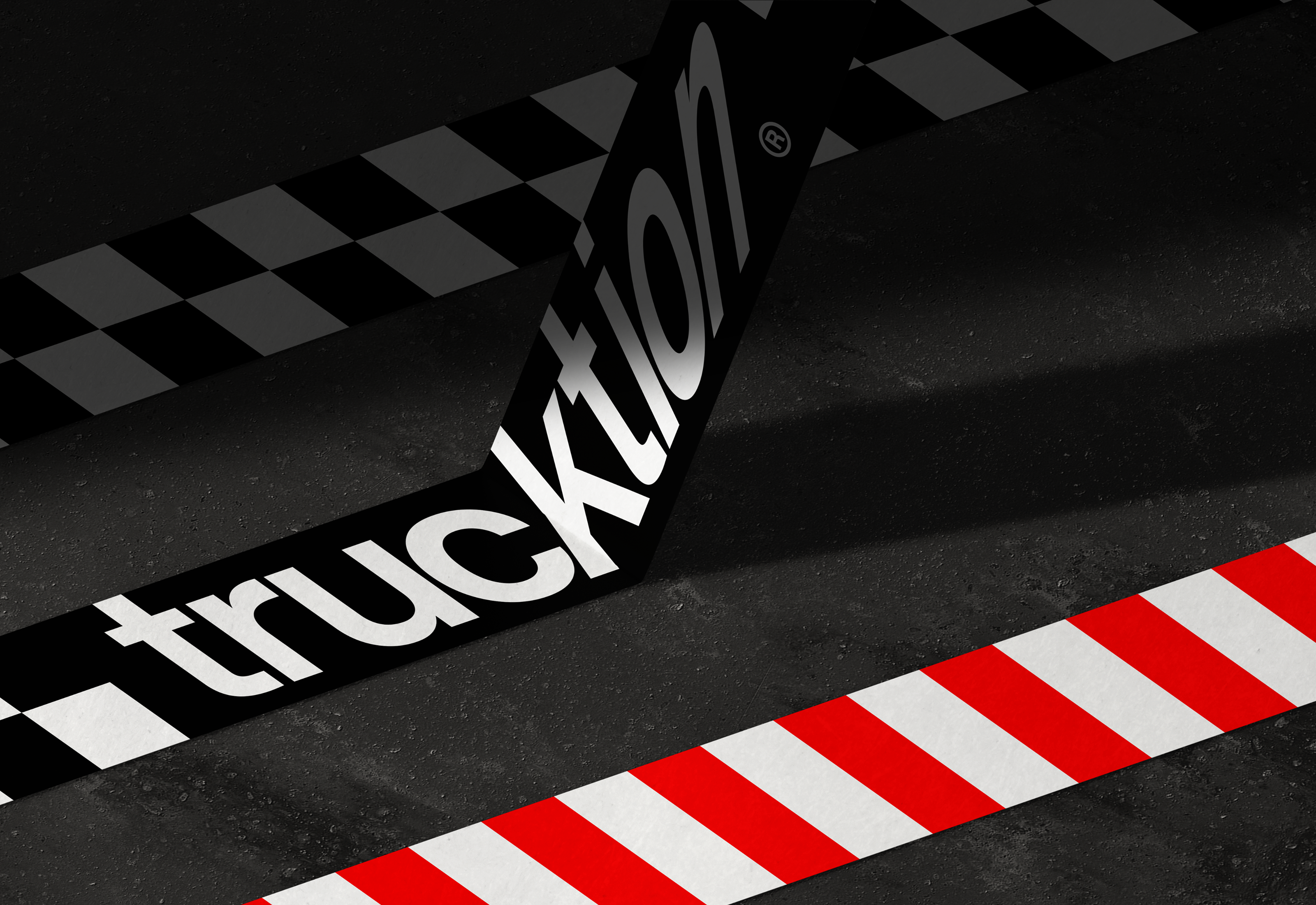
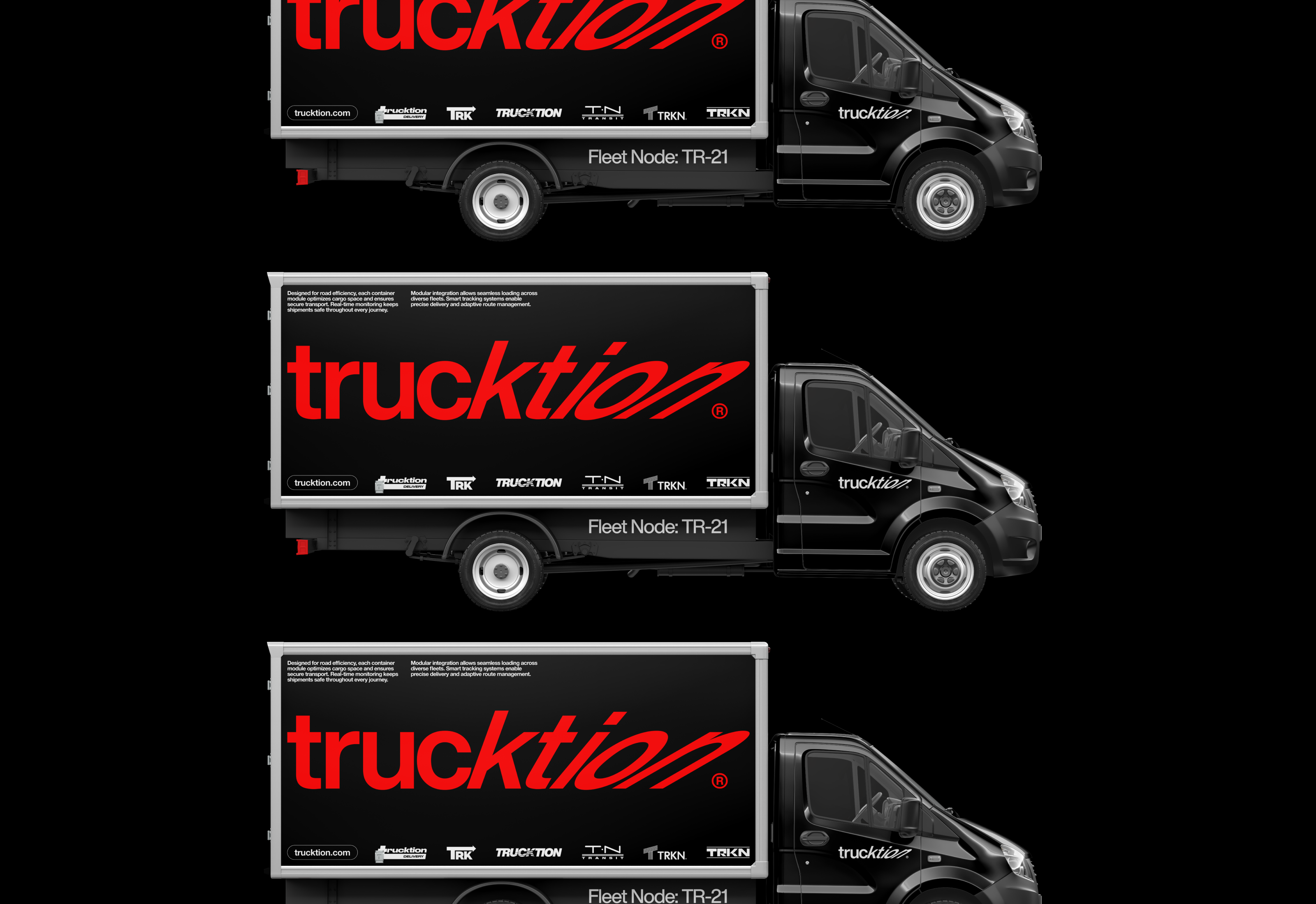
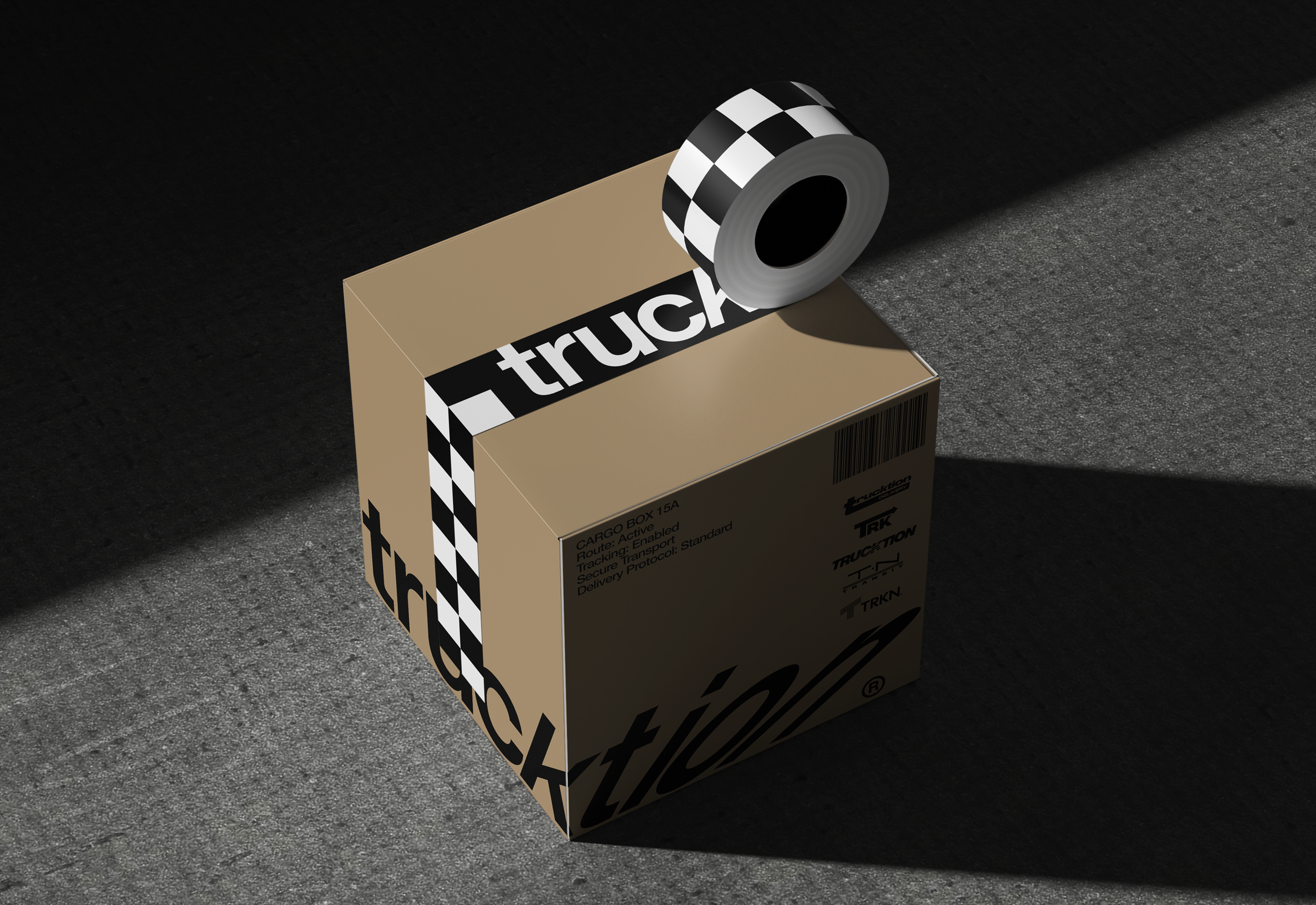
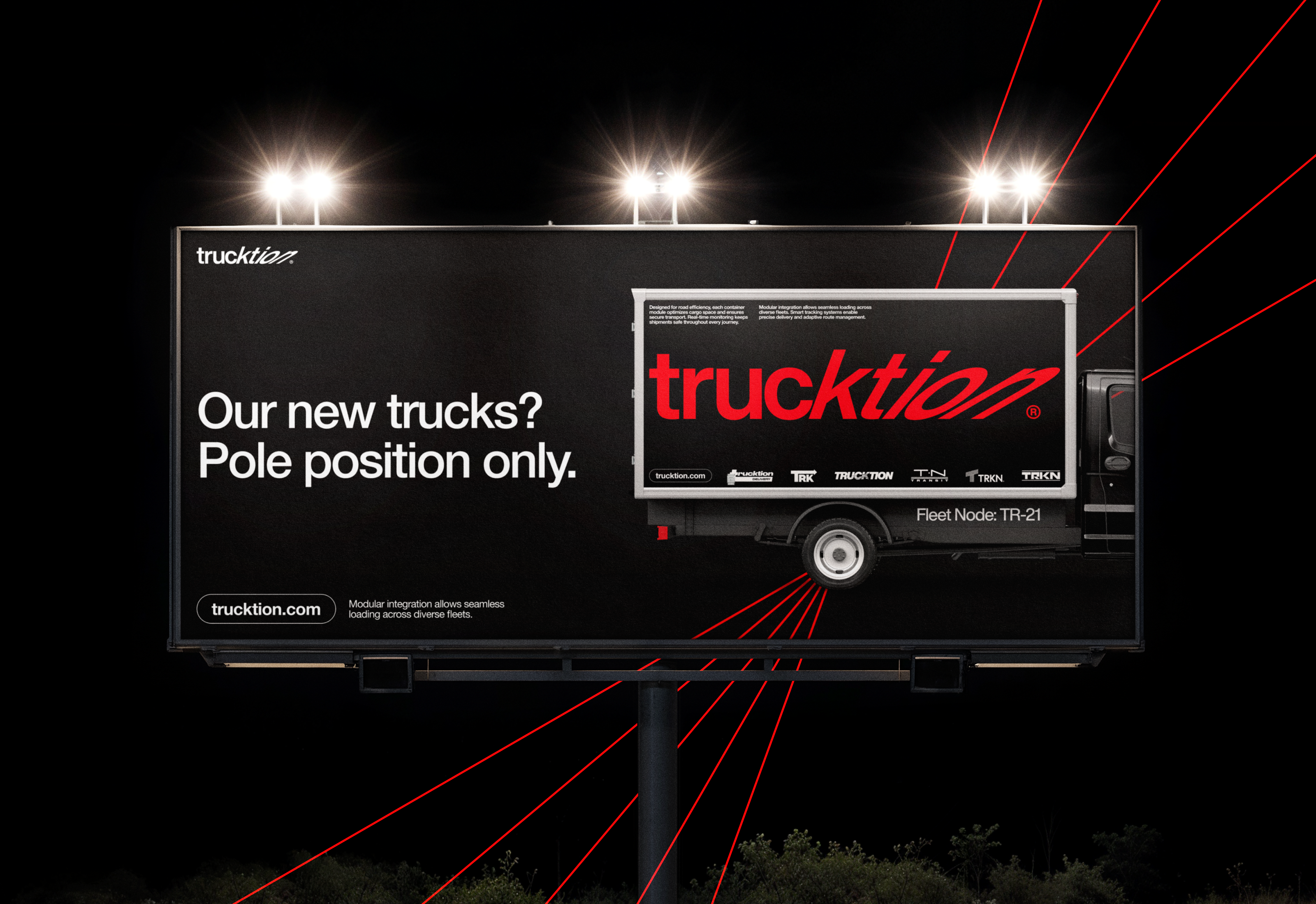
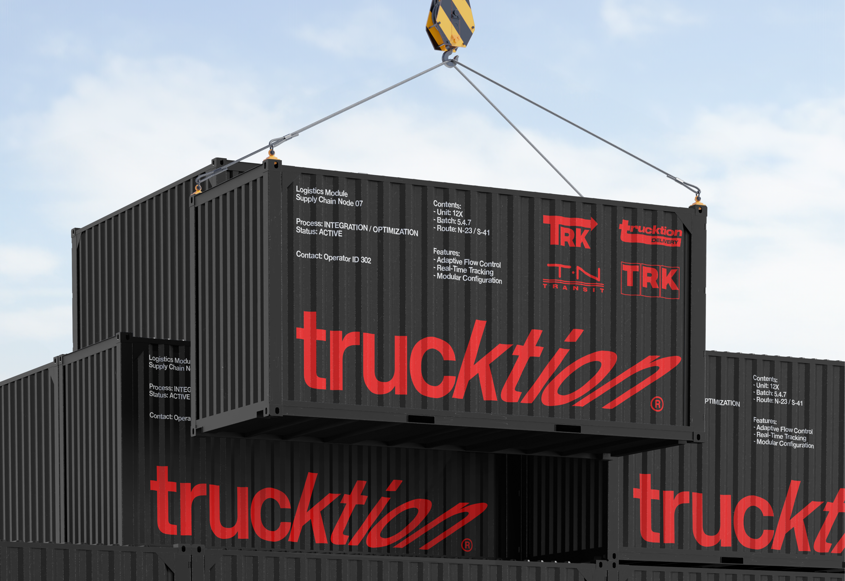
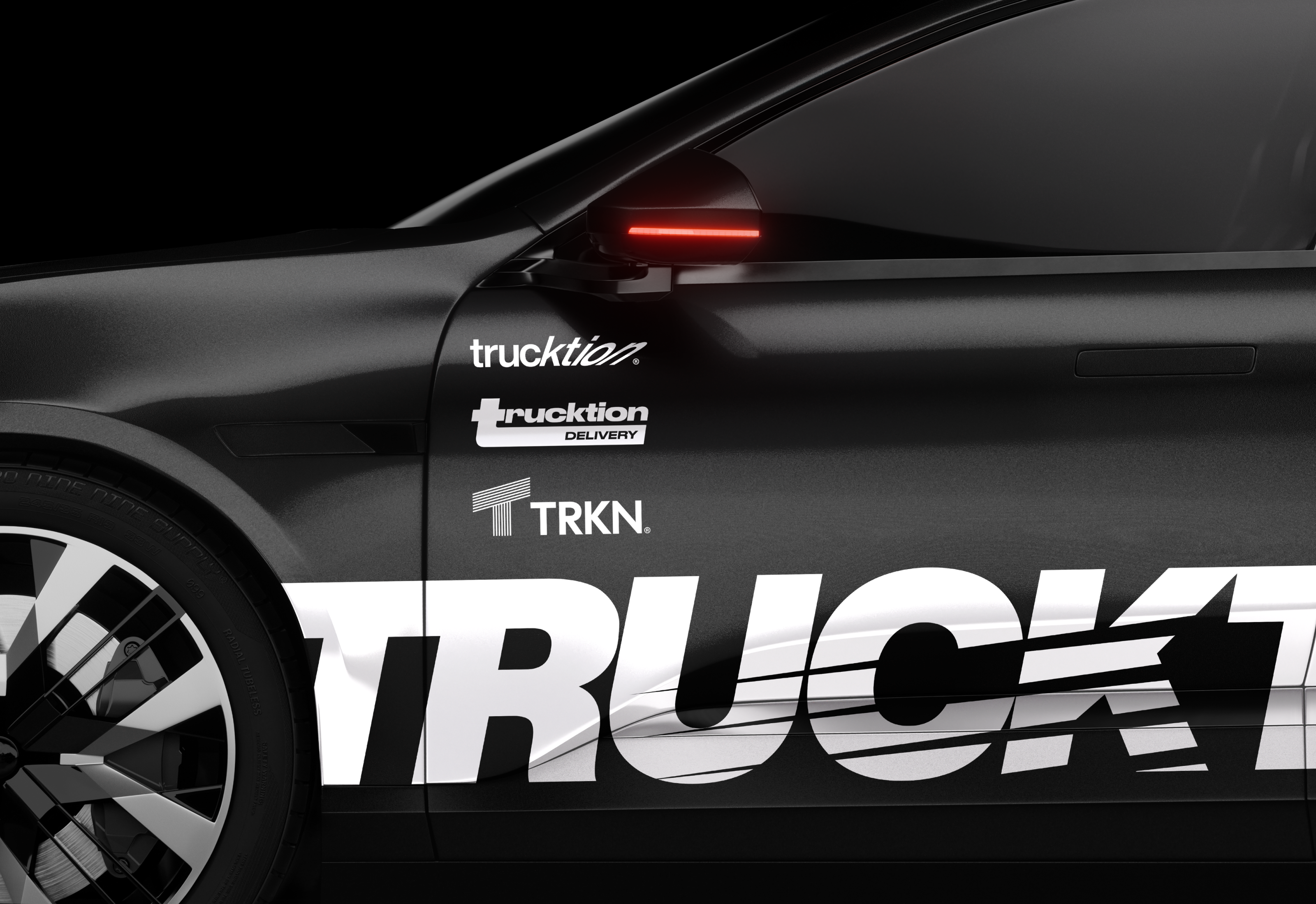
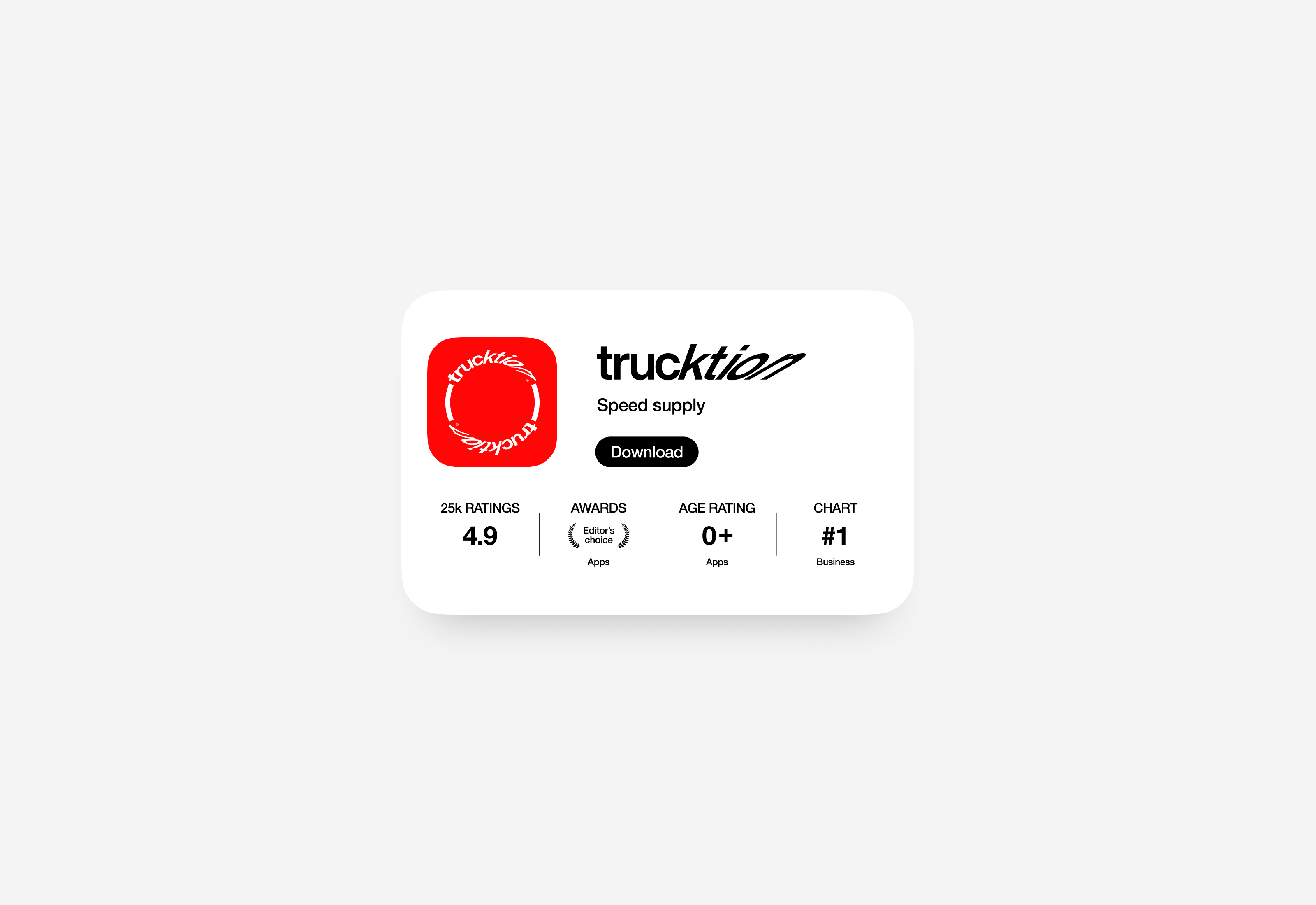
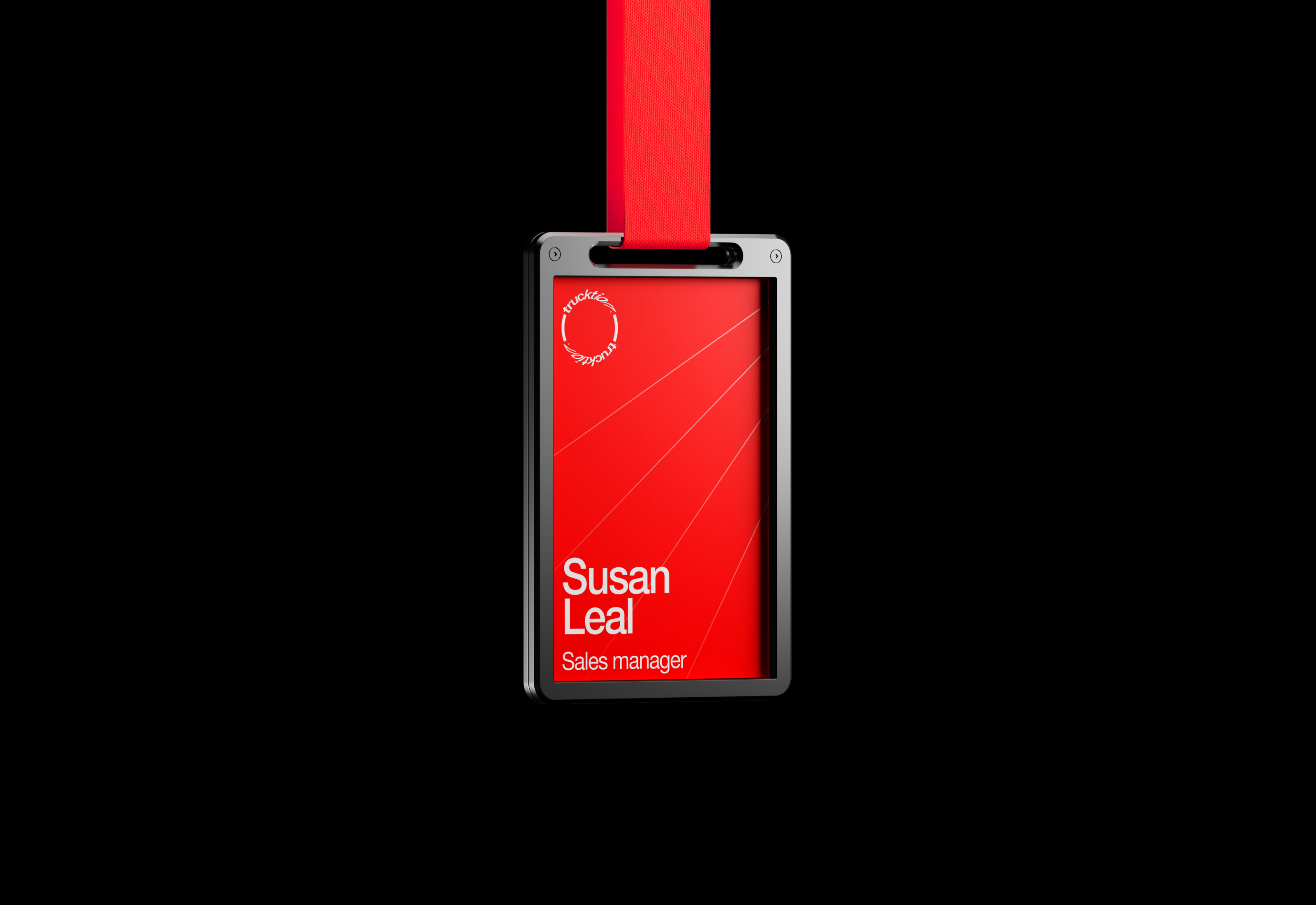
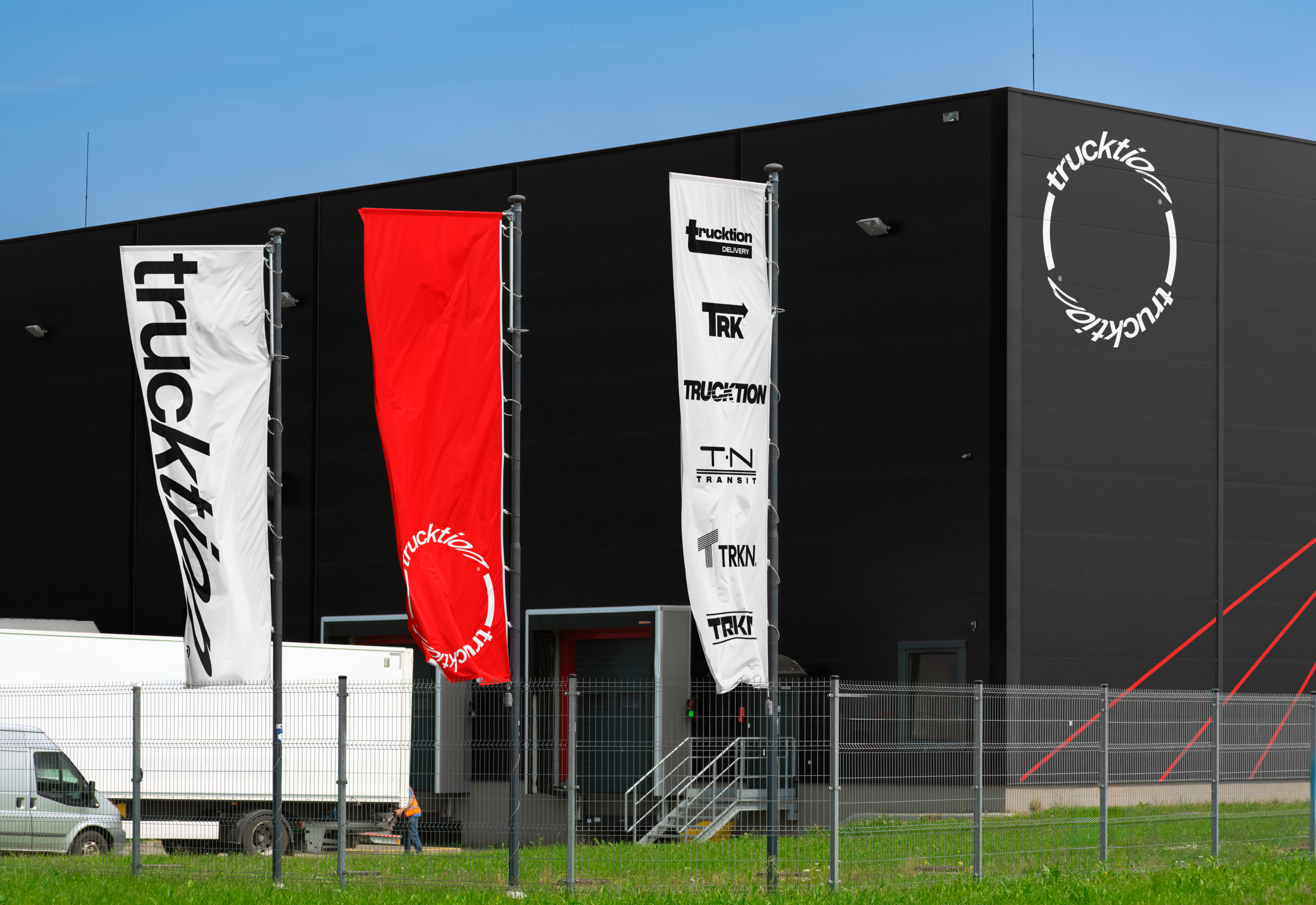
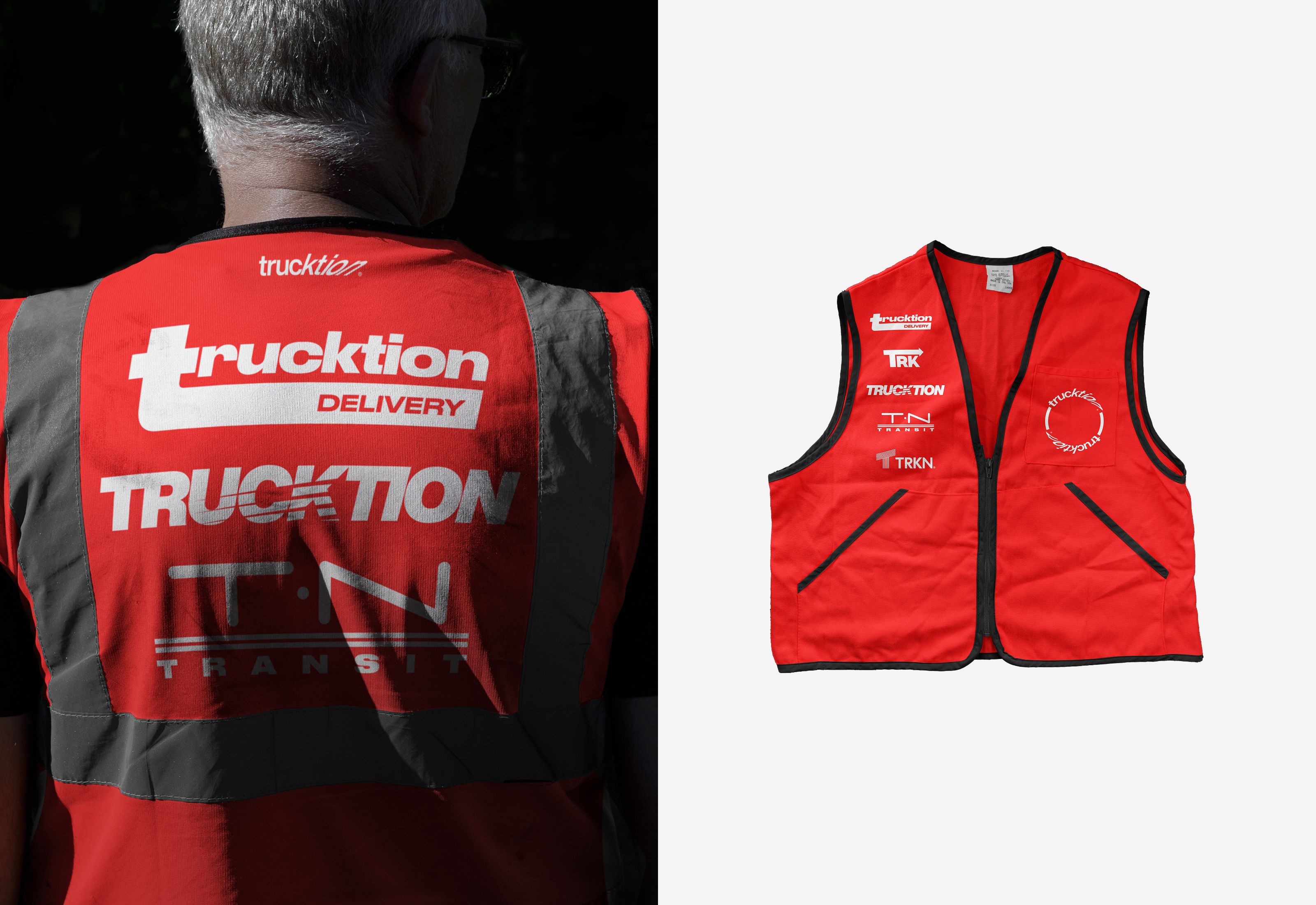
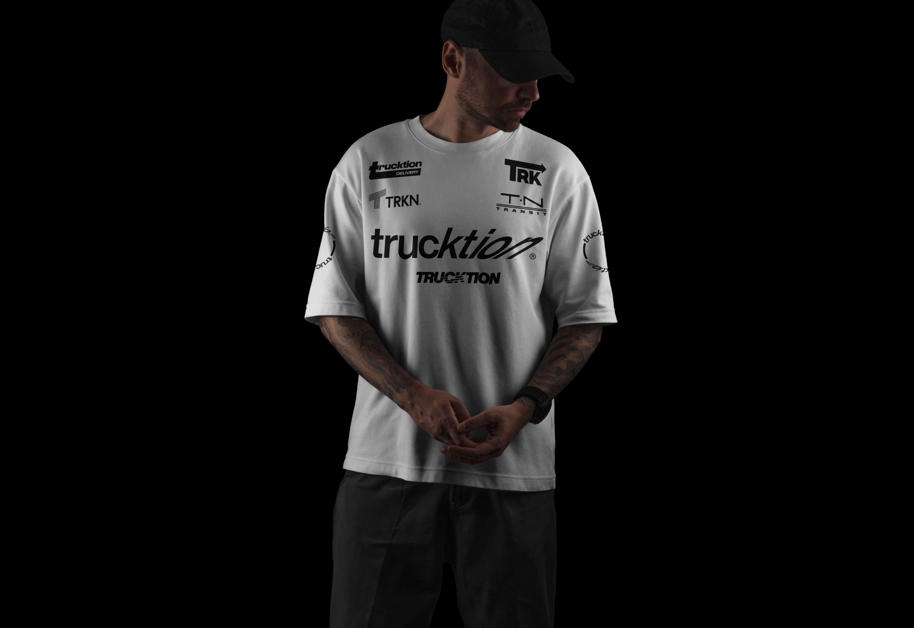
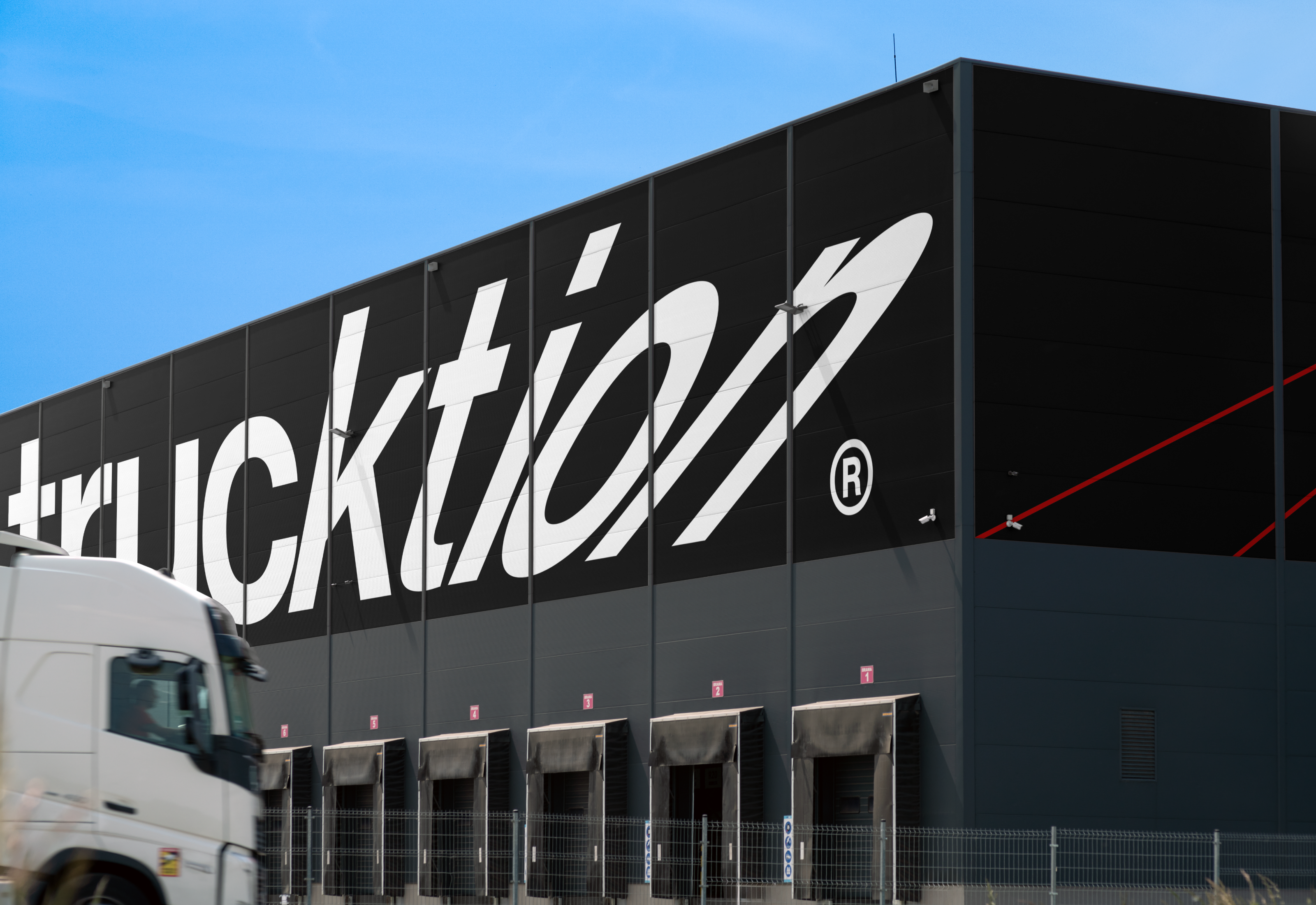
trucktion® operates in constant competition — for speed, precision, and market leadership. The central metaphor of the identity became racing aesthetics, where every delivery transforms into a race against time and competitors. The visual language builds on dynamic forms, aggressive typography, and a color palette borrowed from motorsport — from classic racing stripes to modern aerodynamic solutions. Additional logos were also developed as a graphic device that has become commonplace in the world of motorsport — sponsorship branding.
Design & 3D — Daniil Furashov
рисуем за большие деньги — furashov.com