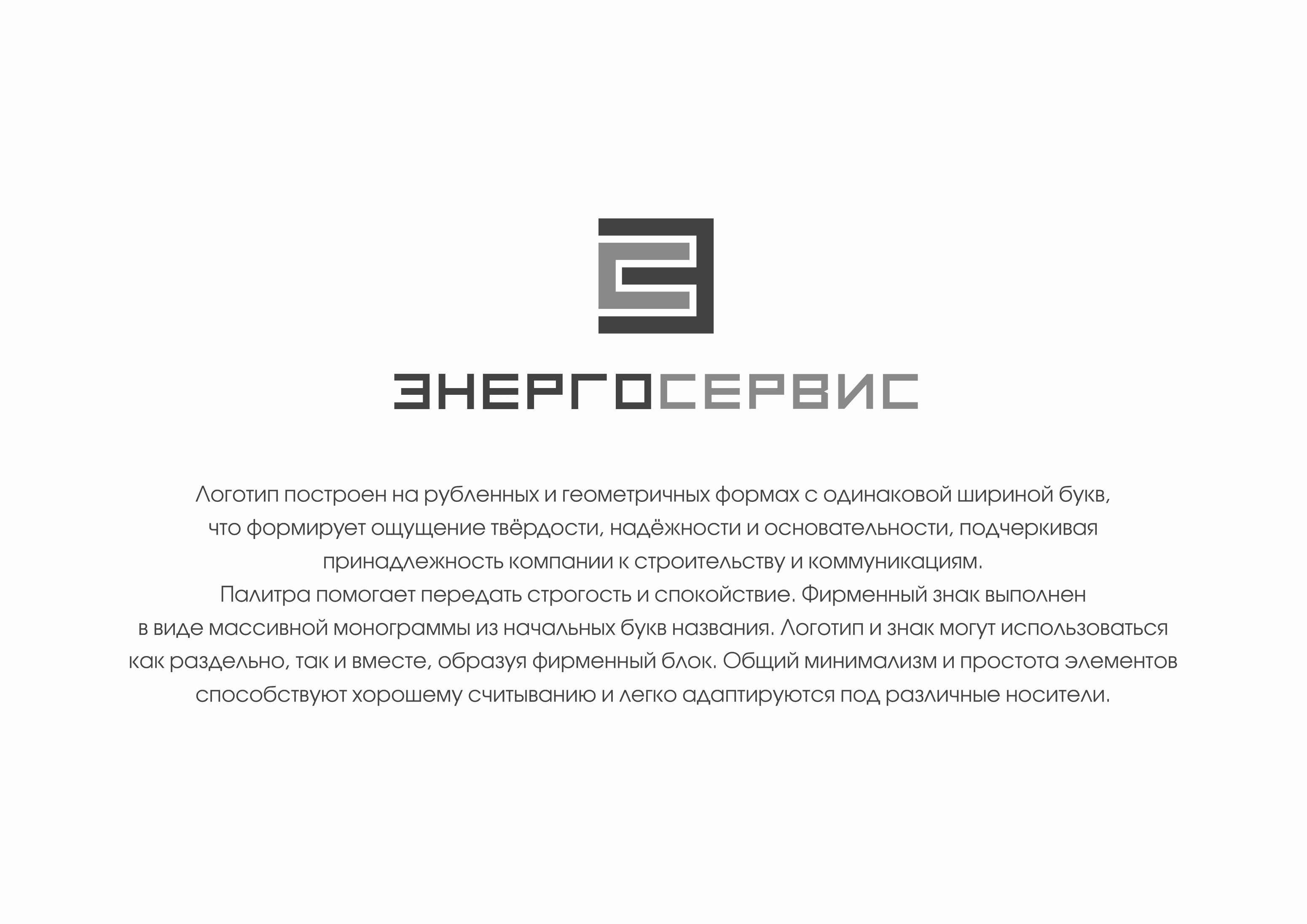
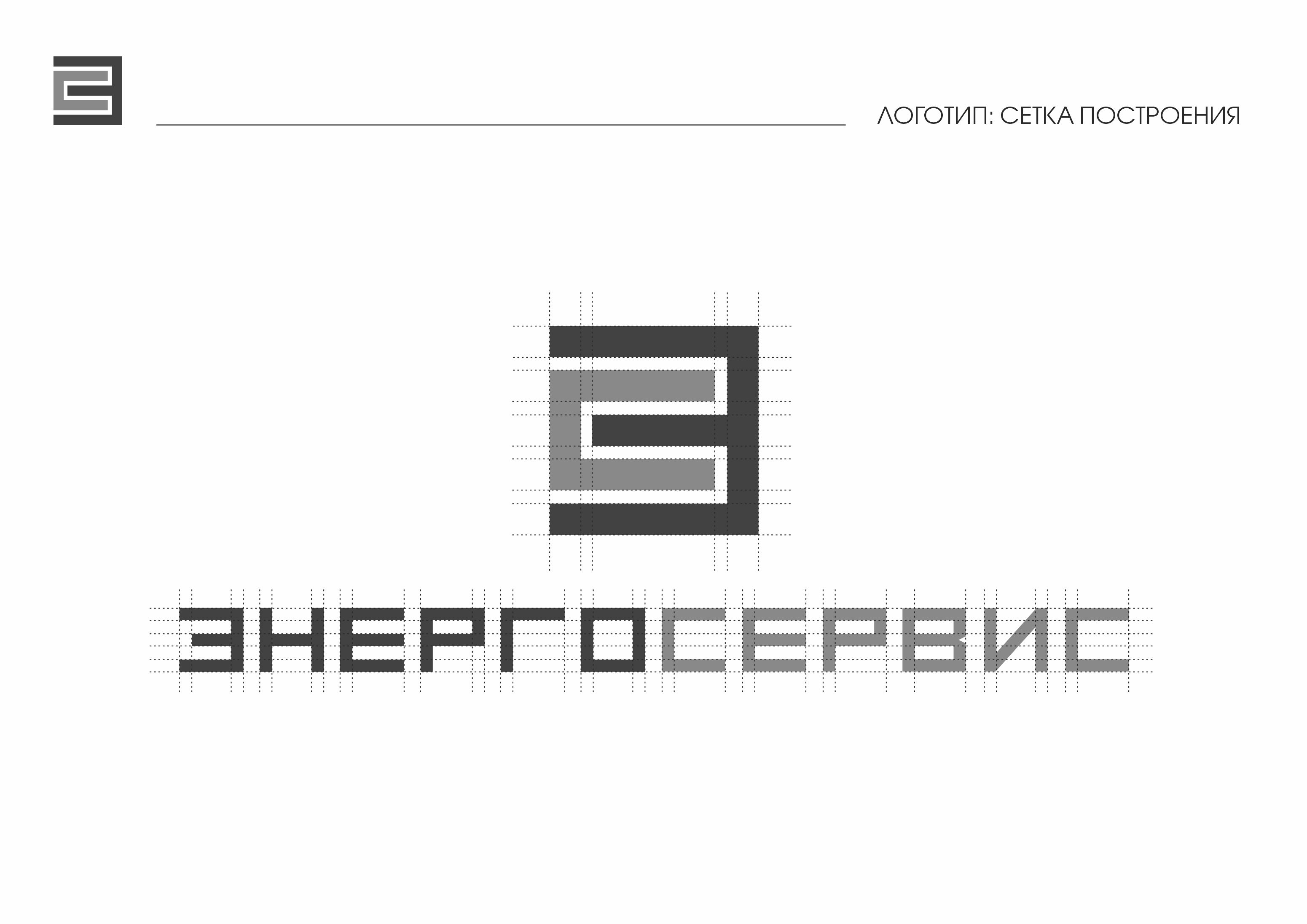
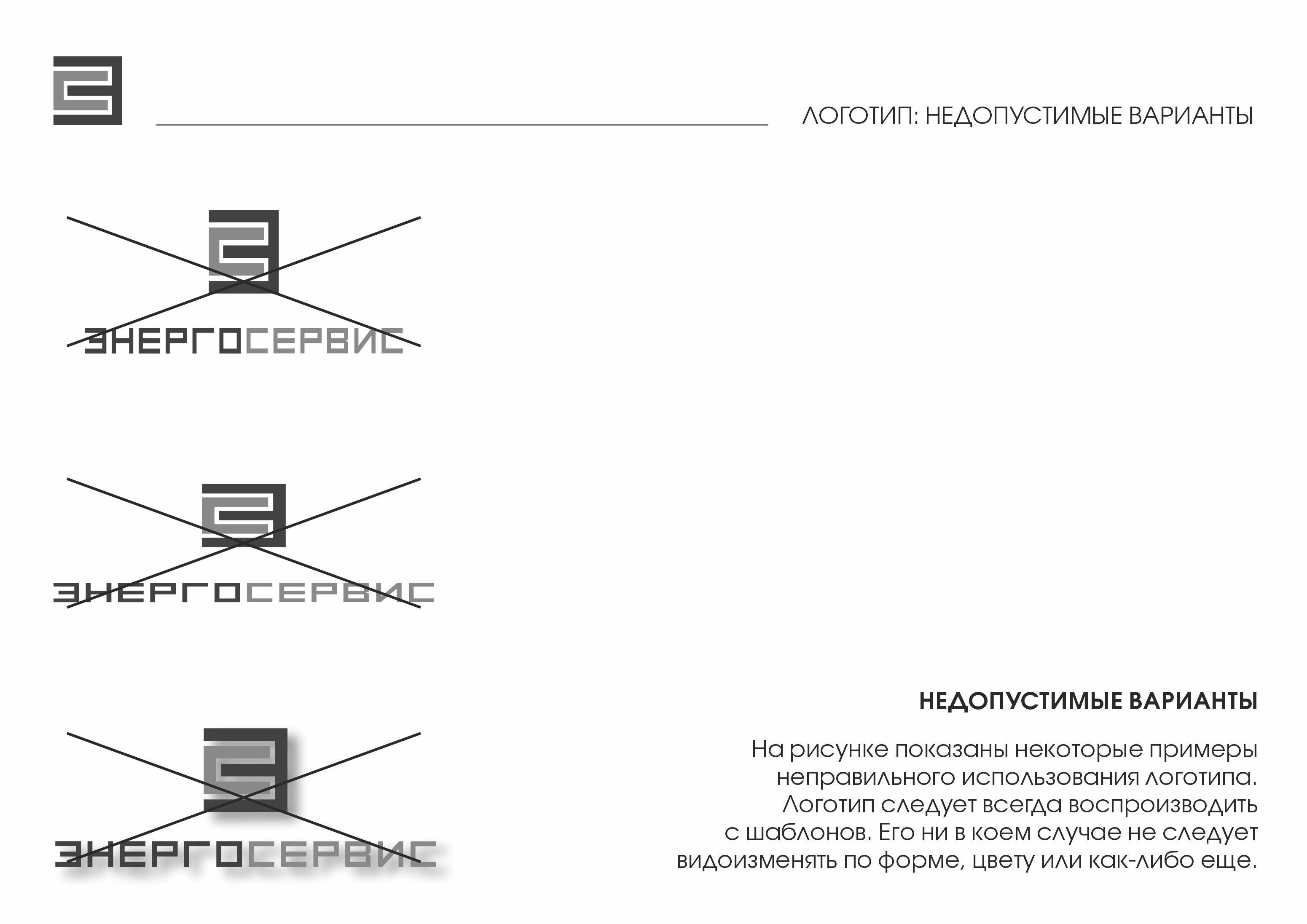
Логотип построен на рубленных и геометричных формах с одинаковой шириной букв,
что формирует ощущение твёрдости, надёжности и основательности, подчеркивая
принадлежность компании к строительству и коммуникациям.
Палитра помогает передать строгость и спокойствие. Фирменный знак выполнен
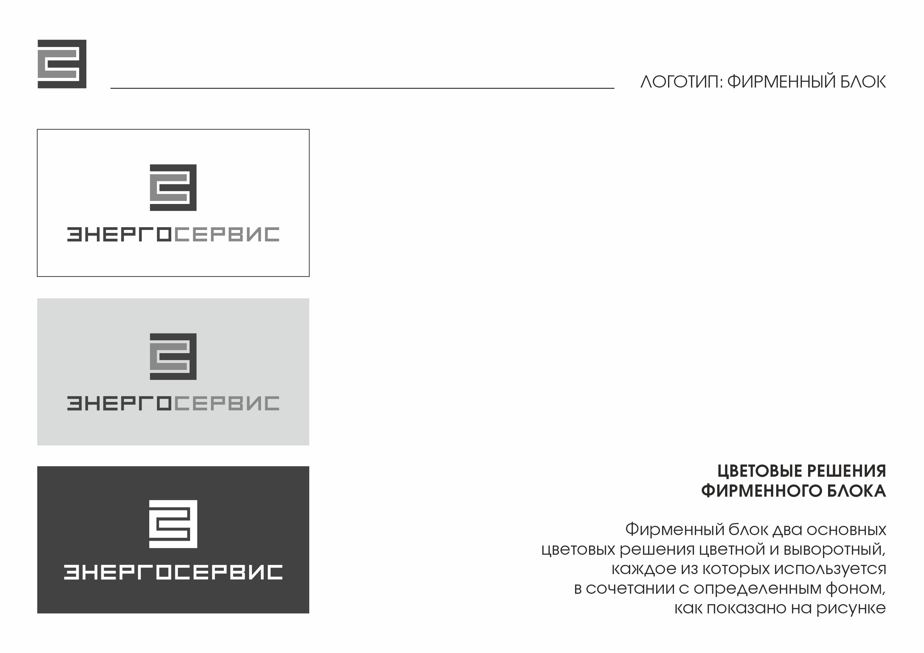
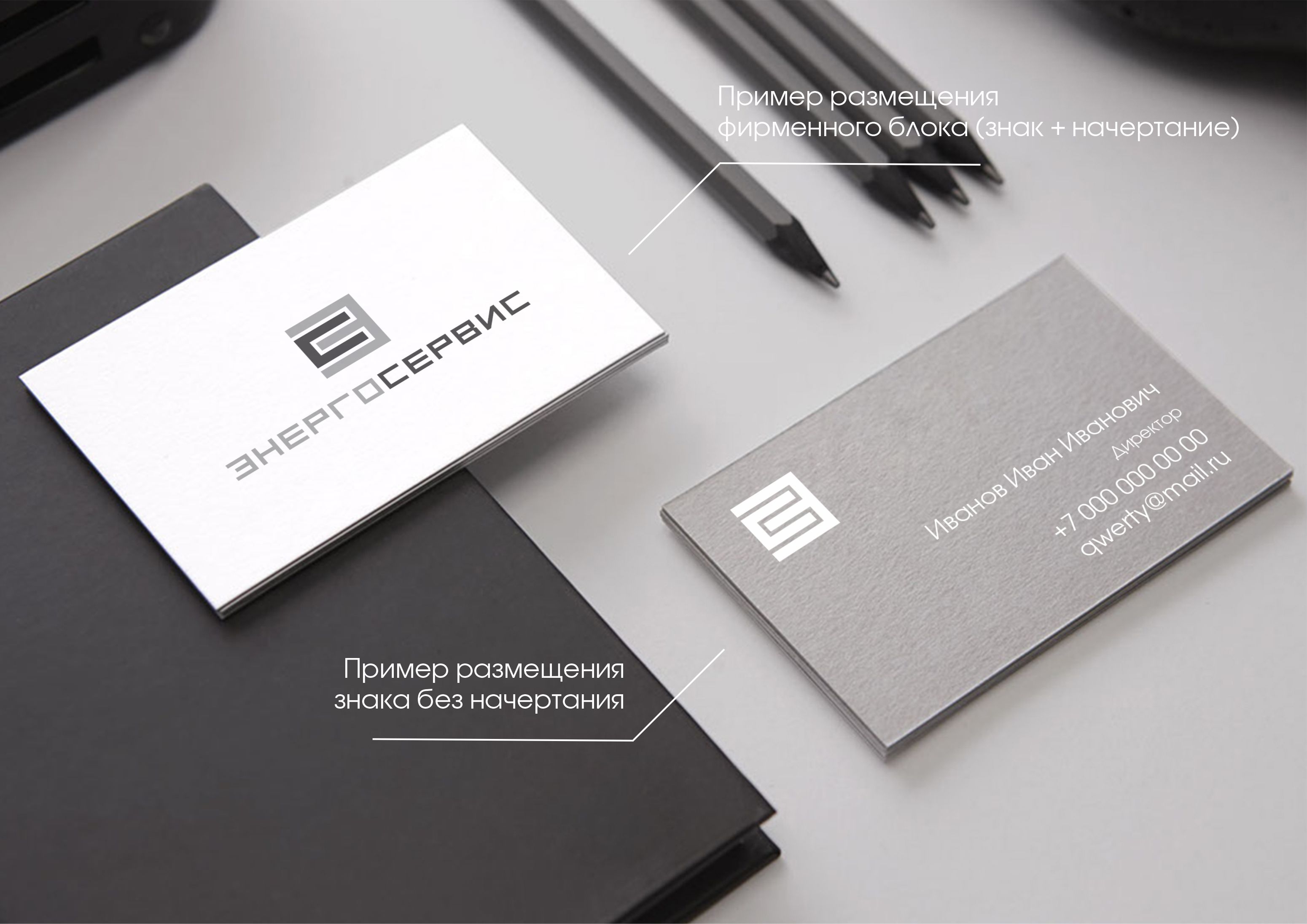
в виде массивной монограммы из начальных букв названия. Логотип и знак могут использоваться
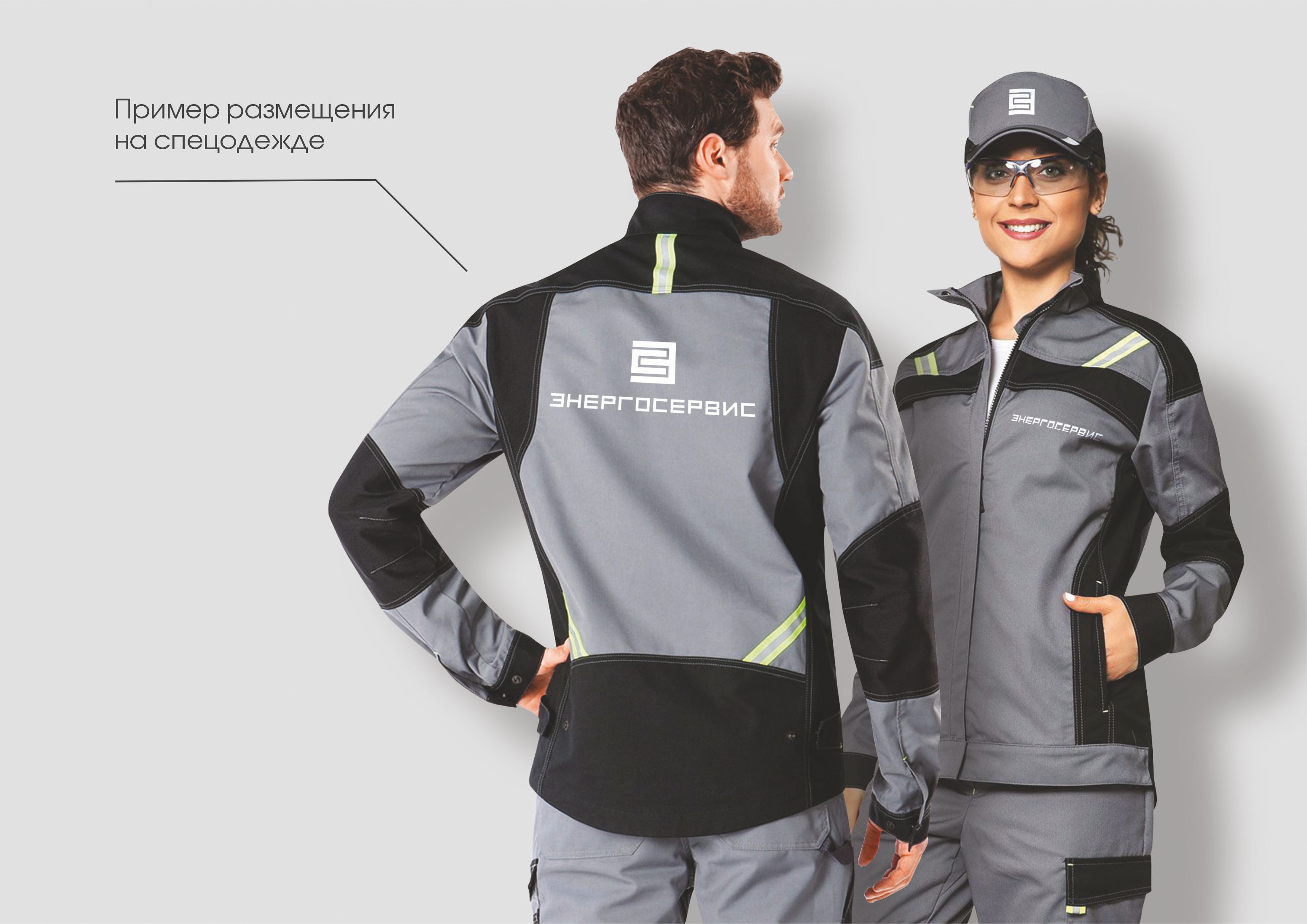
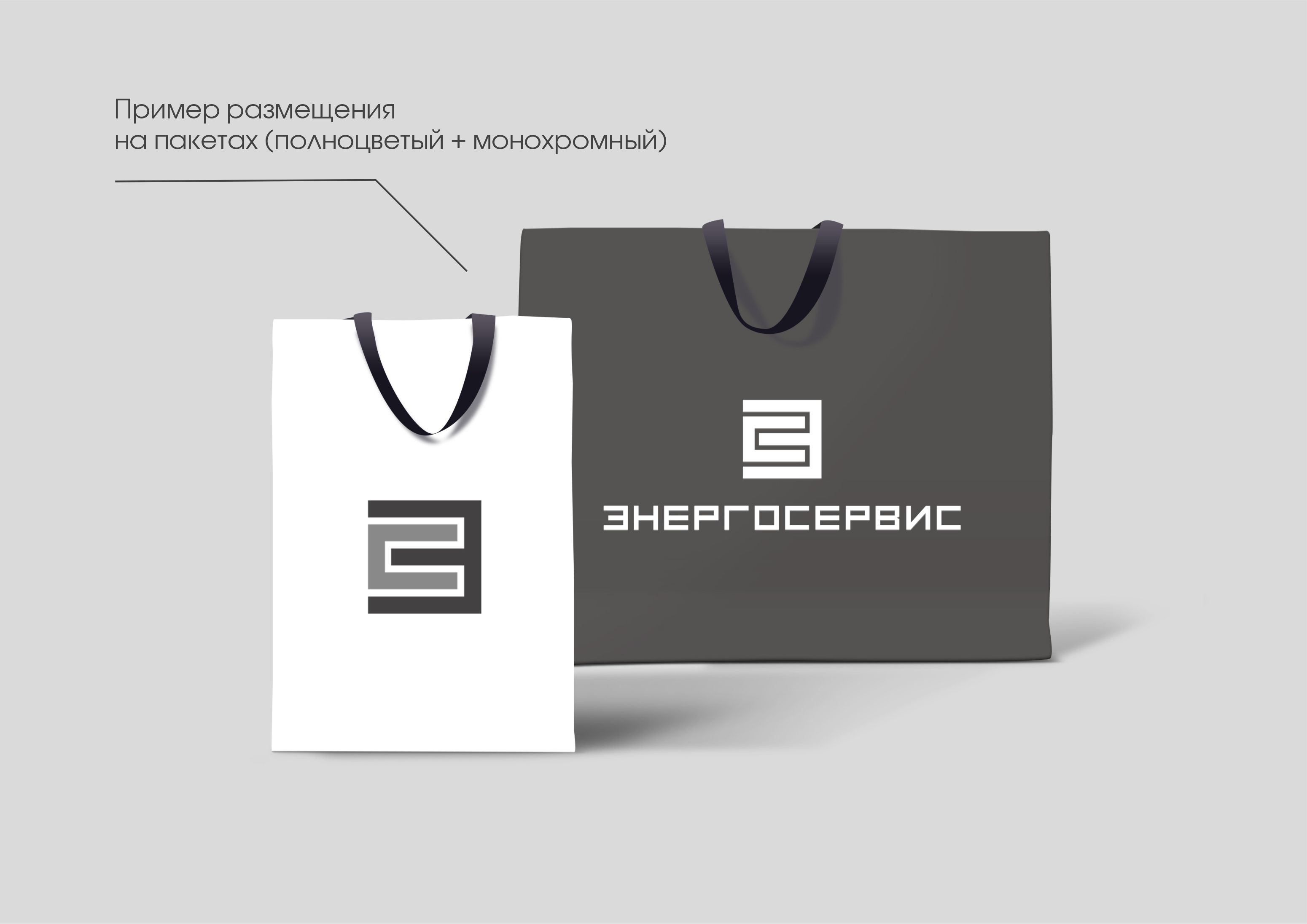
как раздельно, так и вместе, образуя фирменный блок. Общий минимализм и простота элементов
способствуют хорошему считыванию и легко адаптируются под различные носители.
The logo is based on chopped and geometric shapes with the same width of letters,
which forms a feeling of solidity, reliability and thoroughness, emphasizing
the company's affiliation with construction and communications.
The palette helps to convey rigor and calmness. The trademark is made
in the form of a massive monogram from the initial letters of the name. The logo and the sign can be used
both separately and together, forming a brand block. The overall minimalism and simplicity of the elements of
contribute to a good readability and can be easily adapted to different media.
Translated with DeepL.com (free version)