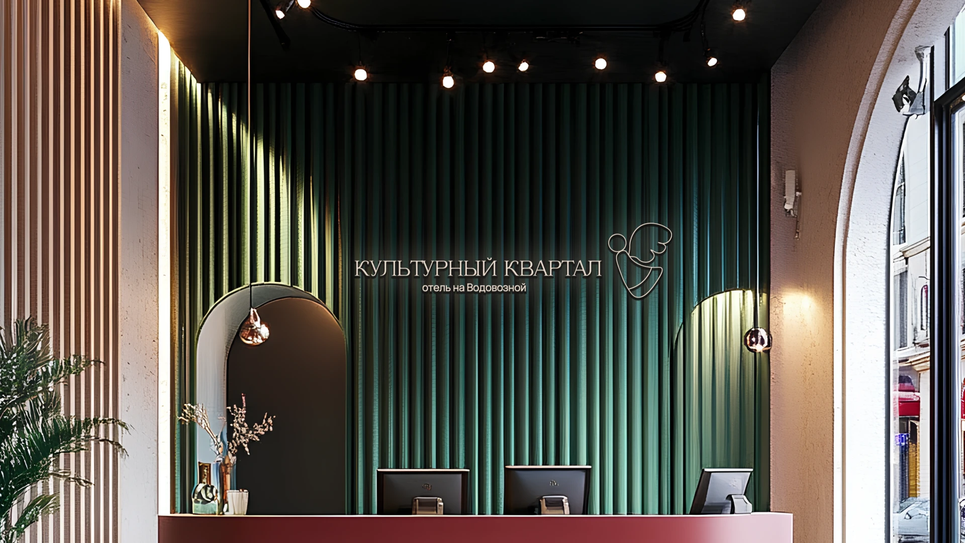
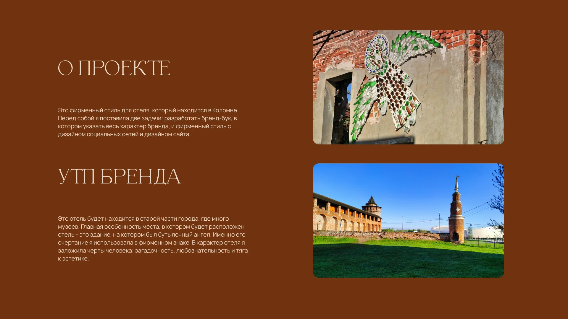
About project: It's the brand identity for hotel in Kolomna. There were some tasks. The first task was to make a brand book. The second task was to do a brand identity and webdesign.
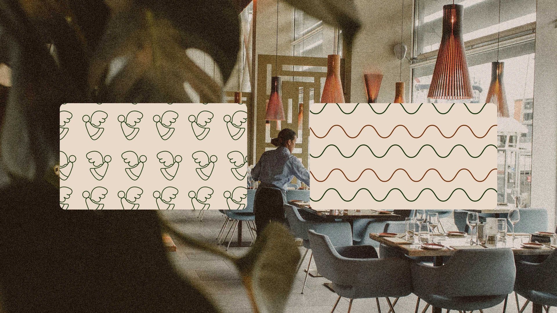
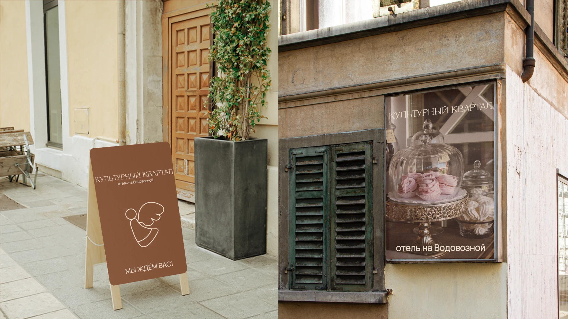
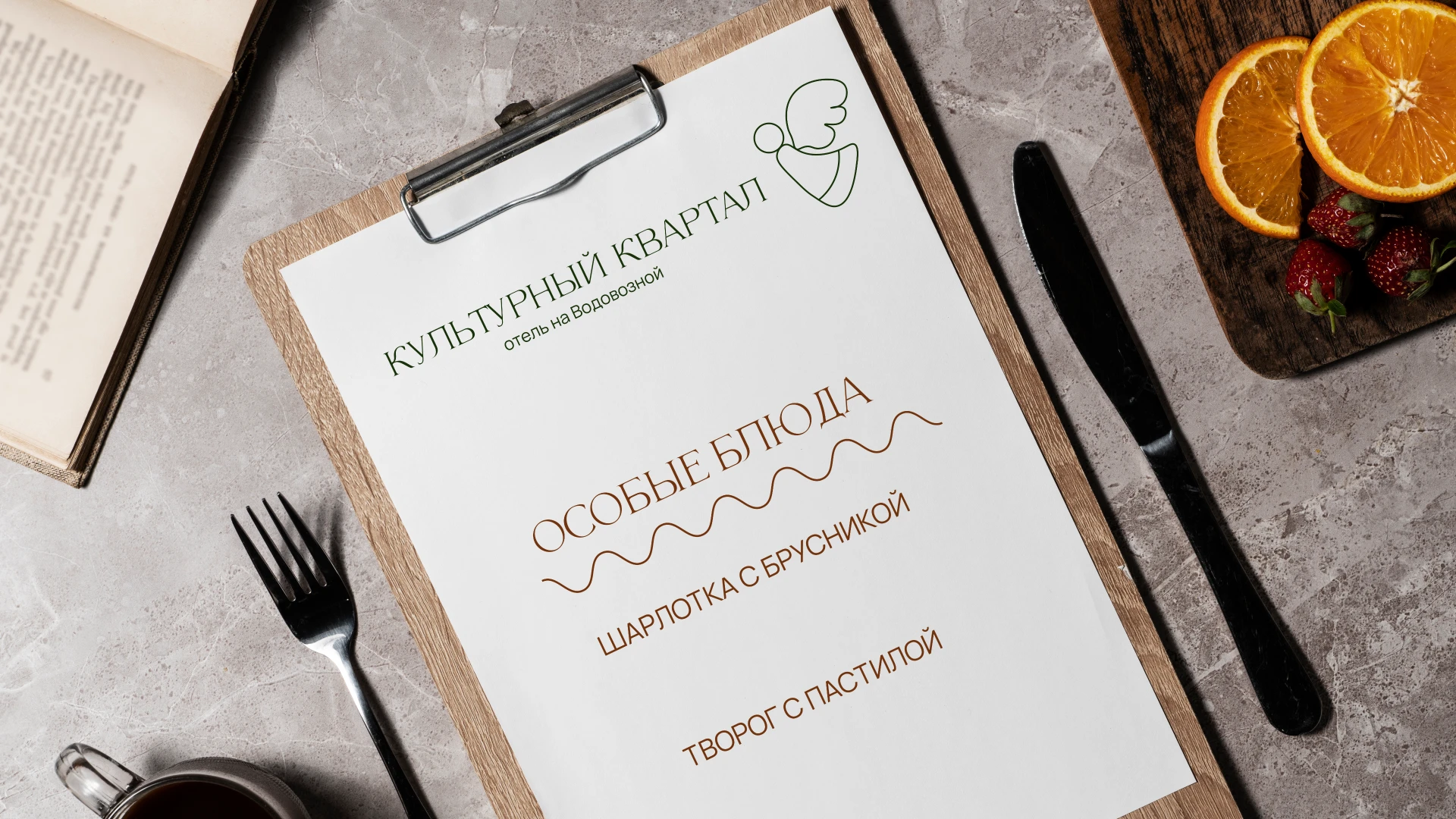
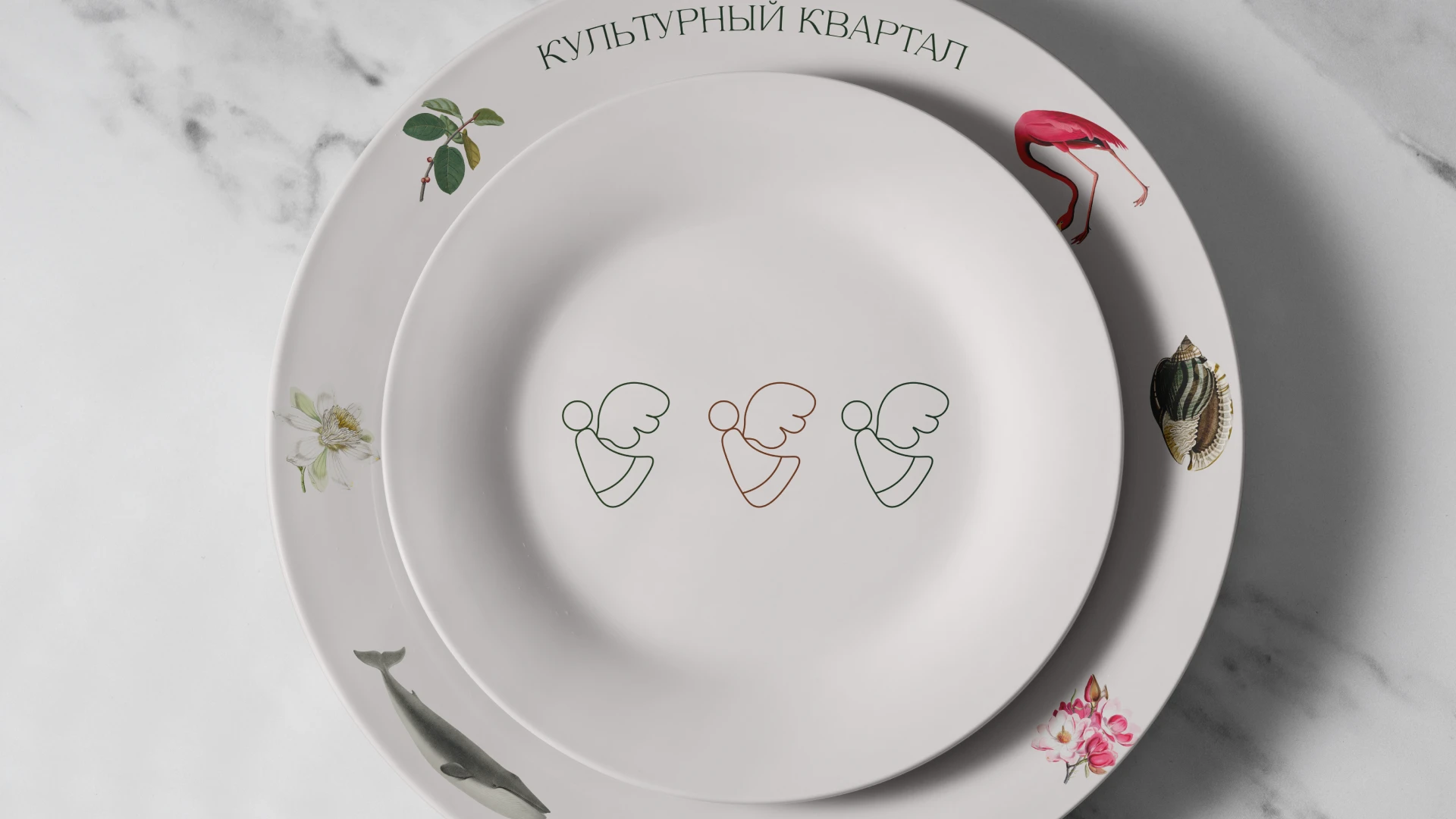
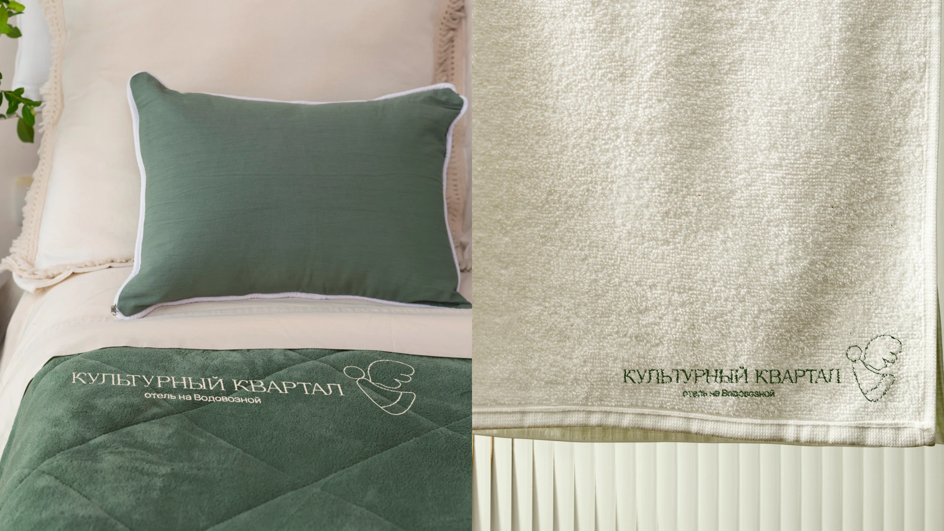
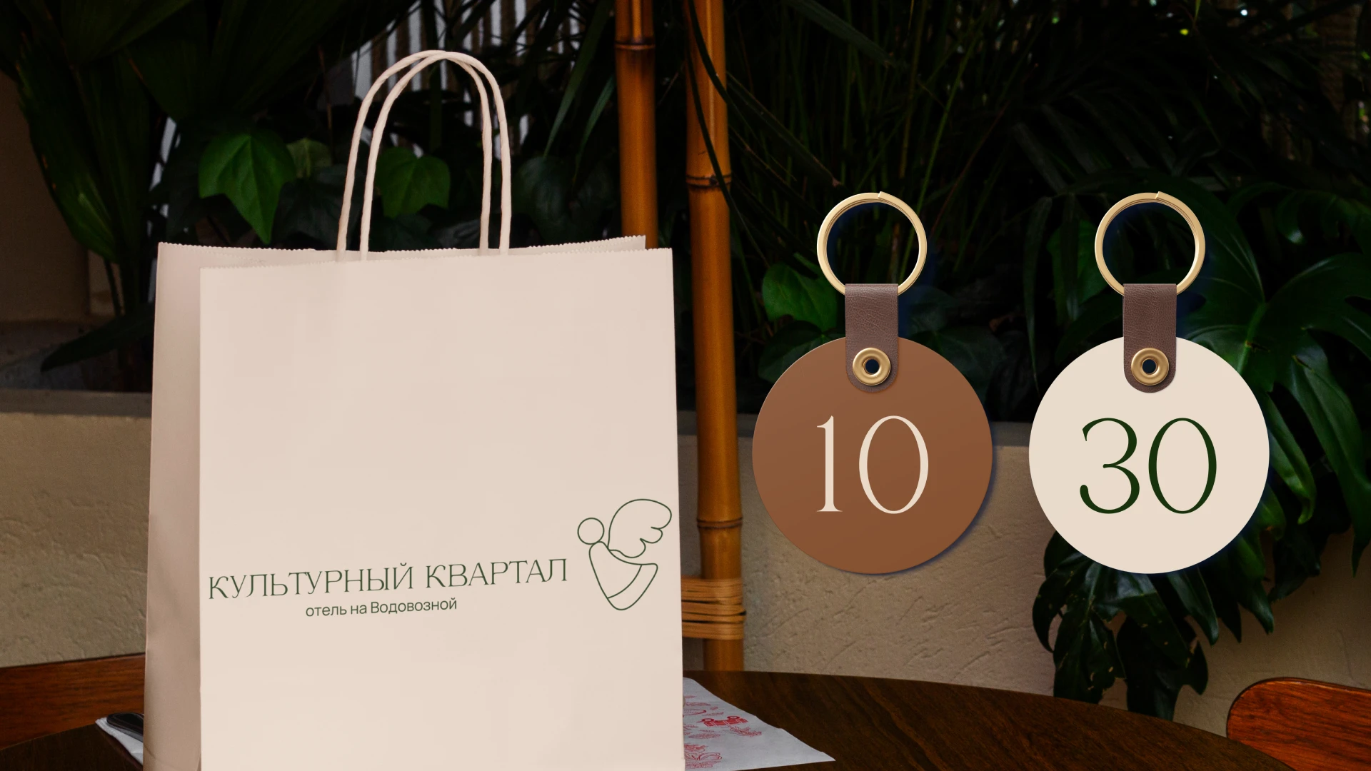
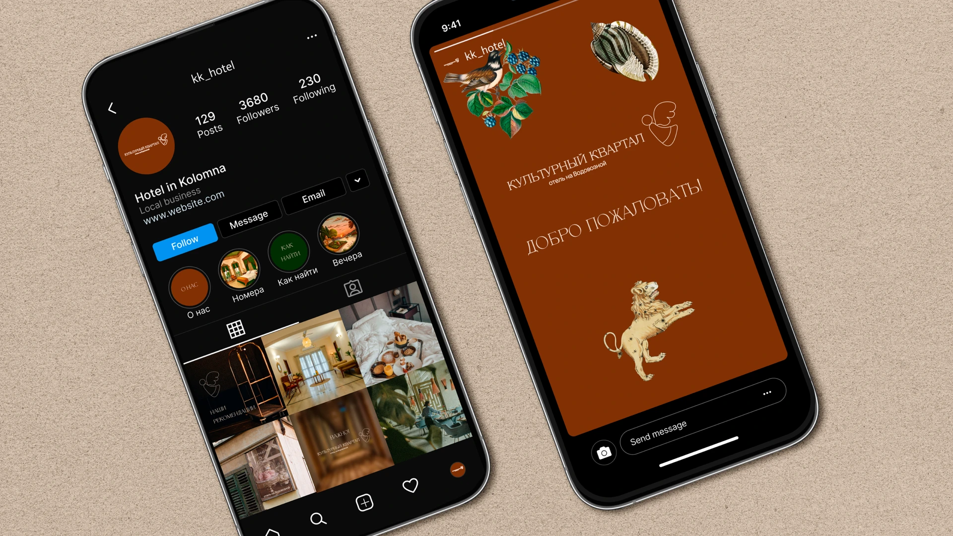
USP of the brand: There is the hotel in old part of Kolomna. There are lots of historical monuments and museums. The unique thing is that an angel was on the building, where will be a hotel. It's historical and memorable symbol. I used this symbol in the logotype. I embeded the values of the person. the person is mysteriuous, clever and likes aesthetic.
Typography: I used two fonts. They are dialling and logo fonts. In logotype i used serif font, because it is thing, sustainable and elegant.
Типография: В типографии я использовала два шрифта - наборный и тот, который в логотипе. В логотипе использовался тонкий, с засечками шрифт. Он устойчивый и элегантный.
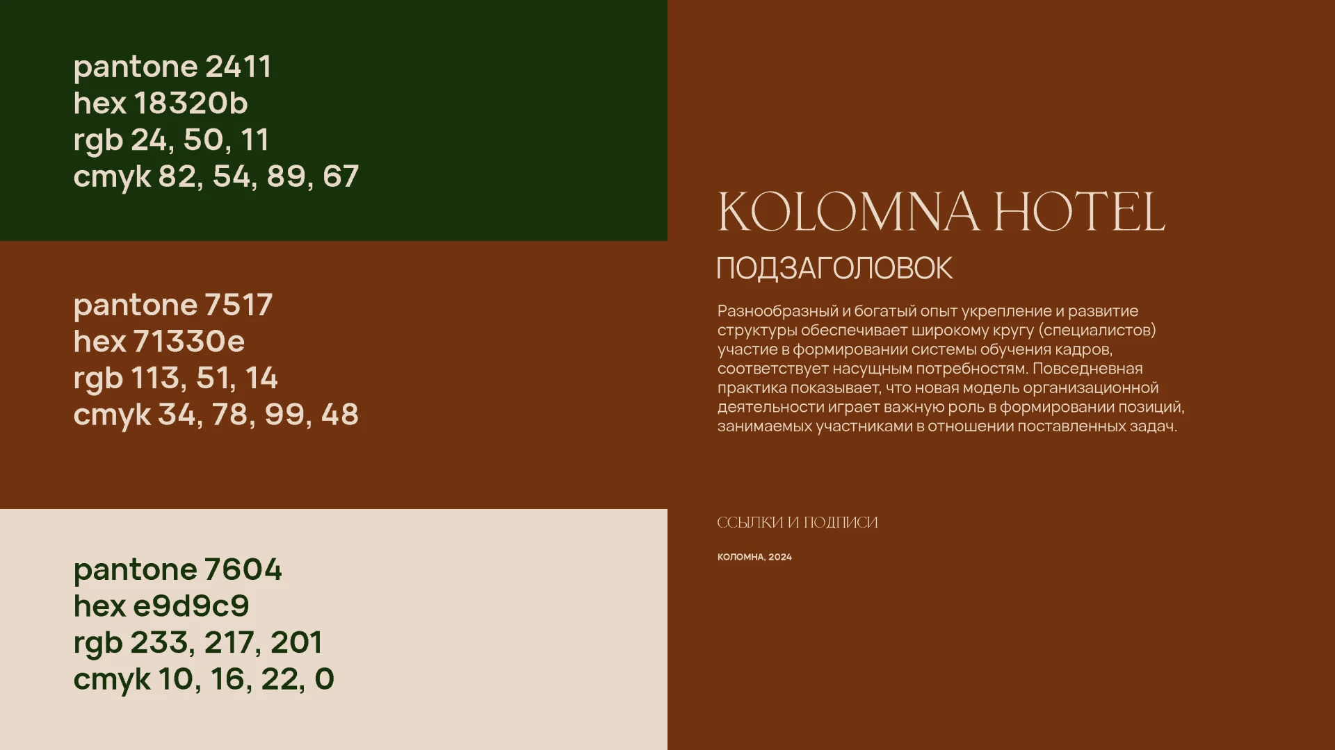
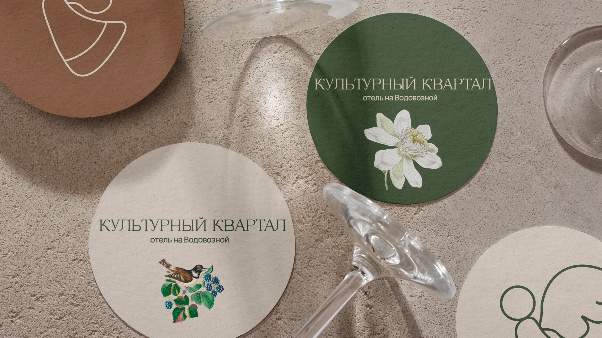
Colors: Colors are natural, because the hotel is the calm place. After big day of excursions and moving, people want to calm and relax.
Цвета: Цвета естественные и спокойные. Отель - место спокойствия после насыщенного дня с экскурсиями и поездками.
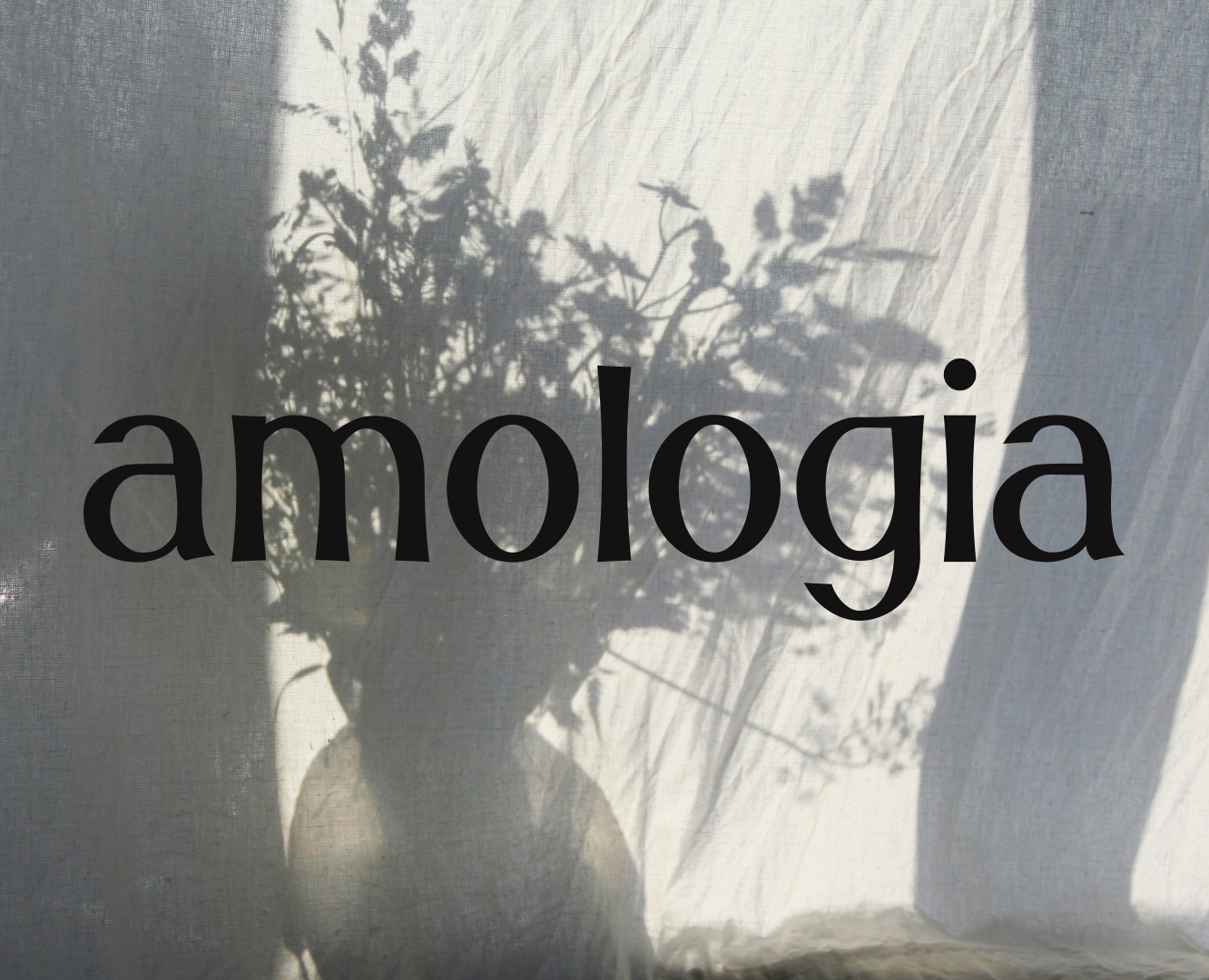
Mockups: There are some aesthetique pictures on the mockups. They are vintage and give the certain mood.
Мокапы: На некоторых носителях есть винтажные изображения. Они передают "историчное" настроение.
Thank you for your attention!
Спасибо за внимание!