RU
О проекте
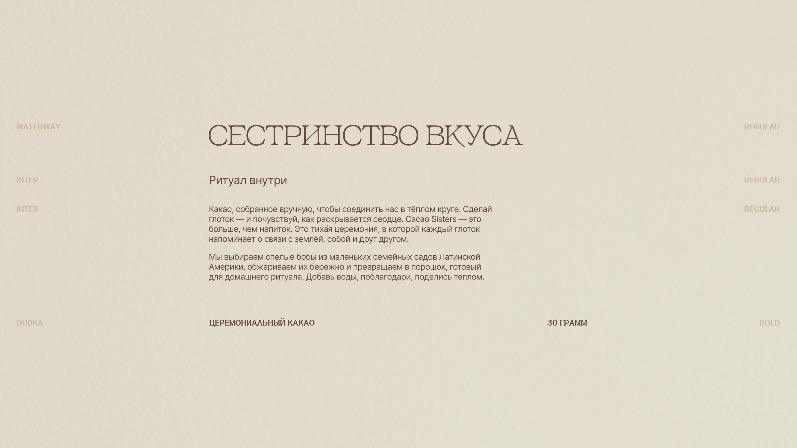
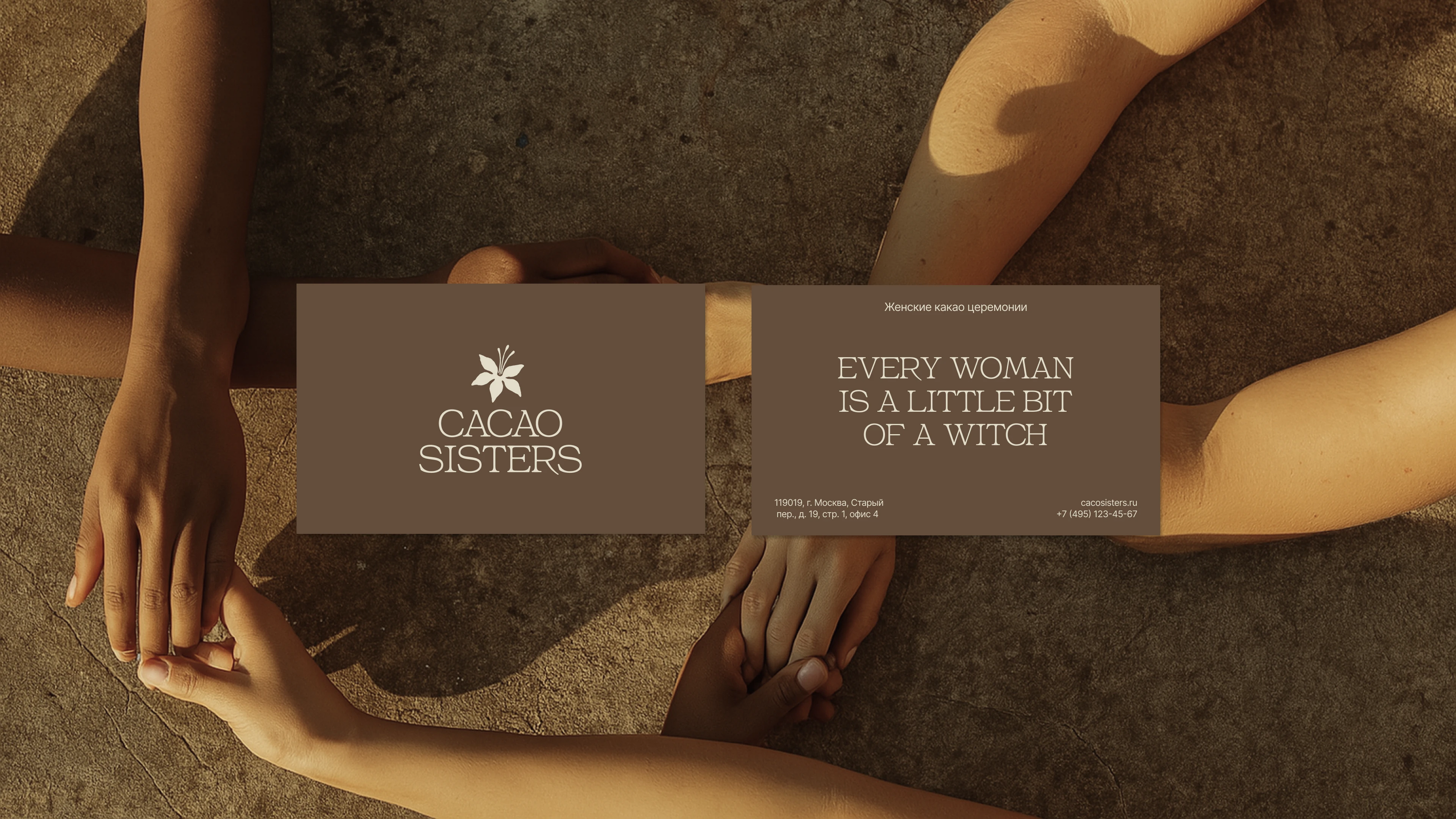
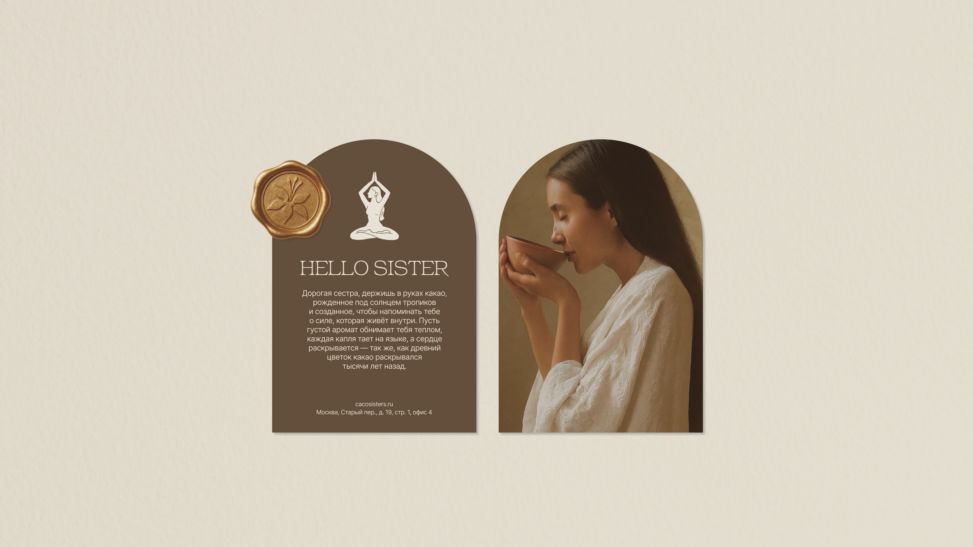
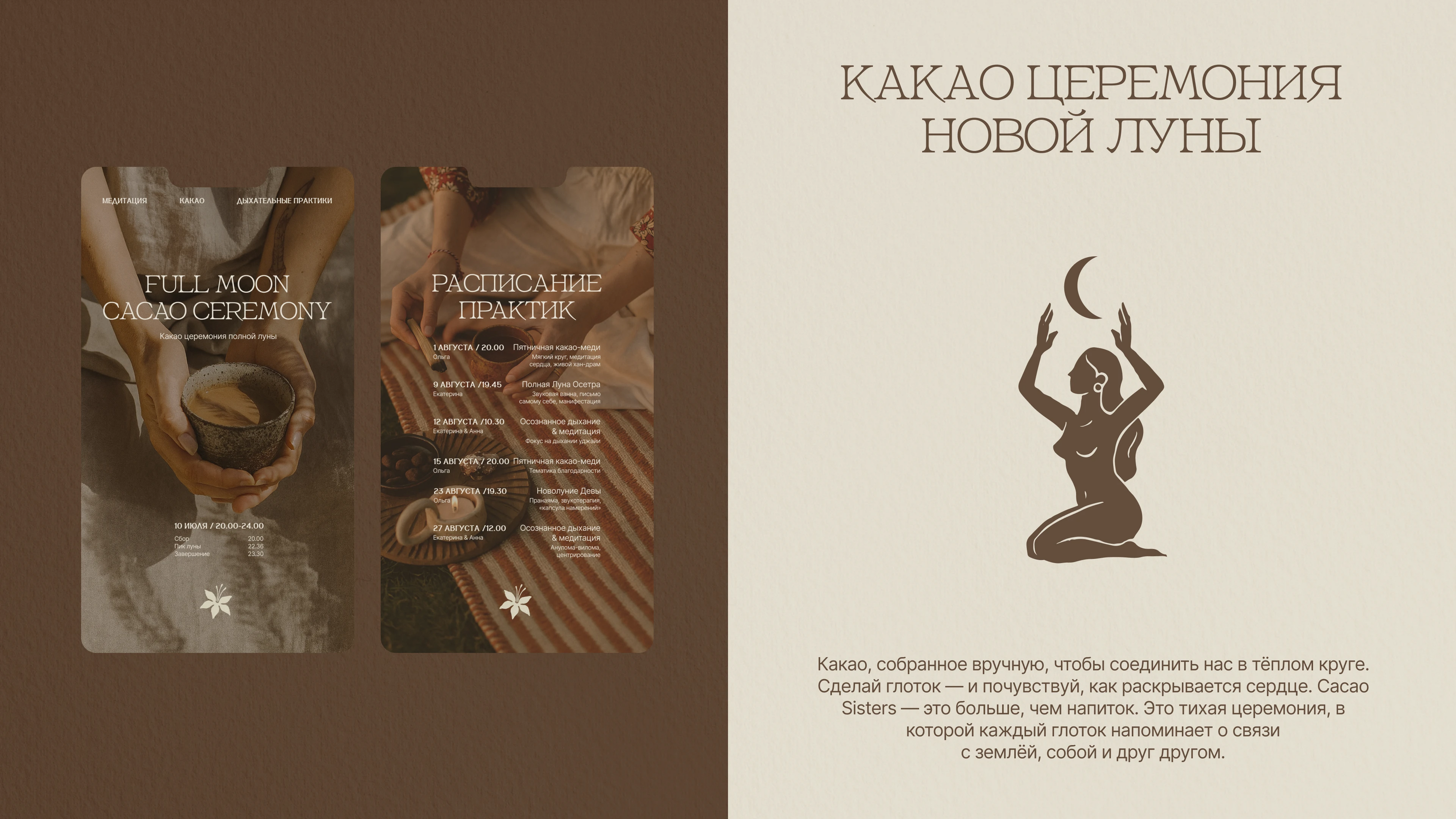
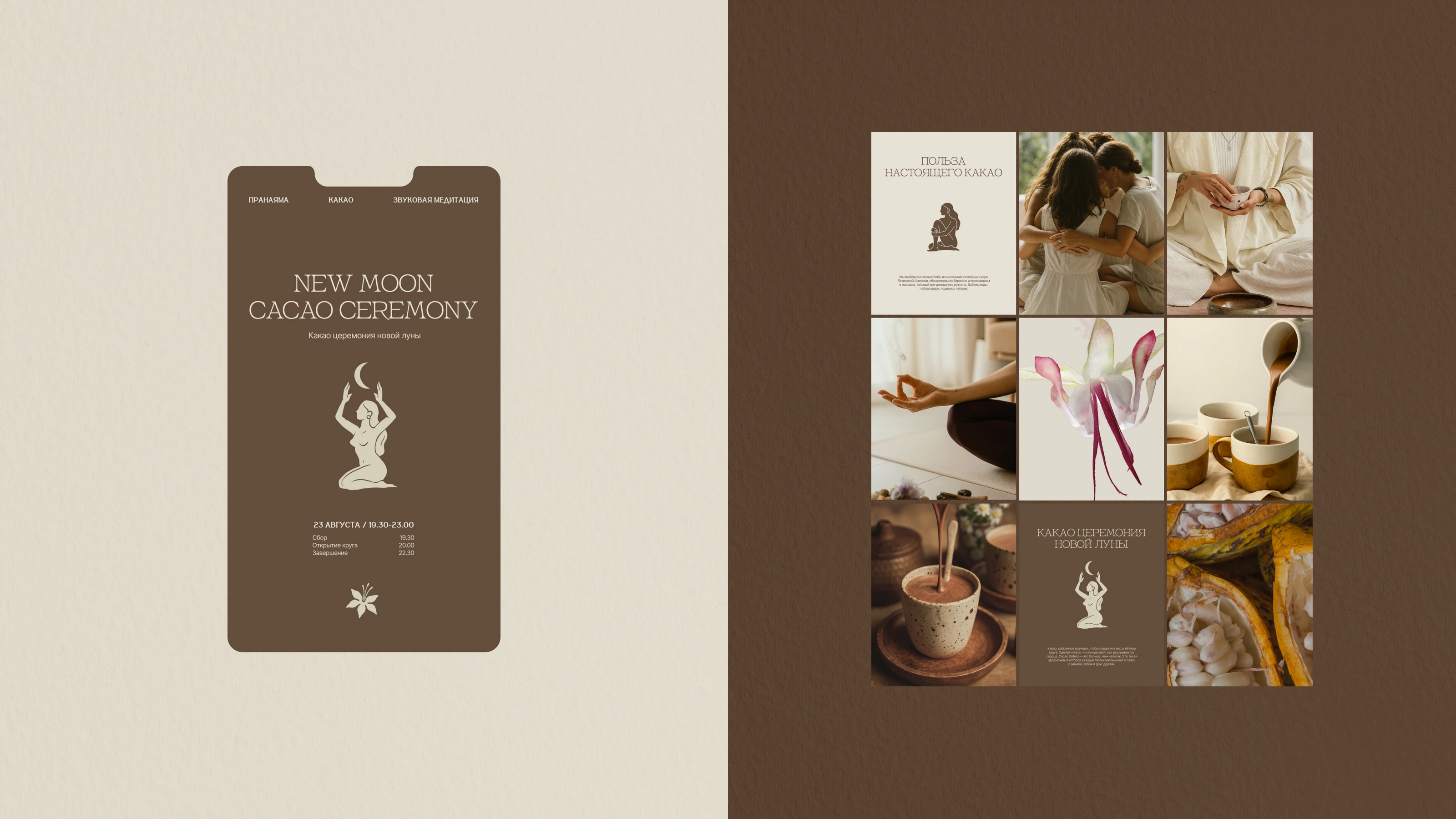
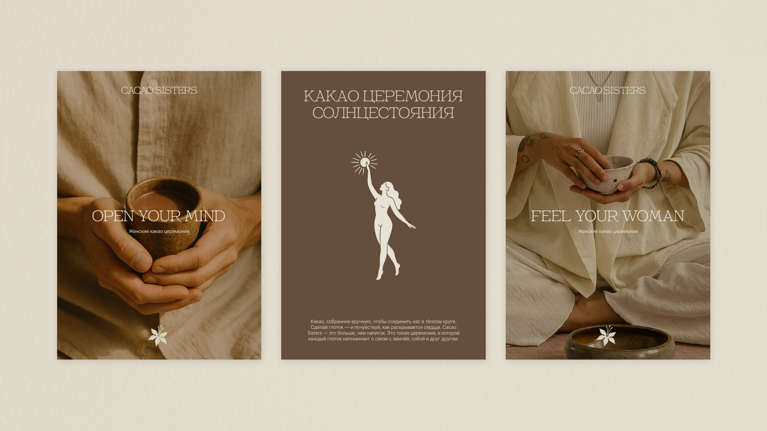
Cacao Sisters — небольшой премиальный бренд, который объединяет людей вокруг церемониального напитка из цельного какао. Через тёплые, камерные церемонии бренд даёт участницам чувство поддержки и уюта. Это не просто продукт — это целый ритуал, женский круг, момент соприкосновения с природой и собой. Все это стало основой при создании визуальной части.
Задача
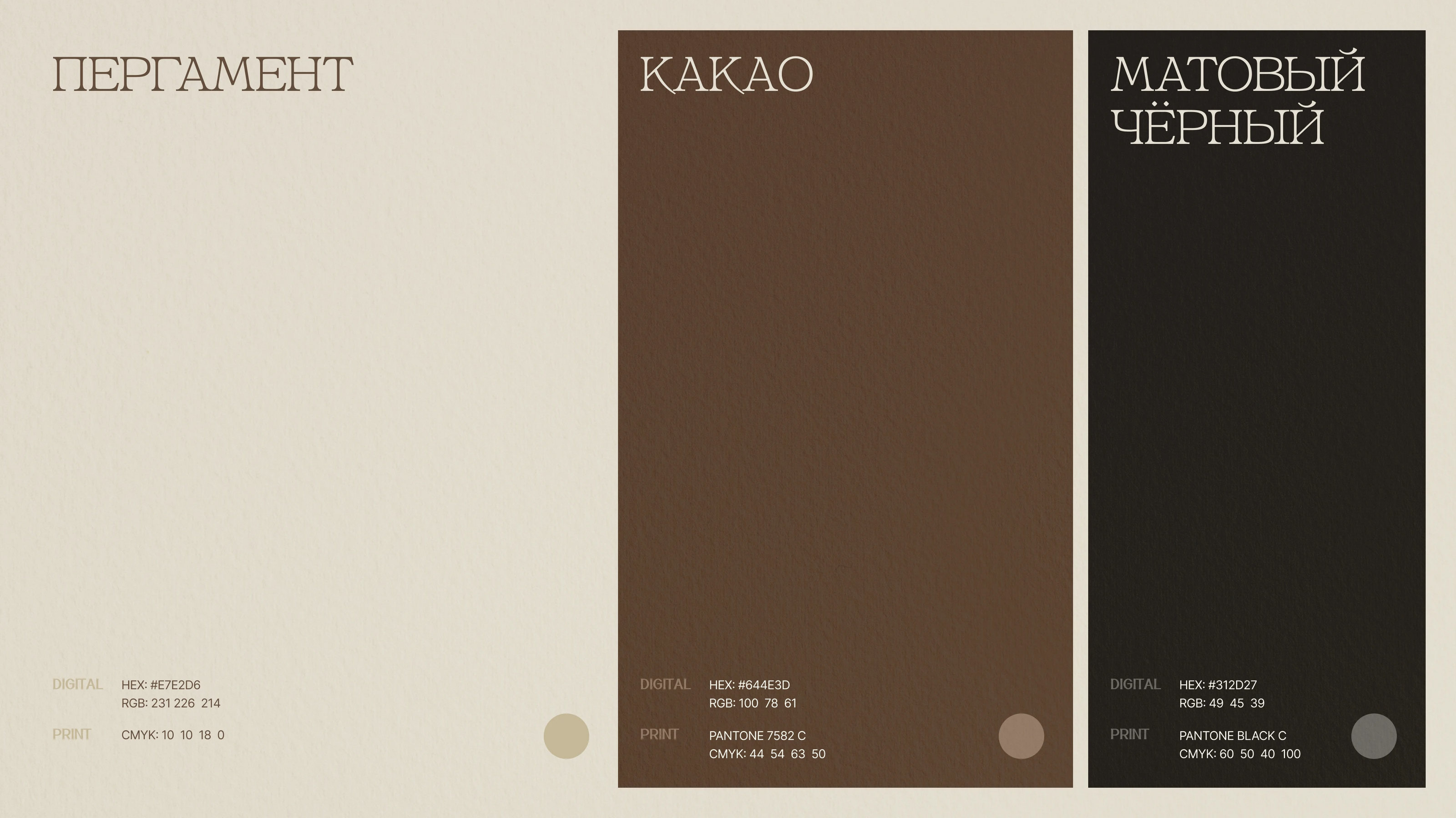
Необходимо разработать логотип и фирменный стиль для бренда. Важным является отразить женское начало в логотипе, при этом отойти от стандартных образов — какао боба, шоколада или самого напитка. Фирменная стилистика должна отражать визуальную лаконичность, женственность, мягкость и уют.
Решение
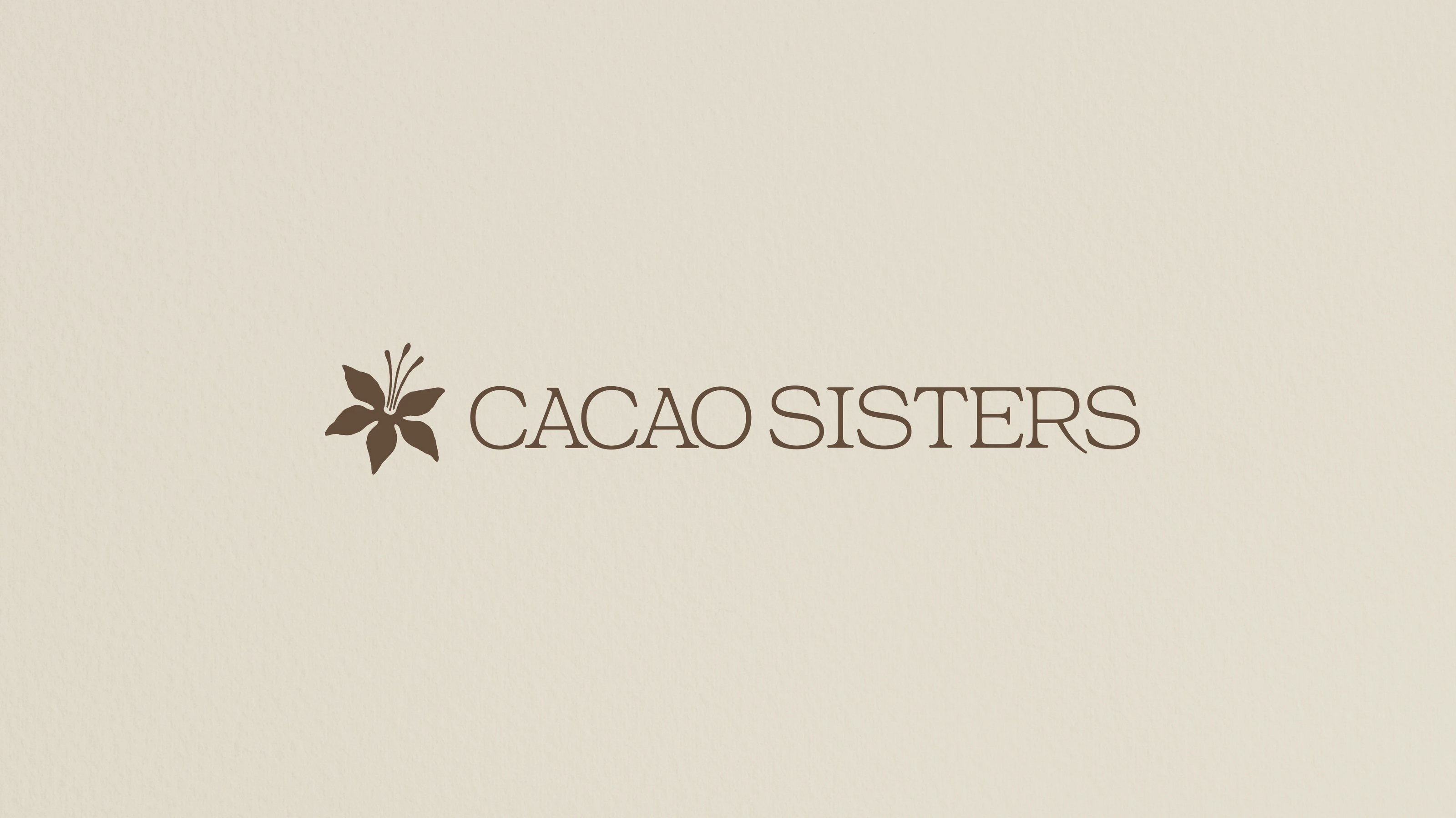
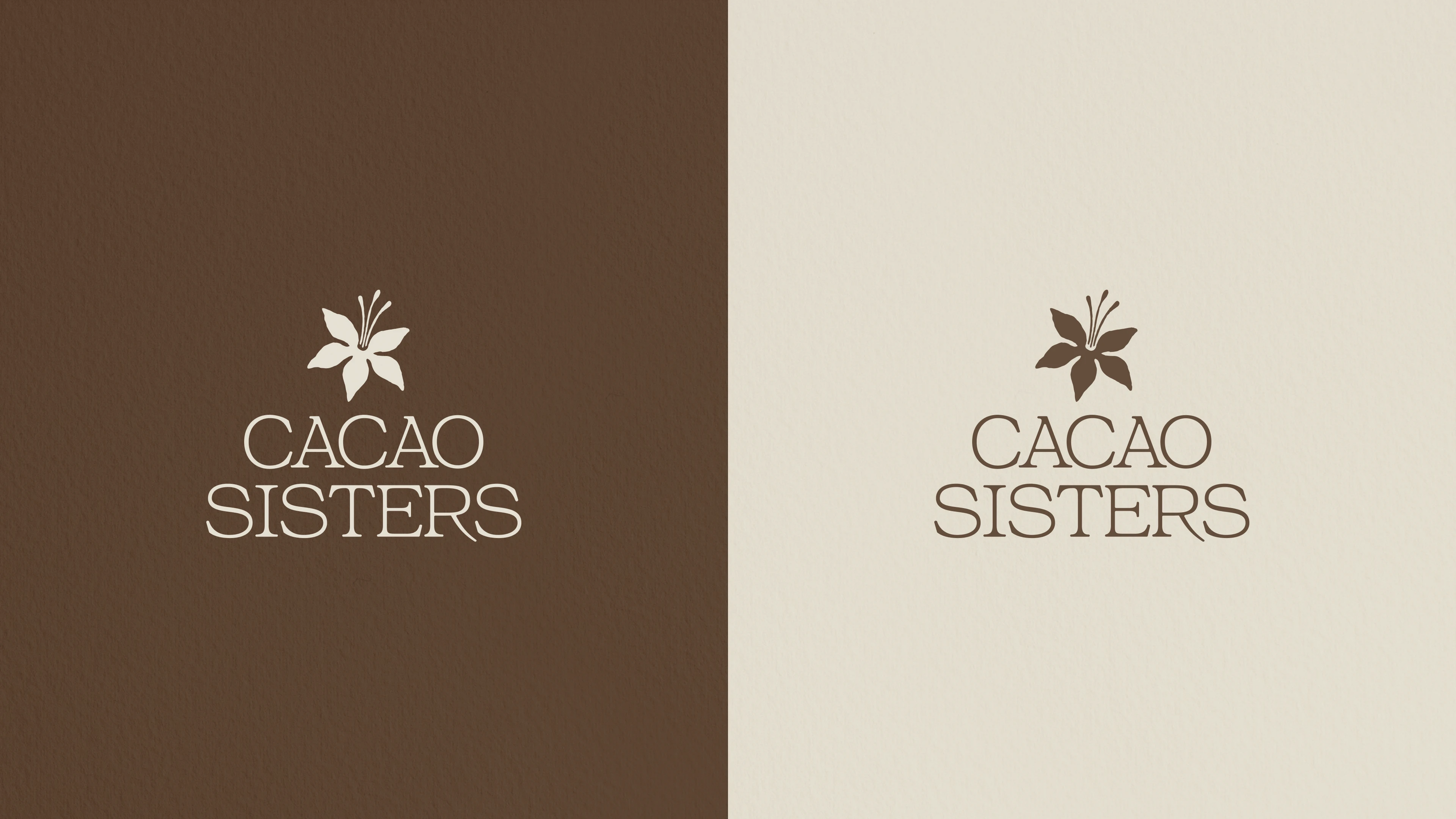
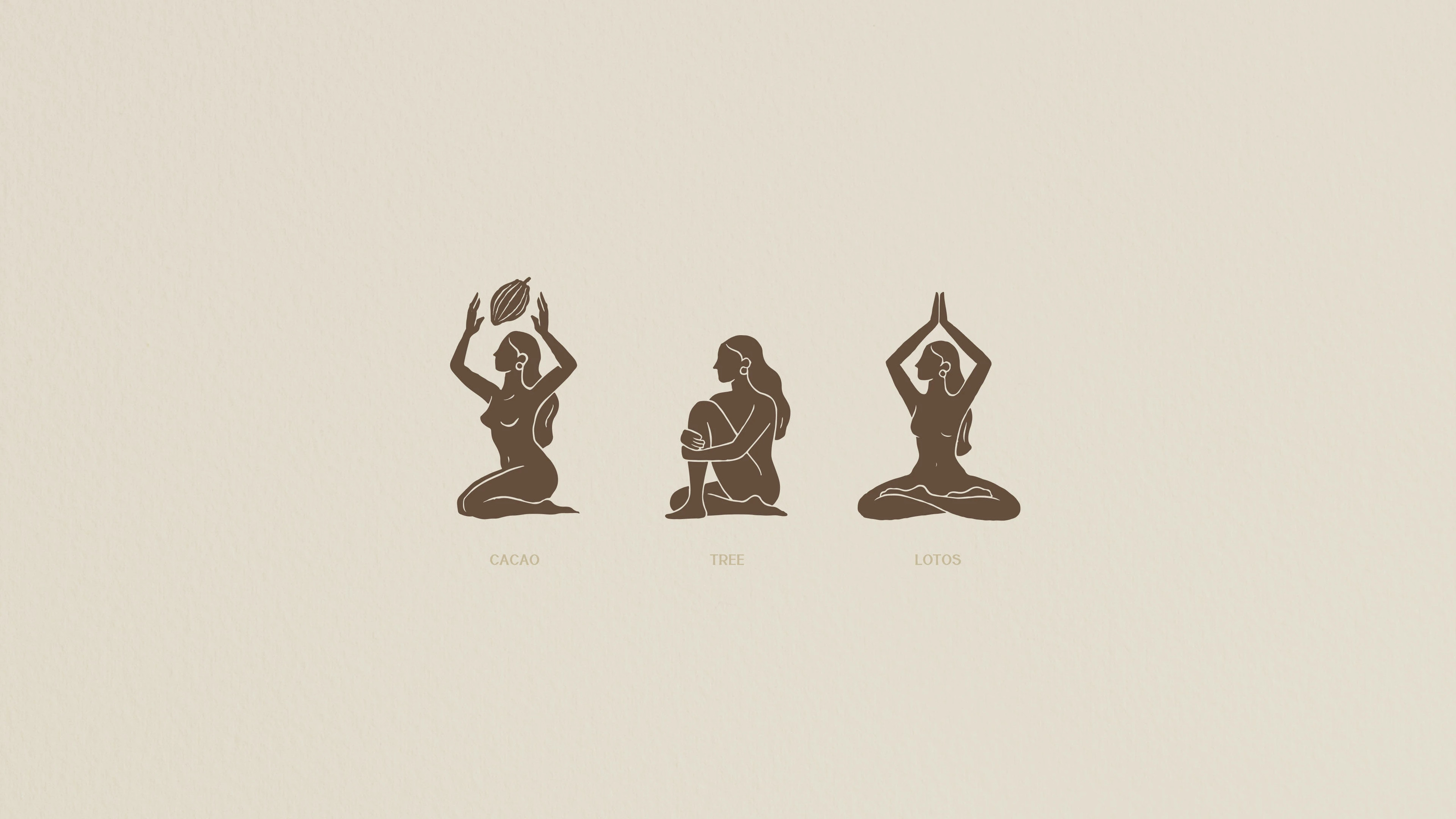
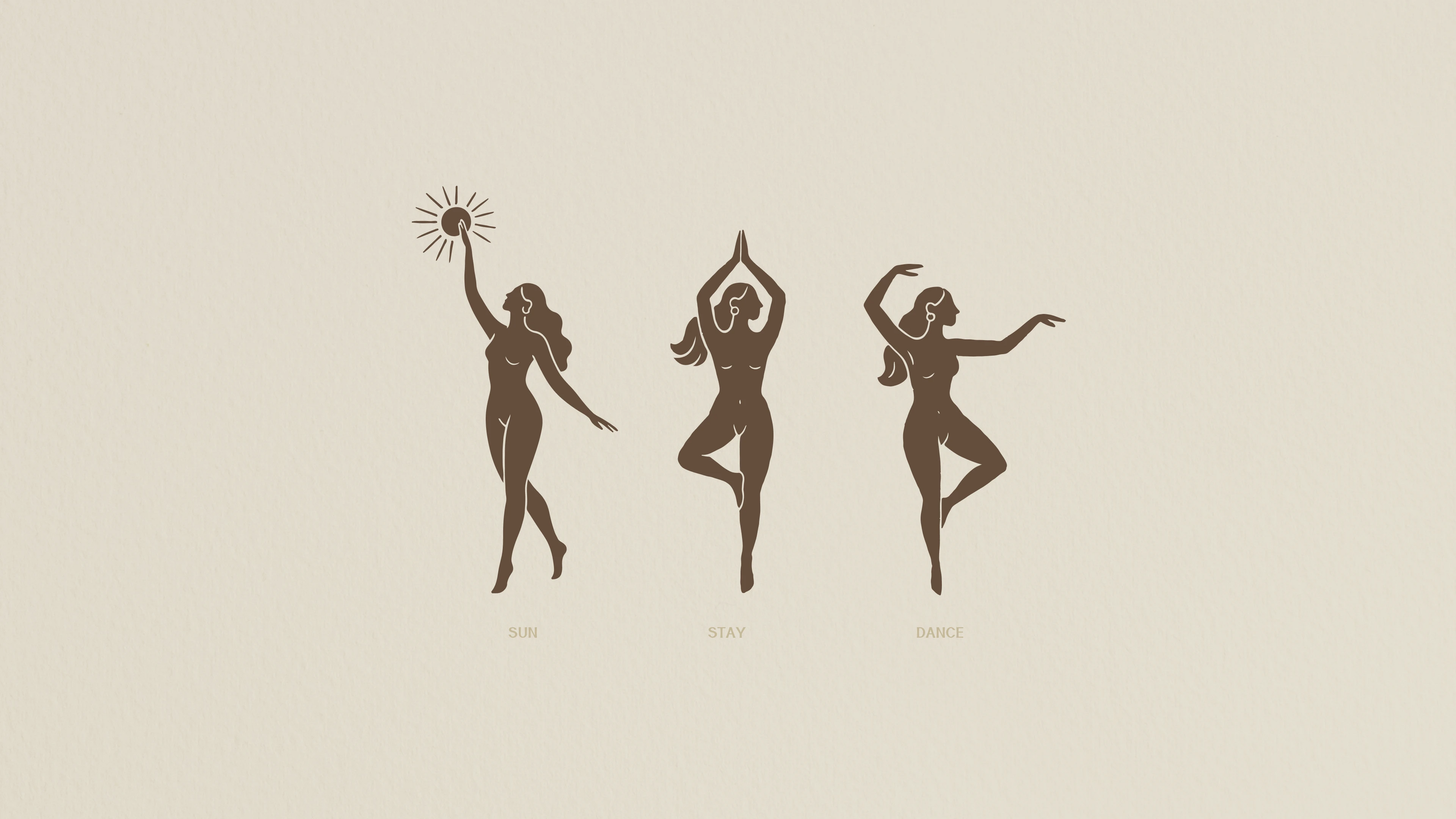
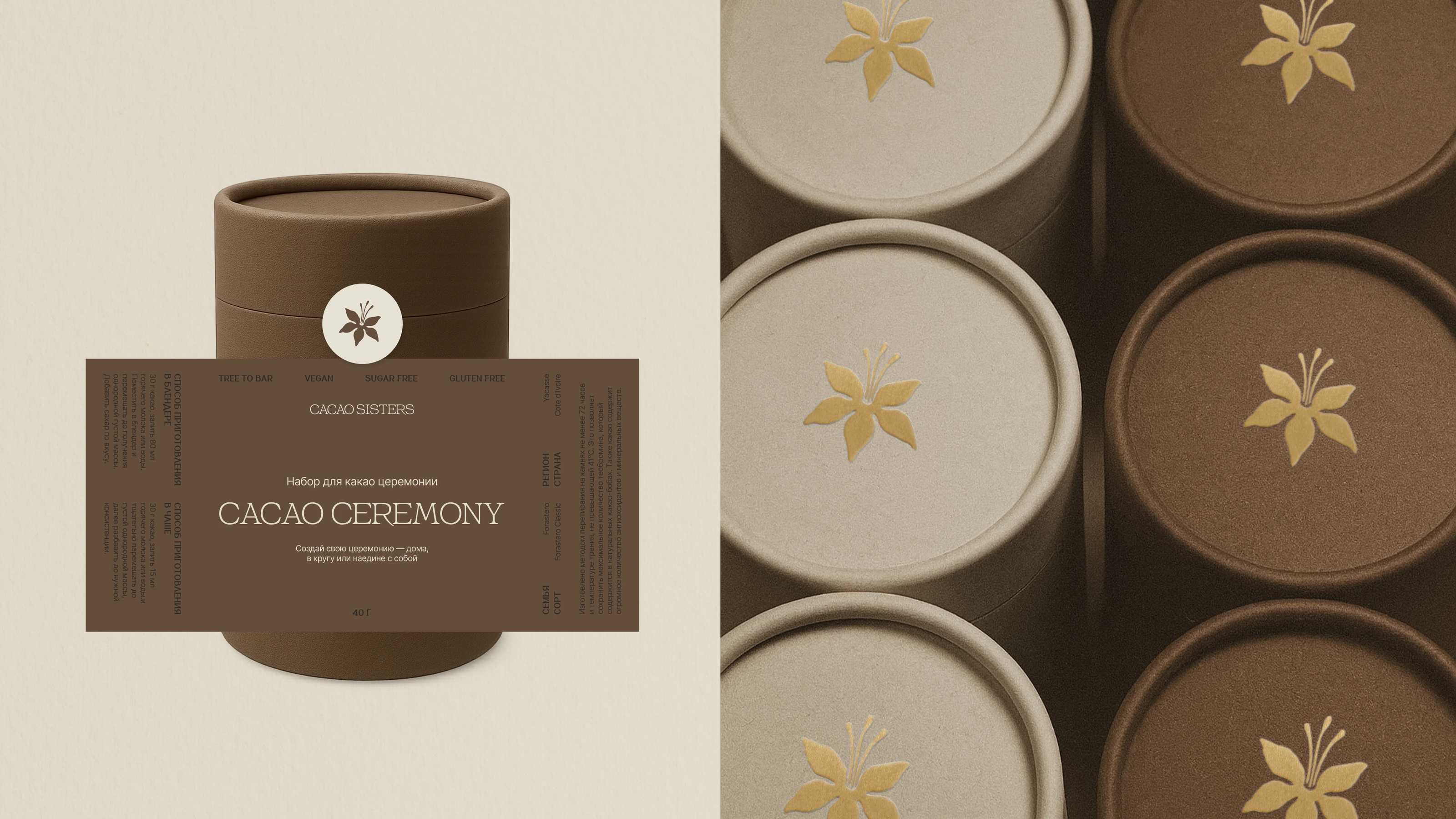
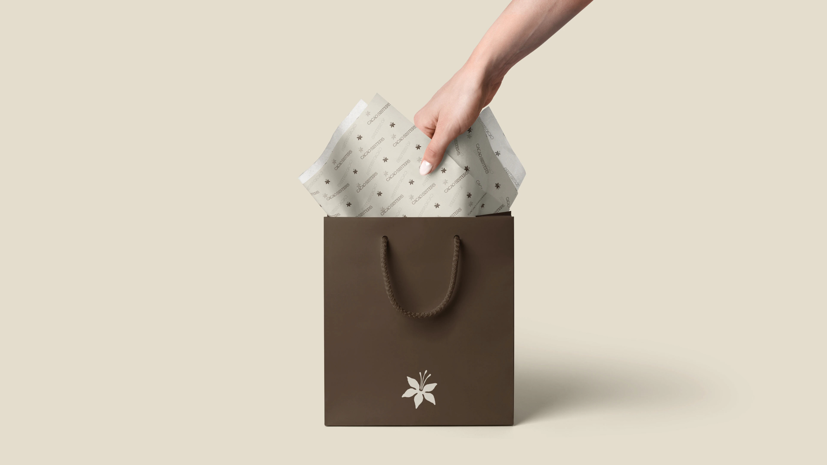
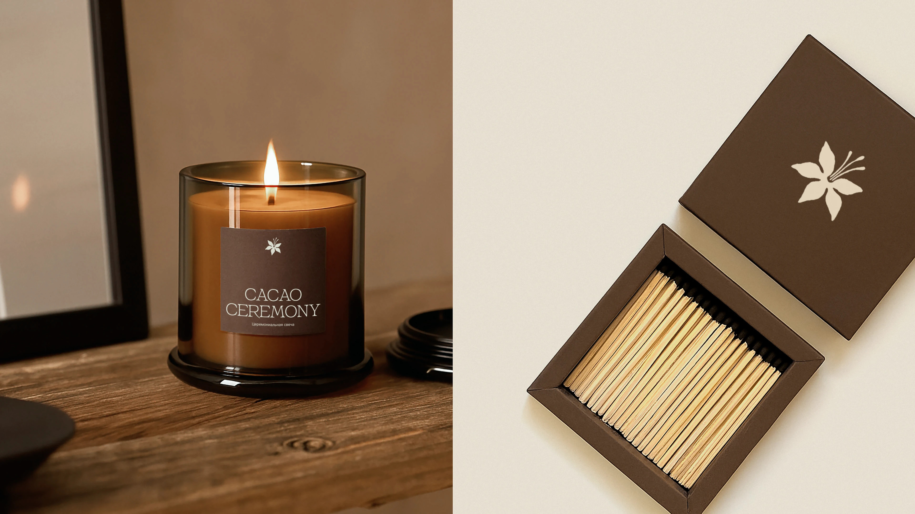
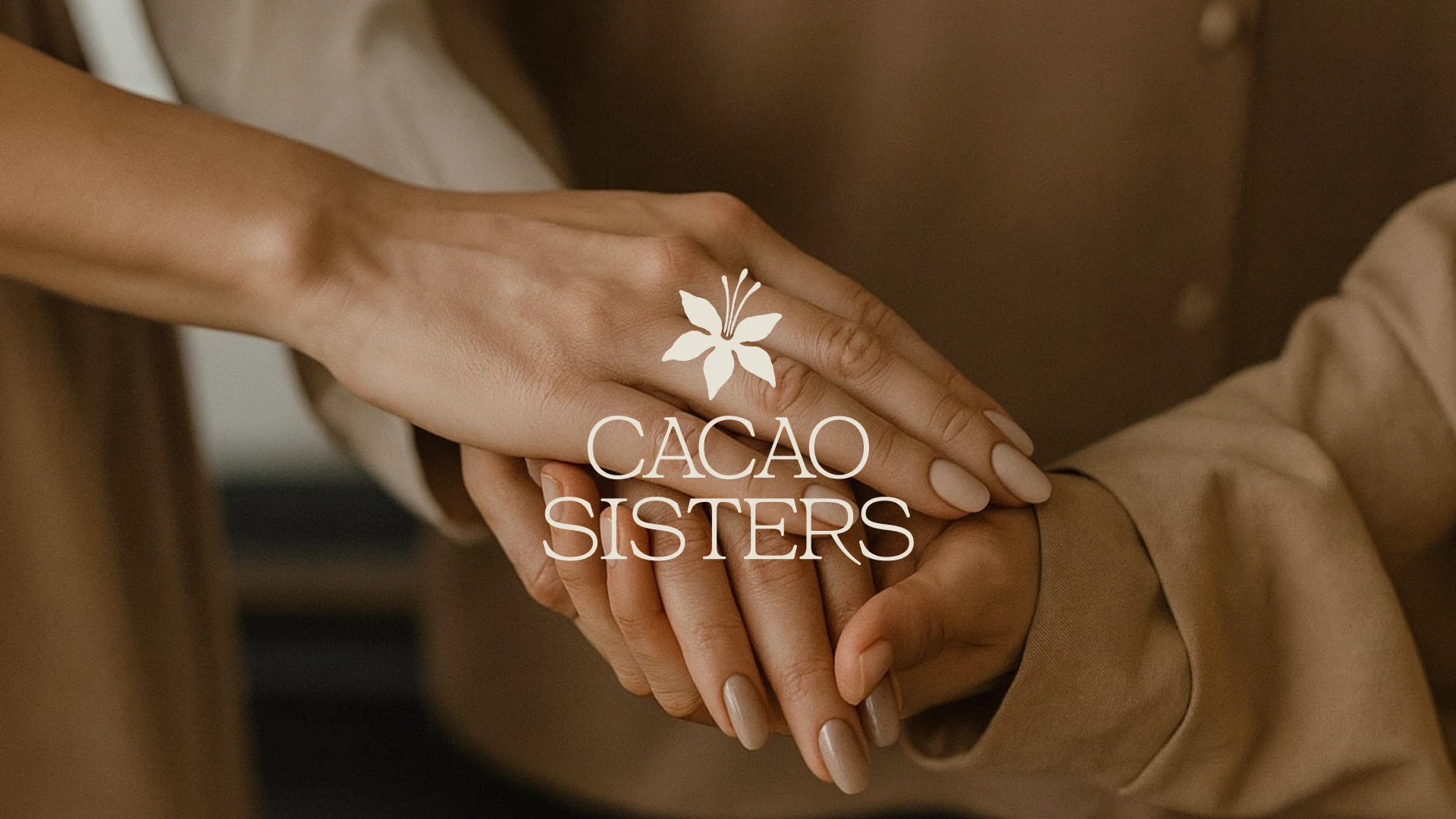
В основе логотипа — цветок какао-дерева. Это не случайный выбор. Цветок символизирует женственность, раскрытие и внутреннюю силу. В отличие от какао-боба, который прямо указывает на продукт, цветок — это метафора. Он тонко говорит о сути бренда, не дублируя название, и благодаря этому выглядит оригинально, изящно и запоминающейся.
Я также вдохновлялась традиционными рисунками Майя, ведь в их культуре какао считалось священным растением. Это дало главному знаку не только визуальный характер, но и глубокую смысловую основу.
ENG
About project
Cacao Sisters is a small premium brand that brings people together around a ceremonial drink made from whole cacao. Through warm, intimate ceremonies, the brand offers participants a sense of support and comfort, helping them open their hearts and reconnect with nature and themselves. This is not just a product — it’s a whole ritual, a women’s circle, a moment of connection with the natural world and one's inner self. All of this formed the foundation for the visual identity.
Task
To develop a logo and brand identity for the brand. The goal was to reflect feminine energy in the logo, while avoiding typical imagery such as cacao beans, chocolate, or the drink itself. The visual style needed to convey elegance, femininity, softness, and a cozy atmosphere.
Solution
At the heart of the logo is a cacao flower — and this choice is no accident. The flower symbolizes femininity, blossoming, and inner strength. Unlike the cacao bean, which directly references the product, the flower acts as a metaphor. It subtly conveys the brand's essence without repeating the name, making the logo feel original, graceful, and memorable.
I was also inspired by traditional Mayan drawings, as cacao was considered a sacred plant in their culture. This gave the main symbol not only a distinctive visual character but also a deep conceptual foundation.
Обсудить проект: Telegram What'sApp