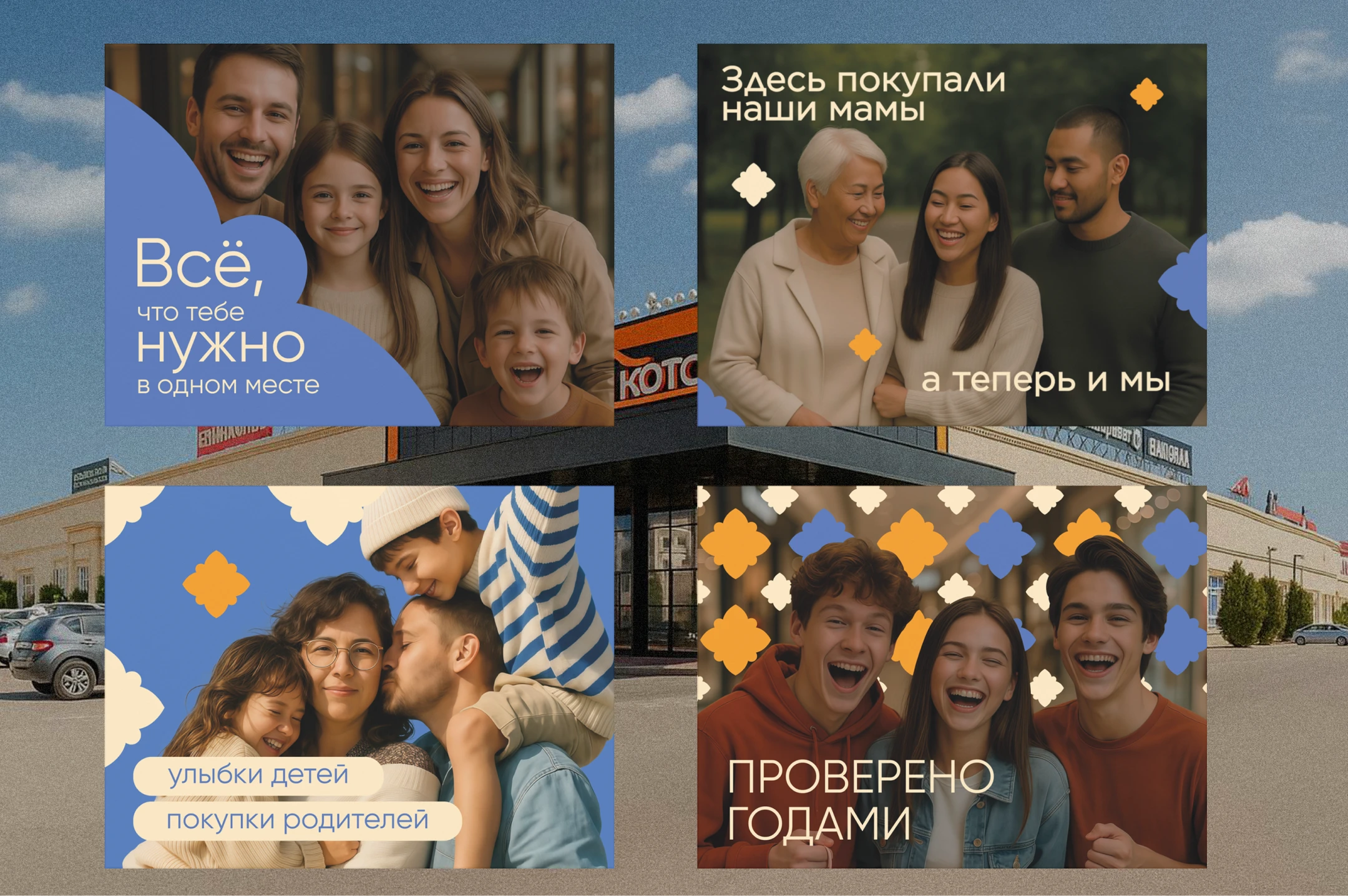
RU
«Три Кота» — это тёплое место, где найдёшь всё нужное по честной цене. Мы сохраняем традиции,
но идём в ногу со временем. Здесь ценят атмосферу, живое общение и выгоду — без суеты
и переплат, в компании семьи и знакомых продавцов.
ENG
"Three Cats" is a warm place where you can find everything you need at a fair price. We keep traditions,
but we keep up with the times. They appreciate the atmosphere, lively communication and benefits here
— without fuss and overpayments, in the company of family and familiar sellers.
RU
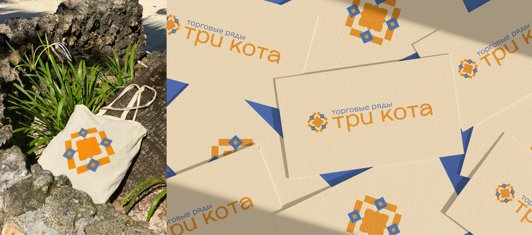
Изначально палитра бренда состояла из приглушённого оранжевого и бежевого, но на этапе разработки концепции я предложила добавить голубой. Он привнёс в образ честность, стабильность и доверие,
а также неожиданно оказался связан с историей торгового центра — голубой и оранжевый
уже использовались здесь раньше.
Это стало «визуальным мостом» между прошлым и будущим бренда, сделав палитру не только гармоничной, но и глубоко связанной с его идентичностью.
ENG
Initially, the brand's palette consisted of muted orange and beige, but at the stage of concept development,
I suggested adding blue. He brought honesty, stability and trust to the image, and also unexpectedly became associated with the history of the shopping center — blue and orange had already been used here before.
This became a "visual bridge" between the brand's past and future, making the palette not only harmonious,
but also deeply connected with its identity.
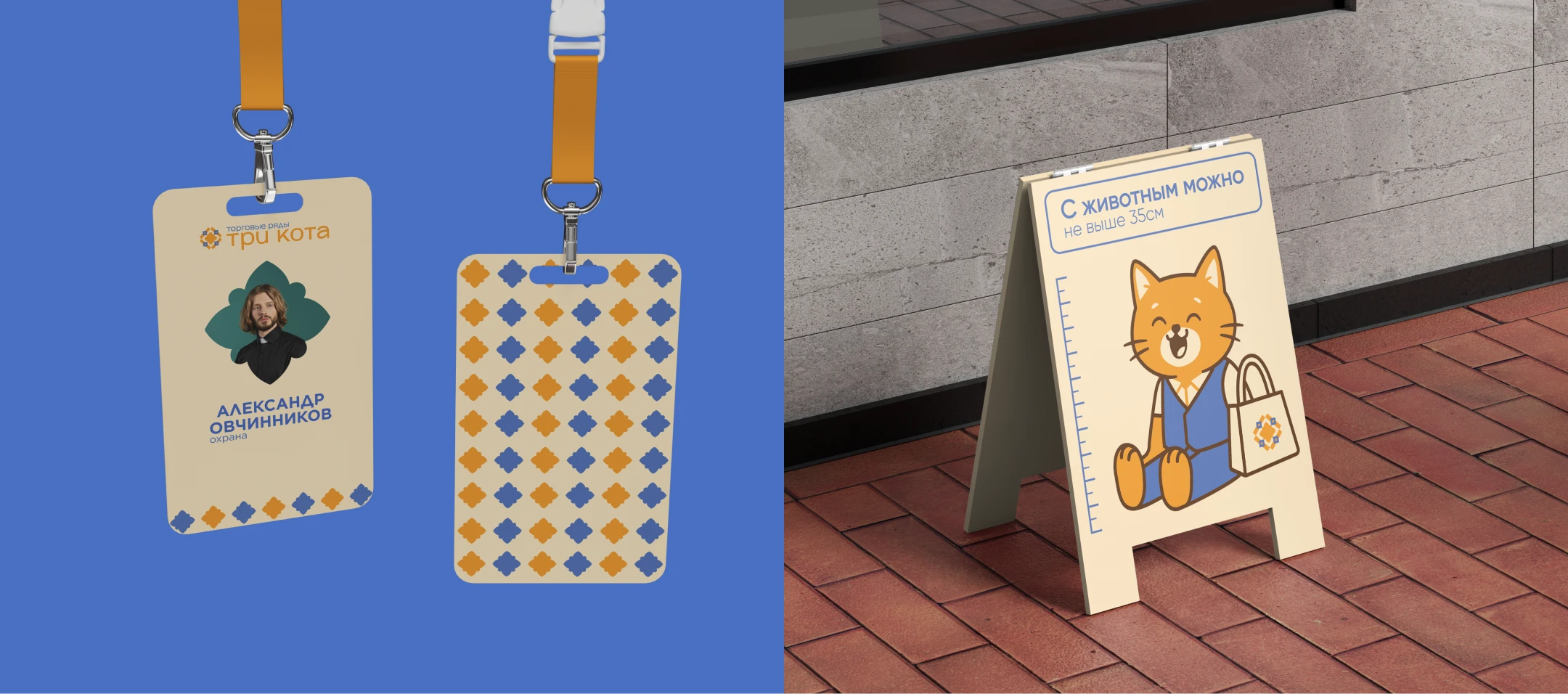
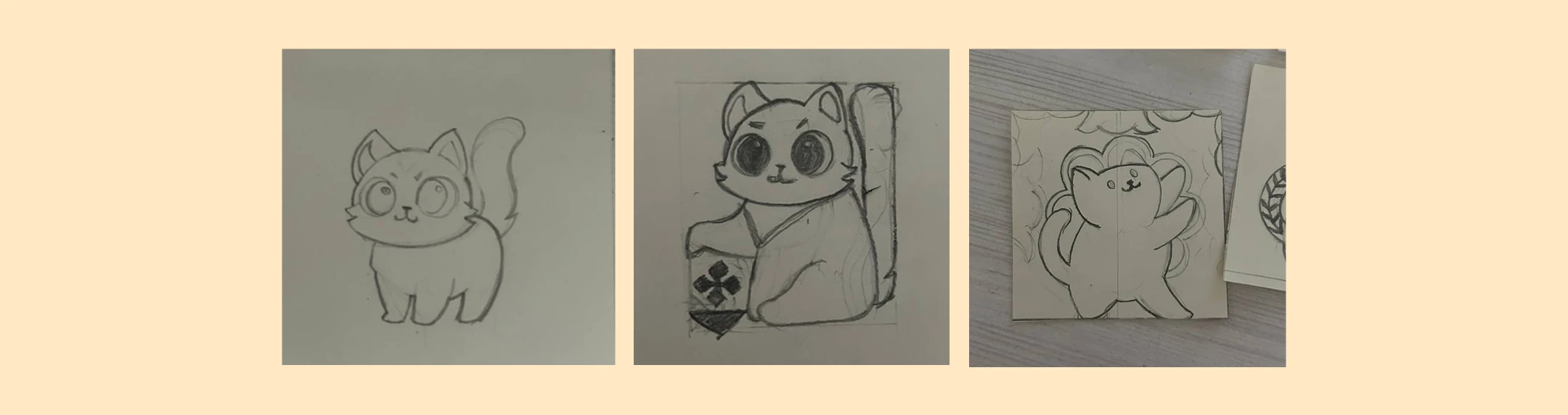
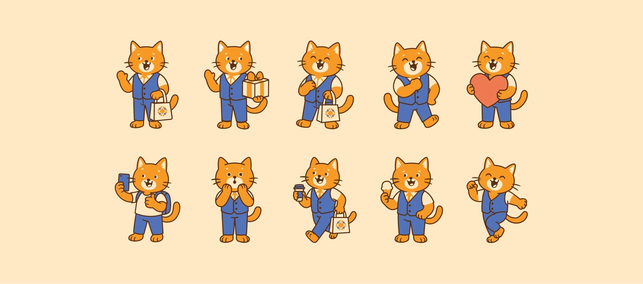
RU
Кота планировали встроить в логотип, но в процессе решили, что современнее и универсальнее будет шрифтовой знак с уникальным элементом. Кот стал маскотом бренда — сохранил дружелюбный образ
и получил свободу для анимации, рекламы и навигации, делая бренд ярким и запоминающимся.
ENG
The cat was planned to be embedded in the logo, but in the process it was decided that a font sign with
a unique element would be more modern and versatile. The cat became the brand's mascot, maintaining
a friendly image and gaining freedom for animation, advertising, and navigation, making the brand vibrant
and memorable.
Thank you!
I am open to new projects and collaborations
Contact me
Instagram
Telegram
di@odzelyaeva.ru