NPOGP. Rebranding
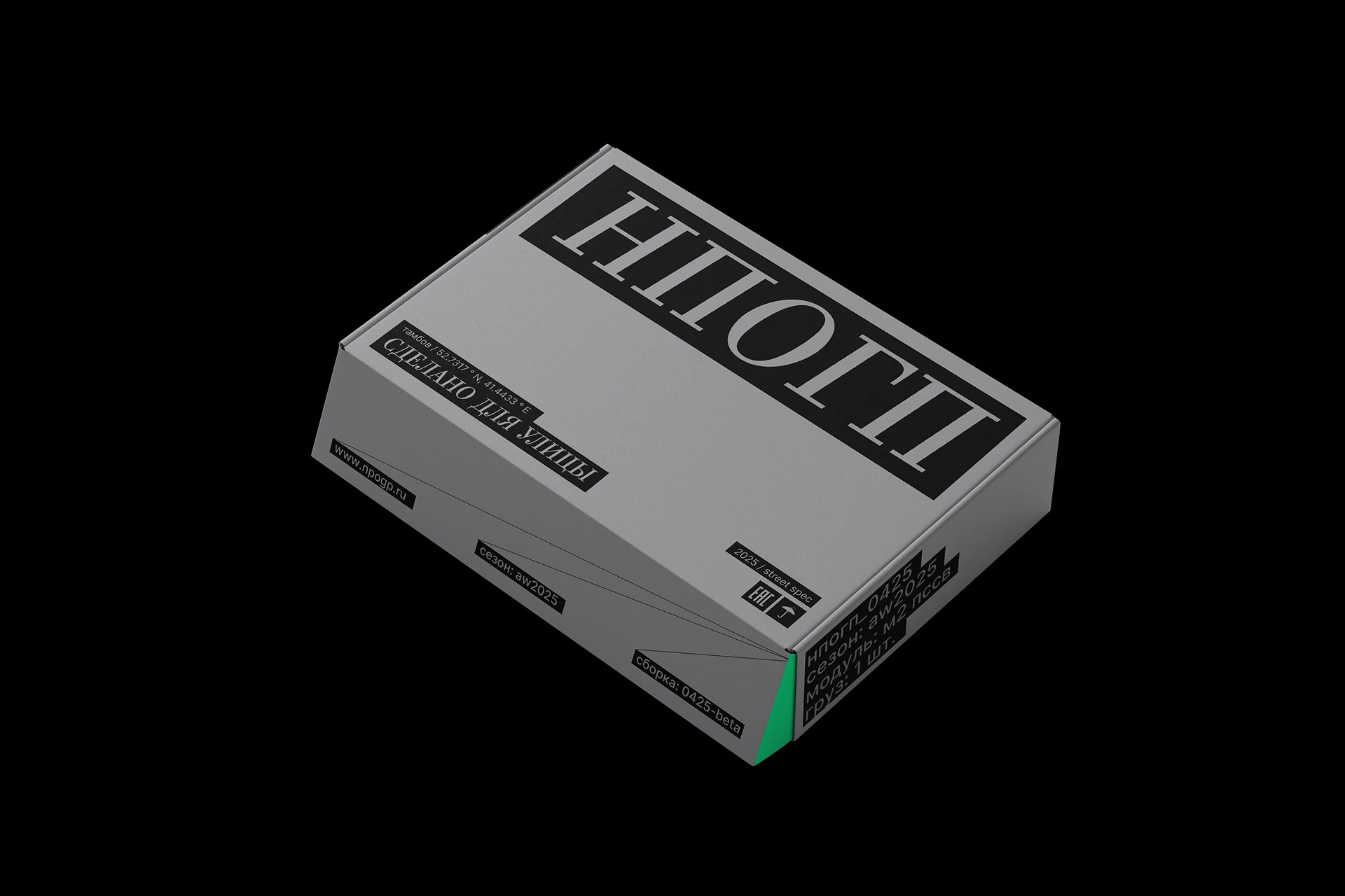
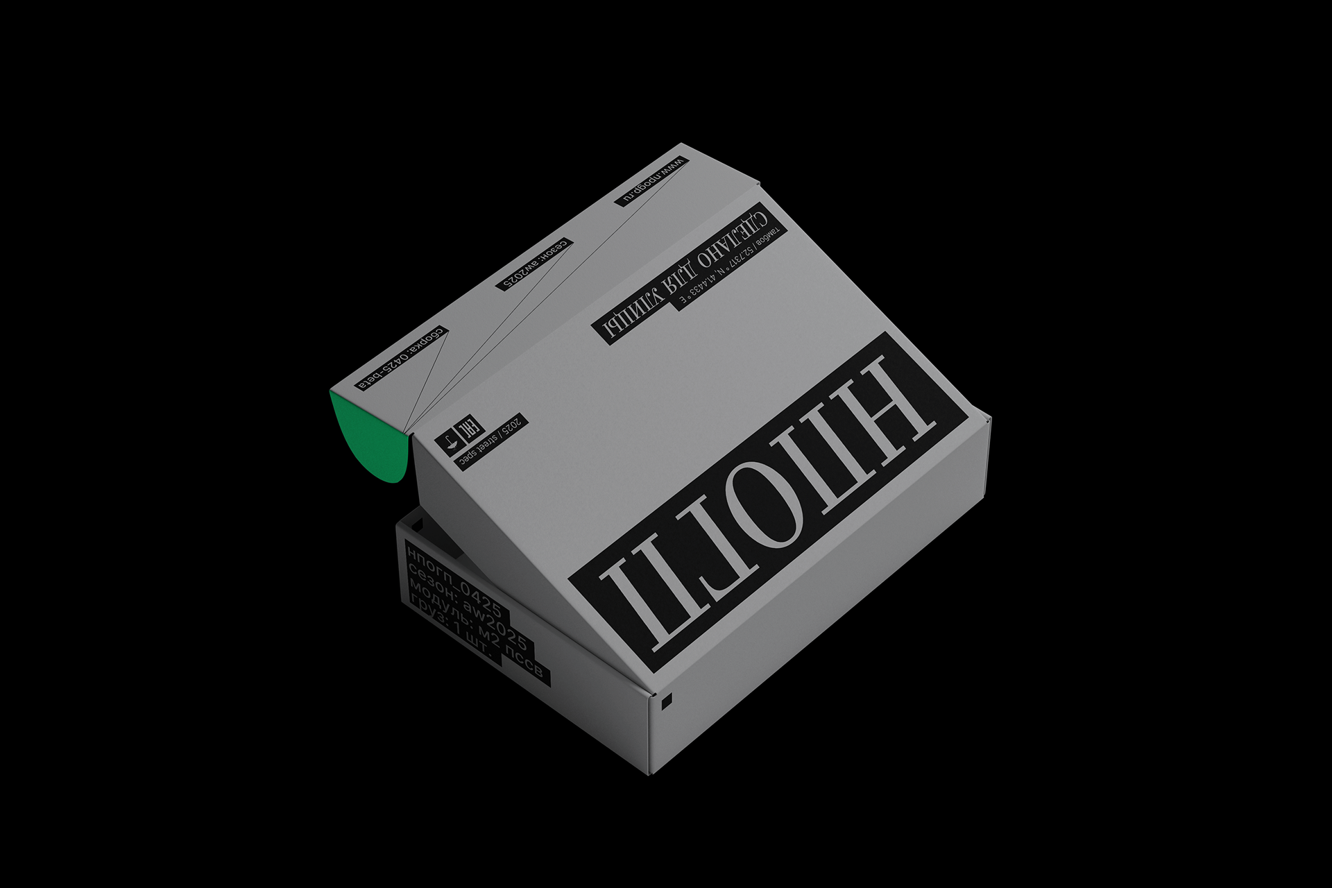
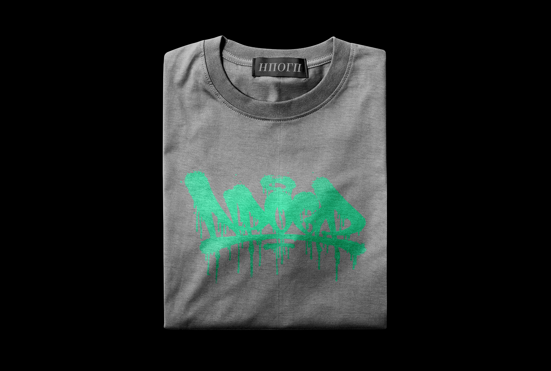
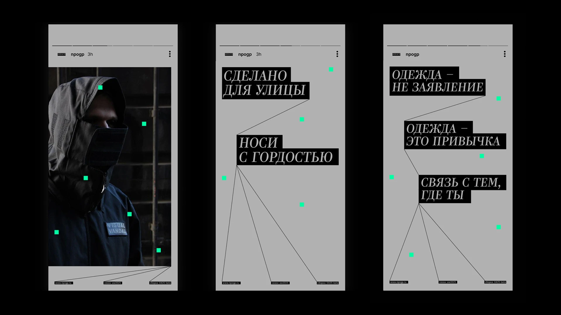
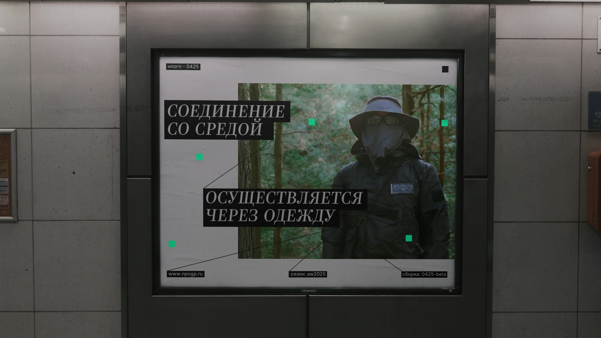
Made for the street.
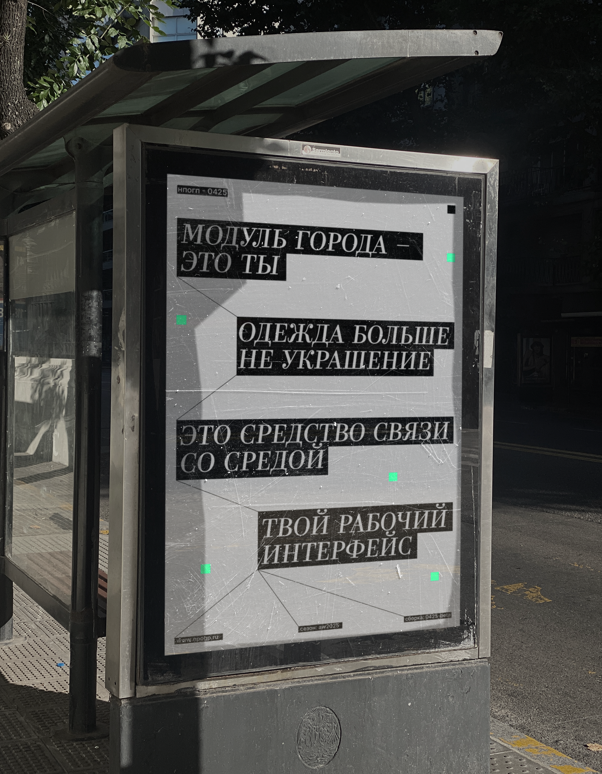
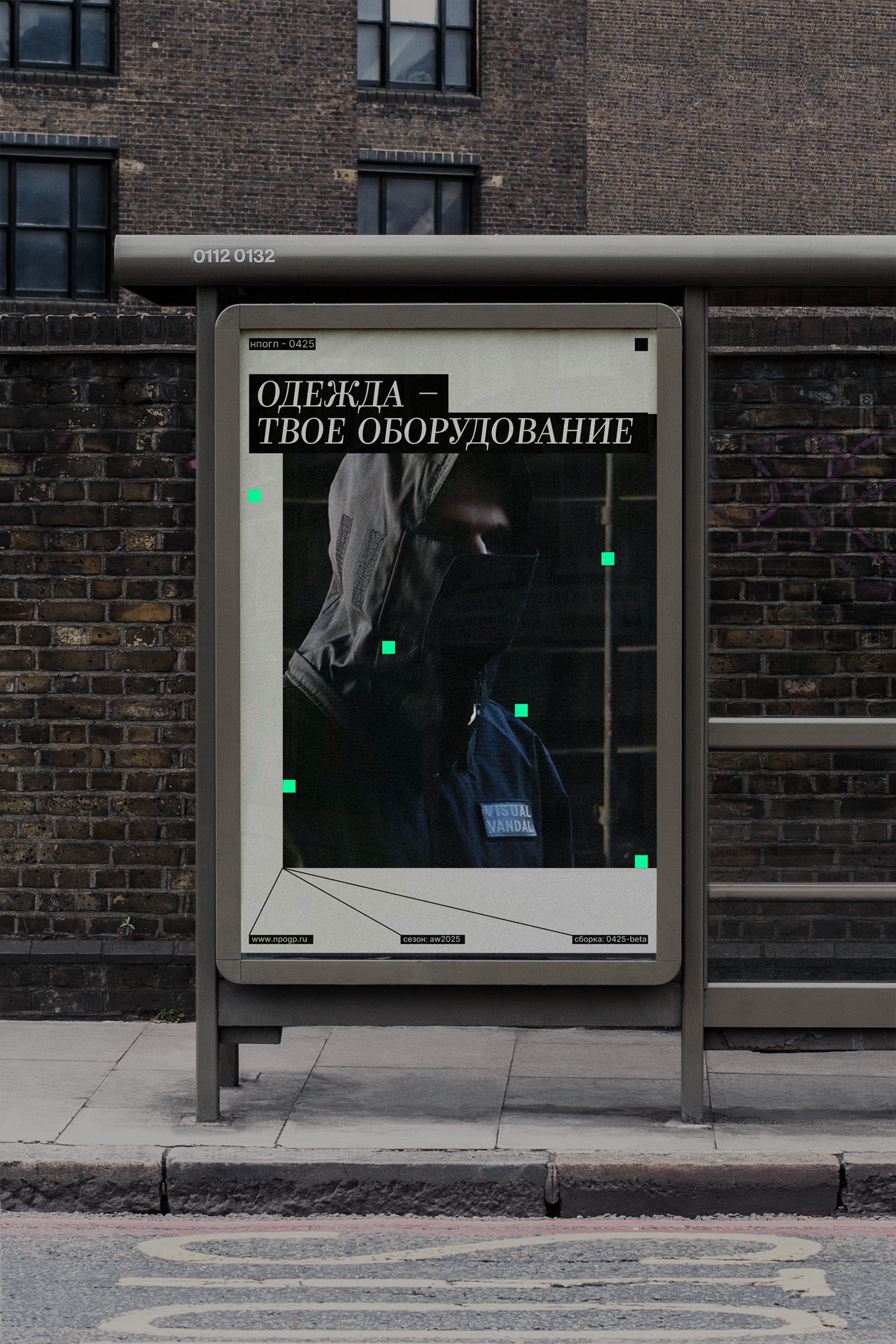
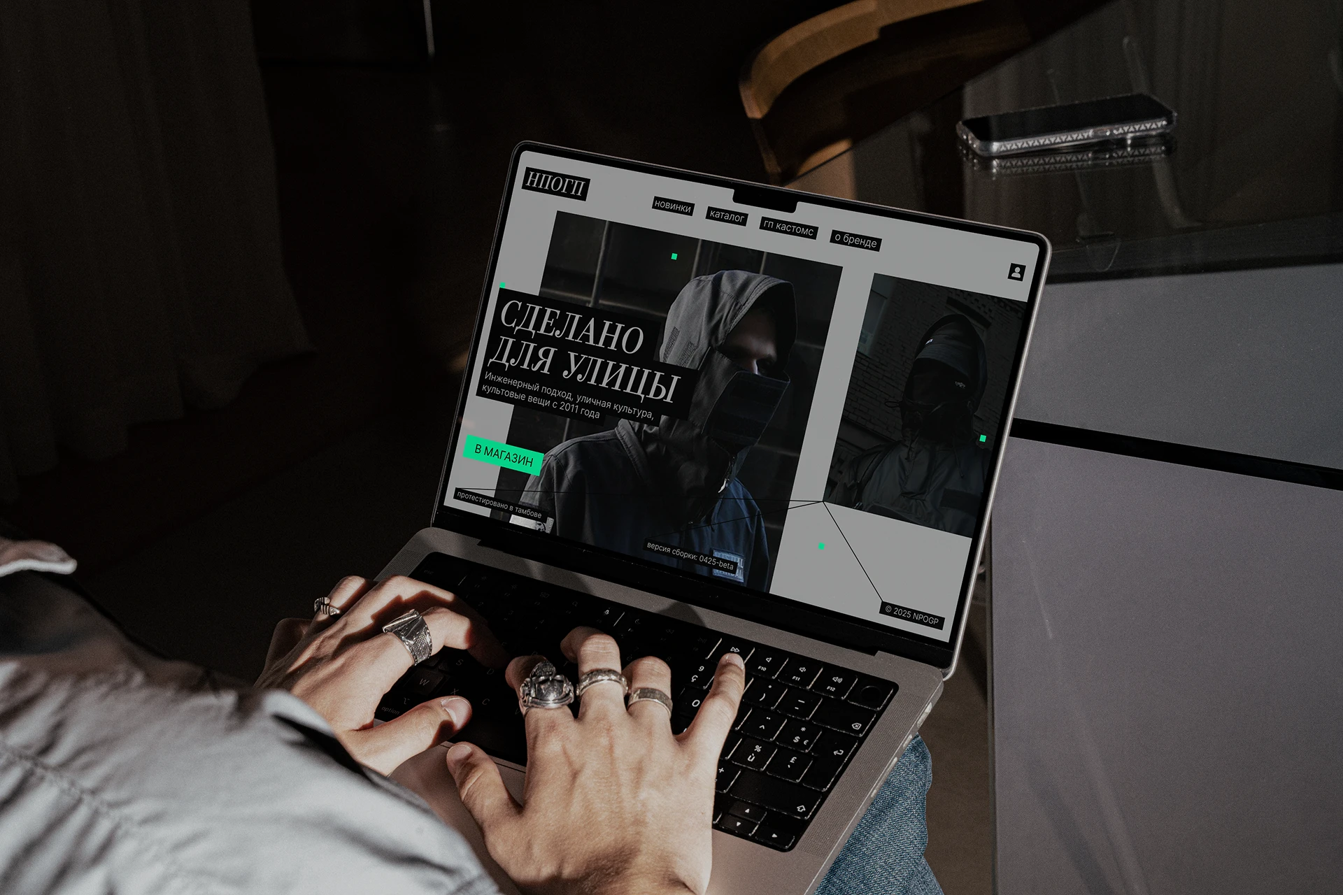
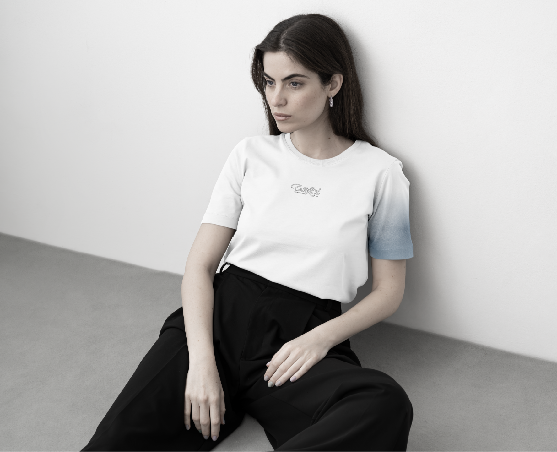
NPOGP is a Russian streetwear brand. It was important to show that this is not just another clothing brand, but a functional tool created for the city. The identity has been updated to emphasize that NPOGP clothing works as clearly as it looks. Reliable and with the character of the street.
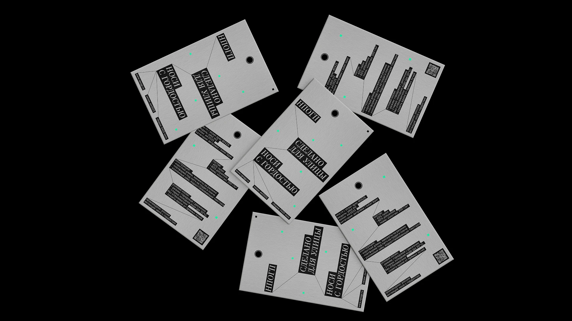
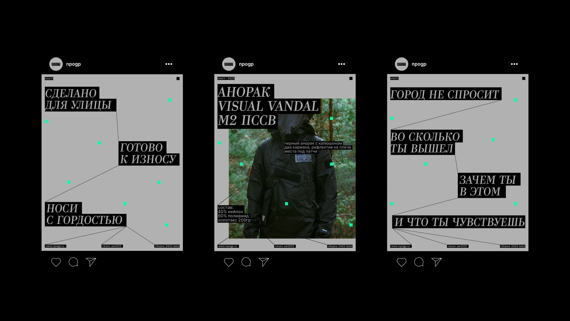
The concept is based on the visual language of urban navigation and street markers – symbols of movement, orientation and personal route. These images keep the focus on the wearer's experience and reflect the idea that NPOGP clothes are elements that can be combined and assembled to suit their rhythm of life, like street signs on facades. The text on the clear black bars refers to the digital age interfaces where information is transmitted quickly, directly and without unnecessary noise. In a digital environment, branded markers work as graphical interface elements, while in communication they acquire volume and texture, turning into tactile accents.
The main colors of the brand are gray and black. They form the image of an industrial urban environment, convey a sense of strength and functionality. The accent green adds contrast and references digital culture, from signal icons to interface elements. This palette creates a visual language in which the harsh texture of the street is combined with the precision and rhythm of the digital world.
NPOGP's visual style is a balance of urban austerity and digital noise. Clear shapes and minimalism emphasize functionality, while branded accents add energy to street culture.
The neat serif font adds character and visual depth. It refers to traditional print culture and industrial labeling, but it is adapted to the digital environment. This choice creates a contrast between the technological elements of the brand and more "tangible" graphics, emphasizing the connection of the ppogp with the real urban space.
The NPOGP style is concise and functional. It reflects the energy of the street and emphasizes the practicality of clothing. The visual language of the brand says that each city route is unique, and the items are designed to work in its rhythm.