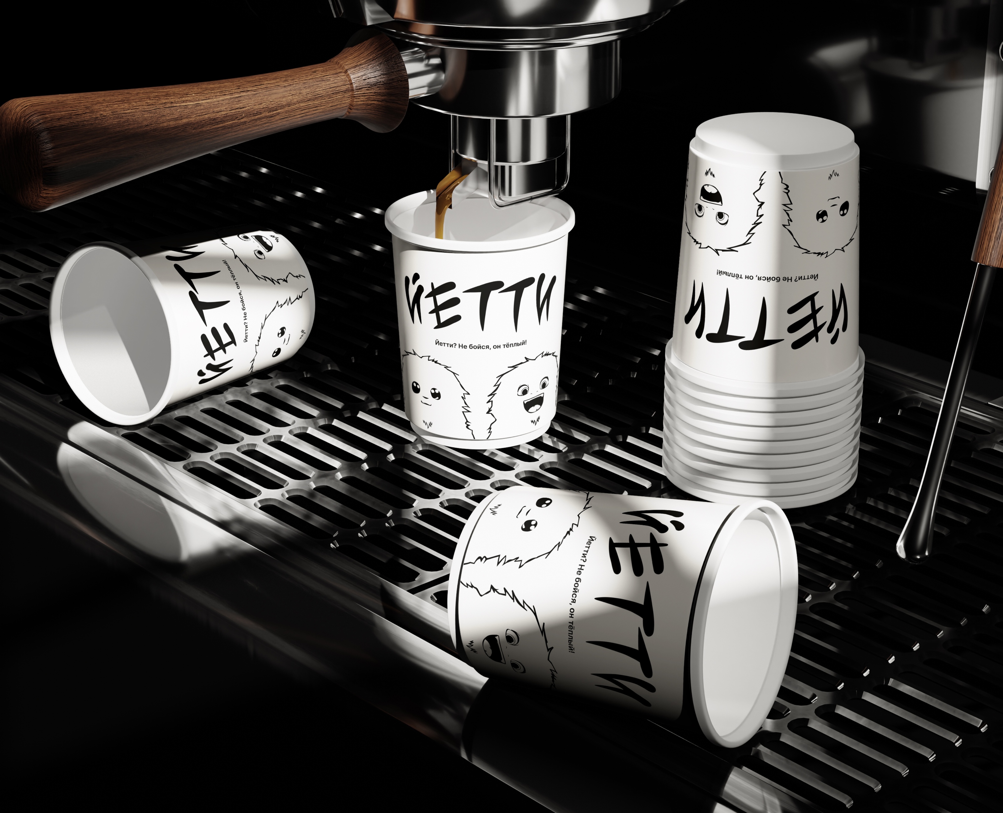
RU
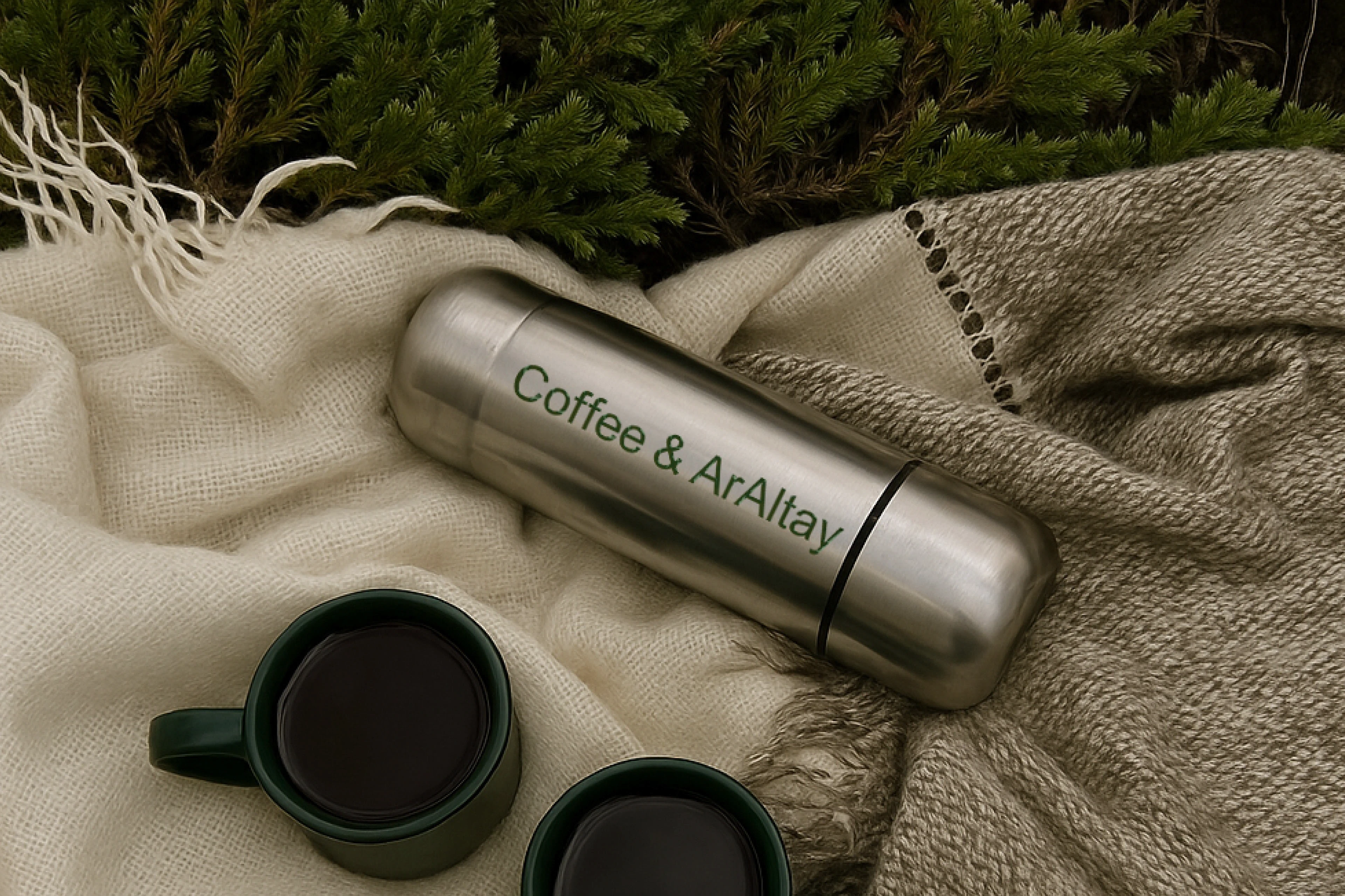
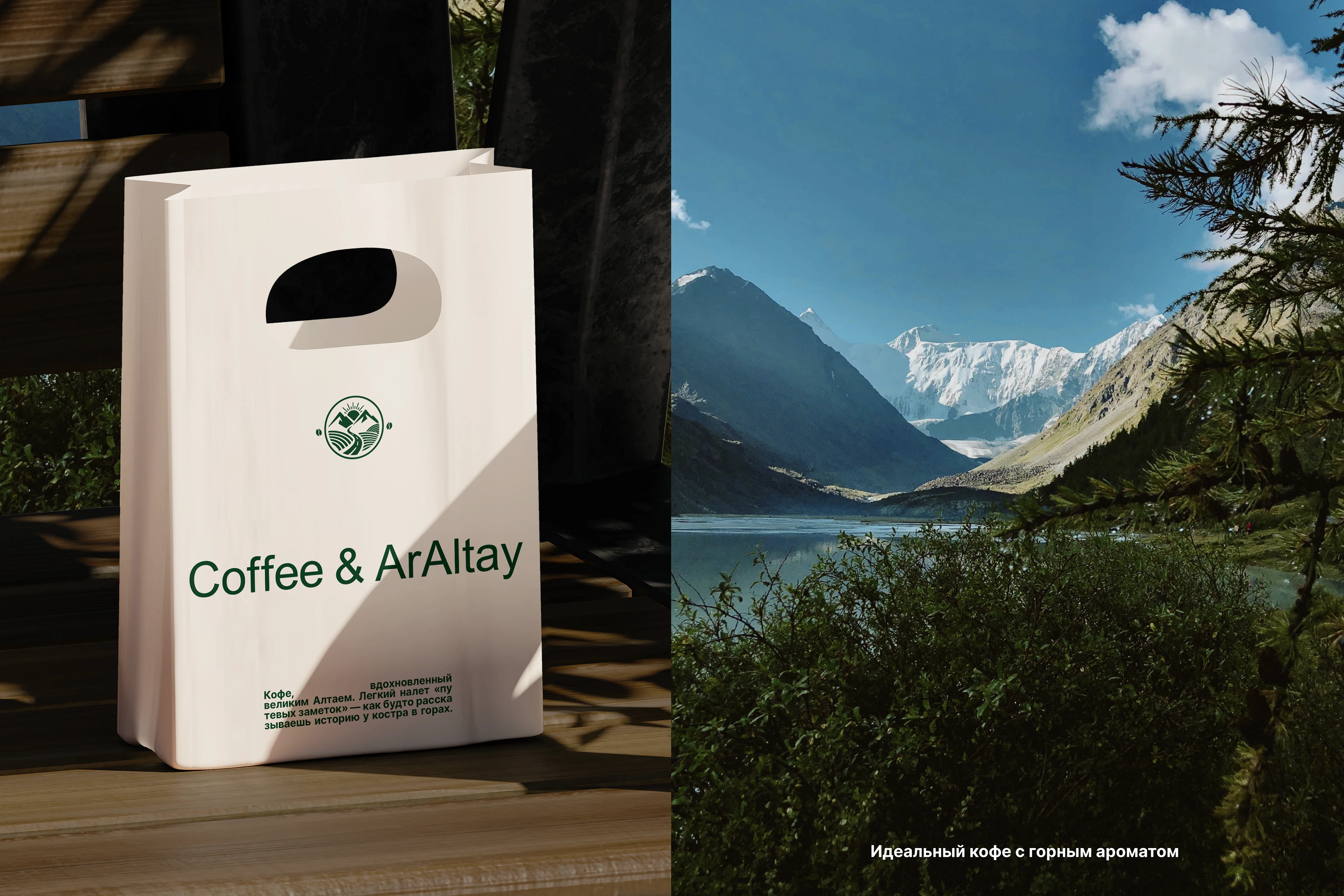
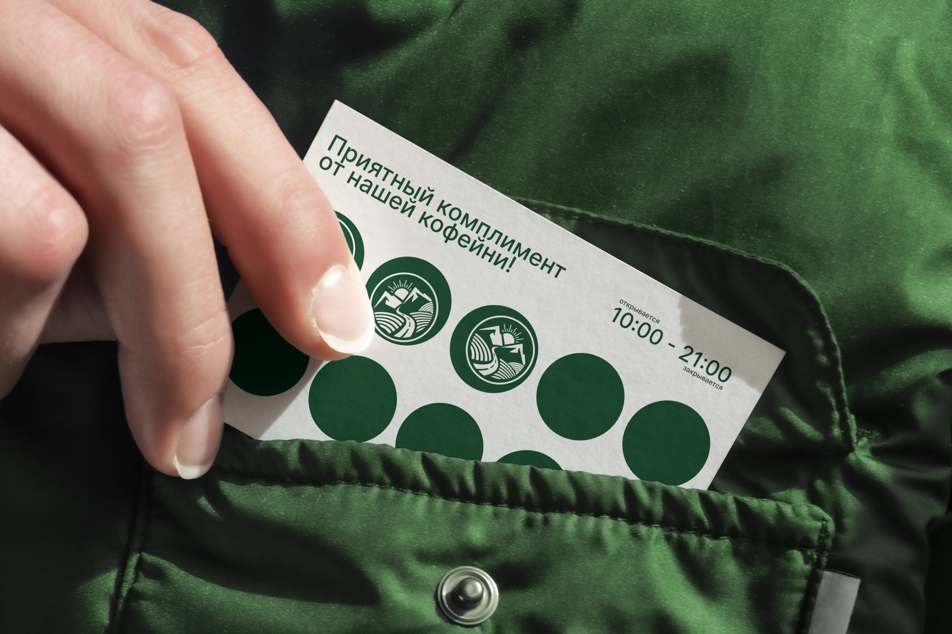
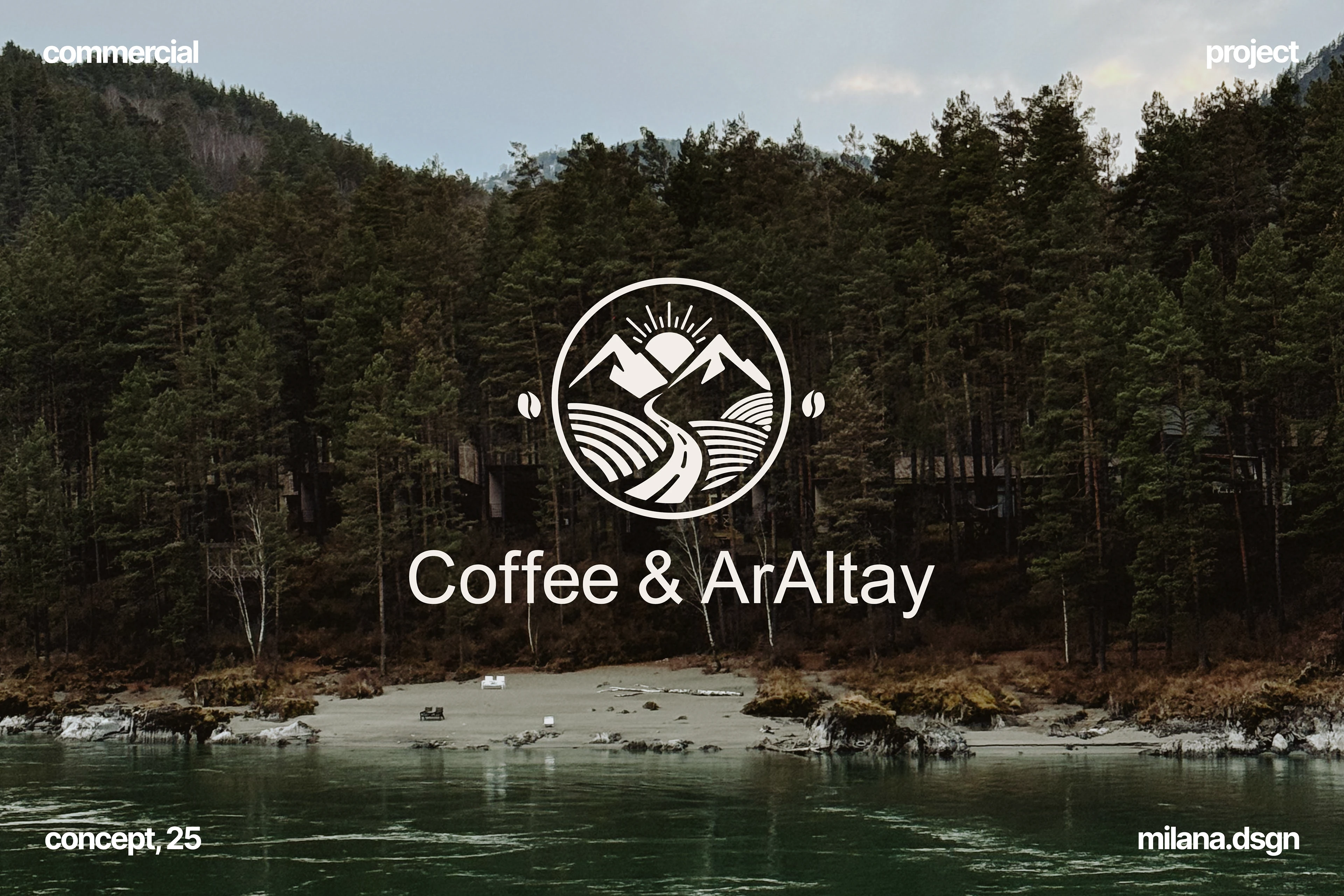
Coffee & ArAltay — это про горы, дороги и кофе с ароматом свободы. Мы создали айдентику, которая стала не просто «знаком», а настоящим символом пути: от утреннего глотка кофе до больших путешествий.
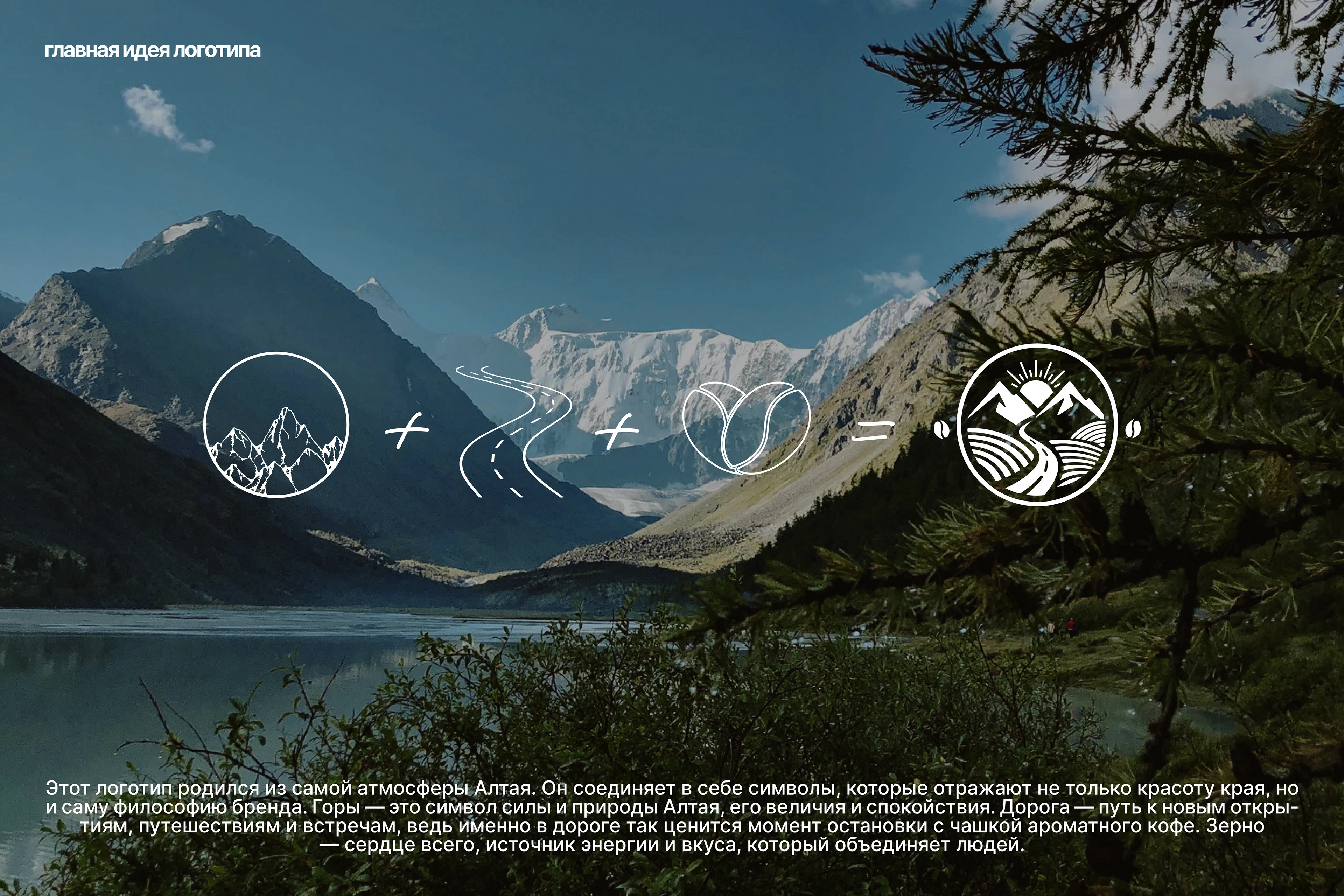
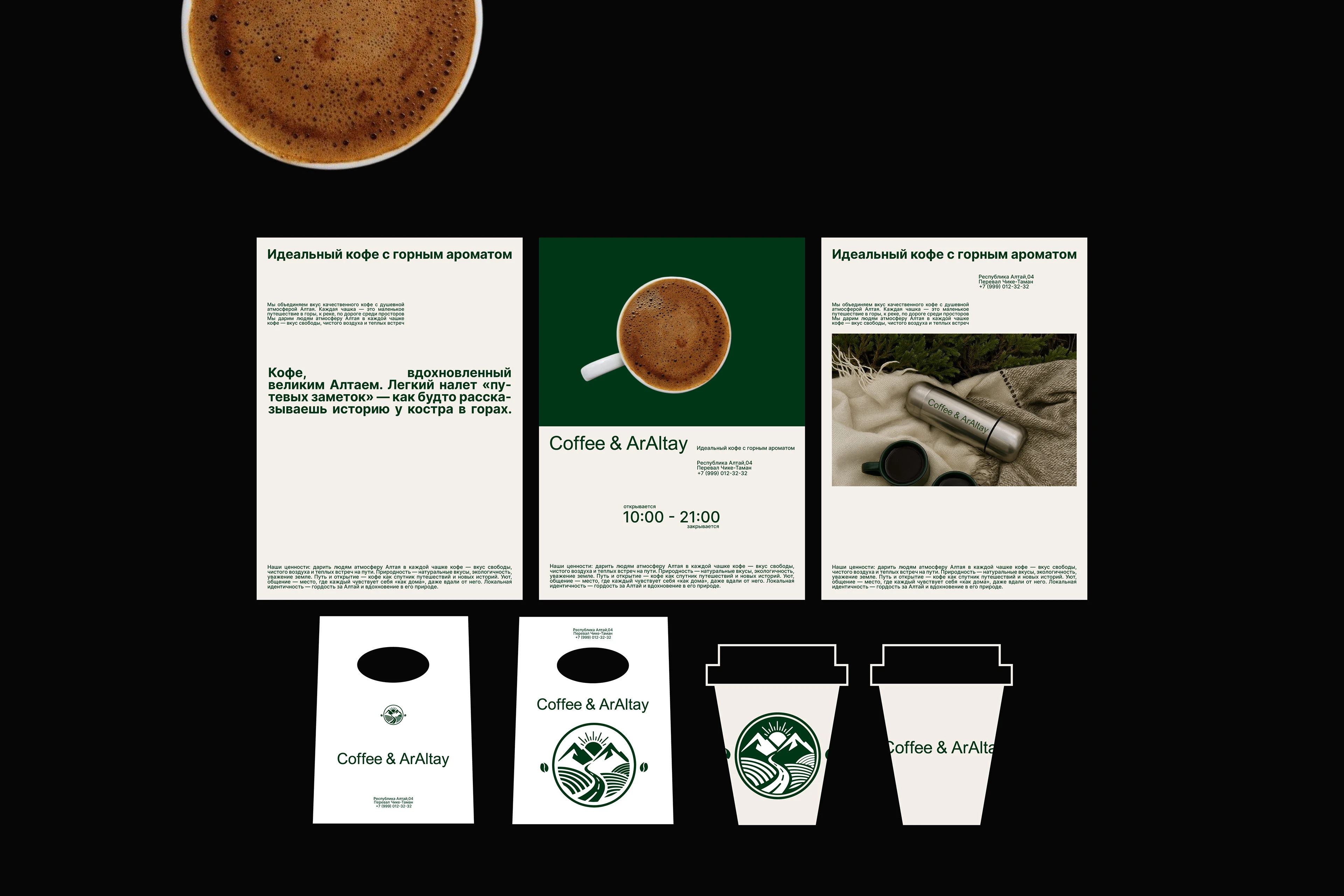
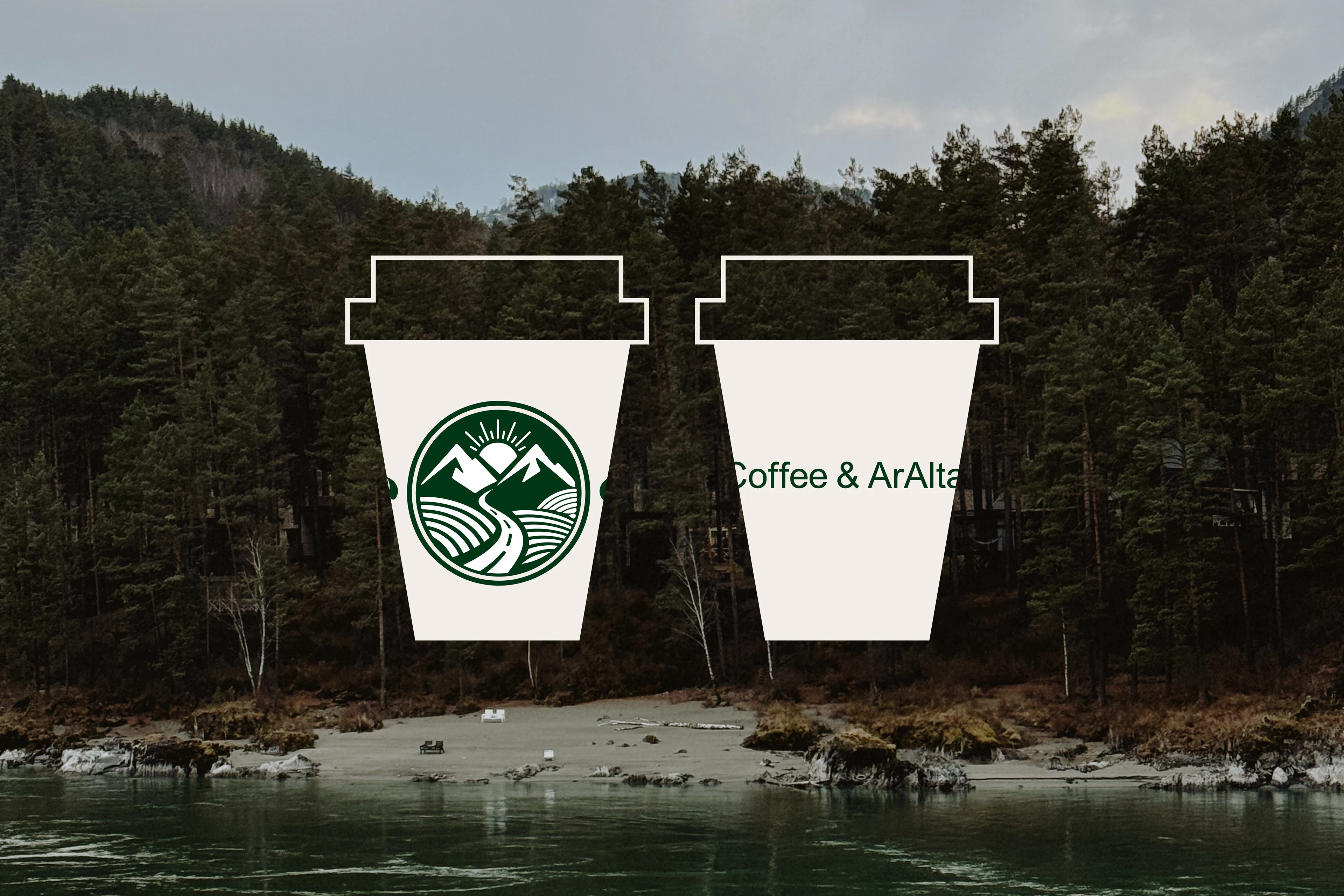
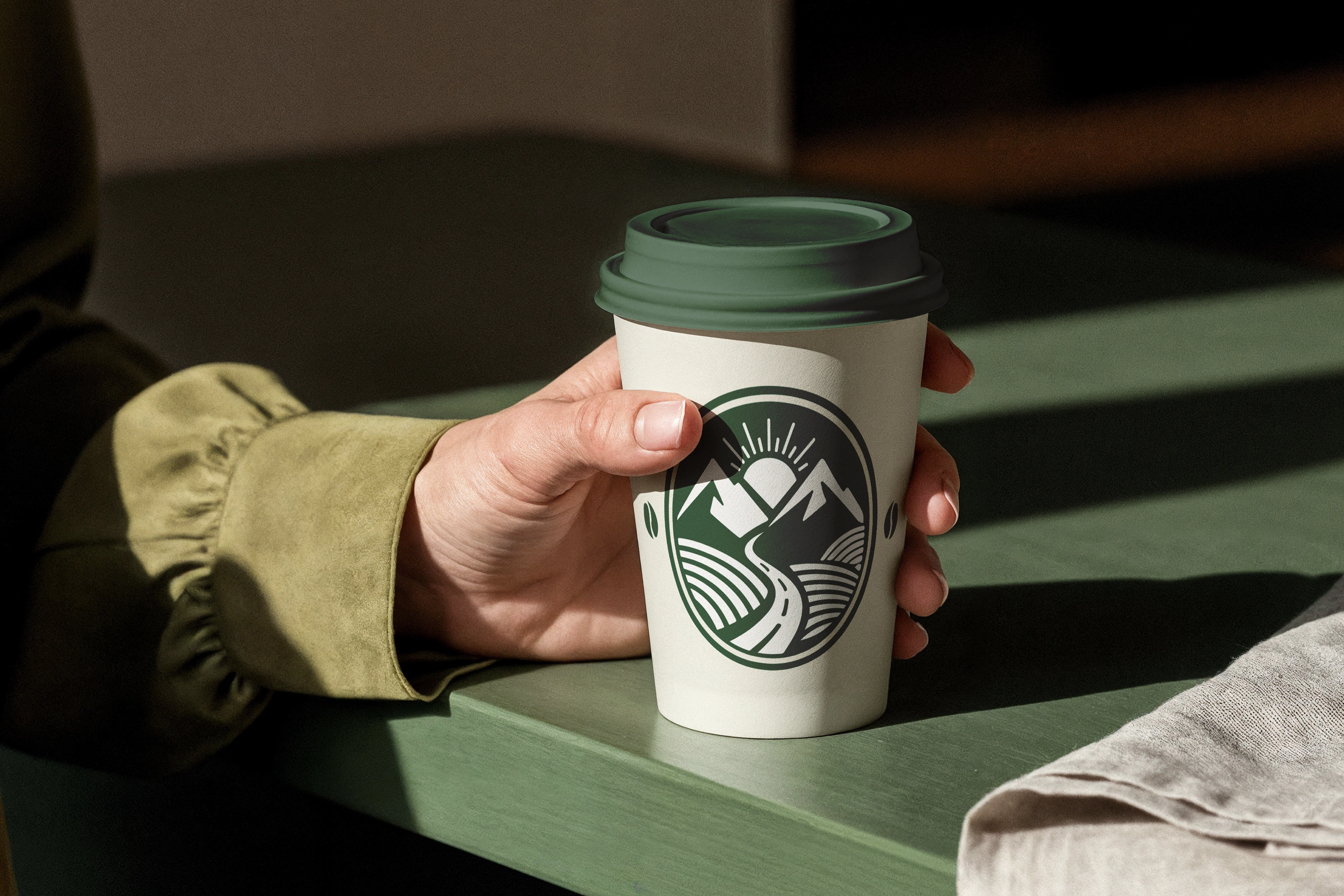
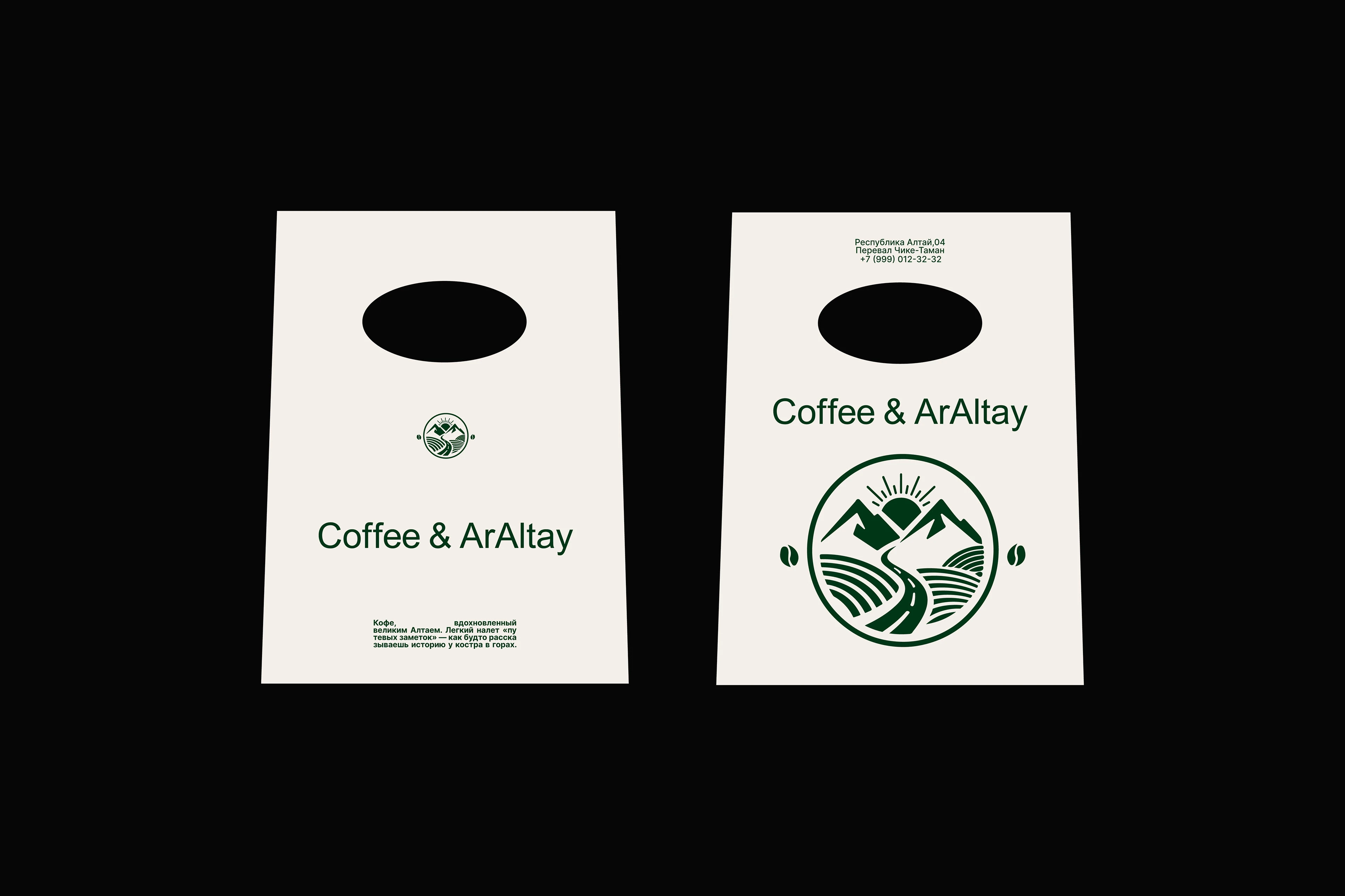
Идея логотипа
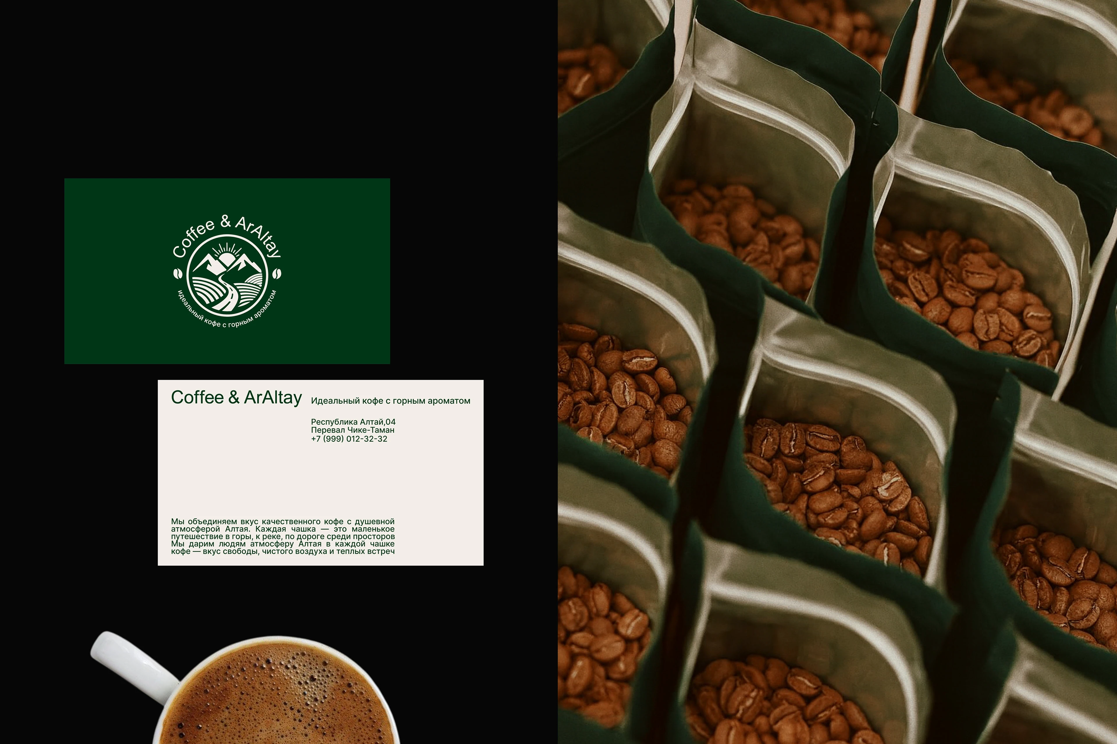
Знак объединяет в себе три ключевых символа, отражающих красоту Алтая и философию бренда:
Горы — сила природы, её величие и спокойствие.
Дорога — путь к новым открытиям и встречам. Именно в дороге особенно ценится момент остановки с чашкой кофе.
Зерно — сердце бренда, источник энергии и вкуса, который объединяет людей.
Дизайн
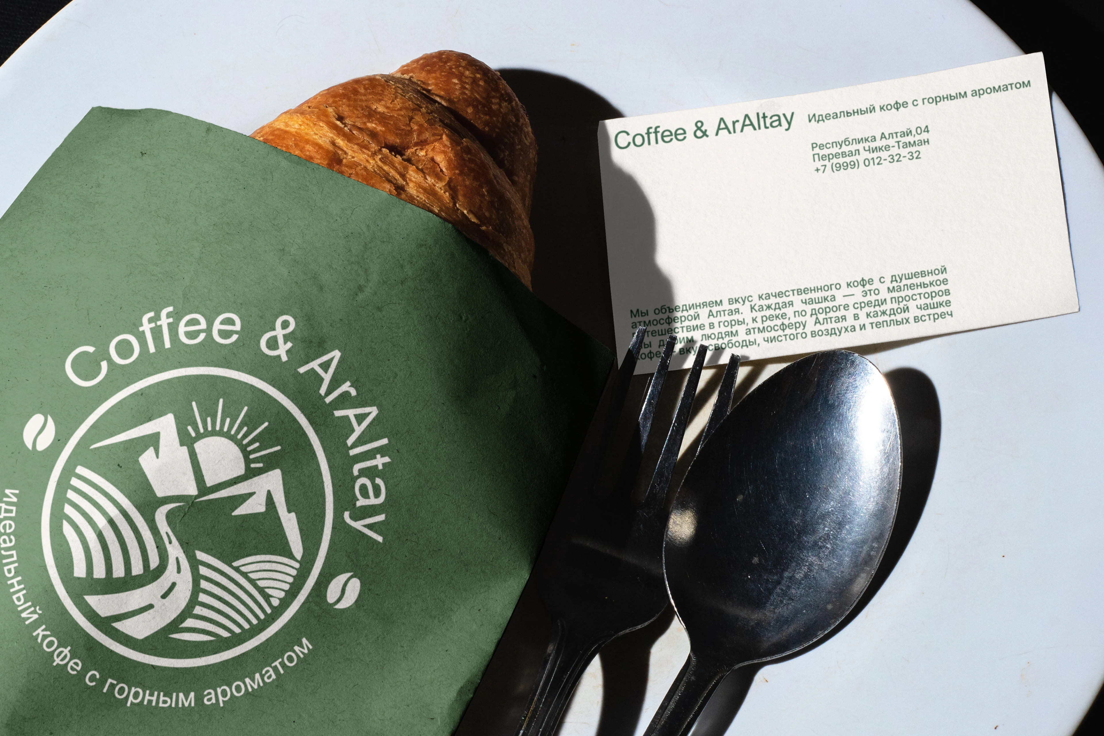
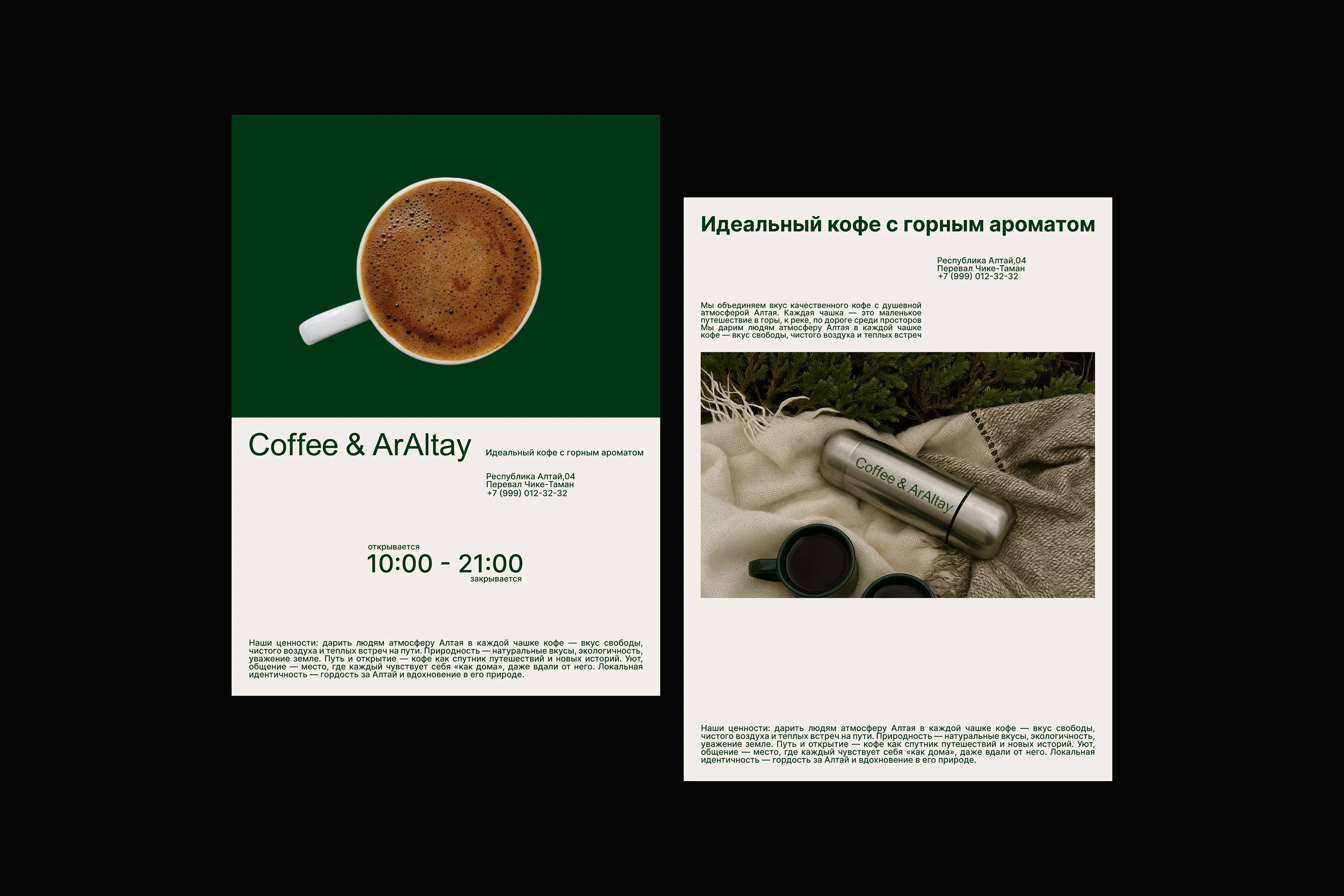
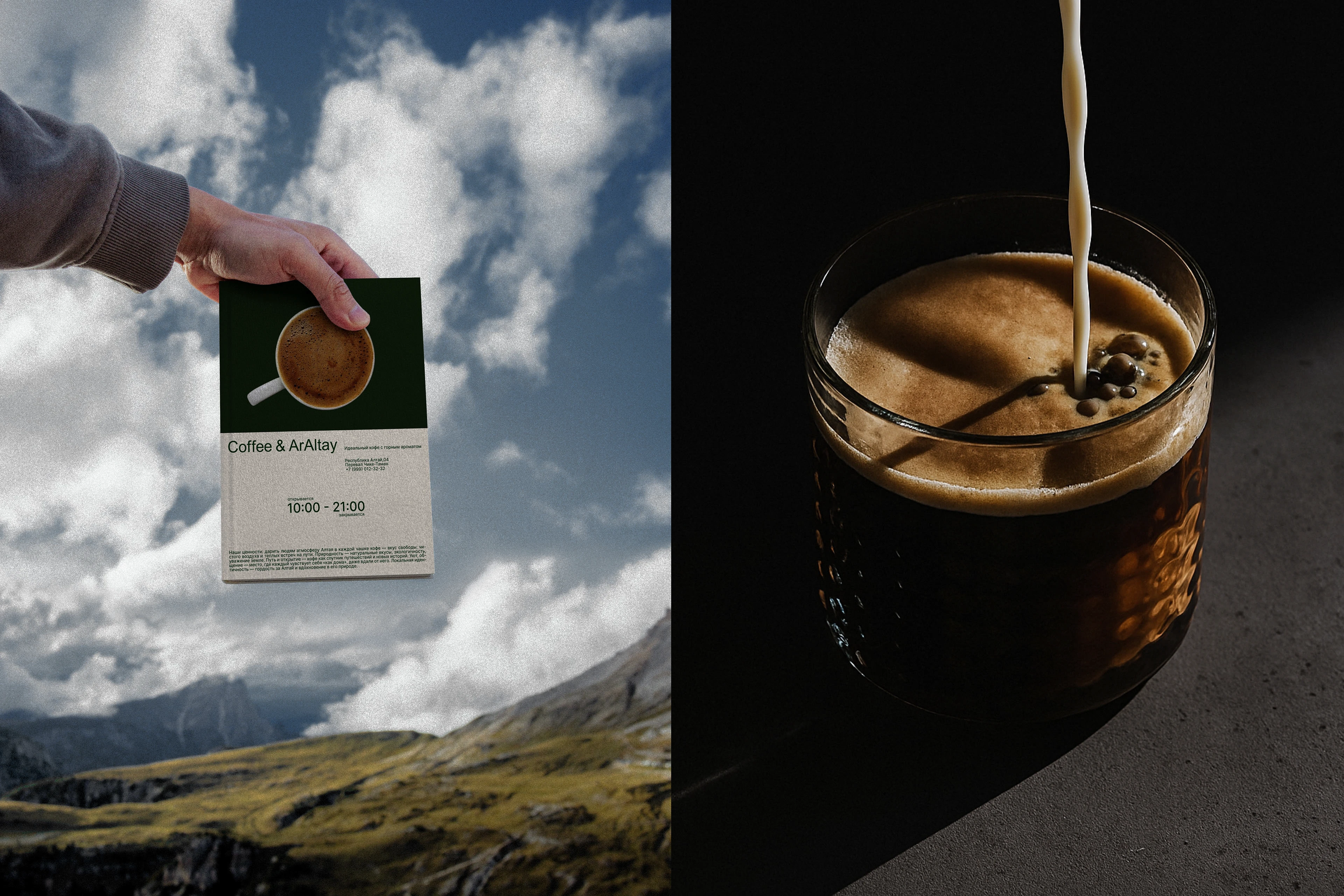
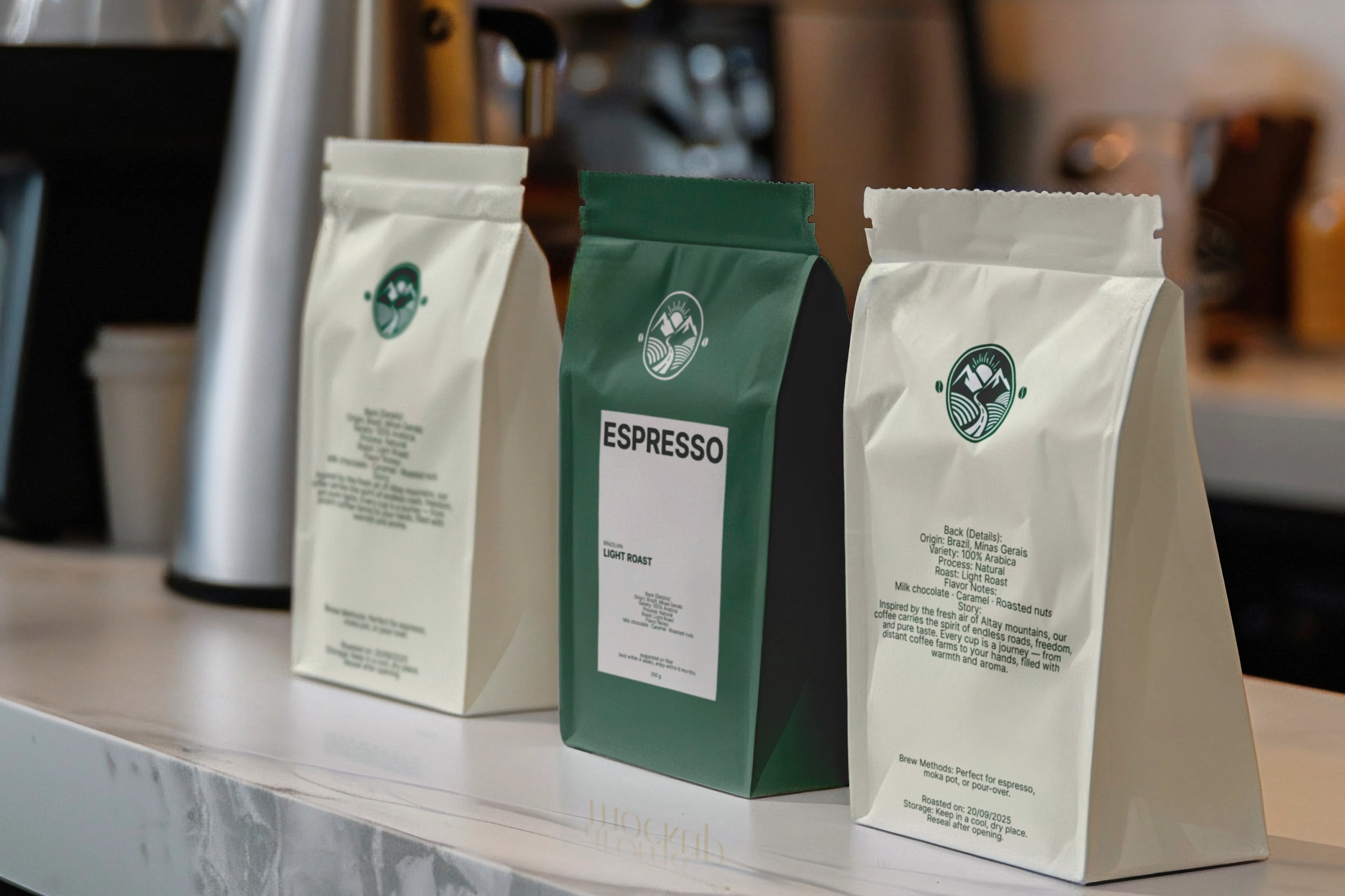
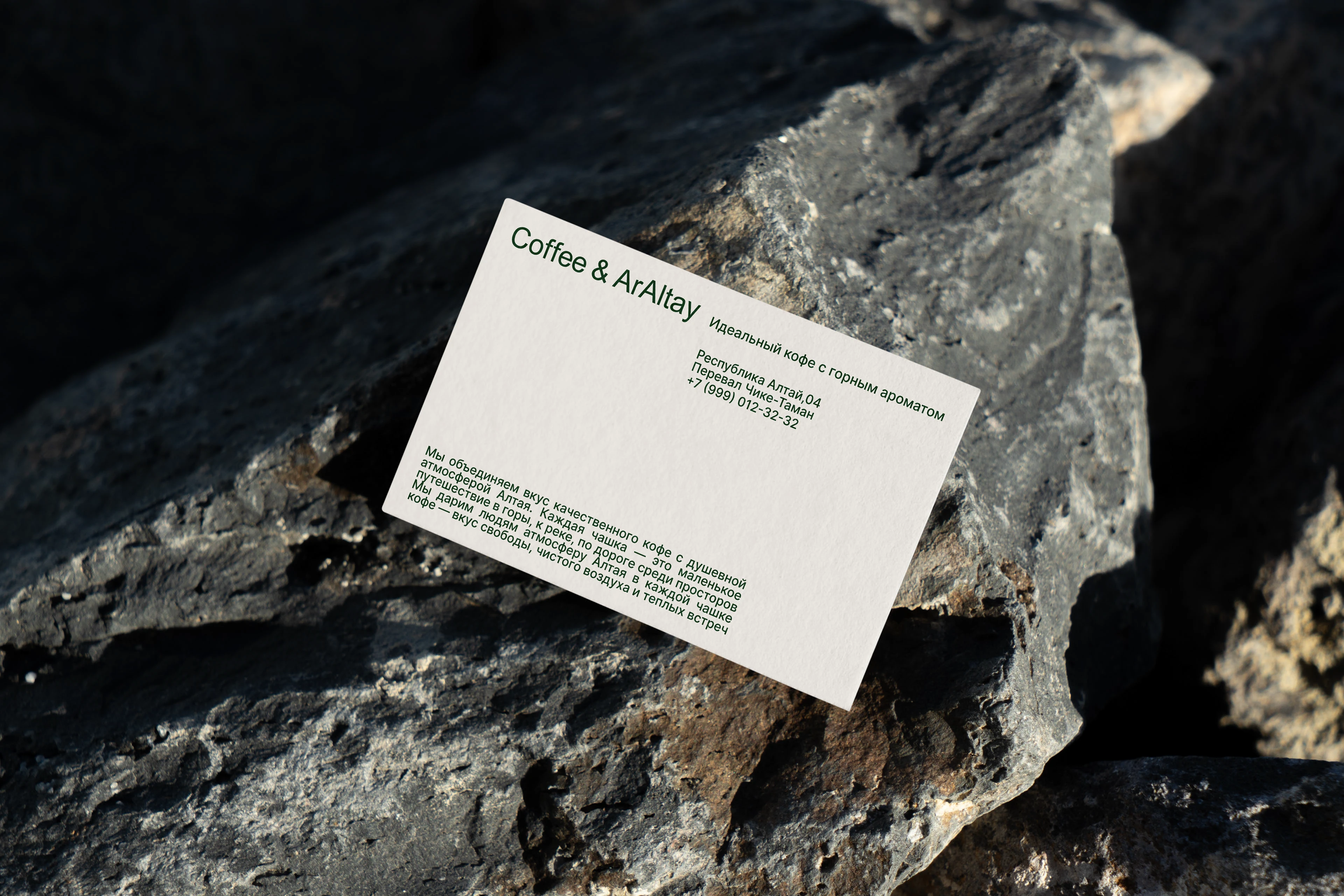
Айдентика построена на принципах чистоты и минимализма — именно таким хотел видеть бренд заказчик. Простые формы, природные оттенки и лёгкая типографика создают современный и узнаваемый визуальный образ. Дизайн не перегружен деталями, а подчёркивает главное — кофе и атмосферу, которая возникает вокруг него.
ENG
Coffee & ArAltay is about mountains, roads and coffee with the aroma of freedom. We have created an identity that has become not just a "sign", but a real symbol of the journey: from a morning sip of coffee to big trips.
Logo Idea
The sign combines three key symbols that reflect the beauty of Altai and the brand's philosophy: Mountains are a force of nature, its greatness and tranquility. The road is a path to new discoveries and meetings. It is on the road that the moment of stopping with a cup of coffee is especially appreciated. Grain is the heart of the brand, a source of energy and taste that unites people.
Design
The identity is based on the principles of cleanliness and minimalism, which is exactly what the customer wanted the brand to look like. Simple shapes, natural shades and light typography create a modern and recognizable visual image. The design is not overloaded with details, but emphasizes the main thing — coffee and the atmosphere that arises around it.
COMMERCIAL PROJECT
DESIGNER: Torbogosheva Milana TELEGRAM / INSTAGRAM