🏆 KUBOK SIBIRI 2025 — Taekwon-Do ITF Championship Identity
Sport Branding / Visual Identity / Event Design
🏆 KUBOK SIBIRI 2025 — Taekwon-Do ITF Championship Identity
Sport Branding / Visual Identity / Event Design
🎯 Project Overview
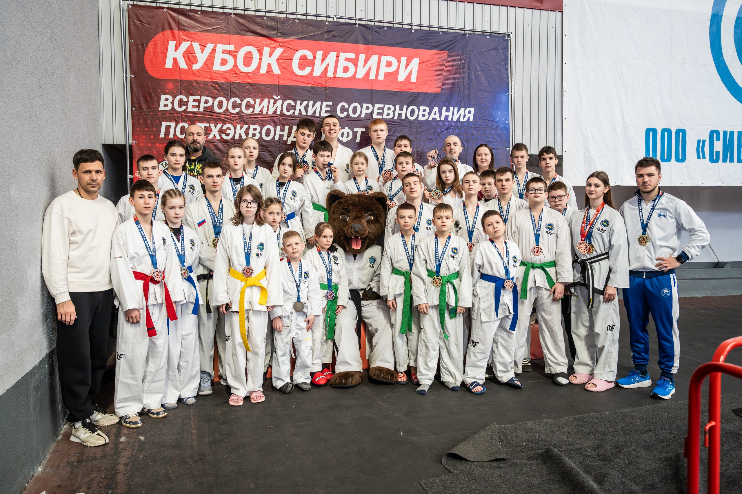
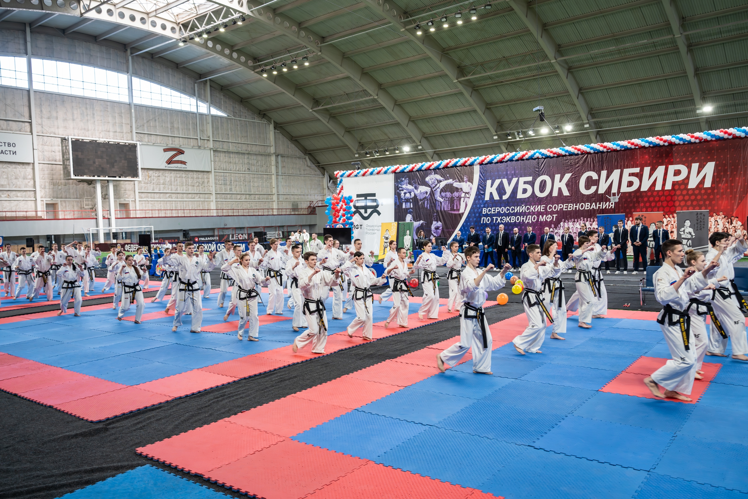
The KUBOK SIBIRI (Siberian Cup) is a large-scale all-Russian Taekwon-Do ITF championship held in Omsk, Russia.
The event brings together over 2000 athletes from all over the country — a unifying platform of strength, movement, and sportsmanship.
Our goal was to create a comprehensive identity system that visually captures the power and discipline of Taekwon-Do while reflecting the cold, proud spirit of Siberia.
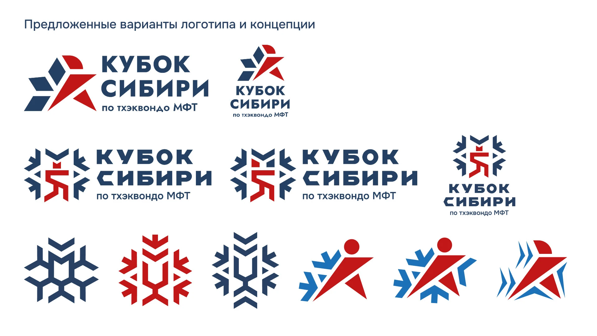
🧩 Concept
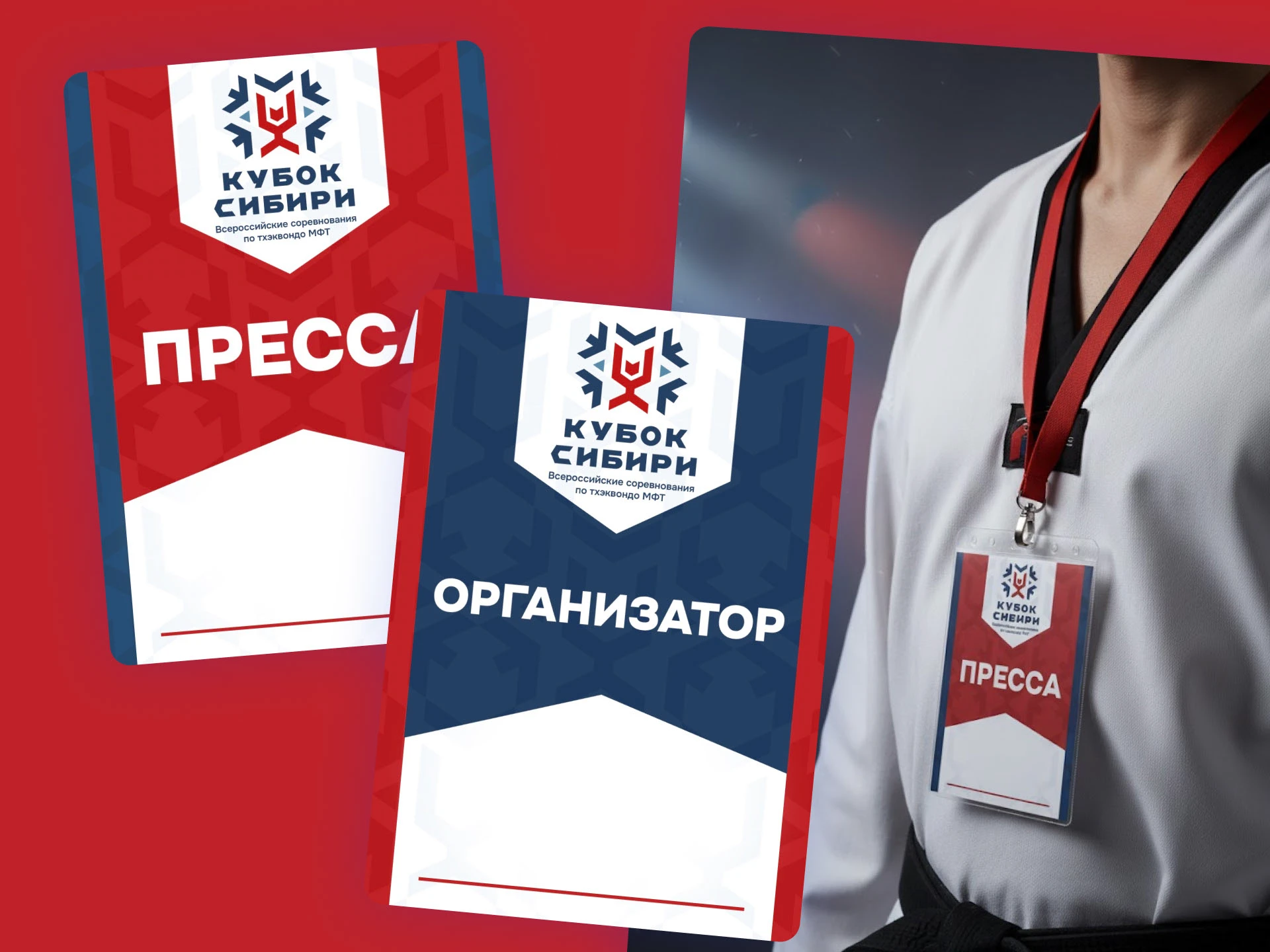
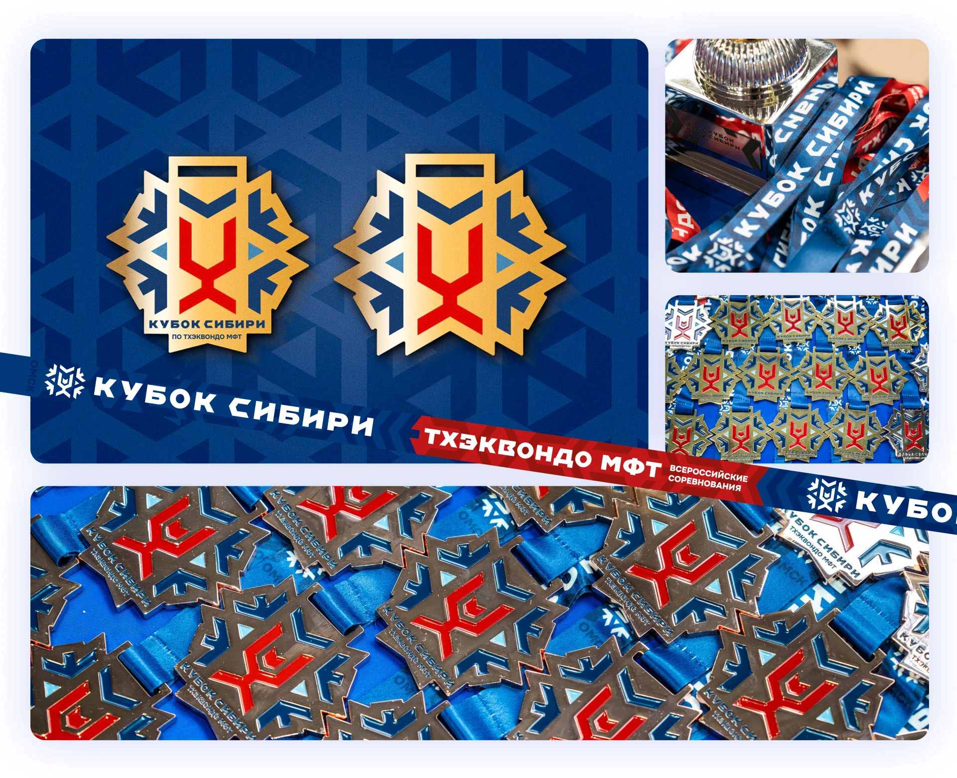
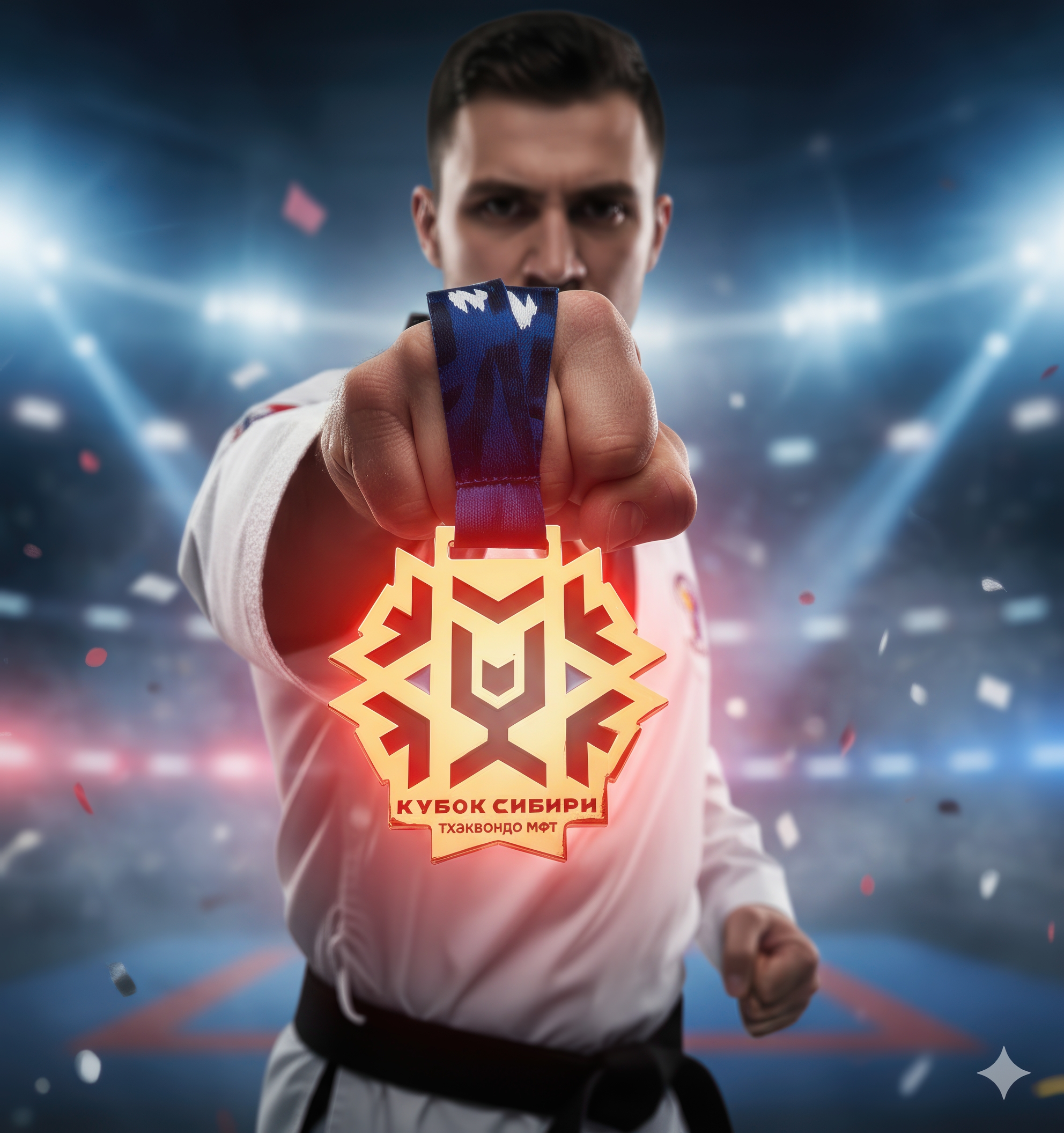
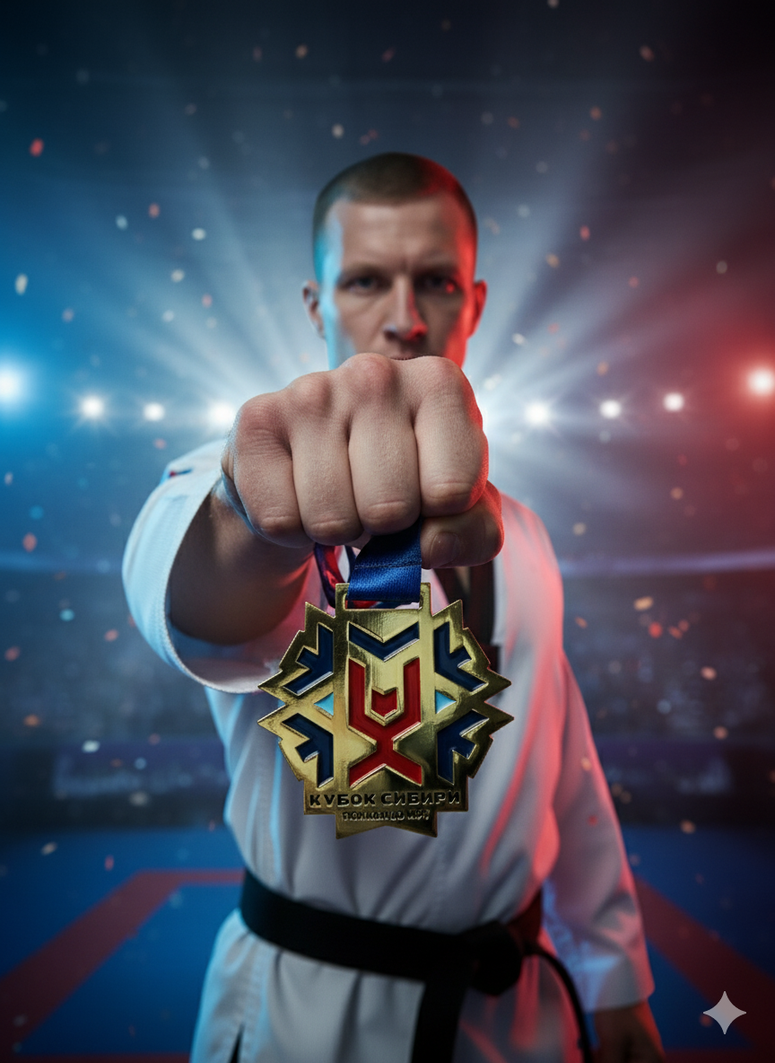
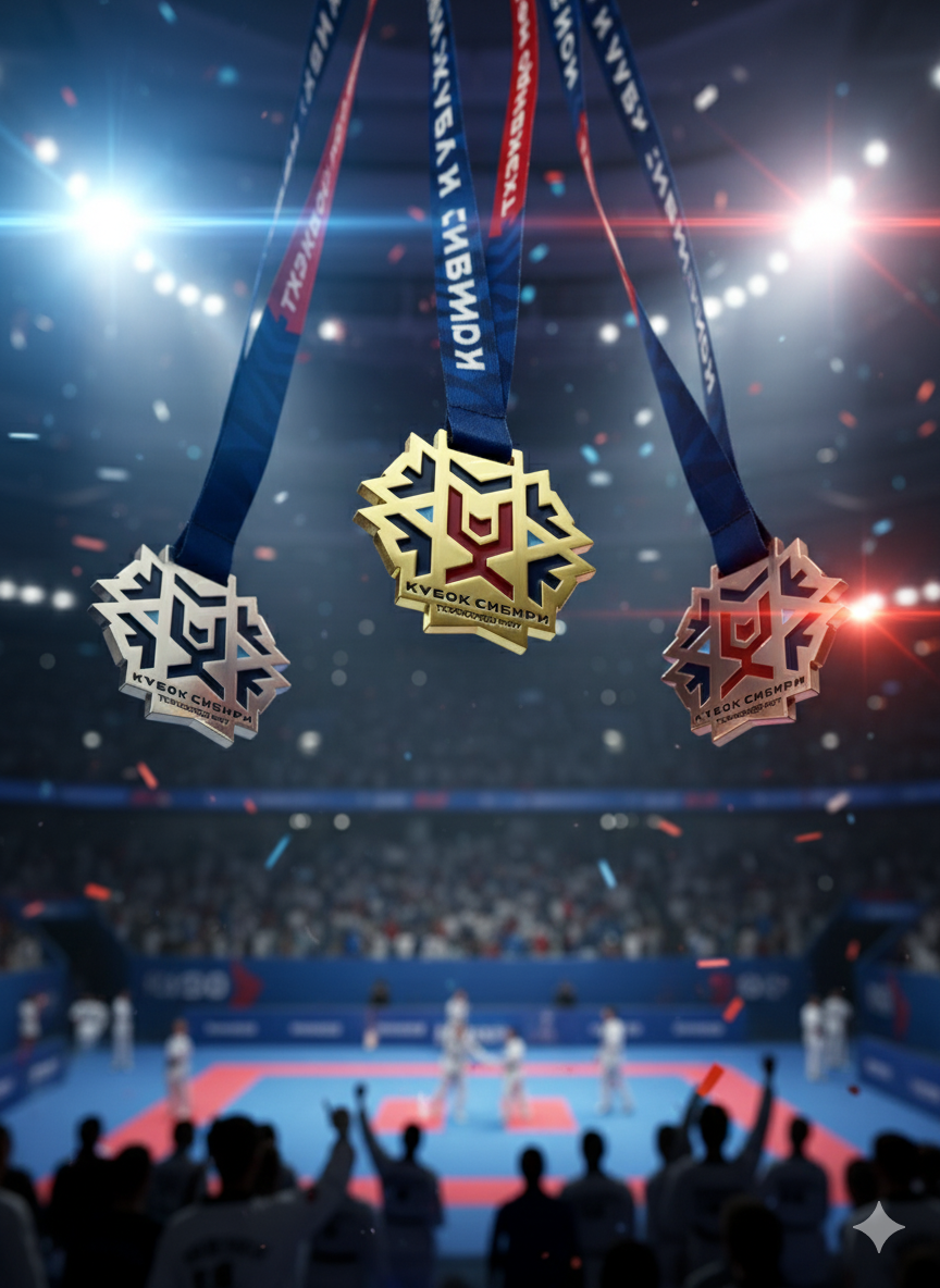
The logo is built on a powerful geometric foundation — a combination of snowflake, cup, and human figure that symbolizes victory, unity, and motion towards the center.
Each element is hand-drawn and balanced by precise geometry:
❄️ Snowflake — symbol of Siberia
🏆 Cup — symbol of triumph
👤 Human figure — athlete, energy, victory
🔺 Letters K + С — abbreviation for Kubok Sibiri (Siberian Cup)
➡️ Directional arrows — movement towards the center, towards the Cup
The font was custom-drawn to mirror the dynamic rhythm of the logo — bold, confident, and sporty.

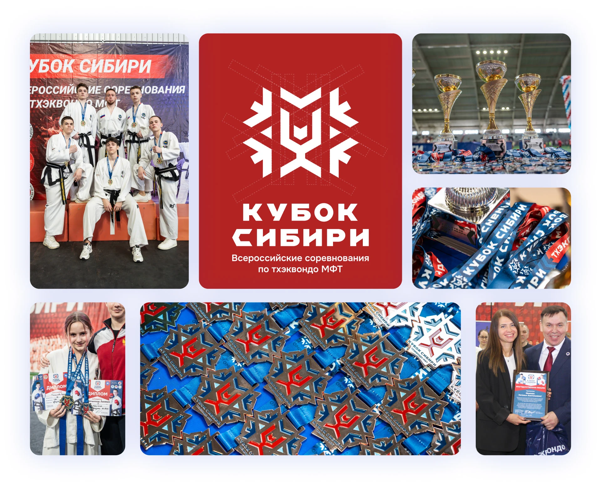
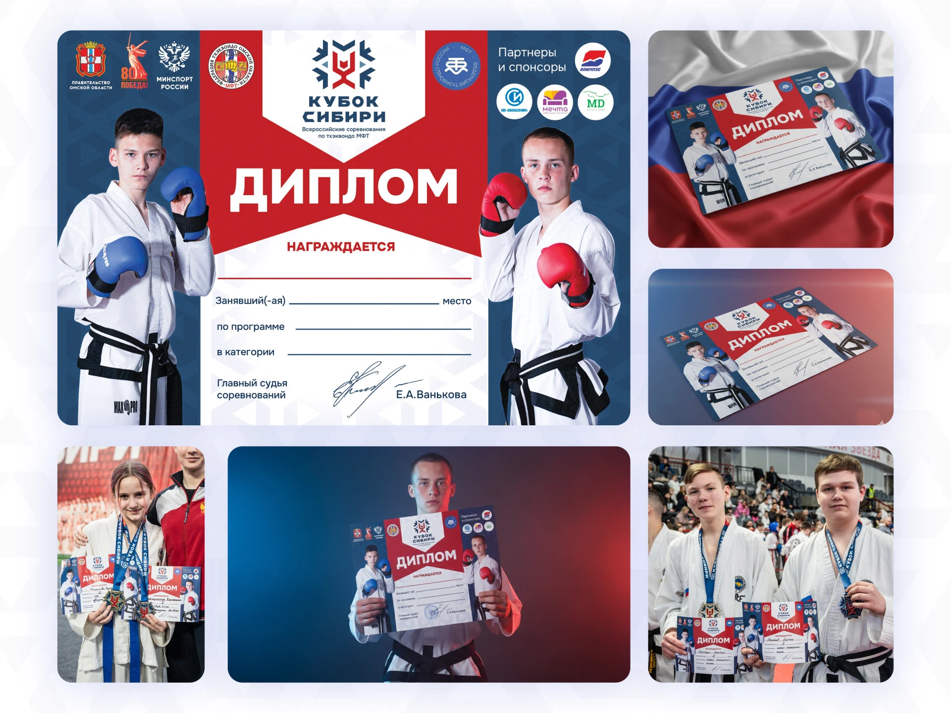
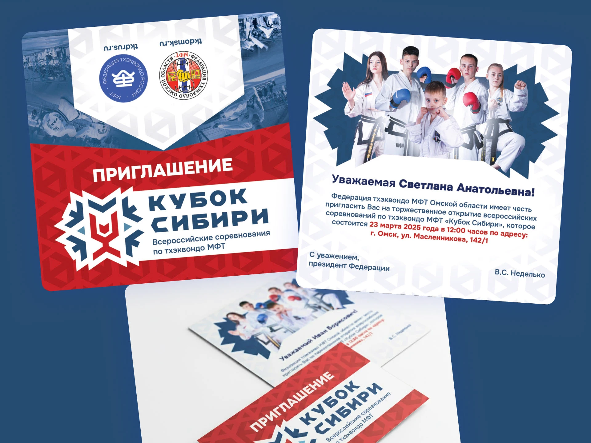
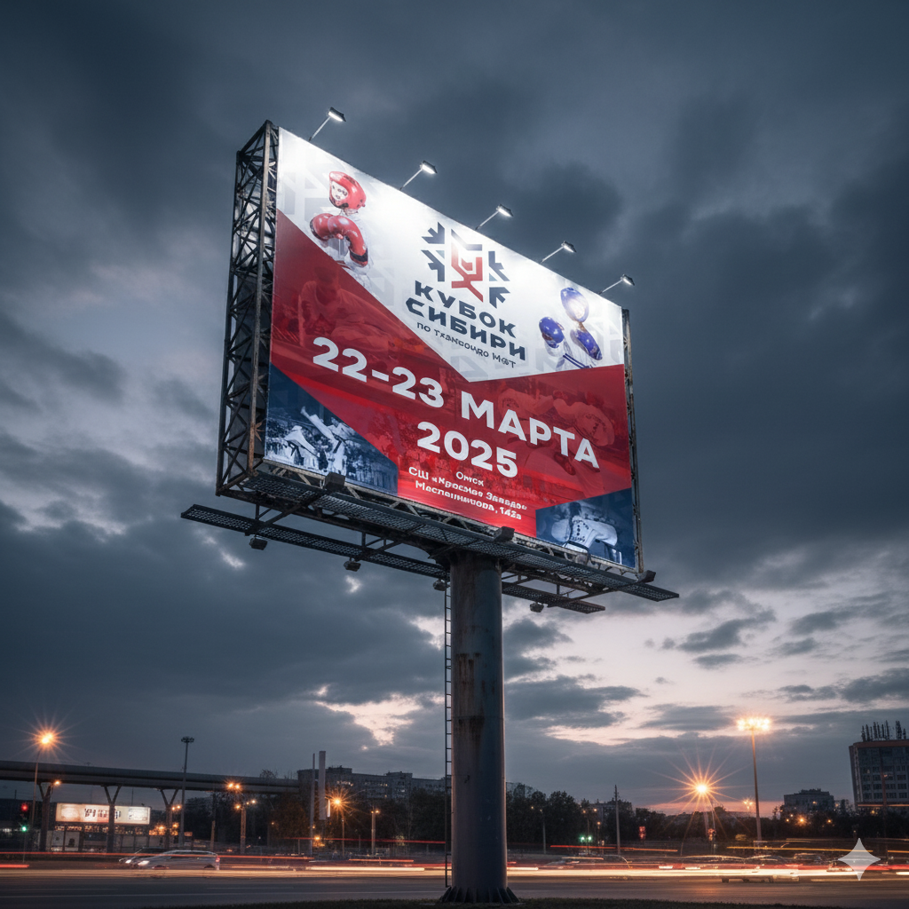
🎨 Visual System
• We developed a full visual ecosystem that united all touchpoints of the event:
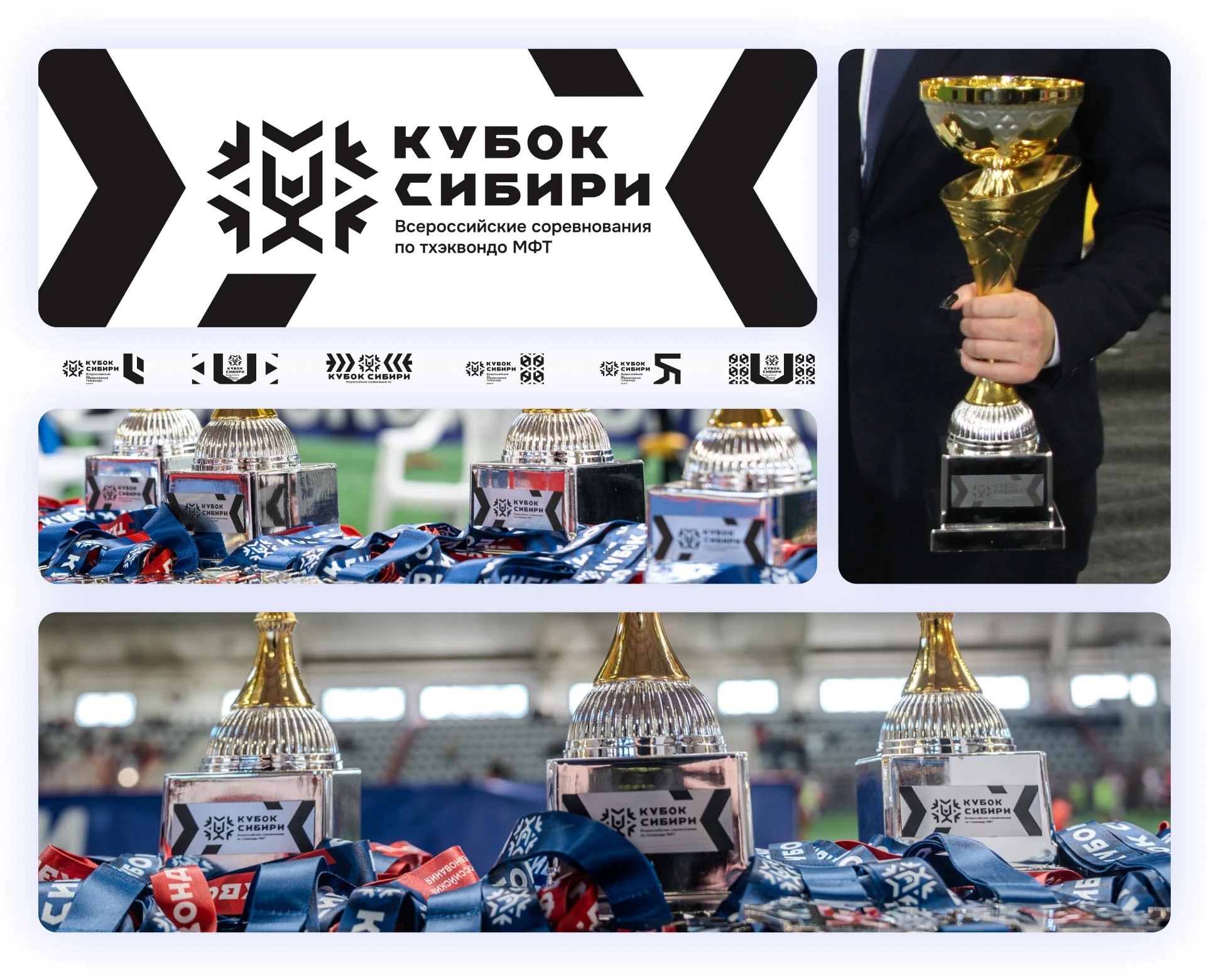
• Event logo and wordmark
• Pattern system built from logo fragments
• Color palette: red, dark navy, and light ice-blue — inspired by the Russian tricolor and the frosty Siberian tone
• Typography reflecting power and clarity
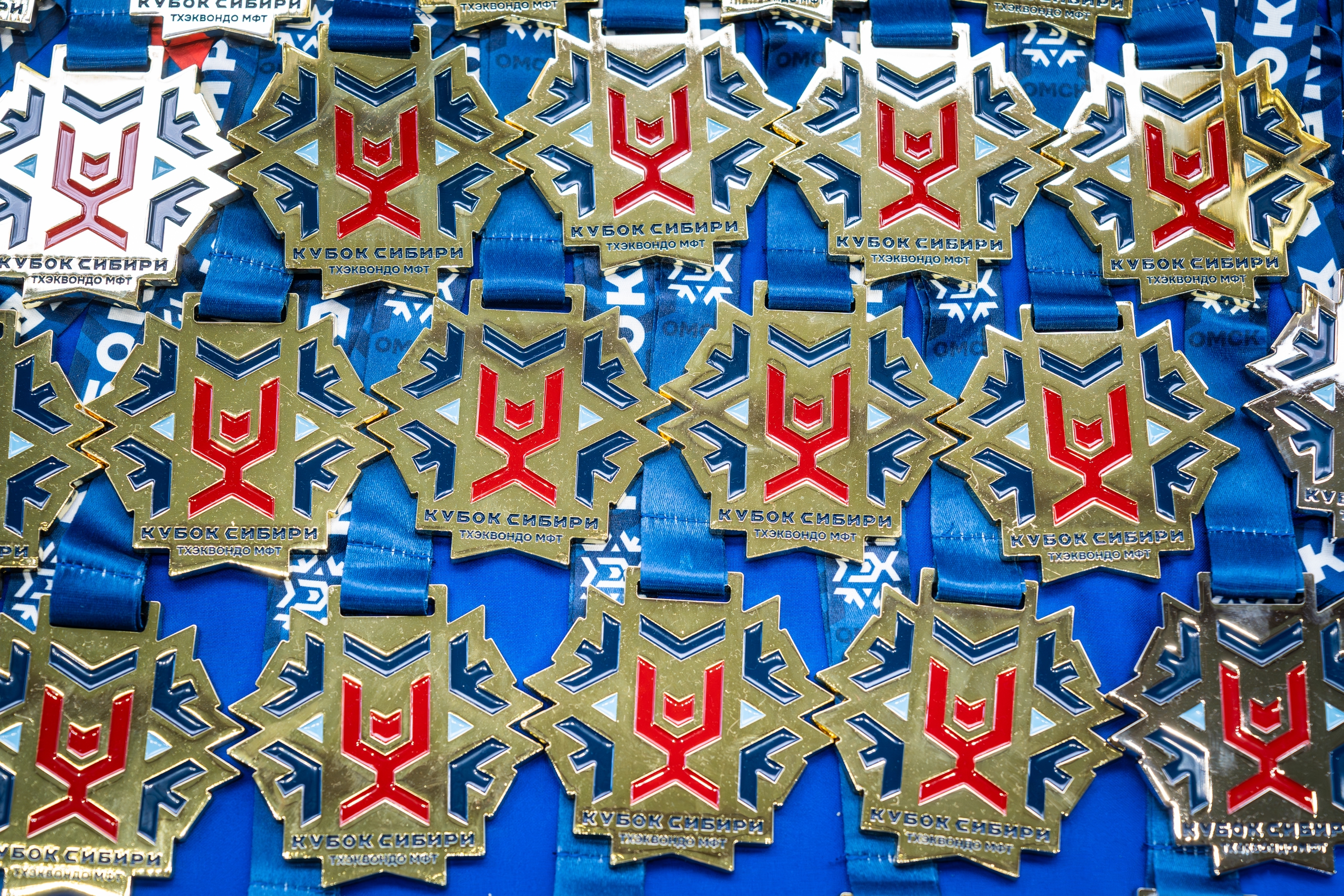
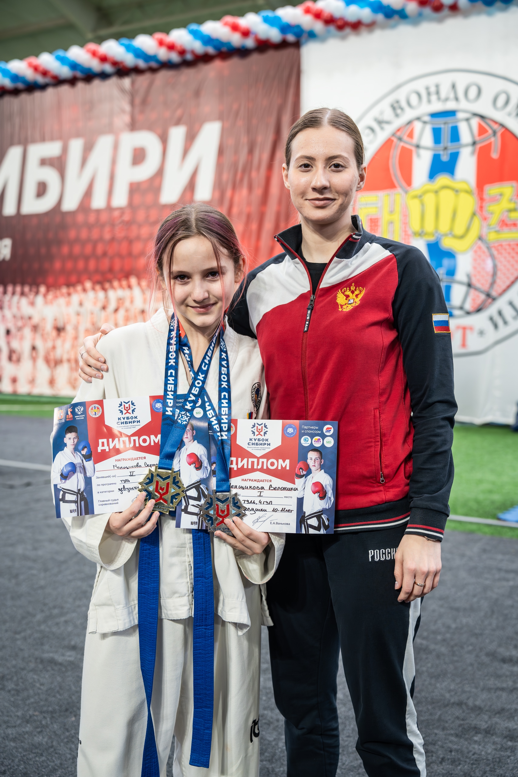
• Medal design, ribbons, and engraving
• Certificates, invitations, badges, merchandise
• Social media visuals and arena navigation
🥇 Key Deliverables
• Brand Identity
• Medal Design
• Diploma and Certificate Design
• Invitations and Tickets
• Merch (cups, T-shirts)
• Social Media Design
• Navigation System
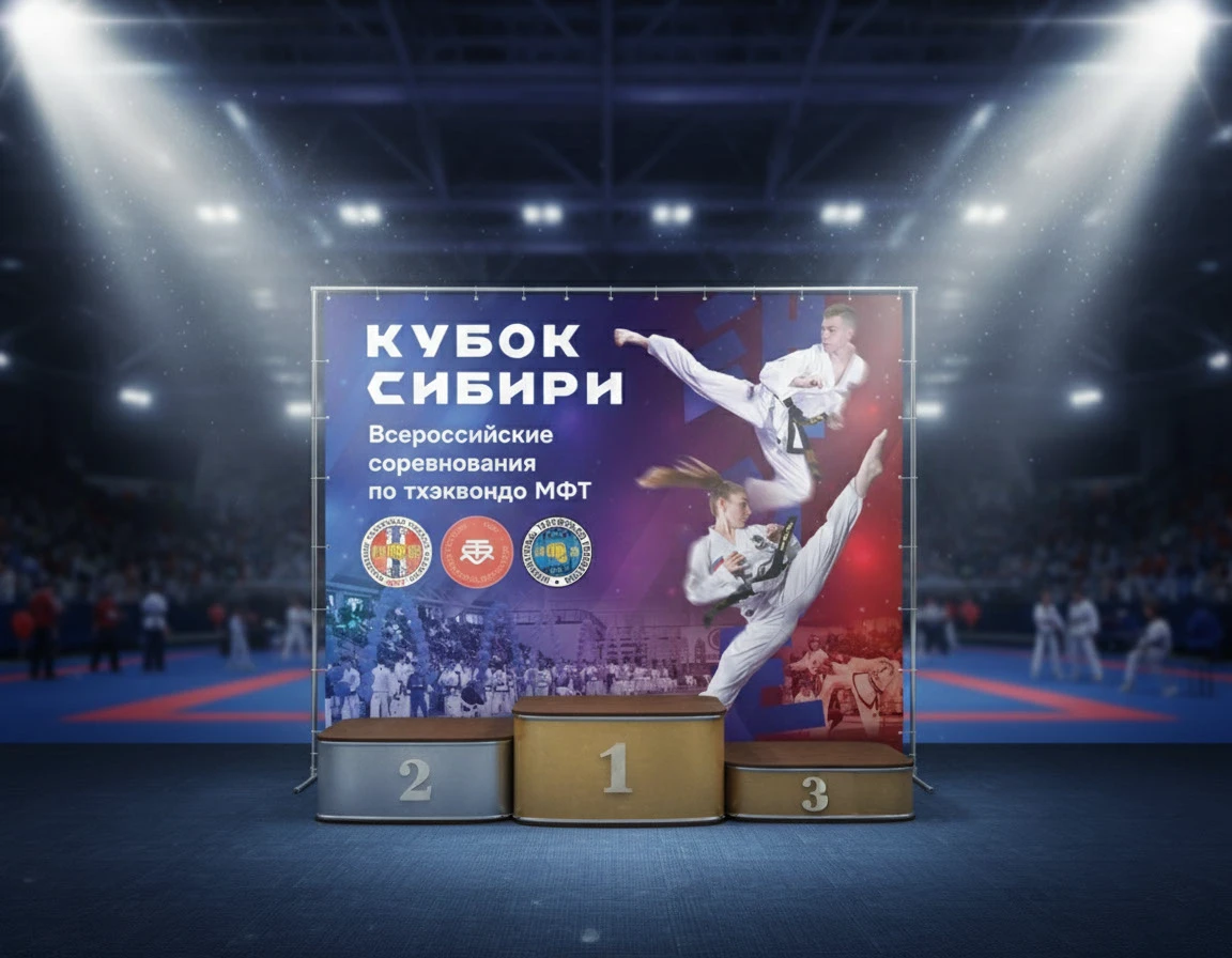
• Stage and Award Backdrops
⚙️ Implementation
All elements were unified into one system for print, digital, and environmental design.
The visual rhythm of diagonals and dynamic shapes created continuity across every medium — from banners to Instagram stories.
The medals were produced in three finishes — gold, silver, and bronze — with embossed details and colored enamel, reflecting the logo geometry.


📸 Event Impact
Over 2000 athletes and spectators attended the championship.
The visual system became a key factor in the event’s recognizability, used across all regions and national Taekwon-Do ITF media.
The new identity emphasized:
• unity of regions and participants
• strength of Siberia’s sporting spirit
• clarity and prestige of the event
⚡️ Credits
Art Direction & Design: Ilya Artkost
Client: Taekwon-Do ITF Federation, Omsk Region
Location: Omsk, Russia
Year: 2025
📍 Tags
Sport Branding / Identity / Event Design / Logo Design / Visual System / Taekwon-Do / Russia / Siberia / Kubok Sibiri / Championship / Branding System

Профиль скрыт

PRO Татьяна Кузнецова

Илья Костерин
Илья Костерин
Графический дизайн

Илья Костерин
Илья Костерин
Графический дизайн
Илья Костерин
Илья Костерин
Графический дизайн
Илья Костерин
Илья Костерин
Графический дизайн
Илья Костерин
Илья Костерин
Графический дизайн

Илья Костерин
Илья Костерин
Графический дизайн
Илья Костерин
Илья Костерин
Графический дизайн
Илья Костерин
Илья Костерин
Графический дизайн
Илья Костерин
Илья Костерин
Графический дизайн
Илья Костерин
Илья Костерин
Графический дизайн