LOUDER is a brand of intimate cosmetics focused on comfort, health, and exploring one's own sexuality.
They emphasize that proper care of intimate areas is the first step toward self-discovery and quality sensations.
The brand also focuses on breaking taboos: they strive to reduce the stigma surrounding intimate topics and create a space for open conversation about sex, desires, and the body.
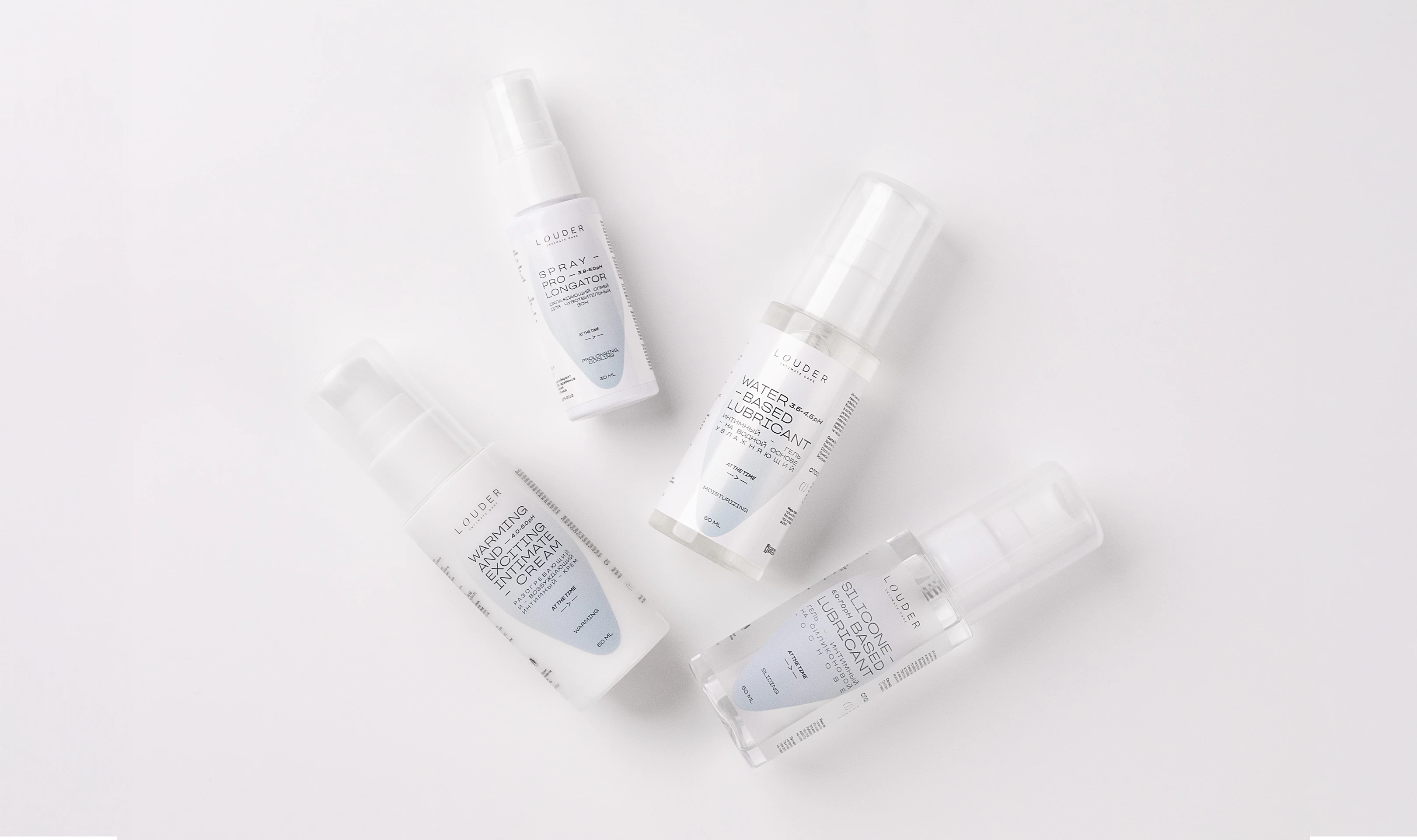
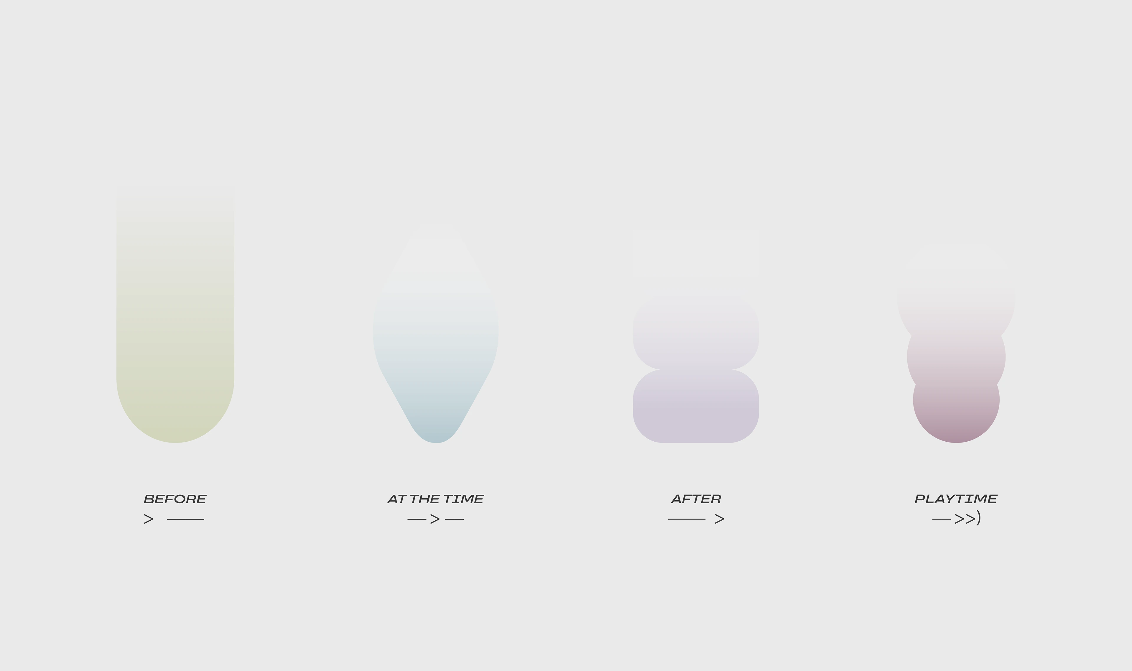
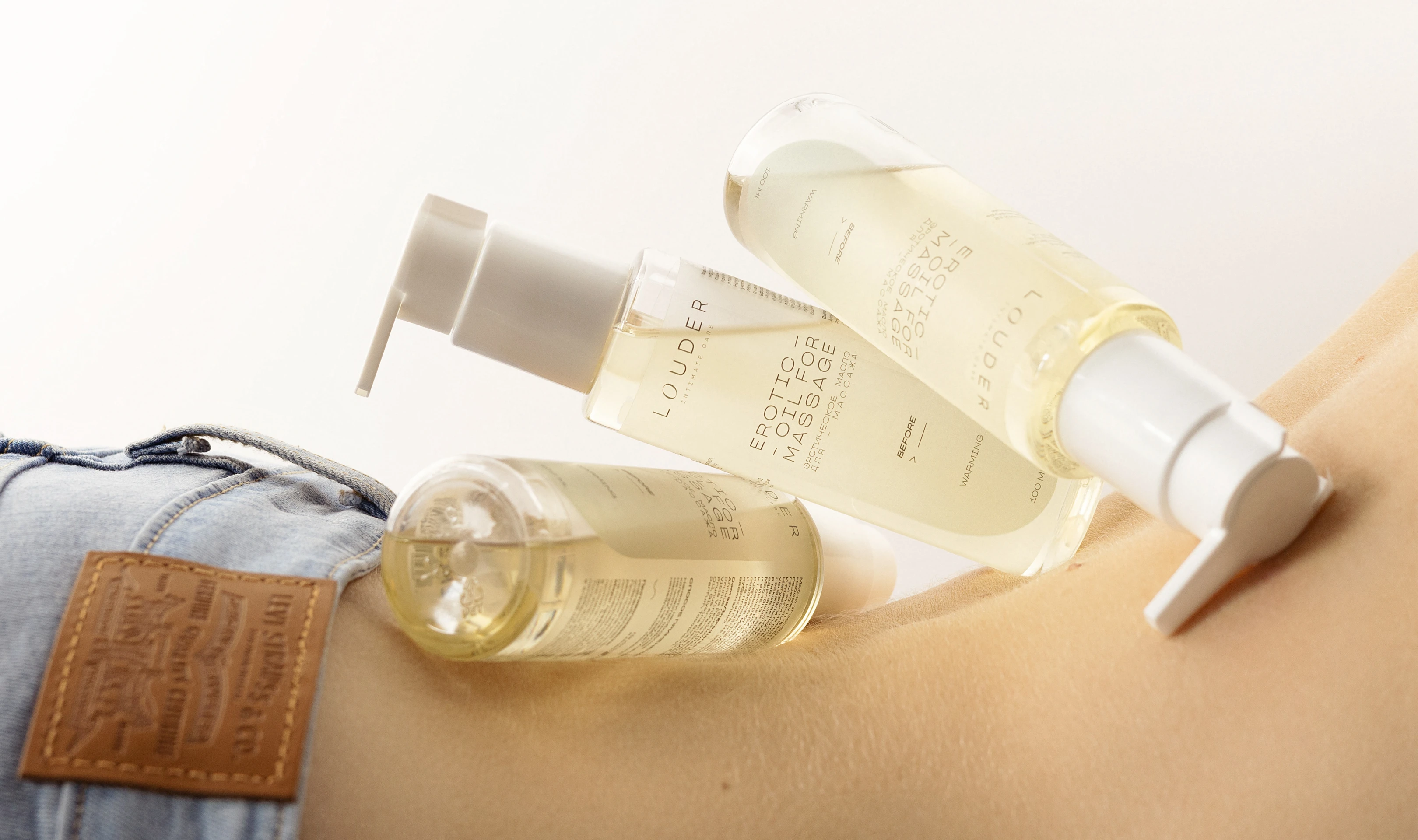
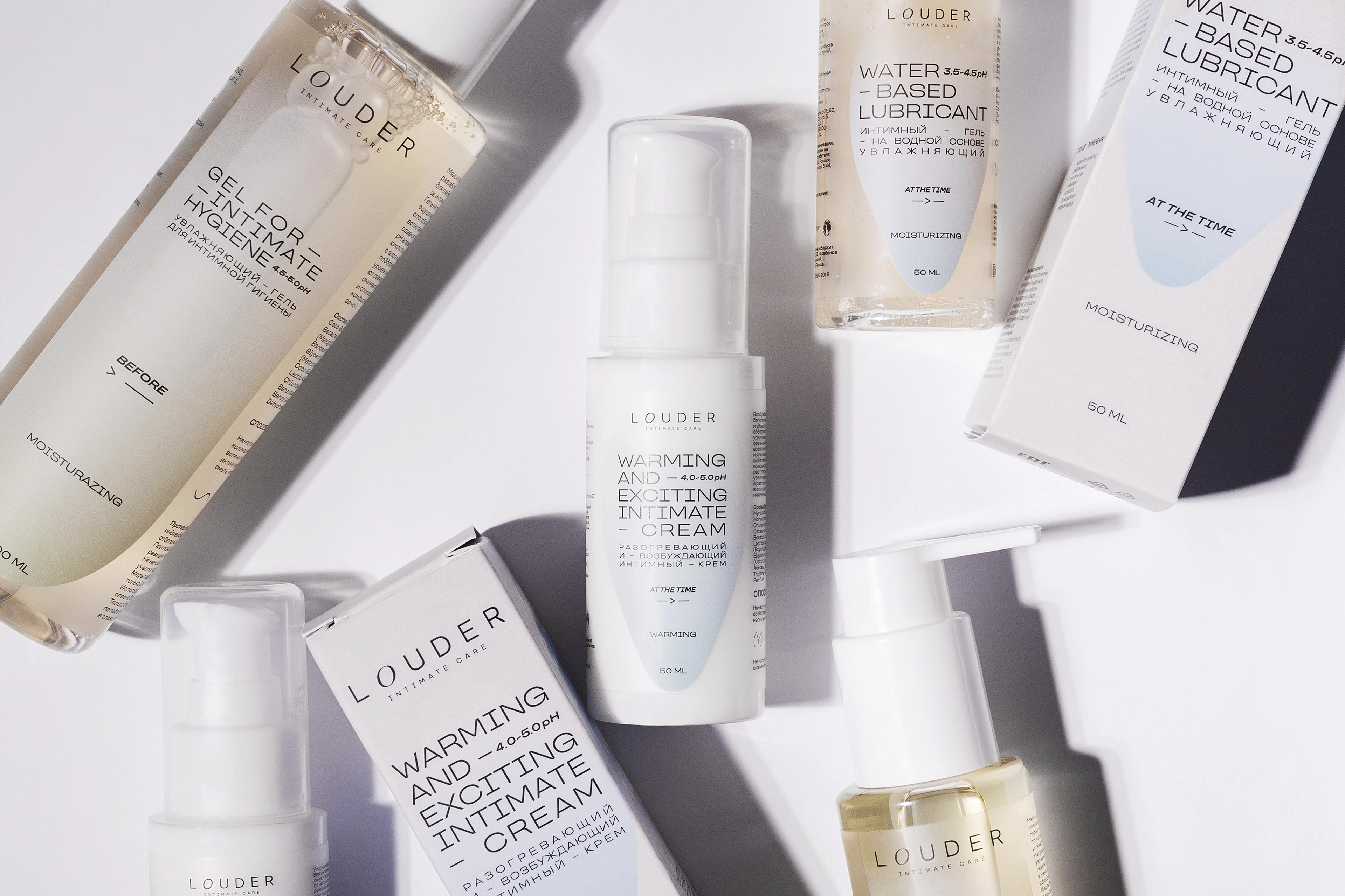
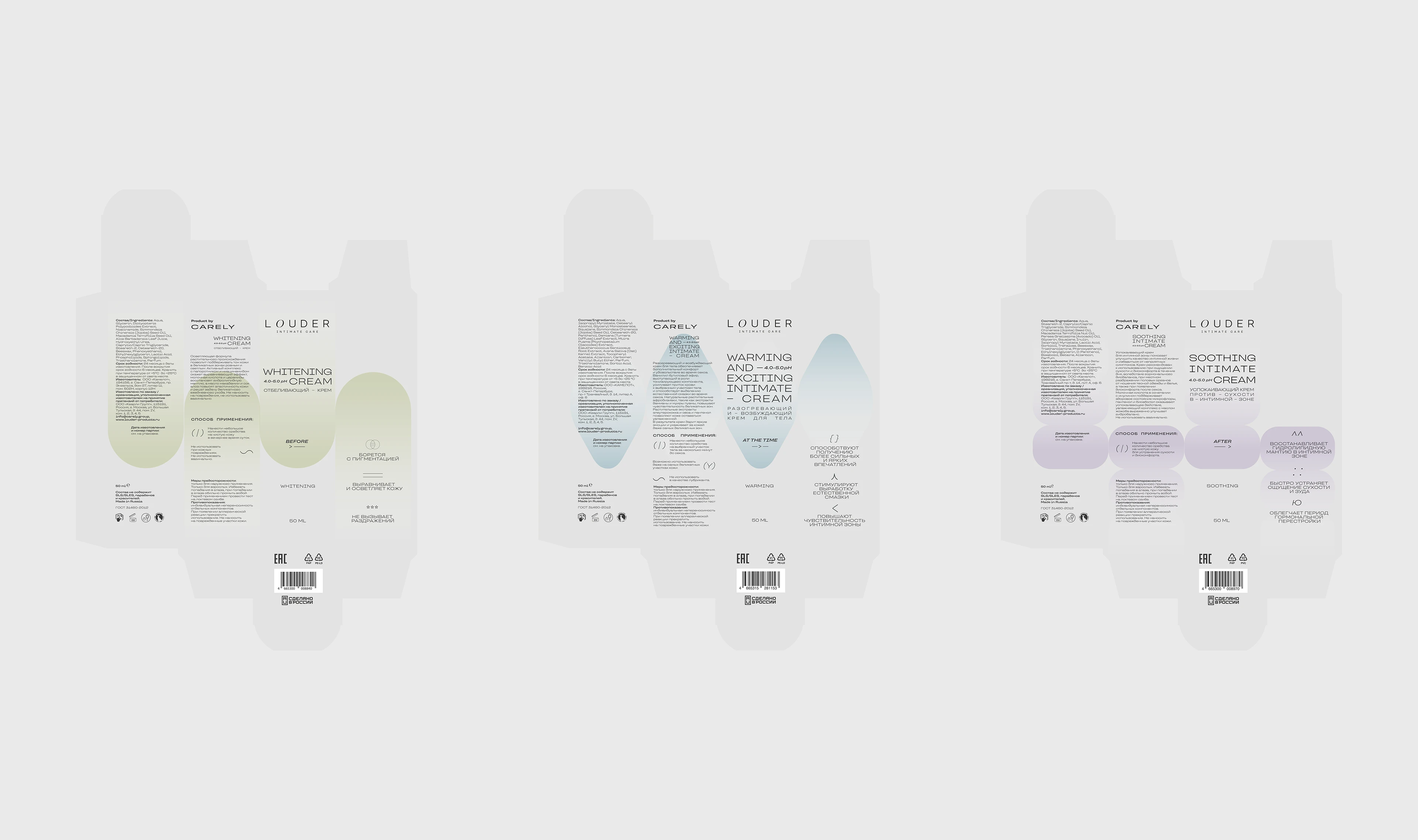
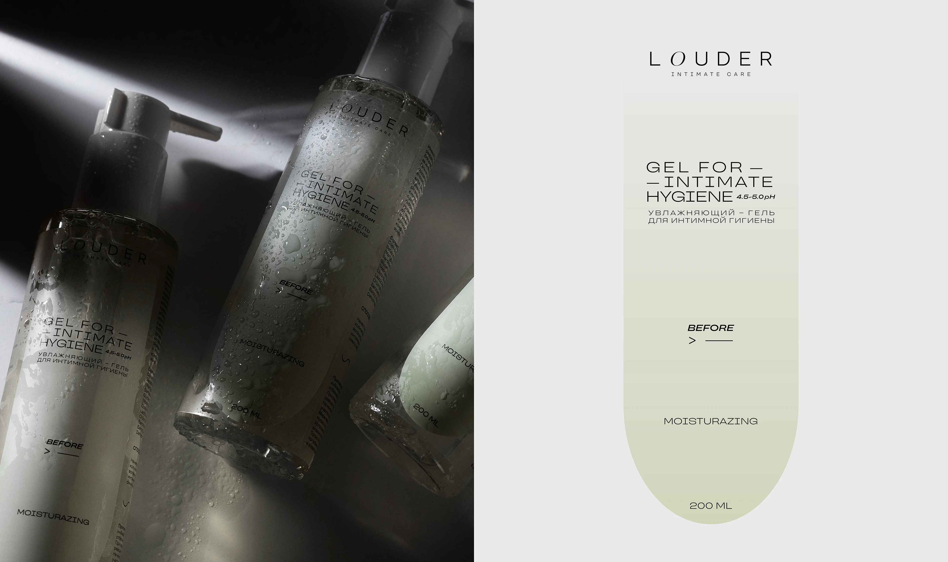
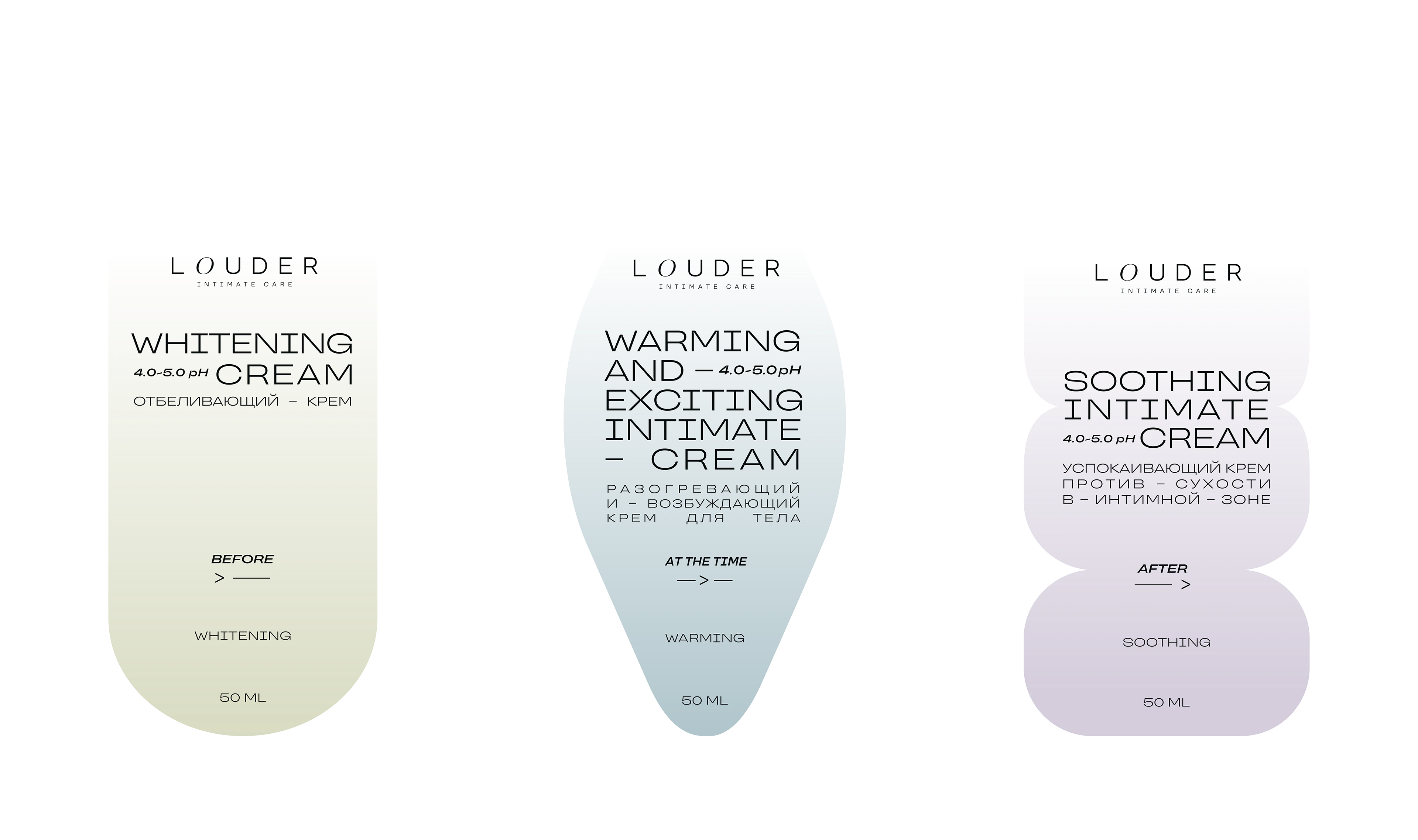
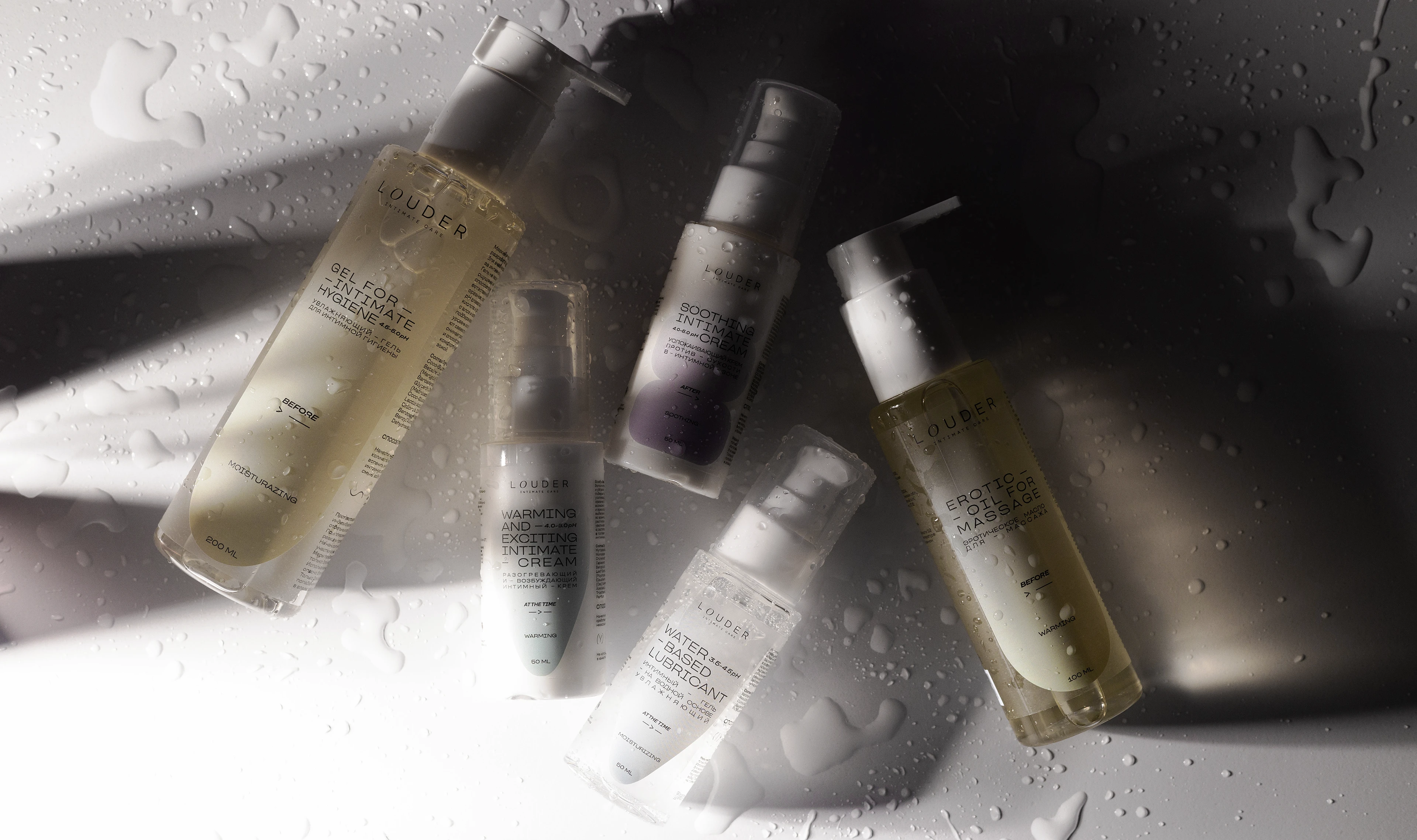
Louder builds its product lines around four key stages:
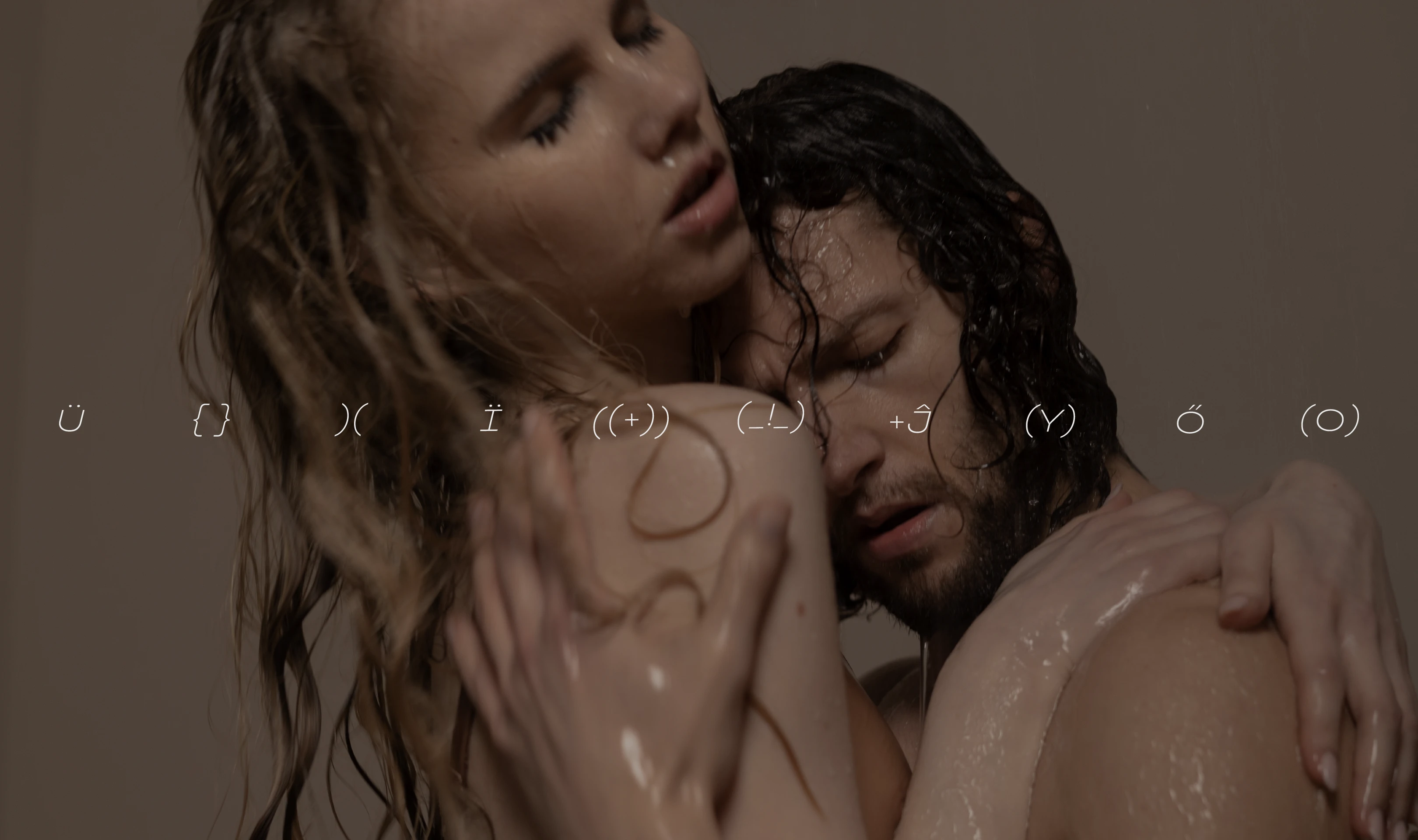
before sex (Before), during sex (At the time), after sex (After) and games (Playtime) - each line has its own color and graphic form. A distinctive part of the brand's corporate identity is infographics in the form of Unicode symbols—funny, truthful, and easy to read.
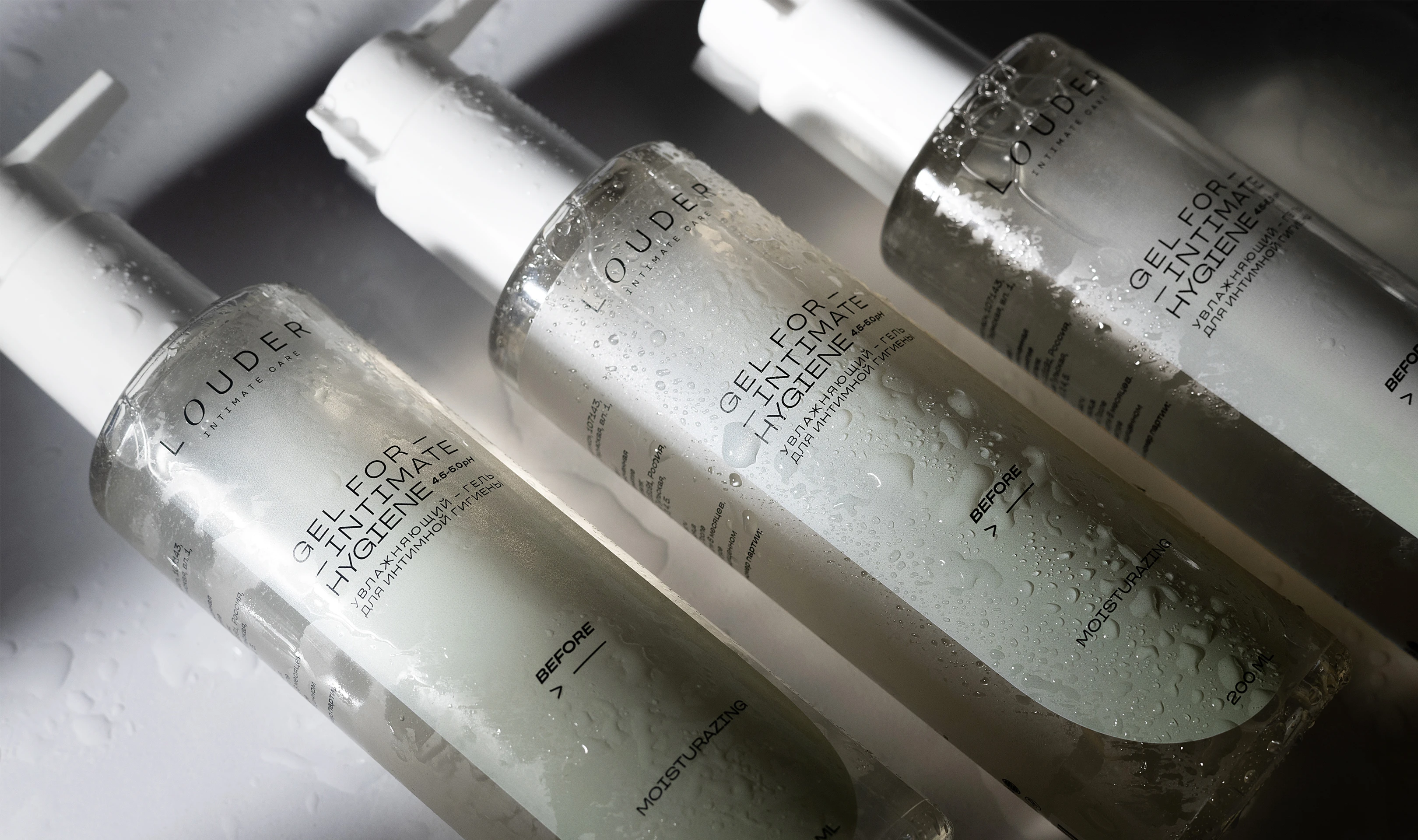
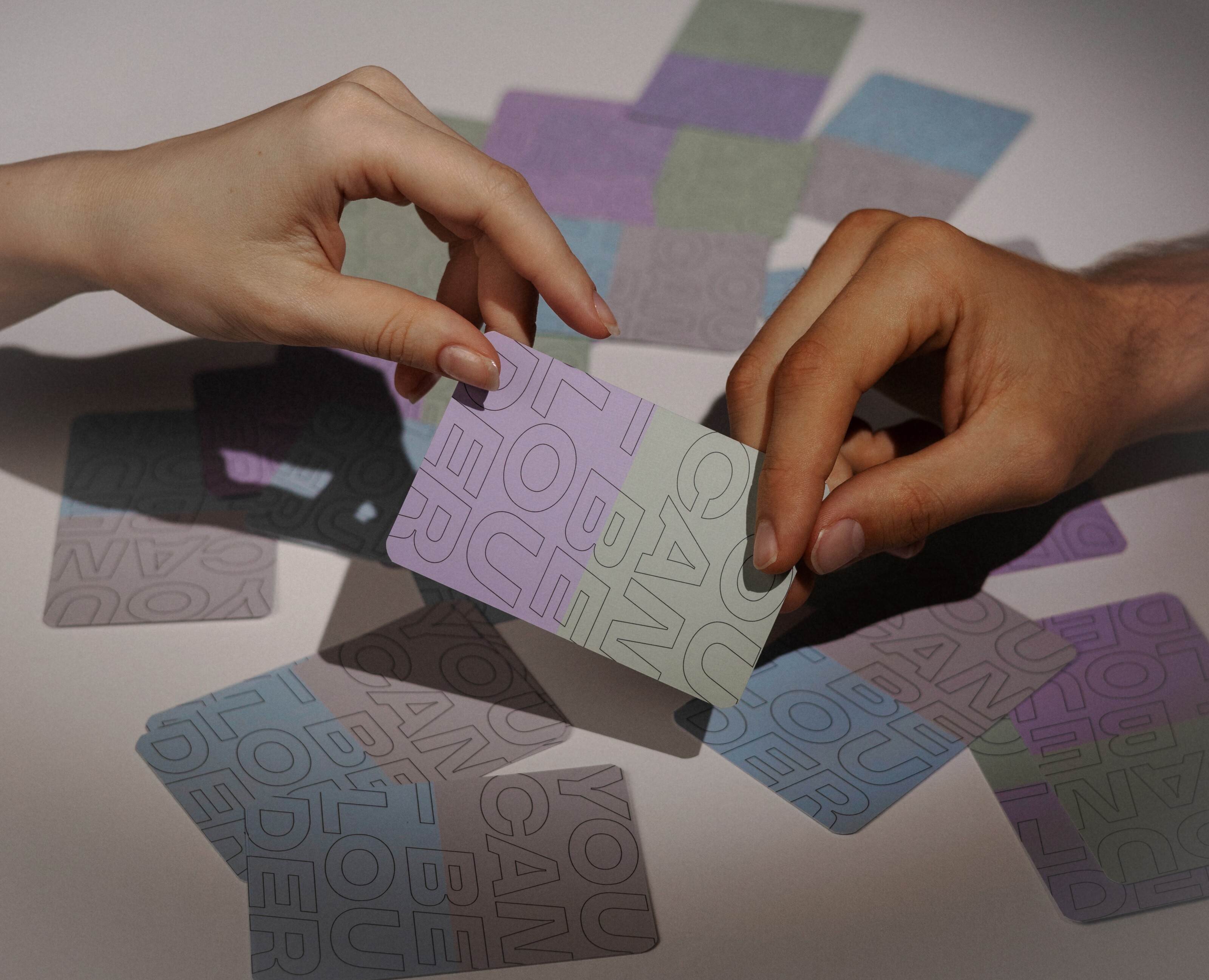
Soft gradients, translucent overlays, and delicate shadows add depth and visual lightness to the packaging, avoiding a “flat” monochrome look. The color palette is designed to evoke trust, calmness, and intimacy.
Louder's visual style fits well with the intimate cosmetics category: it is soft, delicate, and unobtrusive. This is important in order to avoid creating a sense of “aggressive marketing” in such a sensitive area.
The brand “speaks louder” through meaning rather than visual aggression.