
Client: Manicure and Pedicure Master Ekaterina K.
Task: Develop a memorable and concise brand that reflects a professional approach and avoids the stereotypes of "cheap" glamour
Brief:
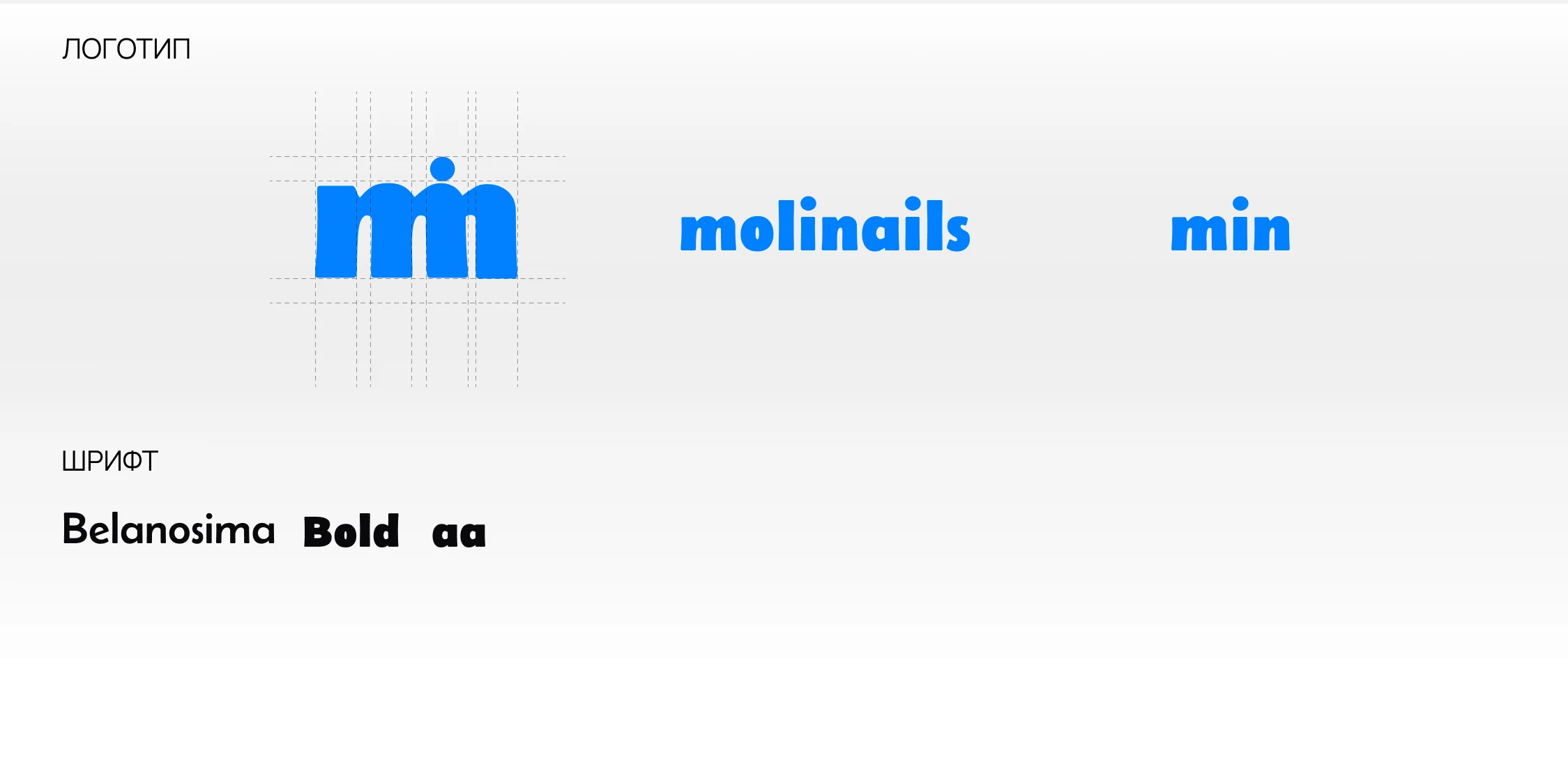
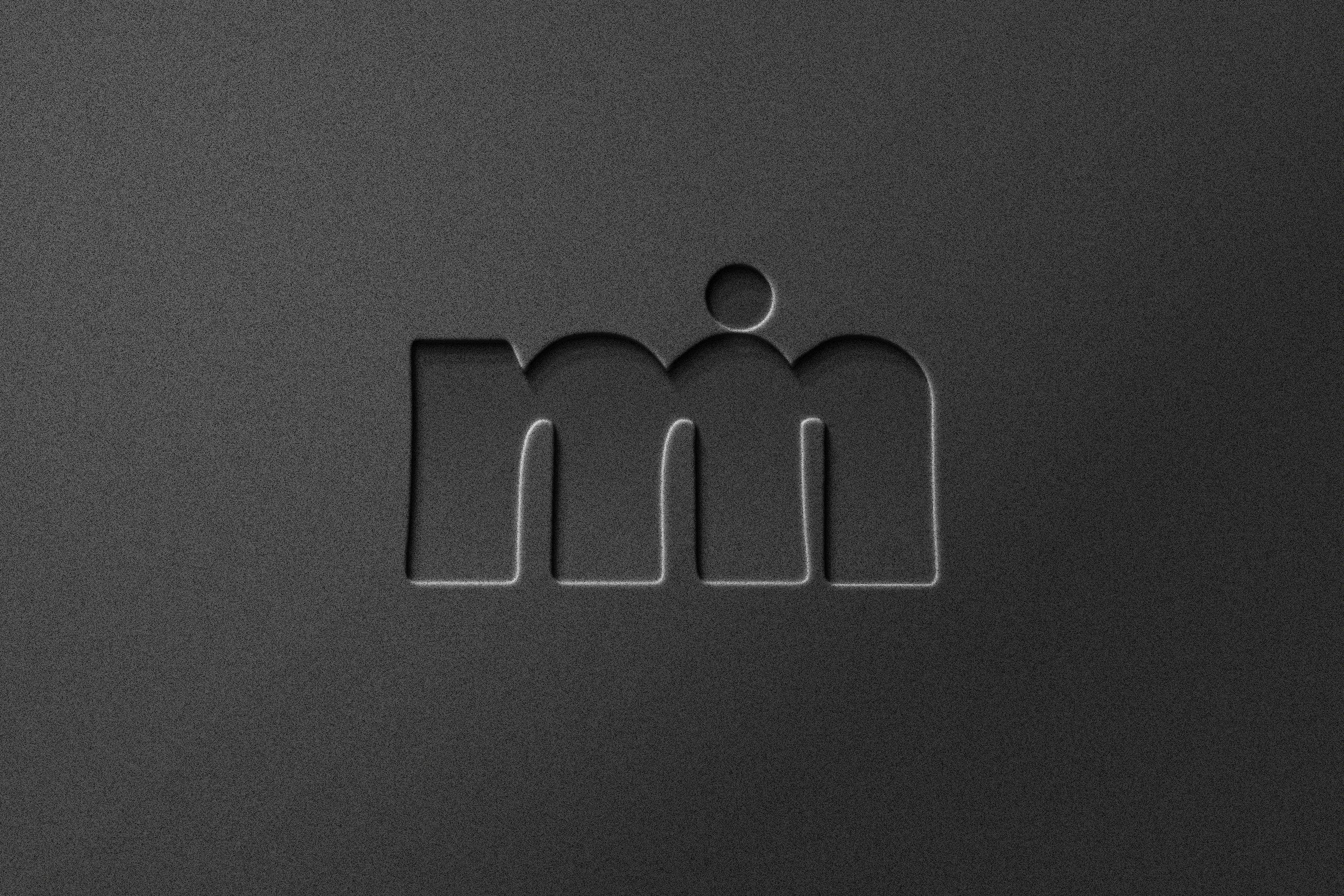
Initials: Integrate into the "MIN" logo
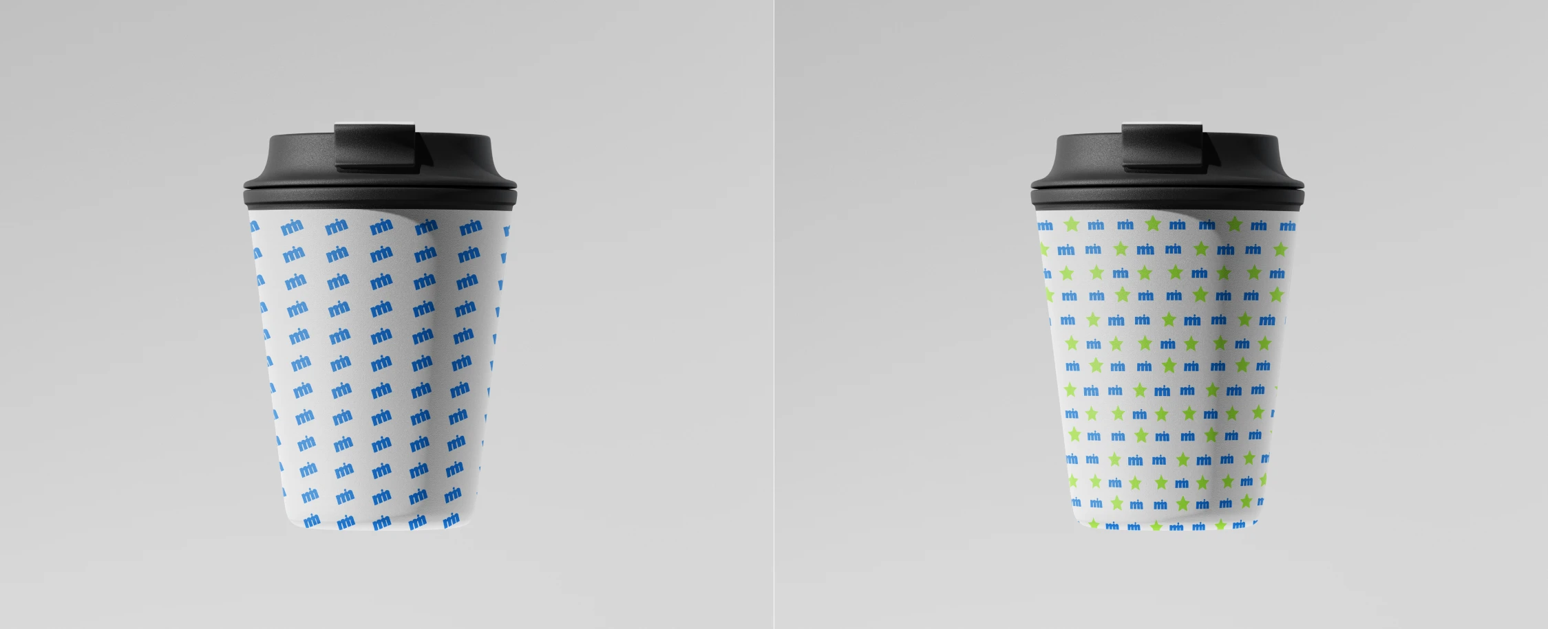
Style: Modern minimalism
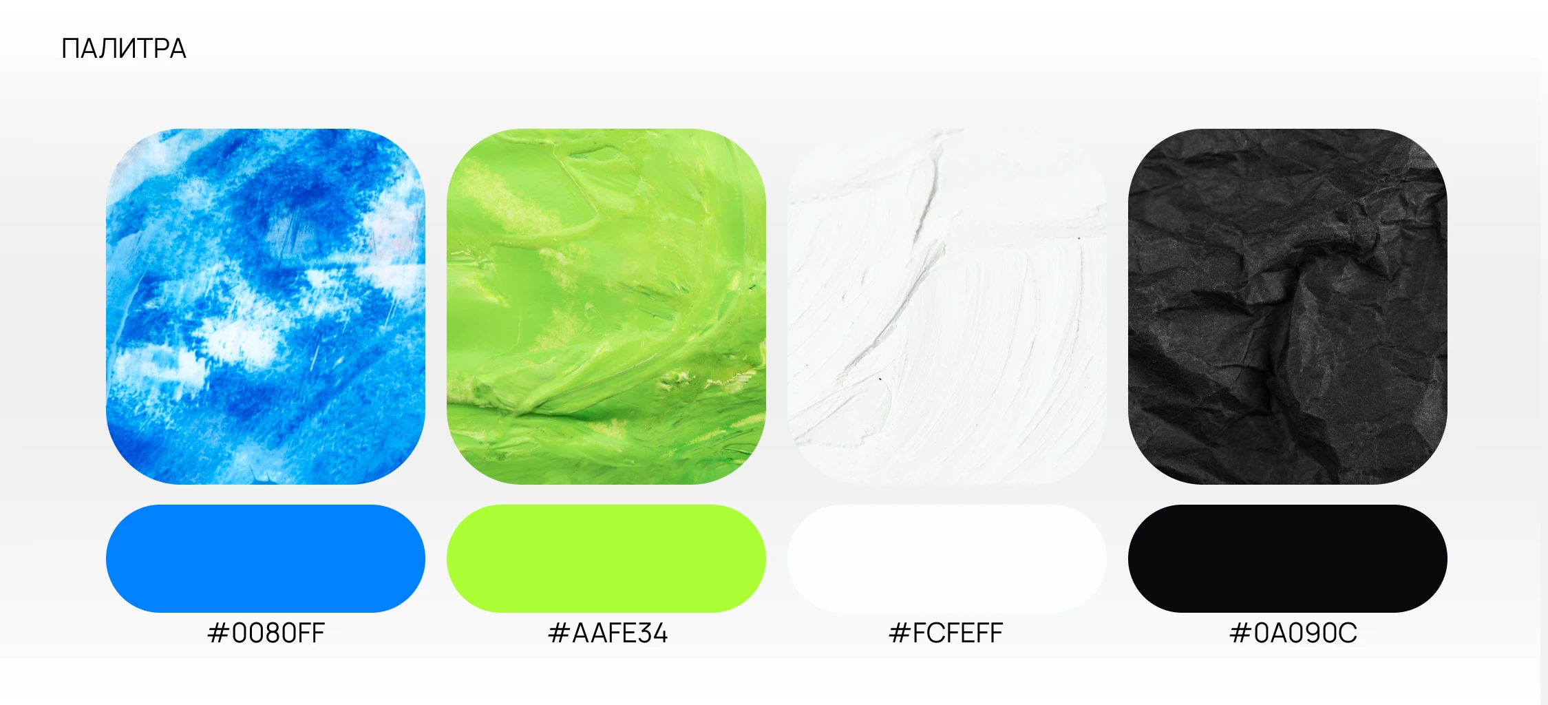
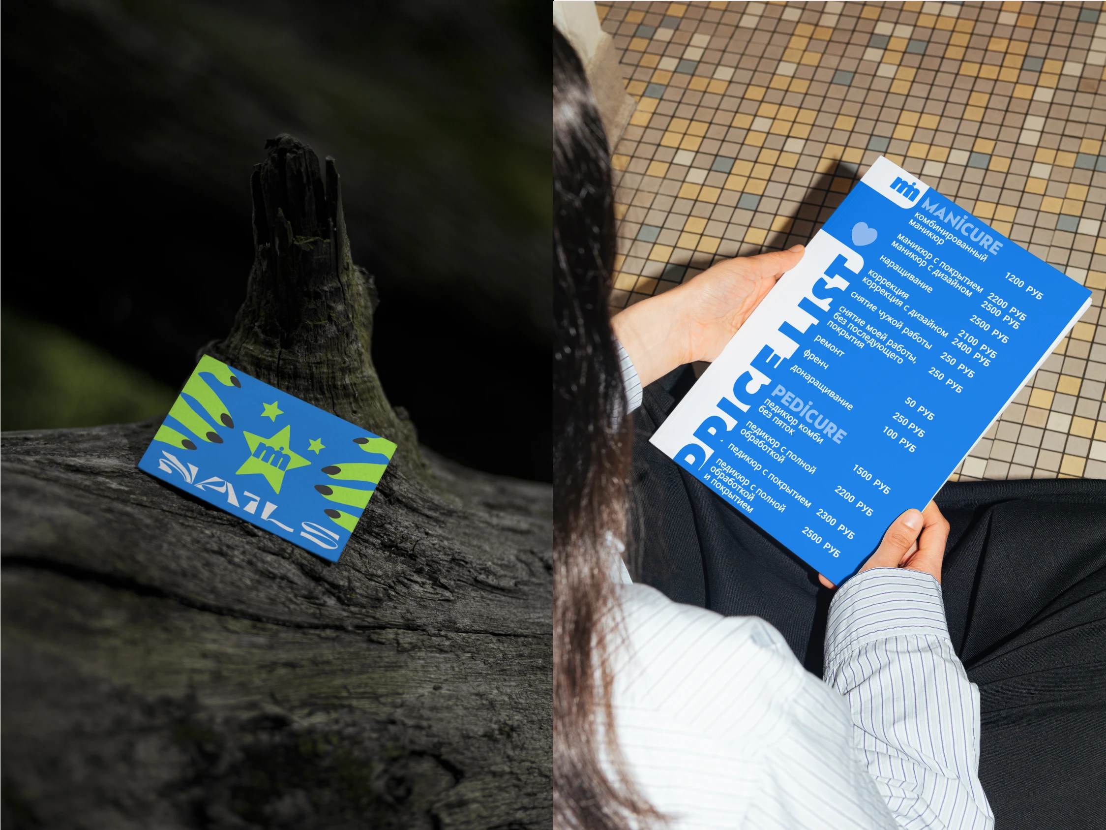
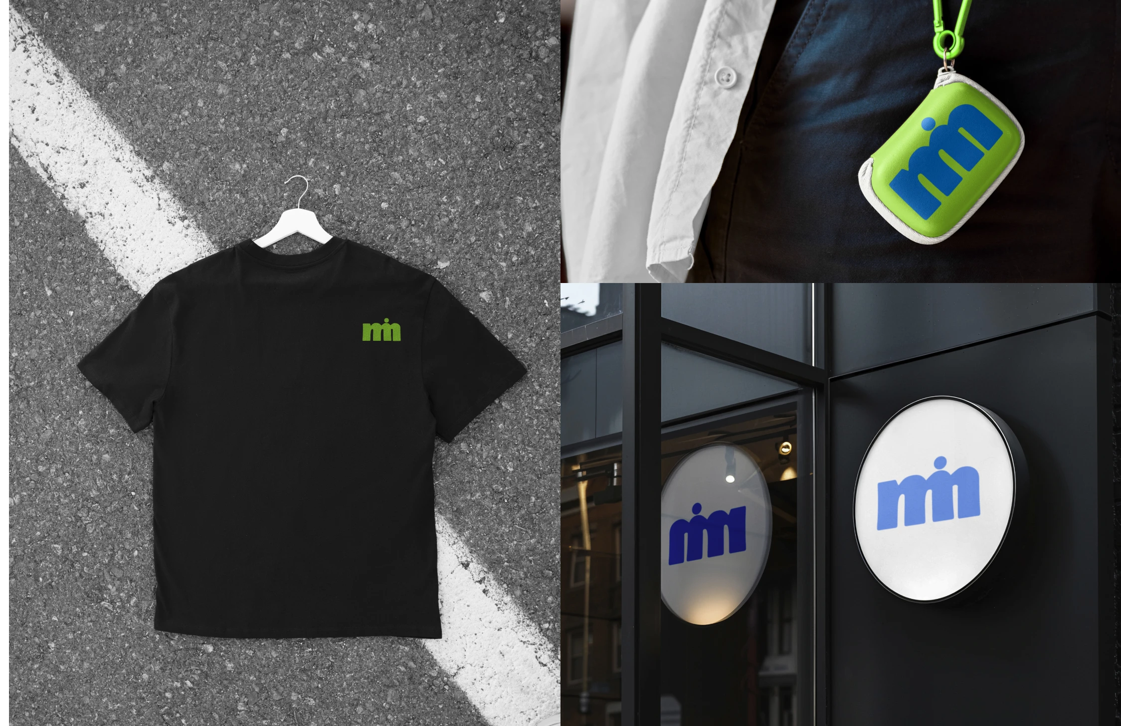
Palette: blue, light green, white, and black
Solution concept: A harmonious monogram that combines the client's initials
Result:
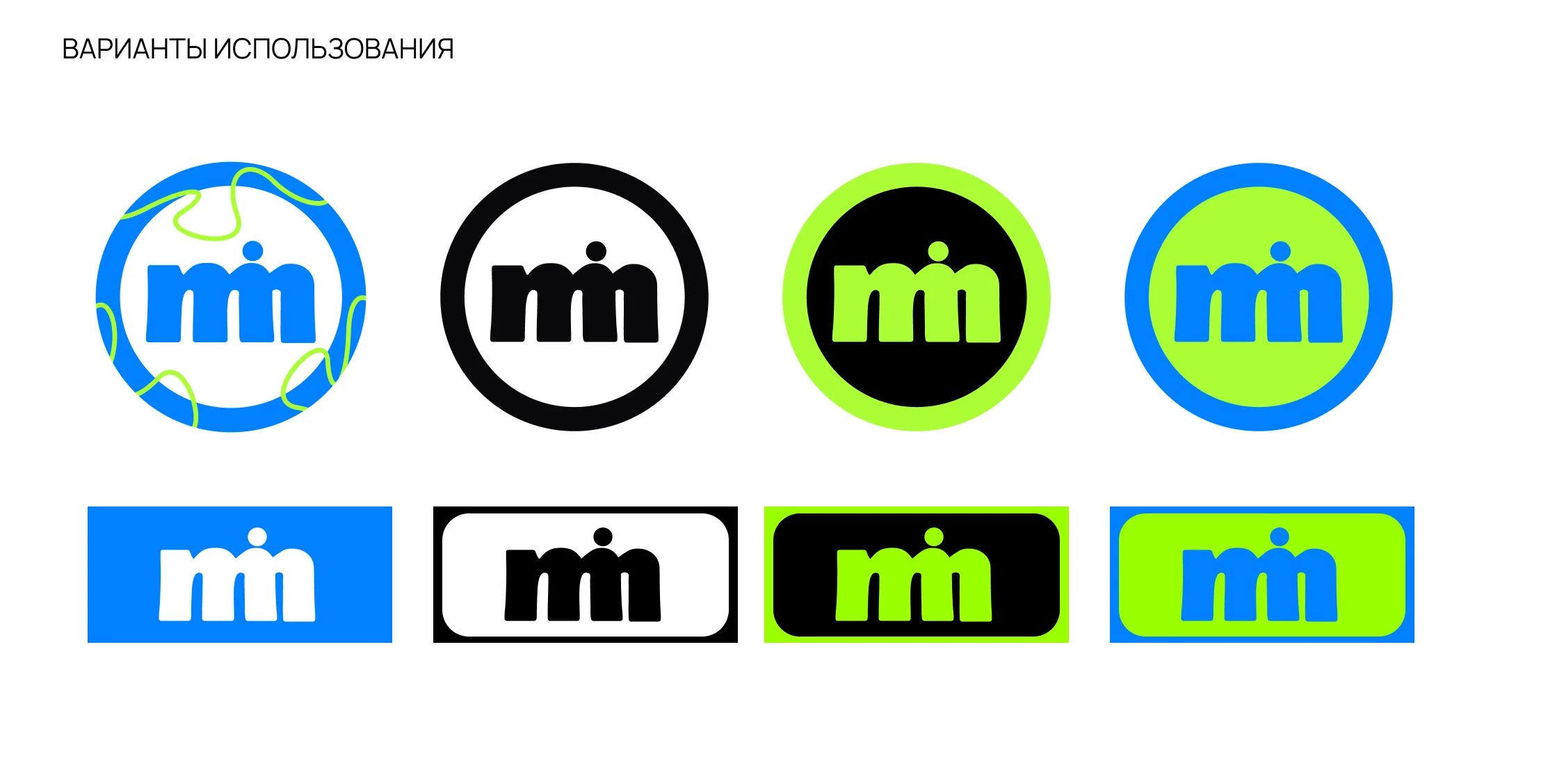
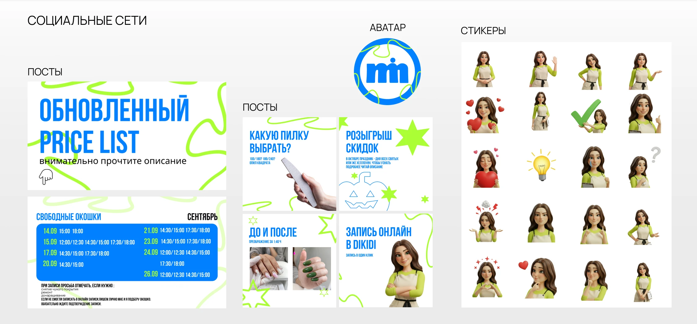
A recognizable, modern, and incredibly adaptable sign. It works everywhere, from a tiny icon on social media, where its clean shape is visible, to a stylish business card, where it serves as a symbol of quality.