OVERVIEW / ОБЗОР
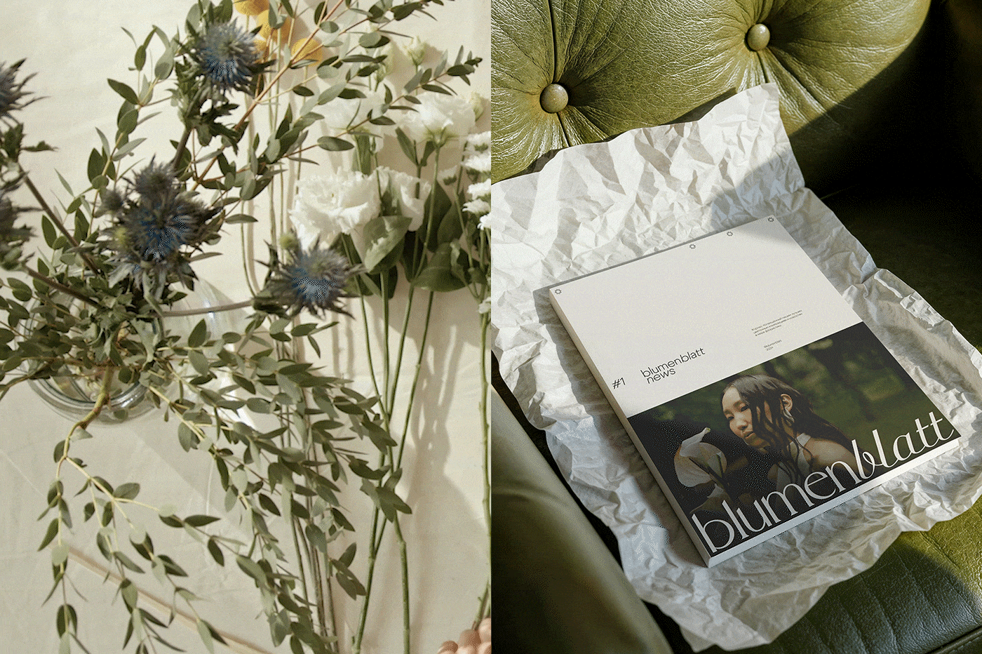
blumenblatt is a floral studio that creates elegant and memorable floral arrangements. the brand's visual identity should reflect and combine sophistication and simplicity to highlight the beauty of the floral compositions. using a minimalist approach and emphasizing floral installations will help the studio stand out among competitors and attract a discerning audience that values quality and aesthetic harmony.
blumenblatt — это цветочная студия, создающая элегантные и запоминающиеся флористические композиции. визуальная идентичность бренда должна отражать и сочетать изысканность и простоту, чтобы подчеркнуть красоту цветочных композиций. использование минималистичного подхода и акцент на флористические инсталляции поможет выделить студию среди конкурентов и привлечь требовательную аудиторию, ценящую качество и эстетическую гармонию.
THE CHALLENGE / ЗАДАЧИ ПРОЕКТА
the main task was to develop a universal and adaptable branding system, as well as a memorable yet minimalist typographic logo that conveys the essence of the brand without using illustrative elements. "blumenblatt" translates from german as "flower petal," which was important to reflect in the logo. the logo should convey elegance and professionalism through font selection and layout, and also have a simplified version.
главной задачей было разработать универсальную и адаптивную систему брендинга и запоминающийся, при этом минималистичный шрифтовой логотип, передающий суть бренда без использования иллюстративных элементов. «blumenblatt» переводится с немецкого языка как «цветочный лепесток», что было важно отразить в фирменном знаке. логотип должен передавать элегантность и профессионализм через выбор шрифта и компоновку, а также иметь сокращенный вариант.

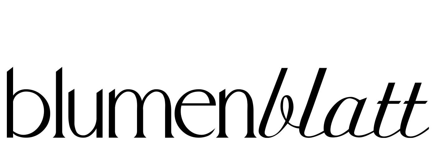
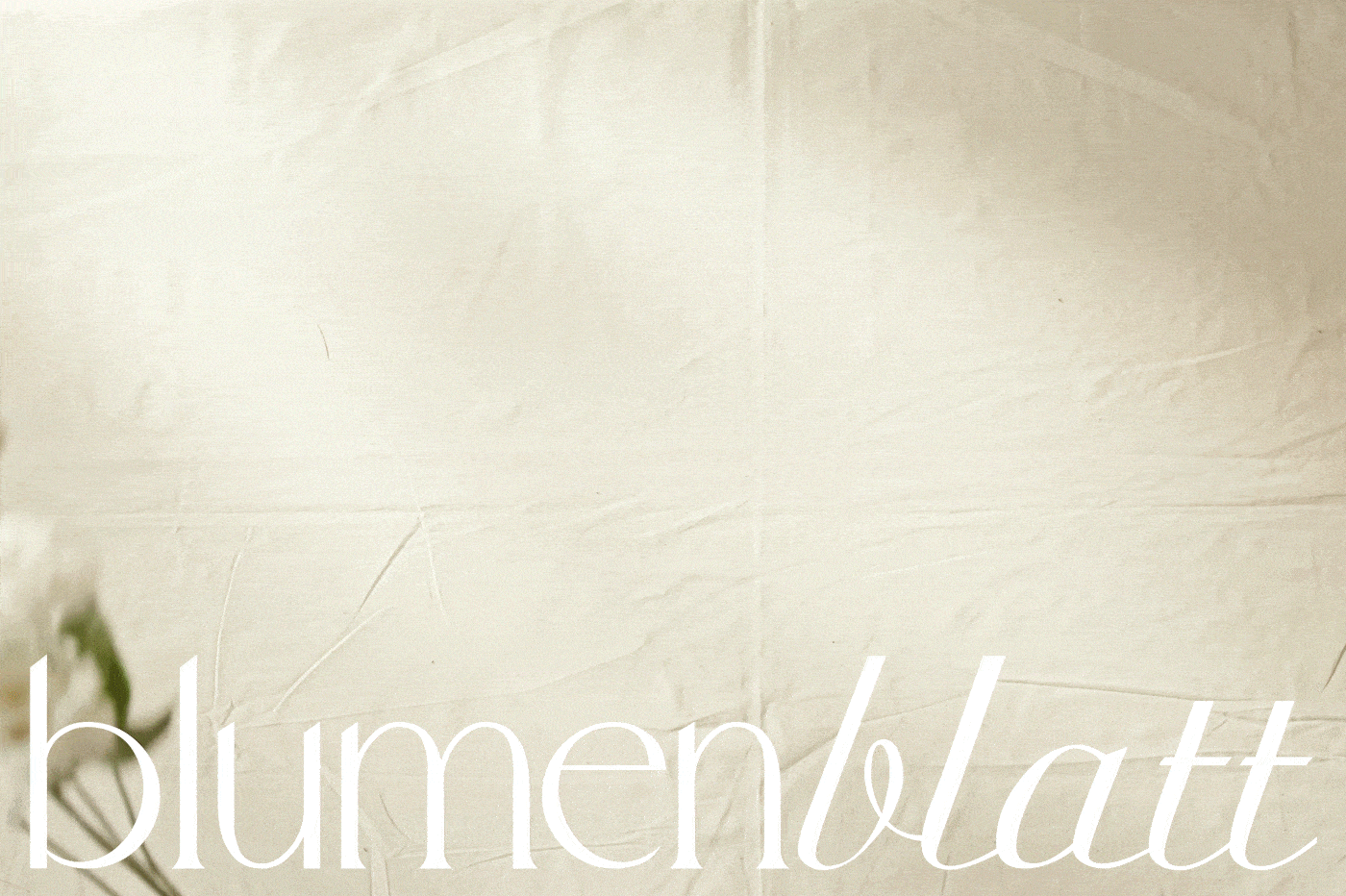
LOGOTYPE / ЛОГОТИП
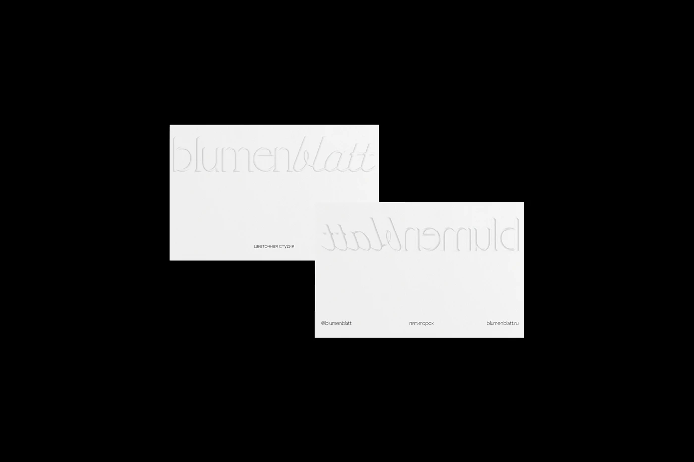
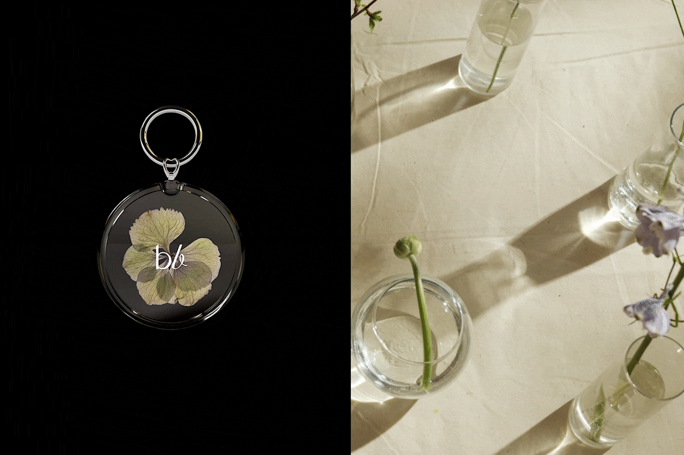
the logo is based on the serif fonts WildOliveDemo and Ariston. the contrast in stroke weights reflects the German word "blumenblatt" ("flower petal"), while the rounded elements combine with sharp angles to accurately represent and emphasize the brand's concept and ideology.
логотип основан на шрифтах с засечками WildOliveDemo и Ariston. контрастность начертаний отражает немецкое слово «цветочный лепесток», а закругленные элементы сочетаются со строгими углами, что правильно отображает и подчёркивает концепт и идеологию бренда.
TYPOGRAPHY / ТИПОГРАФИКА
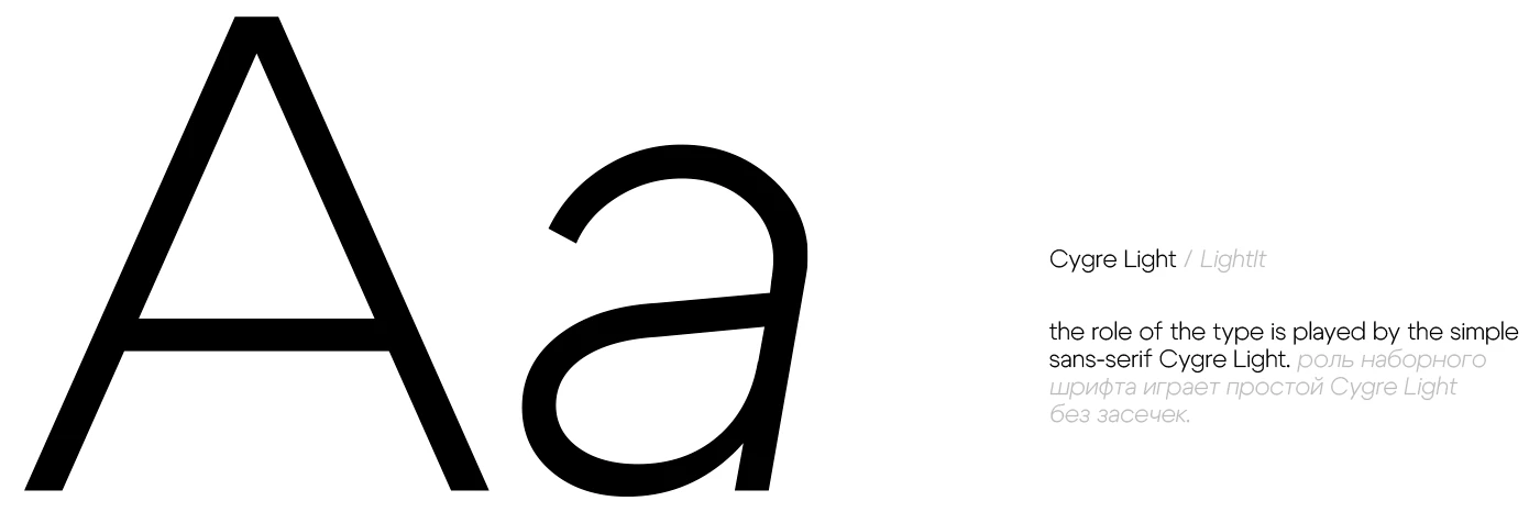

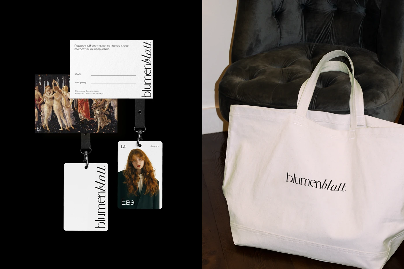
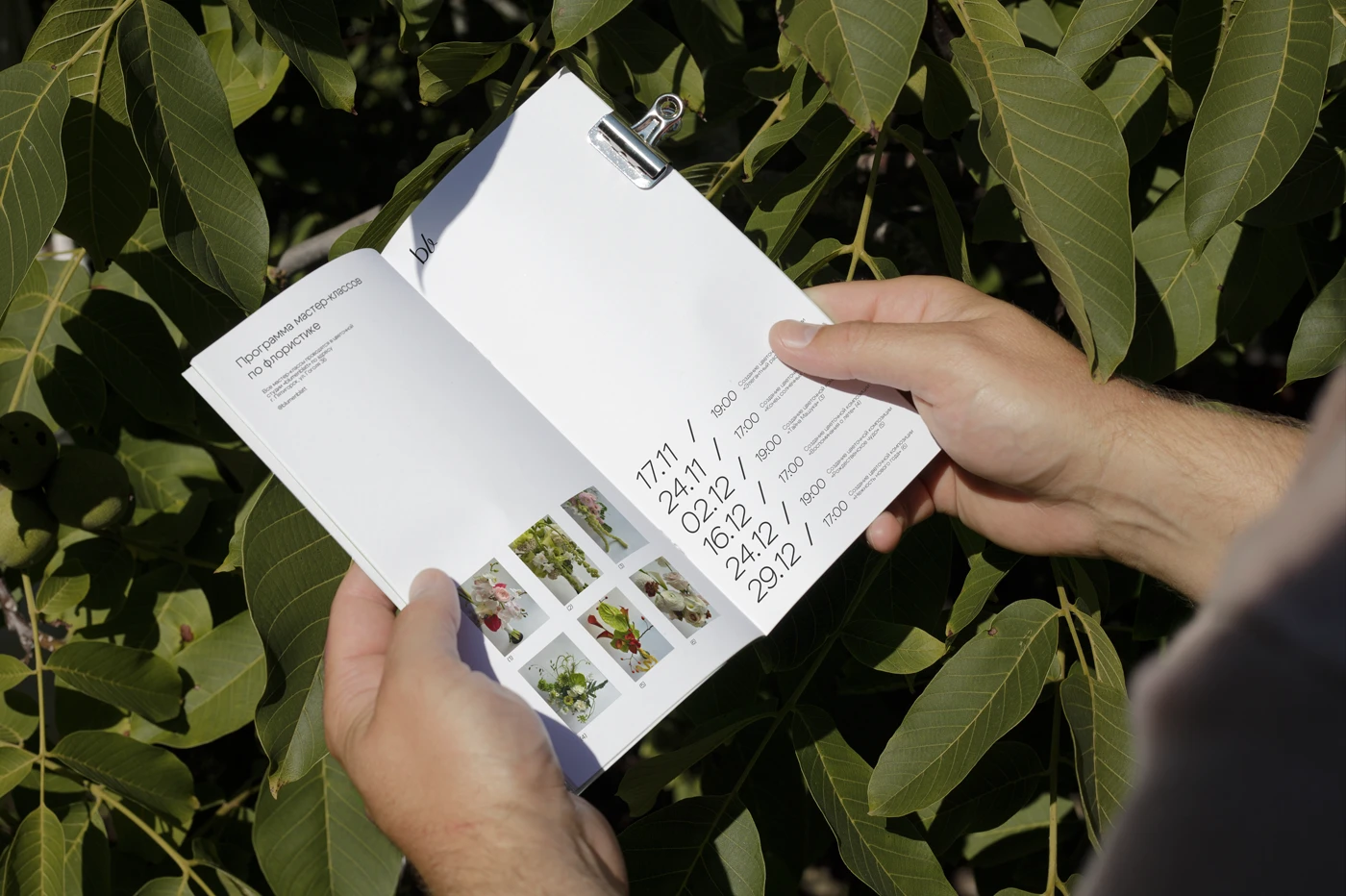
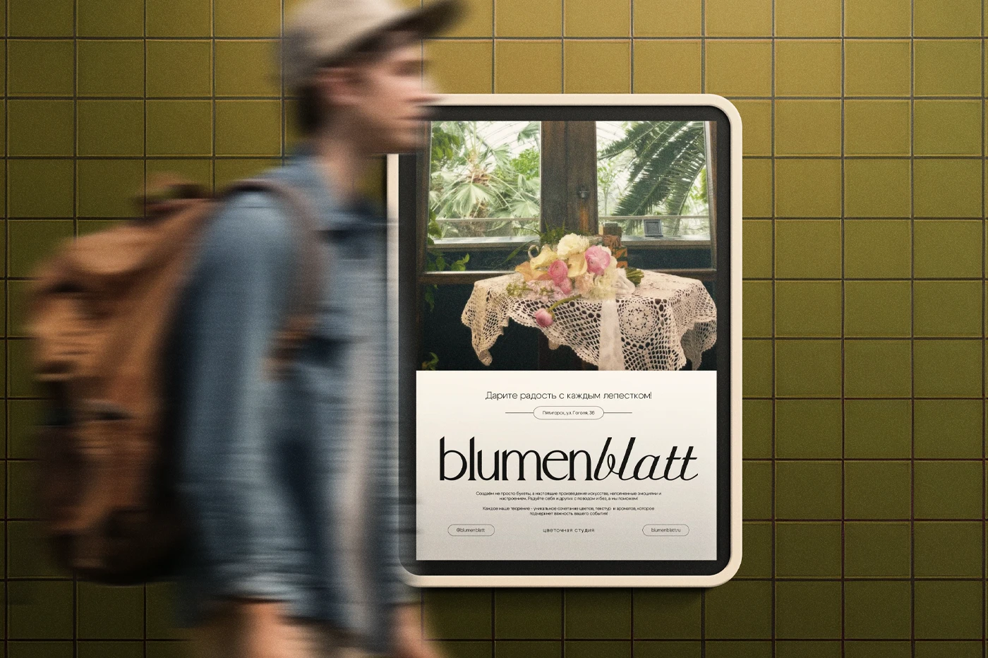
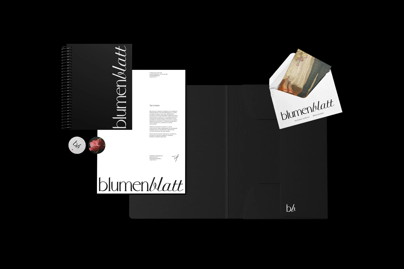
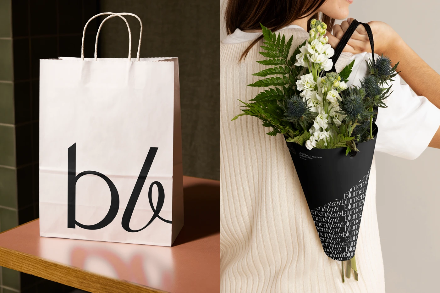
as part of this personal project, i developed a comprehensive branding system. throughout the process, special attention was given to harmony and simplicity to ensure recognizability and a strong emotional impact.
в рамках этого персонального проекта я разработала комплексную систему брендинга. в процессе работы особое внимание уделялось гармонии и простоте, чтобы обеспечить узнаваемость и сильное эмоциональное восприятие.


ACHIEVEMENTS / ДОСТИЖЕНИЯ
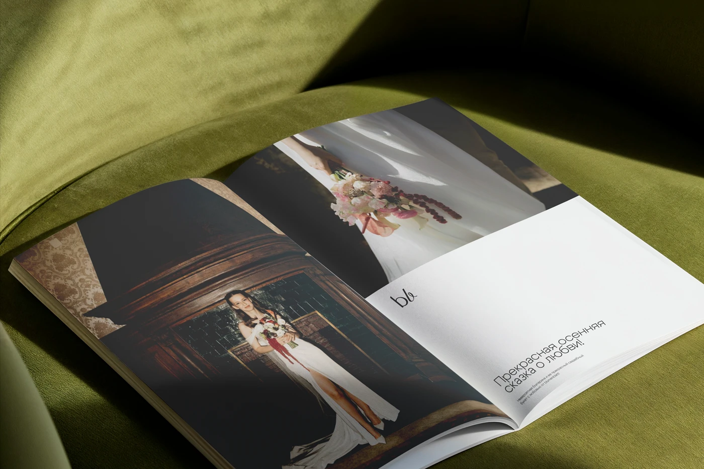
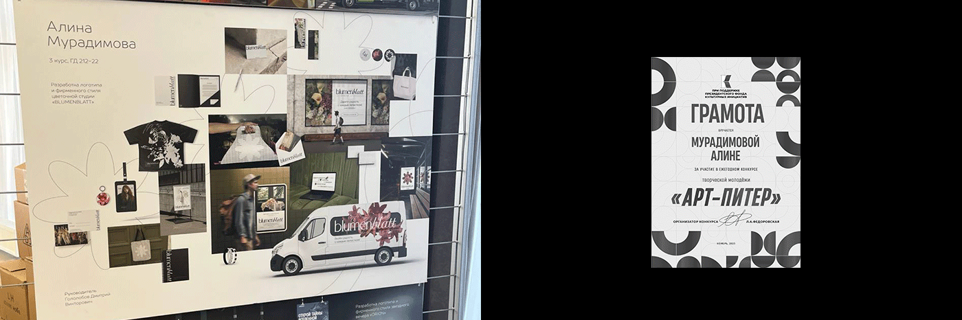
in 2025, blumenblatt participated in the FERODIZ competition (Zheleznovodsk, Russia) and ART-PITER (Saint Petersburg, Russia), and was showcased at the exhibition DESIGN — SPACE OF OPPORTUNITIES (Pyatigorsk, Russia), which confirms its high standard and relevance. Participation in these events provided valuable experience and helped increase the recognition of the work within the professional community.
в 2025 году проект blumenblatt участвовал в конкурсах ФЕРОДИЗ (г. Железноводск, Россия) и АРТ-ПИТЕР (г. Санкт-Петербург, Россия) и был представлен на выставке ДИЗАЙН - ПРОСТРАНСТВО ВОЗМОЖНОСТЕЙ (г. Пятигорск, Россия), что подтверждает его высокий уровень и актуальность. участие в этих мероприятиях позволило получить ценный опыт и повысить узнаваемость работы в профессиональном сообществе.
THANK YOU! / СПАСИБО!
made by @almuradimova
photo and video by @causaflowers
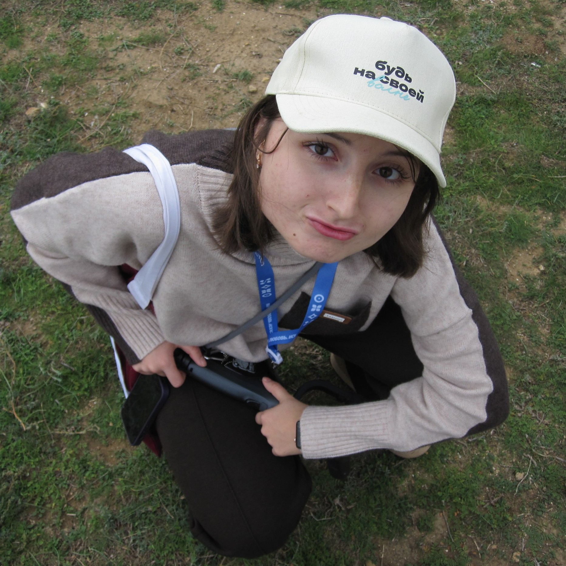
model on the id card @mottibay
A/\, 2024
alina@muradimova.ru