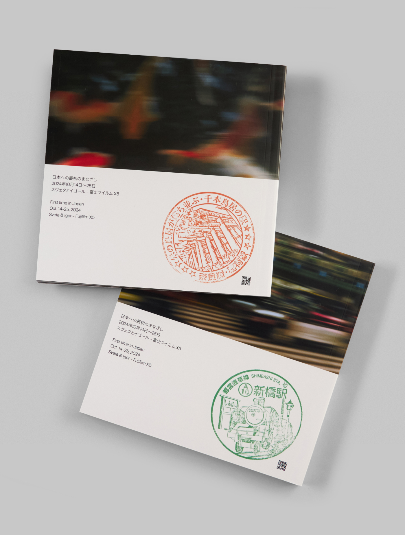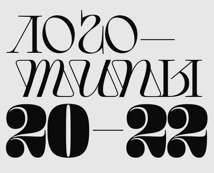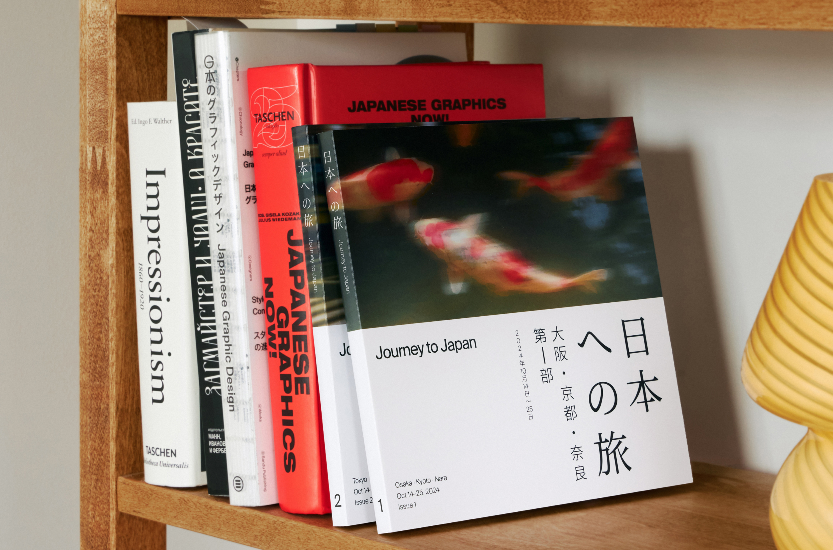
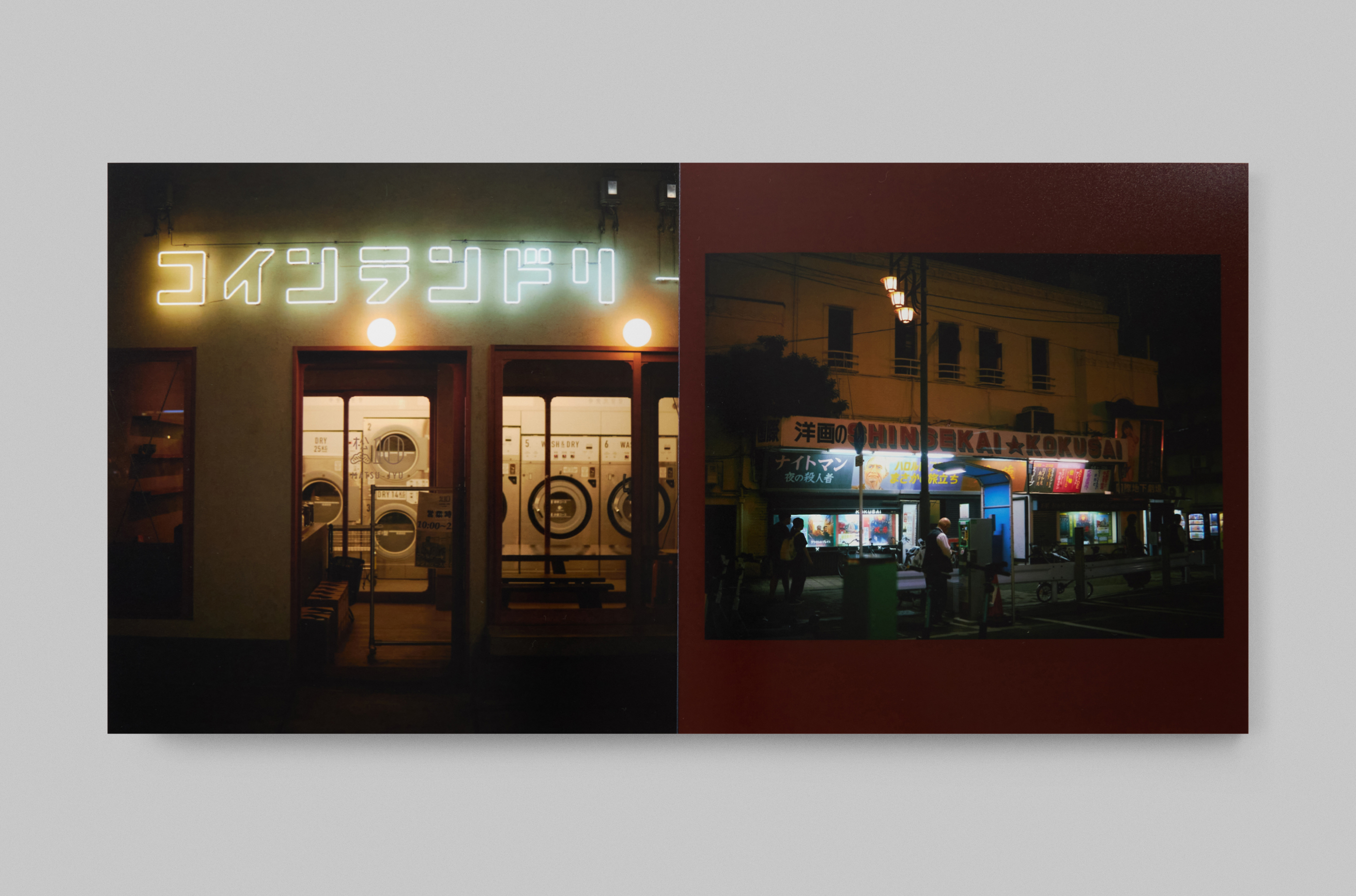
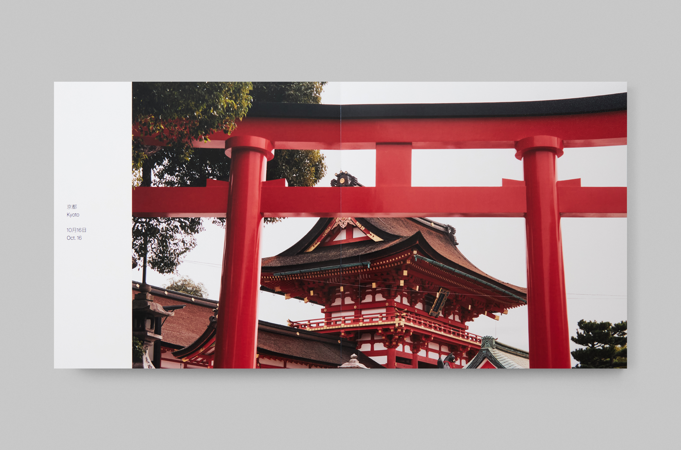
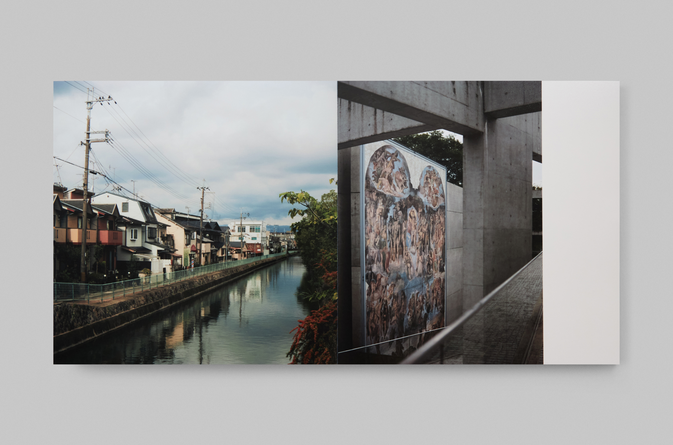
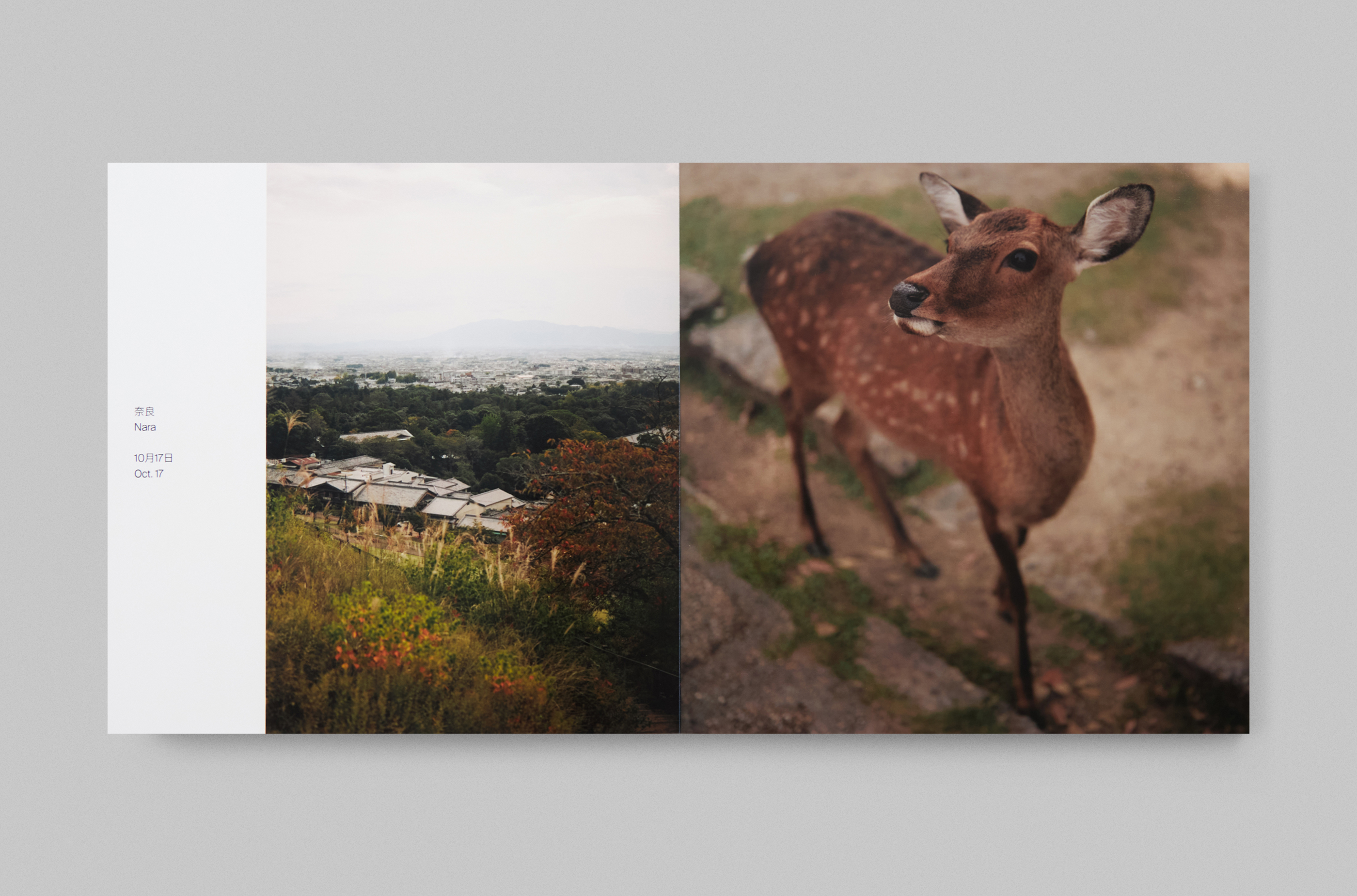
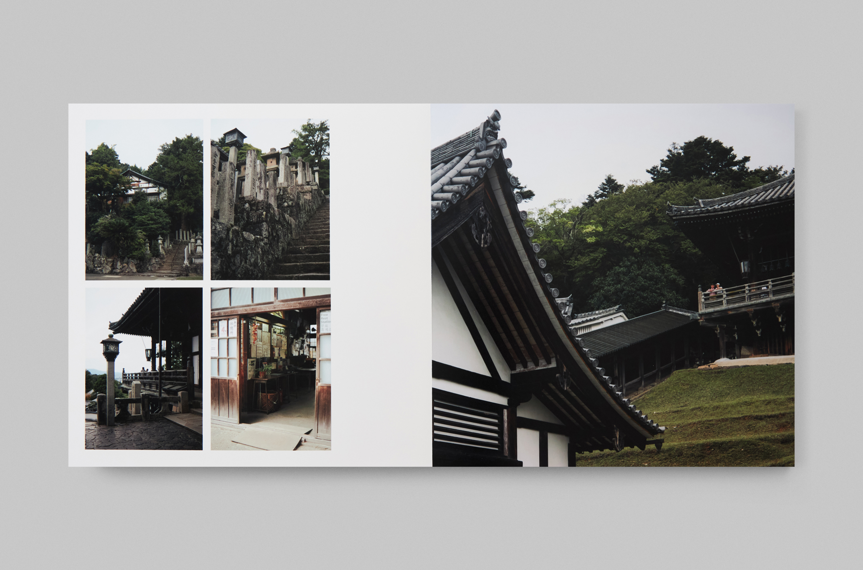
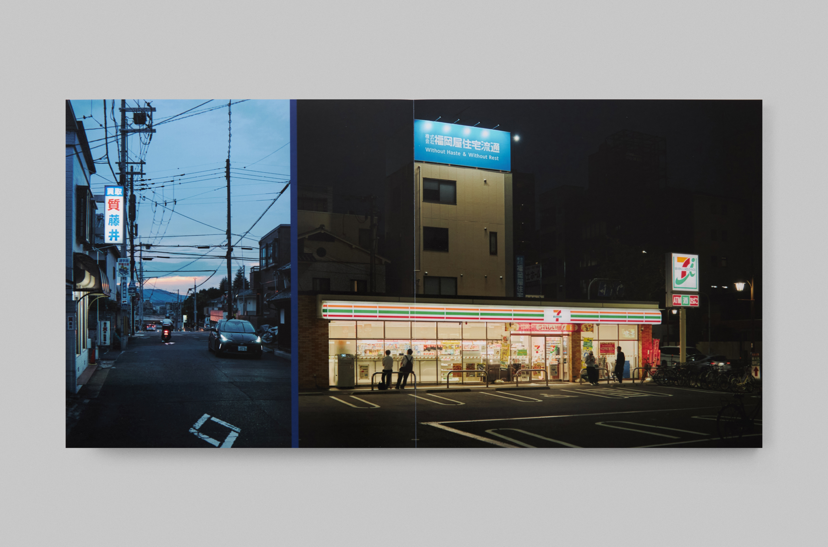
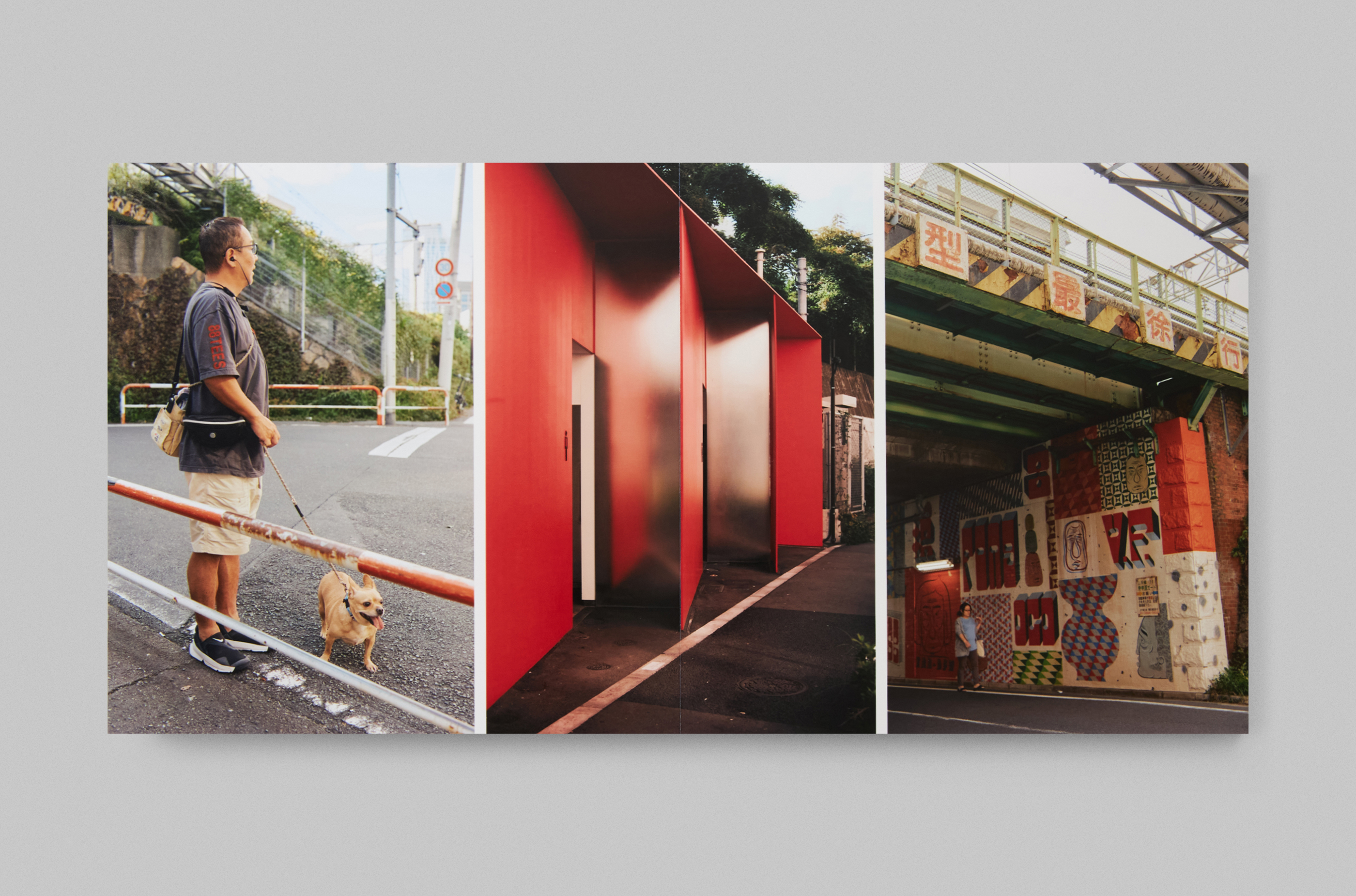
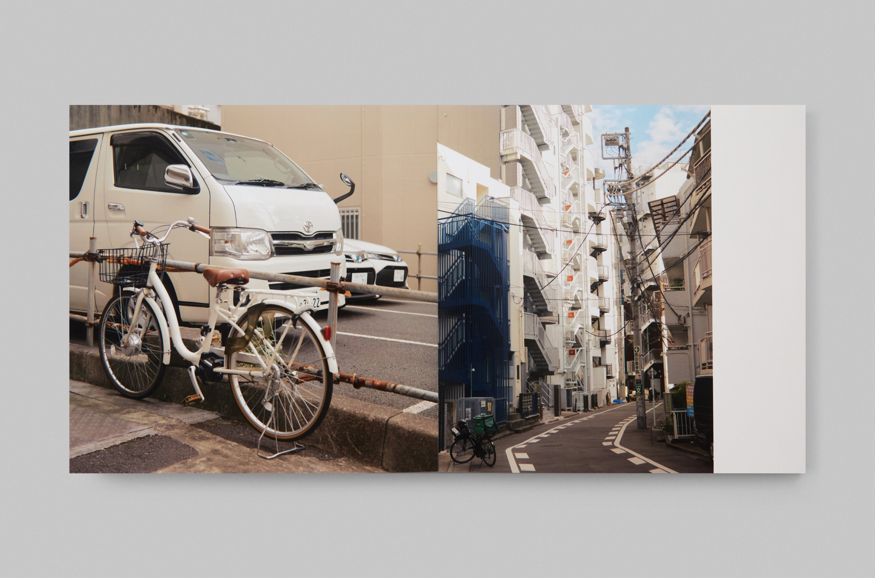
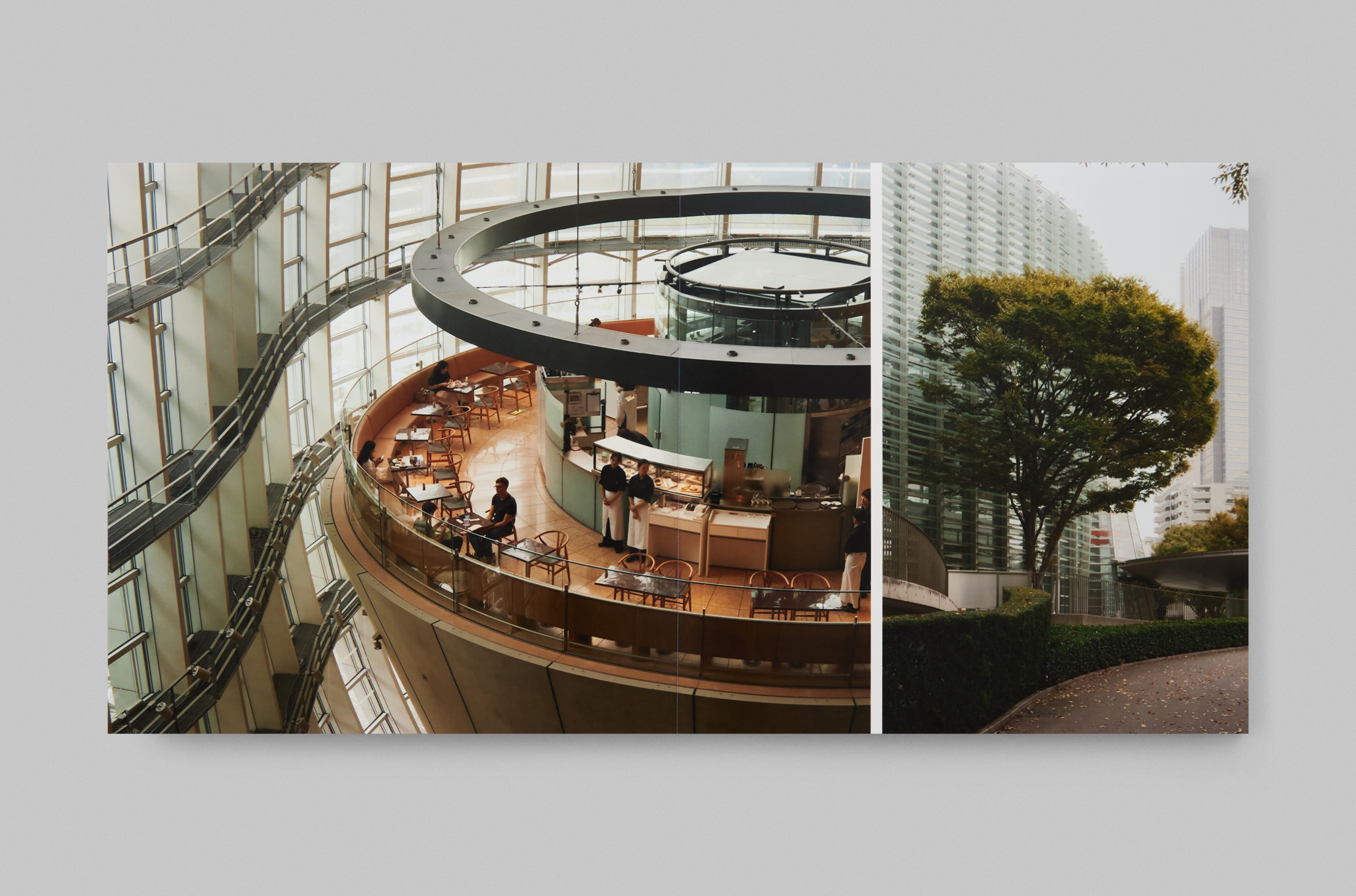
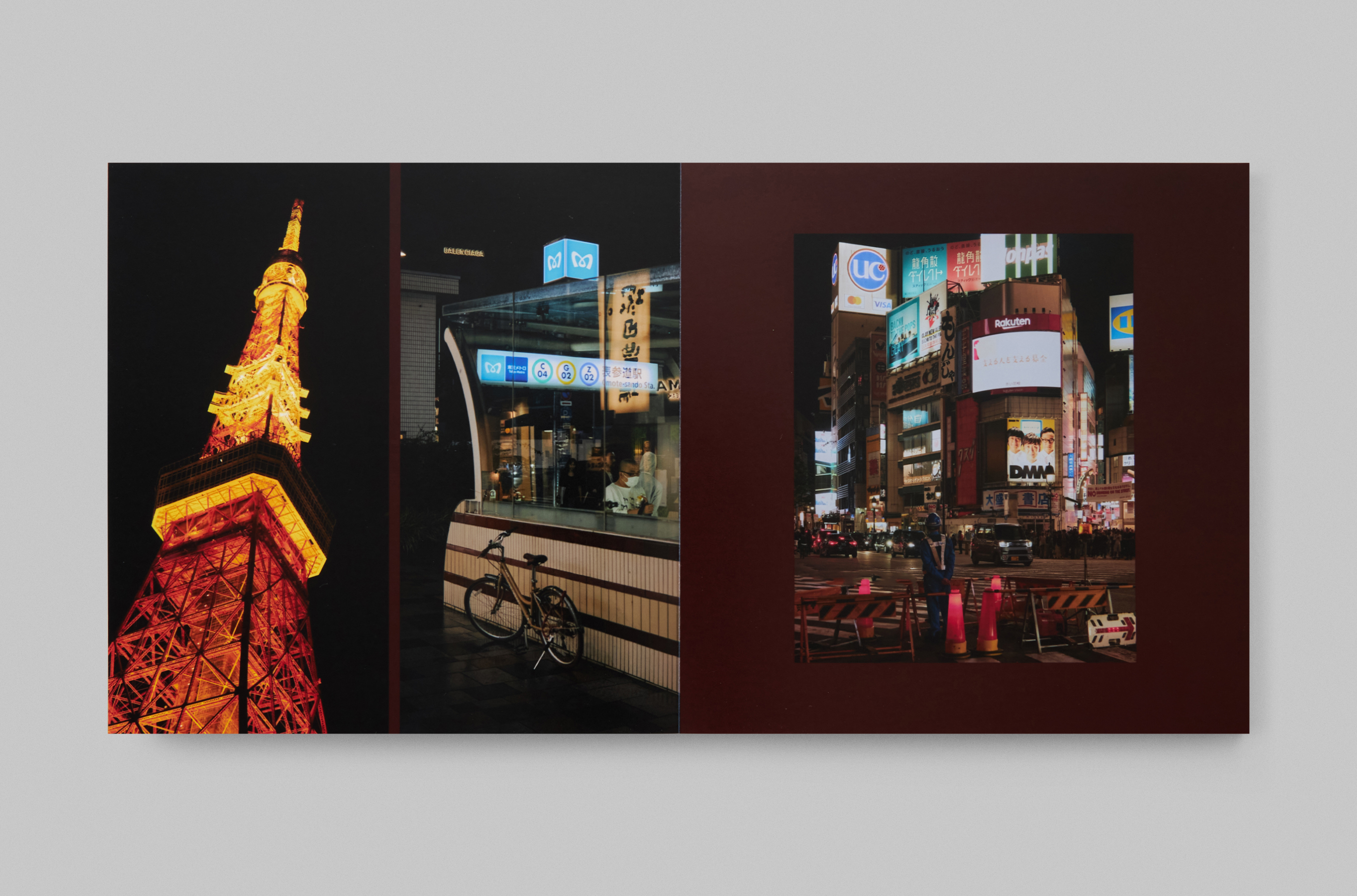
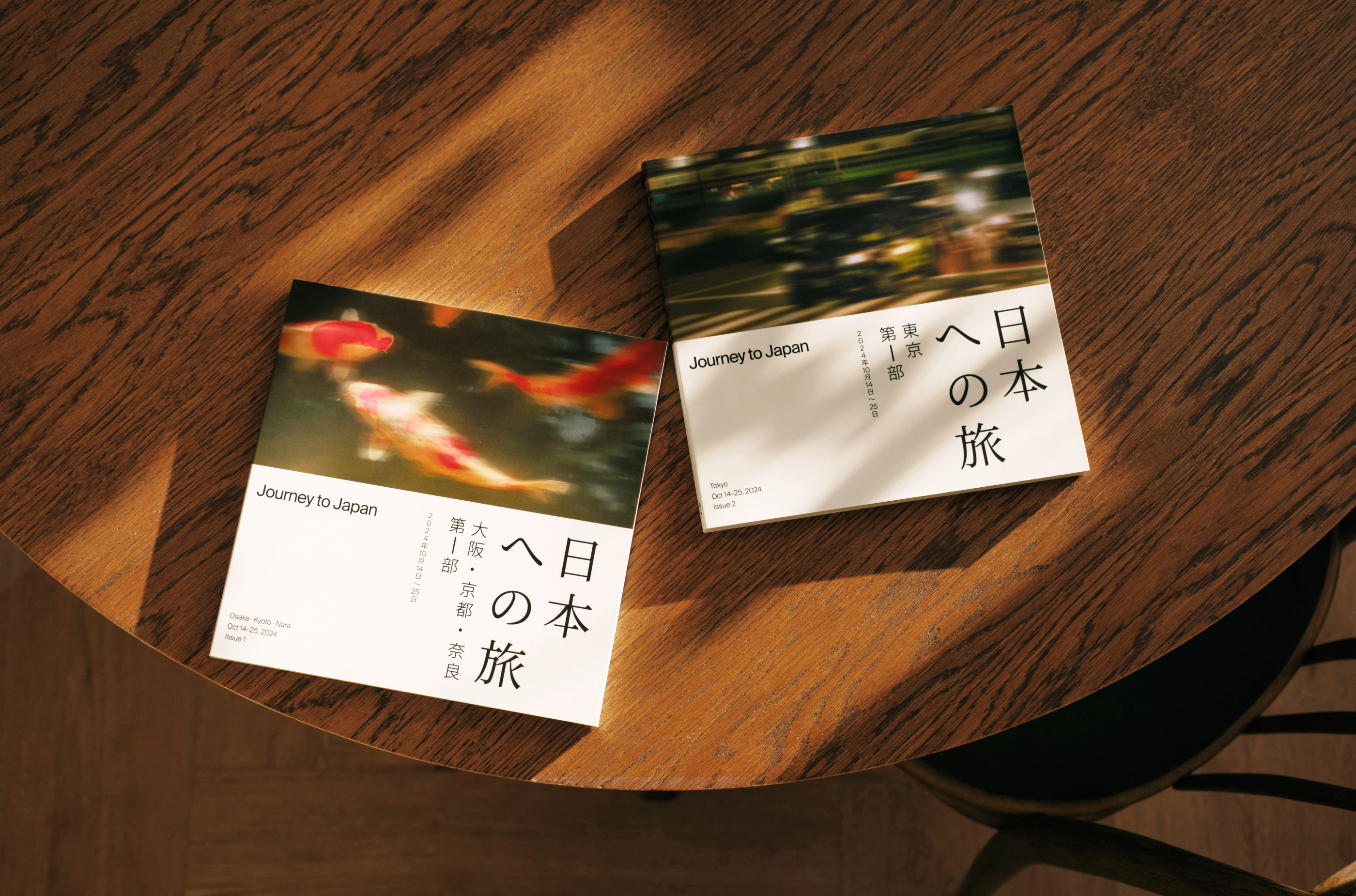
Спустя почти год после поездки в Японию мы собрали впечатления в фотокнигу 20 × 20, состоящую из двух частей: первая — Осака, Киото и Нара, вторая — Токио.
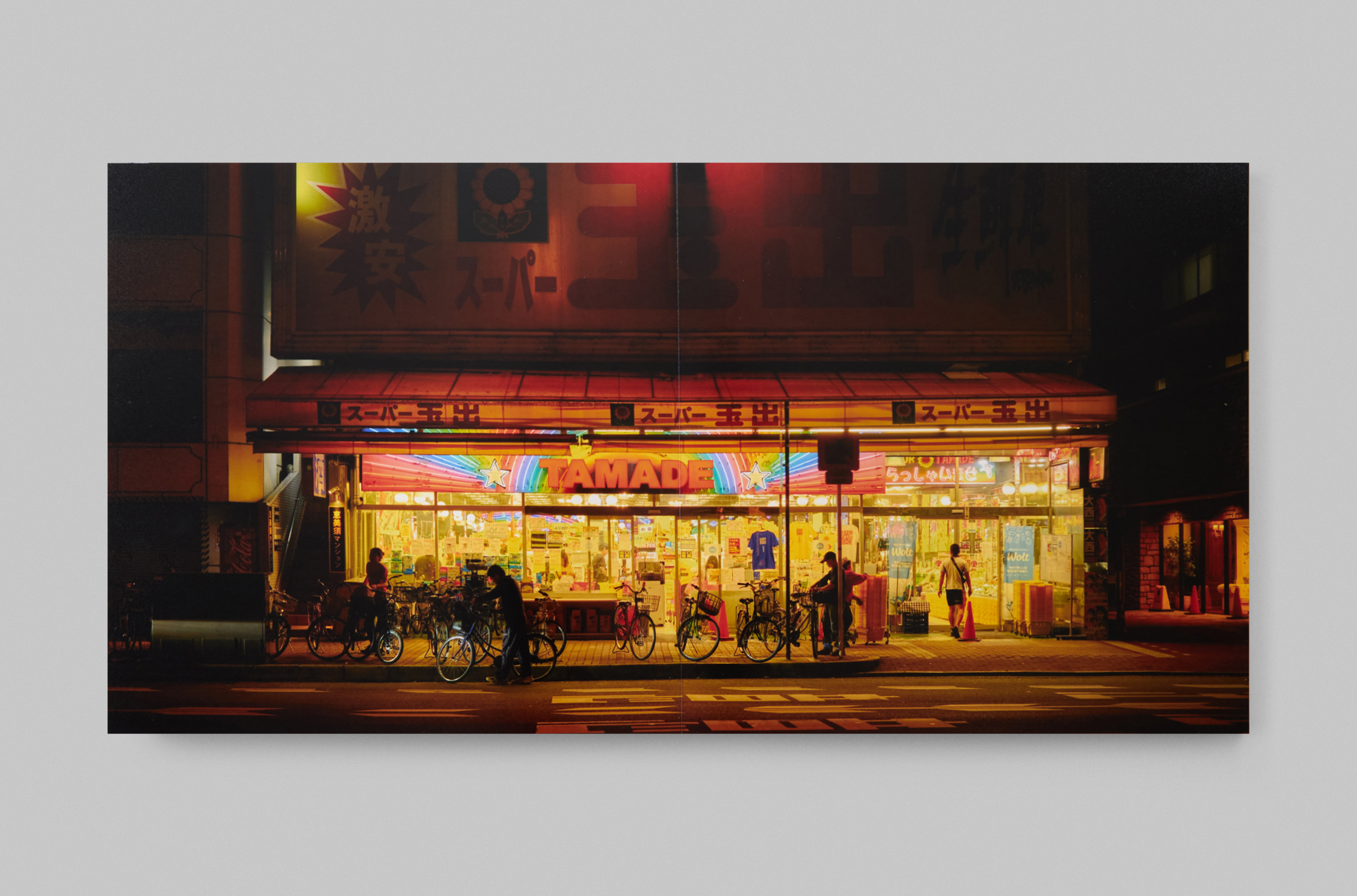
В японской визуальной культуре пустота и молчание — не отсутствие, а средство общения и пространство для размышления.
Я опирался на эти принципы работая над версткой и дизайном. Заодно пришлось немного разобраться с японской орфографией
и способами всё это сверстать: иероглифы помещаются в квадраты и легко компонуются по горизонтали и вертикали.
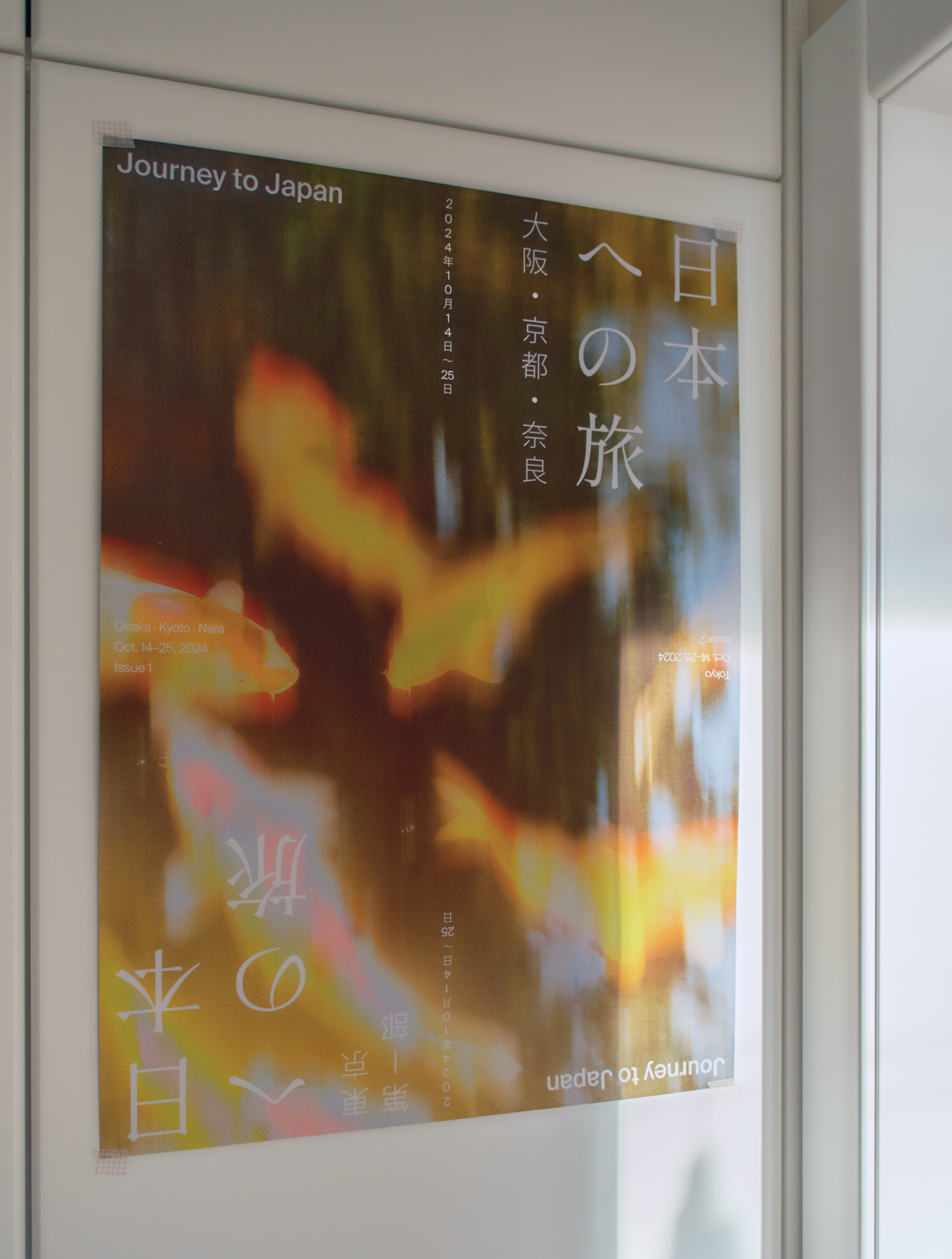
А ещё на основе обложек я сделал плакат формата А2, который теперь висит над моим рабочим столом.
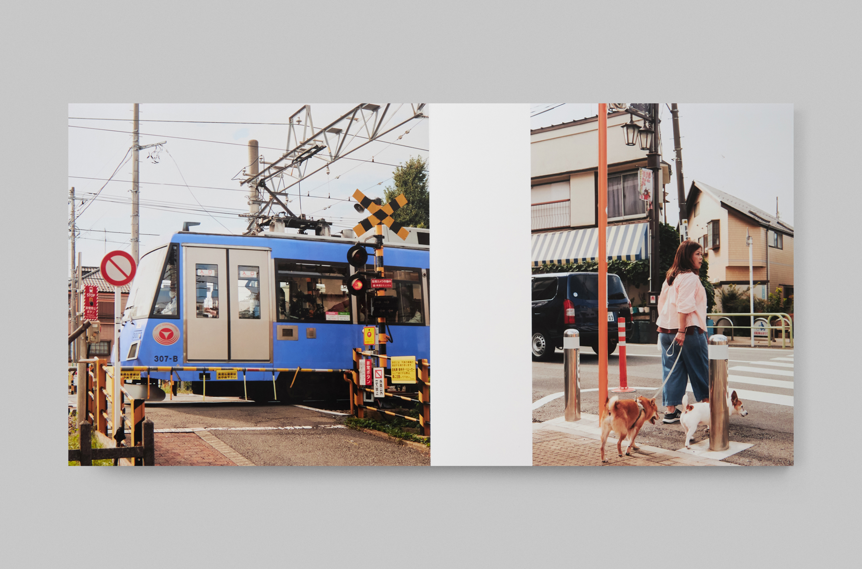
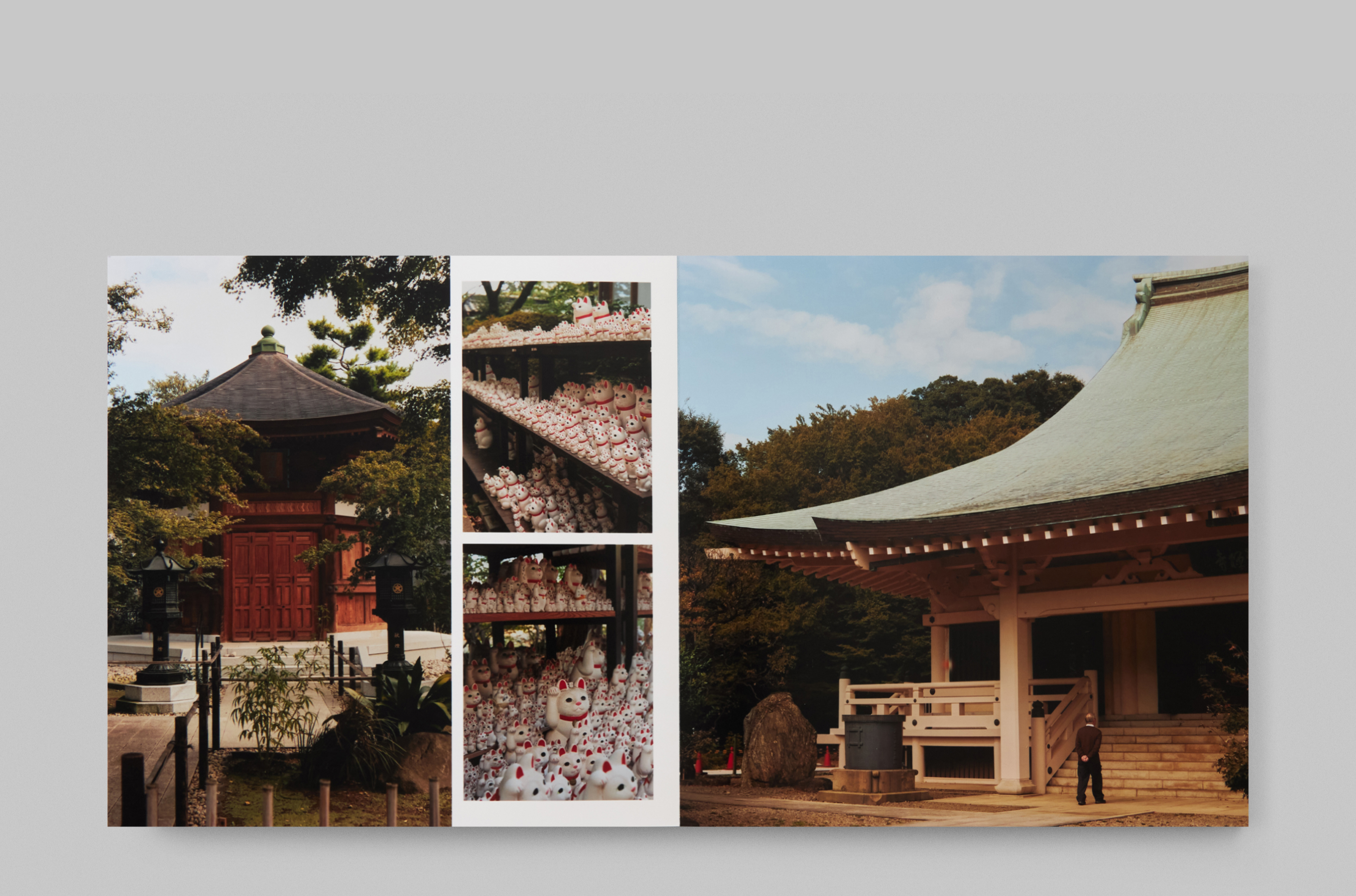
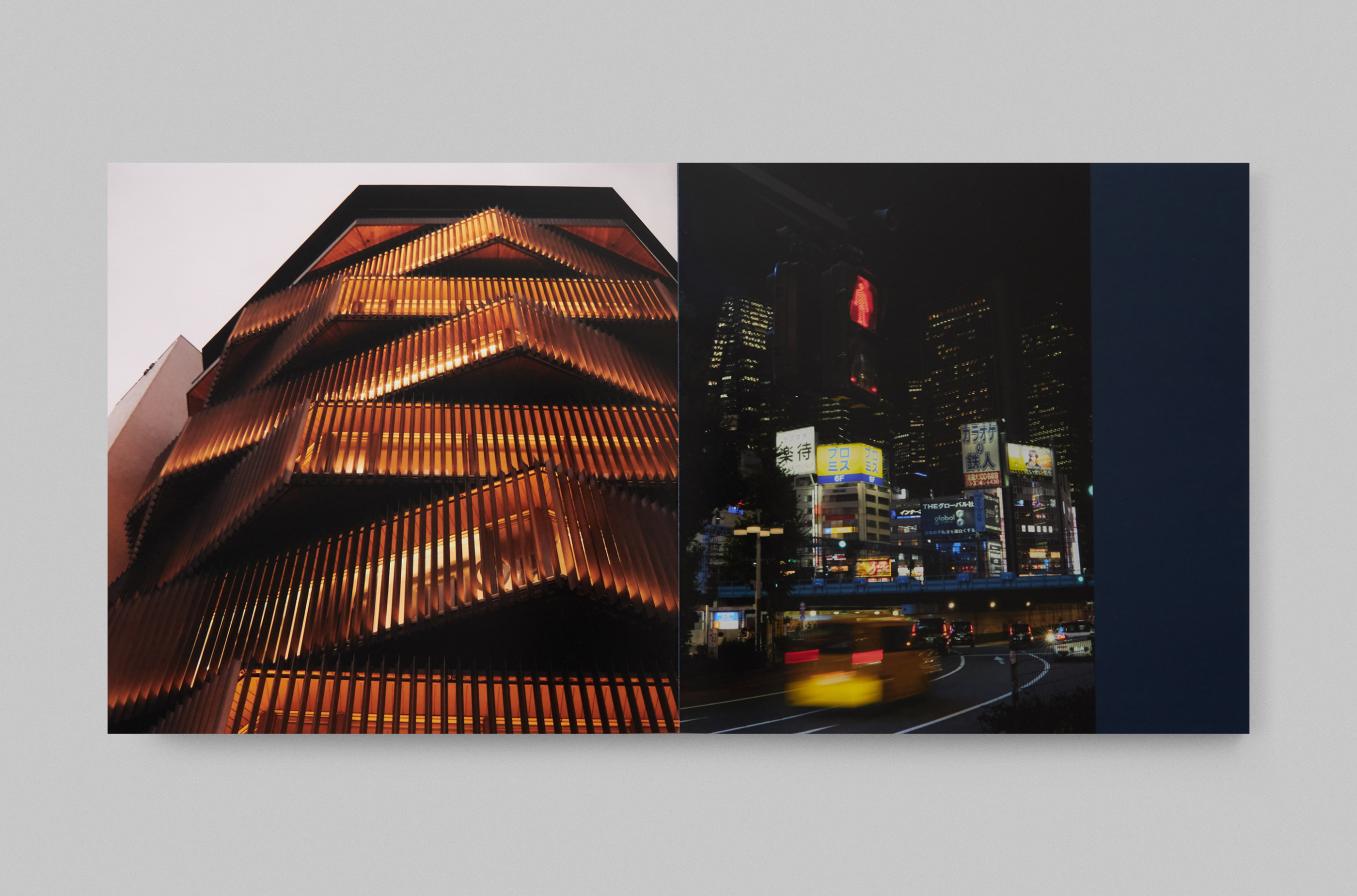
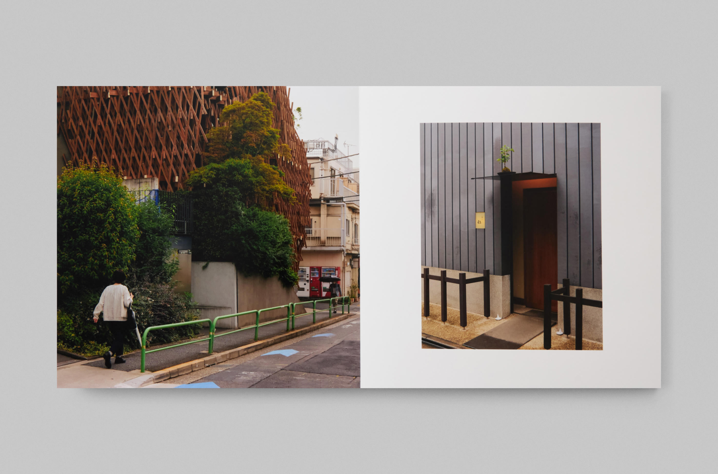
Almost a year after our trip to Japan, we have compiled our impressions into a 20 × 20 cm photo book, consisting of two parts: the first — Osaka, Kyoto, and Nara, the second — Tokyo.
In Japanese visual culture, emptiness and silence are not absence, but a means of communication and a space for reflection. I applied these principles while working on the layout and design. At the same time, I had to familiarize myself with Japanese orthography and ways of setting
it all up: Japanese characters fit into squares and can be arranged easily both horizontally and vertically.
Based on the covers, I also created an A2 poster, which now hangs above my desk.
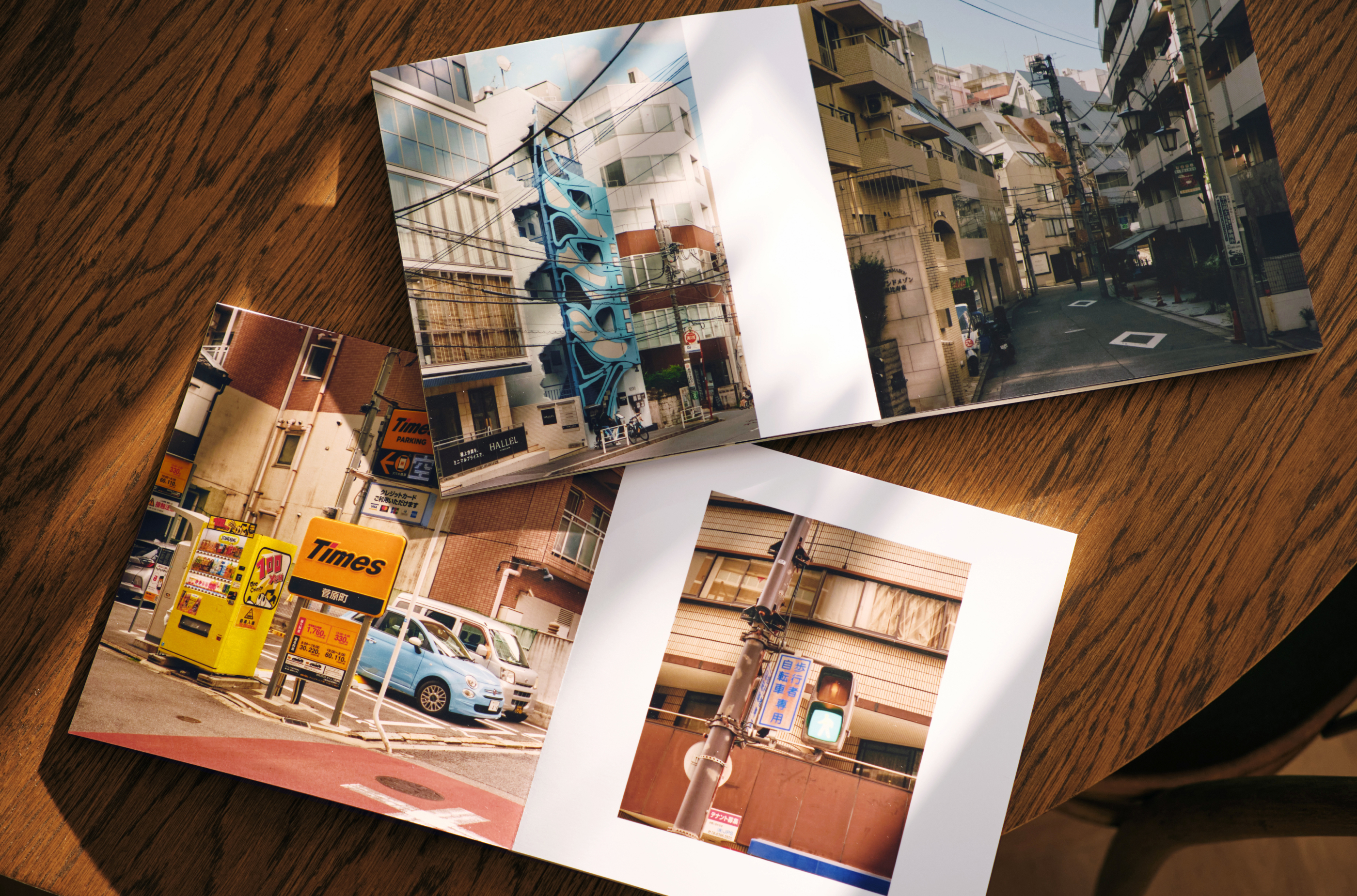
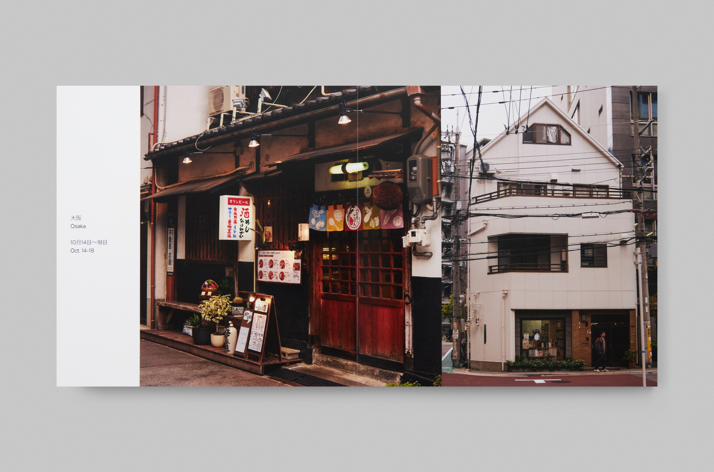
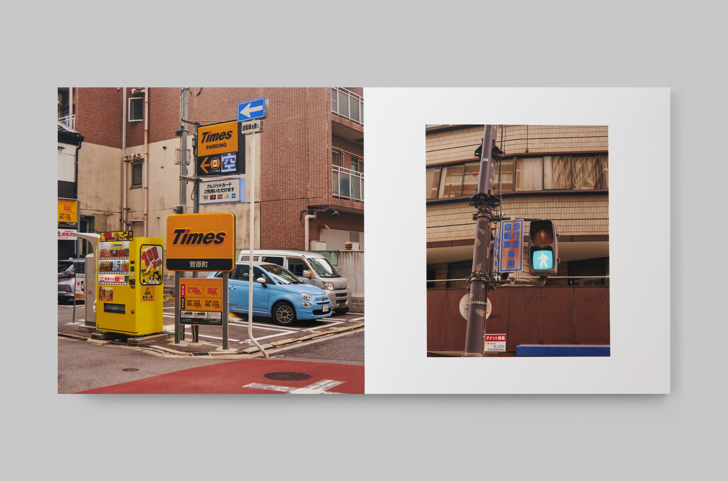
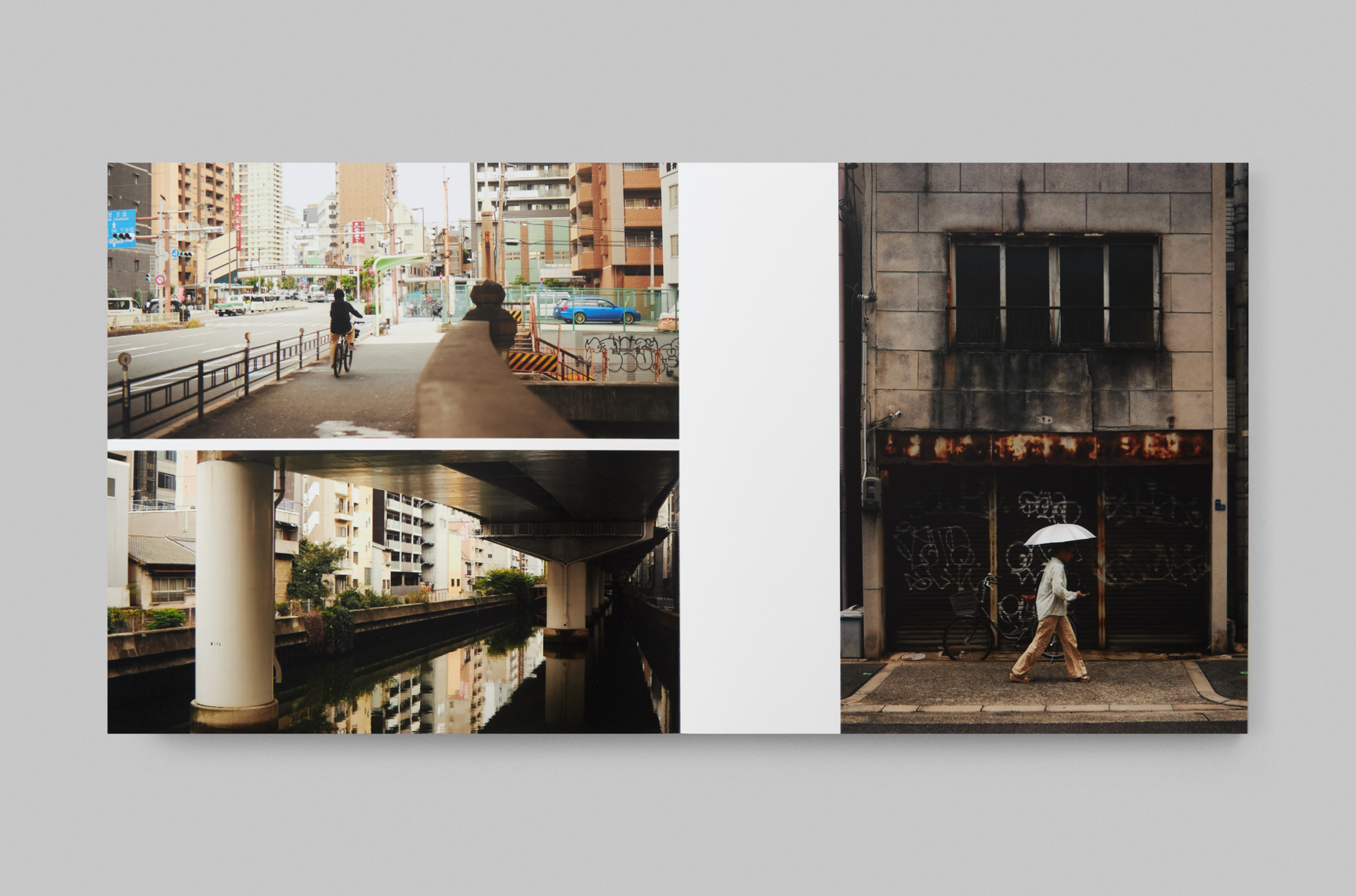
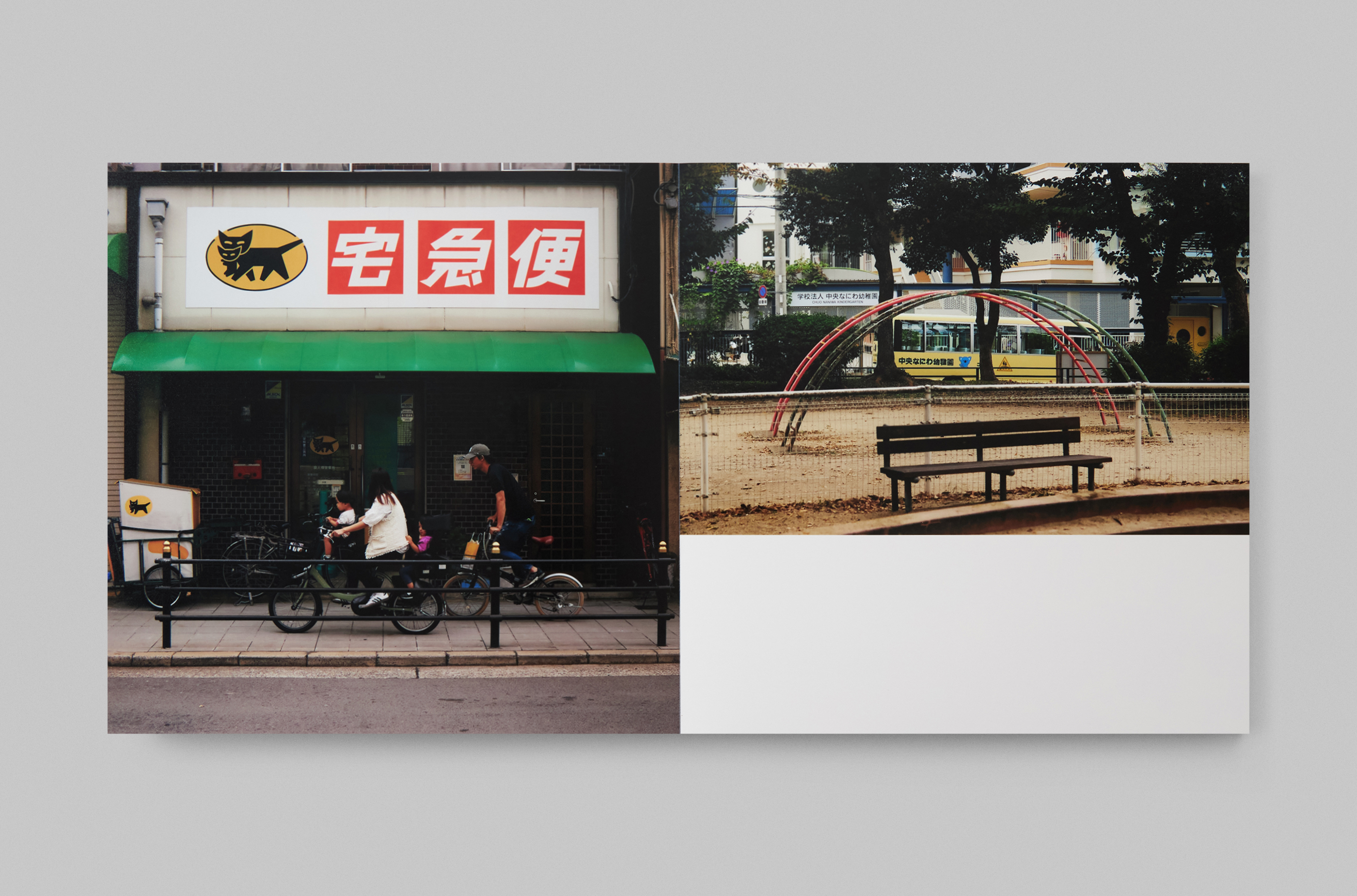
20 × 20 cm
50 pages (25 + 25)
Photoprint RA-4
Photography and design – Svetlana Frolova, Igor Baldin
igor.baldin97@ya.ru