Alchemy of Beauty, a brand identity for a natural cosmetics brand
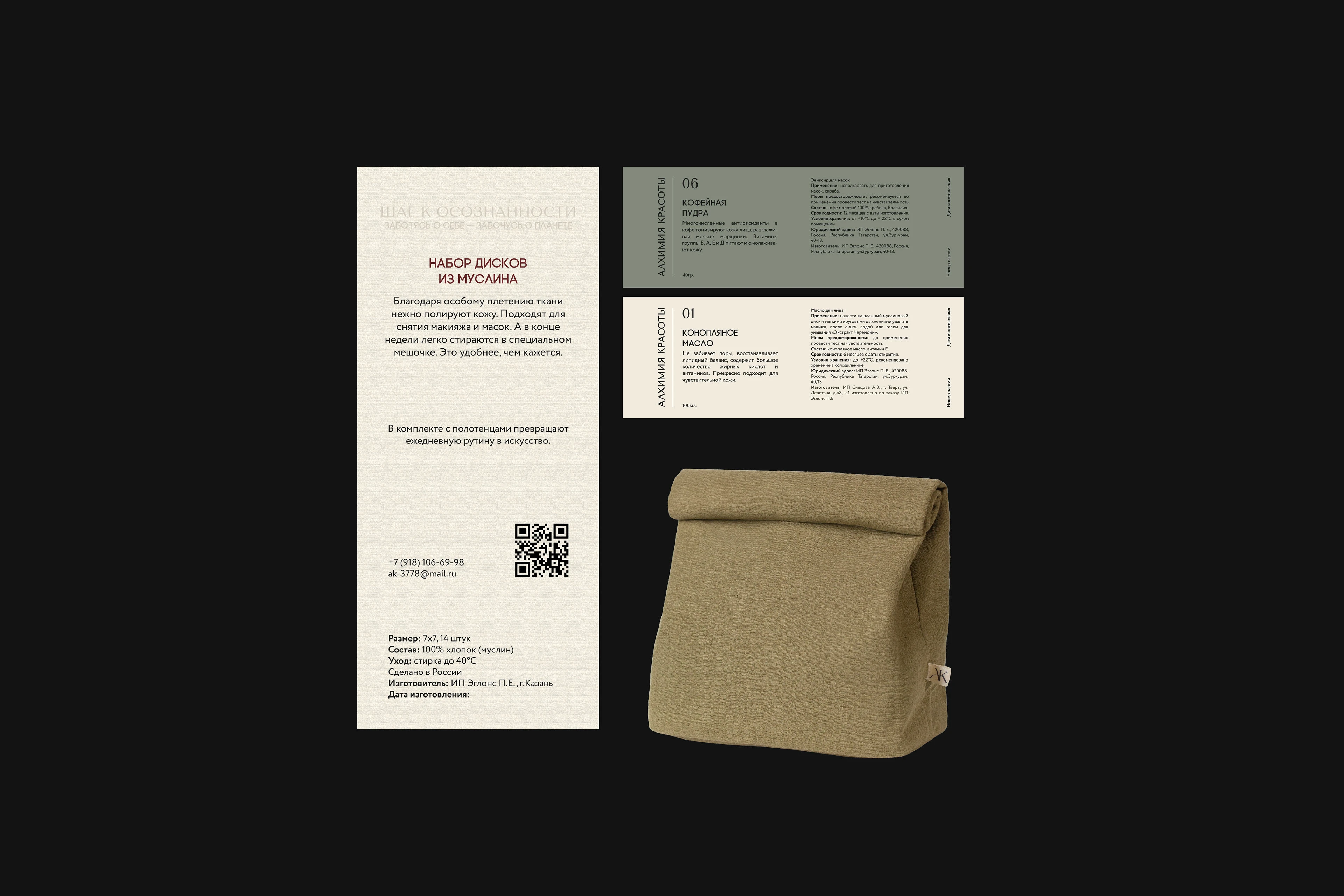
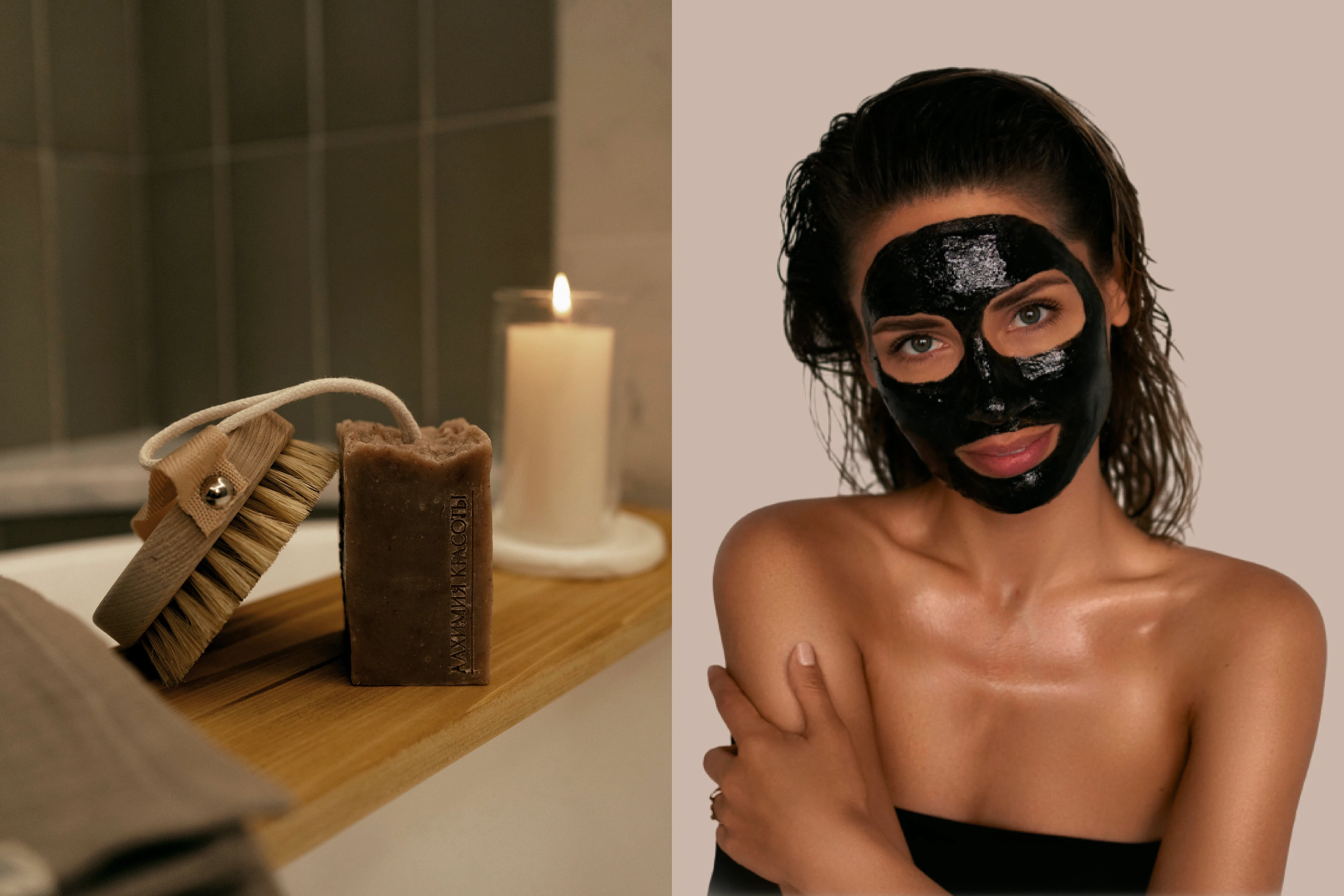
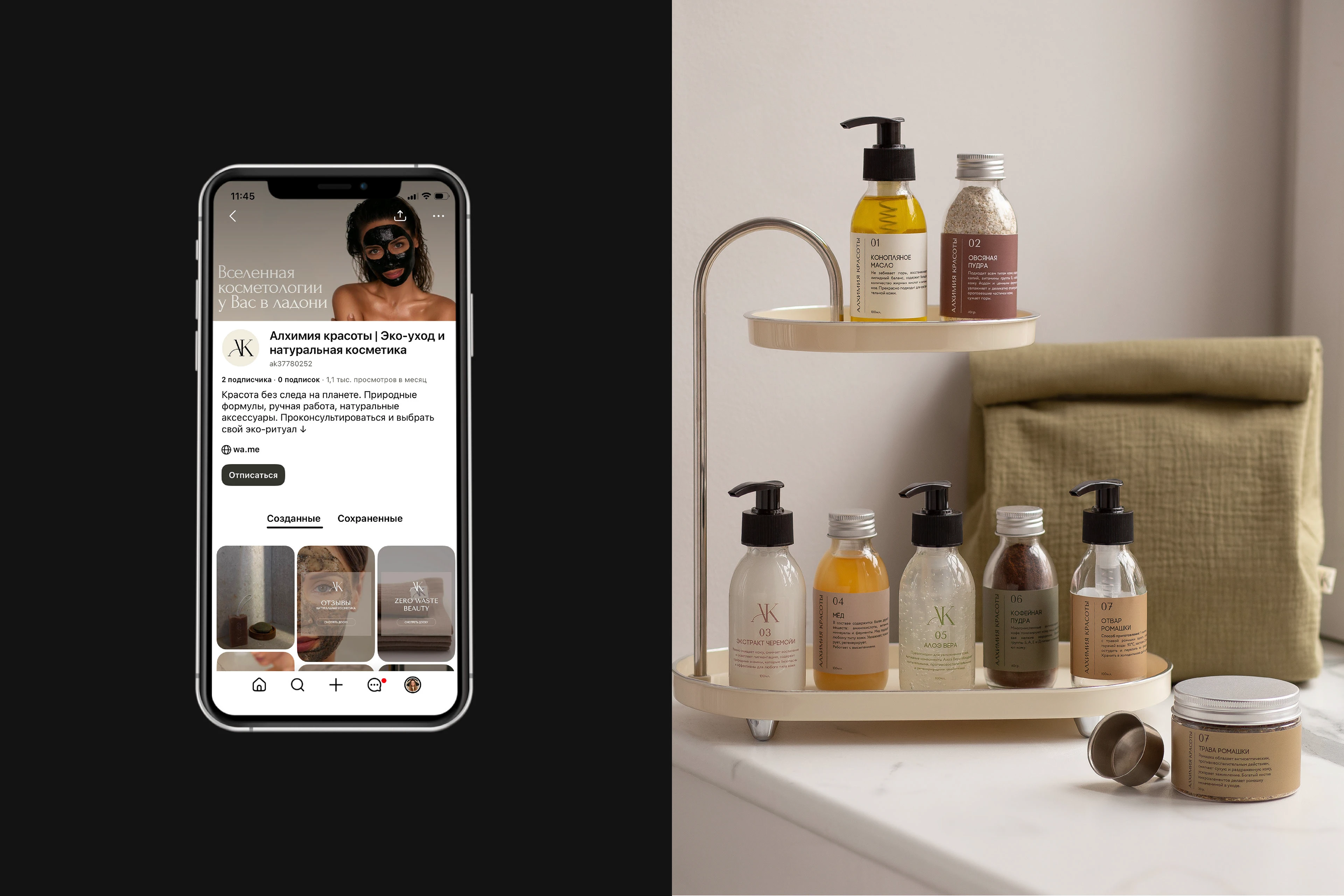
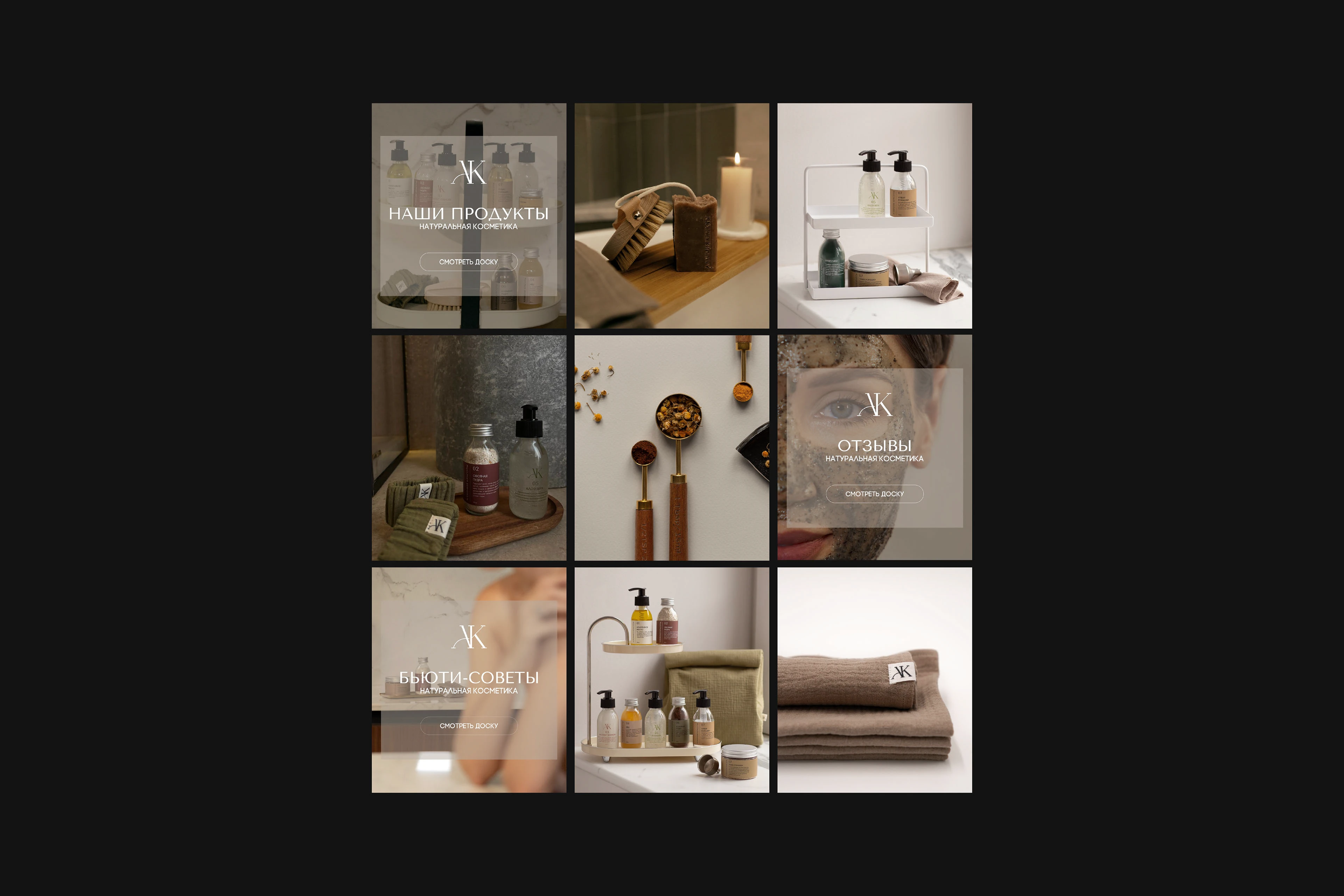
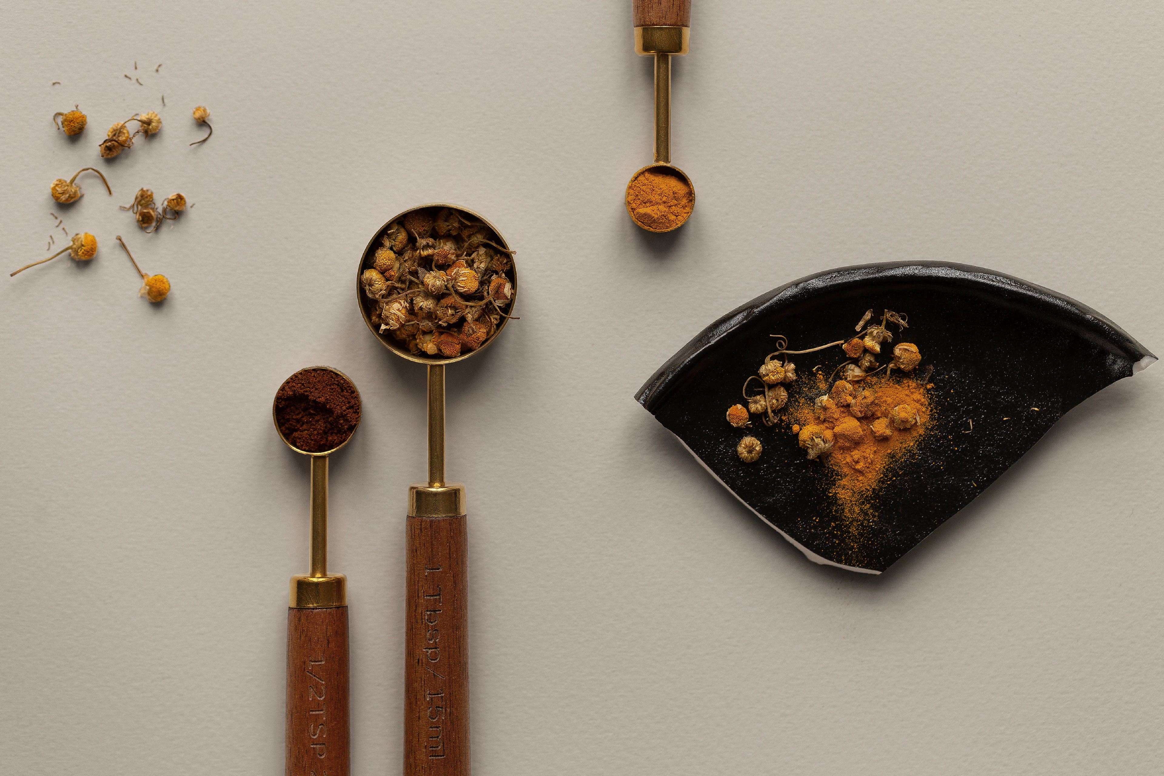
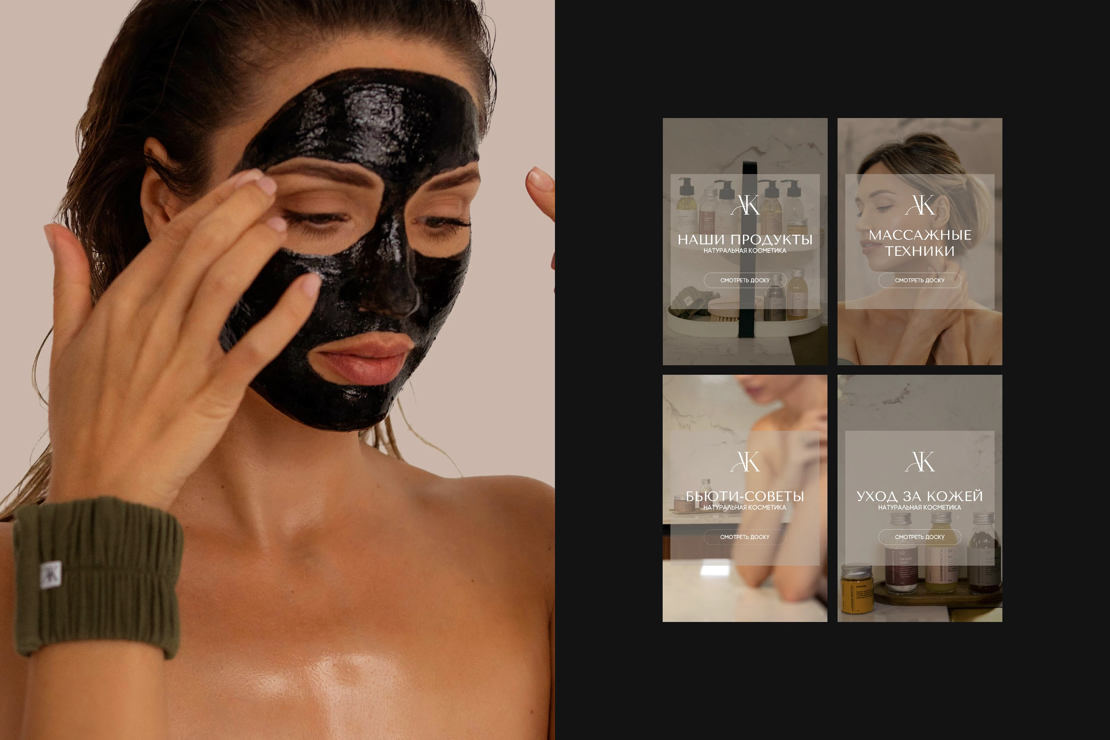
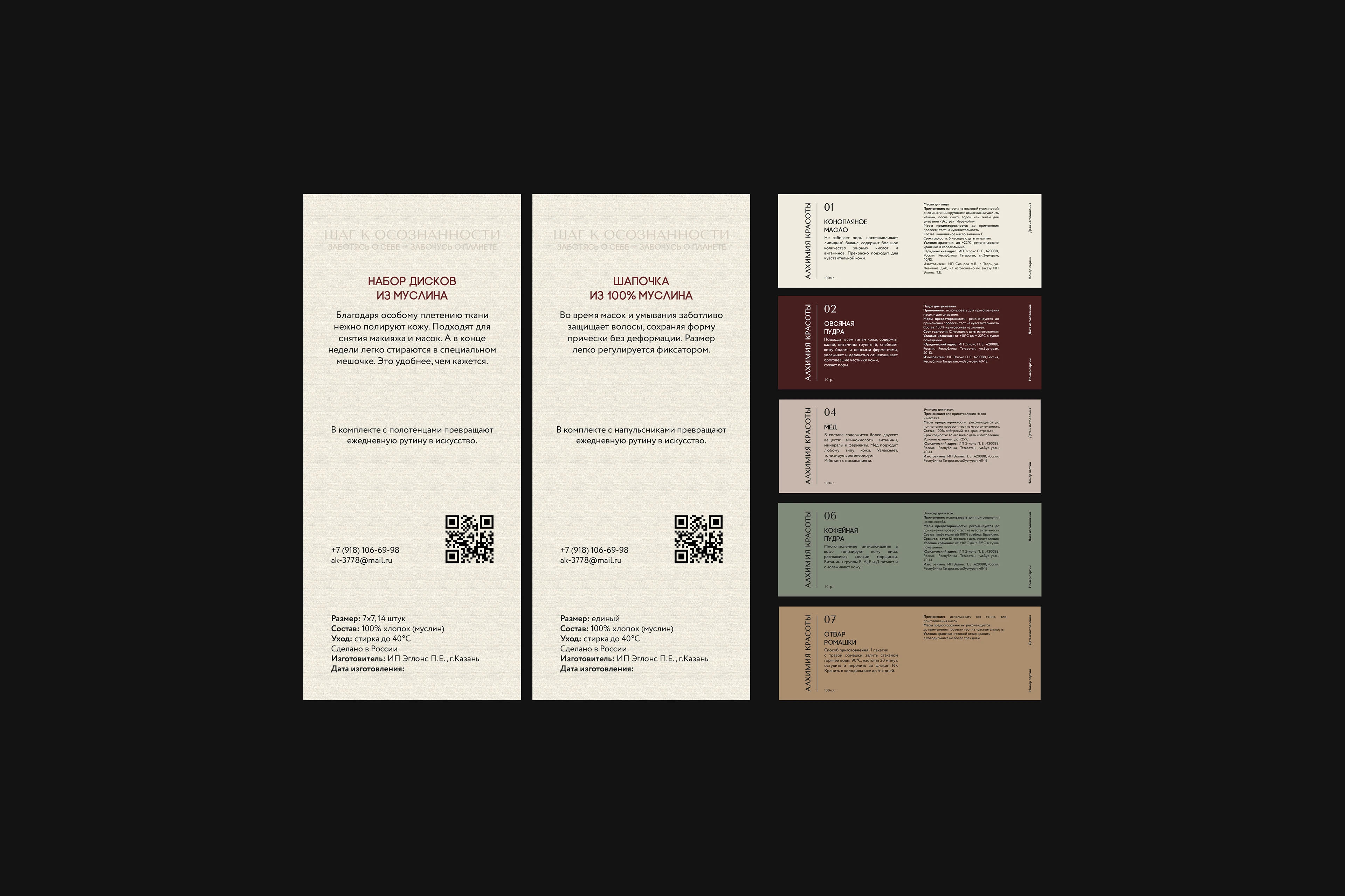
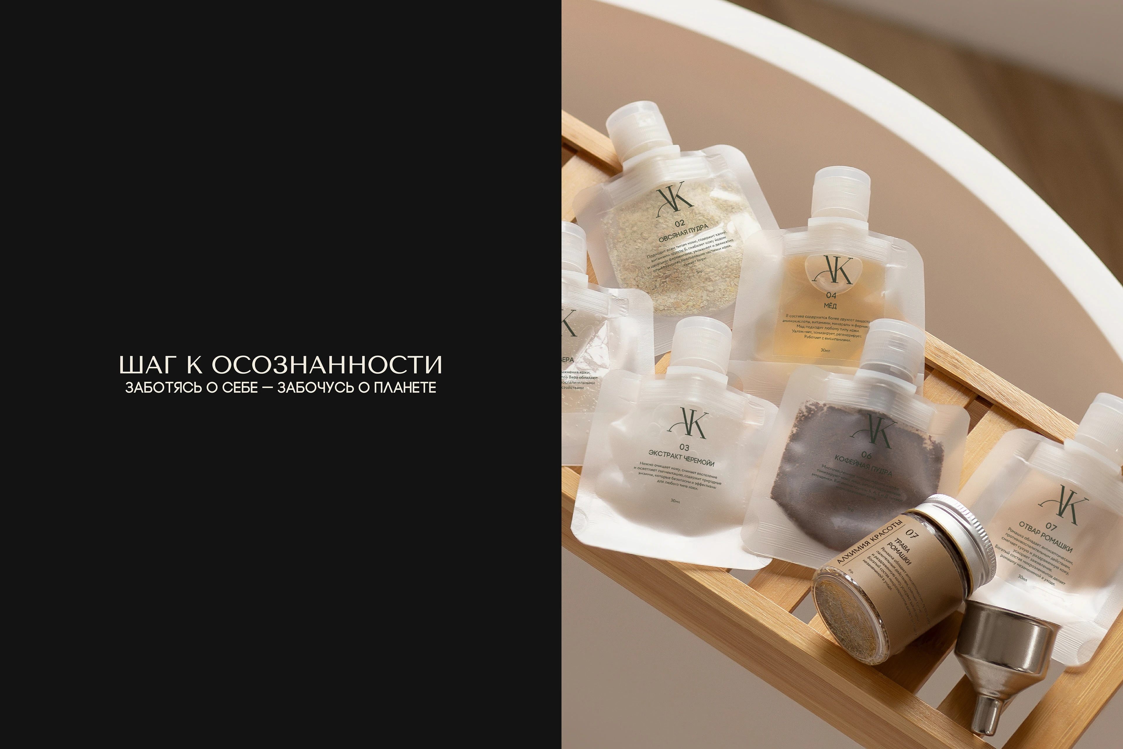
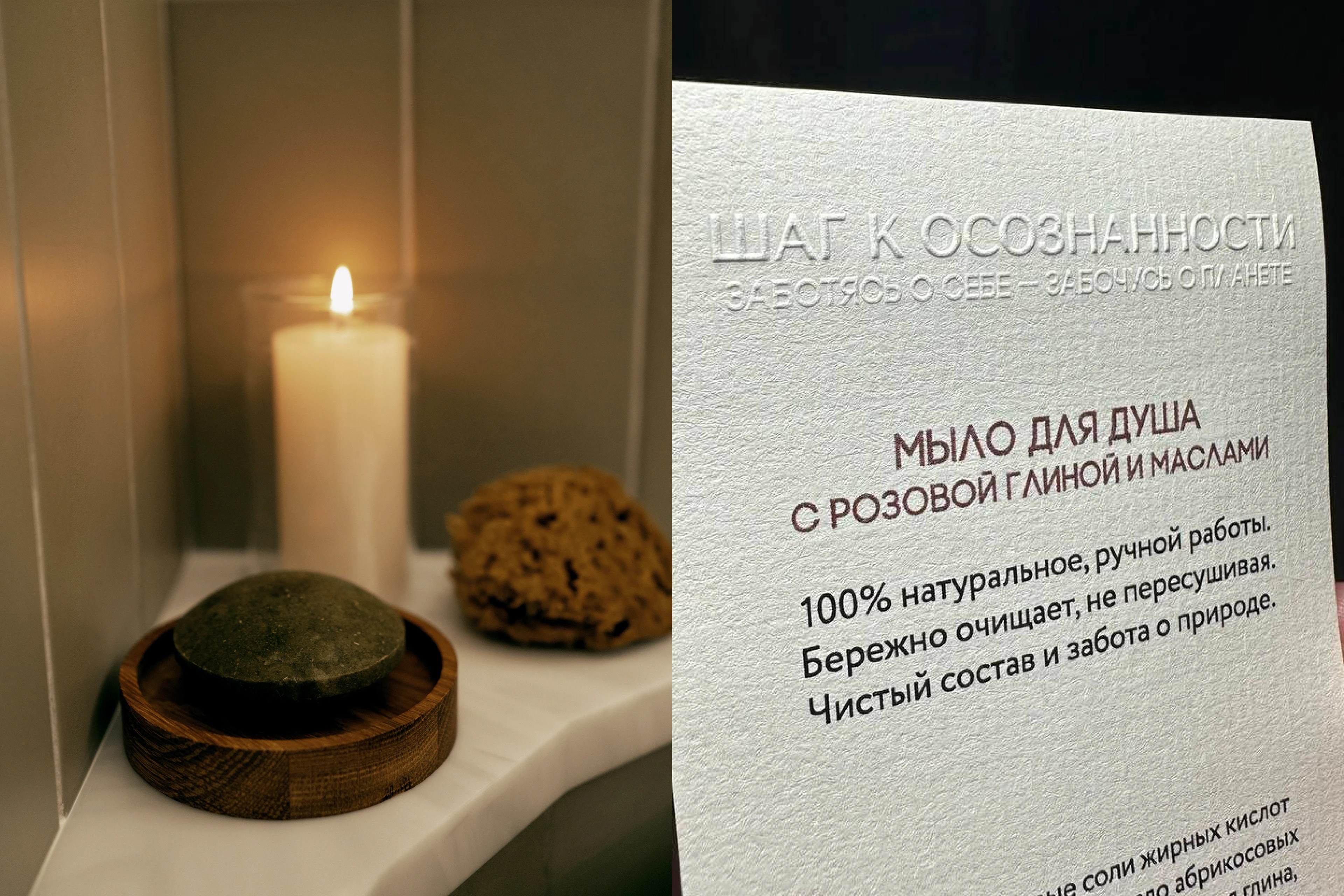
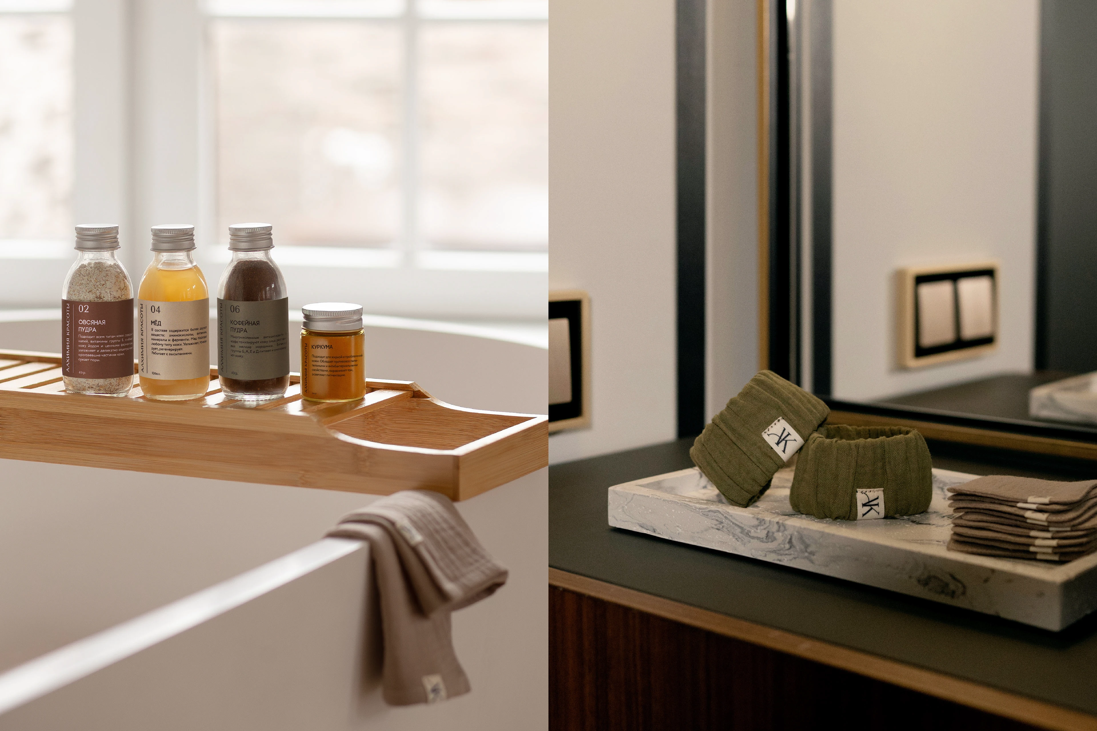
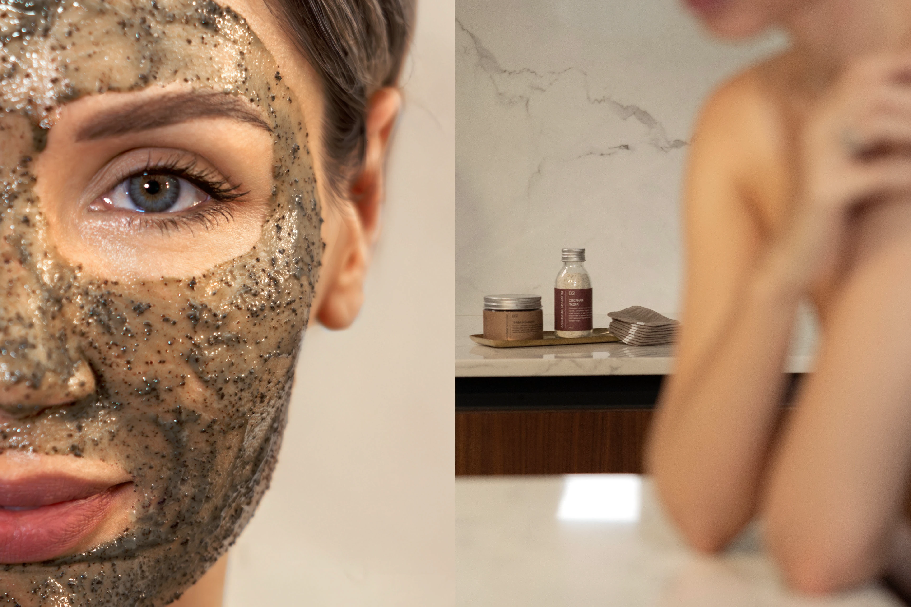
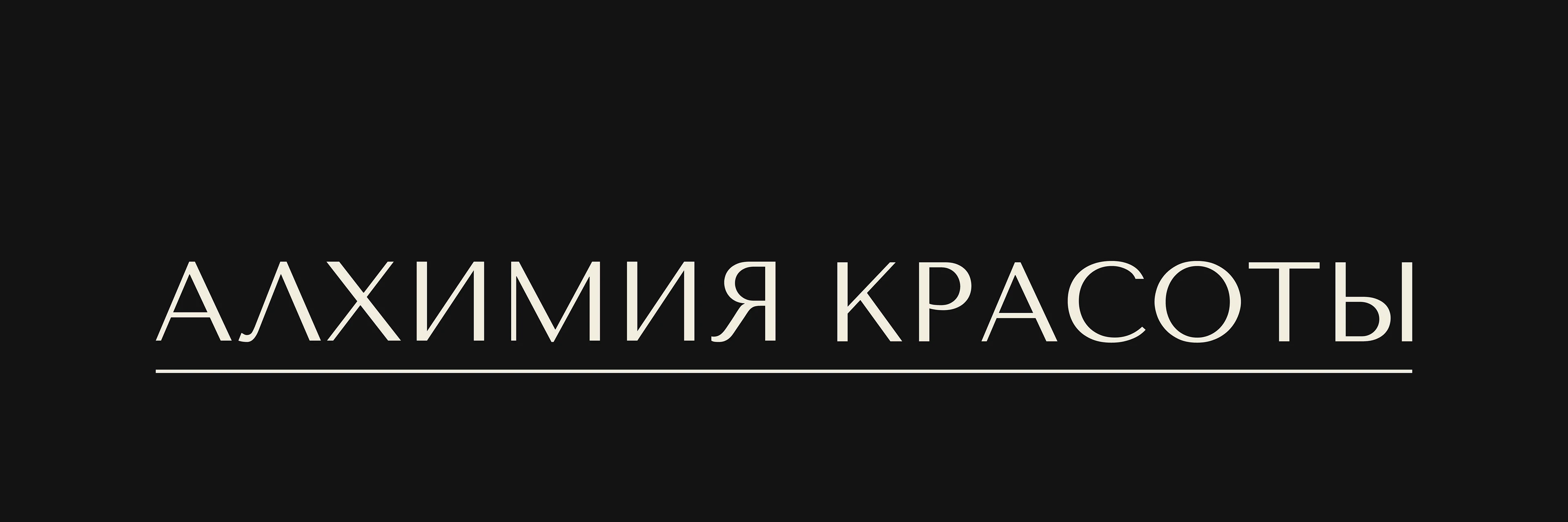
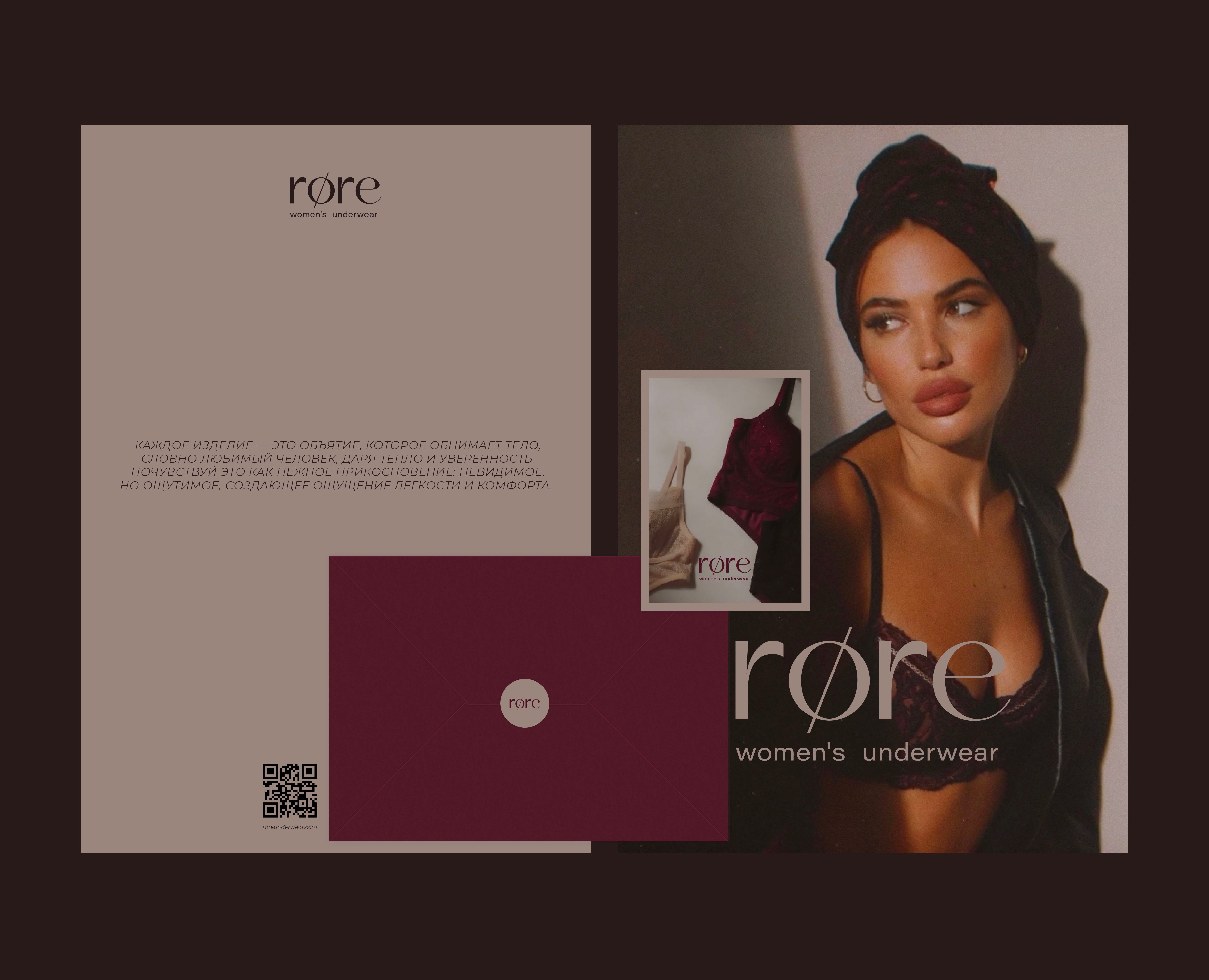
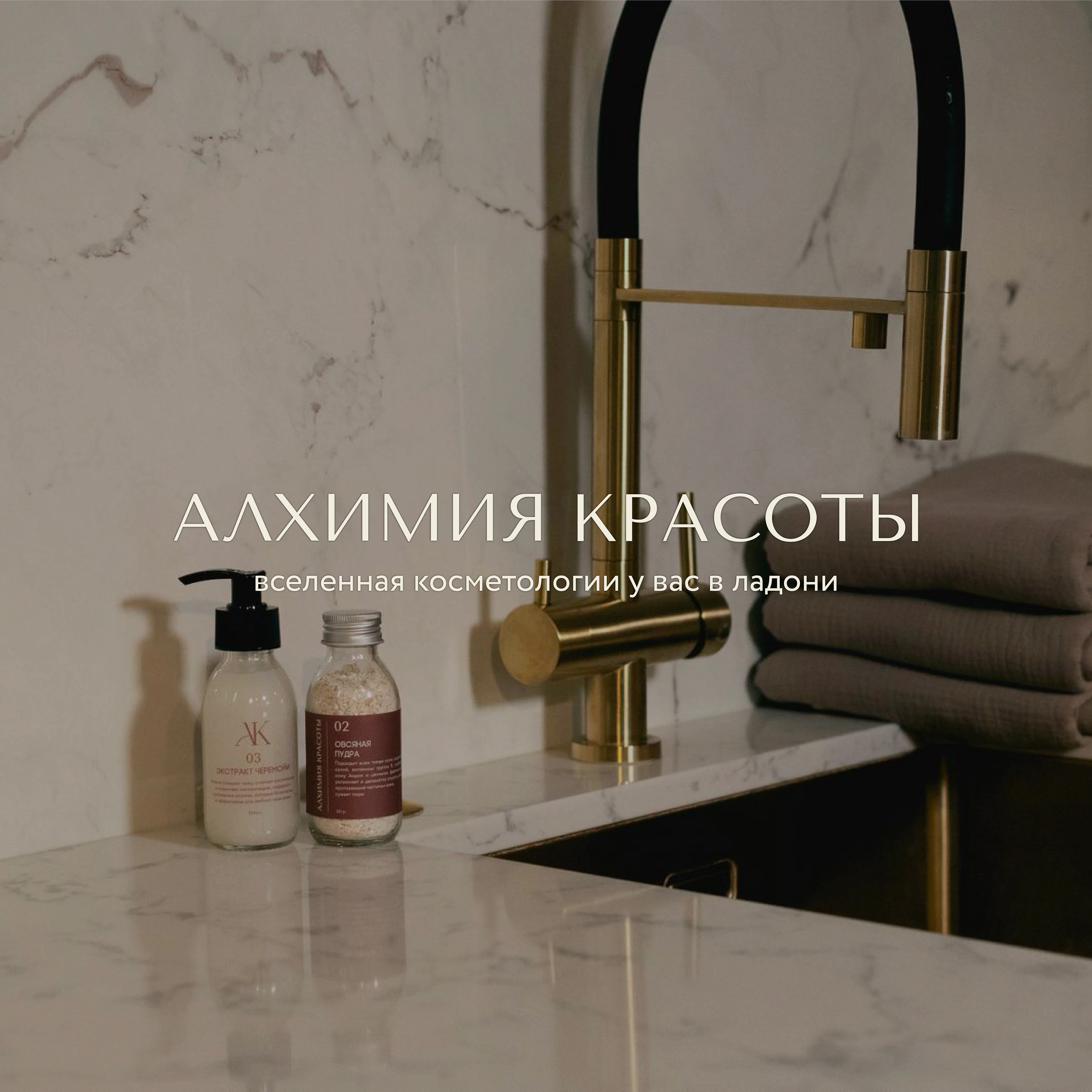
«Алхимия красоты» — это экосистема натурального ухода, созданная вокруг идей осознанности, экологичности и уважения к природе. В рамках проекта я разработала айдентику, передающую эту философию через лёгкий вордмарк-логотип и утончённый монограмный знак «АК», отражающие мягкость, силу и естественность бренда. Цветовая палитра построена на природных оттенках — песочных, травяных и землистых, создающих ощущение доверия и гармонии. Упаковка выполнена исключительно из перерабатываемых материалов — крафта, муслина и необработанной бумаги, что усиливает экологичный подход и добавляет тактильности. Айдентика получилась целостной, масштабируемой и легко применимой во всех каналах, от упаковки до социальных сетей. Такой визуальный язык помог бренду выделиться среди промышленной косметики, подчеркнув его честность, натуральность и экспертность, а также донёс идею о том, что уход может быть простым, экологичным и по-настоящему эффективным.
"Alchemy of Beauty" is a natural skincare ecosystem built around the concepts of mindfulness, eco-friendliness, and respect for nature. For the project, I developed an identity that conveys this philosophy through a lightweight wordmark logo and a refined monogrammed "AK" symbol, reflecting the brand's softness, strength, and naturalness. The color palette is built on natural tones—sand, grassy, and earthy—creating a sense of trust and harmony. The packaging is made exclusively from recyclable materials—kraft, muslin, and untreated paper—reinforcing the eco-friendly approach and adding a tactile feel. The identity is cohesive, scalable, and easily applicable across all channels, from packaging to social media. This visual language helped the brand stand out from the crowd of industrial cosmetics, emphasizing its honesty, naturalness, and expertise, and conveying the idea that skincare can be simple, eco-friendly, and truly effective.