О проекте
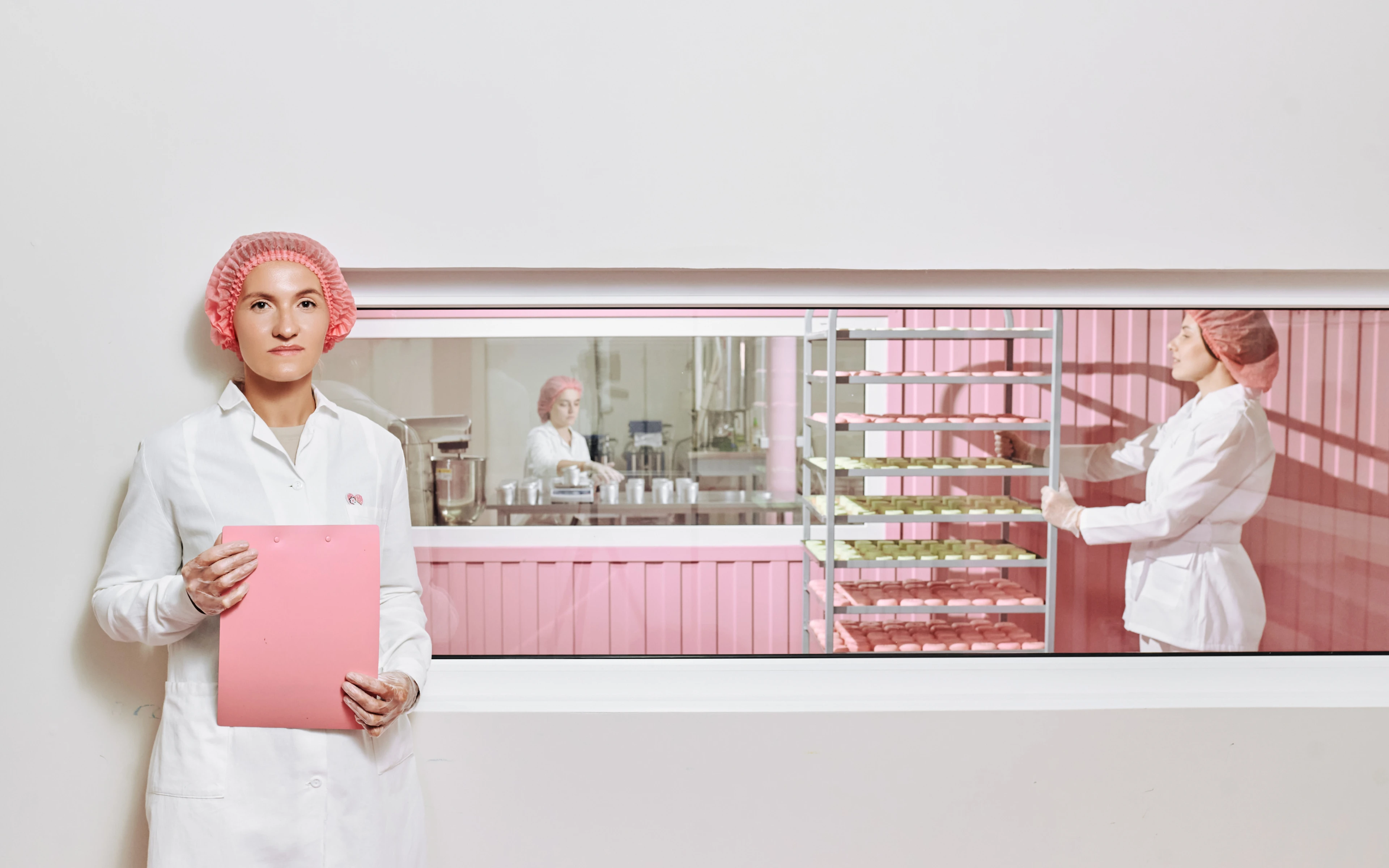
Бренд был создан с целью предложить естественное решение наиболее распространенных проблем с уходом за кожей, используя натуральные ингредиенты и уважая природу.
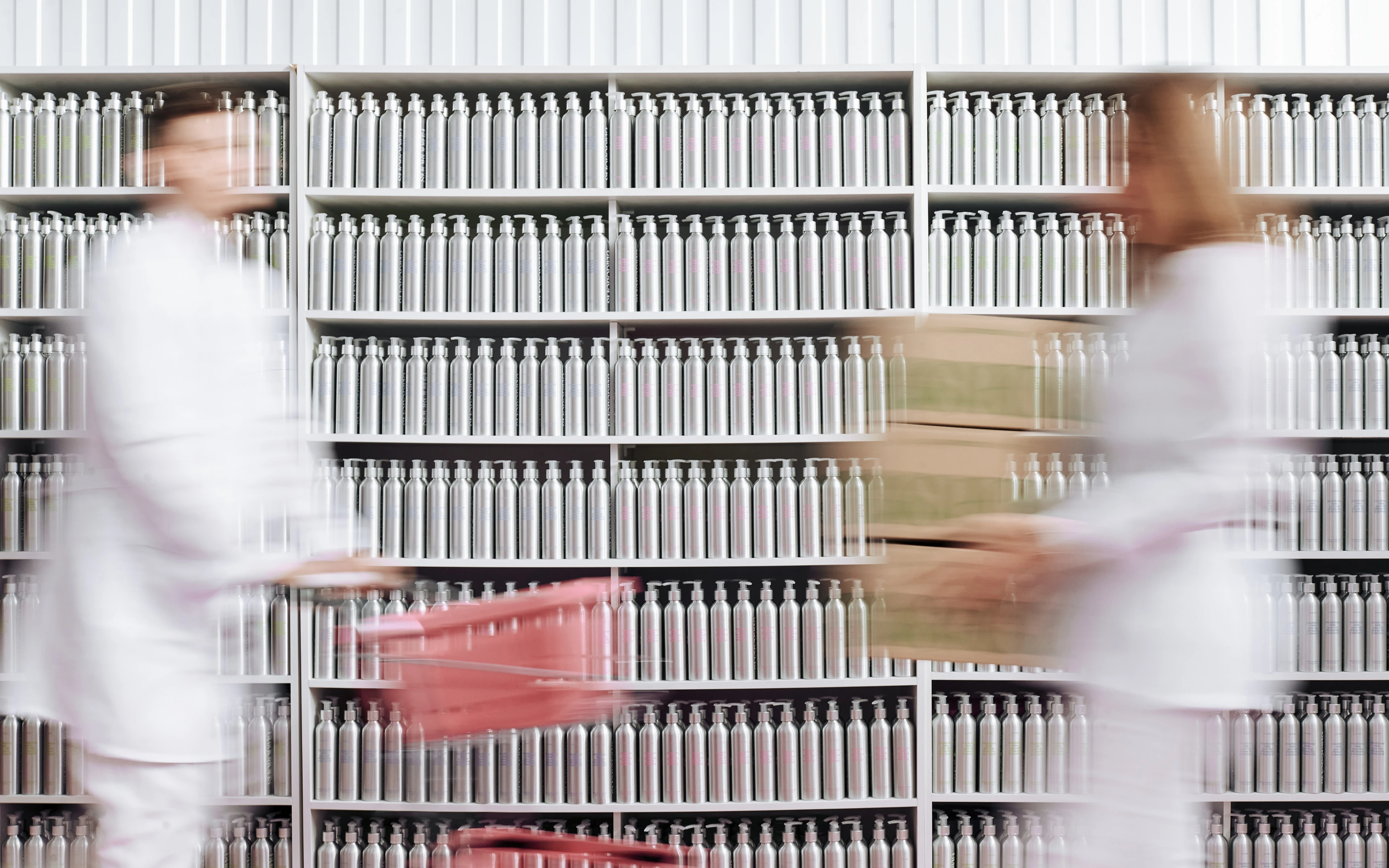
Smorodina выступает за создание единого экологического сообщества, что является важным шагом на пути к изменению отношения людей к окружающей среде. Бренд собирает вокруг себя большое сообщество сознательных людей, которые подают пример бережного отношения к природе. Он также стремится использовать экономичную упаковку, изготовленную из материалов, пригодных для вторичной переработки: алюминия, стекла и картона.
Base
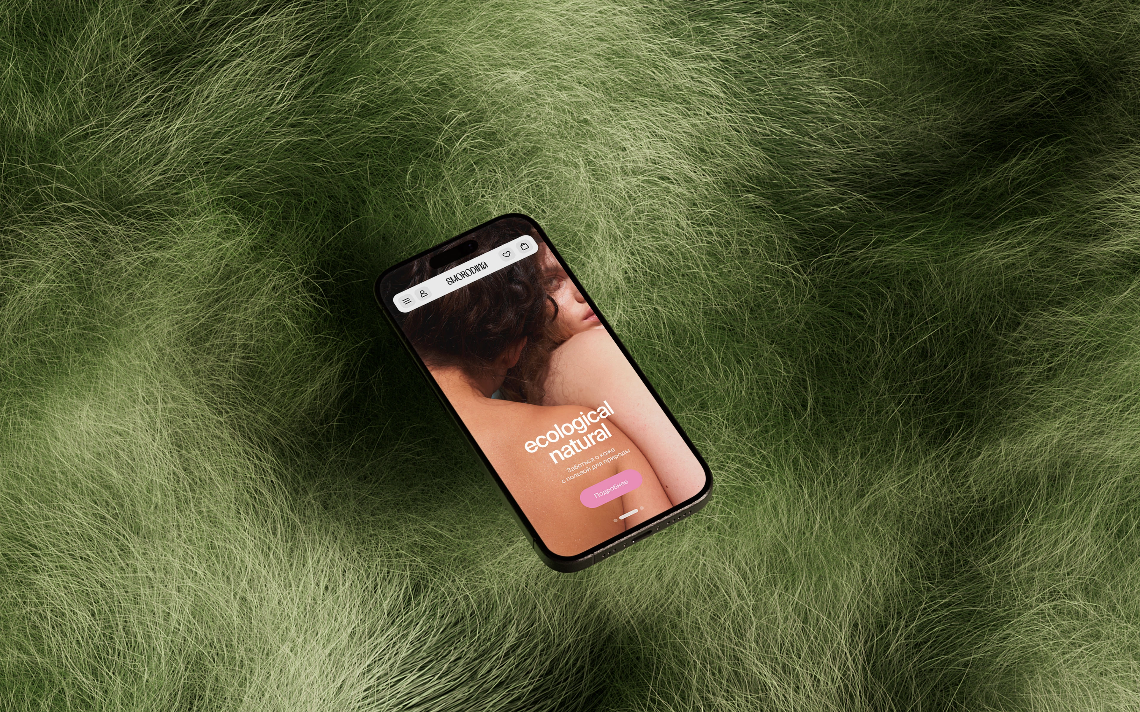
Our task was to create a new, bright identity, to make the brand fashionable and recognisable against the background of competitors in the eco-cosmetics segment. Strengthen the positioning and presentation of the entire brand. Create a new visual language that reflects the core values and speaks to the audience about caring for ourselves and the planet. Talk about efficacy and naturalness. At the same time, the brand should not shout about it, but communicate it quietly.
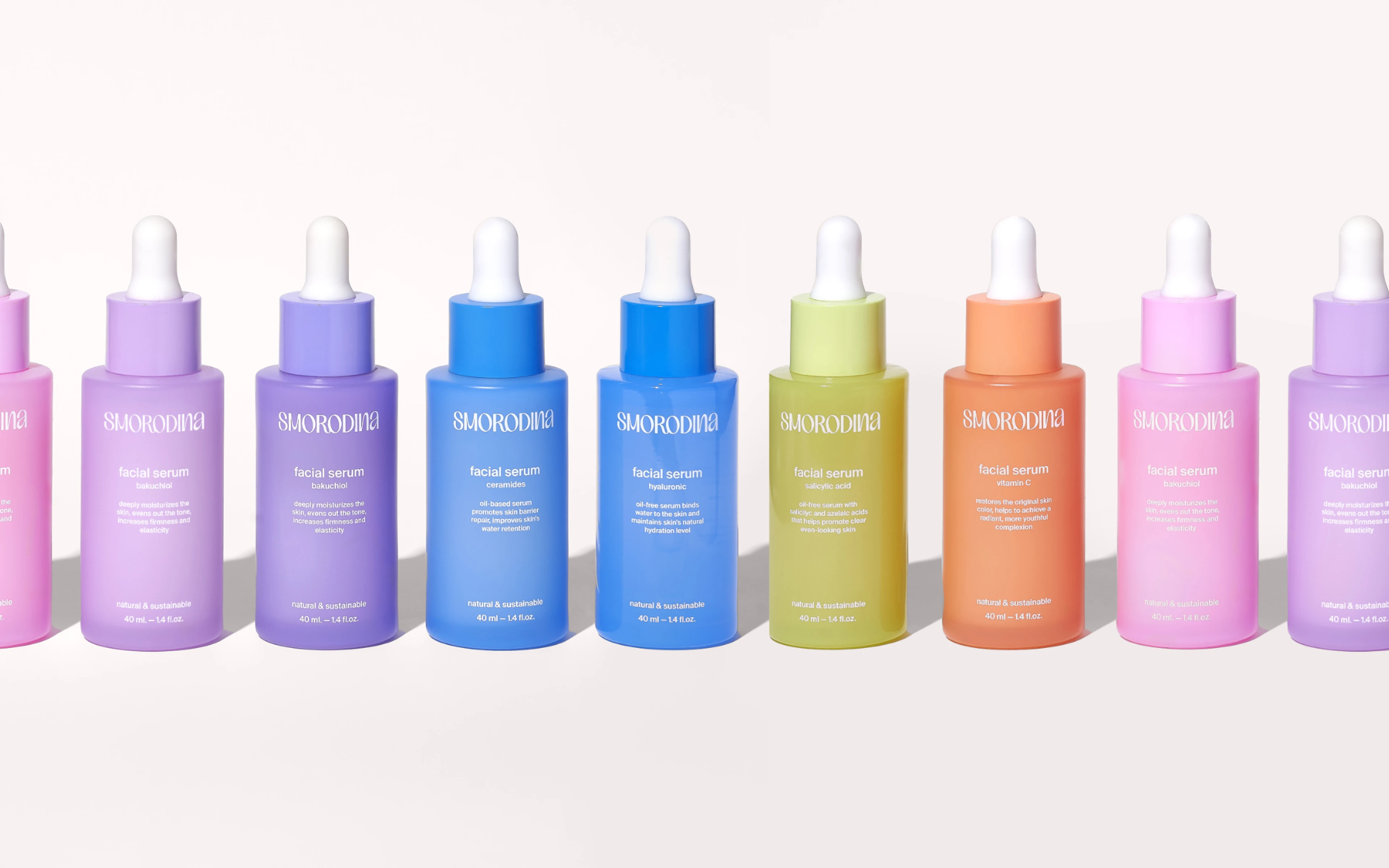
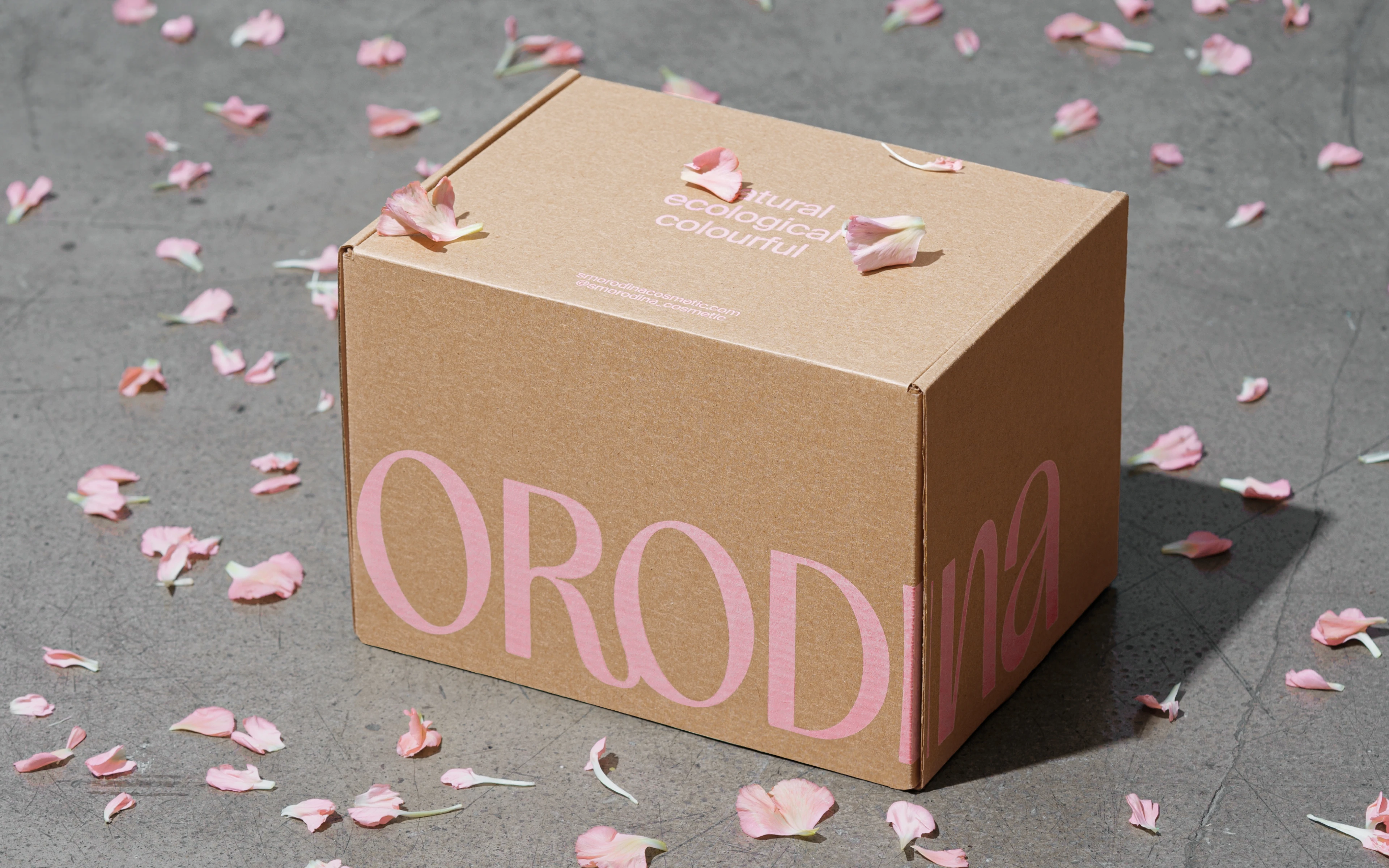
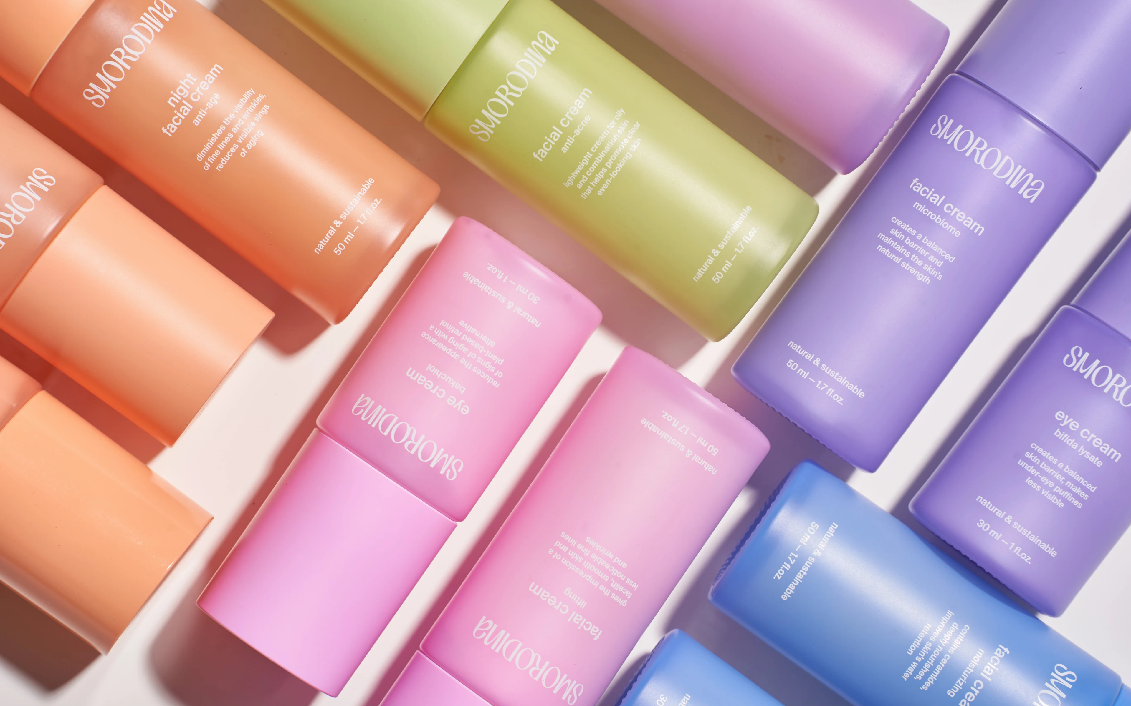
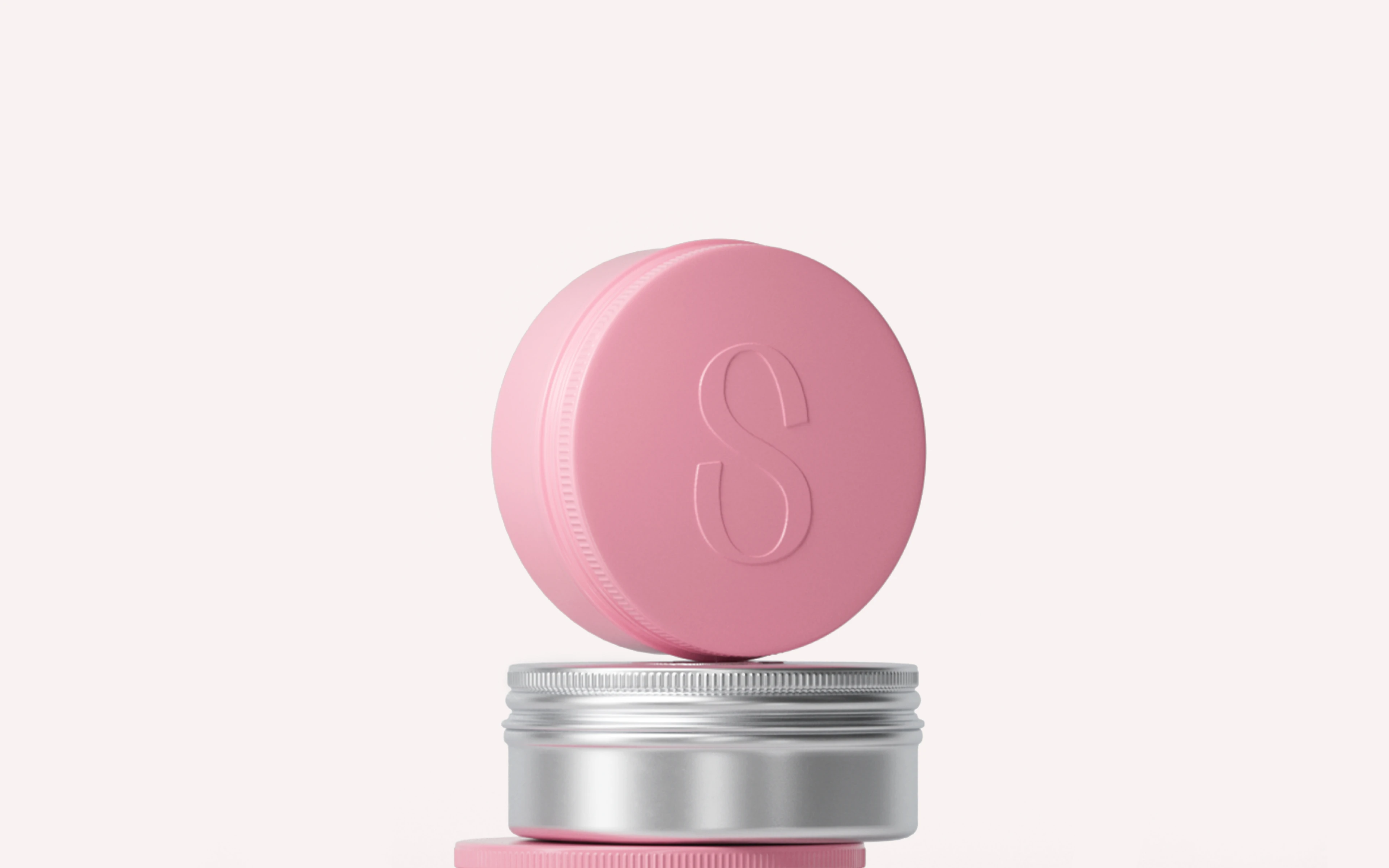
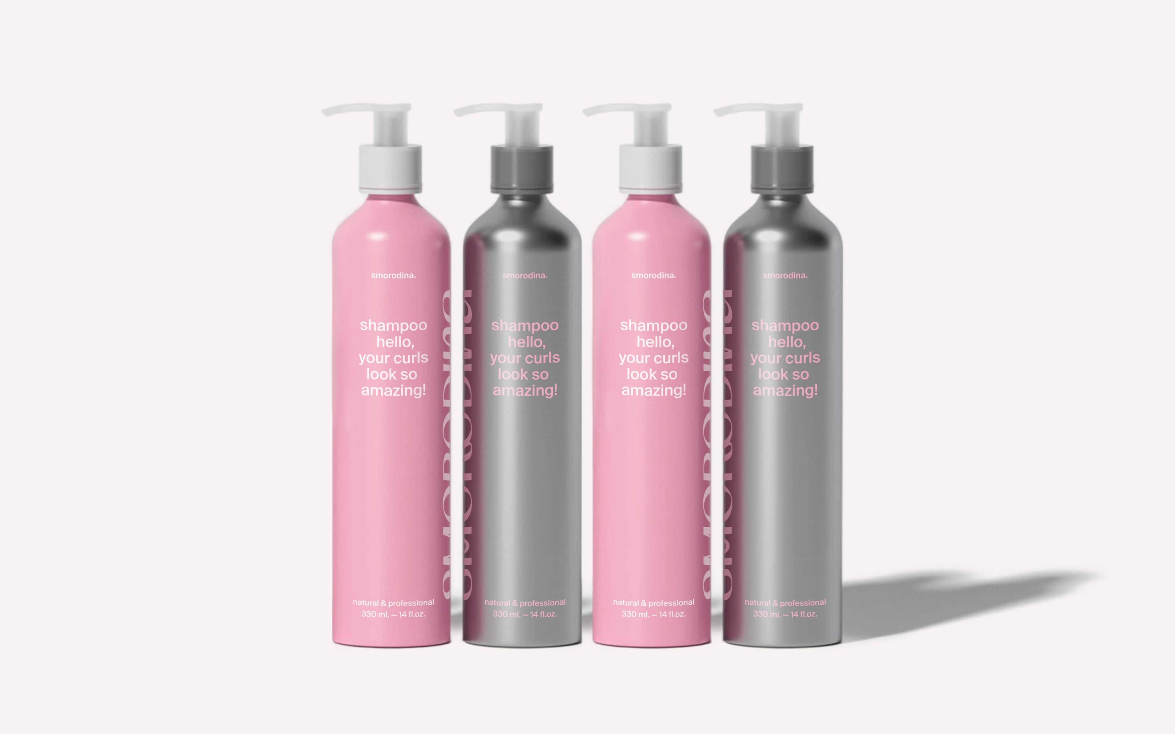
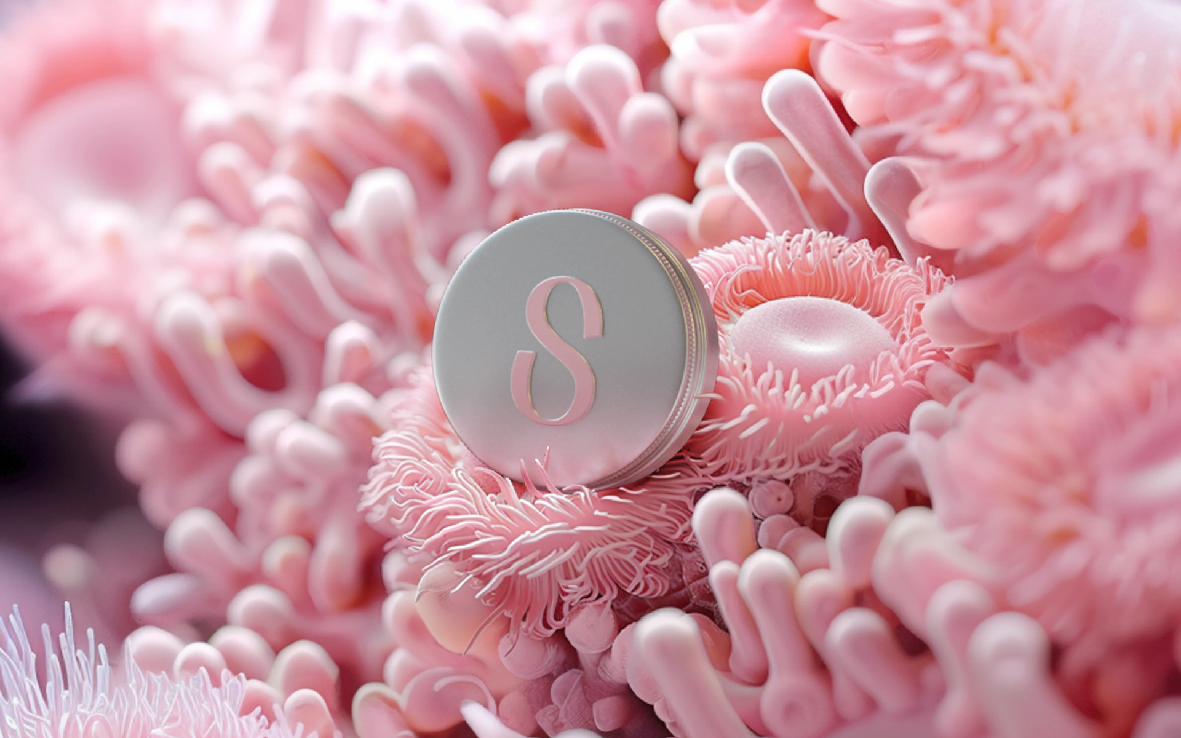
Packaging
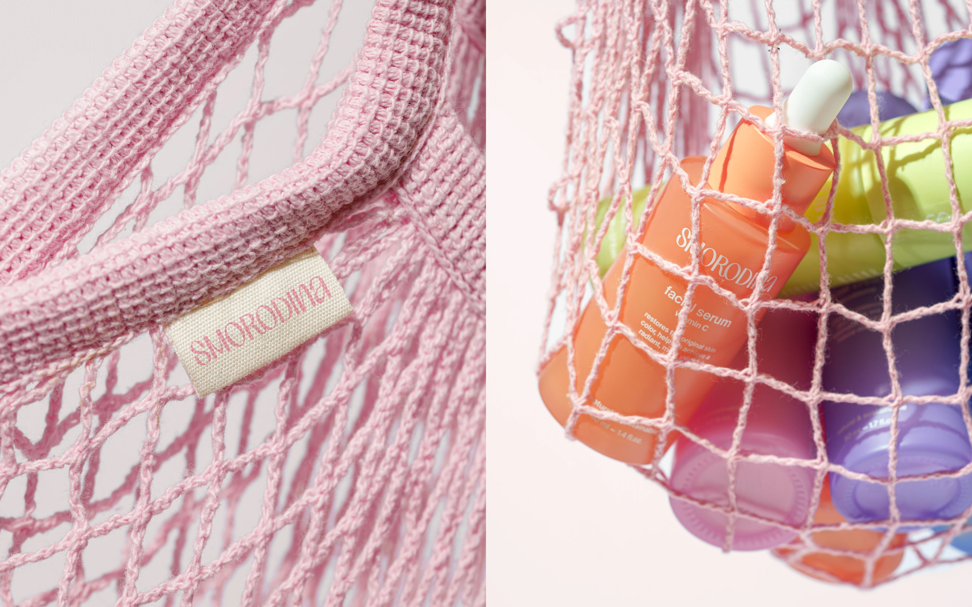
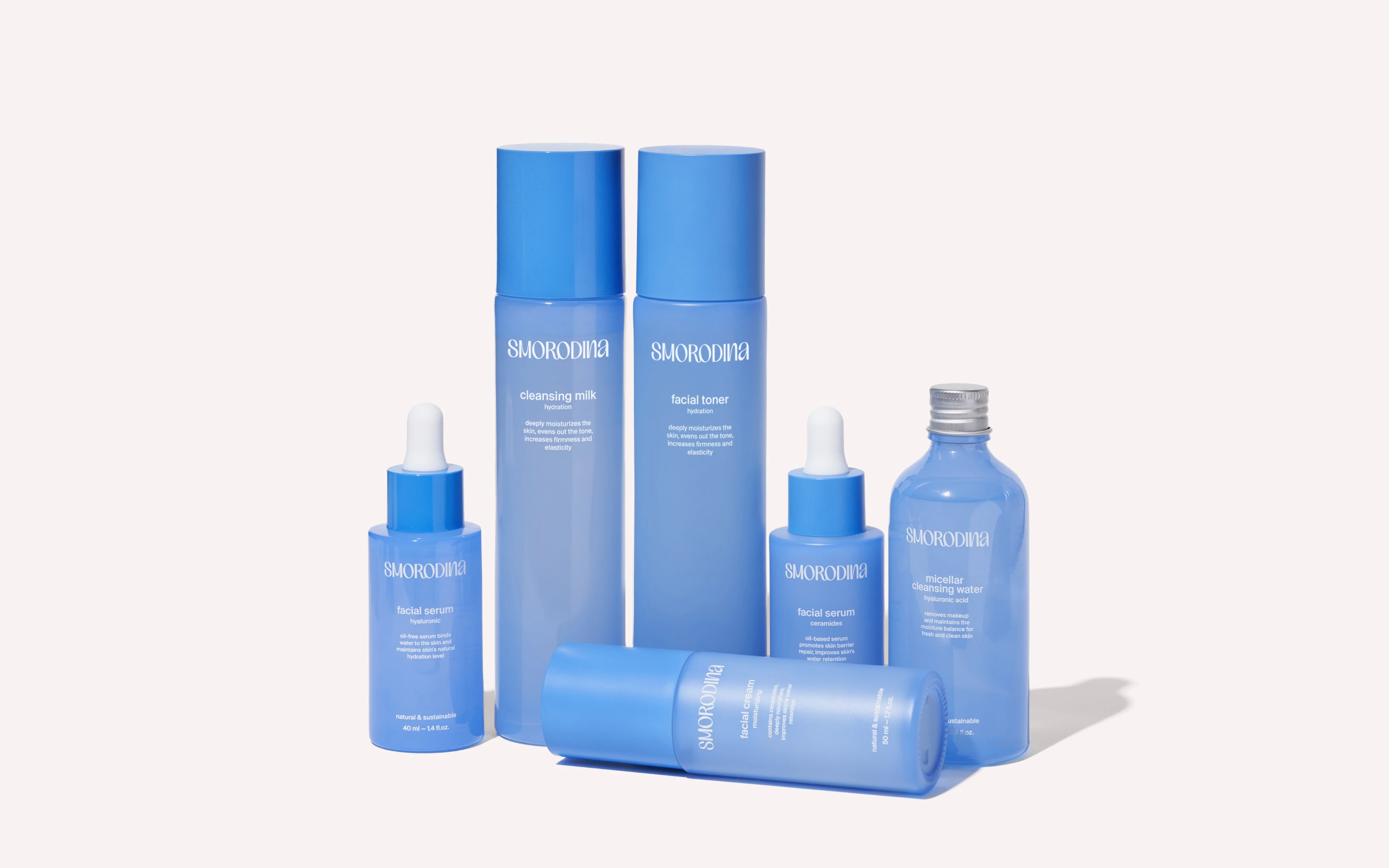
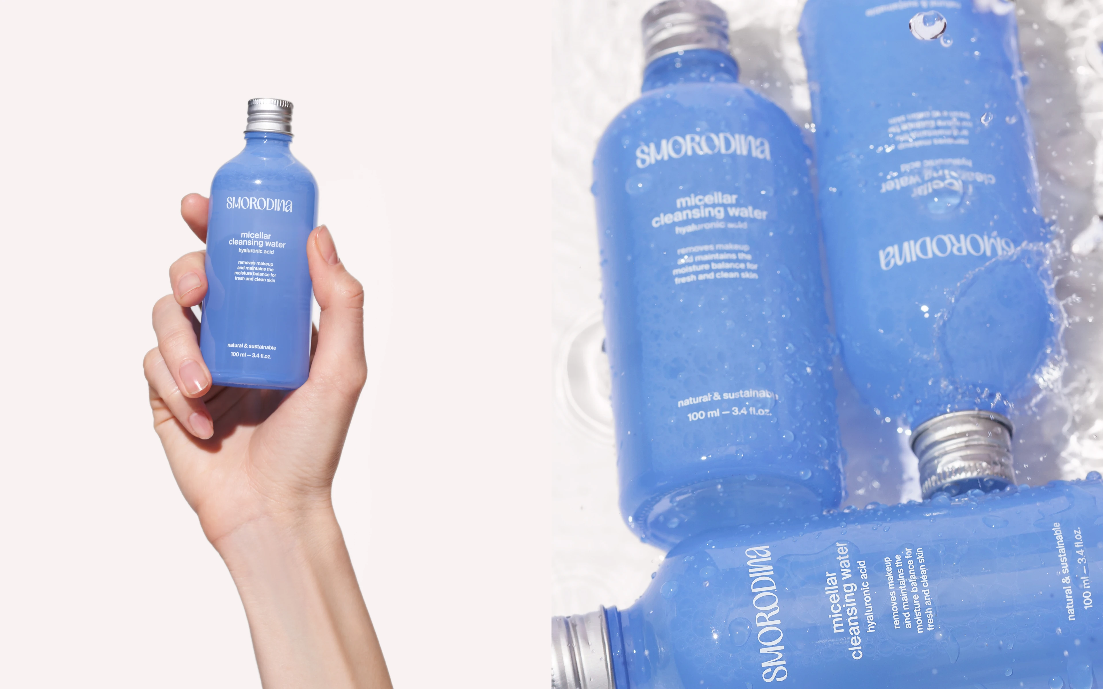
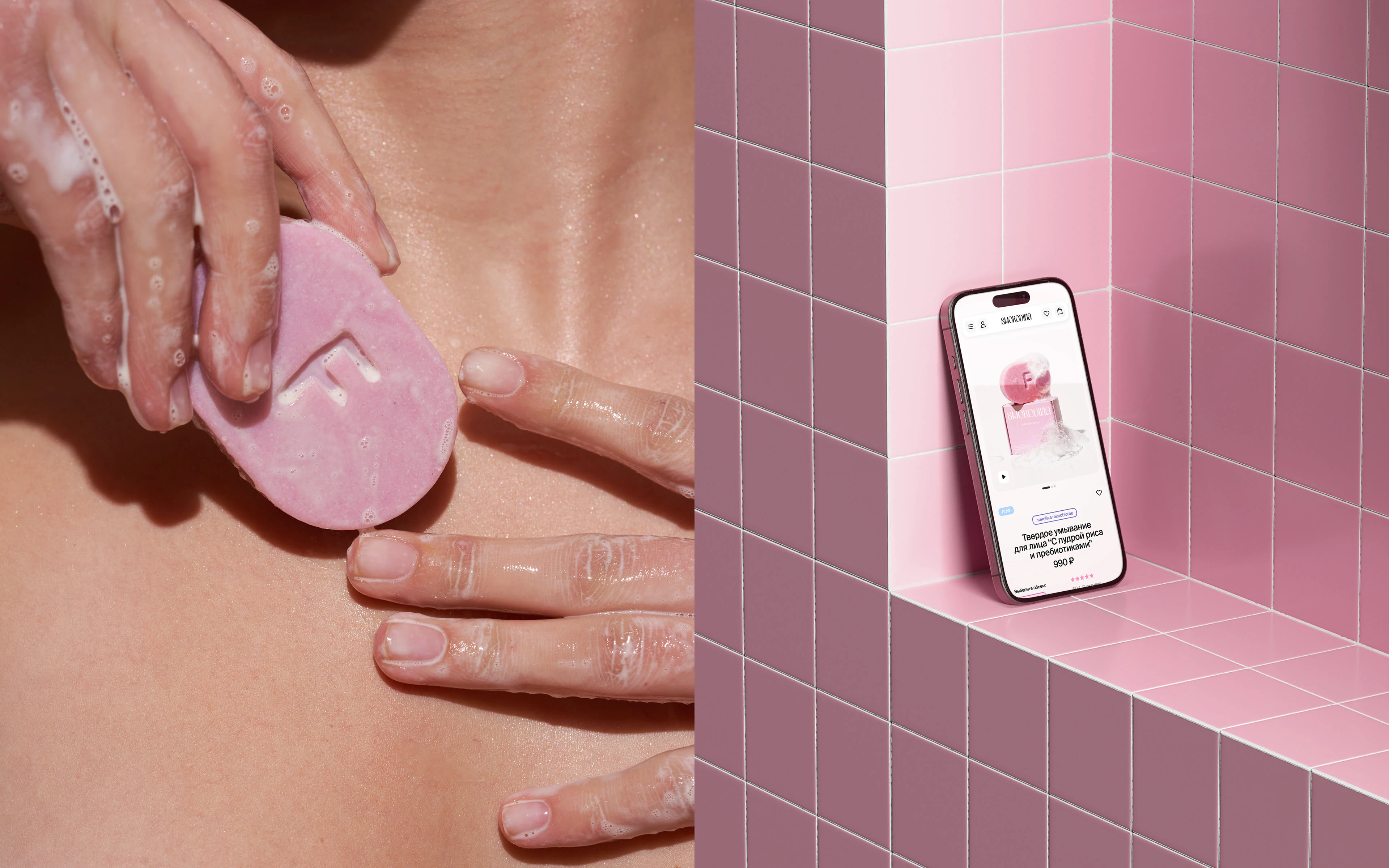
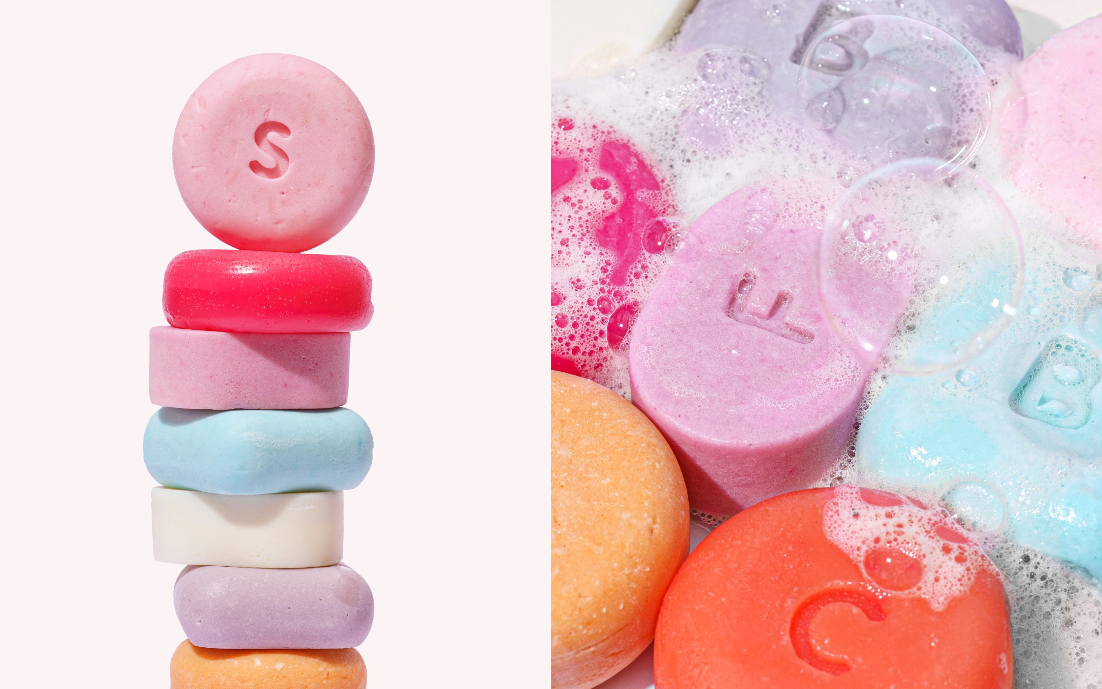
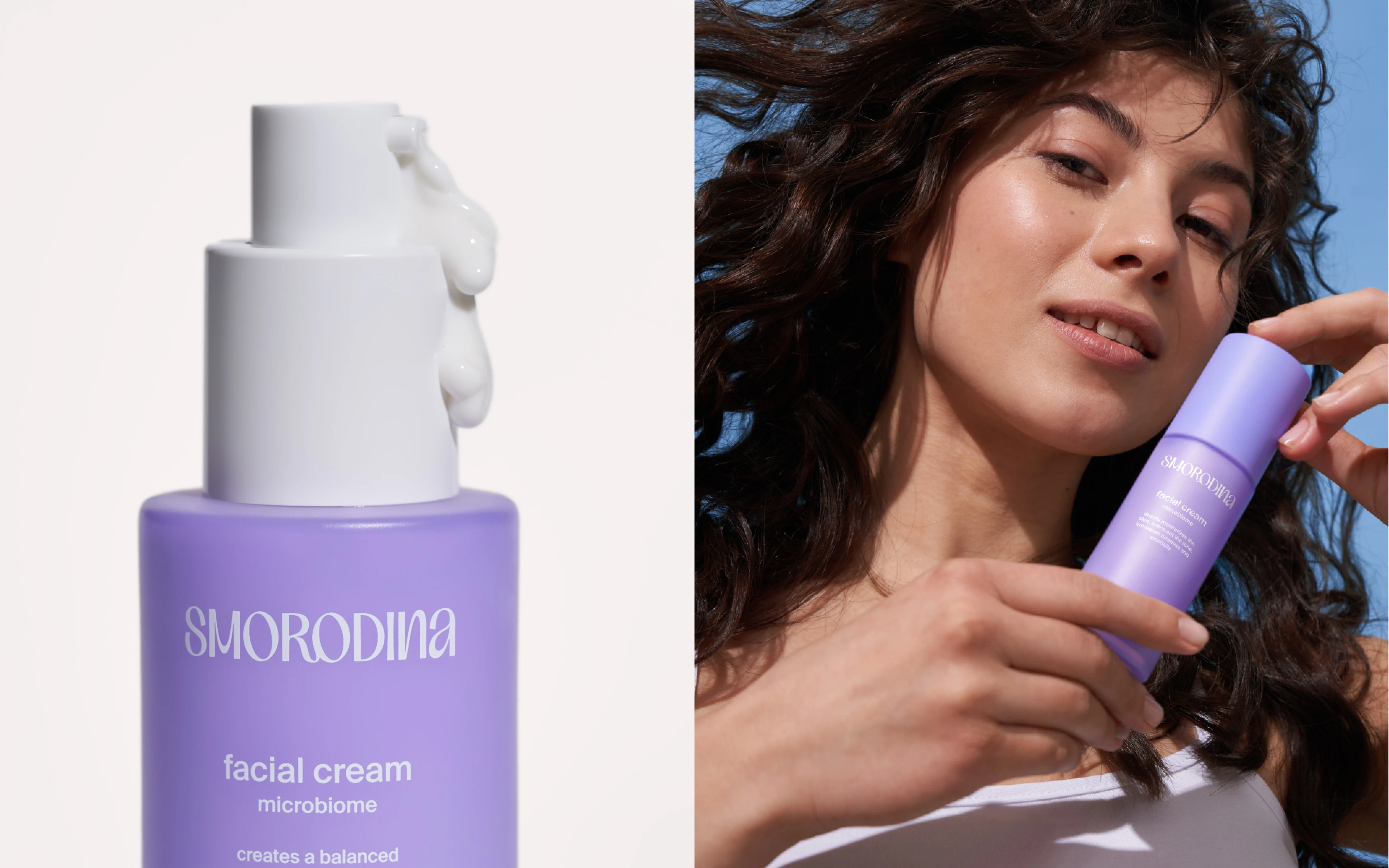
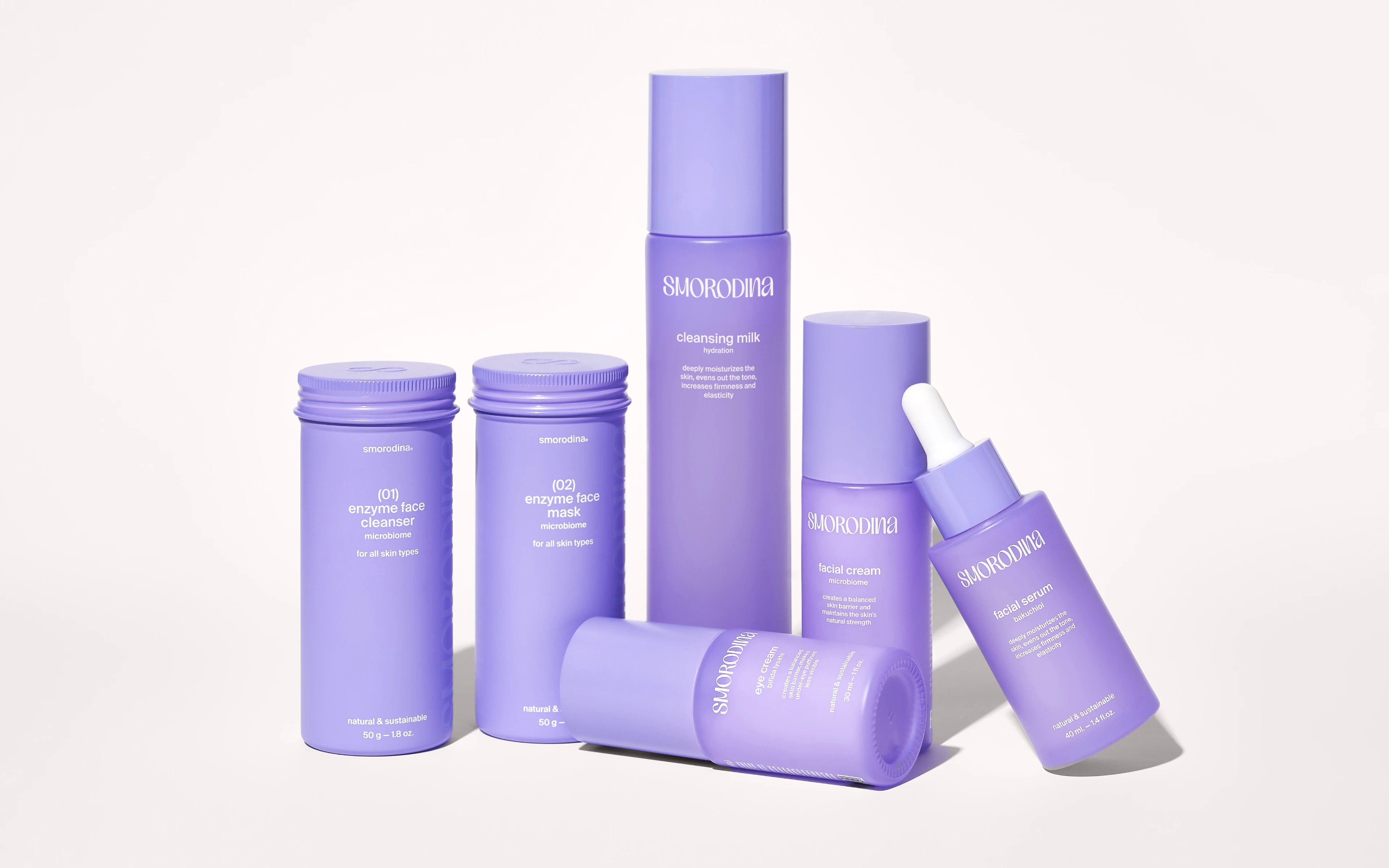
One of the most important points of interaction with the customer, and the bearer of identity, is the packaging. In addition to the main purposes it fulfils: recognition, differentiation from competitors and many others, we wanted to solve a simple but very important task. To make you want to hold it in your hands and not let go, to put it on your bathroom shelf and beyond, and just to get high on the look of it, even if you don't know anything about the brand.
We came up with a great system, went through several design iterations, helped the client with implementation and production, and had a lot of fun doing it.
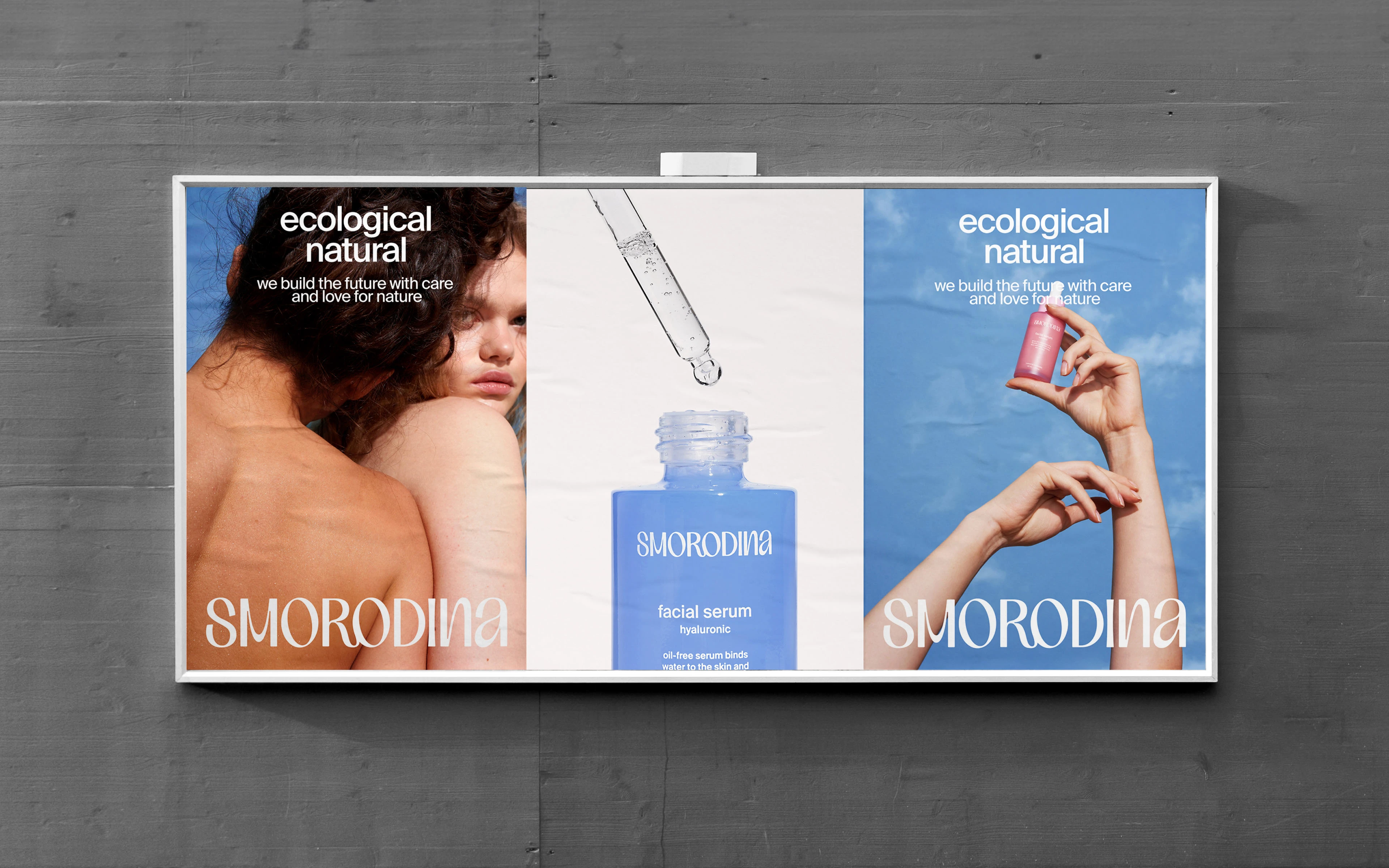
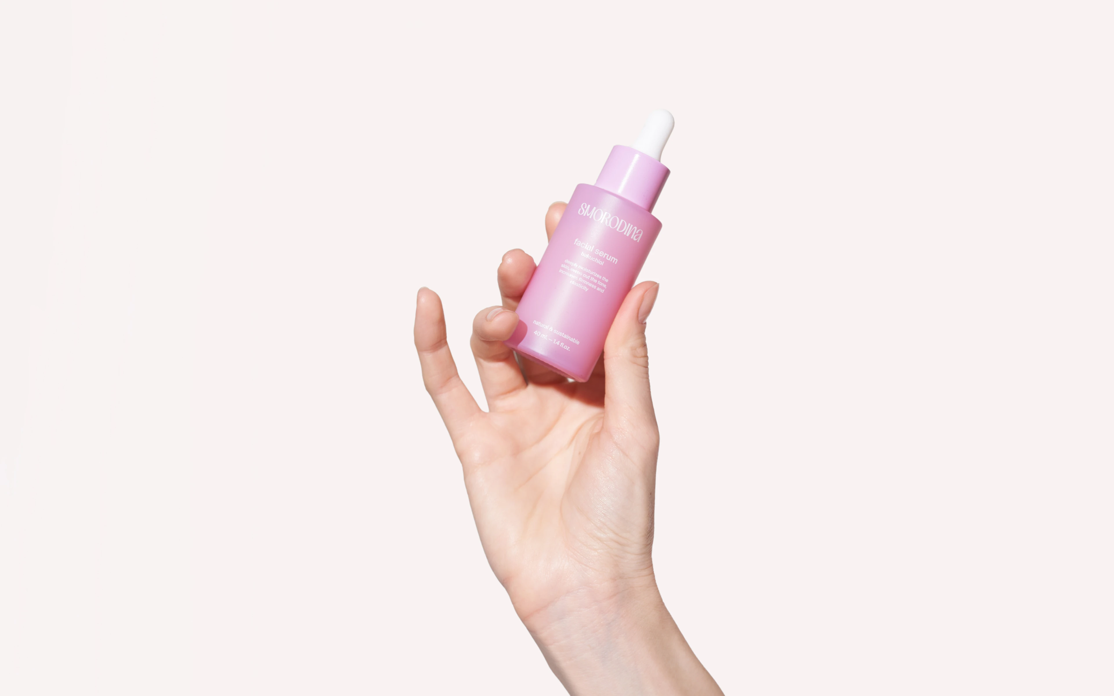
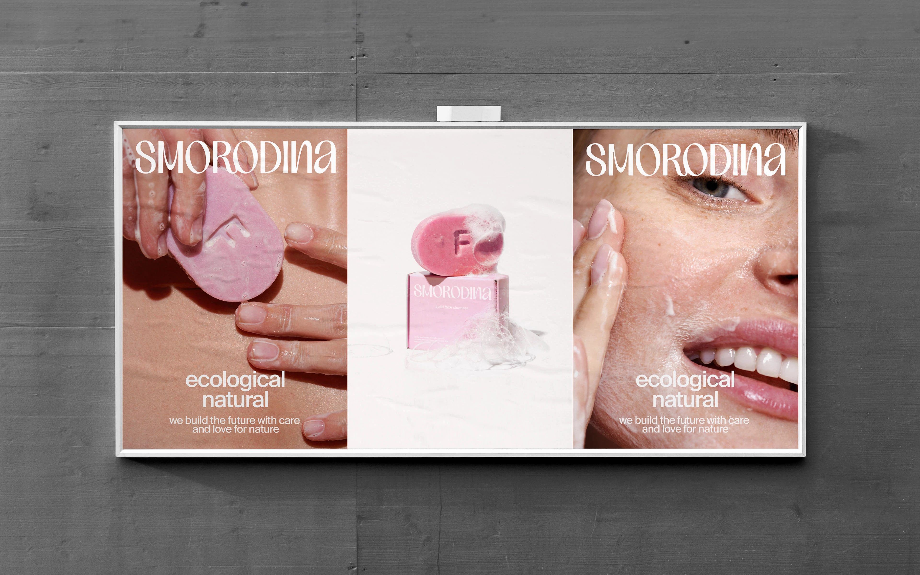
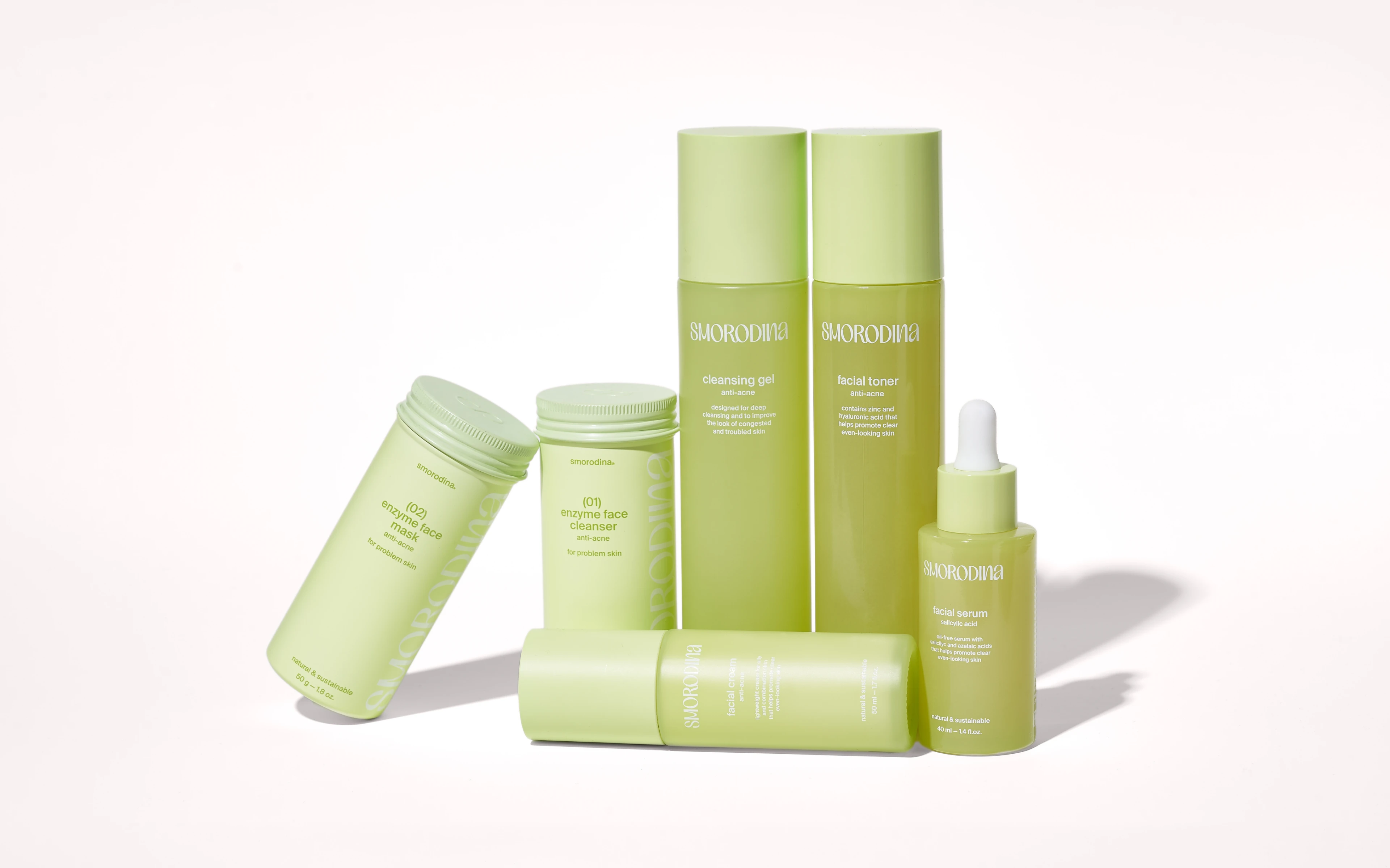
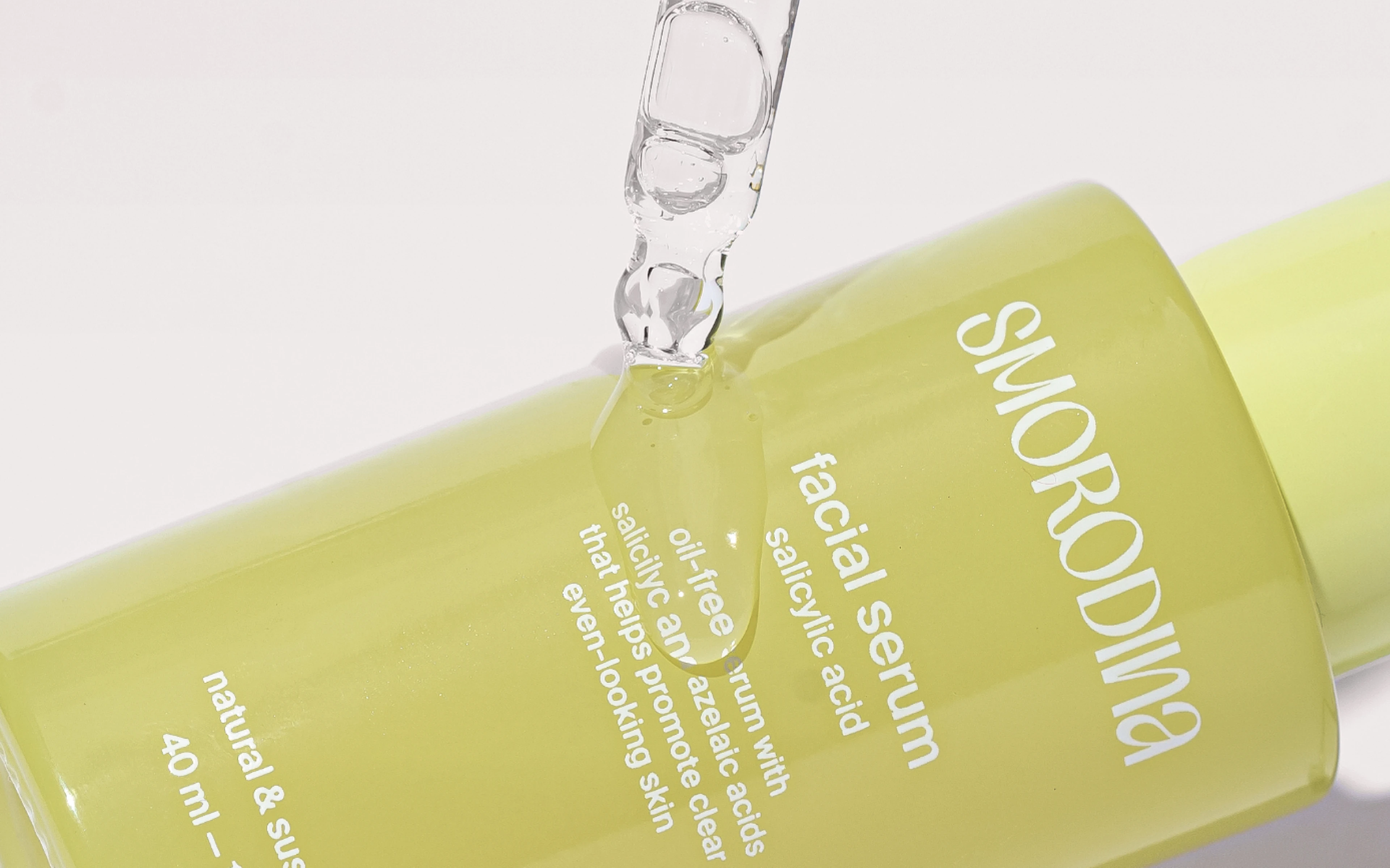
Photo and video
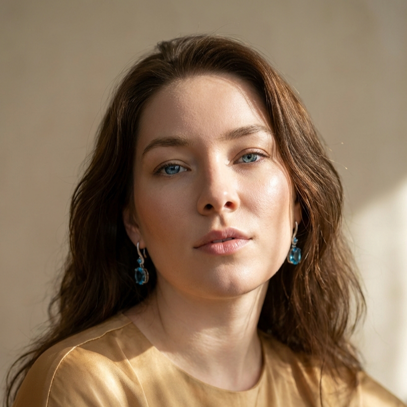
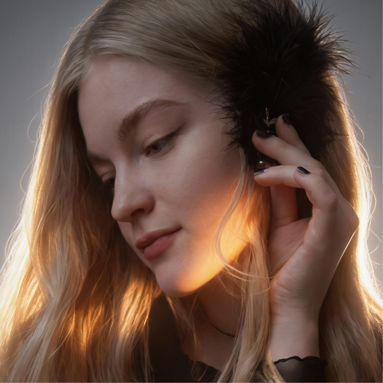
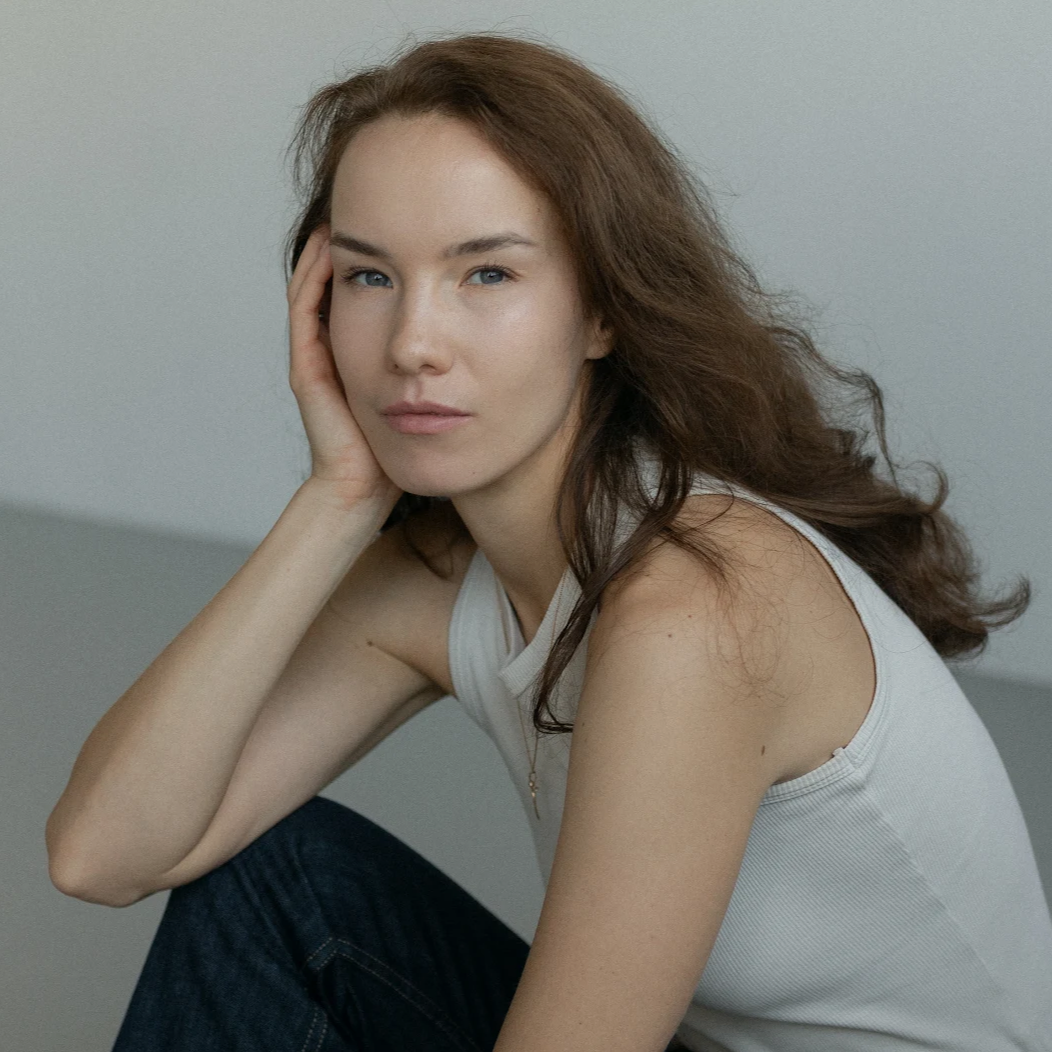
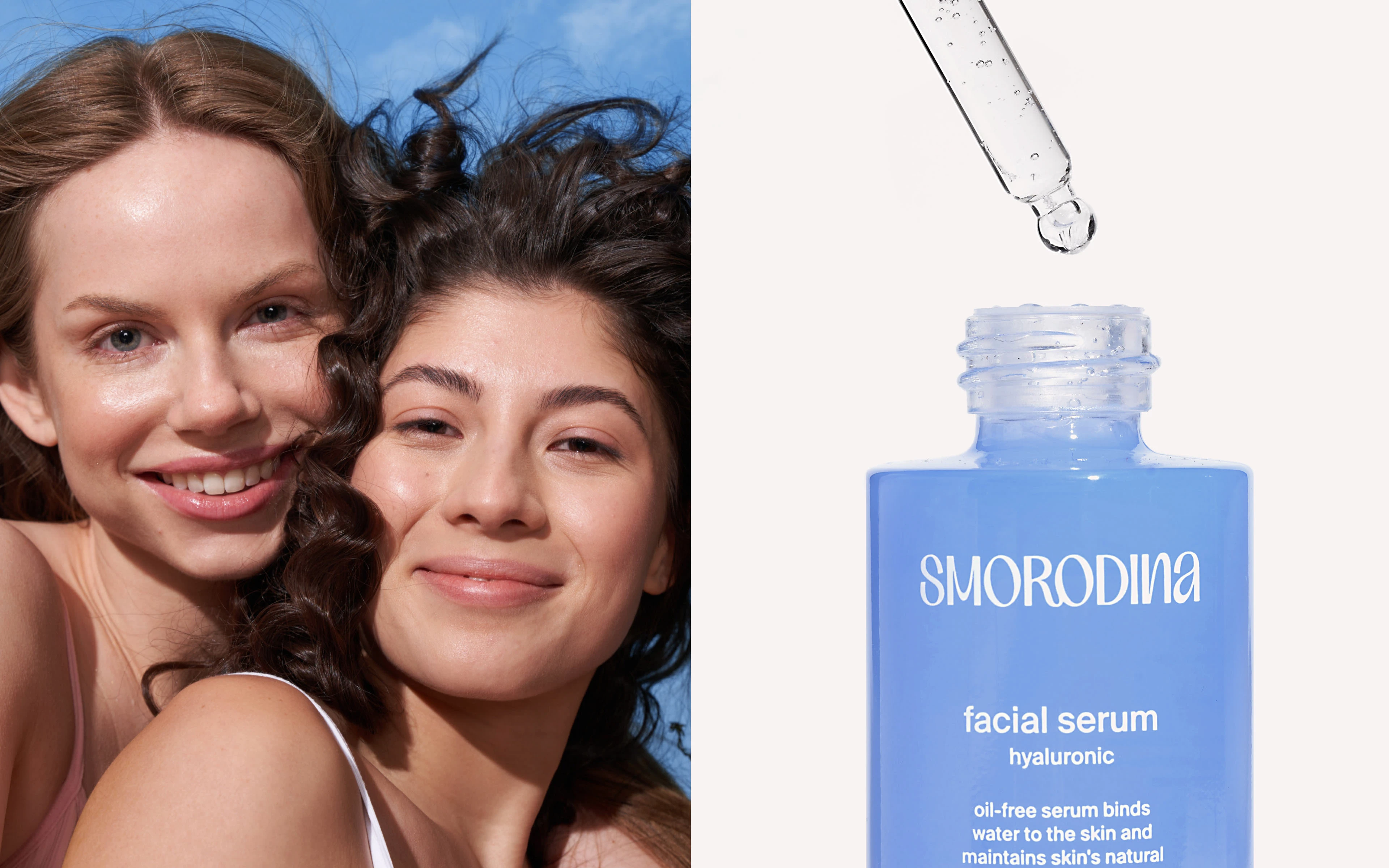
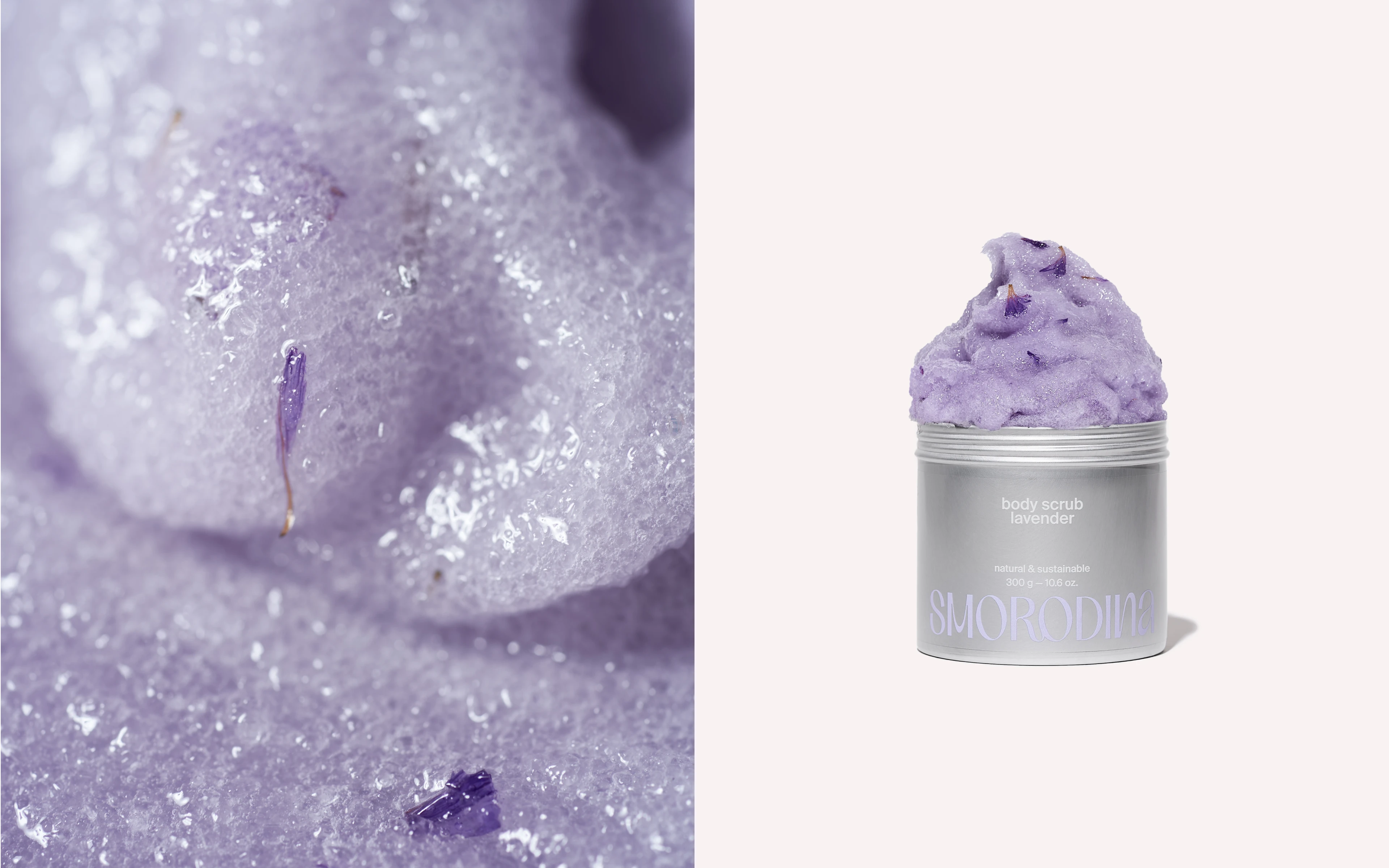
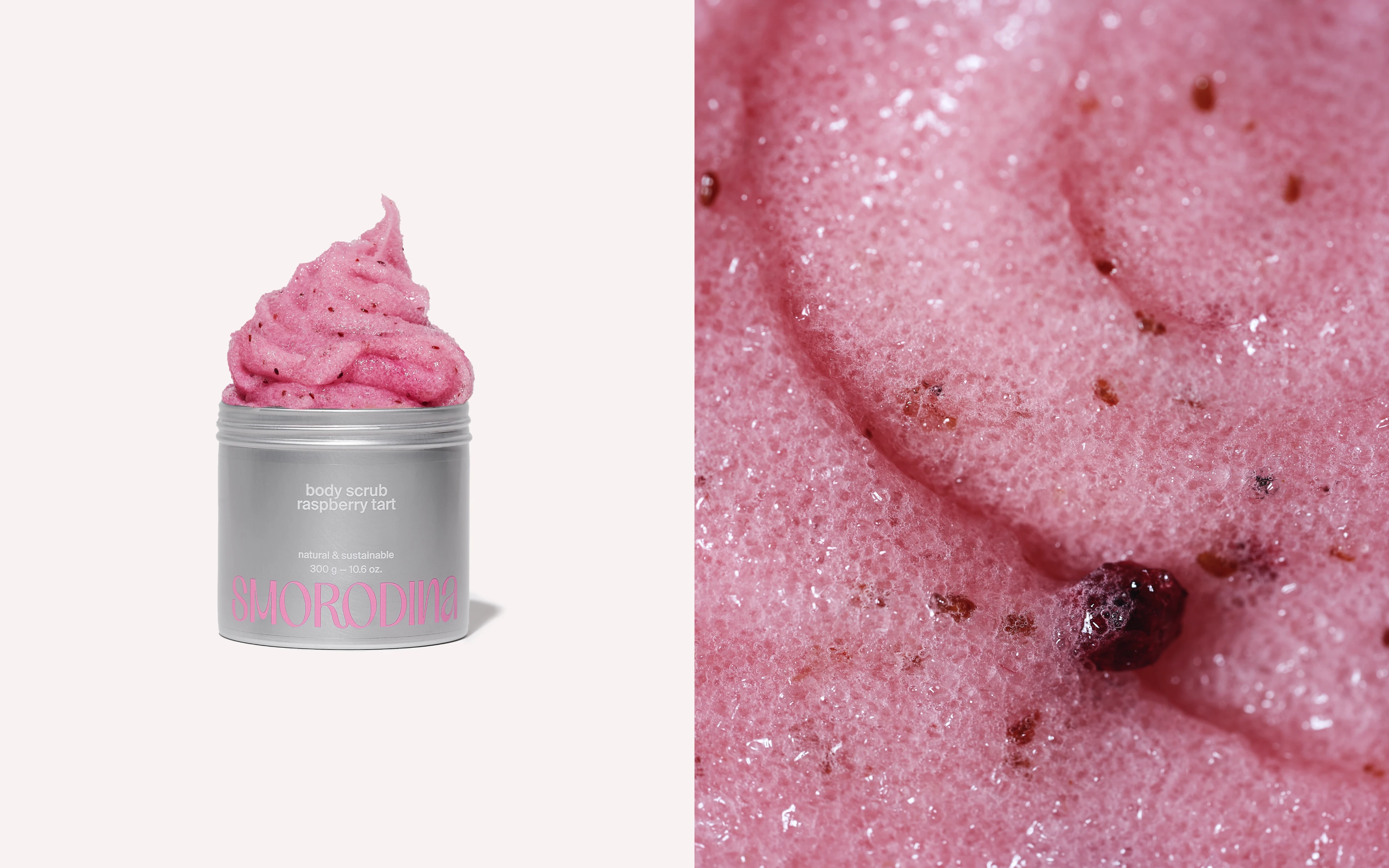
For us, half of the identity is photography and video. We paid special attention to this and developed a full range of visual content. Campaign that reflects the mood and image of the brand: natural beauty and emotion. Product image photography and a complete content system for the website. We put everything together in a handy guide so that the client could continue shooting, keeping the general style and not losing quality.
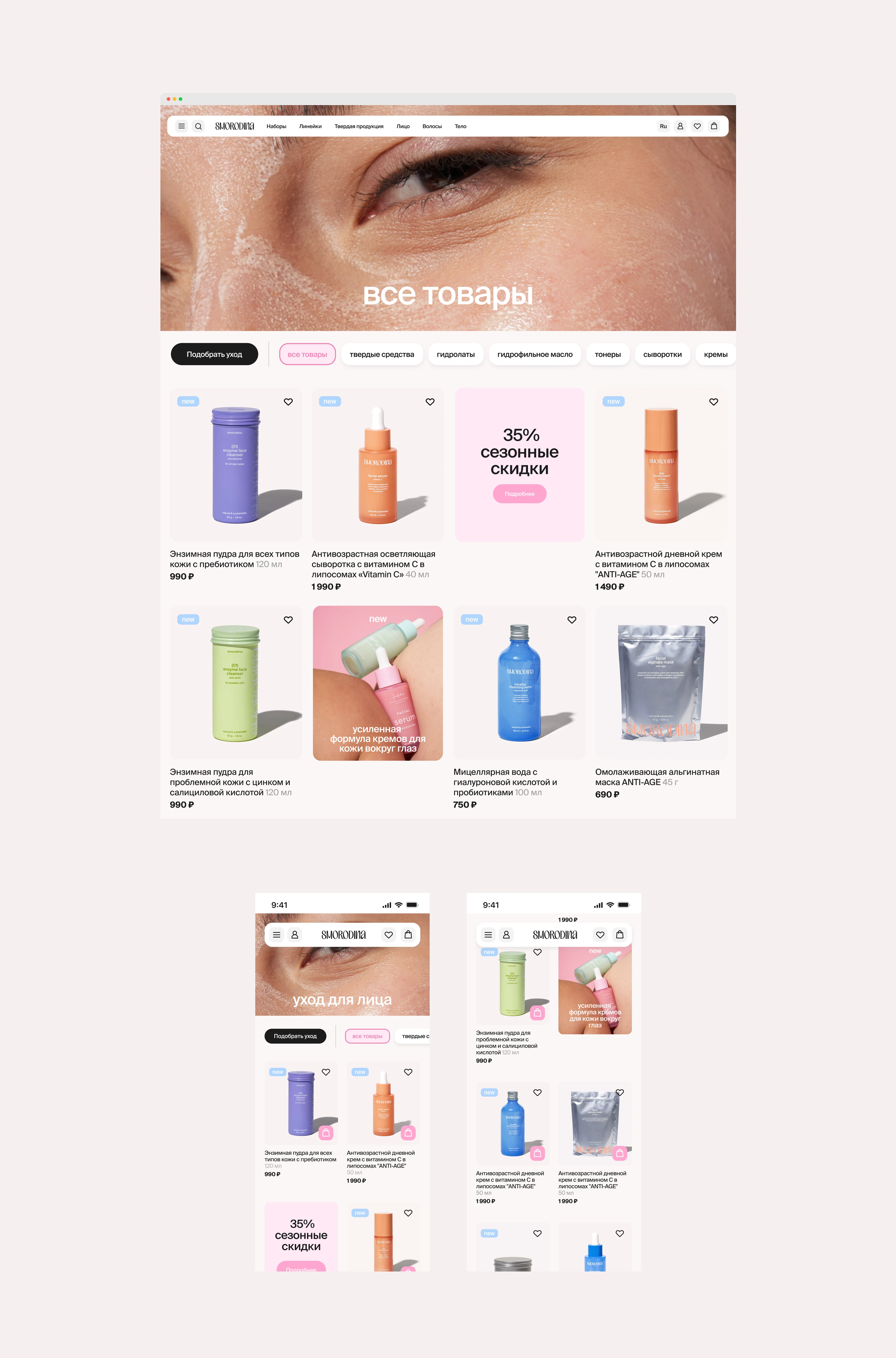
Web
We were tasked with developing Brad's identity in the digital environment, on their website. In addition to implementing a new style, typography, colors and photos, we needed to rework the logic of the online store and improve the user experience so that more users could complete their purchases. We redesigned the navigation system and created two types of menus. We implemented a new marketing tool in the product grid, introducing new product/discount banners. We developed separate pages for product lines and improved the rich content within products.
IDENTITY:
Creative Director — Svetlana Lomakina
Designers — Svetlana Lomakina, Marie Kirillova, Sergey Breus
Logo design — Kirill Turygin
Animation — Sergey Breus
3D — Аnton Shitov
Project manager — Anastasia Pekarskaya
Web
Creative Director — Sergey Polukhin
Designer & Animation — Sergey Breus
Photo campaign and object photography:
Creative Director & Сoncept — Svetlana Lomakina
Producer — Julie Belanska, Svetlana Lomakina
Photographer — Julie Belanska
Assistant — Mari Kirillova, Sergey Breus
MUA — Anita Baboyan
Hair — Julia Khudozhnikova
Retoucher — Julie Belanska, Milana Olennikova