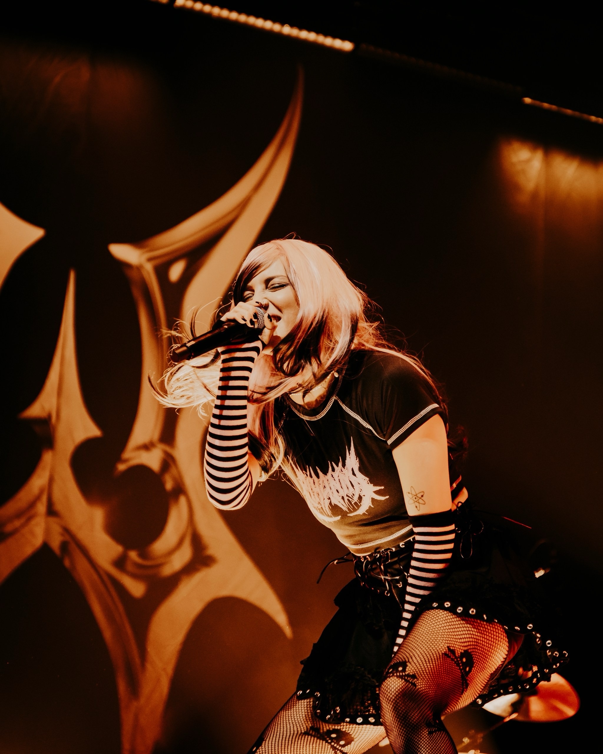
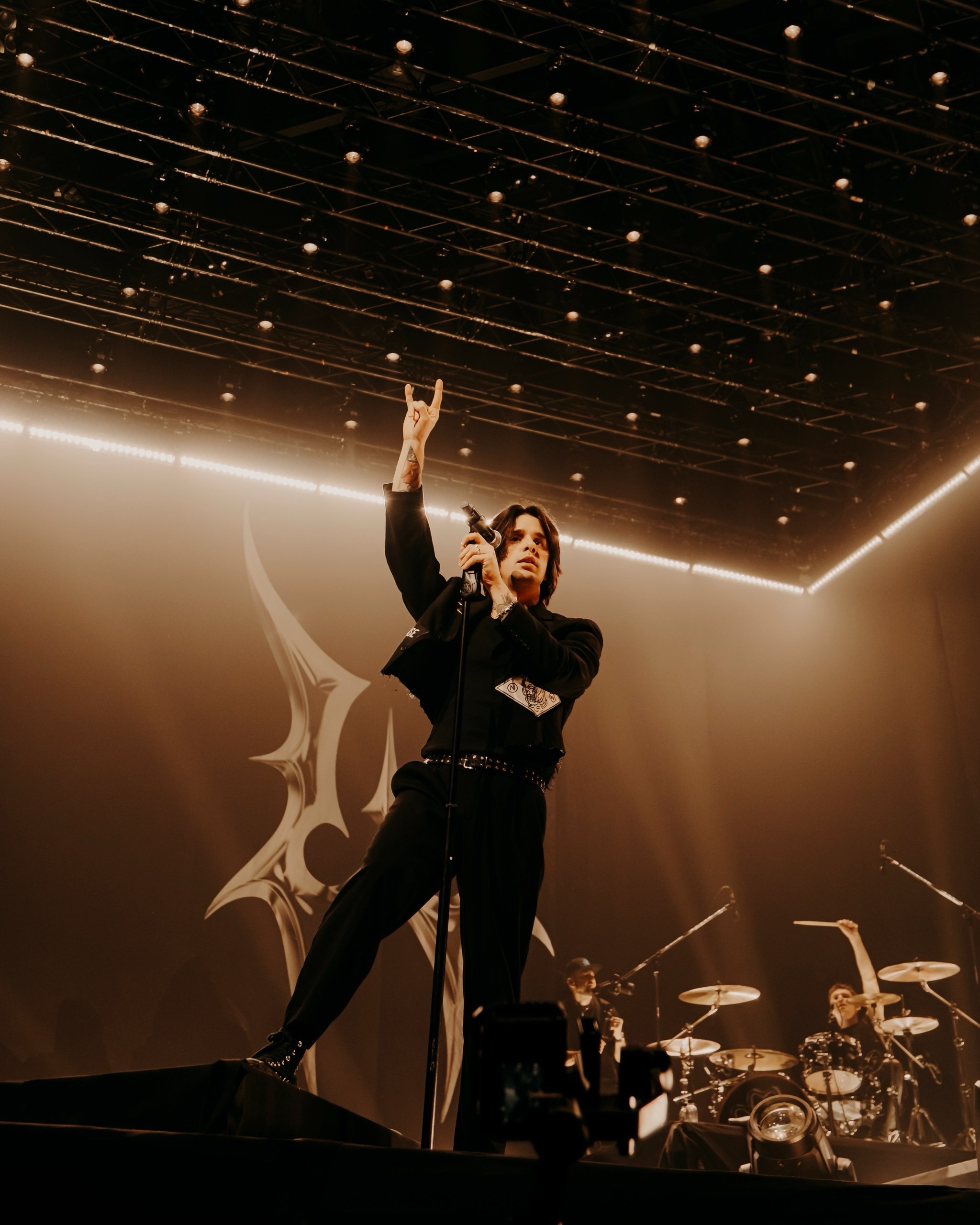
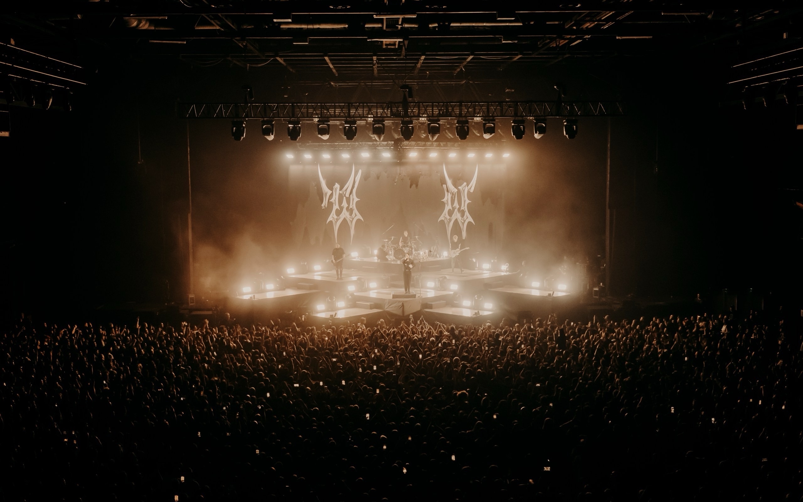
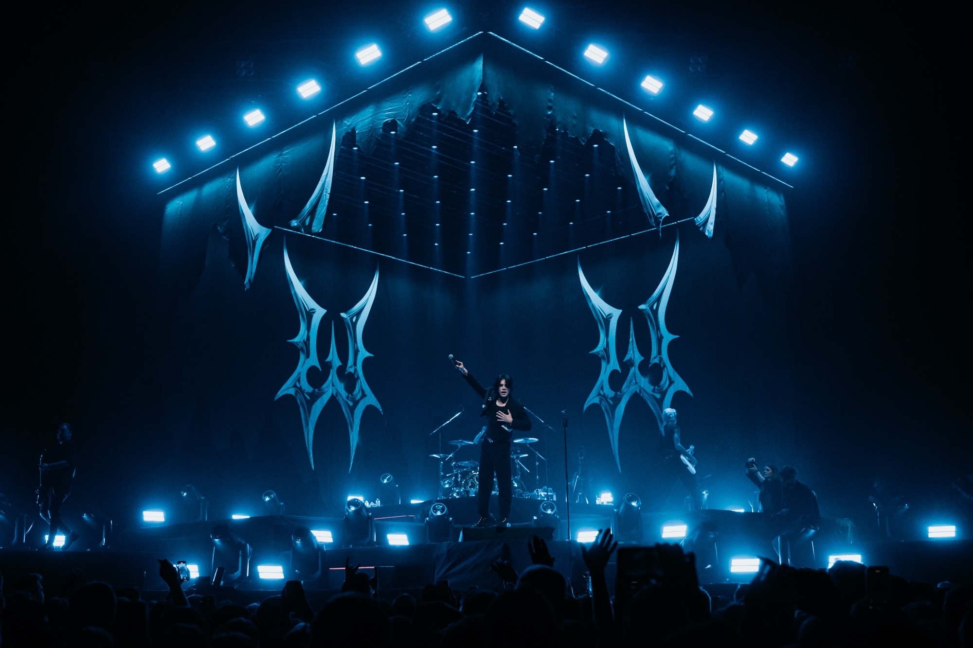
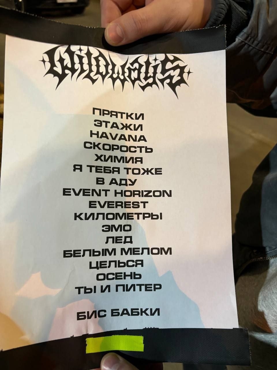
Wildways
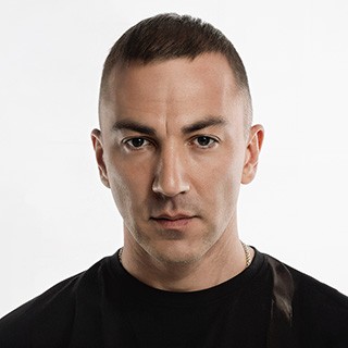
In March 2024, Tolya, the vocalist of Wildways, reached out to me again about a graphic upgrade for their new musical cycle. The goal was to create a readable chrome logo and emblem in a modern metal style, without excessive darkness or brutality, with a slight lean toward pop culture.
1. Logotype.
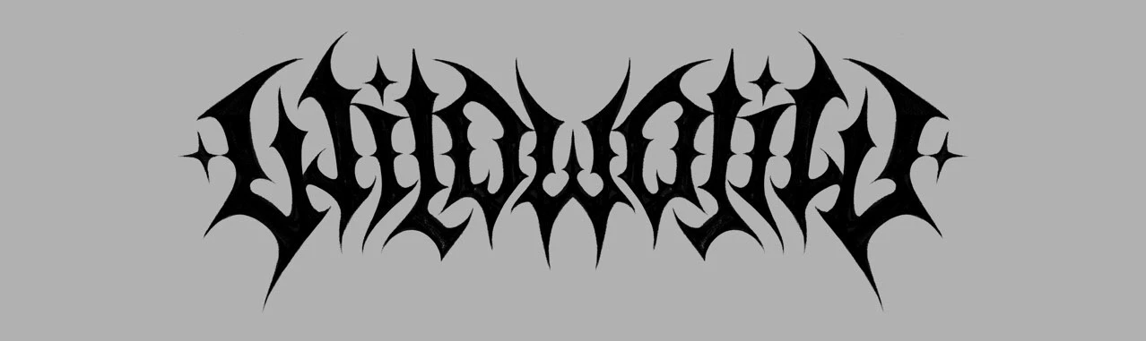
The concept came together quite quickly: I knew I wanted to create a symmetrical logo that would reflect the spirit of metal with its spikiness, while the softer theme of the band would be conveyed through a large number of smooth, rounded shapes. A more modern and lightweight vibe was achieved by varying the thickness of the letter elements. As a result, this skeleton sketch was created, where both sides of the logo are still mirrored, but all the forms are already prepared so that the final letters could be built from them later.
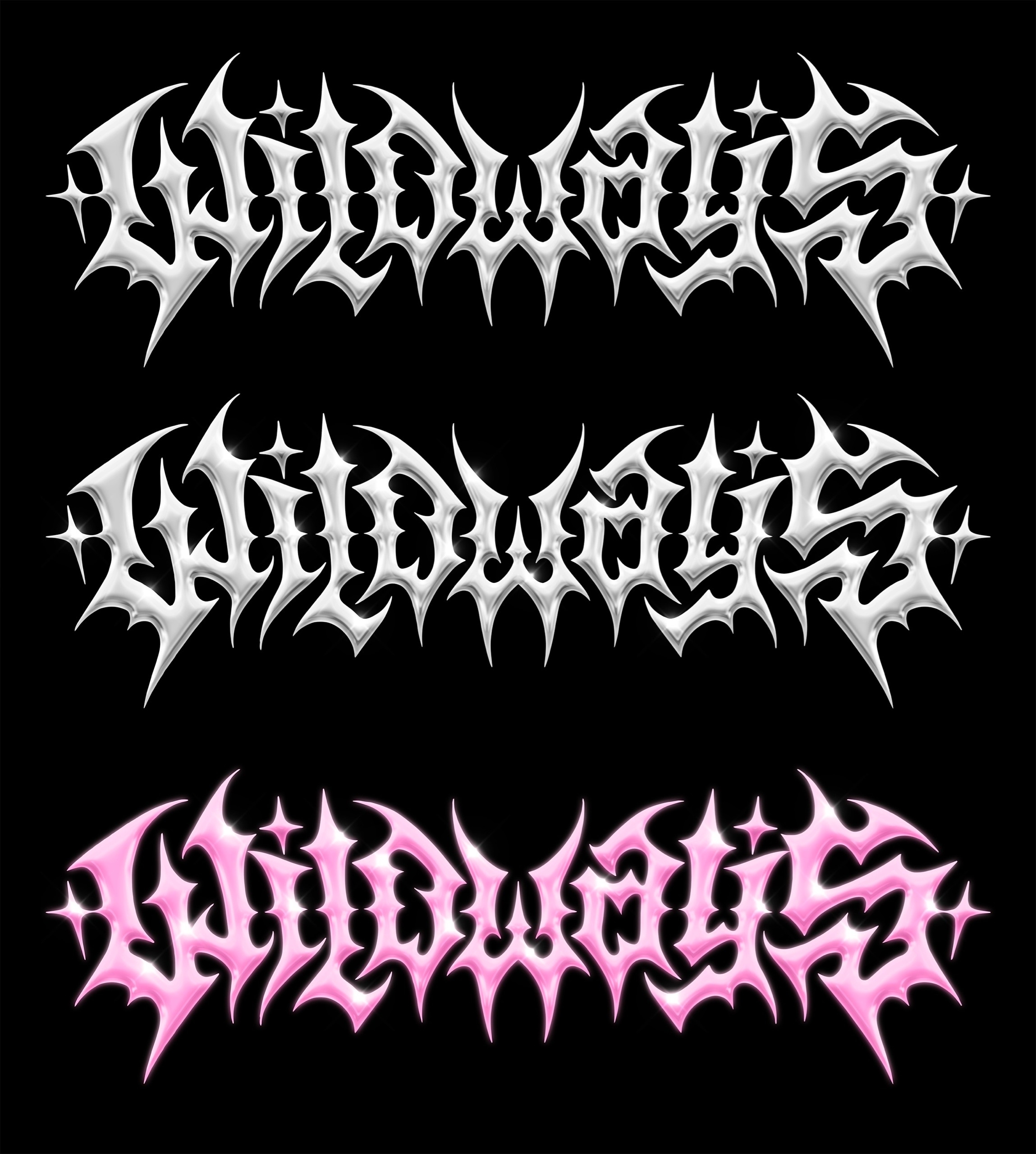
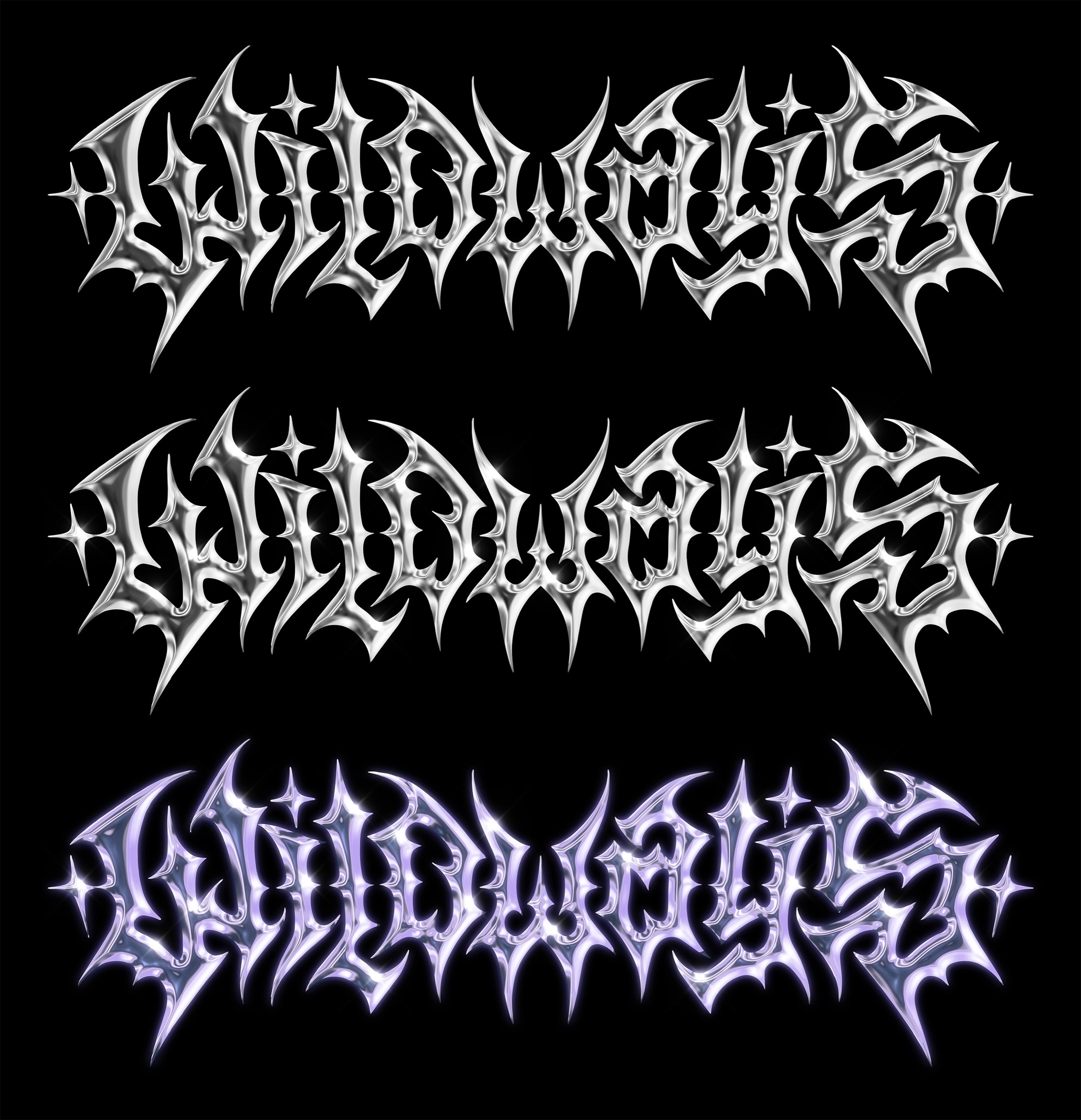
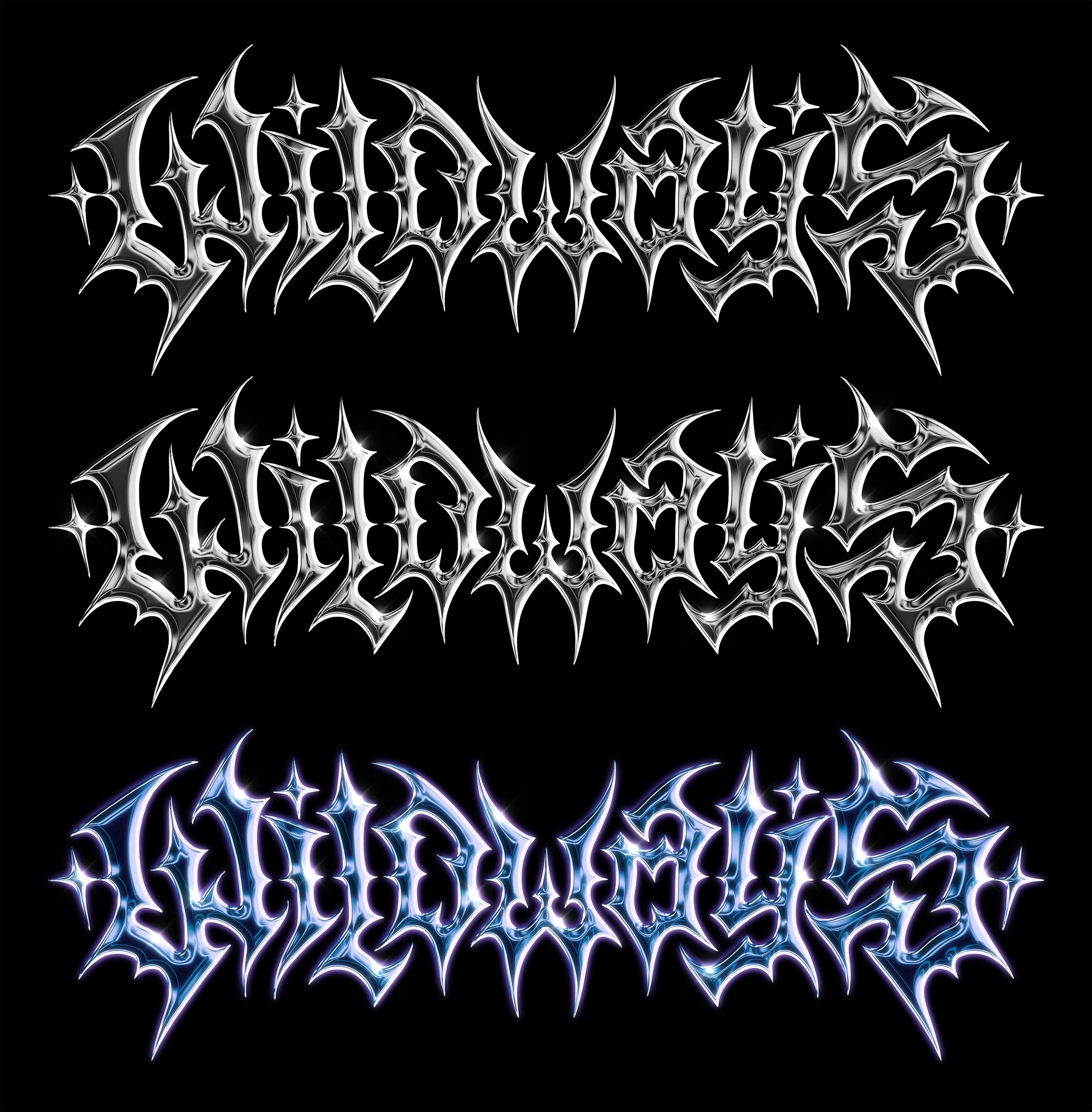
I also took the band’s request for a chrome version of the logo into account from the very beginning, so the entire composition was additionally simplified to work well with a clean chrome render. The sketch for the chrome version turned out like this.
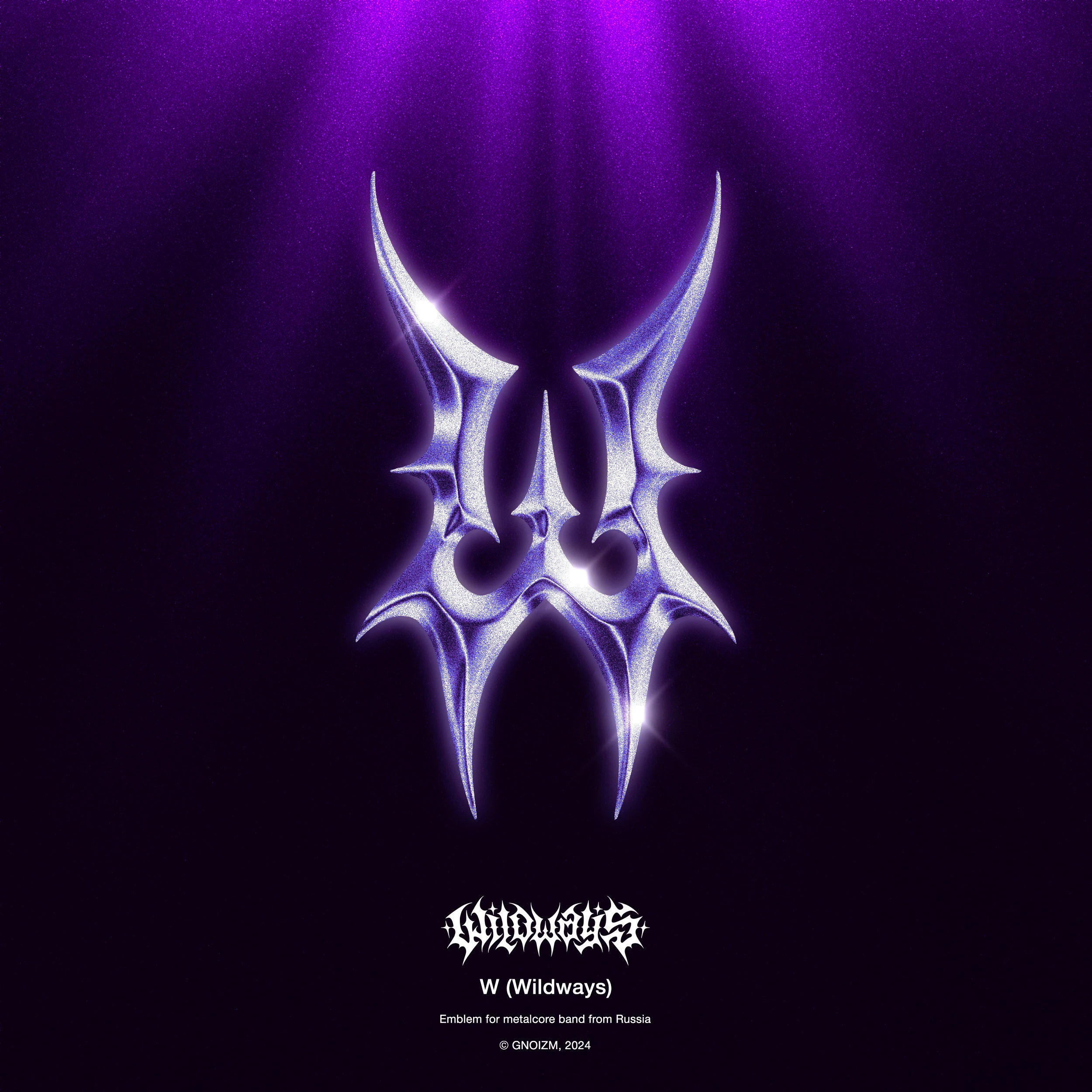
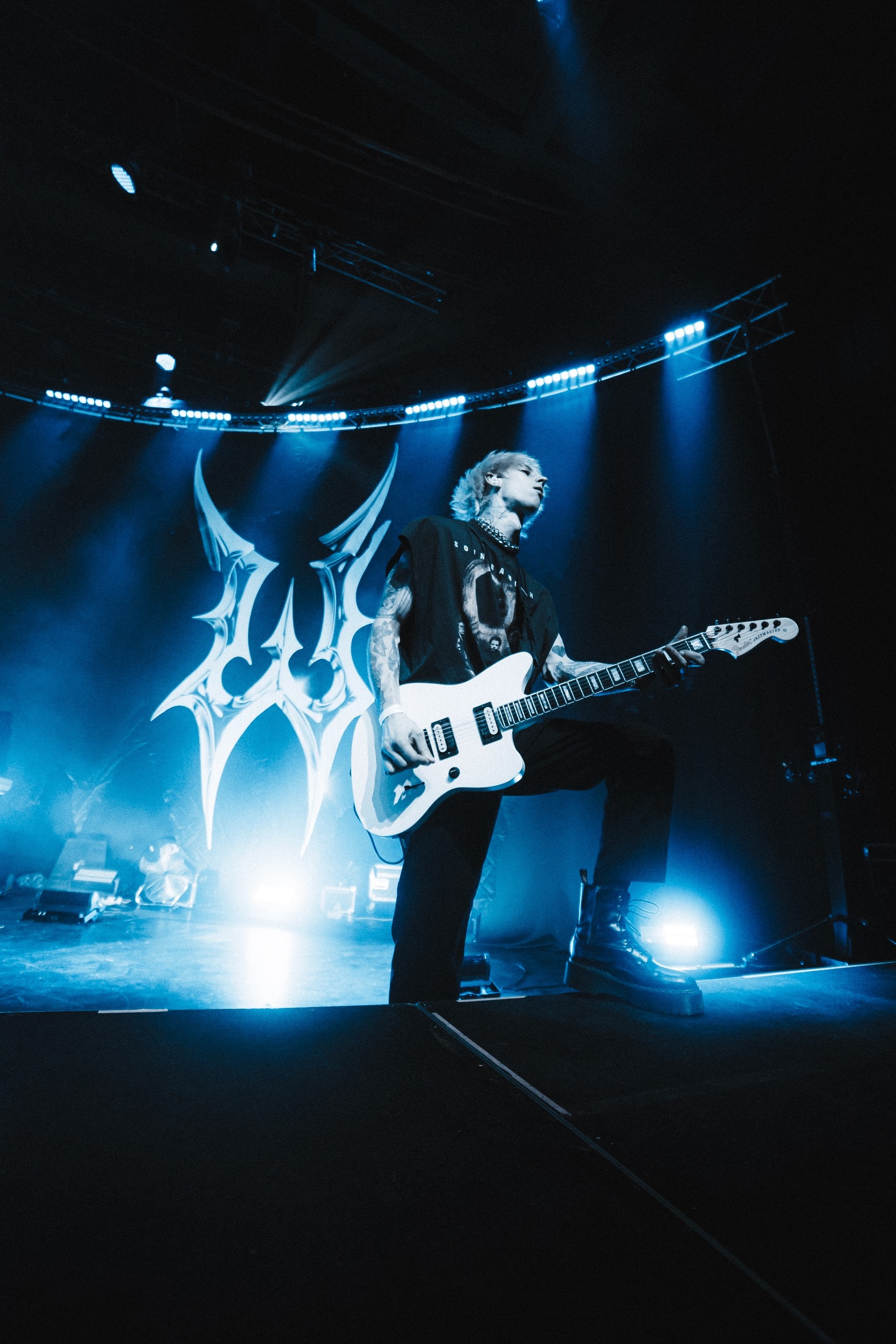
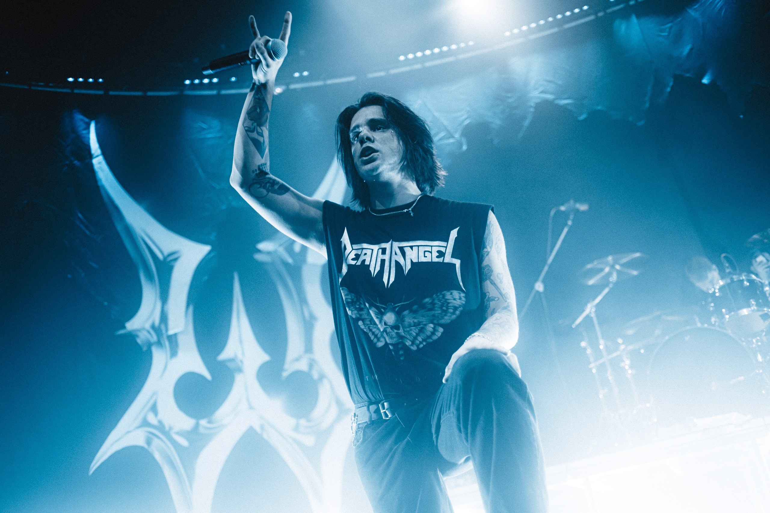
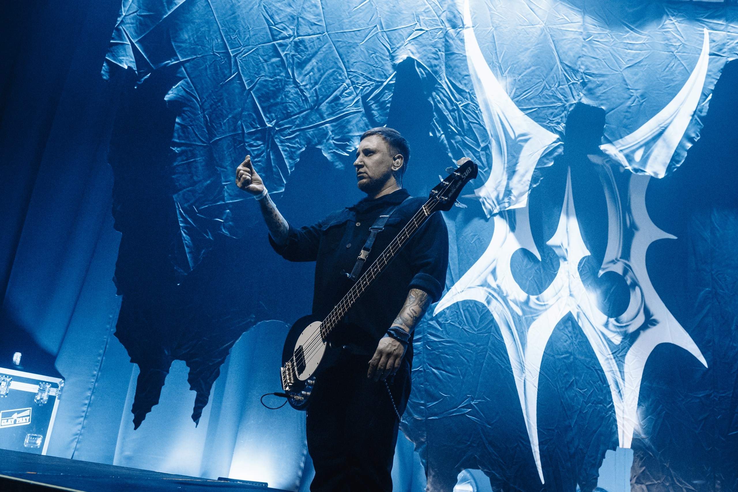
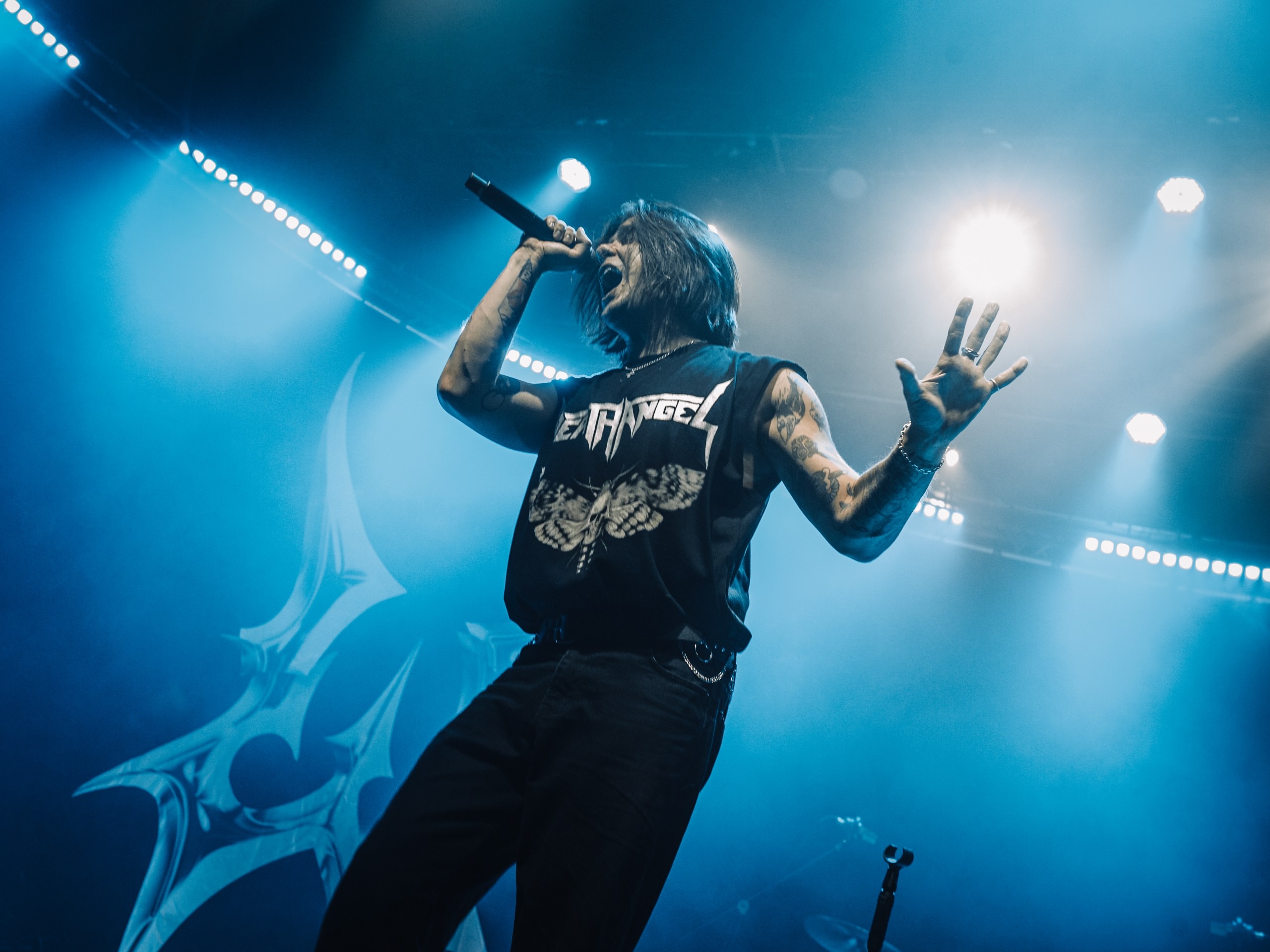
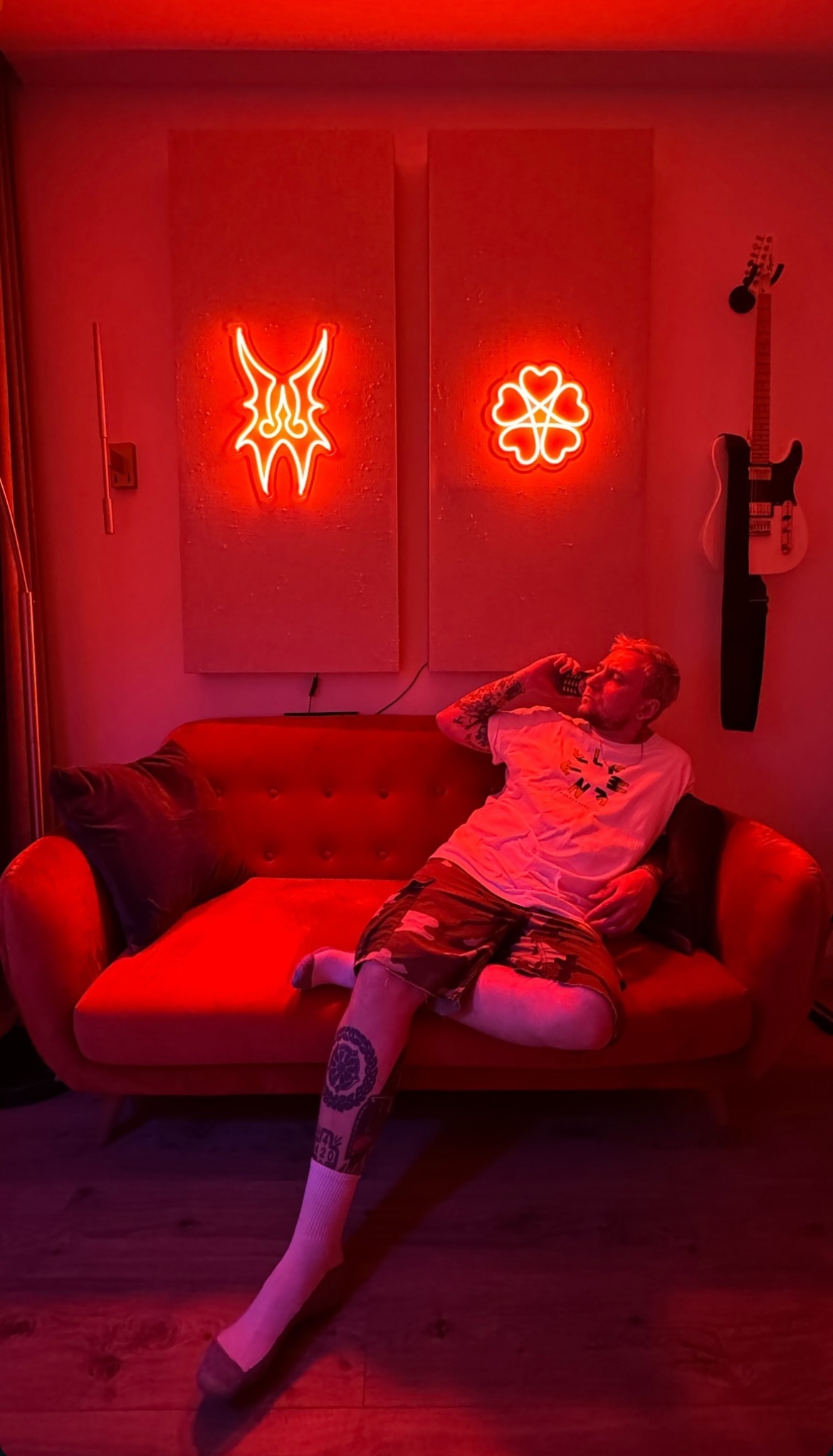
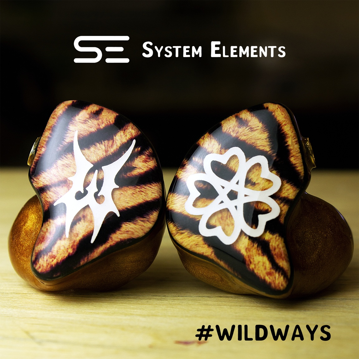
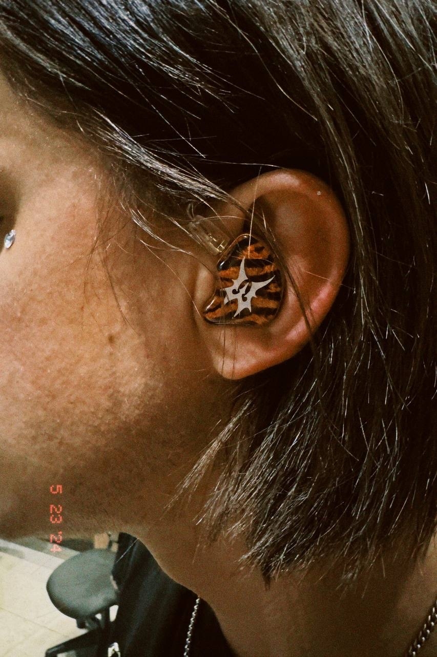
In the logo we created back in 2022, there were quite a few flaws and issues, the most significant of which was the mirrored letter S. This time, that problem was solved, and it was possible to build a solid foundation for mirroring all the letters. As a result, the logo became very symmetrical yet still readable, preserving the original play with shapes and the spirit of metal. Another clear advantage of this composition is that the central focus is a symmetrical, accent letter W, which will later be used as one of the emblems.
After further refinement of the sketch, we arrived at the following composition.
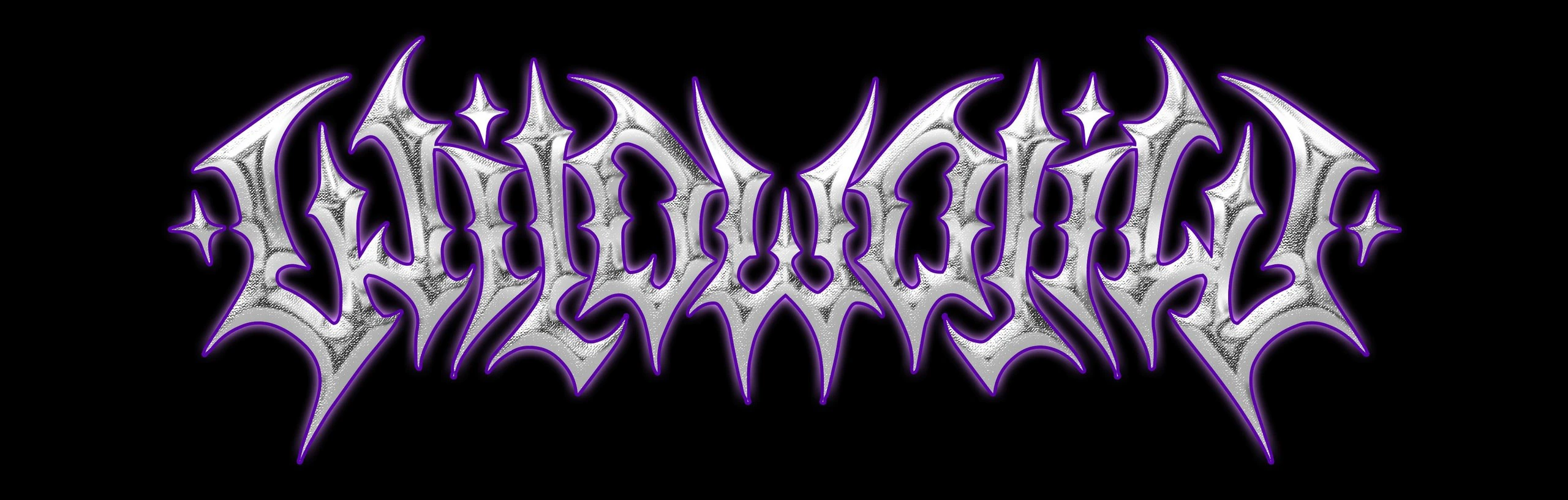
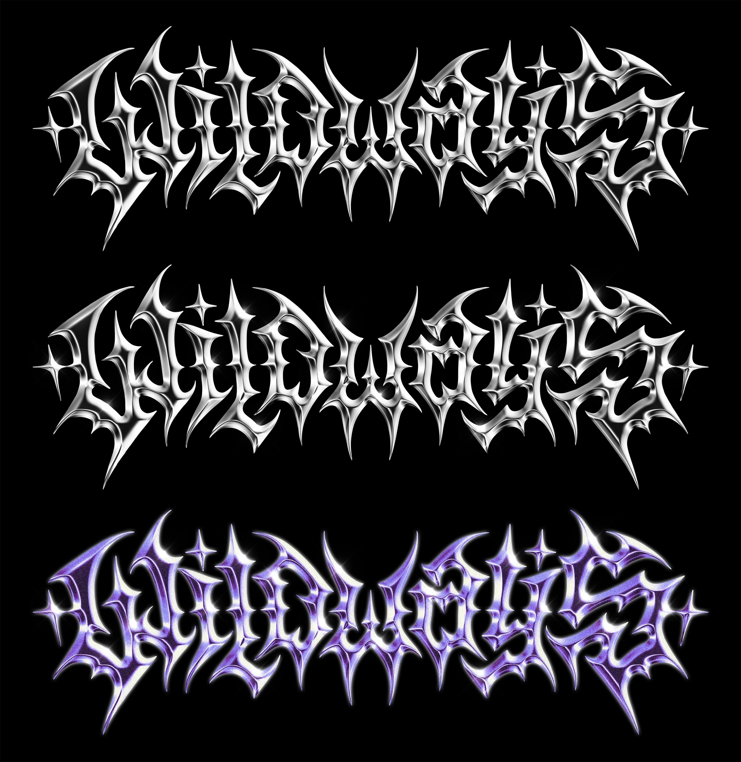
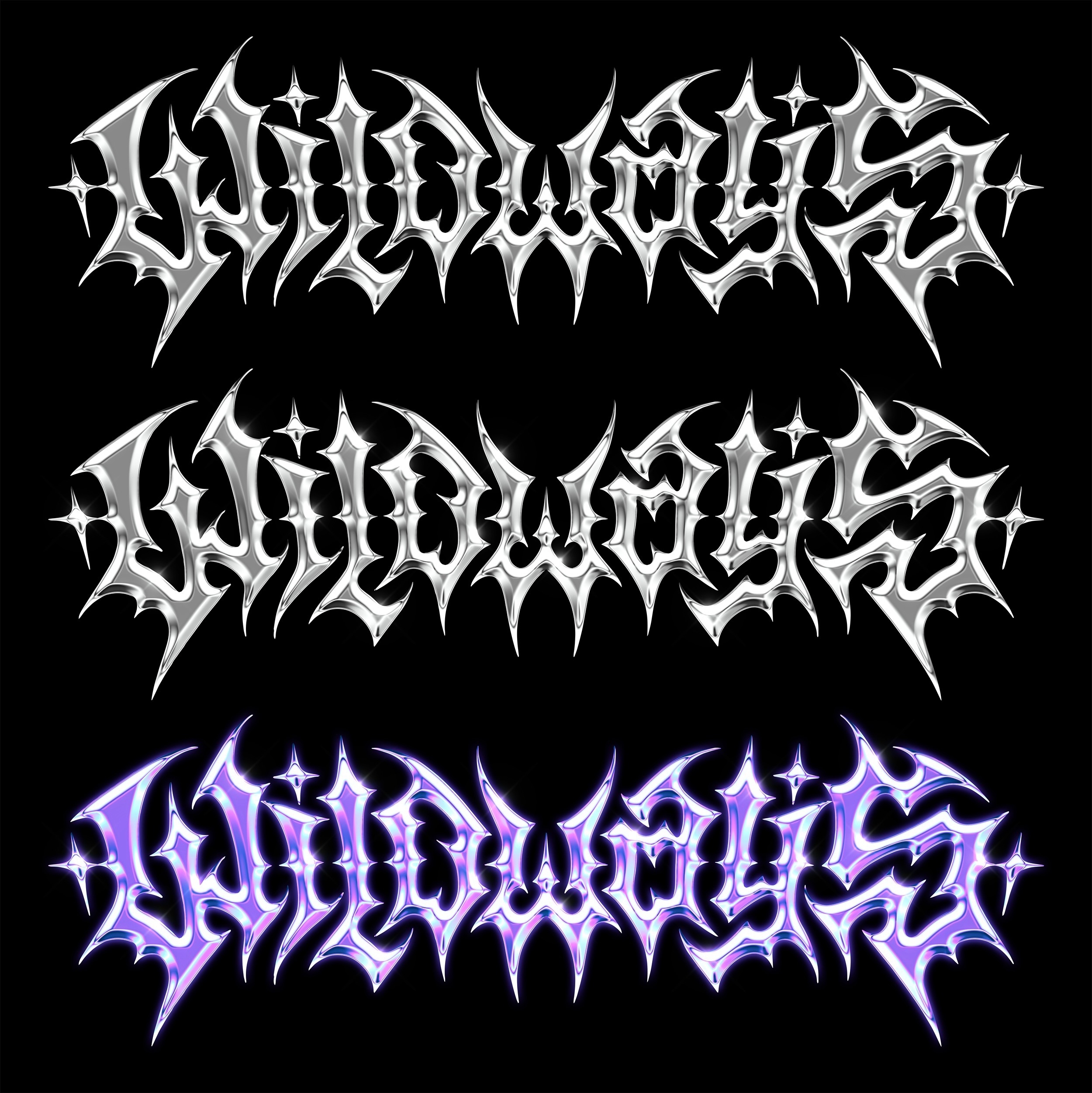
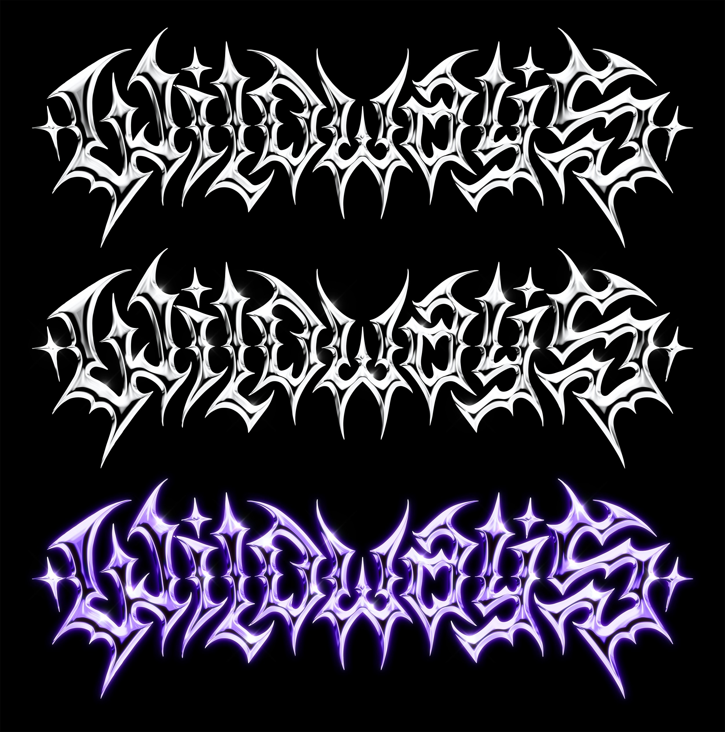
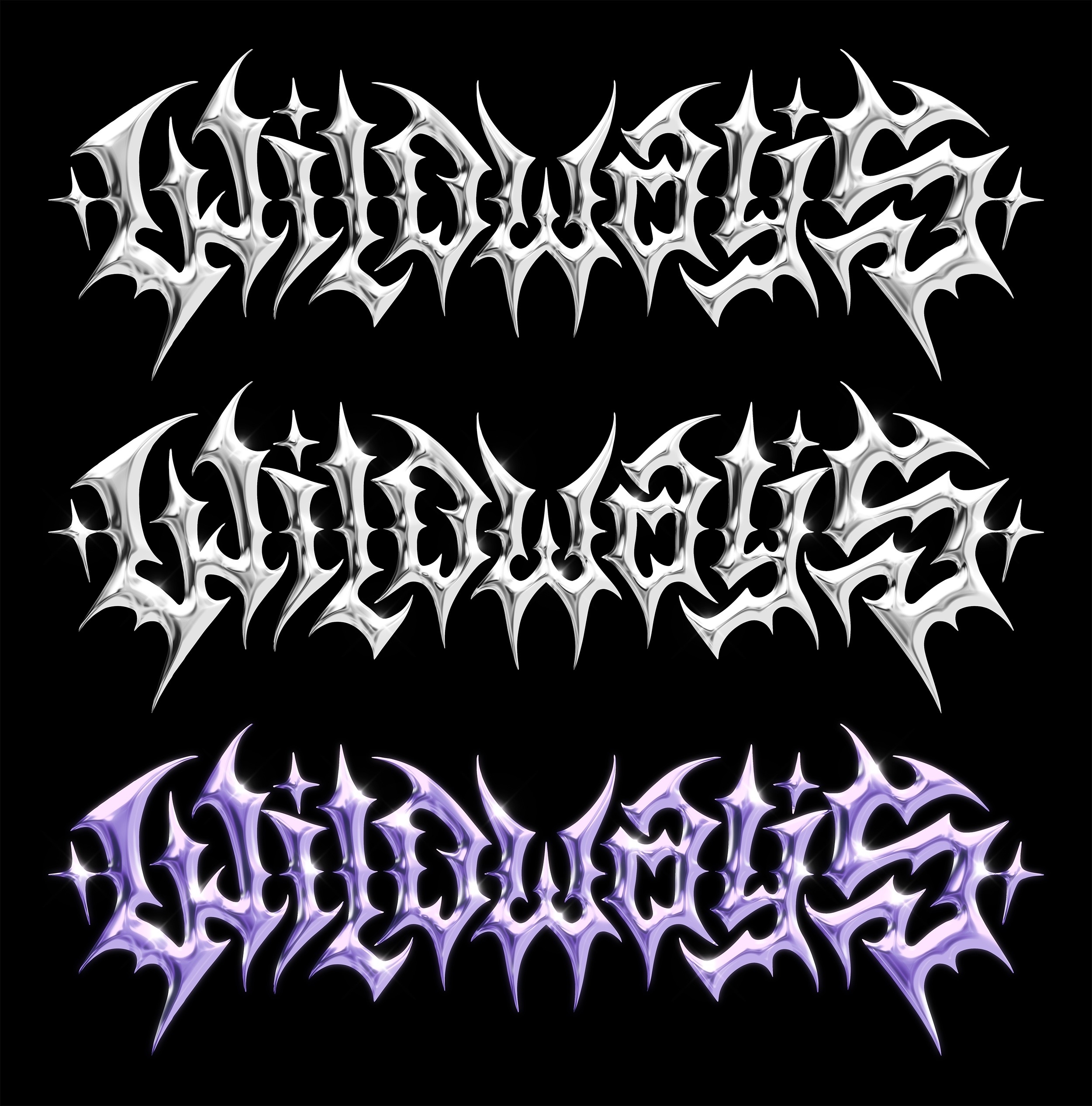
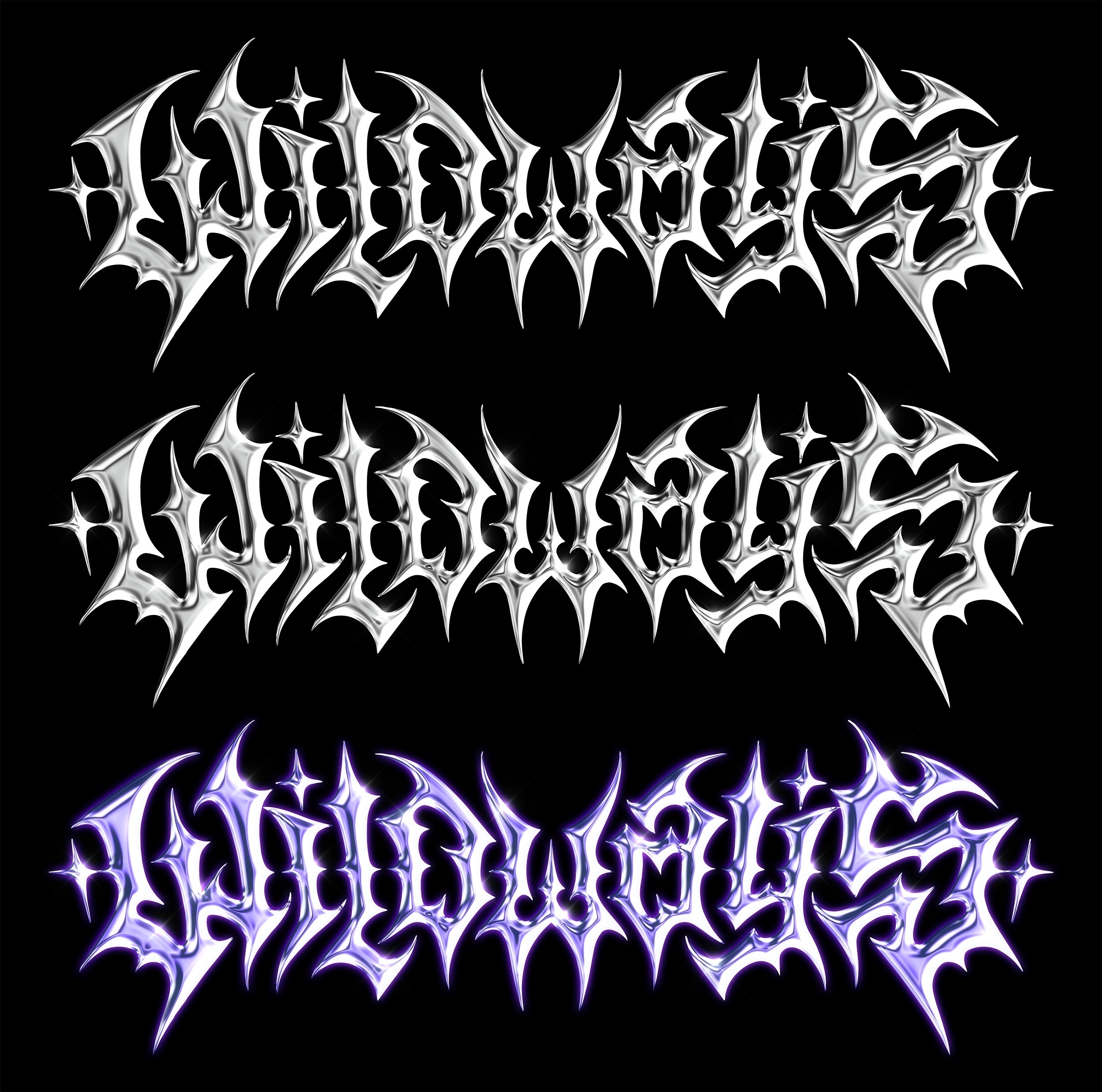
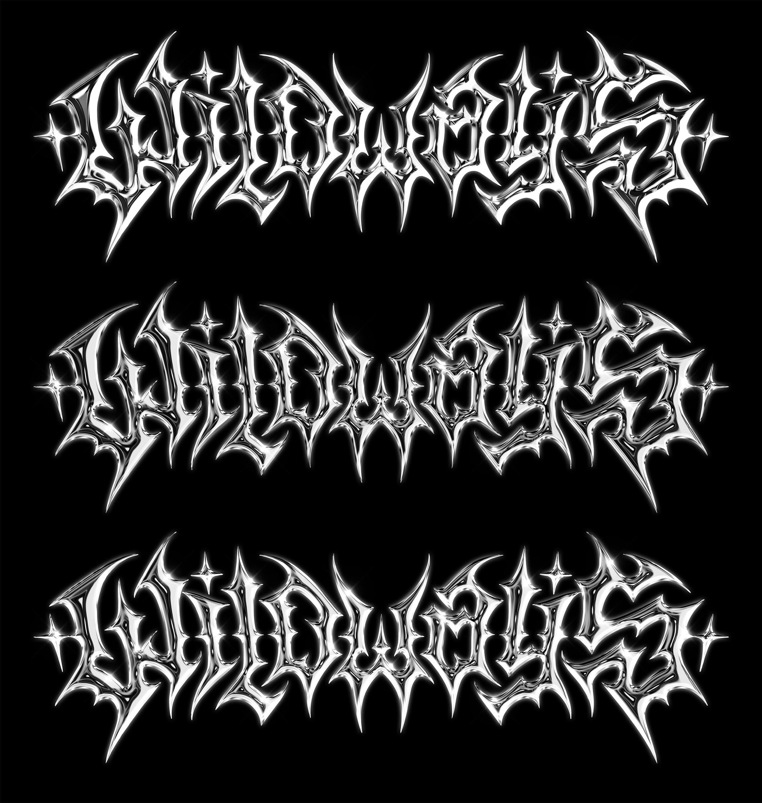
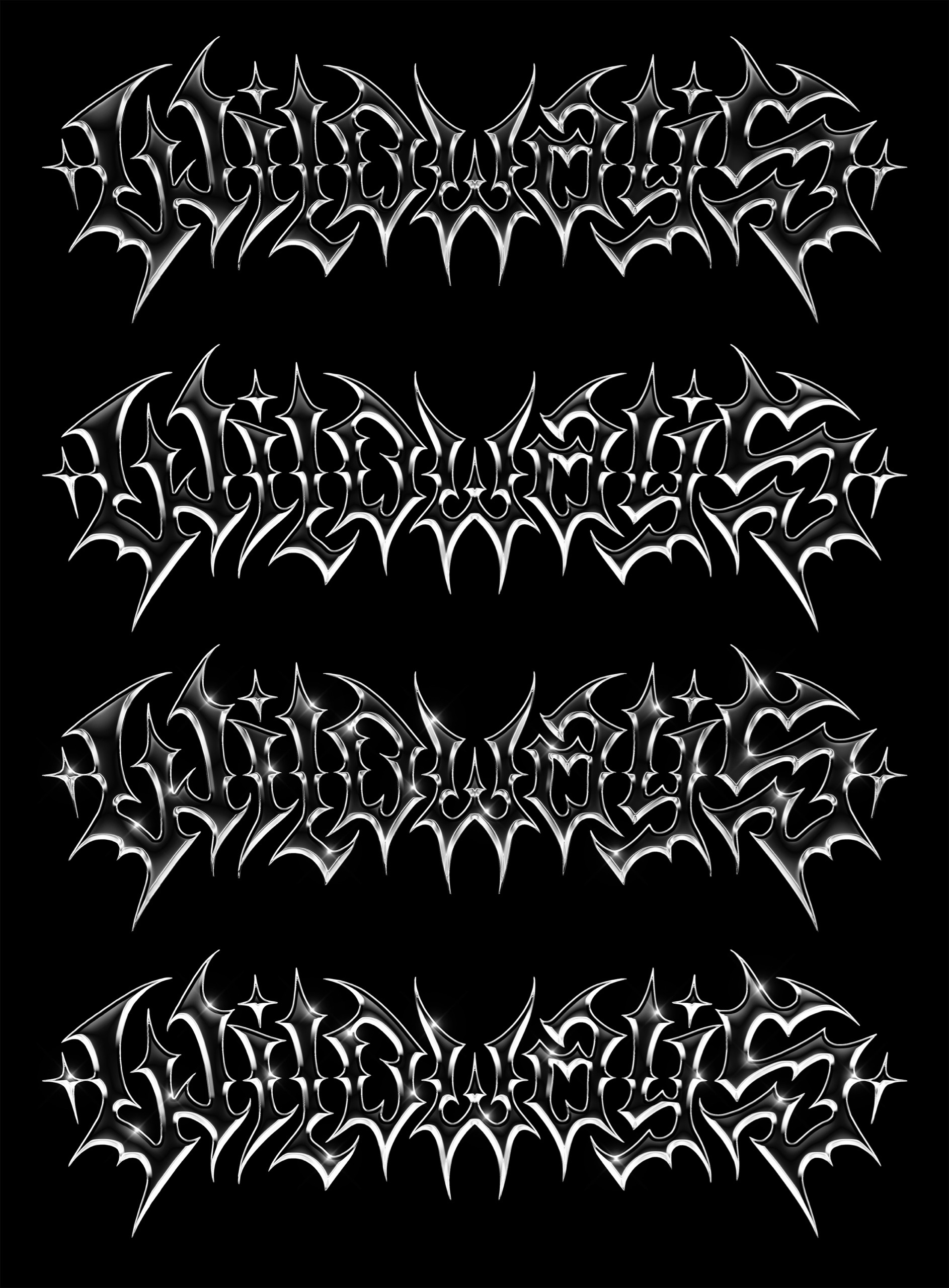
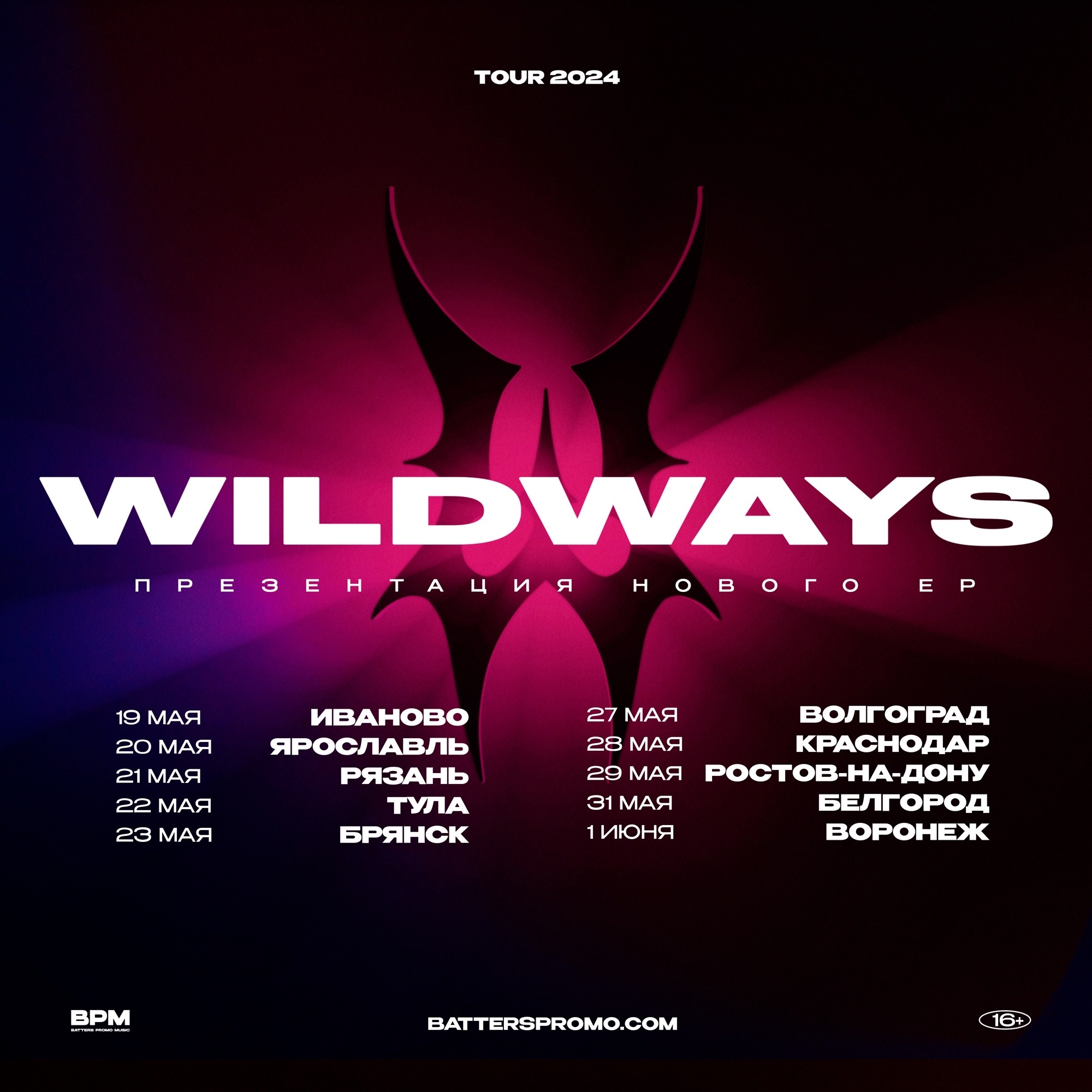
The next step was exploring different options for the chrome version of the logo, which resulted in 10 variations, each with its own texture, specifically matched colors, and highlight placement. The top image shows the raw chrome base without color, the middle one shows the same base with highlights, and the bottom one presents the chrome with highlights and full color applied.
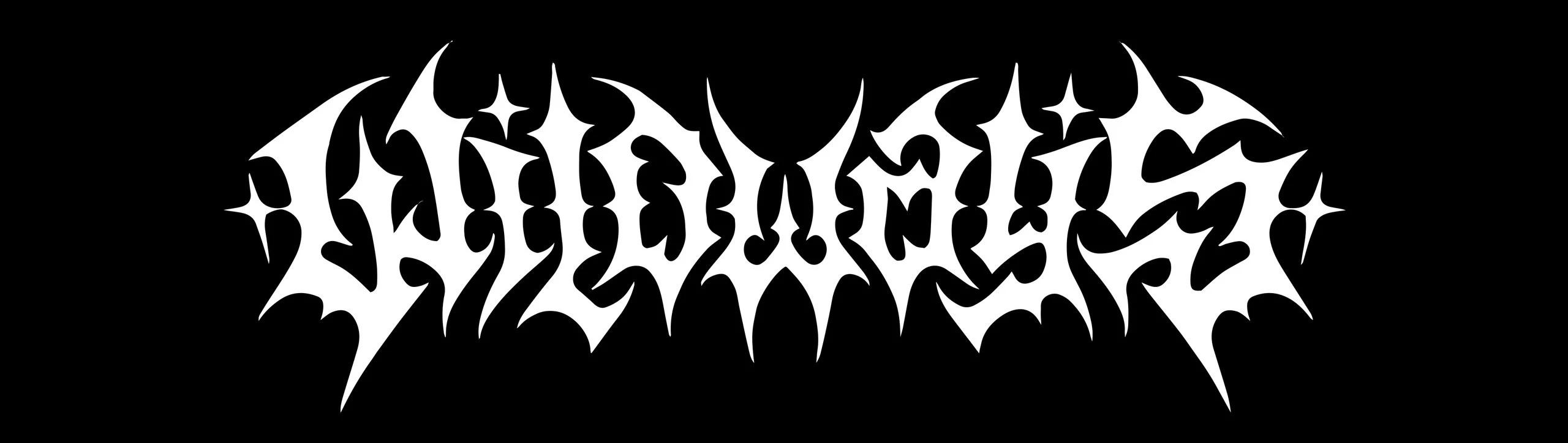
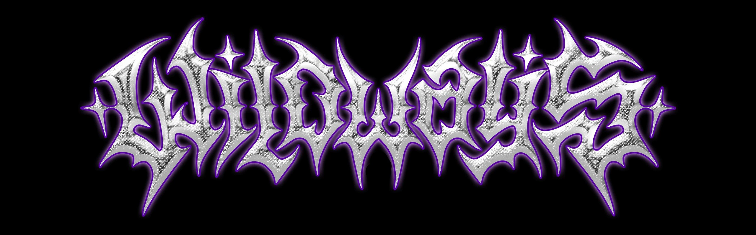
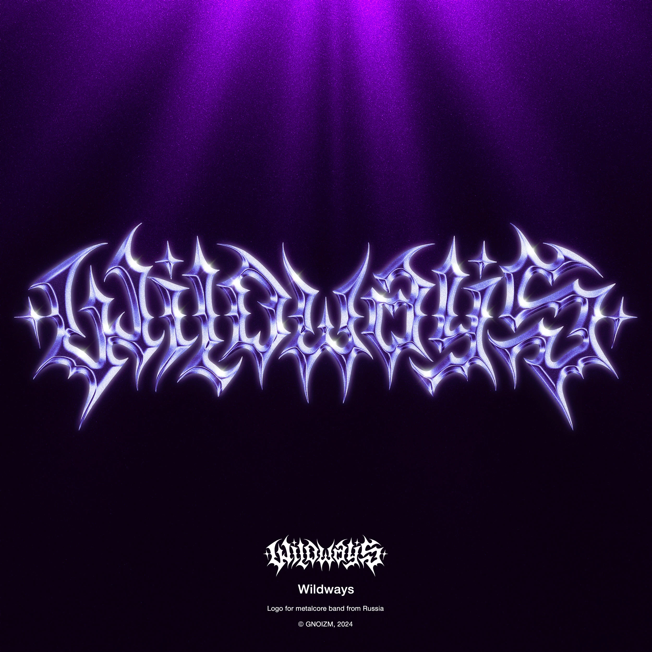
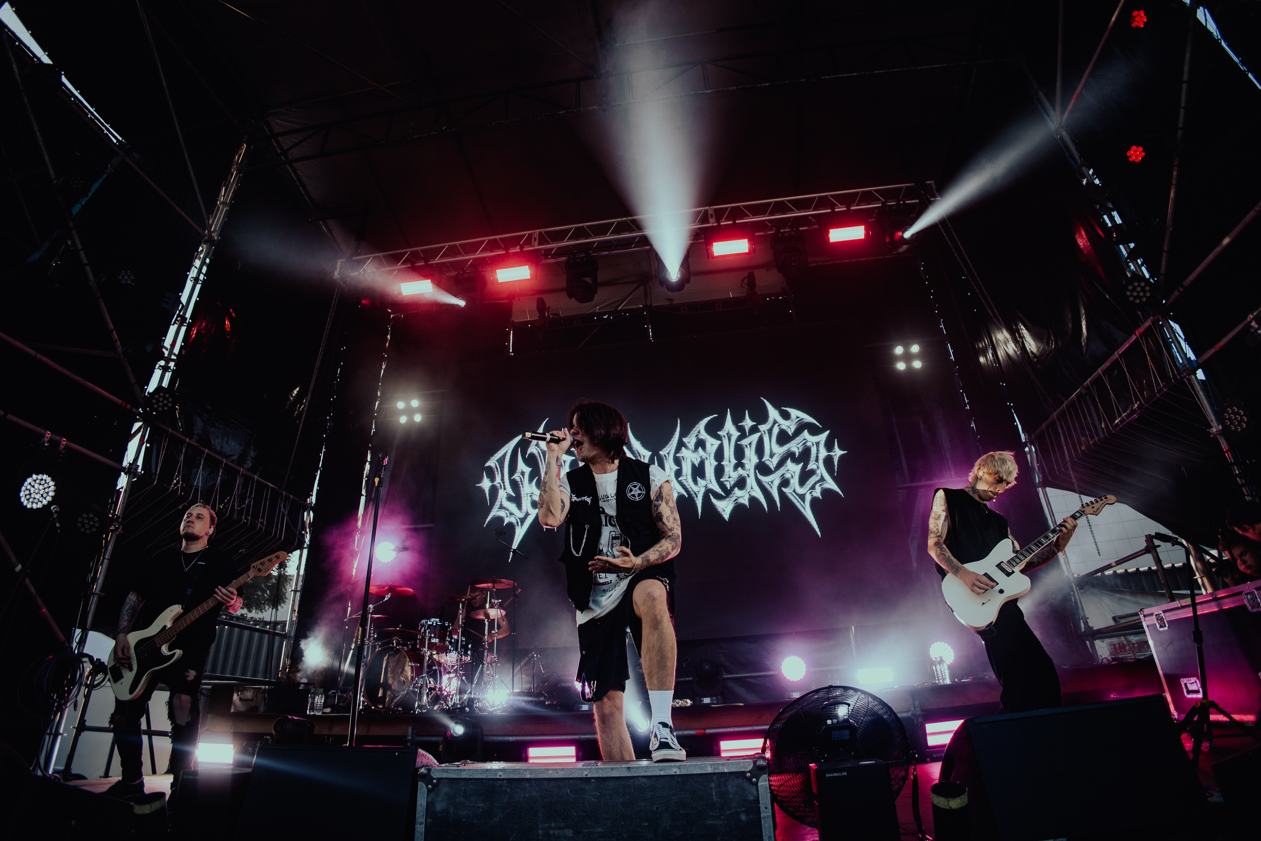
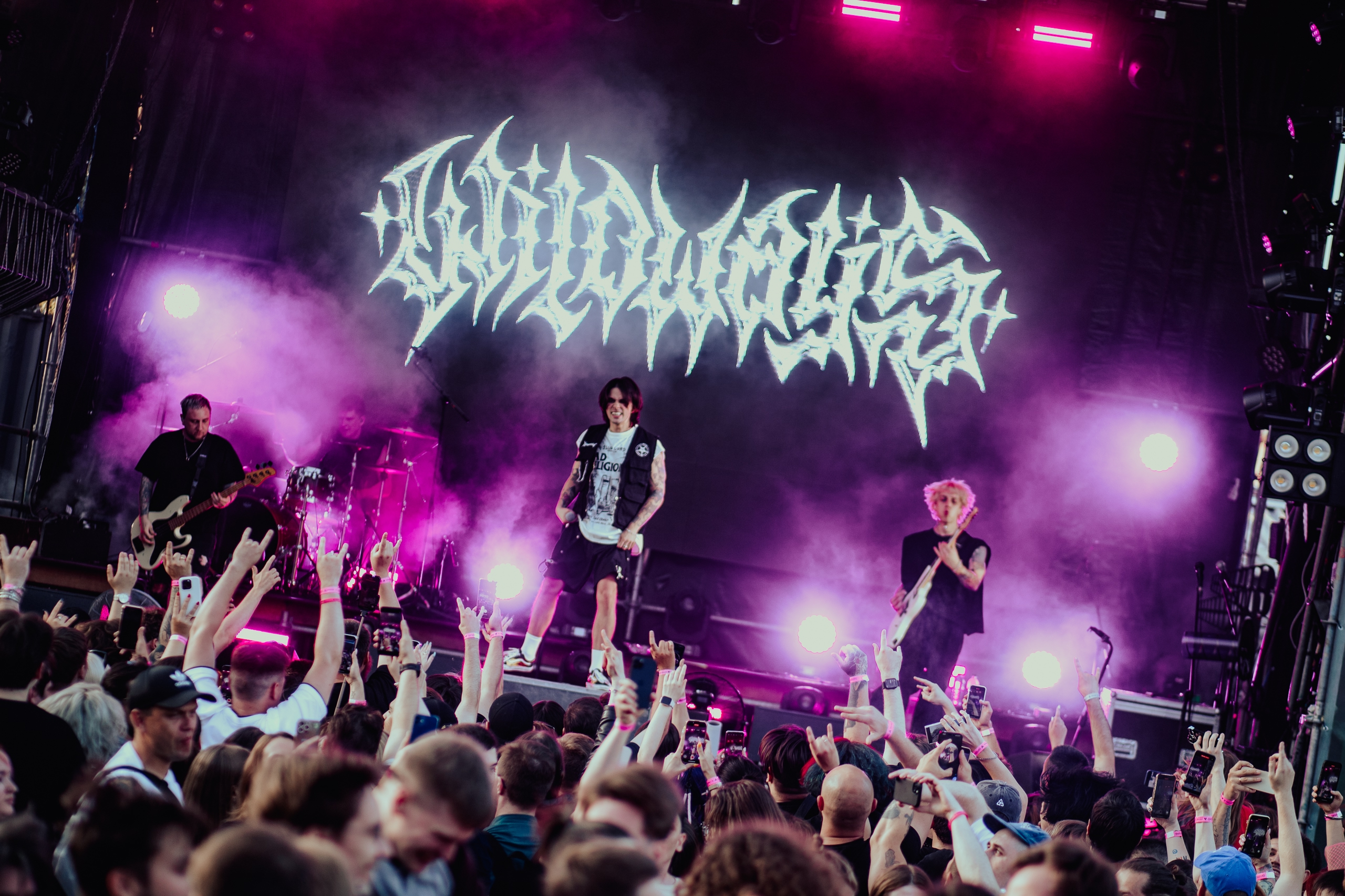
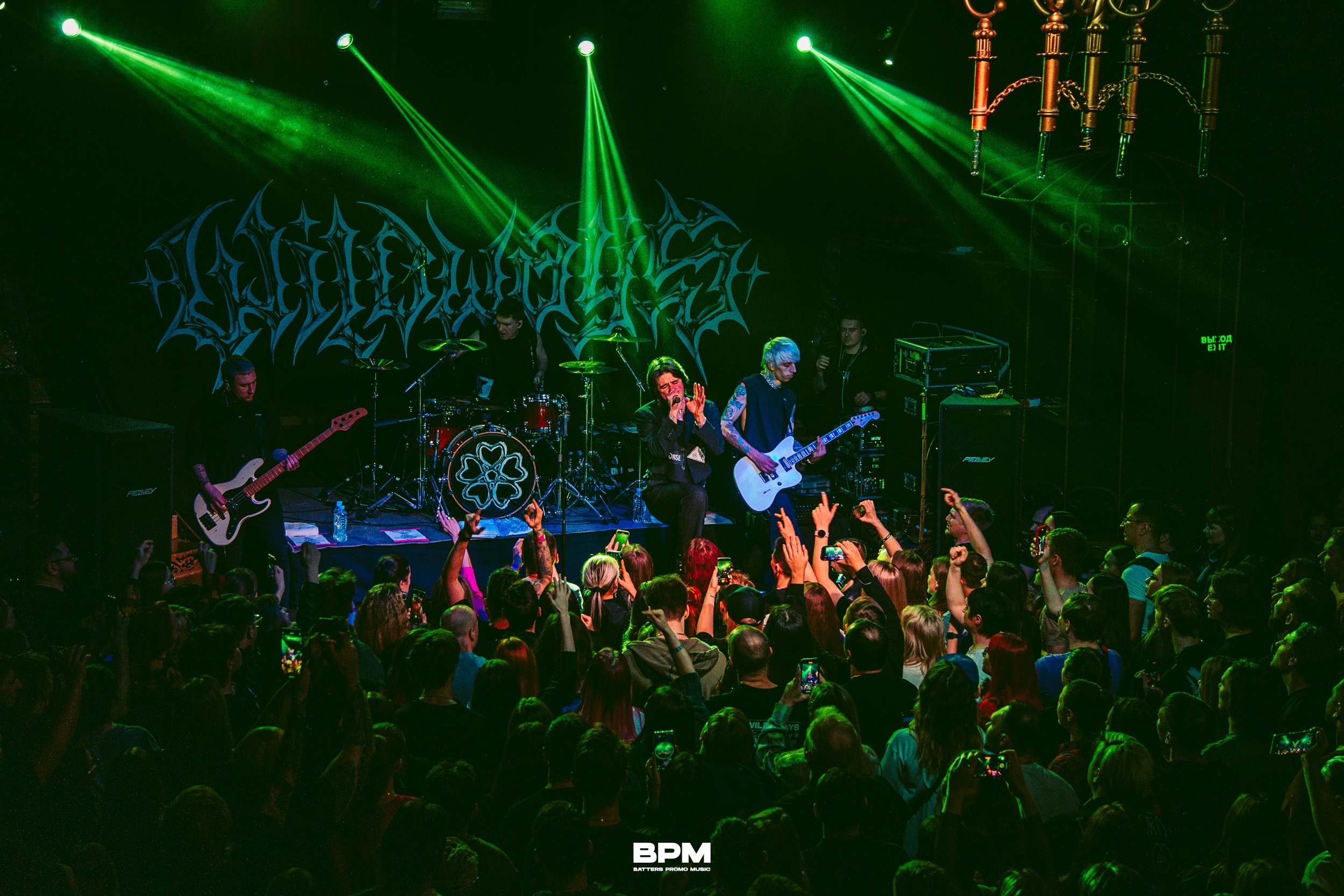
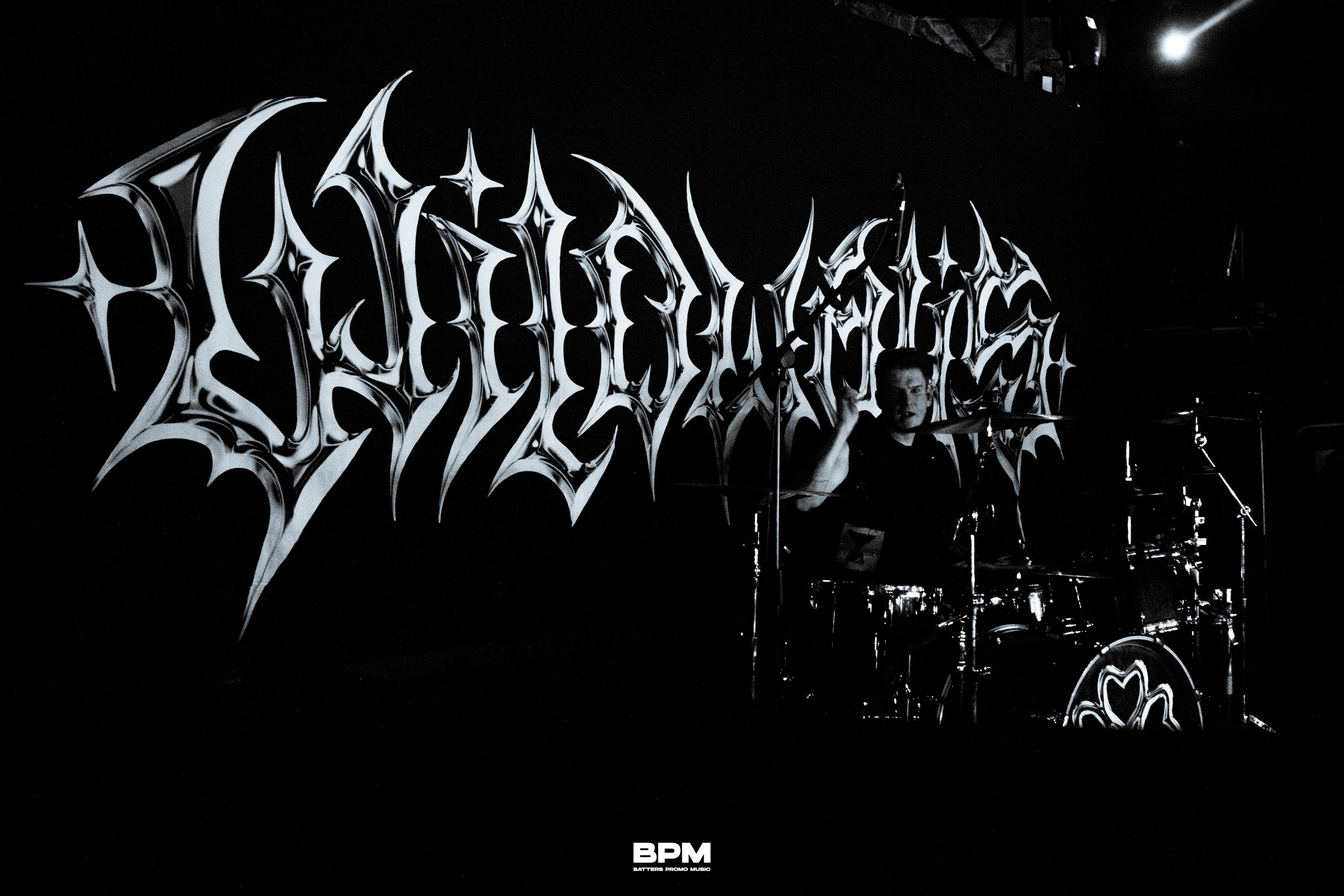
Main variation of the final logo.
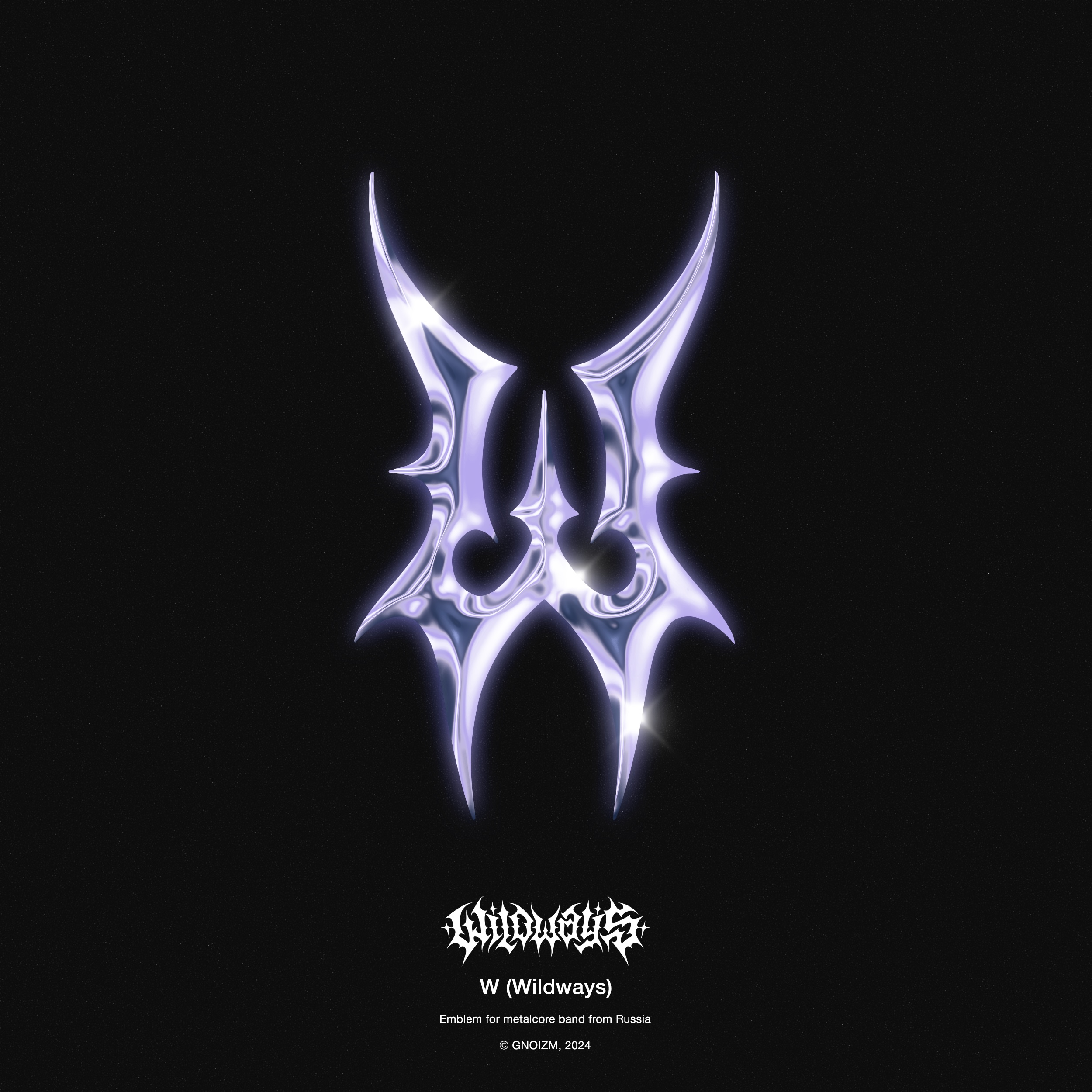
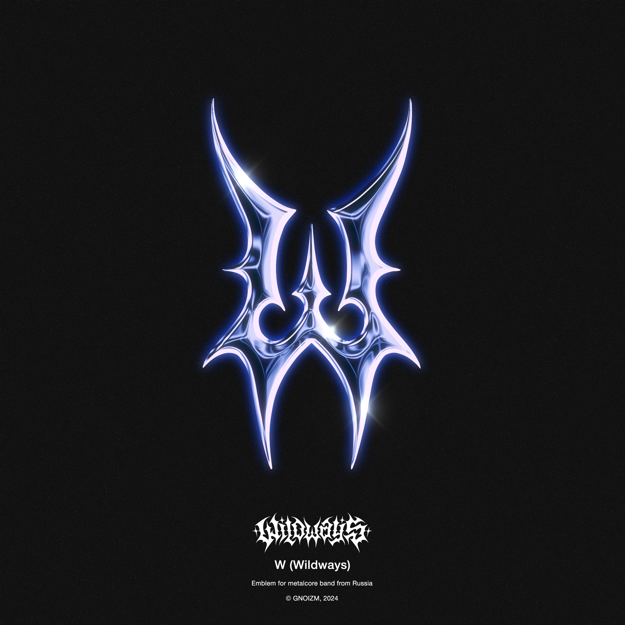
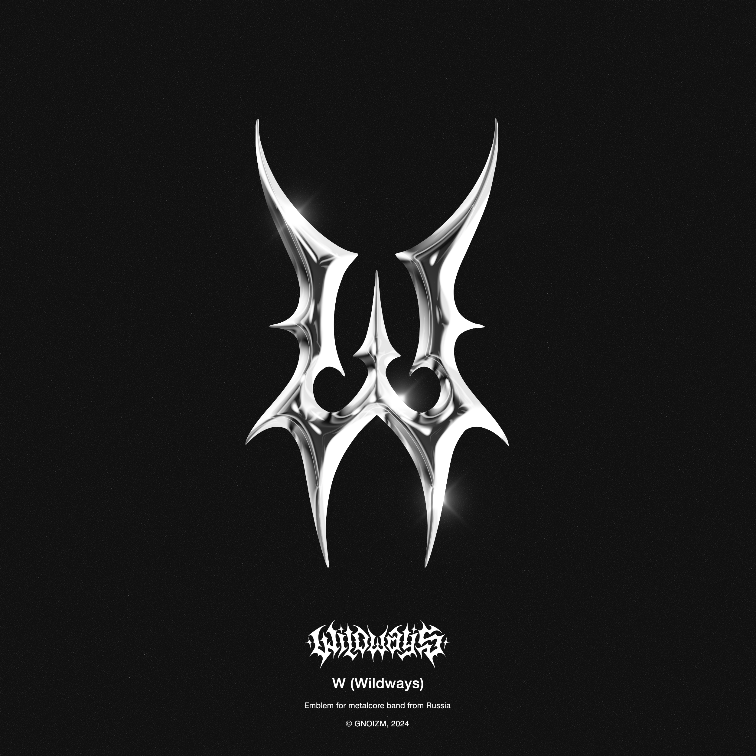
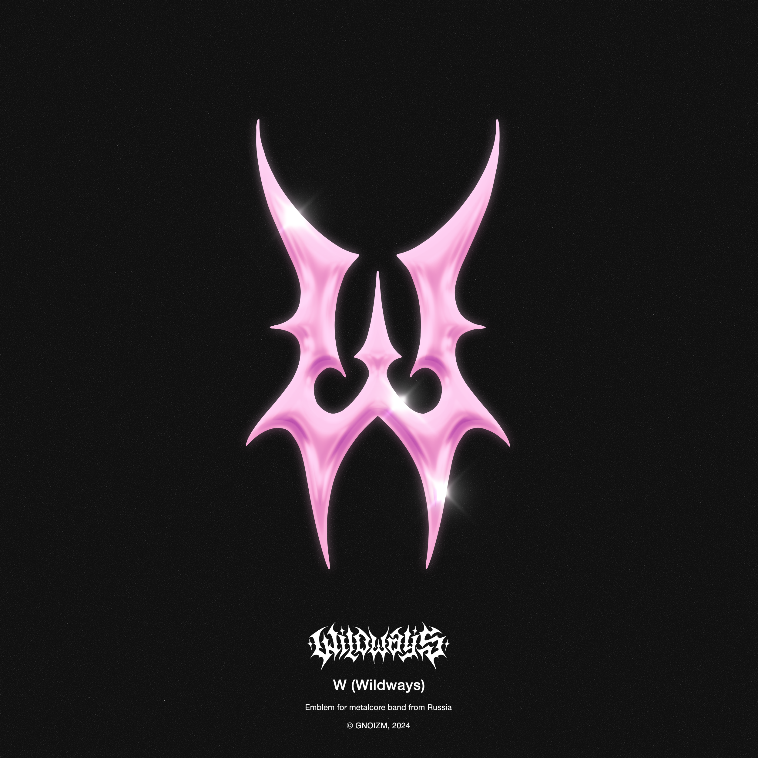
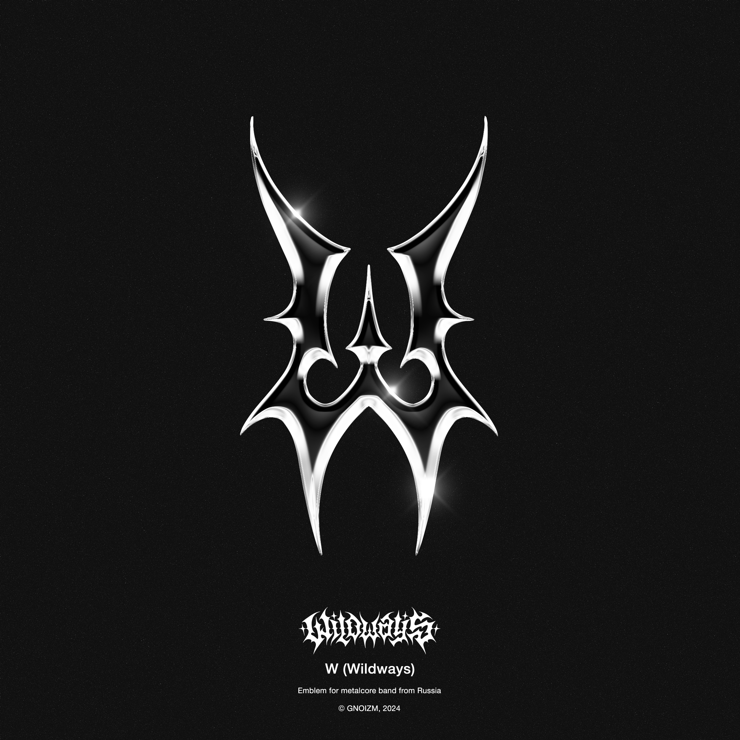
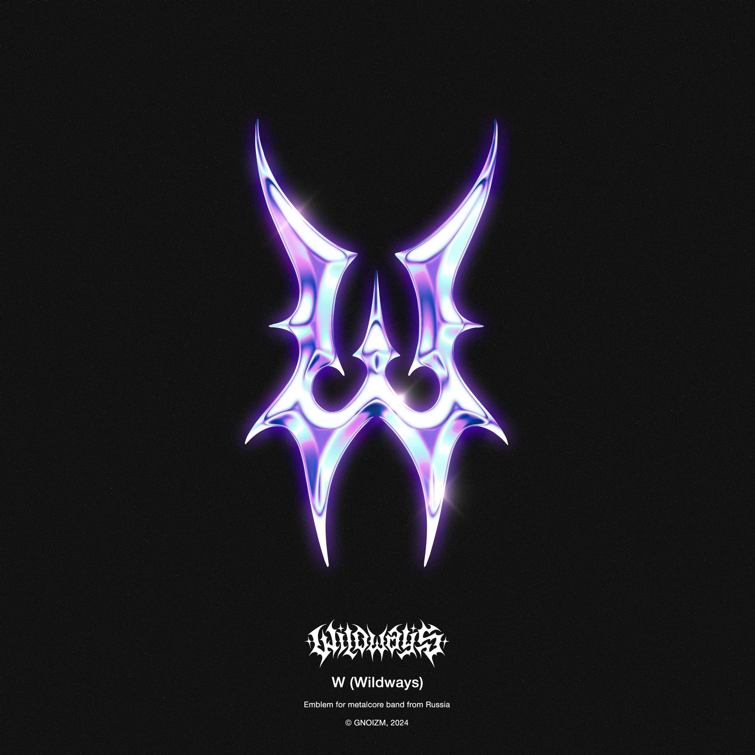
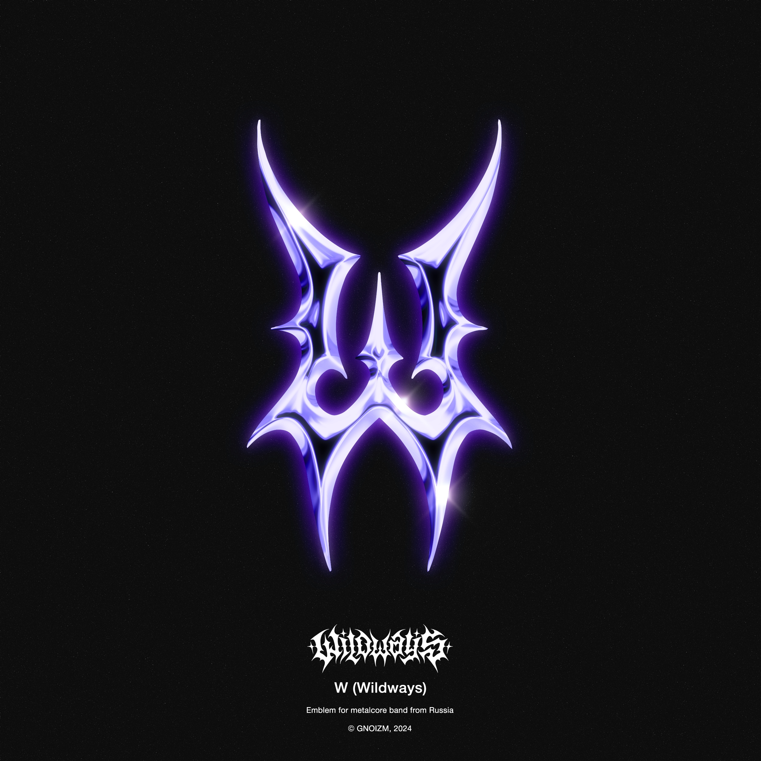
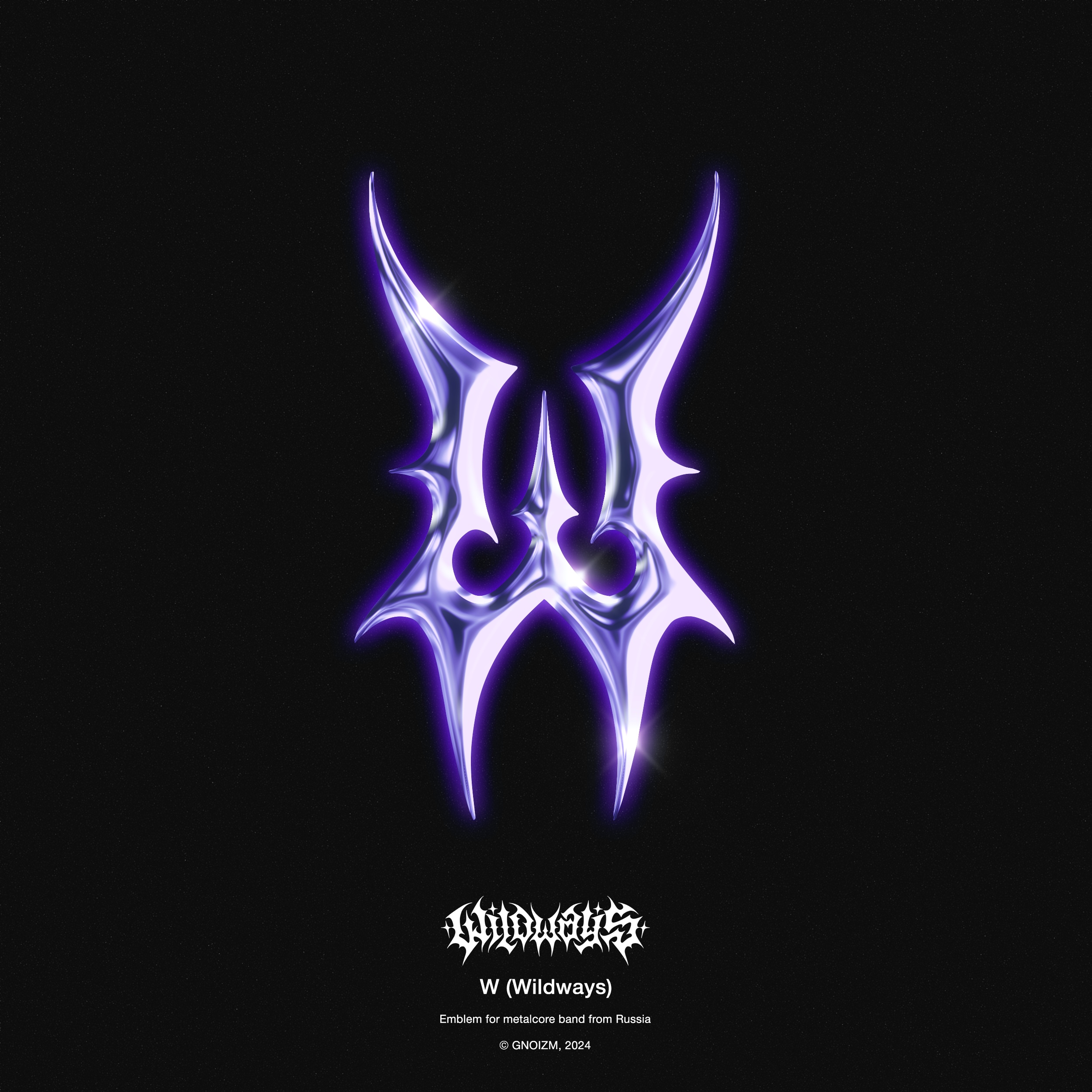
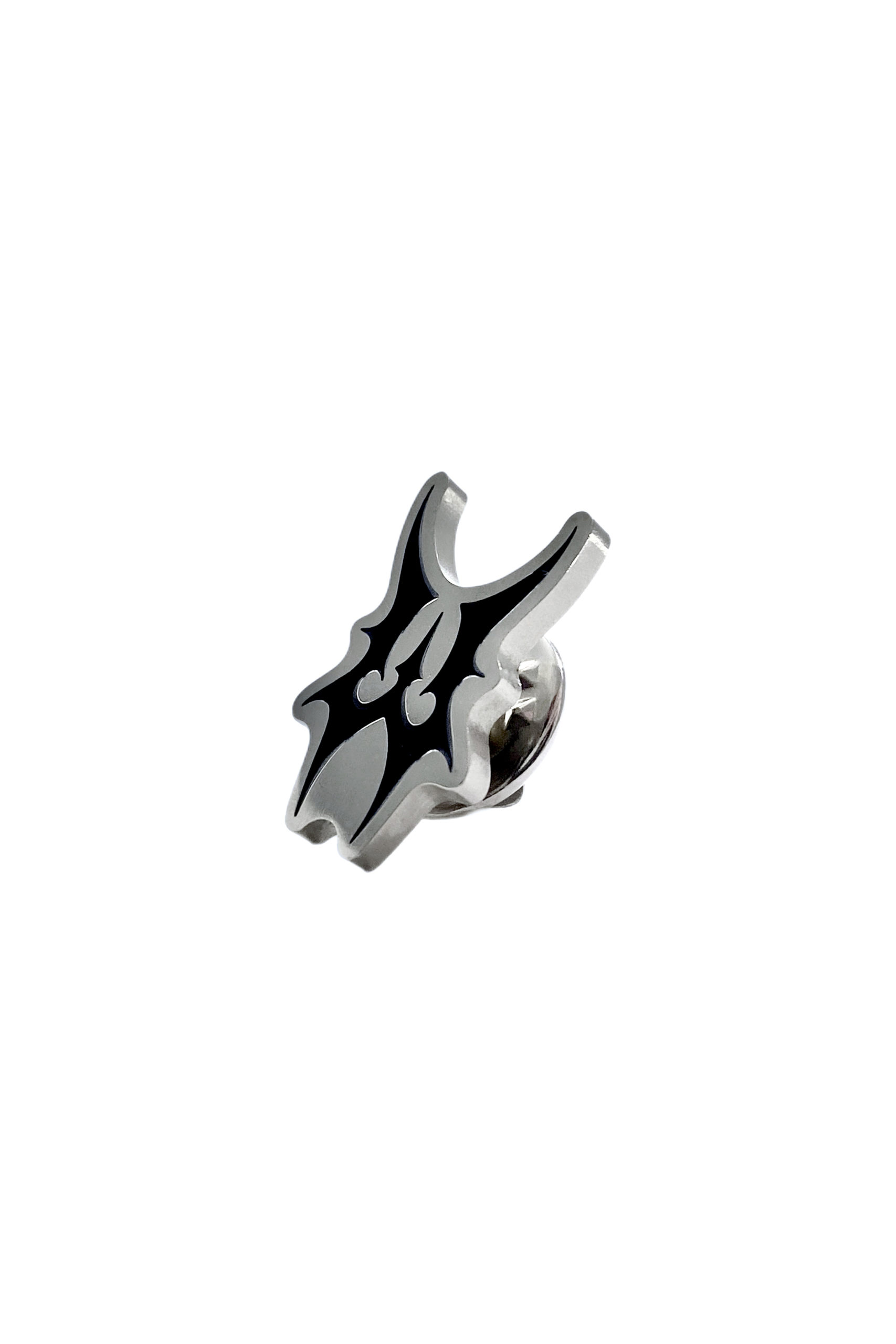
2. Emblem.
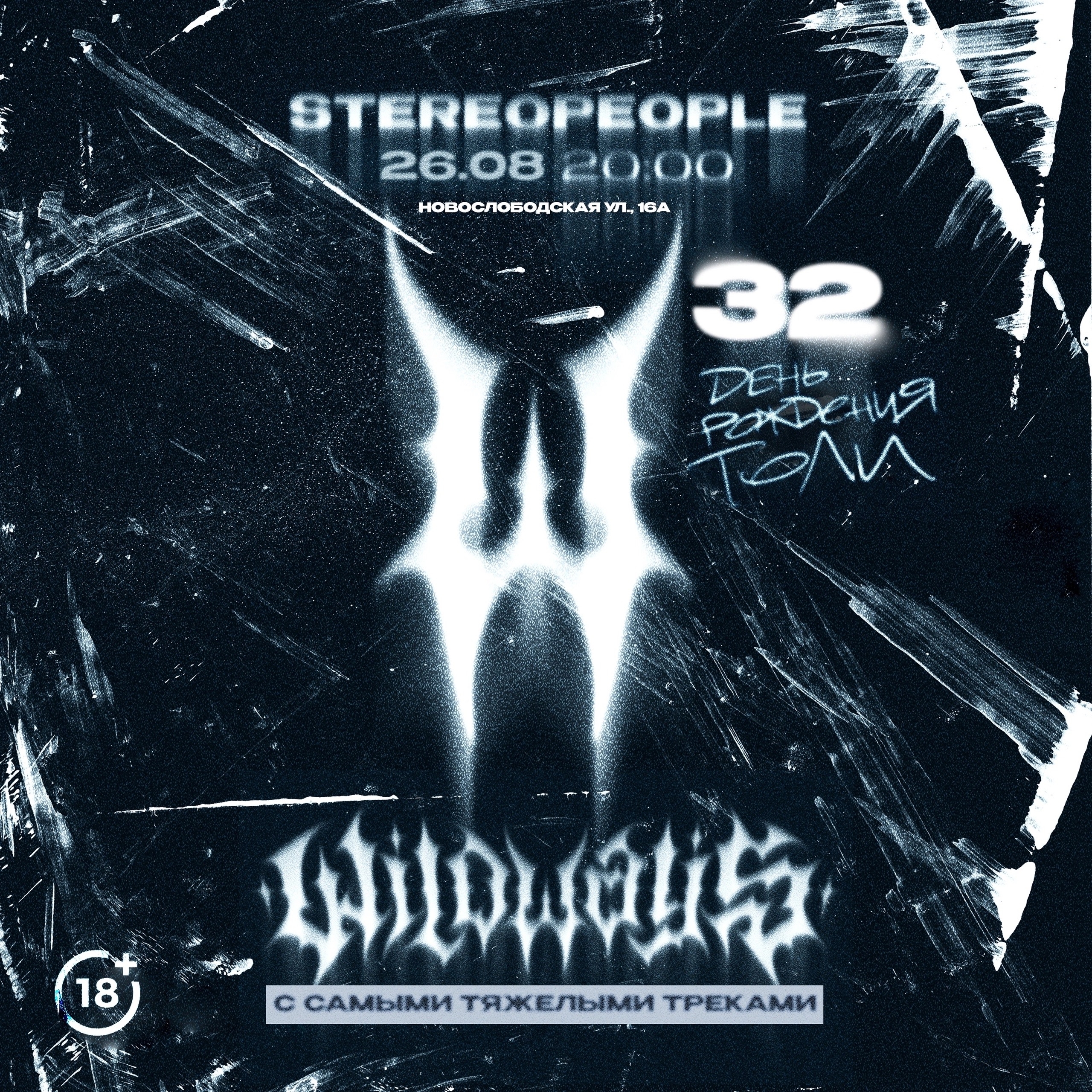
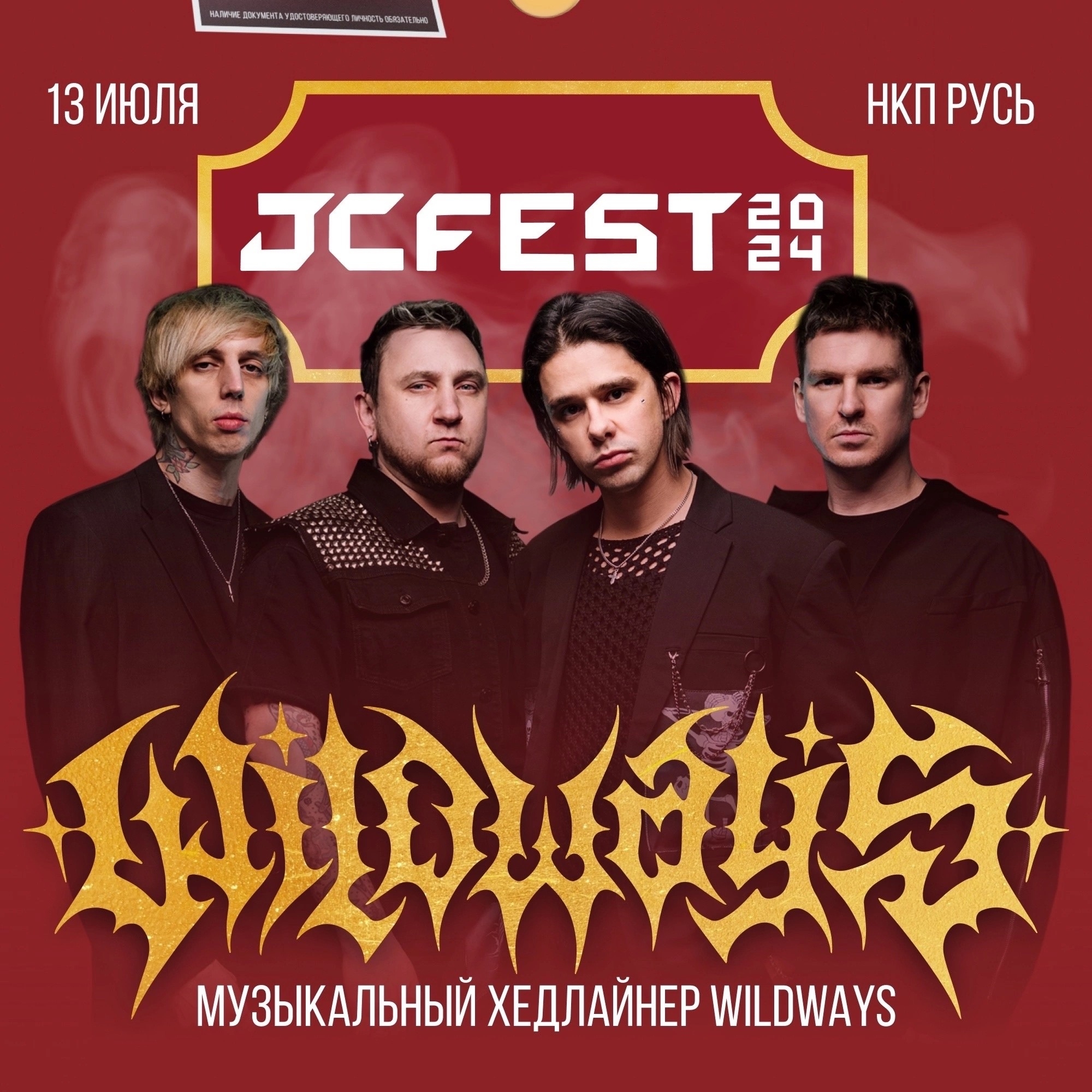
As mentioned earlier, the idea behind the composition made it possible to use the central letter W as an emblem, so here are the versions of the finished emblem.
Main variation of the final emblem.
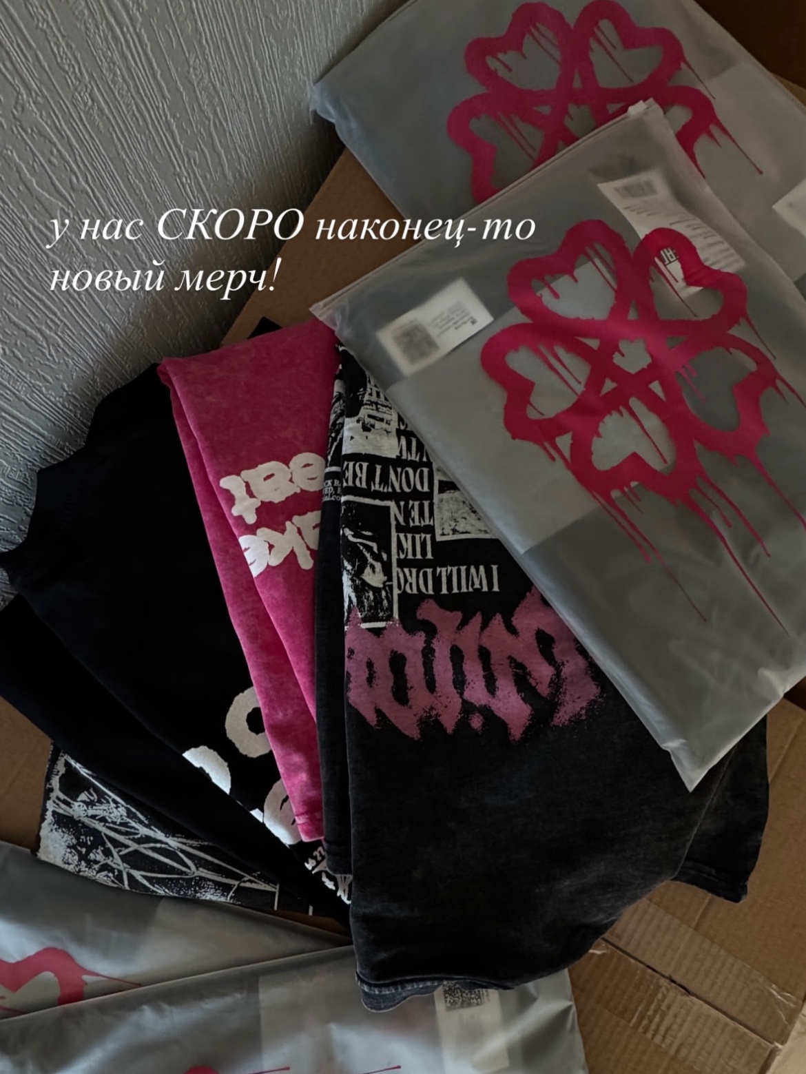
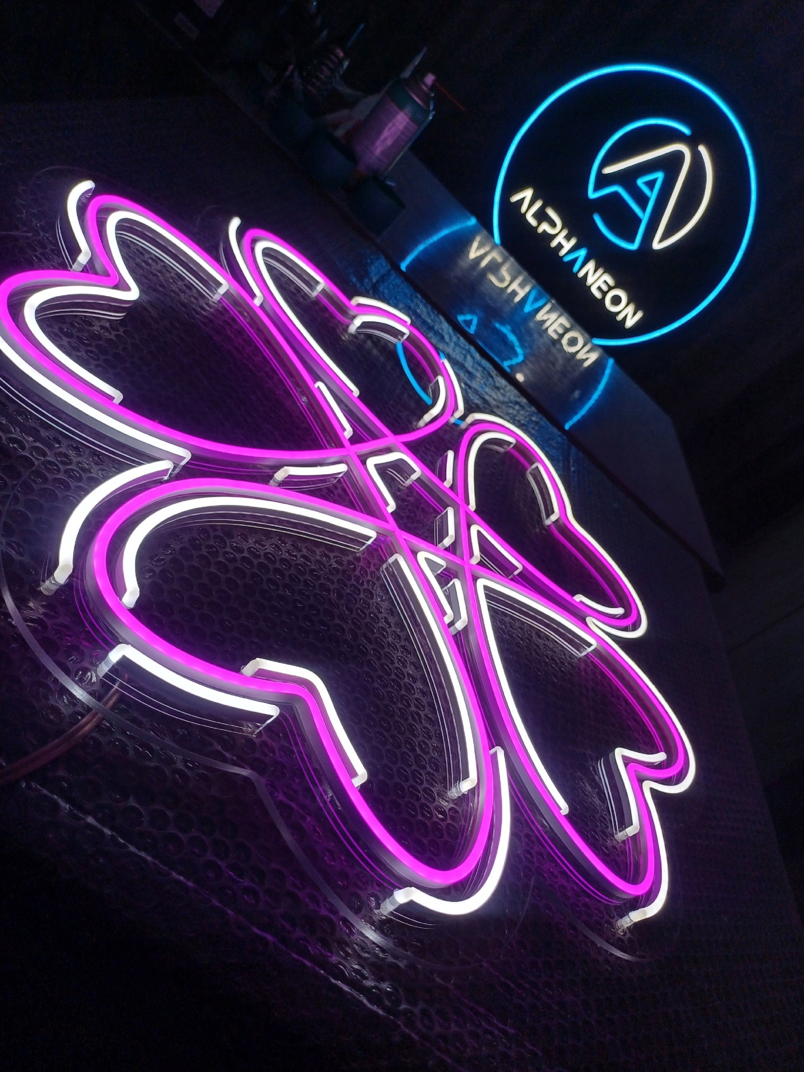
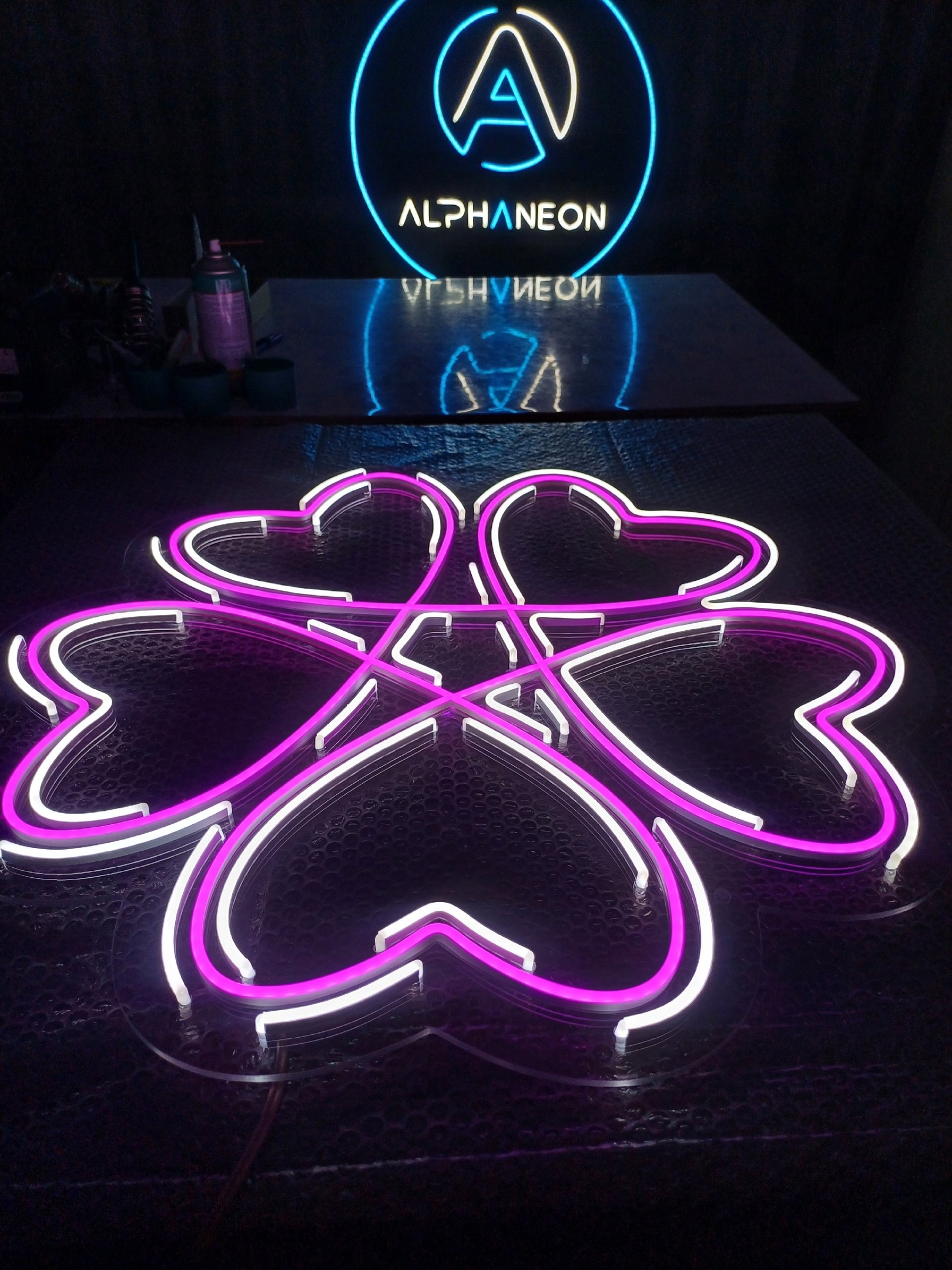
3. Sakura emblem.
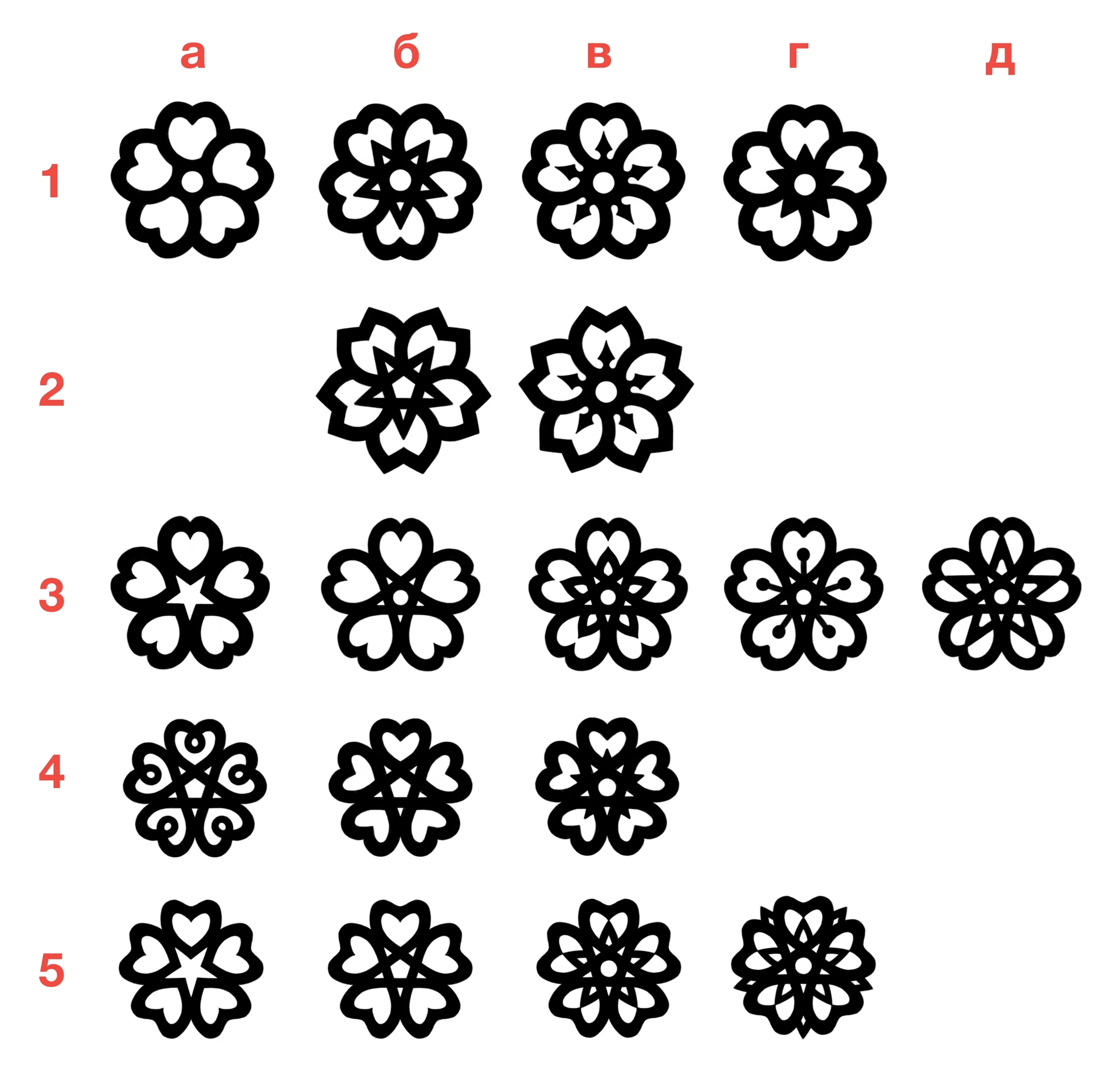
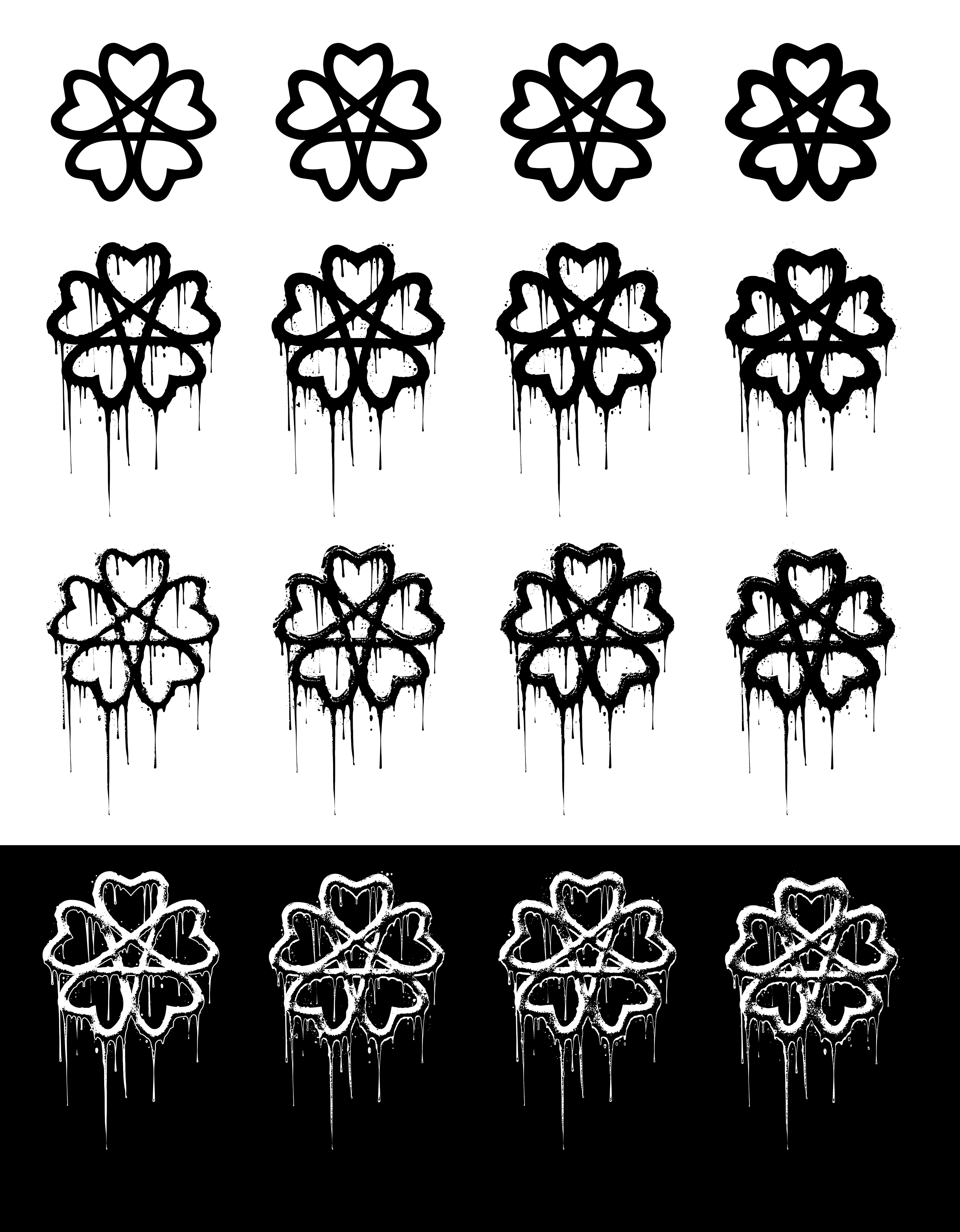
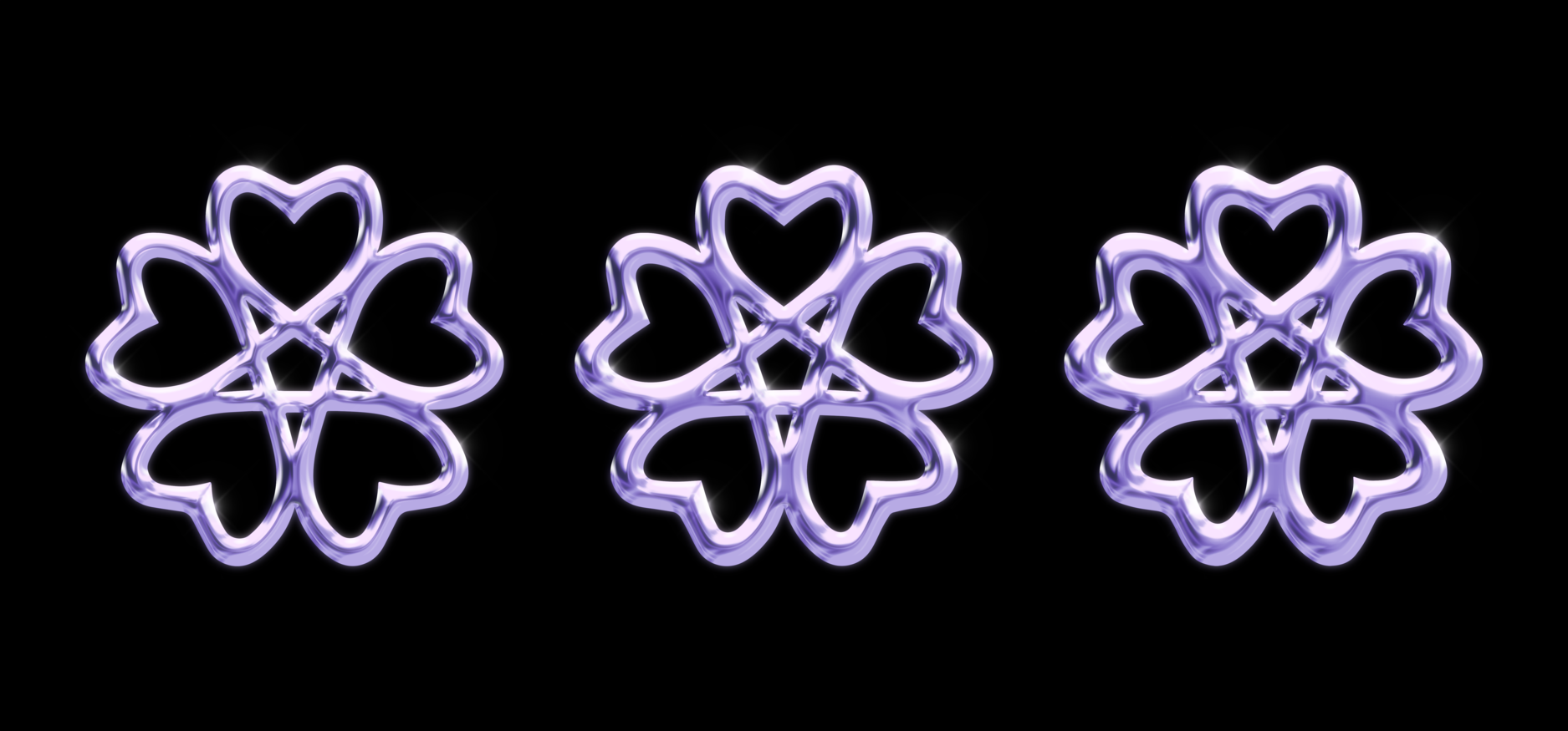
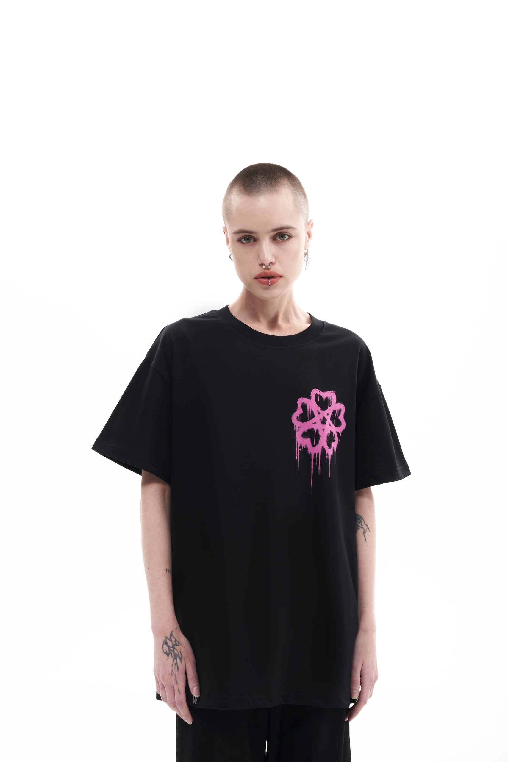
The third stage of our work was developing the sakura emblem for band’s next EP. The brief only specified that I needed to come up with a cool minimalist, geometric sakura emblem that could later be stylized as needed.
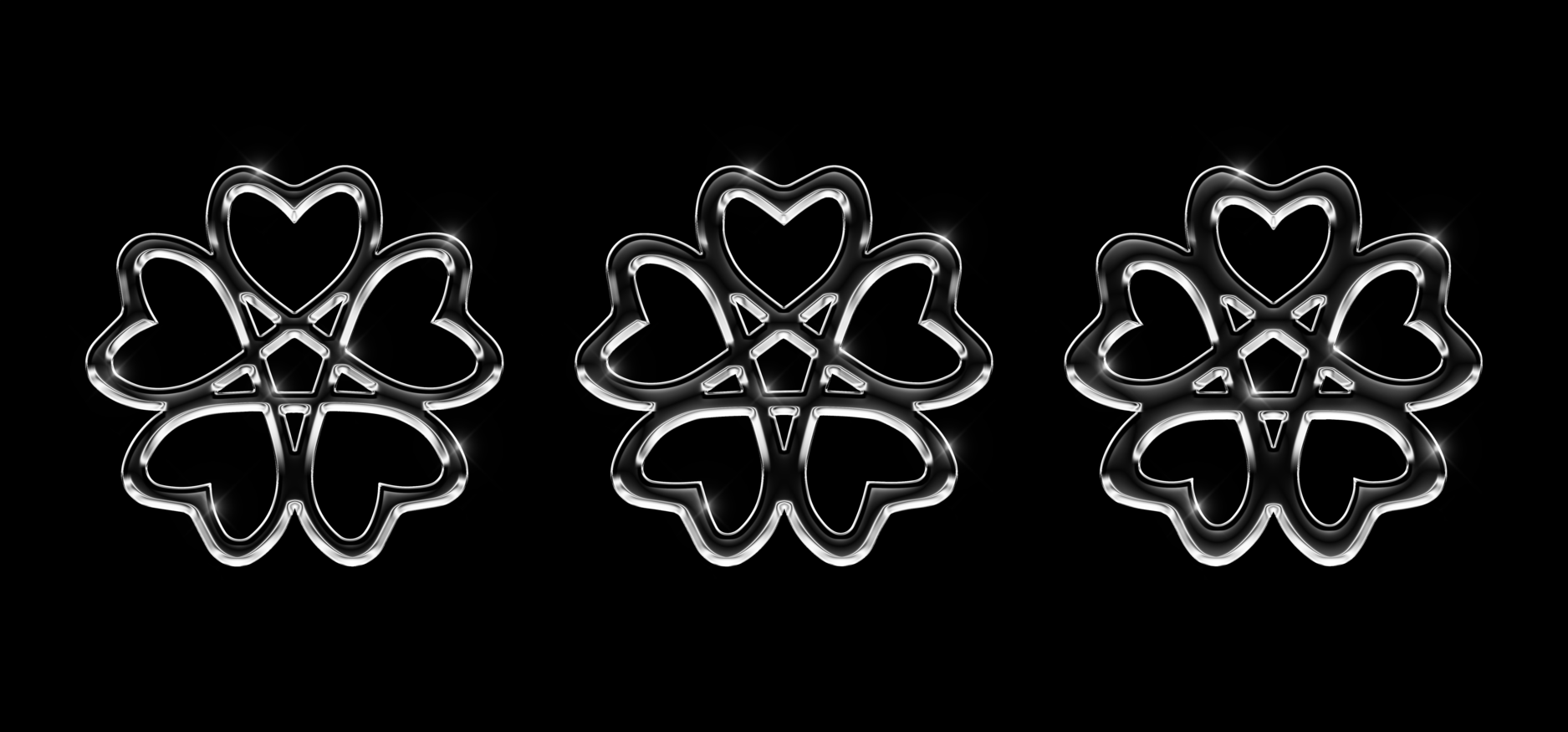
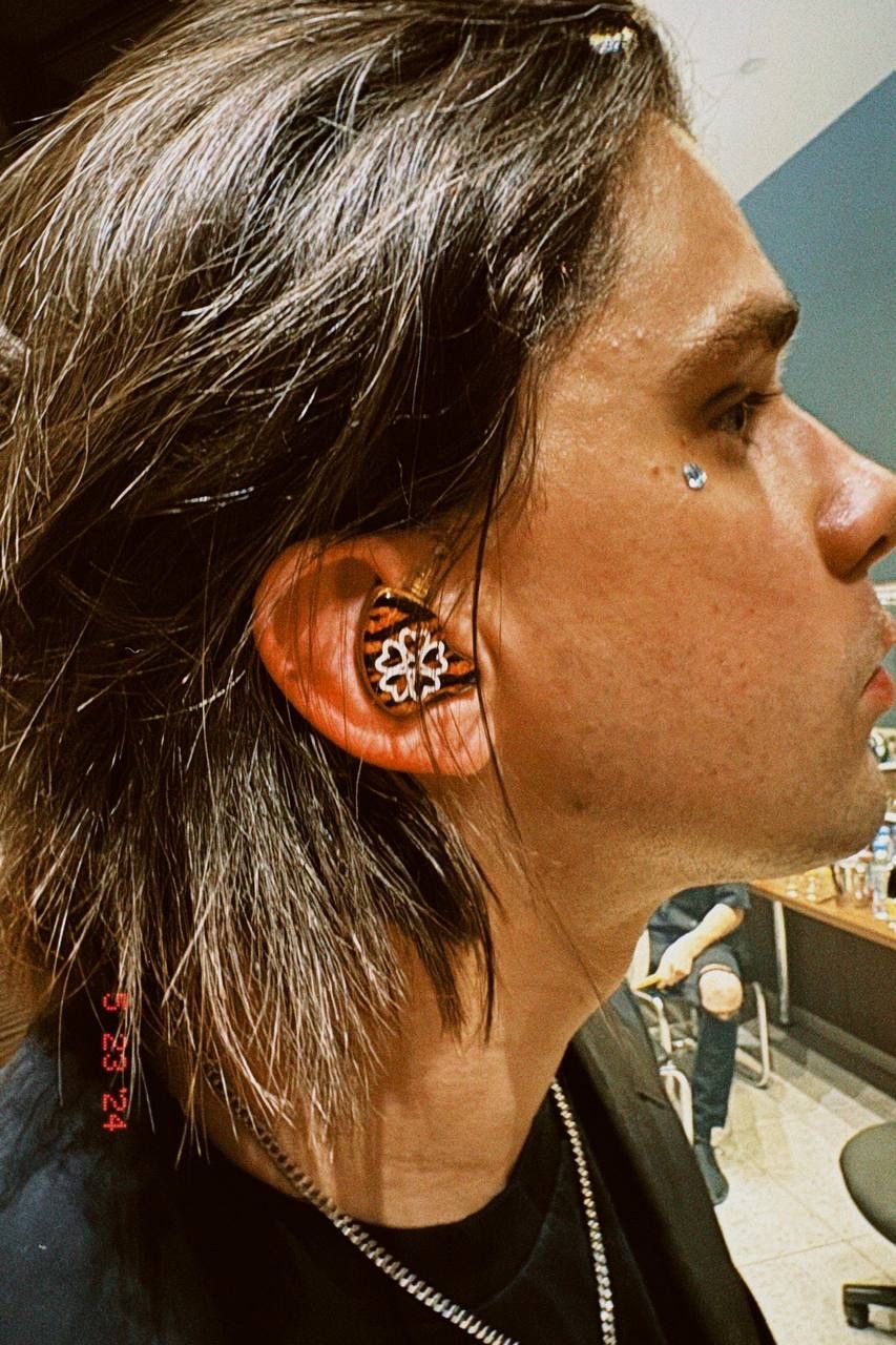
As a result of the brainstorming, I arrived at the following options, and option “б-5” was chosen, where the sakura is composed of hearts and a pentagram, symbolizing both the new focus on sensuality in the band’s work and the enduring spirit of metal.
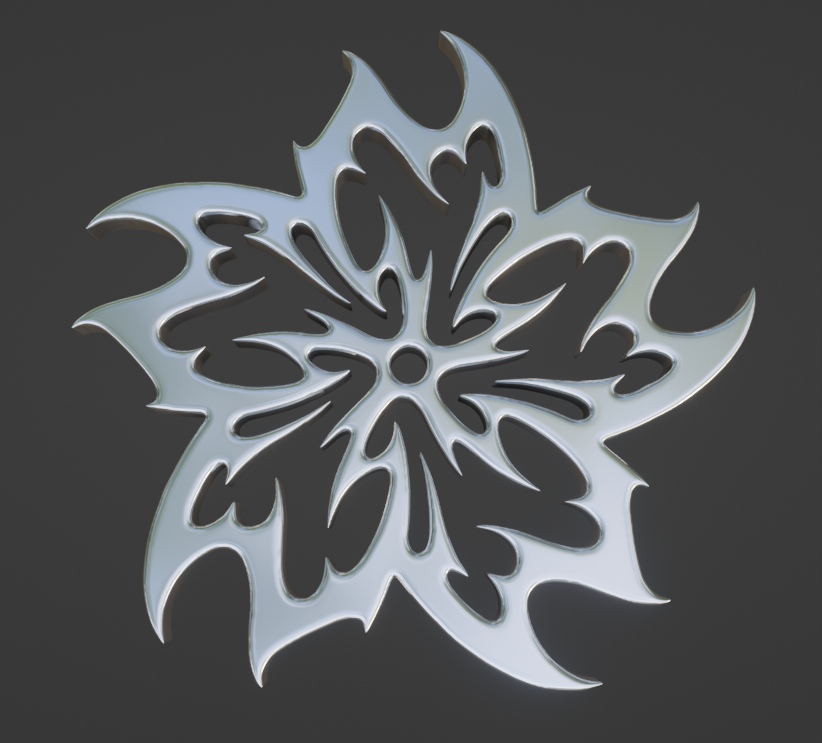
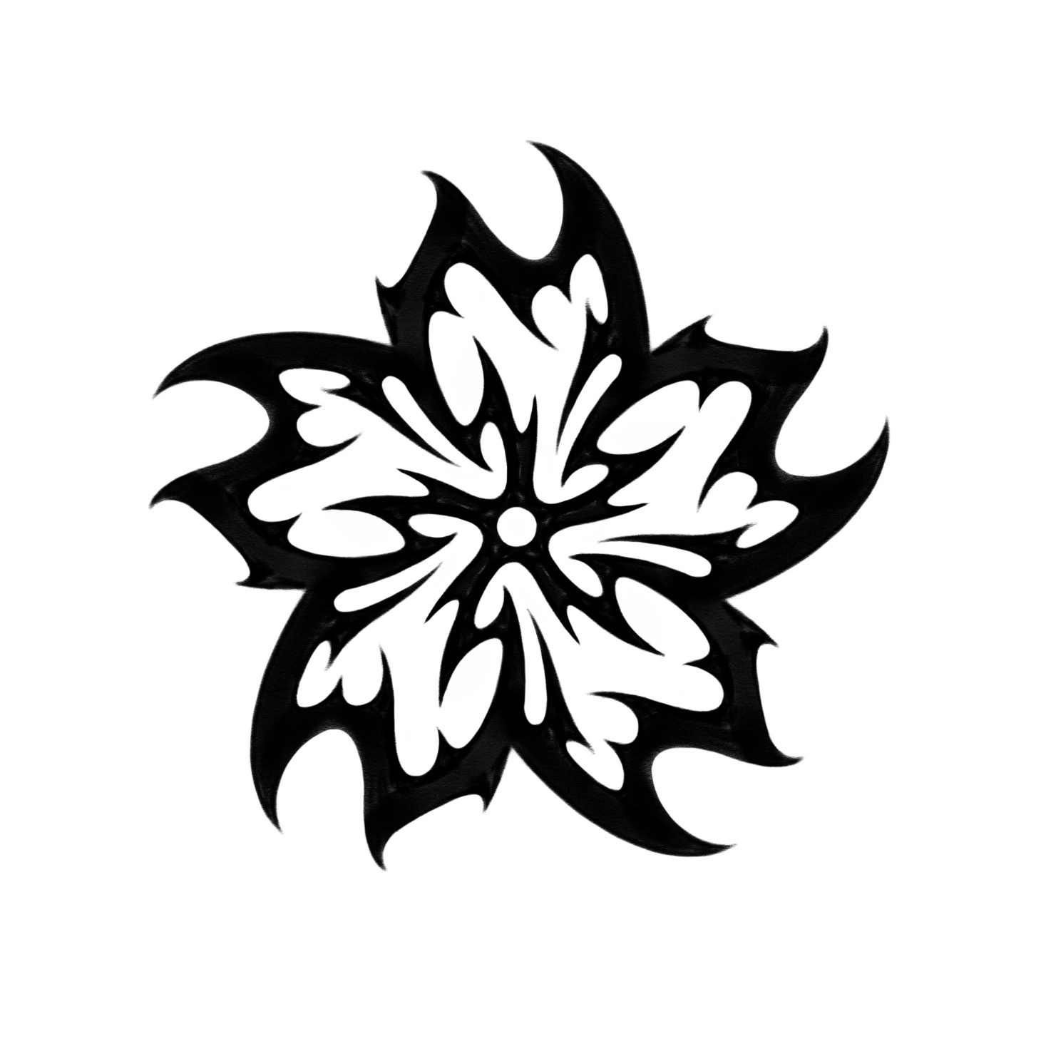
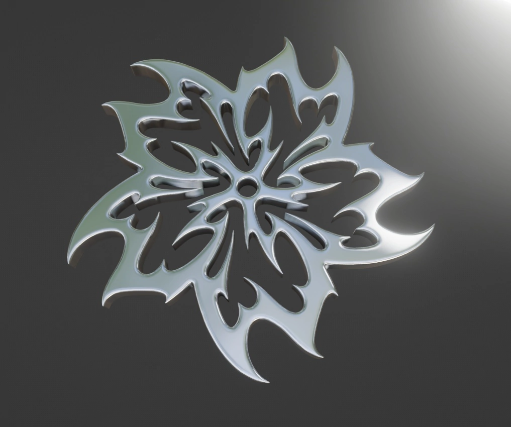
While the band was choosing between the simpler options, I experimented and created a more complex version, stylized as flames and rendered in Blender.
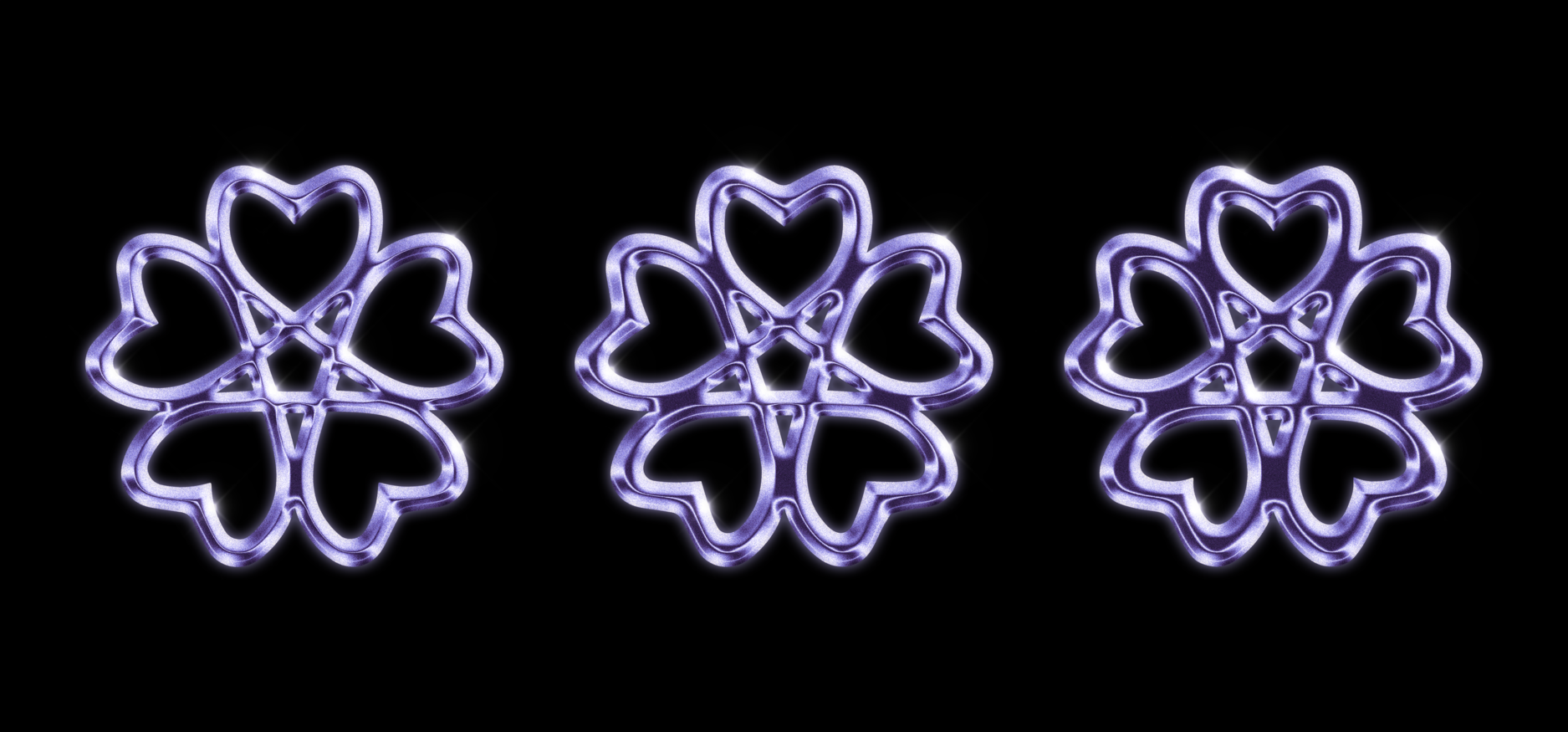
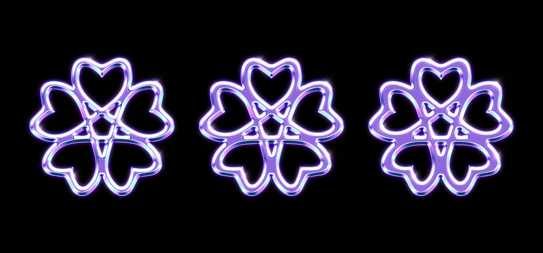
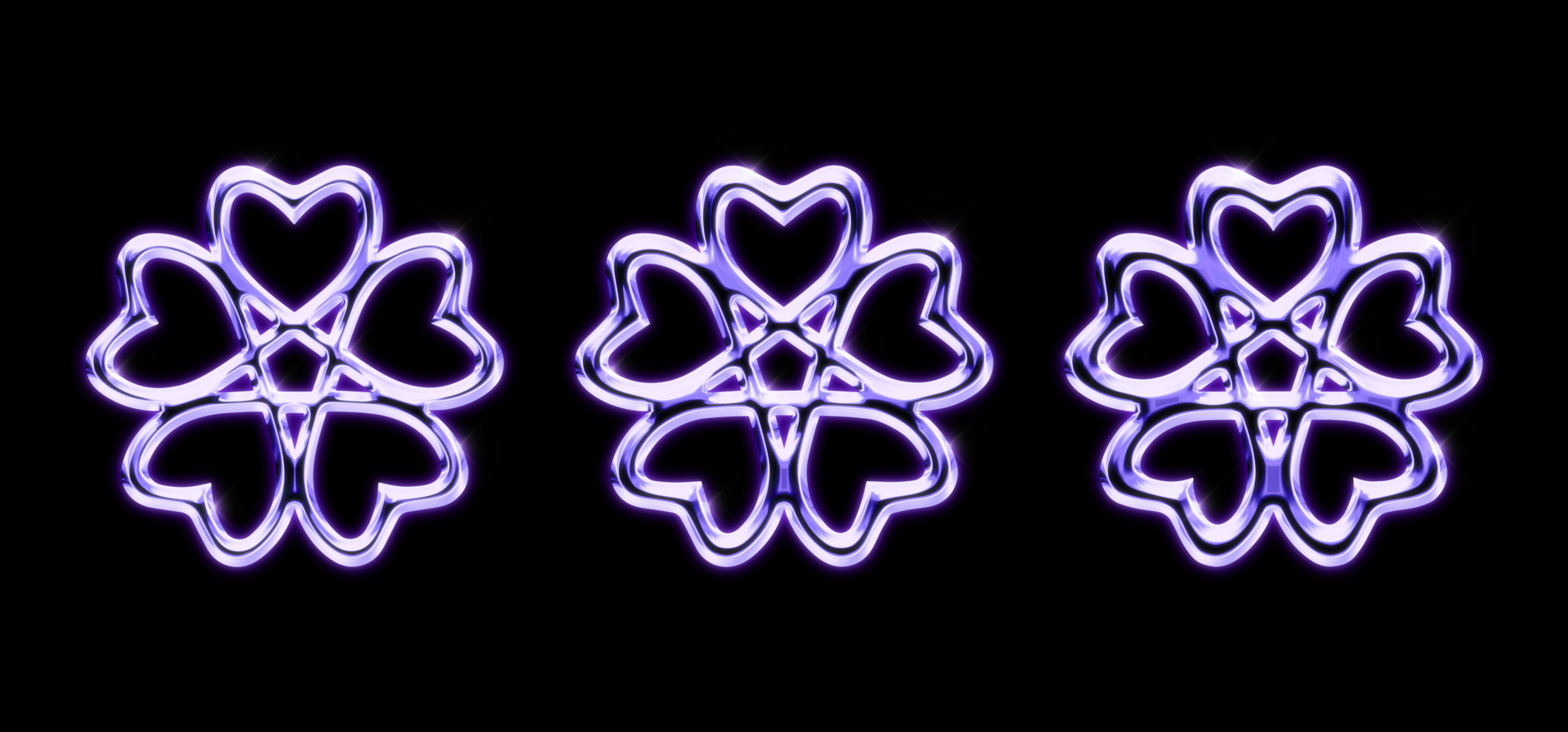
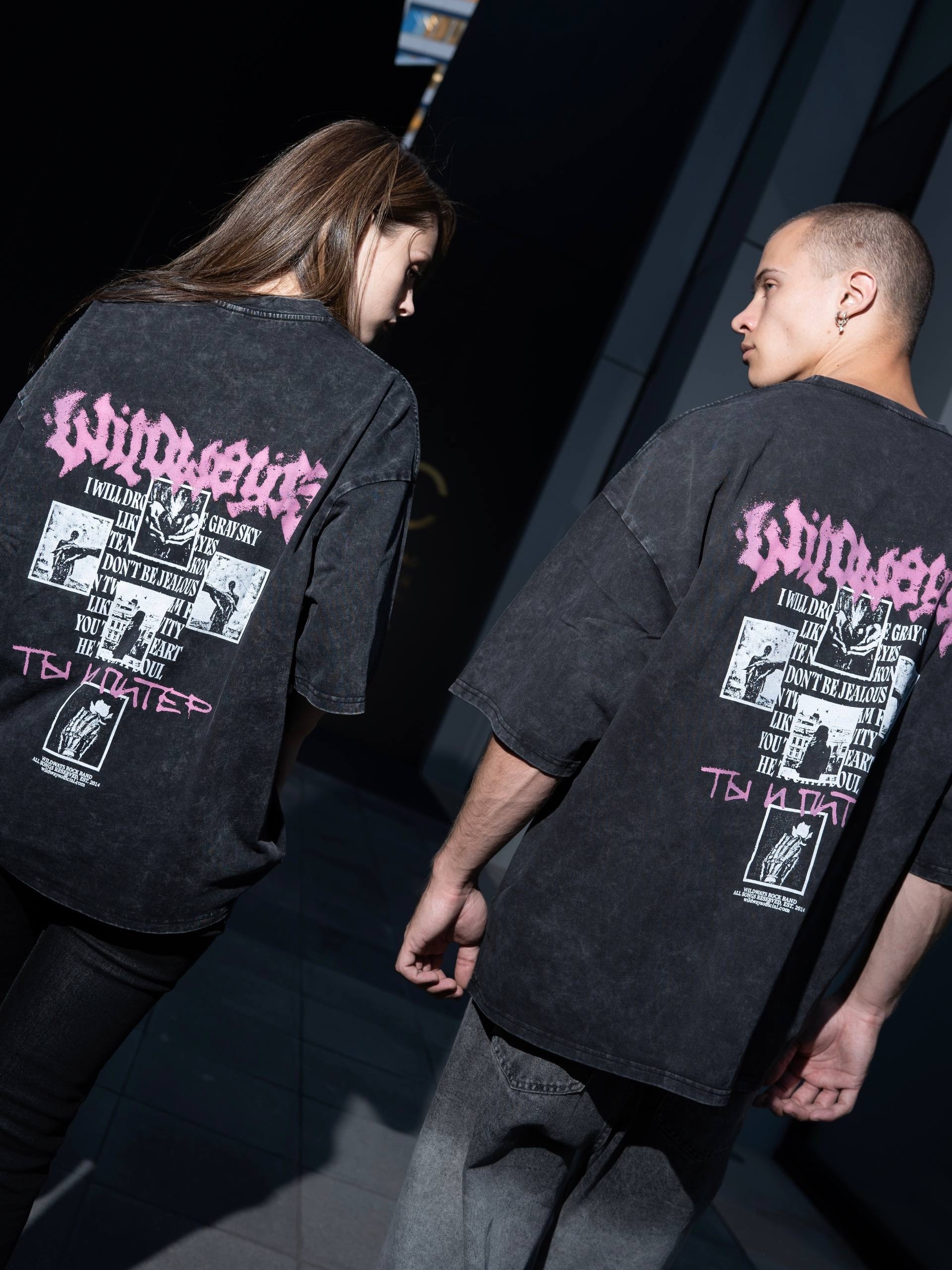
The complex sakura version was also very well received by the band, but as mentioned earlier, we ultimately agreed on the simpler option with the pentagram and hearts. From there, it was refined in four different line weights and given a grunge and graffiti-inspired treatment.
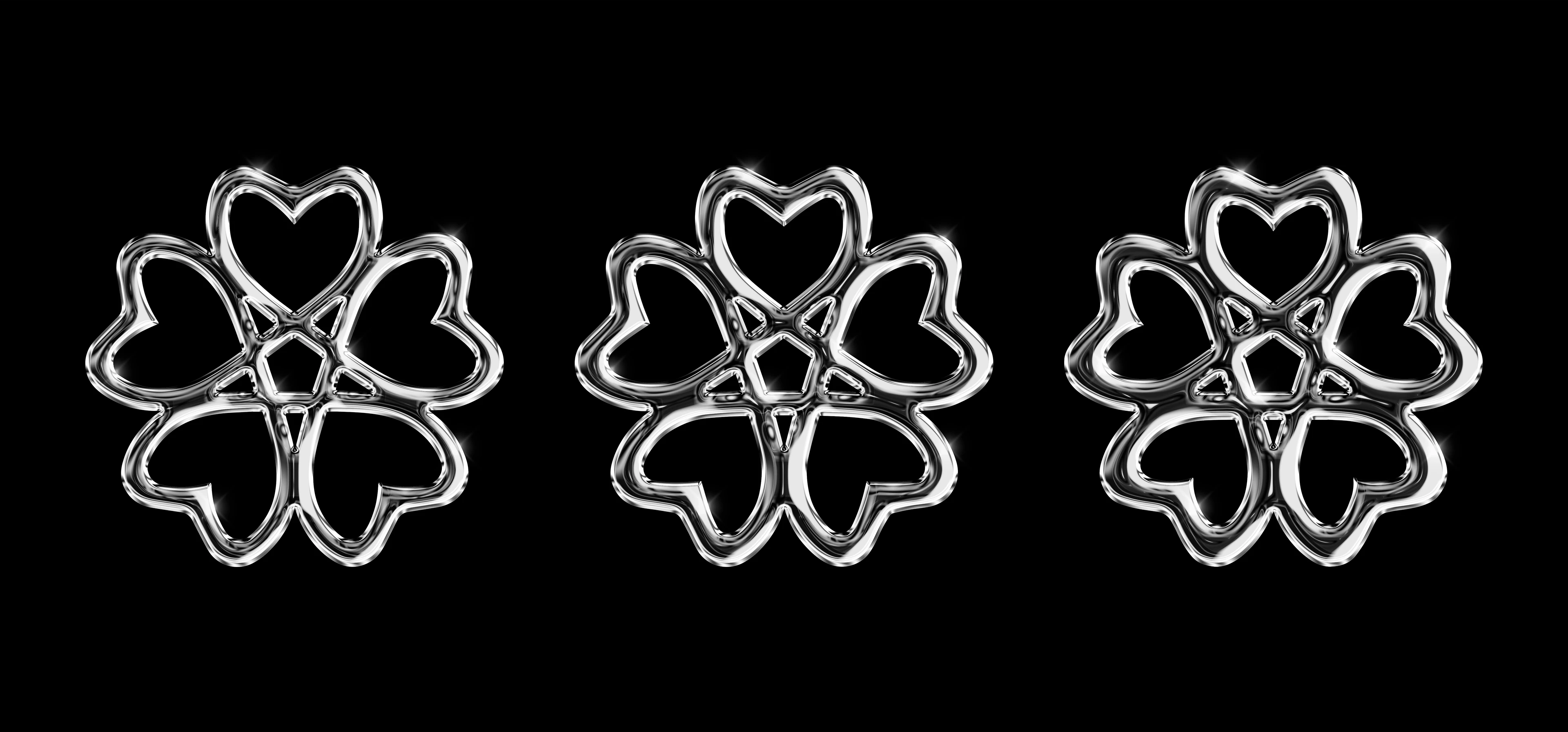
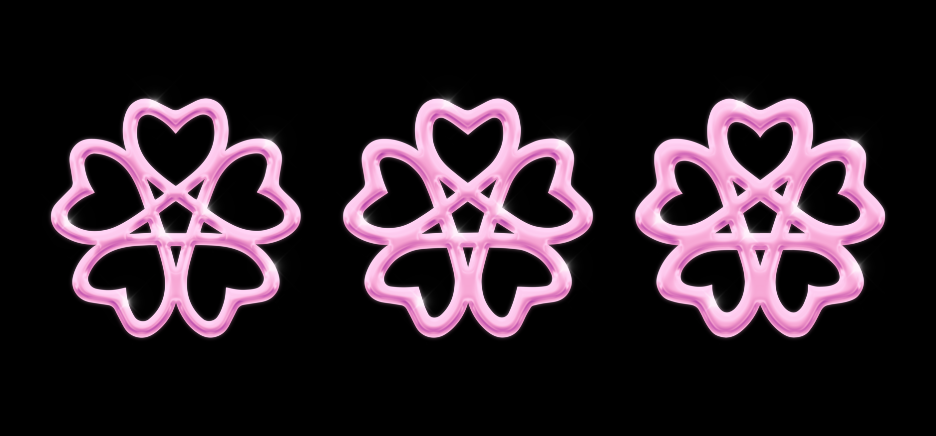
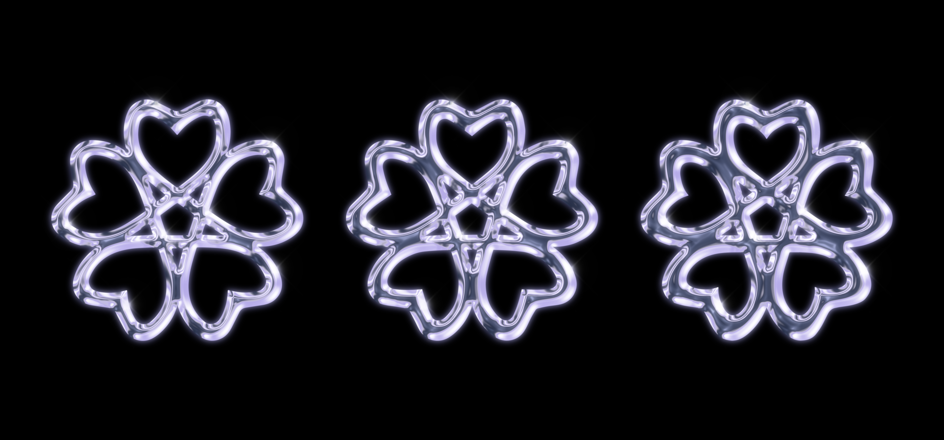
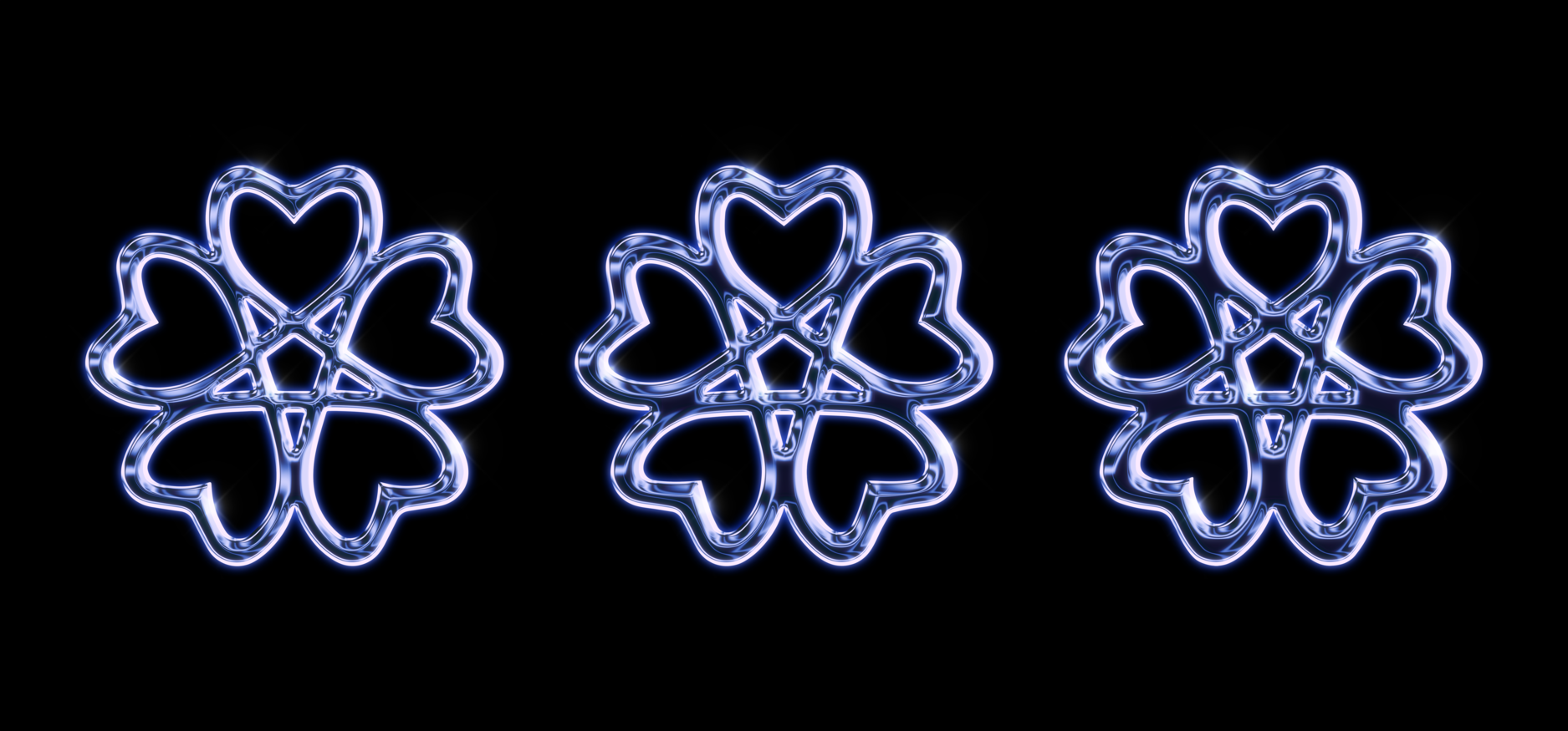
As a final touch, chrome versions of the sakura emblem were also developed to match the styling of the main logo.
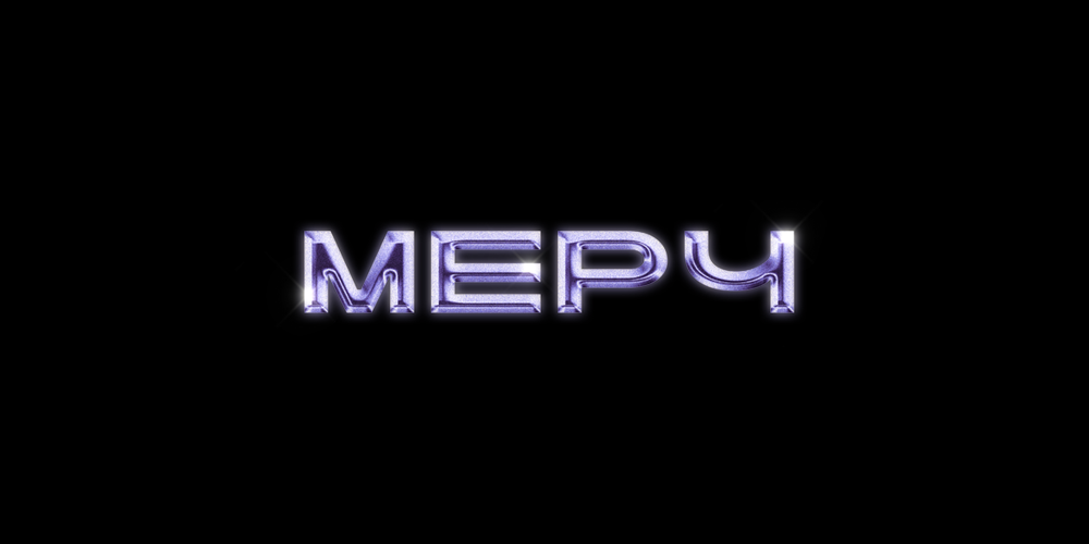
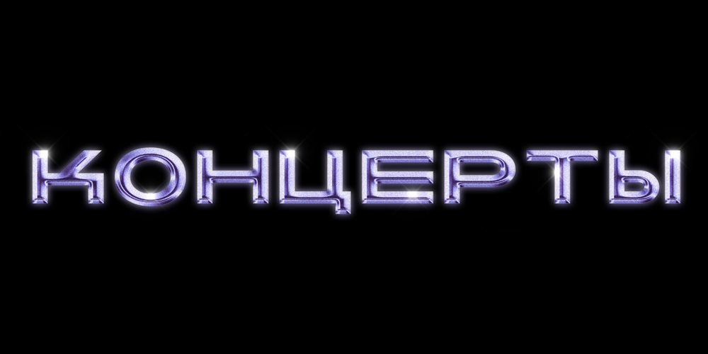
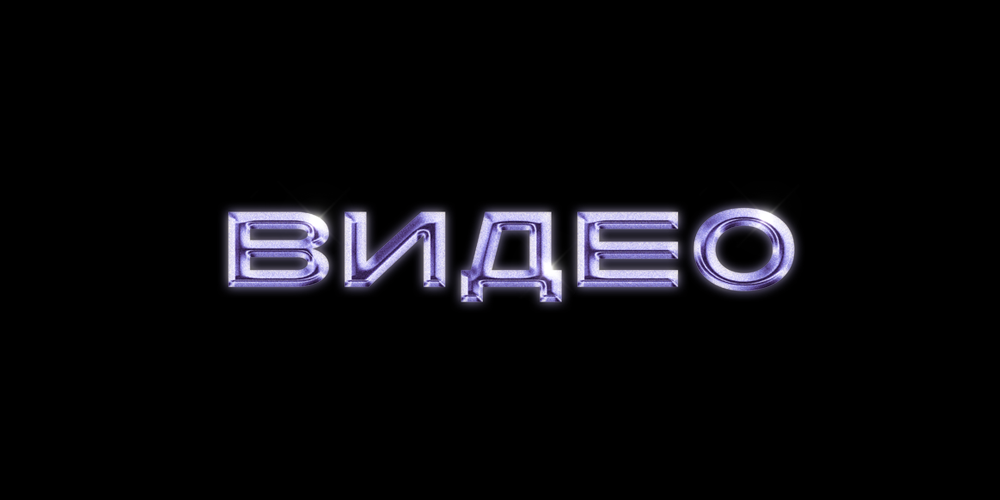
4. Social media.
Additionally, we also styled the band’s social media menu items in chrome to match the overall look.
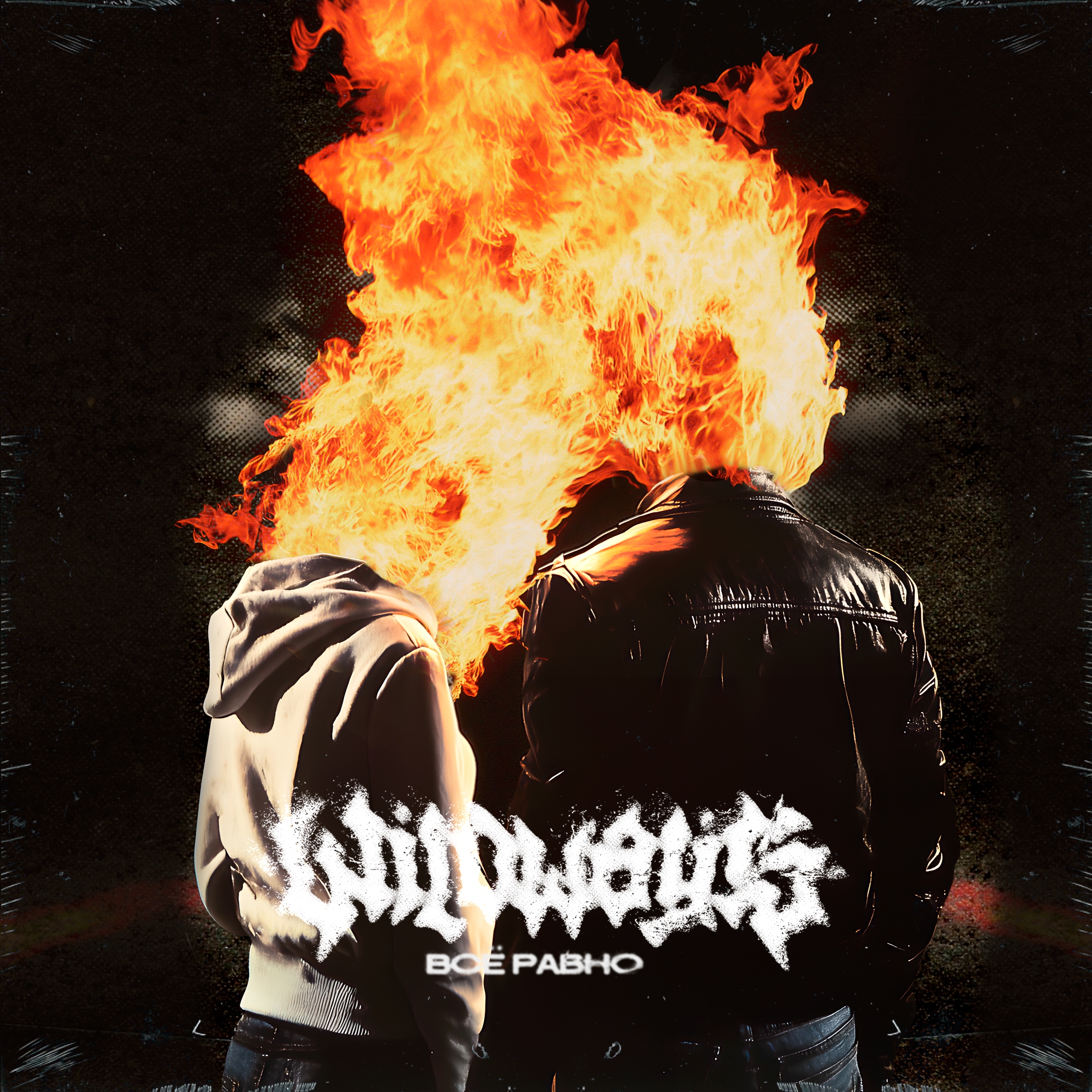
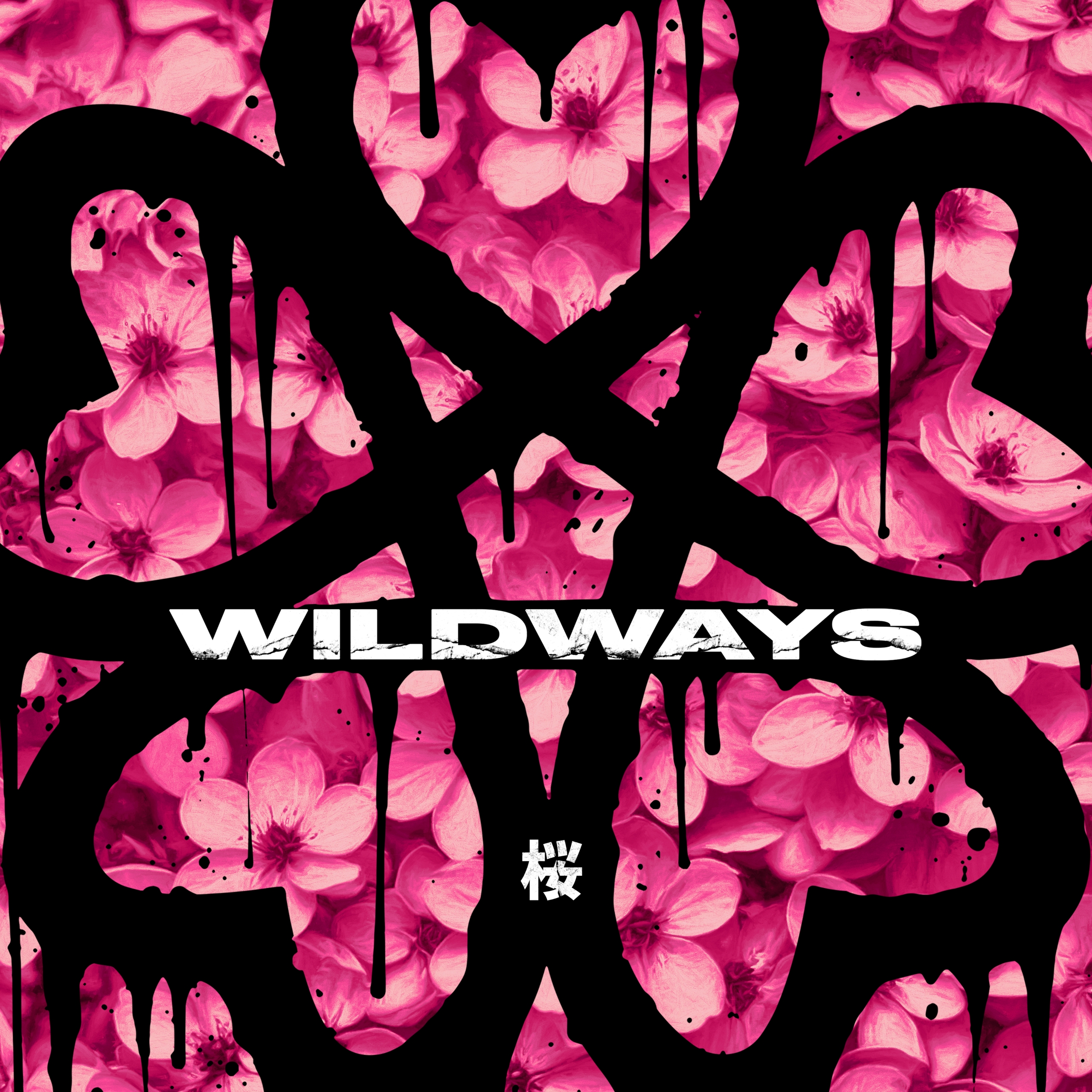
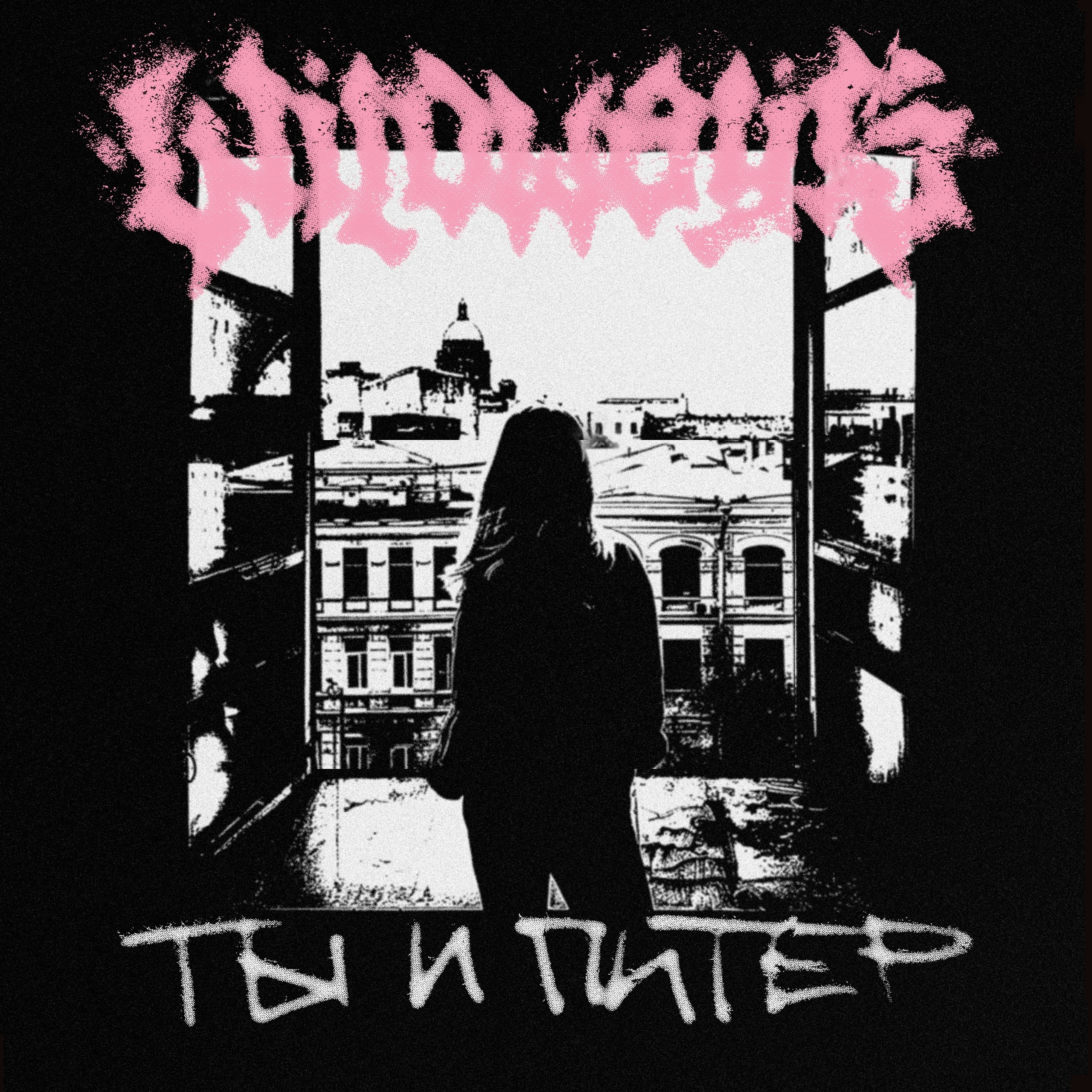
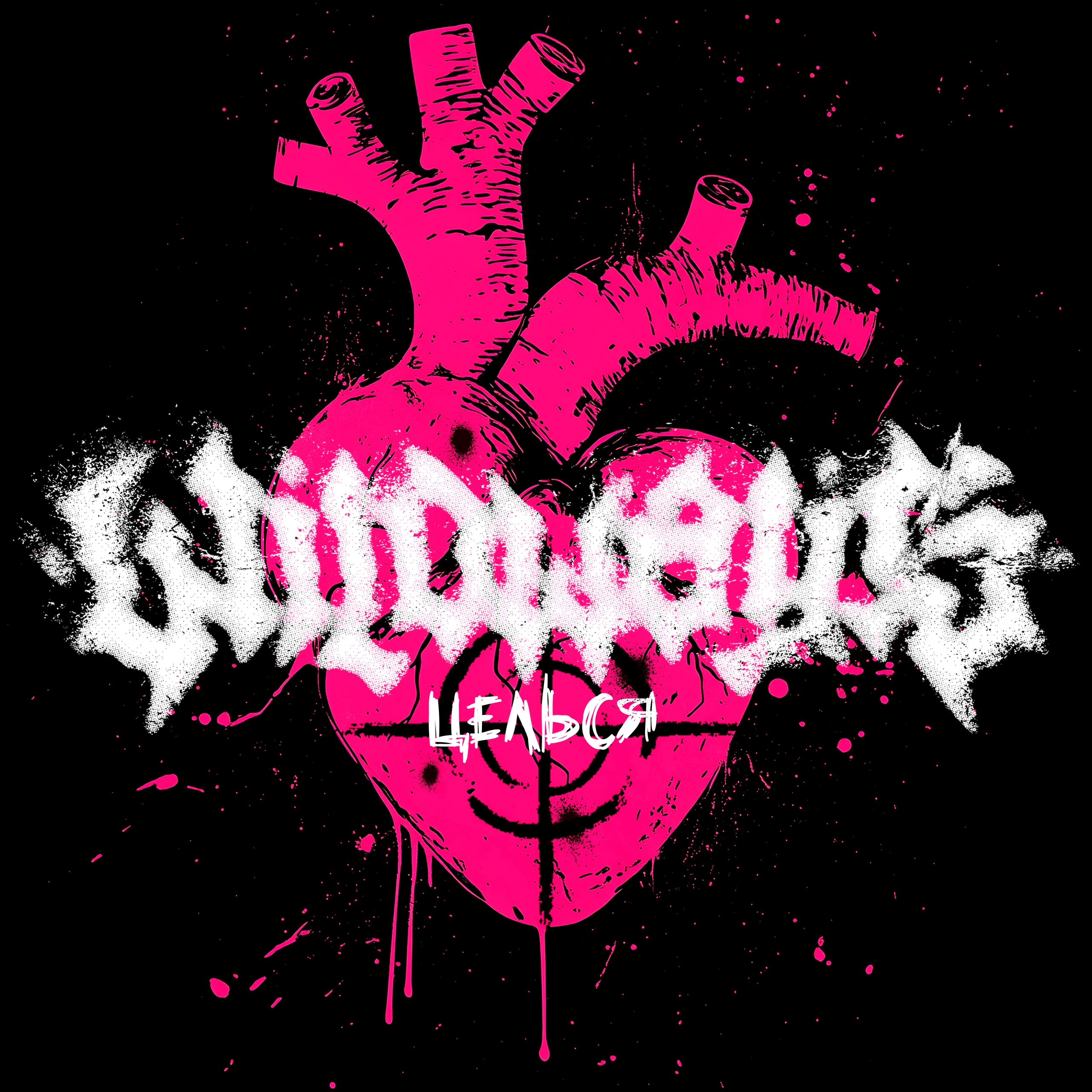
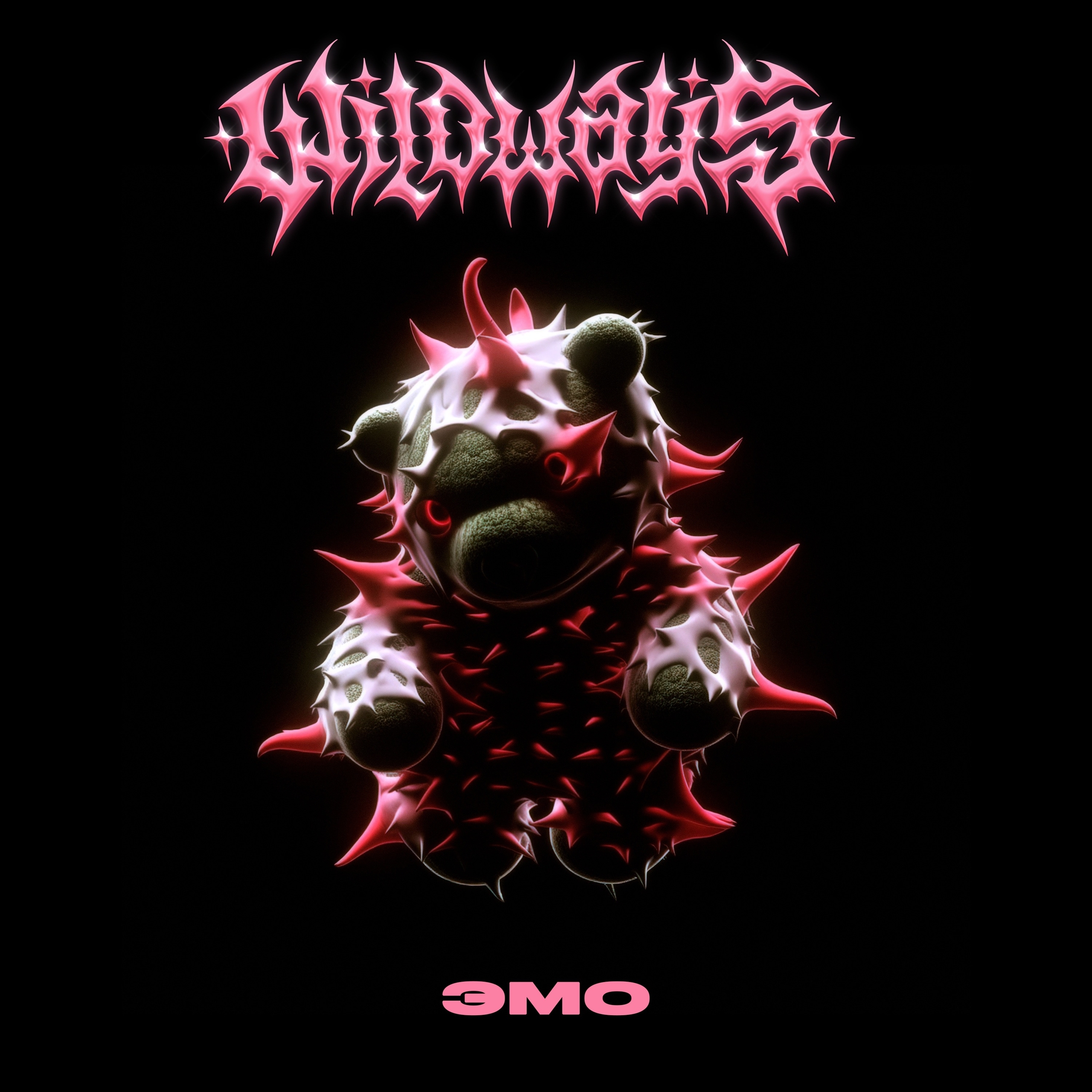
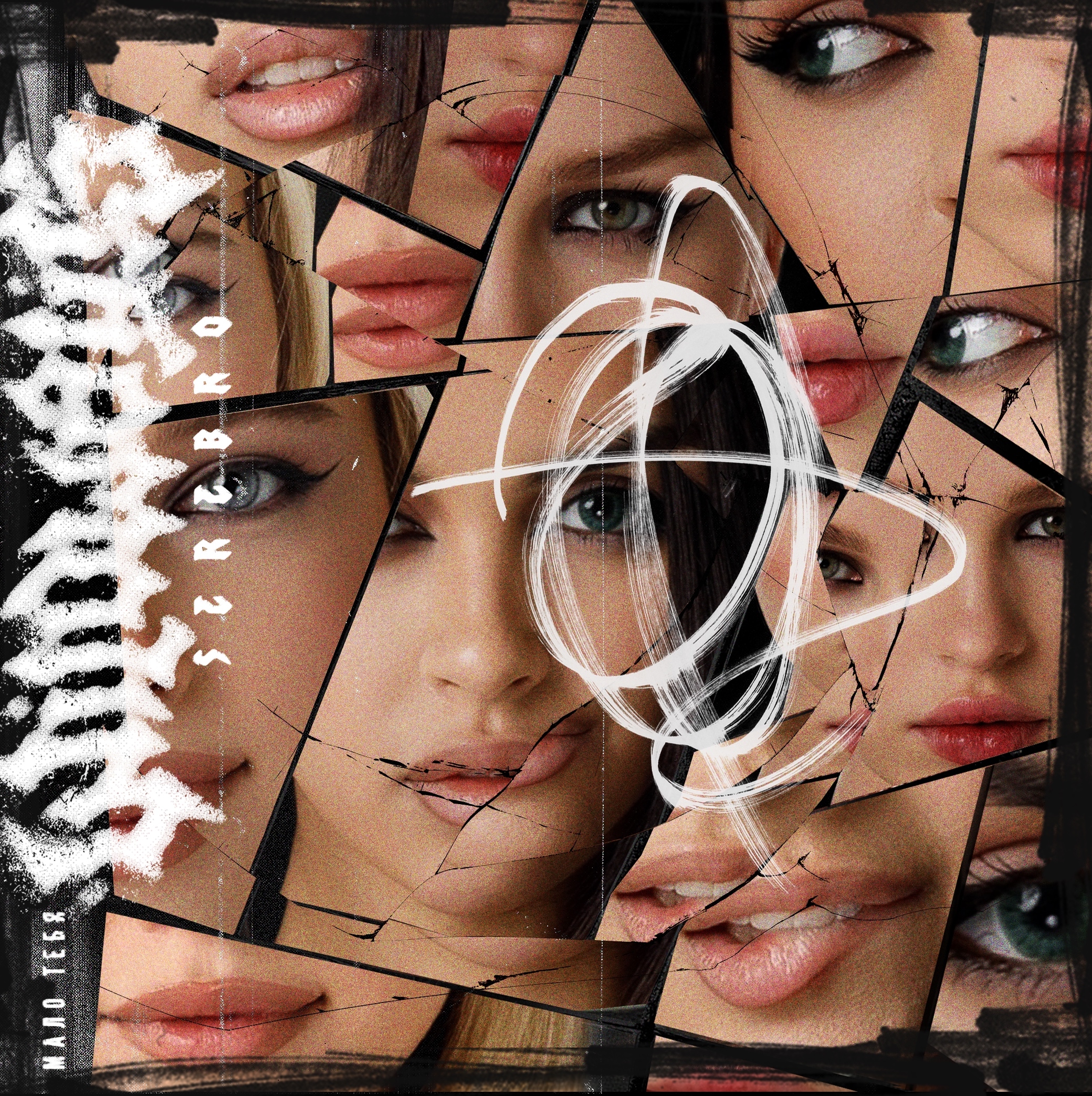
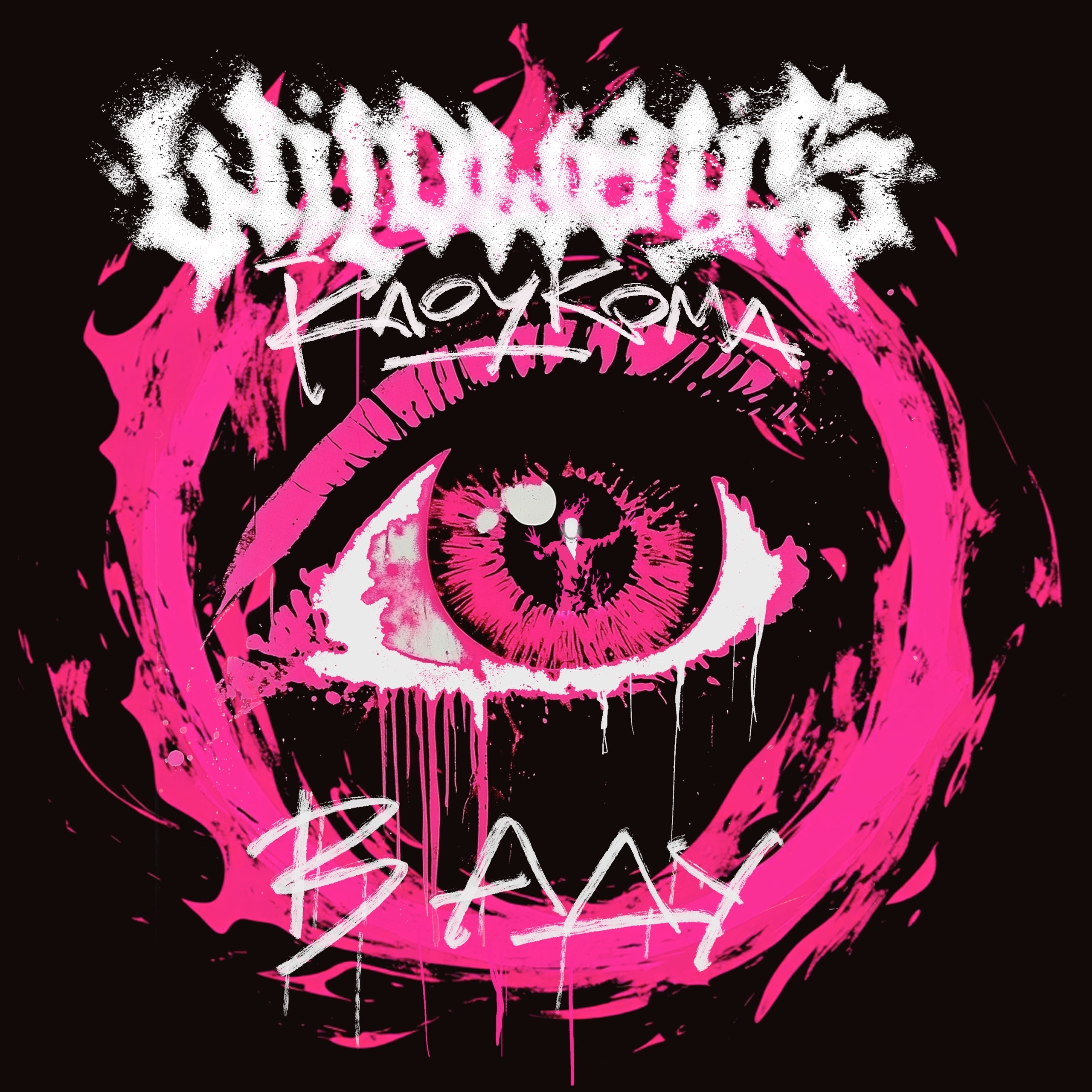
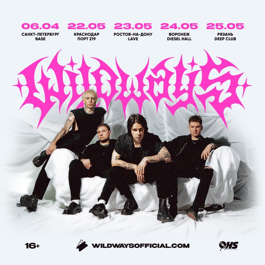
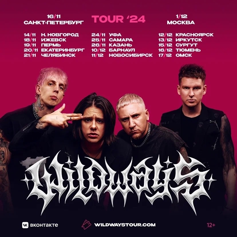
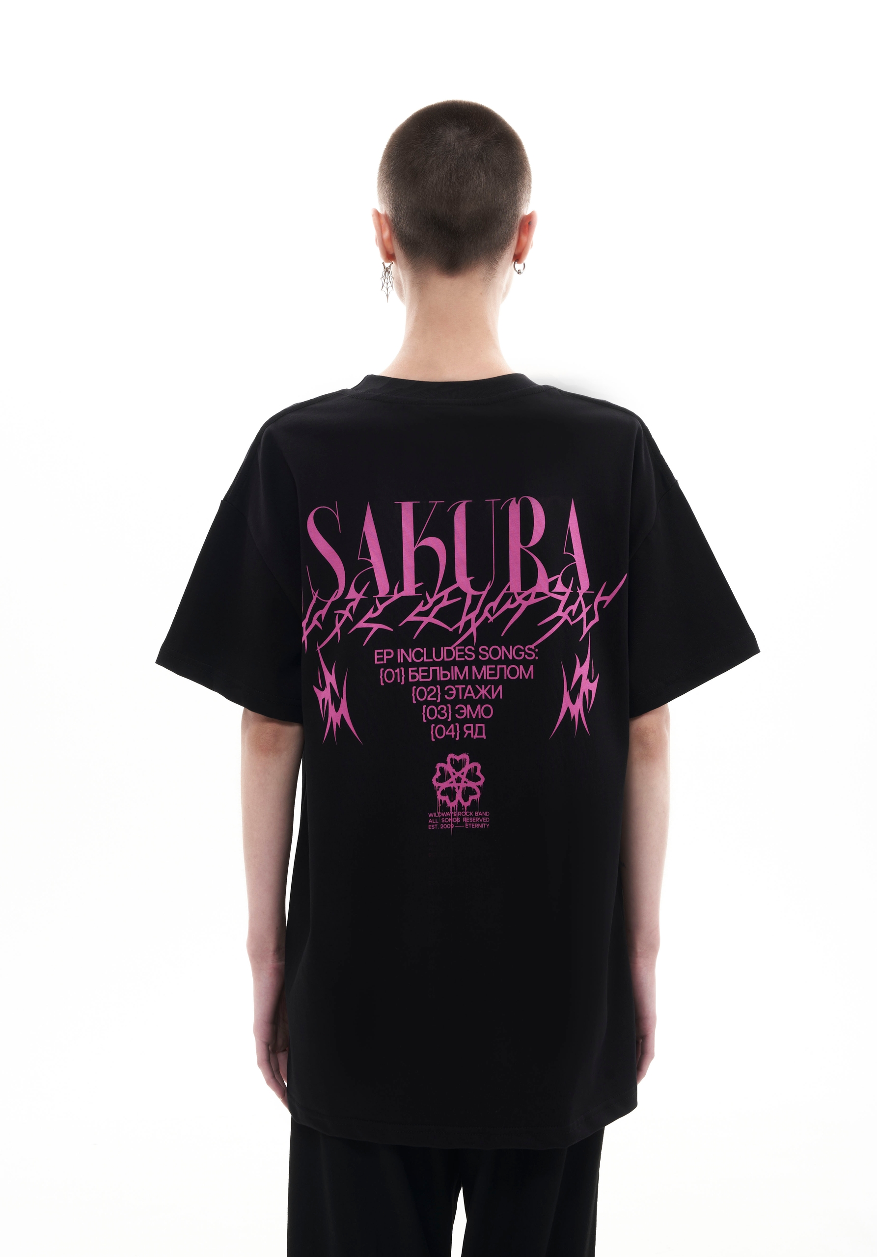
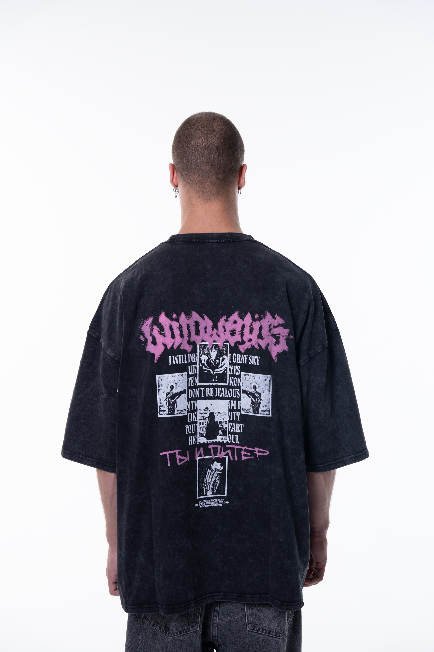
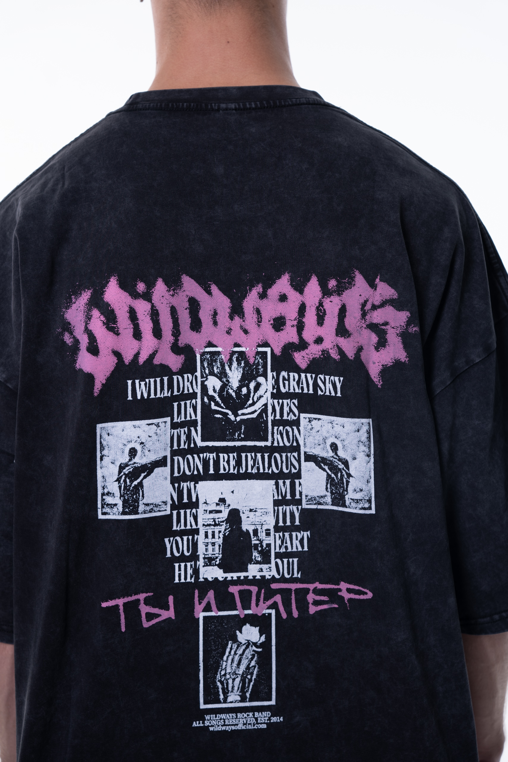
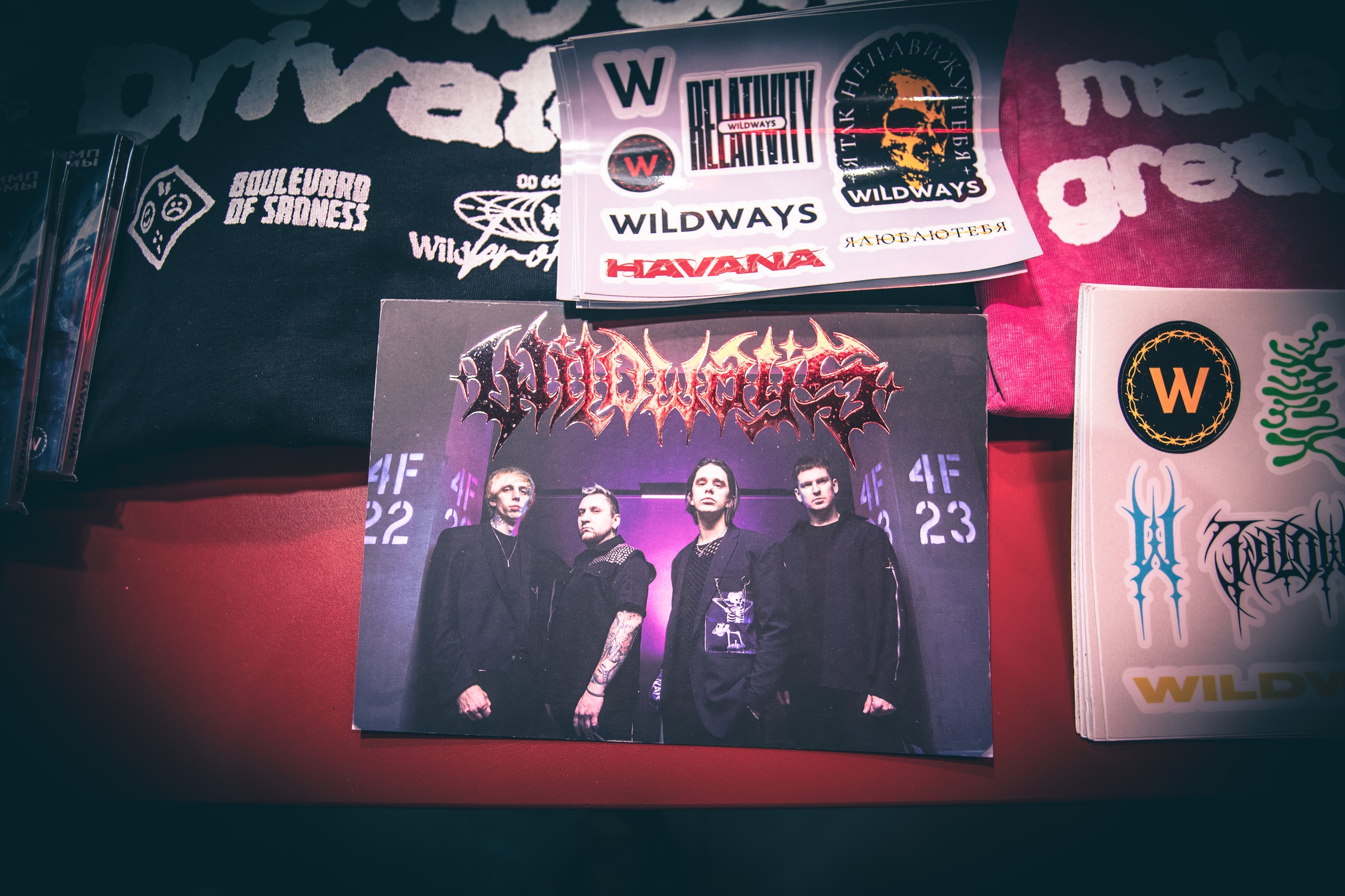
5. Release covers featuring my logos and emblem.
Thanks for watching!
https://gnoizm.com/
/ / /
Telegram or email for price details and commissions:
bokle@yandex.ru
https://t.me/bokler_gnzm
GNOIZM on other social media:
Instagram* | VK | Facebook* | YouTube* | TG channel
*Запрещены в РФ