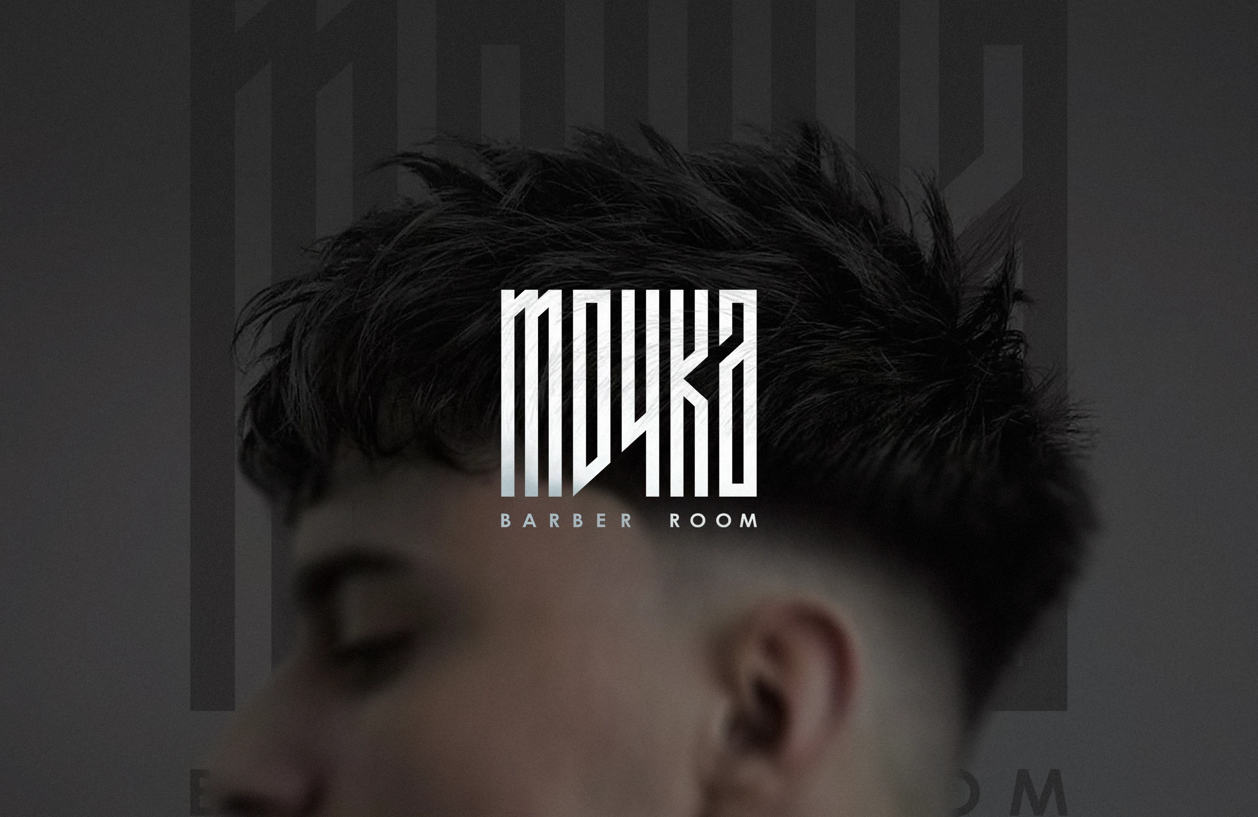
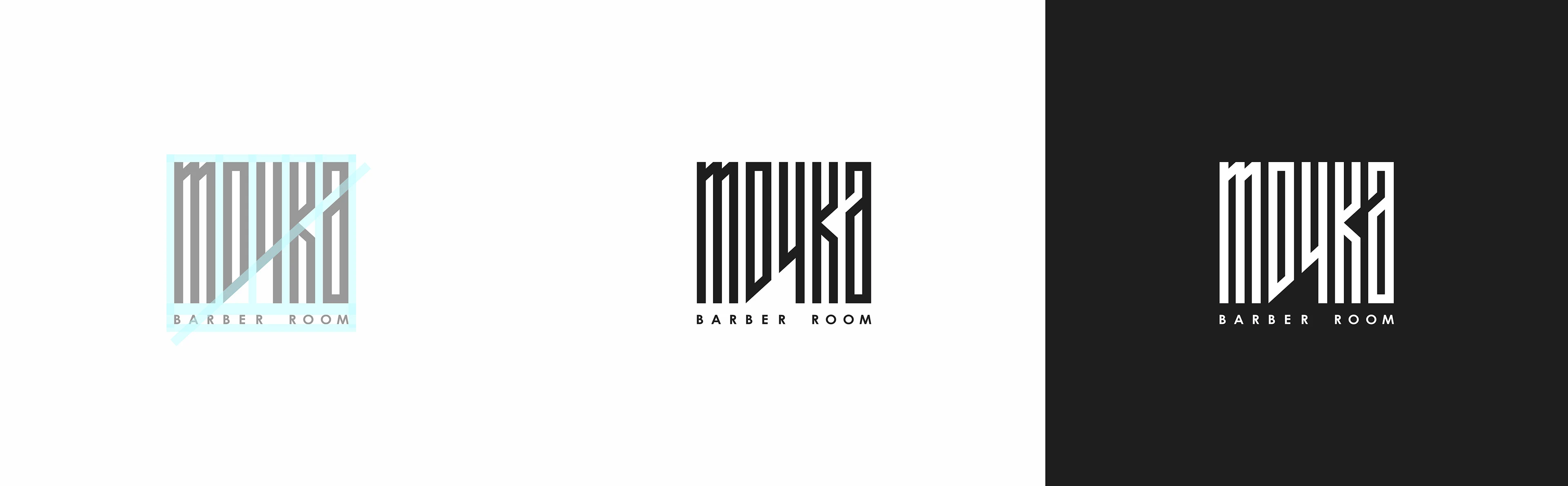
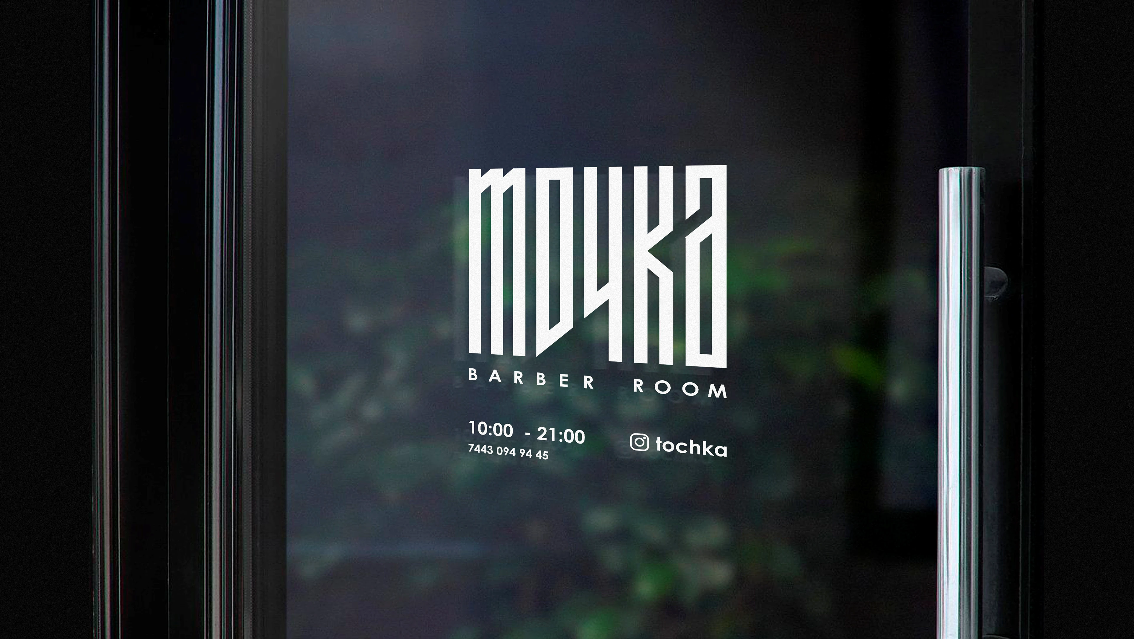
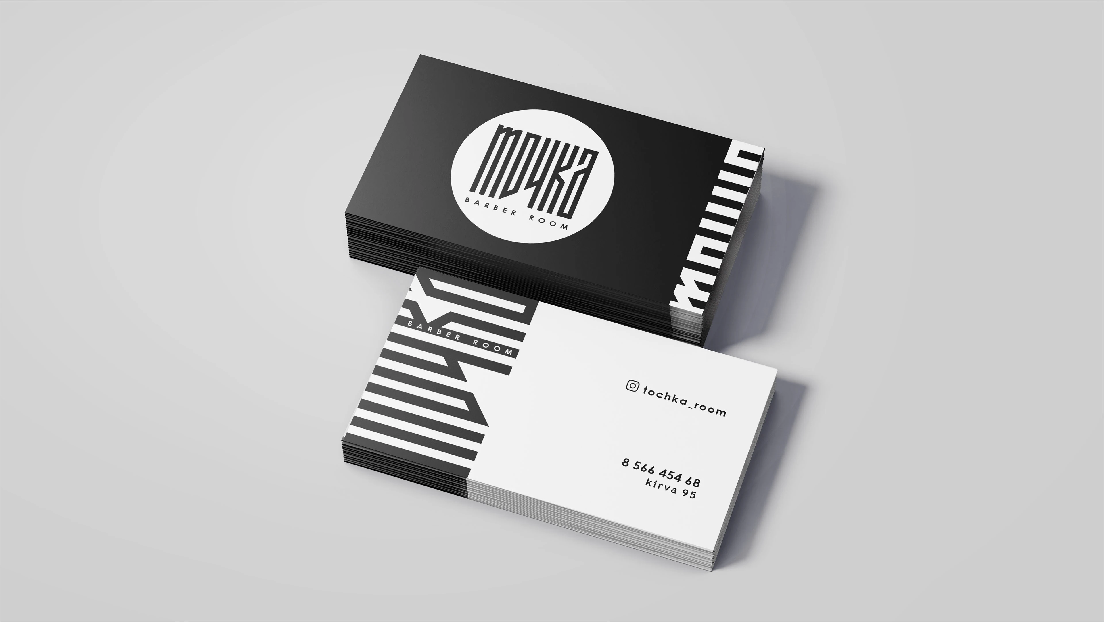
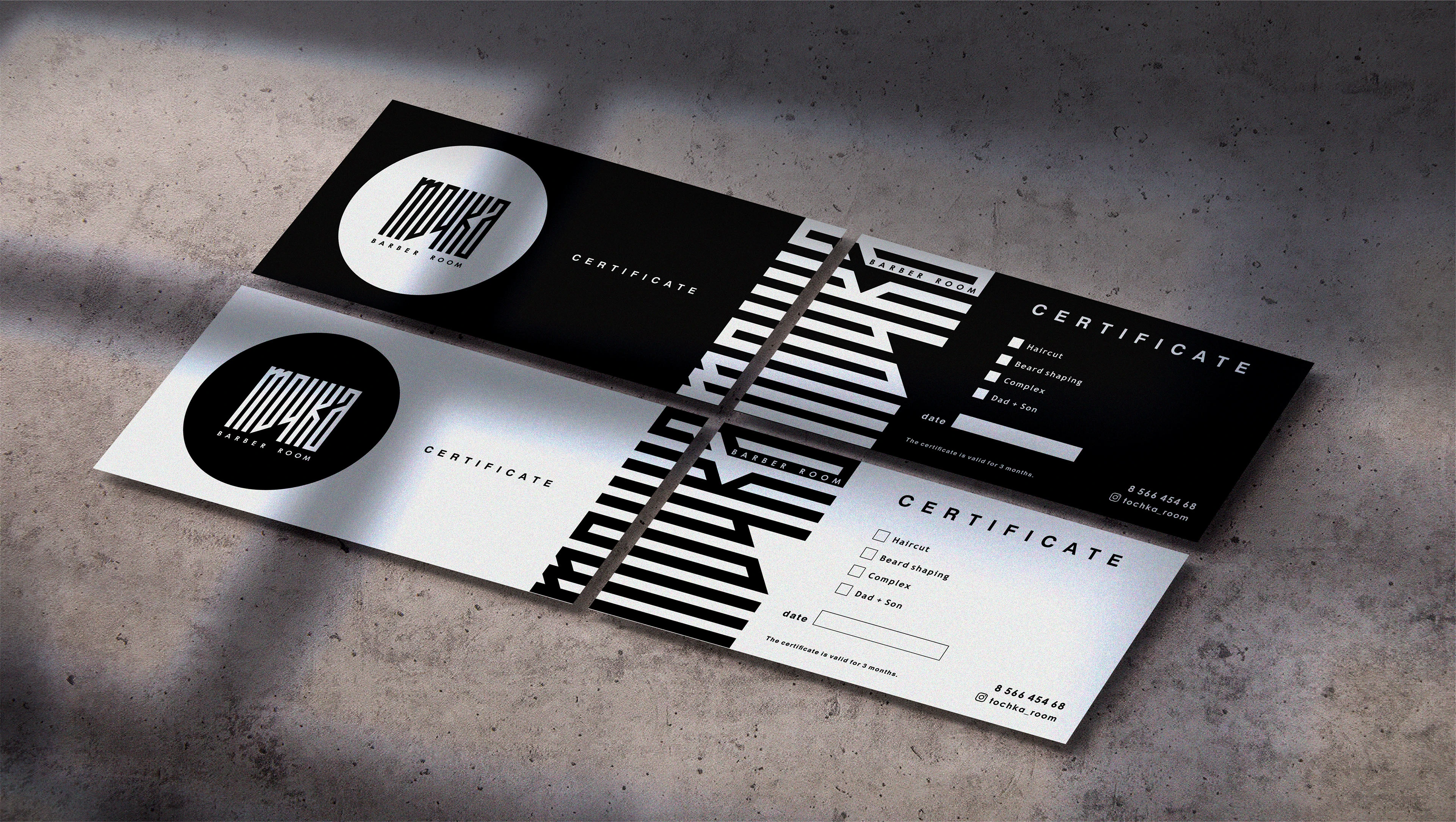
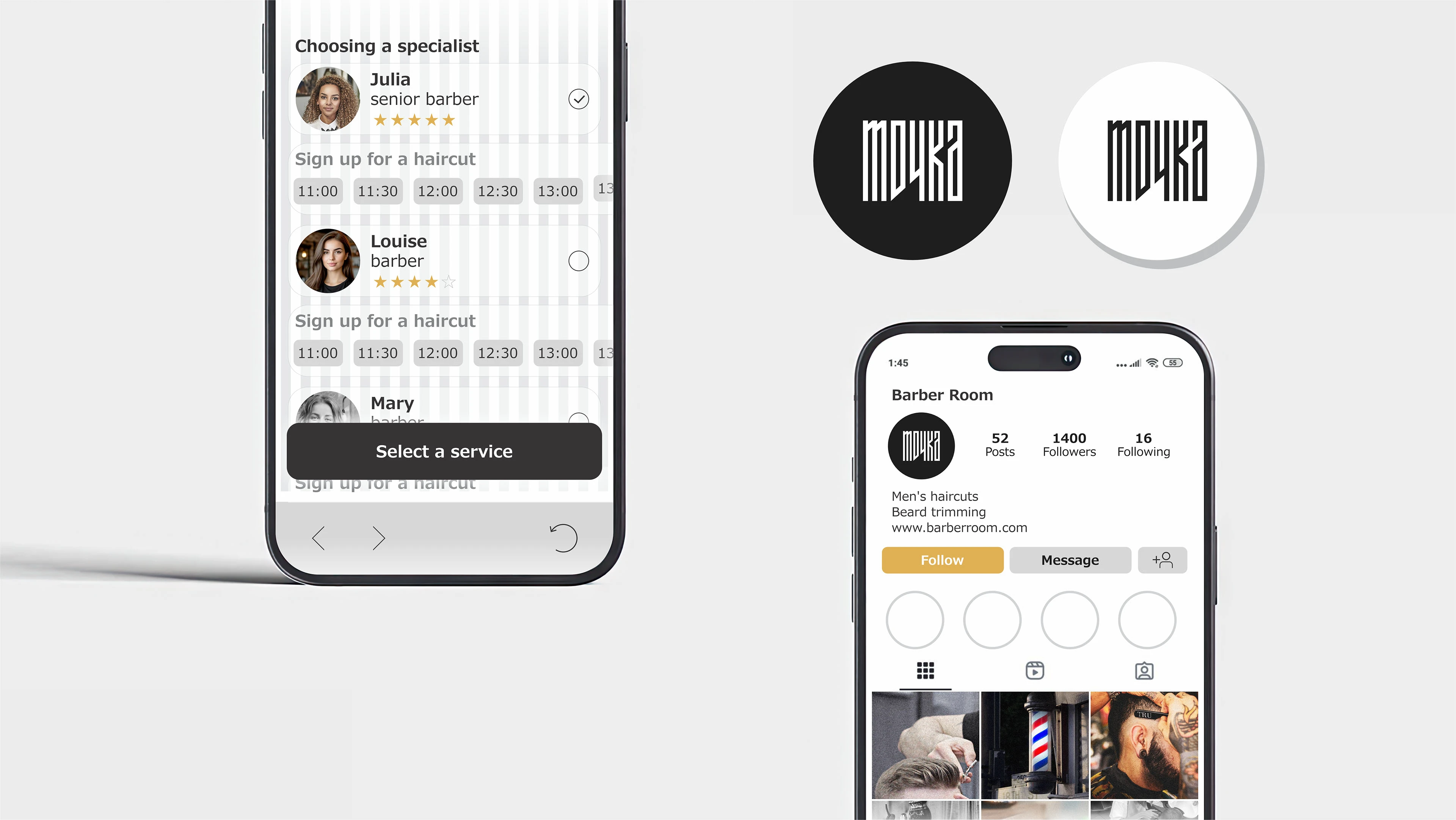
Logo for a Men's Barber room
The logo uses the Russian letters "ТОЧКА," which in English means "point location."
As slang, it represents a place where you can transform yourself every week in one place, become more beautiful and better yourself, and experience positive emotions from interacting with the professionals.
The logo is designed with straight lines, suggesting the process of cutting wet hair
combed with a comb, and features a 45-degree angled scissor cut.
The logo also reflects minimalism, masculine character, professionalism, rigor, style, and the schematic nature of polished work, as well as attention to detail.
The logo features the text "Barber Room" in a laconic font.
The text means "men's barber shop" which accurately describes the brand.
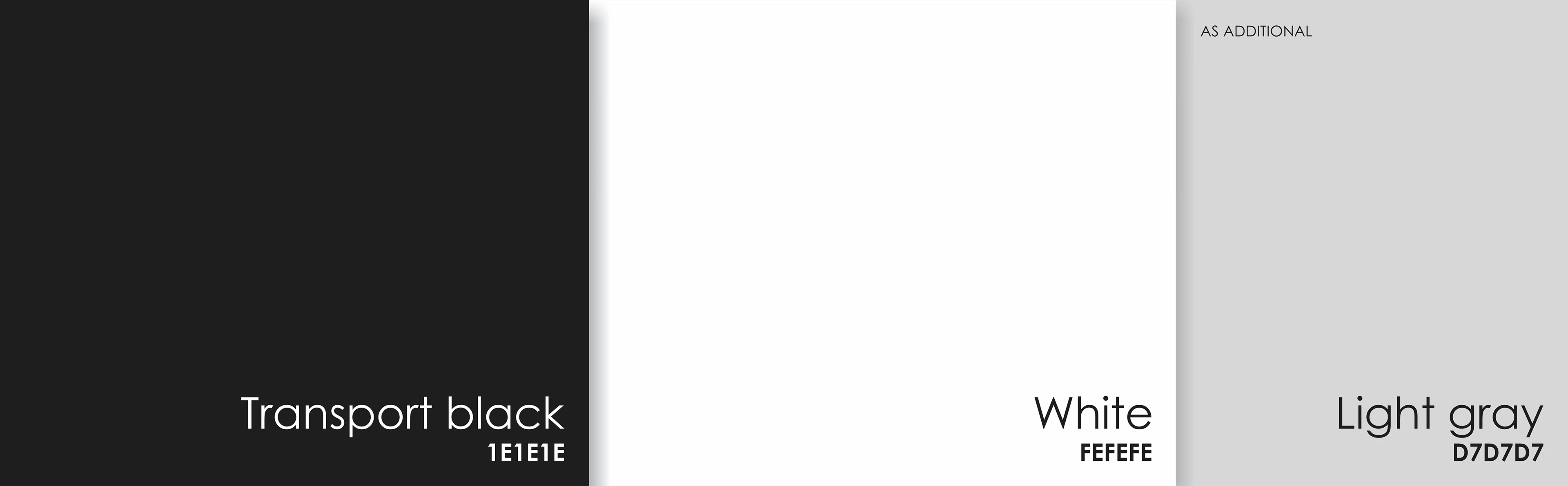
Сolors used
This combination looks stylish and sophisticated, often associated with minimalism and modernity.
These colors easily combine with any other shades, providing more opportunities to complement the design with bright accents.
Black and white provide strong visual contrast, making design elements more expressive and easy to read.
Gray is a neutral and gently balances black and white, creating a calm and balanced composition.
The simplicity of the combination helps create stylish and minimalist solutions without excessive complexity.
This color palette is often used in interior design, branding, and fashion to emphasize modernity and minimalism.
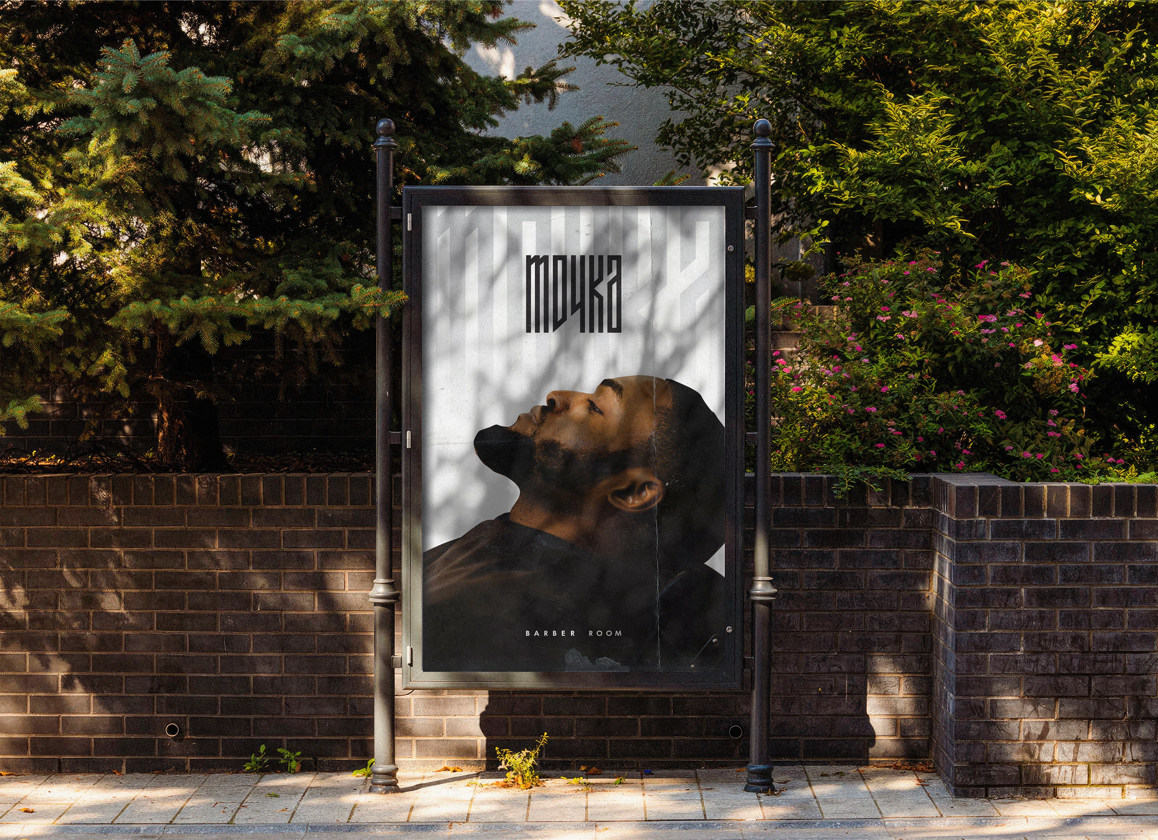
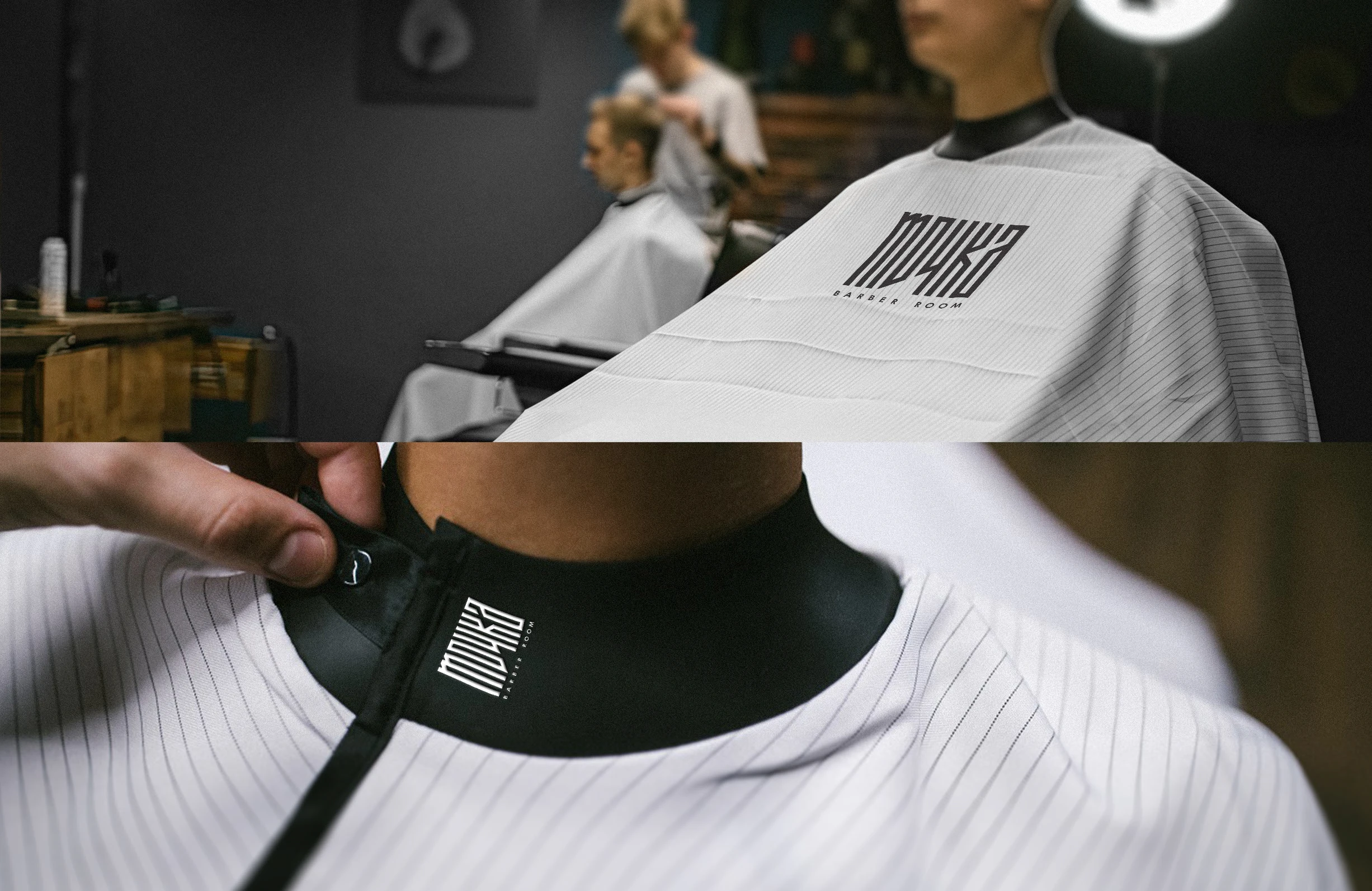
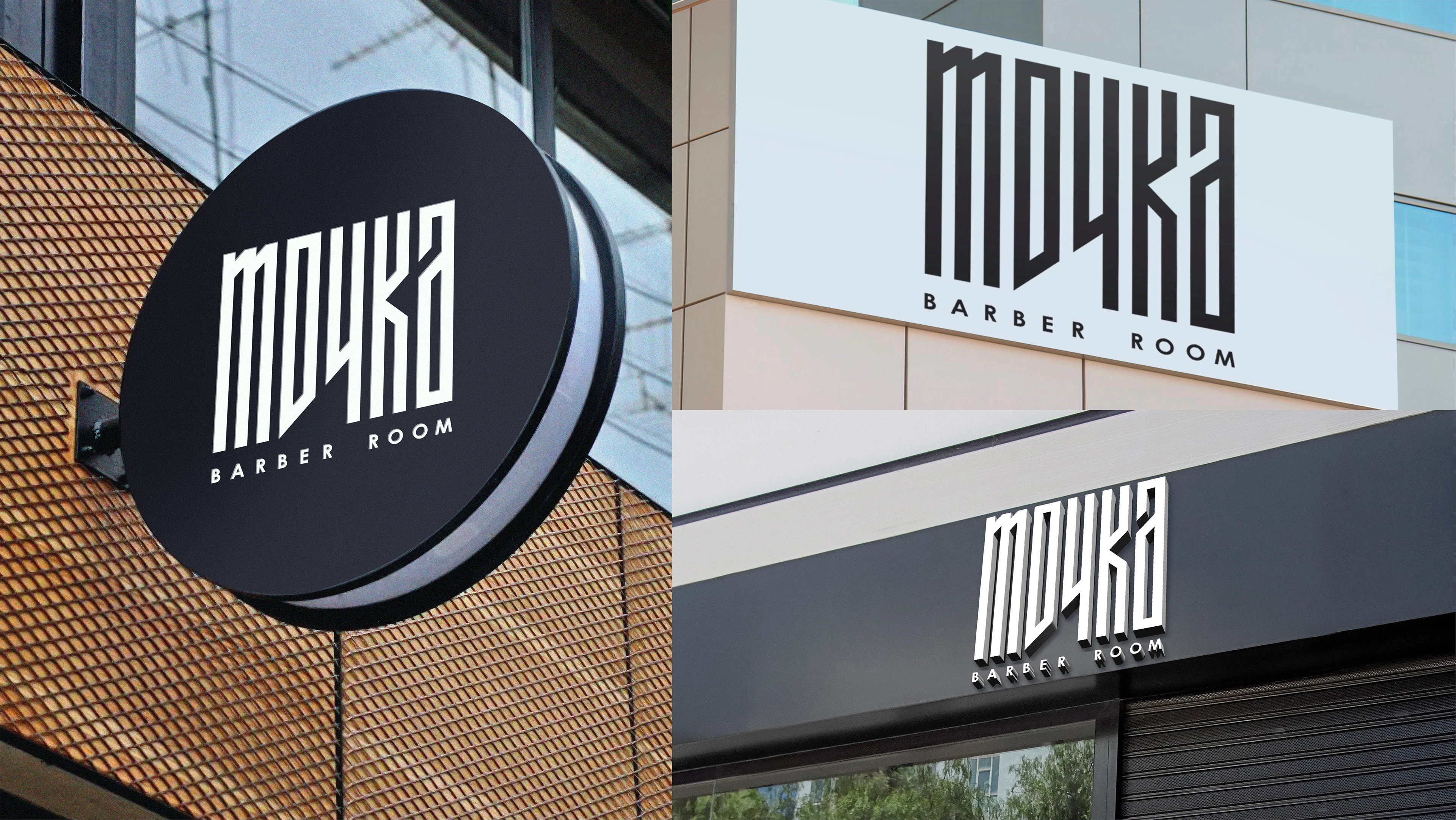
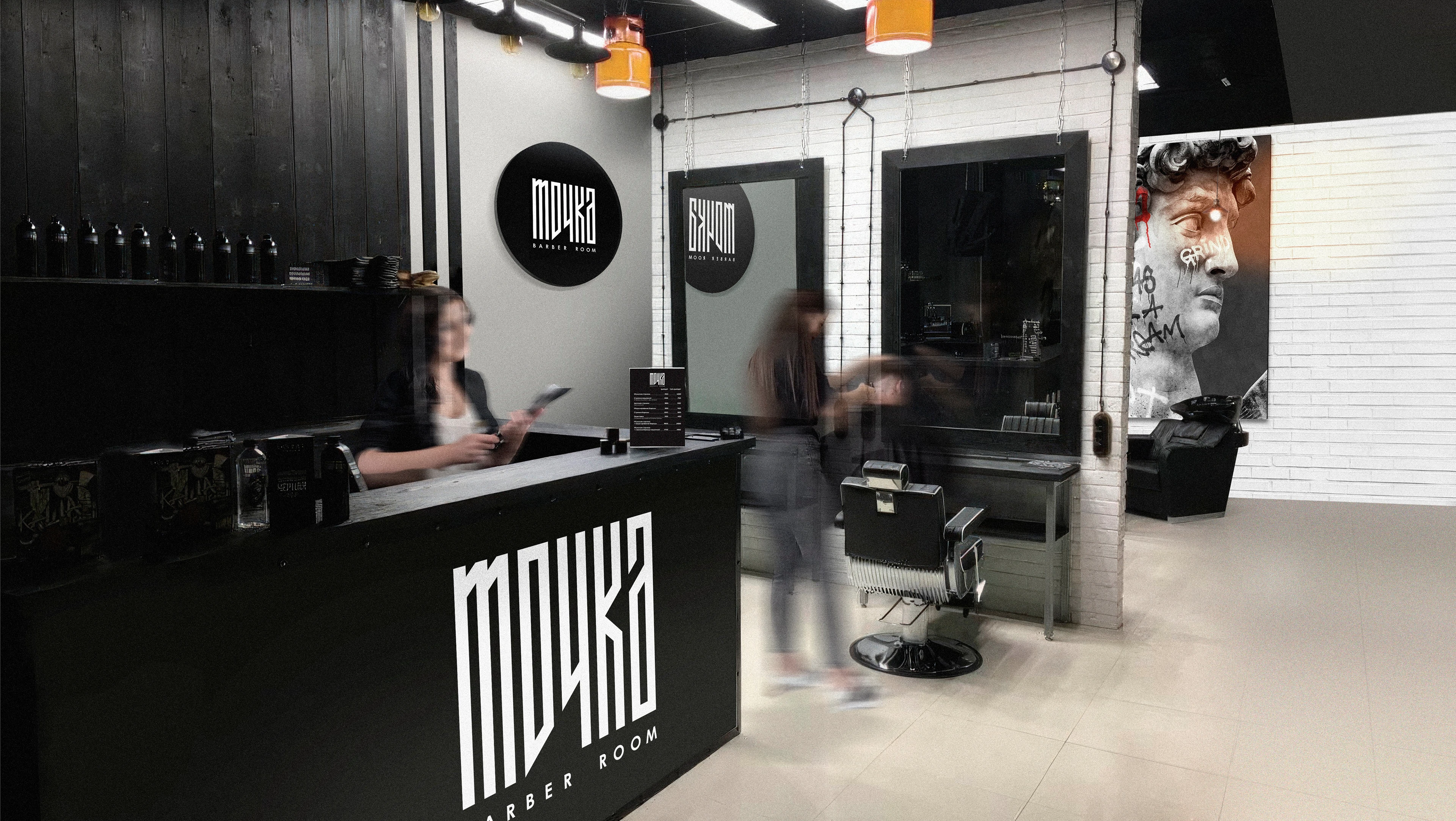
Placement and use of the logo in the interior and exterior.
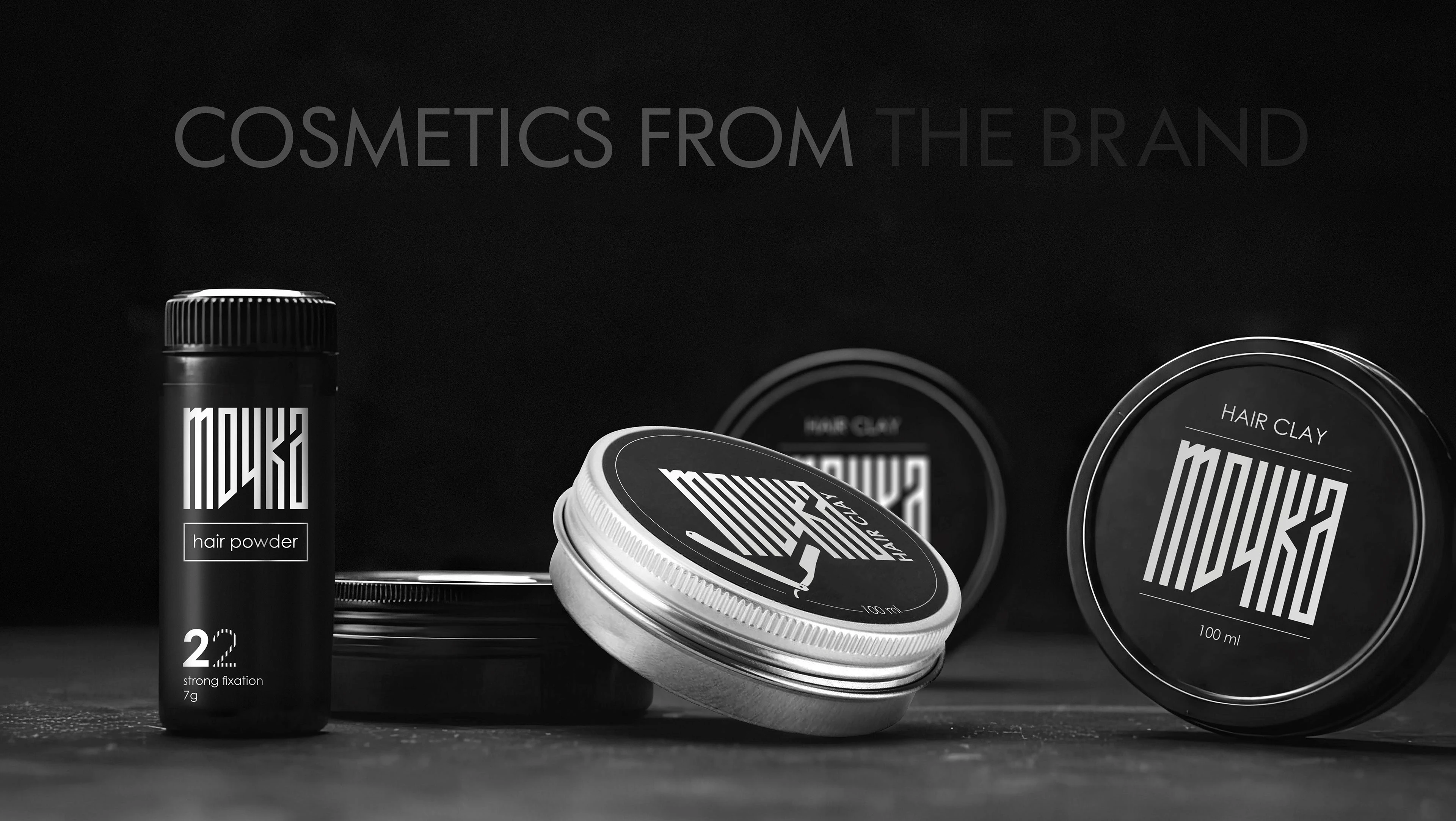
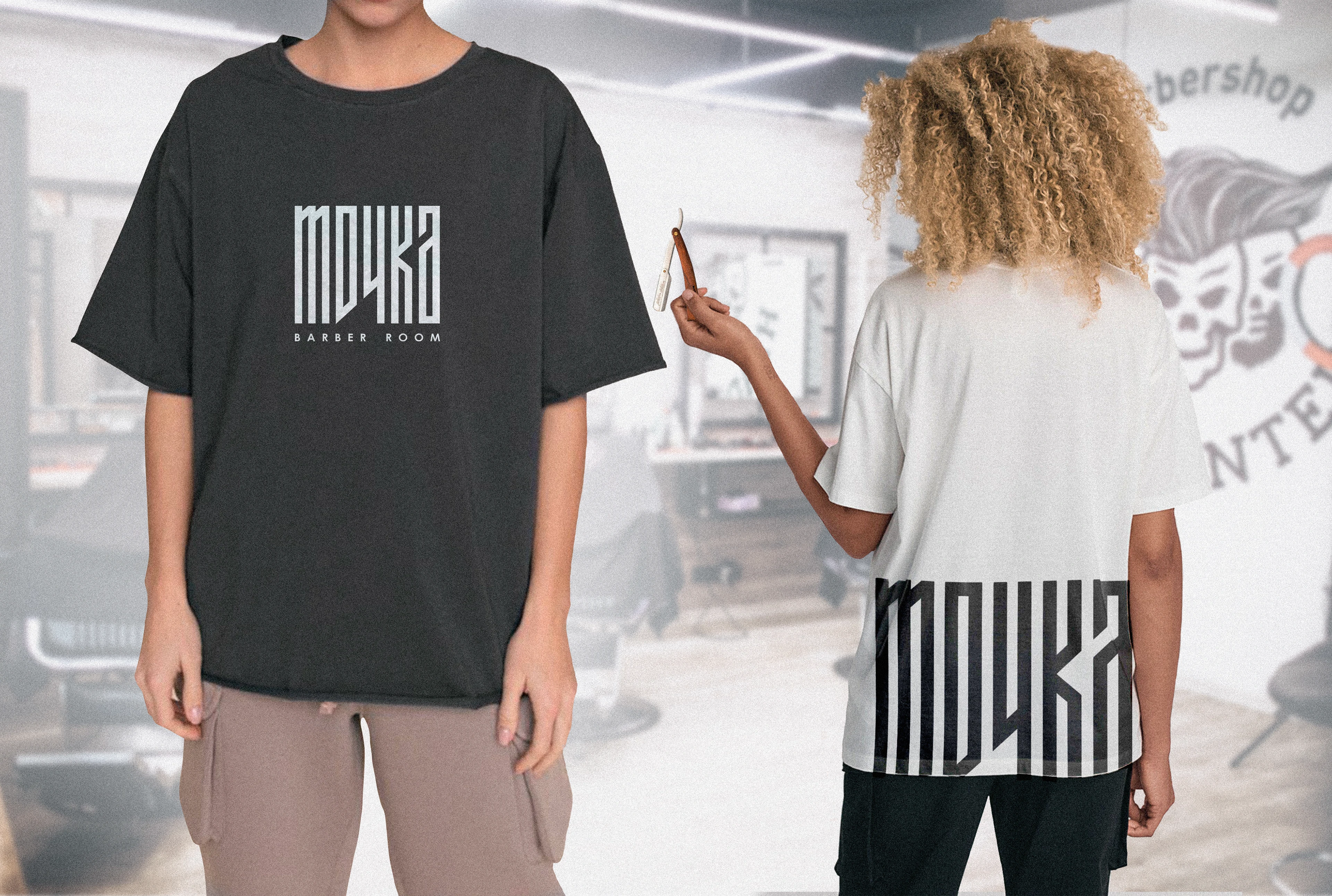
Logo placement and use in printed materials, digital media, websites, etc., as well as on branded products and in the work environment, including tools, cosmetics, and household items.
Looking for a great solution for your logo/brand design?
Contact me about a new project.