О проекте:
Небольшая уютная кофейня в духе старой Франции.
Задача:
Разработка минимального фирменного стиля.
Решение:
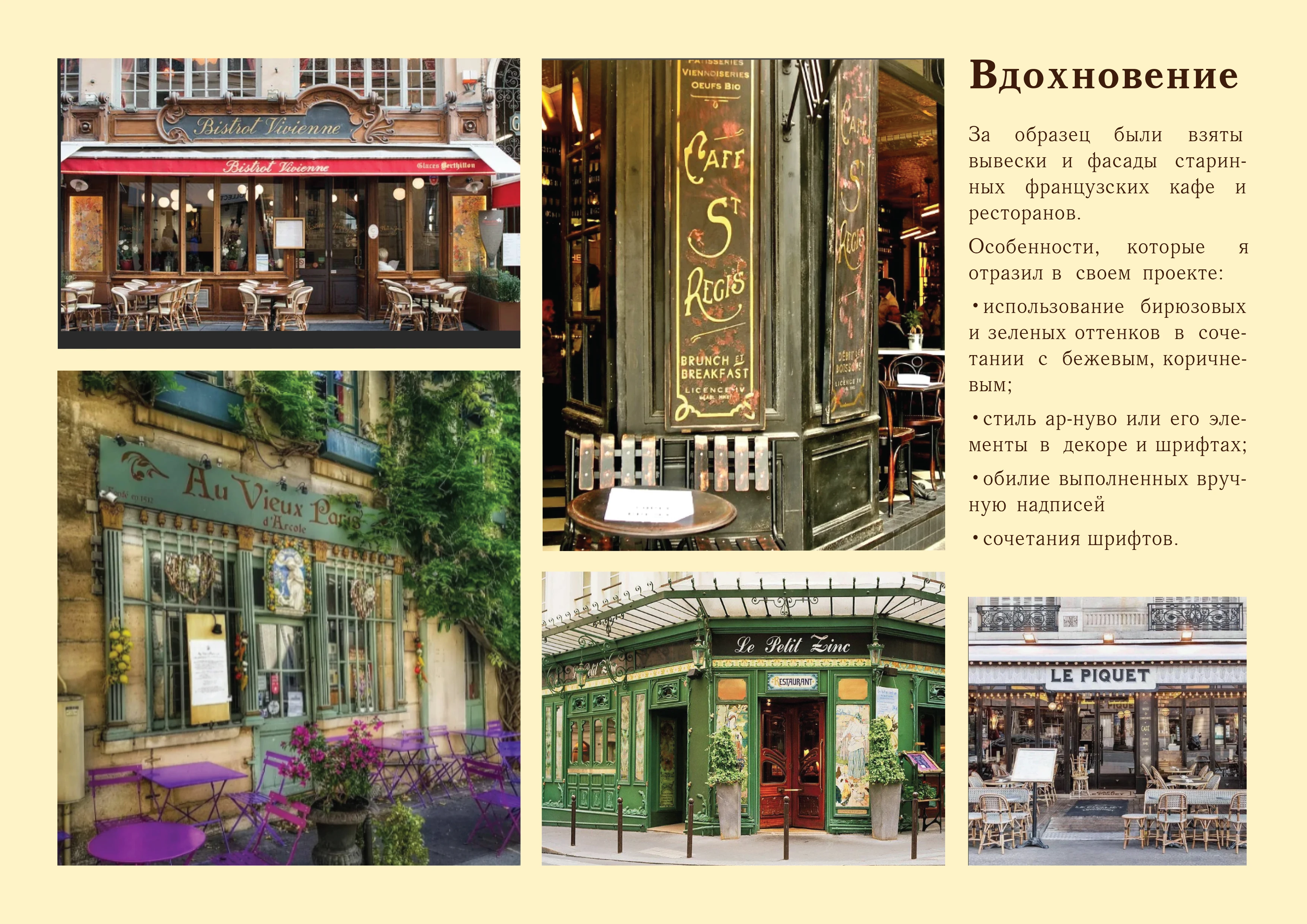
1. Не использовать такие частые и привычные символы, как Эйфелева башня. В настоящем Париже никто не делает контур башни фирменным знаком кофейни, а наша цель - стиль парижской кофейни, а не стиль кофейни "во французском стиле". Ориентироваться на референсы настоящих парижских старинных кафе.
2. Сделать упор на каллиграфию. В старинных парижских кафе много выполненных вручную вывесок.
About the project:
A small and cozy coffee shop in the spirit of old France.
Task:
Minimal corporate identity.
Decision:
1. Do not use such frequent and familiar symbols as the Eiffel Tower. In real Paris, no one uses the outline of the tower as the trademark of a coffee shop, and our goal is the style of a Parisian coffee shop, not the style of a "French-style" coffee shop. Focus on the references of real Parisian old cafes.
2. Focus on calligraphy. There are a lot of hand-made signs in old Parisian cafes.
The features that I reflected in the project:
turquoise and green tints combined with beige and brown;
Art Nouveau style and its elements in the decor and fonts;
abundance of handwritten inscriptions;
font combinations
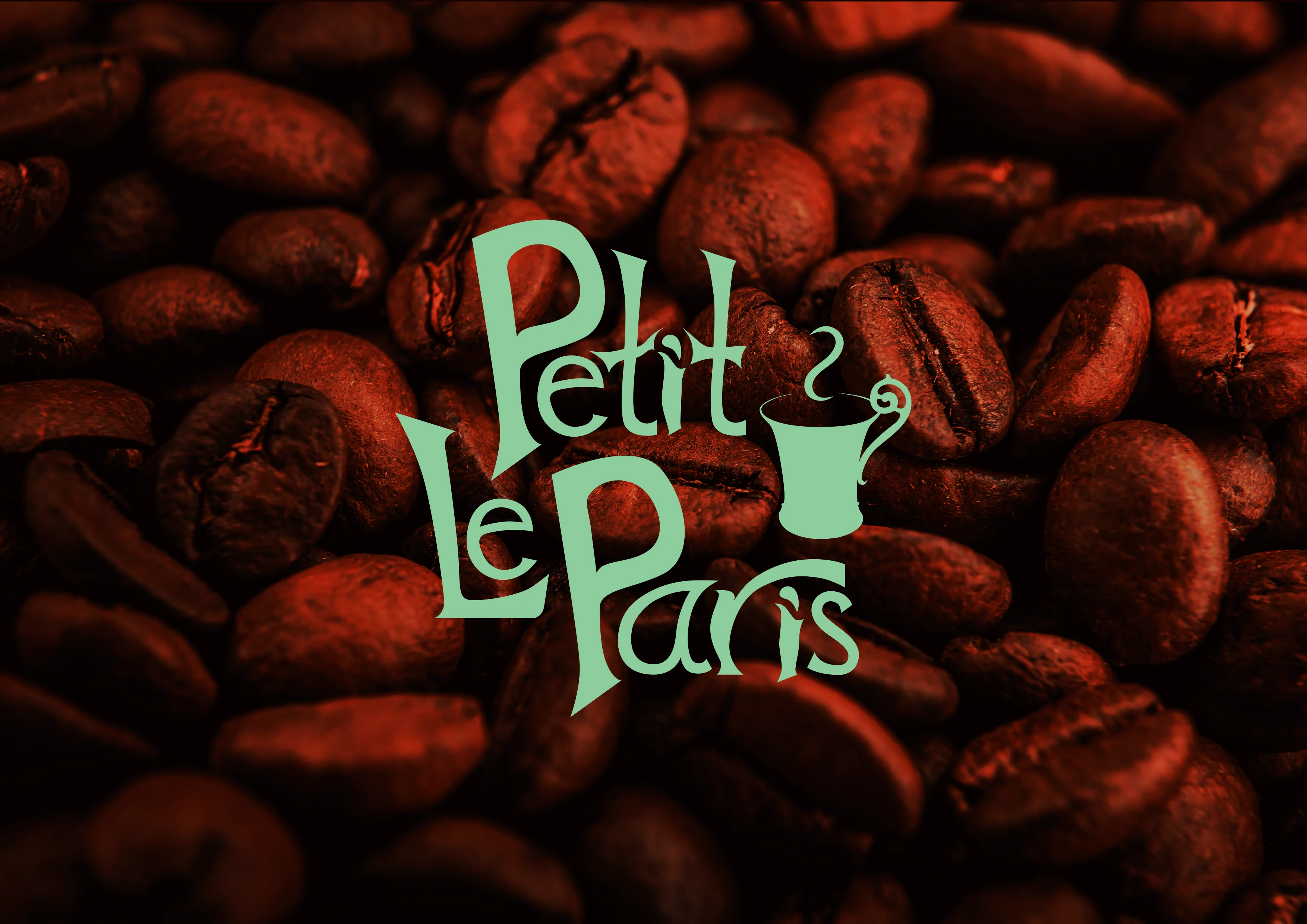
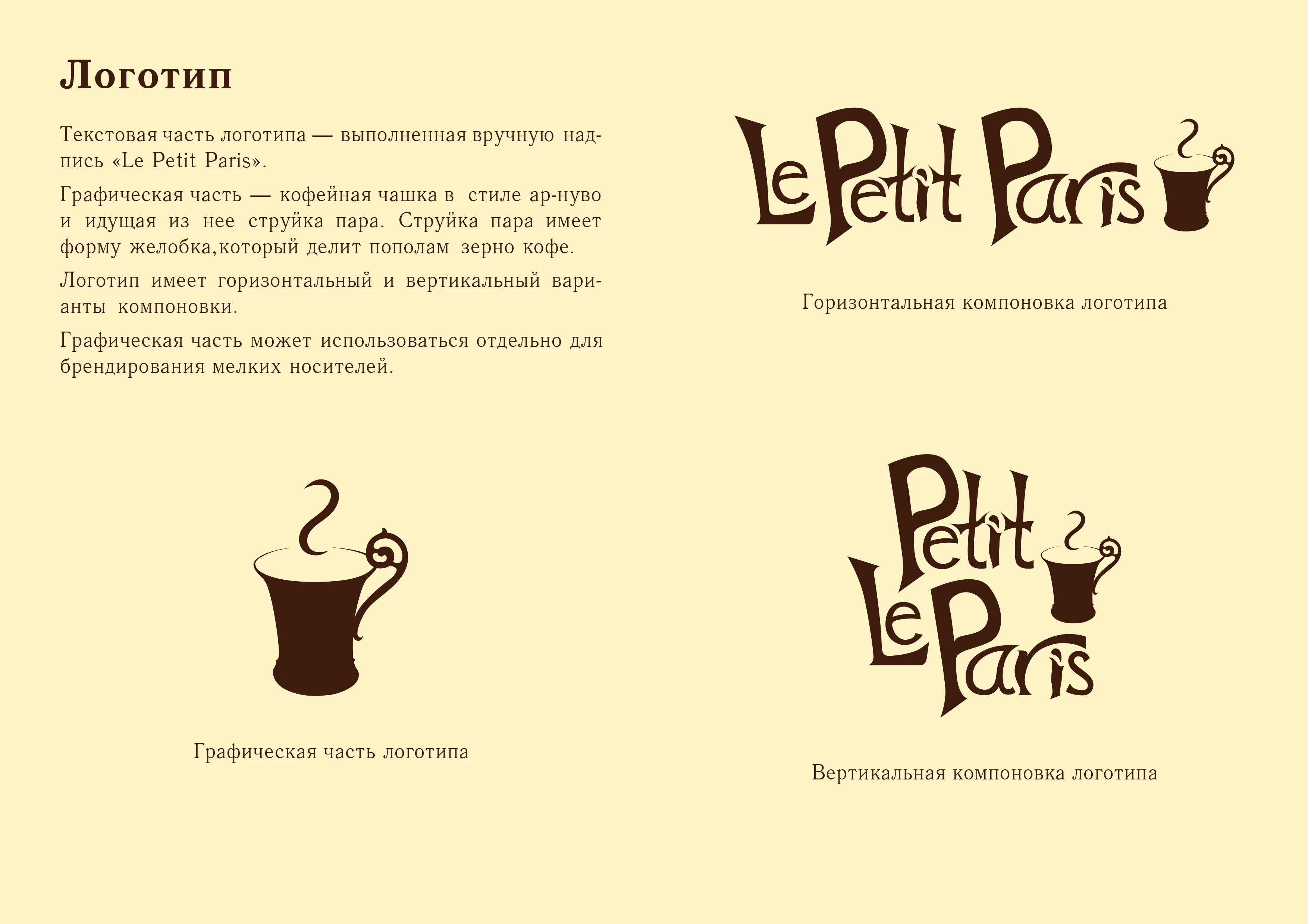
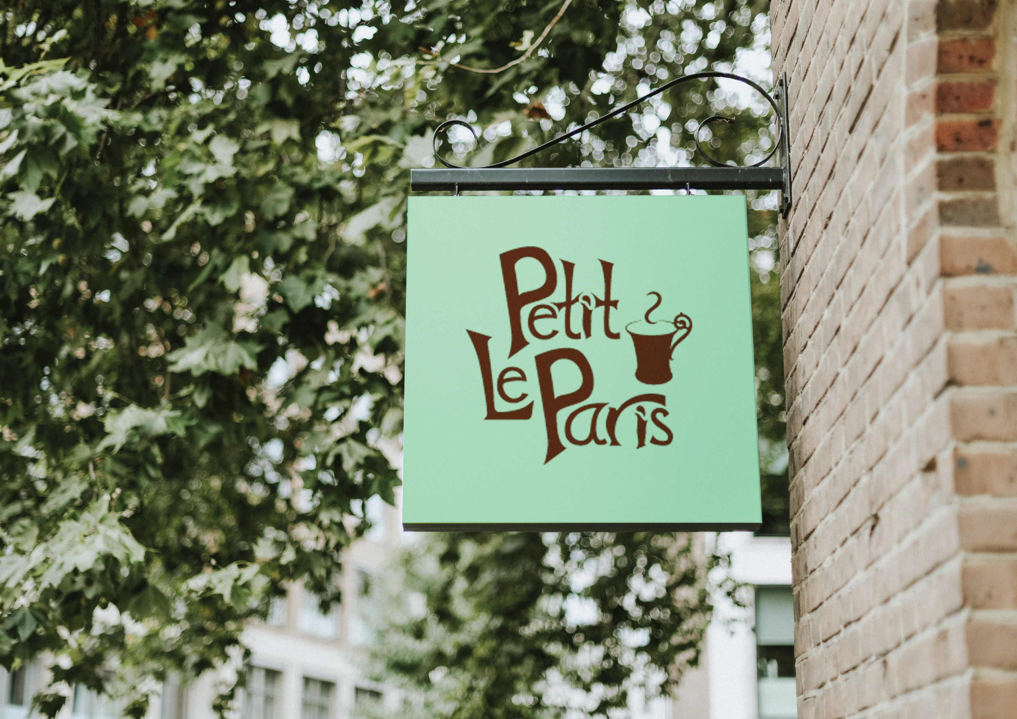
The text part of the logo is the hand-made inscription "Le petit Paris".
The graphic part is an Art Nouveau coffee cup with a stream of steam in the form of a groove that divides the coffee bean in half.
The logo has horizontal and vertical layout options.
The graphic part can be used separately for branding small items.
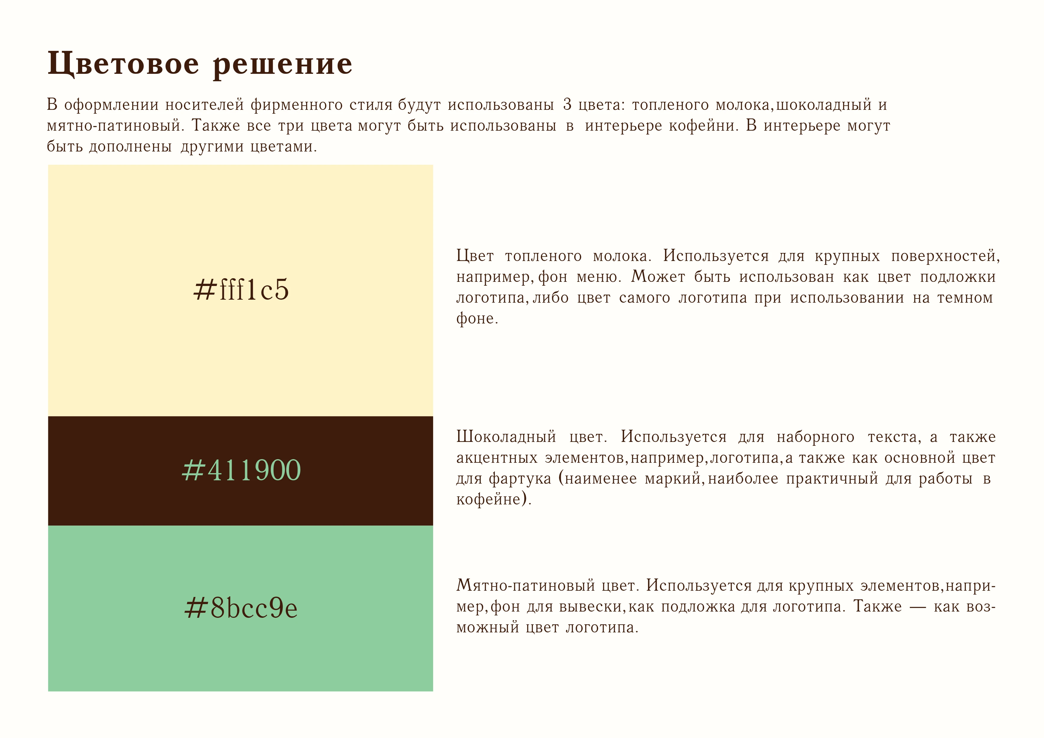
Color scheme:
The color of melted milk - for large surfaces, backgrounds, logo backing, logo on a dark background.
Chocolate color - for typesetting text, logo, and also as the main color for the apron.
Mint-patina - for large elements, such as the background of the signboard, for the logo backing, also a possible logo color.
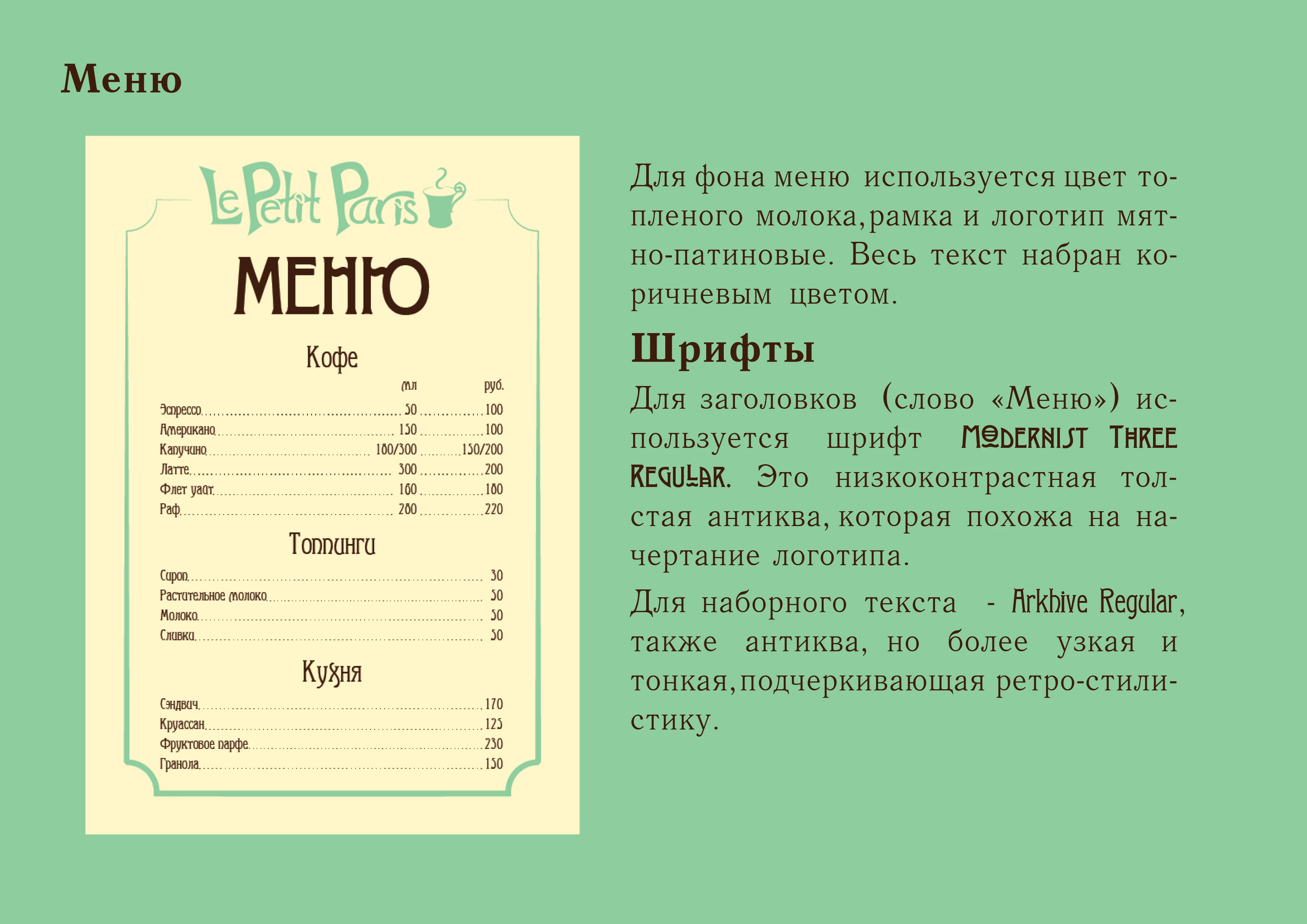
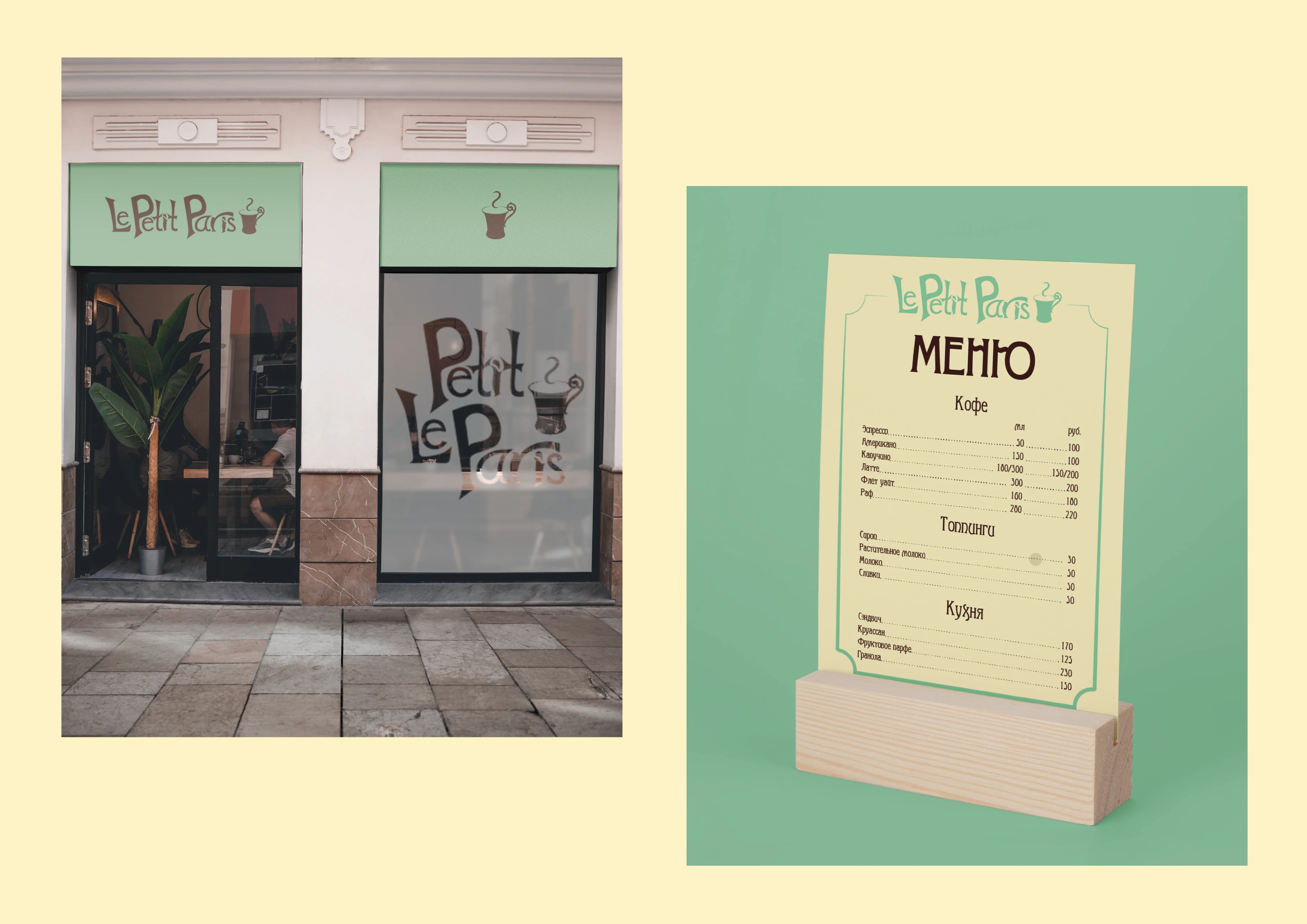
Menu
The background is the color of melted milk, the frame and logo are mint-patina, the text is brown.
Fonts
Title - Modernist Three Regular. This is a low-contrast thick antique that looks like the contours of the logo. For typesetting - Arkhive Regular, also antique, but narrower and thinner, emphasizing retro style.
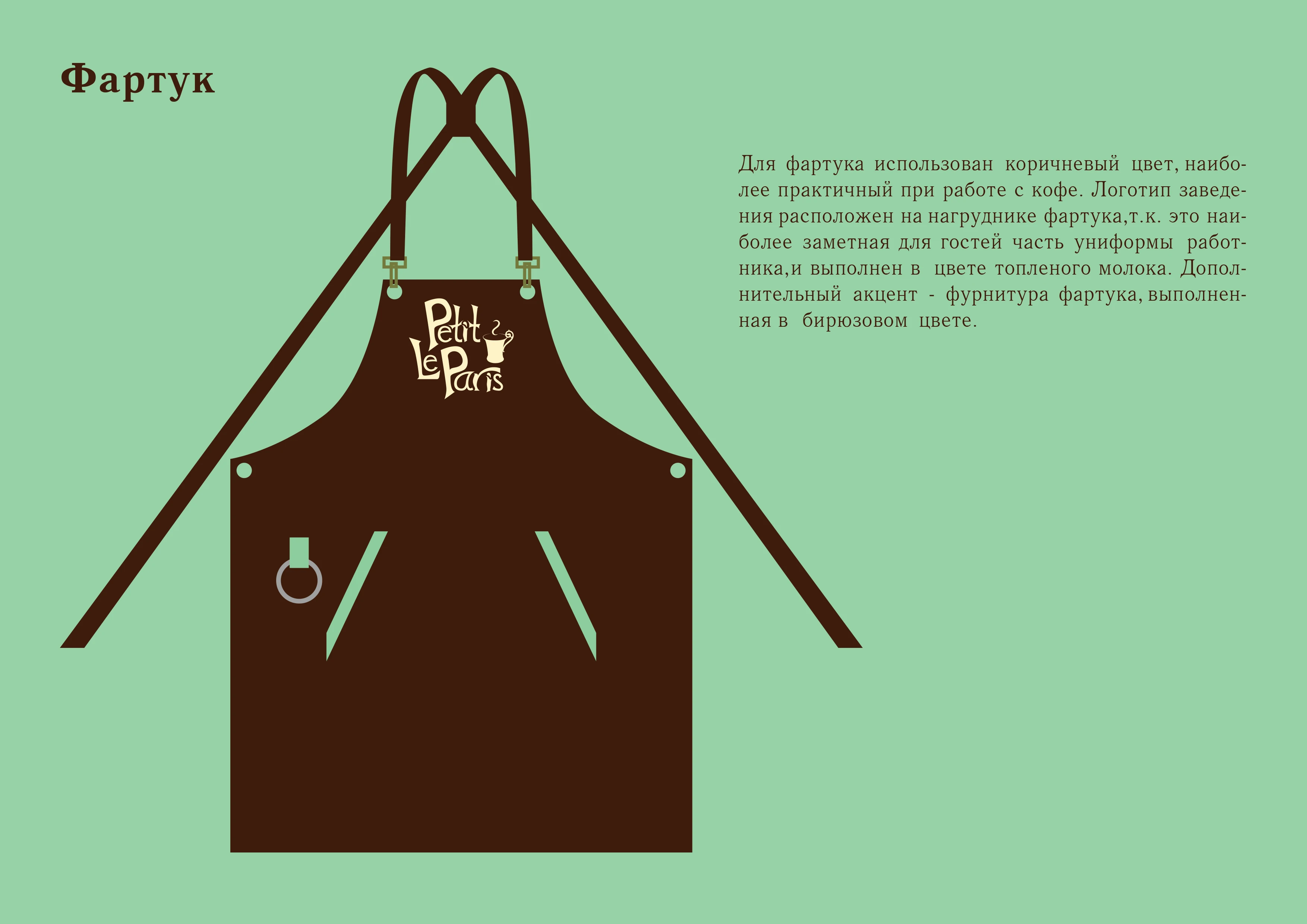
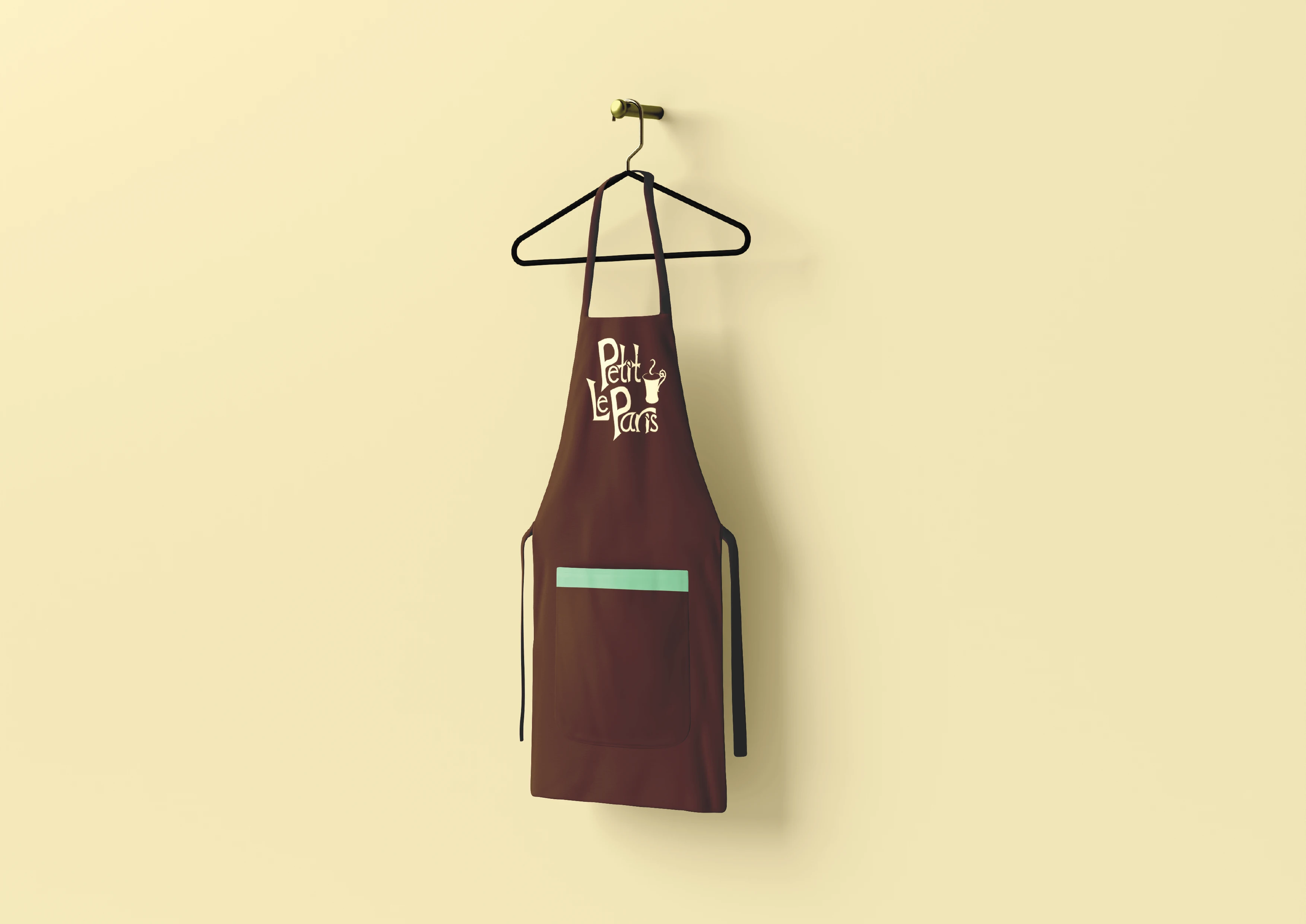
Apron
The brown color chosen for the apron is the most practical for working with coffee. The logo is located on the bib and is made in the color of melted milk. An additional accent is turquoise fittings.
You can order a design for your own items here