[rus]
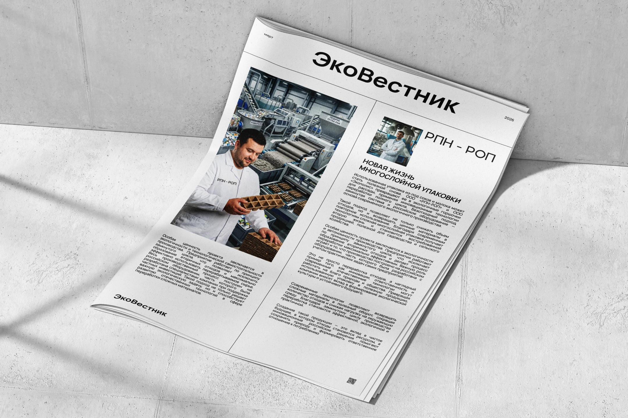
ООО “РПН-РОП” совместно с ООО “ЭКОПОЛИС” || Специализируются на инновационных технологиях переработки многослойной упаковки в полезную продукцию.
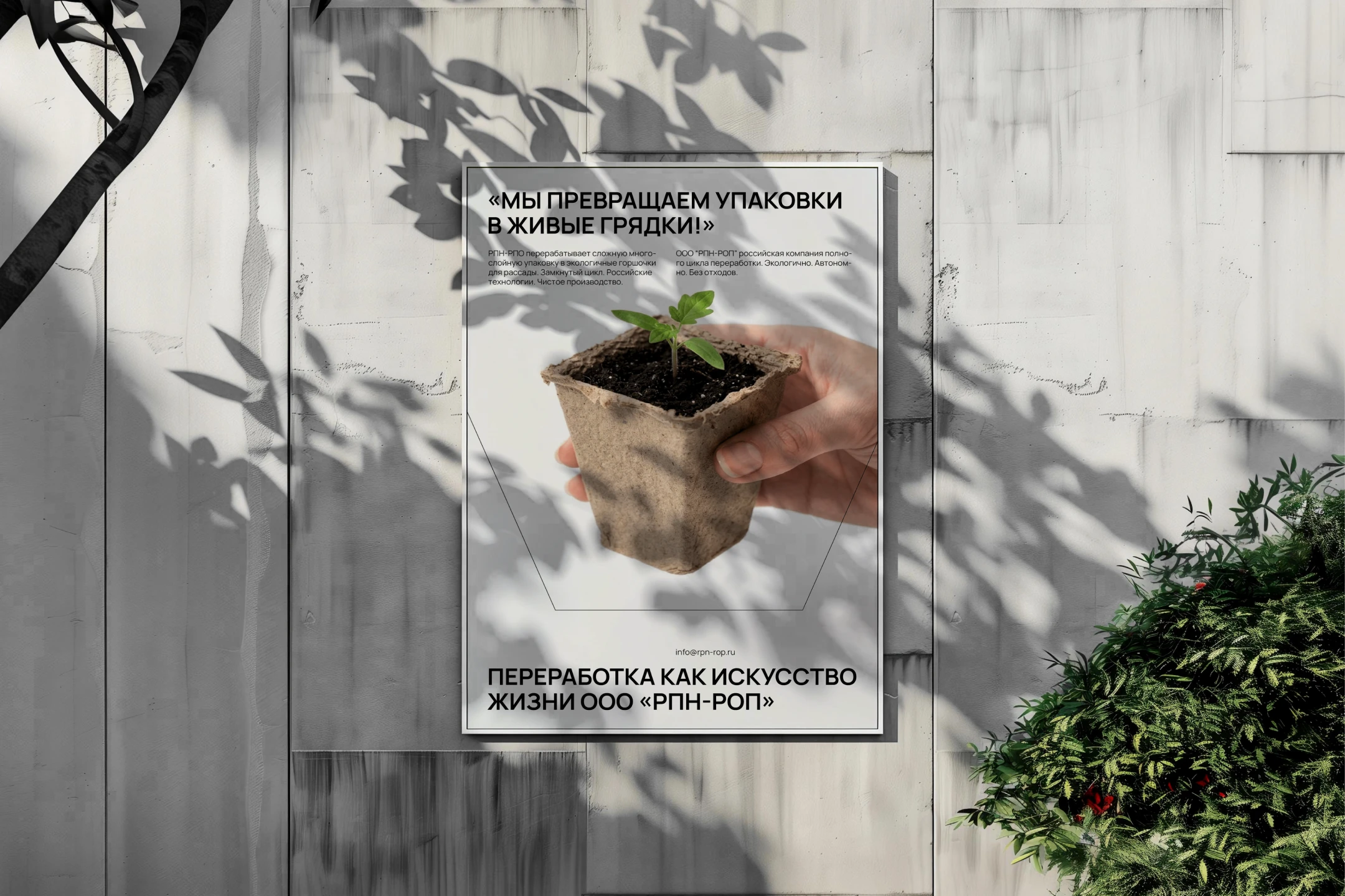
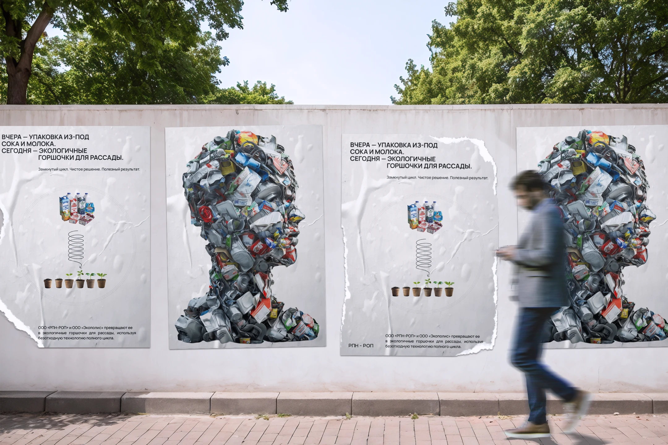
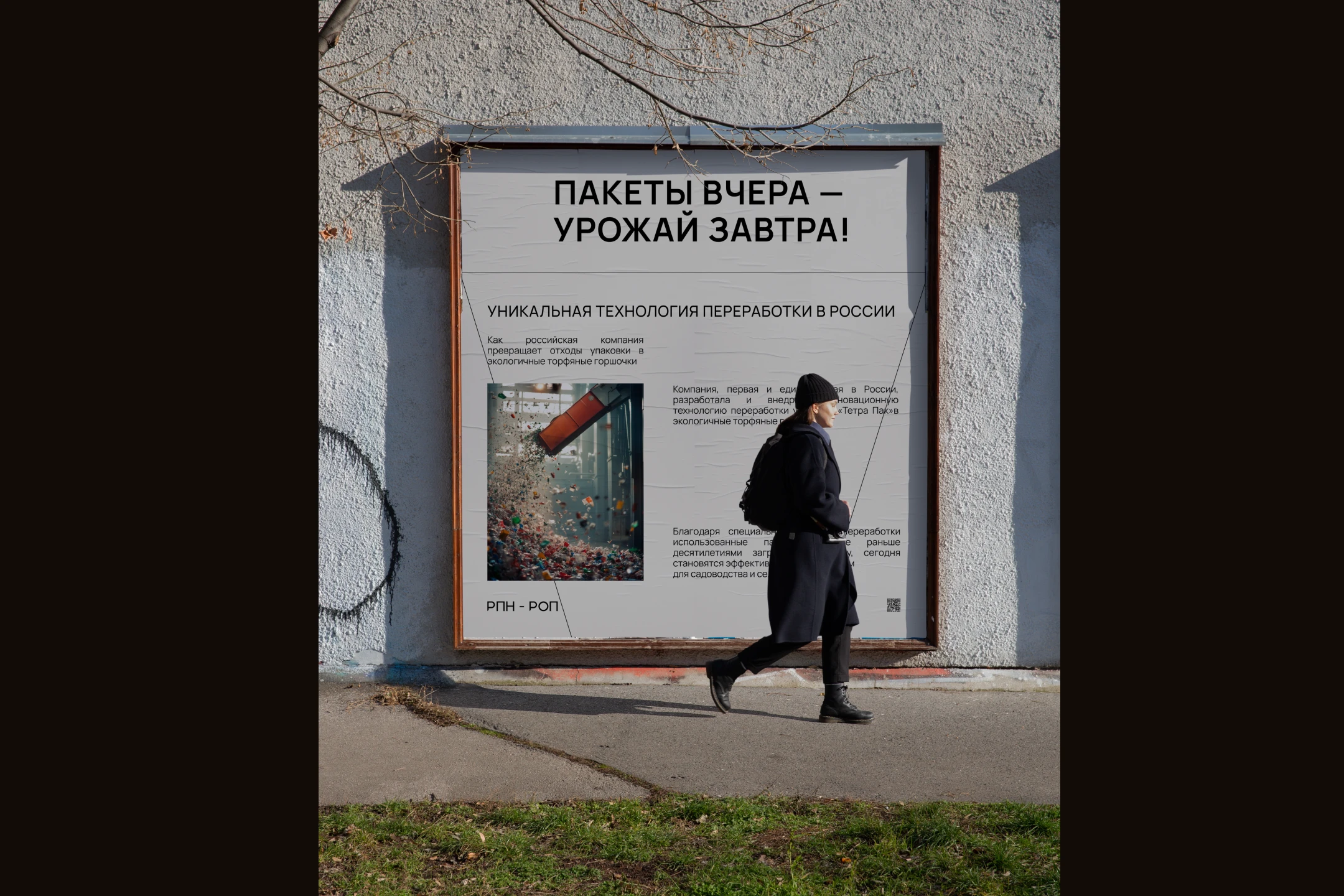
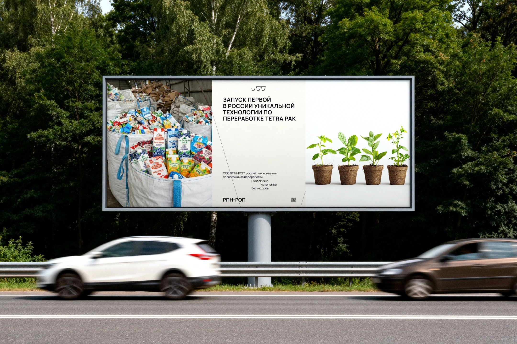
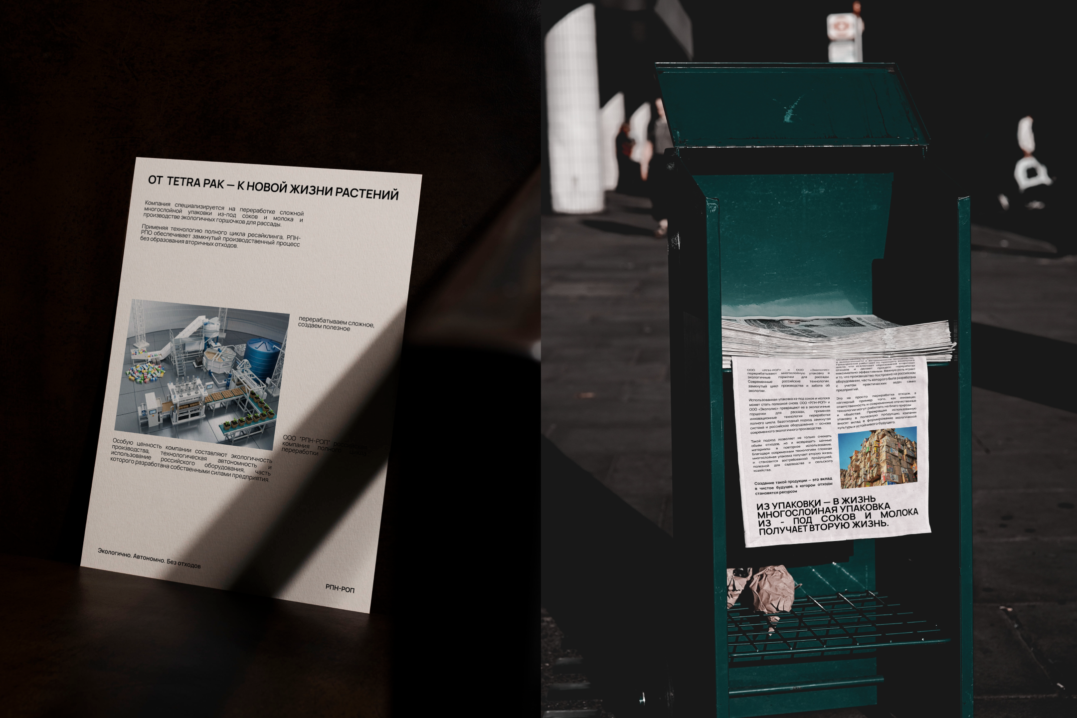
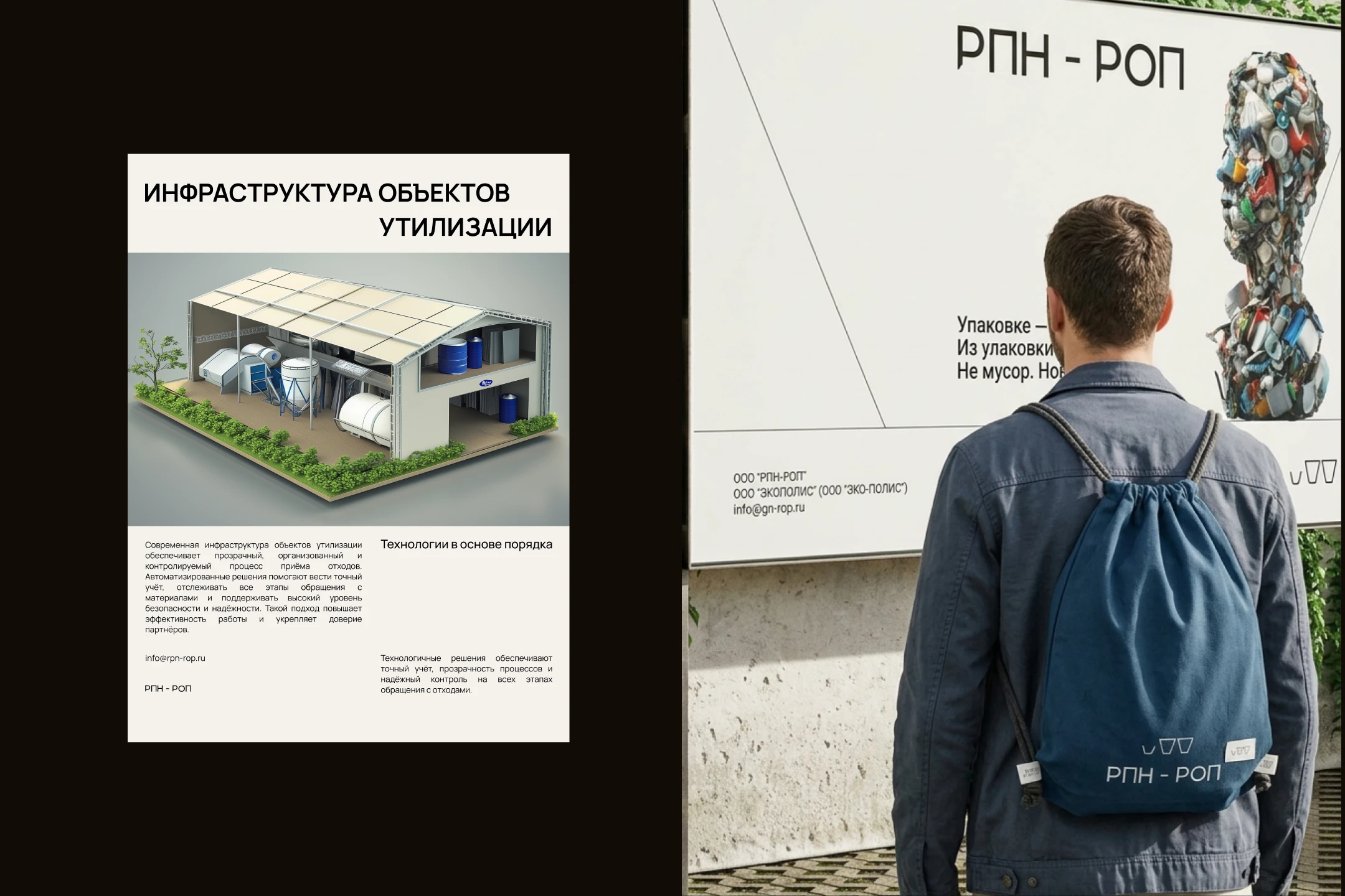
РПН – РОП — российская компания полного цикла, которая перерабатывает многослойную упаковку Tetra Pak в экологичные горшочки для рассады. Используя технологию ресайклинга полного цикла, без вторичных отходов. При этом весь производственный процесс построен на российском оборудовании.
Задача:
Подчеркнуть доверие и инновационную технологию, избегая типичных клише, связанных с переработкой отходов.
визуально отстроиться от перерабатывающих компаний в сфере экологии благодаря единственной в России технологии переработки тетра пак, показать это за счет визуальной составляющей, используя графические элементы и видео, чтобы эффективно донести до потребителя приверженность компании к устойчивому развитию и инновациям.
создать чистый дизайн, который бы отражал миссию компании.
Решение
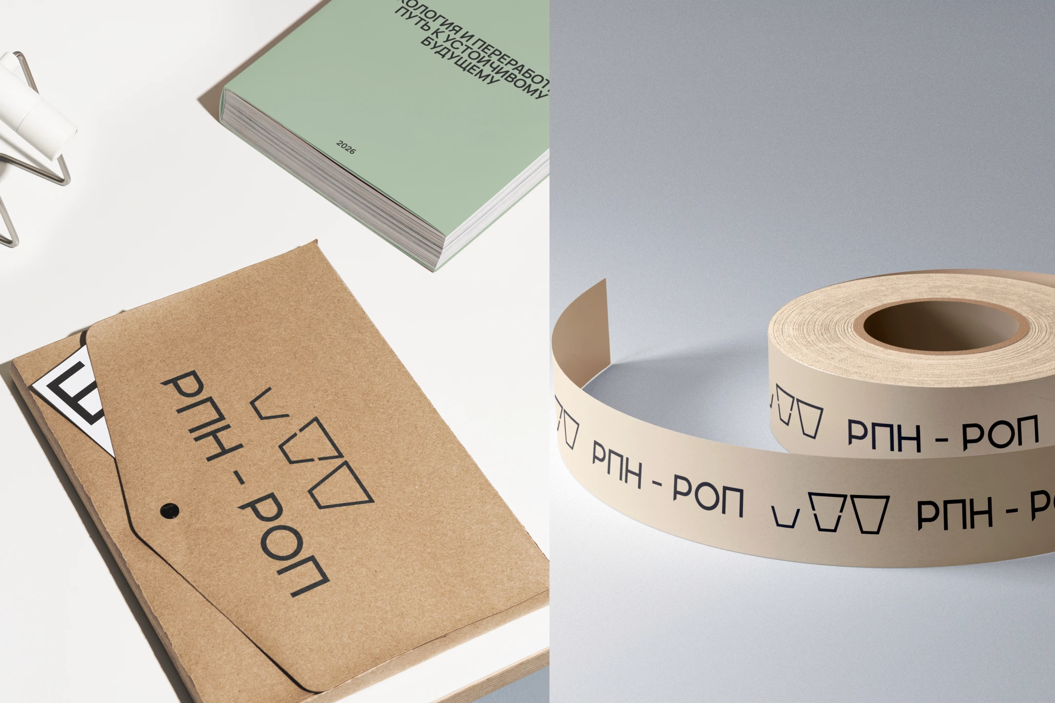
В основе дизайн-концепции — современность, чистота и инновации. Для проекта была выбрана приглушенная индустриальная палитра: мягкий бежевый, земляные оттенки, угольный и другие естественные тона. Такое цветовое решение подчеркивает современное и утилитарное использование материала, а также его связь с природой и экологичность торфяных горшочков.
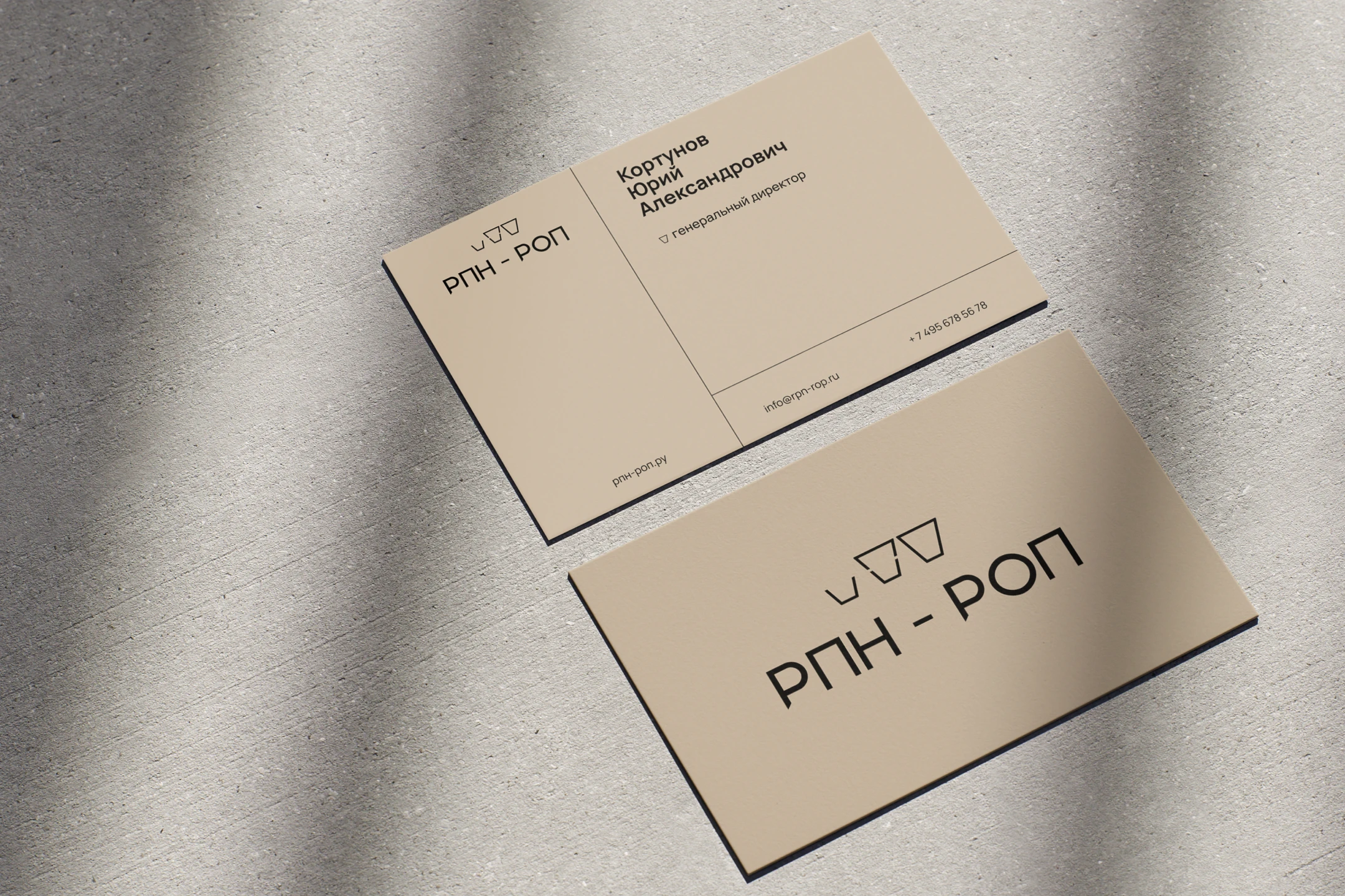
При разработке логотипа важно было сохранить ощущение современной простоты и минимализма, чтобы передать инновационность, надежность и технологичность процесса.
Логотип компании «ЭКОПОЛИС» — простой, чистый и геометричный. В его начертании заложен тонкий намек на цикличность процесса переработки, а также считывается визуальный образ горшочка.
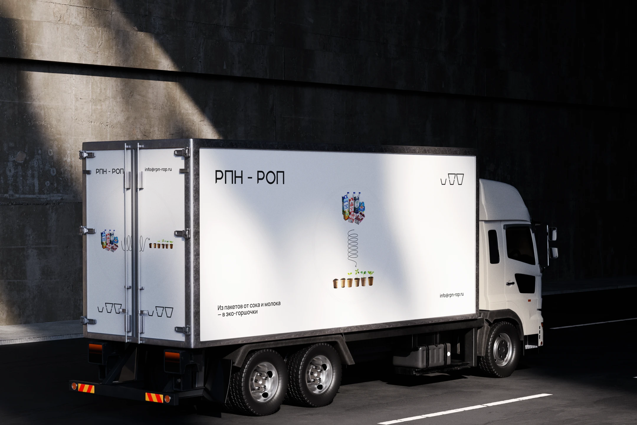
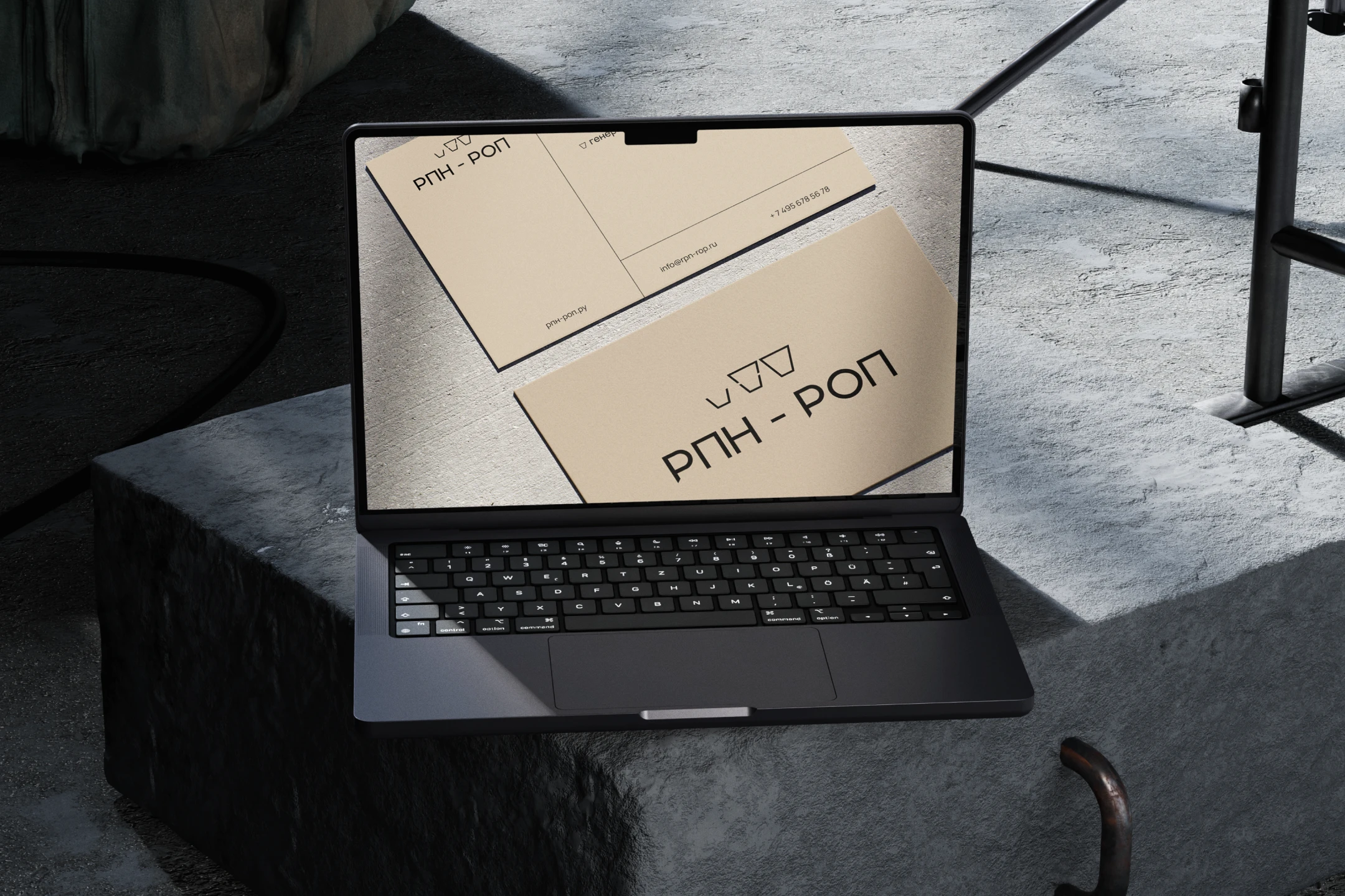
В логотипе «РНП-РОП» нижняя вертикальная ножка буквы «Р» срезана под углом 45° — этот элемент напоминает сгиб картонной коробки Tetra Pak. Визуально он отсылает к бумажной структуре материала и теме переработки упаковки, при этом остается легко узнаваемым и хорошо масштабируется.
Визуальный язык построен на геометрических элементах, которые подчеркивают уникальность технологии на российском рынке. Чистые линейные иллюстрации в техническом стиле наглядно передают процесс трансформации — от упаковки Tetra Pak к полезным горшочкам для рассады
[eng]
RPN-ROP LLC in partnership with ECOPOLIS LLC || Specialising in innovative technologies for recycling multi-layer packaging into useful products.
RPN-ROP is a Russian full-cycle company that recycles Tetra Pak multi-layer packaging into eco-friendly seedling pots. Using full-cycle recycling technology, with no secondary waste. The entire production process is based on Russian equipment.
Objective:
To emphasise trust and innovative technology, avoiding typical clichés associated with waste recycling.
To stand out visually among recycling companies in the environmental sector thanks to Russia’s only Tetra Pak recycling technology, and to demonstrate this through visual elements, using graphics and video to effectively convey the company’s commitment to sustainable development and innovation to the consumer.
To create a concise design that reflects the company’s mission.
Solution
The design concept is based on modernity, purity and innovation. A muted industrial palette was chosen for the project: soft beige, earthy tones, charcoal and other natural shades. This colour scheme emphasises the modern and utilitarian use of the material, as well as its connection to nature and the eco-friendliness of the peat pots.
When developing the logo, it was important to maintain a sense of modern simplicity and minimalism to convey the innovation, reliability and technological sophistication of the process.
The ‘ECOPOLIS’ logo is simple, clean and geometric. Its design contains a subtle hint at the cyclical nature of the recycling process, whilst also evoking the visual image of a pot.
In the ‘RNP-ROP’ logo, the lower vertical stem of the letter ‘R’ is cut at a 45° angle — this element resembles the fold of a Tetra Pak carton. Visually, it references the paper structure of the material and the theme of packaging recycling, whilst remaining easily recognisable and scalable.
The visual language is built on geometric elements that emphasise the uniqueness of the technology on the Russian market. Clean, linear illustrations in a technical style clearly convey the transformation process — from Tetra Pak packaging to useful pots for seedlings