Endorphin. City energy.
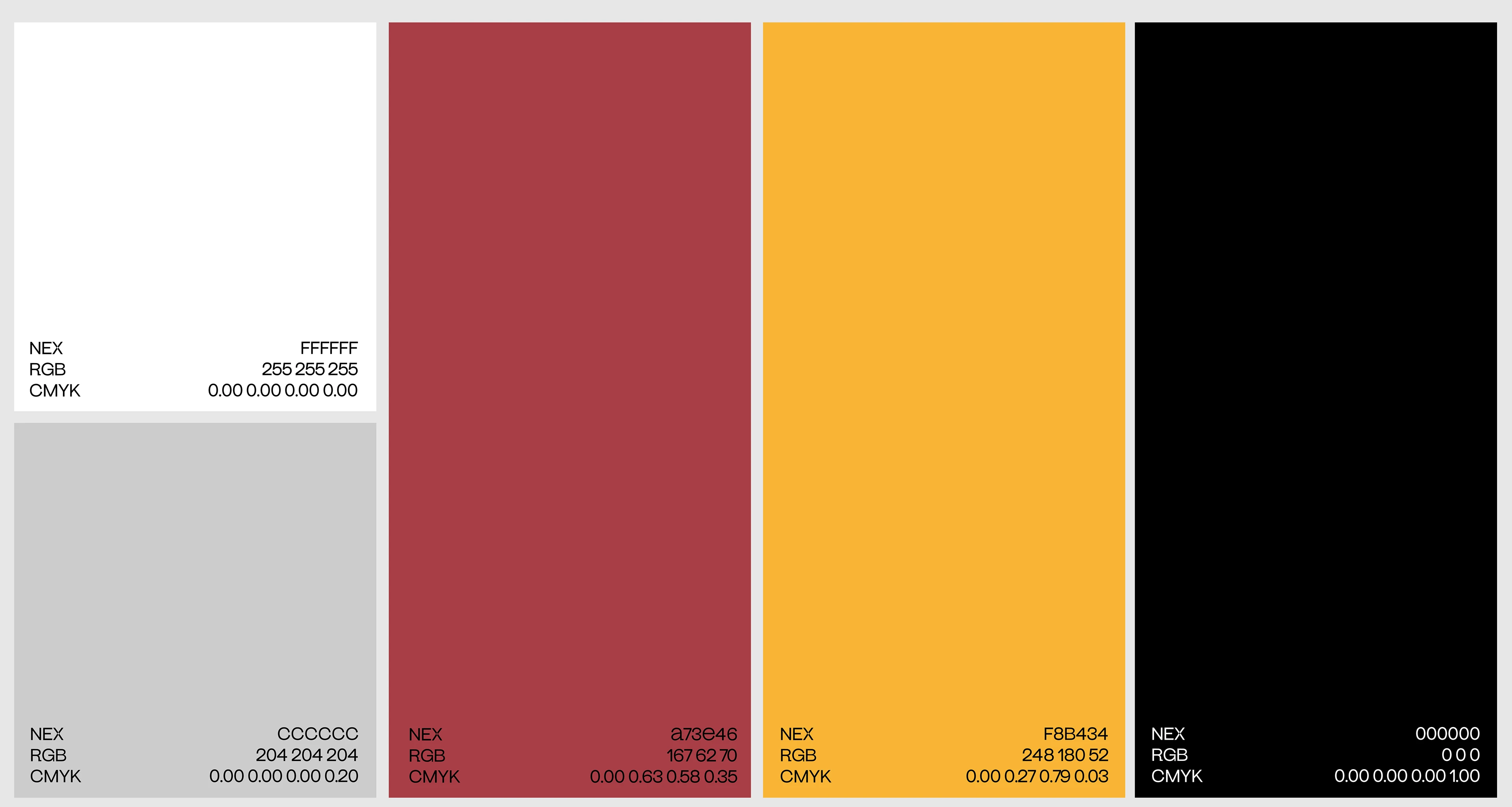
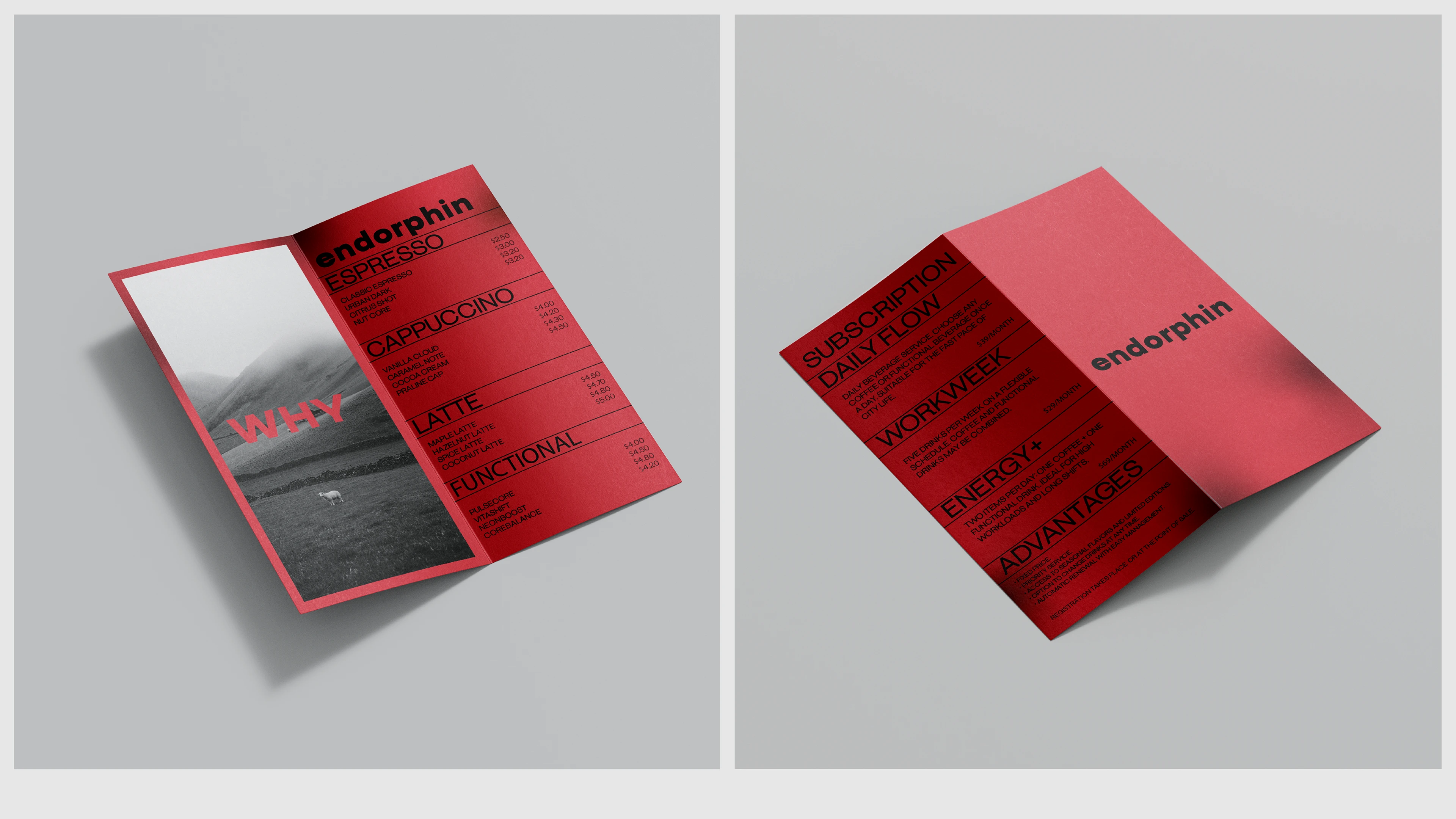
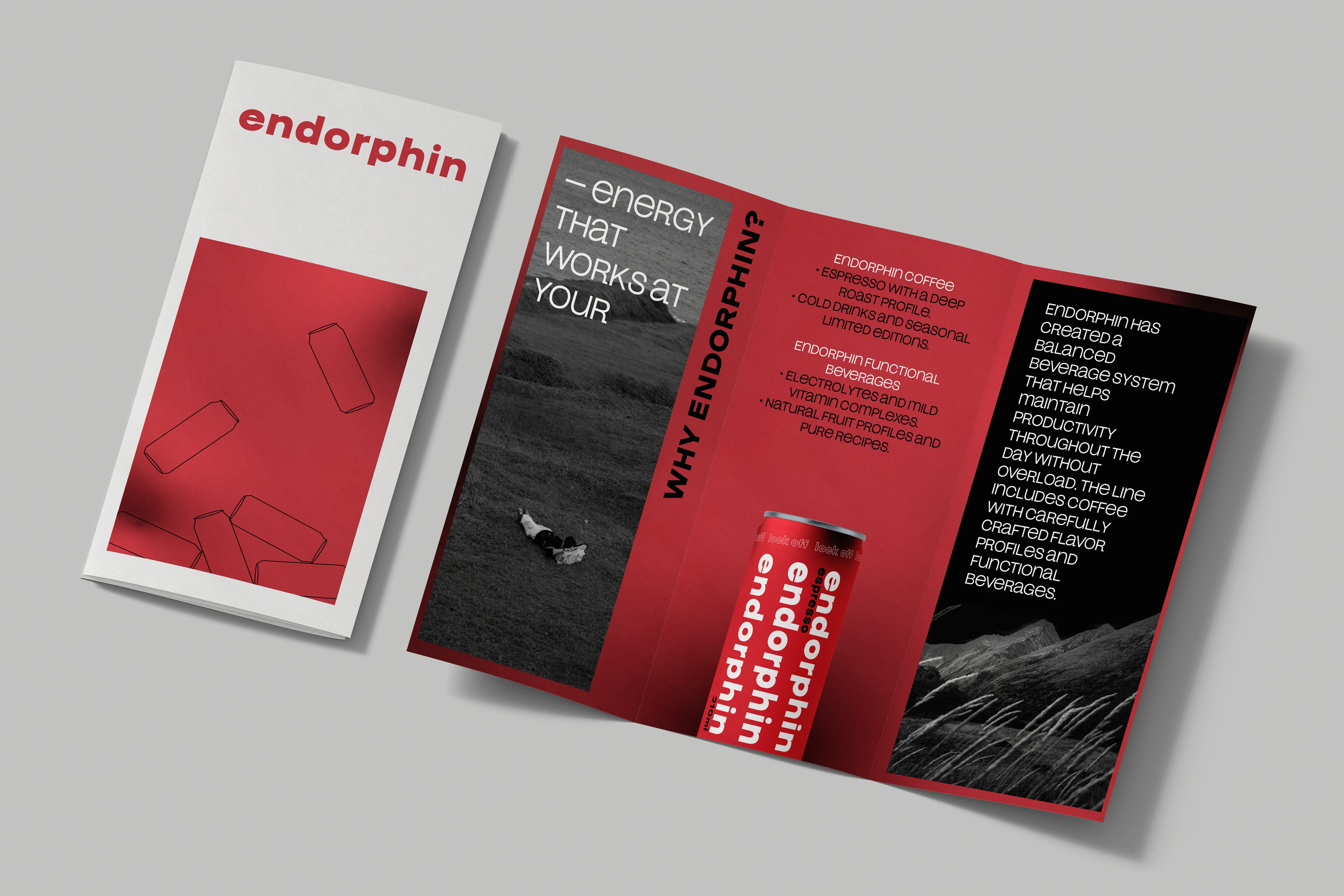
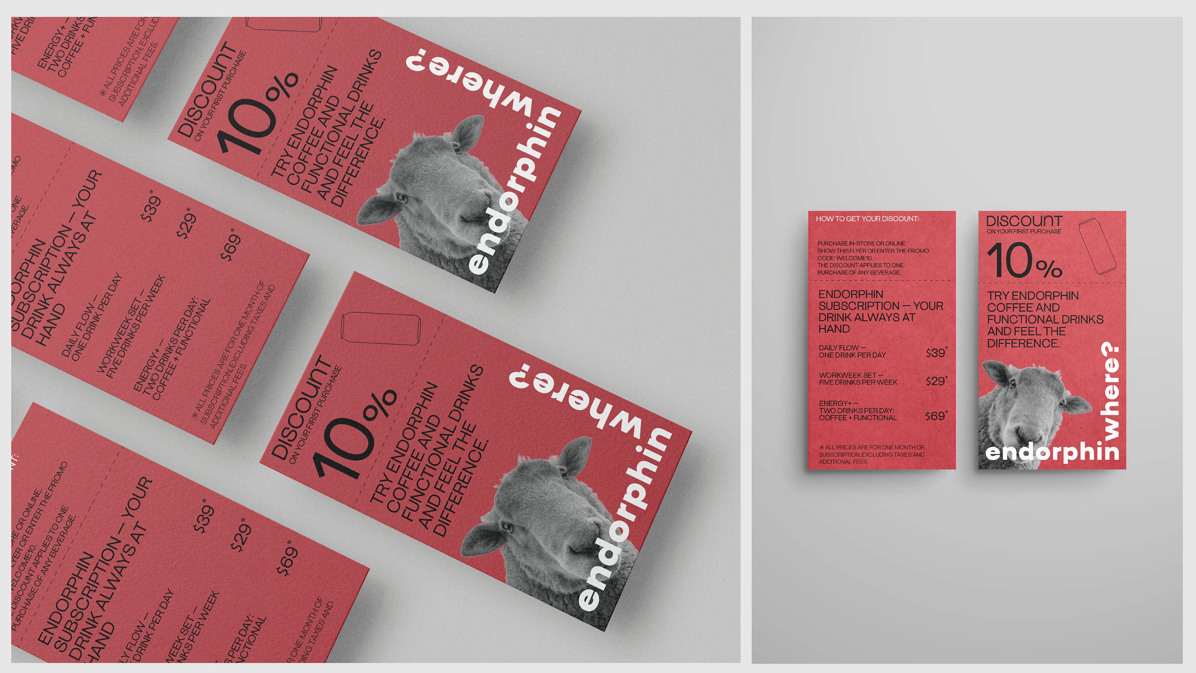
A project exploring the rhythm of the metropolis and personal energy in a fast-paced urban life. The brand unites coffee, energy, and functional drinks, emphasizing focus, mental clarity, and inner drive. The visual system is built on modularity, rhythmic typography, and a bold red palette. Vertical text blocks inspired by urban navigation convey movement and momentum, forming a cohesive, dynamic, and instantly recognizable identity that reflects the brand’s internal tempo.
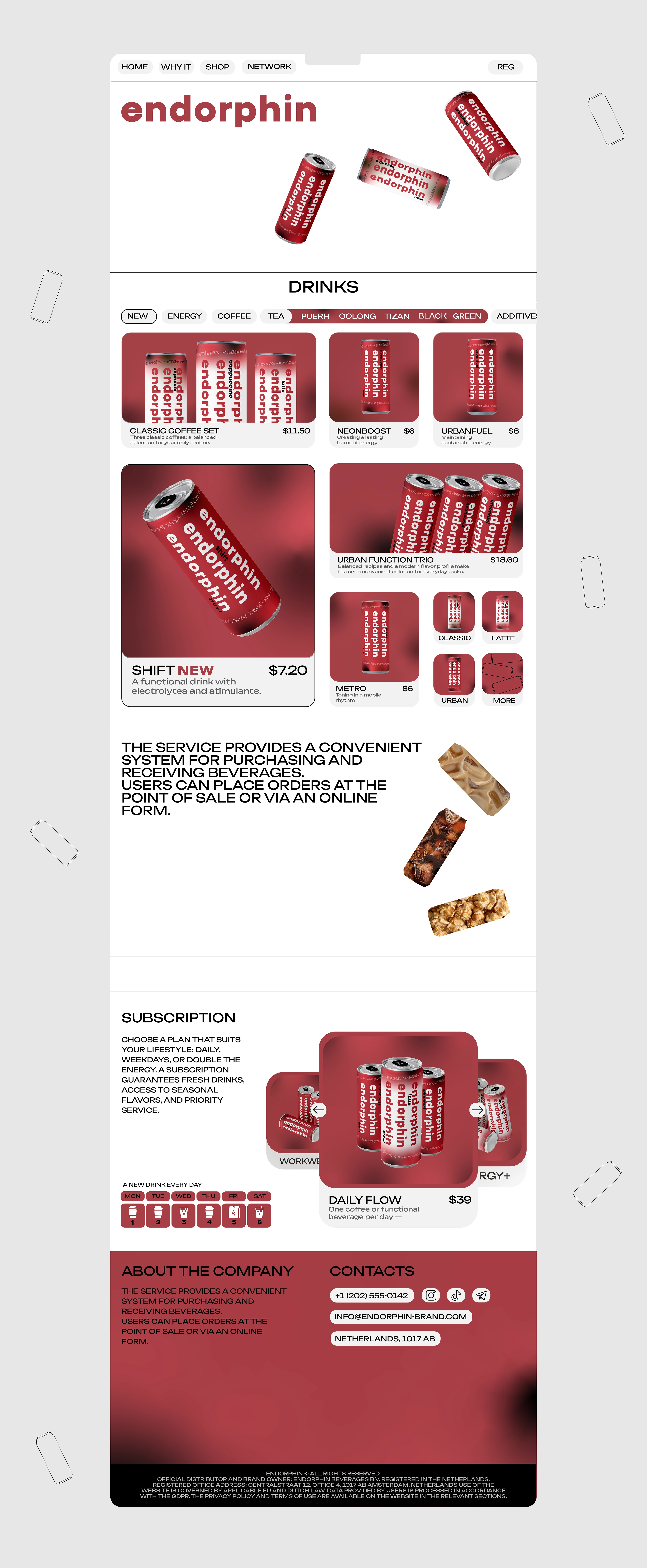
Visual system. Digital interface.
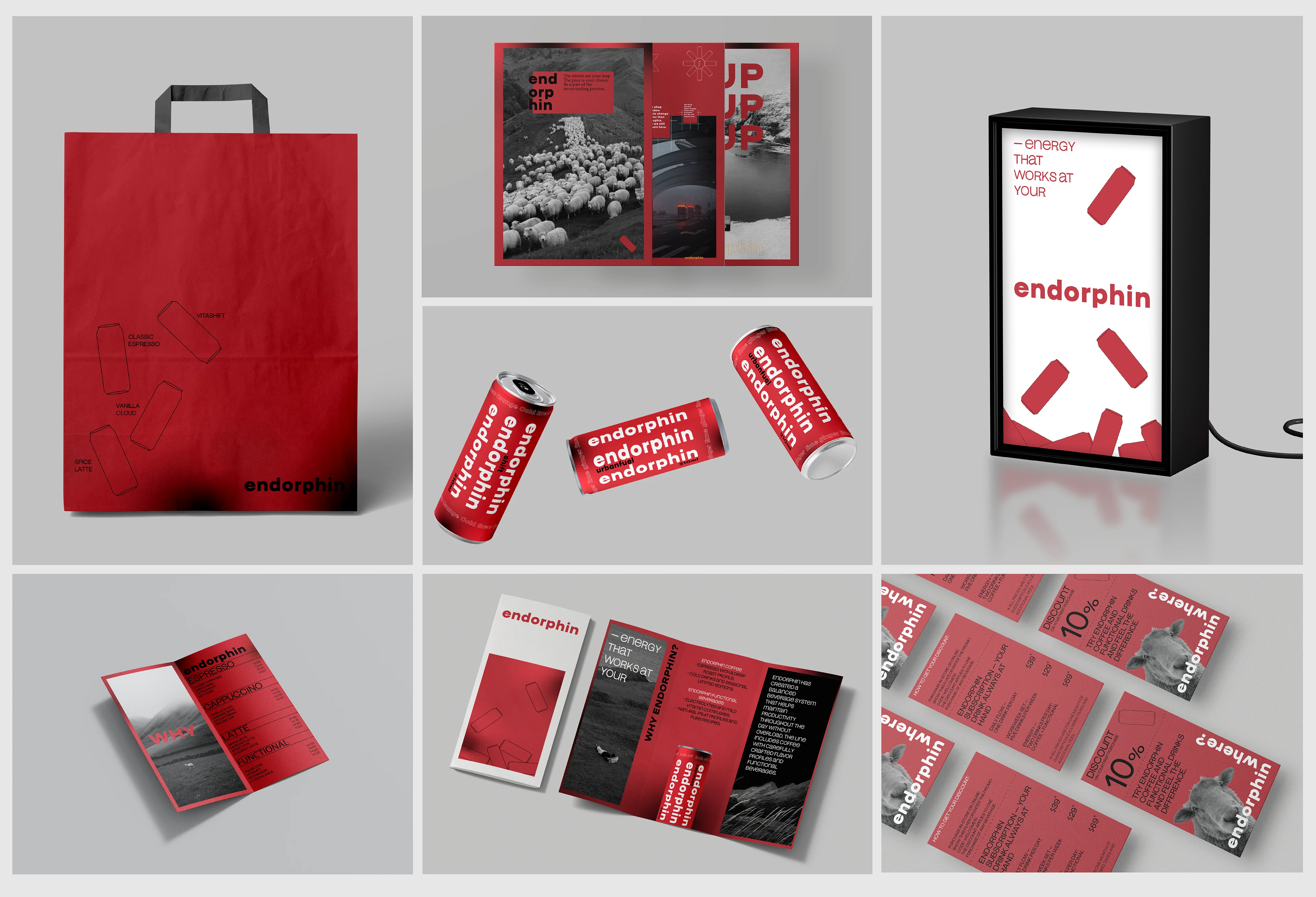
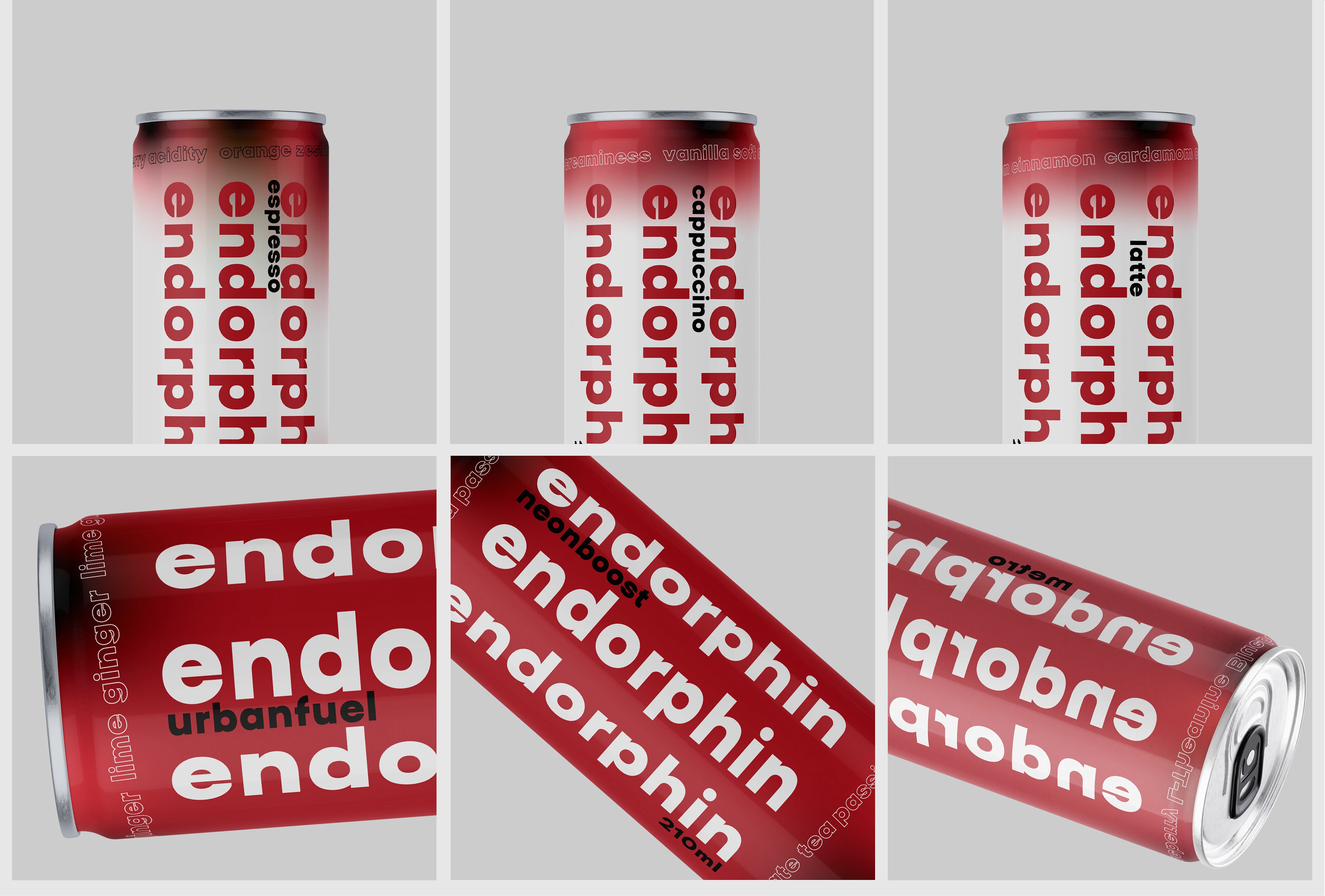
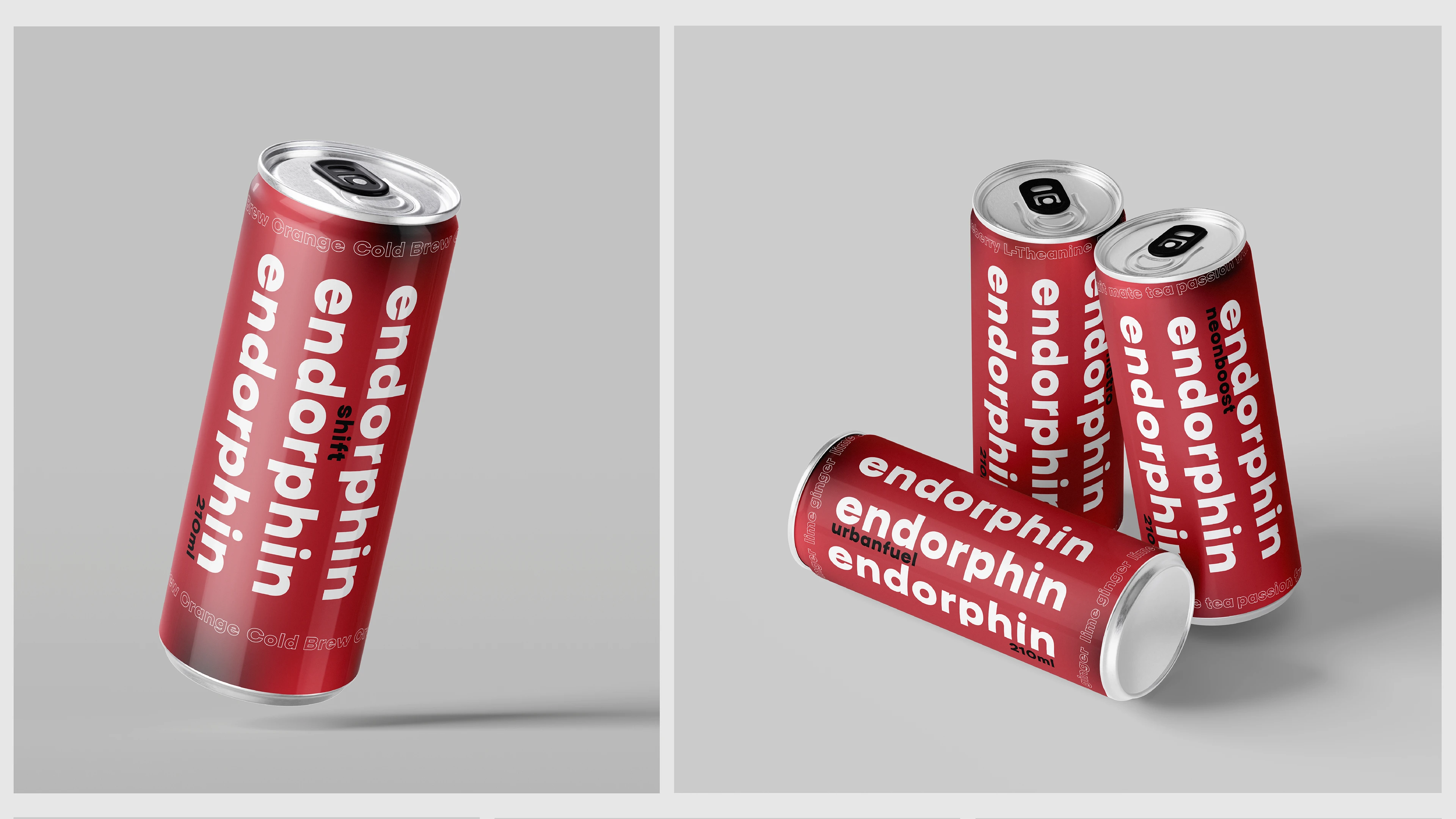
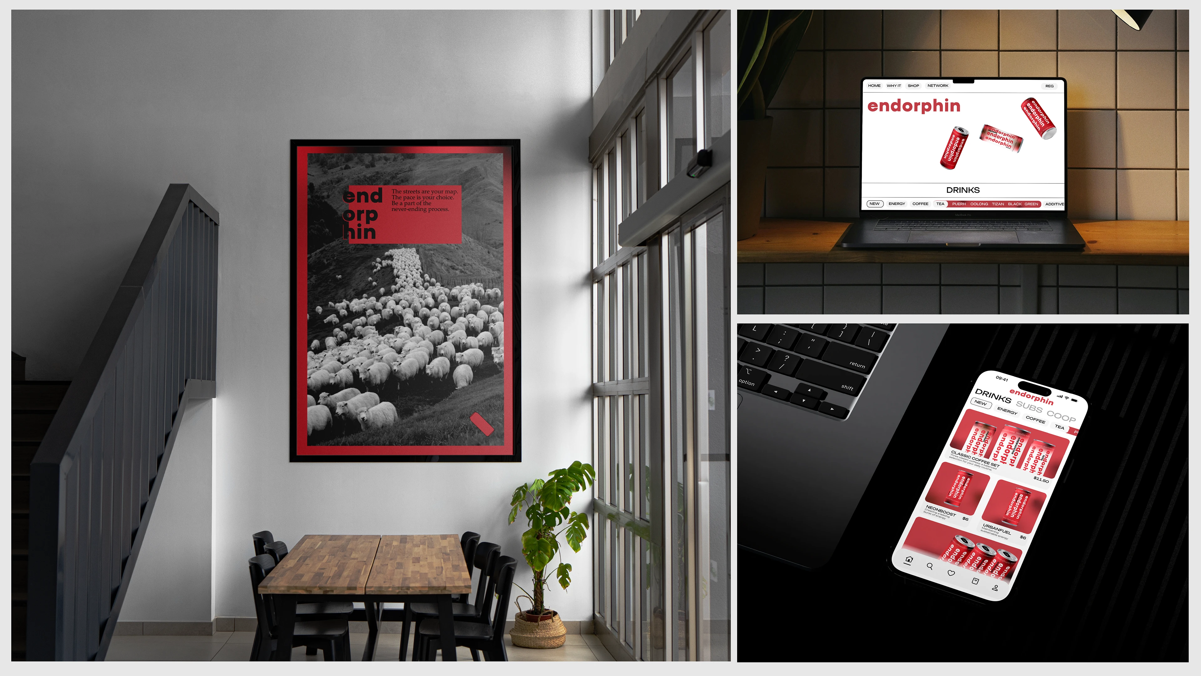
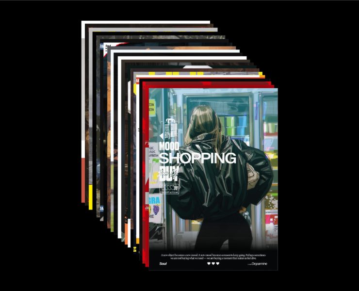
Beverage packaging is based on the principle of repeating text patterns that form the visual “pulse” of the brand. This rhythm unifies all media: from cans and labels to print, web interfaces, and advertising materials. This solution makes the brand easily recognizable in an urban environment and contributes to the formation of a lasting visual memory.
Typographic model.
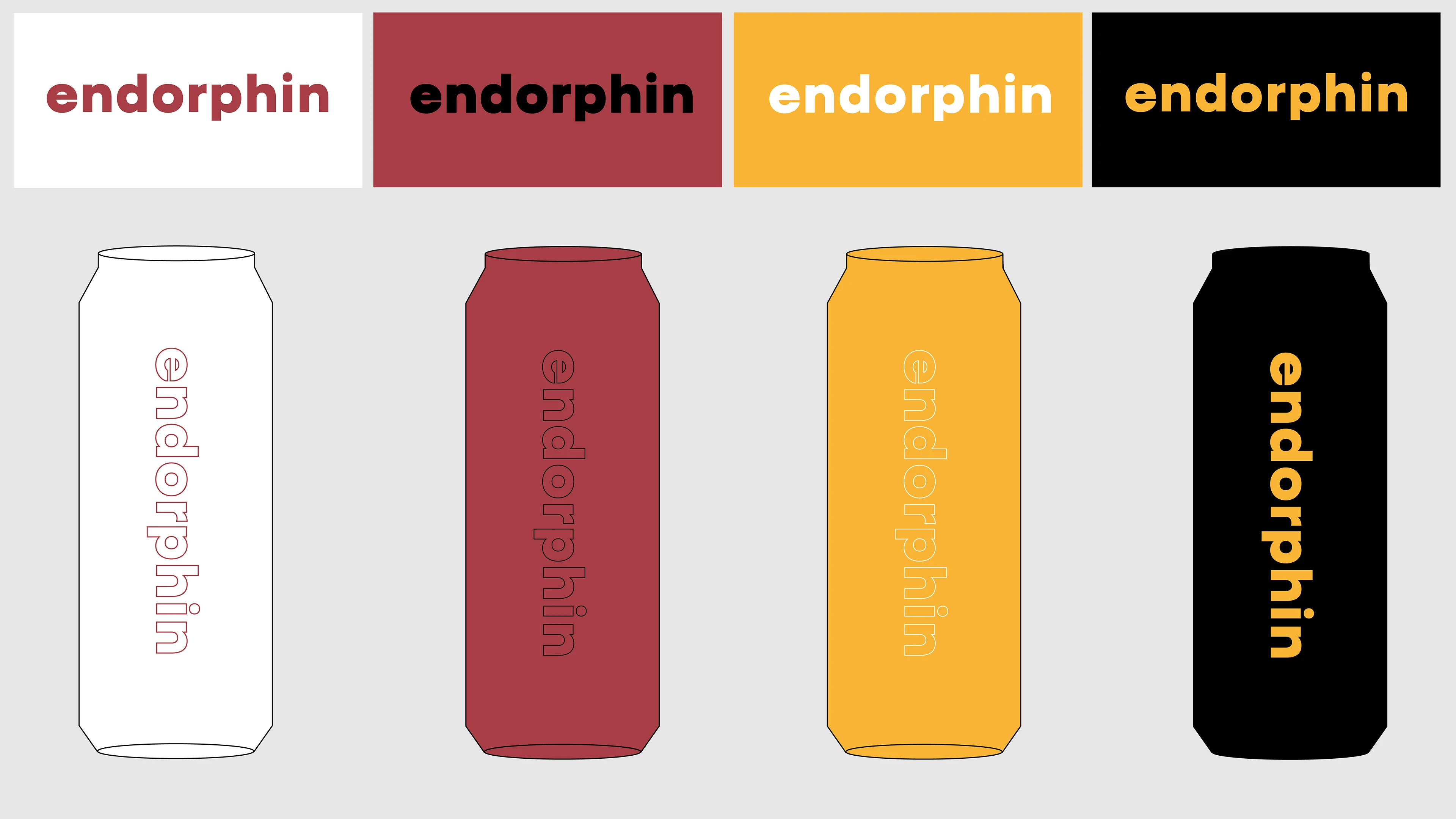
The endorphin typographic system is based on the principles of a strictly defined rhythm, a directed visual vector, and controlled dynamics of text structures. The basic tool used is a geometric sans serif font with neutral plasticity and stable optical architecture.
The system-forming technique is the vertical and diagonal displacement of text arrays, creating a sense of directed movement. This typographic trajectory echoes the dynamics of traffic flows, the visual codes of the metropolis, and the linear structure of urban navigation.