BRANDING / HOSPITALITY
Brand identity for a countryside hotel.
BRANDING / HOSPITALITY
Brand identity for a countryside hotel.
About the project
EN
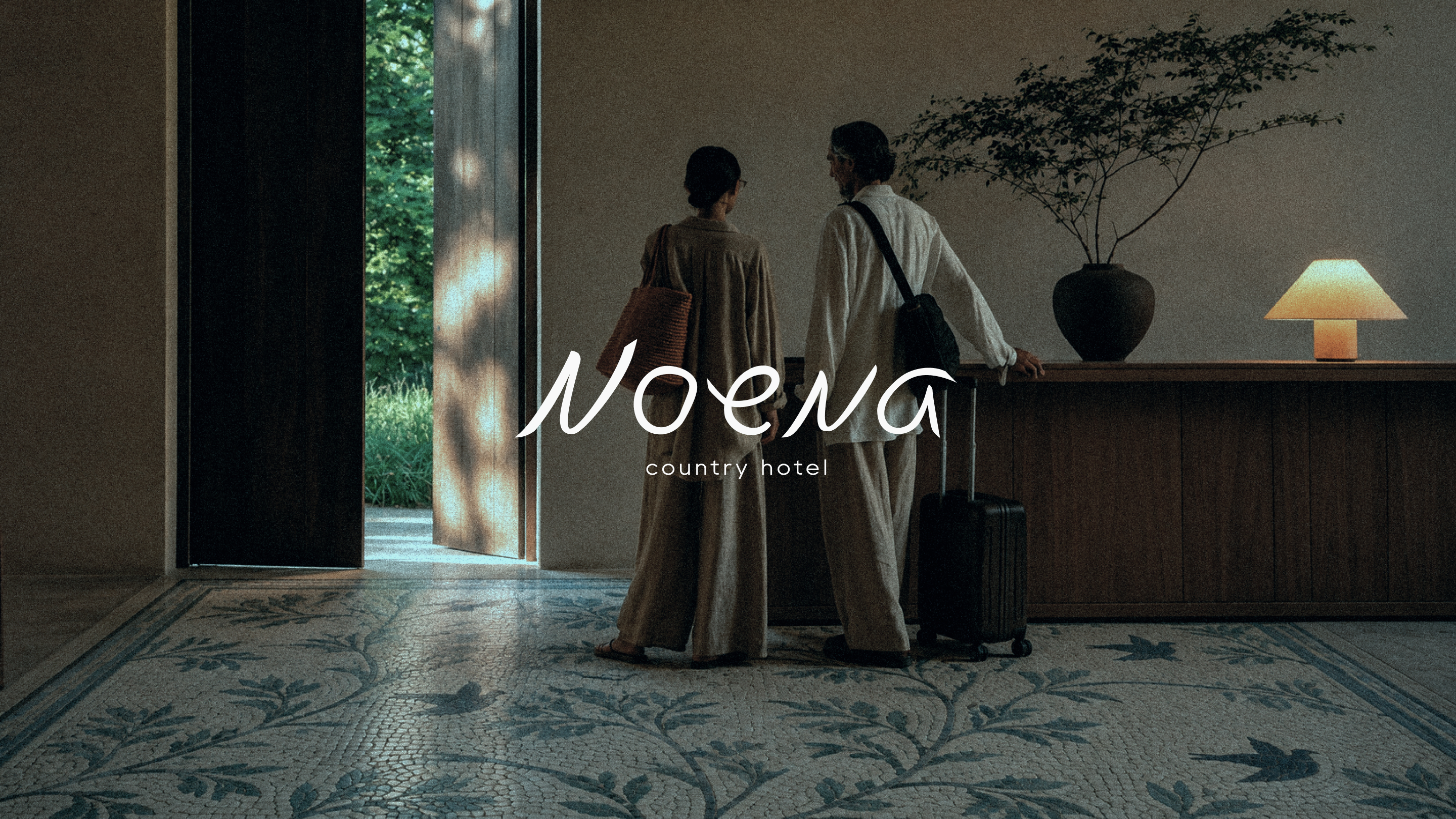
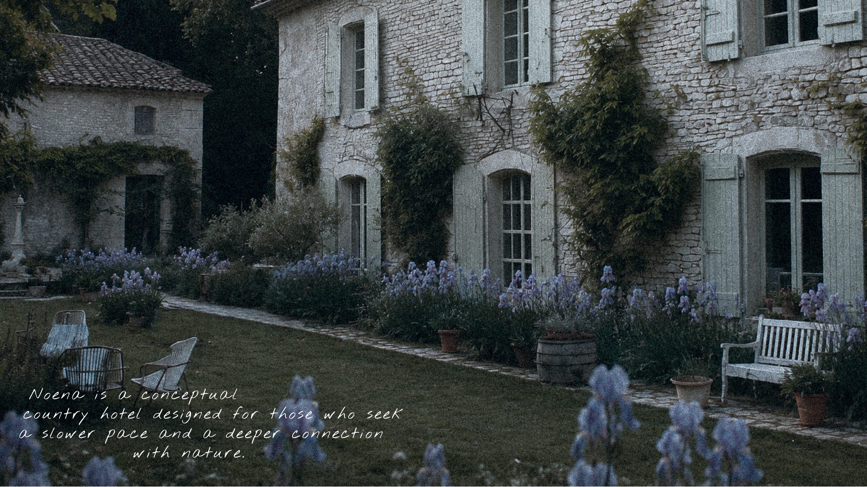
Noena is a conceptual country hotel designed for those who seek a slower pace and a deeper connection with nature.
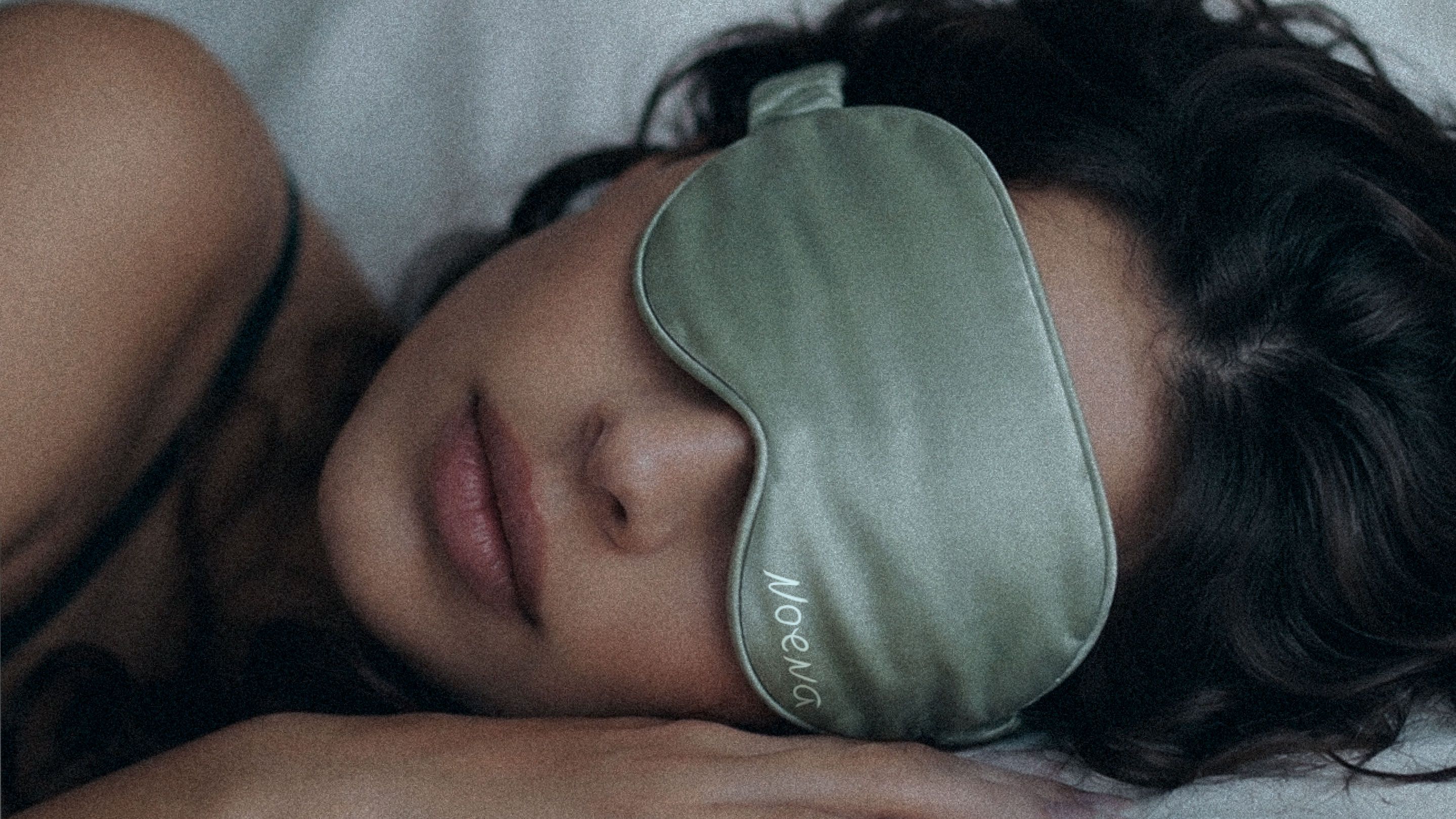
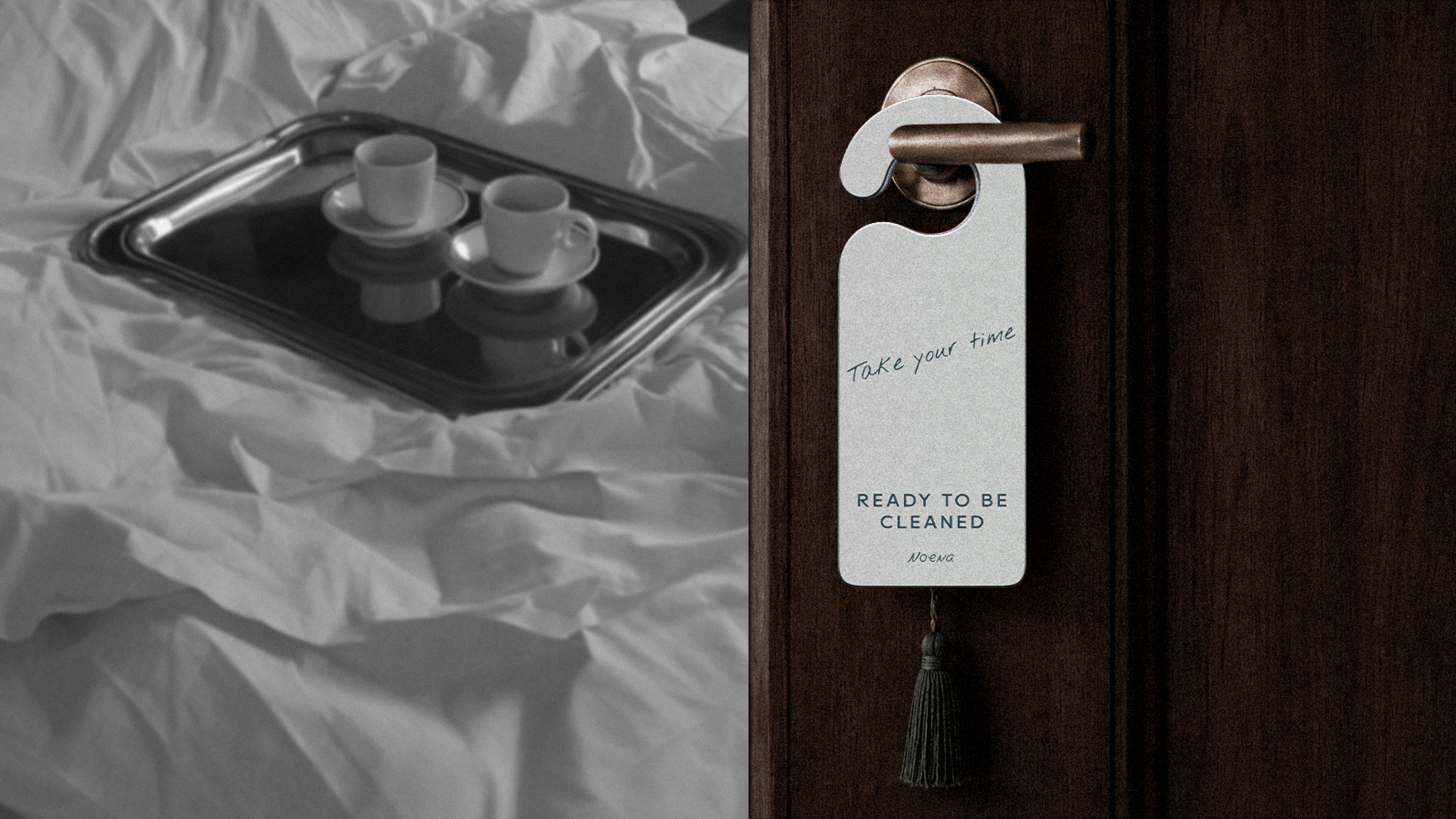
Our goal was to create an identity that wouldn't decorate the place, but become part of it — naturally woven into the architecture, interiors and every guest experience.
RU
Noena — концептуальный загородный отель для тех, кто ищет другой ритм жизни и близость к природе.
Задача состояла в том, чтобы создать айдентику, которая не украшает пространство, а становится его естественной частью — продолжением архитектуры, интерьеров и атмосферы.
LOGOTYPE
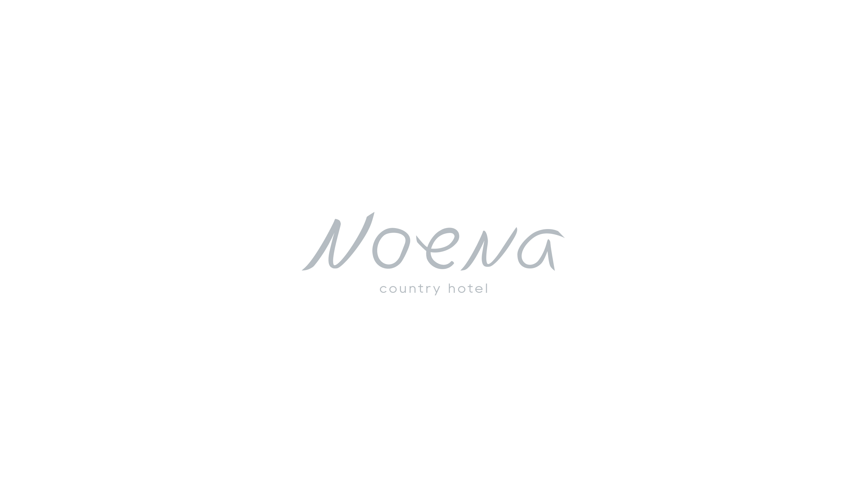
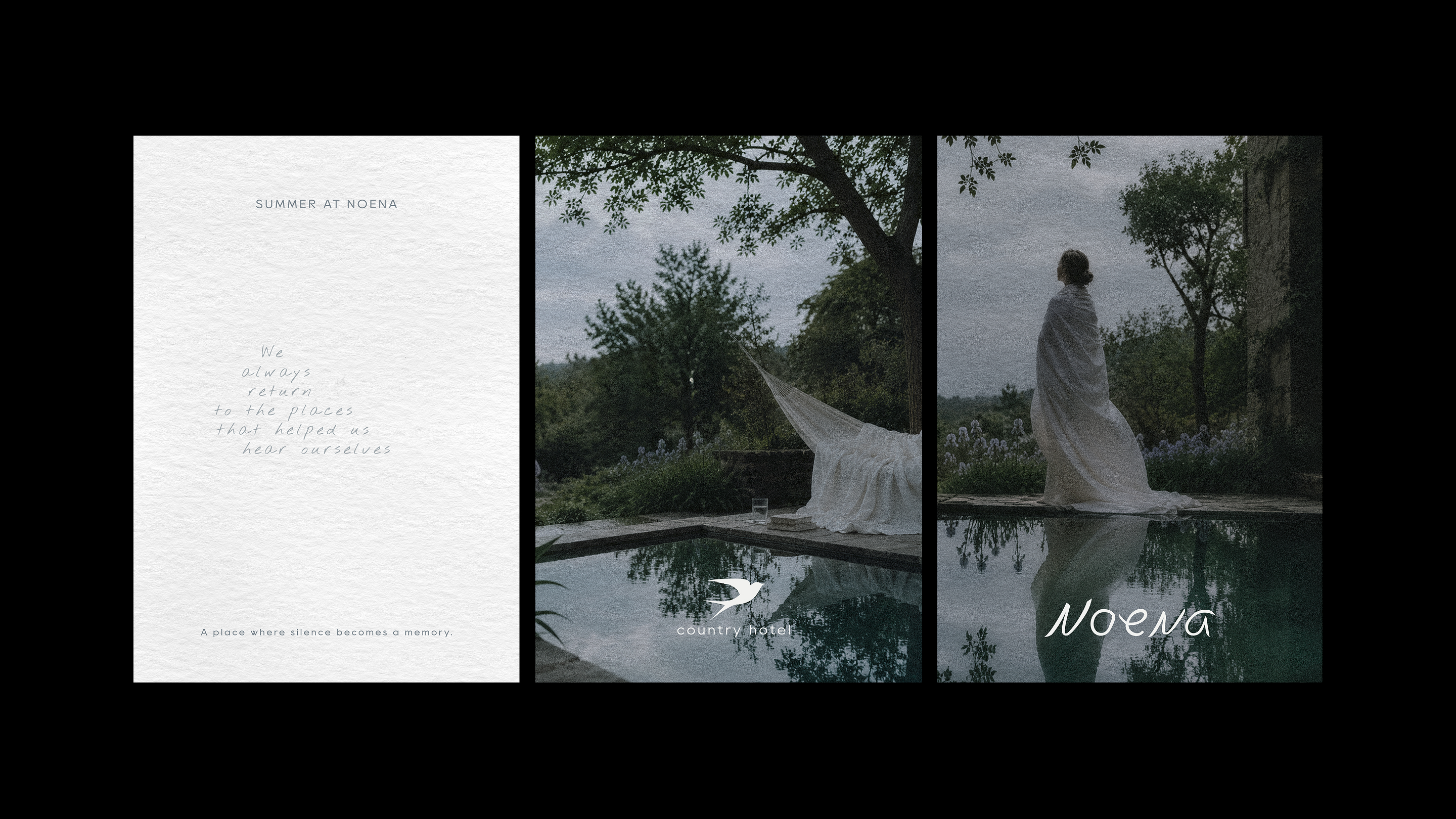
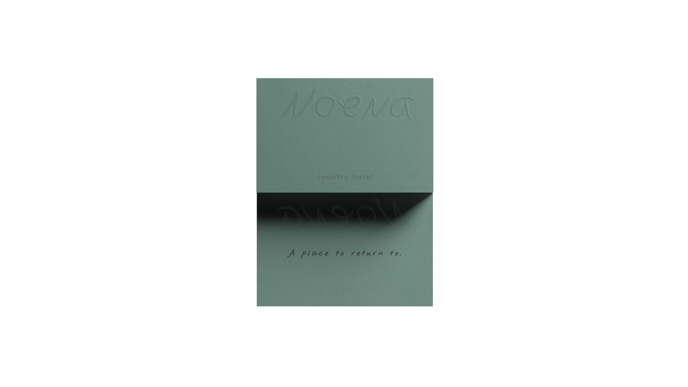
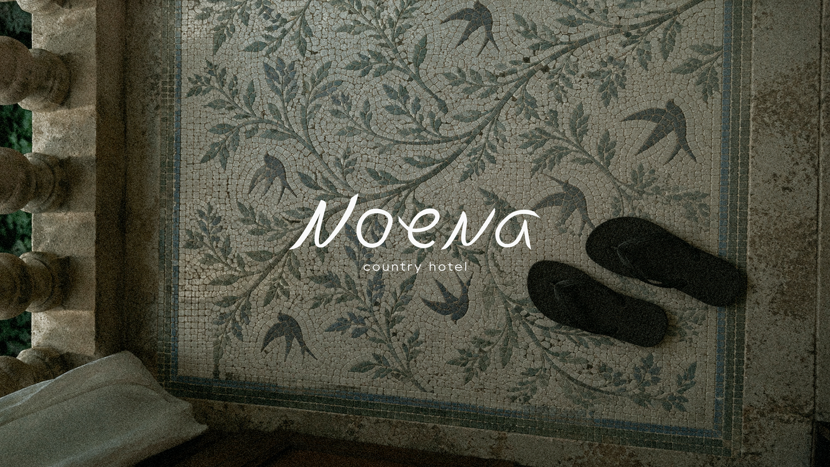
EN: The logo speaks quietly — through handwriting, human warmth and a sense of familiarity.
RU: Логотип говорит тихо: через рукописную форму, человеческое тепло и ощущение знакомого.
TYPOGRAPHY
EN
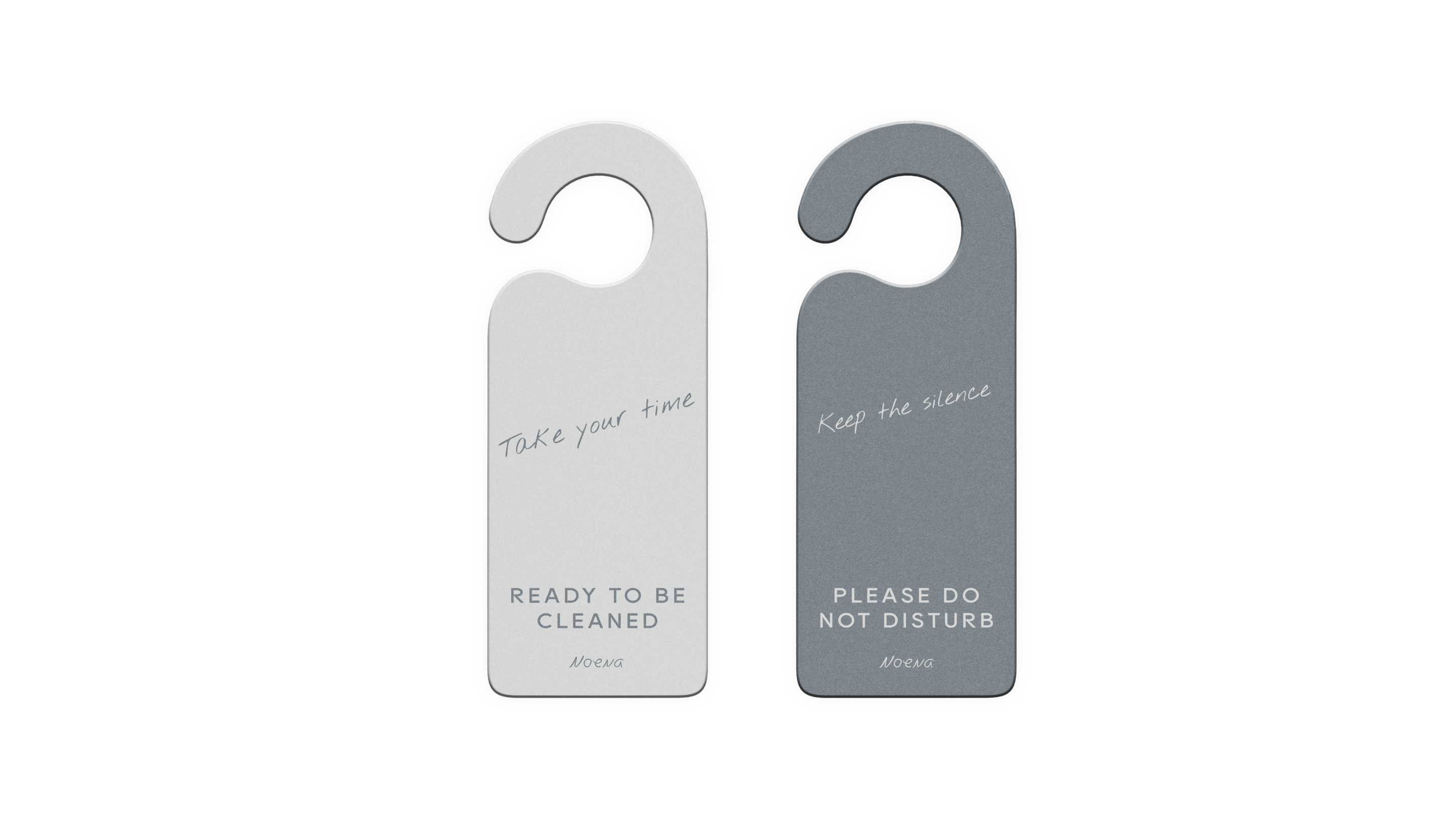
The typography balances the rational and the personal: a clean typeface carries information, while handwriting introduces emotion and human presence.
RU
Типографическая система строится на контрасте рационального и личного: чистый наборный шрифт отвечает за информацию, рукописный — за эмоцию и человеческое присутствие.
THE SWALLOW
EN
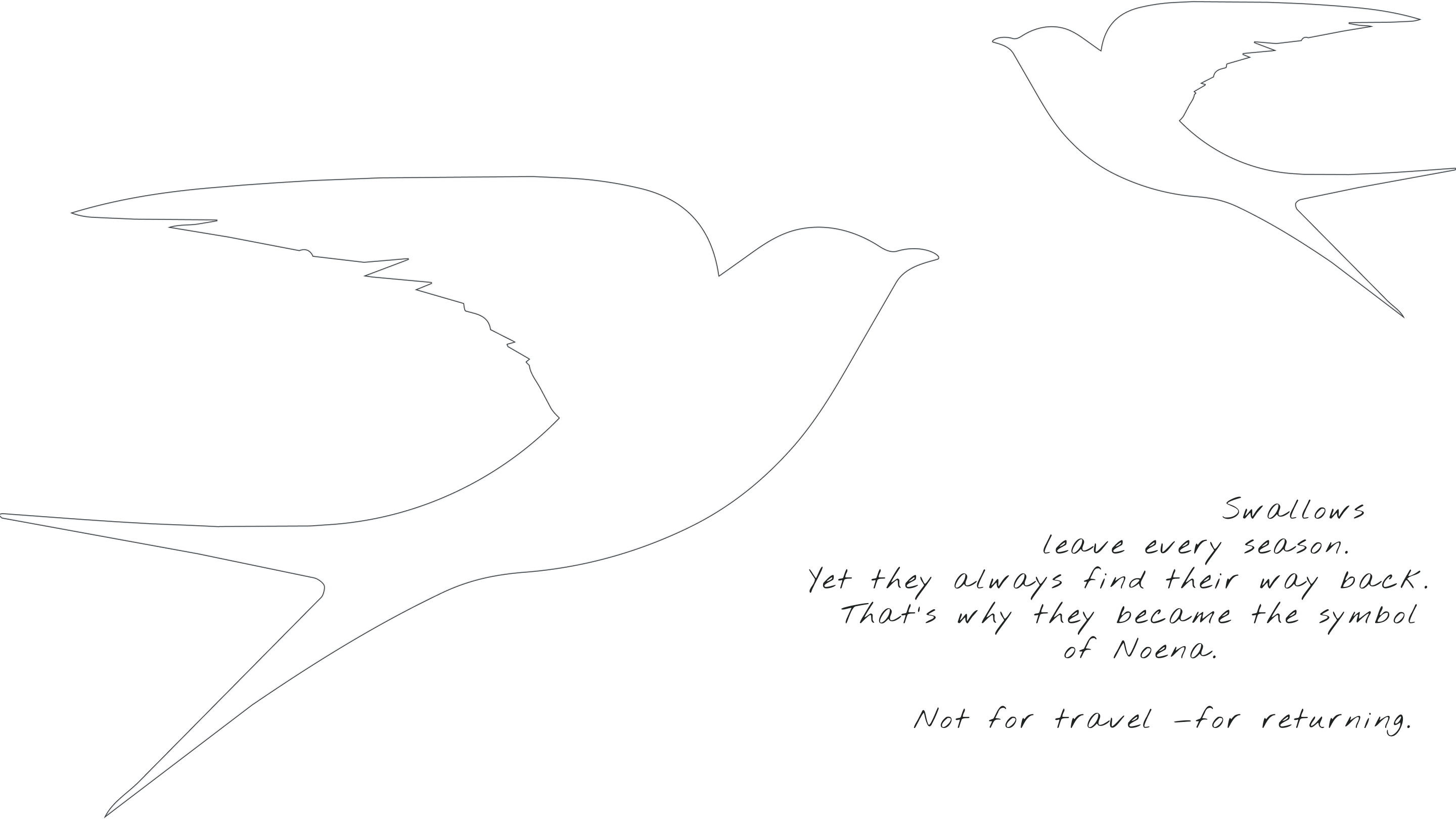
The swallow is a symbol of returning home. For Noena, it represents a place worth coming back to — as well as freedom, summer and life beyond the city.
RU
Ласточка — символ возвращения домой. В Noena она становится знаком места, куда хочется возвращаться, и одновременно воплощает свободу, лето и жизнь за городом.
COLORS
EN
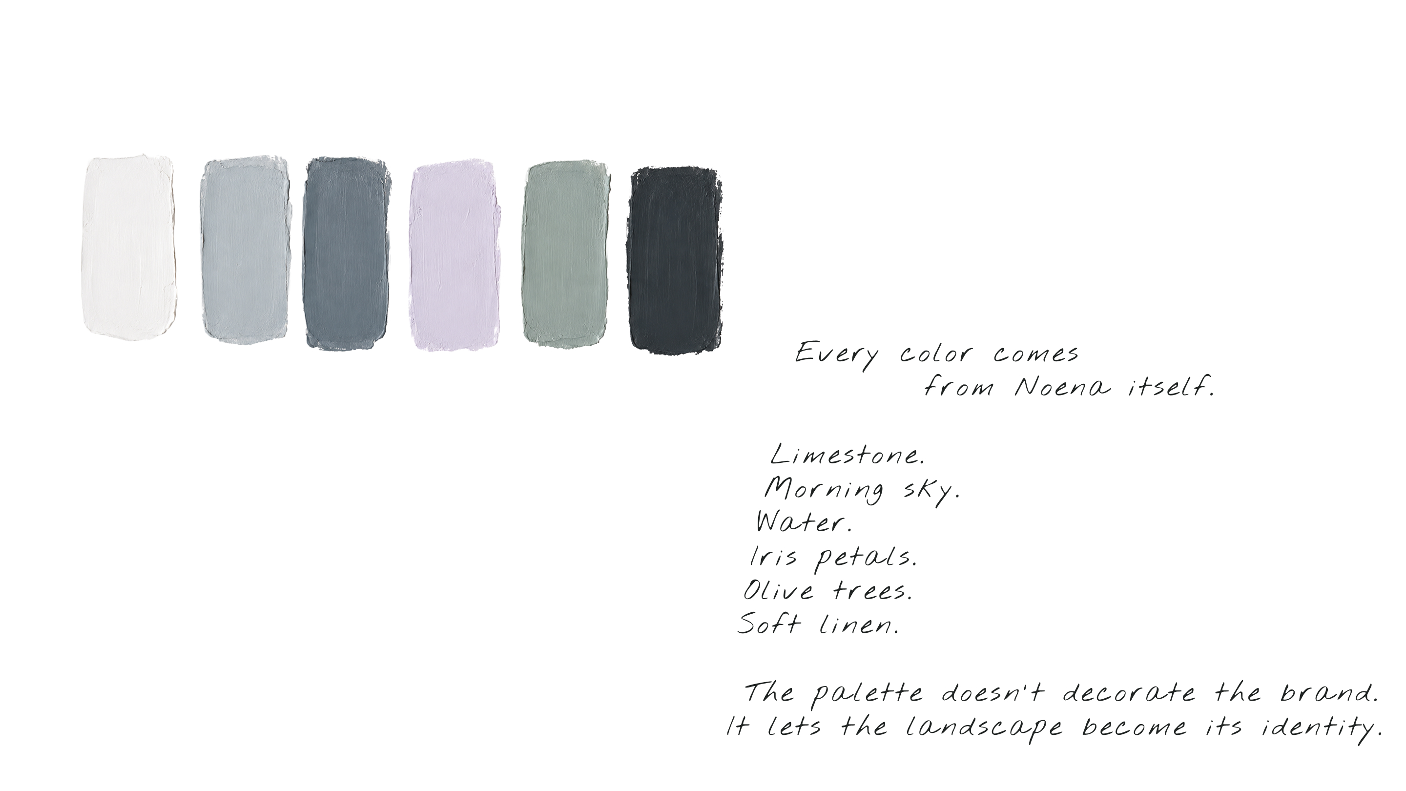
Every color comes from Noena itself.
Limestone.
Morning sky.
Water.
Iris petals.
Olive trees.
Soft linen.
The palette doesn't decorate the brand. It lets the landscape become its identity.
RU
Каждый оттенок найден внутри самой Noena.
Известняк.
Пасмурное небо.
Вода.
Лепестки ирисов.
Оливковые деревья.
Лён.
Палитра не украшает бренд. Она делает сам пейзаж его айдентикой.
PATTERN
EN
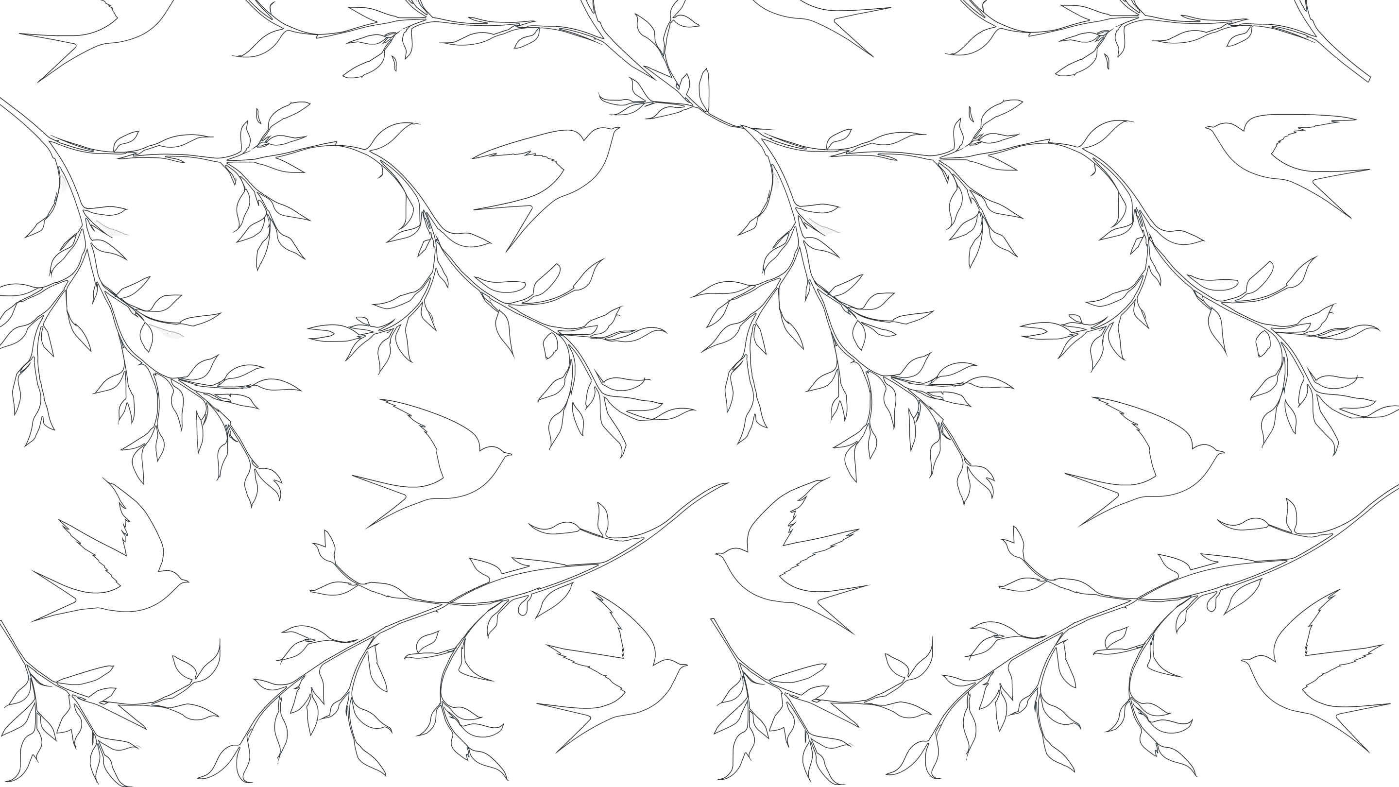
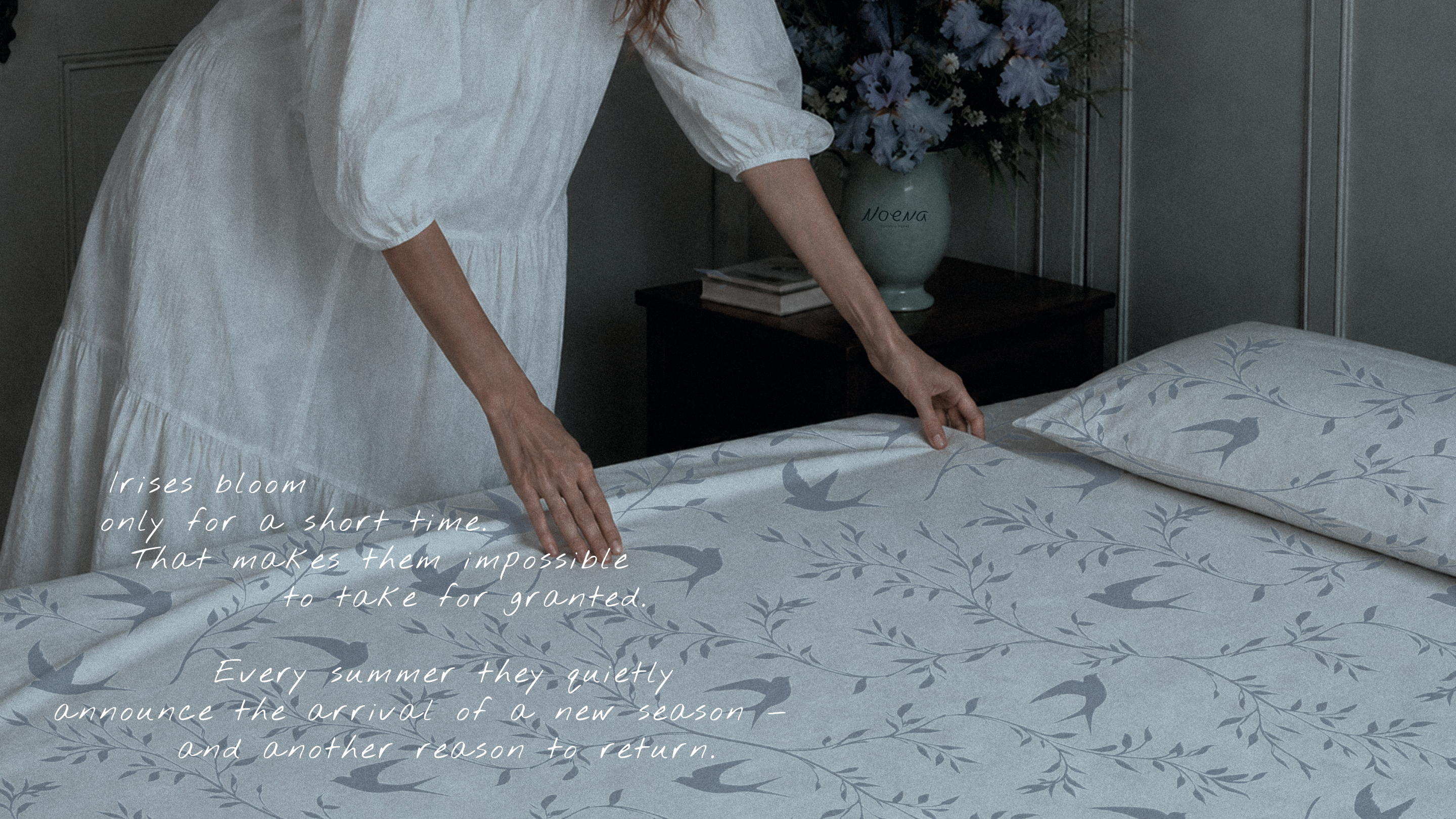
The pattern combines the two most important symbols of Noena.
Swallows.
Garden branches.
Together they grow naturally across textiles, stationery and interiors —
as if they had always belonged there.
RU
Паттерн объединяет два главных символа бренда.
Ласточек.
И ветви сада.
Они естественно переходят на текстиль, полиграфию и интерьер —
словно всегда были частью этого места.
THE IDENTITY BECOMES ARCHITECTURE
EN
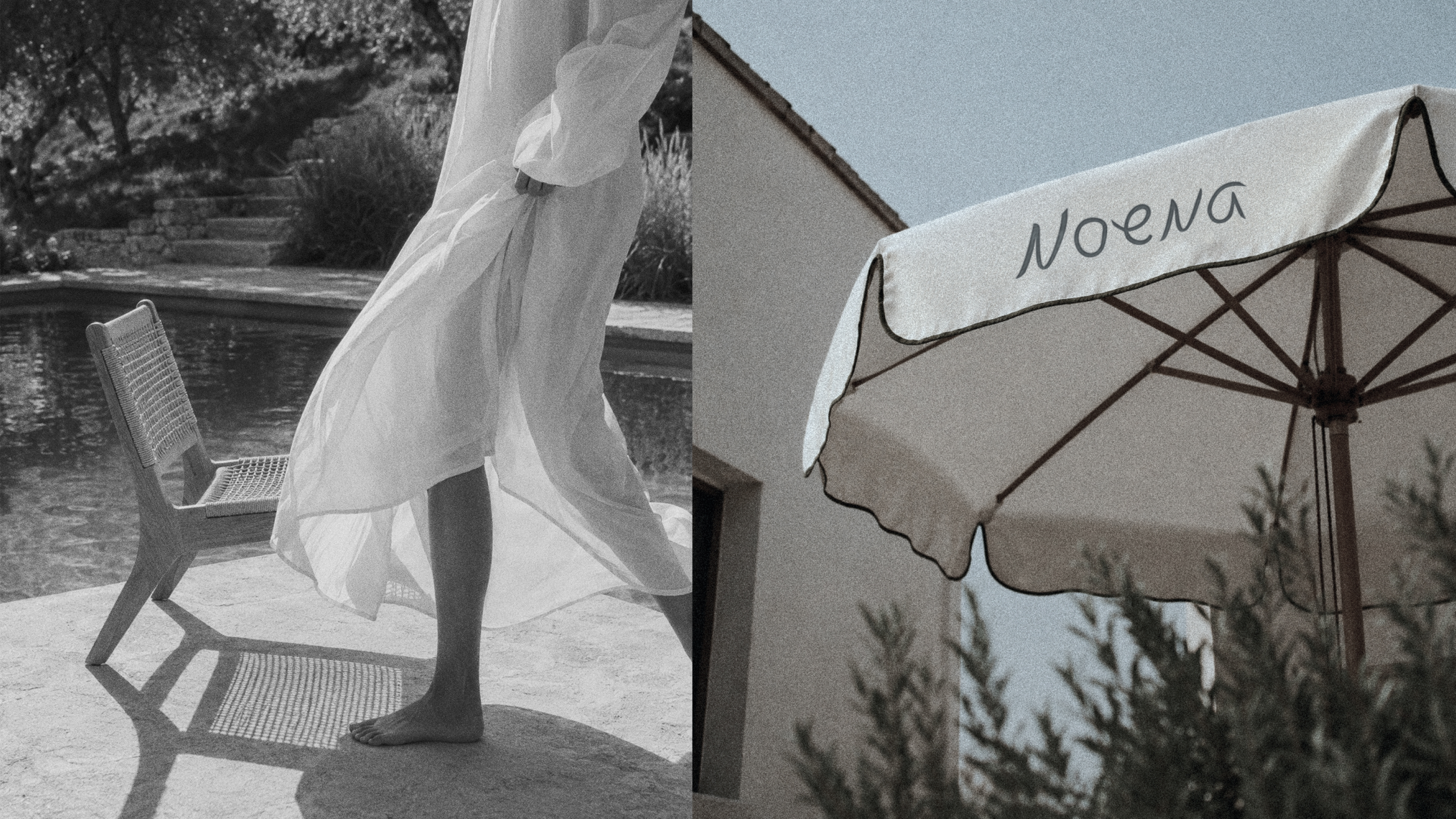
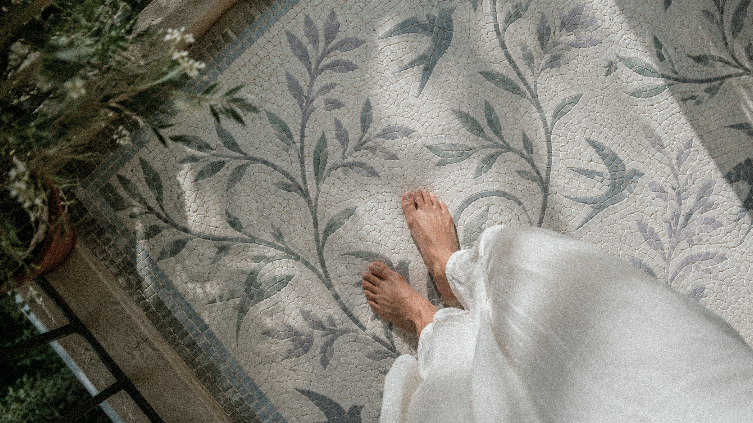
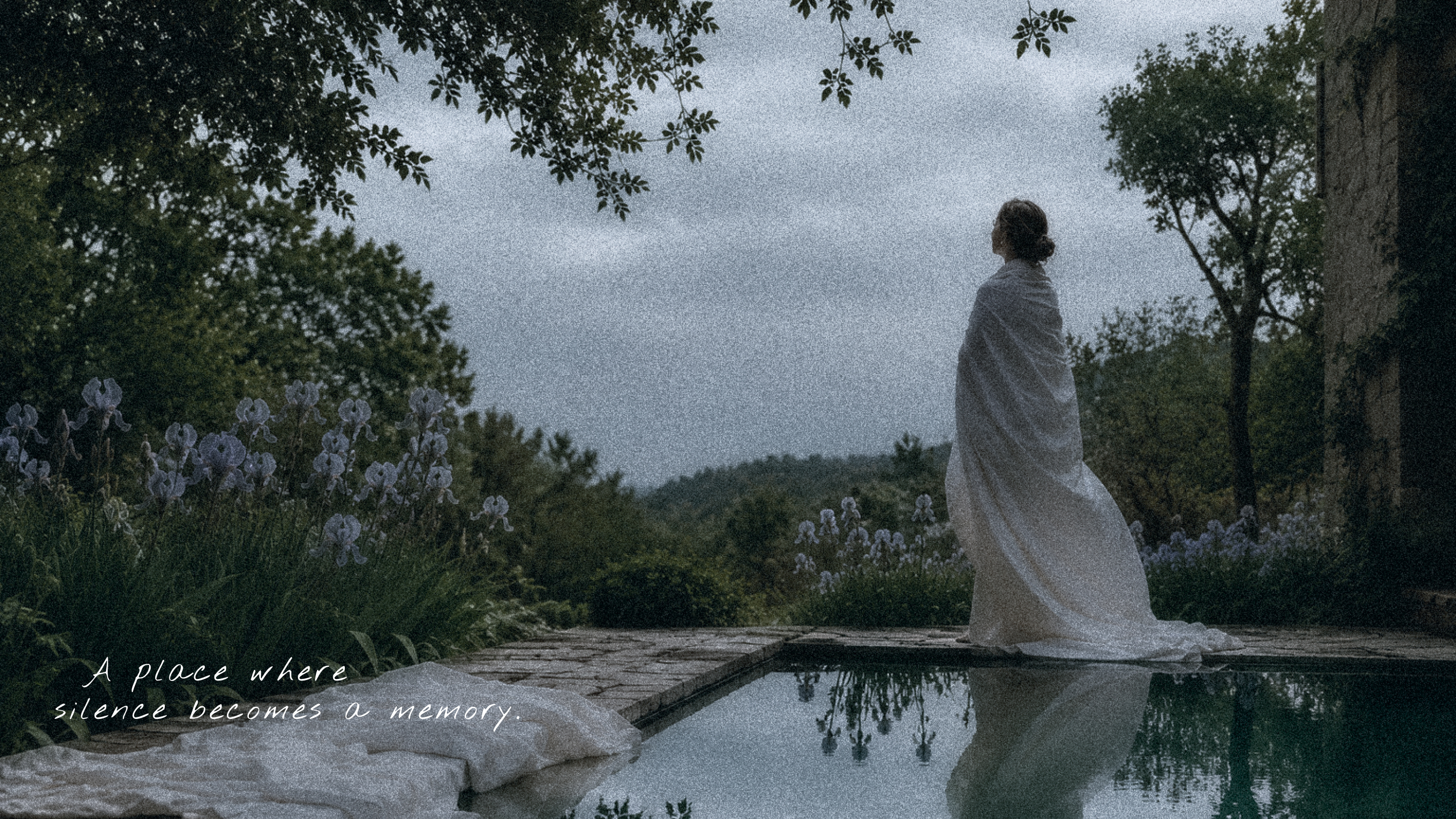
At Noena, branding becomes part of the space. Guests don’t just see the identity.
They literally step into it from the very first moment.
RU
Брендинг в Noena становится частью пространства. Гости не просто видят айдентику.
Они буквально входят в неё с первого шага.
THE IRIS
EN
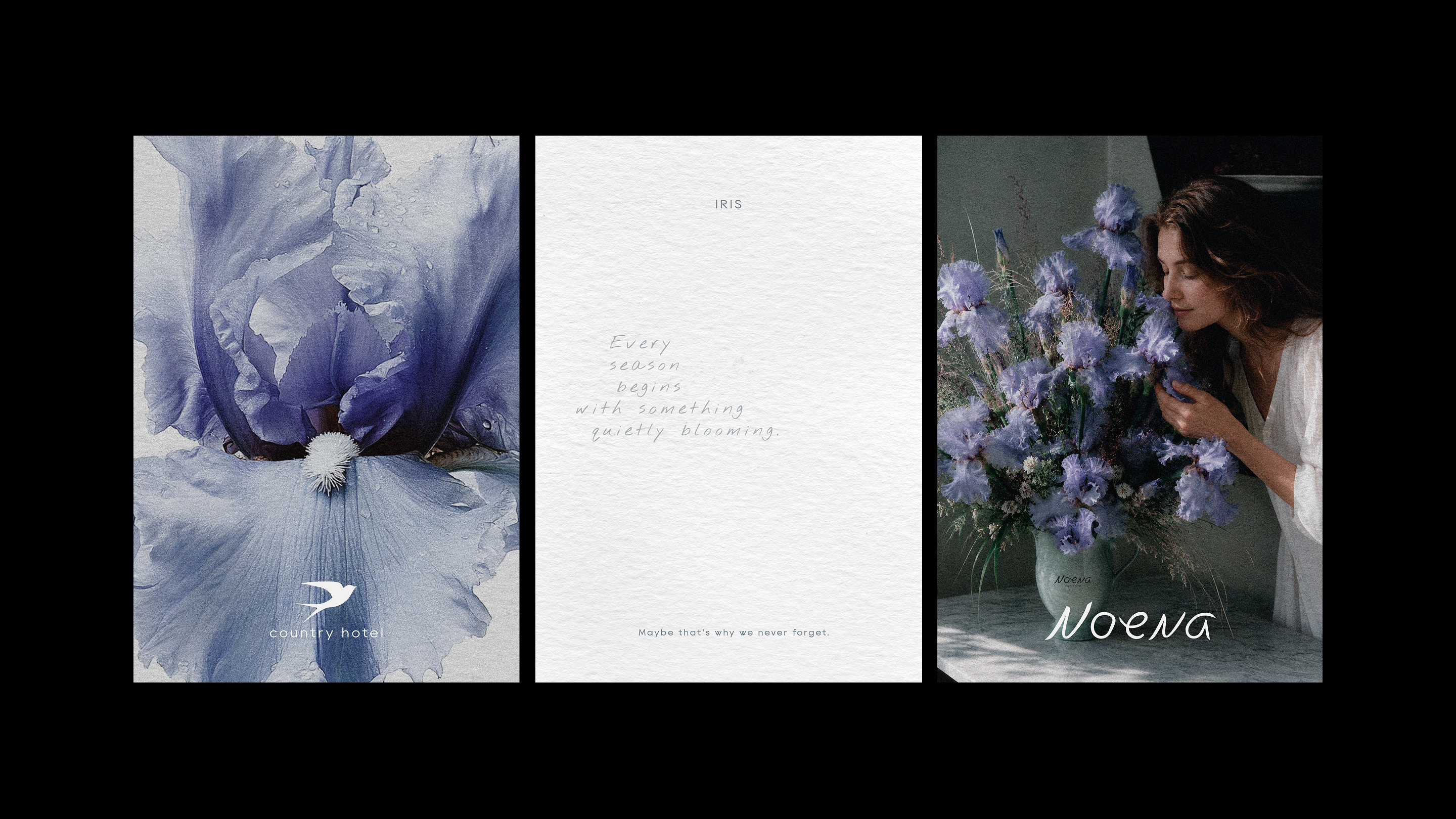
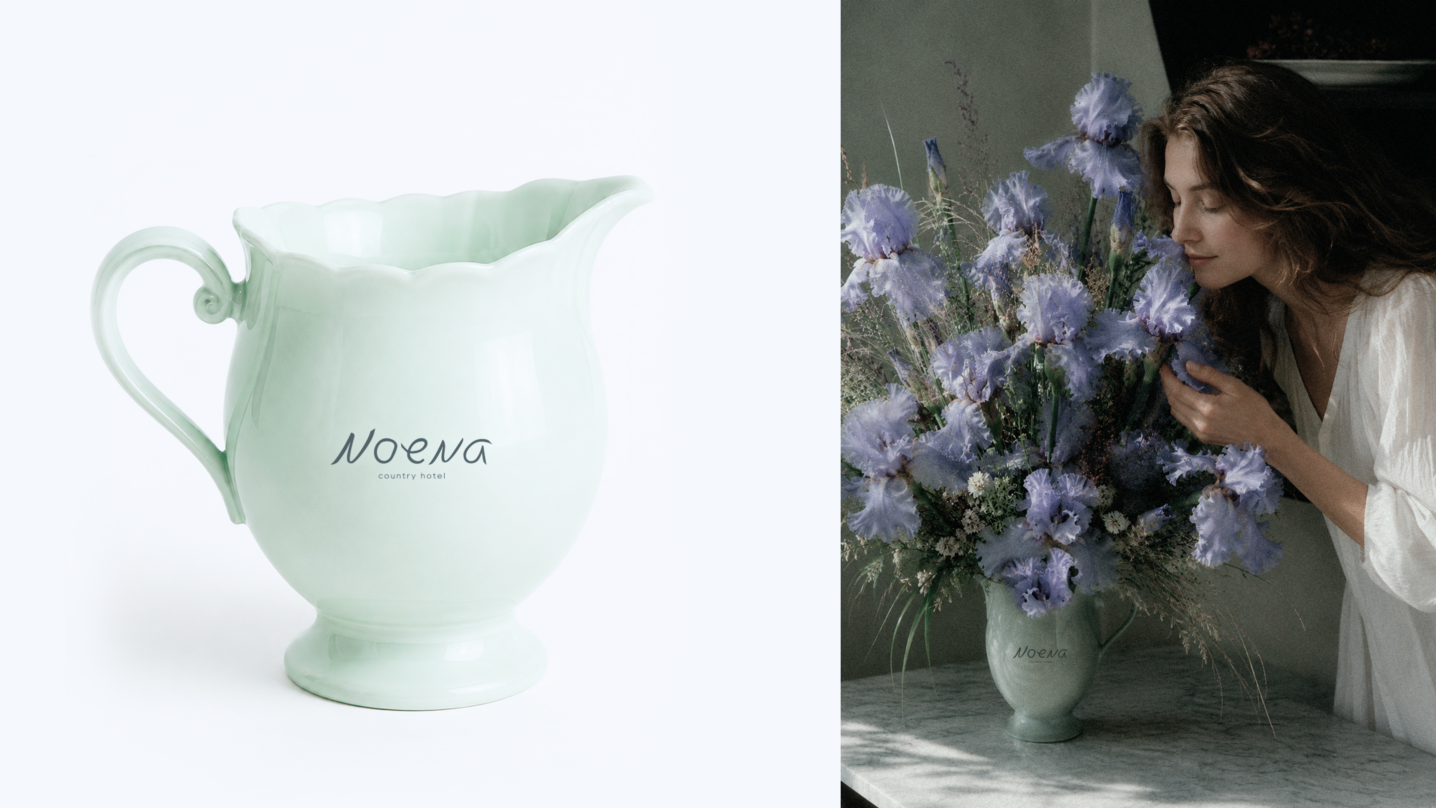
The iris becomes Noena’s living colour accent. It brings the brand palette into the physical space — through the garden, rooms, floral arrangements and photography.
RU
Ирис становится живым цветовым акцентом Noena. Он переносит фирменную палитру из графики в пространство: появляется в саду, номерах, букетах и фотографии бренда.
THANK YOU
Projects & collaborations
Telegram: @IngaAchilova
Instagram: @inga.achilova