
The PARÉA Brand Identity Concept
The brand identity of PARÉA restaurant is built around the idea of modern Greece—not a tourist postcard featuring ancient columns, but a vibrant Mediterranean culture where tradition meets contemporary design. The main goal of the brand identity is to convey the feeling of the sunny Aegean coast, hospitality, leisurely family dinners, and the aesthetic of a premium Mediterranean restaurant.
The name PARÉA comes from the Greek word παρέα, which means a friendly group of people united by warm camaraderie, shared dinners, and pleasant times together. It is precisely this idea that forms the conceptual foundation of the brand’s entire visual system.
The Logo Concept
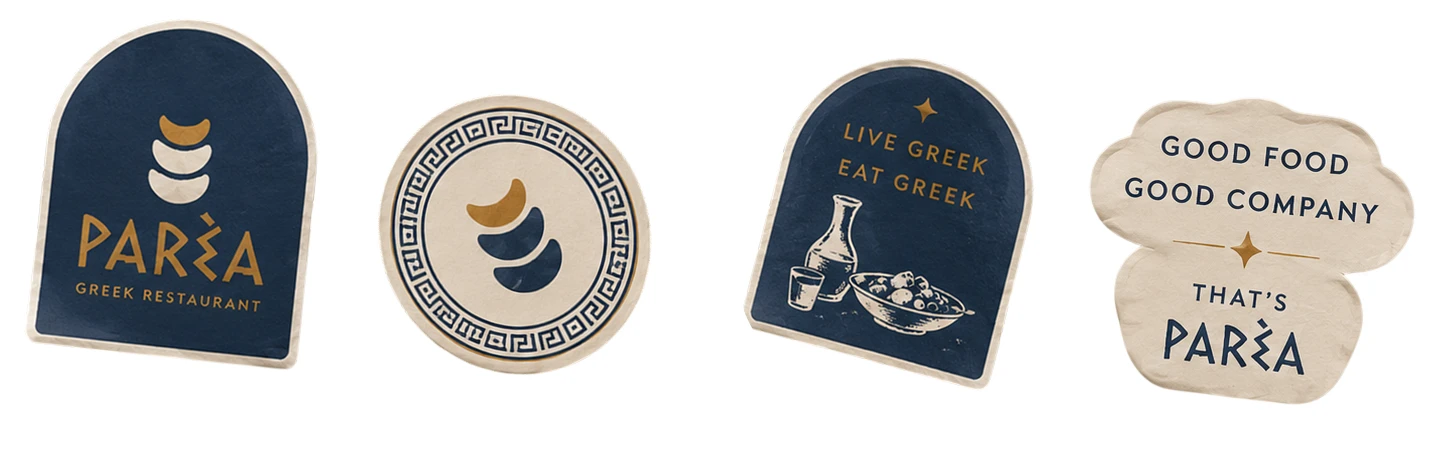
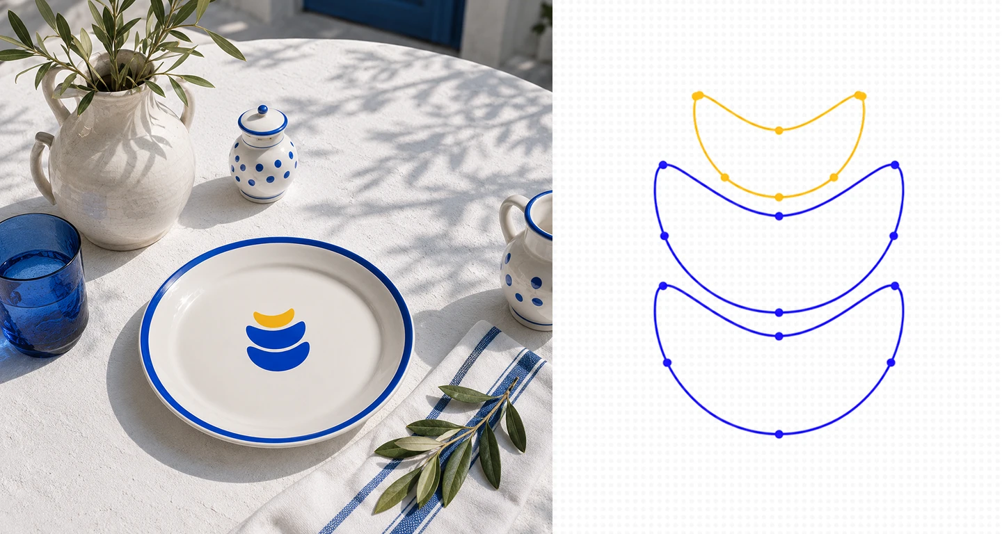
At the heart of the logo lies an abstract symbol composed of three flowing elements.
The logo does not rely on direct, illustrative imagery. Instead, it works through associations, giving it a contemporary feel while remaining easily recognizable.
Each element symbolizes several images at once:
the waves of the Aegean Sea;
Mediterranean hills;
olive leaves;
traditional Greek pottery;
plates stacked on top of one another;
a shared table that brings people together.
The upper gold element echoes the shape of the other details and serves as the composition’s main focal point. It symbolizes the Mediterranean sun, golden olive oil, and the atmosphere of a warm Greek sunset.
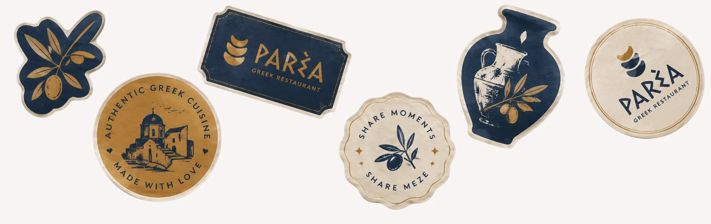
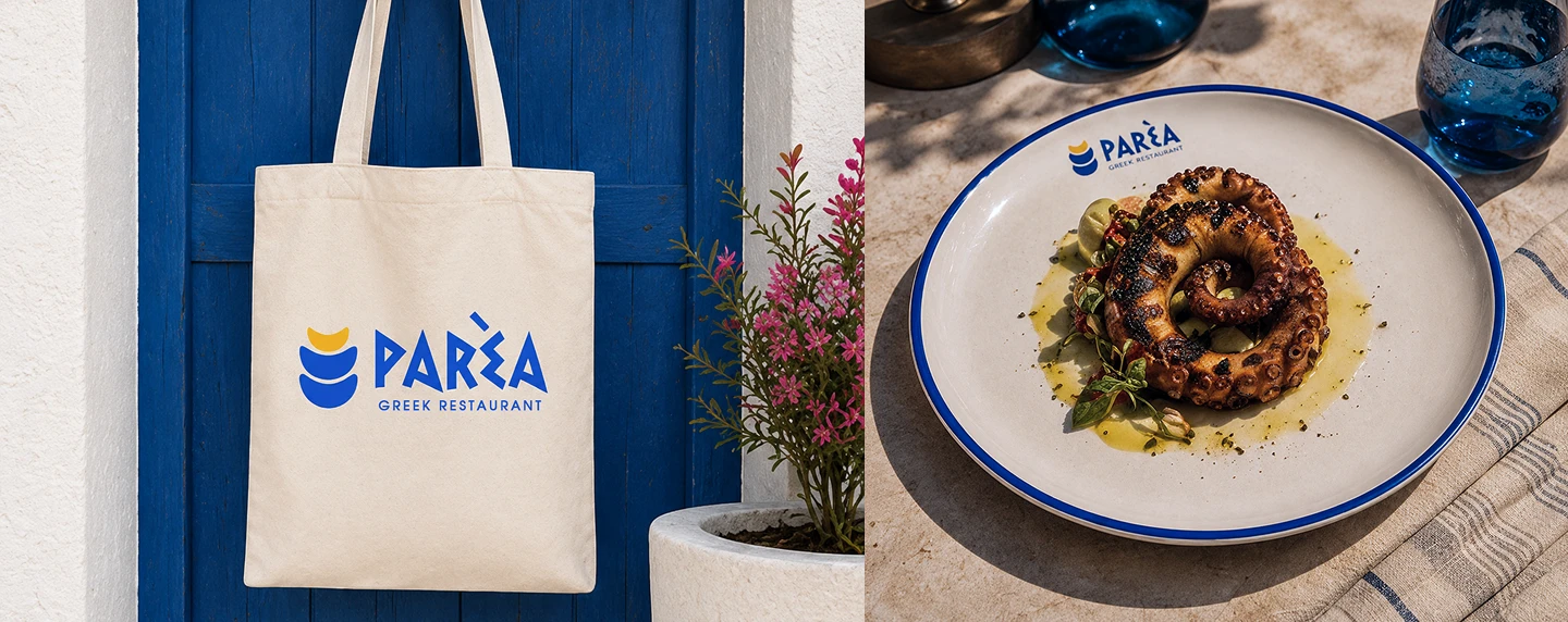
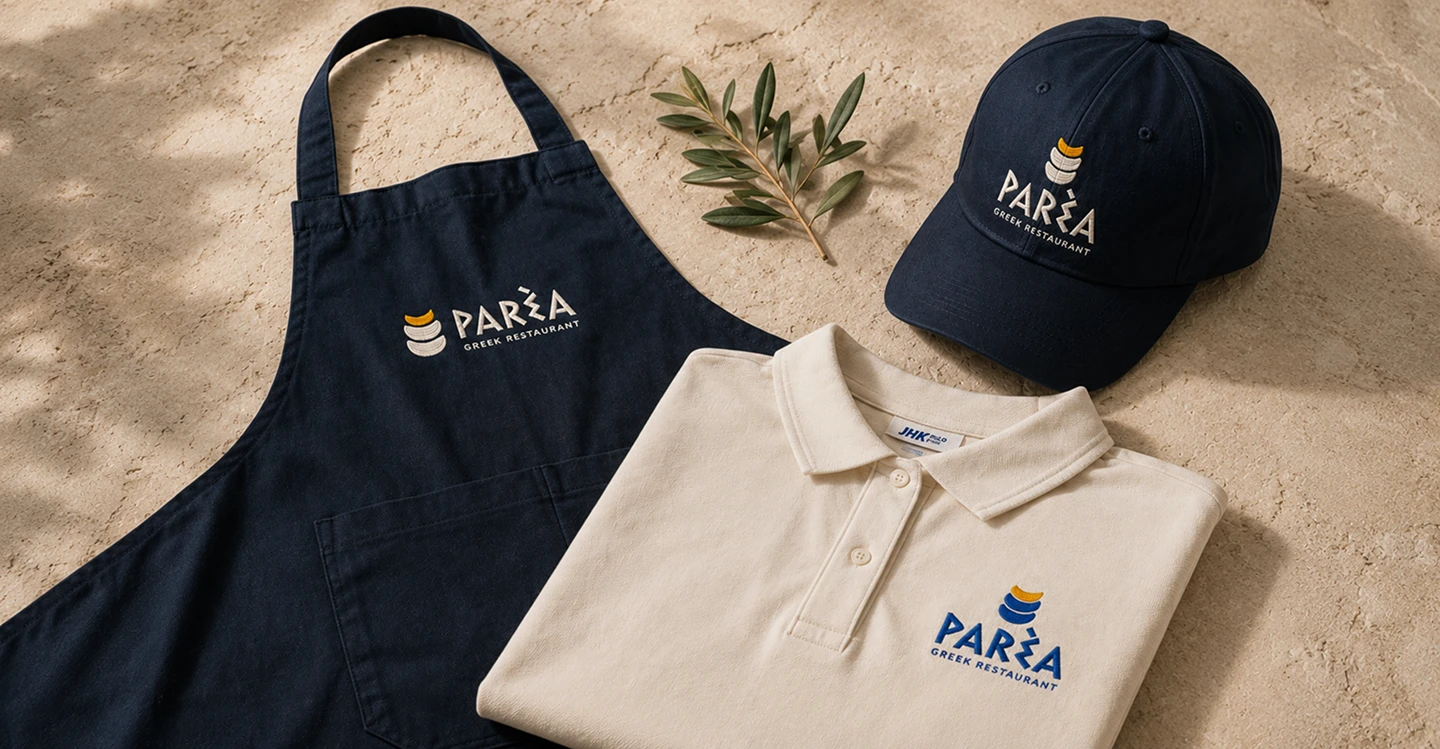
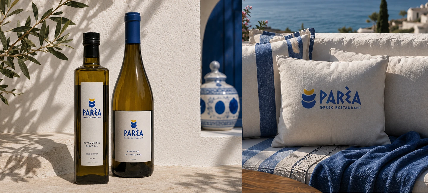
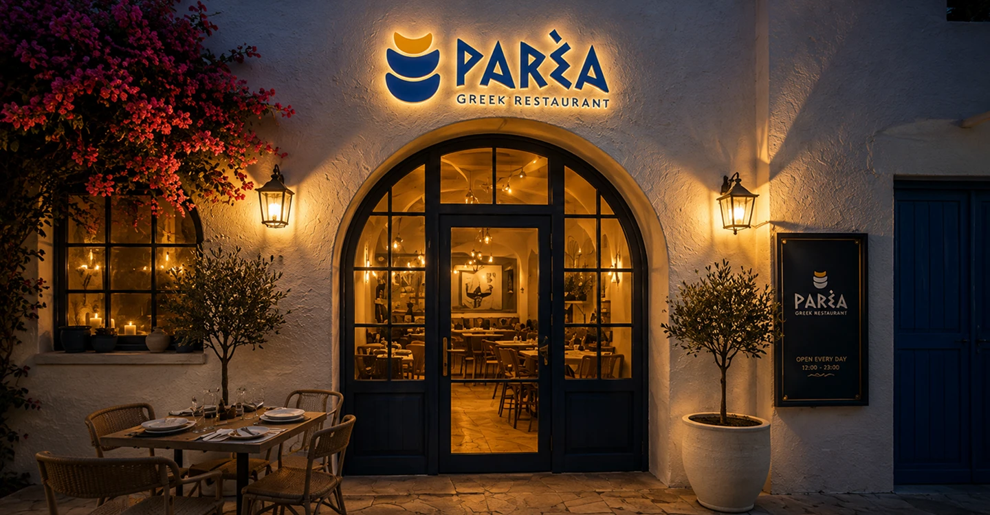
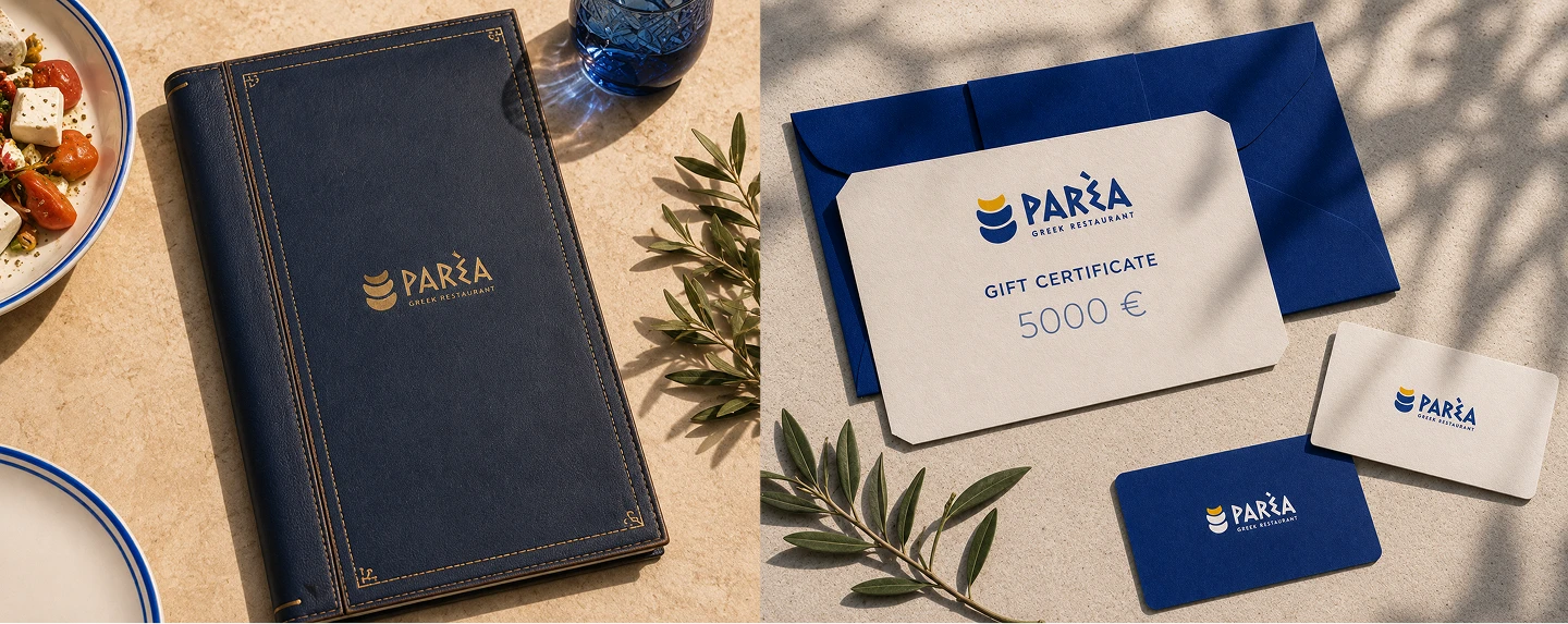
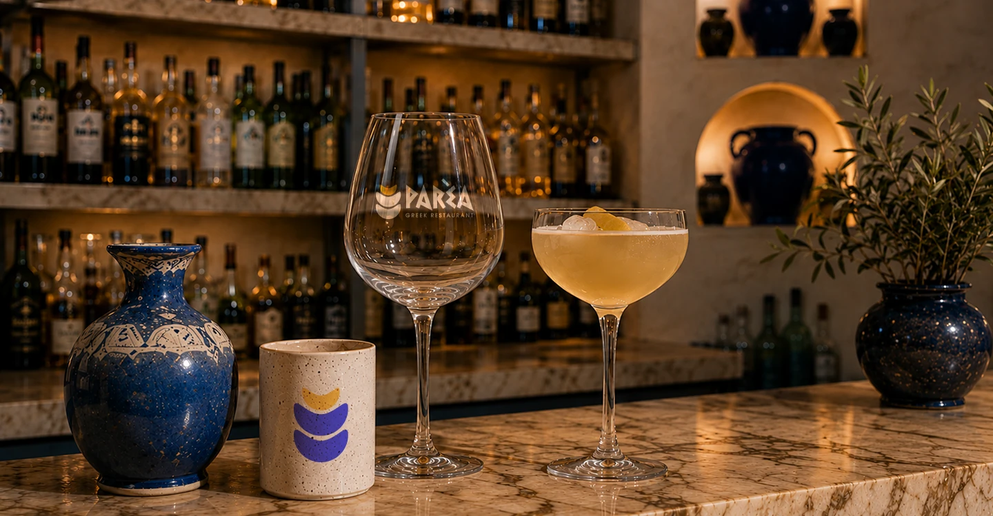
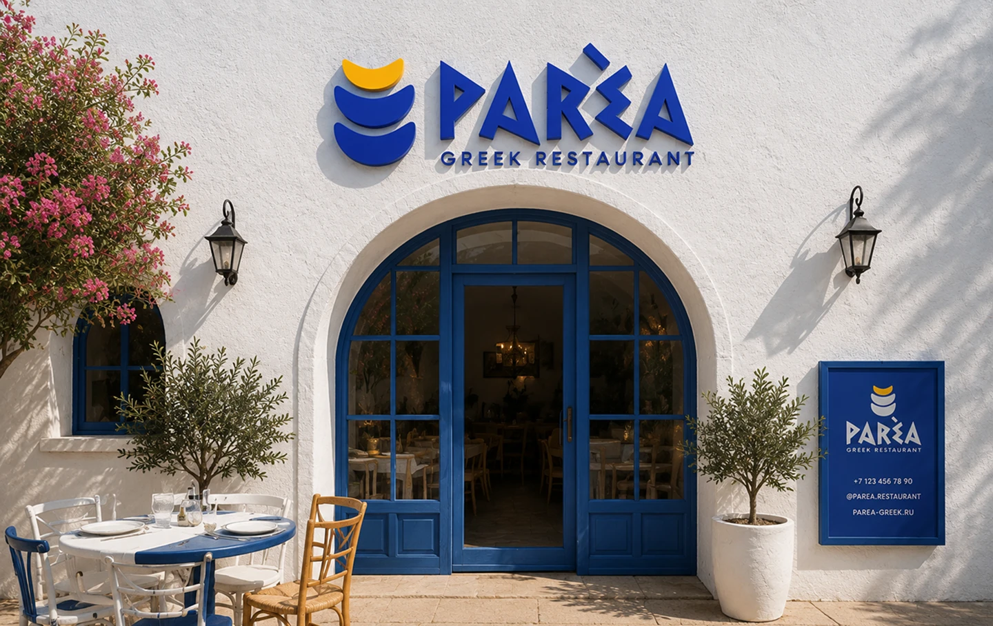
Thanks to its simple geometry, the logo works equally well on large signs as well as on smaller items such as tableware and textiles, packaging and digital interfaces.