Branding • Editorial • Exhibition • 2026
SMENA is a conceptual branding project for an exhibition dedicated to Soviet industrial design from the 1950s to the 1970s.
The goal was to create a contemporary visual identity that reflects the spirit of engineering, functionality, and cultural heritage while remaining relevant and engaging for today's audience.
Challenge
Design a flexible identity system for an exhibition that celebrates Soviet industrial design through a contemporary visual language.
The branding needed to work consistently across printed materials, exhibition graphics, wayfinding, merchandise, and digital media while preserving the character of the historical period.
Research
The project began with extensive research into Soviet industrial design, technical aesthetics, and modernist visual culture.
Special attention was given to the work of VNIITE, Soviet product design, geometric composition, archival publications, and the relationship between engineering principles and visual communication.
These references became the foundation of the project's visual language.
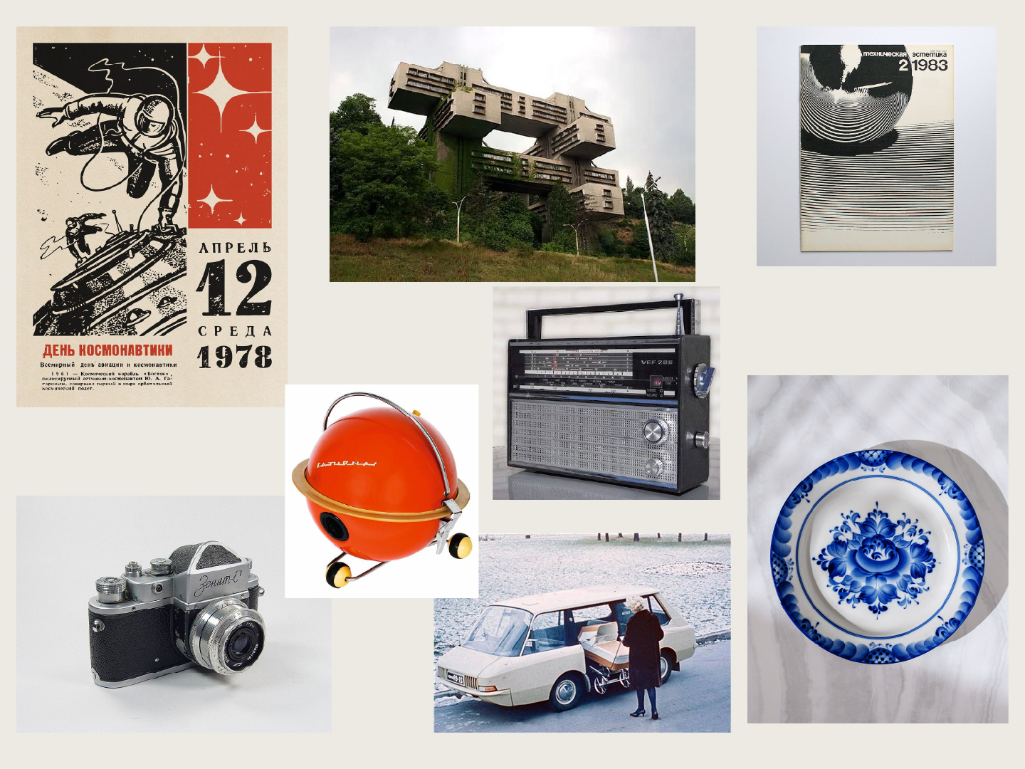
Moodboard of project
топ
Logo
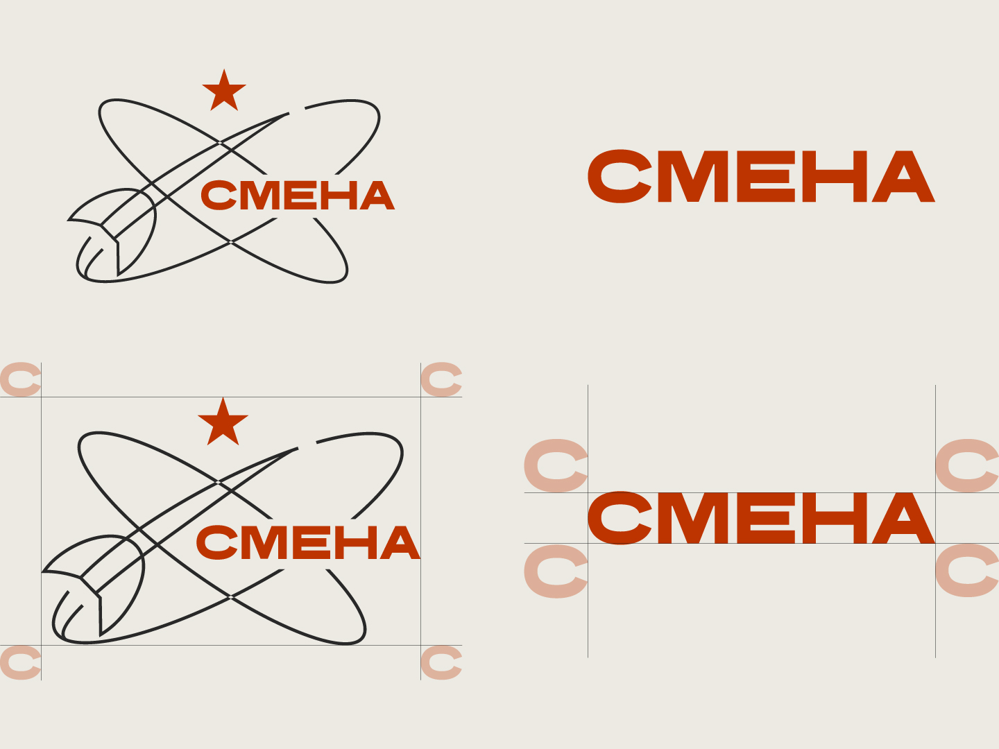
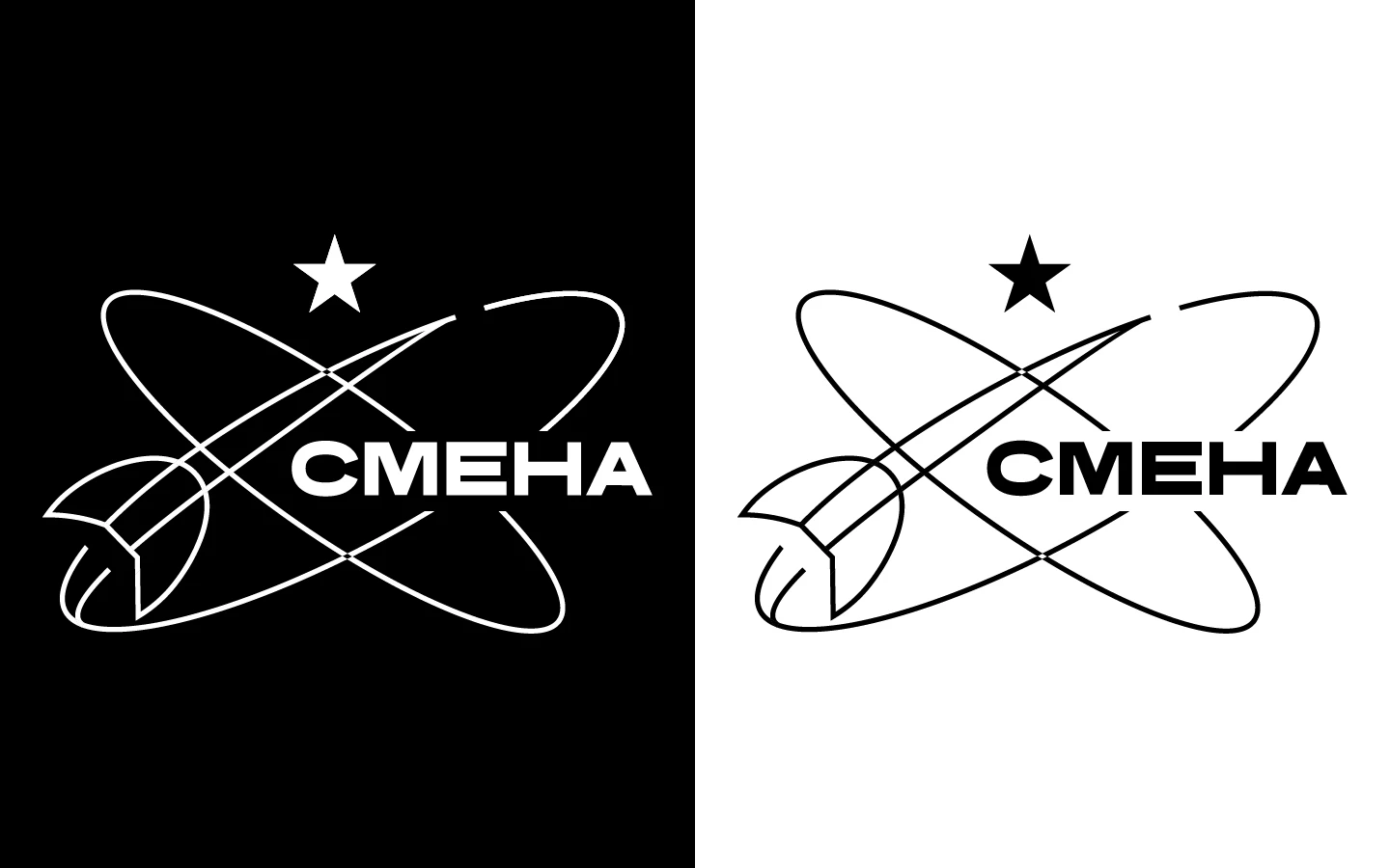
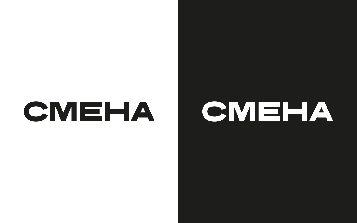
The name SMENA ("Change") reflects the transition between generations, technologies, and design philosophies.
It also references the iconic Soviet camera, reinforcing the project's connection to industrial design and visual culture
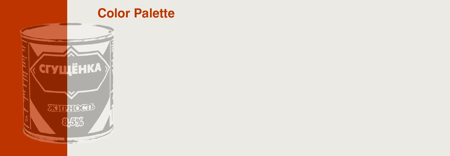
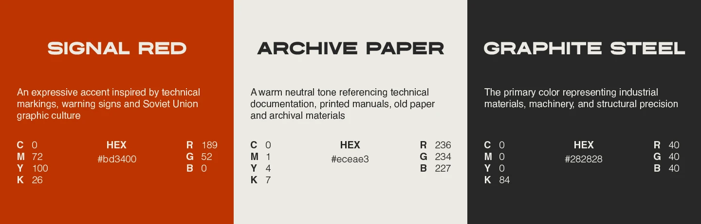
Typography
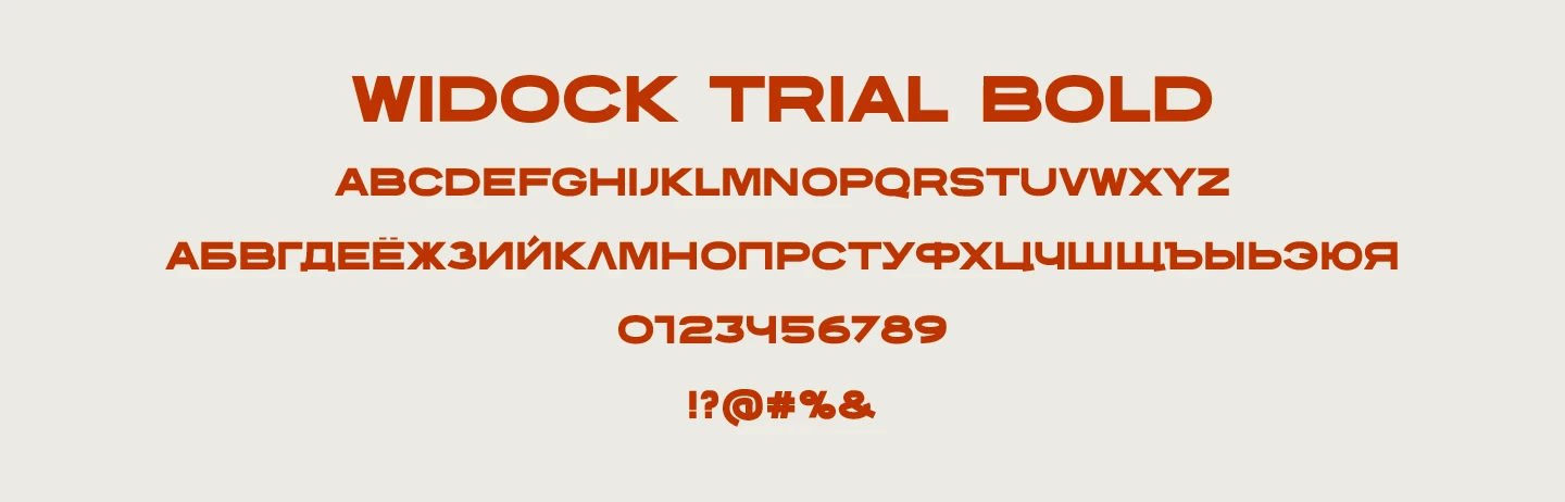
Typography became one of the main tools for expressing the identity.
The combination of bold headlines and clean supporting text creates a clear hierarchy while reflecting the precision and confidence of Soviet industrial design.
Brand Applications
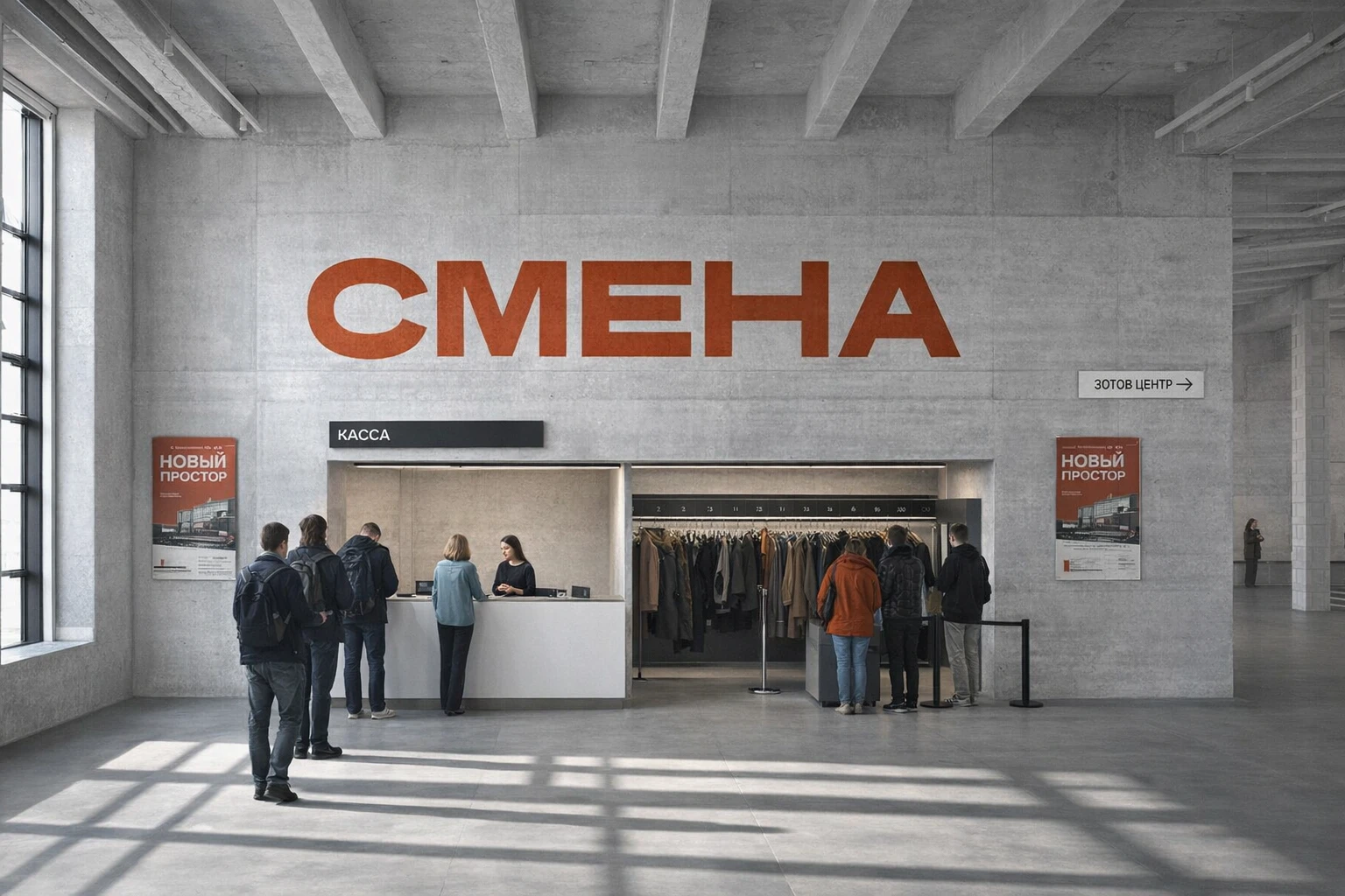
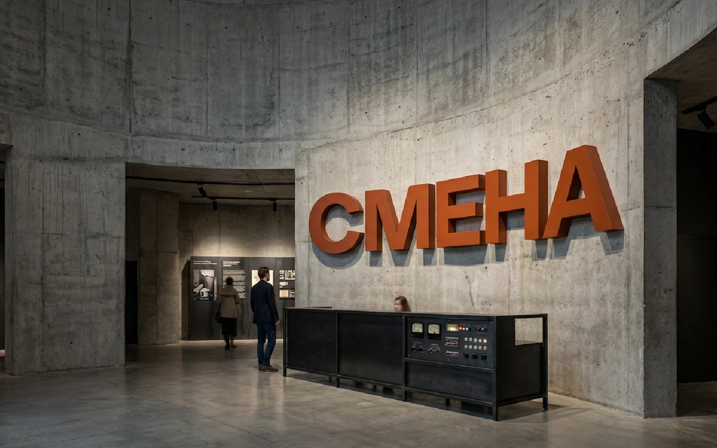
The identity system seamlessly adapts across print, signage, editorial materials, and digital communication while maintaining a cohesive visual language
Poster
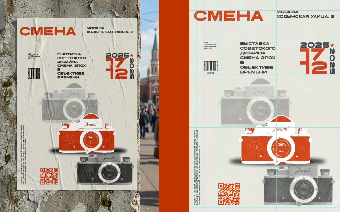
The poster was designed as the main visual element of the festival identity.
Its composition is built around a modular grid based on the Fibonacci sequence, creating a balanced visual hierarchy and natural proportions. This approach helped organize complex information while maintaining a dynamic and expressive layout.
The central illustration combines abstract geometric forms with vibrant gradients, symbolizing creativity, movement, experimentation, and the constant exchange of ideas that define the festival.
Bold typography contrasts with the organic illustration, reinforcing the dialogue between structure and artistic freedom
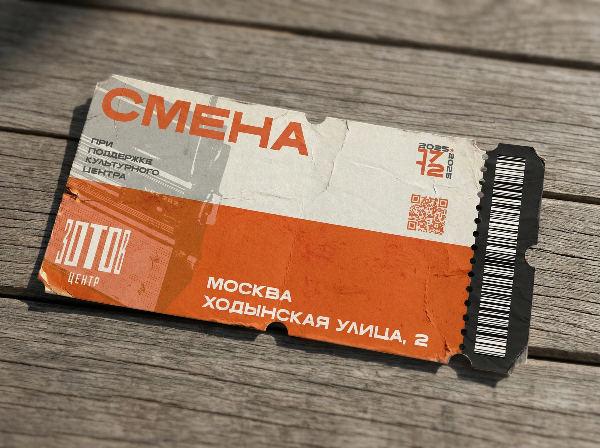
Ticket
The ticket was designed as a seamless extension of the festival identity, combining functionality with a bold visual presence.
Its composition follows the established visual system through strong typography, geometric structure, textured backgrounds, and the signature orange accent. Every element reinforces the festival's recognizable identity while keeping the information clear and easy to navigate.
The layout includes all essential event details — the date, venue, QR code, and barcode — arranged with a clear visual hierarchy that allows visitors to quickly access important information.
More than just an admission pass, the ticket was designed to become a memorable physical artifact of the event
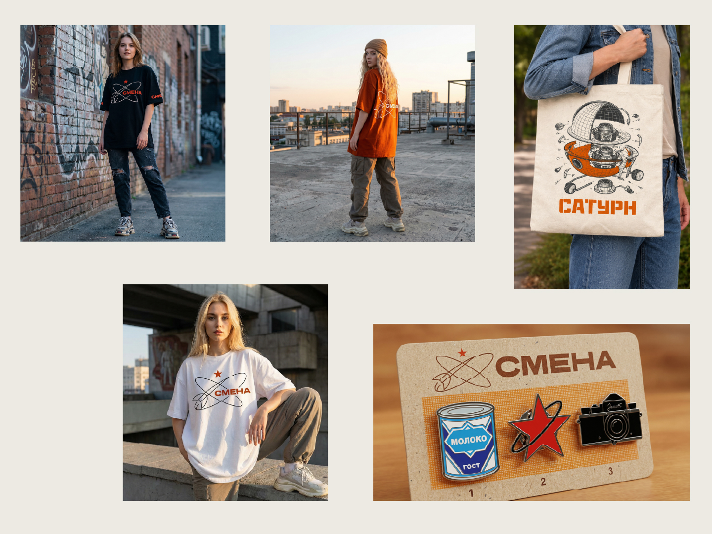
T-shirt / Shopper / Metal pins
Three formats — one visual language: clothing and accessories turn the identity into part of the everyday environment and give the brand a physical presence beyond the project