BILTEK
CONSTRUCTION COMPANY OF READY‑MADE MODULAR COTTAGES |
СТРОИТЕЛЬНАЯ КОМПАНИЯ ГОТОВЫХ ЗАГОРОДНЫХ МОДУЛЬНЫХ ДОМОВ
RU
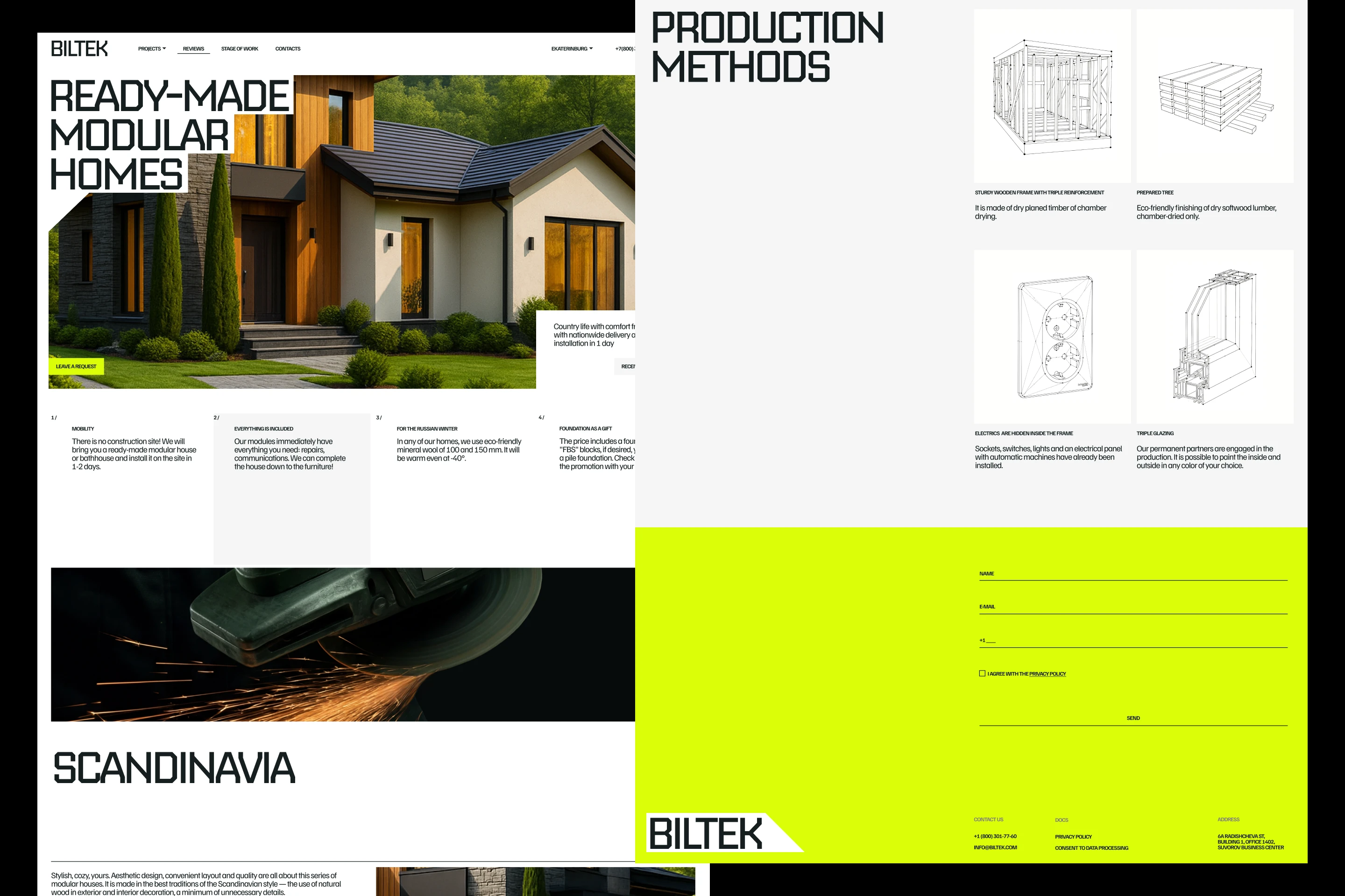
BILTEK — строительная компания готовых загородных модульных домов. Сначала будущий дом проектируют на производстве. Затем собирают его отдельные модули. После этого модули доставляют на участок заказчика и устанавливают.Так человек получает готовое пространство, которое может наполнить собственной жизнью.
Название BILTEK соединяет две смысловые части: BIL / BUILD — строить и TEK / TECH — технология. Метафора айдентики тоже состоит из двух частей. Первая часть. Бригада строит модульный объект. В айдентике на формате собирается композиция из модулей типографики.
Вторая часть. Между модулями возникает контрформа. Она не изображает сам дом и не повторяет его силуэт. Это графическое пространство, которое образуется благодаря расположению типографики. Поэтому меняется объект — меняется композиция, а вместе с ней и контрформа. В анимации контрформа выходит из плоскости, получает глубину и наполняется лаймовым светом. Так построенный объект становится пространством, готовым к жизни. Бригада создаёт и подготавливает его, но настоящим домом это пространство сделает будущий владелец, когда наполнит своими привычками, событиями и отношениями.
Эта идея продолжается и на физических носителях. Карточки вкладываются одна в другую. Отдельные части открываются и соединяются. Вырезы становятся карманами, а ремни, карабины и брелоки связывают элементы между собой. Вся айдентика работает как модульная конструкция. Цвета бренда соединяют производство и будущую жизнь в доме: яркий лаймовый — это сигнальная маркировка строительной бригады. Тёмно-зелёный связан с природным окружением, в котором устанавливают загородные дома. Шрифты: Nippo используется в заголовках: геометрия его букв напоминает строительные конструкции и рифмуется со срезами графических модулей. Familjen Grotesk — читабельный шрифт для основного набора.
Компания создаёт готовое пространство, а люди наполняют его своими привычками, событиями и отношениями.
From Factory to Family. От производства — к семье.
EN
BILTEK is a company that creates ready‑made modular houses. First, the future house is designed in the production facility. Then it is assembled from individual modules and equipped with everything necessary. After that, the house is delivered to the customer’s site and installed. This way, a person gets a ready‑made space that they can fill with their own life.
The name BILTEK combines two semantic parts: BIL / BUILD — to build and TEK / TECH — technology. The identity metaphor also consists of two parts. Part One. The team is building a modular object. In the identity, a composition is assembled from typography modules on the format. Part Two. A counterform emerges between the modules. It does not depict the house itself and does not replicate its silhouette. It is a graphic space that is formed thanks to the arrangement of the typography. Therefore, if the object changes, the composition changes, and so does the counterform. In the animation, the counterform emerges from the plane, gains depth, and is filled with lime light. Thus constructed, the object becomes a space ready for life. The team creates and prepares it, but the future owner will make this space a real home when they fill it with their habits, events, and relationships.
This idea also extends to physical media. The cards fit one inside another. Individual parts open and connect. The cutouts become pockets, and straps, carabiners, and keychains connect the elements to each other. The entire identity works as a modular structure. The brand’s colours connect production and future life in the home: bright lime is a signal marking for the construction crew. Dark green is associated with the natural environment in which country houses are built. Fonts: Nippo is used in headings: the geometry of its letters resembles building structures and rhymes with the cuts of graphic modules. Familjen Grotesk is a readable font for the main text set.
The company creates a ready‑made space, and people fill it with their habits, events, and relationships. From Factory to Family. From production to family.
АВТОРЫ ПРОЕКТА
ИДЕЯ И ДИЗАЙН: АННА ТИХОМИРОВА
АРТ-ДИРЕКШН & АНИМАЦИЯ: ТАТЬЯНА КИРИЧЕНКО / KRECHET_STUDIO