Problem.
The skincare market is flooded with sterile minimalism. White bottles, thin typefaces, identical promises. Brands blend into one faceless mass where shampoo looks like cream, and premium looks like generic.
Solution.
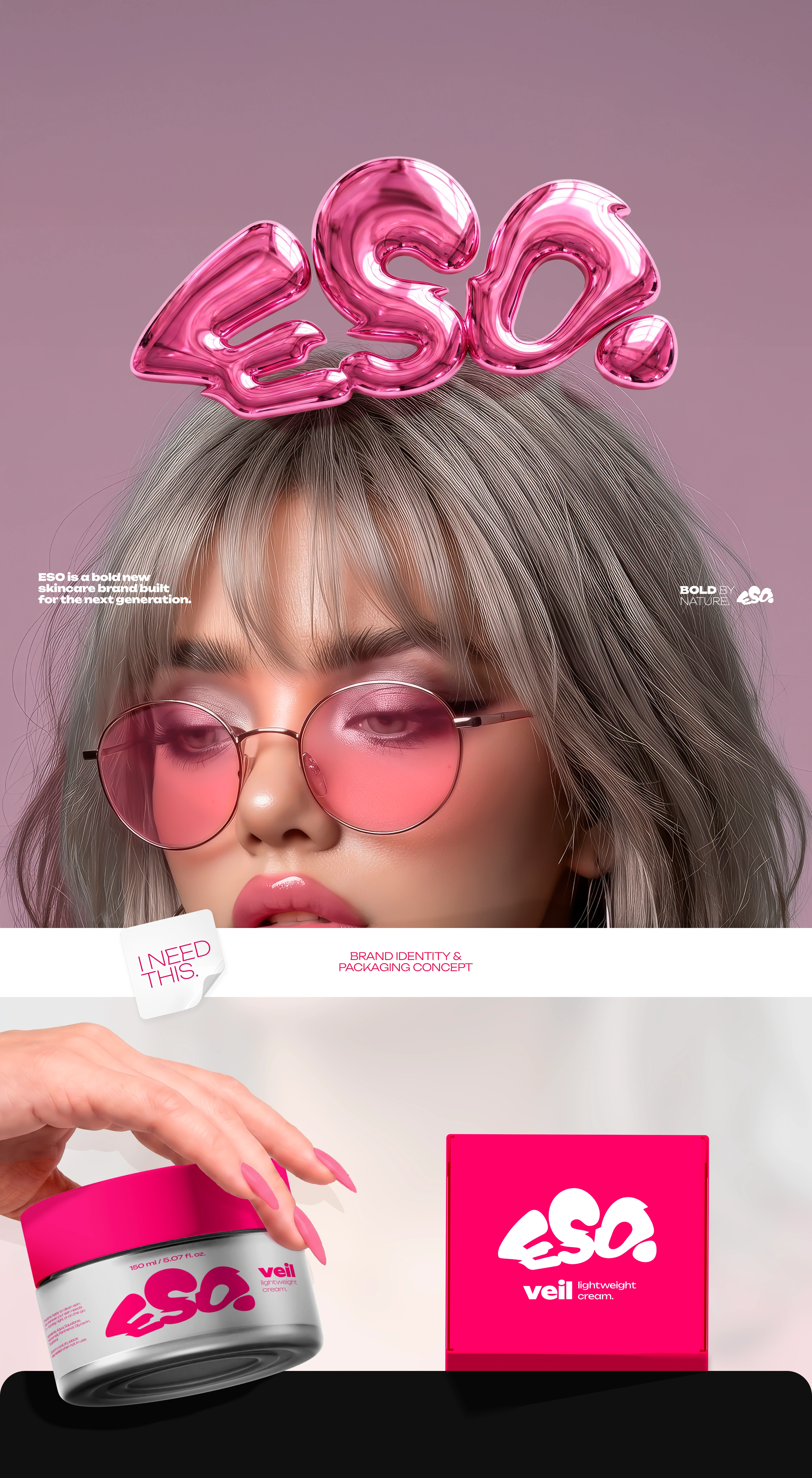
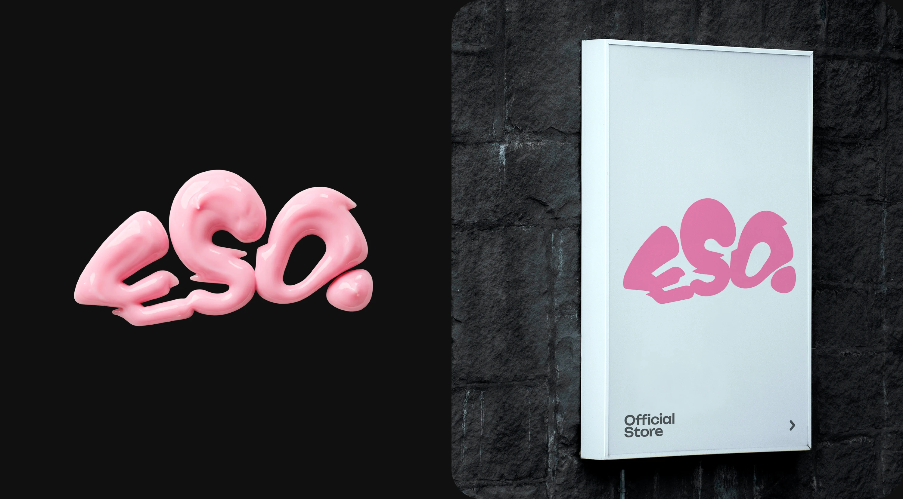
ESO is a bold, loud brand for the next generation. Thick custom lettering, fluid forms, honest formulas without marketing fluff. Design that isn't afraid to stand out.
Why.
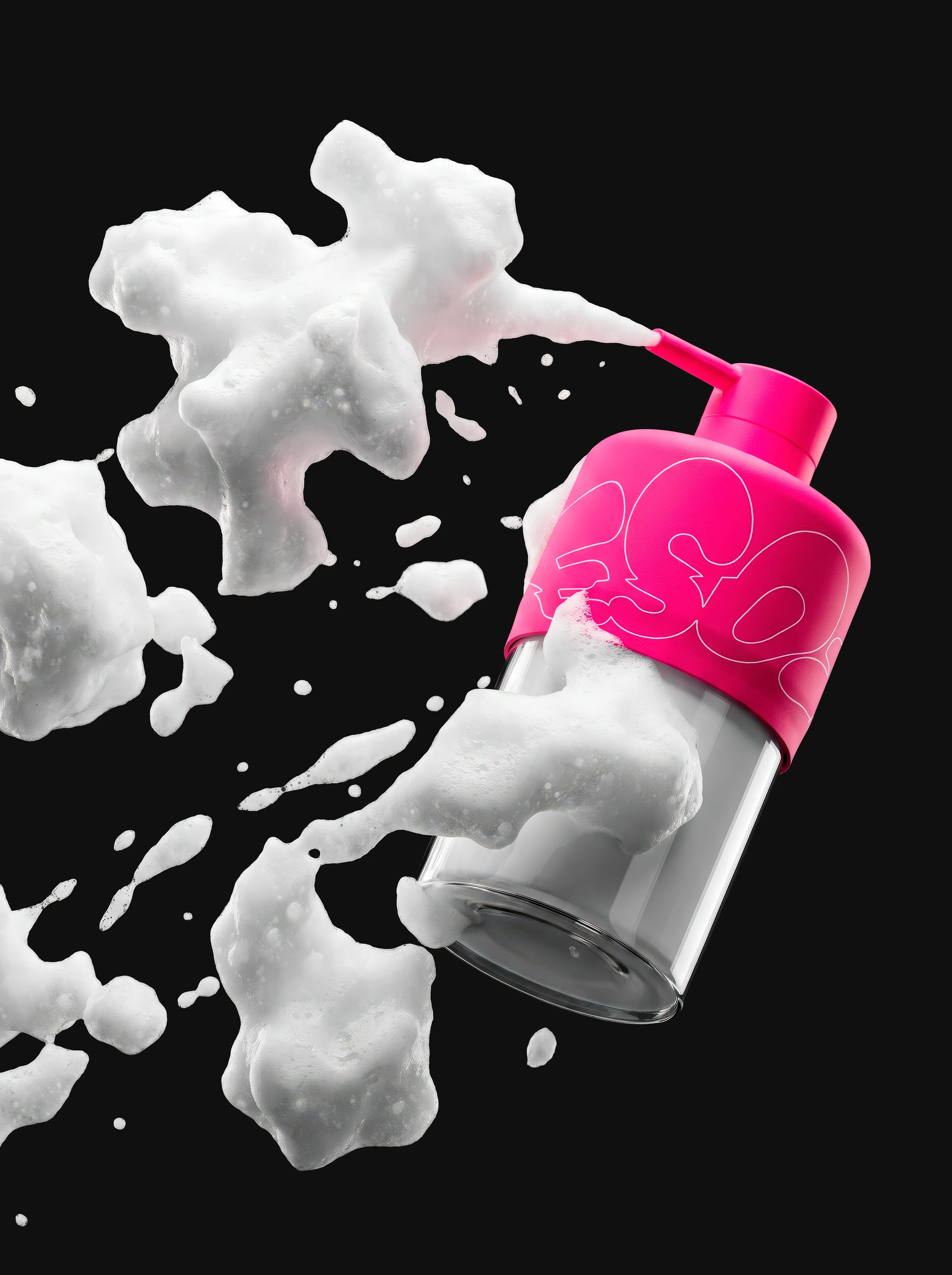
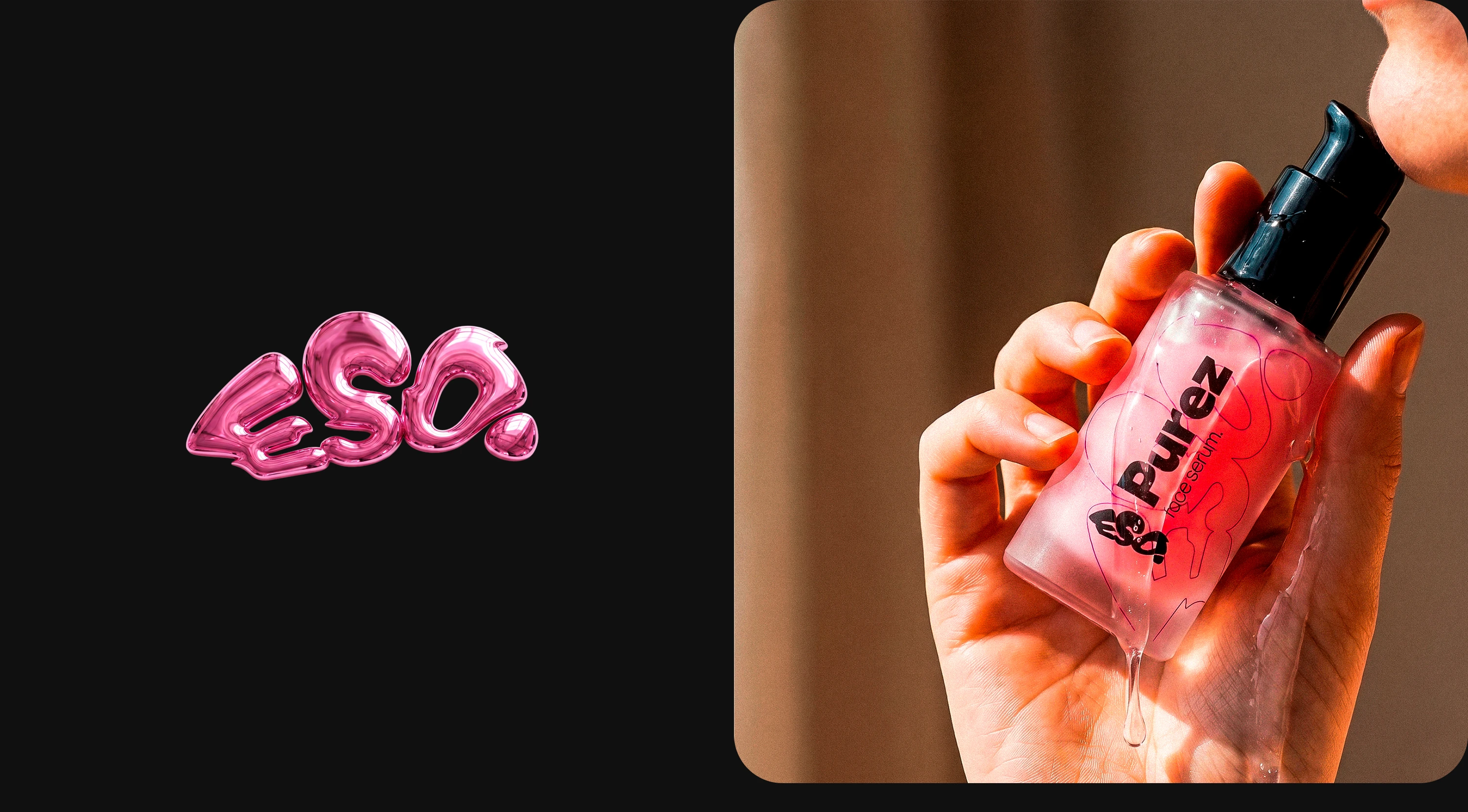
Because skincare shouldn't be boring. ESO speaks the language of textures — drop, gel, ripple. It's a living brand for real people, not for a pharmacy shelf.
Color Strategy
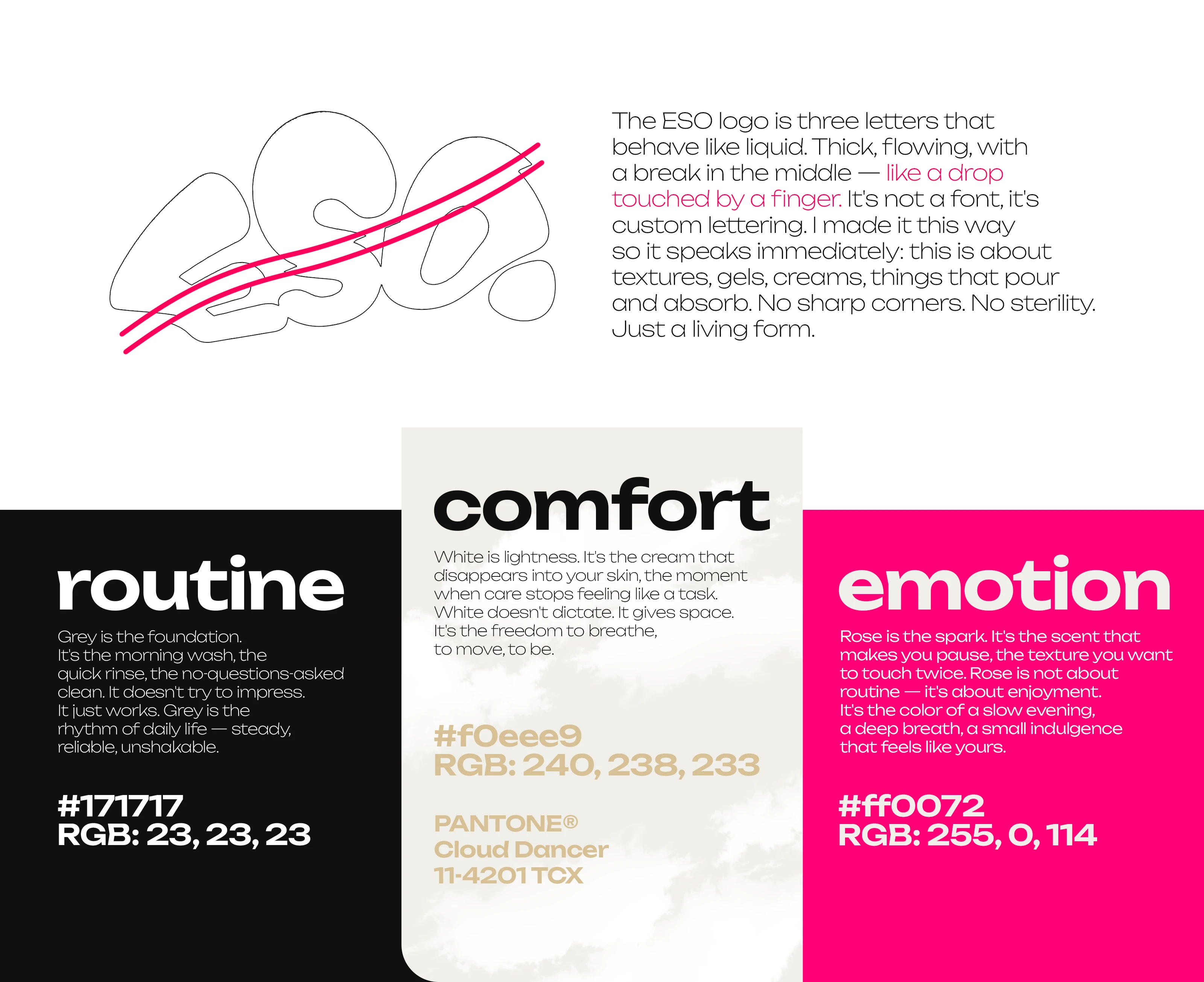
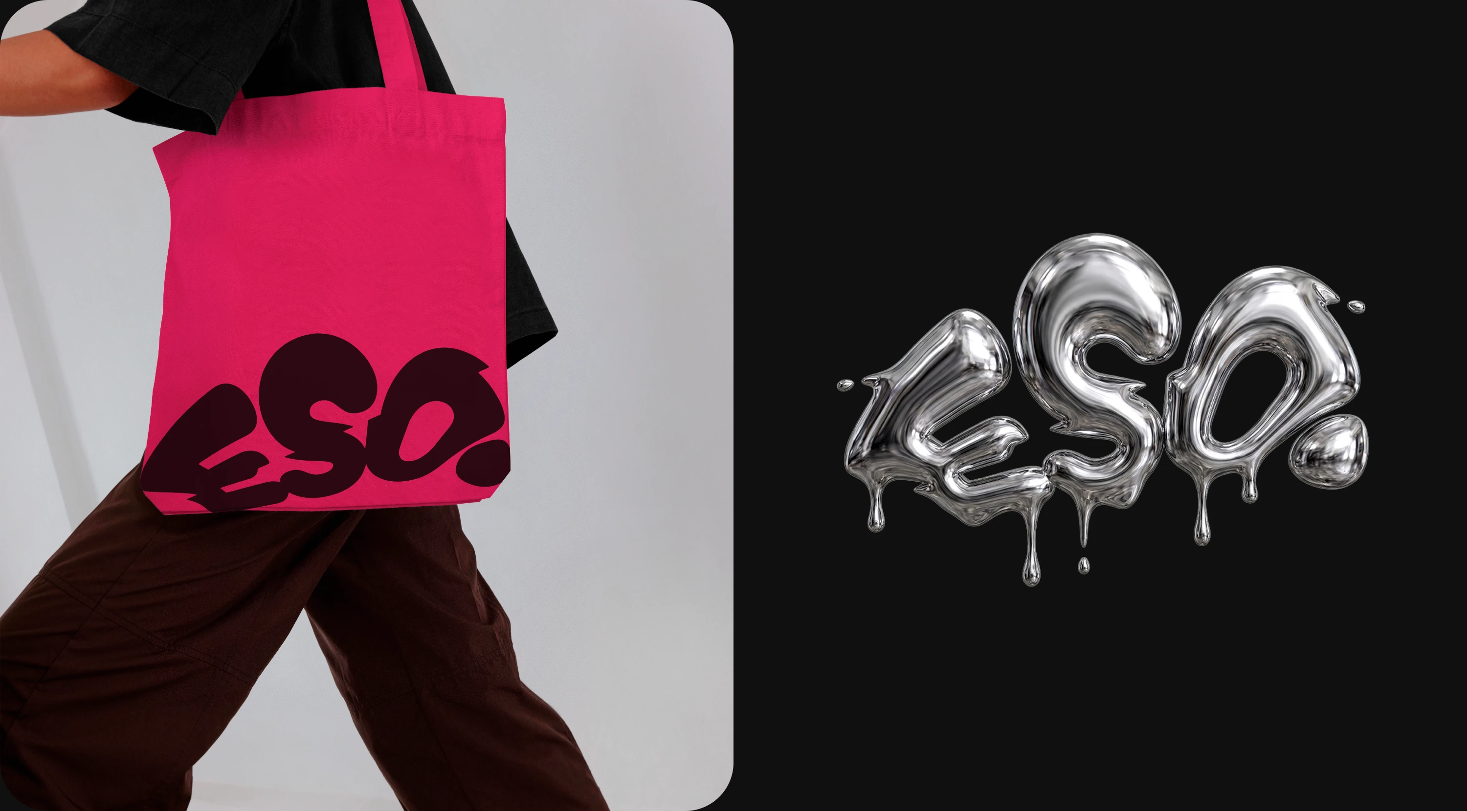
The ESO color system is built on contrasting states, not a decorative palette. Each color plays a distinct role: one holds the structure, one gives the space to breathe, one adds the pulse. Together they create a balance between calm and bold — no extra shades, no gradients, no confusion. The system works across all touchpoints: packaging, digital, social media, print. Minimum colors, maximum character. The brand is instantly recognizable, even without the logo. It's not a palette. It's a visual language.
Product packaging
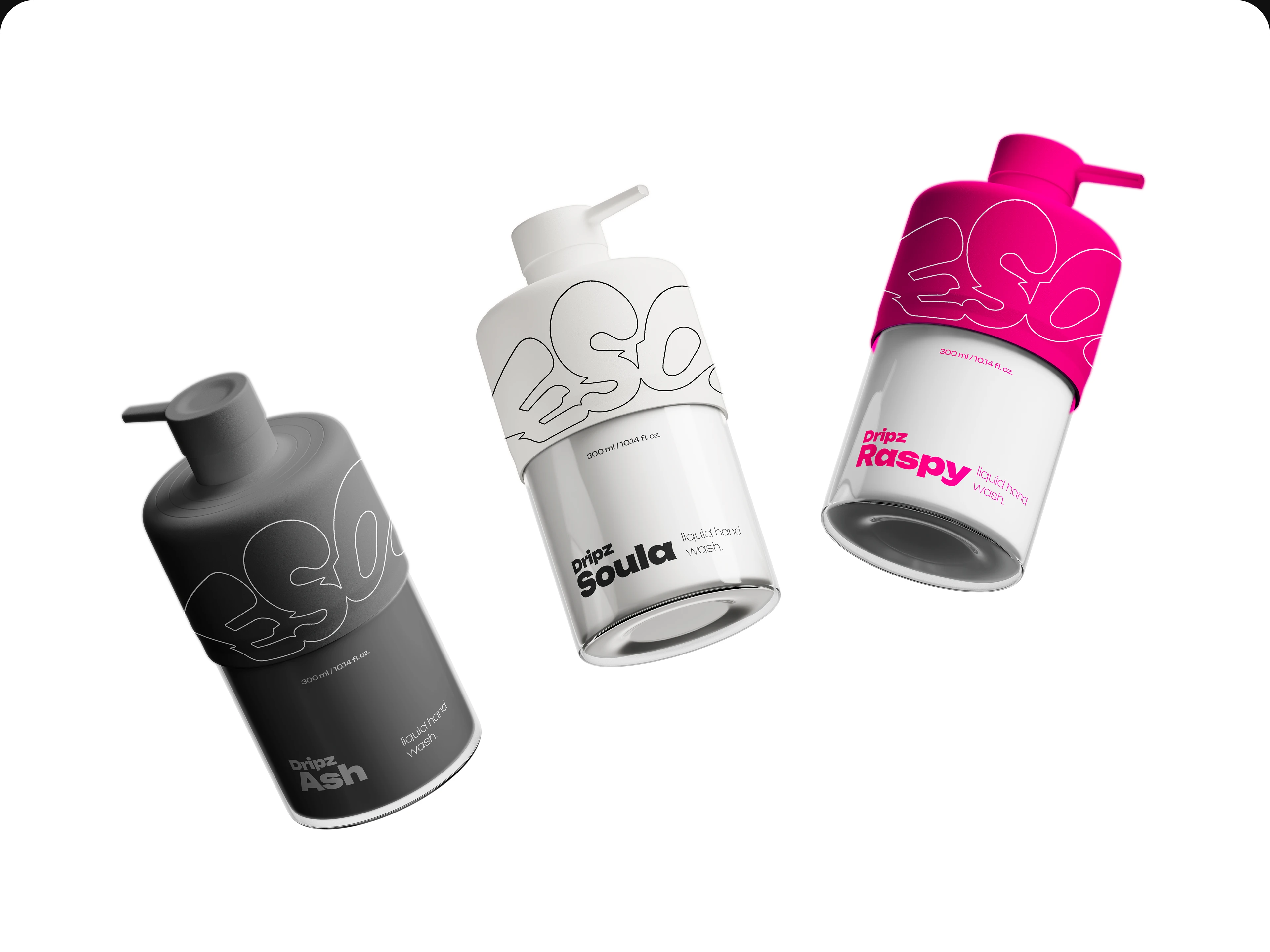
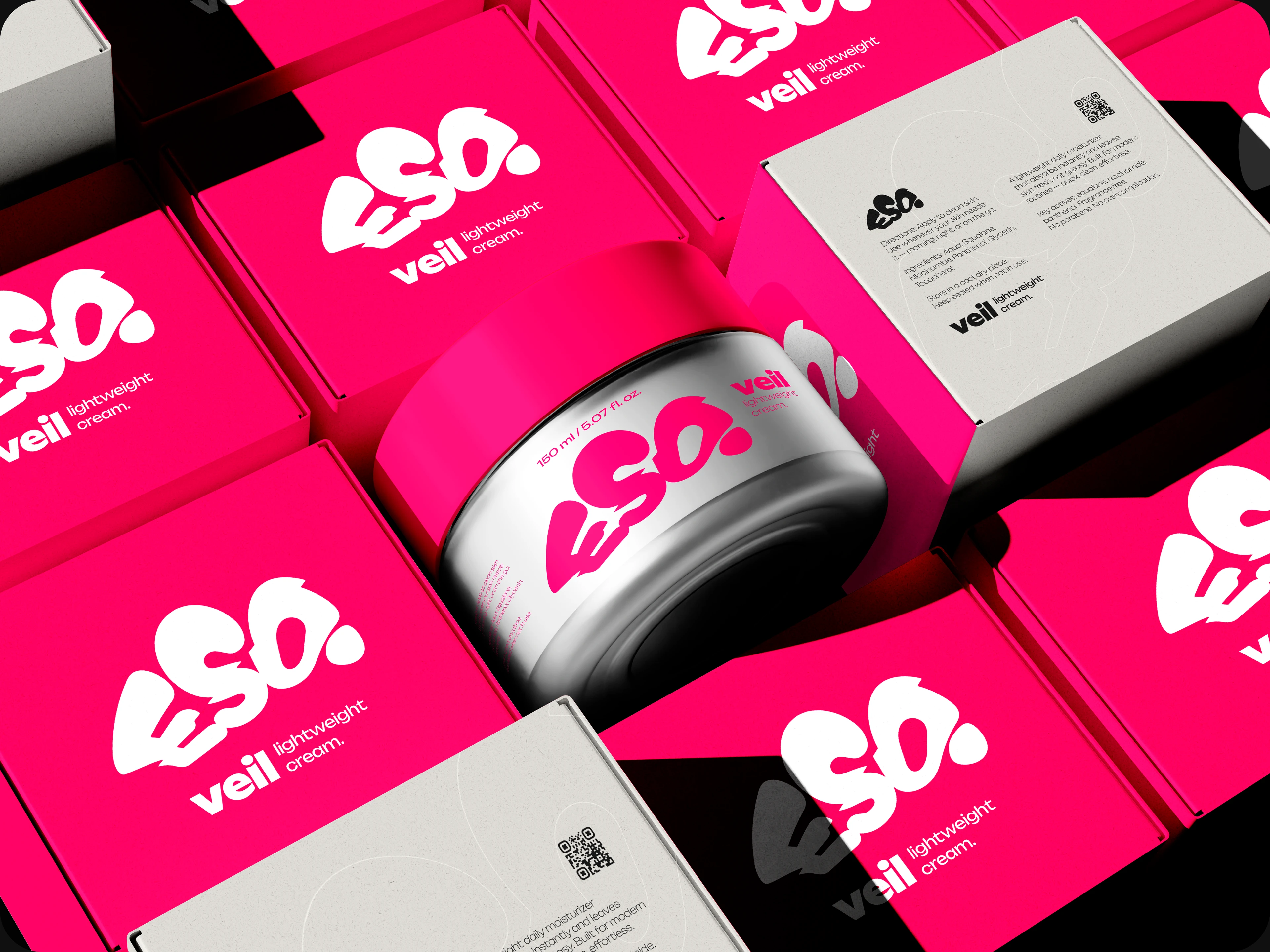
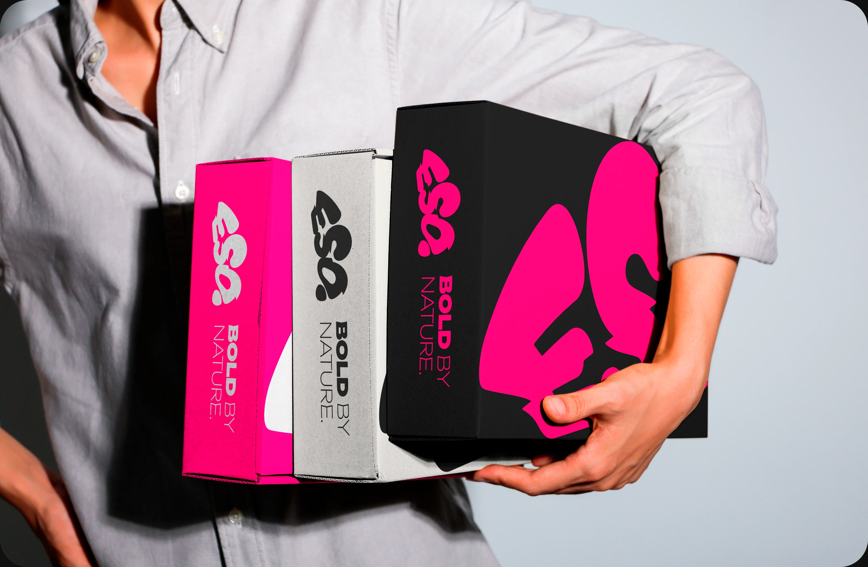
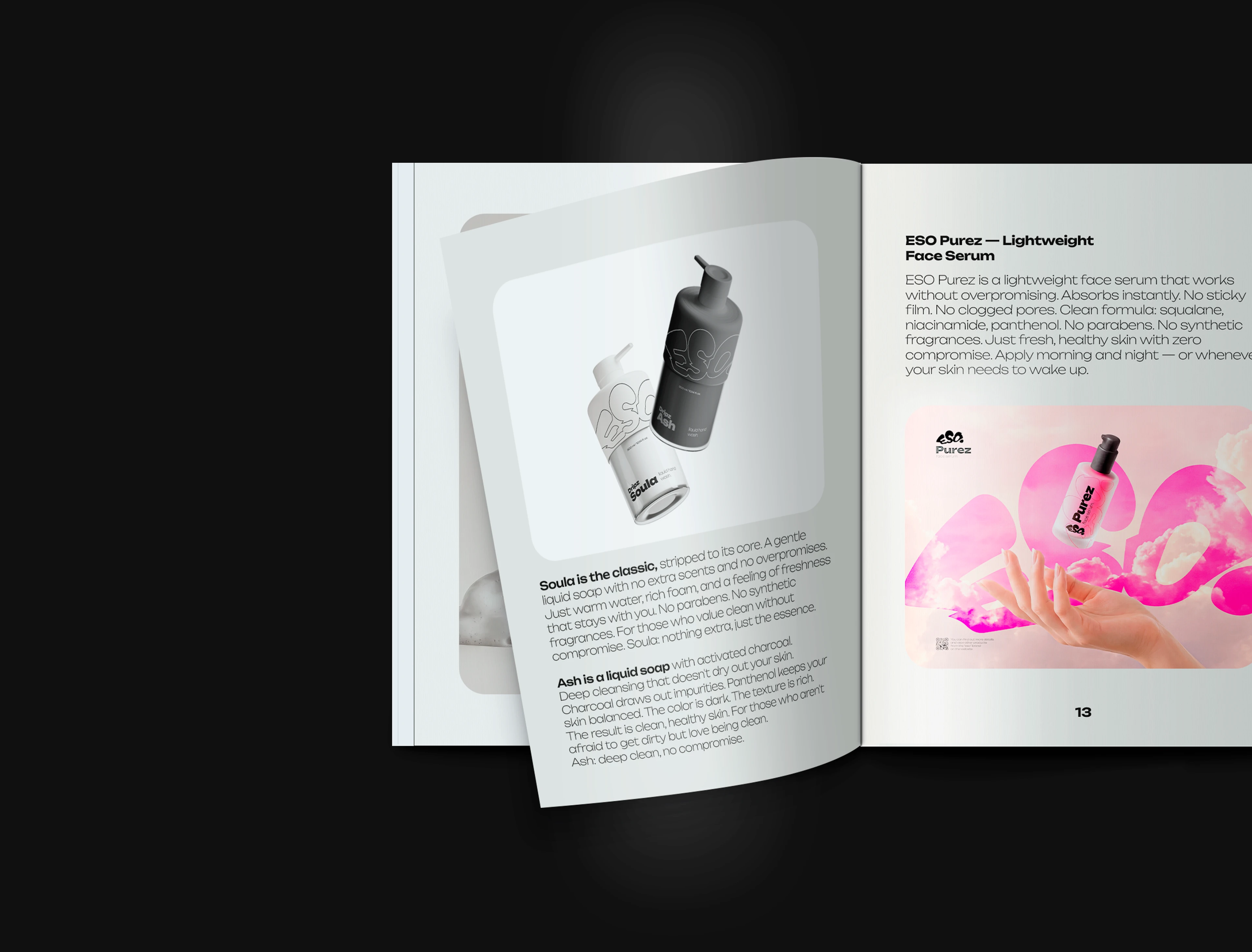
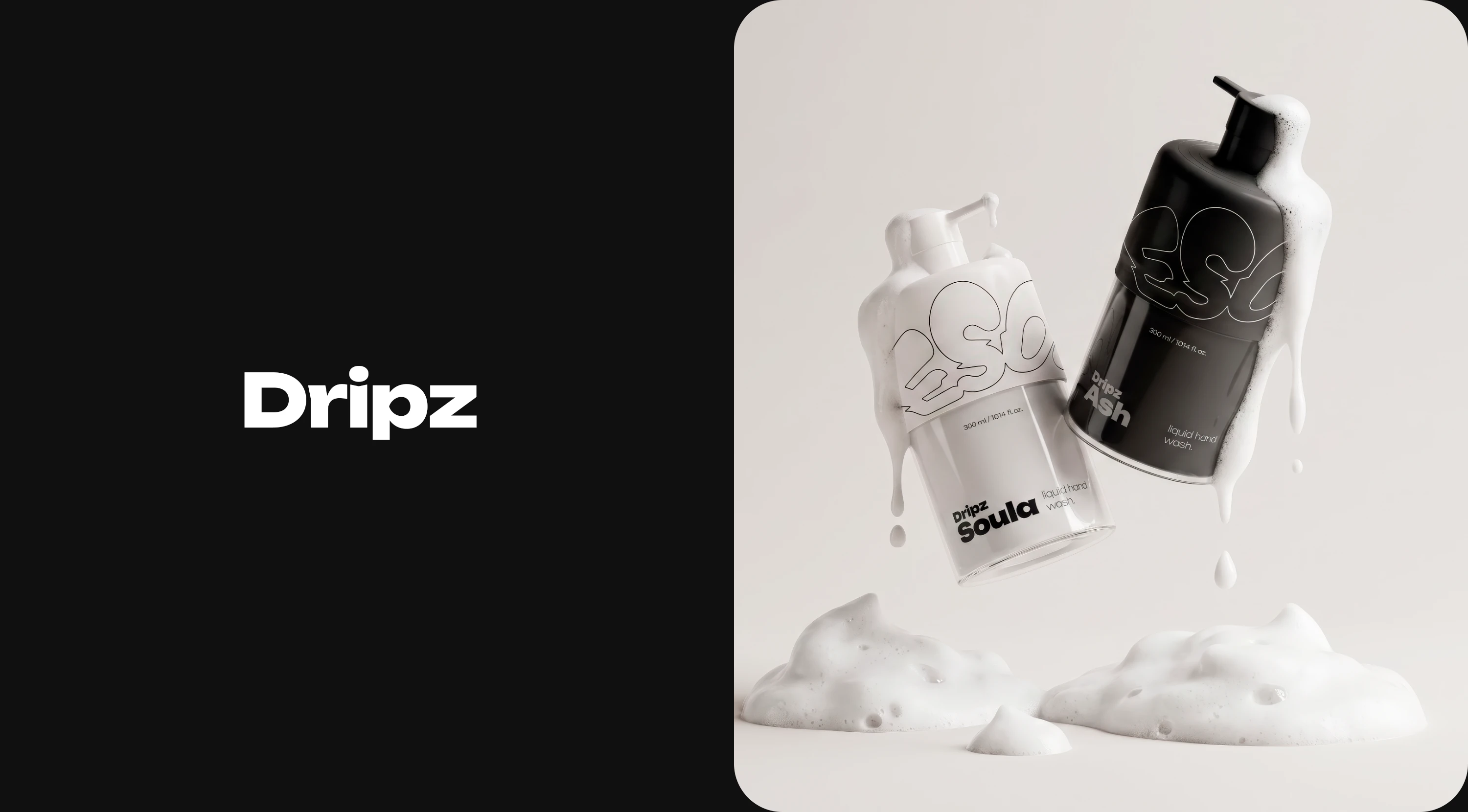
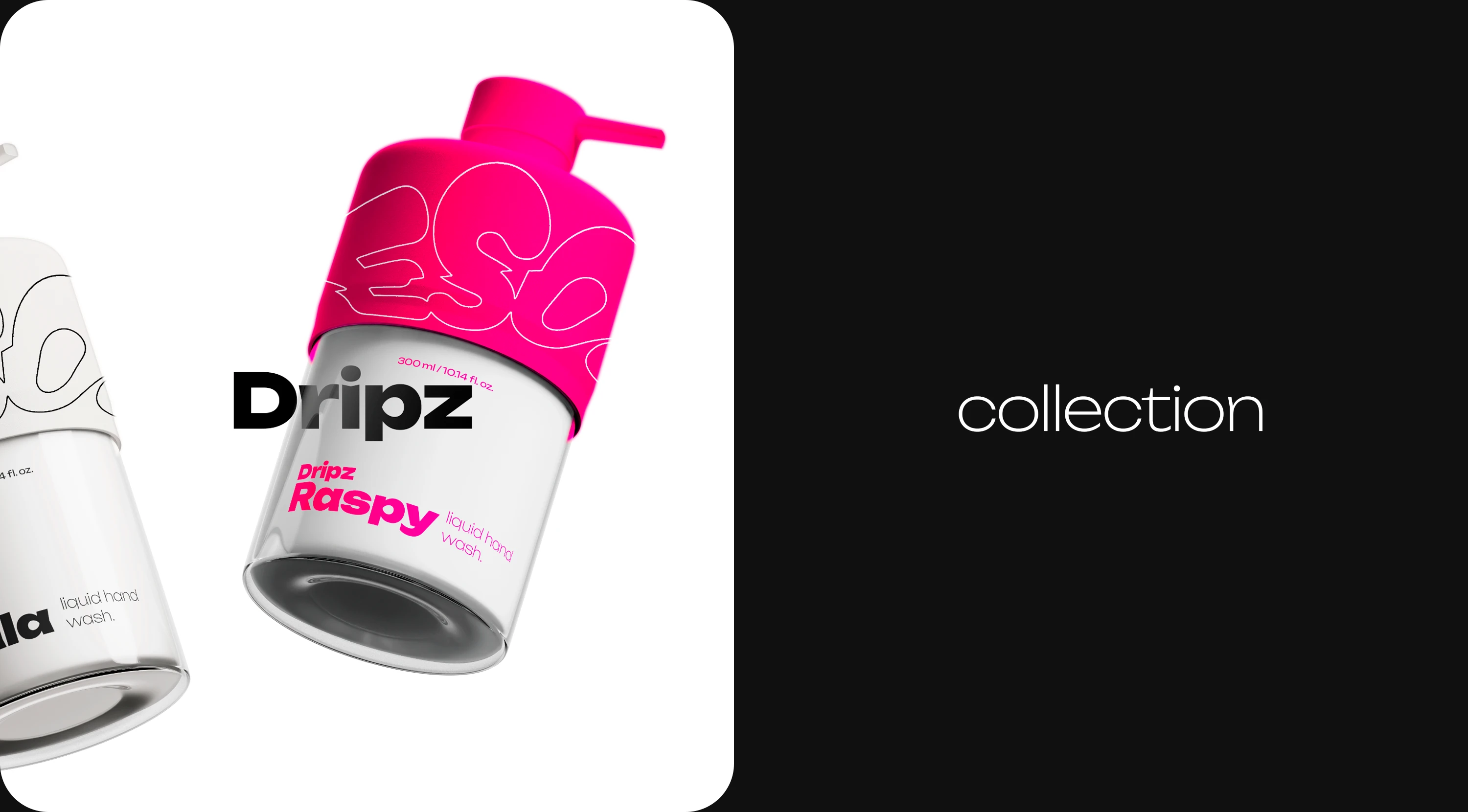
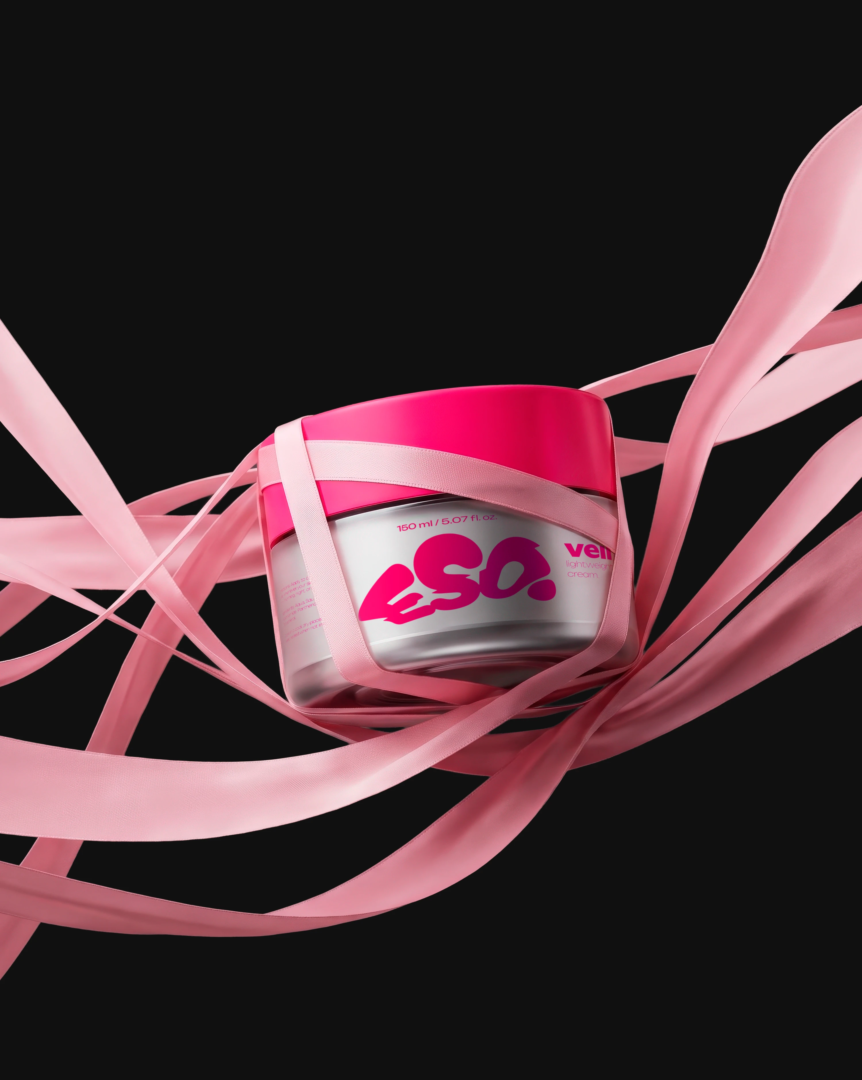
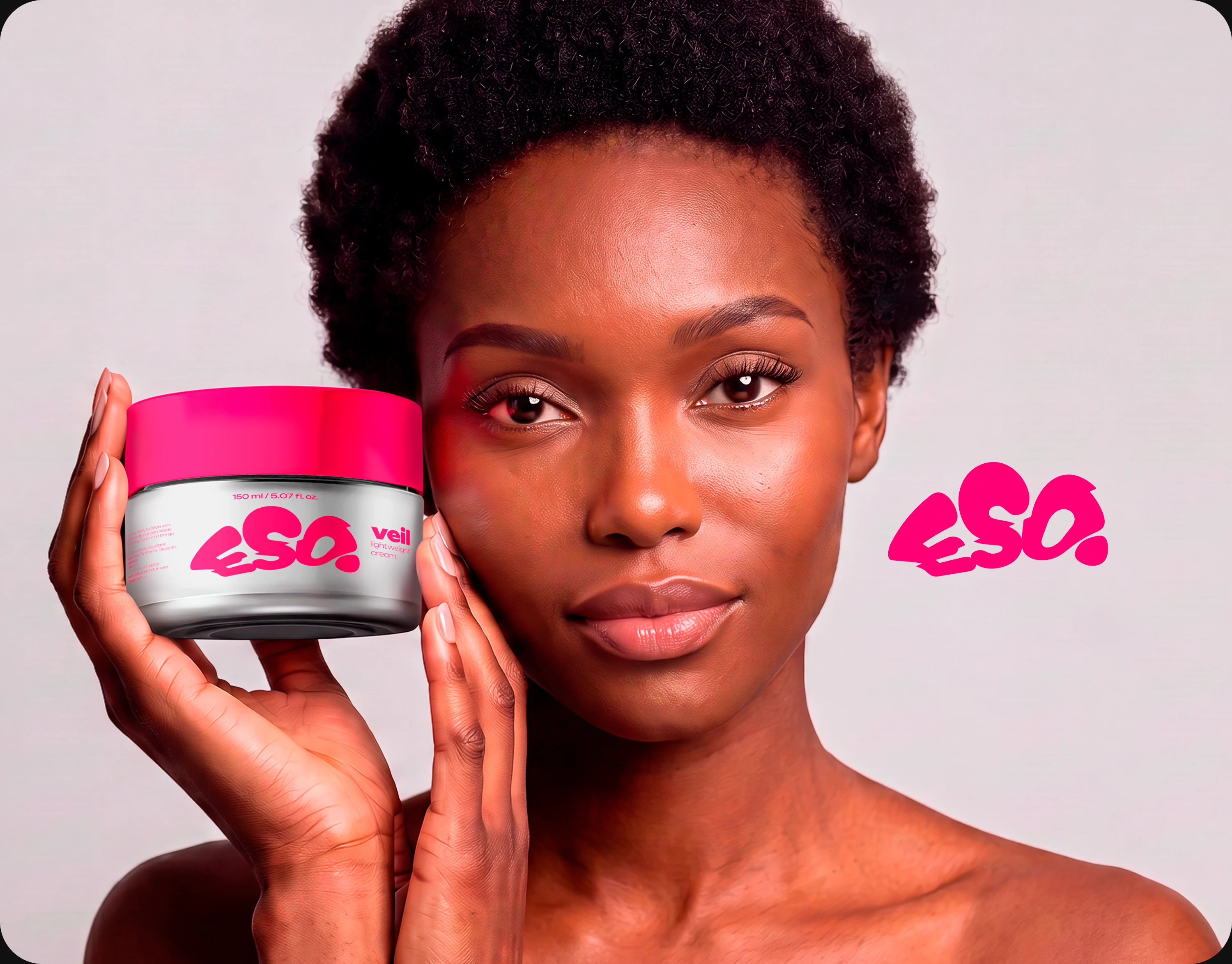
ESO packaging is built on bold typography — the logo always dominates the bottle, instantly standing out on the shelf. The packs are bright, juicy, alive. The typeface is Unbounded — wide, fearless, uncompromising. The tagline Bold by Nature reads literally: bold in character, close to nature. It speaks to both clean formulas and a fearless attitude. Flavor or scent is never written directly — instead, the naming does the work. Raspberry is Raspy. Charcoal is Ash. Classic is Soula. The name tells you everything.
Promo language
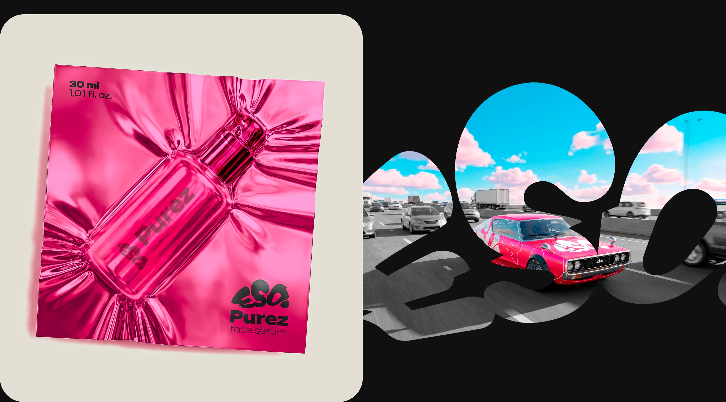
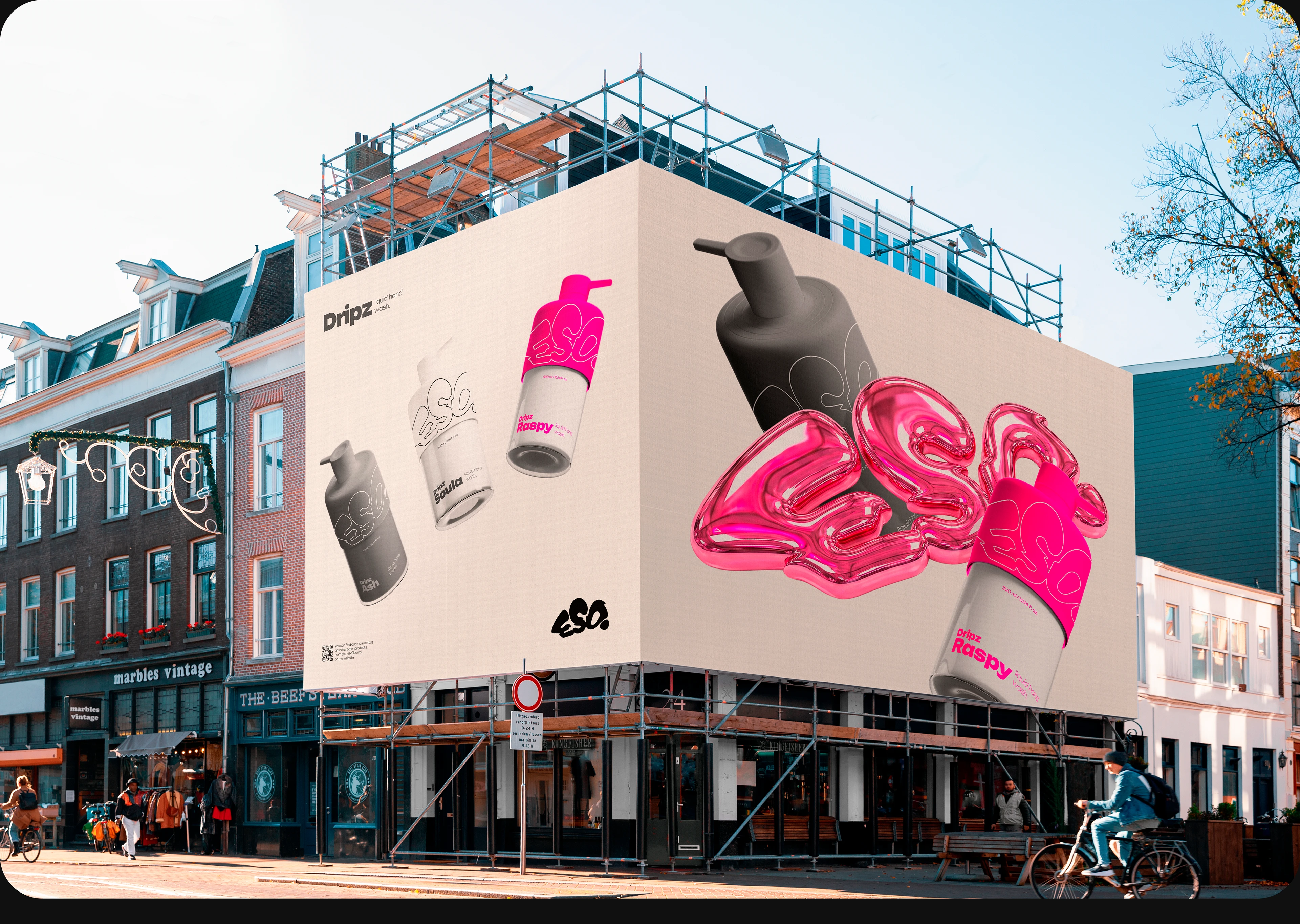
ESO promo is built on a rigid, bold system, references to familiar things, women's secrets, and techniques that are unconventional for skincare. If it's a car livery, it's a pink muscle car — something that doesn't align with feminine nature at all. It screams boldness and the brand's uncompromising attitude. Take everything from life, and above all — ESO.
The same principle works in packaging. A person opens a box expecting to find a jar of serum. Instead, inside there's a vacuum-sealed pack with a tear strip. This unconventional move builds a connection with the consumer through visual language, showing: we are not what you see every day in ads or on supermarket shelves. We are better, more beautiful, more dynamic, more expensive.
At first glance, every other product in a cosmetics store turns into a grey mass. You only notice ESO — not the word itself, but the liquid typography stretched across the entire pack.
Instagram: Daniel Elementorr
Telegram: Elementorrs
WA: Daniel Elementorrs
Email: e.dsgn@mail.ru