



Brand Identity | APSIDA
Architecture & Antiques
TelegramО ANITA BODROVA
E–mail О Art Director & Graphic Designer
О 2026
RU
Апсида — это проектно-строительная компания с двумя равноценными направлениями: созидание (архитектура, строительство, реставрация) и сохранение (работа с антикварной мебелью и историческими объектами). Это бренд, объединяющий архитектурную строгость, инженерную точность и кураторский взгляд коллекционера.
Визуальная коммуникация выстроена вокруг сдержанной уверенности: без демонстративной роскоши, но со способностью вовлекать зрителя в диалог и оставлять послевкусие.
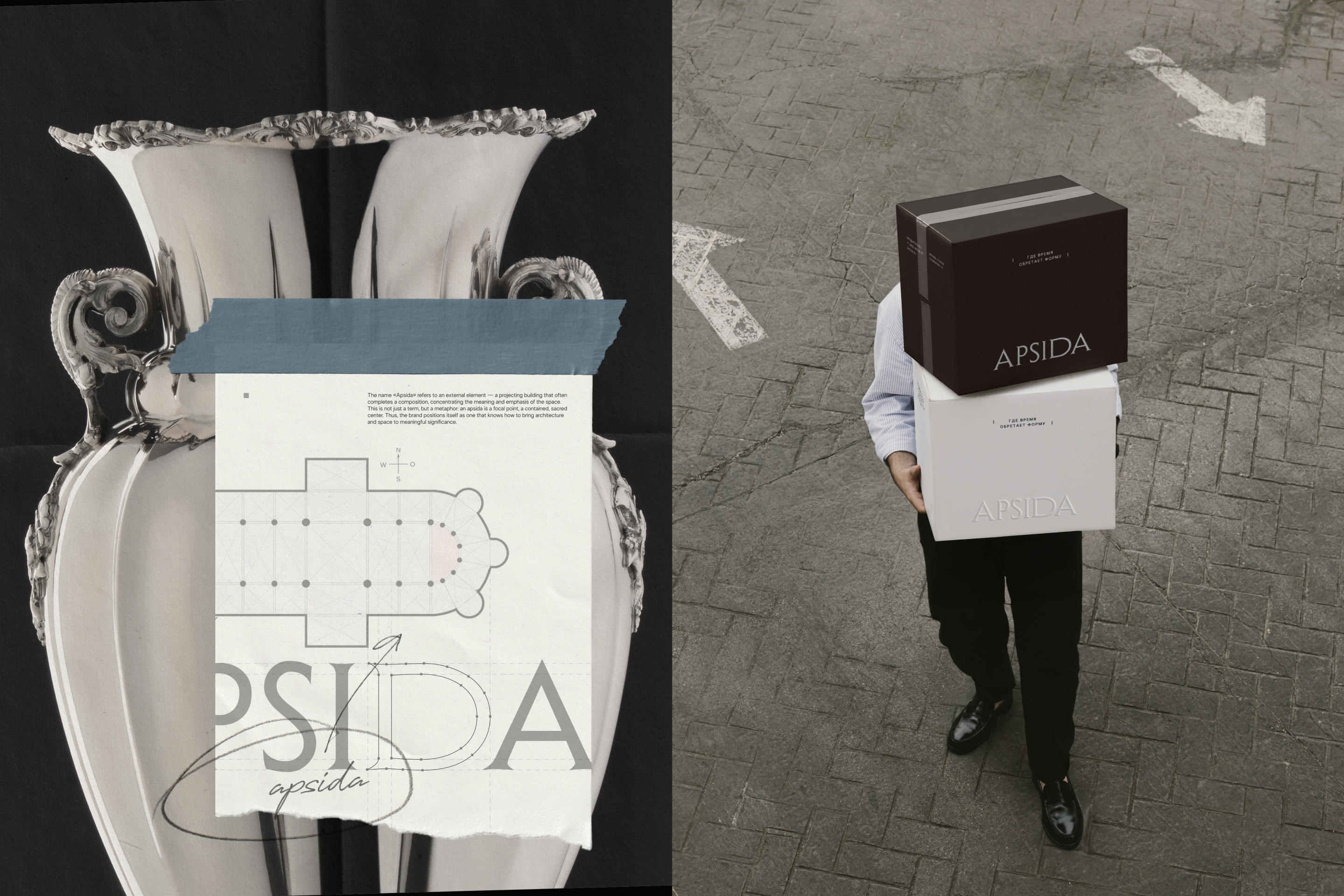
Элегантная антиква в логотипе формирует устойчивый и выразительный образ со своим изысканным ритмом. Само название «Апсида» отсылает к архитектурному элементу: выступу здания, завершающему композицию и акцент пространства. Характерная полукруглая форма апсиды находит отражение в анатомии буквы D.
Композиция знака визуально отсылает к работе с пространством и геометрией, ненавязчиво заключая в себе все буквы логотипа.
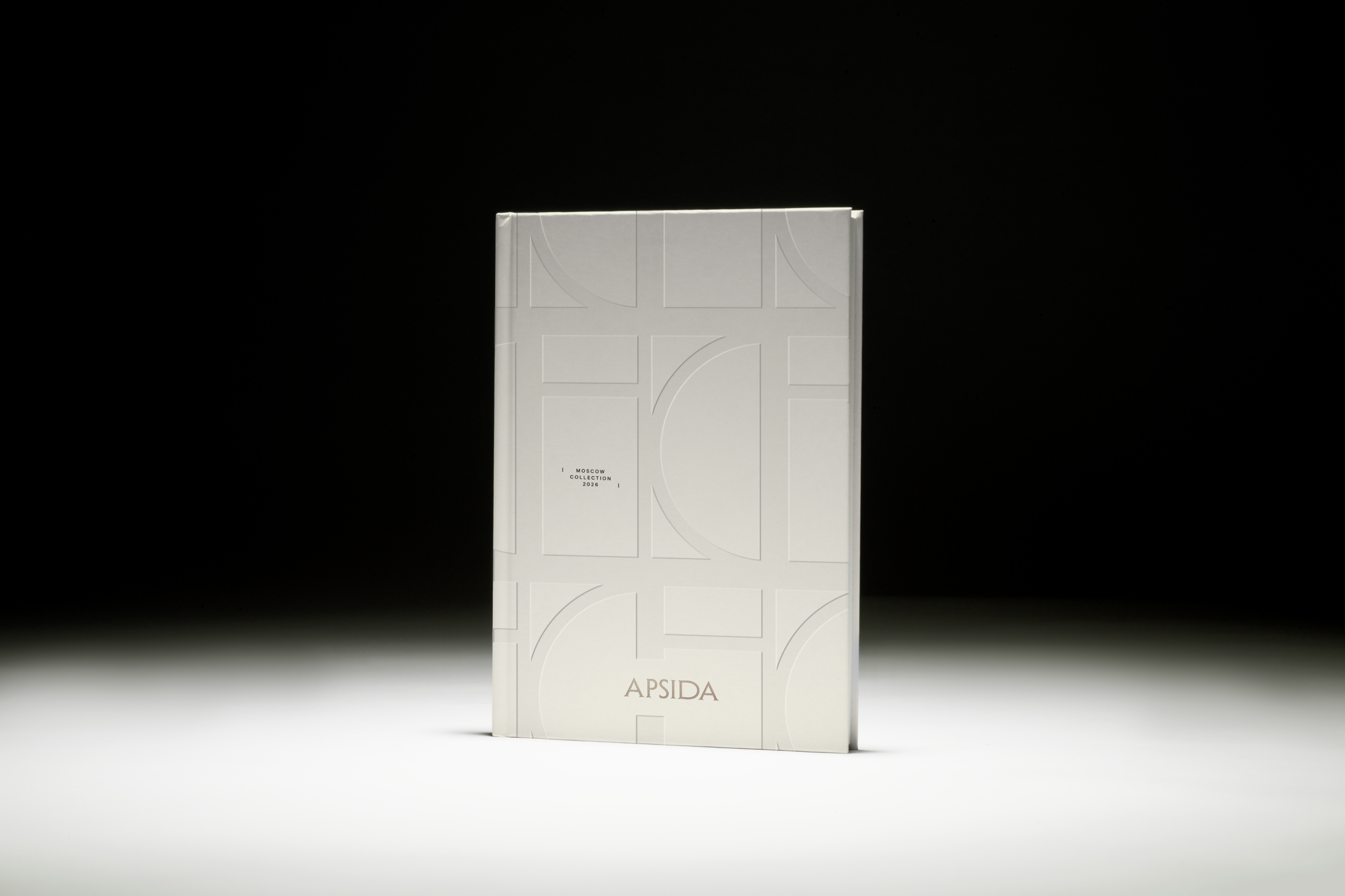
Знак легко трансформируется в паттерны с особым ритмом, которые своей системностью ассоциируются с архитектурными планами и инженерной графикой.
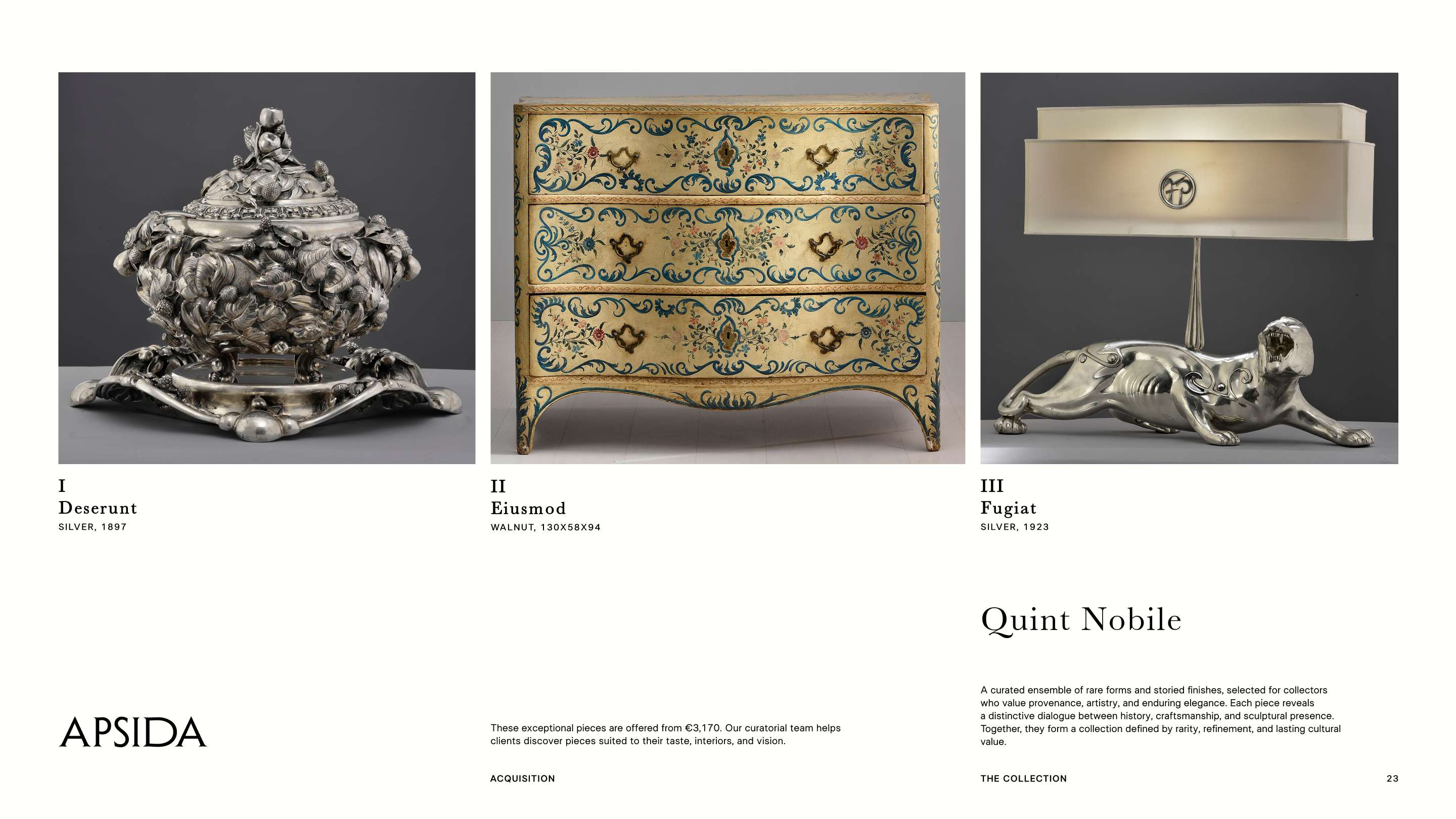
Типографика строится на балансе современности и наследия: строгий гротеск и деликатная антиква создают диалог между инженерной системой и культурной глубиной бренда.
Цветовая палитра состоит из сложных приглушённых оттенков, позволяющих передать тактильность, глубину и уверенность бренда.
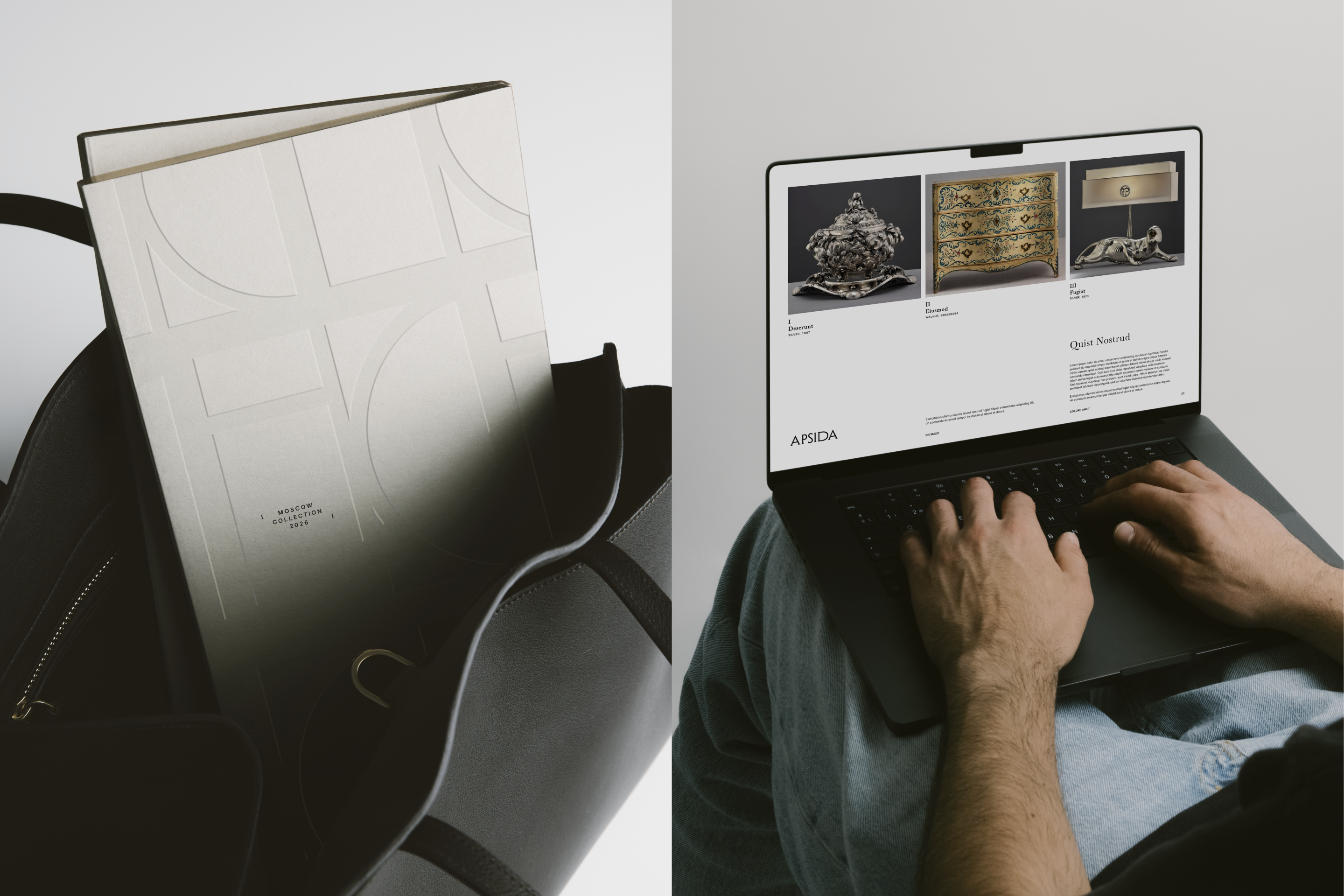
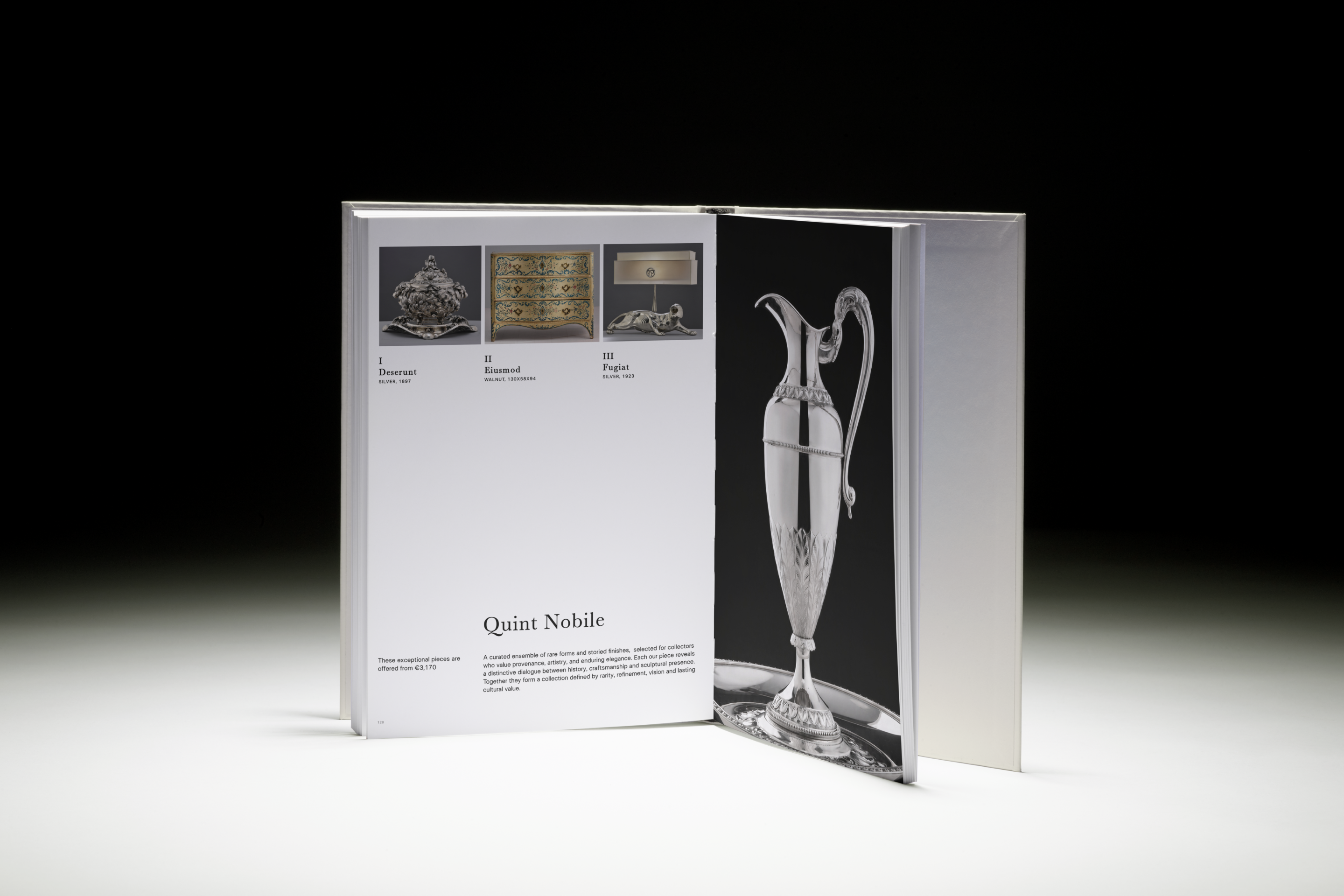
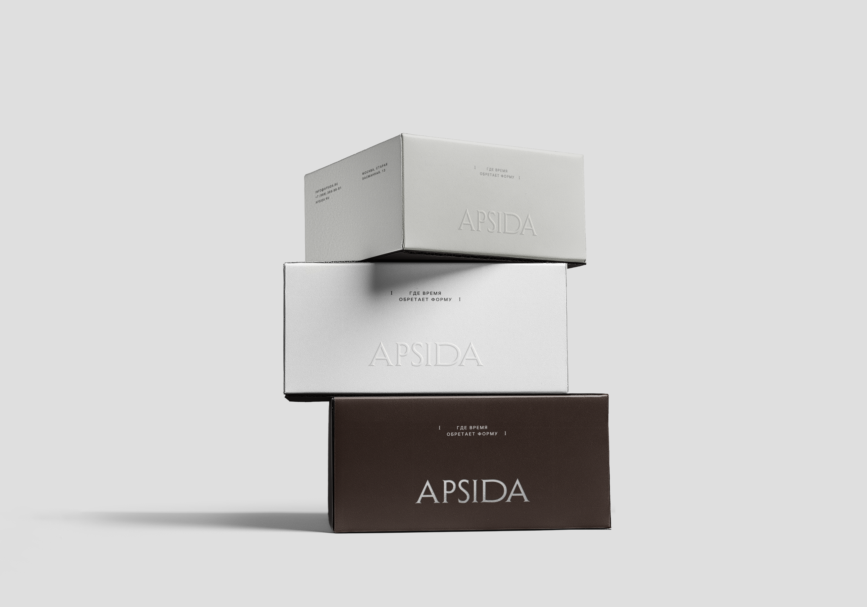
Фирменный стиль гибко адаптируется к различным носителям, сохраняя ощущение пространства, сдержанности и кураторского подхода. Дополнительную выразительность создают материальные акценты — бесцветный конгрев и серебряное тиснение логотипа.
Для бренда также был разработан слоган: «где время обретает форму». Он отражает способность Апсиды работать с единым материалом — временем. И новые проекты, и антикварные объекты здесь существуют в одной системе координат, и эта «форма» может выражаться в контексте пространства, архитектуры или истории.
EN
Apsida is an architectural and construction company with two equally important areas of focus: creation — architecture, construction and restoration — and preservation — working with antique furniture and historic objects. It is a brand that brings together architectural rigor, engineering precision and the discerning eye of a collector.
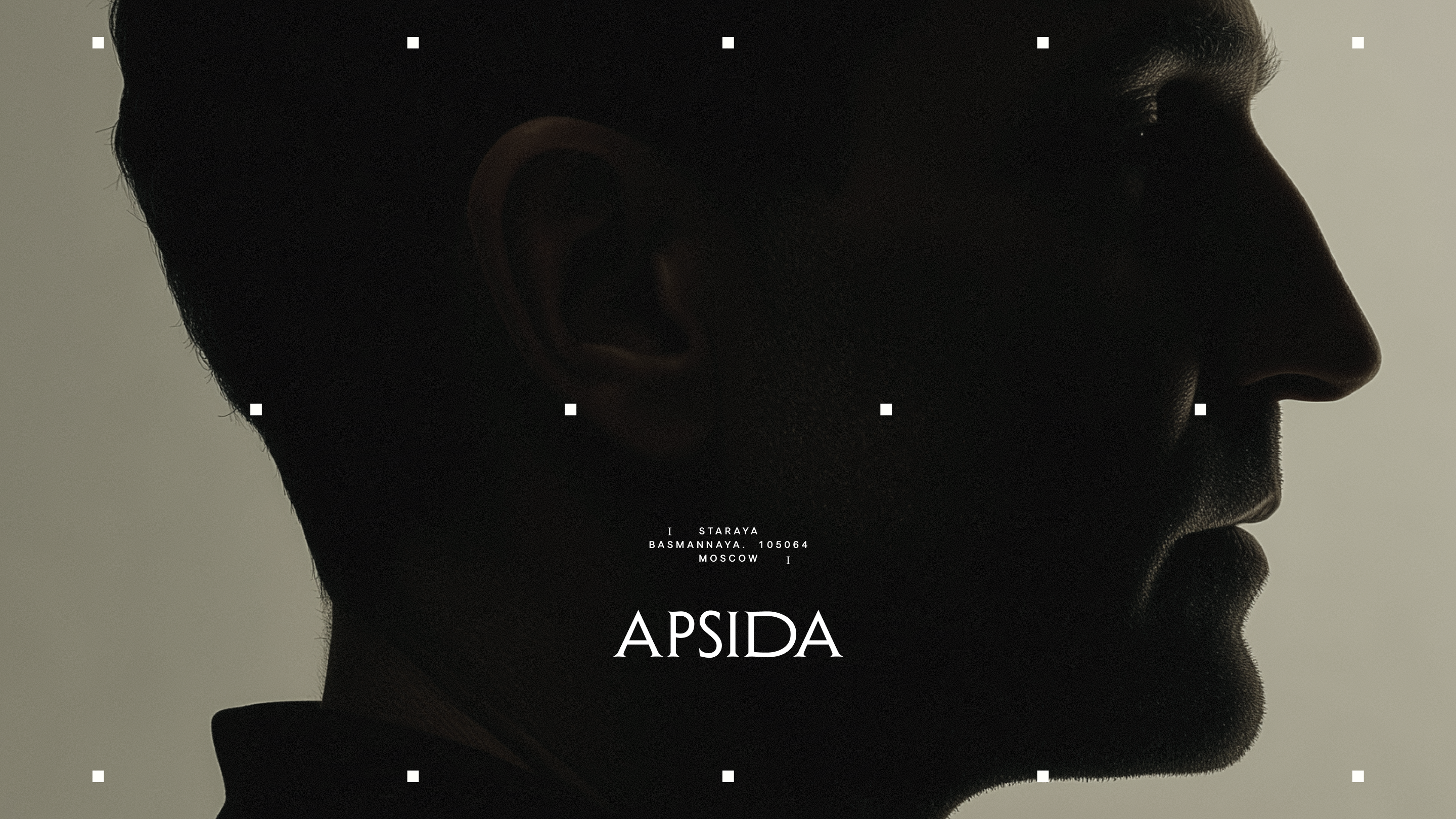
The visual communication is built around understated confidence: free from ostentatious luxury or the need to prove anything, yet capable of engaging the viewer in a dialogue and leaving a lasting impression.
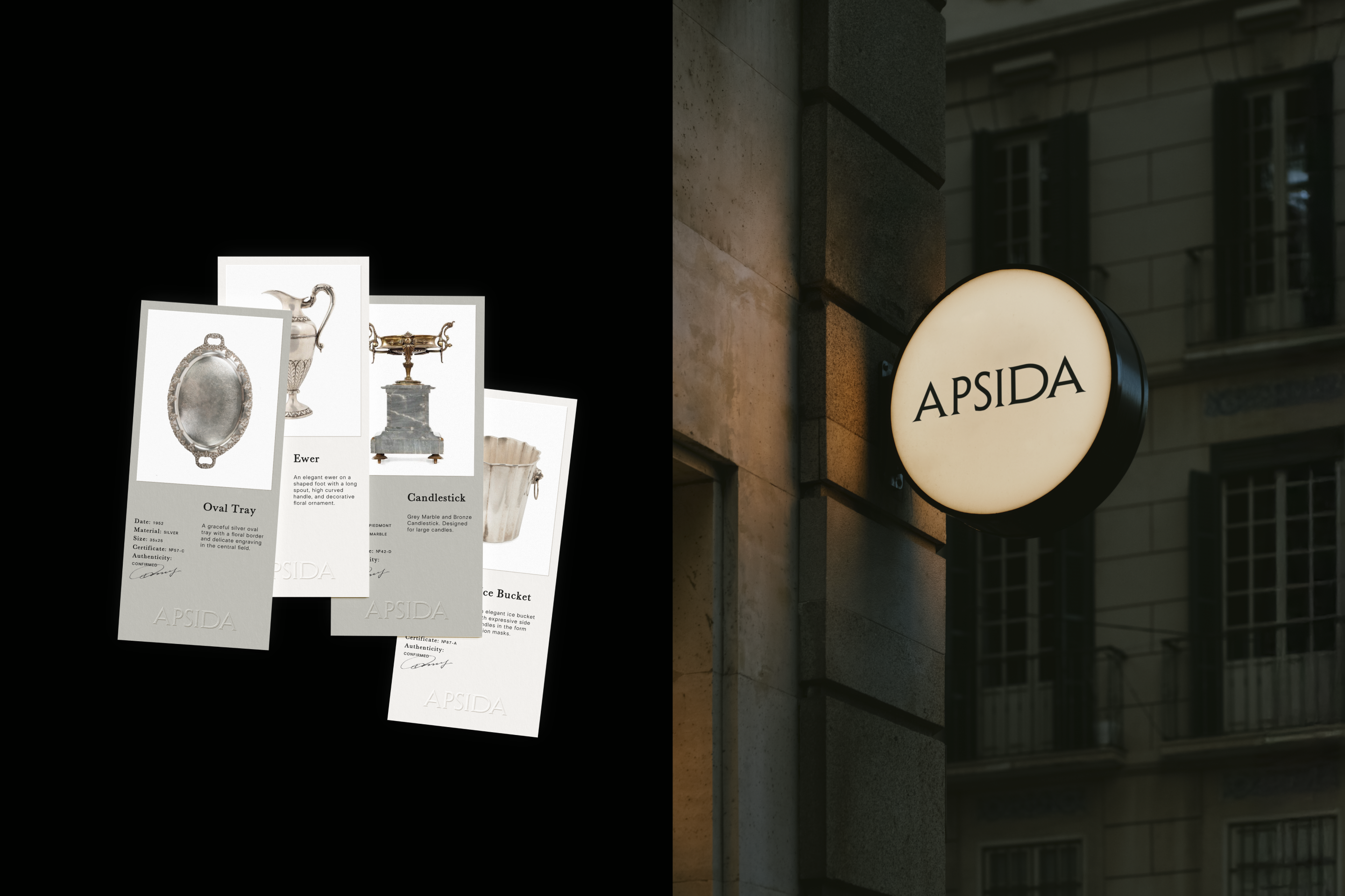
The elegant serif typeface of the logo creates a refined and distinctive identity with its own rhythm. The name Apsida refers to an architectural element — an apse, a projecting part of a building that completes the composition and serves as a spatial accent. The characteristic semicircular form of an apse is reflected in the anatomy of the letter D.
The symbol visually references the interplay of space and geometry, subtly incorporating all the letters of the logotype within its structure.
The symbol can be easily transformed into patterns with a distinctive rhythm, whose systematic repetition evokes architectural plans and engineering drawings.
The typography is built on a balance between modernity and heritage: a strict sans serif and a delicate serif create a dialogue between engineering systems and the cultural depth of the brand.
The colour palette consists of complex, muted tones that convey tactility, depth and confidence.
The identity flexibly adapts to a variety of applications while maintaining a sense of space, restraint and a curatorial approach. Material accents — blind embossing and silver foil stamping of the logo — add another layer of expression.
A tagline was also developed for the brand: «Where time finds form». It reflects Apsida’s ability to work with a single material — time. New projects and antique objects exist within the same frame of reference, while this «form» can manifest itself through space, architecture or history.
Brand Identity | APSIDA
Architecture & Antiques
TelegramО ANITA BODROVA
E–mailО Art Director & Graphic Designer
О 2026