RU
Серия тестовых заданий по SMM-дизайну для digital- и tech-проектов в сферах AI, Web3, gaming и спорта. В рамках кейсов я разработала визуальные концепции и системы коммуникации для социальных сетей, адаптируя графический язык под разные аудитории и характер бренда. В работе использованы крупная типографика, модульные композиции, 3D-элементы, digital-графика и современные editorial-tech приёмы. Проекты демонстрируют мой подход к social media design, visual identity и созданию целостного визуального языка для технологичных брендов.
EN
A series of SMM design test assignments for digital and tech projects across AI, Web3, gaming, and sports. The cases explore different approaches to social media design and visual communication, adapting each visual system to the brand’s audience, positioning, and character. The projects combine bold typography, modular layouts, 3D elements, digital graphics, and contemporary editorial-tech aesthetics. Together, they showcase my approach to social media design, visual identity, and building cohesive visual languages for modern technology brands.
Client Description:
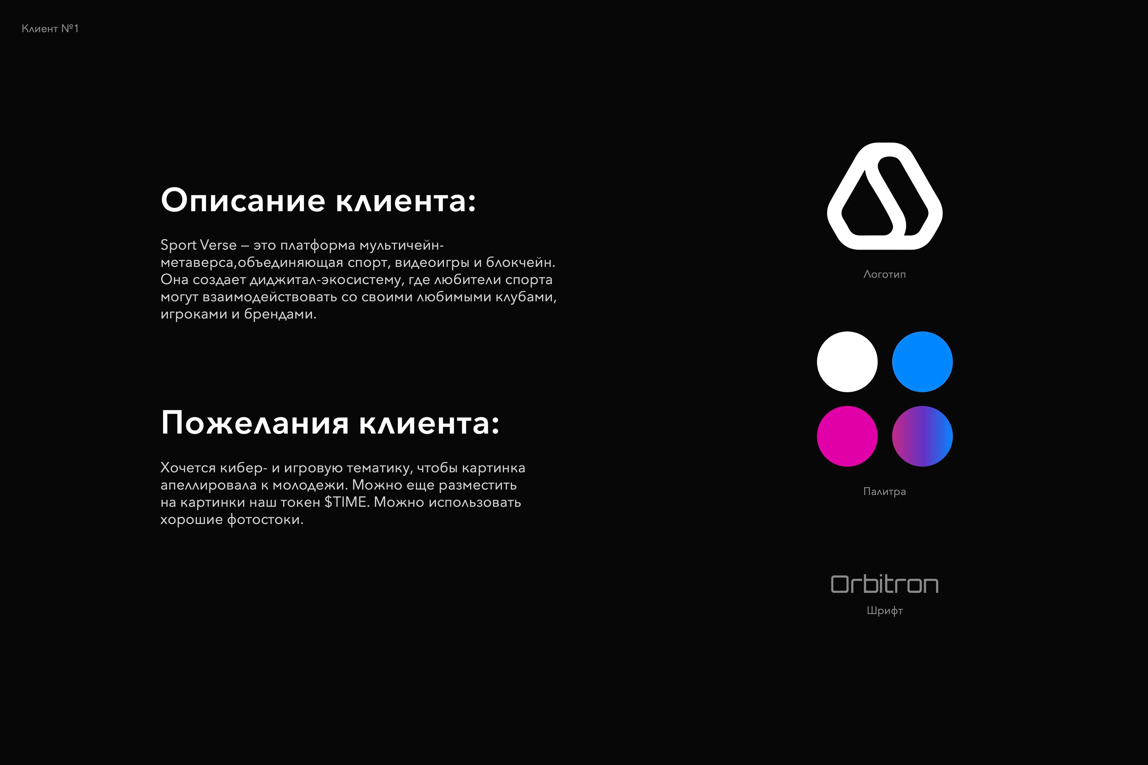
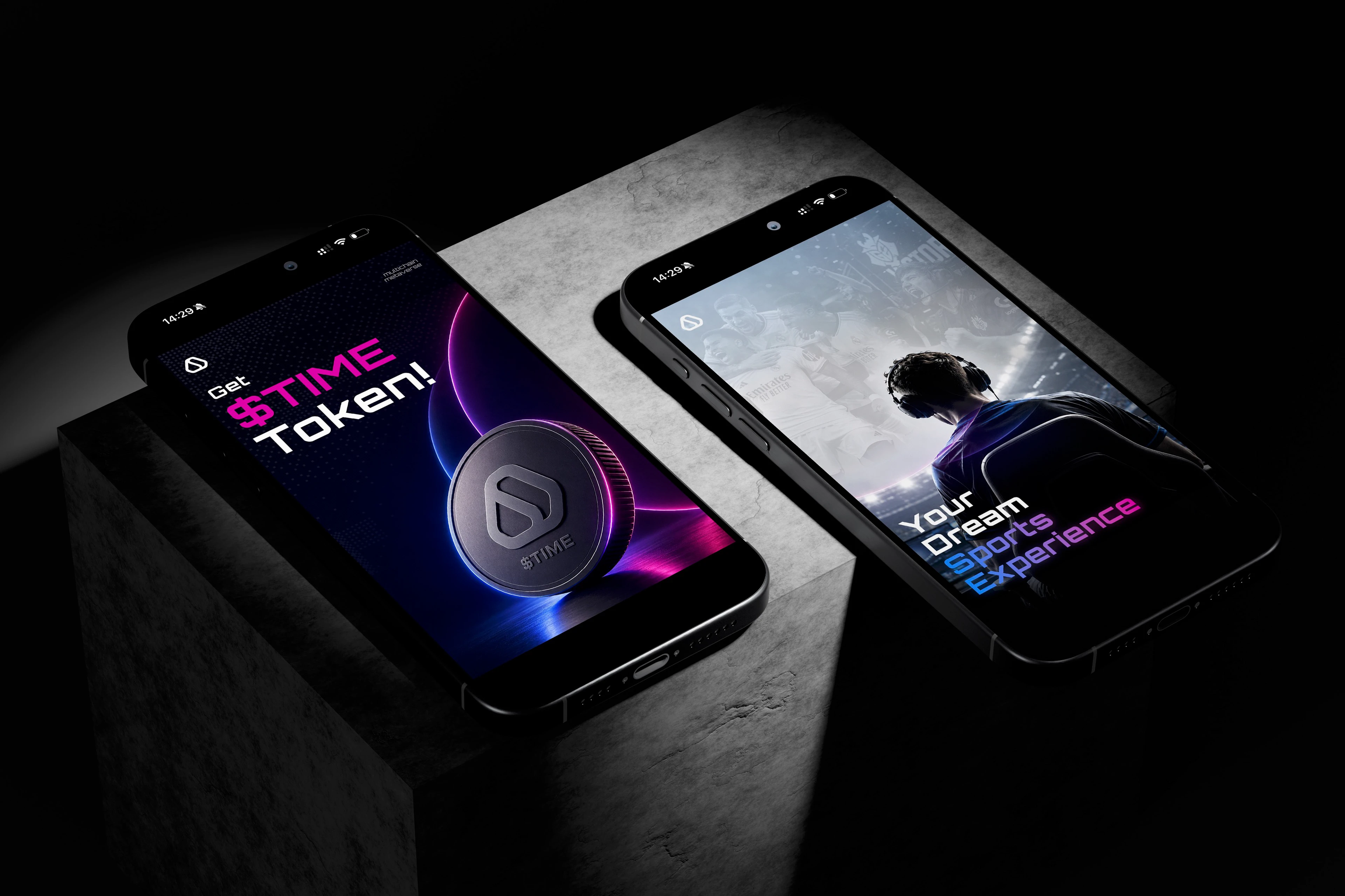
Sport Verse is a multichain metaverse platform that brings together sports, gaming, and blockchain. It creates a digital ecosystem where sports fans can interact with their favorite clubs, players, and brands.
Client Preferences:
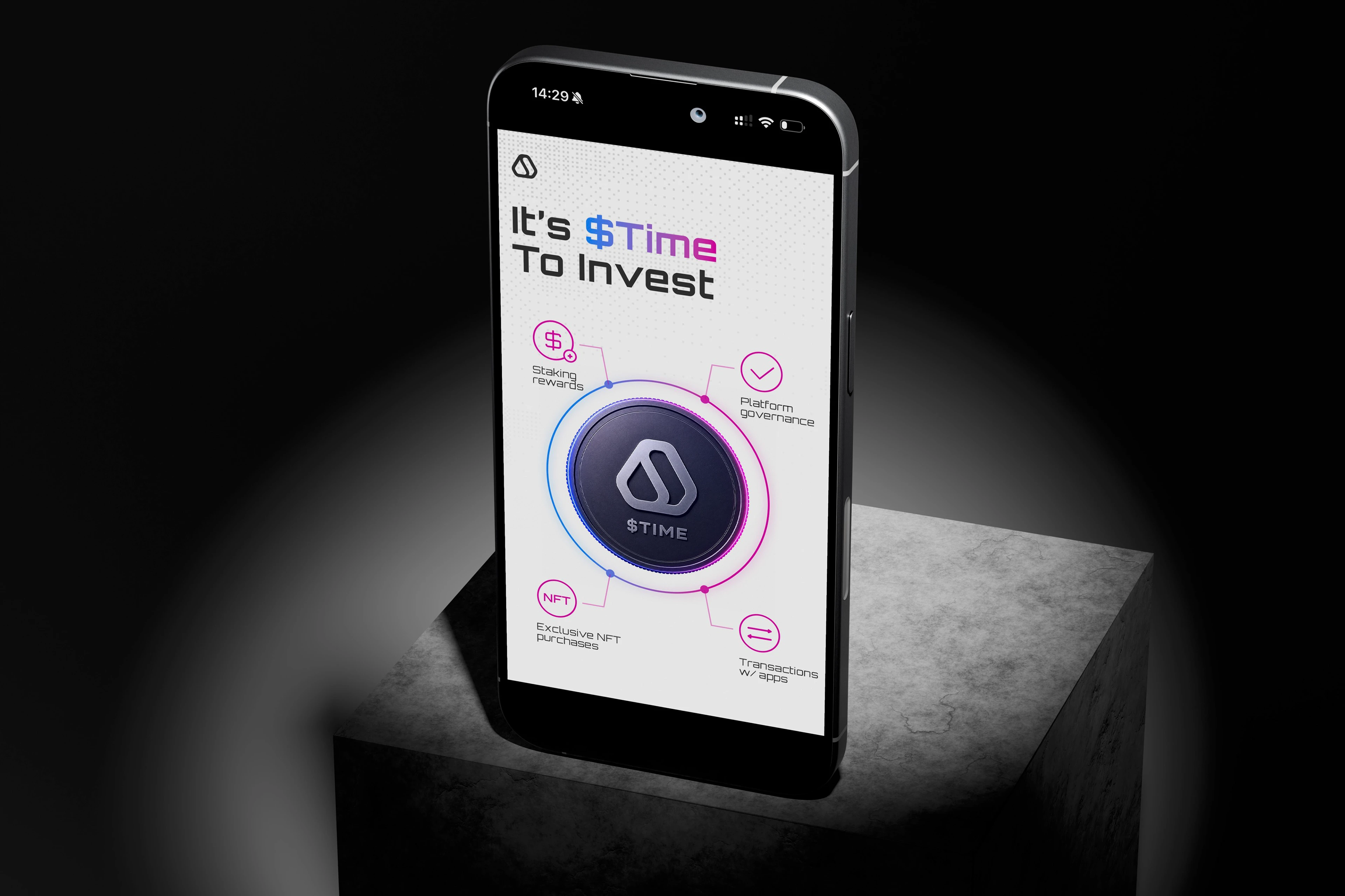
The client wanted the visual direction to have a cyber and gaming feel that would appeal to a younger audience. The $TIME token could also be incorporated into the visuals. High-quality stock photography was allowed.
Exploring the Visual Language:
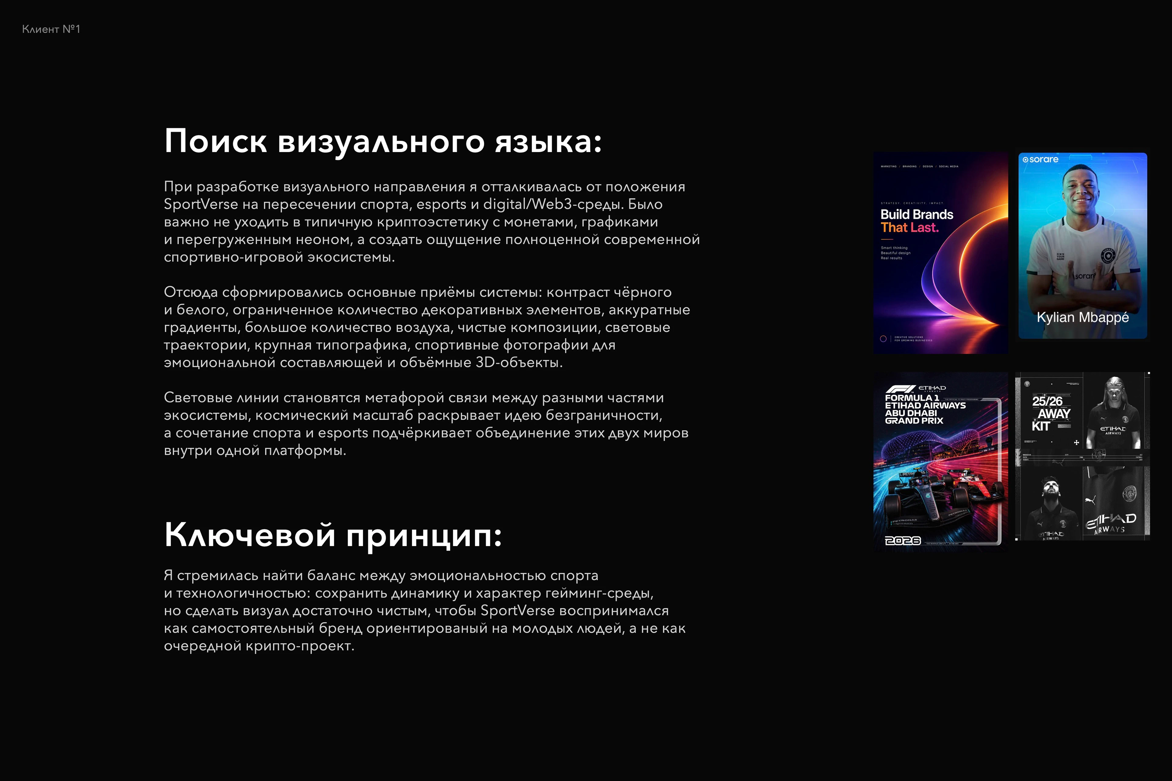
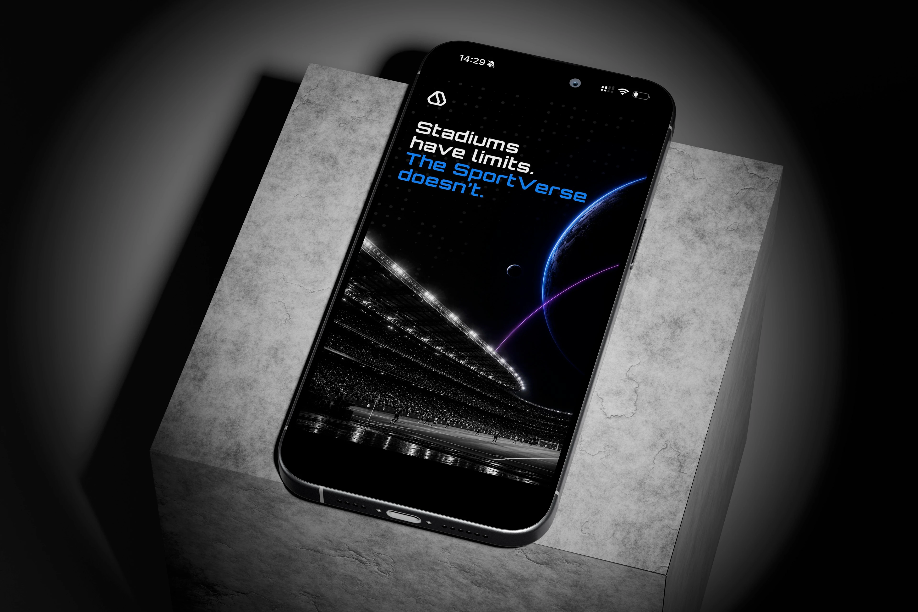
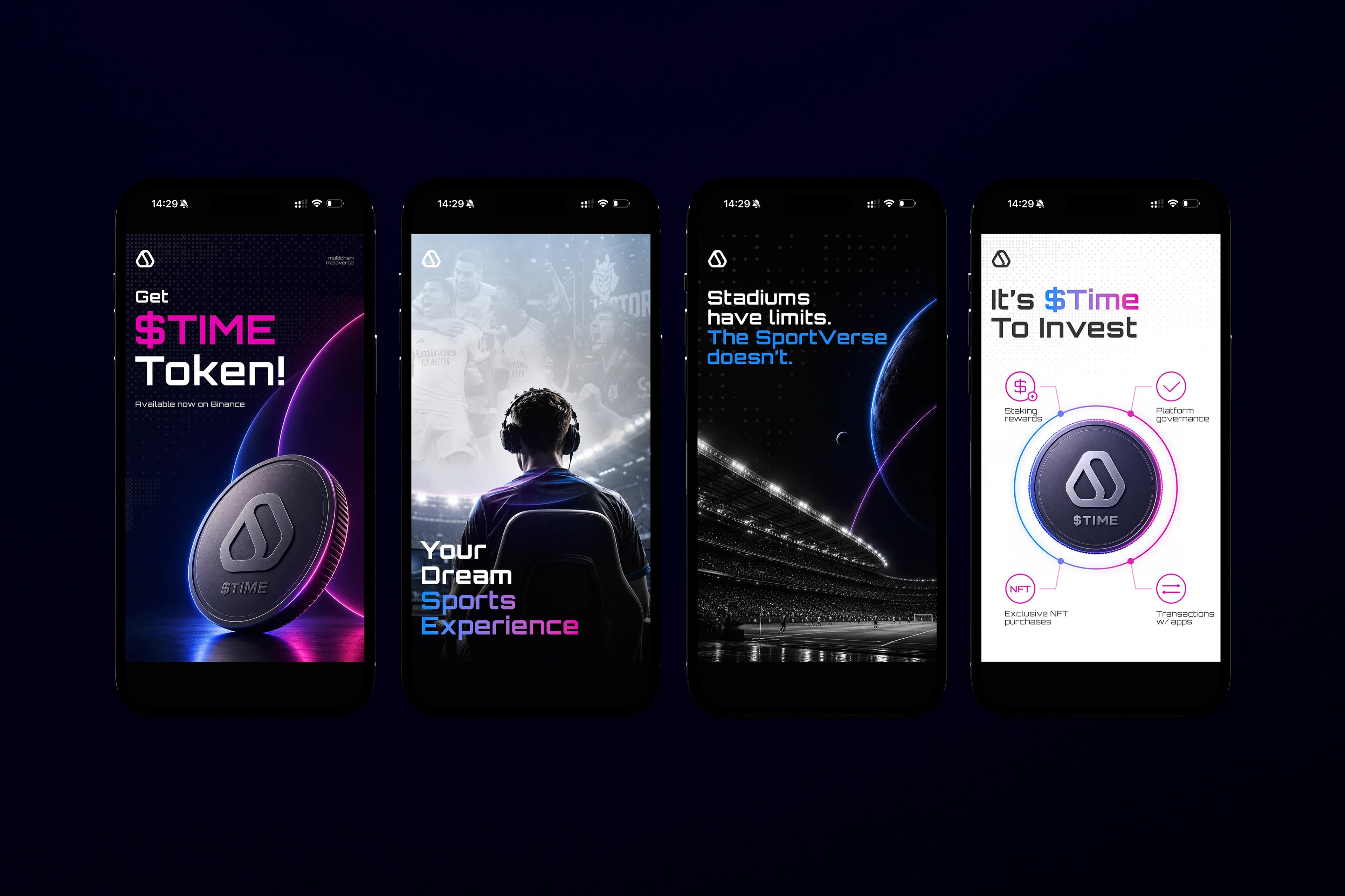
When developing the visual direction, I started from Sport Verse’s positioning at the intersection of sports, esports, and the digital/Web3 space. It was important to avoid the typical crypto aesthetic built around coins, charts, and excessive neon, and instead create the feeling of a complete, contemporary sports and gaming ecosystem.
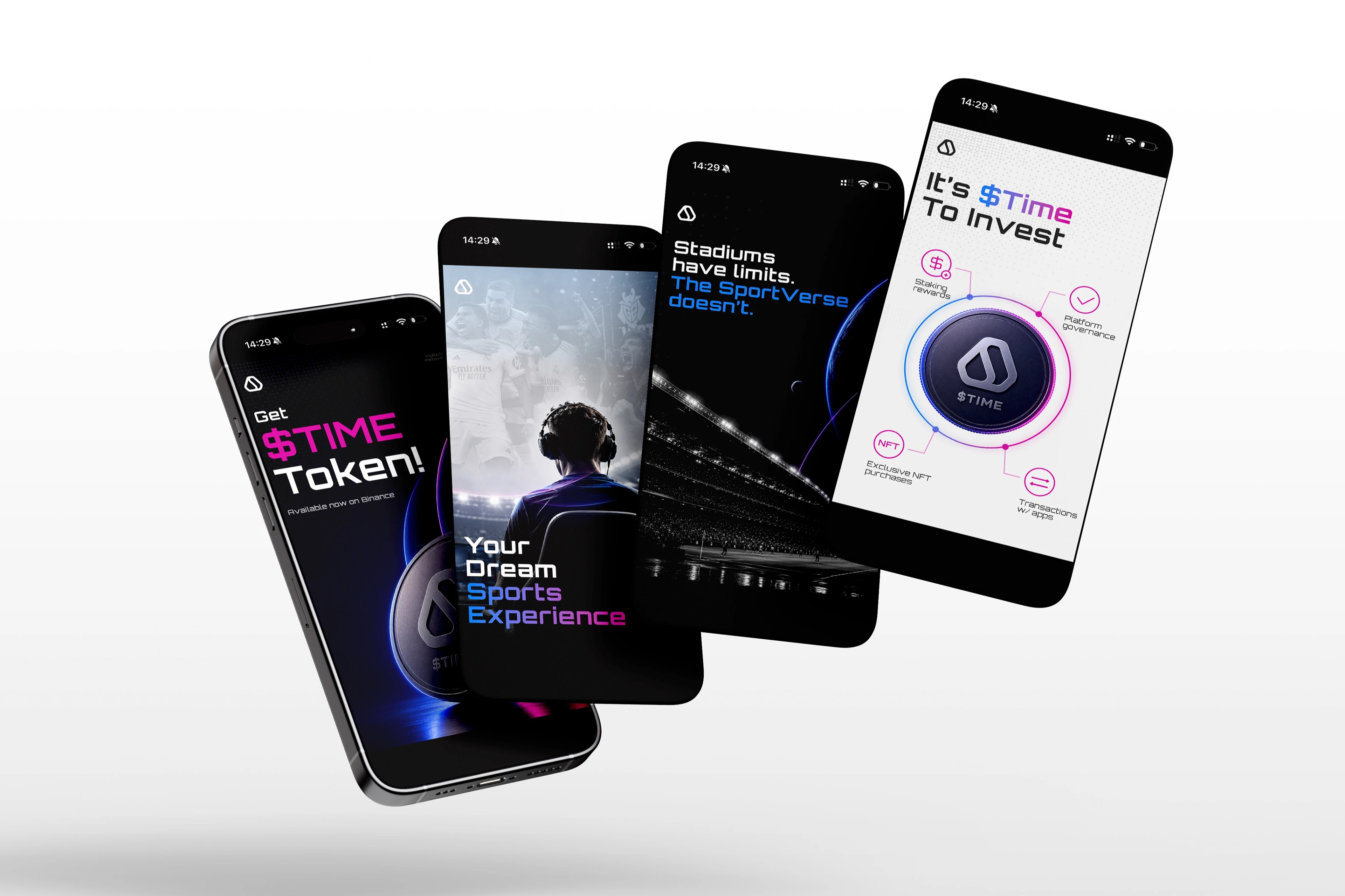
This approach shaped the key elements of the visual system: strong black-and-white contrast, a limited number of decorative elements, subtle gradients, generous use of negative space, clean compositions, light trails, bold typography, sports photography for emotional impact, and dimensional 3D objects.
The light trails act as a metaphor for the connections between different parts of the ecosystem, while the sense of cosmic scale reinforces the idea of limitless possibilities. The combination of sports and esports imagery highlights the way these two worlds come together within a single platform.
Key Principle:
My goal was to find a balance between the emotional energy of sports and the technological character of the platform: to preserve the dynamics and attitude of the gaming environment while keeping the visuals clean enough for Sport Verse to feel like a distinctive youth-focused brand rather than just another crypto project.
Client Description:
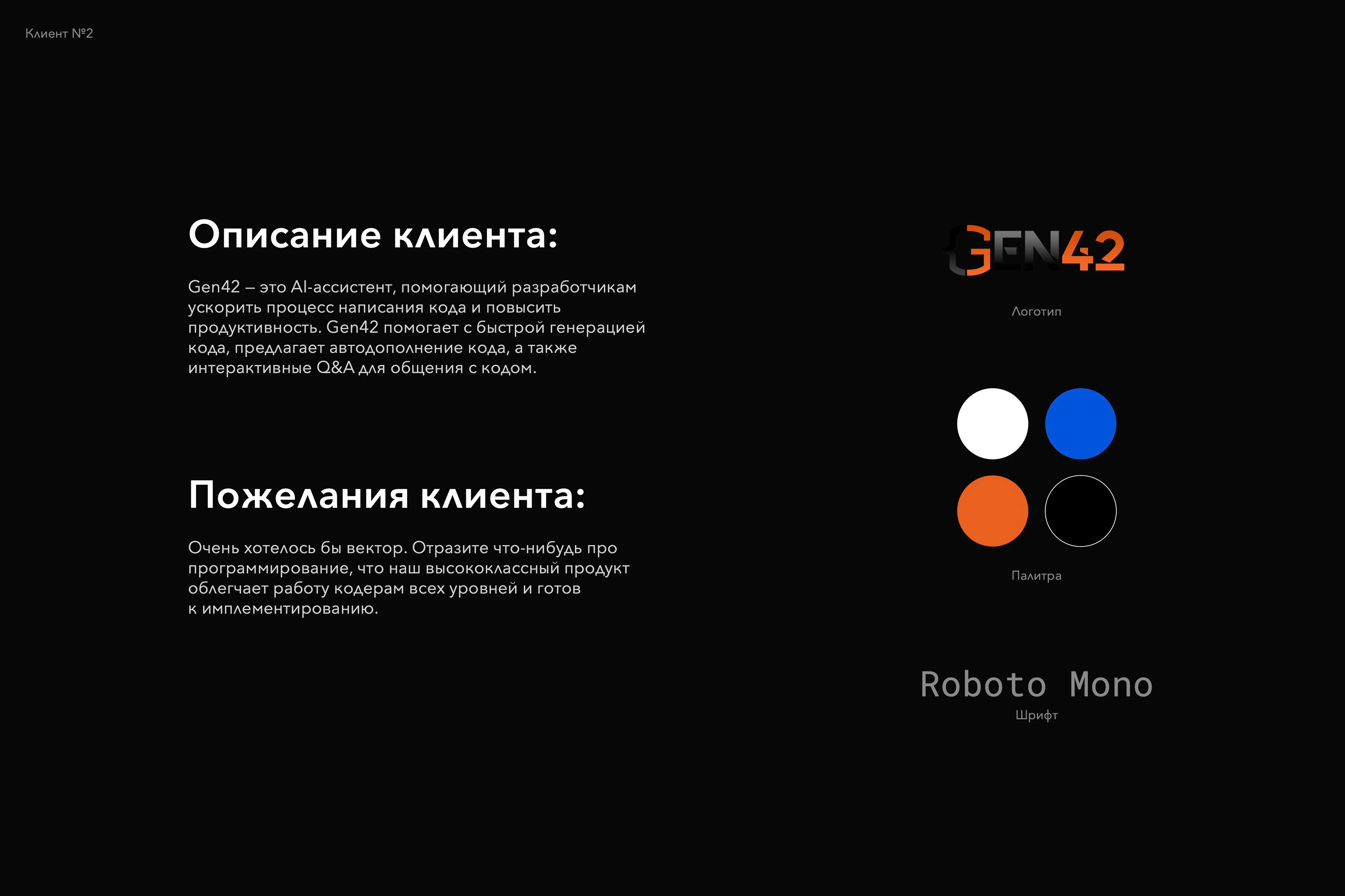
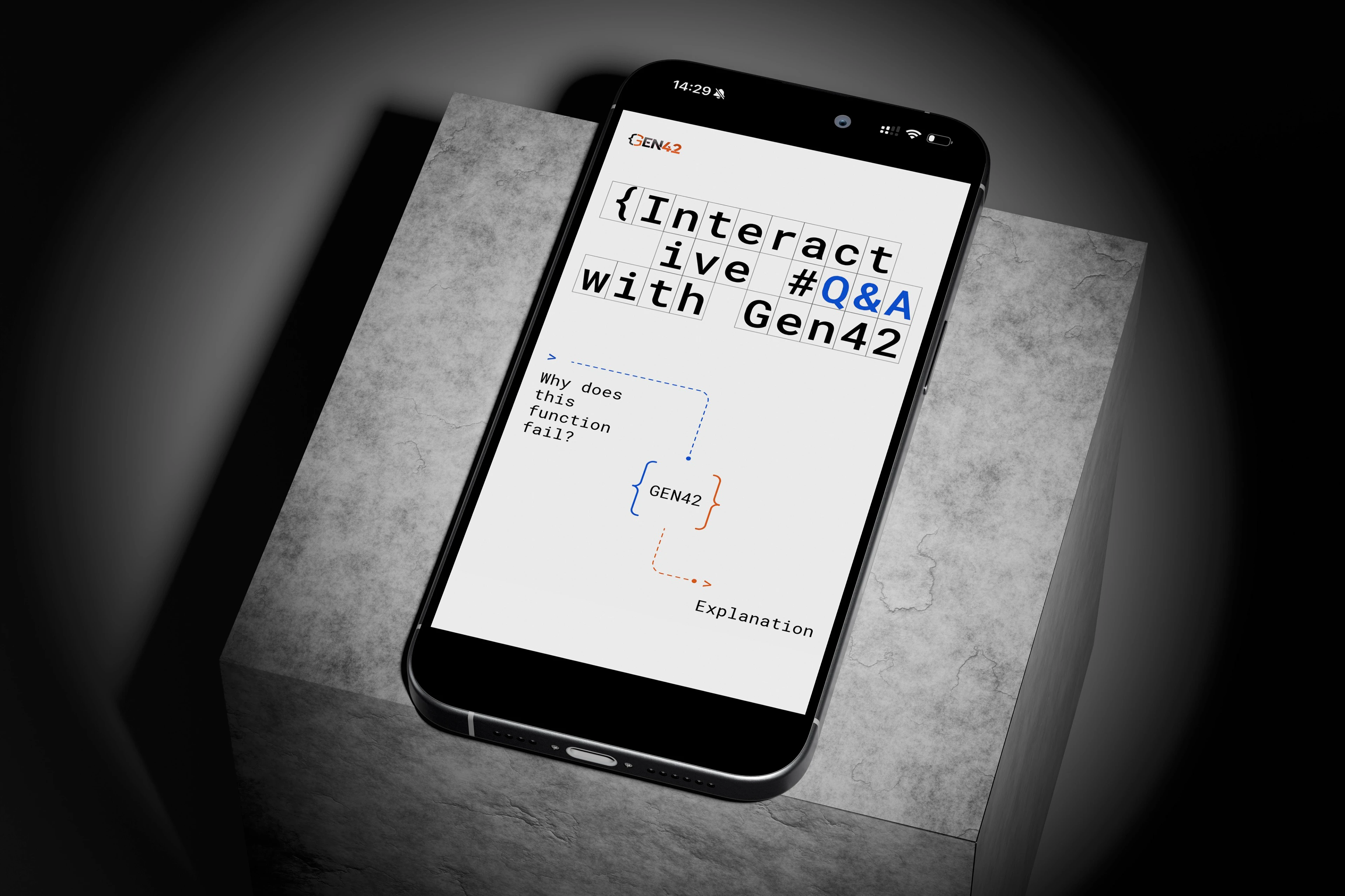
Gen42 is an AI assistant designed to help developers write code faster and work more efficiently. The product supports rapid code generation, intelligent code completion, and interactive Q&A, allowing developers to communicate with and better understand their code.
Client Preferences:
The client wanted the visual direction to be primarily vector-based and clearly connected to programming. The key objective was to communicate that Gen42 is a high-quality, implementation-ready product that simplifies the workflow for developers of all experience levels.
Exploring the Visual Language:
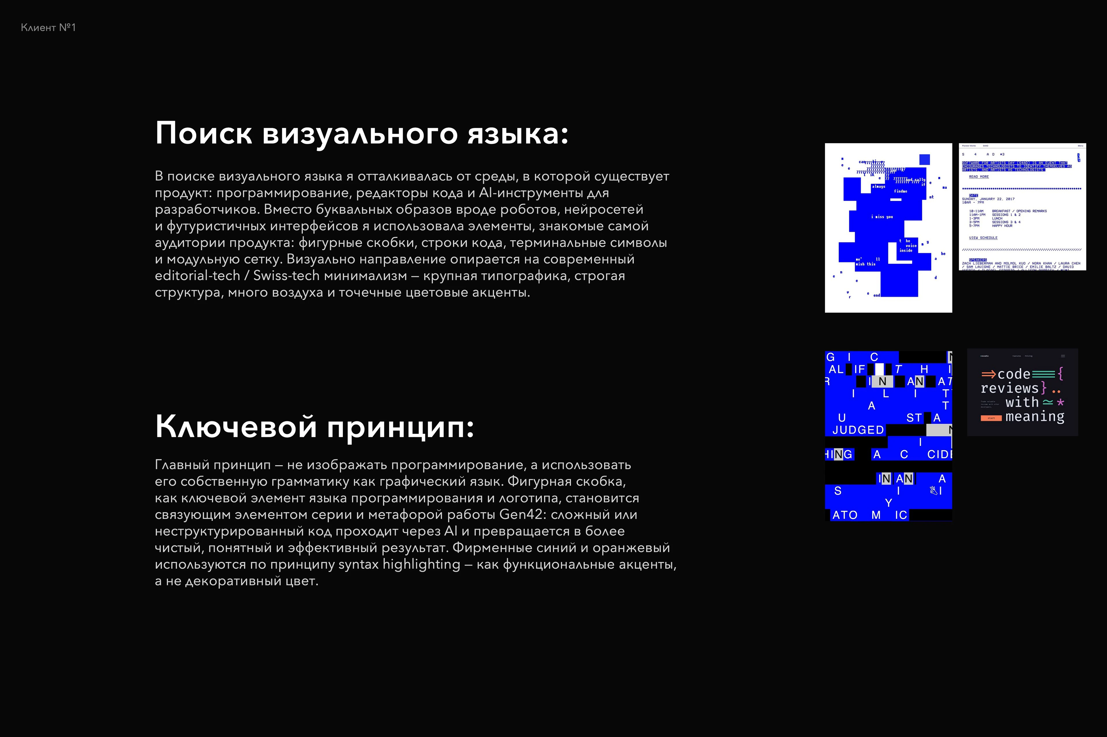
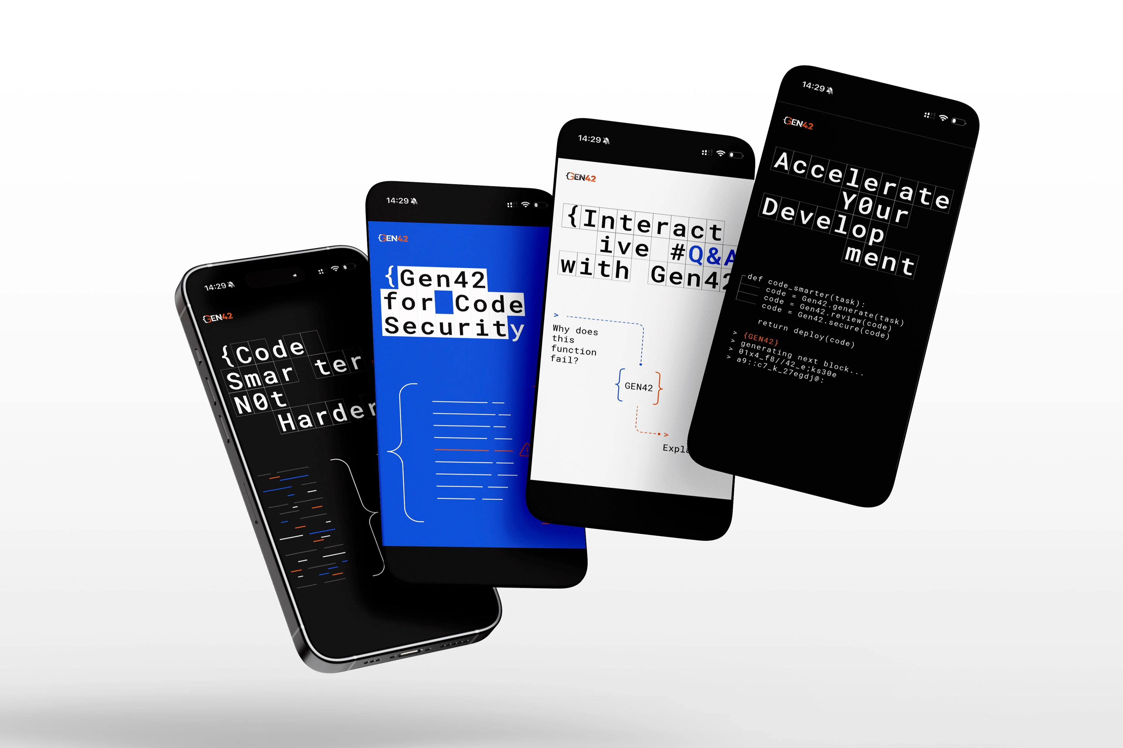
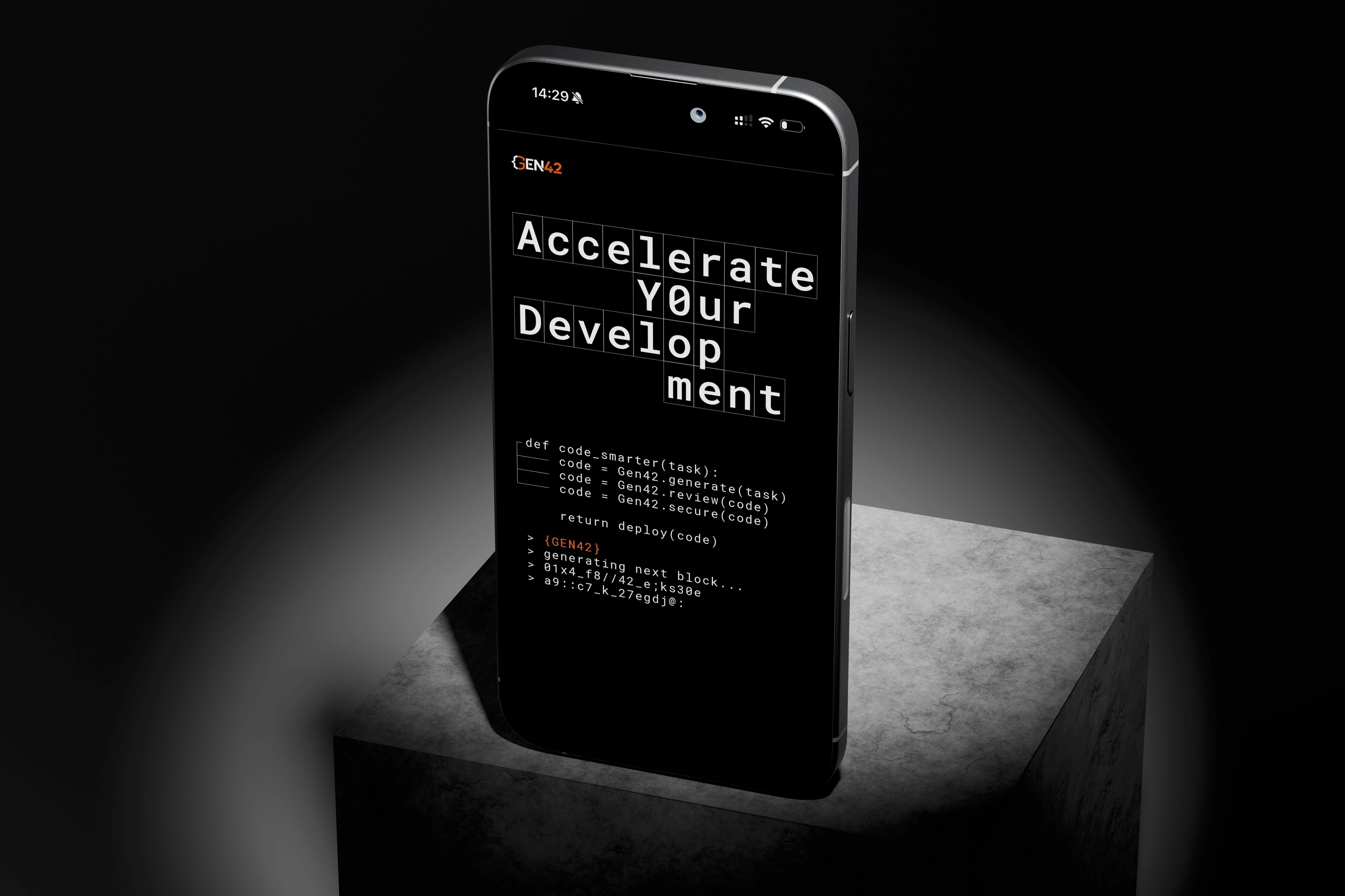
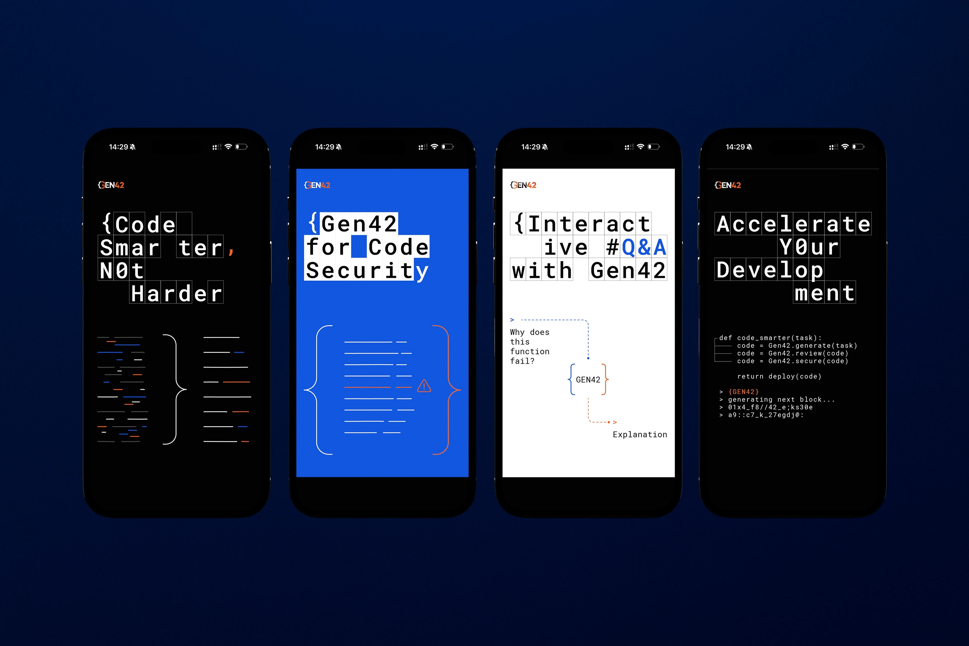
In developing the visual direction, I started with the environment in which the product naturally exists: programming, code editors, and AI-powered developer tools. Instead of relying on literal imagery such as robots, neural networks, or futuristic interfaces, I used elements already familiar to the product’s audience: curly brackets, lines of code, terminal symbols, and a modular grid.
Visually, the direction is rooted in a contemporary editorial-tech / Swiss-tech minimalism, combining bold typography, a strict structural system, generous negative space, and carefully placed color accents.
Key Principle:
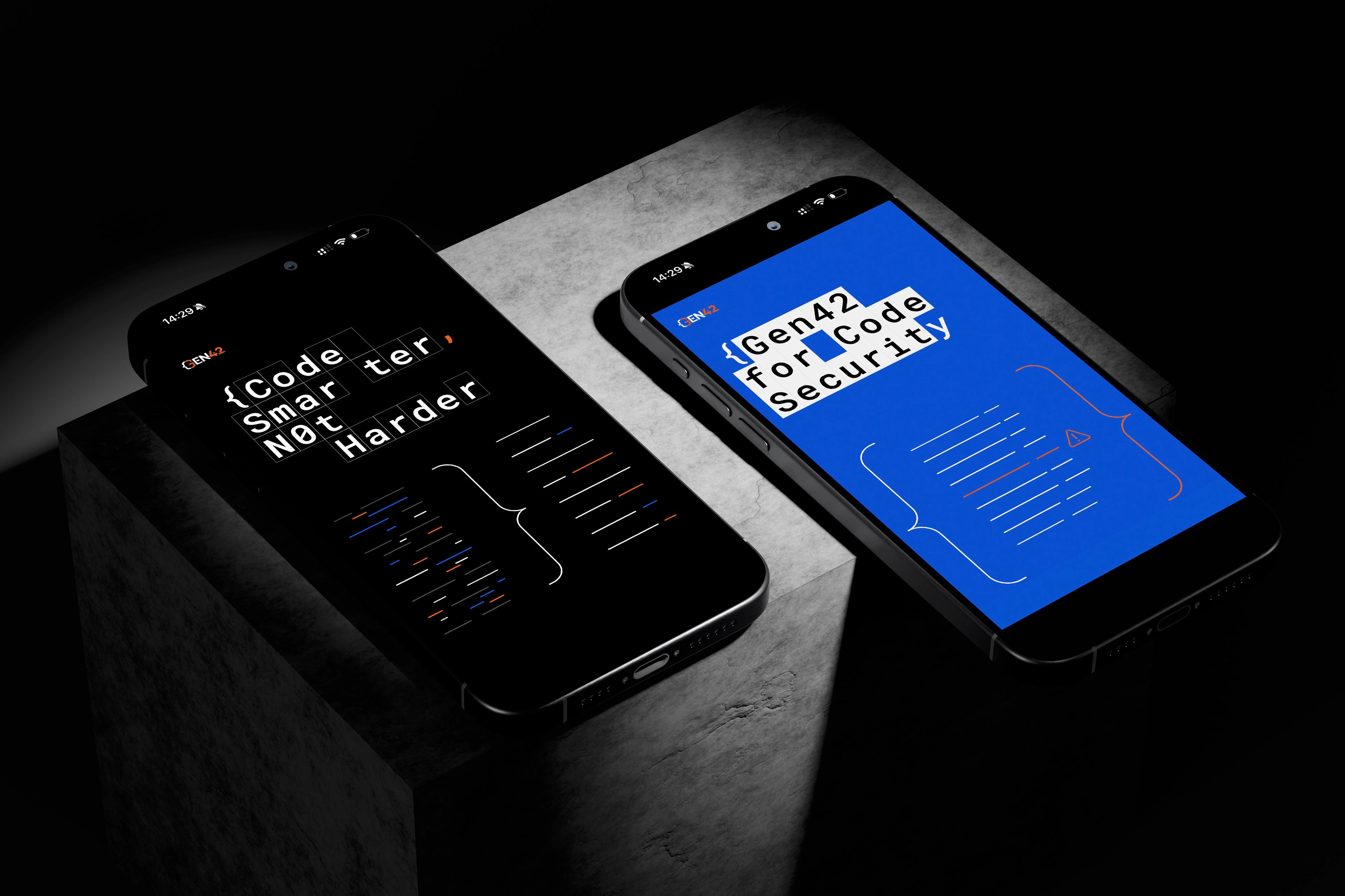
The main idea was not to illustrate programming, but to use its own grammar as the graphic language of the brand. The curly bracket — both a fundamental programming symbol and a key element of the Gen42 logo — becomes the unifying device across the visual system and a metaphor for how the product works: complex or unstructured code passes through AI and is transformed into a cleaner, clearer, and more efficient result.
The brand’s blue and orange are used according to the logic of syntax highlighting — as functional accents rather than purely decorative color.
WE ARE READY FOR A NEW PROJECTS
Let's create impactful, innovative designs together.
polina.zubareva@inviewdesign.ru
GET IN TOUCH
Telegram | Instagram | Linkedin | Dprofile
Thank you for viewing and appreciating this project