
BRAND VISUAL SYSTEM
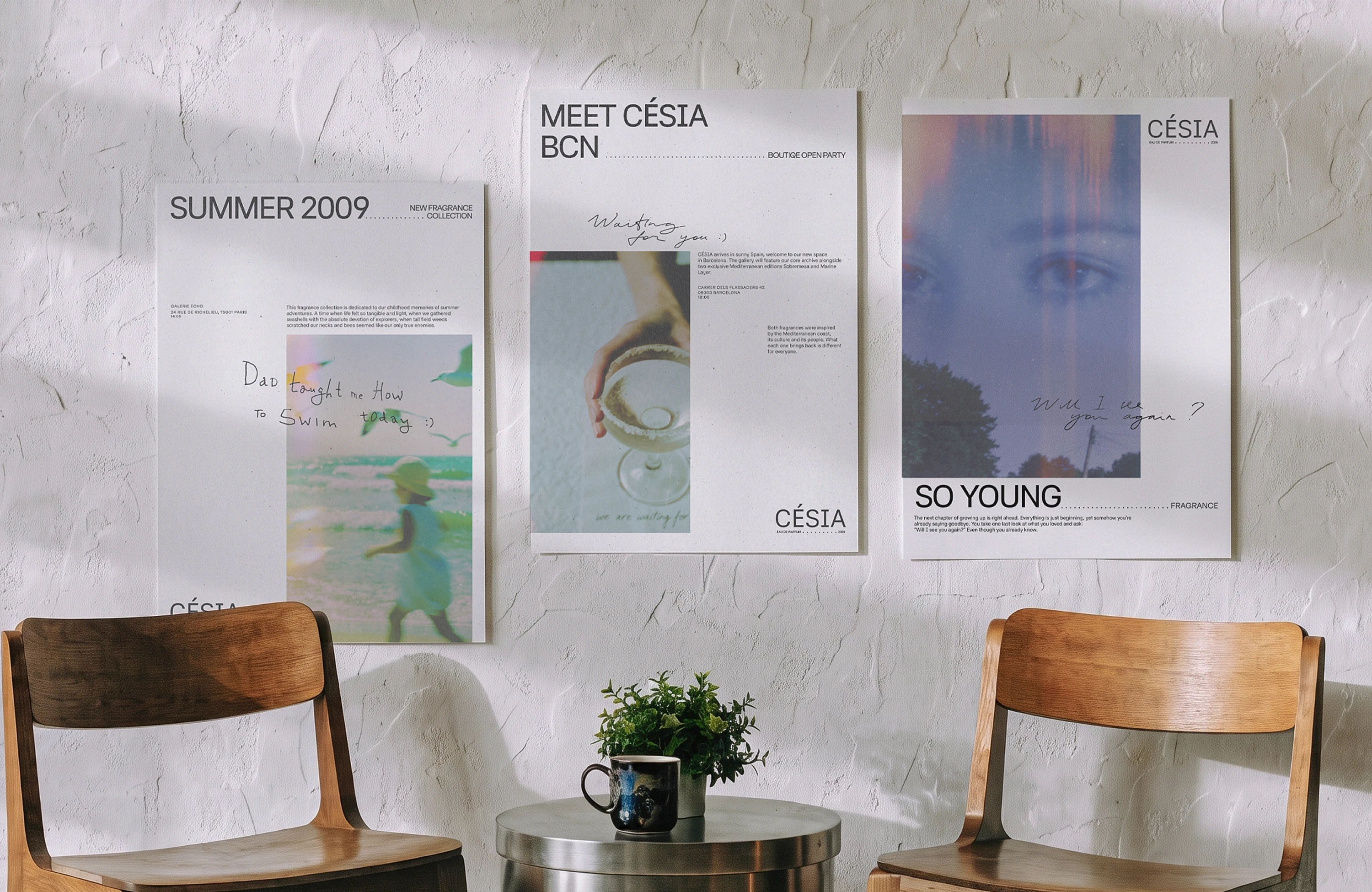
Cesia's identity is built on one idea "scent as memory". The visual system follows the same structure — a personal archive, organized like a film, frame by frame.
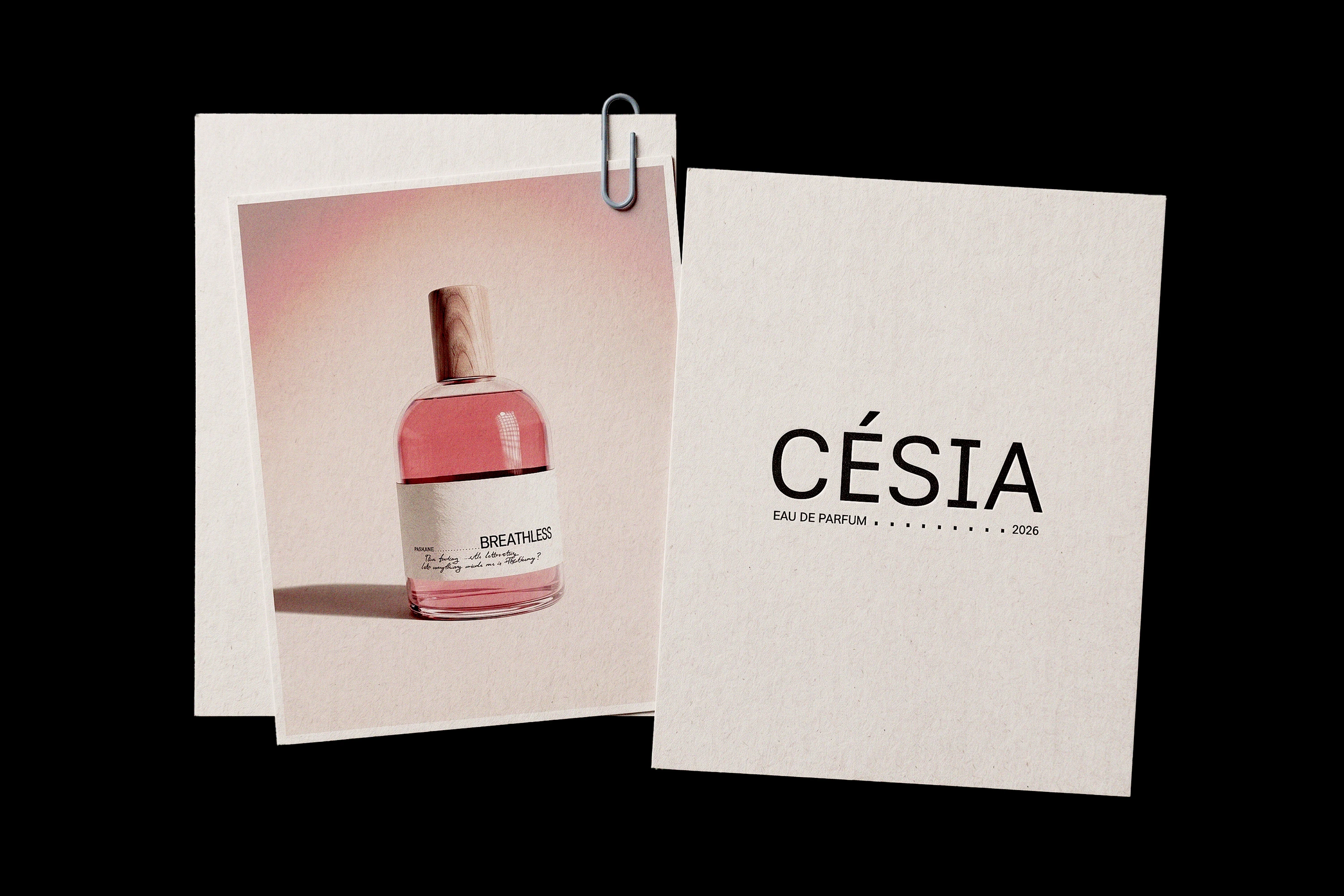
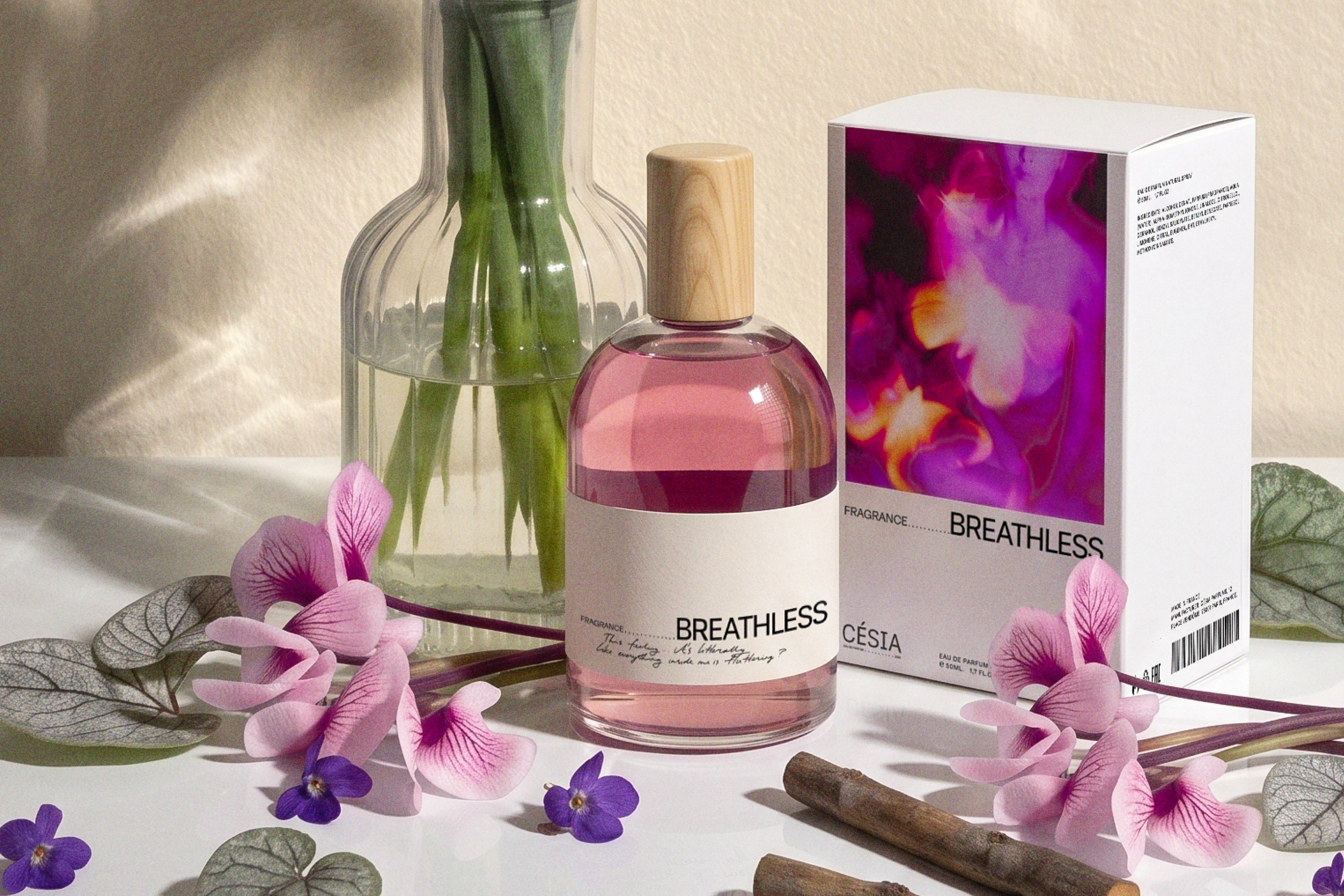
The logo is text-only. This keeps it neutral and lets the viewer form their own association with the brand. Its one distinguishing element is the dotted line under the descriptor, which connects it to the leader-dot device used throughout the identity.
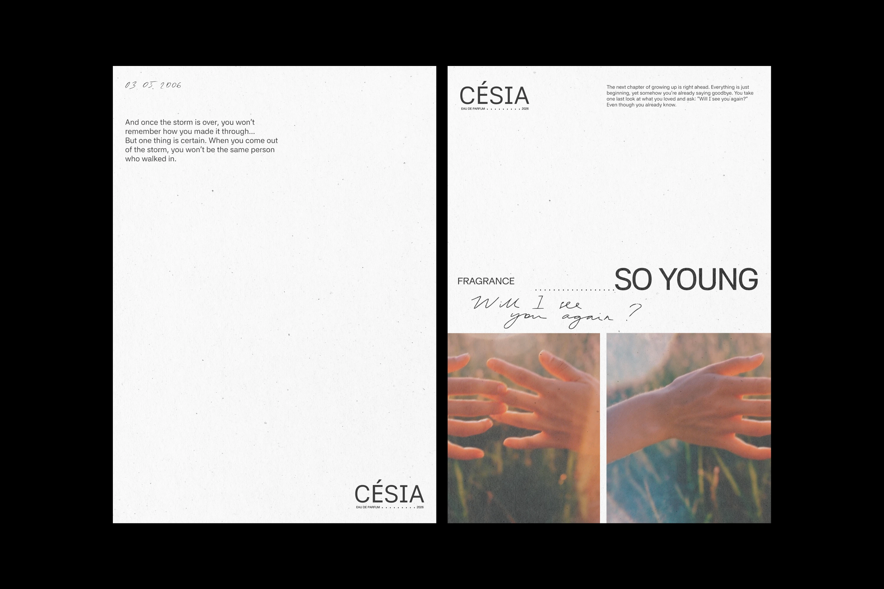
The leader dots are a direct reference to film credits typography. They serve two functions: a formal nod to that reference and a functional space reserved for handwritten additions — a caption, a date, a note. The same dots separate headline from subheadline across the two typefaces — 42dot Sans and Inklination.
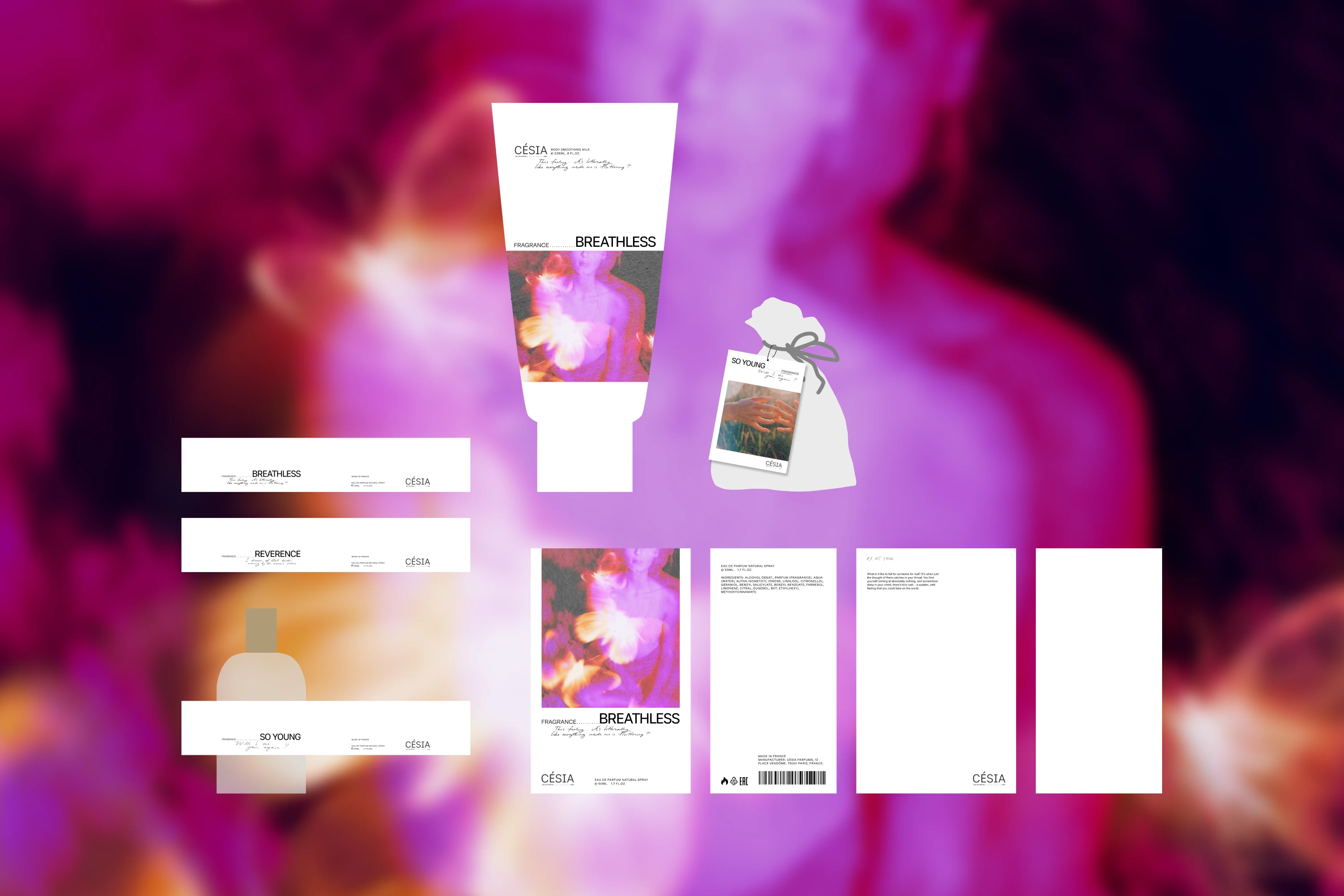
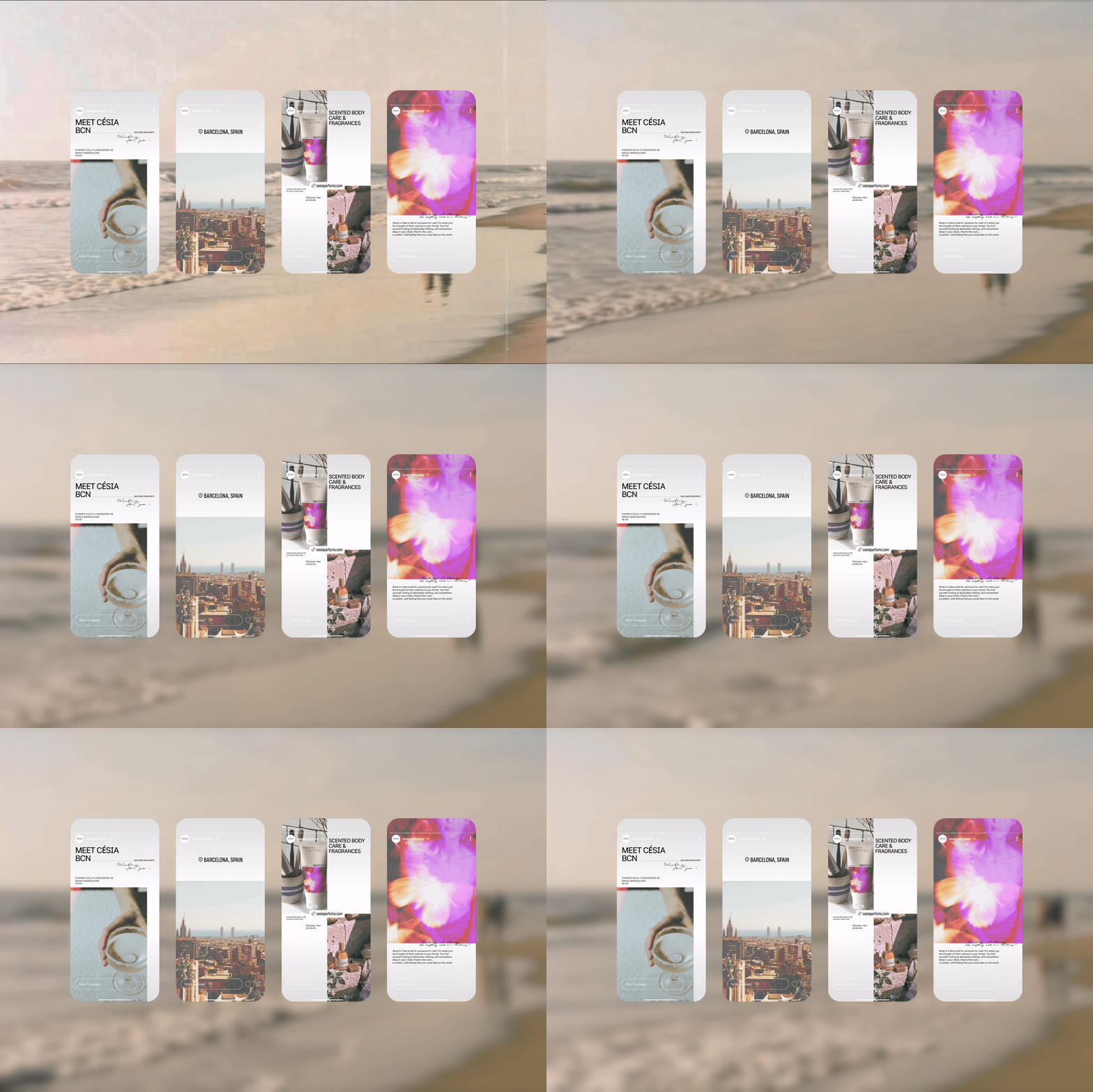
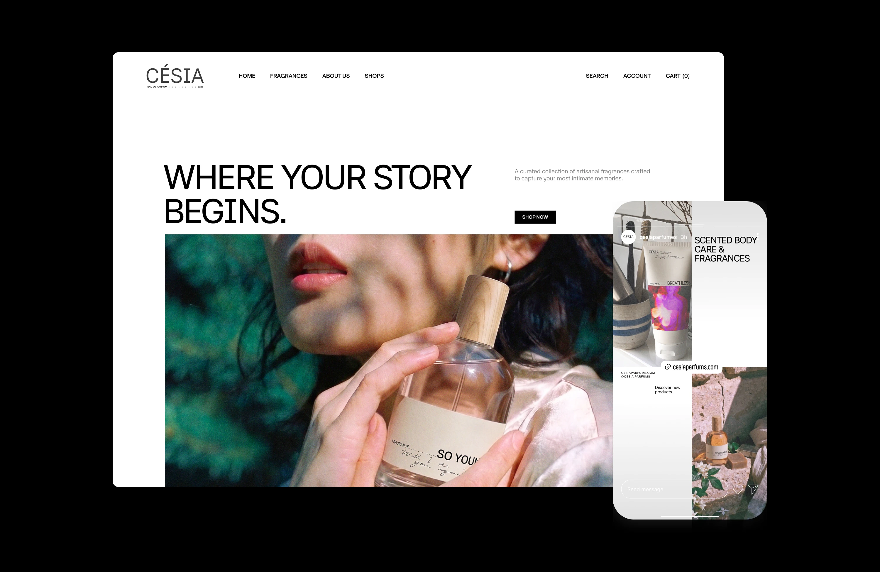
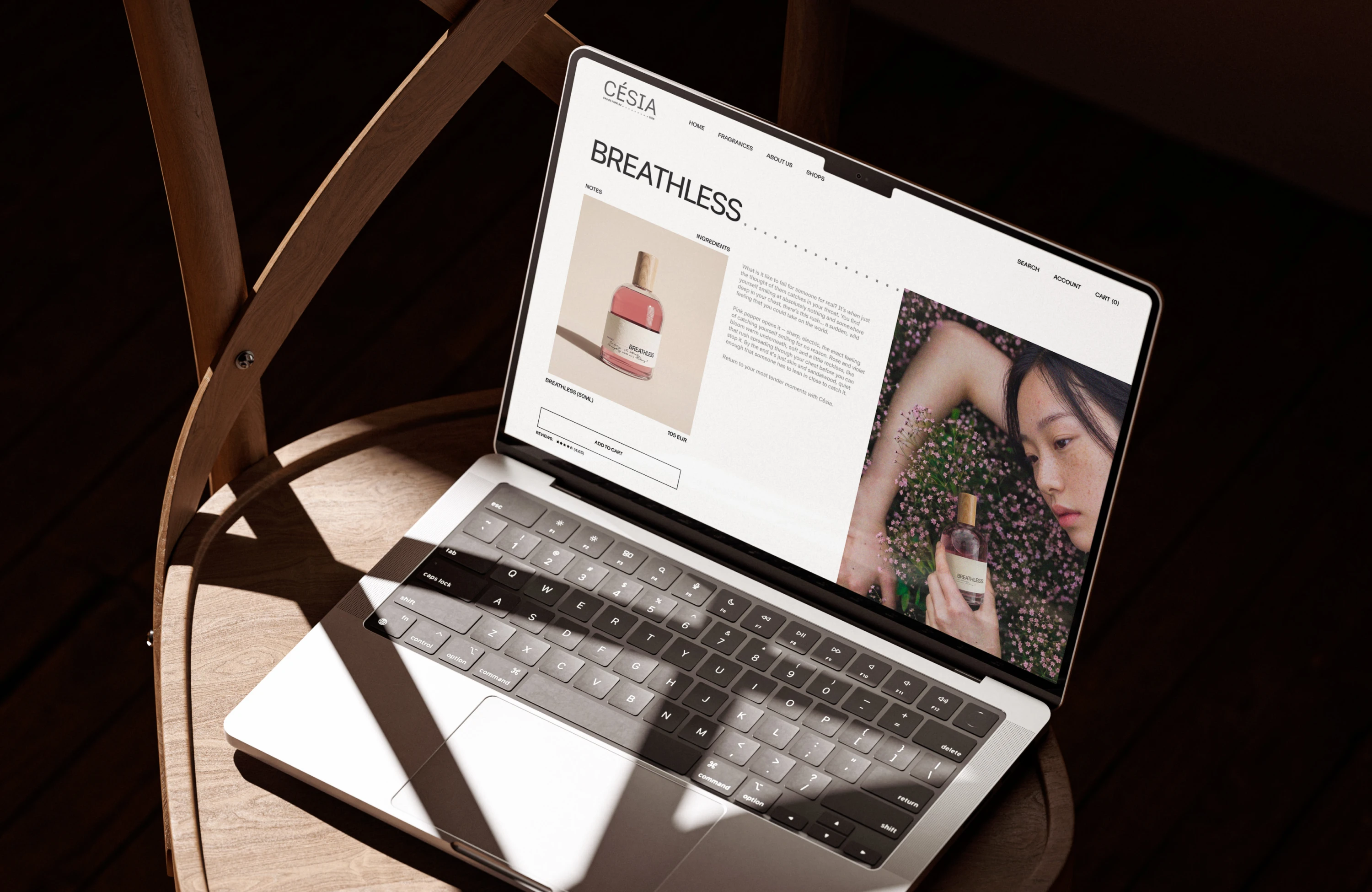
Césia meets its customers through several touchpoints and each one carries a different role. The bag and card handle the introduction — the first greeting before the product itself. The packaging is designed around daily use. Digital touchpoints — Instagram and the website — are where communication happens, and where customers go to find information about the brand.