Featured Packaging of the World × World Brand Design Society
Develop a packaging concept for a sparkling beverage line based on natural juices.
Create a bold visual system that stands out within the category through color, minimalist typography, and expressive graphic elements.
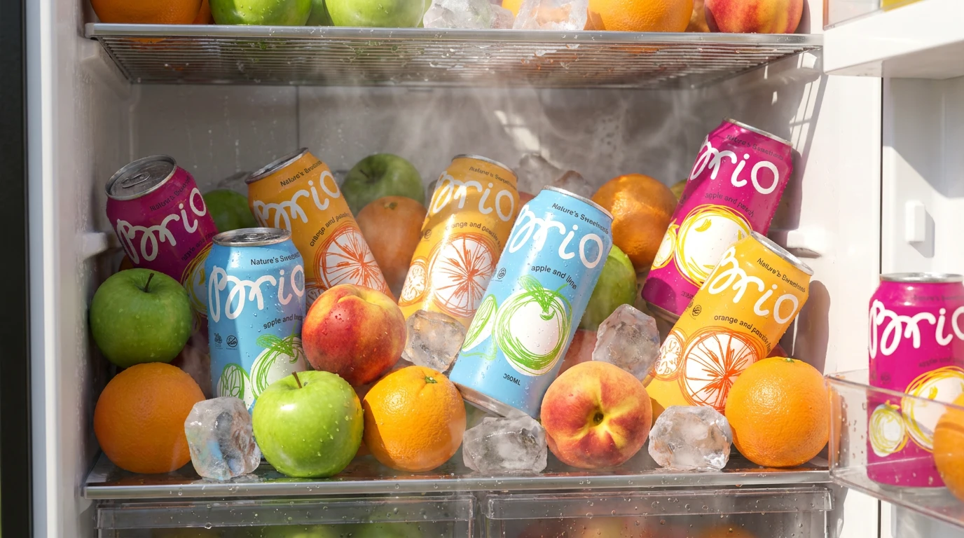
Design a scalable identity adaptable across multiple SKUs, digital media, and brand communication materials.
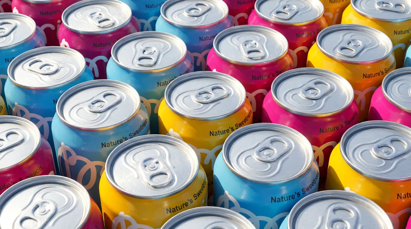
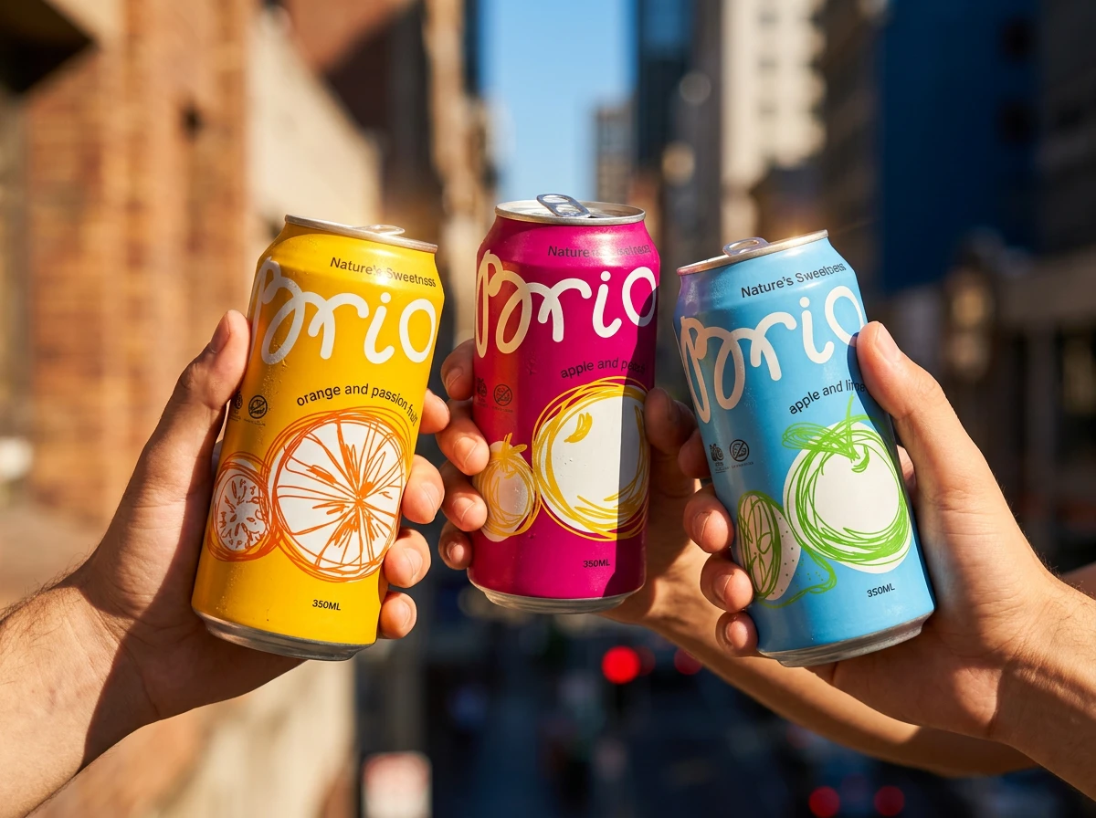
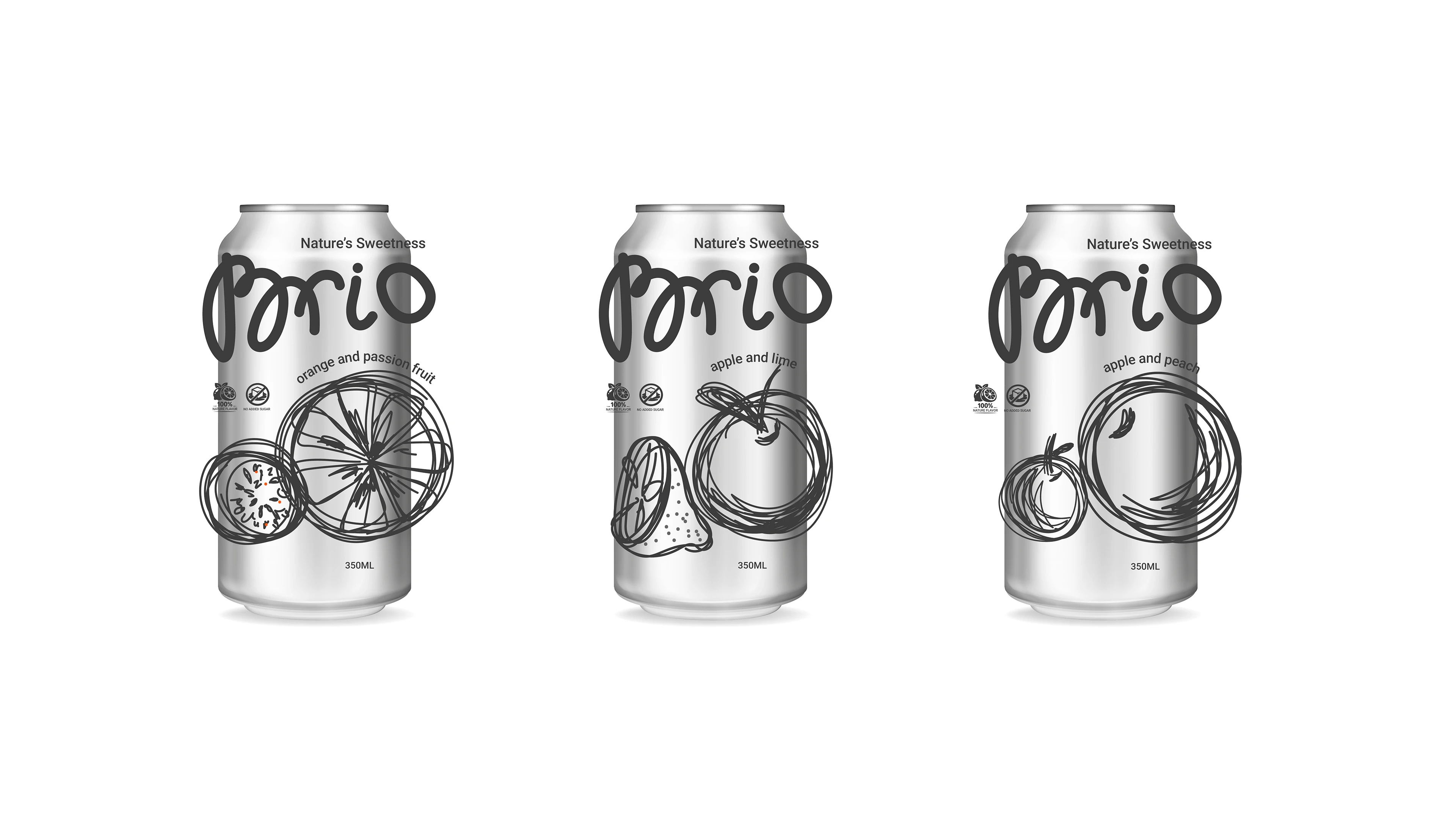
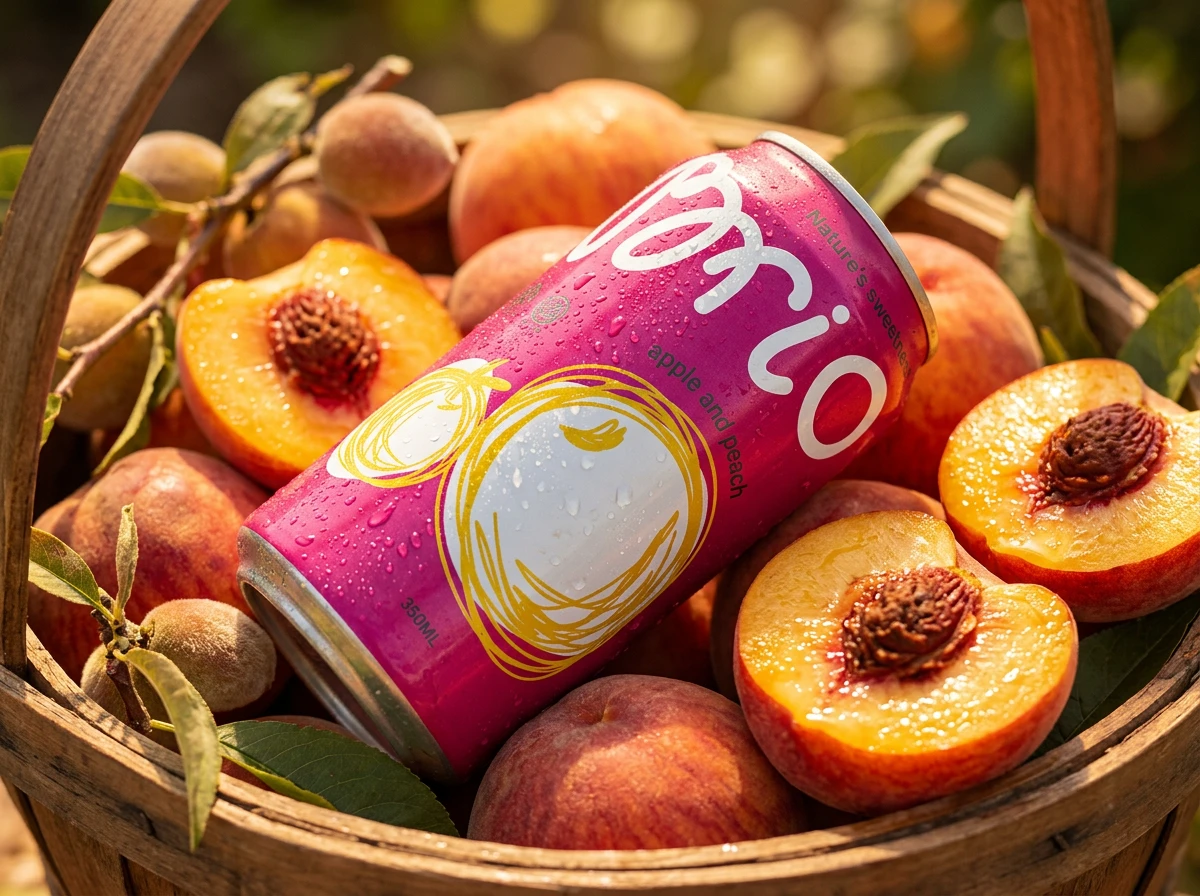
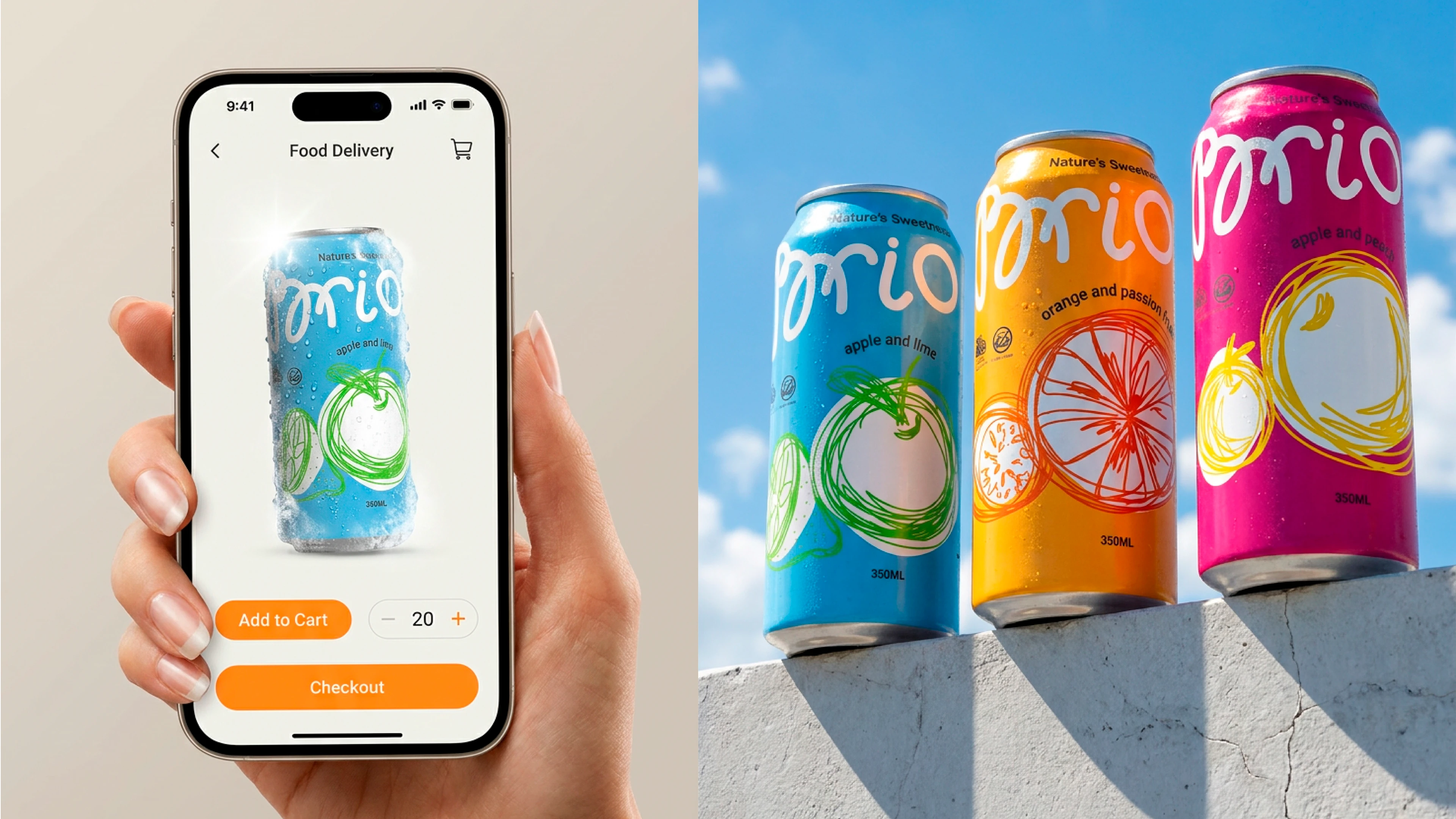
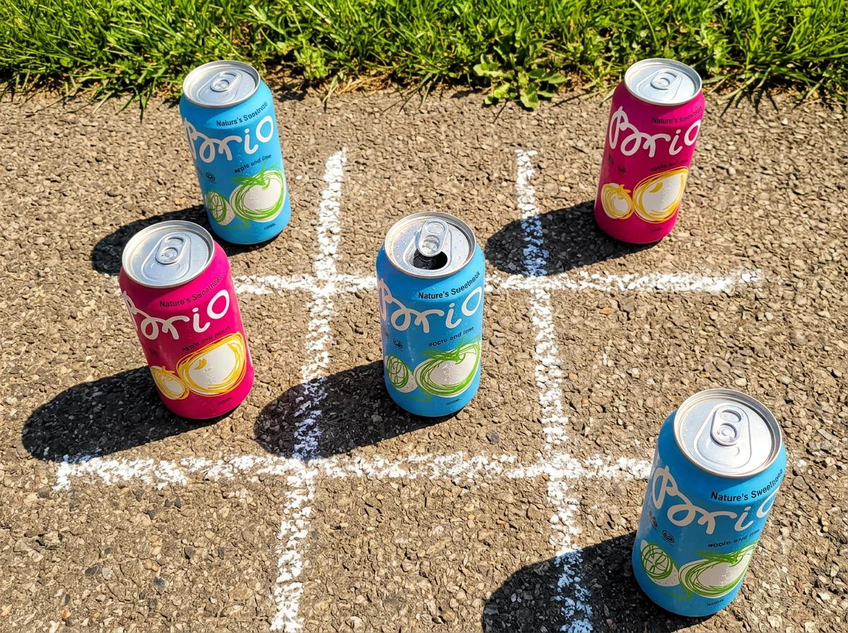
The visual concept of Brio combines minimalist typography, bold color fields, and expressive sketch-style graphics.
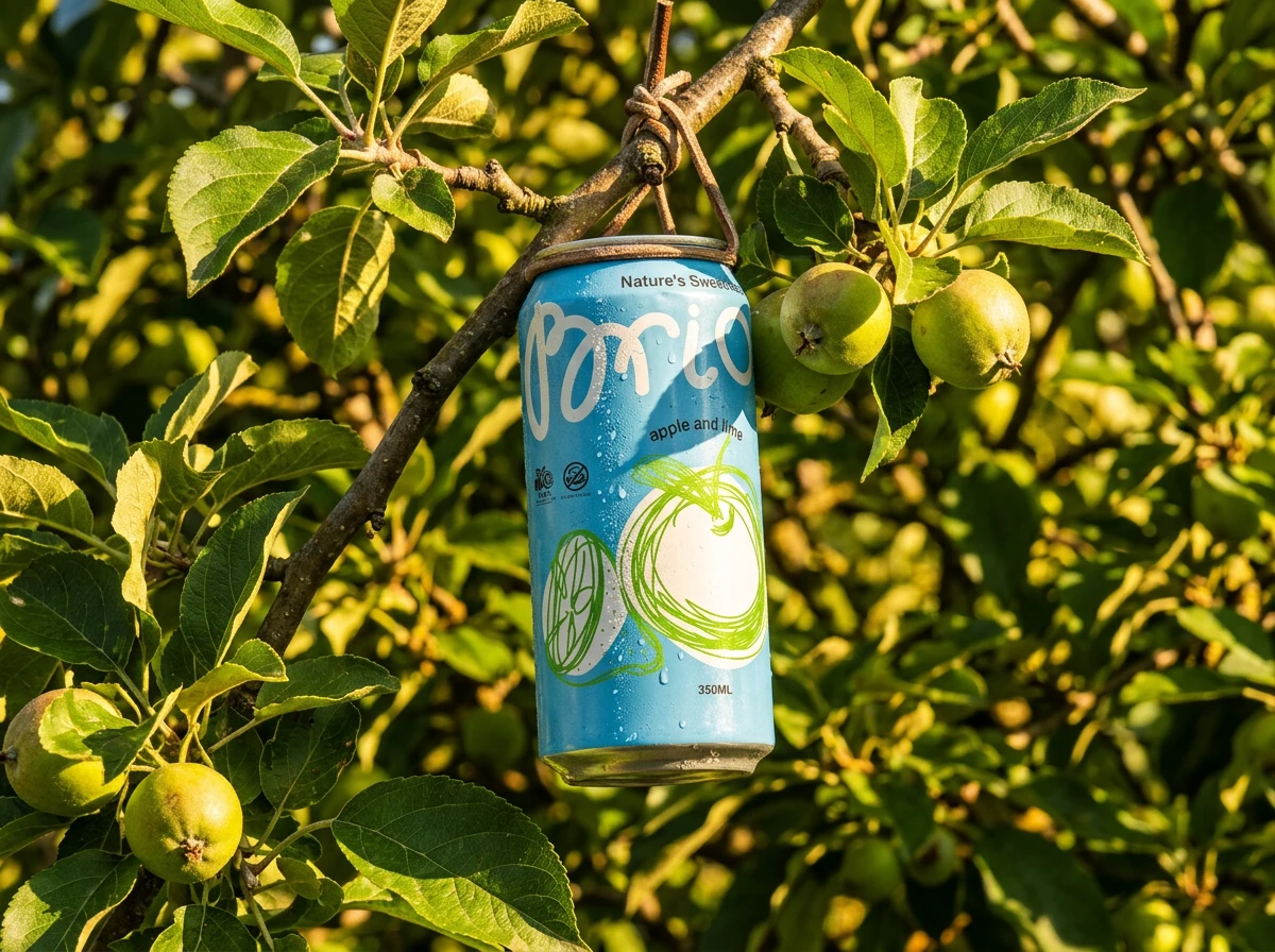
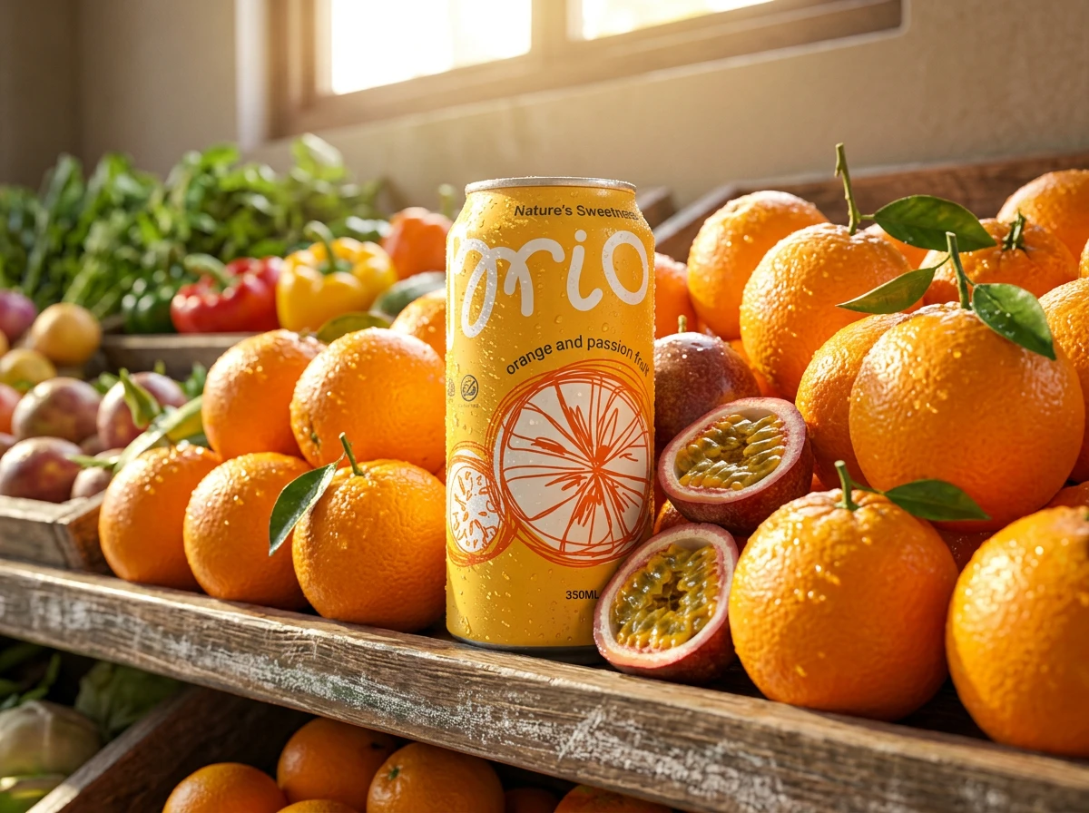
Instead of traditional realistic fruit imagery, the design uses loose hand-drawn lines to create a sense of movement, freshness, and spontaneity. Each flavor features its own color identity and graphic element while maintaining consistency across the entire product line, resulting in a recognizable and contemporary brand image.
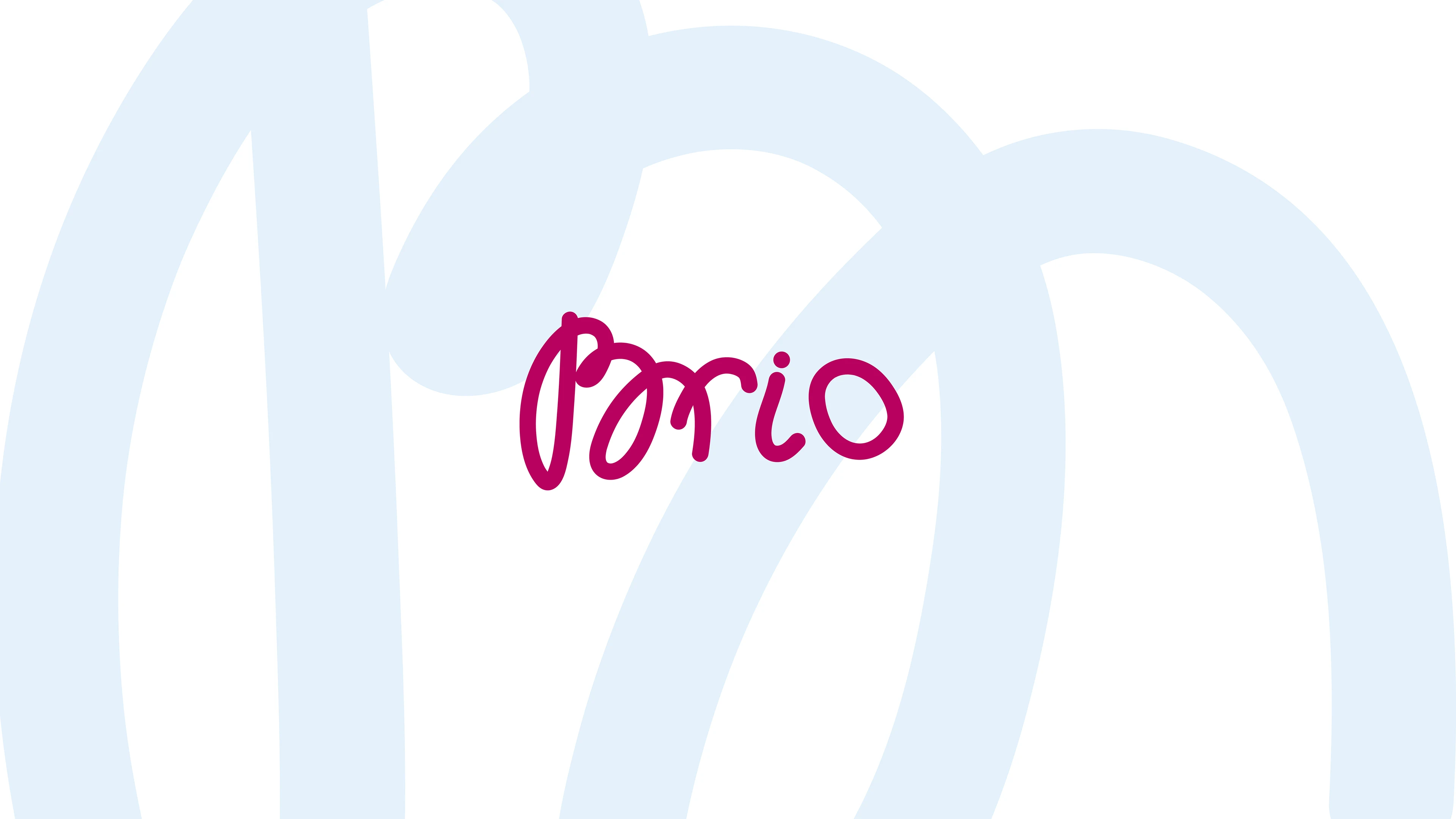
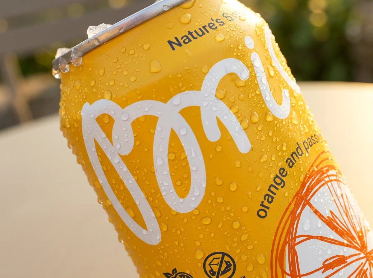
The Brio logo is designed using soft, fluid typography with rounded shapes that create a light and approachable feel.
Its large-scale appearance increases shelf visibility, while the minimalistic execution allows the logo to work naturally alongside expressive graphics and bold color accents across the packaging system.
Graphic designer, packaging designer: Svetlana Morozova
Contact me
email morozova@redlana.ru