CREAMO
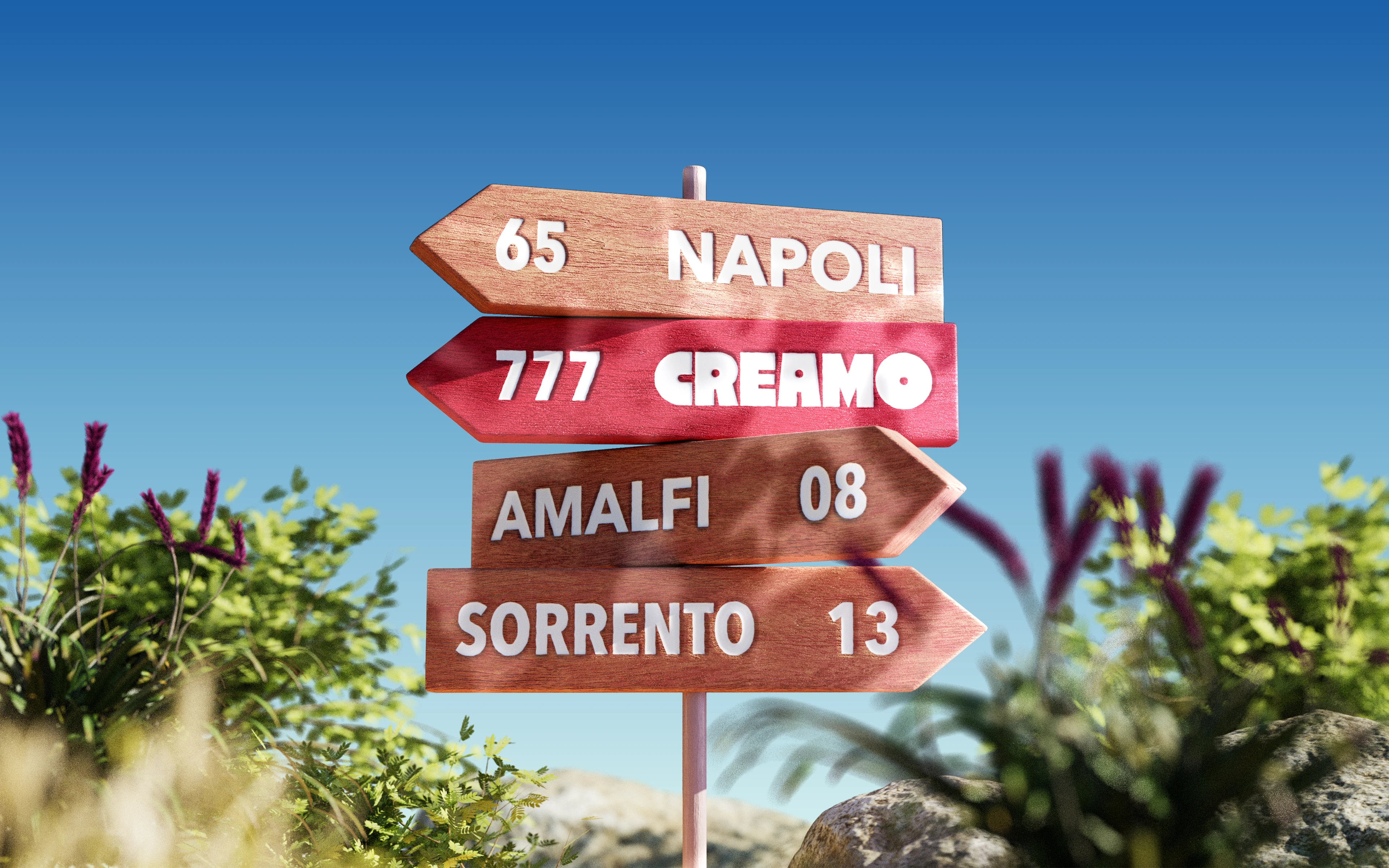
It started with the name. We were looking for something short, warm and memorable — a word that could describe the product without being too literal.
Cream + amore became one.
The name gave us the tone for the whole project: soft, playful, slightly Italian and built around a simple idea of food made with affection. From there, the identity came naturally.
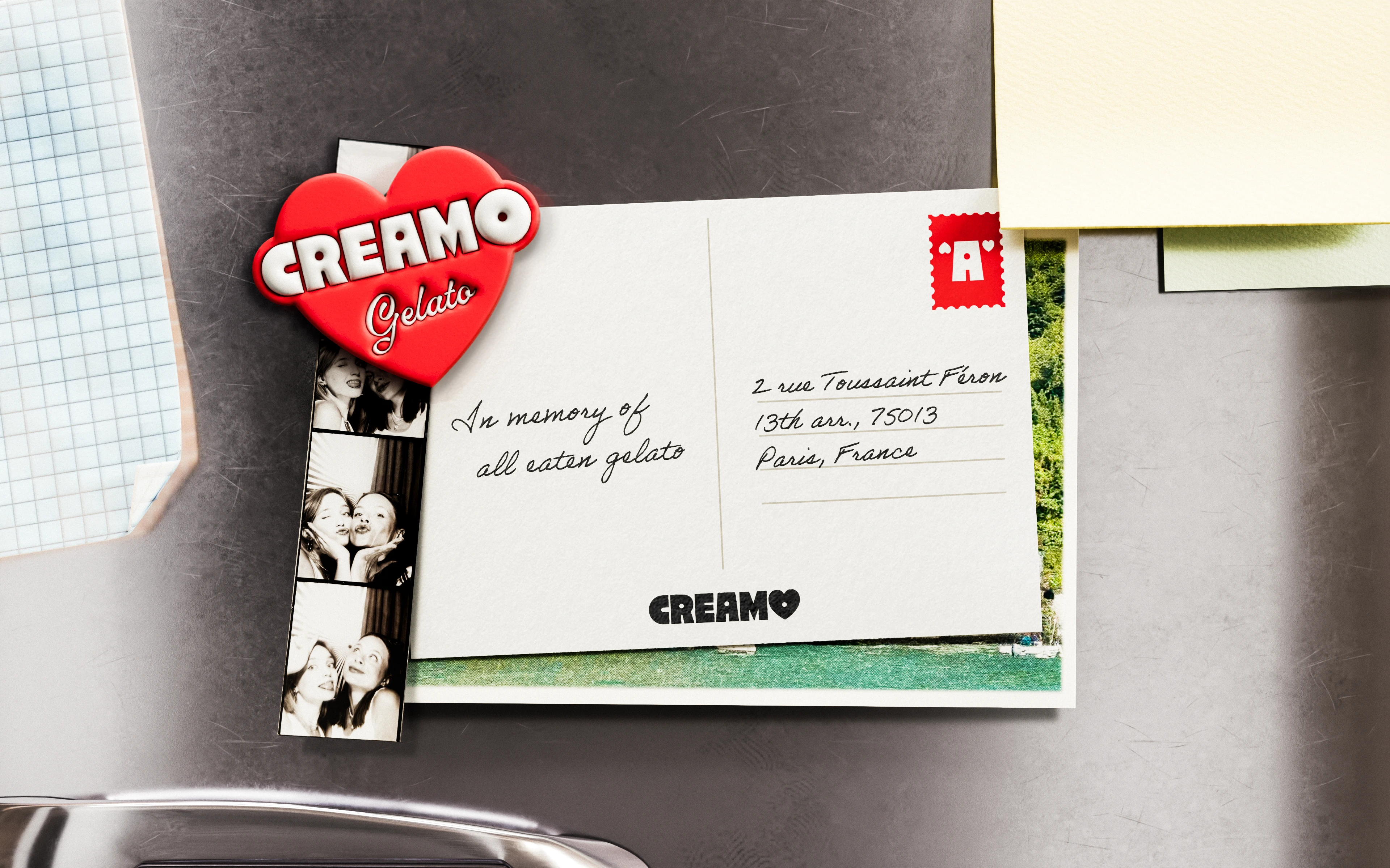
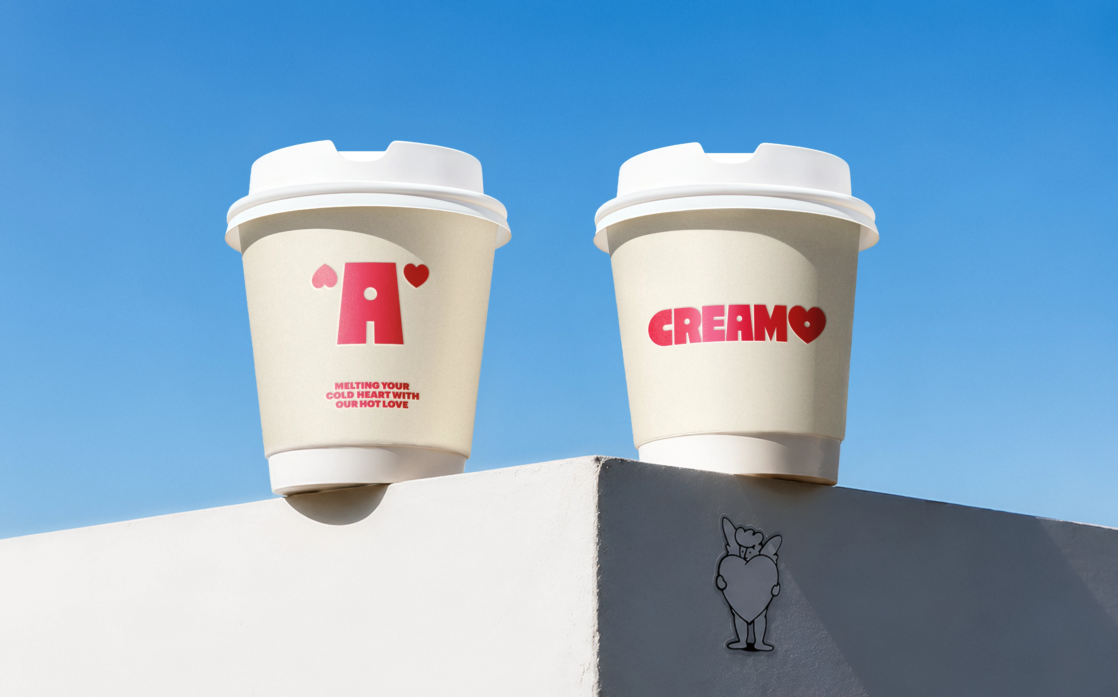
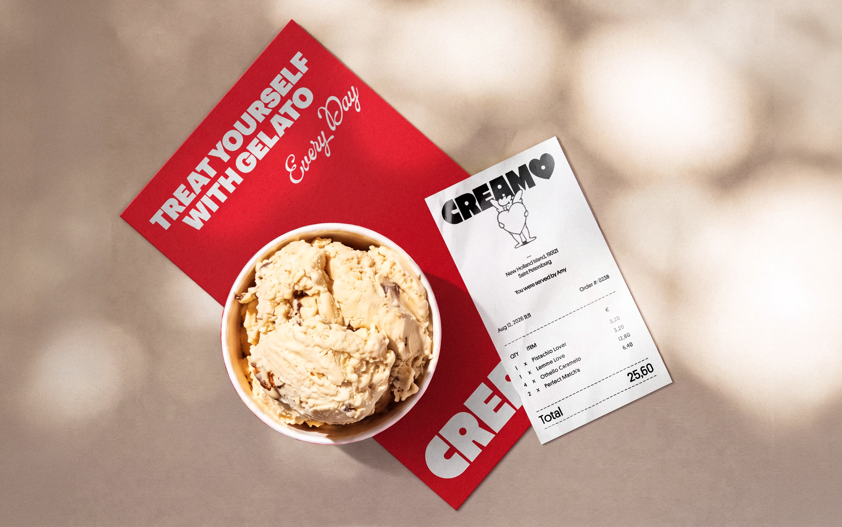
Bold typography, warm colours and simple graphic details created a flexible visual system with plenty of character. We added a mascot to make the brand feel more human and to bring in humour, small visual jokes and a bit of self-irony.
The result is a warm, expressive identity designed to live naturally across packaging, digital and physical spaces.
Naming + Brand Identity + Art Direction