ENG
ismatime | бренд одежды
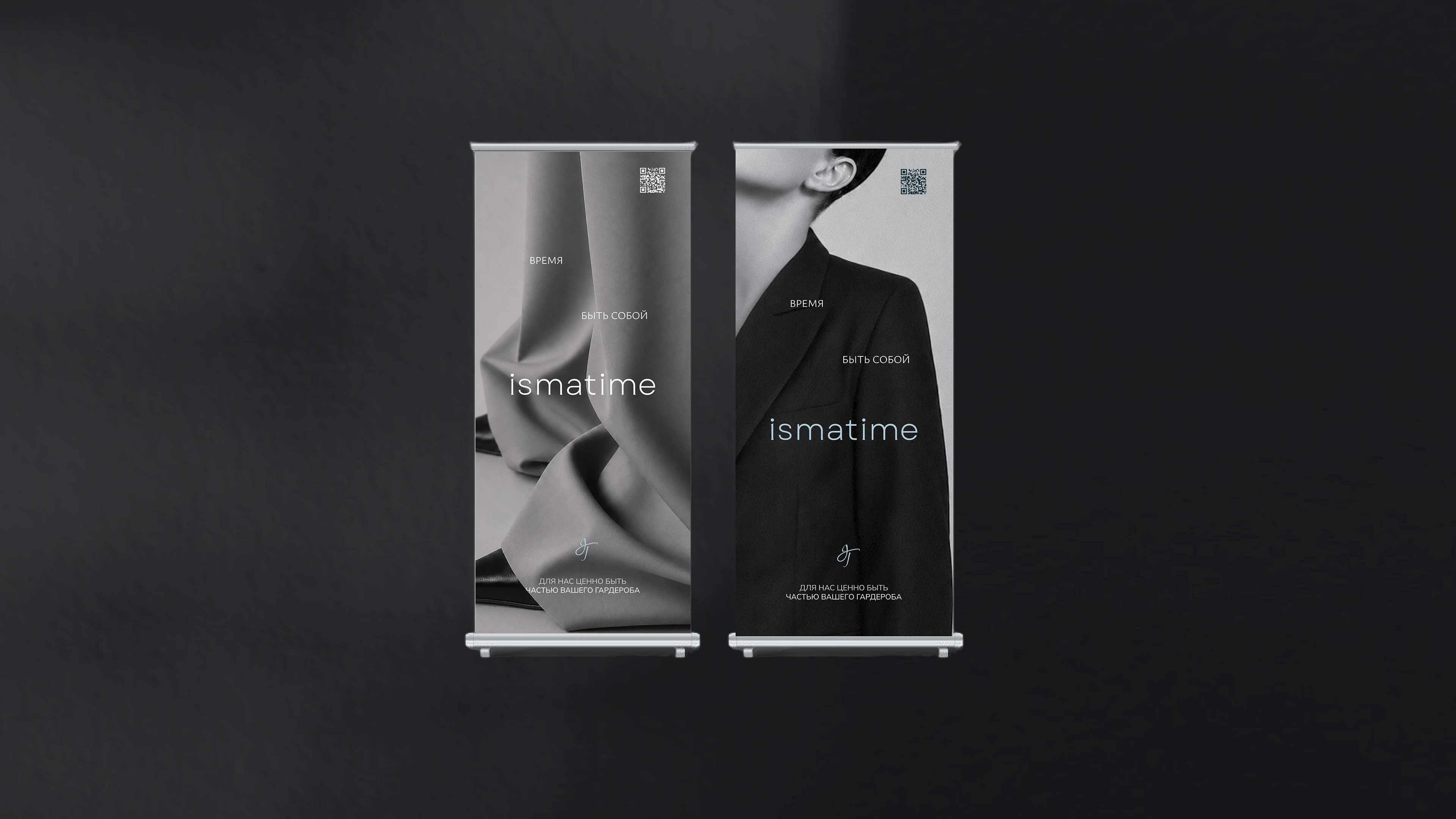
Дескриптор бренда ismatime — время быть собой. Эта идея скрыта в названии, где isma означает внутреннюю целостность и способность оставаться собой, а time отражает движение жизни, смену ролей и ритмов.
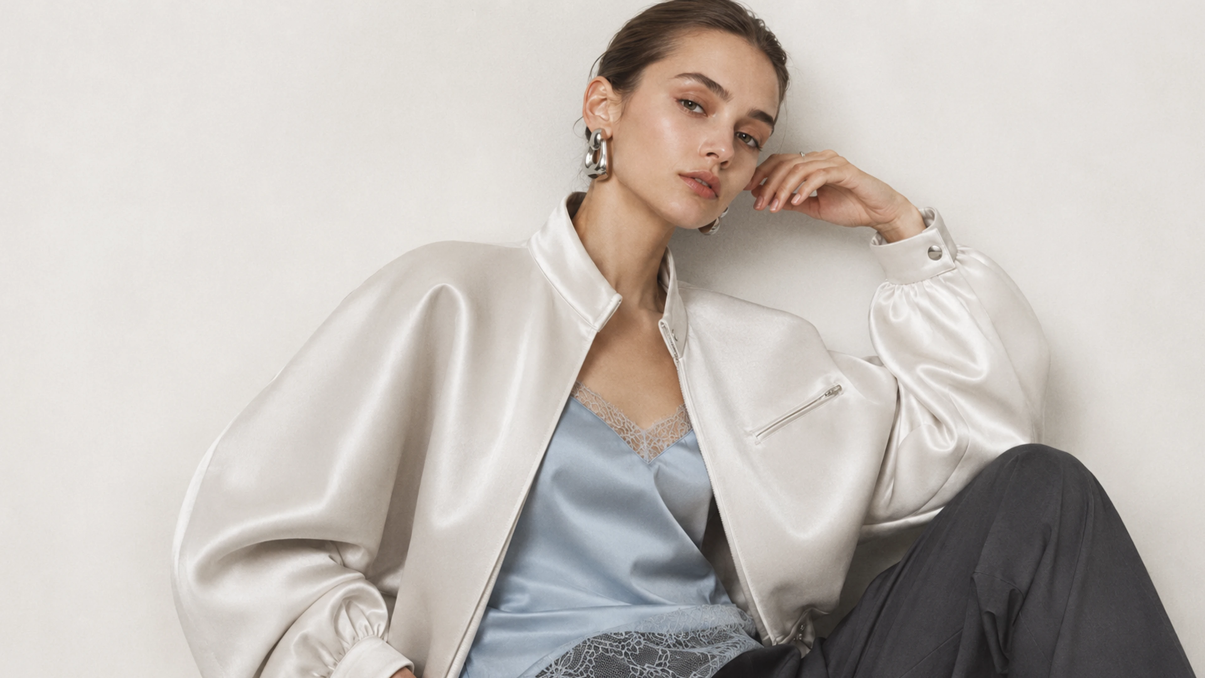
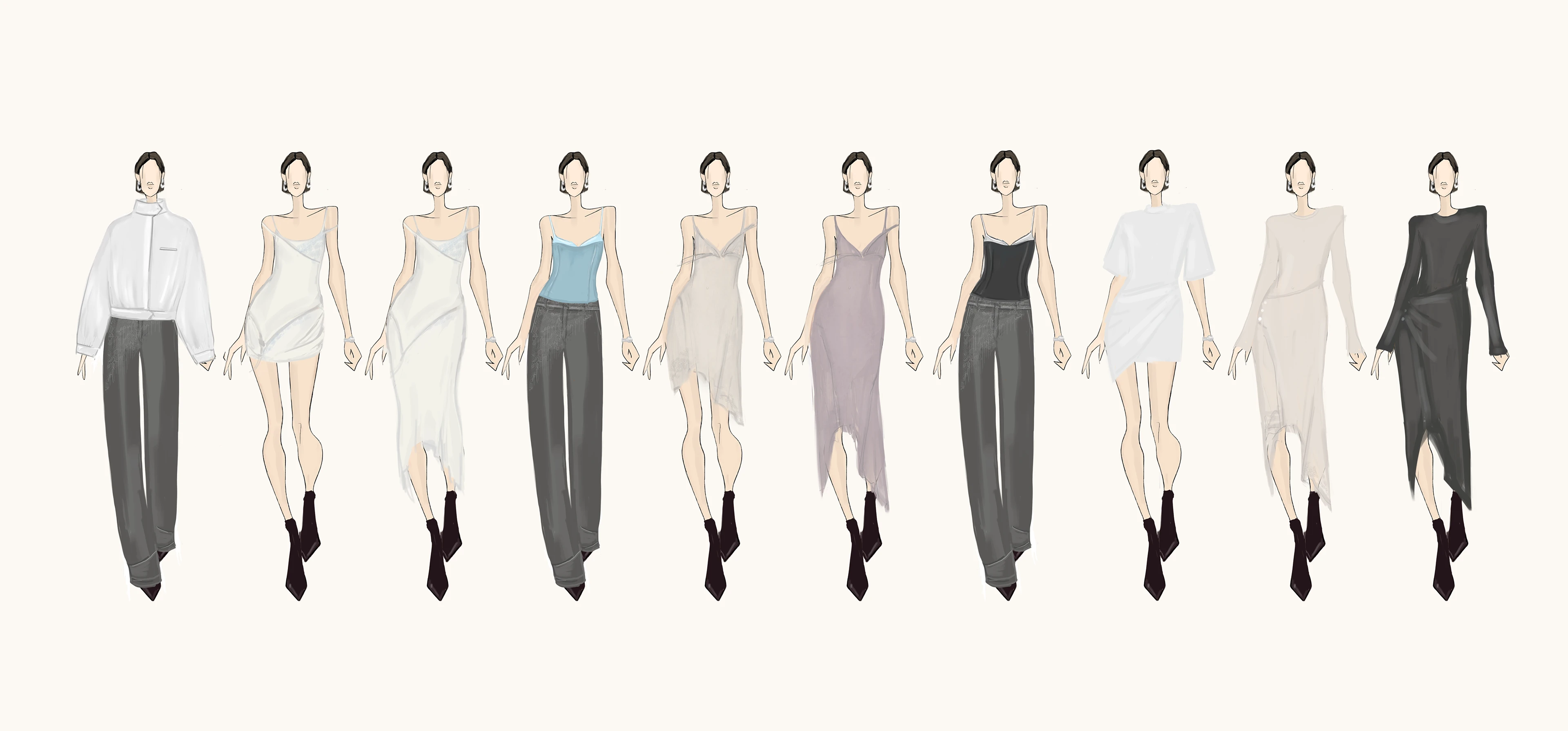
Главная цель бренда — создавать комфортный, но при этом выразительный дизайн для активной жительницы города, которая в течение дня сохраняет собственный характер, собранность и целостность образа.
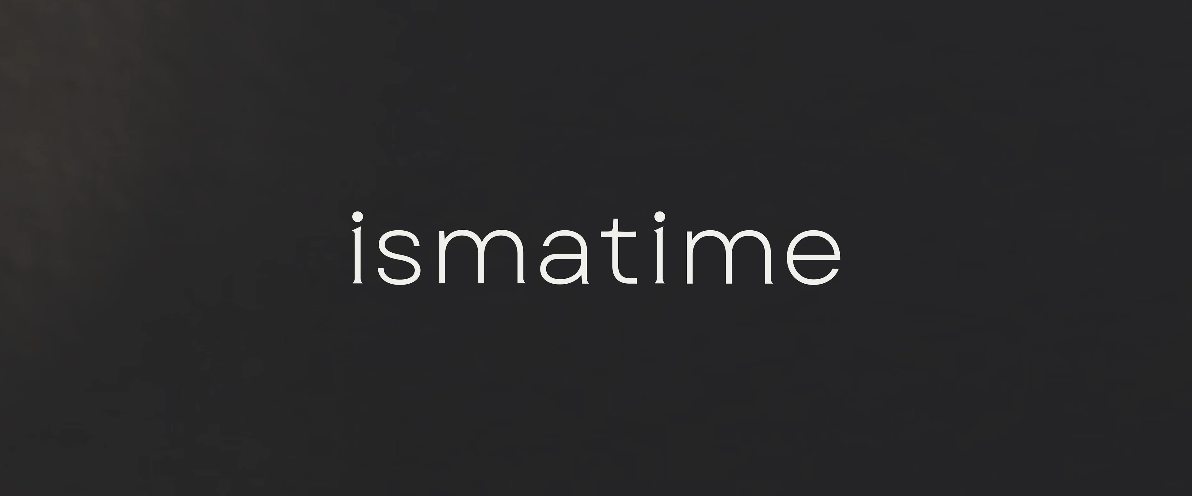
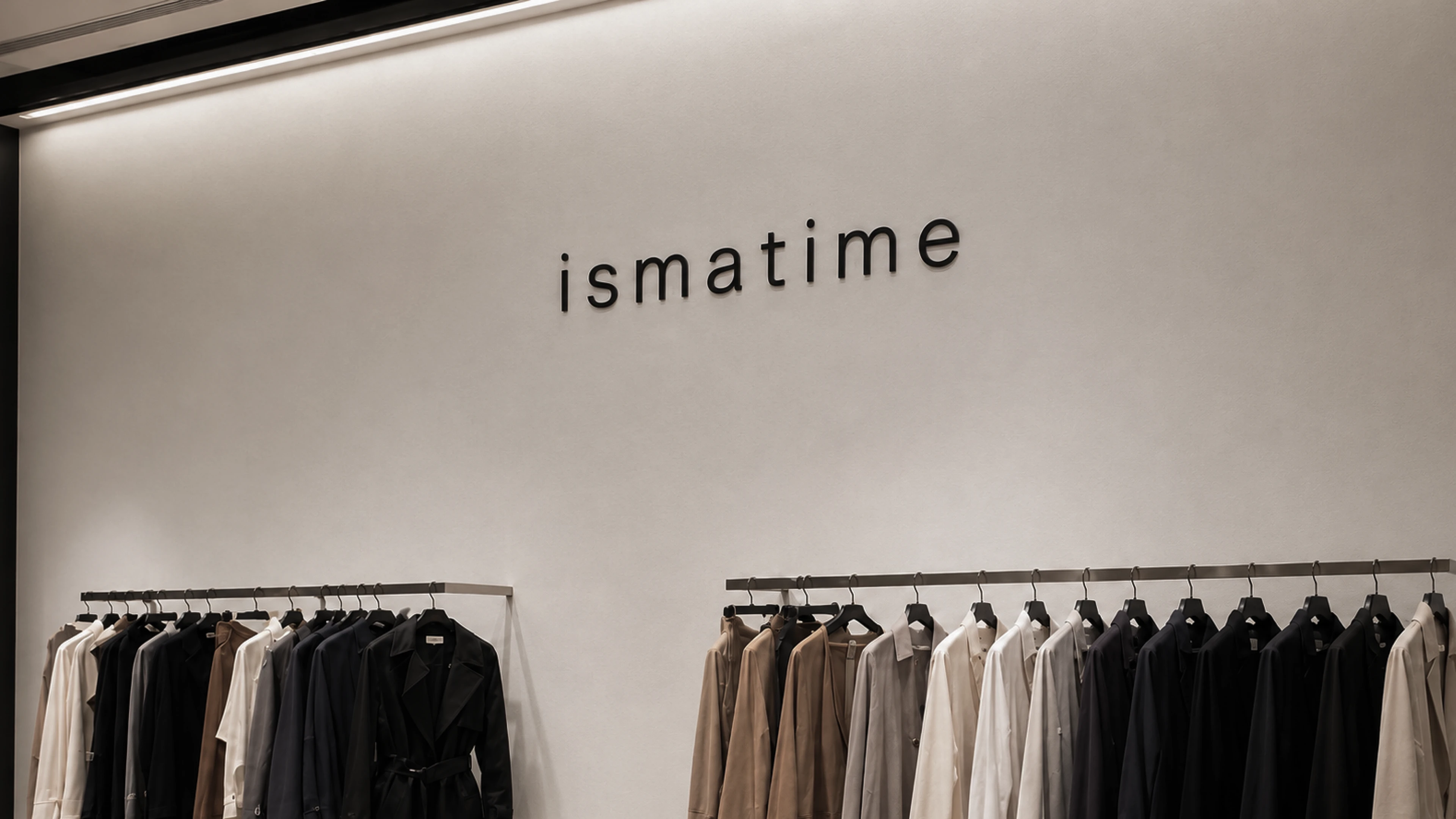
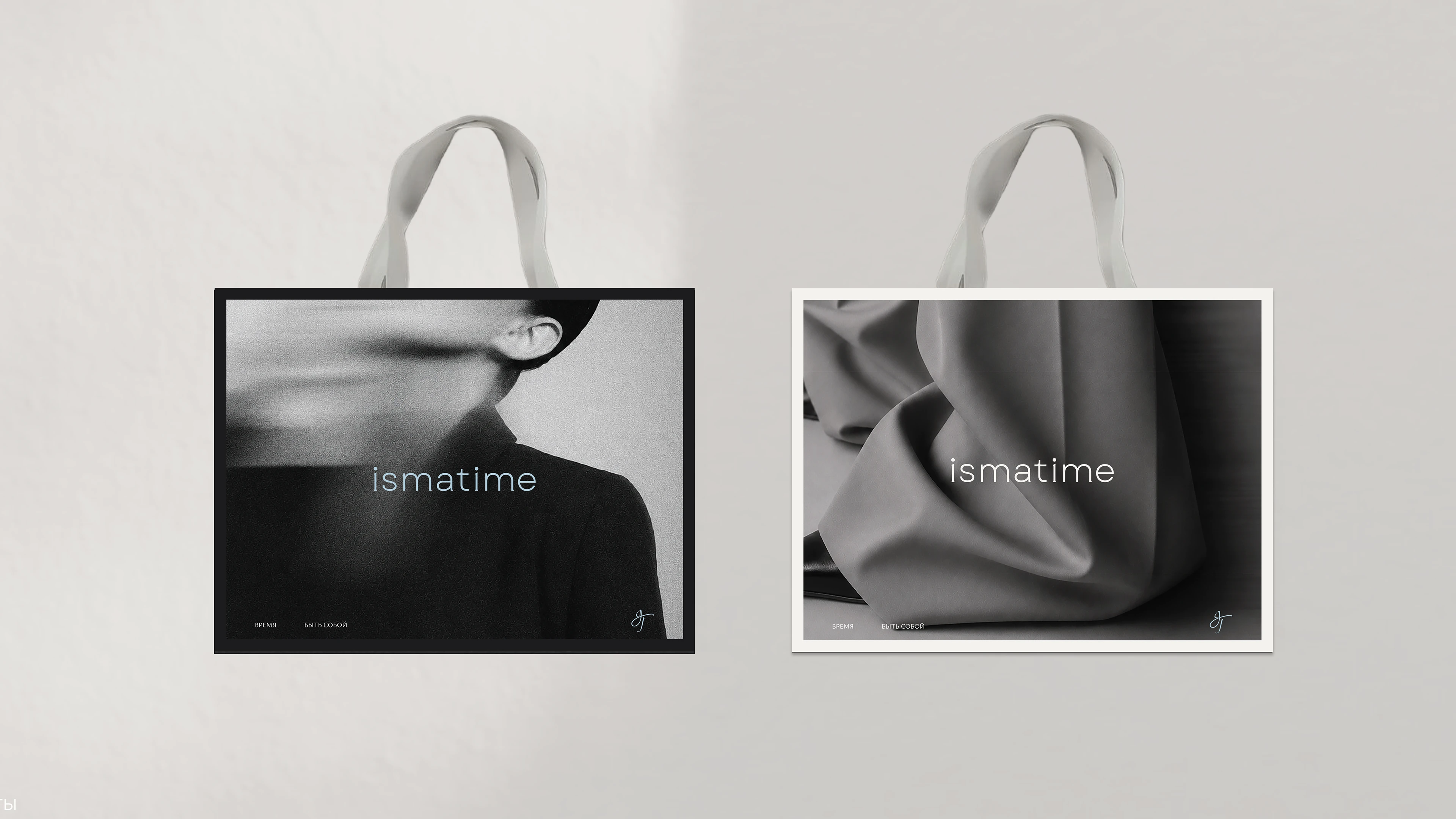
В логотипе isma и time объединены в одно слово. Мягкие засечки и воздушный ритм букв выражают идею современности, лёгкости и активной женственности. Шрифтовая часть логотипа строится на основе, в которую добавлены острота и засечки, передающие актуальность и характер бренда ismatime.
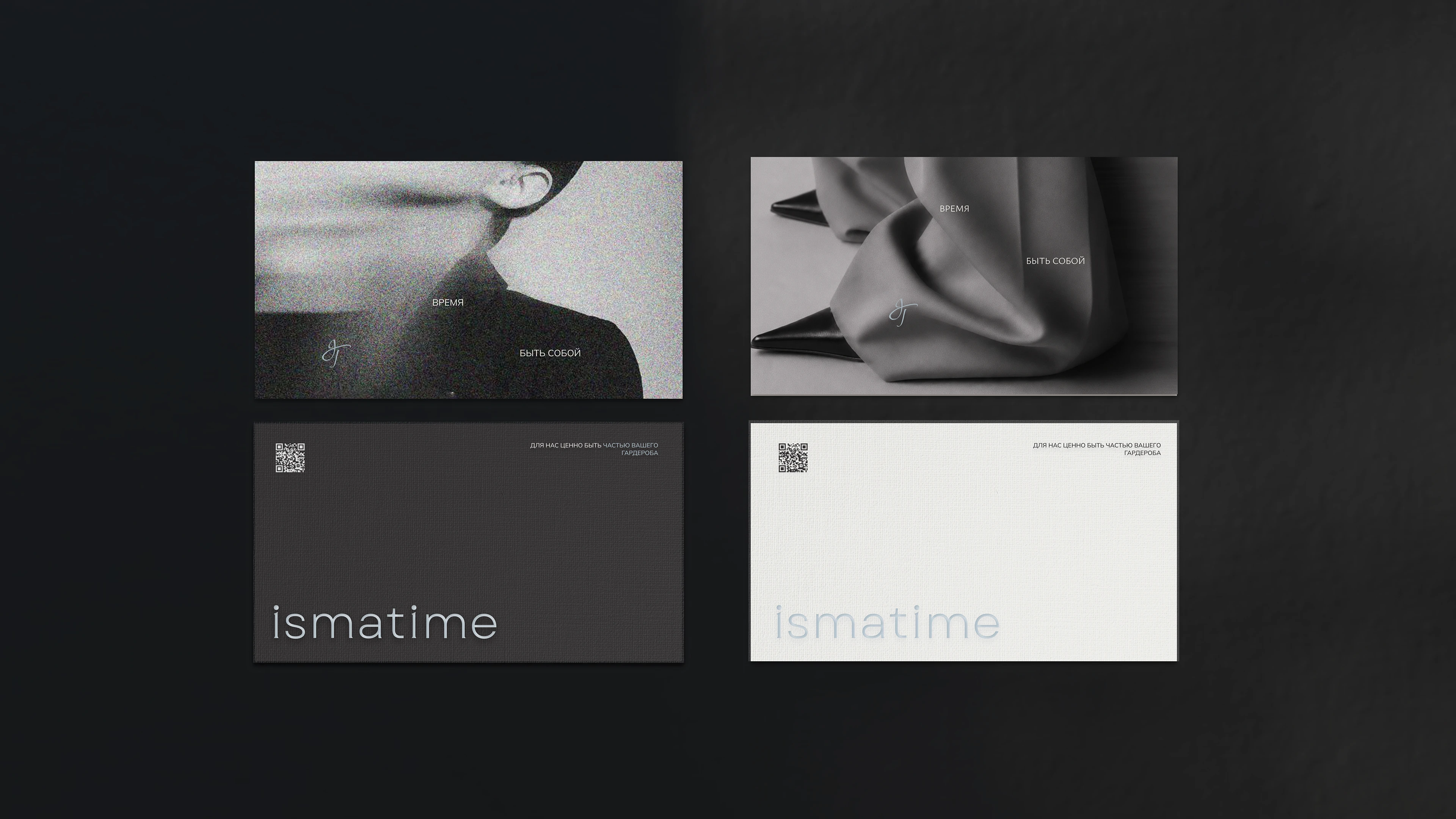
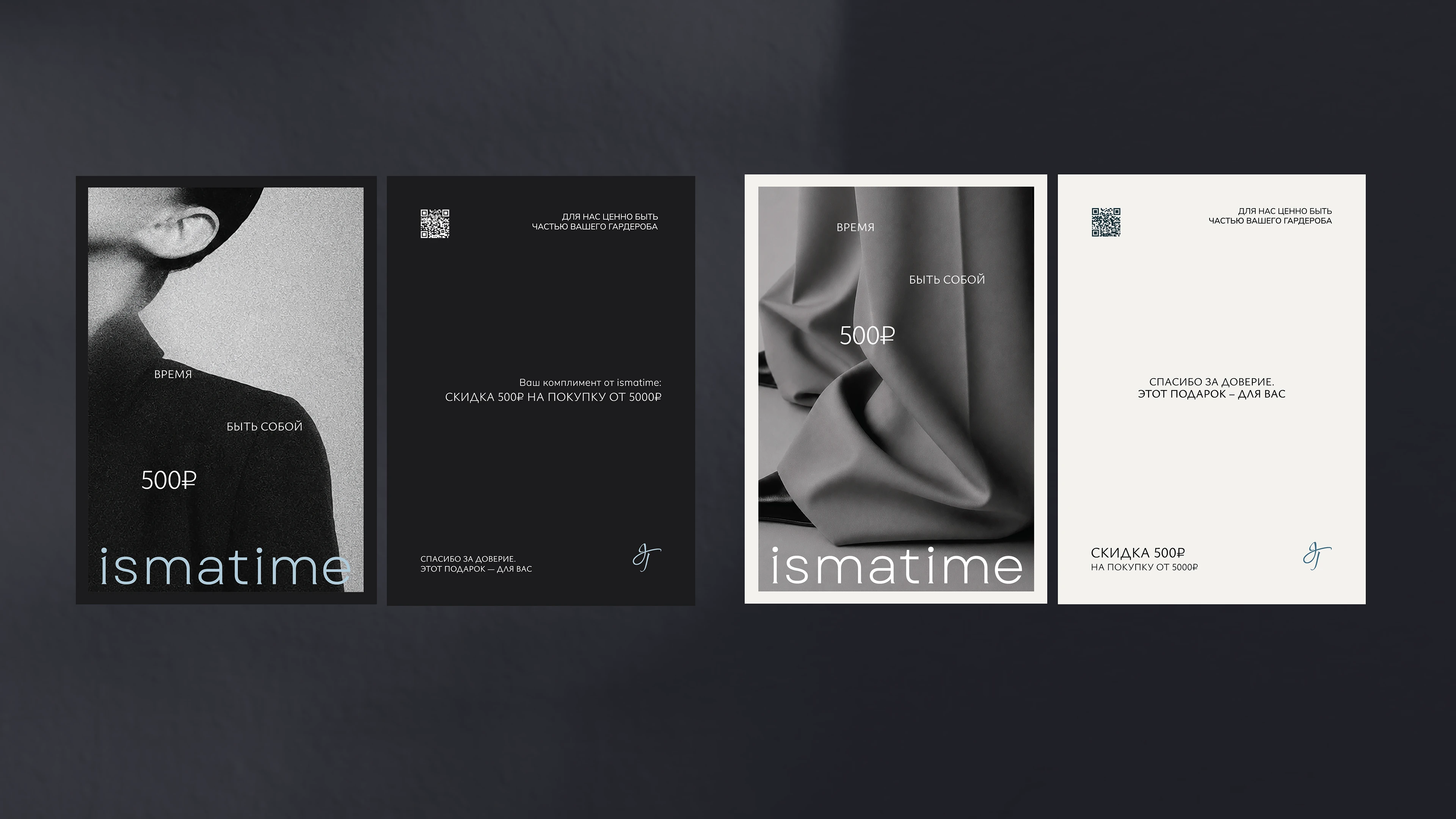
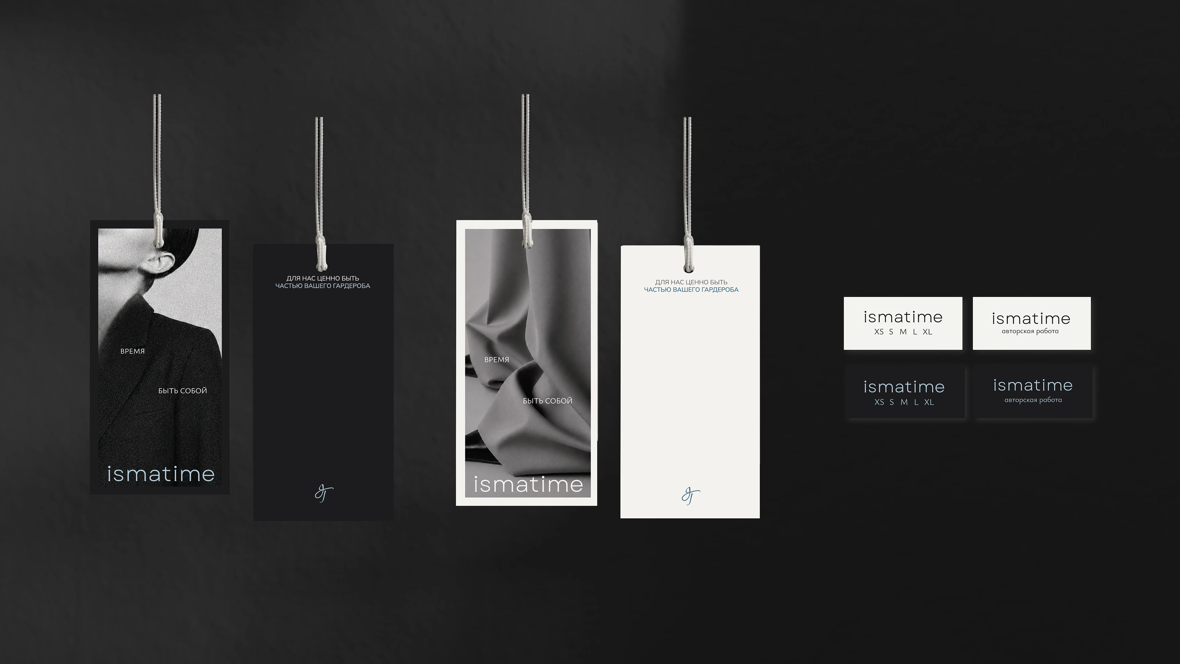
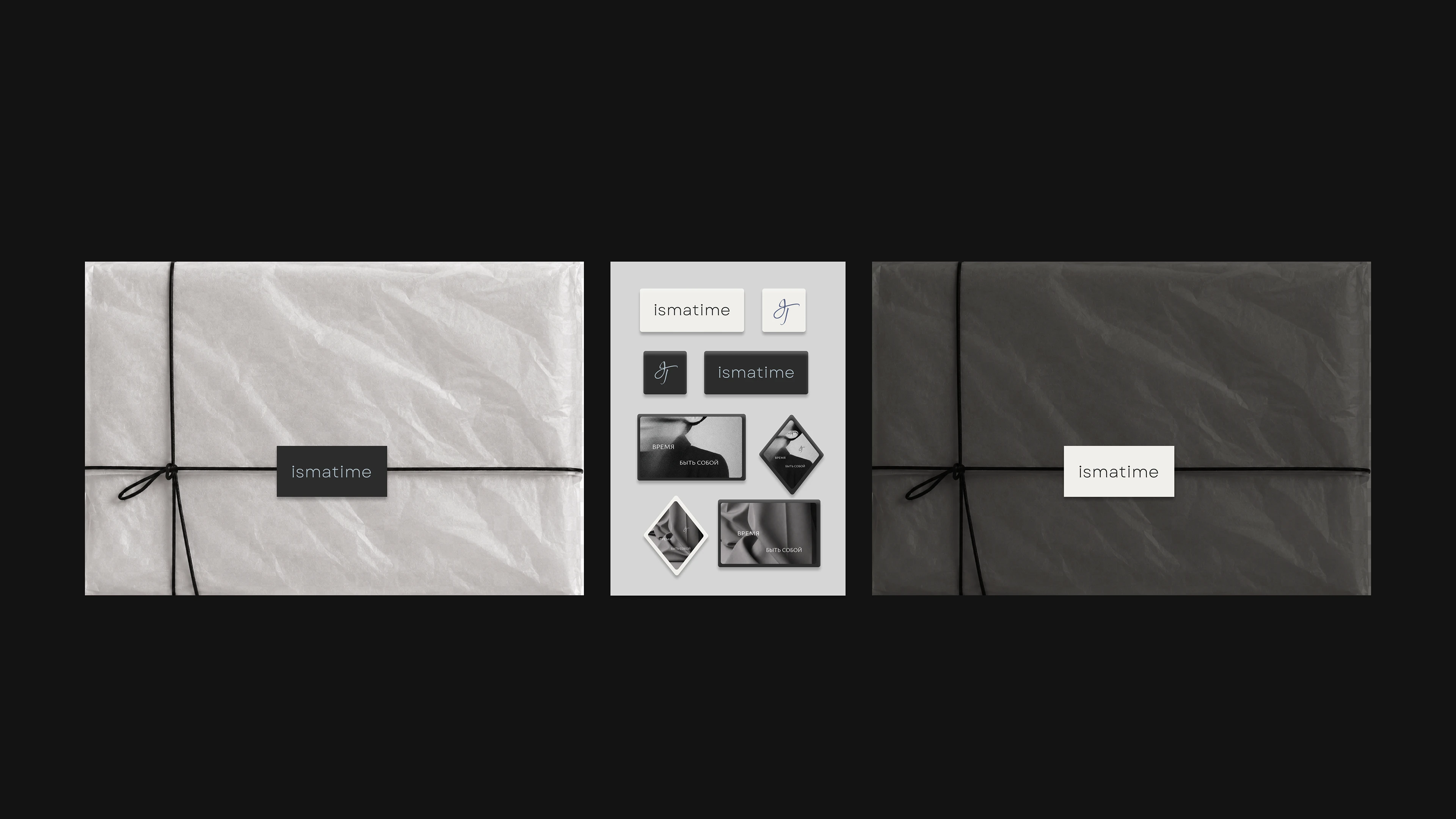
Фирменный знак состоит из каллиграфических букв i и t, стилизованных с элементами шрифтового логотипа. Он задуман как художественная форма, которая передаёт идею целостности isma и движения времени time. Знак может работать отдельно: на упаковке, бирках, фотографиях и других носителях.
RU
ismatime | fashion brand
The brand descriptor of ismatime is time to be yourself. This idea is hidden in the name, where isma means inner wholeness and the ability to stay true to yourself, while time reflects the movement of life, the change of roles and rhythms.
The main goal of the brand is to create comfortable yet expressive design for an active city woman who lives in her own rhythm, while keeping her personal character and the wholeness of her look throughout the day.
In the logo, isma and time are combined into one word. Soft serifs and the airy rhythm of the letters express the idea of modernity, lightness and active femininity. The typographic part of the logo is based on a clean foundation, enhanced with sharp details and serifs that convey the relevance and character of the ismatime brand.
The brand mark consists of the calligraphic letters i and t, stylized with elements of the typographic logo. It is designed as an artistic form that communicates the idea of isma as wholeness and time as the movement of time. The mark can work separately: on packaging, tags, photographs and other brand materials.
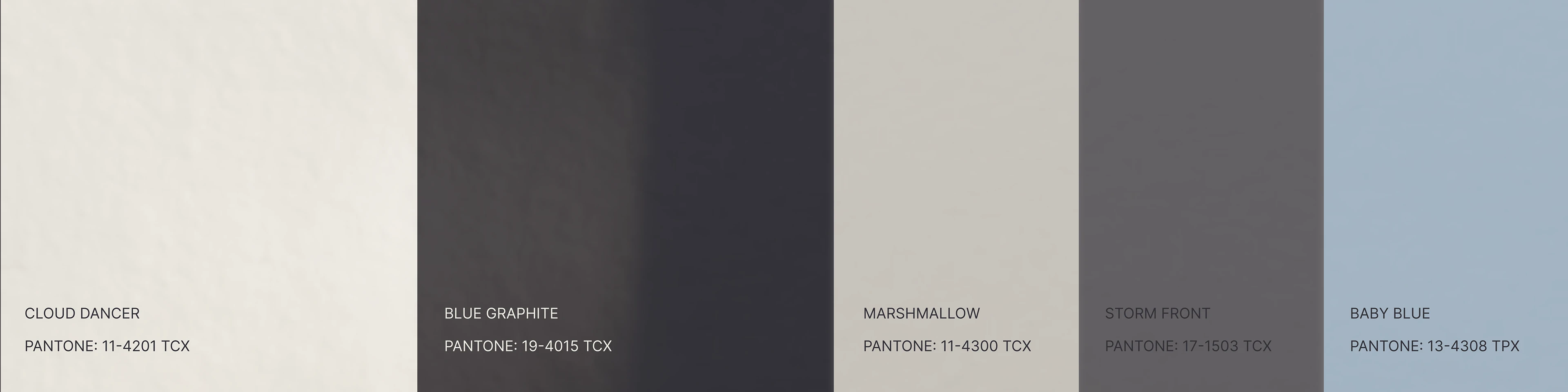
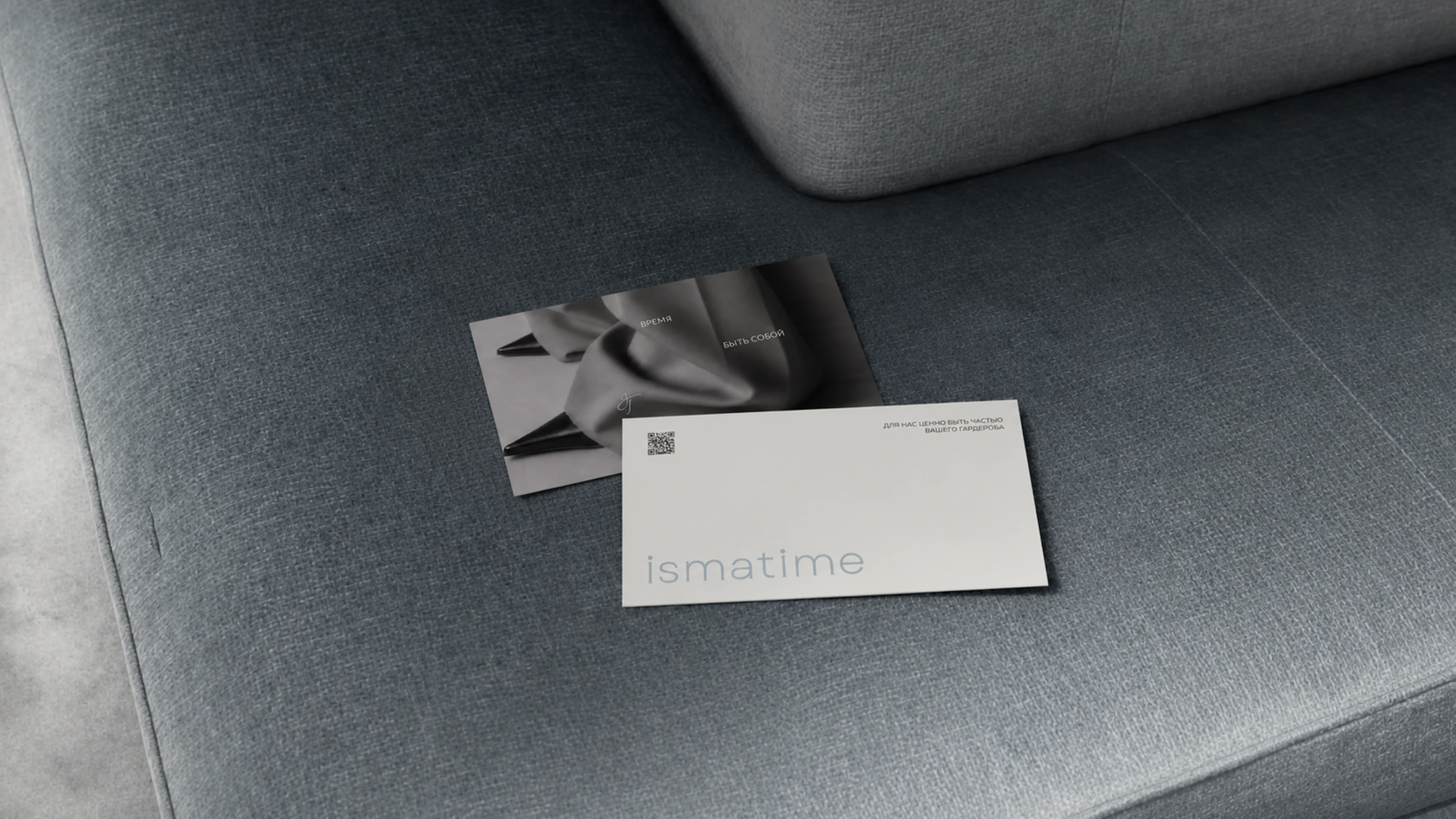
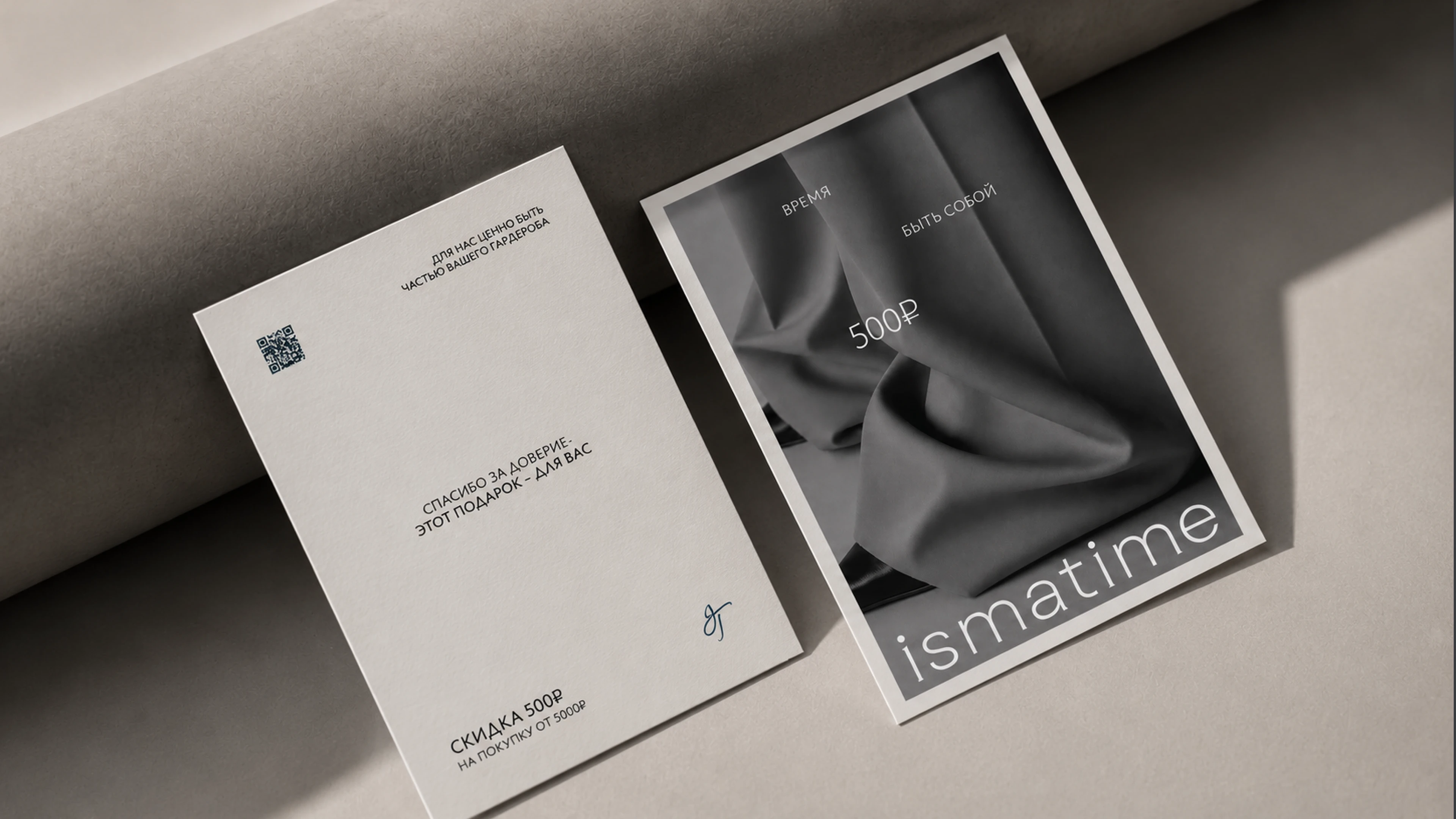
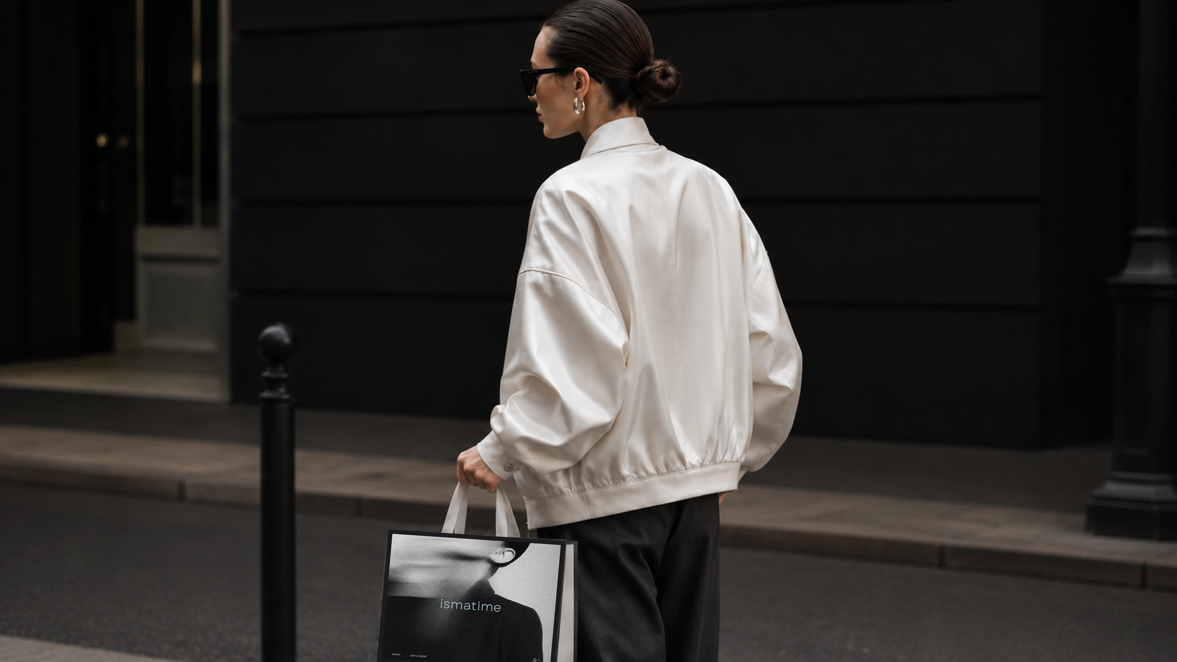
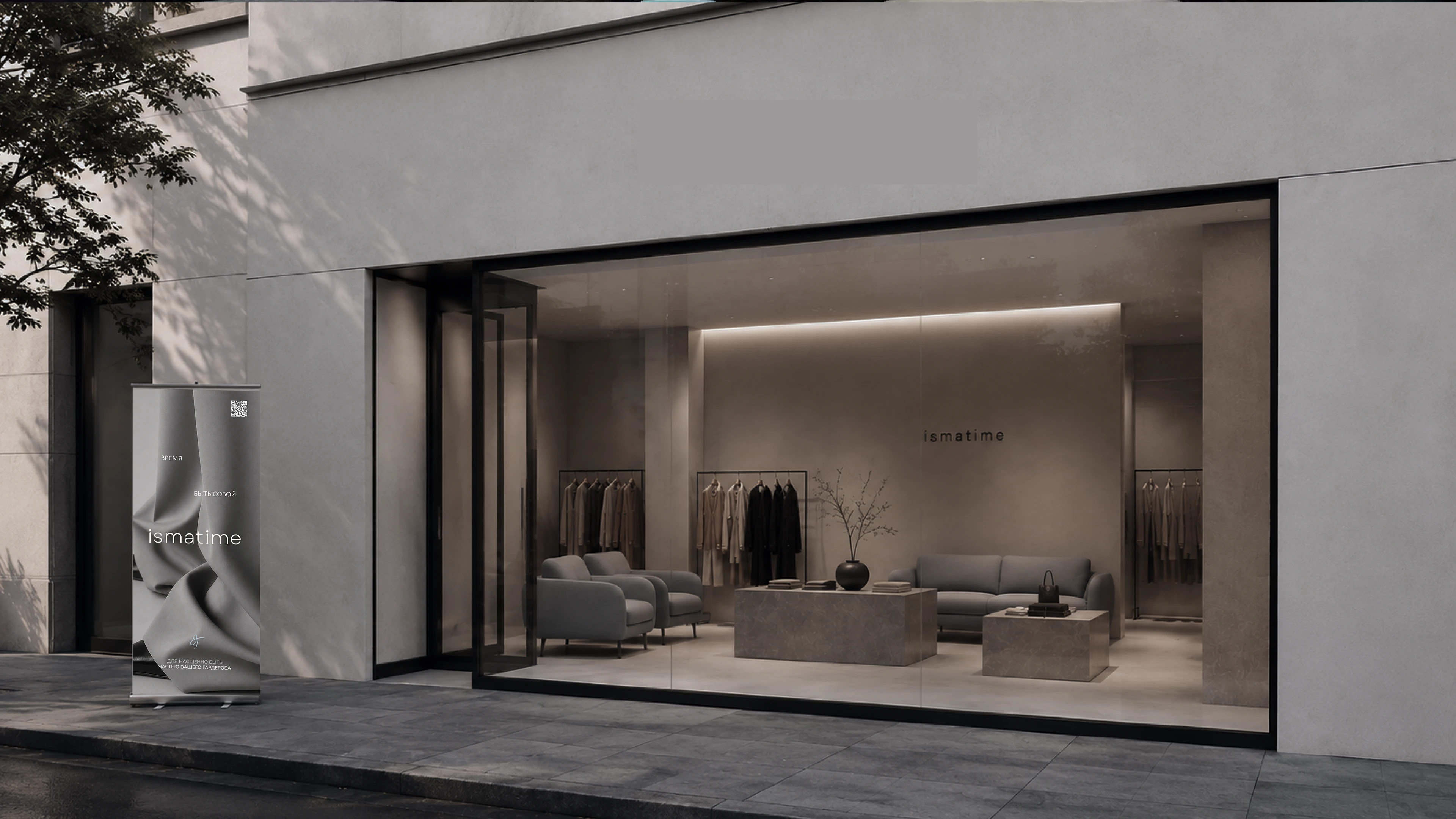
The ismatime visual identity reads as a cohesive visual system, strengthening the brand positioning and making further work with brand materials easier.
Дизайнер: Zoe Uvarova
Заказчик: ismatime