
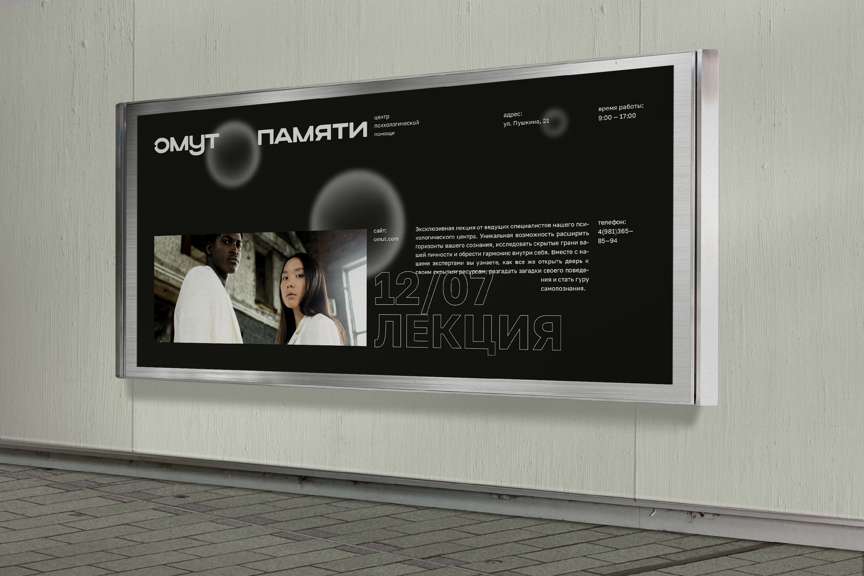
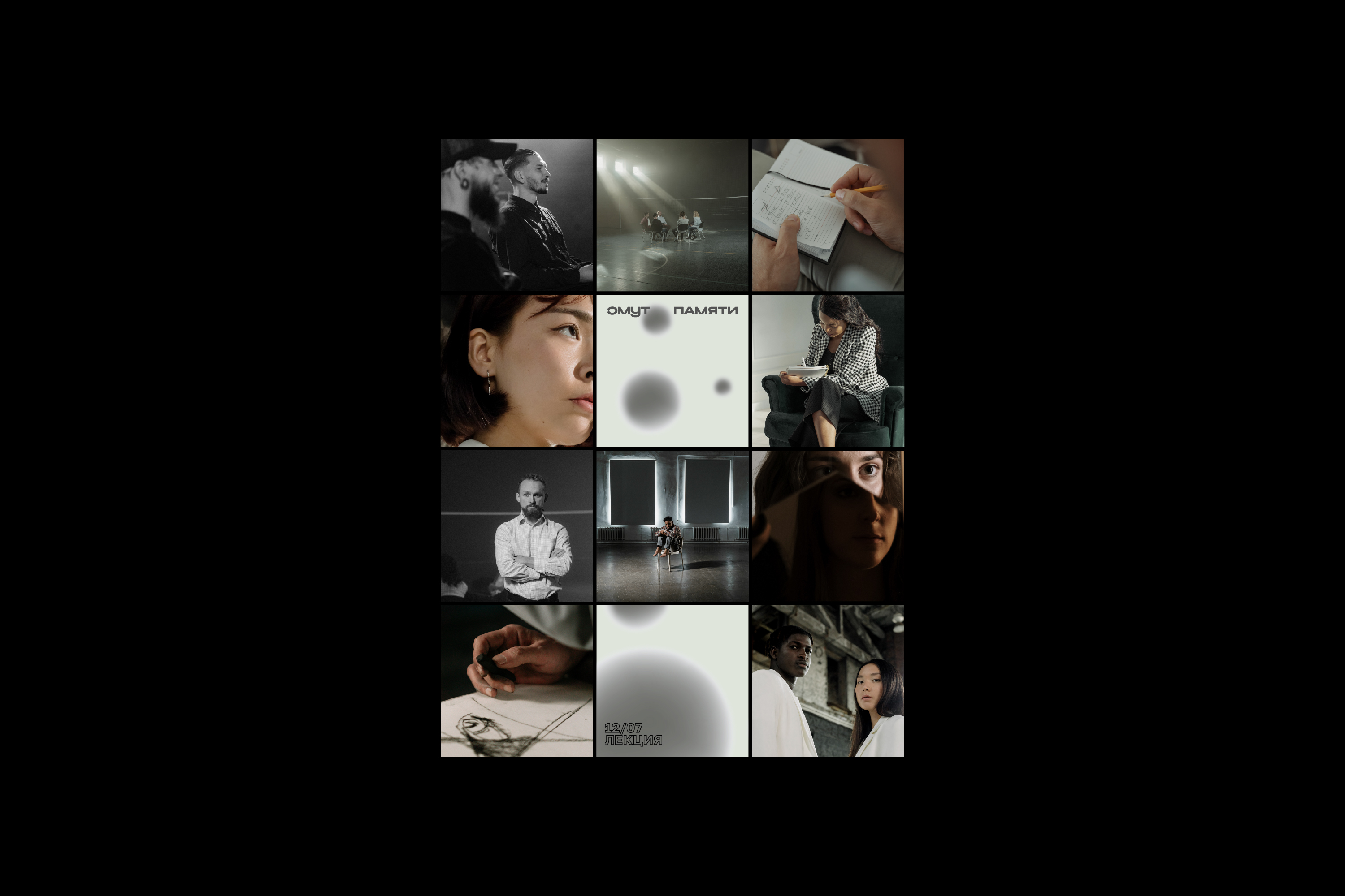
ОМУТ ПАМЯТИ
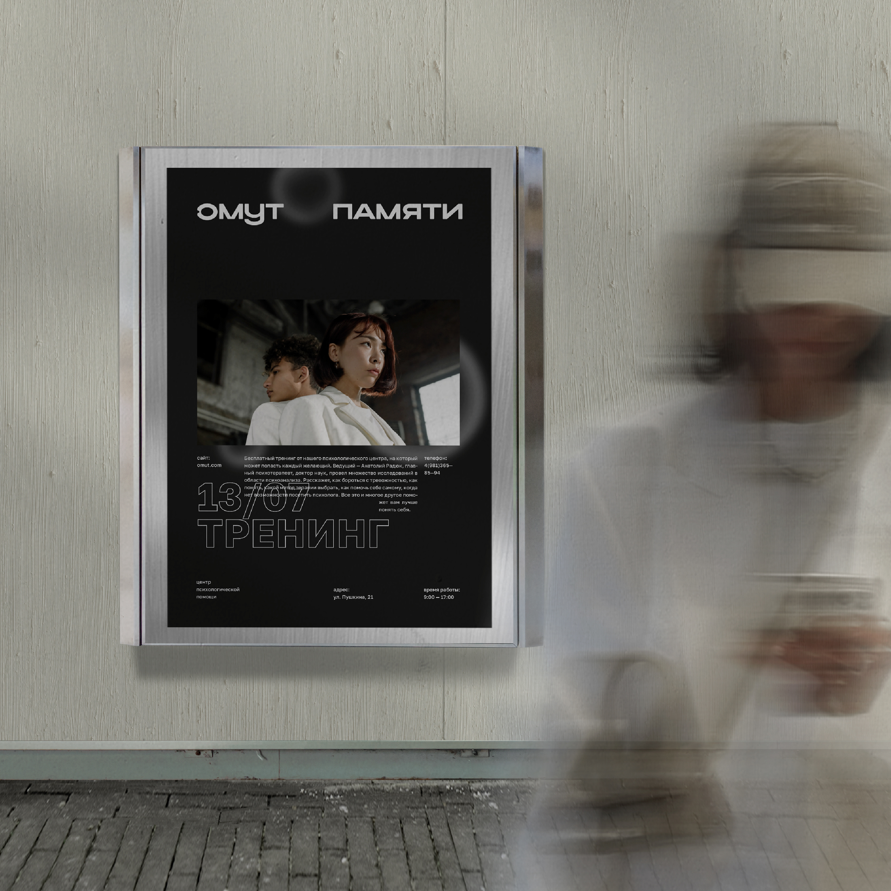
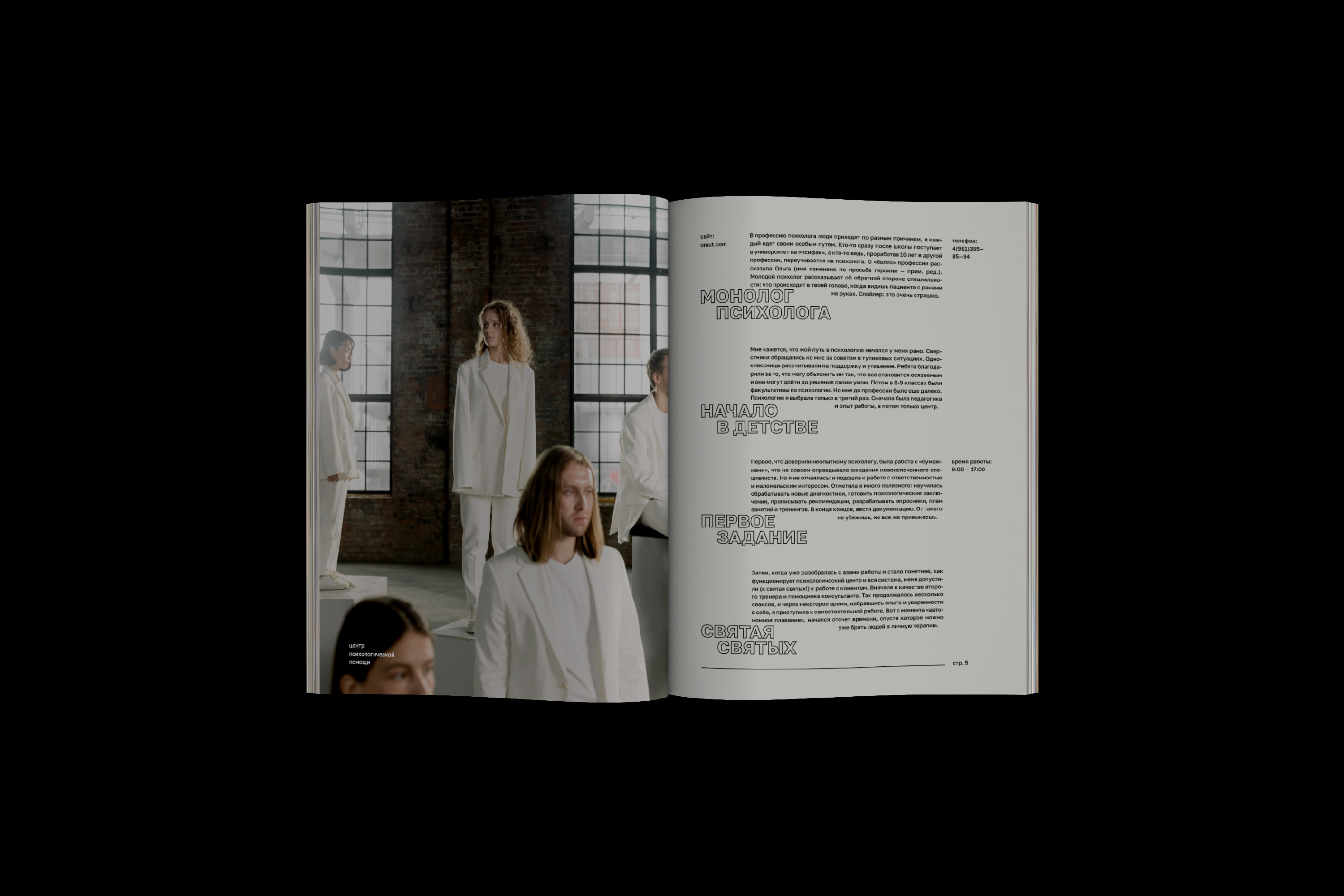
Омут памяти — это психологический центр, на базе которого работают специалисты, которые предлагают такие методы терапии как гештальт-терапия, психоанализ и когнитивно-поведенческая терапия.
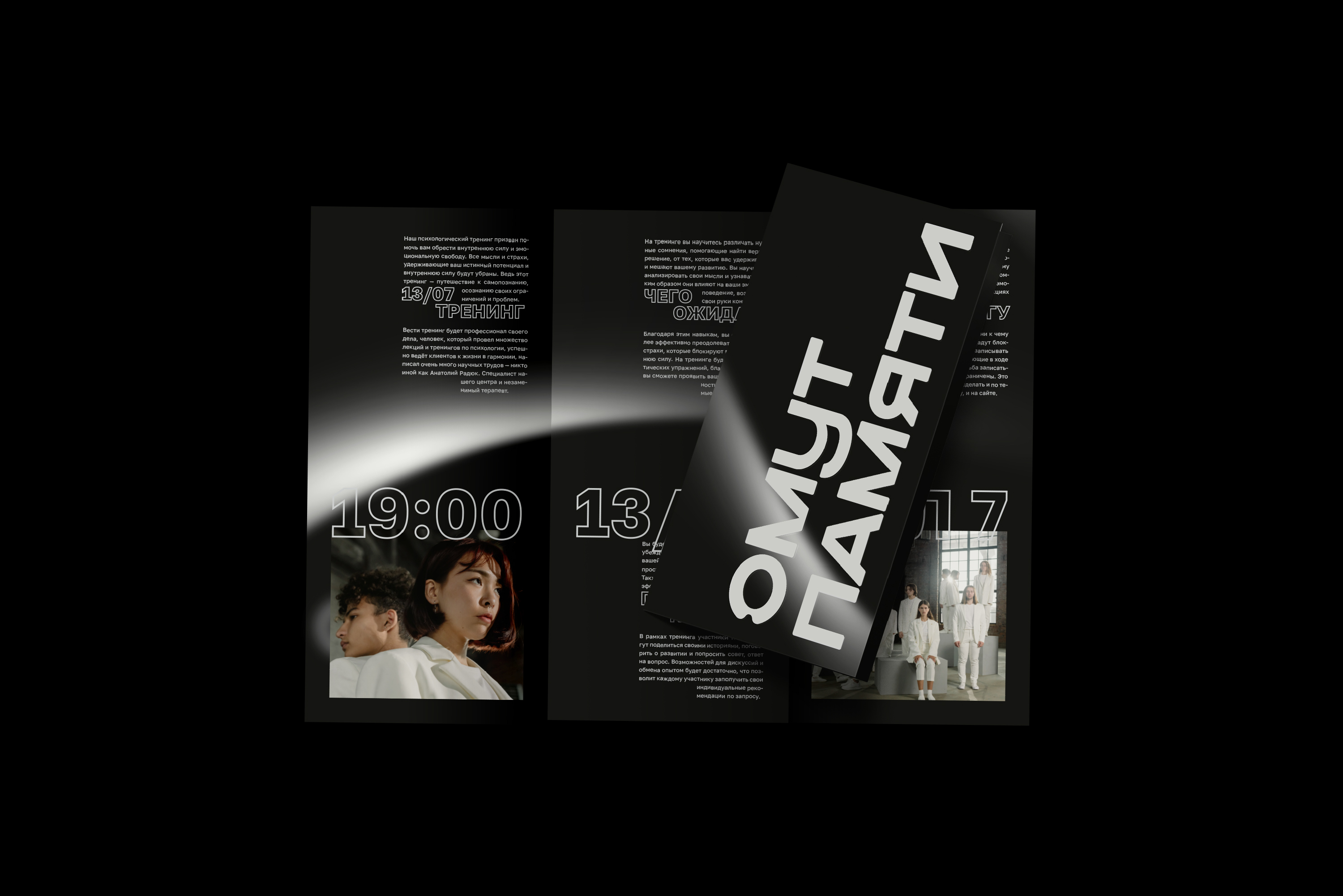
Центр помогает понять, что забота о своем психологическом благополучии необходима ровно так же, как и забота о своем физическом здоровье. Для этого проводятся множество бесплатных тренингов и лекций, чтобы каждый сделал шаг к исследованию своих мыслей и пониманию эмоций.
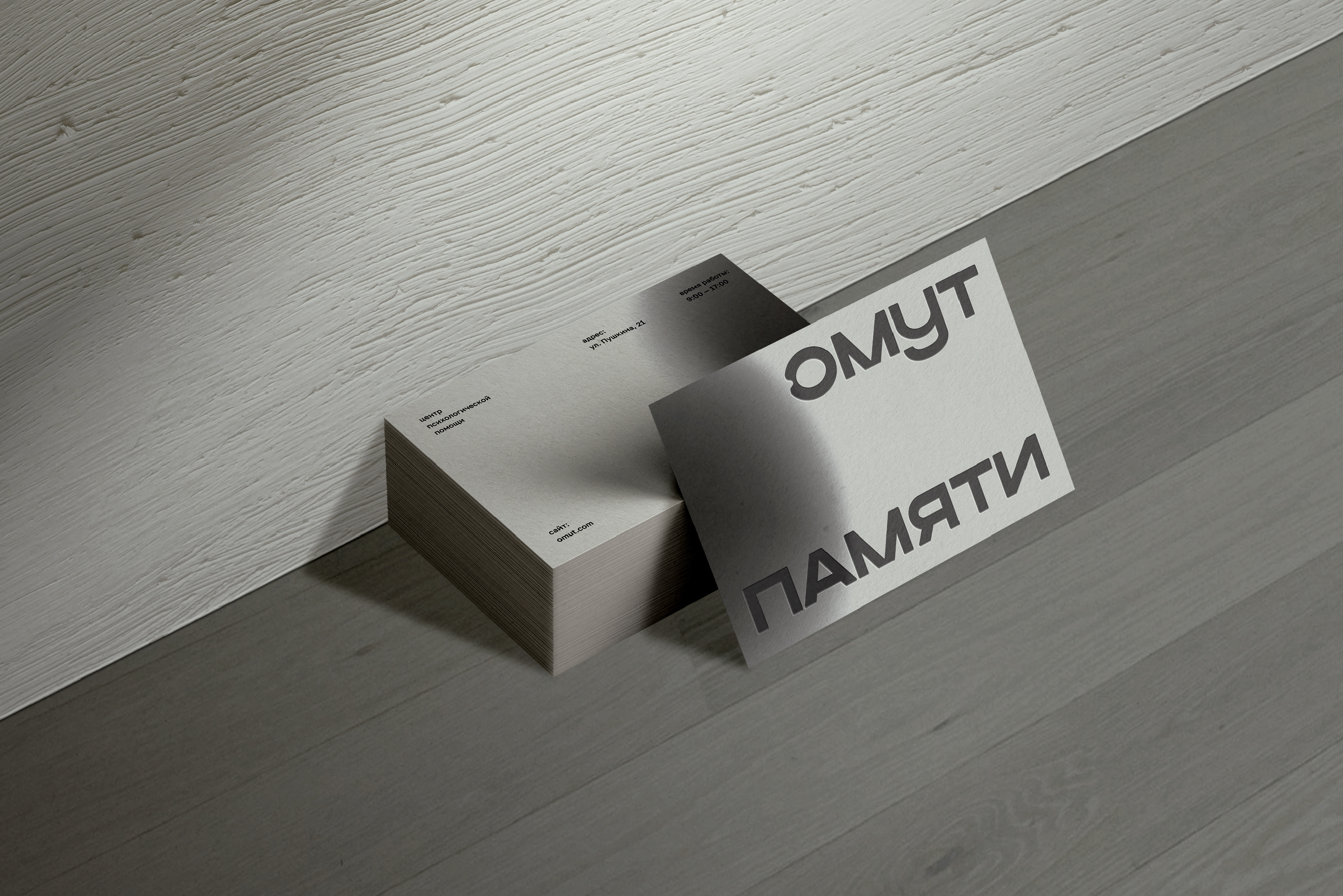
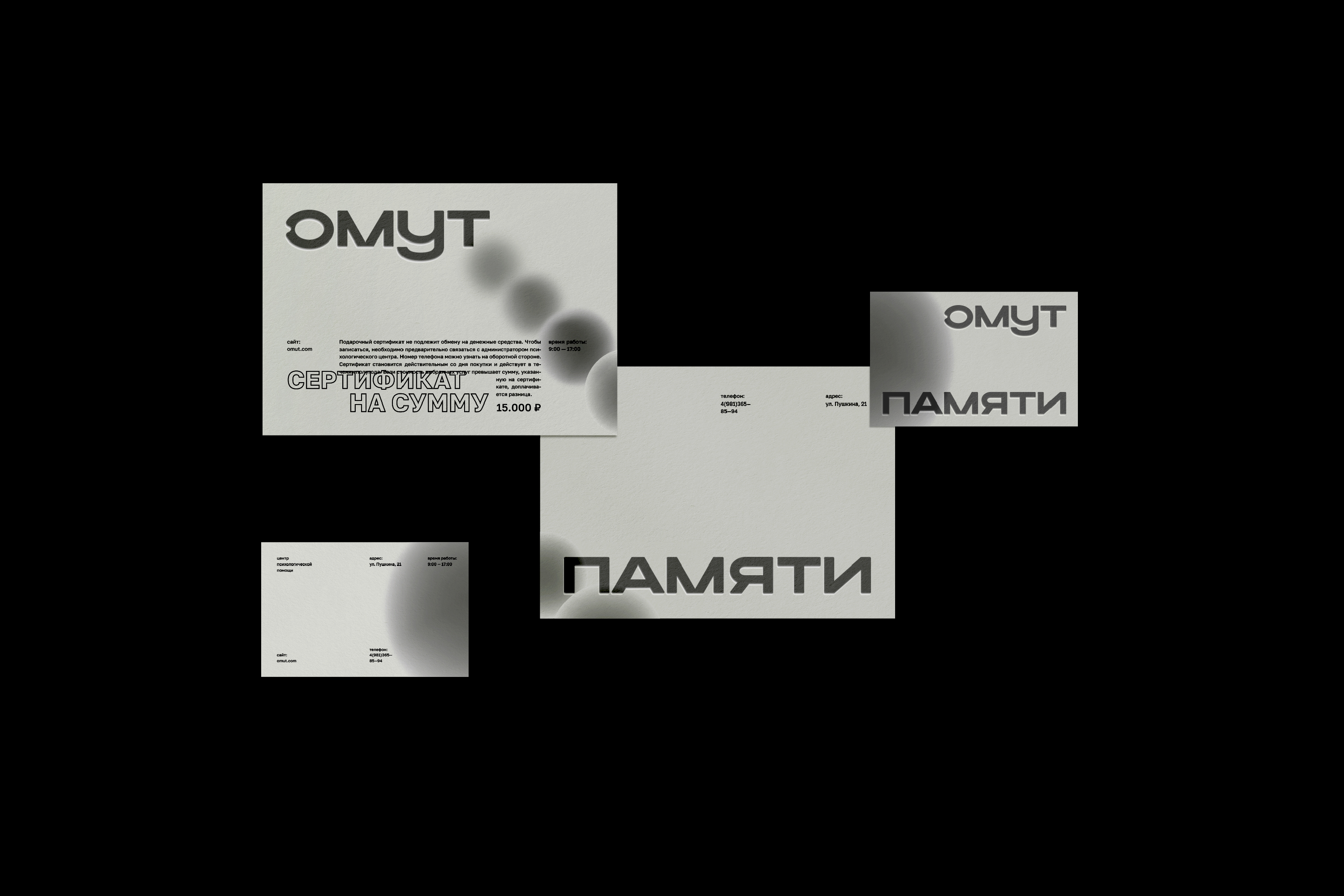
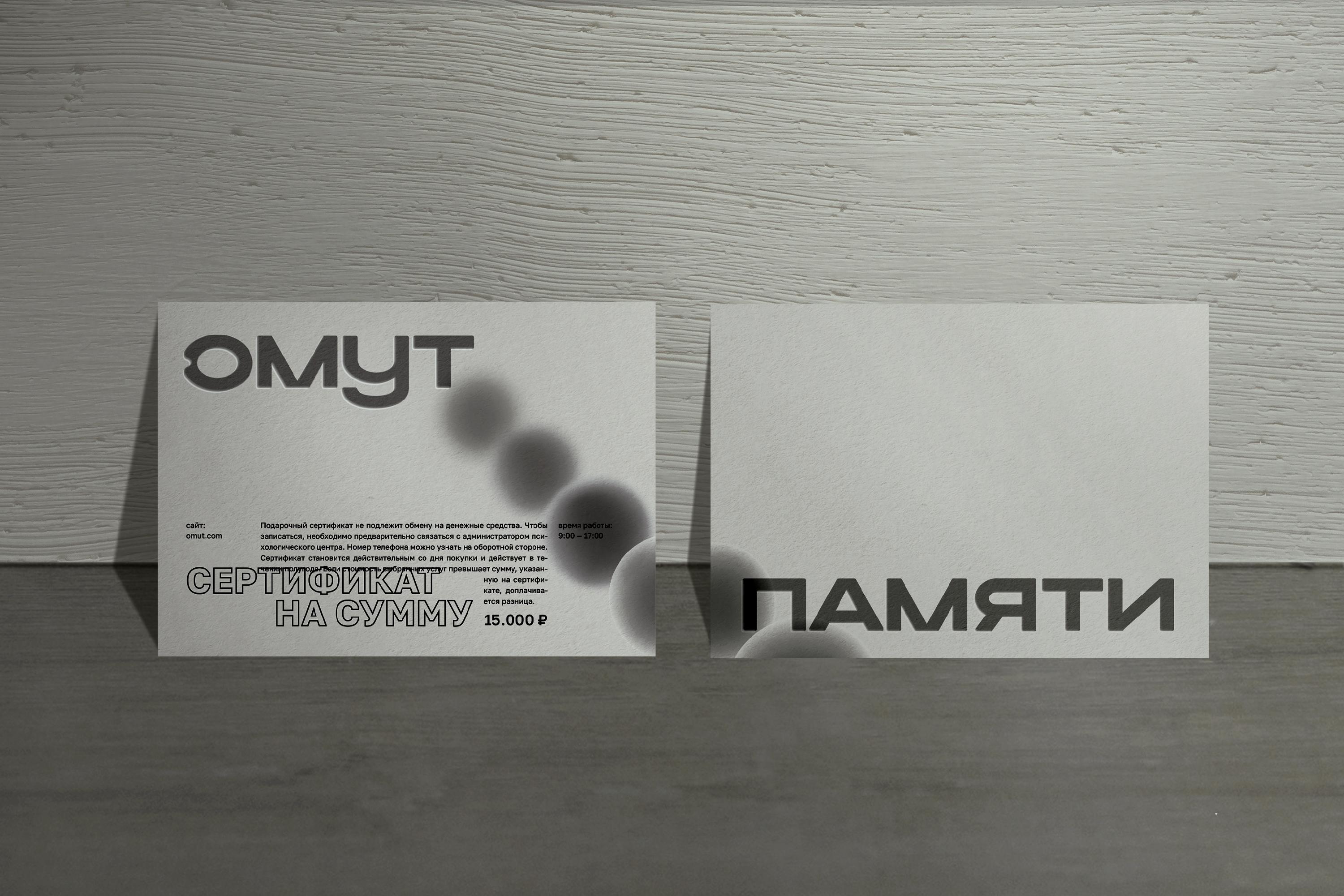
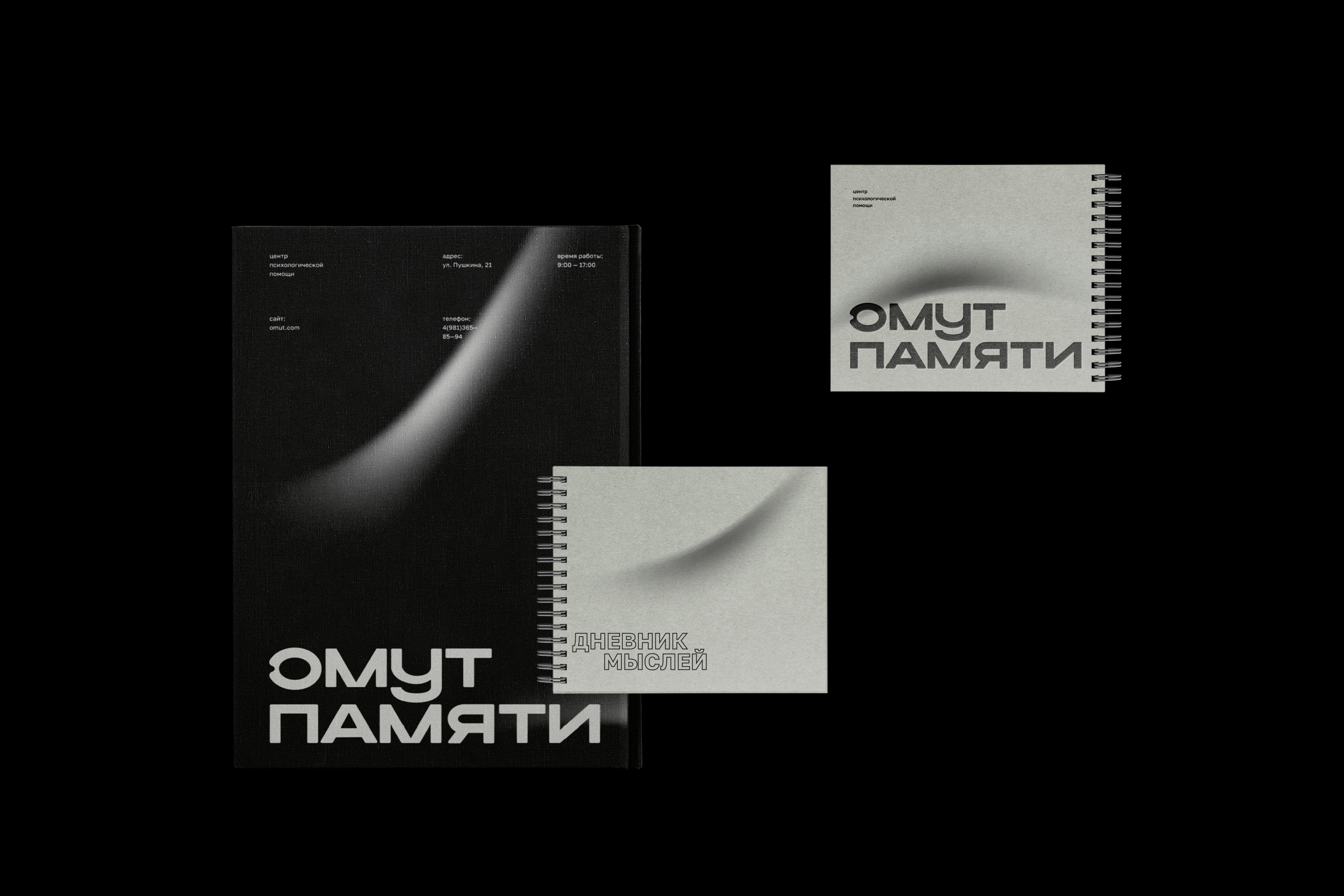
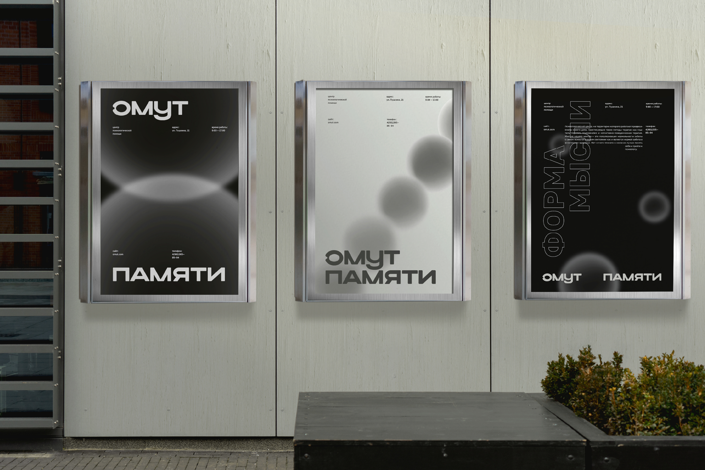
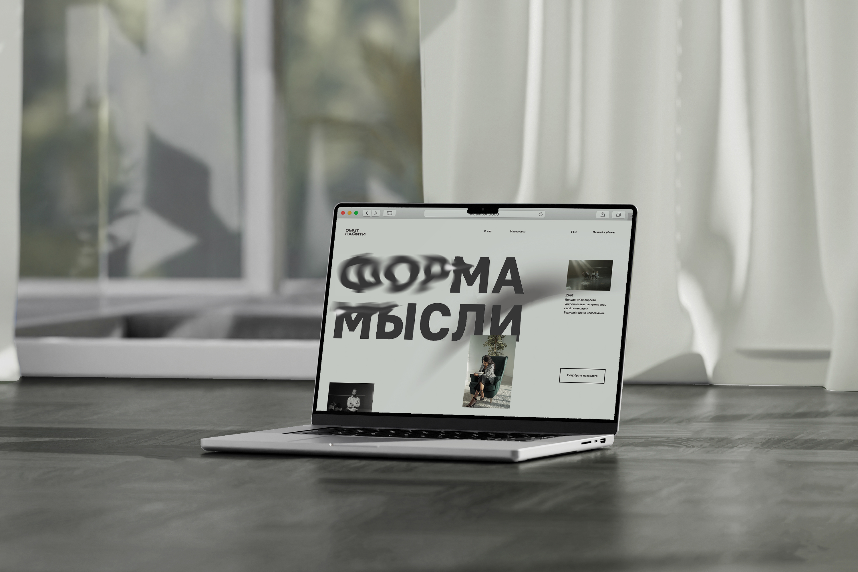
Название «Омут памяти» подчеркивает глубину исследуемых чувств и переживаний, сложность нашего внутреннего мира, который содержит как светлые, так и темные стороны. Это можно заметить и в айдентике, где один носитель является инверсией другого. Суть терапии — погрузиться в глубины сознания, чтобы отыскать в нем нужные мысли и позволить им приобрести форму.
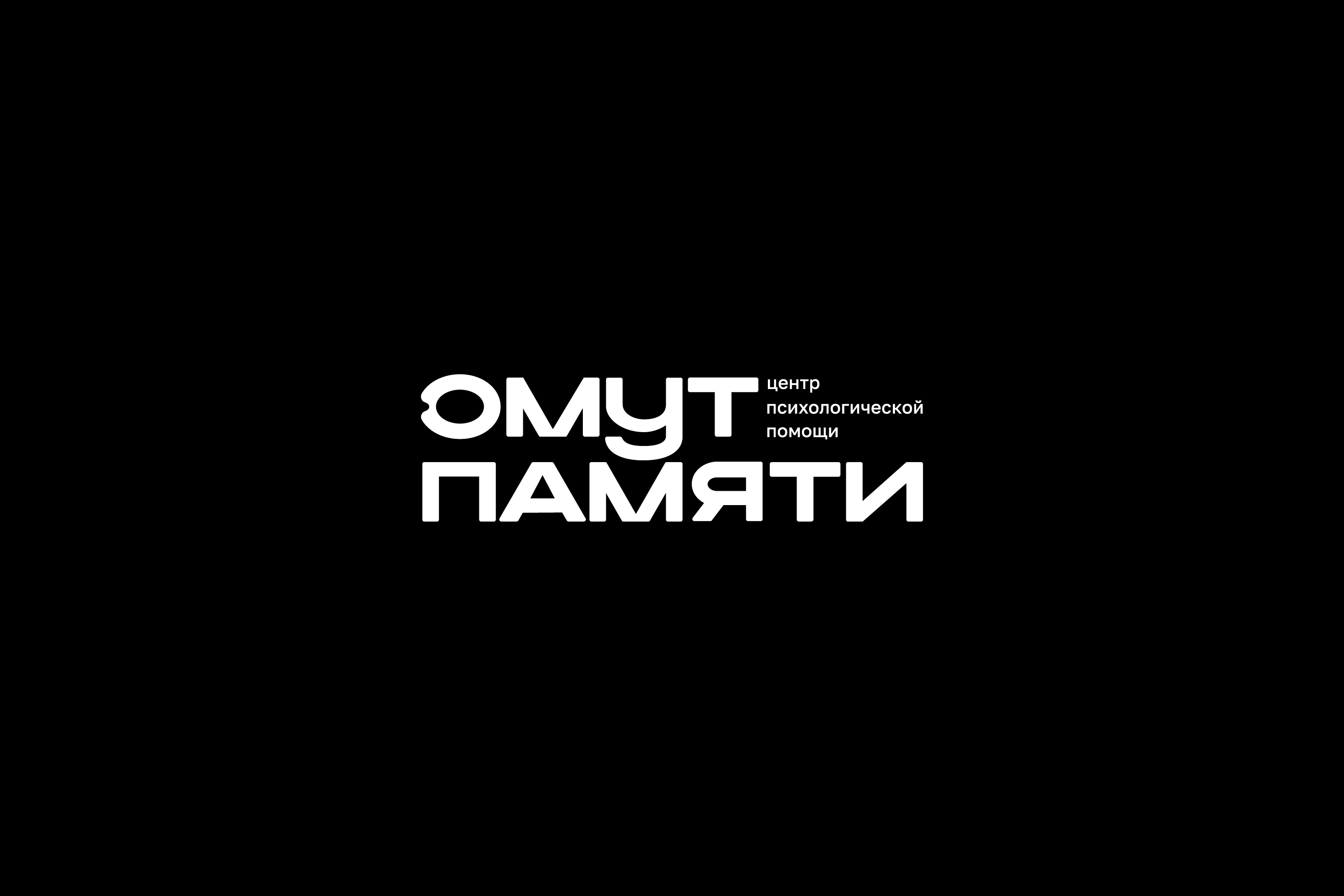
Эта метафора и легла в основу системы всего фирменного стиля, начиная с логотипа, из буквы «О» которого вылетел шар — ещё невидимая нами мысль, которая начала приобретать очертания на всех последующих носителях. Где-то наши мысли настолько большие и занимают так много места в сознании, что мы видим лишь их край. Форма круга используется нами неспроста, так как именно круг является символом гармонии. А гармония в мыслях и сознании — это то, чего помогает достичь психология.
The pool of memory is a psychological center that employs specialists who offer such therapies as Gestalt therapy, psychoanalysis and cognitive-behavioral therapy.
The center helps to understand that taking care of one's psychological well-being is as necessary as taking care of one's physical health. For this purpose, many free trainings and lectures are organized, so that everyone can take a step towards exploring their thoughts and understanding emotions.
The name " The Pool of Memory" emphasizes the depth of the feelings and experiences explored, the complexity of our inner world, which contains both light and dark sides. This can also be seen in the identity, where one carrier is an inversion of the other.
The essence of therapy is to delve into the depths of the mind to find the right thoughts and allow them to take shape. This metaphor formed the basis of the entire corporate identity system, starting with the logo, from which a balloon flew out of the letter "O" - a thought not yet visible to us, which began to take shape on all subsequent carriers. Somewhere our thoughts are so big and take up so much space in our consciousness that we can only see the edge of them. The form of a circle is used by us for a reason, for it is the circle that is the symbol of harmony. And harmony in thoughts and consciousness is what psychology helps us to achieve.
Designer: Diana Chernevskaya
Logo Mentors: Darya Basalaeva & Diana Semenova
Motion: Plyashnik Margarita & Yankilevich Margarita
Art Director: Tatyana Kirichenko