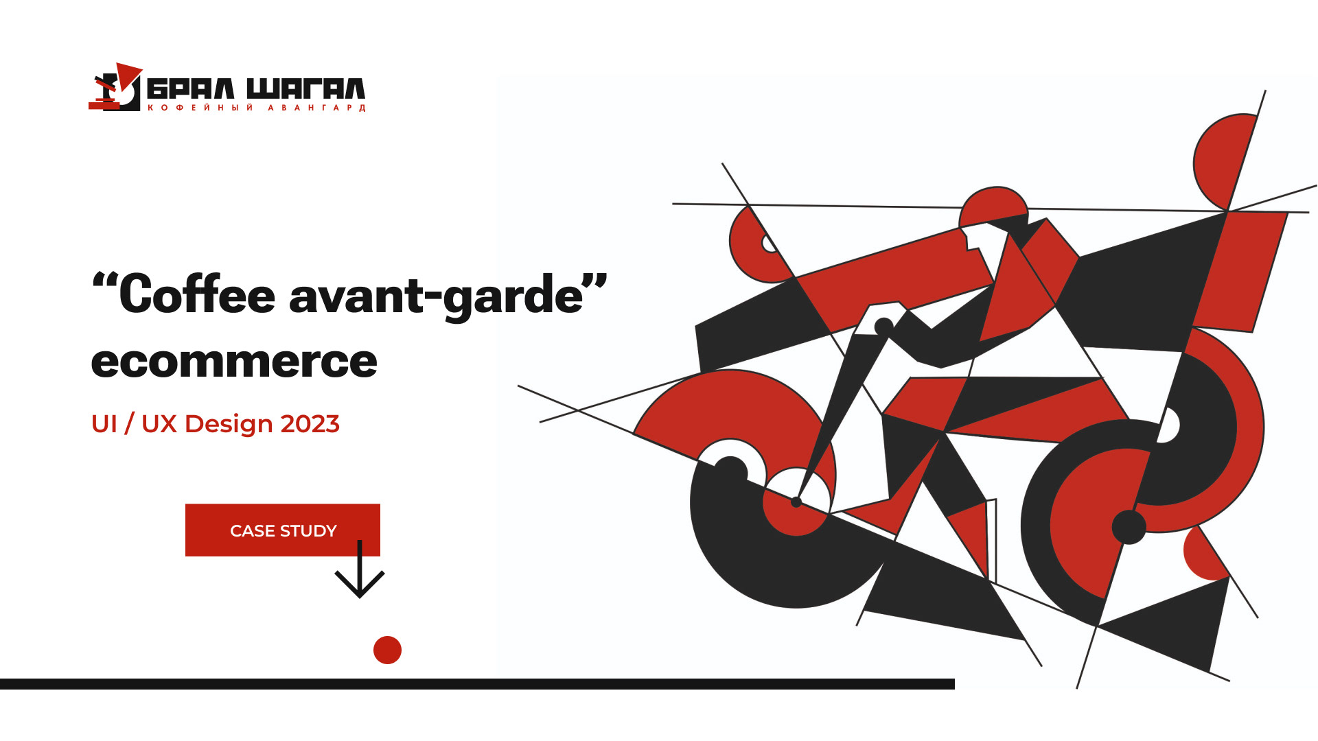
Backstage
BRAL SHAGAL is a young coffee production company.
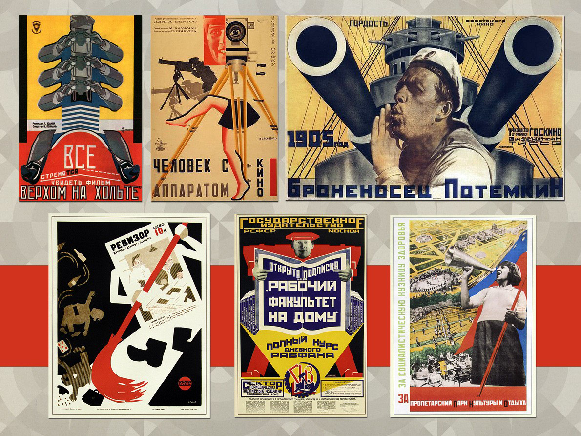
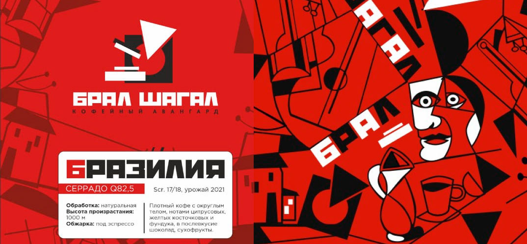
They have a unique corporate identity designed by Graphic Designer based on “Russian avant-garde” (the beginning of ХХ century) such as:
Backstage
BRAL SHAGAL is a young coffee production company.
They have a unique corporate identity designed by Graphic Designer based on “Russian avant-garde” (the beginning of ХХ century) such as:
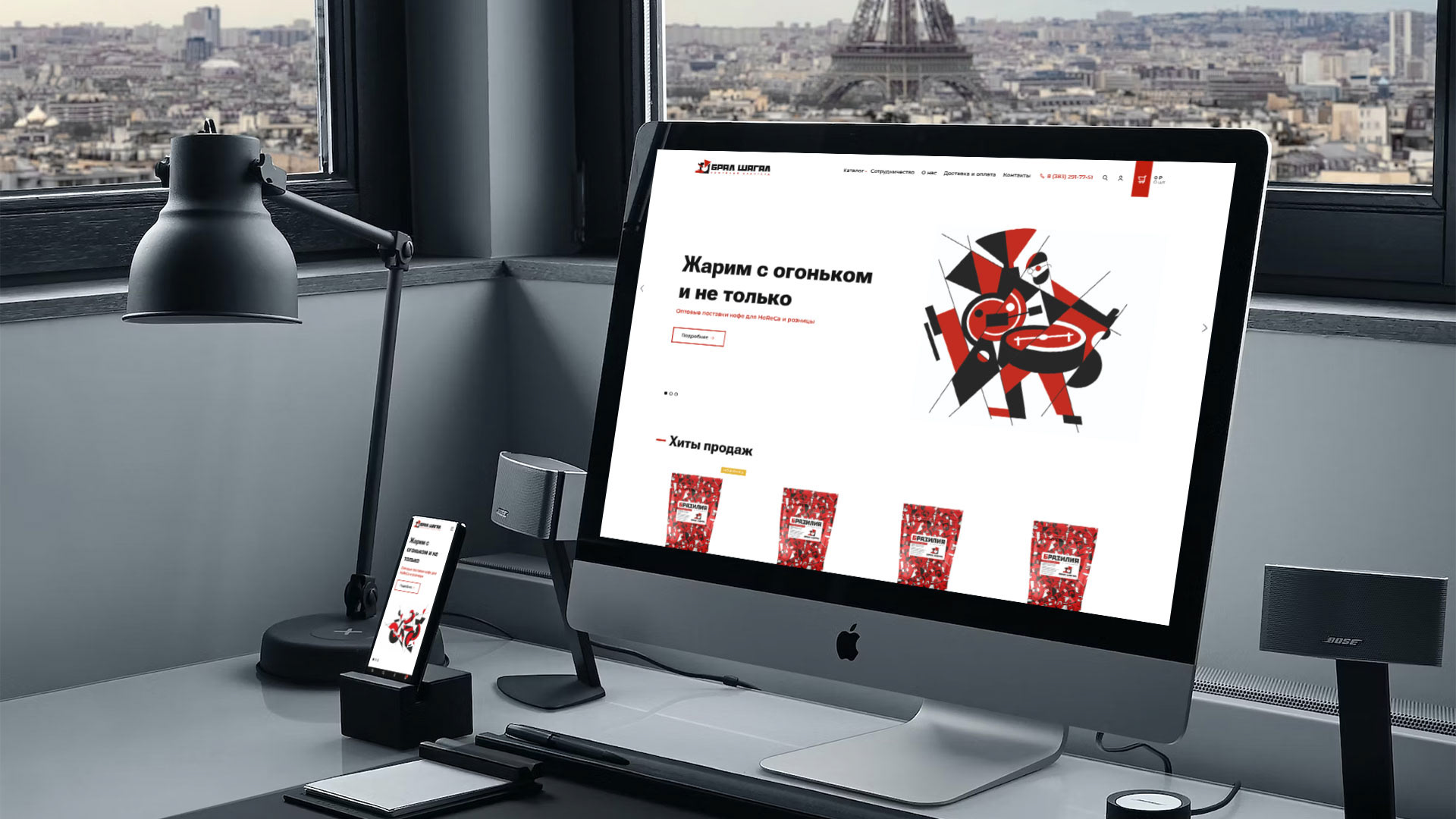
Thus ecommerce UI design should reflect its style, however they have banners & images in “Russian avant-garde” style so it should be in harmony. On the other hand, UX should be simple and informative.
The Client provides the main colors, logo and package design, as well as we define the tech description:
With this baggage I proceed with UX design.
UX research
Ecommerce should work for both retail and wholesale with special conditions (price and delivery). The primary mockups should work for retail, 8 pages in development:
— Homepage
— Catalog – the list of categories
— Catalog – items list with filters and sorting
— Catalog – item page
— Shopping cart
— Order process
— News list
— Default page (for styles and formatting)
Mockups
1. Homepage
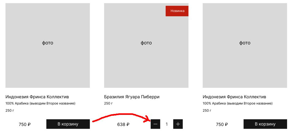
Client’s wishes: 1. Full screen (width) banner (like all competitors’ websites), 2. Lots of big items per page without “noise”, 3. Mobile friendly. Therefore I decided to use the max content width 1600px with 4 items per line. Client plans to expand its catalog with new items in future, thus catalog makes as a dropdown menu with no design restrictions.
Shopping cart with login is on top right side – it’s usual UX. The button “In cart” transforms into items count (-1+) to allow add to cart several items easily right from the items list:
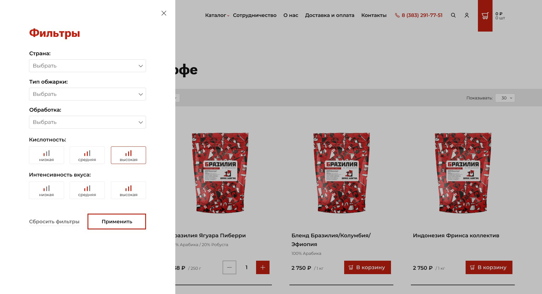
2. Catalog
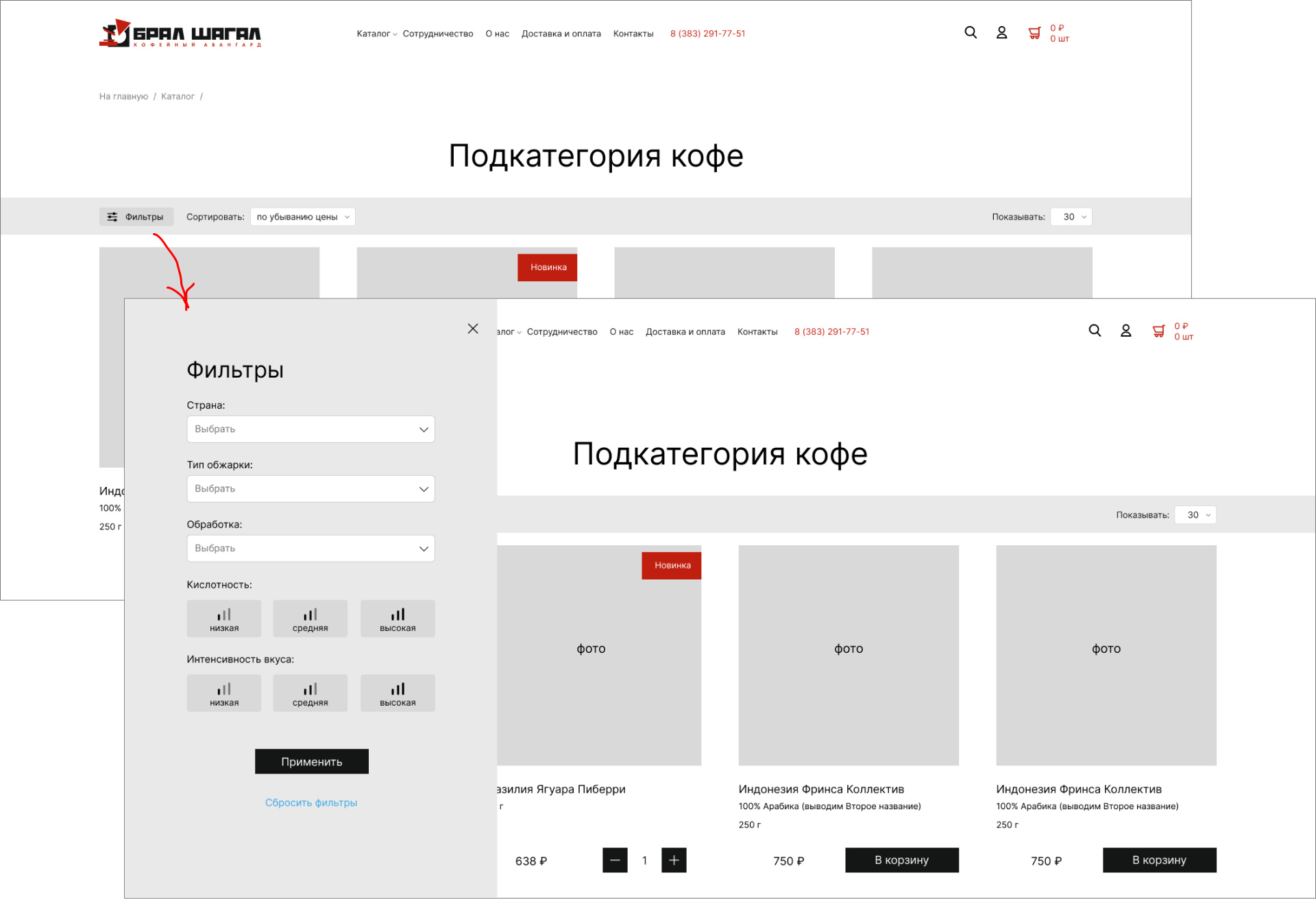
Categories and items list – usual view. Due to the mobile first strategy, I decided to hide the filters behind the button, click opens the filter panel (on smartphones it will be full screen):
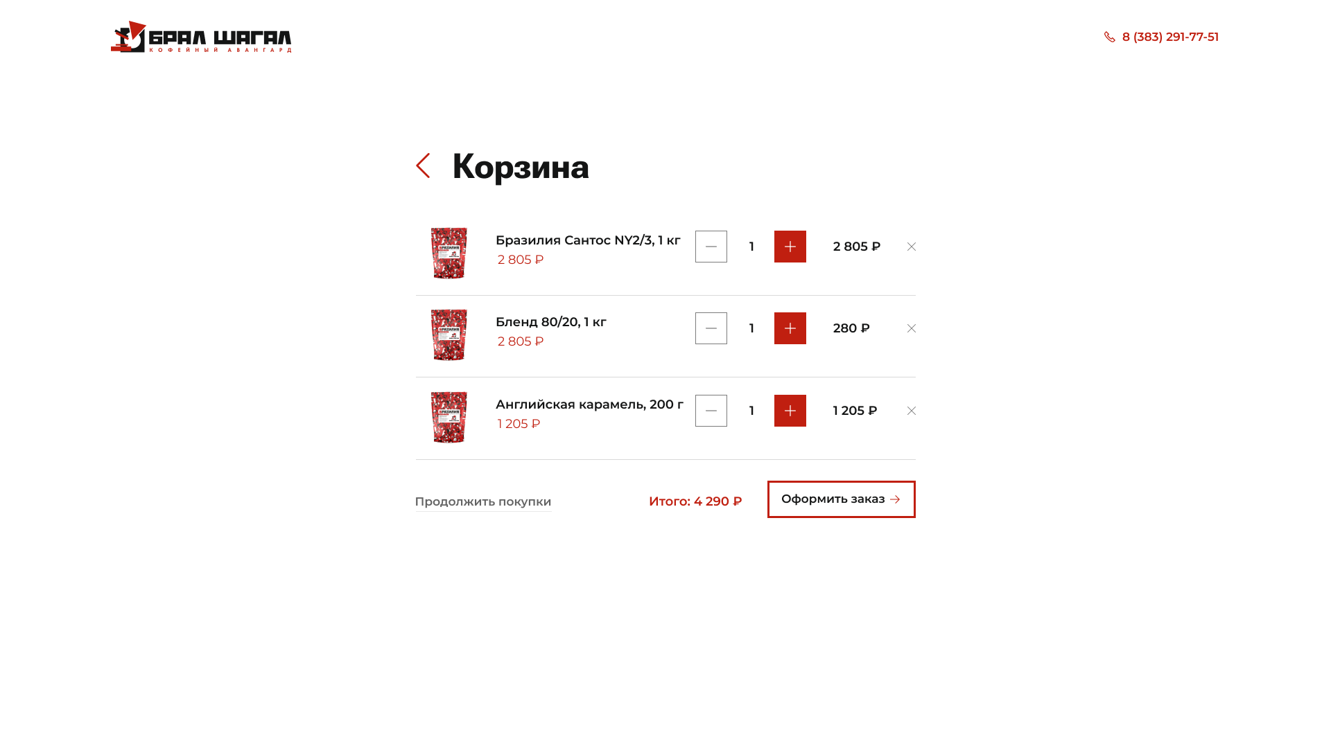
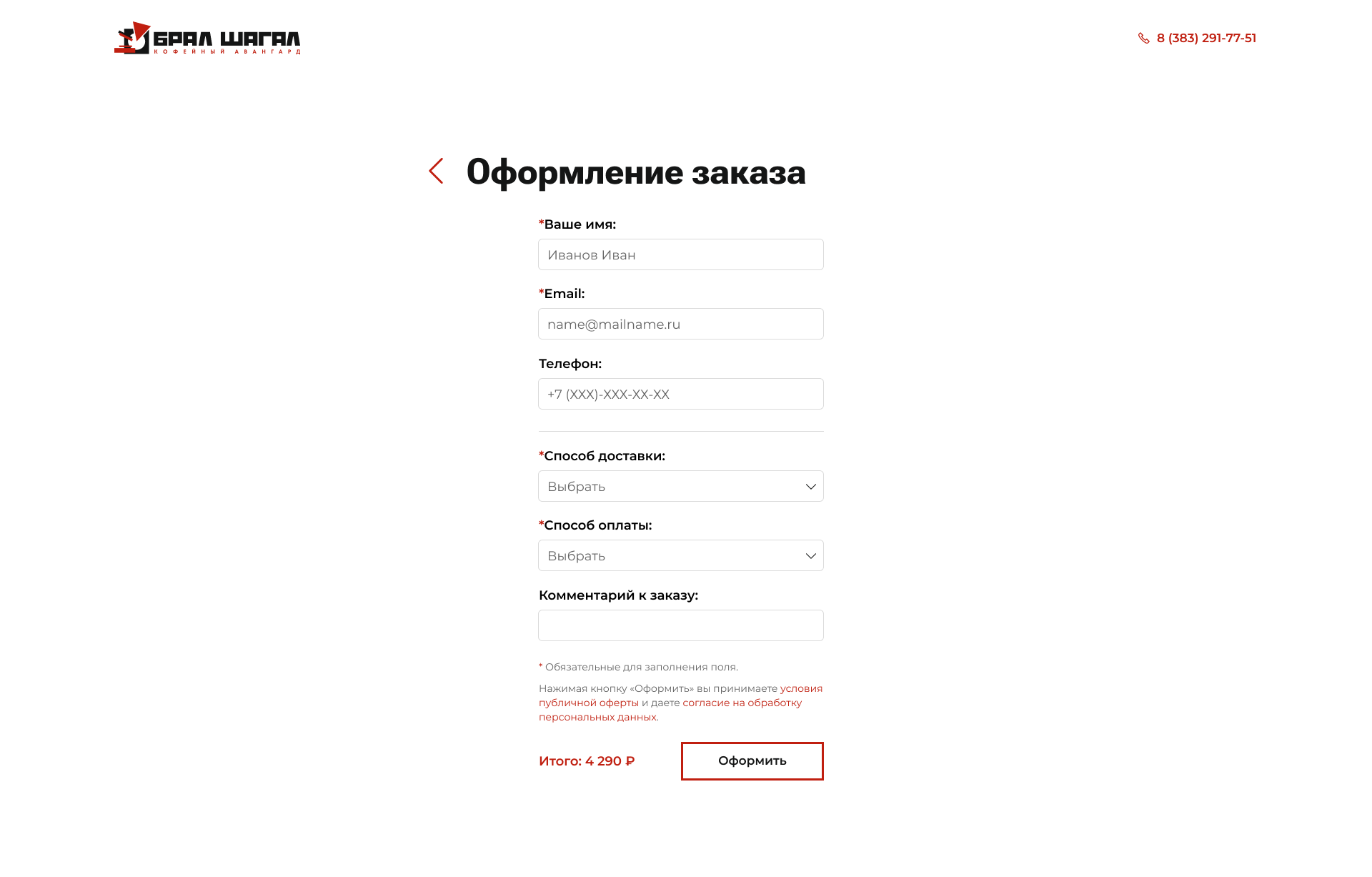
3. Shopping cart & Order process
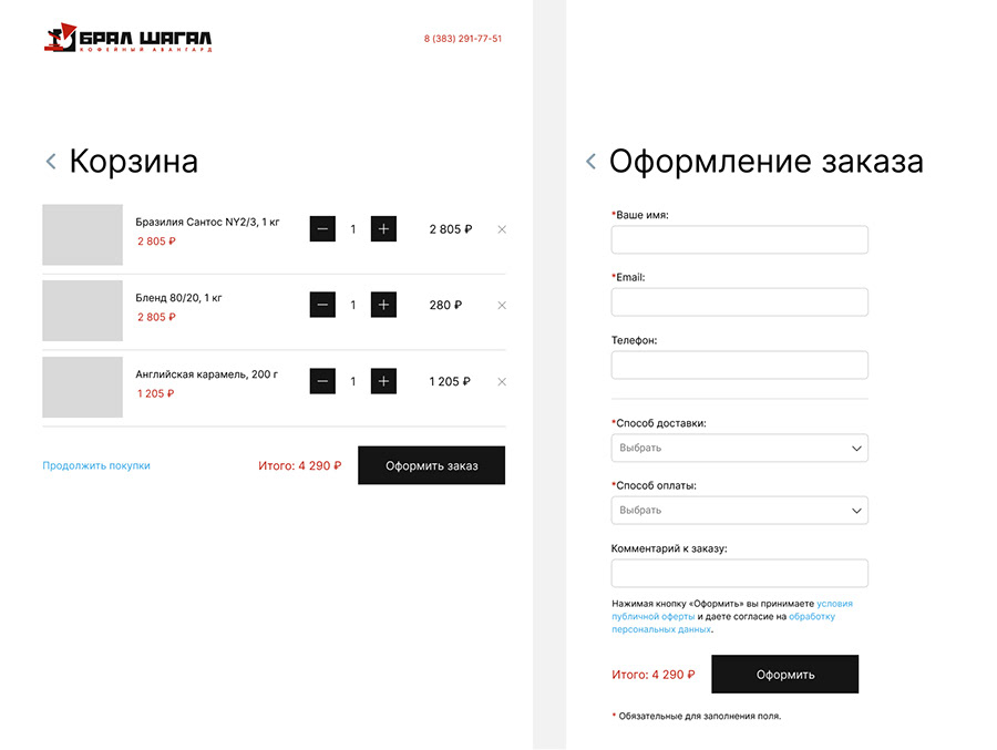
Shopping cart is usual – list of items with ability to change the quantity or delete item. The next step/screen is order process - its simple (due to Clients' process): enter contacts info, select payment & delivery, enter comments. But there are no header and bottom info - only shopping process (plus logo and the phone number), therefore nothing will disturb from the order:
UI design
3 Design concepts of homepage were developed:
1. Standard way - full screen slider, top menu with the accent of shopping cart, bestsellers with card items, neutral bottom color.
2. Logo is the main accent, assimetrical banner and bottom to add the dynamic on page.
3. Simple slider with white bg to make more "air" on the page with neutral bottom color:
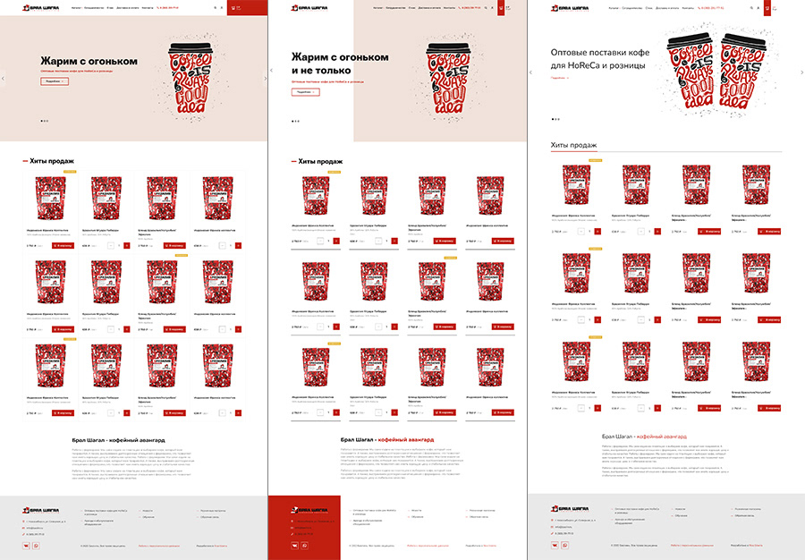
And the winner is...
Client likes the concept #1 with the bottom of concept #2. Meanwhile some banners were ready and I put them in design:
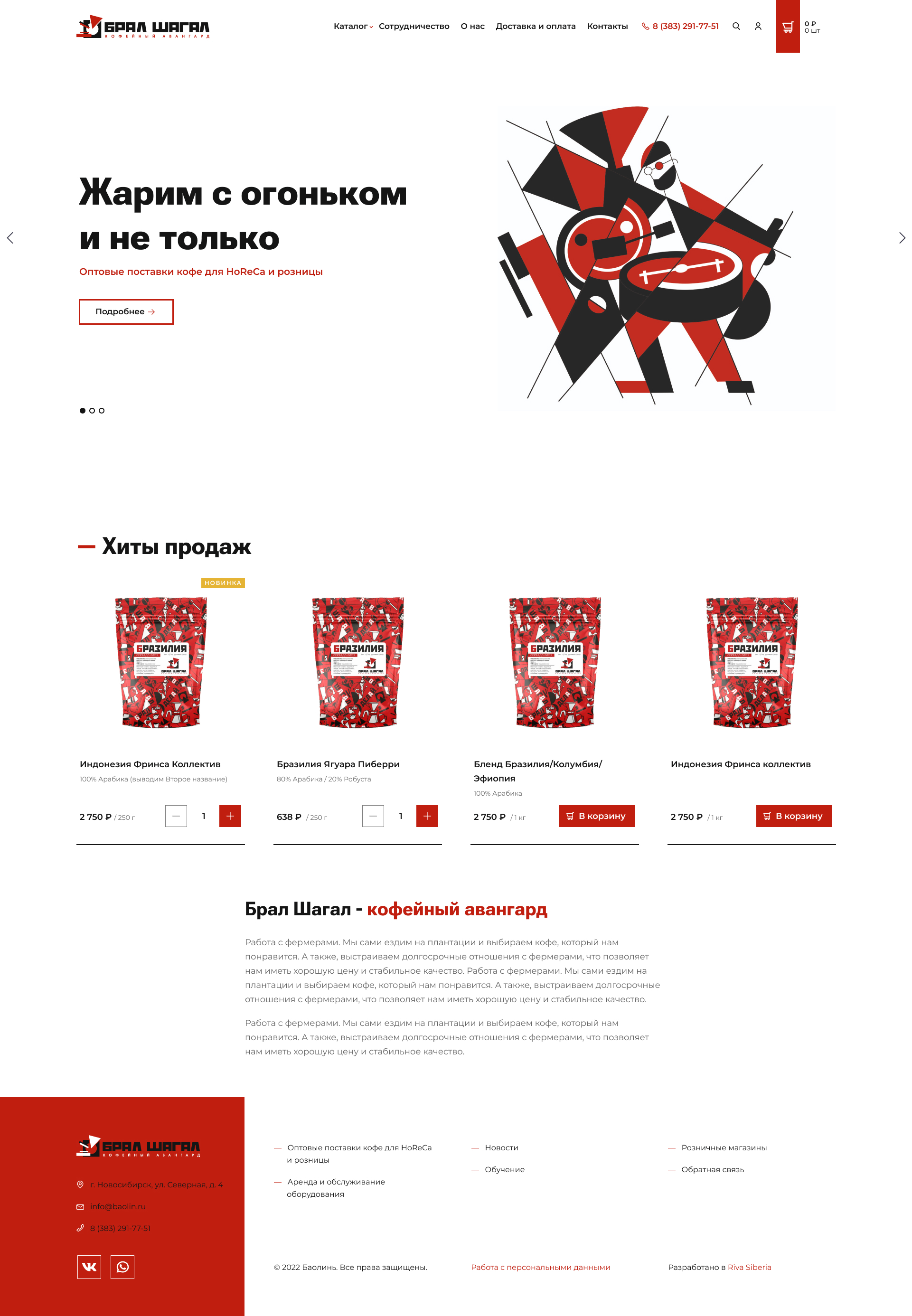
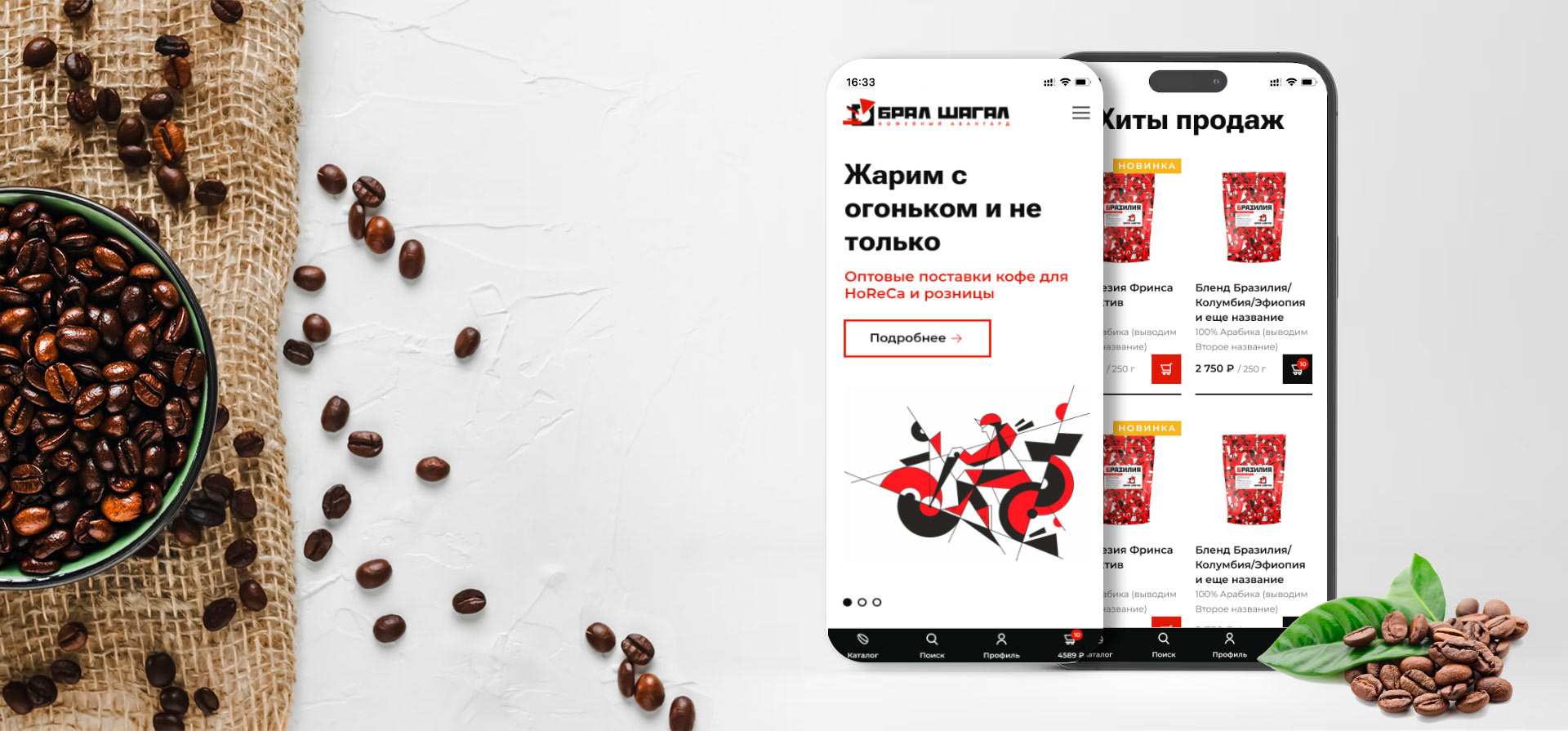
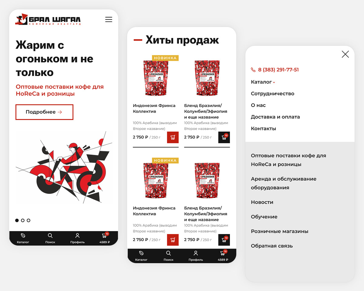
Mobile friendly:
The list of items:
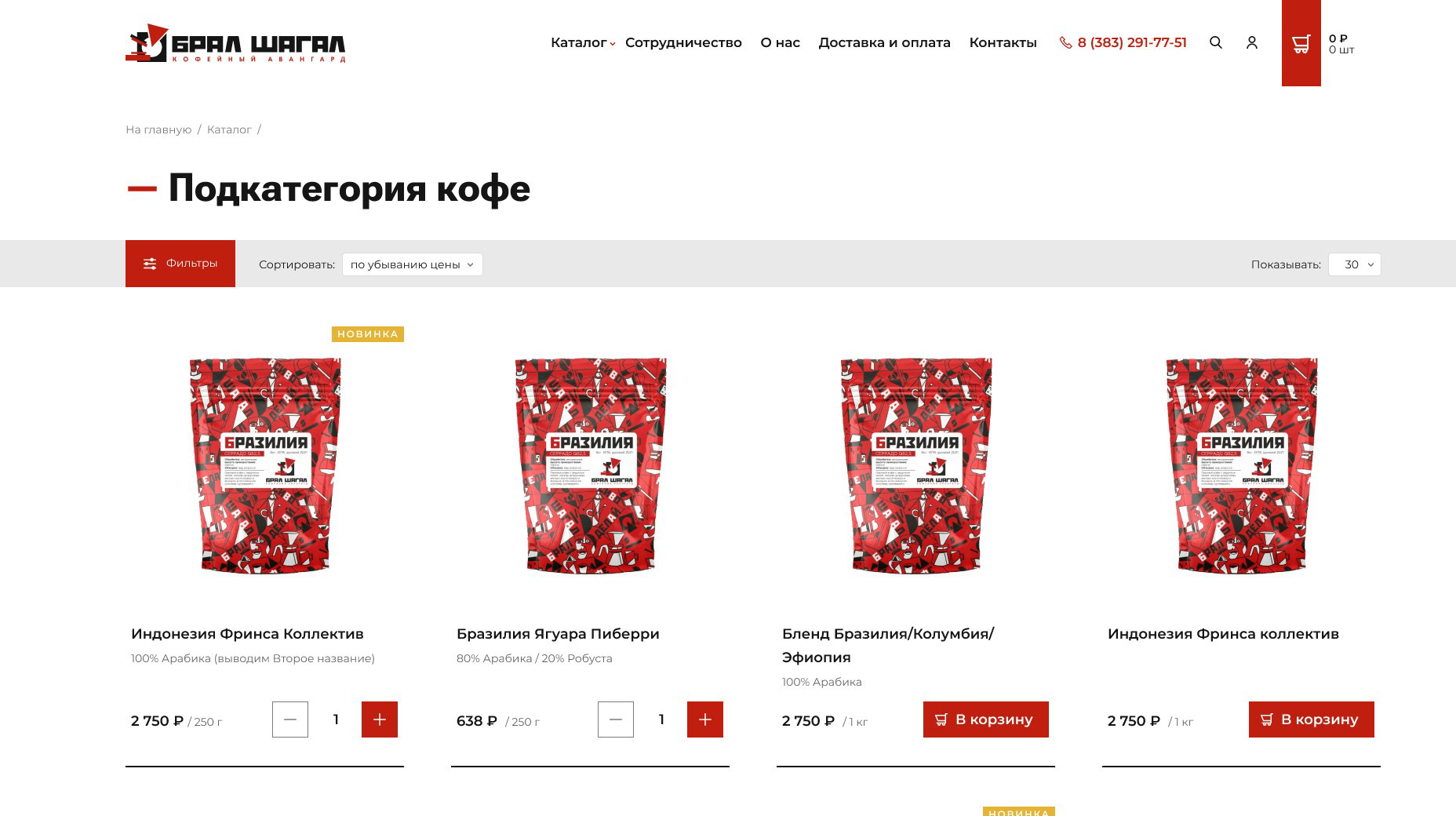
with the filters opened:
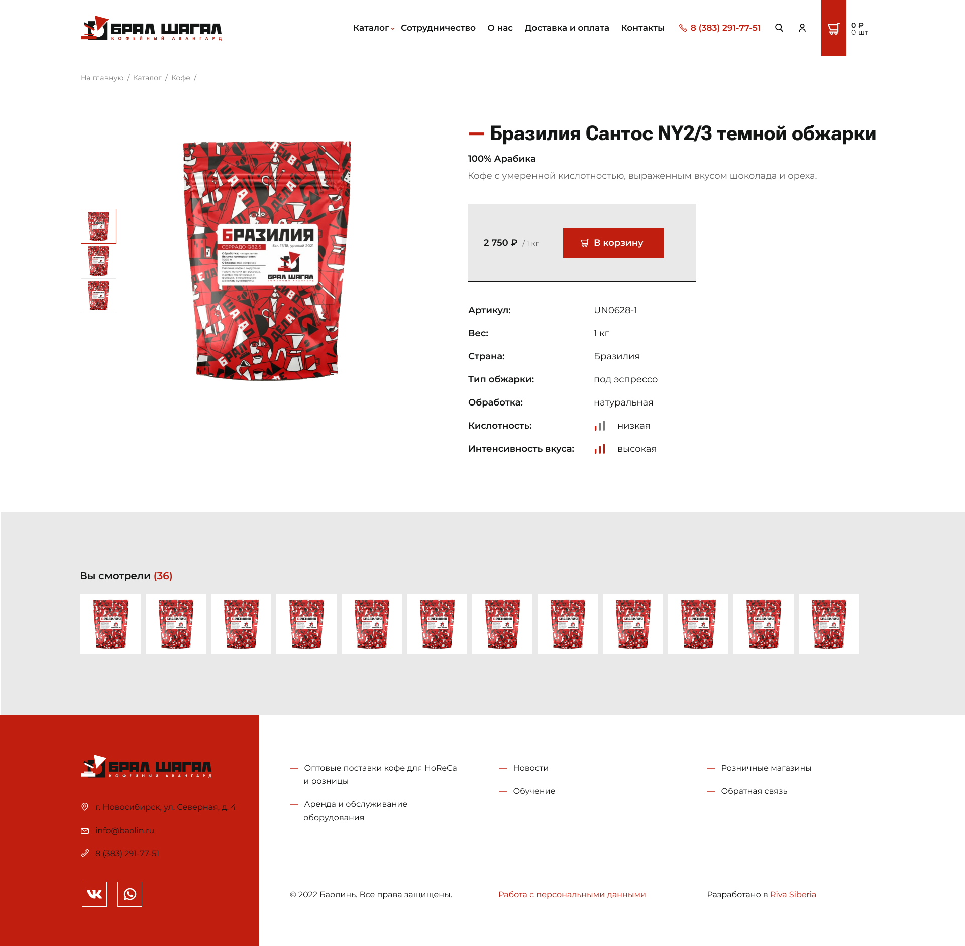
Item page:
Shopping cart
The page contains ONLY the list of items with the total sum. No extra details such as menu links, header / footer, just order process with 2 steps:
1 step - shopping cart:
2 step - contacts, delivery and payment info:
Website is available online https://bralshagal.ru/
Thank you for watching!
I'll be happy to work on your project!
Feel free to contact me

Юлия Курзова

Илона Нестерова

Профиль скрыт

Anastasya Yakushenko...

Мария Никонова

Венера Зайкова
Профиль скрыт

Elena Tiukova
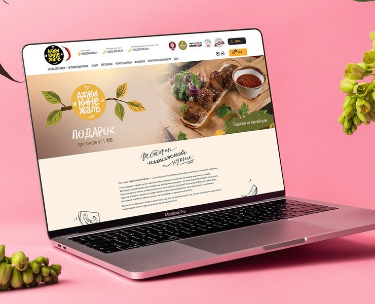
Венера Зайкова
Венера Зайкова
Дизайн интерфейсов
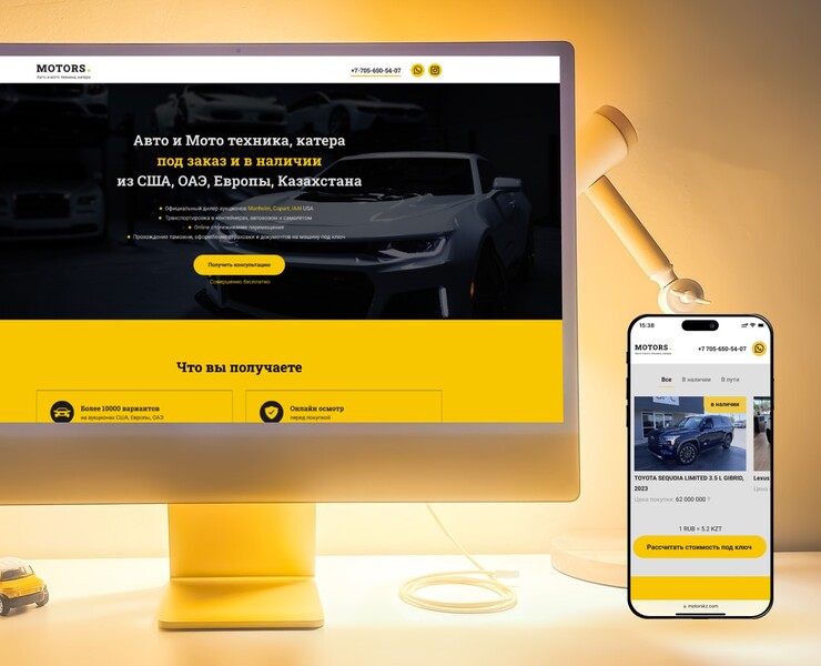
Венера Зайкова
Венера Зайкова
Дизайн интерфейсов
Венера Зайкова
Венера Зайкова
Дизайн интерфейсов
Венера Зайкова
Венера Зайкова
Дизайн интерфейсов
Венера Зайкова
Венера Зайкова
Дизайн интерфейсов
Венера Зайкова
Венера Зайкова
Дизайн интерфейсов