[RU] О проекте: Green Way - компания, предоставляющая натуральные и экологически чистые продукты от местных фермеров и производителей. Все продукты проходят строгий контроль качества и безопасности.
[EN] About the project: Green Way is a company that offers natural
and environmentally friendly products from local farmers and producers. All products undergo strict quality and safety controls.
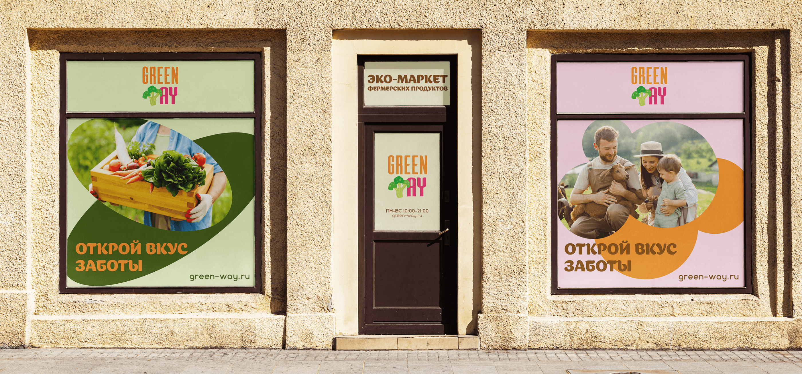
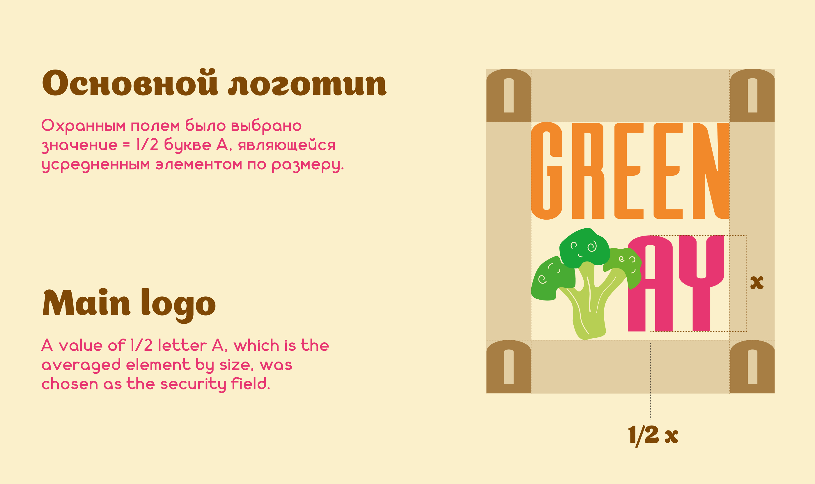
[RU] Логотип
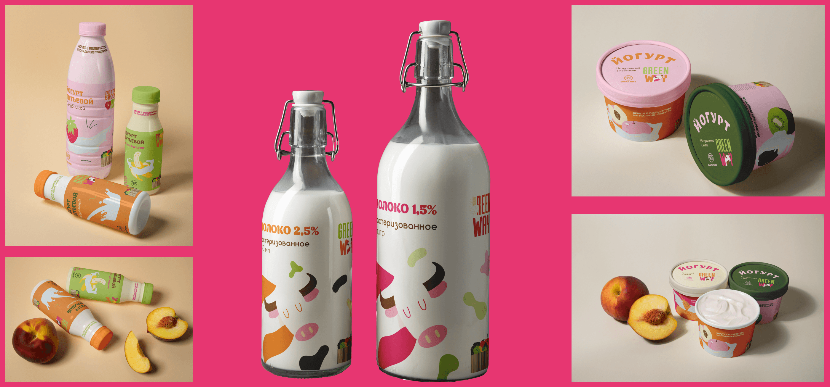
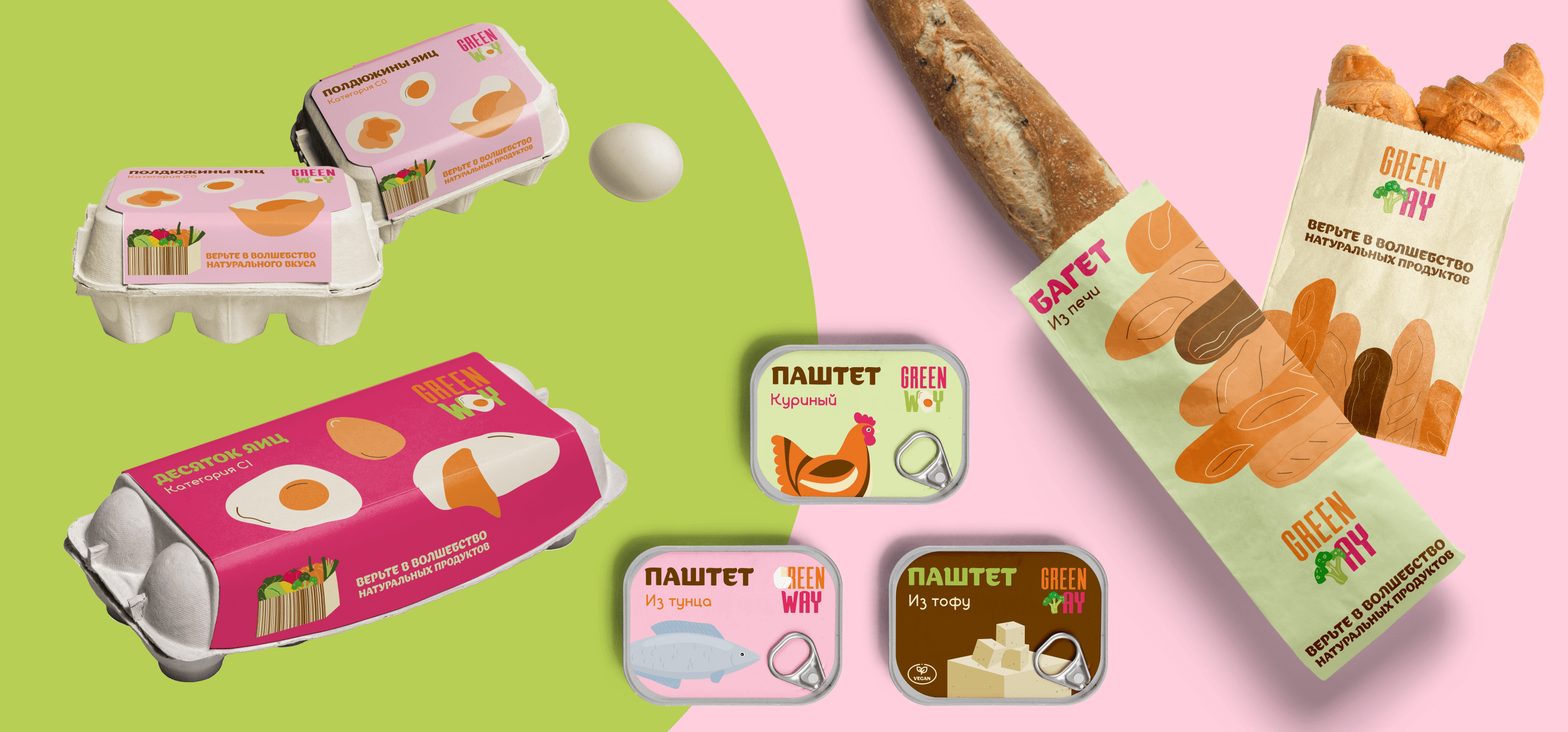
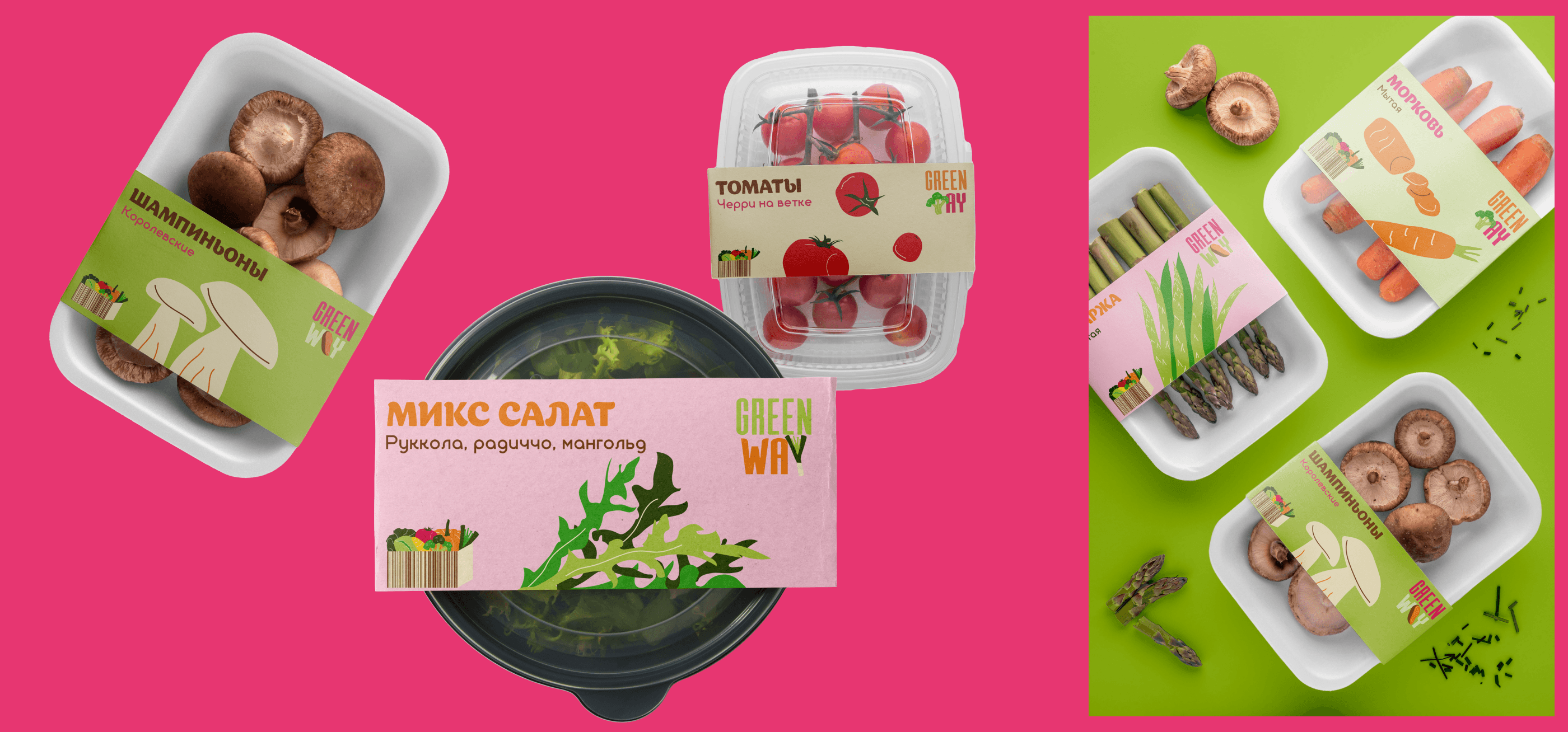
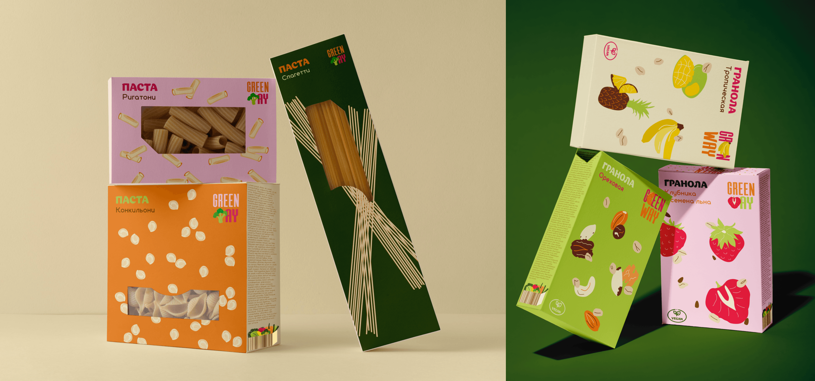
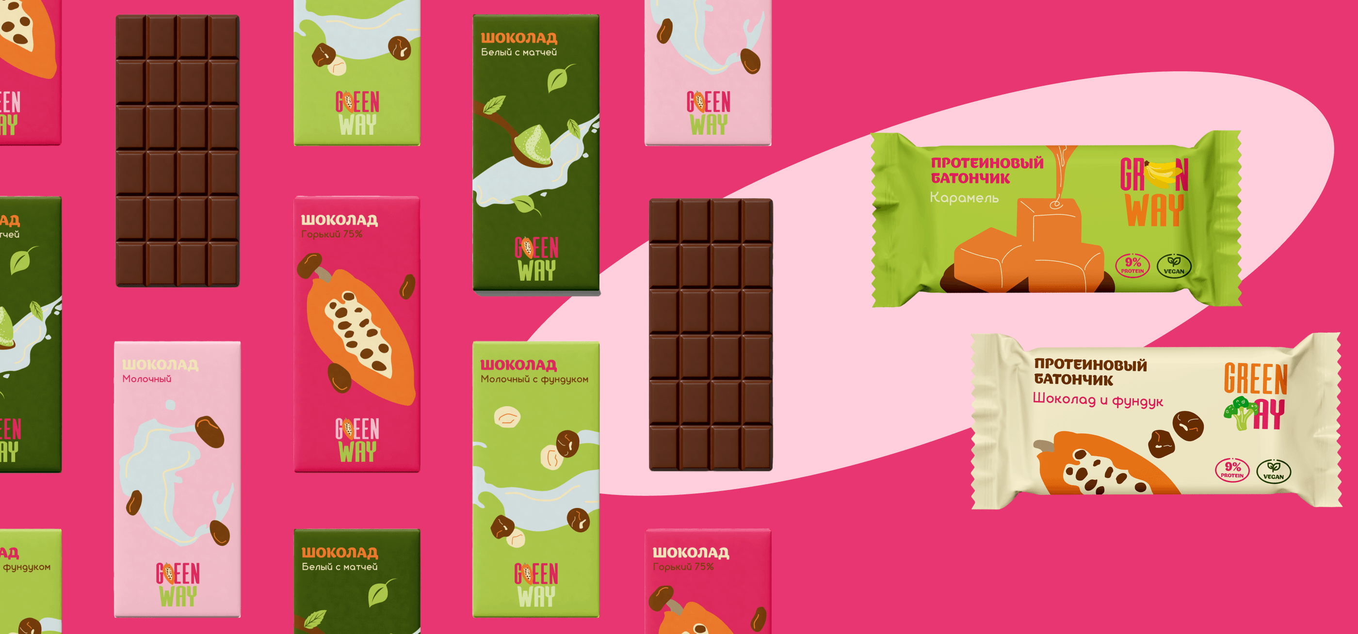
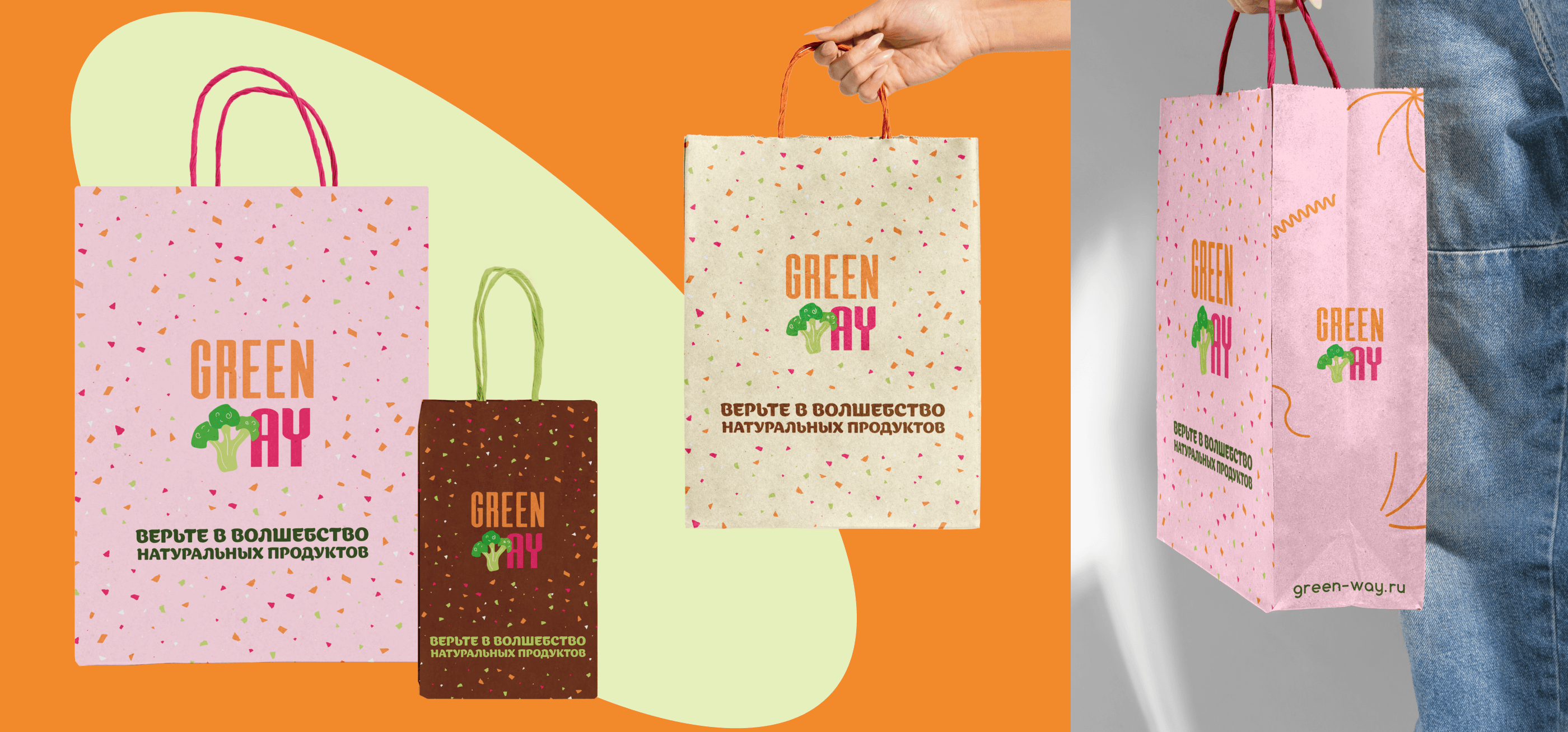
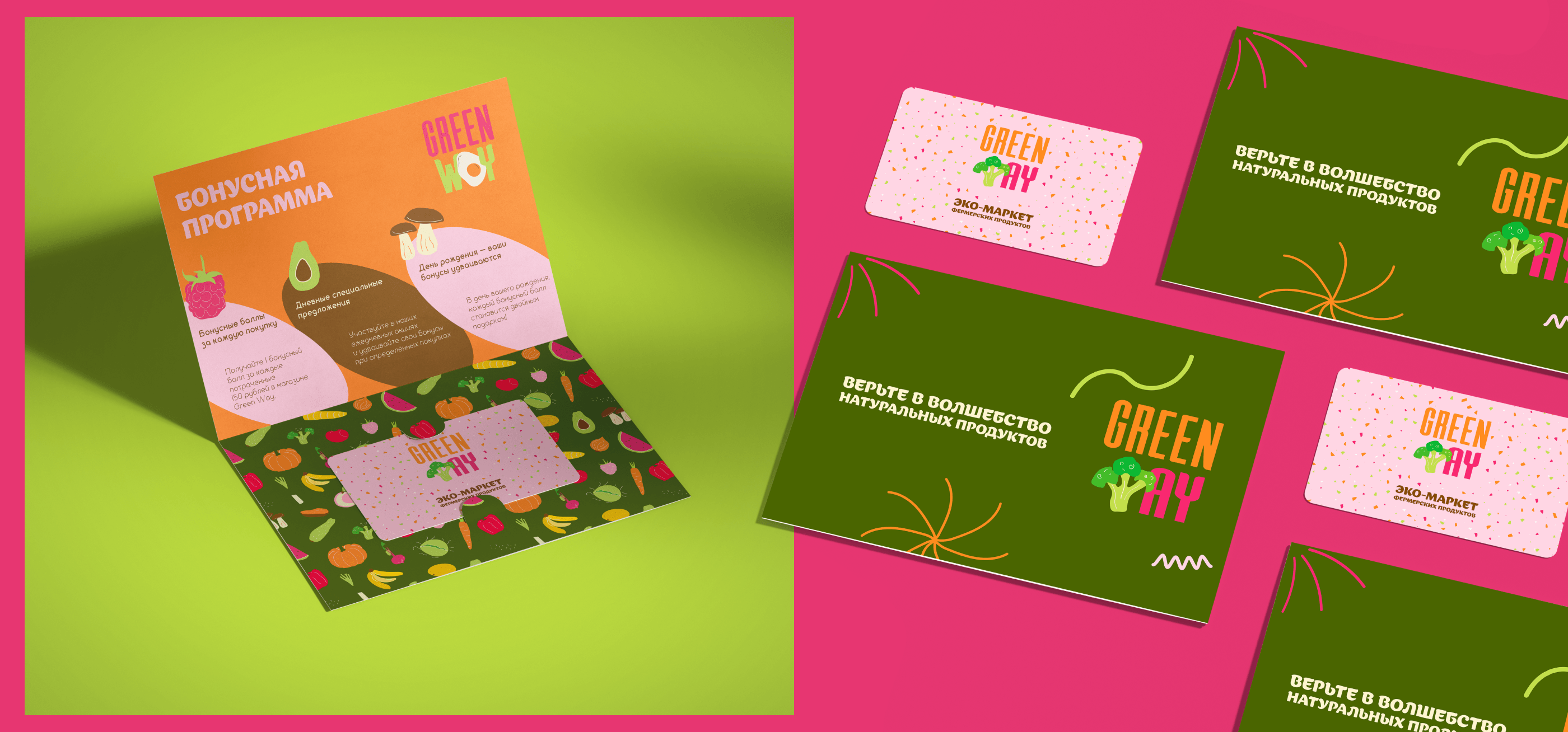
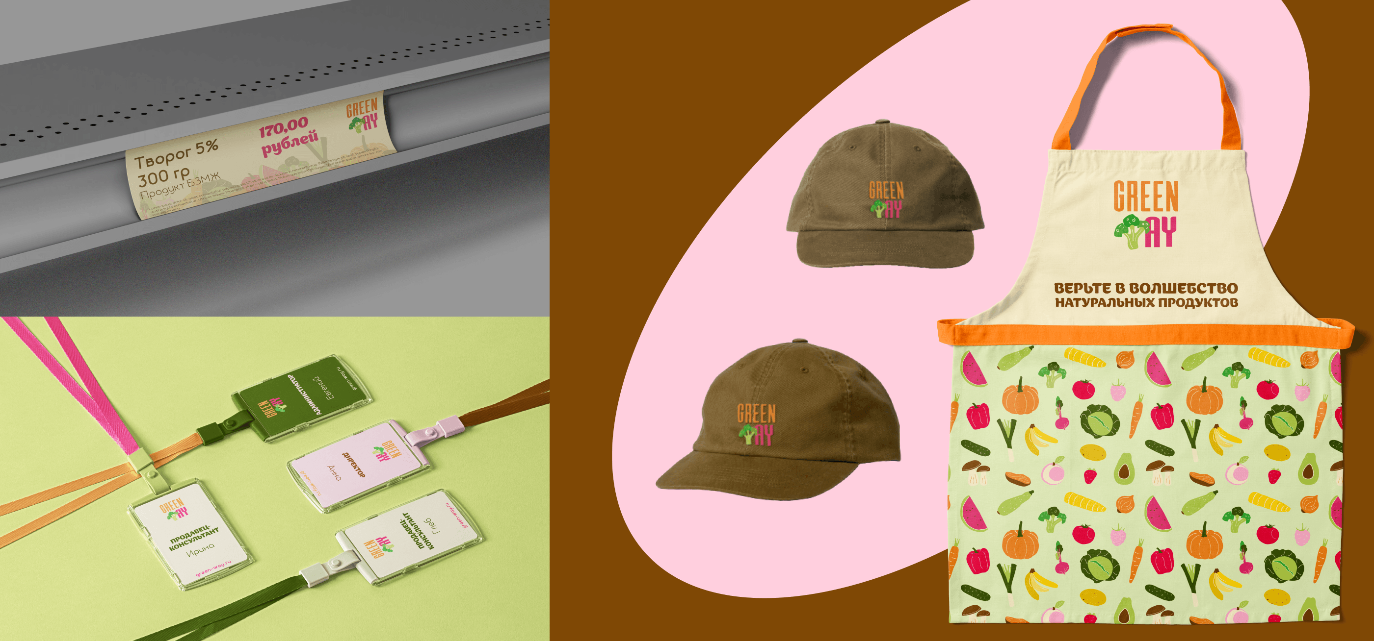
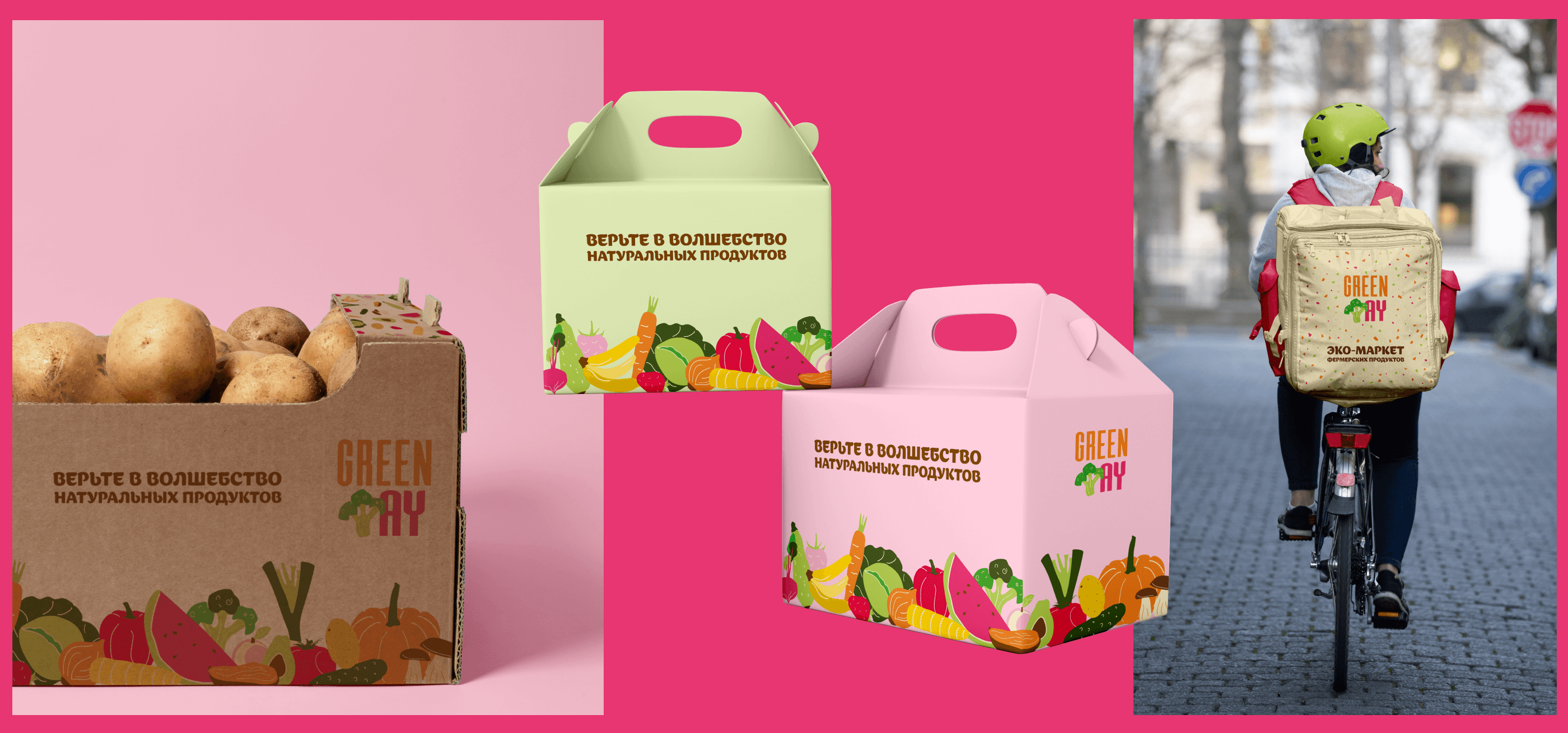
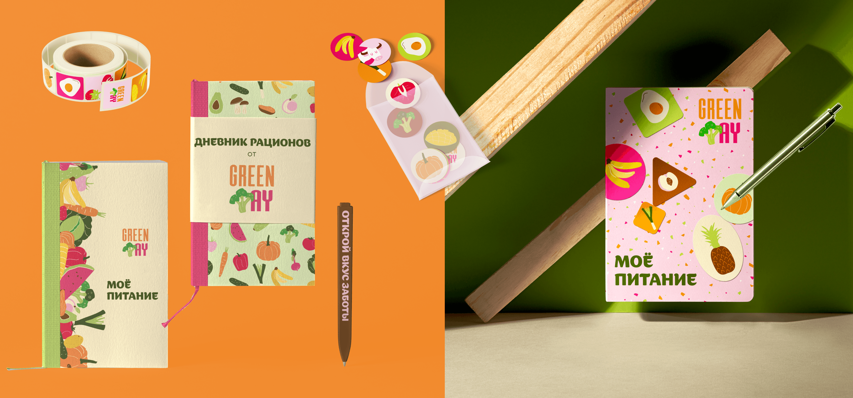
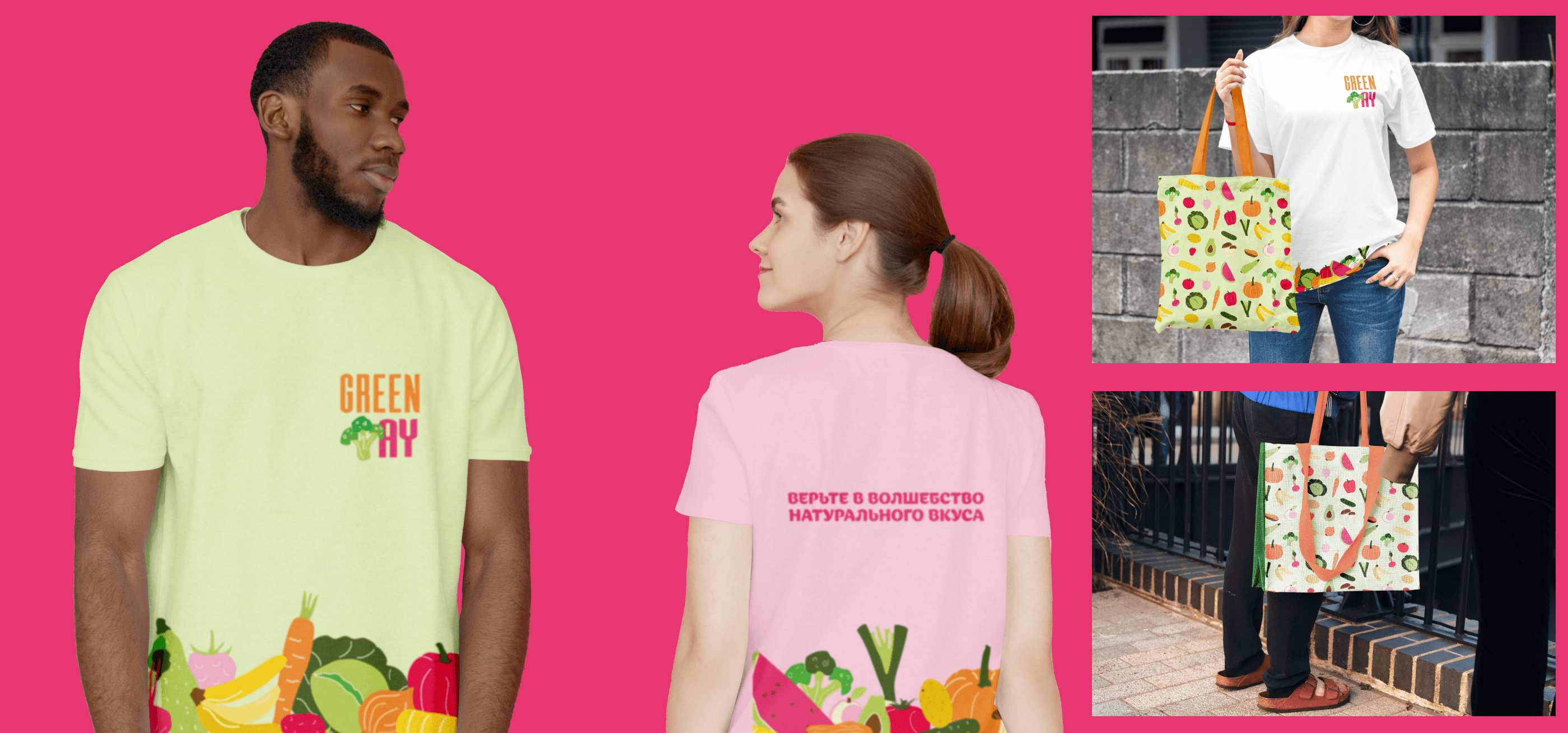
Cоздан динамичный логотип с интегрированной иллюстрацией, которая заменяет часть шрифта. Основной логотип выполнен с изображением брокколи. Каждая упаковка товаров снабжена уникальной иллюстрацией. Шрифтовая часть всегда оформлена одним из цветов основной цветовой палитры и выполнена в трендовом вытянутом стиле с дополнительно закруглёнными углами.
[EN] Logotype
A dynamic logo with an integrated illustration replacing part of the font has been created. The main logo features an image of broccoli. Each product package is accompanied by a unique illustration.The typographic element is consistently designed in one of the colors from the main color palette and is executed in a trendy elongated font with additionally rounded corners.
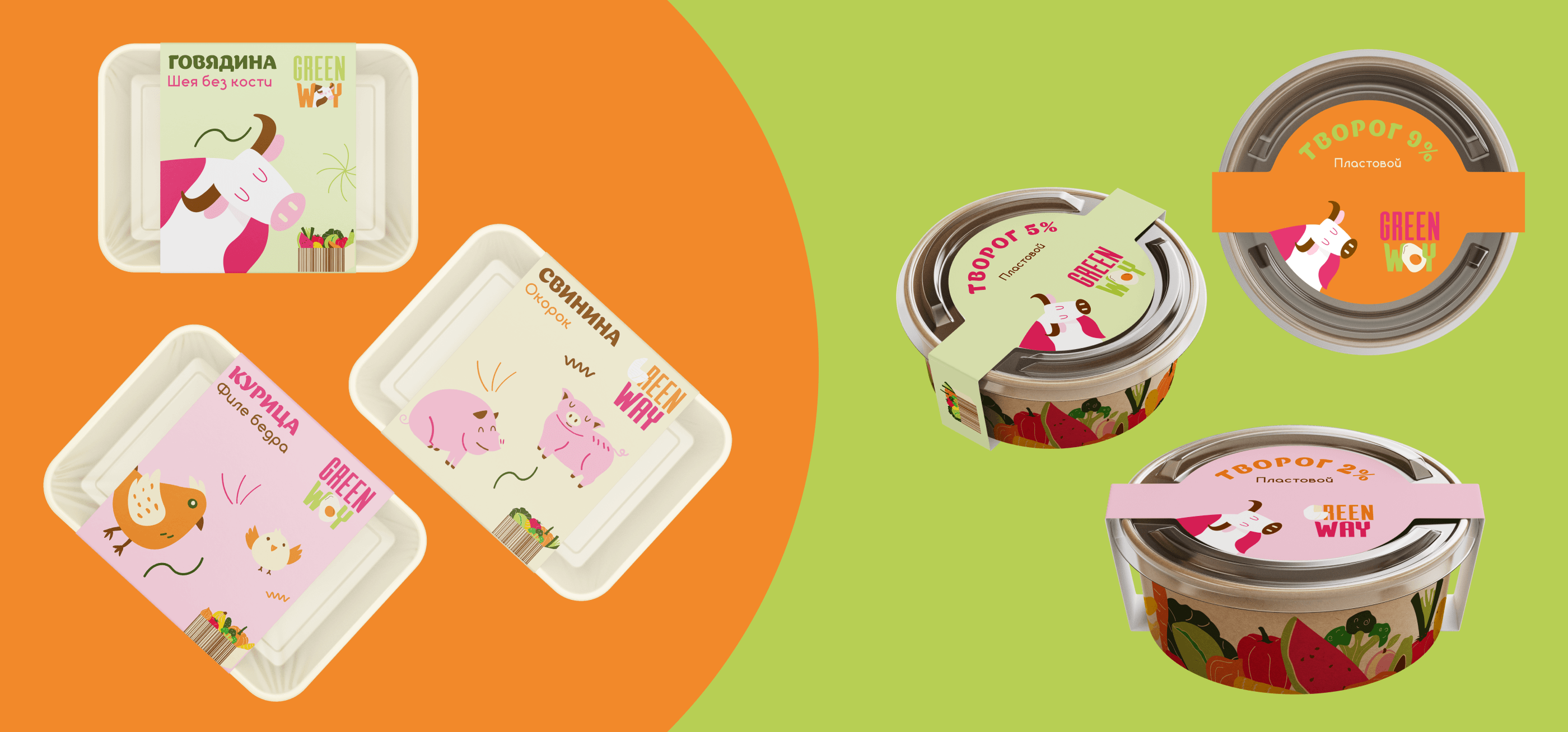
[RU] Главной идеей дизайна стала отрисовка иллюстраций для всех видов продуктов в плоском инфантильном стиле, а также яркое и насыщенное color-block сочетание. Этот выбор сделан с целью привлечения молодой аудитории, а также демонстрирует семейные ценности компании, завлекая внимание детей к натуральной и полезной еде.
[EN] The main idea of the design was to create illustrations for all types of products in a flat, infantile style, as well as a vibrant and saturated color-block combination. This choice is made to attract a young audience and also demonstrates the company's family values, drawing children's attention to natural and healthy food.
Я открыта для сотрудничества!
Для связи со мной воспользуйтесь ссылкой на мой телеграм.
Спасибо за просмотр 😊
I am open for cooperation!
To contact me please use my Telegram link.
Thanks for watching 😊