- Objective
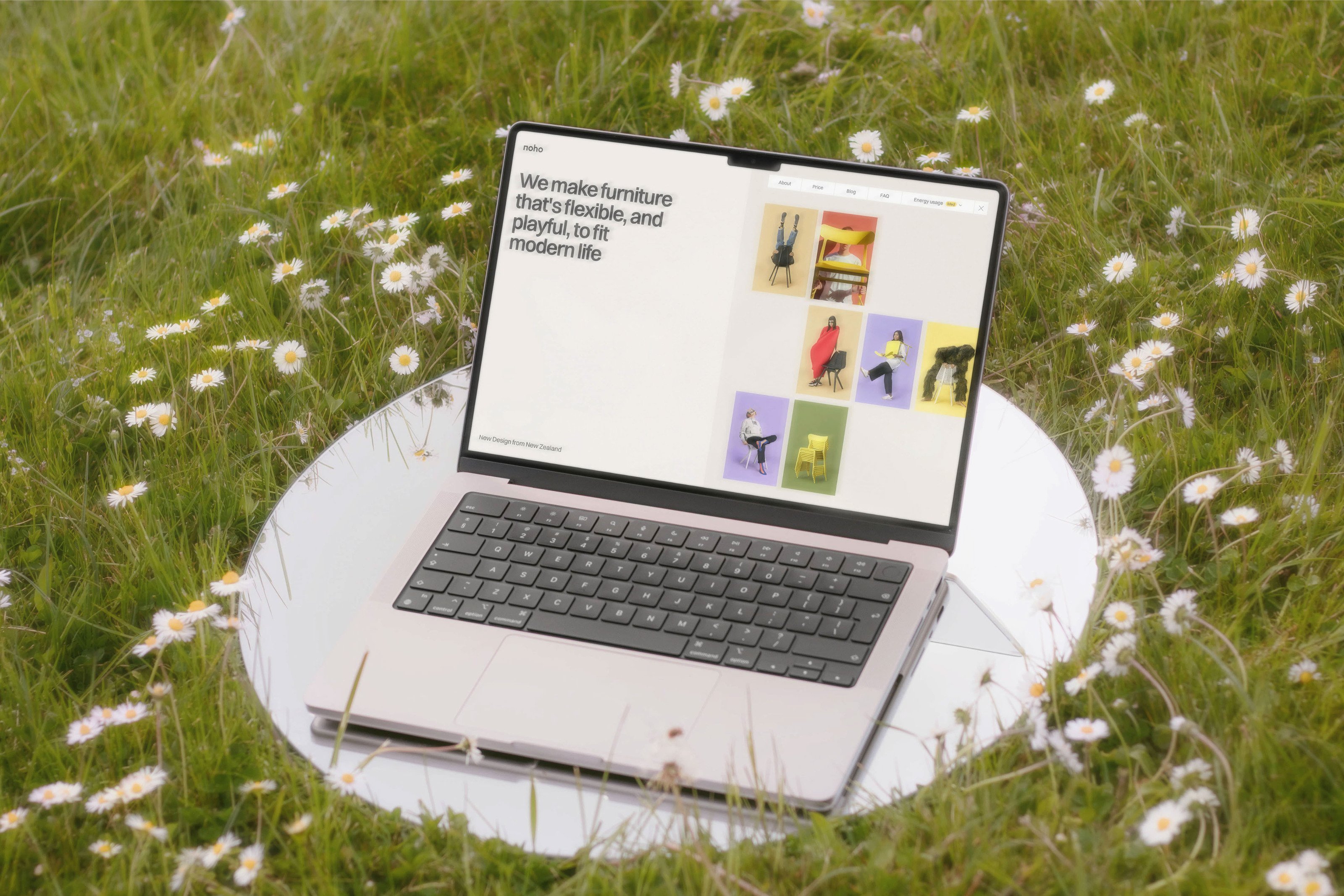
Noho is a direct-to-consumer brand based in New Zealand. The team at Noho is committed to crafting sustainable, ergonomic, and aesthetically pleasing furniture. All Noho products are designed to improve the lives of people, with a lighter impact on the planet.
Noho's target audience primarily consists of progressive and eco-conscious individuals with above-average affluence, who value modern living and prioritize both comfort and visual appeal in their home furnishings.
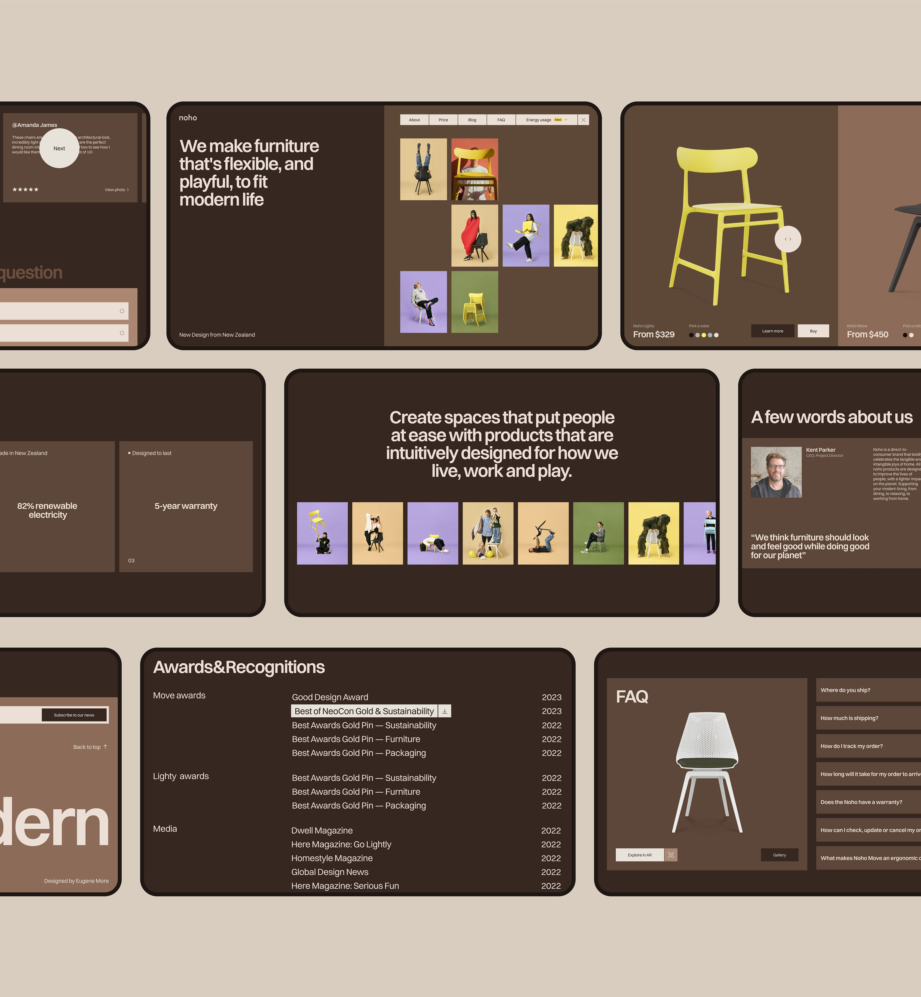
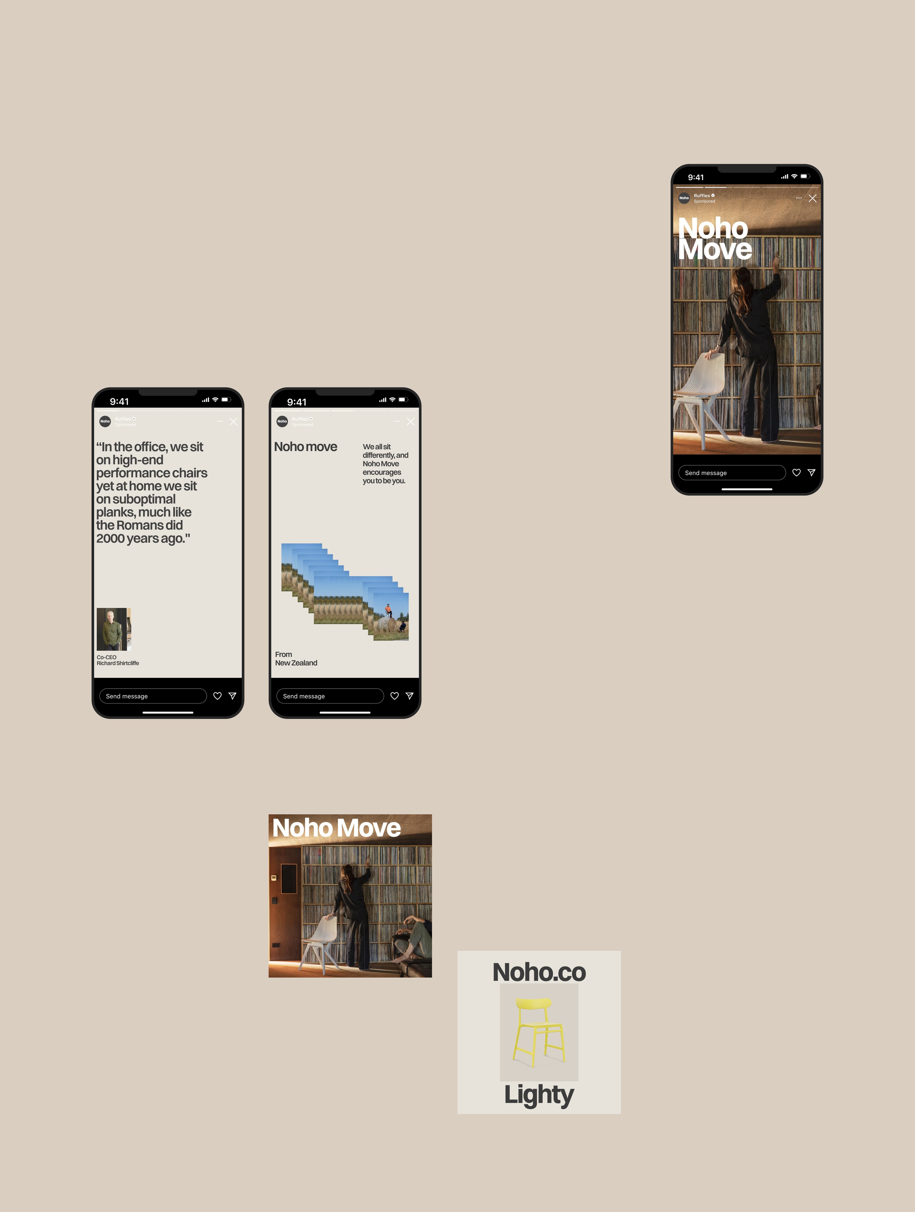
In crafting the website design for Noho, the main metaphor revolves around movement. Just as Noho's chairs follow the natural movement of the body, the interactive cursor accompanies users through their digital journey. The website's clean and stylish design mirrors Noho's dedication to modernity and simplicity.
- Color Palette
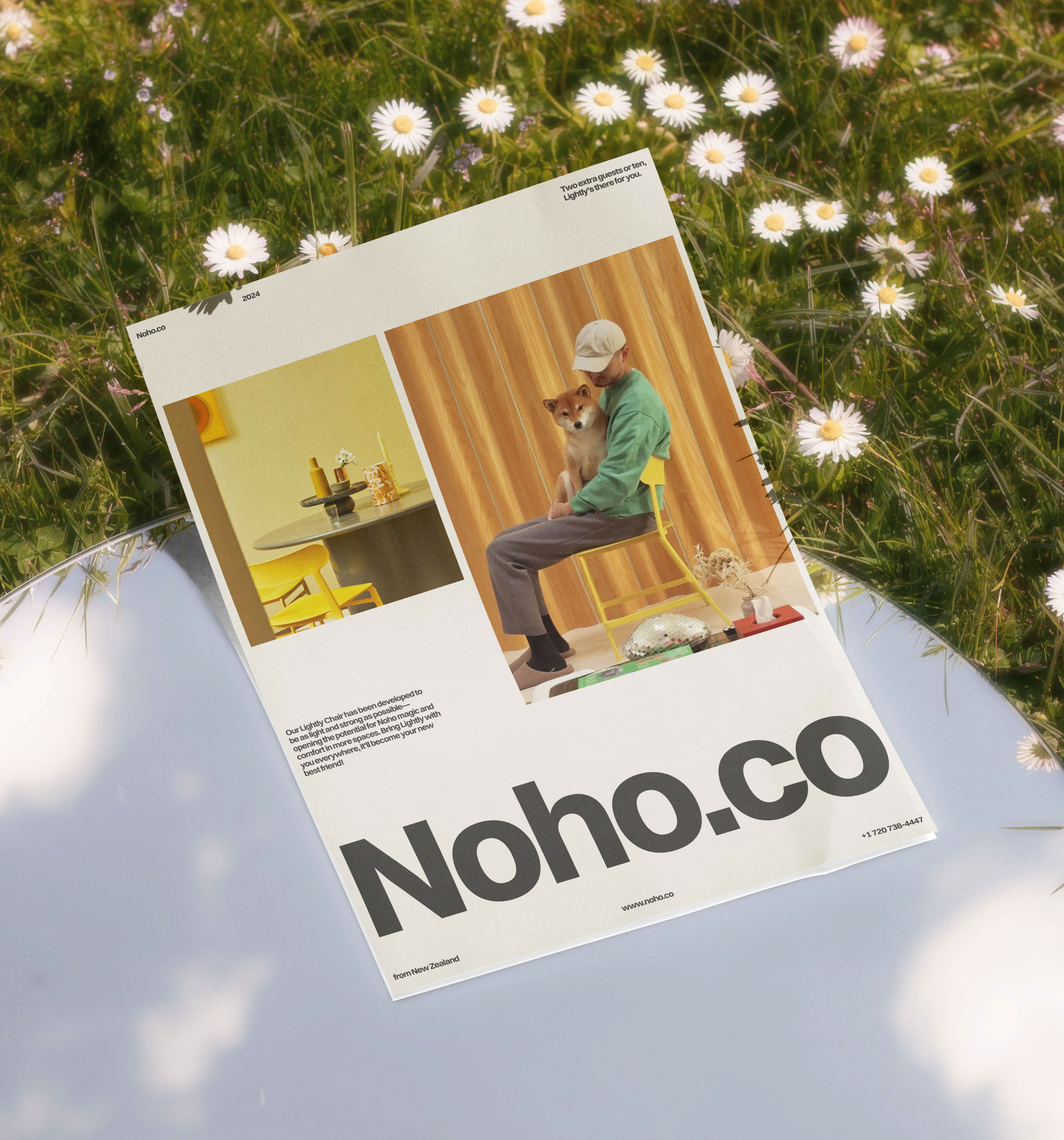
The color palette chosen for Noho's website redesign reflects the brand's commitment to transparency and openness. Drawing inspiration from the warm tones and hues of New Zealand's landscapes, these earthy tones evoke a sense of genuine comfort and coziness, inviting customers into a space that feels like home. The palette is carefully selected to inspire confidence and trust, aligning seamlessly with Noho's status as a B-Corporation and dedication to sustainability.
- Metaphor
The Noho product cards emerge from droplets of water, symbolizing the company’s deep commitment to sustainability. Inspired by the founder’s personal experience of surfing with his family in Bali, where they witnessed the devastating impact of unchecked sea plastic, Noho's products are crafted from reclaimed fishing nets and carpets retrieved from the ocean. This concept not only highlights Noho's eco-friendly approach but also creates a memorable and engaging experience for users. As the centerpiece of the website, this eye-catching animation is designed to captivate and inspire visitors to explore Noho's sustainable furniture collection further.
- Dark mode
In the new Noho website, users have the option to customize their experience by enabling dark mode, along with a feature to reduce animation. Research by Google highlights that consumers are motivated by sustainable experiences that demonstrate how their choices can help lower ecological footprint. These features empower users to actively contribute to a healthier future
while enjoying a personalized browsing experience. Noho's commitment to sustainability extends beyond its products, providing users with opportunities to be part of this change.
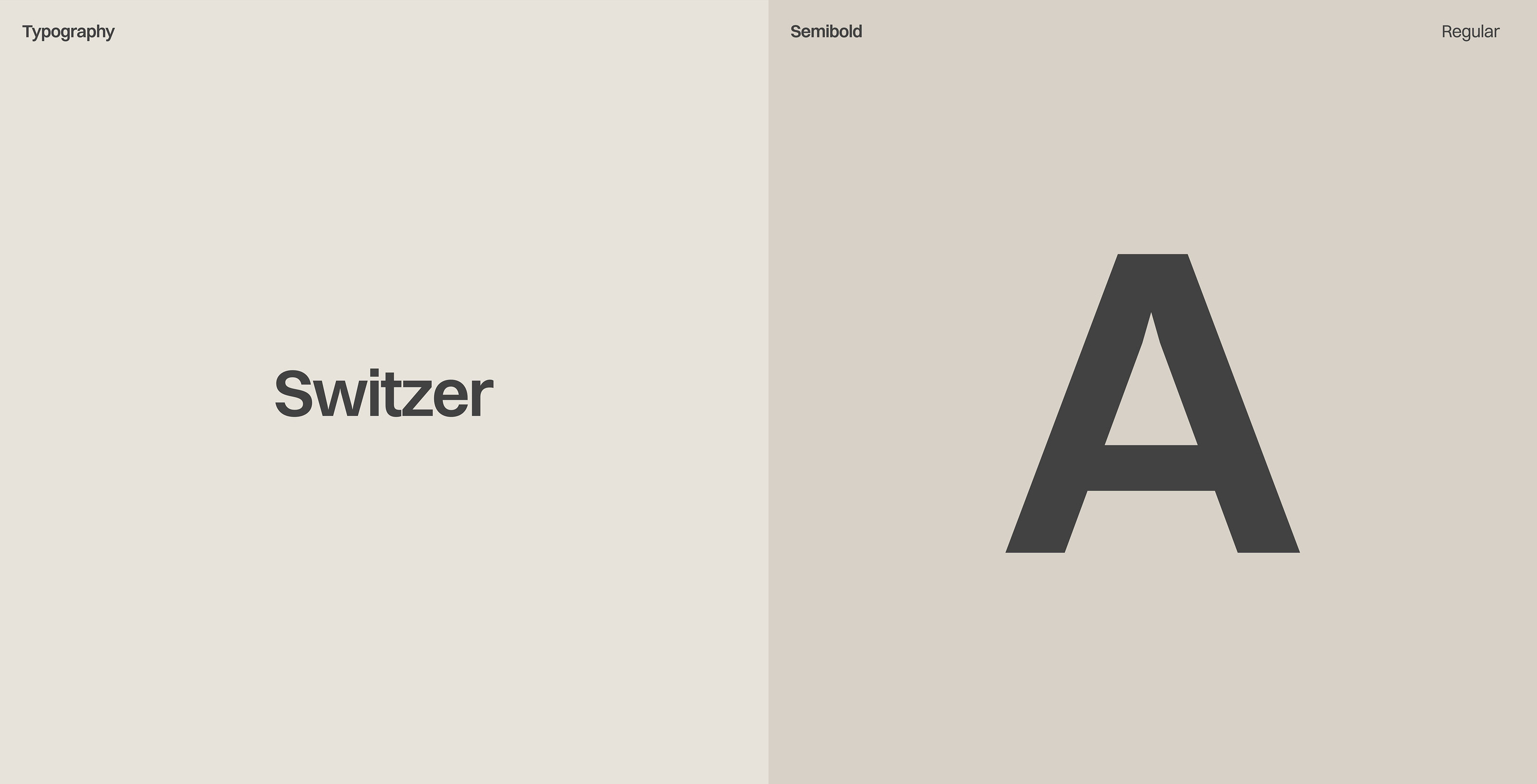
- Typography
For the typography choice in this project, I carefully considered the impact it would have on the overall user experience and brand perception. The neo-grotesk font, Switzer, was selected for its clean and timeless design with a modern twist, aligning perfectly with Noho's values of simplicity, sophistication, and sustainability.
-Credits
Web design / motion / branding: Evgeny Morev
Art direction: Evgeny Uprock
Photos: Noho.co / Unsplash / Republic
Typeface: Switzer — ITF®
All materials were used for non-commercial
purposes only and belong to its owners.
-Socials
Linkedin
Cosmos