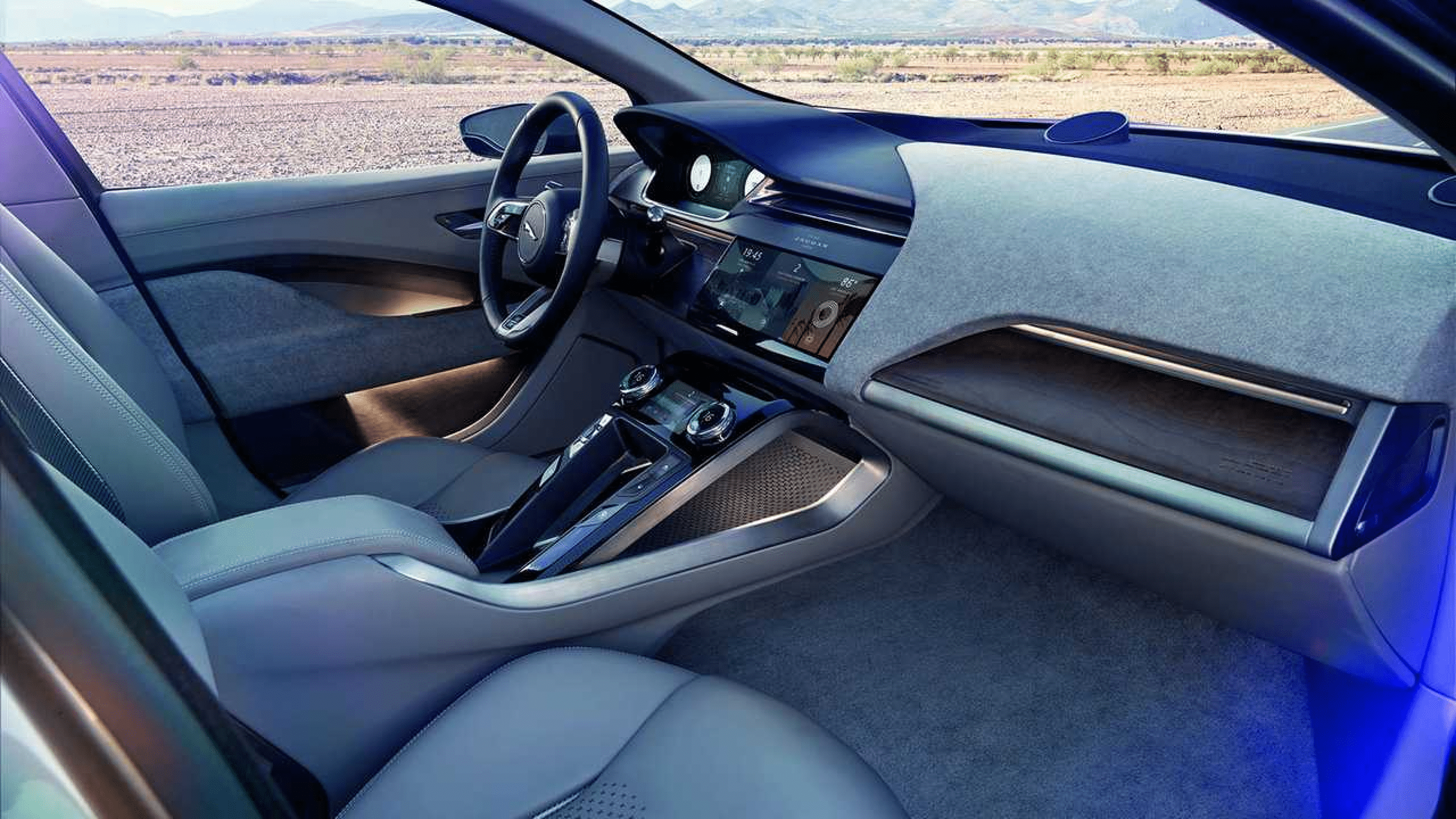
Jaguar I-PACE challenge
Since the electric car is still a groundbreaking theme, at the junction of time. The present and already foreseeable impoverished car industry. In the Jaguar I-PACE car itself, there are still many imperfections. And there is something to strive for. To buy such an electric car in 2021 in Russia is a big dilemma (from the banal, the lack of charging stations in the city, even in the capital). I would say they just don't exist ;)
So a complete switch to an electric motor without a hybrid system is just nonsense.
This kills all the mood to go on a trip to the sea.
But! I have moved away from the topic, as it is about a conceptual application for I-PACE. All the bright problems of InControl (the existing version, sale on App S.) were painted by critics of PRO and ordinary users... again, it turned out negative
(see the link to the article).
Here are a couple of bright reasons that I highlighted after reading the reviews on the forums:
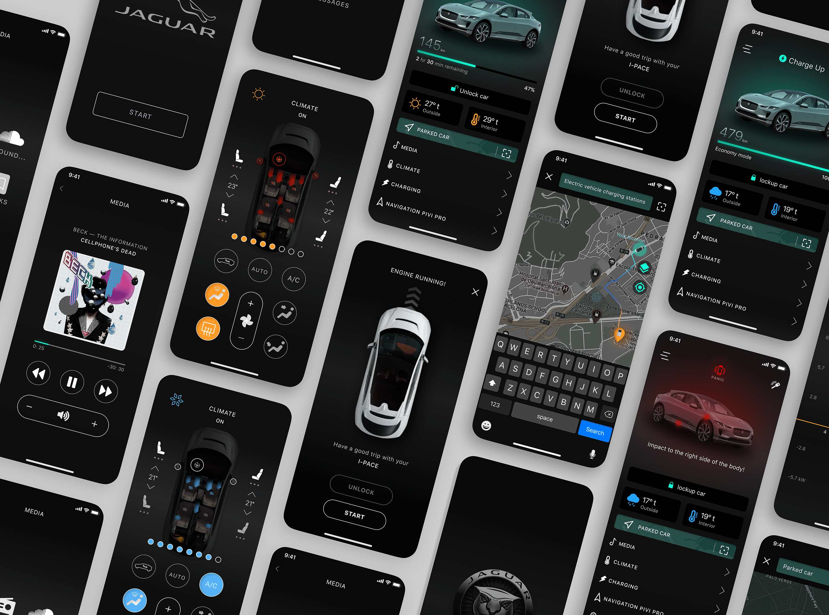
1. - This is the media in the app itself. I was surprised that the application when syncing with the vehicle using Bluetooth works as if from the last century, there is no image transfer, all other options are disabled. There is an inconvenient connection with a minimal set of functions via a USB cable (see problems) Are you serious?)
2. - In InControl problems, we see that from the main application we go to the phone (messages, calls, etc.) the application (InControl) flies off, the settings are lost.
DECISION: I offer synchronization via Bluetooth, stationary unit, full set of functions ;)
The advantage is that, unlike the InControl app, my app concept gives a complete media base — it's not only music in the usual mode, but also the ability to integrate applications such as SoundCloud, various messengers, messages from the phone, switching to a call. At the same time, you remain in the app.
If you need to view any other files, etc., the application will remain active and will be displayed in a small window on the home screen of your phone. You can always go back without unnecessary activation, without losing the connected options. Once the interaction is over, simply swipe to the top like any other app ;)
After analyzing the mobile application for "TESLA" and the redesign of the application from Matt Farmer, I conducted a survey of friends, one motorist whom I met at the car wash (Seryoga), a fan of cool cars, my brother, my own long-term experience and adapted it to the local market taking into account the climate zone and formed my Frankenstein ;)
(although there are a lot of screens for statistics and so on.. left on paper, do not forget that-this is just a concept ;)
In particular, in the redesign from Matt Farmer, there are solutions that are really more convenient than in the original "TESLA" application.
The top important options are adapted to the main screen without a tabular form, in fact, what he writes in the summary (do not forget that Matt is from the United States, and everything is clear with the climate there).
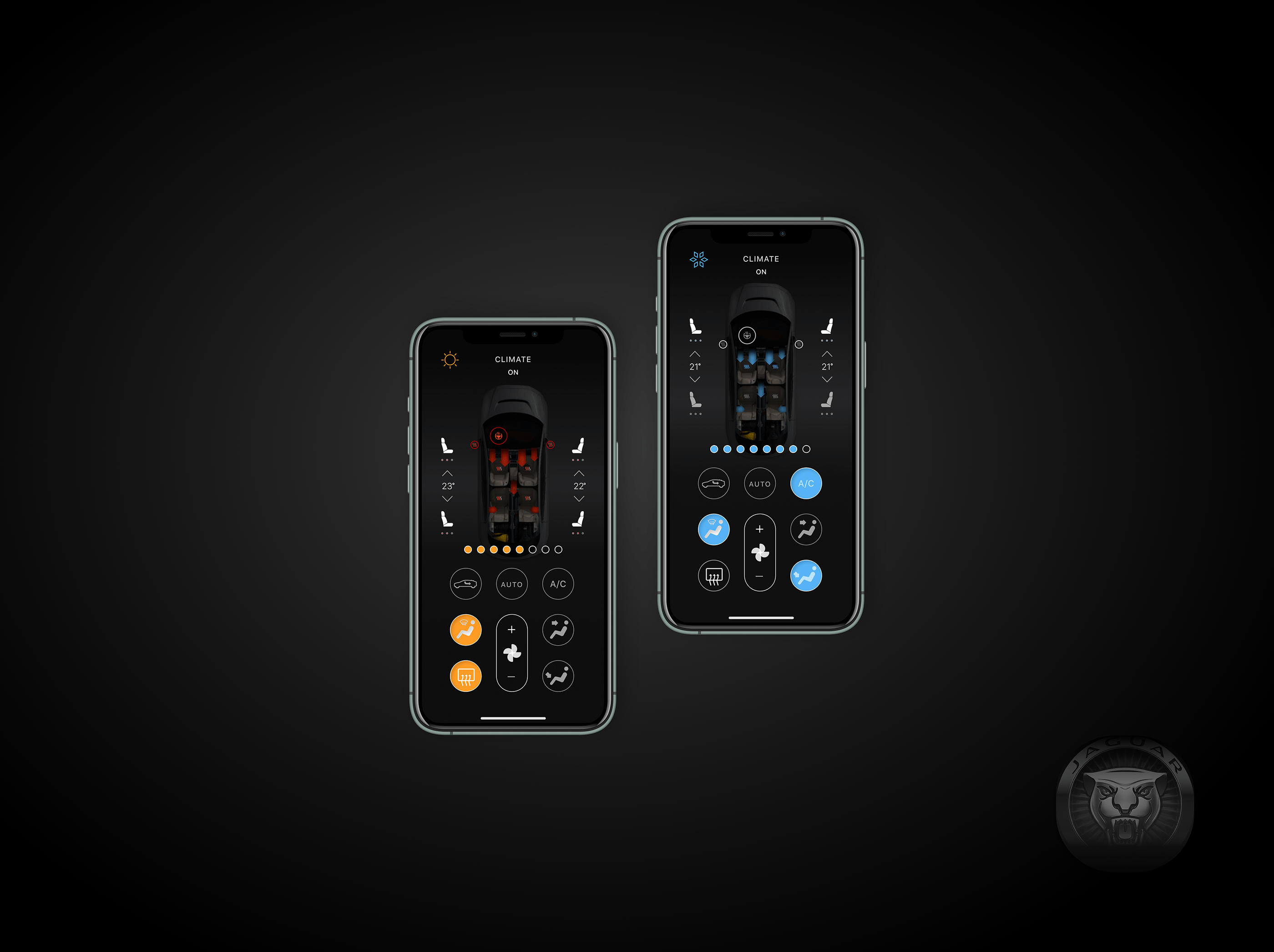
But there are issues such as climate control, heated seats, steering wheel,
mmirrors, and cooling…
To fully connect the functions, you need to go to another screen (with a partial set of options, unlike the original "TESLA" application).
In my opinion, this can be a problem for the layman, and not all the climate control functions are available on the duplicate screen of Matt Farmer.
I also have questions about the interface. The design is done neatly in a minimalist style. This is cool, beautiful, and it seems to me that we need to move away from the stereotypes that the mobile phone is made of the same components as opposed to the design of the web interface. But! Icons, such as the charger (battery) and its percentage filling are too minimized, as well as the air temperature (in the interior of the interior, it is not immediately clear where the temperature is), starting the car with sign language and other questionable decisions.
The positive thing is that you can immediately launch the map on the main screen and find your car, forgotten by the past day ;)
Very relevant for those who like to spend the night with a light ;)
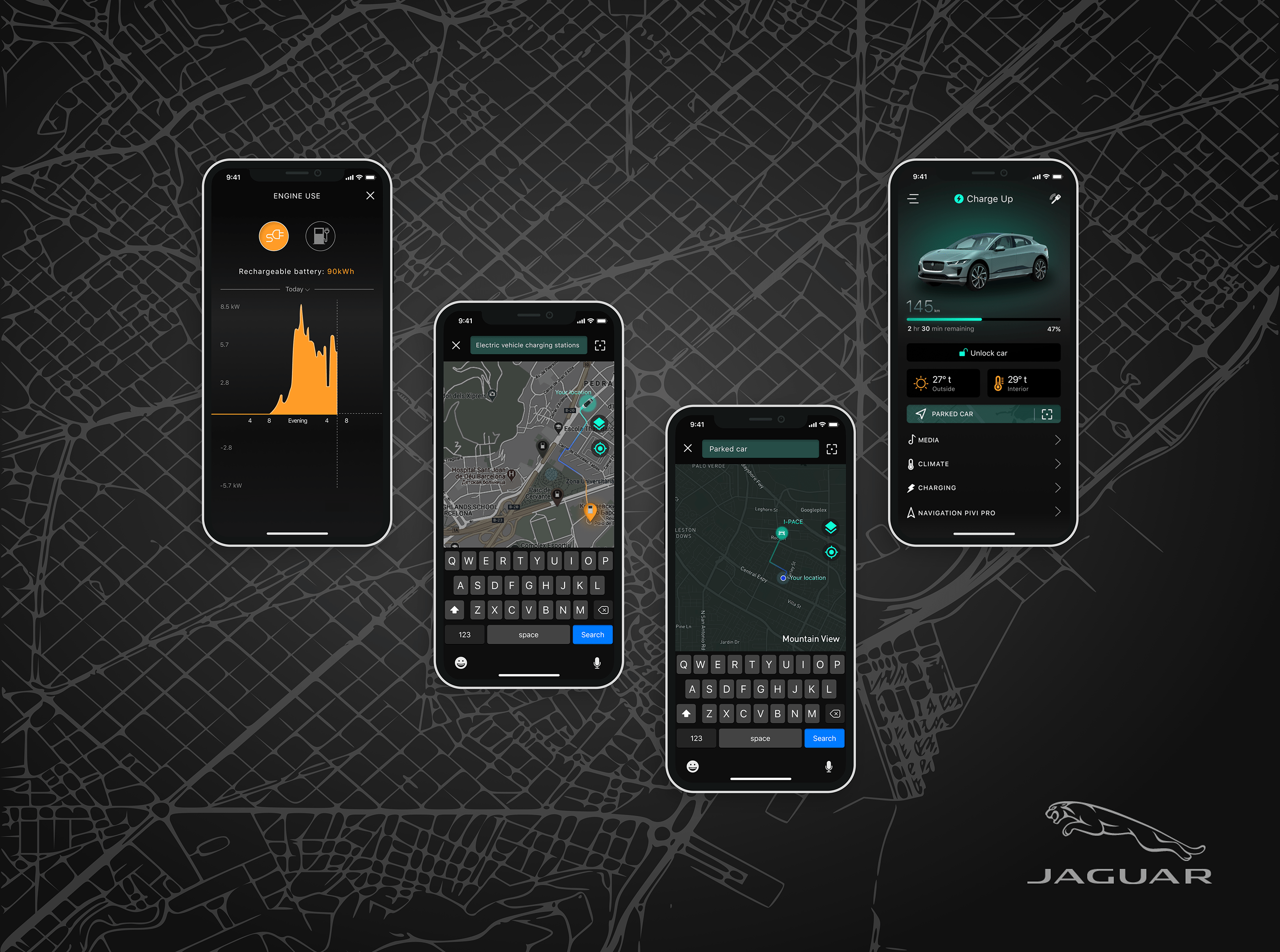
In my application concept, I chose the tabular execution of the main options:
1. You always see the Battery status on the main screen in a graphical version for quick interaction with the device. As a percentage to assess the battery status with a reminder of how long it will take to fully recover. And in units of measurement (Km).
2. Integrated the idea with the vehicle search on the home screen (I love cranks).
3. Highlighted the vehicle unlock/lock.
4. Visualized the weather conditions and showed the temperature in the vehicle interior on the main screen.
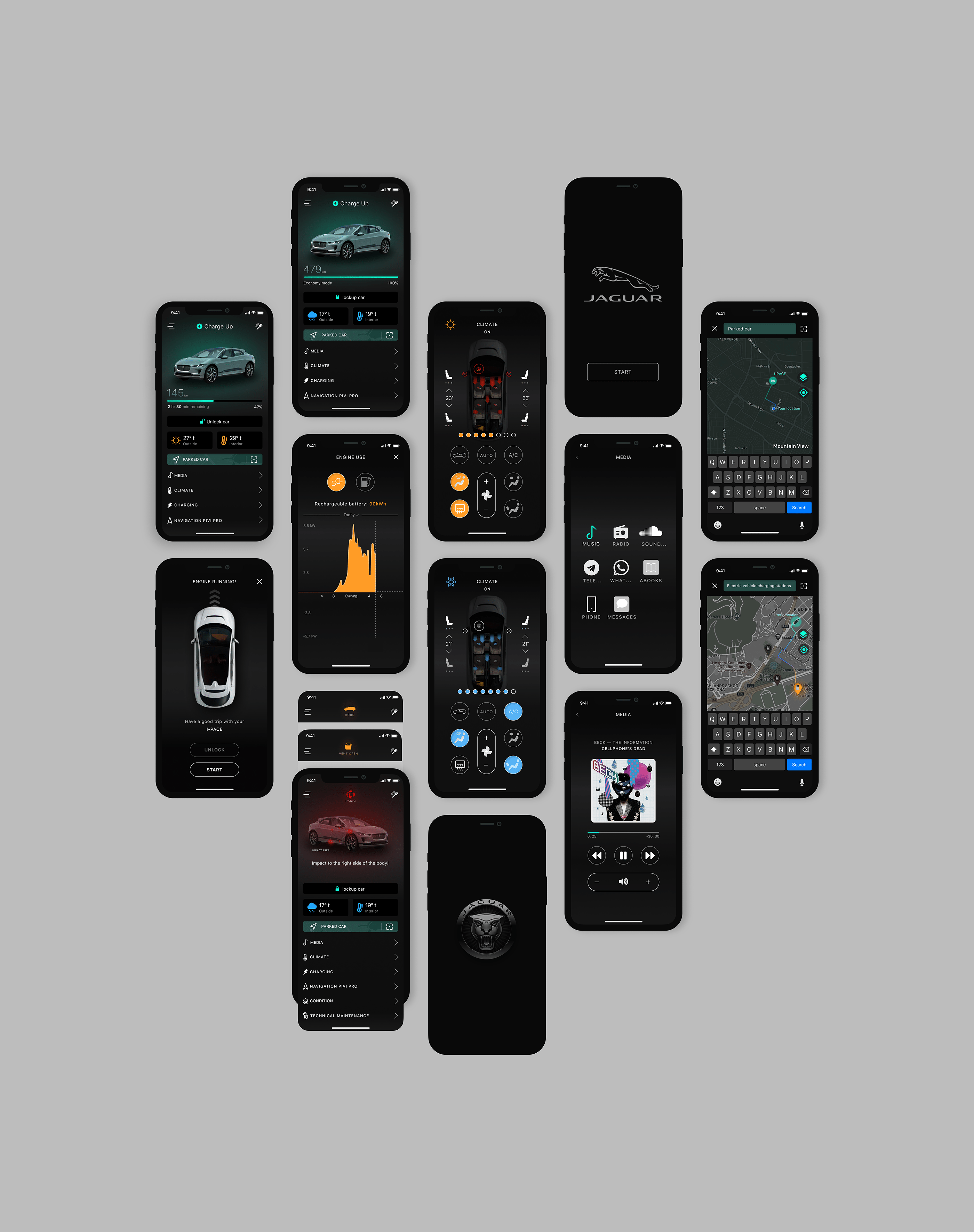
5. The launch path begins when you click on the icon/button "keys" then go to the vehicle launch screen, unlock the system with a slight movement to the right of the "unlock" button and press the "START" button))
6. I consider it a useful function to launch the Pivi Pro navigation system, from a mobile application that automatically integrates the route with the shortest path when connected to the vehicle, to the vehicle's on-board computer( saving your precious time). You get into the passenger compartment of your I-PACE and immediately start driving along the specified route.
7. The "Panic" system is displayed on the main screen of the phone. It signals you graphically and shows the area of impact with approximate accuracy.
8. According to the same methodology, the system shows if you still have open windows, trunk, hood ;) when you click on the icon, you can automatically close one of the..
9. Climate control-you can connect all options, starting from heated steering wheel, mirrors, seats, etc., according to this methodology, cooling occurs.
Thank you for reading the summary!