BRANDING IDENTITY
2023
BRANDING IDENTITY
2023
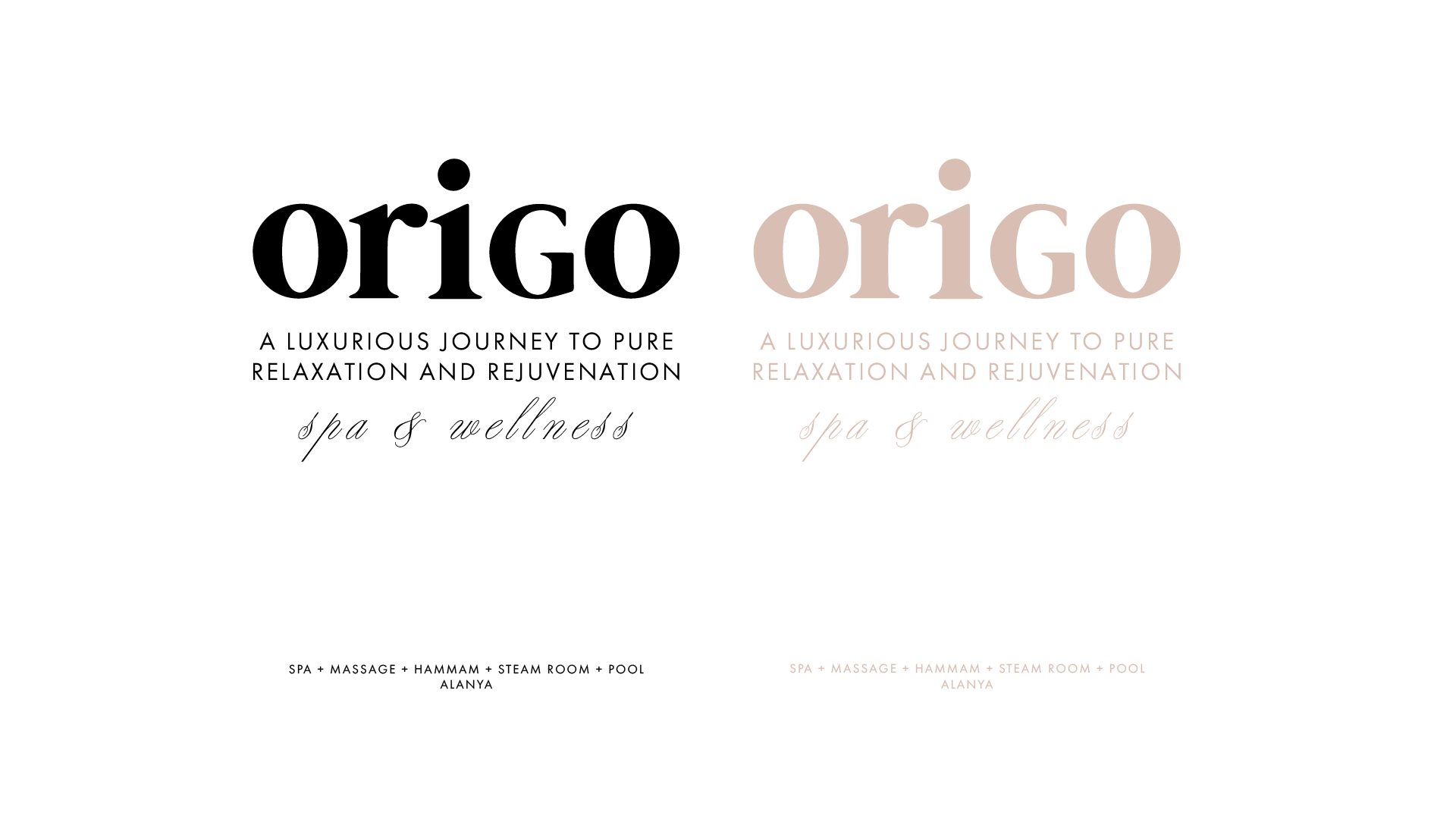
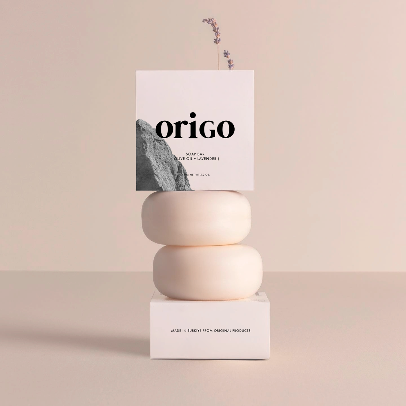
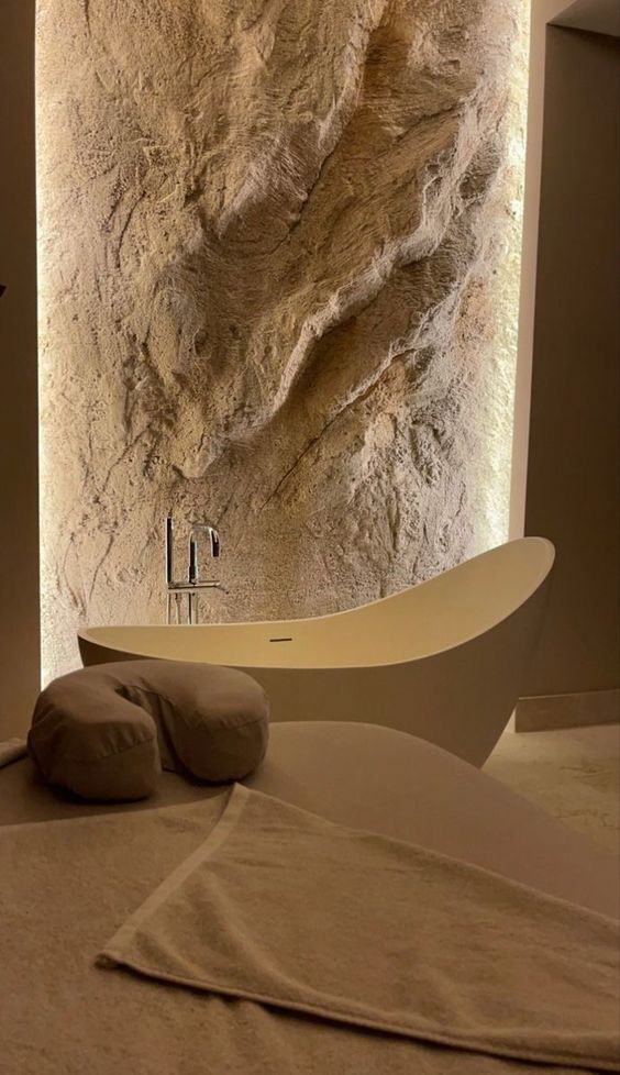
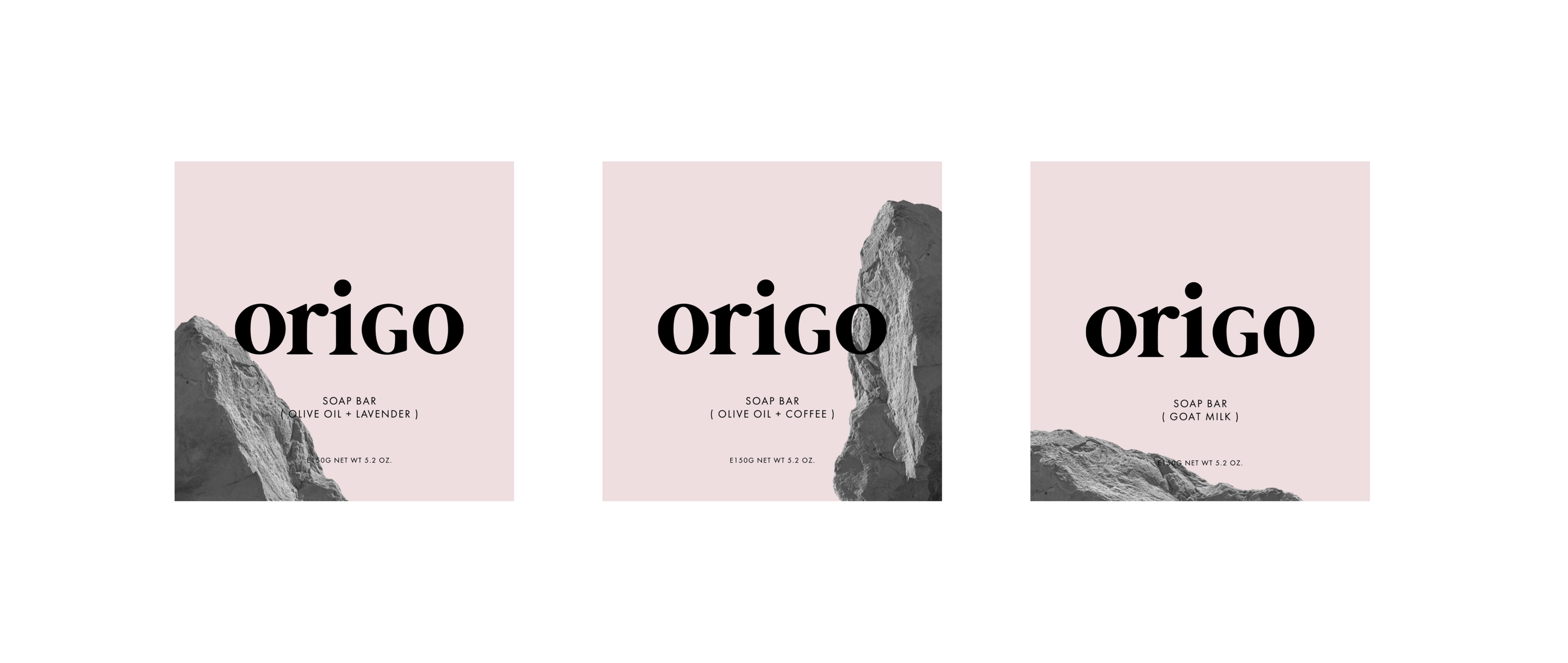
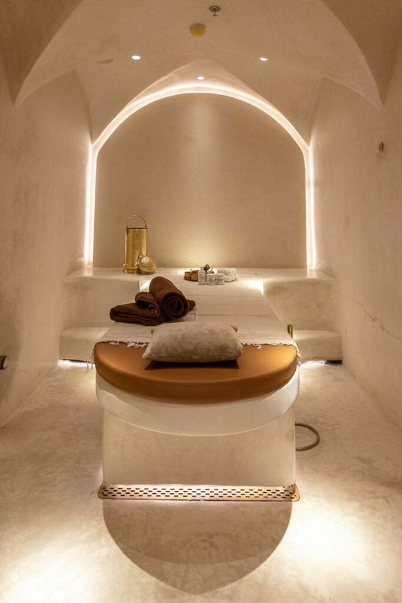
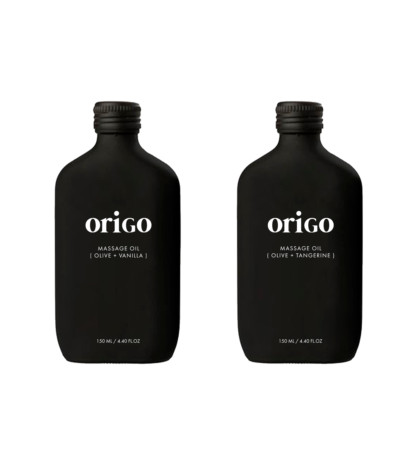
Origo is a premium spa with an exceptional atmosphere of inner peace and purification of the mind and body. They use their own line of skin care products based on organic essential oils and extracts of local plants.
I studied the company's values, target audience and positioning of competitors. The brand owner confirmed that
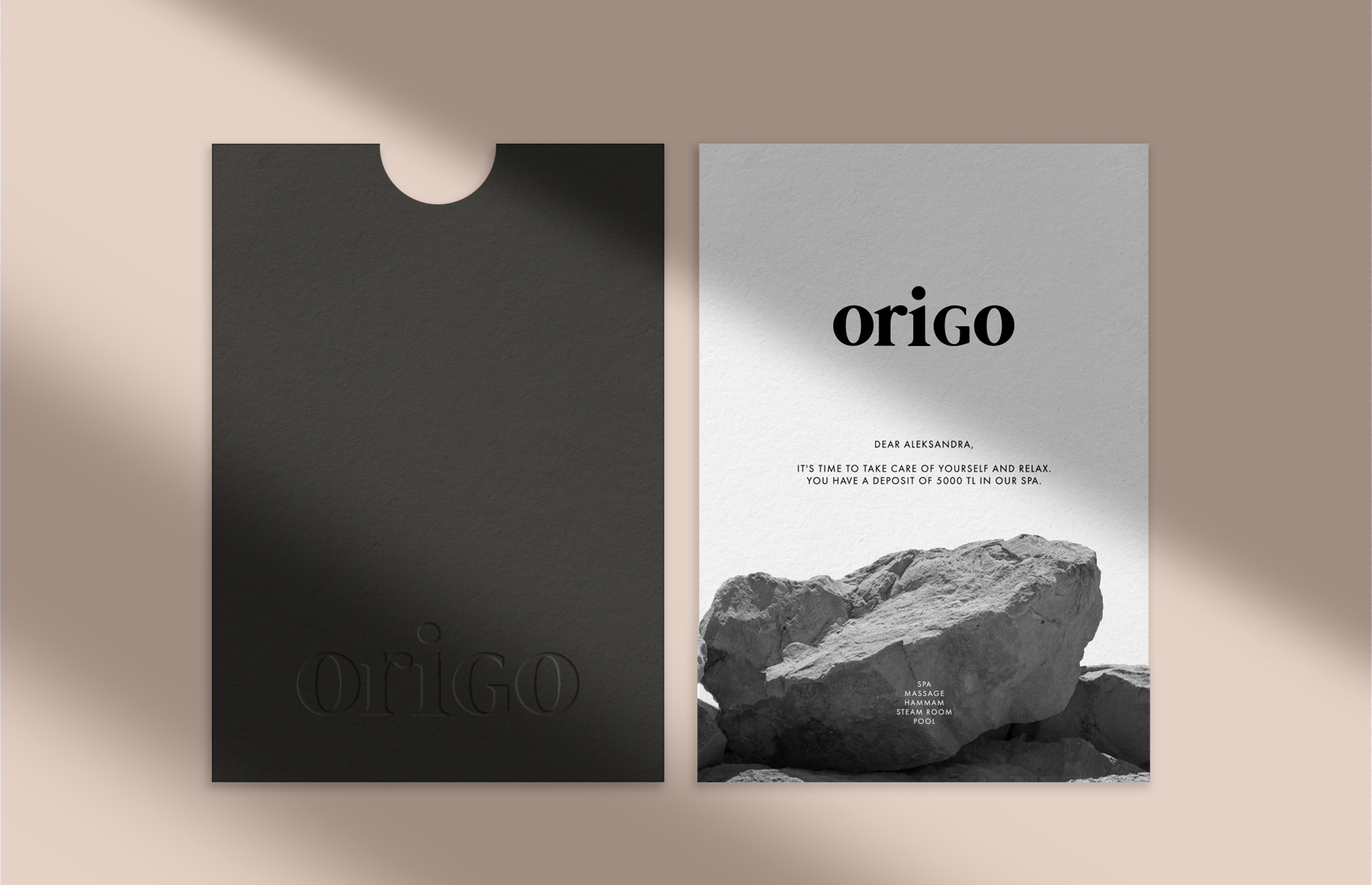
the client of Origo must feel his exclusivity, he must be sure that he will spend 1-2 hours of time in complete relaxation with impeccable service. Without compromise! This is what I need to reflect in the identity.
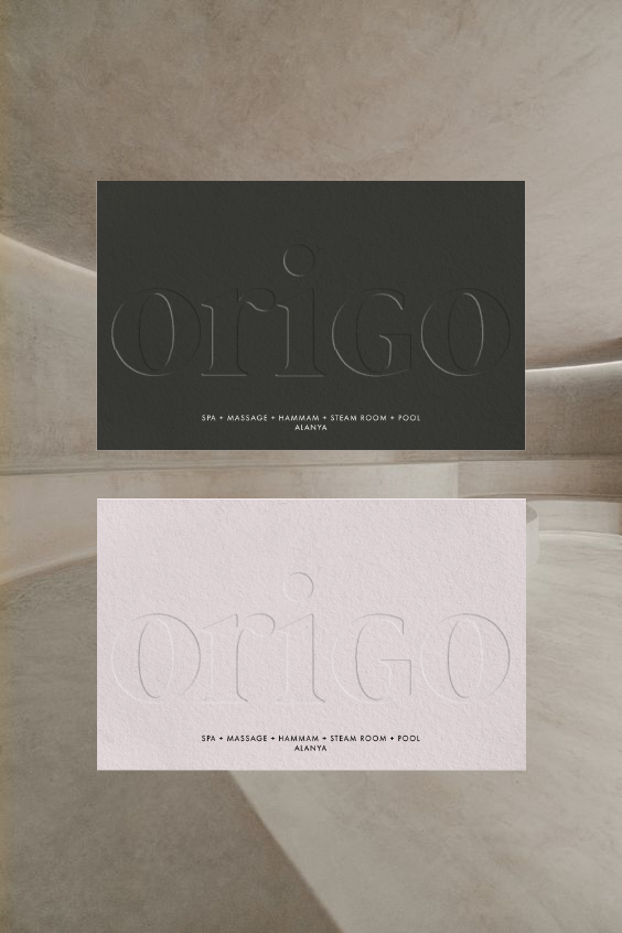
I developed brand identity from brand positioning and naming to visual identity design and packaging design.
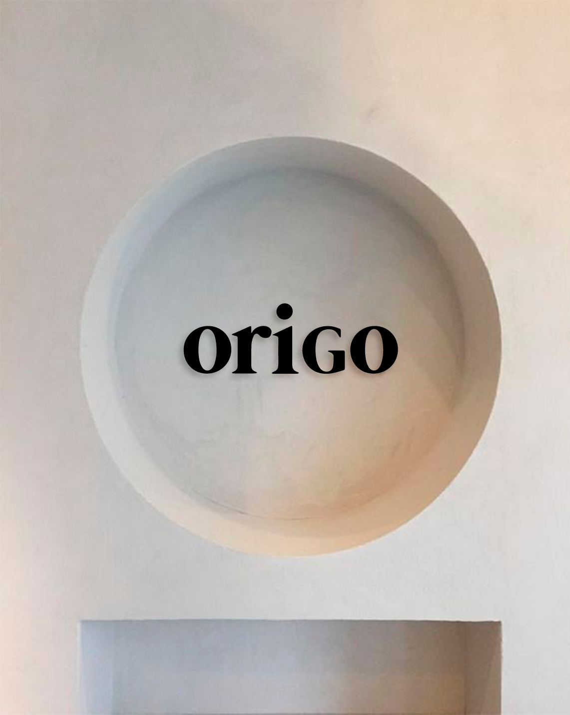
NAMING origo (latin) - source, origin
The name ORIGO refers us to remembering that the source of our happiness and well-being is already in our inner world.
You just need to stop, relax and listen to yourself :)
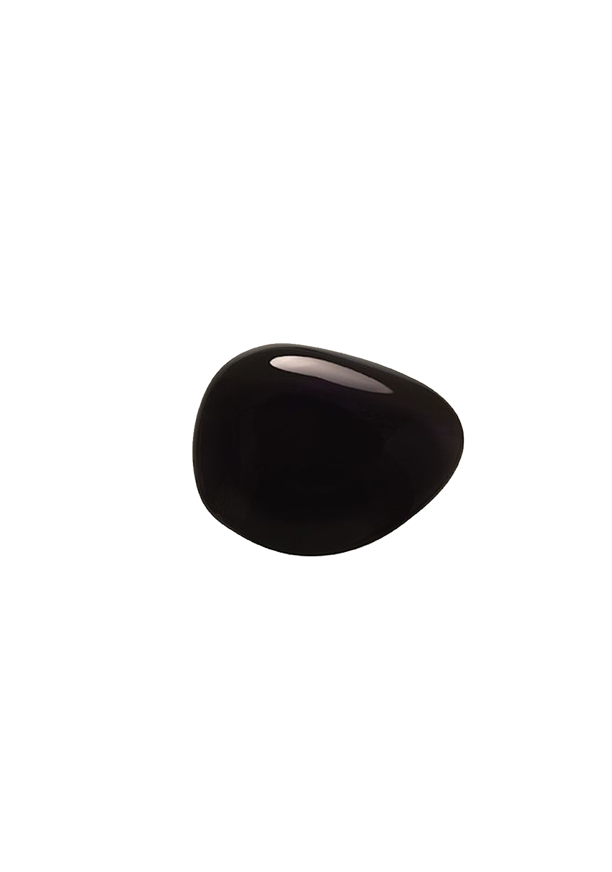
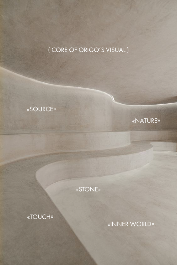
VISUAL CORE OF THE BRAND
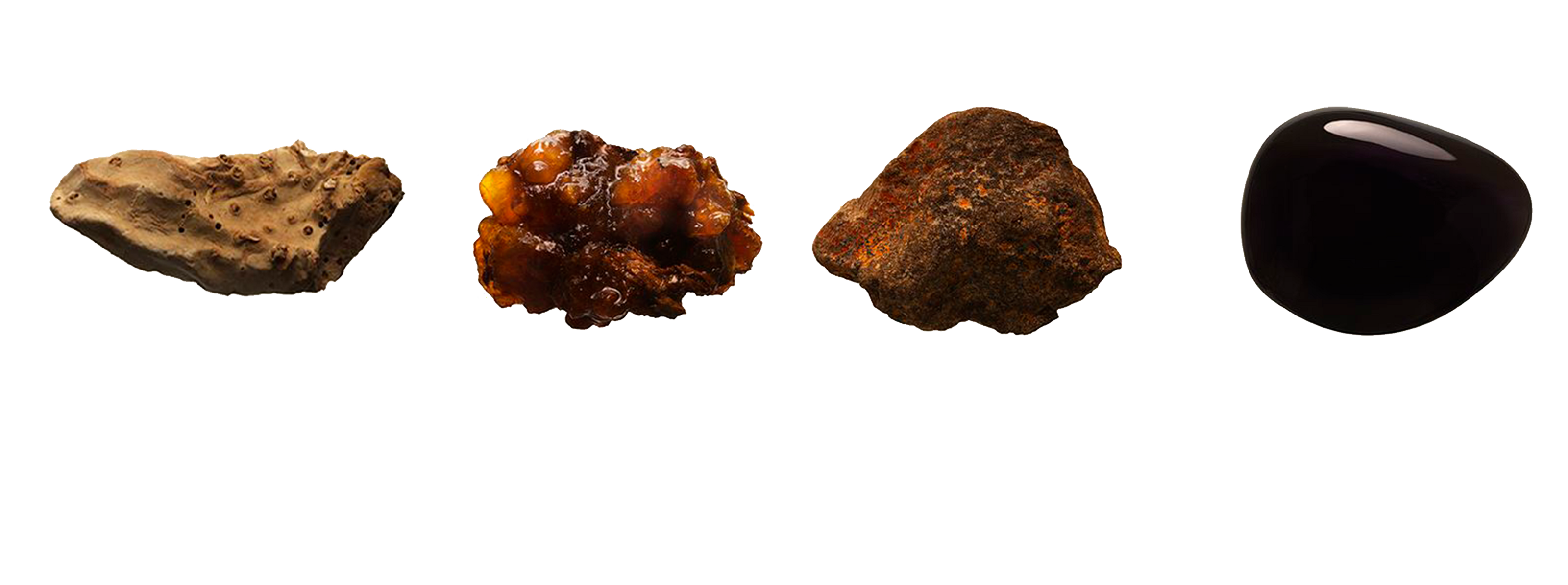
STONE TEXTURES NATURAL COLORS ROUNDED SHAPES
I decided to use shapes and textures close to nature. In contact with nature the client can afford to connect with his inner world and relax. Nothing should irritate. All surfaces (including printed materials) should be pleasant to the touch and evoke positive emotions.


Natalia Ivashkovich
Evgeniy Polyakov
Natalia Ivashkovich
Natalia Ivashkovich
Брендинг