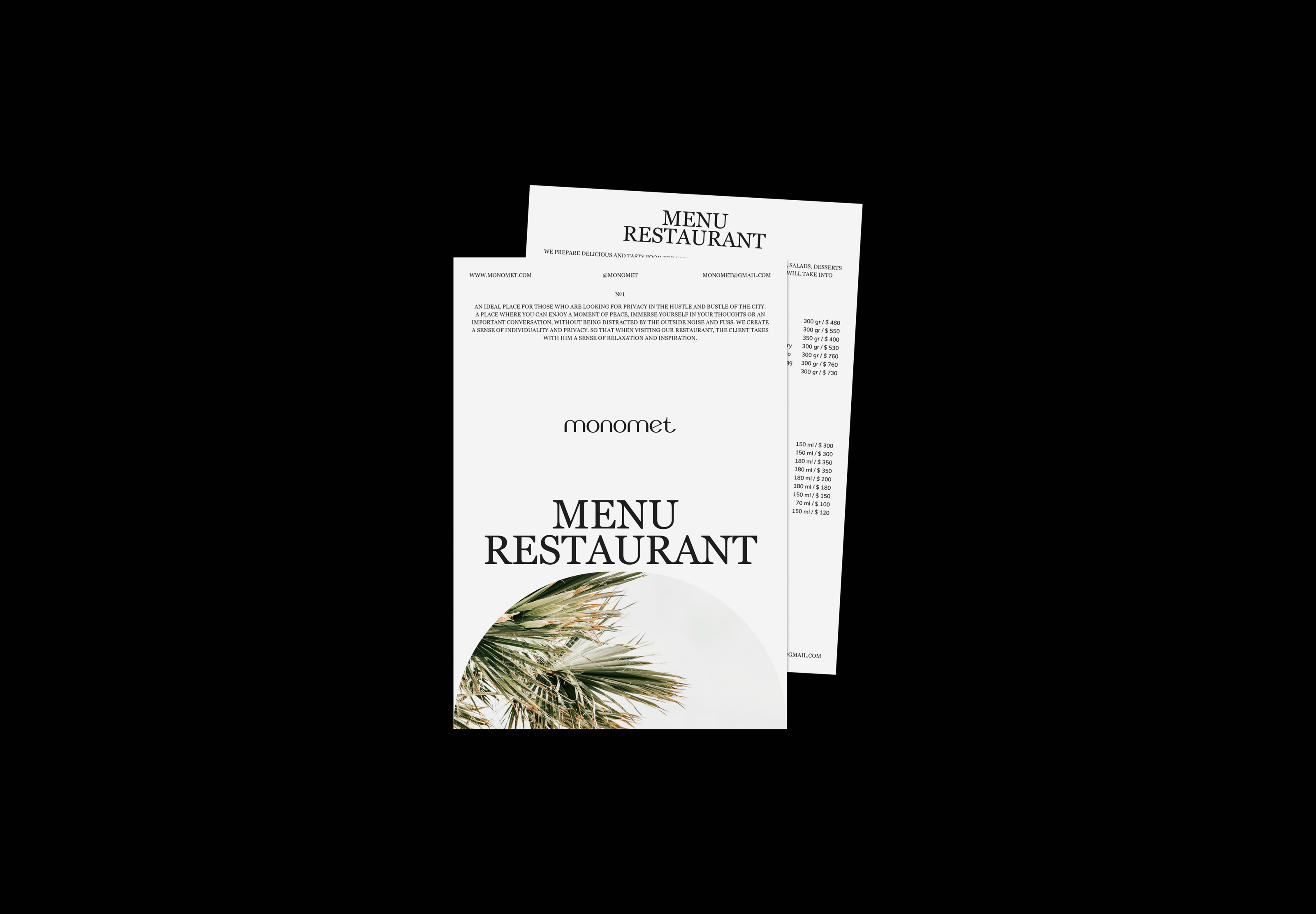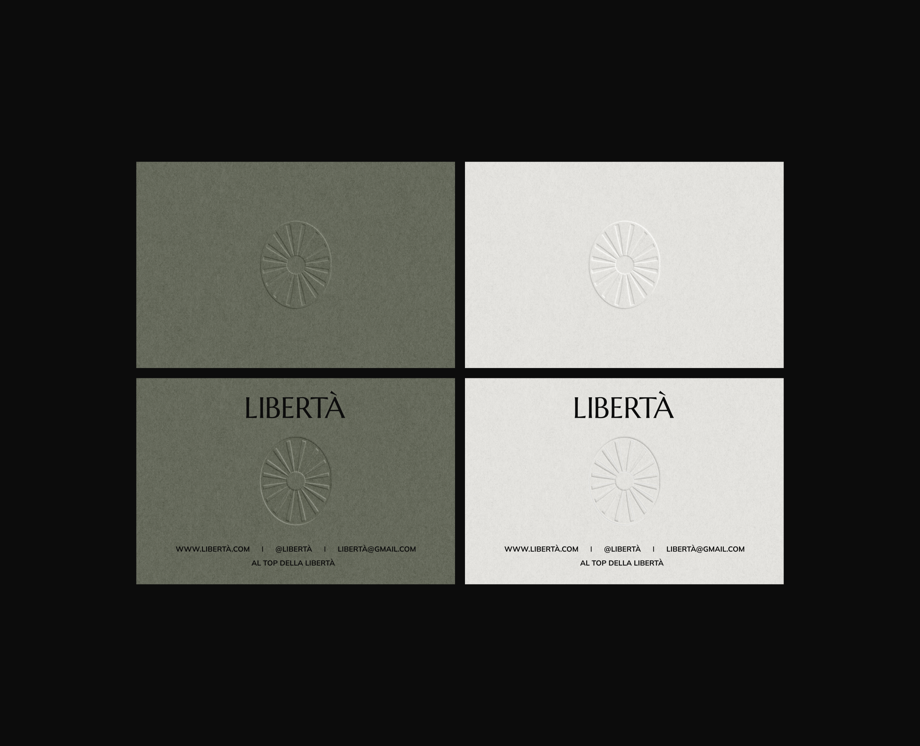
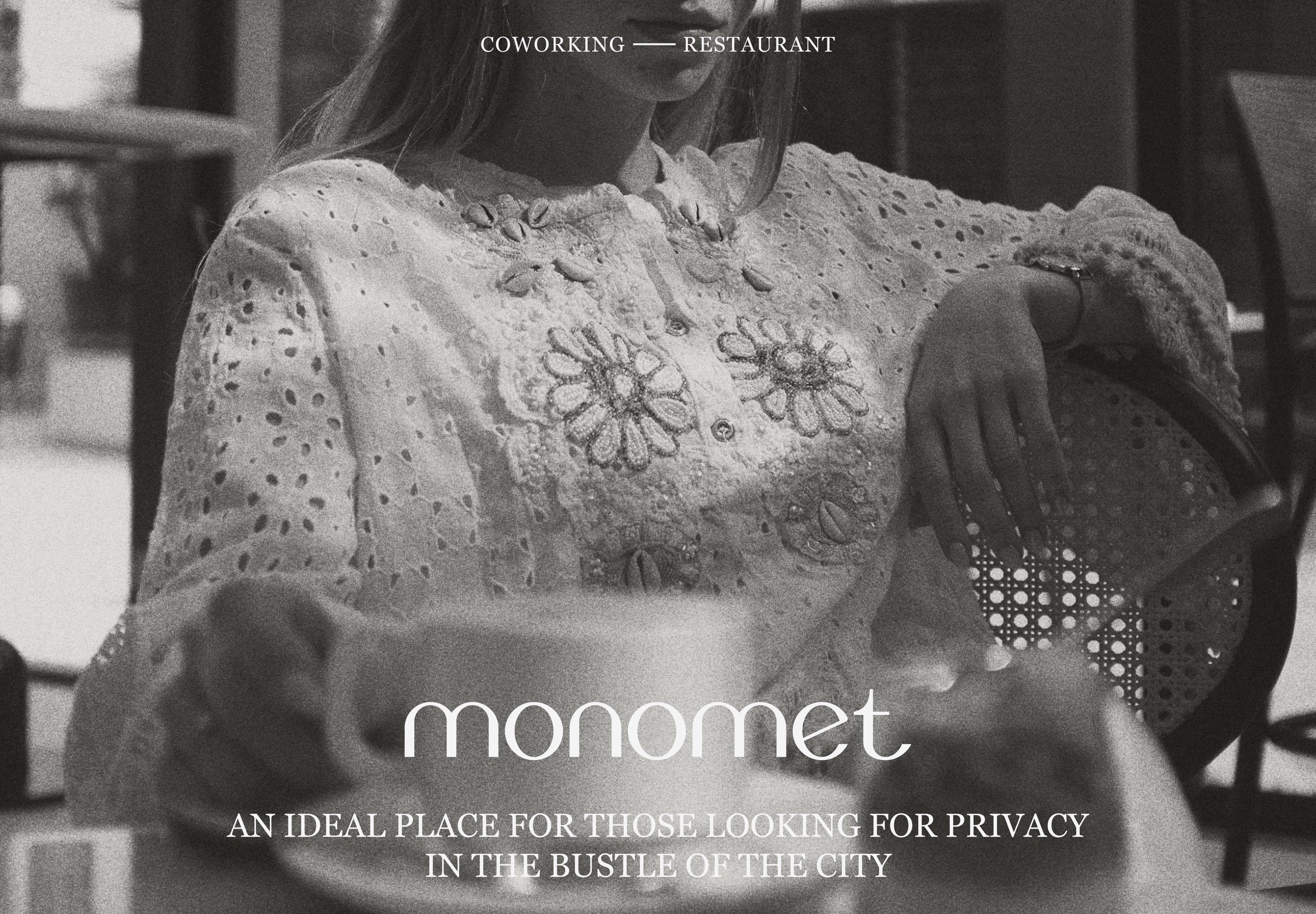
Identity for the MONOMET brand (coworking — restaurant)
ENG
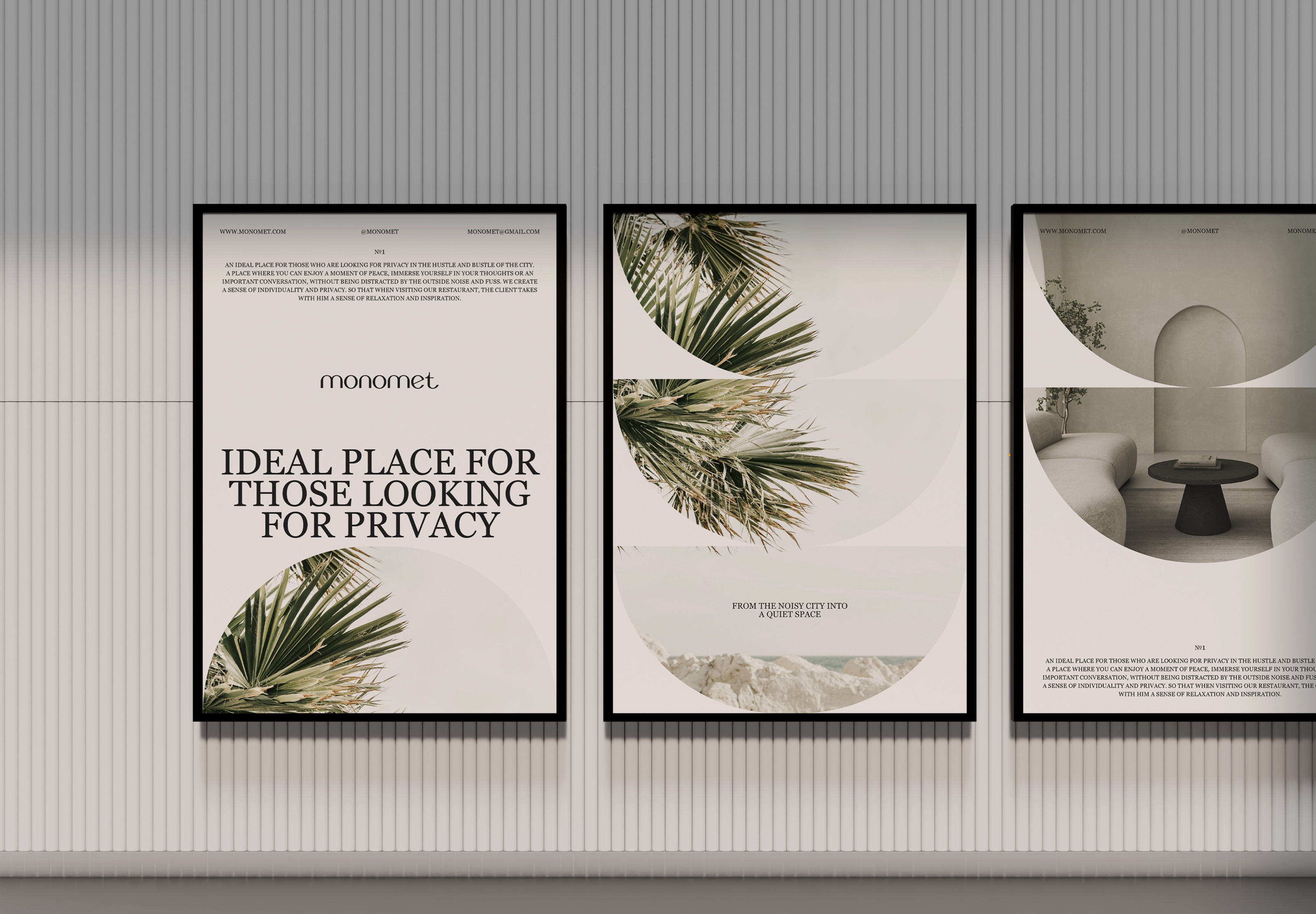
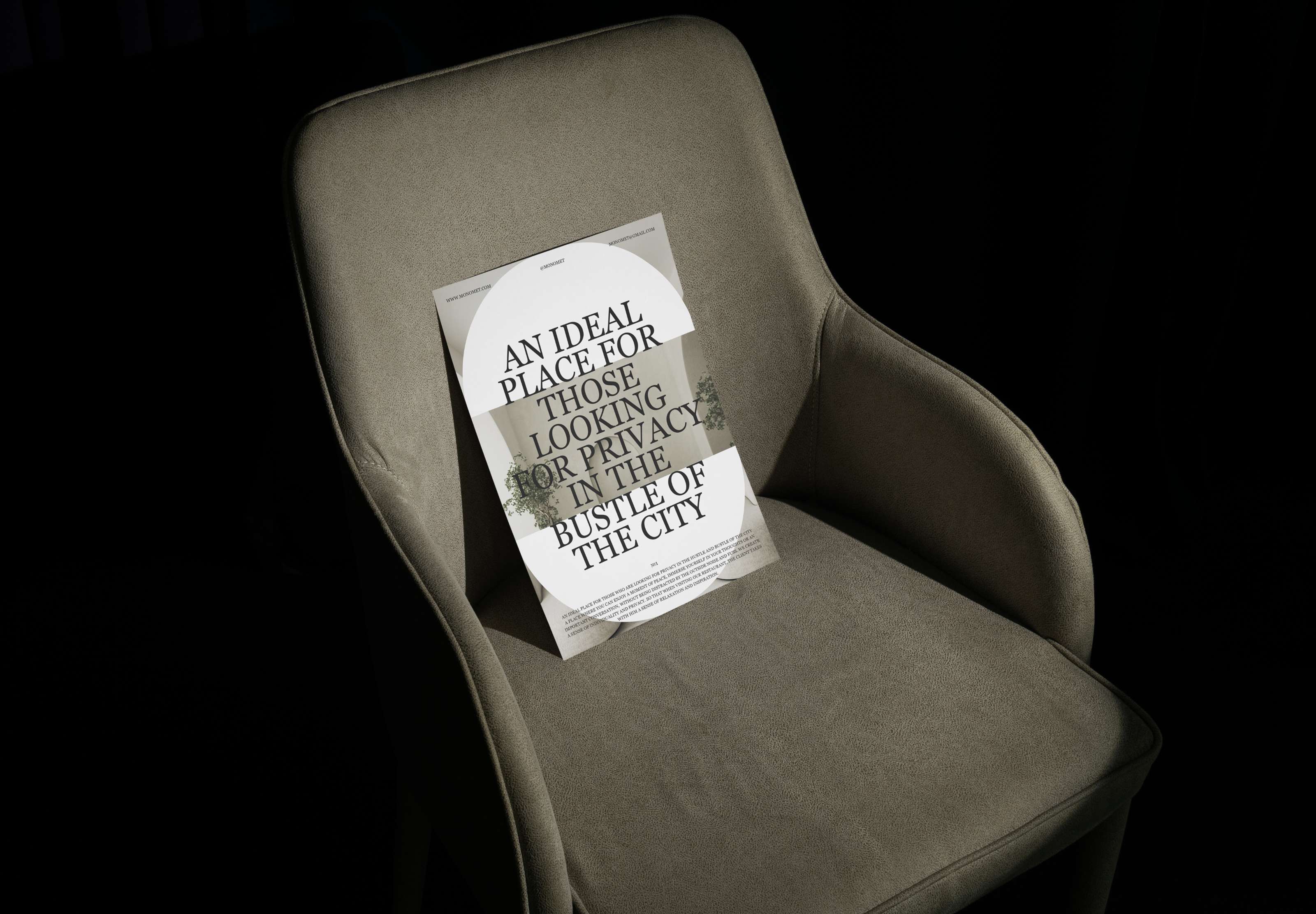
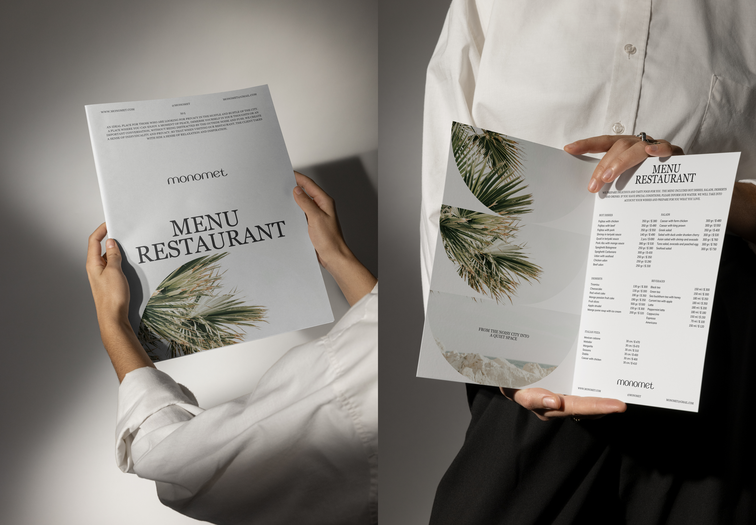
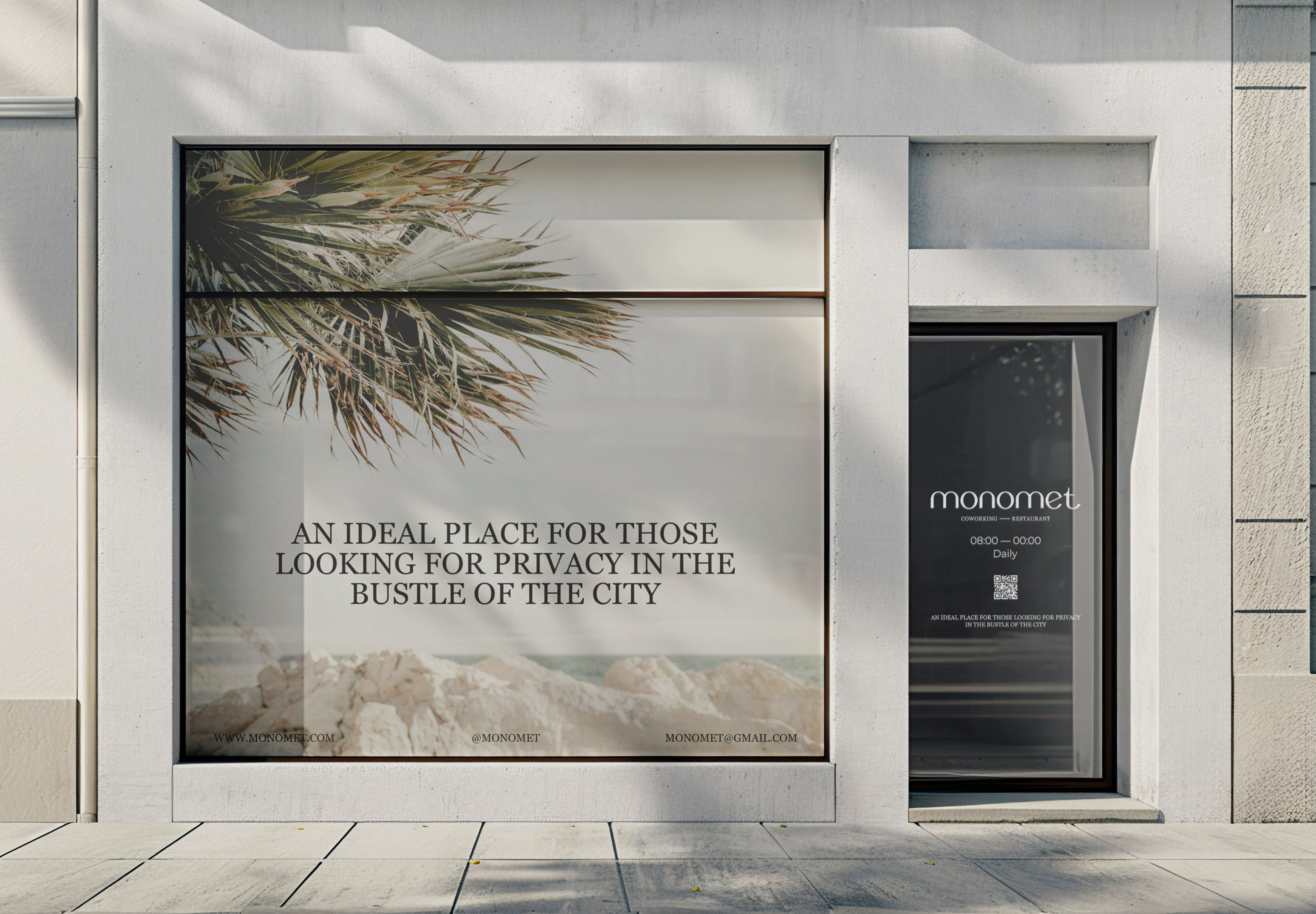
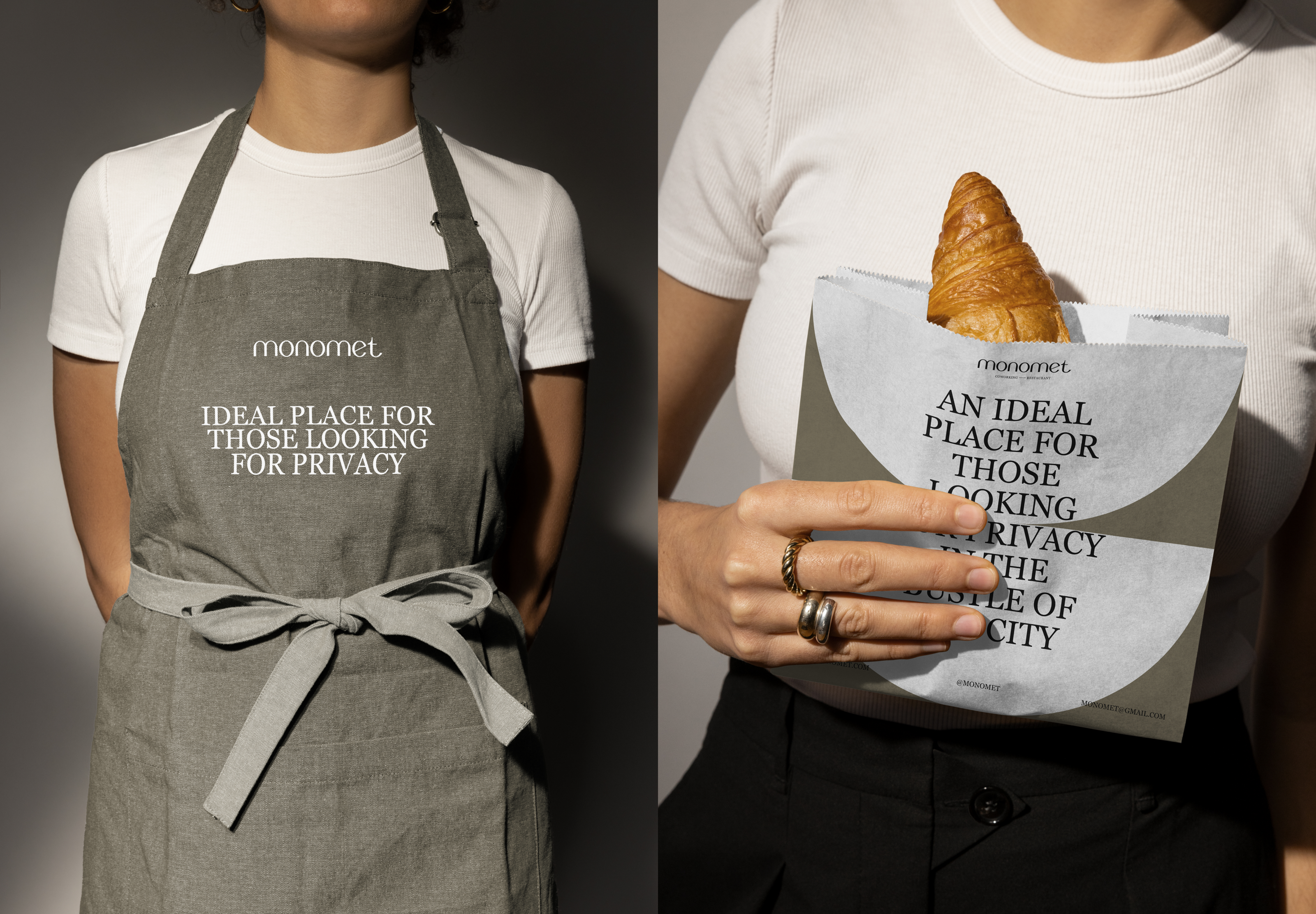
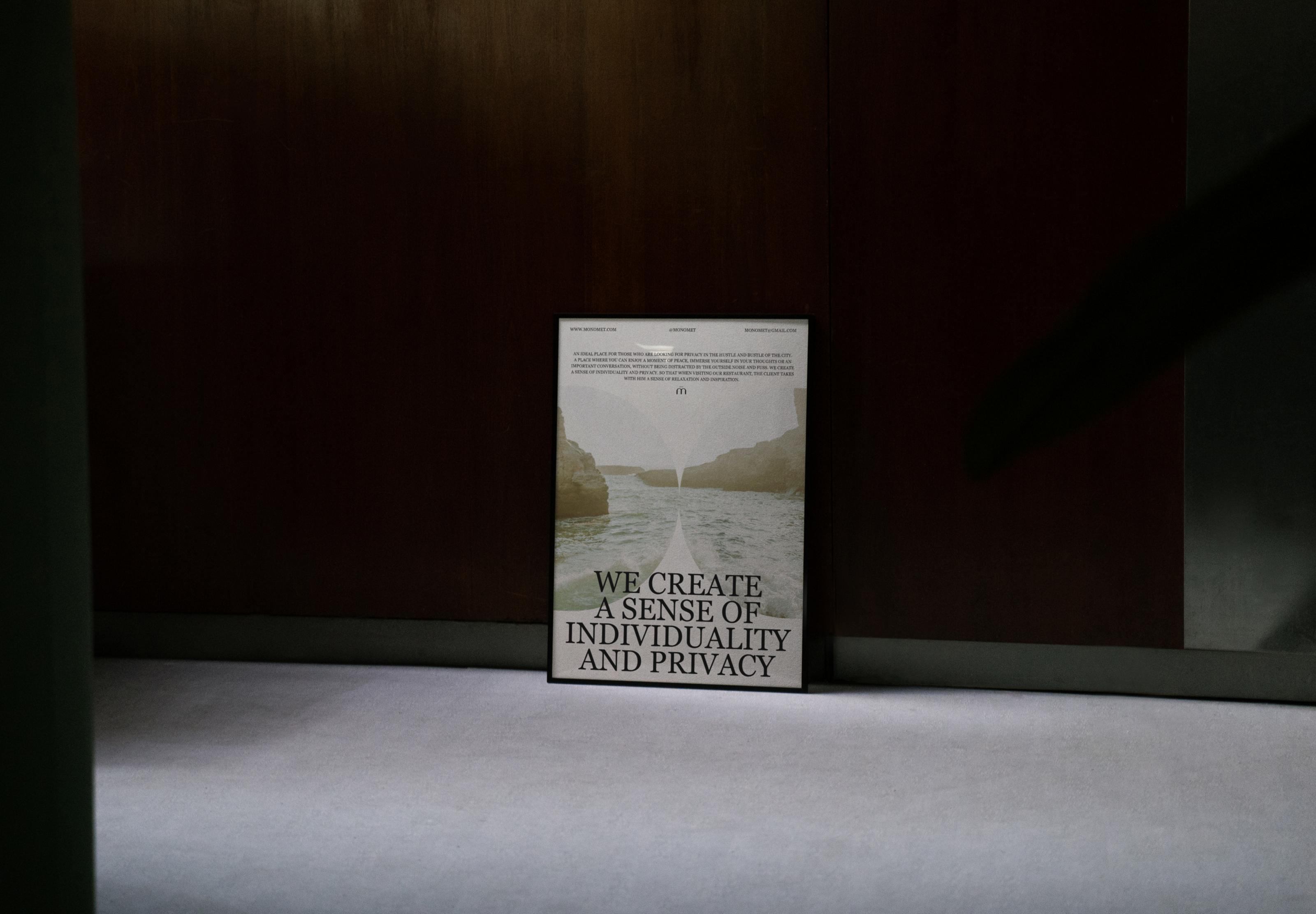
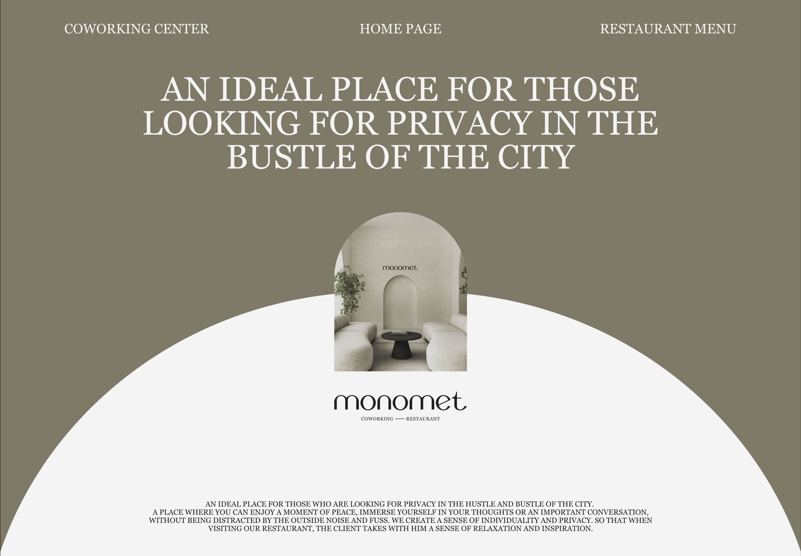
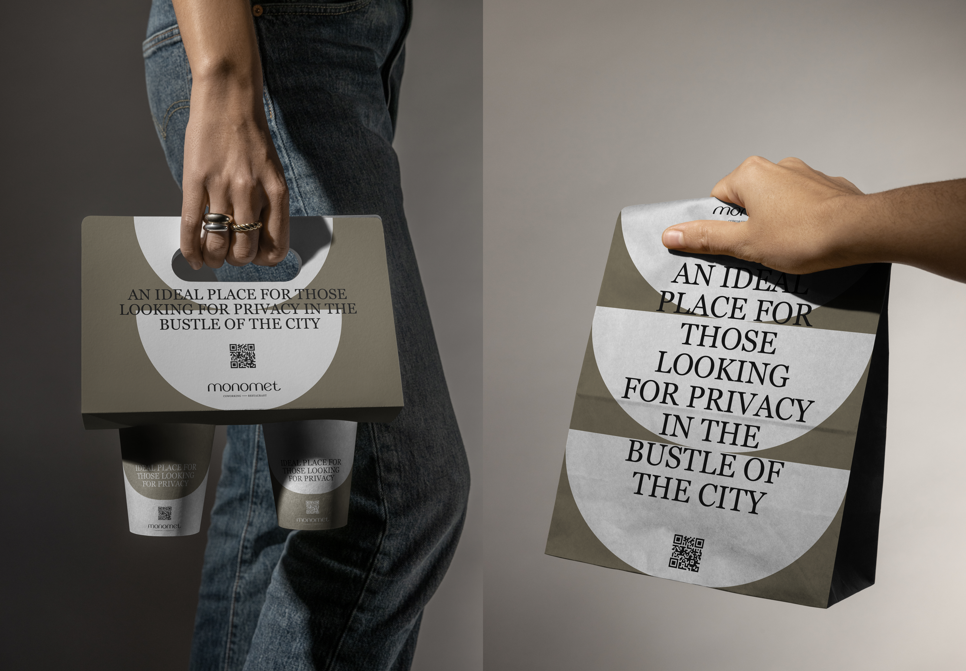
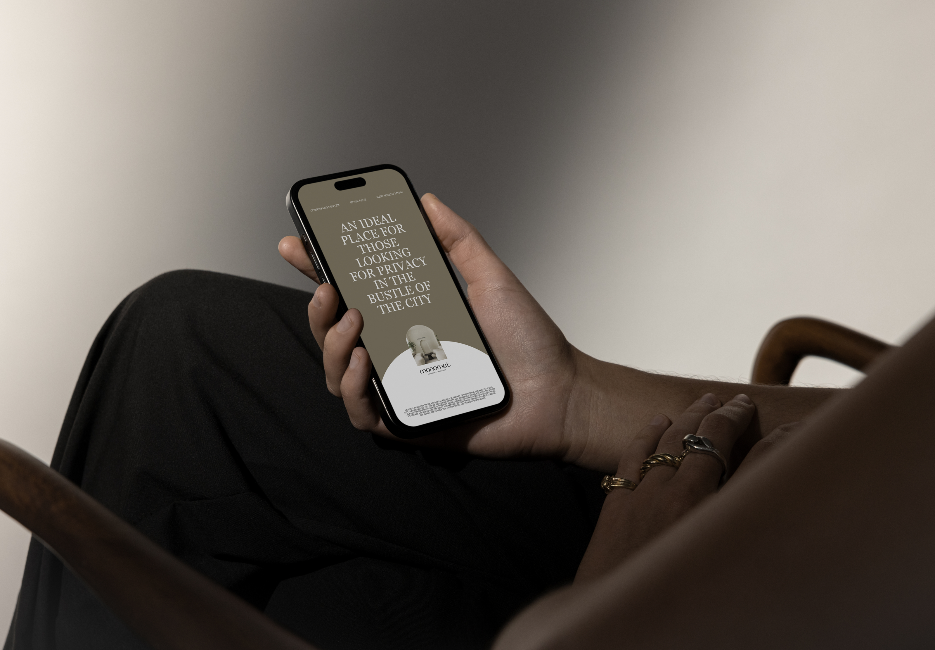
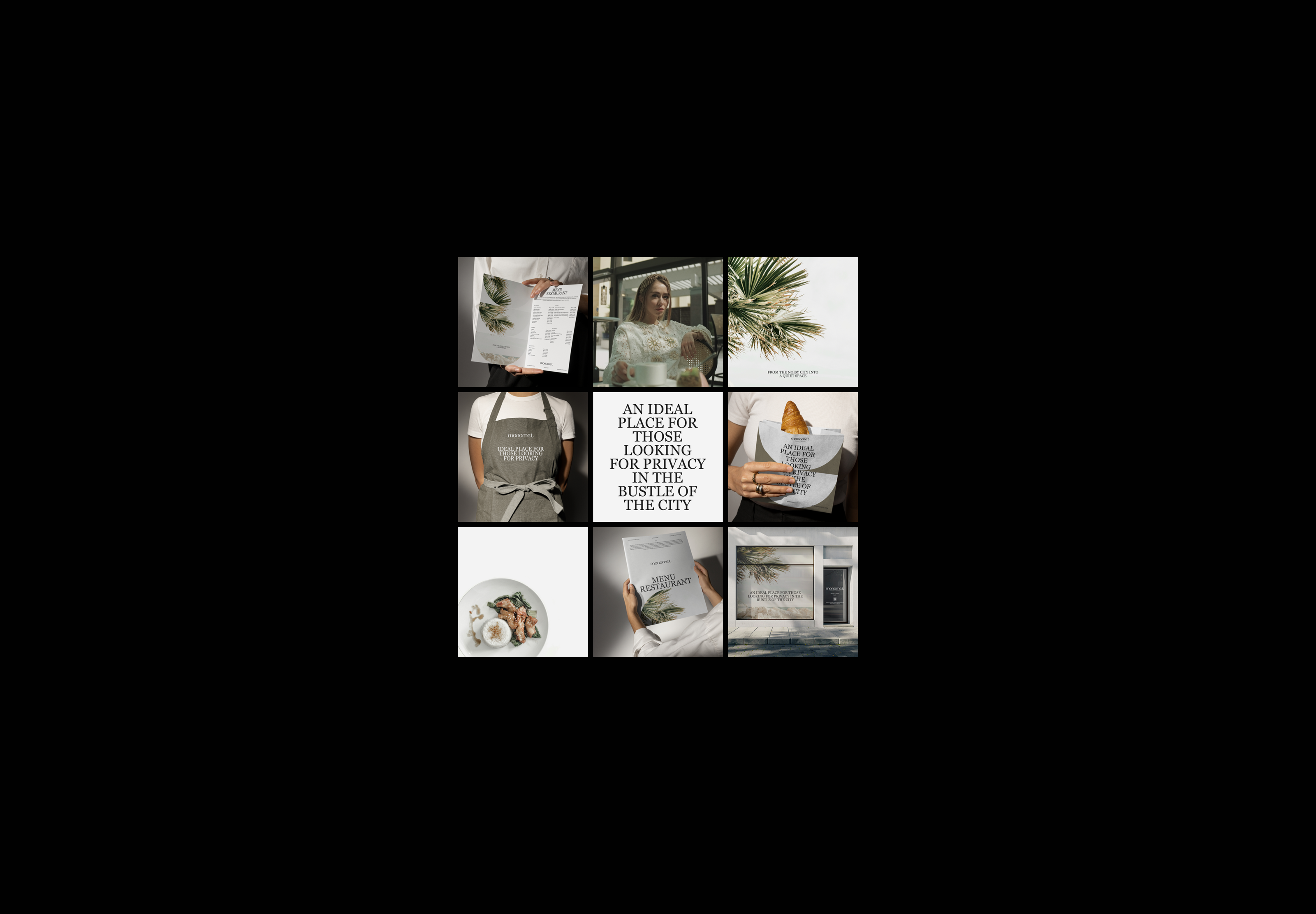
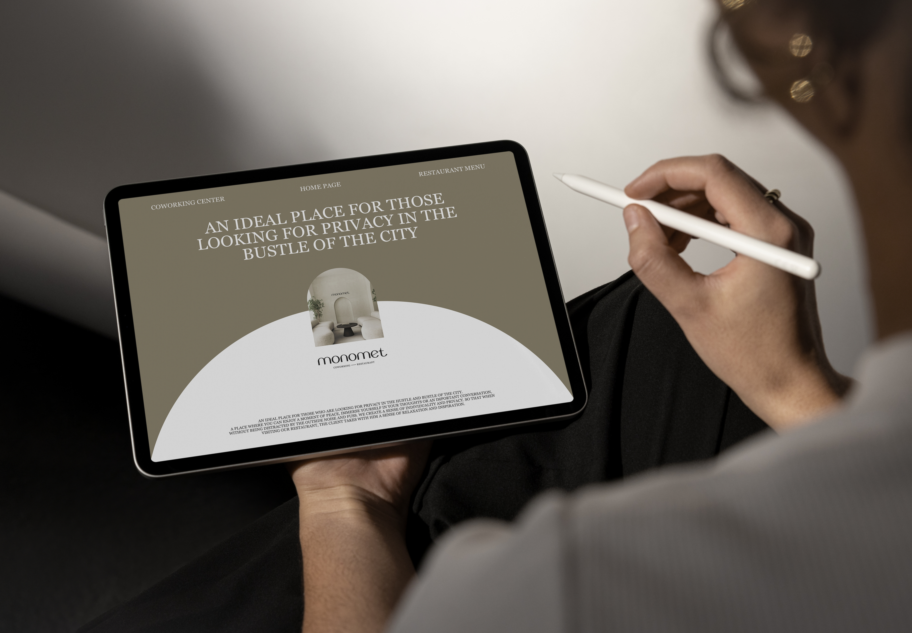
MONOMET is a space combined with a coworking space and a restaurant. Sounds like a place where every guest can feel special and at the same time feel calm while being in a public space. They can sit comfortably in the book department or restaurant hall and be sure that no one will distract them from reading and thinking. MONOMET is a space of silence, where noisy conversations and loud music in the background are not welcome. An ideal place for those looking for privacy in the bustle of the city. A place where you can enjoy a moment of calm, immerse yourself in your thoughts or an important conversation, without being distracted by external noise and bustle.
CONCEPT :
The name Monomet is formed from two words. Mono is a prefix to the word meaning "one". Meet - to meet. Like meeting yourself. Retreat and be in a calm, quiet place, supporting the brand’s metaphor of “transition from the noisy bustle of the city to a calm and quiet space.”
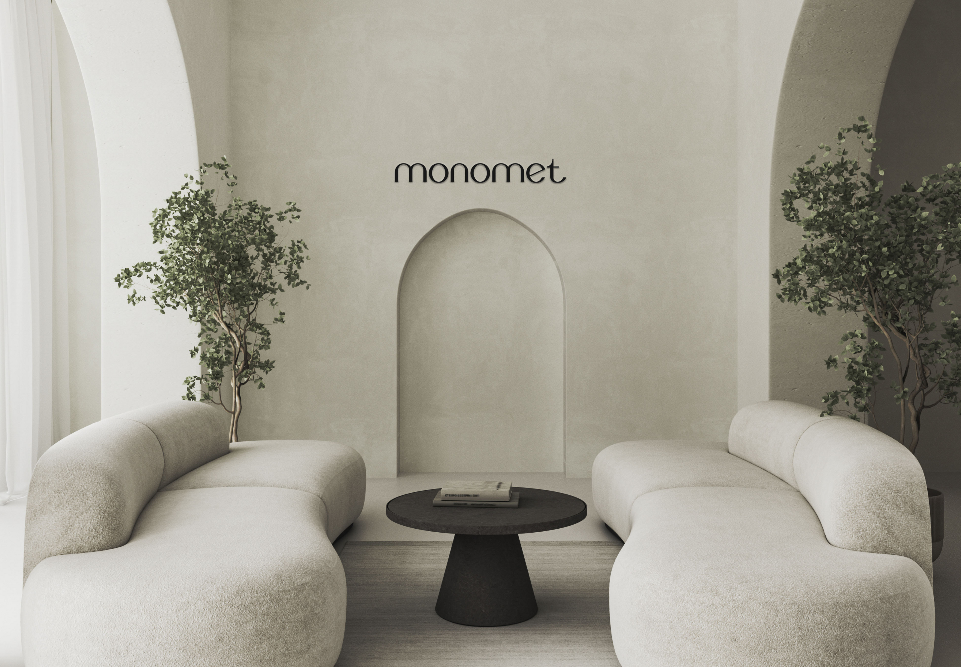
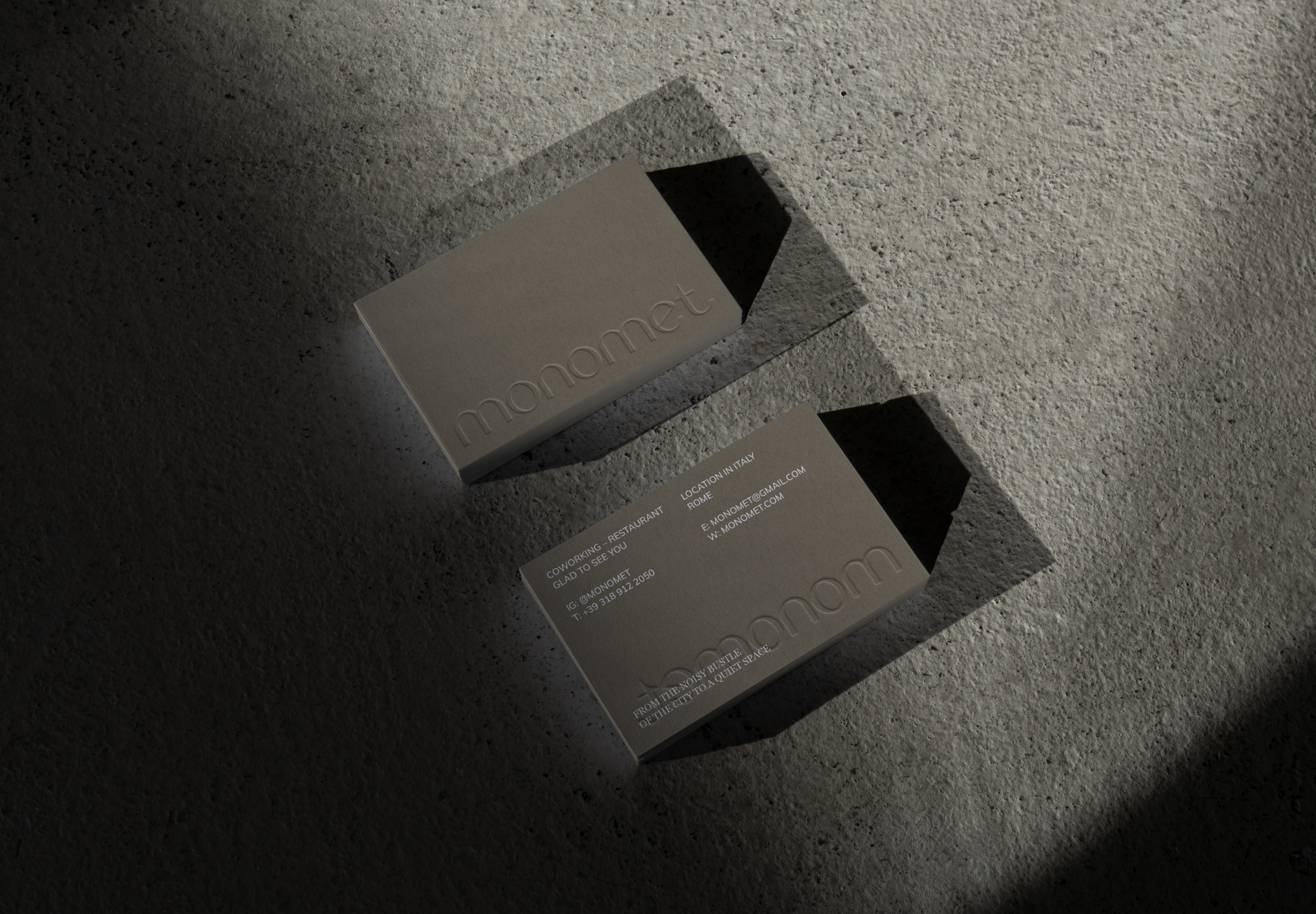
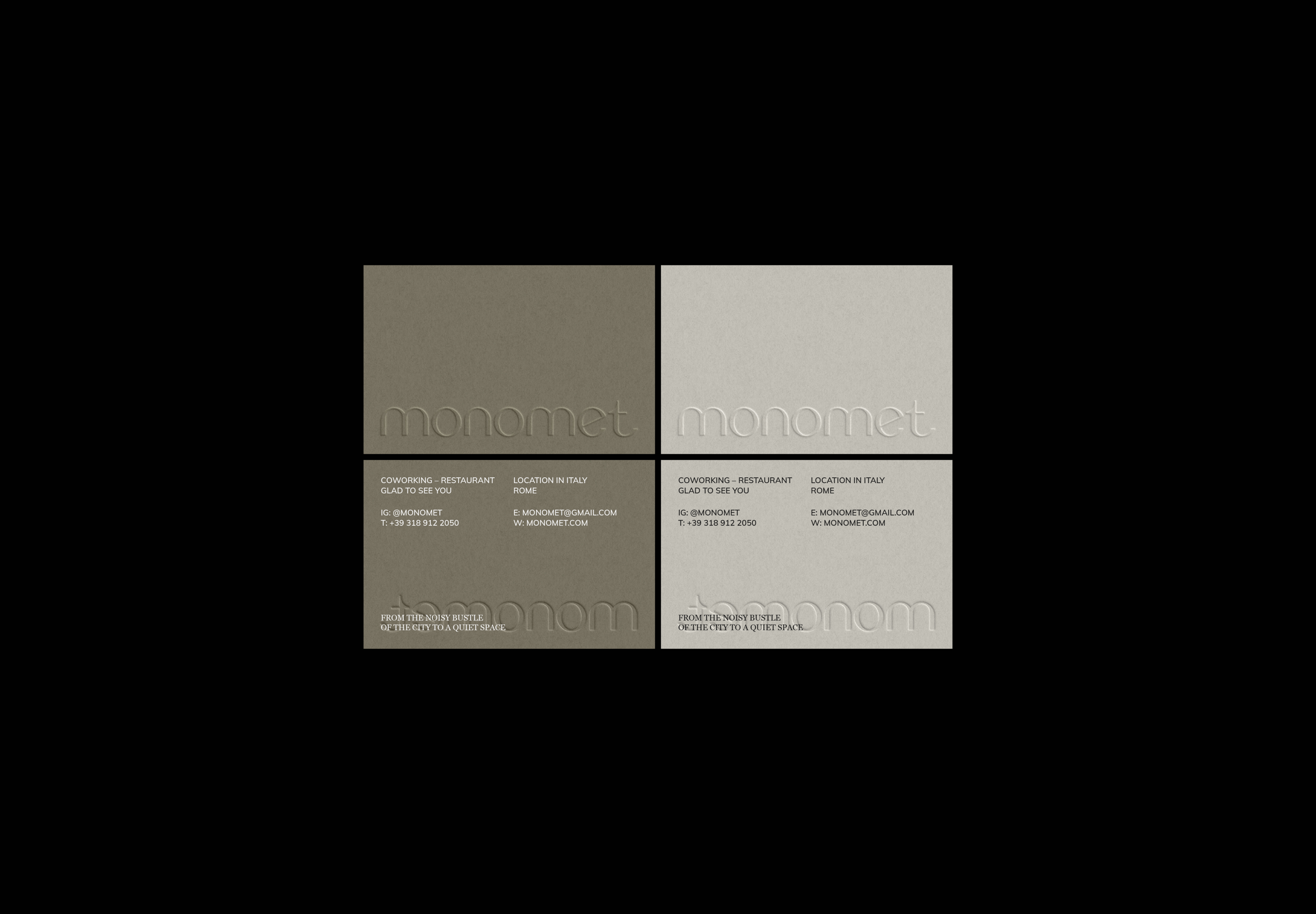
The key device for graphically expressing the metaphor is the arch, like a passage from a noisy city to a quiet place. It can be seen on all brand media. The logo font was designed from scratch in grotesque, fully conveying the brand philosophy. It has rounded shapes in the form of arches. The descriptor uses an antiqua serif font, which refers to the premium nature of the space. An em dash between words conveys a sense of stability, stability, and trust in the brand.
RUS
MONOMET — пространство в слиянии с коворкингом и рестораном. Звучит как место, где каждый гость может почувствовать себя особенным и в то же время ощутить спокойствие, находясь в общественном пространстве. Они могут с комфортом устроиться в книжном отделе или рестораном зале и быть уверенными, что никто их не отвлечёт от чтения и размышлений. MONOMET — это пространство тишины, где не любят шумные разговоры и громкую музыку на фоне. Идеальное местом для тех, кто ищет уединение в городской суете. Место, где можно насладиться моментом спокойствия, погрузиться в свои мысли или важную беседу, не отвлекаясь на внешний шум и суету.
КОНЦЕПЦИЯ:
Название Monomet образовано от двух слов. Mono - приставка к слову, означающая «один». Meet - в переводе с англ. «встретиться». Как встреча с самим собой. Уединиться и побыть в спокойном, тихом месте, поддерживая метафору бренда «переход из шумной городской суеты в спокойное и тихое пространство».
Ключевым приемом графического выражения метафоры является арка, как проход из шумного города в тихое место. Она прослеживается на всех носителях бренда. Шрифт логотипа разработан с нуля гротеском, полностью передавая философию бренда. Имеет округлые формы в виде арок. В дескрипторе используется шрифт антиква с засечками, что отсылает на премиальность пространства. Длинное тире между словами передает ощущение устойчивости, стабильности и доверия бренда.
Art director: Semenova Diana
Brand designer: Soskova Kristina
Brand strategy mentor: Pazavina Olesya
Design course IT'S BASE